CHAPTER 2
Perception in Charts
Maps are a type of chart that can convey relationships about space and relationships between objects that we relate to in the real world. Their effectiveness as a communication medium is strongly influenced by a host of factors: the nature of spatial data, the form and structure of representation, their intended purpose, the experience of the audience, and the context in the time and space in which the map is viewed. In other words, maps are a ubiquitous representation of spatial information that we can understand and relate to. Based on the geospatial task we have in mind, effective maps simply work. Take an example during your day when you use a map, subconsciously solving your problem without really giving it too much thought. You are running late to an appointment, but you park your car in the closest available parking spot. You whip out your phone and quickly punch in the address of the office you need to head to. The map application uses the context of your location, where you are standing in space, and assesses that given the proximity of where you are from the office, you are probably walking. Rather than a full-scale map, a walking map shows turn-by-turn directions with an estimated time of arrival that helps you determine your pace. It's a simple yet delightful functional representation that helps you reach your appointment on time.
Route maps, which depict a path from one location to another, are one of the most common forms of graphic communication. Before the mobile device became our digital napkin, these route maps were often created as quick drawings to direct someone to a particular location. Such handcrafted maps are usually simplified to make them reasonably intuitive to understand and follow. Mapmakers make explicit decisions about which aspects of the route are most relevant for a navigator to understand and follow. They use a variety of cartographic generalization techniques described in the previous chapter, to help improve the clarity of the map and emphasize only the most important information (Agrawala & Stolte, 2001). Cartographic generalization, performed either consciously or subconsciously, is prevalent in quickly sketched maps, as seen in Figure 2.1 where the artist, Mia Trachinger, sketched out the route to her wedding reception venue for the attendees.
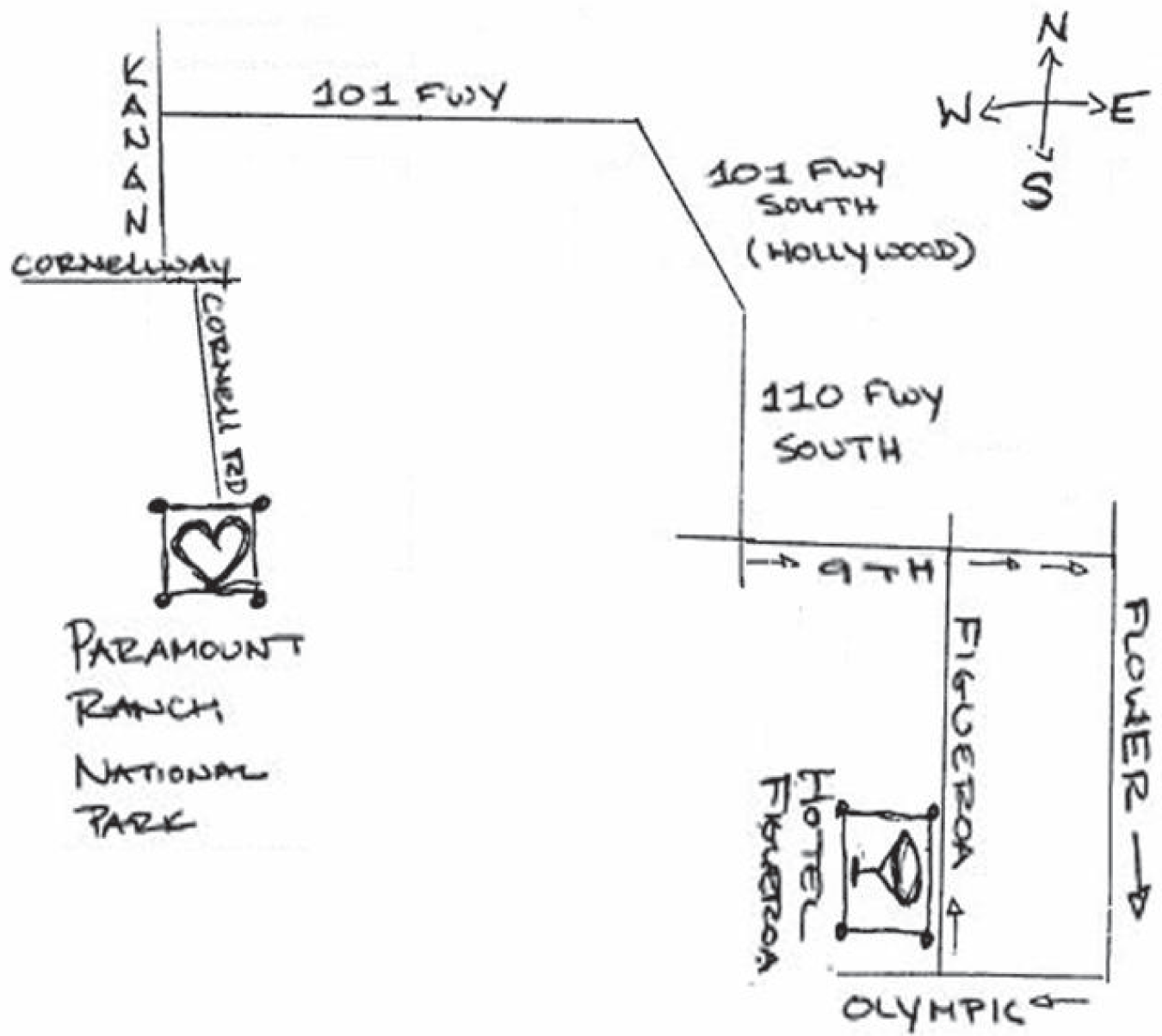
FIGURE 2.1 Hand-drawn route map
Mia Trachinger
From a practice standpoint, even this hand-drawn map embodies common practices. It includes only key information, dropping additional side streets that are not relevant to the task. The compass drawn above acts as a bit of a legend and clarifier: those with a sense of a direction or a compass can affirm they are headed in the right direction. The arrows also help guide the viewer.
Visualization and Task
While we can understand the utility of maps for spatial orientation and navigation tasks, what exactly a task comprises in visualization is rather a fuzzy topic. For instance, as Brehmer and Munzner (2013) point out, finding an extreme value is more concrete than exploring or integrating insights. Relating these task descriptions is difficult, though not impossible; however, visualization practitioners hardly have a shared vocabulary when describing these relations between levels of abstraction and application areas. In this book, we bring together both the researchers' and practitioners' perspectives to go beyond merely describing the use of visualization techniques in a specific application domain but rather abstract these tasks in order to realize an appropriate visualization design space.
In Parts B and C, we build upon existing visualization task taxonomies in this space (Munzner, 2015) to show how semantics and intentionality can make a chart or dashboard both informational and inspirational. This abstraction also enables practitioners to contribute back to the visualization research community, transferring their findings beyond a single domain.
Task can be classified by the actions one performs using verbs such as identify, compare, or summarize. These actions might be supported directly by how the data is encoded, arranged, and annotated, either in a static display or in conjunction with various forms of interaction. Descriptions of tasks also tend to include nouns such a trend, correlation, or distribution: abstract aspects of data observed during visual analysis. These nouns are the targets of corresponding actions, and throughout literature they alternatively appear in classifications of data facts, mental models of a dataset, and insights. Insights evoke qualities that go beyond the observation of data facts: they imply spontaneity and actionability; they must be a catalyst for self-reflection or hypothesis-based reasoning. Figure 2.2 shows an example of how line charts could be represented based on task target and actions.
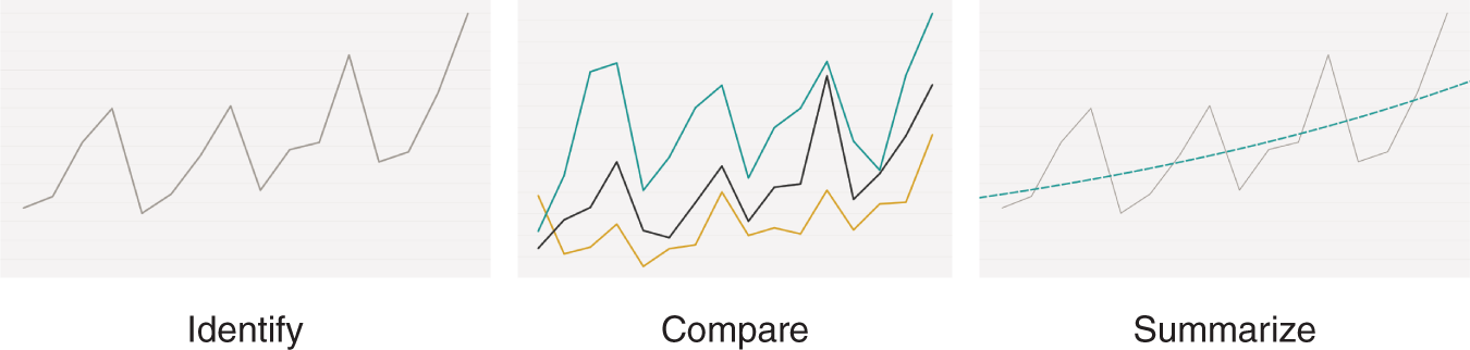
FIGURE 2.2 Examples of line charts for various task targets and actions
However, picking a chart type for a task is much more nuanced, and best depends on real-world phenomena, how the data is collected, and how that information is represented to meet the goal of the intended task.
Chart as an Informational Unit
Thinking of a chart as a unit of conveying information helps frame the use of perception as a means for regarding, understanding, or interpreting something, a mental impression. These charts encode information in the form of shape, color, position, and size. One of the basic aspects of learning the fundamentals of visualization is figuring out which chart can be most effective for a specific goal. There are some basic rules, but we will show during the course of the book how one can also challenge them.
It's similar to learning how to cook. You start with the basics—understanding how to use your tools in the kitchen and the elementary flavors that make a functional meal. As you become more fluent with your cooking skills, you evolve from being a cook to being a chef, getting creative as you juxtapose flavors and presentation into something that is worthy of a Michelin star.
Researchers have conducted several perceptual studies to better understand what these basic rules are and how charts can provide effective visual cues for solving an analytical task. Most notable is Cleveland and McGill's seminal paper (1984). The paper has been foundational in providing a guideline for the link between data visuals and the human visual system. Cleveland and McGill hypothesized a set of elementary perceptual tasks, tasks carried out when people are trying to extract quantitative information from visualizations.
Figure 2.3 illustrates 10 elementary perceptual tasks that people use to extract quantitative information from graphs for making relative judgments. The findings from the studies showed that humans have a better judgment on dot position than they do on length, direction, angle, area, curvature, and volume.
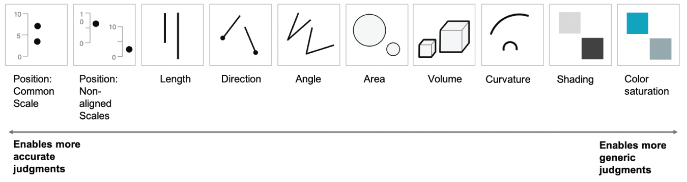
FIGURE 2.3 Ten elementary perceptual tasks and their efficacy for making relative judgments
Heer and Bostock's research (2010) performed an approximate replication of Cleveland and McGill's study while examining the viability of crowdsourcing of perceptual experiments. They were able to confirm the relative rankings of the comparison tasks by using Amazon's Mechanical Turk (www.mturk.com) as an online platform for running graphical perception experiments. With its low cost and scalability, crowdsourcing presents an attractive option for evaluating the large design space of visualizations and replicating studies, which is important for research to be generalizable. Studies employing crowdsourcing pose challenges that include reduced control in the assessment of participants' background and training as well as ethical concerns around pay. Some studies, particularly those sensitive to factors such as color blindness or limited visual acuity, may not be well-suited for the Web. Nevertheless, crowdsourcing offers a scalable way to conduct a valuable range of graphical perception experiments, including four on bar charts (Talbot et al., 2014) that are relevant to the visualization community.
From these perception studies, key takeaways were made. For example, showing differences in a single line chart displaying the actual difference between values was recommended to be more useful than two lines showing the absolutes. On the topic of pie charts, there has been lots of discussion about the validity of pie and donut charts as a meaningful way to convey information that could accurately be interpreted. This is partly due to Cleveland and McGill's findings of the angle being evaluated at a low accuracy level. Skau and Kosara (2016) decided to focus their study on pie and donut charts with stimuli shown in Figure 2.4.
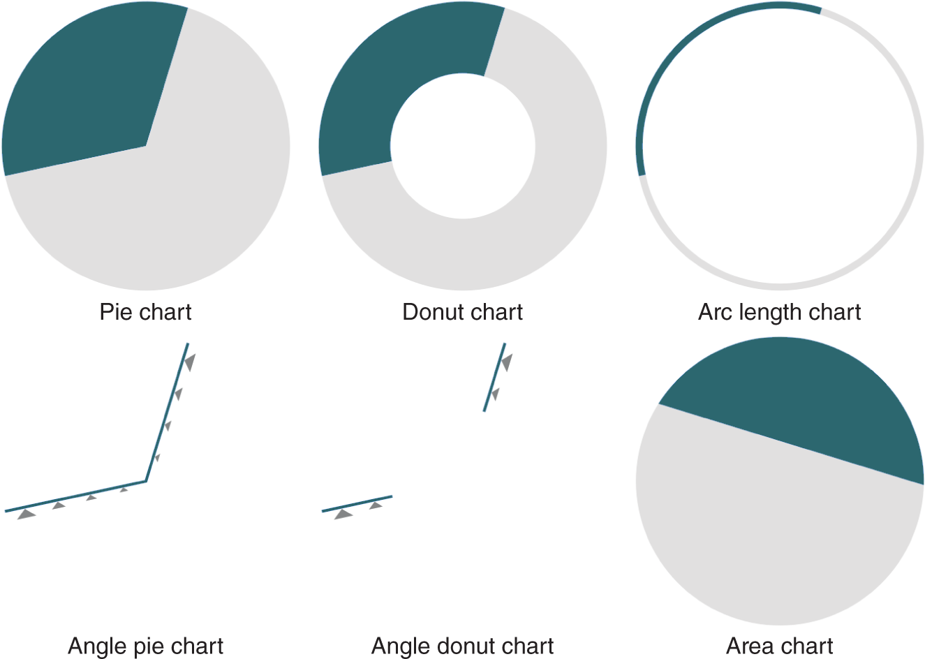
FIGURE 2.4 A sampling of charts used in the study of pie and donut chart encodings showing 33%
Adapted from Skau and Kosara (2016)
The results were quite interesting: the complete pie and donut charts did the best for reading accuracy, while the angle-only conditions (angle pie chart and angle donut chart) were the worst. People were surprisingly good with the area-only condition, which was completely unexpected. Arc-only was virtually identical with area-only.
While these studies provide useful guidelines related to what kind of visualization to use, the findings are not meant to be prescriptive. As Cleveland and McGill note, “The ordering of the tasks does not result in a precise prescription for displaying data, but rather is a framework within which to work.” Start with the visual fundamentals, but there is much more to what makes a visualization functionally aesthetic as we describe in the course of this book. You'll learn from practice how to get fancy with your visualizations and “break” some rules. And yes, sometimes pie charts may be the right choice.
We will explore how these individual charts form paragraphs that get woven into a narrative of sentences to convey a story or a certain point of view to the intended audience. Each chart plays its part, yet harmoniously coexists in its space with the others. The placement and natural sizing of these charts are thoughtful and intentional, similar to meaningful artifacts that we experience in the physical world.
Unboxing Functional Aesthetics in the Physical World
We first eat with our eyes. We scan our meal, the steam rising from parts, the colors contrasting in others. It's ritualistic; the experience of dining far exceeds satisfying an appetite. Multilayered and sensory, we see the food, smell the spices intersecting with one another and the heady steam carrying into our nose. Before we've eaten a bite, we're already taking in the flavor.
Arranging bento boxes is an art, but they aren't solely artistic renditions. They come packed with functions that are supported by their simple elegance. The red contrasts against the bright greens of the salad, the dark hues of the seaweed wrapping the sushi, and the brightness against the white of the rice. Our main dish, the largest piece, is the part most likely to have the least contrast. As we constrain space, details and nuance help guide us through the experience. The wasabi can go with the sides, but we may also mix it with our main. As it takes pride of place, we recognize that the small ingredient might just be the heart of our meal. It is one we can customize, taking in more or less heat and allowing the pickled ginger to provide a bit of an afterbite of sour.
As a perfect mix of form and function, traditional bento boxes combine the efficient use of space and arrangement and the beauty of food to cultivate joy. The Japanese aesthetic focuses on the beauty of simplicity and natural asymmetry, and what is considered to be appropriately tasteful. Both function and form embrace a rich, intertwined goal: concrete, multisensory, and visceral. The bento box is a paradigm we know well, even if it's not a direct experience we've had. We often turn to containers and frames to organize like with like.
Recursive Proportions
Architectural systems are founded on the same assumptions as the bento box. They always question the very premise of beauty. Is beauty in the eye of the beholder or does it come about through intrinsic properties of space? Probably both.
Three general principles—repetition, harmony, and variety—lie at the basis of beautiful design:
- Repetition is achieved by using a system that provides a set of proportions that are repeated in a design or building at different scales.
- Harmony is achieved through a system that provides a small set of lengths or modules with many additive properties, which enables the whole to be created as the sum of its parts while remaining entirely within the system.
- Variety is provided by a system that provides a sufficient degree of versatility in its ability to tile the plane with geometric figures.
Converting these principles into craft involves different issues regarding perception, physics, and dimensions. The generative approach to architectural design called “recursive proportions'' (Corcuff, 2012) is the use of transformation rules, which often involve ratios. Recursive proportions guide the assemblage of parts subject to uniform established proportions, regulated by the premise that each part must perform, each distinguished by its proportions and characteristic profiles. Skilled builders are familiar with this order and hierarchy, and they typically don't get hung up on the small details. They take a step back and look at the intended work holistically.
Asher Benjamin, a prolific craftsman, published a clear system of proportion for designing a mantelpiece when he wrote in the First American Architectural Handbook (1797) with an illustration shown in Figure 2.5, “divide the width, or opening of the Chimney, into eight or nine parts; give one eighth, or one ninth to the breadth of the Architrave” (plate XVII). He started with a truly pleasing design, with an illustration describing the width and depth of the pilasters, the height of the entablature, and how far the cornice should extend. The result was also scalable. Builders have since taken this blueprint of proportional ratios and built mantelpieces of different sizes, yet with the same proportions of parts, keeping the aesthetics of the design intact.
George Walker (2013), a woodworker, describes how he learned to apply proportions to his woodwork: “I always had strong opinions about what looked right to my eye, but for many years I was unable to actually understand what I saw. I might have a feeling something looked clunky and might even be able to narrow it down to a single element being the culprit. What I could not do was make the connection and see that a leg might be too heavy for its height, or that a molding is too small for the form it's supposed to highlight. I had some knowledge of proportions but was unable to think proportionally.” He discovered that there is a big difference between just seeing the elements in a piece and really being able to see how they connect with other elements, and with the whole, a conscious practice that he even applies to tool assembly in his workshop, as seen in Figure 2.6.
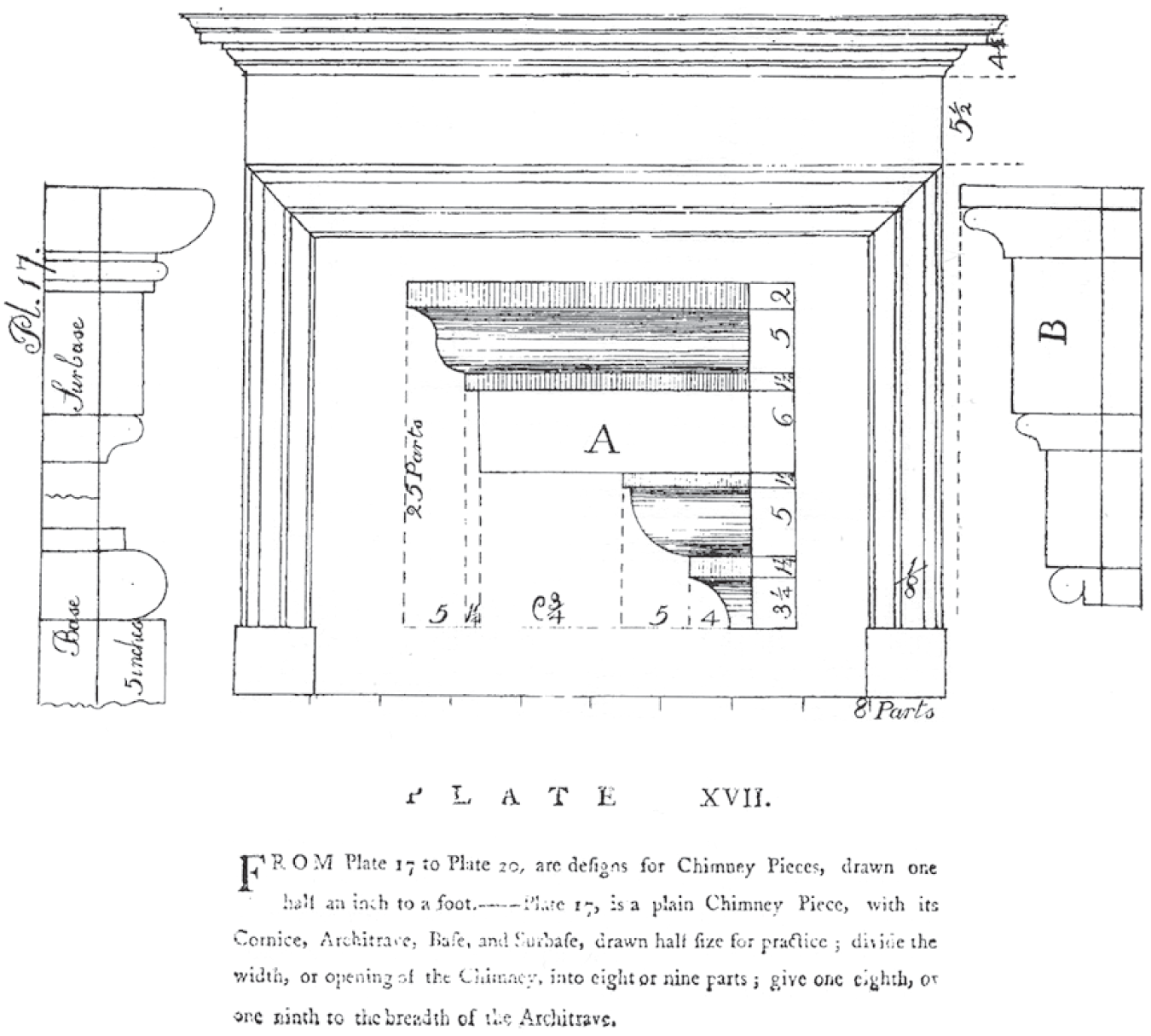
FIGURE 2.5 Mantelpiece design based on recursive proportions
Asher Benjamin 1797
These architectural constructs are beyond just guidelines. They provide a “visual grammar” that determines how each component fits in with a purpose. Thinking proportionally is not so much about finding answers. We may long for some quick cheat sheet approach that can unlock our design strengths, but it simply doesn't work that way. Instead of answers, we are looking for connections. The connections we have are with perception, art, architecture, and even the masterworks of furniture. Proportions are the essence that permeates a great design, and if we can somehow begin to grasp them, we open up a whole world of new expression.
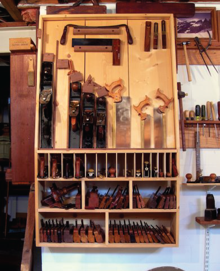
FIGURE 2.6 George Walker's workshop
The Digitized Space: Creating Experiences on the Screen
As we move experiences from the physical realm to the digital one, some rules change. We lose a level of depth. We can certainly create it with illusions and graphics. Texture becomes visual—invoked—rather than physically felt. We rely on patterns to cue sensory perceptions: colors that create warmth with light rather than sunshine itself.
A traditional long-form website may try to fill the screen with a captivating image and use shadowing to push the image back or bring the text forward with contrast. Scrolling often leads to text, typically framed by white space. Somewhere below the text, smaller images may frame up pathways to further explore. The image creates the initial emotional resonance, while the text ideally builds on that image. Data visualization, however, is less straightforward. News organizations can take the long-form design and intersperse charts with text. The New York Times has made this an art form with its Upshot section, intermixing charts with paragraphs and often using animation to unfurl the experience. In one article, “You Draw It: How Family Income Predicts Children's College Chances” (Aisch et al., 2015), the reader is introduced to basic concepts around line charts and then must draw a line to get the rest of the text. While news organizations can certainly embrace a long-form design framed by a holistic narrative, dashboards and similar data-driven apps rely on less text and reduced scrolling. Like the bento box, space is typically constrained to a set size with various techniques used to expand, drill down, or otherwise expose further information.
To illustrate, take a look at the frame in Figure 2.7. If you want, sketch and think about the types of charts you would put in this frame. Do certain charts belong in certain boxes?
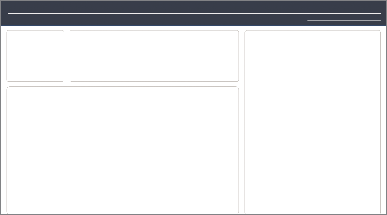
FIGURE 2.7 An example frame for charts
As you look at the framing, consider what types of charts you'd place within the frames. What rules do you feel about the space?
Now look at Figure 2.8. It, like Figure 2.7, has four boxes. Do you feel differently about this space? Beyond changing sizes, do you feel compelled to change charts entirely?
Like rooms, the containers start to inform use. We'll explore this more in later chapters.

FIGURE 2.8 An alternative frame for charts
In Figure 2.9, we can see how the container paradigm sets the tone. The large curvy title bar creates a backdrop and hugs the map. This element unifies the overall work and provides a bit of playfulness. A gray container sets the proportion for the high-level elements that drive most of the interaction. The design elements help users flow from the map down to the bars and the KPIs before rolling over to the shipping class details. The elements are interactive, highlighting and encouraging users to select a state to further filter the data.
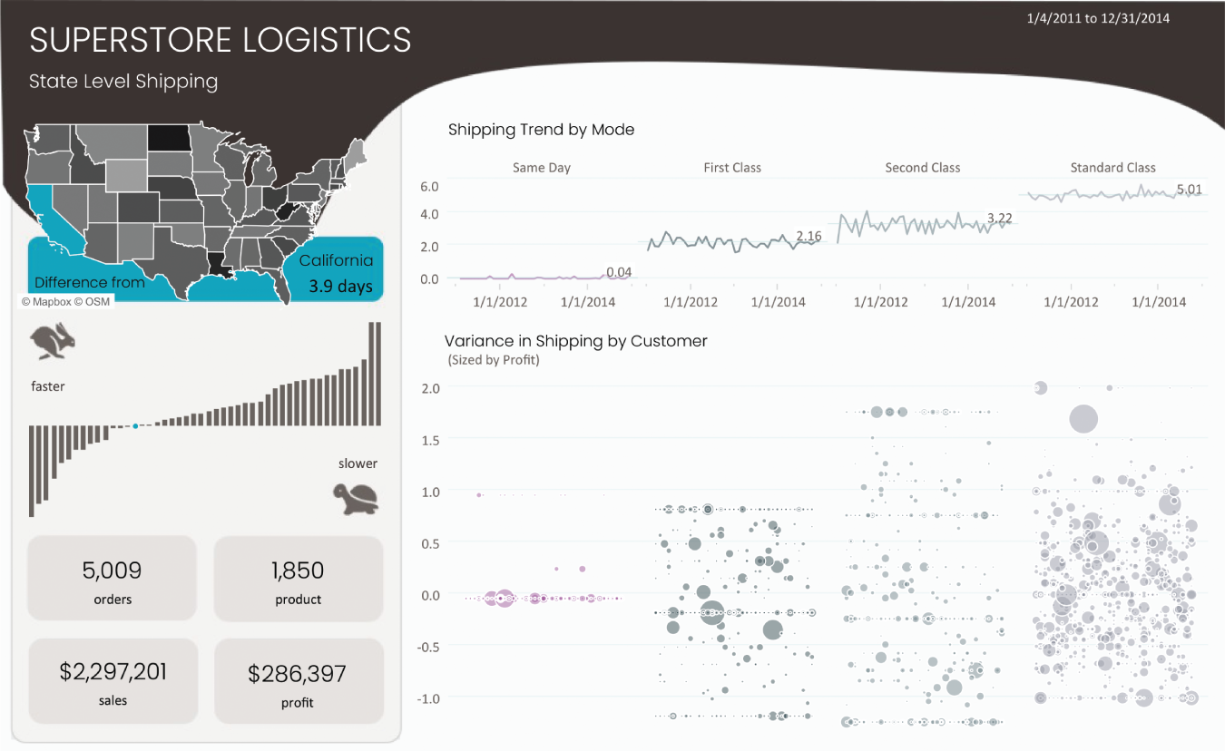
FIGURE 2.9 A dashboard showing containers and proportions framing the various charts
Within the charts selected, the filled map shows geographic patterns of sales by state. Perceptually, it's not the best choice for this task, but it's a familiar paradigm that serves as a comfortable entry point for our end users. They instantly understand that a geographic field is encoded. The map uses color to do the overall comparison, calling out the comparison point in teal. The bar chart immediately below it accommodates the need for a more precise comparison; the teal from above is integrated as a dot to show the comparison point. KPI boxes within the frame provide the literal numbers, allowing end users a way to identify and describe counts. Within the body of the dashboard, we can compare trends both within a shipping class or as an average across groups. These two charts create shared groupings in their use of space and colors.
Summary
In this chapter, we proposed that perception, aesthetics, and function belong together: they are not separate parts. Conventional practitioner dialog often focuses on design being separate from chart making, most often framed in terms of “making it pretty” after the analysis is complete. Understanding the task at hand and how best the chart can draw a user's attention into a flow of analysis through thoughtful proportions and boxes is key. In line with Tableau Hall of Fame Visionary and blogger Kelly Martin, we believe that “beauty is meaningful design.” The charts, the design, and the goals are one unit knitted together with functional aesthetics. The next chapter will explore how this premise can be practiced along with some history of data visualization.