CHAPTER 10
Text and Charts
As we come away from discussing the grammatical construction of functionally aesthetic dashboard design, we can better appreciate how data narratives can be expressed through the thoughtful placement and sequencing of charts. Text helps add additional context, guidance, and directives to imagery such as illustrations and charts. This additional information further supports the reader in developing a coherent mental representation of the information presented to them (Bransford et al., 1972). Comprehending the visual depiction of what's important in a chart, along with suitable support from the accompanying text, further enhances the reader's understanding of the meaning of that representation. This overall understanding of the representation is the product of the interaction between the chart and text along with the reader's knowledge from both prior and current interactions that they discover as the reading progresses.
In reality, when we author visualizations, we often discount the importance of textual context that accompanies these charts. Similar to the deliberate and thoughtful placement of marks with color and size encodings, we need to carefully consider the construction of language based on its intended purpose in communicating aspects of the data to the reader. When integrating written text with charts in a functionally aesthetic way, the reader should be able to find the key takeaways from the chart or dashboard, taking into account the context, constraints, and reading objectives of the overall message.
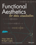
Let's unpack all of this with an example. We return to the Bird Strikes visualization we showed in Chapter 4. In Figure 10.1, we have highlighted all the text and numbers. We can now see how much text supports the overall composition and all the areas where annotation is subtly embedded throughout the composition. With all the text called out, we can see how much of a presence it has. As we progress through this chapter, we will further dissect the roles text plays in providing clarity and user support.
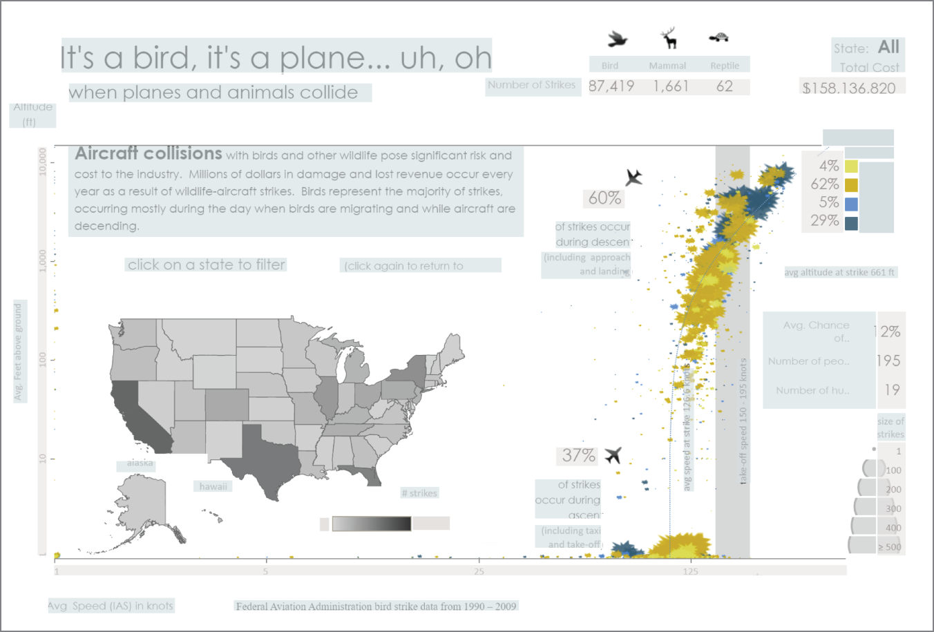
FIGURE 10.1 Bird Strikes dashboard with text and numbers highlighted
Data visualization opens the channel of communication between the authors who create the visualization and the people who act upon it. As we think about ways to transform complex data into a format that is both visually appealing and universally accessible to a wider audience, we need to also think of the medium that the visualization is part of.
Medium Being the Message
The Internet is quickly changing how we read. Articles rely more and more on a reading experience that combines text, graphics, and various design elements. Yet this book and many others showcase another change happening with literacy: that words alone are rarely enough to fully make a point. Going a bit meta here, many points within this book rely on graphics or design elements to highlight or clarify the details within them. Additionally, we are using triangles both for quick reference and to be clear about our understanding of where an idea lands. Even the colored strip at the bottom provides information about the part of the book being read. It would be much harder to express these concepts in words alone. Multimodal reading requires being able to read the entire ensemble: the text, the visuals, and additional design elements that provide cues about the whole piece. We work to understand the entire ensemble as a cohesive unit of meaning presented in different ways. Together, they ideally clarify and frame the message (Serafini, 2014).
As we discussed in Chapter 9, comics artfully combine multimodal reading within frames. Deciding how to tell the story between text and pictures requires balancing intent with semantics and perception. Visually, the comic can be presented at a faster or slower pace or convey other things about the event by balancing text with the pictures. By themselves, the pictures can only say so much, relying on text to set the tone, introduce ideas, and provide perspective into the thoughts and actions of what's occurring within the comic frame. Data visualization, like comics, can expose information through charts. It relies on a balance of text to pace the exposition and set the tone.
Newspapers are using more visuals than ever, partly because digital media offset the cost of a full-color print, and because the graphic often communicates far more effectively. Academic papers and scientific journals use charts as an anchor to communicate a data-driven point of view or to invite critical discourse. Look at some of the pictures in this book and how they affect your attention or emotions as you read through a chapter. As data visualization expands into broader circles, graphicacy, or the ability to draw meaning from charts, is key.
Types of Text
Balancing the types of text used allows users to navigate our visualizations effectively. While charts are our primary medium, text provides the support and framing to fully support them and foster multimodal reading. The words we choose can set the tone, clarify, and fill in gaps. Done well, text solidifies the understanding, providing language to both the insight and visual.
The following types of text are shown in Figure 10.2:
- Titles
- Quantifiers
- Qualifiers
- Annotations
- Narrative text
- Captions
- Caveats, disclosures, and warnings
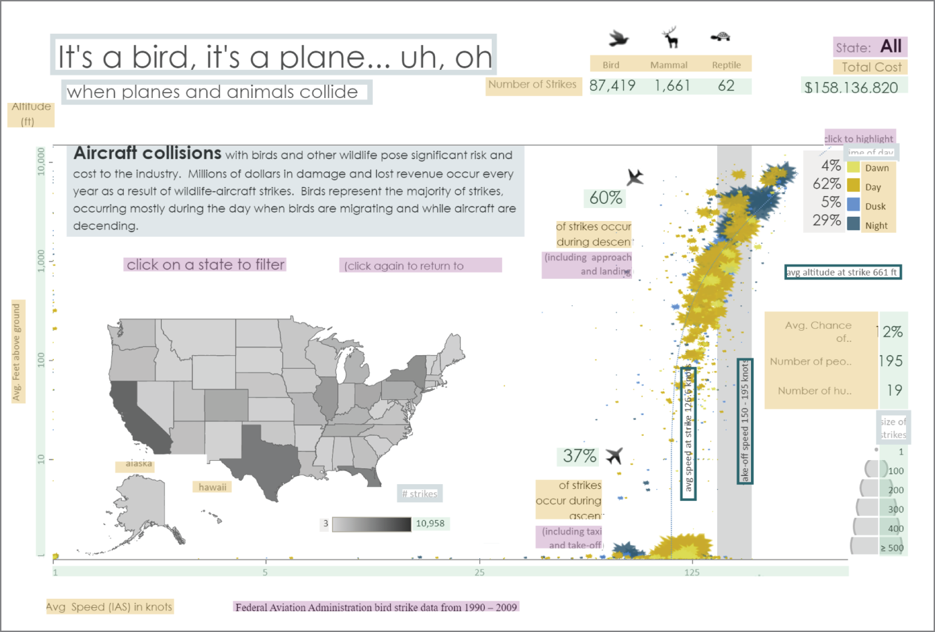
FIGURE 10.2 Different types of text highlighted and boxed
These text elements work together to build a whole that is stronger than its individual parts. This example blurs the line between where one chart ends and another begins through layering. This premise is also reflected in how text is paired and placed.
FIGURE 10.3 Boxed text shows titles.
Titles set the tone of the visualization and also start the reader on the journey to figuring out what the visually encoded data means. In the composition shown in Figure 10.3, the title relies on a familiar phrase to invoke some of its playfulness: “It's a bird, it's a plane … it's Superman!” indicating the visually encoded data is about birds and planes. The subtitle helps pull toward the heart of the story and answers the question, How likely is a plane going to hit an animal during the flight? The tone of the title and the visual presentation match. The scatterplot leverages a “crash-effect” jagged icon to represent events, while icons provide clarity and match the tone. Data encodings like the fill coloring in this map view do not convey the meaning of the data without the “balance of text.” Charts themselves are not titled; instead, the semantics of the visualizations and layered effect create a whole unit under the primary title. Most visualizations use titles to frame charts in addition to the entire composition.
Quantifiers form the backbone of any visualization. They allow the visual pattern to be articulated into quantities and mathematically understood as well as visually. They also allow us to take the information we're seeing and compare it to other statistics, such as the likelihood of similar accidents while driving rather than flying. Beyond what we see, quantifying allows us to assess our world. Figure 10.4 shows the quantifiers in the dashboard providing numerical information that supports the data story about bird strikes.
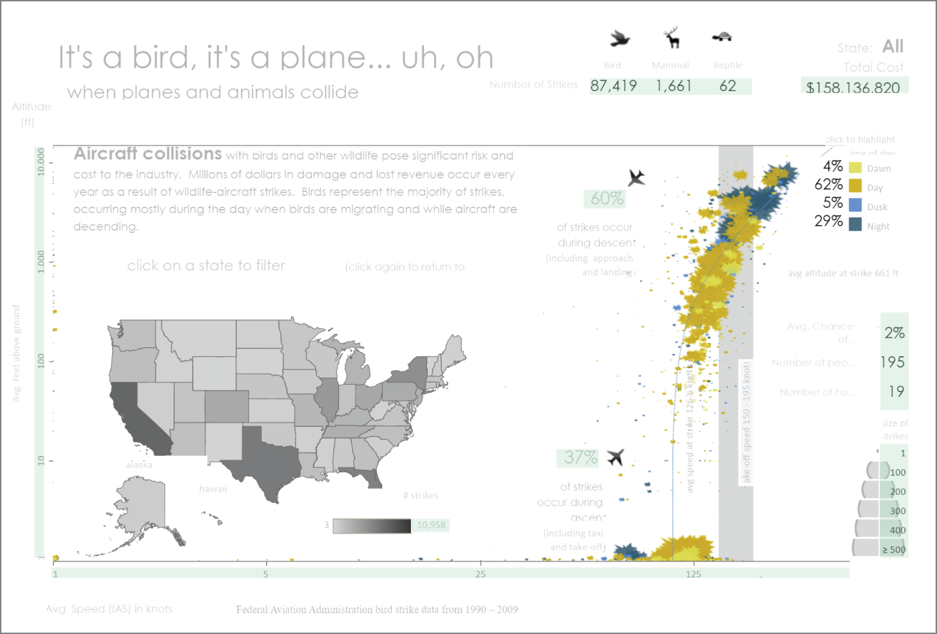
FIGURE 10.4 Quantifiers are highlighted in sea green.
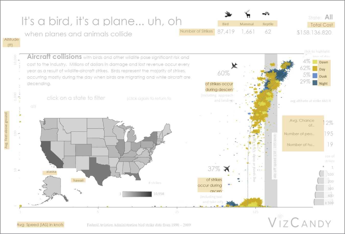
FIGURE 10.5 Qualifiers are highlighted in peach.
Qualifiers are words and fragments anchored to quantifiers that provide context to the number within the visualization. They label axes, serve as legends, segment measures as dimensions, and format large numbers with stylization and units. This visualization uses a variety of techniques: pairing legends with numbers, clarifiers (such as state names), and dimensional faceting (such as species types and statistics about strikes at the right). Several techniques overlap, creating clarity that compounds understanding. For example, legends in the graphic in Figure 10.5 are accompanied by numbers providing additional depth to the topic.
Annotations are in-chart clarifiers. They identify salient points within the visualization using placement as a primary attribute in their understanding. They call out peaks, averages, or notable reference points. Figure 10.6 shows how annotations provide contextual support to the individual chart elements, such as the marks in the scatterplot and the color legend.
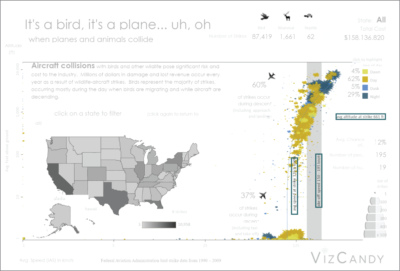
FIGURE 10.6 Boxed text shows annotations.
Framing text includes sentences that are captions, narratives, and other callouts outside the visualization. They set the angle, reiterate salient findings, and expose other contextual information. Framing text can be a sentence or multiple paragraphs designed to further expose what is both displayed and not displayed in the chart. Figure 10.7 shows a caption that provides additional narrative for the charts by making a point about the risk of aircraft collisions with birds and other wildlife.
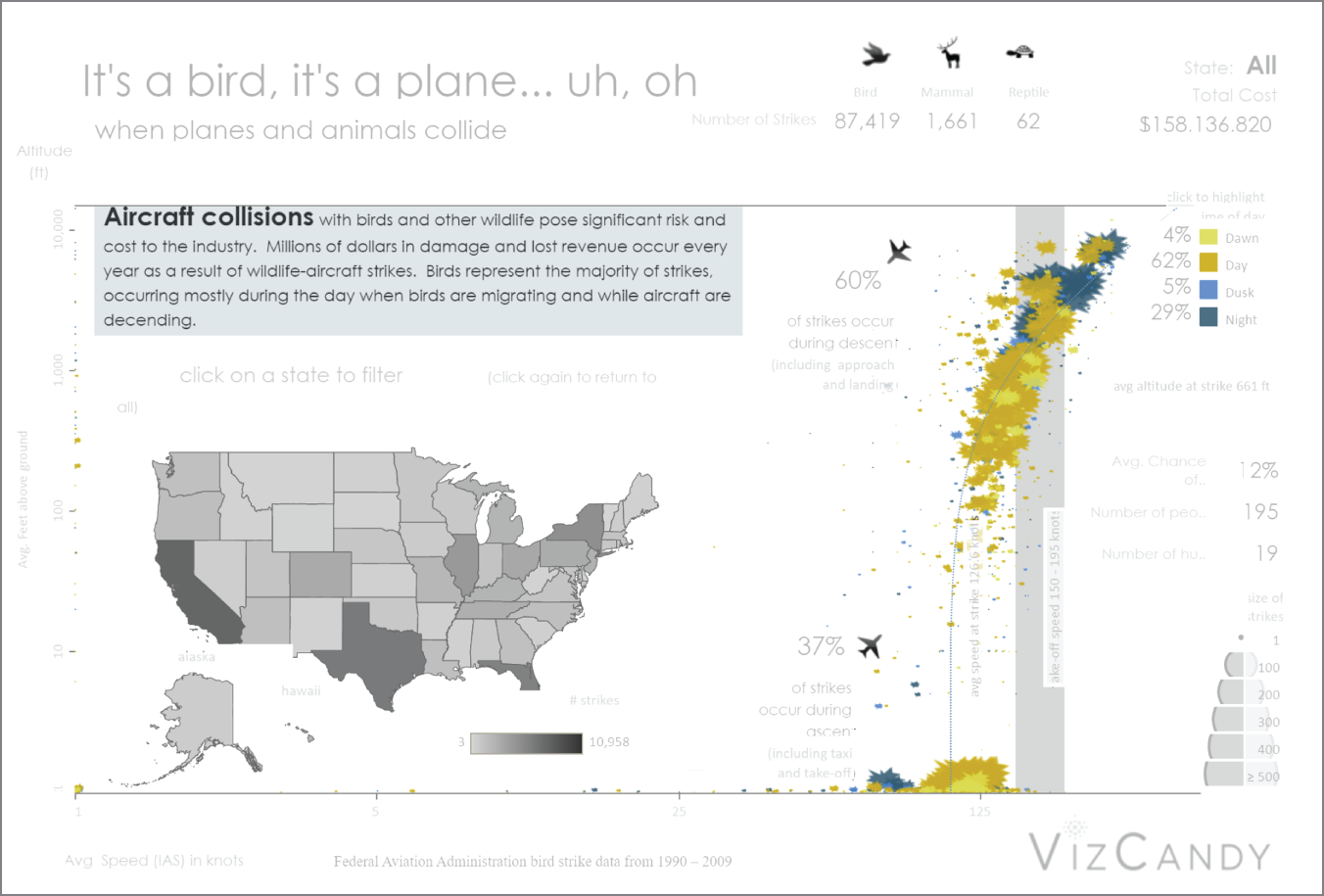
FIGURE 10.7 Framing text is highlighted in grey.
Functional text provides those consuming the visualization, the necessary information to use or evaluate the limits of the visualization. Here, the visualization discloses its data source, the time limitations of the data, and what filters are applied. Caveats around qualifiers include nuance around what is included in a given category. Functional text can also include interactive features, such as drop-down filters. Figure 10.8 shows how functional text provides directives to the reader about the interactive aspects of the dashboard, such as “click on a state to filter.”
While there is a definite utility of text to help add additional semantics to the data, too much can actually do harm. It's a common design problem—when to include information versus when not in the quest to communicate clearly. Text with charts is no exception, especially when the data is both abundant and thought-provoking. So how does one avoid the pitfall of overtexting?
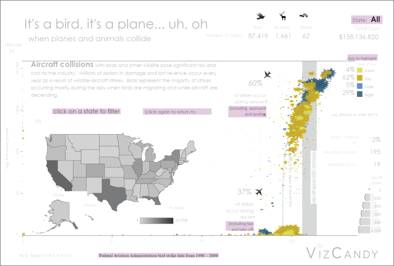
FIGURE 10.8 Functional text is highlighted in Lilac.
Balancing Text with Charts
Data visualization is a medium requiring multimodal literacy skills (Serafini, 2014). Drawn on paper or displayed interactively, the visualization combines the balance of numbers and text with the language of charts to convey information. Additional elements, such as interactivity and animation, can affect both the delivery of the message and its understanding. Balancing between these elements relies on the interplay of perception, semantics, and intent. In working with these visual patterns, the goal is to relax the eye so that the visualization can be read “at a glance,” allowing the visual aspect to come forward. Thinking of the words as being in a field, or white space, will help you see the different aspects of the visual pattern. Recurrence and predictability are the basis of this pattern. This includes words, phrases, and sentences that can be easily scanned and seen.
Figure 10.9 shows an example of where text is not balanced with the visual. The visual accompanies the text rather than the text amplifying the visual. Many of the points are told rather than shown. In a static medium such as this book, finding the referenced points is even harder. The top chart showing the running count of visualizations is only effective for seeing the hockey stick shift in the trend, while the bottom daily count provides perhaps the most insight due to some annotation.
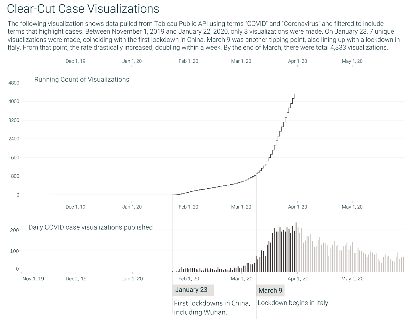
FIGURE 10.9 Text is not balanced with the visual.
As we move some of the information from the paragraph to the chart (Figure 10.10), we can see that the number of visualizations from March 8 to March 16 nearly doubled. Four days later, the number is almost triple our first number. The annotations work within the chart to call out a pattern that is nearly undetectable in the first example.
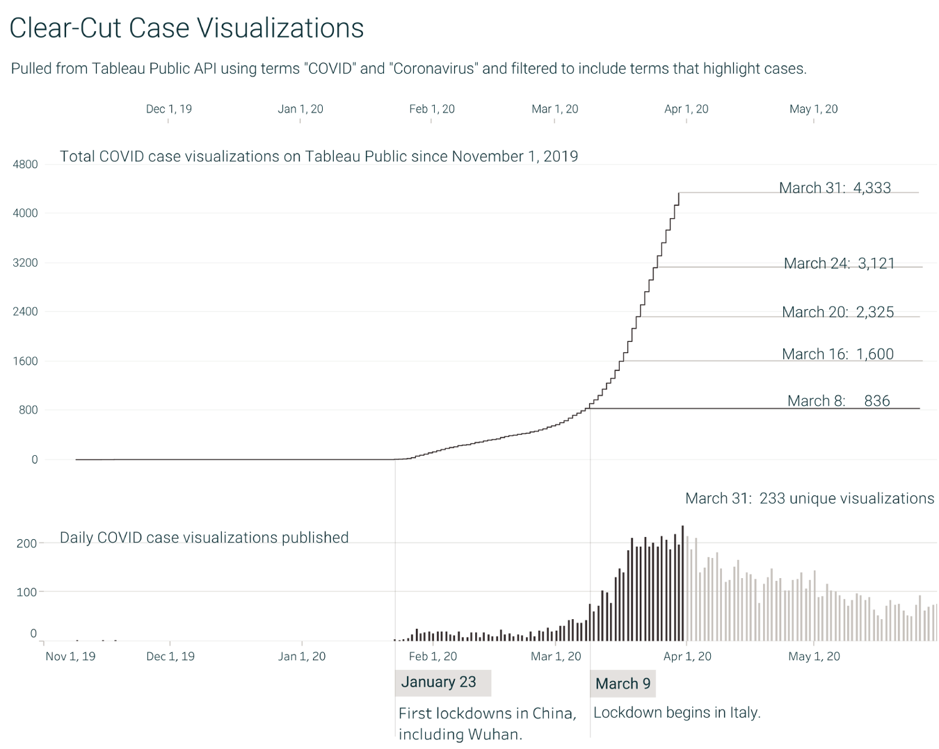
FIGURE 10.10 Text is balanced with the visual.
Adapting this visualization for the print medium requires thinking through what information is salient for those viewing it. Without the ability to hover, selecting dates for emphasis becomes critical. The dates give the closest times to which visualizations on Tableau Public multiplied from March 8. The intent of this composition is to highlight the relationship between lockdowns and publications to Tableau Public.
Chart and Text Agreement
Charts are used to communicate information about data to a reader. Authors often add text such as captions along with charts to provide additional context and clarification to help with their message to the intended audience. But what makes for a good caption? And how does the caption interact with the chart?
While charts can draw a reader's attention to various visual features such as outliers and trends, it's unclear what the reader takes away from both text and charts together.
Take a look at this line chart in Figure 10.11. What do you think are the main visual features of the chart, and what are your key takeaways?
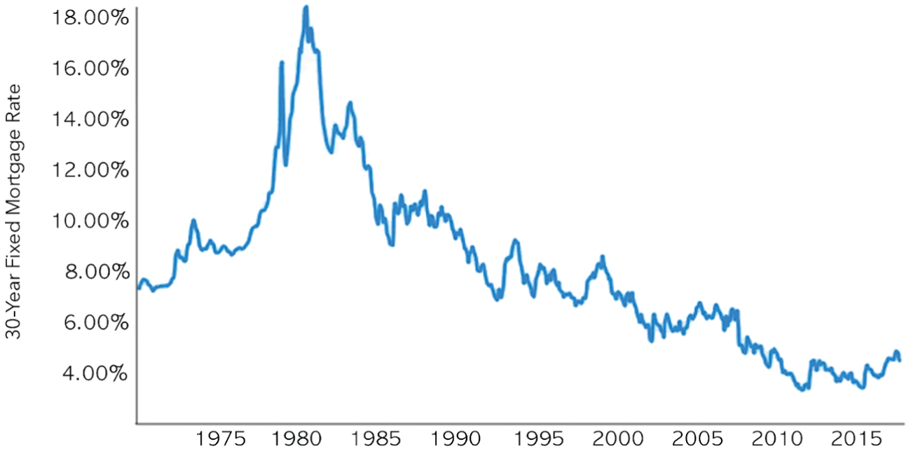
FIGURE 10.11 Line chart example
Now, consider each of the following caption possibilities with the chart. How do your takeaways change with each one?
- The chart shows the 30-year fixed mortgage rate between 1970 and 2018.
- The 30-year fixed mortgage rate increased slightly from 1997 to 1999.
- The 30-year fixed mortgage rate reached its peak of 18.45% in 1981.
- The 30-year fixed mortgage rate reached its peak of 18.45% in 1981 due to runaway inflation.
The first caption simply describes the attributes graphed in the chart and only provides redundant information that could be read from the axis labels. Many of the automated caption generation tools create captions of this form. The next three each emphasize aspects of the data corresponding to a visual feature of the chart, such as a peak or an upward trend. However, there are differences. The second caption emphasizes a feature of low visual prominence—a relatively local and small rise in the chart between 1997 and 1999. The third caption describes the most visually prominent feature of the chart—the tallest peak that occurs in 1981. The fourth caption also describes this most visually prominent feature but adds external information not presented in the chart and provides context for the data.
So, how do each of these different captions, when accompanied with a chart, affect readers' takeaways?
Kim et al. (2021) explored this question using a set of 43 line charts. Findings from their study showed that users described the feature doubly emphasized by both the chart and caption in their takeaways when they both provided a coherent message. However, when the chart and caption diverged in terms of the feature that they were emphasizing, participants were less likely to use information from the caption in their takeaways.
Going back to our initial line chart example shown in Figure 10.11, when the caption mentions the most visually prominent feature as in the third caption (i.e., the peak in 1981), readers will probably take away information from that feature. When the caption mentions a less prominent feature as in the second caption (i.e., the increase from 1997 to 1999), there is a mismatch in the message between the chart and the caption. Readers will have a strong tendency to go with the message conveyed in both the chart and the caption when they mention the most prominent feature. Revisiting the chart and the third caption from Figure 10.11, the portions of the chart and caption highlighted in blue (shown in Figure 10.12) agree with each other. Finally, the external information about the peak value present in the fourth caption will further reinforce the message in the caption and the readers will more likely take away information about the peak.
The work shows how charts and text relate to one another when they occur together. Findings from the study bring up an important aspect of functionally aesthetic charts with text. Authors should effectively convey their message to readers by ensuring that both charts and captions emphasize the same set of features. For example, authors could make visual features that are related to their key message more prominent through visual cues (e.g., highlighting, zooming, or adding annotations) or include external information to further emphasize the feature described in the caption. Visualization authoring tools can provide guidelines for authors when they craft charts and captions together so that the intended takeaways are effectively communicated to the reader.
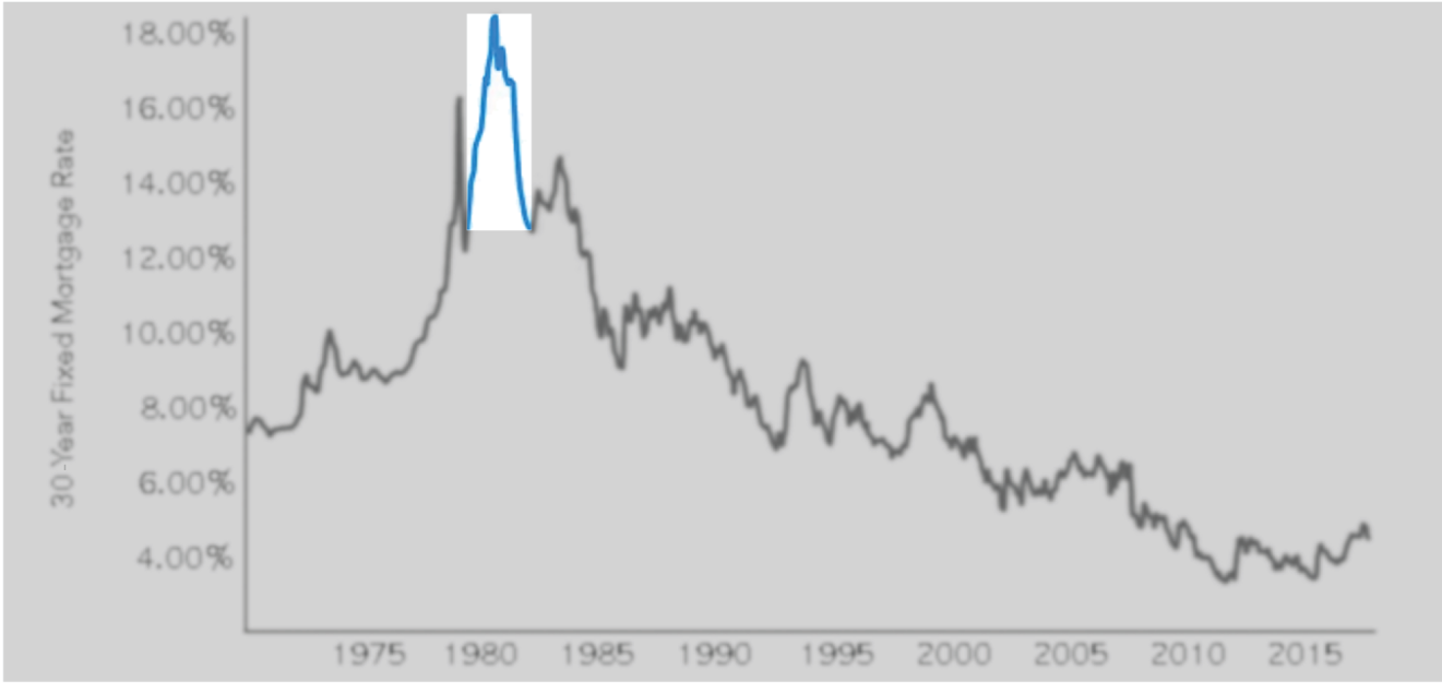
FIGURE 10.12 The 30-year fixed mortgage rate reached its peak of 18% in 1981.
Text in Analytical Conversation
With the proliferation of smarter and more interactive visual analysis systems such as natural language interfaces, text is a useful mechanism for the system to converse with the human, explaining the system's behavior to the human, or providing additional context to the system's response. A well-accepted principle in visual analytics is the need to support interactive exploration and iterative view refinement. A single static visualization is rarely sufficient except in the simplest of investigative tasks. The user often needs to interact with their data, iteratively evolving both the questions and the visualization design. Natural language interaction (NLI) is a complementary input modality to traditional mouse- and touch-based interaction for visual analytics.
Let's walk through a few examples of how text can be used to support an analytical conversation between a human and a computer.
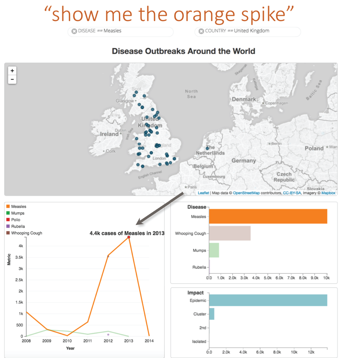
FIGURE 10.13 Text used to annotate the spike in the orange line
The first example, in Figure 10.13, shows an NLI using a conversational approach, where the user has a back-and-forth exchange with a system called Evizeon (Hoque et al., 2018). The user types “show me the orange spike”, and the system understands that this is a reference to the visual properties of the line chart and dynamically adds a text annotation to the spike in the line. The display of the annotation serves two goals:
- It shows to the user that Evizeon understands that the phrase “orange spike” is a reference to the visual properties of the line chart.
- The detail in the text provides contextual information about that spike, supporting the intent of the question.
The second example describes how text can help clarify ambiguity during an analytical conversation. NLI often involves the use of vague subjective modifiers in utterances such as “show me the sectors that are performing” and “where is a good neighborhood to buy a house?” Interpreting these vague modifiers is often difficult for these tools because their meanings lack clear semantics and are in part defined by context and personal user preferences, a concept we discussed in Chapter 5. Sentifiers (Setlur & Kumar, 2020) was a research prototype that explores ways to handle these vague concepts in users' input queries. The algorithm employs word co-occurrence and sentiment analysis to determine which data attributes and filter ranges to associate with the vague predicates. The provenance results from the algorithm are exposed to the user as interactive text that can be repaired and refined. Figure 10.14 shows how the system interprets the vague concept “struggling” in the input query “which countries are struggling?” The red hue shows a negative sentiment mapped to the attributes “income per capita” and “life expectancy.” The system maps values to lower ranges for each of these attributes, given the negative sentiment. Clicking on a numerical value shows a slider, encouraging the user to play with it, as the corresponding scatterplot below updates.
Making Data More Accessible
Alt text, a contraction of alternative text, is a concise description of an image when it can't be viewed. Effective alt text helps more people understand the content. Assistive technology like screen readers reads the alt text out loud for people with certain visual and cognitive impairments. Alt text is also displayed in place of the image in web browsers if the image file is taking a while to load, for example. This text can be read by search engines or be used to later determine the content of the image from page context alone.
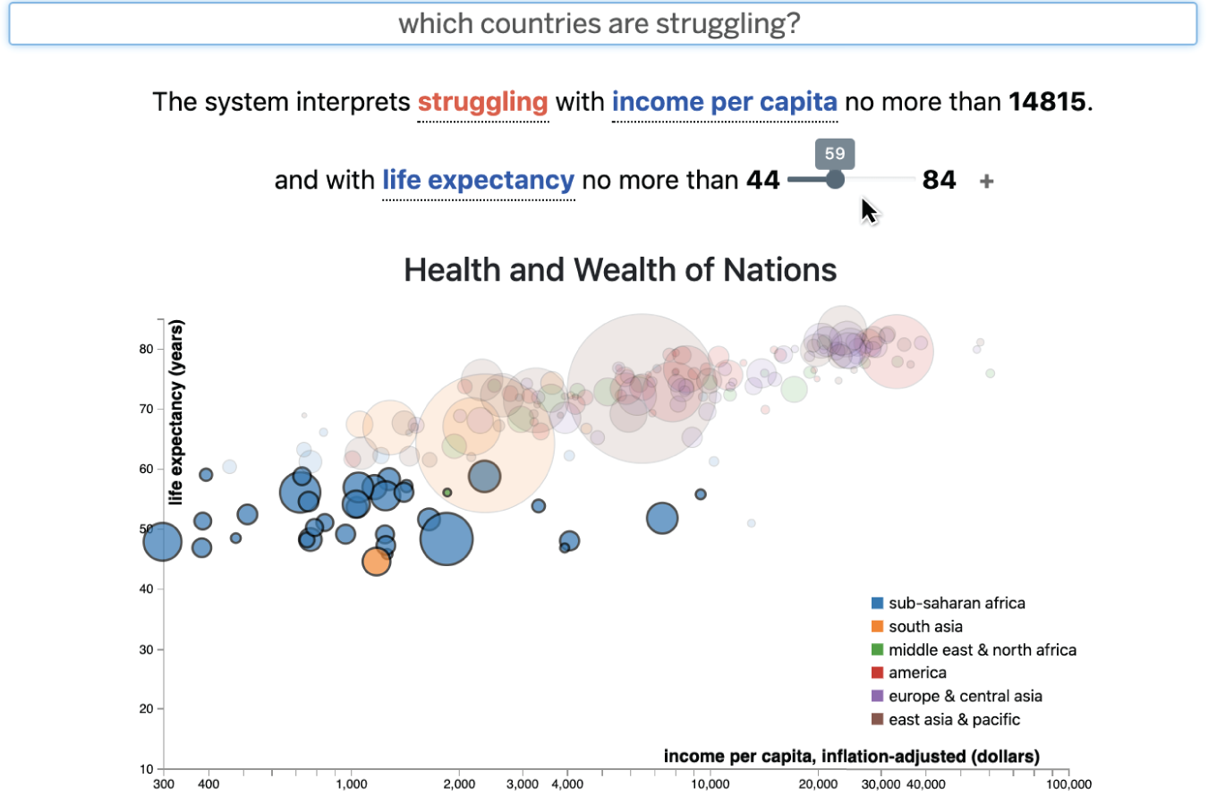
FIGURE 10.14 The Sentifiers system shows interactive text as a response.
So, how do you write something concisely that conveys the essence of a visualization? Given the precedence of alt text for images, the World Wide Web Consortium (W3C) offers guidelines for alt text for complex images (2021), but it can be difficult to interpret how to apply the guidelines to data visualization. While those guidelines don't completely transfer to charts, there are some helpful pointers (Cesal, 2020):
- Keep the alt text concise. There is no point in describing information that only makes sense visually. Rather, pick key insights and takeaways. Also, alt text tends to be read linearly by screen readers, meaning that people can't go back a word if they missed something.
- Supplement the chart with a link to the raw data so that readers can access the data in their own preferred program.
- For the benefit of people with partial sight or for people who have a good sense of space, including the chart type may be helpful to add some context to the key insights described in the al text.
- Finally, multimodal interaction that includes haptic feedback and sonification could be used with text to speech when describing aspects of the chart.
Text can also be used to generate summaries about data insights. Natural Language Generation (NLG), a subcategory of Natural Language Processing (NLP), is a software process that automatically transforms structured data into human-readable text. NLG tools such as Narrative Science (Figure 10.15) and Automated Insights automatically analyze data, interpret it, identify the most significant parts, and generate written reports in plain English (or localized to other languages).
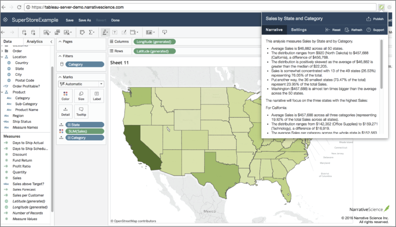
FIGURE 10.15 Narrative Science NLG plug-in for Tableau
Narrative Science
Text for Supporting Reading Fluency
Lastly, fluency is a complex reading skill that is crucial in the understanding of text. The cognitive process of reading creates changes in the visual cortex of our brain, which is the area that receives, integrates, and processes visual information relayed from our retinas. This is where we visualize images of individual letters and the patterns of letters strung together. So why is reading fluency important?
Cognitive neuroscientist and child development expert Maryanne Wolf (2007) states that reading fluency is an important skill as it provides the extra time for the brain to infer, understand, predict, and interpret the meaning of the information when processing words. When text is used effectively with visuals, we get a preview of what lies ahead as we read, making it easier to understand what follows. As we continue to explore the role of text with charts in effective takeaways and reading comprehension, it is important to consider whether the juxtaposition of text with imagery interrupts the flow of reading or aids in further understanding. As we have seen with text in the flow of analytical conversation, it is also important that we identify ways in which text can be combined with updates to charts for adding context and reasoning to the interface. As we see an increase in the presence of charts and text coexisting together, we need to consider how the structure and placement of words and imagery affect layout and fluency at various levels of granularity, ranging from sentence to document levels.
Summary
We close out this chapter and Part B by discussing how text is just as important as the visualizations themselves, supporting data semantics when used effectively. While we can explore different ways to present data that is meaningful, how do we know if the intended message by the author matches that of the reader? As we enter Part C, we will explore that very question. Data, visual depiction, and language help map the author's mental model to the intended audience. Functionally aesthetic visualization that conveys intent effectively can be a useful scaffold for helping people make relevance judgments and aid in sensemaking. So, let's continue our journey.