
CHAPTER 10
Toward Security Metrics Maturity
As you look to improve in any endeavor, it helps to have a view of where you are and a vision for where you need to go. This improvement will need to be continuous and will need to be measured. The requirement of being “continuous and measurable” was stated as one of the main outcomes of this how‐to book. Continuous measurements that have a goal in mind are called “metrics.” To that end, this chapter provides an operational security‐metrics maturity model. Different from other analytics‐related maturity models (yes, there are many), ours starts and ends with predictive analytics.
This chapter will begin to introduce some issues at a management and operations level. Richard Seiersen, the coauthor who is familiar with these issues, will use this chapter and the next to talk to his peers using language and concepts that they should be familiar with. Richard will only selectively introduce more technical issues to illustrate practical actions. To that end, we will cover the following topics:
- The operational security metrics maturity model: This is a maturity model that is a matrix of standard questions and data sources.
- Sparse data analytics (SDA): This is the earliest metrics stage, which uses quantitative techniques to model risk based on limited data. This can specifically be used to inform new security investments.
- Functional security metrics: These are subject‐matter‐specific metrics based on early security investments. Most security metrics programs stop at this point of maturation. The Metrics Manifesto adds predictive analytics to functional security metrics. Indeed, a whole framework is introduced called “baseline objectives and optimization measures” (aka BOOM). The focus here will be on the first part of the BOOM framework: baseline metrics.
- Security data marts: This section focuses on measuring across security domains with larger data sets. The following chapter will focus on this topic.
- Prescriptive security analytics: This will be a brief discussion on an emerging topic in the security world. It is the amalgam of decision and data science.
Introduction: Operational Security Metrics Maturity Model
Predictive analytics, machine learning, data science—choose your data buzzword—are all popular topics. Maturity models and frameworks for approaching analytics abound. Try Googling images of “analytics maturity models”; there are plenty of examples. Our approach (see Figure 10.1) is different. We don't require much data or capability to get started. In fact, the practices you learned in previous chapters shine at this early stage. They help define the types of investments you will need to make your program mature. So there is no rush to invest in a big data solution and data science. Don't get us wrong—we are big advocates of using such solutions when warranted. But with all these “shiny” analytics concepts and technology comes a lot of distractions—distractions from making decisions that could protect you from the bad guys now. To that end, our perspective is that any analytic maturity model and framework worth its salt takes a decision‐first approach.
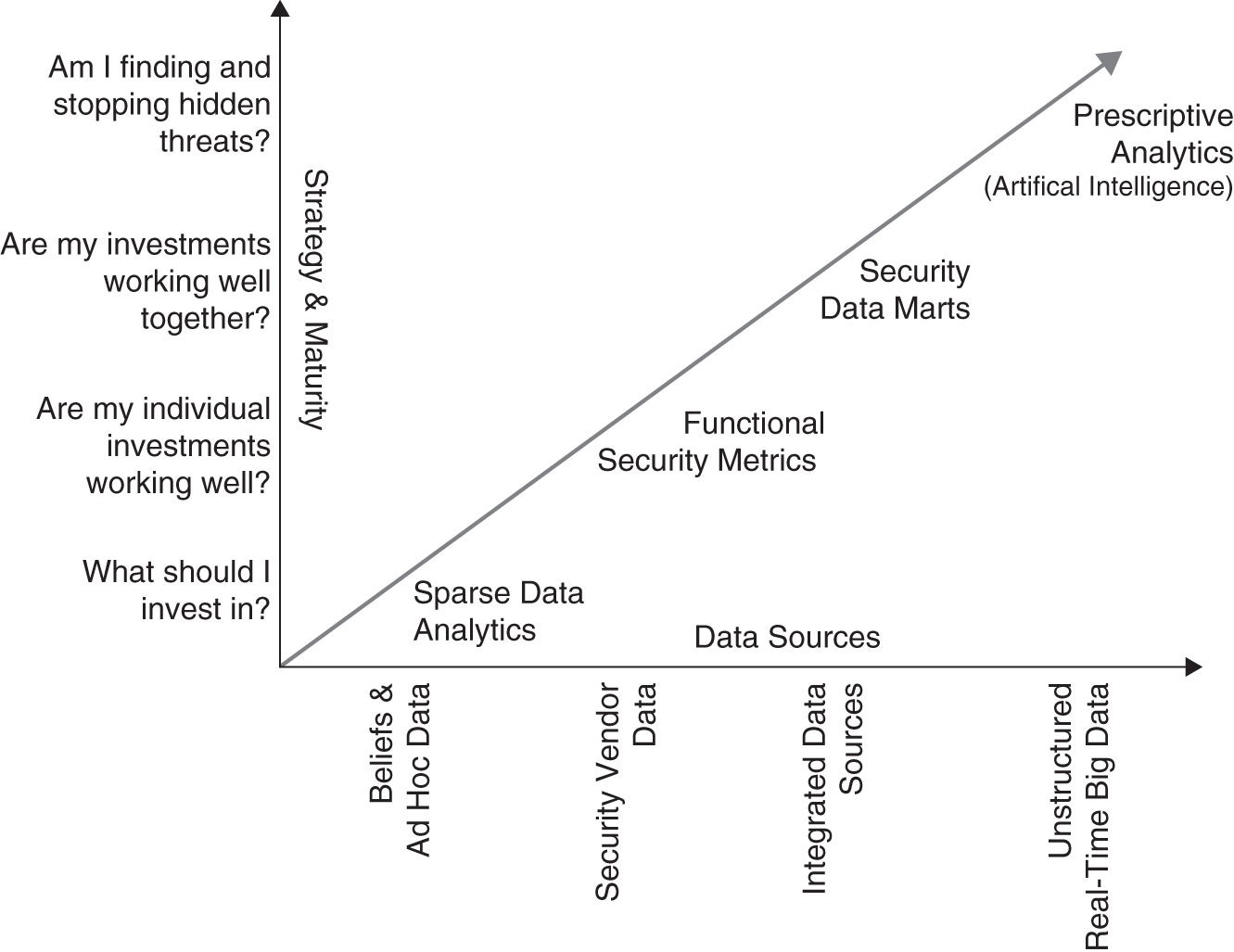
FIGURE 10.1 Security Analytics Maturity Model
Sparse Data Analytics
N (data) is never enough because if it were “enough” you'd already be on to the next problem for which you need more data. Similarly, you never have quite enough money. But that's another story.
—Andrew Gelmam 2
You can use predictive analytics now. Meaning, you can use advanced techniques although your security program may be immature. All of the models presented in Chapters 8 and 9 fit perfectly here—they embody “sparse data analytics.”
Just because your ability to collect broad swaths of security evidence is low does not mean that you cannot update your beliefs as you get more data. In fact, the only data you may have is subject‐matter expert beliefs about probable future losses. In short, doing analytics with sparse evidence is a mature function but is not dependent on mature security operations.
From an analytics perspective, sparse data analytics (SDA) is the exclusive approach when data are scarce. You likely have not made an investment in some new security program. In fact, you may be the newly hired CISO tasked with investing in a security program from scratch. Therefore, you would use SDA to define those investments. But once your new investment (people, process, technology) is deployed, you measure it to determine its effectiveness to continually improve its operation.
Functional Security Metrics
After you have made a major investment in a new enterprise‐security capability, how do you know it's actually helping? Functional security metrics (FSMs) seek to optimize the effectiveness of key operational security areas. There will be key performance indicators (KPIs) associated with operational coverage, systems configuration, and risk reduction within key domains. There are several security metrics books on the market that target this level of security measurement. One of the earliest was Andrew Jaquith's Security Metrics3 (The Metrics Manifesto is a more modern treatment of metrics). Jaquith's book brought this important topic to the forefront and has a solid focus on what we would call “coverage and configuration” metrics. Unfortunately, most companies still do not fully realize this level of maturity. They indeed may have tens, if not hundreds, of millions of dollars invested in security staff and technology. People, process, and technology for certain silo functions may in fact be optimized, but a view into each security domain with isometric measurement approaches is likely lacking.
Most organizations have some of the following functions, in some form of arrangement:
- Malware defense;
- Vulnerability management;
- Penetration testing;
- Application security;
- Network security;
- Security architecture;
- Identity and access management;
- Security compliance;
- Data loss prevention;
- Incident response and forensics;
- And many more.
Each function may have multiple enterprise and stand‐alone security solutions. In fact, each organization ideally would have sophisticated security metrics associated with each of their functions. These metrics would break out into two macro areas:
- Coverage and configuration metrics: These are metrics associated with operational effectiveness in terms of depth and breadth of enterprise engagement. Dimensions in this metric would include time series metrics associated with rate of deployment and effective configuration. Is the solution actually working (turned on) to specification and do you have evidence of that? You can buy a firewall and put it in line, but if its rules are set to “any:any” and you did not know it—you likely have failed. Is logging for key applications defined? Is logging actually occurring? If logging is occurring, are logs being consumed by the appropriate security tools? Are alerts for said security tools tuned and correlated? What are your false positive and negative rates, and do you have metrics around reducing noise and increasing actual signal? Are you also measuring the associated workflow for handling these events?
- Mitigation metrics: These are metrics associated with the rate at which risk is added and removed from the organization. An example metric might be “Internet facing, remotely exploitable vulnerabilities must be remediated within one business day, with effective inline monitoring or mitigation established within 1 hour.”
Functional Security Metrics Applied: BOOM!
BOOM stands for “baseline objectives and optimization measurements.” It is the core metrics framework found in Seiersen's recent book The Metrics Manifesto: Confronting Security With Data1 (TMM). BOOM metrics are a class of “functional security metrics.”
This section will provide an explanation and simple example of each of the five BOOM metrics (Figure 10.2):
- Burndown: The baseline rate with which risk is removed over time;
- Survival: The time‐to‐live (TTL) of risk;
- Arrival: The rate with which risk arrives;
- Wait‐times: The time between risk arrivals;
- Escapes: The rate with which risk moves.
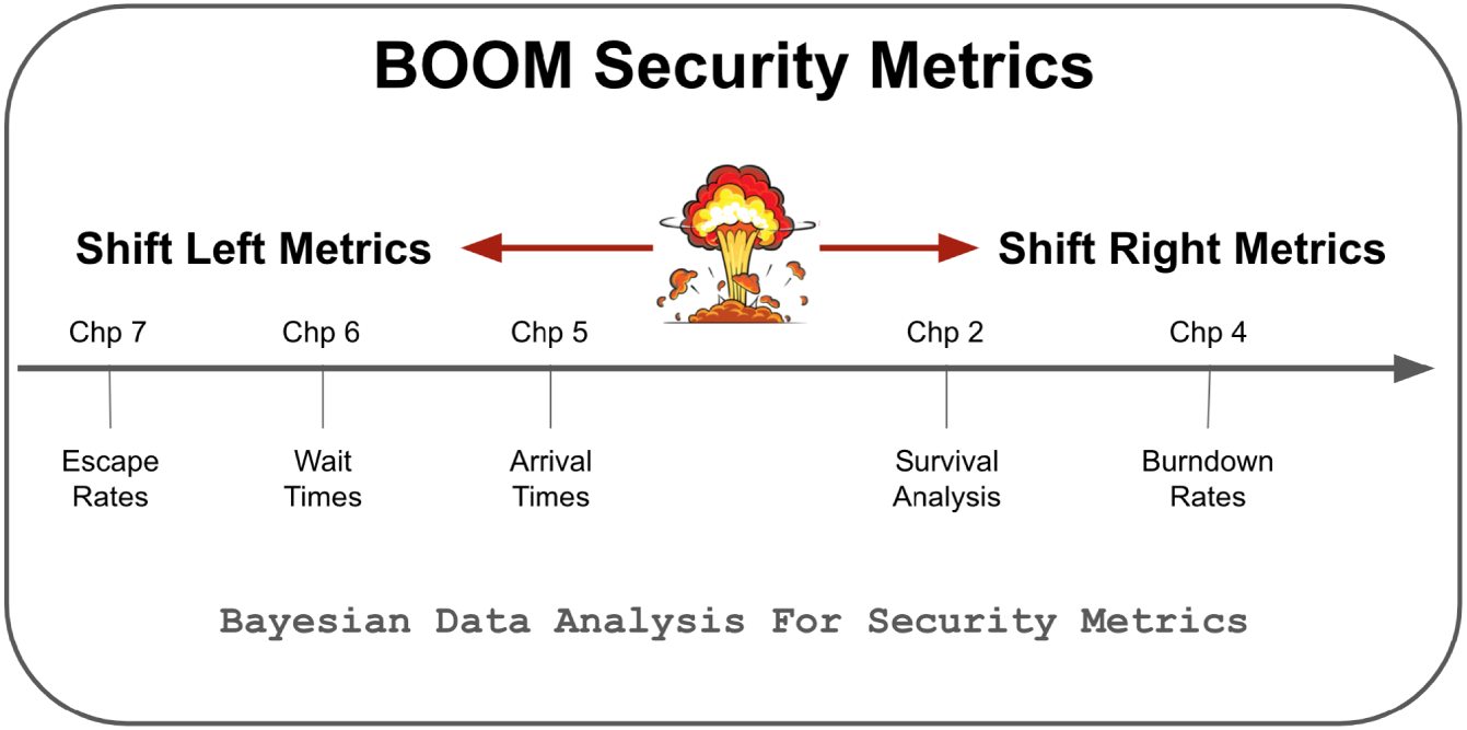
FIGURE 10.2 The BOOM Metrics Framework
Our goal is to expose you to these five methods. You will also become more familiar with Bayesian data analysis techniques that were presented in earlier chapters.
Note, code and supporting functions found in this section are located at www.themetricsmanifesto.com. Go to the section title HTMA CyberRisk. Functions particular to this section are in the htmacyber_functions.R file.
Burndown Baselines
Burndown is nothing more than a ratio over time—aka a cumulative ratio. It's like a batting average. The numerator is hits. The denominator is hits plus misses, aka total.
What might we burn down in security? The range of topics includes vulnerabilities, configuration items, threats, identity and access management issues, incident response, and more. Any SecOps topic is fair game. All you need is two pieces of information to start.
The first piece of information is a start date. Start dates include the time something was discovered, time it was entered into a ticket system, time it was accepted as a work item, and such. The second piece is the end date. That could be the date a ticket was closed, the date something is no longer there, the date some work item changes its state from discovered to accepted, etc. Most burndown metrics measure date discovered to date eliminated.
Let's assume you are going to measure your vulnerability remediation burndown. (Substitute in whatever security process you like here.) In January you discover 100 critical vulnerabilities. In the same month you close 50. Your burndown rate is 50/100, or 50%. In February you discover 100 more and close 30 of the total remaining (i.e., from the vulns still open between January and February). Your cumulative burndown rate is 80/200, or 40%.
The keen reader may already see where we are going with this probability‐wise. Indeed, this is another use case for the beta distribution.
The code below models five months of burndown, extending the first two months discussed above:
What if you had a KPI of 65% for your burndown rate over the last five months. Did you make it? Strictly speaking, not yet. There is some uncertainty about what your baseline rate is. It could credibly be as low as 61% based on a 90% credible interval. If your KPI were 60%, you could credibly say you achieved your goal—for the most part.
Why does measuring this way matter? We are measuring a capability and how consistently it produces desired results over time. We are trying to be conservative. A single point and time measure will hide the truth.
Survival Baselines
Survival analysis is the statistical approach behind BOOM's survival baseline. Survival analysis is a big topic in epidemiology, insurance, and any number of fields that are concerned with how long things tend to exist. Like burndowns, survival analysis also depends on a start and end date—with a twist. Survival analysis allows you to include things that have yet to experience a “hazard.” These not‐as‐yet events are formally said to be censored.
Hazards cause the termination of a process. In our previous example, a patch terminates a vulnerability. Anti‐malware can terminate malware. Deprovisioning a user terminates access.
In the code below we will measure the time to live of malicious (evil) domain access. This metric measures how fast bad domains are blocked, aka filtered.
Effective filtering reduces the time to live (ttl) of evil domain access. This metric measures the ttl of evil URLs where attempts to connect to the domain were made before getting blocked—meaning the domain was eventually put on a “blocklist,” but at least one host attempted to reach that domain. You can query DNS history to find evil domain access (assuming it's logged). It would be a post hoc query that happens after the domain appears on a blocklist.
You want to record the earliest attempt to reach domains on the blocklist. You also want to record the date the domain was added to the blocklist. These are your first.seen and last.seen timestamps. The difference between those dates is the count in days, aka diff.
In the code below, any malicious domains that are active, yet not on the blocklist, are considered censored. Their status is marked with a 0, otherwise 1.
We think it takes between 2 and 14 days to block previously accessed malicious domains. The analysis also thinks there is a 50% chance the rate is just as likely above or below five days (median). That tells us the data is skewing right and centered a bit more toward the lower end of the range.
We had 20 processes (n) with 17 of them experiencing a hazard. The analysis calls the 17 data points “events.” What happened to the three processes that did not experience a hazard? They were censored.
Arrival Baselines
Most security measurement tends to be “shift‐right.” Our first two BOOM metrics were like this. They focus on measuring risk cleanup “right of boom!” (See Figure 10.2.) For prevention we use “shift‐left” measures.
An important shift‐left measure is the arrival rate. It measures the rate with which risk materializes. Arrival rates help you discern if your preventative measures are working. If they are working, you should see a reduction in the rate with which risk arrives. Let's use a concrete and vexing problem to explore this measure—phishing.
We are particularly concerned with the rate with which employees interact with phish beyond mere clicks on links. We will call this measure the phishing victim arrival rate. These most often show up in incident response tickets. So they should not be hard to find.
Let's assume your company has 10,000 employees. Before doing any empirical measures, you and your team believe the phishing victim rate is roughly five arrivals a week. This is what you believe before seeing any data. The code below generates Figure 10.3, showing what a gamma distribution averaging 5 arrivals per week should look like.
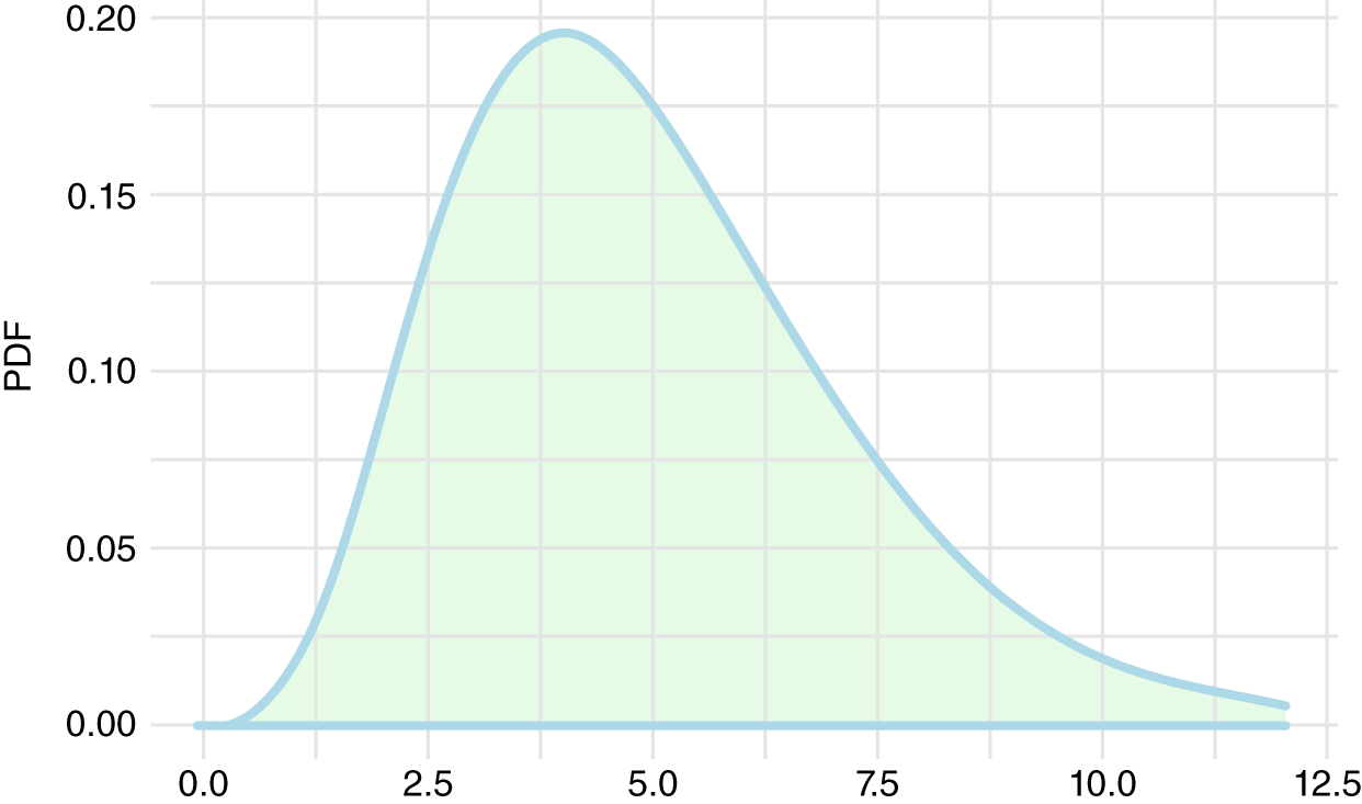
FIGURE 10.3 Gamma Prior
You were introduced to the gamma distribution in the previous chapter. It's used here as a Bayesian prior for a count model. That is a fancy way of saying that it captures what we believe about counts, with plenty of uncertainty. The rate could plausibly land somewhere between 1 and 10 events per week.
Next, you collect three months (12 weeks) of data. And in that time you have 87 victims. What might your baseline rate be given this data? The following code generates Figure 10.4 seen below.
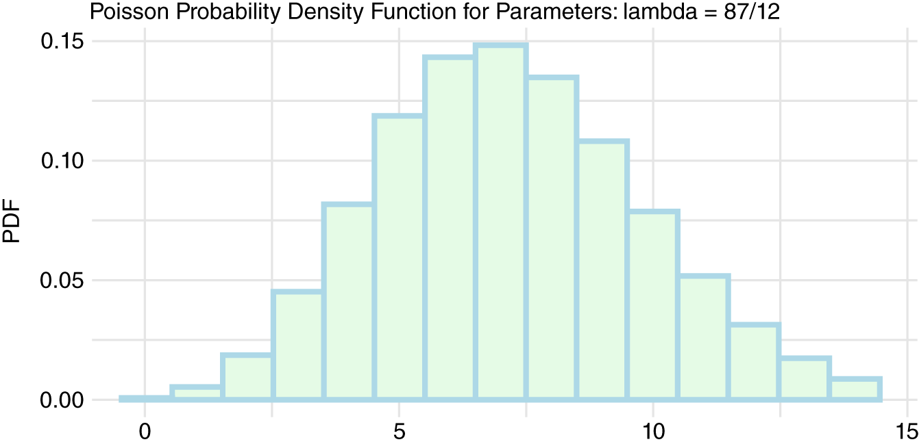
FIGURE 10.4 Poisson Data
Next, let's have the prior inform our data. Prior knowledge can help regulate our data when that data is sparse. The function bayesPhishArrive() integrates these two distributions of data together. Reminder: this function and others can be found in the htmacyber_functions.R file at www.themetricsmanifesto.com.
On the surface, this may not seem all that impressive. After all, 87/12 is an average rate of 7.25. Our updated model that considers our prior came up with 7. So why all the fuss?
What we really want to know is if our rate is changing for the better given our beliefs and small data. Let's assume we implement a new mitigating technology. We track results for three weeks and get the following phish results per week: 6, 7, 8. How does that compare to our previous data? We are going to use a Bayesian A/B testing approach to compare results.
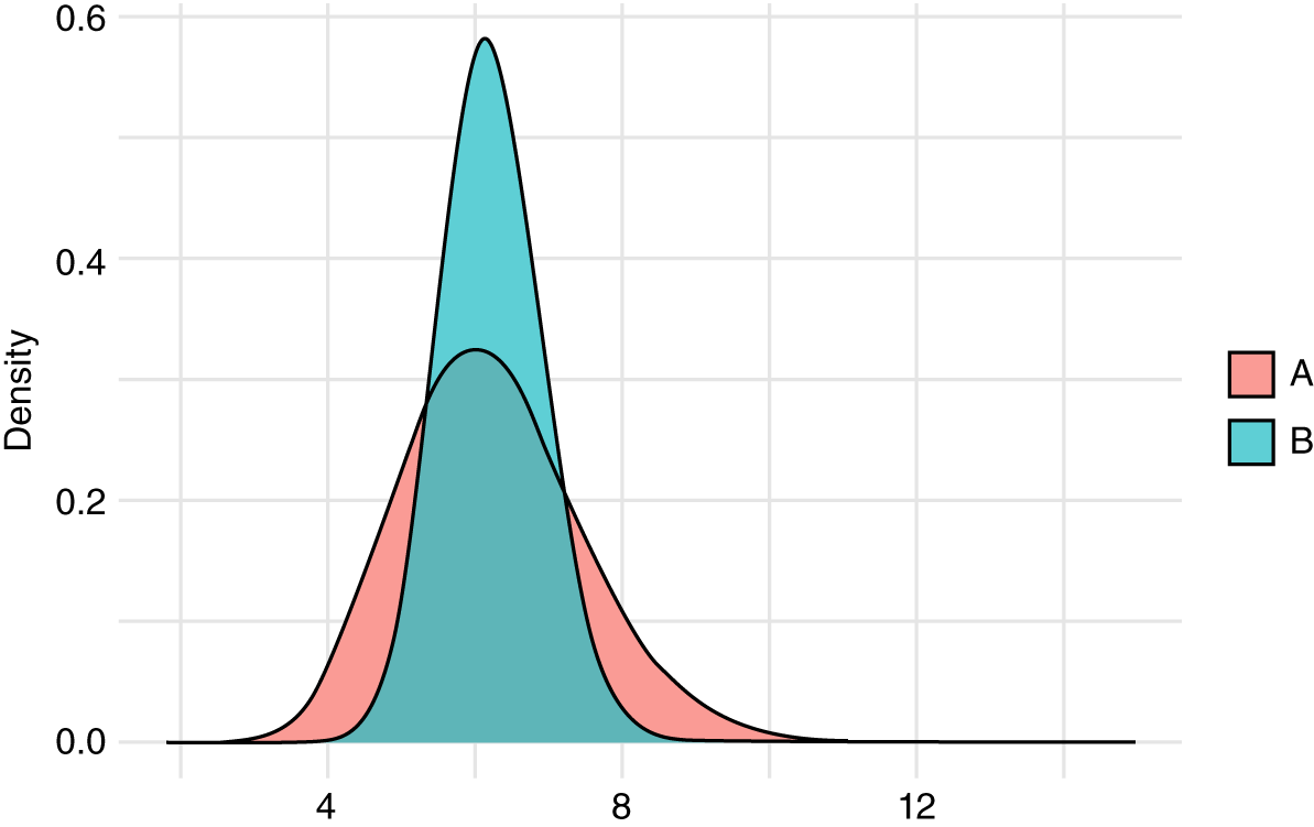
FIGURE 10.5 Phish Overlap
The three weeks of new data have a mean of 7. The previous data also have a mean of 7 when the prior was considered. That is why the distributions in Figure 10.5 overlap in the center area. But distribution A is less certain than B. Its tails stick out to either end. To what extent do these two data‐generating processes produce similar results?
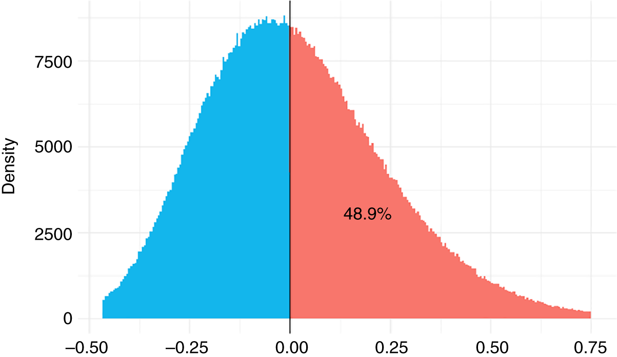
FIGURE 10.6 Phish Difference
Figure 10.6 tells us that nearly 50% of A overlaps with B. We can't tell if the mitigation is making a difference. If we had to make a choice today, we would have to say the data is inconclusive. It's largely a function of the data being too small.
Let's fast‐forward in time to a full twelve weeks. Here is what the data looks like now:
Let's run our analysis again. I won't put all the code here to conserve space. What I will share is the final graph (Figure 10.7).
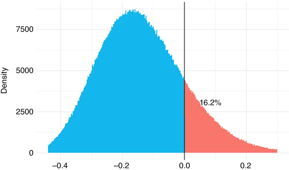
FIGURE 10.7 Updated Phish Difference
We are starting to see a difference, but it is still inconclusive. The mean for A is 5 and B is 7.25. Ideally, there would be 0 overlap between the two data‐generating processes. At least, their credible intervals would not overlap.
Our code looks for a credible difference in the underlying data‐generating process. It does that by diffing the two distributions. If they were exactly the same distributions of data, the diff would produce a 0.
Any differences in data would show up as either a negative or positive value. If all the data are different in a particular direction, meaning they all fall to one side or the other of zero, then we could assume the data generating‐processes are different. Let's see how A and B differ:
Notice how the difference between the two distributions straddles 0. We have −0.35 to 0.11. Since the difference does overlap with 0, we are not confident that the processes are credibly different. Perhaps we should extend our POC of the new solution? Of course, we may want to move on if the vendor claimed we would see amazing results (for a hefty price tag).
What I want to see is a strongly negative 90% credible interval. We want a negative difference because we hope our new mitigation produces less phish victim arrivals. We want it to be “strongly negative” because we are hoping the new investment really works.
Wait‐Time Baselines
This next BOOM metric is closely related to arrivals. It is called wait‐times. It also goes by interarrival time in the literature. We use the two names interchangeably.
Wait‐time is an important measure in operations management—particularly reliability engineering. These disciplines deal with queues of events. Those events could occur in milliseconds to much larger time frames.
As events flow in, you are looking to measure the expected rate with which the next event should materialize. In this sense, interarrivals are like canaries in a coal mine. They can help you detect changes in your data‐generating process with a finer grain than arrivals. Let's work through a useful security example.
Assume you have some security process that produces high‐risk events. Events occur by the day. Some days may have no events. Some days may have multiple. Your job is to get a baseline “between extreme event” rate. Once you have a baseline you can set goals for betterment.
In the example below substitute in any security topic of interest. Note: non_bayes_waits() and other functions can be found in the htmacyber_functions.R file at www.themetricsmanifesto.com. Also, once we cover a few examples using this function, we will use a Bayesian approach that expands our toolset.
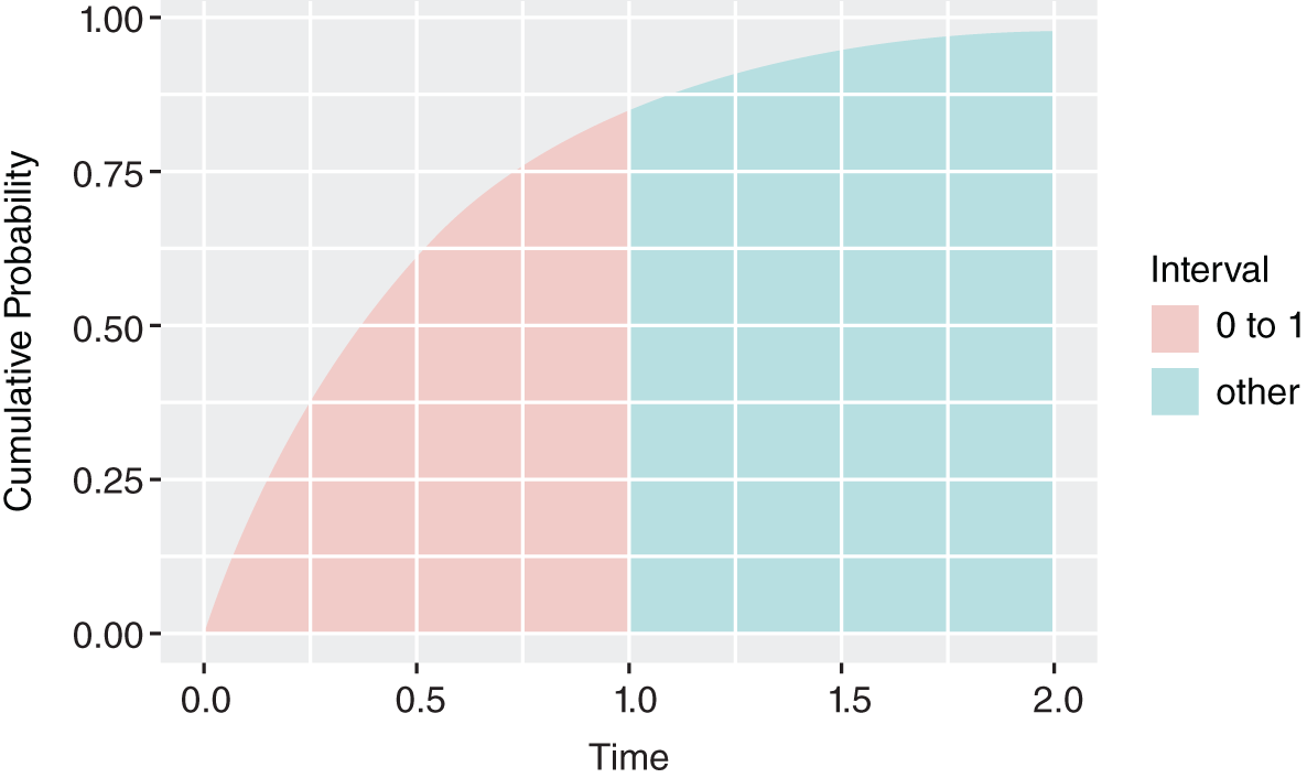
FIGURE 10.8 Next Event in One Day or Less
In Figure 10.8 we see that there is an 85% chance the next event will arrive in one day or less. There's roughly a 100% chance a critical event will arrive in two days. Let's add some more days to our events.
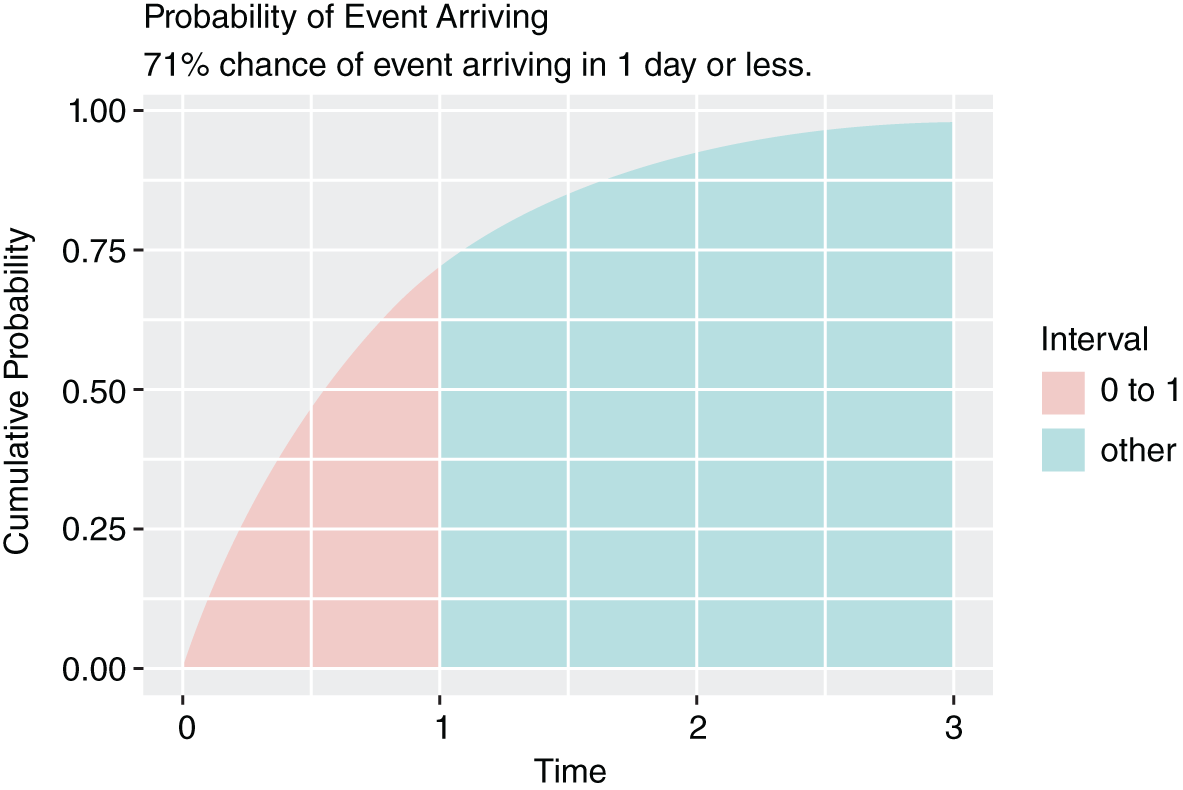
FIGURE 10.9 Next Event in One Day or Less Improved
Notice how our rate has improved slightly. That improvement came from adding more days with less event frequencies. It now takes about three days to approach a 100% probability of experiencing the next event.
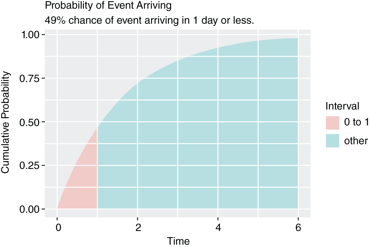
FIGURE 10.10 Many Events with Continued Improvement
Notice all the zeroes in the last example. This creates “over‐dispersion.” That's fancy talk for “lots of wiggle in the data.” The current approach does not address over‐dispersion very well. Fortunately, Bayesian approaches can easily capture our data's wiggle. The functions below are also found on the book's site: www.themetricsmanifesto.com.
In this example, we are going to take a slightly different route to generating our prior. This method is called empirical Bayes. It uses empirical data to generate our priors.
Below we have 12 days’ worth of events as our prior. Next, we have 24 days’ worth of events. Our new bayes_waits_basic() function takes our data in and spits out a standard Bayesian graph.
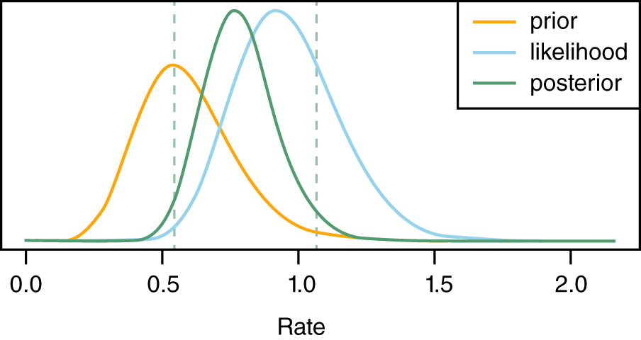
FIGURE 10.11 Empirical Bayes Interarrival Analysis
This graph above shows how our prior influences our data (likelihood) and produces the posterior. The posterior distribution is the mathematical compromise between the prior and the likelihood. The two vertical lines are the 95% credible interval for the posterior. The interarrival rate is between 0.5 and 1.1 portions of an event per day.
What I really want to ask is, “How long does it take for the next full event to arrive?” To get at this result we simulate a thousand results from the posterior. As you may recall, simulation selects values from the posterior in a quasi‐random fashion. That means the results will be selected in proportion to the posterior distribution.
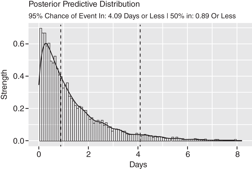
FIGURE 10.12 Empirical Bayes Posterior Prediction
This type of analysis is far more intuitive. You can credibly believe an event will arrive within four days given our current data. And there is a 50% chance an event will arrive in just under a day.
Let's pump this up with many more results. Below we have two weeks of days as a prior followed by a quarter's worth of days:
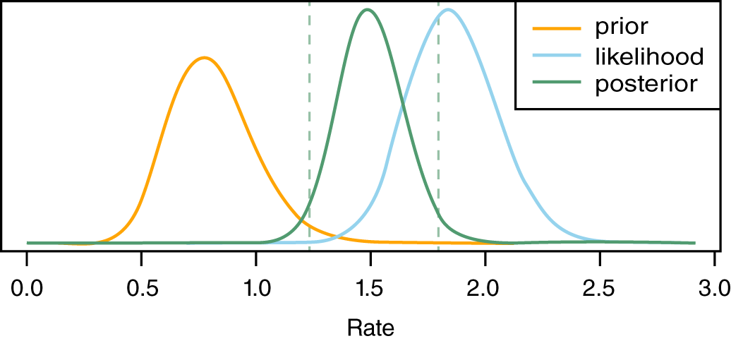
FIGURE 10.13 Second Empirical Bayes Analysis
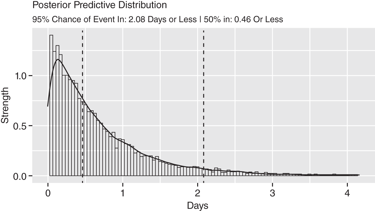
FIGURE 10.14 Second Empirical Bayes Posterior Analysis
Interarrival time halved between Figures 10.13 and 10.14. That is easy to see. You can use this method to detect fine‐grained changes. What you would be looking for is a consistent difference over time.
We gave arrival and interarrival rates a lot of attention. It's a critical type of measurement for security. We will conclude our discussion of BOOM metrics with escape rates.
Escape Rates
This section focuses on escape rates. It also provides more clarity on empirical Bayes methods. You first encountered empirical Bayes with wait‐times above.
An escape rate is a canonical measure used in software development. It's the rate with which bugs escape from development into production. If your bug‐squashing process is efficient, then escapes should rarely happen.
The same concept can be applied liberally to any number of security processes. An obvious example is vulnerabilities and configuration items found in staging that make their way into production. Generalizing this concept further you could say escapes measure the movement of risk across a barrier.
Preproduction to production represents a barrier. When you cross the barrier, you're more exposed to loss. With that in mind, a service level agreement (SLA) is a barrier. A risk that lives beyond an SLA can be thought of as escaping. A risk mitigated within SLA is thought to be in control.
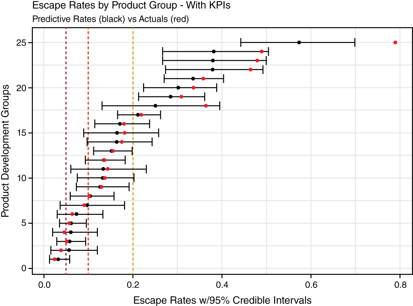
FIGURE 10.15 Escape Rate Analysis with KPIs
For our use case, let's assume you have 25 development teams in your org. You are looking to gauge the rate with which vulnerabilities and configuration items discovered in development make their way into production. Some groups have been around only a few months. Many have a year or more of experience.
The groups with limited data can't be trusted. It's like a batter who has been up to bat only a handful of times. If he was lucky and got a bunch of hits, he might have a batting average over 500 or more. That average obviously won't hold.
We adjust this rate by using an approach called empirical Bayes. It's a fancy turn of phrase for a simple concept. In short, we create a special average from the long‐run data. We trust the long‐run data to be more reflective of the overarching data‐generating process. This new average is used to update every group. Let's see how this works.
Figures 10.16 and 10.17 hold portions of results. The first is a sample of groups with small data. The second set are those with larger data. Glancing at the total_vulns column shows the relative sizes. If you divide the prod_vuln value by total_vulns you get the escape_avg. Figure 10.15 displays this average as a grey dot.
Our empirical Bayes analysis creates the emp_bayes_avg. The black dots in Figure 10.15 represent this value. It balances out data that is biased by its small size. Small data makes for more uncertainty. The spread between the low_ci and high_ci values reflects our uncertainty—it's twice as large in the first sample.
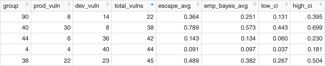
FIGURE 10.16 Original Escapes with Small Data
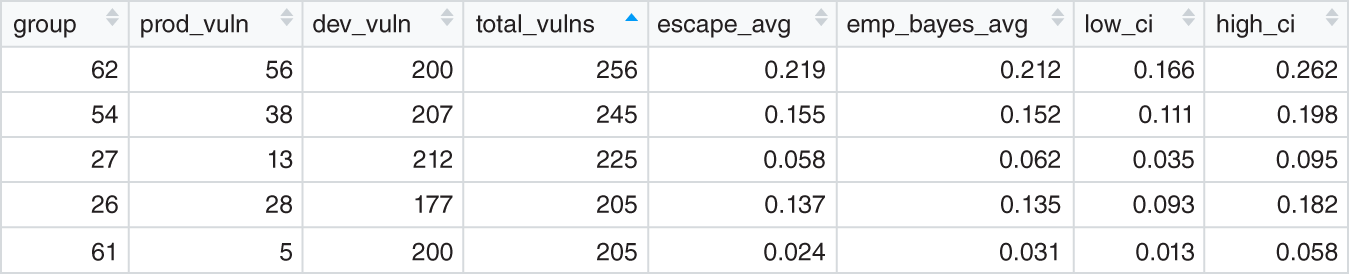
FIGURE 10.17 Original Escapes with Larger Data
This wraps up our whirlwind example of functional security metrics. As mentioned, all the code for these samples can be found at www.themetricsmanifesto.com.
Security Data Marts
Note: Chapter 11 is a tutorial on security data mart design. The section below only introduces the concept as part of the maturity model.
“Data mart” is a red flag for some analysts. It brings up images of bloated data warehouses and complex ETL (extraction, transformation, load) programs. But when we say “data mart” we are steering clear of any particular implementation. If you wanted our ideal definition, we would say it is “a subject‐matter‐specific, immutable, elastic, highly parallelized and atomic data store that easily connects with other subject data stores.” Enough buzzwords? Translation: super‐fast in all its operations, scales with data growth, and easy to reason over for the end users. We would also add, “in the cloud.” That's only because we are not enamored with implementation and want to get on with the business of managing security risk. The reality is that most readers of this book will have ready access to traditional relational database management system (RDBMS) technology—even on their laptops.
Security data marts (SDM) metrics answer questions related to cross‐program effectiveness. Are people, process, and technology working together effectively to reduce risk across multiple security domains? (Note: When we say “security system” we typically mean the combination of people, process, and technology.) More specifically, is your system improving or degrading in its ability to reduce risk over time? An example question could be “Are end users who operate systems with security controls XYZ less likely to be compromised? Or are there certain vendor controls, or combinations of controls, more effective than others? Is there useless redundancy in these investments?” By way of example related to endpoint security effectiveness, these types of questions could rely on data coming from logs such as the following:
- Asset management (CMDB);
- Software bill of materials (SBOMs);
- Vulnerability management;
- Identity and access management (IAM);
- Endpoint detection and response (EDR);
- Security information and event management (SIEM);
- Static/dynamic analysis (SAST/DAST);
- Cloud workload protection;
- Countless other security things (COSTs).
Other questions could include “How long is exploitable residual risk sitting on endpoints before discovery and prioritization for removal? Is our ‘system’ fast enough? How fast should it be, and how much would it cost to achieve that rate?”
Data marts are perfect for answering questions about how long hidden malicious activity exists before detection. This is something security information and event management (SIEM) solutions cannot do—although they can be a data source for data marts.
Eventually, and this could be a long “eventually,” security vendor systems catch up with the reality of the bad guys on your network. It could take moments to months if not years. For example, investments that determine the good or bad reputation of external systems get updated on the fly. Some of those systems may be used by bad actors as “command and control” servers to manage infected systems in your network. Those servers (our cloud services) may have existed for months before vendor acknowledgment. Antivirus definitions are updated regularly as new malware is discovered. Malware may have been sitting on endpoints for months before that update. Vulnerability management systems are updated when new zero‐day or other vulnerabilities are discovered. Vulnerabilities can exist for many years before software or security vendors know about them. During that time, malicious actors may have been exploiting those vulnerabilities without your knowledge.
This whole subject of measuring residual risk is a bit of an elephant in the room for the cybersecurity industry. You are always exposed at any given point in time and your vendor solutions are by definition always late. Ask any security professional, and they would acknowledge this as an obvious non‐epiphany. If it's so obvious, then why don't they measure it with the intent of improving on it? It's readily measurable and should be a priority.
Measuring that exposure and investing to buy it down at the best ROI is a key practice in cybersecurity risk management that is facilitated by SDM in conjunction with what you learned in previous chapters. In Chapter 11, we will introduce a KPI called “survival analysis” that addresses the need to measure aging residual risk. But here's a dirty little secret: if you are not measuring your residual exposure rate, then it's likely getting worse. We need to be able to ask cross‐domain questions like these if we are going to fight the good fight. Realize that the bad guys attack across domains. Our analytics must break out of functional silos to address that reality.
Prescriptive Analytics
As stated earlier, prescriptive analytics is a book‐length topic in and of itself. Our intent here is to initialize the conversation for the security industry. Let's describe prescriptive analytics by first establishing where it belongs among three categories of analytics:
- Descriptive analytics: The majority of analytics out there are descriptive. They are just basic aggregates such as sums and averages against certain groups of interest like month‐over‐month burnup and burndown of certain classes of risk. This is a standard descriptive analytic. Standard online analytical processing (OLAP) fares well against descriptive analytics. But as stated, OLAP business intelligence (BI) has not seen enough traction in security. Functional and SDM approaches largely consist of descriptive analytics except when we want to use that data to update our sparse analytic models’ beliefs.
- Predictive analytics: Predictive analytics implies predicting the future. But strictly speaking, that is not what is happening. You are using past data to make a forecast about a potential future outcome. Most security metrics programs don't reach this level. Some security professionals and vendors may protest and say, “What about machine learning? We do that!” It is here that we need to make a slight detour on the topic of machine learning, aka data science versus decision science.
Using machine learning techniques stands a bit apart from decision analysis. Indeed, finding patterns via machine learning is an increasingly important practice in fighting the bad guy. As previously stated, vendors are late in detecting new attacks, and machine learning has promise in early detection of new threats. But probabilistic signals applied to real‐time data have the potential to become “more noise” to prioritize. “Prioritization” means determining what next when in the heat of battle. That is what the “management” part of SIEM really means—prioritization of what to do next. In that sense, this is where decision analysis could also shine. (Unfortunately, the SIEM market has not adopted decision analysis. Instead, it retains questionable ordinal approaches for prioritizing incident‐response activity.)
- Prescriptive analytics: In short, prescriptive analytics runs multiple models from both data and decision science realms and provides optimized recommendations for decision making. When done in a big data and stream analytics context, these decisions can be done in real time and in some cases take actions on your behalf—approaching “artificial intelligence.”
Simply put, our model states that you start with decision analysis and you stick with it throughout as you increase your ingestion of empirical evidence. At the prescriptive level, data science model output becomes inputs into decision analysis models. These models work together to propose, and in some cases dynamically make, decisions. Decisions can be learned and hence become input back into the model. An example use case for prescriptive analytics would be in what we call “chasing rabbits down holes.” As stated, much operational security technology revolves around detect, block, remove, and repeat. At a high level this is how antivirus software and various inline defenses work. But when there is a breach, or some sort of outbreak, then the troops are rallied. What about that gray area that precedes a breach and/or may be an indication of an ongoing breach? Meaning, you don't have empirical evidence of an ongoing breach, you just have evidence that certain assets were compromised and now they are remediated.
For example, consider malware that was cleaned successfully, but before being cleaned, it was being blocked from communicating to a command‐and‐control server by inline reputation services. You gather additional evidence that compromised systems were attempting to send out messages to now blocked command‐and‐control servers. This has been occurring for months. What do you do? You have removed the malware but could there be an ongoing breach that you still don't see? Or perhaps there was a breach that is now over that you missed? Meaning, do you start forensics investigations to see if there is one or more broader malicious “campaigns” that are, or were, siphoning off data?
In an ideal world, where resources are unlimited, the answer would be “yes!” But the reality is that your incident response team is typically 100% allocated to following confirmed incidents as opposed to likely breaches. It creates a dilemma. These “possible breaches” left without follow‐up could mature into full‐blown, long‐term breaches. In fact, you would likely never get in front of these phenomena unless you figure out a way to prioritize the data you have. We propose that approaches similar to the ones presented in Chapter 9 can be integrated near in real time into existing event detection systems. For example, the lens model is computationally fast by reducing the need for massive “node probability tables.” It's also thoroughly Bayesian and can accept both empirical evidence coming directly from deterministic and nondeterministic (data science)‐based security systems and calibrated beliefs from security experts. Being that it's Bayesian, it can then be used for learning based on the decision outcomes of the model itself—constantly updating its belief about various scenario types and recommending when certain “gray” events should be further investigated—and going so far as analyzing the value of additional information.
This type of approach starts looking more and more like artificial intelligence applied to the cybersecurity realm. Again, this is a big, future book‐length topic, and we only proposed to shine a light on this future direction.
Notes
- 1. Richard Seiersen, The Metrics Manifesto: Confronting Security With Data (Hoboken, NJ: Wiley, 2022).
- 2. Andrew Gelman, “N Is Never Large,” Statistical Modeling, Causal Inference, and Social Science (blog), July 31, 2005, http://andrewgelman.com/2005/07/31/n_is_never_larg/.
- 3. Andrew Jaquith, Security Metrics: Replacing Fear, Uncertainty, and Doubt (Upper Saddle River, NJ: Pearson Education, 2007).