
CHAPTER 11
How Well Are My Security Investments Working Together?
In Chapter 10, we shared an operational security‐metrics maturity model. The model started with sparse data analytics. That really is the main theme of this book: “How to measure and then decide on what to invest in when you have a lot of uncertainty caused by limited empirical data.” Chapters 8 and 9 represent the main modeling techniques used in sparse data analytics. The goal is to make the best decision given the circumstances. And as you may recall, a decision is an “irrevocable allocation of resources.” In short, you know you've made a decision when you have written a check. Is measurement all over once you have made an investment? Certainly not!
What do you measure once you have made a decision (i.e., an investment)? You determine if your investment is meeting the performance goals you have set for it. For the security professional this is the realm of functional security metrics. Once you have made a security investment, you need to measure how well that investment is doing against certain targets. That target is often considered a KPI. We covered advanced measurement techniques encompassed in the baseline objectives and optimization measurements (BOOM) framework. This framework is detailed in Seiersen's The Metrics Manifesto: Confronting Security With Data.
Assuming you have made a serious outlay of cash, this would warrant some form of continuous “automated” measurement for optimization purposes. Likely you may have made a number of investments that work together to affect one or more key risks. When it comes to integrating data sources for the purpose of measuring historical performance, we are now talking security metrics that start to look more like business intelligence (BI). There are many great books on business intelligence. Most of them are large and in some cases cover multiple volumes. So why do we need more on this topic, and what could we hope to achieve in just one chapter?
Specifically, we are not aware of any books that advocate BI for cybersecurity metrics. This is a profound shame. In fact, Jaquith's book Security Metrics advocated against such an approach. Over 15 years ago we too might have held the same opinion. (Although at that time one of the authors was rolling out security data marts like hotcakes.)
But risks and technology have evolved, and we need to as well. Analytic technology has improved, both open source and commercial, and more and more security systems “play well with others.” Almost all enterprise security solutions have APIs and/or direct database connectivity to extract well‐formed and consistent data. It could not be any easier.
Our first goal is to expose and encourage the reader to investigate this classical form of process modeling in a modern context. To that end, Omer Singer, head of cybersecurity strategy at Snowflake, has generously agreed to share how a modern full‐data stack approach can be used to address security BI with ease. After this section, we will dive into core “logical modeling” for integrated security metrics.
Security Metrics with the Modern Data Stack
Measuring your first security KPI doesn't require advanced analytics. Follow the process described in this section to quickly show the value of a data‐driven security program, and later on work your way toward data models and data science.
Here is a straightforward approach to creating security metrics with the modern data stack1 already deployed at your enterprise. That's the popular term for where the data engineering team combines cloud‐based solutions for data pipeline (ETL), data platform, and enterprise reporting (BI). How are security teams successfully leveraging2 this stack for security metrics?
Let's say we've chosen to start with a metric for timely deprovisioning of terminated employees. This metric maps to the “account management” critical security control (CSC) number 5 in CIS, and it's all the more important to measure because of how often this control gets violated. When my team started tracking this as a KPI, we learned that over 20% of employees had access to systems longer than allowed by policy!
To get started, we turn to the modern data stack that's already in place at our company—say we have “as a service” the following layers: ETL delivered by Fivetran, data platform delivered by Snowflake, and BI delivered by Tableau. These components are already integrated with each other and can support the sources we need for this metric.
Our KPI will depend on how quickly terminated employees are processed by IT. So we'll enter our Workday3 and ServiceNow4 details in Fivetran, which will stream updates regarding HR changes and IT ticket updates from those source systems to Snowflake, our data platform. Note that setting up a data pipeline is something that your data team regularly does on behalf of other departments. Follow the same process as finance, marketing, and sales in order to get timely support for your use case.
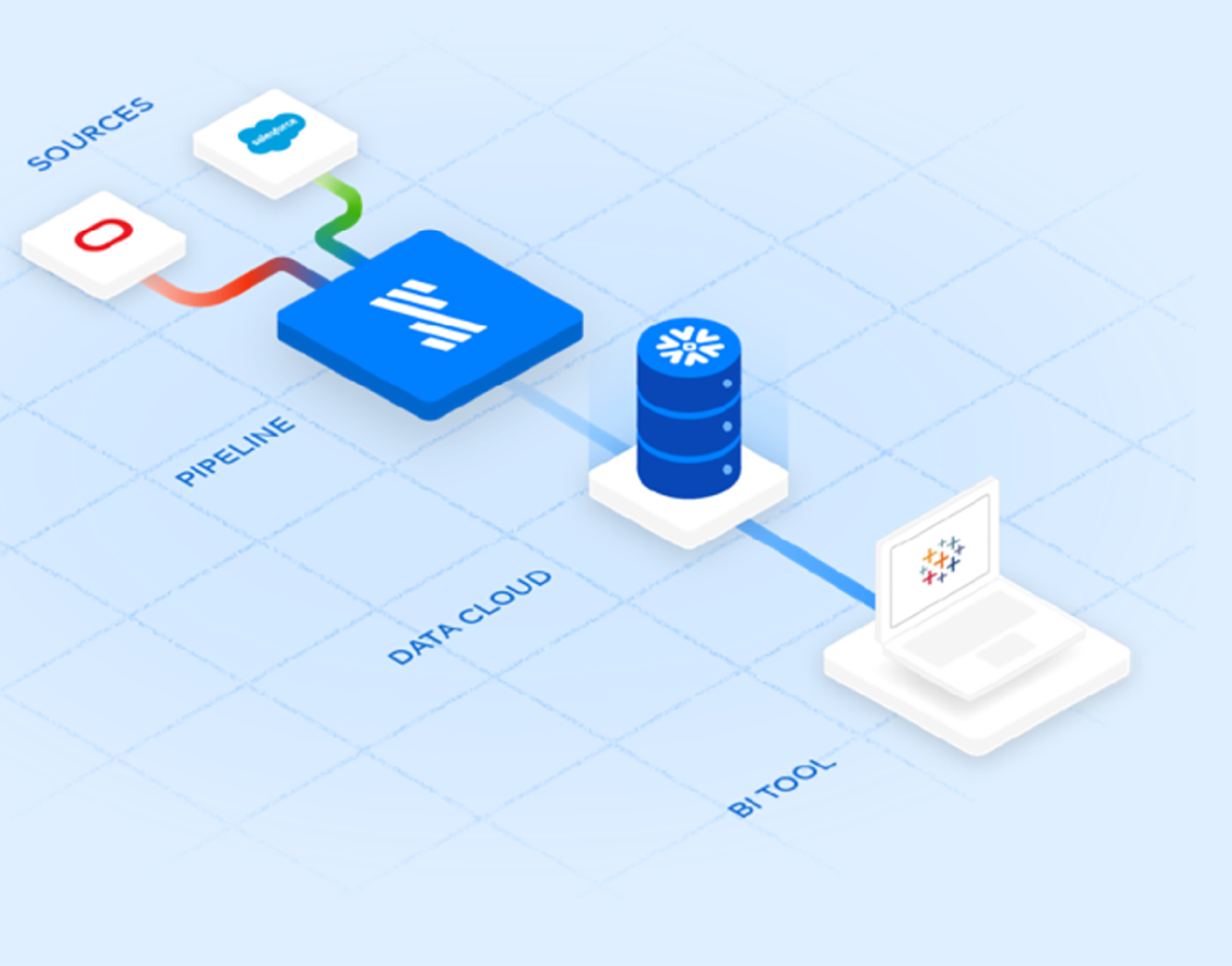
FIGURE 11.1 The Modern Data Stack
Speaking of use case, collecting data should always be done in service of answering specific questions. We want to answer the question “What percentage of employee terminations took too long to deprovision?” For that, we need to know when each termination occurs and when each deprovisioning is completed. To help with accountability, it'll help us to know when the request to deprovision was filed by HR to IT. And of course we need to know what is the maximum deprovisioning time allowed by our security policy.
So our KPI will be based on three calculations.
- “Time to file”: how much time passed between when the termination was recorded in the HR system and when the service ticket was opened.
- “Time to deprovision”: how much time passed between when the service ticket was opened and when the service ticket was closed.
- “Total time elapsed”: the sum of “Time to file” and “Time to deprovision.”
If our security policy expects terminated employees to be locked out within 24 hours, then our control effectiveness rate is based on comparing the number of terminations completed on time to the total number of terminations.
The logic for measuring control effectiveness is one of the many things that your data team can help you with. They do this for other departments all the time, trust me.
Based on the logic we worked out for this control, we need to have the following fields for each termination event:
- Termination time (from Workday);
- Ticket creation time (from ServiceNow);
- Ticket close time (from ServiceNow);
- Employee ID (from both).
Let's look at three termination records as gathered by our ETL to our data platform (Figure 11.2):
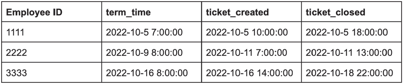
FIGURE 11.2 ETL Results
In the first case, the whole process wrapped up in under 24 hours. Well done. In the next case, HR took almost two days to file the ticket—not good. The third case also represents a policy violation because IT took way too long to work through the deprovisioning. Represented as a security metric, we're looking at a 33% success rate.
All of these calculations are easily performed in SQL. Whether someone on the security team is comfortable with SQL or through collaboration with the data team, this KPI can be quickly implemented once the data is flowing. To see an example of SQL code that generates this KPI, check out the “How to Measure Anything in Cybersecurity Risk” listing on the Snowflake Marketplace.
Now that we have our query code, it's time to visualize the results. We'll want to track this KPI in the same reporting (BI) tool as the rest of the enterprise. In our example, that's Tableau. None of the relevant stakeholders from security, HR, or IT should be logging into any other tool for security metrics. Nor should they be emailing screenshots for that matter—consistency in data analysis and reporting drives alignment.
As data accumulates, our analytics return results in daily or weekly buckets, which are reported in a line chart. That line chart will let us see a trend—are we getting better at deprovisioning terminated employees? A separate chart can show the breakdown in policy violations by responsibility: HR misses vs IT misses. We should also expose a table view with specific case details for investigation. That way all stakeholders are clear on what the recent “misses” have been and who's responsible.
The end result might look something like Figure 11.3:
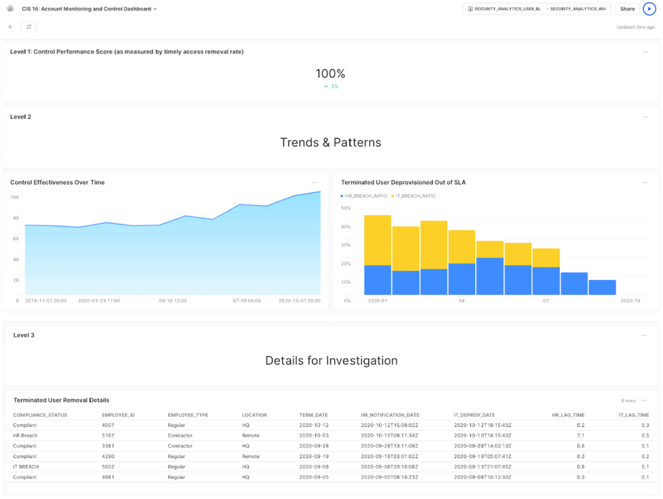
FIGURE 11.3 BI End Results
These dashboards are available on the Snowflake Marketplace; access the free listing and use it as a template for your KPIs.
The approach described above is effective at measuring cybersecurity risk in a way that drives continuous improvement. For my team, it meant aligning HR and IT on the need to improve their processes for timely deprovisioning. And it enabled them to do it independently. Once all sides agreed on the data, each org could follow along in the dashboard to see their progress in handling termination events, without the need for meetings with security to pester, plead, or threaten. The same stats were being tracked by the CIO and CFO and the VPs of each org took it on themselves to fix what needed to be fixed.
You can apply this approach to many other use cases. Depending on your priorities, you can set up KPI tracking for software vulnerabilities, cloud misconfigurations, log visibility, agent coverage, awareness training, phishing tests, admin access, alert volume, and triage time, just to name a few. And security metrics tend to share data sets so that, for example, the same asset inventory that supports vulnerability KPIs are helpful for tracking agent coverage.
It's worth noting that security vendors are increasingly embracing the modern data stack. Key vendors in SIEM, GRC, cloud security, and vulnerability management now support data export, data sharing, or can even run as a “connected application” directly on your cloud data platform. These integrations mean that many of your datasets can be available for analysis off‐the‐shelf without the need for ETL integration. Ask your security vendors about their data platform integration options and how they can streamline your data collection process.
As you can see, it's easier than ever to get started with security metrics. If you can describe your expectations of the environment, your company's data stack can be used to quickly translate those expectations into automated queries that power near‐real‐time reports accessible across the enterprise. Once you get into the habit of starting your day with a hot cup of coffee and a fresh BI dashboard, you'll wonder how you ever worked without it.
Modeling for Security Business Intelligence
Our goal in this chapter is to give a basic, intuitive explanation in terms of a subset of business intelligence: dimensional modeling.
Dimensional modeling is a logical approach to designing physical data marts. Data marts are subject‐specific structures that can be connected together via dimensions like Legos. Thus they fit well into the operational security metrics domain.
Figure 11.4 is the pattern we use for most of our dimensional modeling efforts. Such a model is typically referred to as a “cube” of three key dimensions: time, value, and risk. Most operational security measurement takes this form, and in fact the only thing that changes per area is the particular risk you are studying. Time and value end up being the consistent connective tissue that allows us to measure across (i.e. drill across) risk areas.
Just remember that this is a quick overview of dimensional modeling. It's also our hope that dimensional approaches to security metrics will grow over time. With the growth of cloud‐based database platforms such as Snowflake, modern approaches such as DataVault 2.0,5 and related open source analytic‐based applications such as Apache Superset,6 now is the right time.
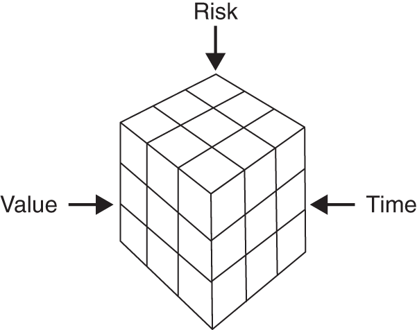
FIGURE 11.4 The Standard Security Data Mart
Addressing BI Concerns
At the mention of BI, many readers may see images of bloated data warehouses with complex ETLs (extraction, transformation, and load). And indeed ETLs and even visualizations can take quarters to deliver value. That problem stems from the complexities underlying relational database infrastructure. It also stems from how analytic outcomes are framed. On the infrastructure side of things, this has largely been solved.
Most cloud providers have big data solutions. Specifically, companies such as Amazon, Google, and Microsoft have mature cloud database products that scale. (And as mentioned, companies such as Snowflake offer complete end‐to‐end specialized solutions for the use cases discussed in this chapter.) Even Excel can handle larger datasets and simulations as is seen in the tools provided on our site.
In terms of BI prejudices toward an analytic approach, you may have heard the following about business intelligence: “BI is like driving the business forward by looking through the rearview mirror.” You may also hear things like, “Business intelligence is dead!” But to us this is like saying, “Descriptive analytics is dead!” or “Looking at data about things that happened in the past is dead!” What's dead, or should be, is slow, cumbersome approaches to doing analytics that add no strategic value. Those who make those declarations are simply guilty of the “beat the bear” or “exsupero ursus” fallacy we mentioned in Chapter 5. Of course, all predictive analytics are predicated on things that happened in the past so as to forecast the future! In short, there is always some latency when it comes to observable facts that make up a predictive model.
Now that we have hopefully blown up any prejudice associated with BI, we can get on with the true core of this chapter: how to determine if security investments are working well together by using dimensional modeling.
Just the Facts: What Is Dimensional Modeling, and Why Do I Need It?
When you are asking dimensional questions about historical facts that allow for both aggregation and drilling down to atomic events, then you are doing BI. A meta‐requirement typically includes data consistency, meaning that the problem you are modeling requires some consistency from a time‐series perspective: day to day, month to month, and so forth. Data consistency is particularly important for forensics and regulatory compliance reporting. This means that consistency over time cannot be ad hoc since it will be audited and could even support legal action.
Dimensional modeling is a logical design process for producing data marts. (How you physically model these things is your choice, i.e. as a big write‐only table, as hubs and satellites [see DataVault 2.0 reference], or sets of write‐only files in S3 buckets7—it's dealer's choice.) In simplified logical modeling we are working with two macro objects: facts and dimensions. A grouping of dimensions that surround a list of facts is a data mart. Figure 11.4 is a simple logical data mart for vulnerabilities. Note that it follows the same pattern from Figure 11.5. Vulnerability in this case is a particular risk dimension. Asset is a value dimension, value being something that is worth protecting. We also have a date dimension, which exists in almost all models.
In the middle of your dimensional tables is something called a “fact table.” A fact table holds pointers to the dimension tables. The fact table could be in the millions if not billions of rows. If your asset dimension is in the hundreds of thousands if not millions, and that is a reality one of the authors has modeled, then your fact table would certainly be in the billions. Do the math; there could be N vulnerabilities per asset that exist at a given time. Also note that we said “logical.” This is a reminder that we will not necessarily create physical objects like dimension tables and fact tables. With modern approaches, when you query against various data sources it may be all virtualized into one simple in‐memory data object. So don't let these various schemas fool you; they are just for our brains so we can get clear about our metrics questions.
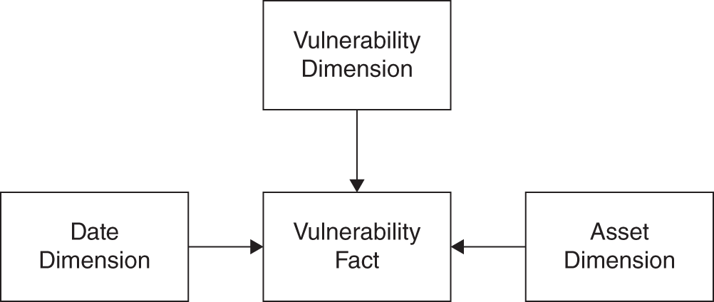
FIGURE 11.5 Vulnerability Mart
Conforming or shared dimensions allow you to connect data marts together to ask new and interesting questions. Probably the most popular conforming dimension is “date time.” The second most popular, at least in security, would be “asset.” Asset can be decomposed in a variety of manners: portfolio, application, product, server, virtual server, container, micro service, data, and so on. An asset represents value that gets protected by controls, attacked by malicious threats, and used for intended purposes by authorized users. To that end, you will likely want to have data marts related to the state of vulnerabilities, configurations, and mitigation. Each of those data marts may share the same concept of asset. That “sharing” across security domains is what allows us to ask both horizontal and vertical questions. Or, as we like to say in the BI world, conforming dimensions allow us to drill down and across.
In terms of a drill‐across use case, let's say you have a metric called “full metal jacket.” A full metal jacket, as shown in Figure 11.6, represents a series of macro‐hardening requirements for certain classes of assets. Specifically, you have KPIs in terms of least privilege (config), patch status, speed of mitigations to end points, and availability of blocking controls on the network. This is all really control coverage metrics in relationship to some concept of value (asset). The simple structure below would give you guidance in that regard. You could determine where you have completely unmitigated, known‐exploitable, residual risk versus what is controlled via configuration or mitigation.
What is missing from this model is some concept of “threat”: how well your macro concept of protecting value (full metal jacket) is doing against certain vectors of threat. Figure 11.7 is a simple extension of the model. In this case, you integrate your malware‐analysis data mart to your conforming data marts. This is simple because your malware mart conforms on asset and date.
This mart could answer hundreds if not thousands of questions about the value of various forms of defense against malware. For example, on the mitigation dimension, you could ask questions about the performance of host‐based versus inline defenses against spear phishing. Or, in the same vein, how often did application whitelisting have impact where all other controls failed—that is, is there a class of malware where application whitelisting is the last line of defense? (Note, application whitelisting is a control that only allows approved applications to run. Thus, if something malicious attempts to install itself or run, in theory, the application whitelisting control would stop it.) Is it increasingly the last line of defense, meaning other investments are deteriorating? Or are there new strains of malware that all your protections are failing at finding in a timely manner, thus hinting at a possible new investment and/or de‐investment opportunity? In short, are you getting the ROI on whitelisting you predicted when you modeled it as an investment? With models like this it becomes obvious which protections are underperforming, which stand out and deserve more investment, and which are retirement candidates, providing opportunity for new, innovative investments to address unmitigated growing risks.
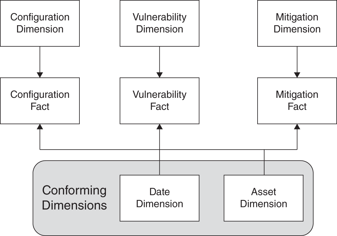
FIGURE 11.6 Expanded Mart with Conforming Dimensions
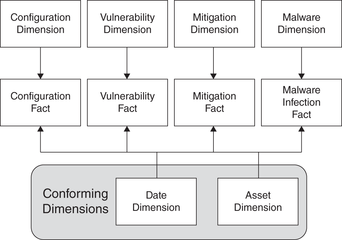
FIGURE 11.7 Malware Dimension
Interestingly, in dimensional modeling, a fact in a fact table is also known as a “measure.” They're called a measure because they measure a process at the atomic level. “Atomic” means you cannot decompose the event being measured any further. A typical fact in business would be the sale of some product such as a can of beans. The measure in this fact would be the sale price. You might want to know how much of a particular product you sold at a particular time and place. Additionally, you may want to watch its sales performance quarter by quarter. Perhaps you want to compare the profitability of a certain product versus another, given certain geographical markets and/or store placements, and so forth. This is all traditional BI.
What is a “security fact”? It is simply an event that happened. It could be that a firewall rule was changed, or it could be that an intrusion prevention system blocked a particular attack. It could be the state of a particular piece of software in a cloud application at a particular time. The point is that we are recording that an event (or state change) happened or did not happen. State could change by the millisecond or by the year. Because of this on/off metric, as opposed to a monetary measure, the security fact is said to be “factless.” You are essentially summing up a bunch of ones as opposed to dollars and cents. A fact table in the traditional sense would look something like Table 11.1 for a simple vulnerability data mart.
TABLE 11.1 A Fact Table with Multiple Vulnerabilities for One Asset at a Given Time
| Vuln_Dim_ID | Asset_Dim_ID | Date_Dim_ID | Event |
|---|---|---|---|
| 1 | 43 | 67987 | 1 |
| 2 | 43 | 67987 | 1 |
| 3 | 43 | 67987 | 1 |
| 4 | 43 | 67987 | 1 |
TABLE 11.2 Vulnerability Facts with Dimensional References Resolved
| Vulnerability | Asset | Date | Event |
|---|---|---|---|
| CVE‐2016–0063 | 10.0.10.10 | 1455148800 | 1 |
| CVE‐2016–0060 | 10.0.10.10 | 1455148800 | 1 |
| CVE‐2016–0061 | 10.0.10.10 | 1455148800 | 1 |
| CVE‐2016–0973 | 10.0.10.10 | 1455148800 | 1 |
In old‐school data marts the first three columns are IDs that are references to dimensional tables. You would sum(event) based on dimensional criteria. While perhaps going into a little optional technical detail, Table 11.2 is what that same data structure might look like with the IDs revolved (note that date is an epoch).
We have various CVEs, which is short for “common vulnerabilities and exposures.” The vulnerability dimension table would hold all the salient characteristics of the vulnerability that could additionally constrain a query. We have an IP address, but yet again there could be an additional 100 characteristics in the asset dimension we might use for our interrogation. Last, there is the timestamp.
A dimension is a decomposition of something of interest. It's a bunch of descriptive characteristics of some fact that allow you to ask many and varied questions. For example, in our asset dimension we could also have things such as operating system or service pack version. In fact, if storage is no object, you could in theory track a complete list of installed software and its versions related to a particular concept of asset over time. This asset could in turn become one or more data marts with facts that you track. You just need to be sure that you have an analytic that requires that level of decomposition. While BI is getting significantly easier, this is an area where useless decompositions can lead to a lot of wasted effort. Brainstorm with your stakeholders and shoot for agile results first. Apply the KISS principle (Keep it simple, stupid).
Table 11.3 is a small example of what a dimension object might look like; note that it could be 100 or more columns wide.
TABLE 11.3 Asset Dimension
| Asset_ID | IP | FQDN | OS | Type | Service Pack | BuildNum |
|---|---|---|---|---|---|---|
| 1 | 10.0.0.1 | thing1.foo.org | Win10 | Laptop | n/a | 14257 |
| 2 | 10.0.0.2 | thing2.foo.org | Win10 | Laptop | n/a | 14257 |
| 3 | 10.0.0.3 | thing3.foo.org | Win10 | Laptop | n/a | 14257 |
| 4 | 10.0.0.4 | thing4.foo.org | Win10 | Laptop | n/a | 14257 |
Now that we have covered some of the very basics of dimensional modeling, we are going to create a dimensional model. Our goal in this case is to keep the explanation simple, intuitive, and nontechnical. No need to create the dimensional model to rule the universe that anticipates any and all possible questions. You can add those values as you have need for them.
Dimensional Modeling Use Case: Advanced Data Stealing Threats
For this use case let's assume you developed a KPI around a new distinction you are calling “Advanced data stealing threats,” or ADST for short. Your definition of this threat is “malware that steals data and that your commercial off‐the‐shelf security solutions originally miss,” meaning the ADST is active for some time before your investments “catch up” and stop it. Let's assume you used Excel, R, or Python to do a quick analysis on a few samples of ADST over the last year. Specifically, you performed what is called a “survival analysis” to get the graph shown in Figure 11.8.
What is survival analysis? (See Chapter 9.) It's the analysis of things that have a life span for which there is eventually some change in status inclusive of end of life. While survival analysis originates in the medical sphere, it has application to engineering, insurance, political science, business management, economics, and even security. The heart of survival analysis is the survival function. In our case, this ends up being a curve that maps a time variable to a proportion. This way we can make inferences about the life expectancy of certain phenomena, such as ADSTs.
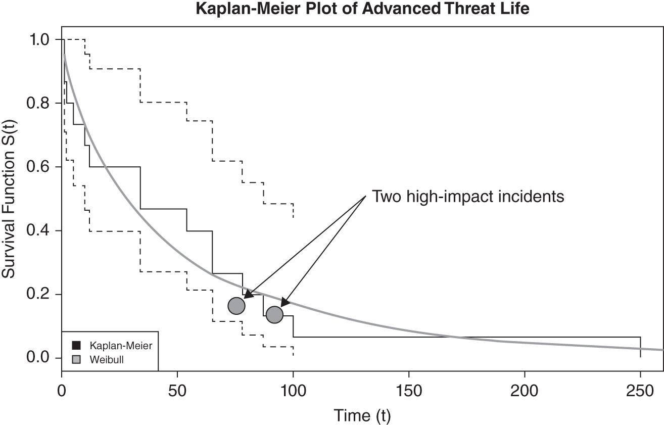
FIGURE 11.8 Days ADST Alive Before Being Found
Note the two instances called out, where financial impact occurred. For a lack of better options you decide you want to “improve the overall curve,” particularly in relationship to those two losses. So your KPI becomes “Improve on 20% of advanced threats surviving for 70 days or greater.” You have decided that this is something that you should be measuring closely for the foreseeable future. (This is indeed something we do recommend measuring as a fundamental security metric.)
We will need to list the “dimensions” we have and how they support an ADST survival analysis mart (see Table 11.4). We want to know whether our capabilities are effectively stopping ADST. Is there an opportunity to optimize a particular solution? Is one vendor outperforming others, or is one lagging?
TABLE 11.4 ADST Dimension Descriptions
| Dimension | Description |
|---|---|
| Asset | An asset could be a computer, an application, a web server, a database, a cloud service, a portfolio, or even data. While it's tempting to capture every potential jot and tittle related to the concept of an asset, we recommend only selecting a minimal subset of fields to start with. To that end, we're looking to focus on the end user's system. This is not to say that server‐class and/or larger applications are out of scope over time. Therefore, this dimension will solely focus on desktop and laptop computers and/or any other systems on the network that browse, get mail, and so forth. |
| HTTP Blocked | This is a list of all known bad‐reputation sites that your reputation systems are aware of. At a previous engagement we built a dimensional table for this same purpose that tracked pure egress web traffic. It was well over 100 billion records. This sort of table that just logs endlessly and is used to create other dimensions is formally called a “junk dimension.” The idea is that you are throwing a lot of “junk” into it without much care. This “junk dimension” looks backward in HTTP history to see when a particular asset first started attempting communication with a now known malicious command‐and‐control server. |
| Vulnerability | This is a standard vulnerability dimension, typically all of the descriptive data coming from a vulnerability management system. Perhaps it's something coming from a web application scanner such as Burp Suite or some other form of dynamic analysis. One of the authors has built vulnerability dimensions well in excess of 50 fields. |
| Configuration | We put this here as a loose correlation, but the reality is that this would be a drill‐across for meta metrics. This is why there is a dotted line in the dimensional model in Figure 11.9. You could have 100–200 controls per control area be it OS, web server, database, and so forth. If you have 100,000 assets, and you track changes over time, this would certainly be in the several hundreds of millions of records quickly. |
| Mitigation | This is a complete list of all dynamic blocking rules from various host and inline mitigating controls and when they fired in relationship to the ADST. |
| Malware | A list of all malware variants that various malware systems are aware of. Antimalware could in theory be lumped into mitigations, but it is a large enough subject that it likely warrants its own mart. |
The data mart as shown in Figure 11.9 leverages the existing marts and brings in HTTP‐related data from web proxies. This mart would suffice for complete ADST analysis.
In looking at Table 11.5, you can see how simple our fact table ends up being. Dimensions tend to be wide, and facts are relatively thin. Here is how the fact table works:
- If mitigation is responsible for blocking, then the mit_id field will be populated with the ID of the particular mitigation vendor solution that was responsible for thwarting the attack; otherwise it will be 0. The mitigation ID points back to the mitigation dimension.
- If malware defense is responsible for closure, then the mal_id will be populated with the ID for the particular piece of antimalware coming from the malware dimension.
- The http_id points to the URL for the particular command‐and‐control server that the asset was attempting to talk to at the time of being thwarted.
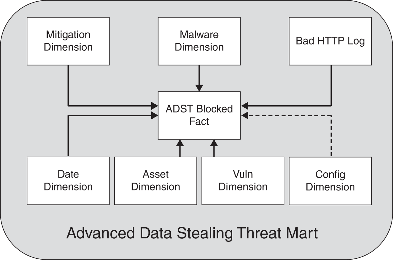
FIGURE 11.9 ADST High‐Level Mart
TABLE 11.5 ADST Blocked Fact
mit_id mal_id http_id date_http_start_id date_http_end_id asset_id vuln_id - date_http_start_id points to the date dimension indicating when the ADST was first noticed. Nine times out of ten this will require querying back through HTTP logs after the mitigation system and/or the malware system becomes aware of the threat. This is easily automated, but as previously stated the logs would likely be in a big data system.
- date_http_end_id would be the same as the previous but for when the ADST was thwarted.
- asset_id points to the asset in question.
- vuln_id is populated if there is a correlation to a known vulnerability. If it is the only populated ID, other than the date and asset fields, then it would indicate that a patch was responsible for thwarting the ADST instance.
Modeling People Processes
Dimensional models are perfect for security metrics because they are designed to measure processes, and security absolutely is a process. Of course the ADST use case is a technical process. But what if you have a need to measure processes that are more people based? What if the process has multiple gates and/or milestones? This, too, is easily modeled dimensionally. This particular type of model is called an “accumulating snapshot.” What you “accumulate” is the time that each process phase has been running.
From a security perspective this is key for measuring pre‐ and post‐product development, remediation activity, or both. For example, if you have implemented a security development lifecycle program (and we hope you have), then you will likely want to measure its key phases. The macro phases are secure by design, secure by default (development), and secure in deploy. And it does not matter if you are using waterfall, agile, or a mix of both that looks more “wagile.” You can instrument the whole process. Such instrumentation and measurement is key if you are operating in a continuous integration and continuous development (CICD) context. CICD supports an ongoing flow of software deploys daily. New development and remediation occur continuously. This is one of many functions that can and likely should be dimensionally modeled, measured, and optimized ad infinitum.
In Figure 11.10 we have a high‐level logical accumulating snapshot for security remediation. It could be one large data mart across a variety of risks or associated with a particular risk type. For example, one of these could model system vulnerability remediation, perhaps another could model web application remediation, and so forth. The risk dimension is just a generalization for any sort of vulnerability type that could be substituted here. “Asset” also is generalized. It could be an application, service, or perhaps even an OS. The remediation dimension presupposes some sort of enterprise ticketing system that would contain a backlog of items, including data on the various people involved with the remediation. Time is the most complex in this case.
You can see that there are four gates that are measured and one overarching gate. There are well over 20 dates associated with this measurement. In each of the five groups there is a final field such as: “Days_Existing” or “Analysis_Days_Reviewing.” These are accumulators that add days by default while something is still open and then stop when the final data field for each area is filled in with a date. The accumulator makes for much faster queries and additional aggregates when analyzing remediation processes.
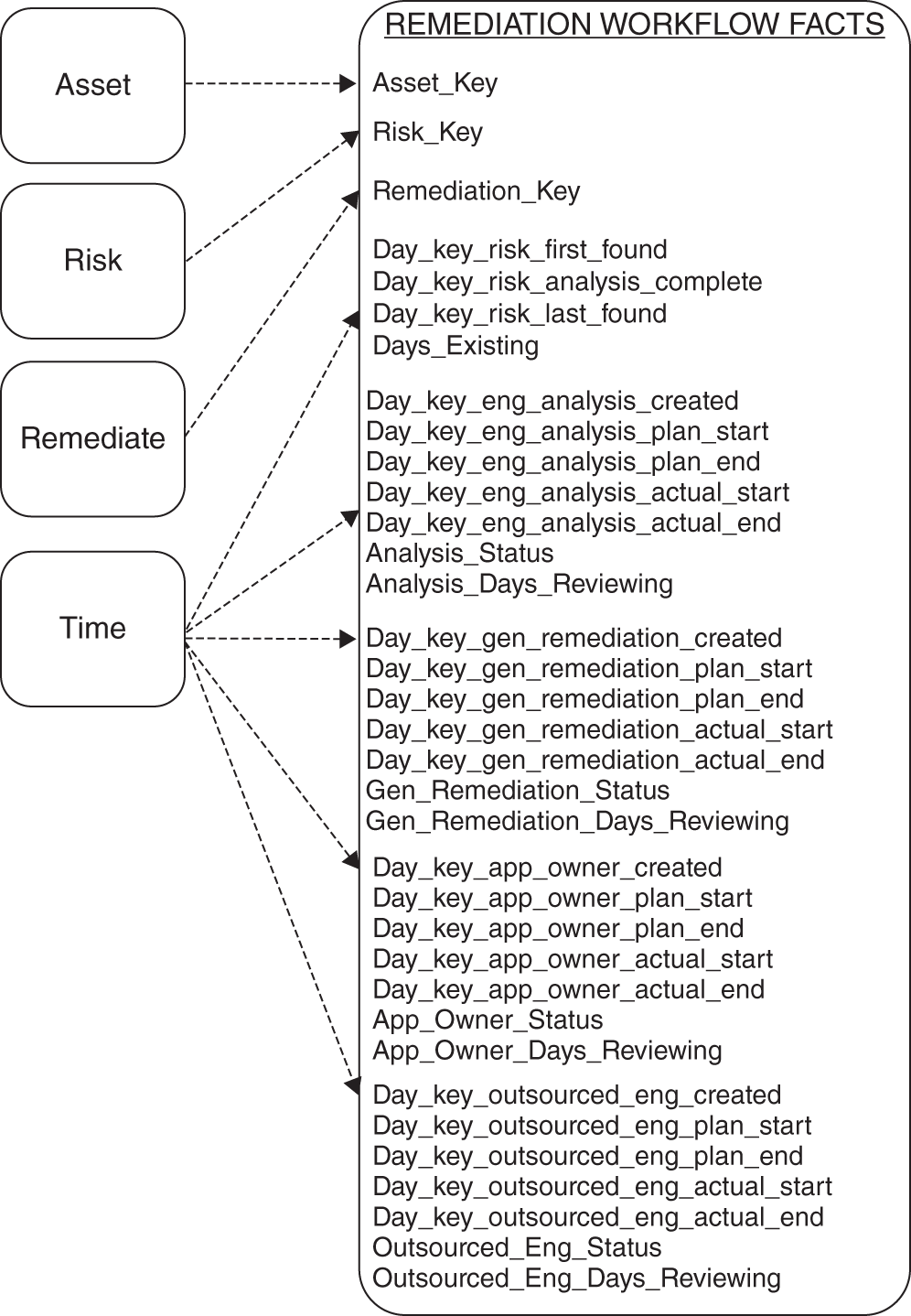
FIGURE 11.10 Remediation Workflow Facts
This model becomes a simple template that can be reused to model a number of security processes with multiple steps. It leverages dimensions that you use to model your technical solutions as well. Thus we stay close to the KISS principle, agility, and reuse.
Conclusion
In this chapter we provided a very brief glimpse into a powerful logical tool for approaching operational security metrics: dimensional modeling. This level of metrics was little practiced when this book was originally published. It's now all in reach thanks to advances in cloud computing, open source development, and comprehensive solutions such as Snowflake. We think analyzing the effectiveness of your investments is a close second to using predictive analytics when deciding on investments. We, in fact, would say that you are giving advantage to both the enemy and underperforming vendors when you don't go about measuring operations this way. High‐dimensional security metrics should become the main approach for measurement and optimization. This chapter attempted to explain, at a very high level, this much‐needed approach for cybersecurity metrics. Our hope is that your interest has been piqued.
The final chapter will focus on the people side of “cybersecurity risk management” for the enterprise. It will outline various roles and responsibilities and give perspectives for effective program management.
Notes
- 1. M. Samuel, How Jetblue's Integrated Use of Snowflake and Fivetran Is a Model for the Modern Data Stack, VentureBeat. VentureBeat. Available at: https://venturebeat.com/data-infrastructure/how-jetblues-integrated-use-of-snowflake-and-fivetran-is-a-model-for-the-modern-data-stack/ (Accessed: November 5, 2022).
- 2. Case study: CSAA's Data‐Driven Security Transformation With Snowflake. Available at: https://resources.snowflake.com/financial-services/csaas-data-driven-security-transformation-with-snowflake (Accessed: November 5, 2022).
- 3. Workday ETL: ETL | Data Integration. Available at: https://www.fivetran.com/connectors/workday (Accessed: November 5, 2022).
- 4. ServiceNow ETL: ETL | Data Integration. Available at: https://www.fivetran.com/connectors/servicenow (Accessed: November 5, 2022).
- 5. Understanding Data Vault 2.0 (2022), DataVaultAlliance. Available at: https://datavaultalliance.com/news/dv/understanding-data-vault-2-0/ (Accessed: November 6, 2022).
- 6. Maxime Beauchemin (April 6, 2021), Use Apache Superset for Open Source Business Intelligence Reporting, Opensource.com. Available at: https://opensource.com/article/21/4/business-intelligence-open-source (Accessed: November 6, 2022).
- 7. Building a Modern Batch Data Warehouse Without Updates (no date). Available at: https://towardsdatascience.com/building-a-modern-batch-data-warehouse-without-updates-7819bfa3c1ee (Accessed: November 6, 2022).