Chapter 13: Setting Logo Usage Guidelines
The logo is complete, now what? Do you just let the client ride off into the sunset with your design and let them slap the logo on anything they want? The answer is no, not without guidance to ensure that the identity you’ve created remains consistent. Your involvement in a logo design doesn’t end when the files are ready to be given to the client. The final stage in the process is setting logo usage guidelines.
If you’ve designed logos in the past, the client may have made some changes to your final artwork after you handed over the deliverables. They might have added a new obscure font because “we found it online and it looks really cool!” They might have even changed the colors because they think “it pops.” Seeing your work treated in such a way can be demoralizing (not to mention ruin the identity you created), but you can prevent these situations with logo usage guidelines.
Logo usage guidelines will be useful to anyone who needs to use the logo, now or in the future—including other professionals within the creative industry. The client may hire another designer or design team down the road; if so, the client should give the new designer your logo usage guidelines to make sure that his decisions conform to the identity. Printers also may refer to the guidelines if they’re not sure which color reproduction method to use and which inks to select.
The Purpose of Logo Usage Guidelines
Imagine you’ve just purchased a new piece of technology. In the box, you find a detailed instruction manual that tells you how to use the device. Logo usage guidelines are no different—they’re a way for you, the designer, to communicate to your client how to use the logo you’ve designed for them.
Logo usage guidelines offer the following benefits:
• They help to guide and educate anyone who uses the logo about the design choices you made. Most of your clients won’t have a design background, so they may not realize that every decision you made when it comes to the logo was made for a specific reason. If they’re aware of how much thought went into your design, they’ll be less likely to tinker with it.
• They improve the efficiency and consistency for any future design work carried out using the logo. If, down the road, any design professionals need to work with the logo, regardless of the medium, you can be assured that the brand identity will remain consistent.
• They help to ensure regulated reproduction both on-screen and in print. Providing different color values for at least RGB and CMYK ensures that the output for each medium will look as similar as possible.
• They provide a more professional service and package for the client. When you design a logo and e-mail it off with a simple “Nice working with you!,” you’re not communicating the same message as you are when you include detailed logo usage guidelines. If you provide guidelines on the logo’s usage, the client will see you as the professional designer you are and respect the work you’ve done.
• They prevent possible design disasters that are beyond your control. This includes printers playing around with the dimensions or color values used in the logo, or clients applying the logo in such a way that it isn’t even close to the original design that you created.
• They enhance competitive advantage. Usage guidelines ensure that the identity remains regulated, which will in turn make it look more professional than the identities of competitors who don’t employ logo usage guidelines.
Consistency is key when it comes to brand identity, and logo usage guidelines help your client to achieve that consistency for years to come. Have you ever noticed that the logos of the world’s biggest brands always look the same, no matter where you see them? Whether you’re looking at the Coca-Cola logo on the side of a can or on a roadside billboard, the logo looks the same. This isn’t a coincidence.
Part of what you want to do in working with your client—from the beginning of the design process to the end—is sell them on the importance of consistency. That way, when you present the client with the logo usage guidelines, you can remind them that this document will help them achieve the same consistency that the world’s biggest brands achieve.
A consistent brand identity increases recognition. A logo that’s used inconsistently can cause confusion for the audience. Logo usage guidelines help to provide a springboard for future brand development and identity exploration and adaptation. They’re the basis for, rather than the overall scope of, the rules and regulations concerning the visual identity.
Essential Components
I’ve sold you on the purpose and importance of logo usage guidelines. So, now all you need to know is what to include in the guidelines you write. In this section, I walk you through the contents. For readability, I recommend that each of these components be given its own page in your document.
Note: If you’re designing a brand, not just a logo, you’ll probably need to design brand guidelines instead. Those will be much more detailed, including elements that go way beyond the logo. Brand guidelines include specifications for logo usage. Even if someone else is working on the wider brand identity, you should provide advice for optimal visual performance of the logo.
Front cover
A front cover, which clearly explains the purpose of the document and contains the logo, helps distinguish your guidelines from the average piece of office paperwork (see Figure 13-1).
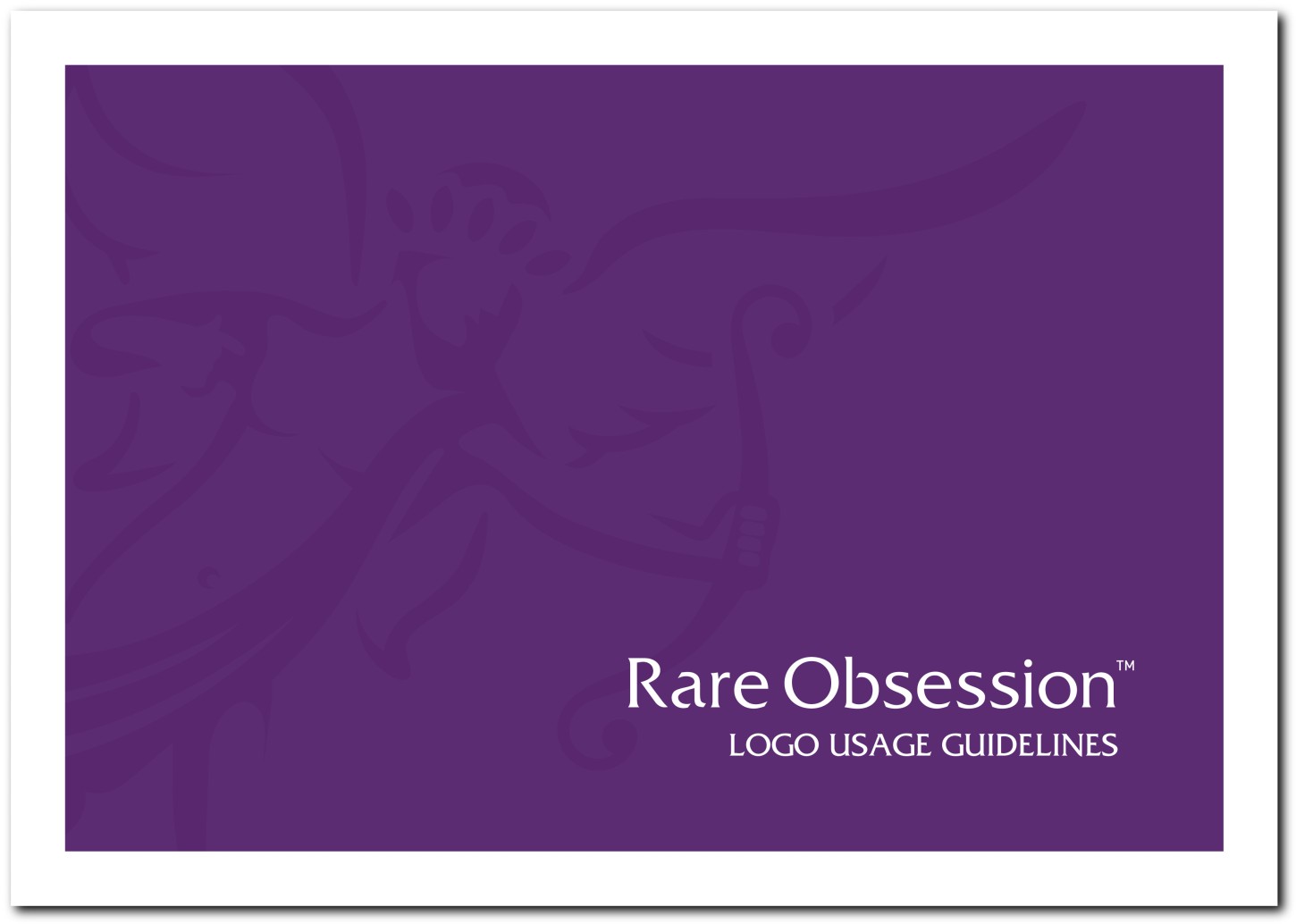
Figure 13-1: The front cover.
Table of contents
Including a table of contents helps people find the information they’re looking for. Your goal is to make the guidelines as easy to use and understand as possible, and a table of contents helps you reach that goal (see Figure 13-2).
Brandmark
Clients don’t always realize that the whole artwork provided for the creation of the logo is the defined artwork that should not be tampered with. The brandmark section of your guidelines (see Figure 13-3) should
• Confirm the exact elements of the logo
• Explain that, if type is used in the logo, it is not a font but an original piece of artwork, and should not be replaced by using a font
• Confirm that the dimensions of the artwork should not be changed
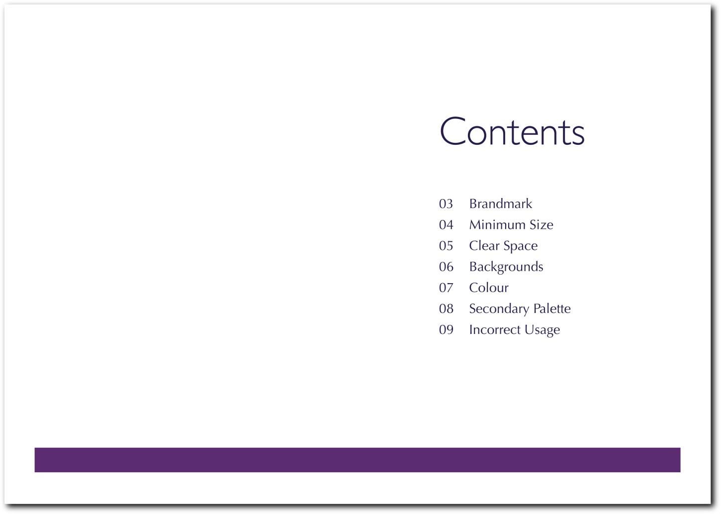
Figure 13-2: The table of contents.
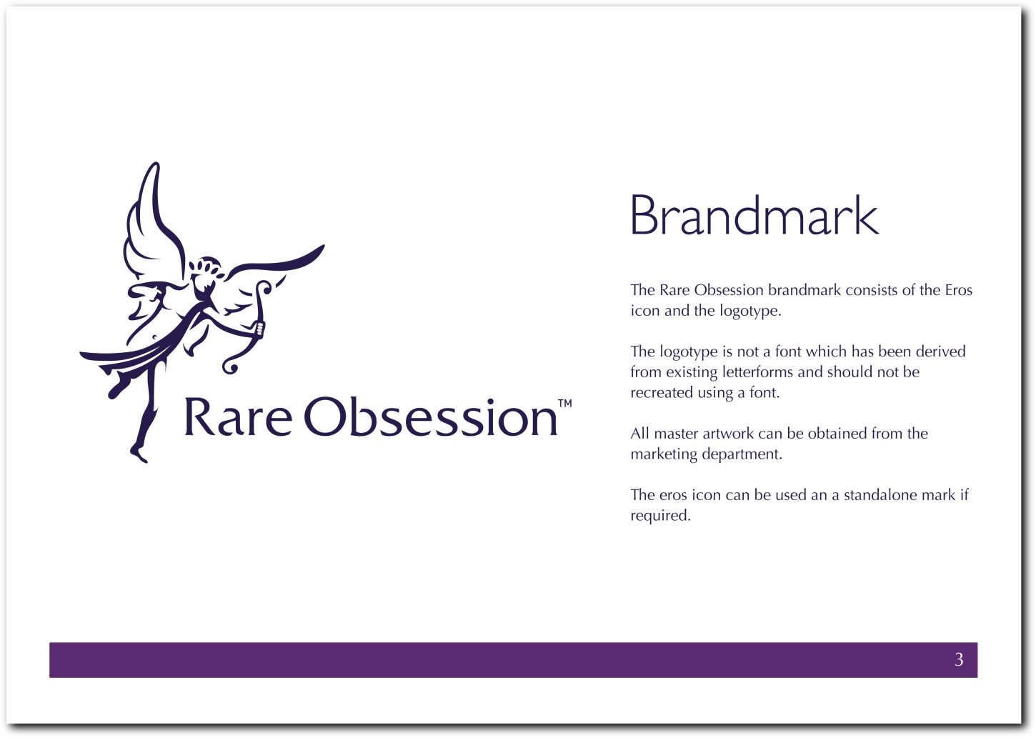
Figure 13-3: What is classed as the official logo.
Minimum size
If the logo is decreased in size too much, it won’t be recognizable to the human eye. A logo that cannot be recognized is pointless. That minimum size is different for every logo, but the average minimum size is 45 millimeters for the whole brand mark. If your logo uses only an icon, as is this case for Apple, then the minimum size may be smaller. Be sure to define the minimum size in your logo usage guidelines (see Figure 13-4).
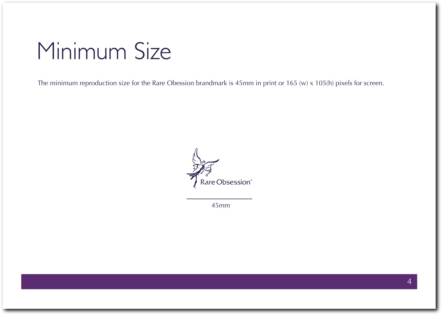
Figure 13-4: The smallest size at which the logo can be reproduced.
Clear space
Clear space (also known as white space) is your friend. Imagine a situation where numerous logos are shown in one given space—for example, on the sponsorship board for an event. Each logo is screaming out for attention, and if they’re all extremely close together, the audience will have trouble recognizing each brand individually.
A minimum amount of clear space should be defined so that the logo has room to breathe and is easily identifiable in its own right, wherever it appears. This defined clear space helps to protect the integrity of the brand not only from competing logos but also from any assisting graphics, copy, or photography. The clear space should be proportionally maintained as the logo is increased or decreased in size. Giving an exact measurement in figures will be harder to work out, so minimum clear space often is measured in proportion, using an element of the logo for reference (see Figure 13-5).
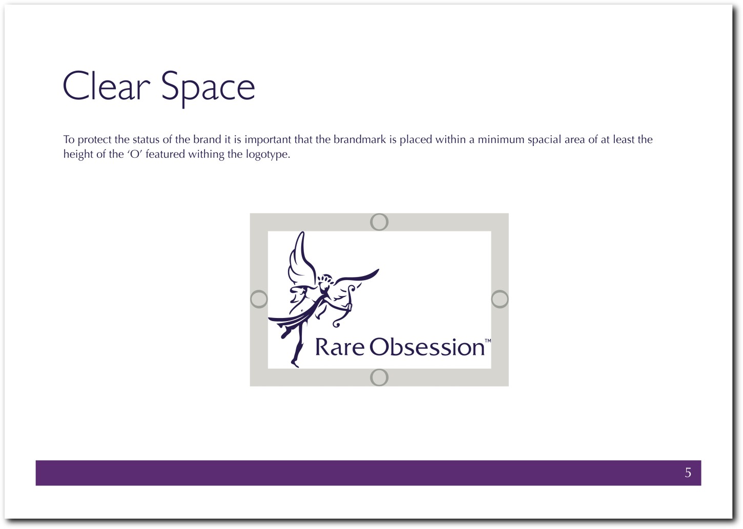
Figure 13-5: The minimum clear space that should be allowed from the logo artwork.
Backgrounds
The logo may need to be reproduced on different types of backgrounds, so you should give guidelines for the following (see Figure 13-6):
• Whether a background color is part of the main logo
• Flat color options for background or gradients, if required
• Whether a photograph may be used as a background
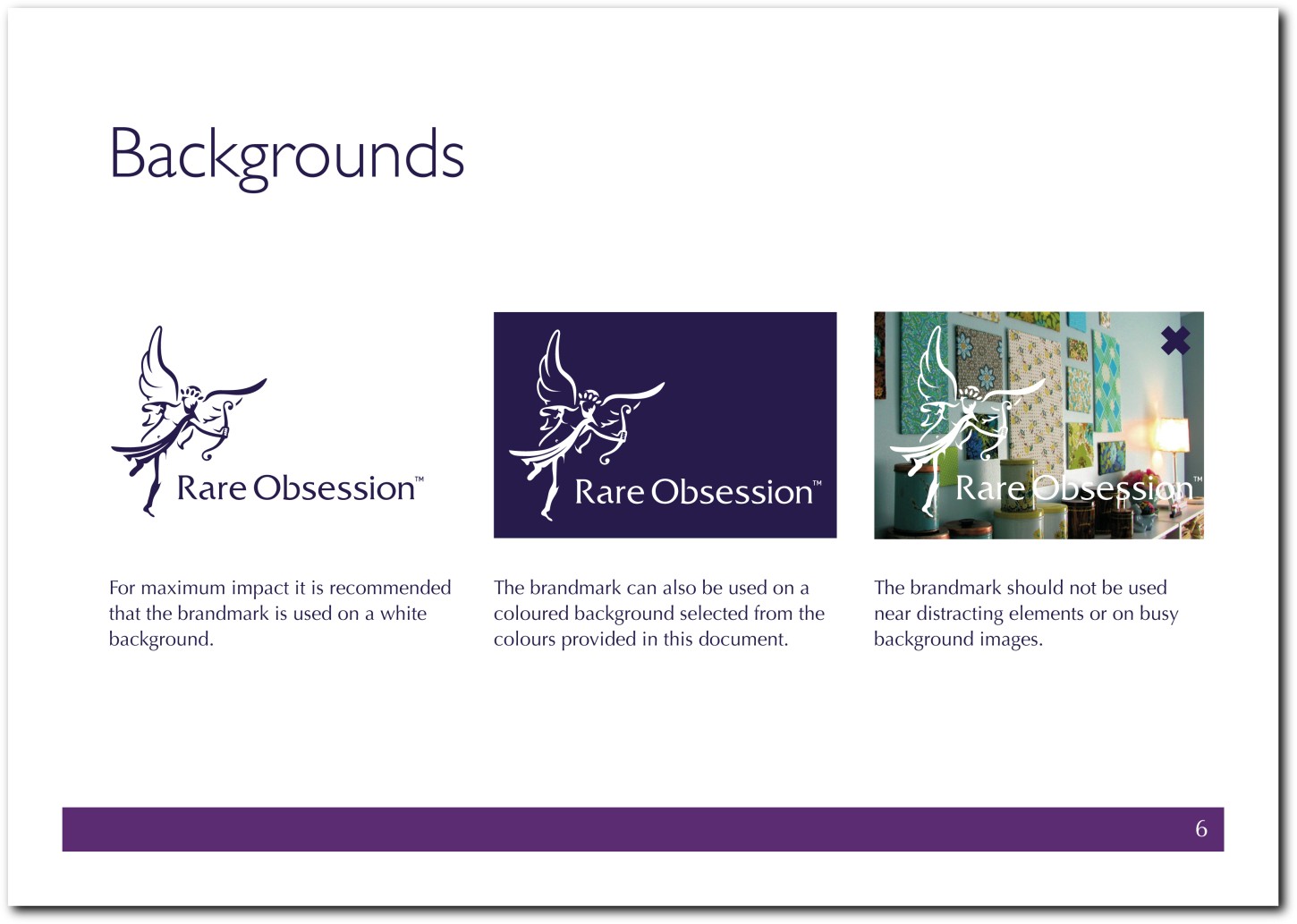
Figure 13-6: Logo usage on different backgrounds.
Color
In Chapter 7, I explained that there are different types of output for color, so in the logo usage guidelines, you should provide the different values for each medium and method. You can’t assume that the client will always be able to print using Pantones, so you should also provide four-color process values.
Provide color values in the following formulas:
• RGB: For screen usage composed of red, green, and blue
• Hex: For use on the web
• Pantones: For printing with Pantone inks
• CMYK: For four-color process printing comprised of cyan, magenta, yellow, and black, when Pantones are not available
Provide instructions for the use of each different color output—your client may not have heard of them (see Figure 13-7).
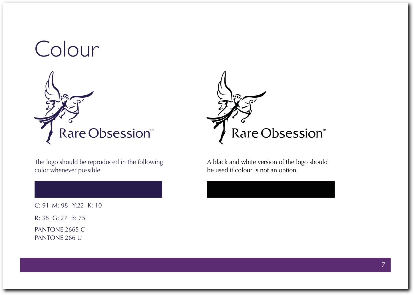
Figure 13-7: The color values of different color modes and printing methods.
Secondary palette
You may want to provide examples of how other colors can be used to help support the logo (see Figure 13-8), but this isn’t required—it’s more relevant to brand identity guidelines. Even if you aren’t designing the whole brand identity, you can still make suggestions about what colors to use. This will help prevent the client or another design team from making a choice that conflicts with all your previous decisions.
Incorrect usage
There are right ways and wrong ways to use a logo. Show as many incorrect uses as possible so that you clearly communicate what can and can’t be done (see Figure 13-9). In particular, be sure to show examples of incorrect usage concerning:
• Scale and perspective
• Color
• Orientation

Figure 13-8: Examples of optional colors.
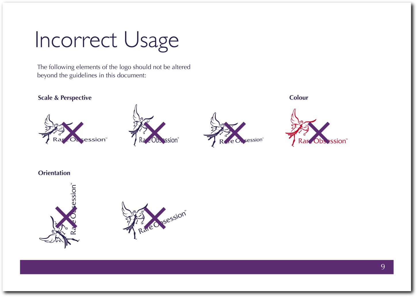
Figure 13-9: Examples of incorrect logo usage.
The format of the guidelines: Screen or print?
What output should the logo usage guidelines be designed for: screen or print? Designing for print is common sense, because the resolution won’t affect how the logo looks on-screen.
I always provide the guidelines in both hard copy and as a digital file that can be shared easily with future users. This way, the client can always reproduce copies of the guidelines down the road. As with the logo source files themselves, keep a copy of the guidelines so that you can update the guidelines in the future, if necessary.
