Chapter 2: Types of Logos
Logos can take on many different forms, from pictures to words to abstract symbols. Graphics allow designers to be expressive in a variety of ways. This freedom of expression translates into the logos that you see every day. Each different type of logo offers advantages and disadvantages to both the designer and the person, product, or organization that the logo identifies. In this chapter, I walk you through the main types of logos and what they’re most useful for.
Pictorial Marks
Pictorial marks are drawings—everything from simple line drawings to detailed illustrations—that use a form of literal imagery as the identifier. Pictorial marks make a quicker connection with the audience through already recognizable images. They often require no explanation, regardless of the language or culture.
The one downside to pictorial marks is that they often require assisting typography to get the message across. That said, some of the larger brands have dropped the typography from their logos altogether. This is becoming a popular trend and one that only helps to simplify the design, in addition to making it more memorable and iconic. As I was writing this book, the international coffeehouse chain Starbucks announced that its logo would be displayed free of type.
Perhaps the most popular and well-known logo that’s a pictorial mark is the logo for Apple. Believe it or not, Apple hasn’t always used such a clean and literal image to help translate the brand name. The first Apple logo featured a heavily detailed illustration of Sir Isaac Newton sitting under a tree with a single apple hanging from a branch directly above his head, alluding to Newton’s groundbreaking discovery of the law of gravity. Steve Jobs, co-founder of Apple, recognized that the logo was far too detailed and wouldn’t match the brand image of the company, so he employed the services of Rob Janoff to create a simpler and more iconic mark. Janoff’s final outcome (see Figure 2-1) is a clear representation of an apple with the bite mark on the side to help distinguish the image from that of a tomato.
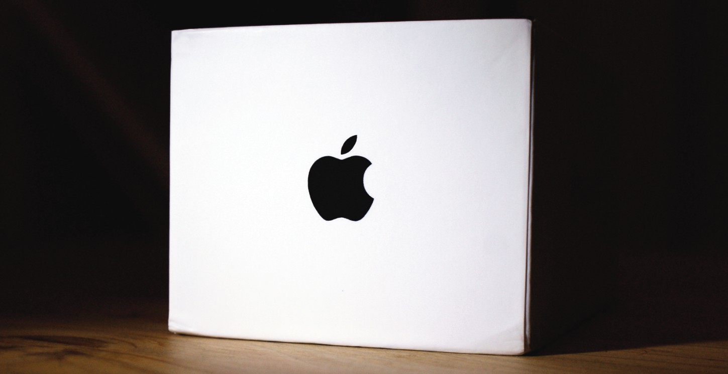
Figure 2-1: The Apple logo, designed by Rob Janoff (www.robjanoff.com).
Photo by Charlotte Morris
Craig Russell, a designer from Melbourne, Australia, chose to implement a pictorial mark for Driving for Charity (see Figure 2-2), a harness-racing charity. The pictorial mark shows this connection between animal and competitor. The simple icon isn’t a literal representation, but it also isn’t so abstract that it’s unrecognizable as an illustration of a horse rider.

Figure 2-2: The Driving for Charity logo, designed by Craig Russell (www.craigrussell.com.au).
Josiah Jost, of Alberta, Canada, designed the new logo for Undersea Productions (see Figure 2-3), an Australian company specializing in underwater imaging. Jost spent some time studying sea life, including footage provided by the company, and noticed the connection between circling fish and an aperture, which, when combined, form the perfect image for underwater photography. The effect makes the viewers feel like they’re at the bottom of the ocean, instantly connecting them to the workplace of Undersea Productions.
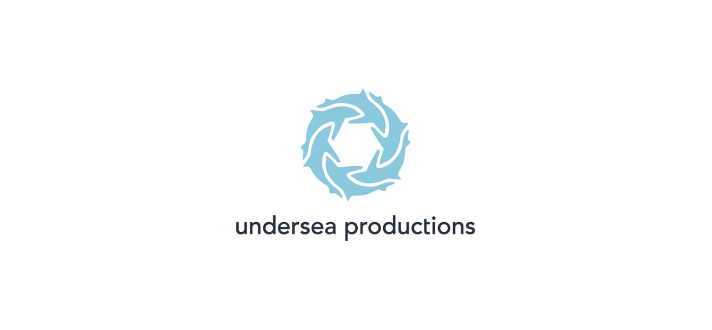
Figure 2-3: The Undersea Productions logo, designed by Josiah Jost (www.siahdesign.com).
Abstract and Symbolic Marks
Abstract and symbolic marks consist of a nonliteral interpretation of a concept, idea, or belief held by the identifier (the organization or individual whom the logo represents). Because they’re indefinite, abstract and symbolic marks often rely on geometric shapes, designed with careful precision. Abstract and symbolic marks provide limitless avenues for creativity. They can tell a story. On the downside, abstract and symbolic marks might make less of a connection with the audience because the imagery they employ isn’t immediately recognizable. Plus, it’s often difficult to find a unique solution that works.
The world-famous Nike Swoosh logo (see Figure 2-4) is perhaps one of the most recognized abstract and symbolic marks. The original logo was designed in 1971 by Carolyn Davidson, who infamously charged only $35 for her graphic design service. The name Nike is taken from the name of the winged goddess in Greek mythology. The simple Swoosh is a symbol of the wing of the goddess, who exemplifies victory; this ties in with a company that originally started as a manufacturer of running shoes. The logo also was meant to inspire athletes to run faster, with the movement it suggests.
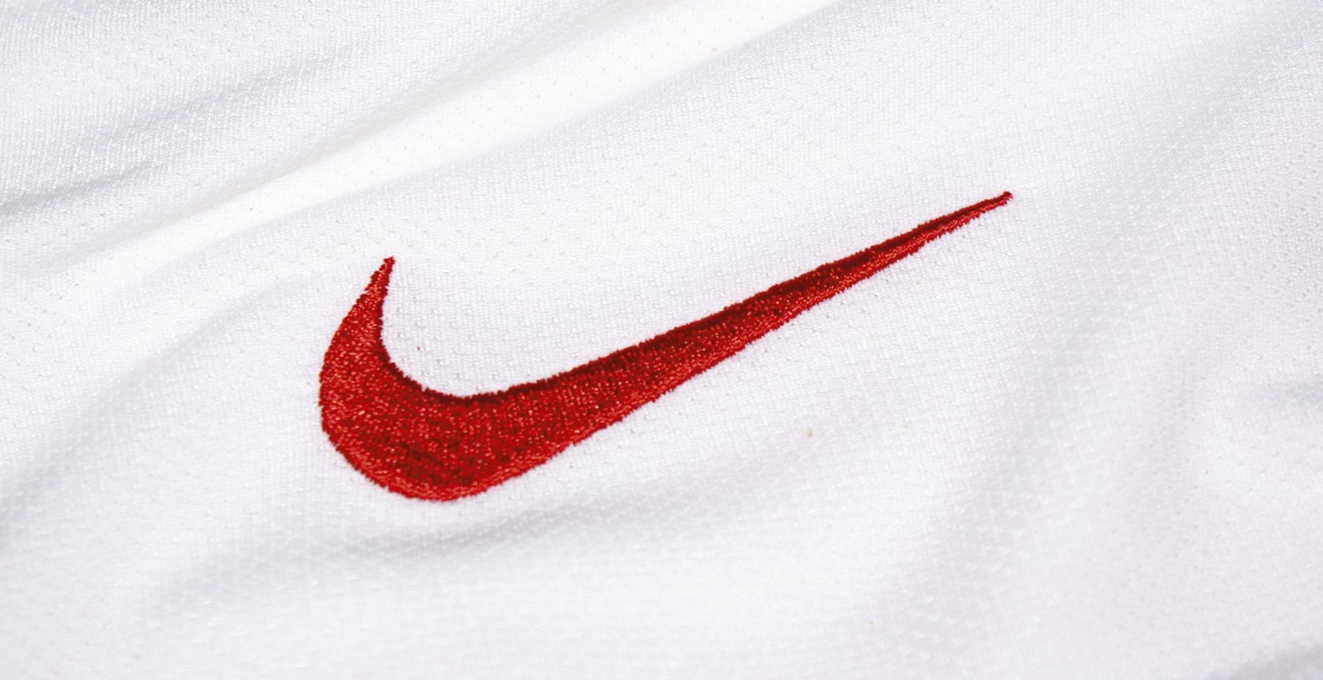
Figure 2-4: The Nike Swoosh logo, designed by Carolyn Davidson.
Photo by Charlotte Morris
The logo for Adimurti (see Figure 2-5), a company that sells yoga-related products, was designed by Sergey Shapiro, a graphic designer from Moscow, Russia, who specializes in identity. The symbol evokes a feeling of three people coming together to practice yoga in a calming environment. The mark also could be viewed as a very abstract initial A.
Figure 2-5: The Adimurti logo, designed by Sergey Shapiro (www.fromtheska.ru).
Brandberry, an award-winning design company based in Samara, Russia, designed an abstract mark for Idealogy (see Figure 2-6), which is the first official school of strategic communications in social media in Russia. The colorful random shapes within the mark symbolize the fast-paced, ever-changing online world that social media has helped to create.
Figure 2-6: The Idealogy logo, designed by Brandberry (www.brandberry.net).
Emblems
An emblem is an amalgamation of a surrounding shape and the name of the identifier. Emblems can be simple enclosures that capture stylized lettering or intricately illustrated motifs. They’re wisely used to help identify sports teams and prestigious organizations (possibly tied to the use of family crests by English monarchs). Emblems help to give people a more personal relationship with the brand, especially if they represent teams or clubs. On the downside, they don’t scale well if they’re extremely intricate.
Emblems also work extremely well on the packaging of foods. One food product that is well known for its intricate emblem is Lyle’s Golden Syrup (see Figure 2-7). The emblem is one of the oldest brands in the United Kingdom. First launched in 1904, the packaging and logo have changed only marginally since, which helps to give the product a brand image of great esteem.

Figure 2-7: The Lyle’s Golden Syrup logo.
Photo by Charlotte Morris
Alan Oronoz, an identity designer and illustrator from Chihuahua, Mexico, used a crest logo for Agralot (see Figure 2-8) to create a friendly image, including an illustration of the product that Agralot sells.
Figure 2-8: The Agralot logo, designed by Oronoz Brandesign (www.alanoronoz.com).
John Boerckel, a professional graphic designer working in Philadelphia, was asked to design a new logo for Kennedy’s American Barber Club (see Figure 2-9). The coupling of a recognizable image of a pair of scissors with assisting decorative elements drawn in a traditional style instantly makes you think that the barber club is an established organization.
Figure 2-9: The Kennedy’s American Barber Club logo, designed by John Boerckel (www.johnboerckel.com).
Characters
Characters are more prevalent among institutions and clubs. Businesses that include characters in their logo are typically seen as more fun and not so serious. Characters can invoke humor and remind us of our childhoods because of the cartoon-like illustrative style. A character in a logo can go on to have its own identity and become an official mascot of the company or organization itself. Characters can build strong connections with audiences (especially younger ones), help to support a friendly brand image, and foster brand loyalty. They can be used as the major element in marketing campaigns. On the downside, they might be seen as creating a juvenile brand image, they aren’t suitable for every brand. Therefore, the style or nature of the character needs to be chosen carefully.
Monopoly, the popular board game made by Parker Brothers (a subsidiary of Hasbro), has used a character as part of its logo since 1936. Mr. Monopoly (see Figure 2-10), who was originally named “Rich Uncle Pennybags,” was introduced to use the power of branding to full effect. Mr. Monopoly—a recognized character that is instantly associated with the product—is still in use today.
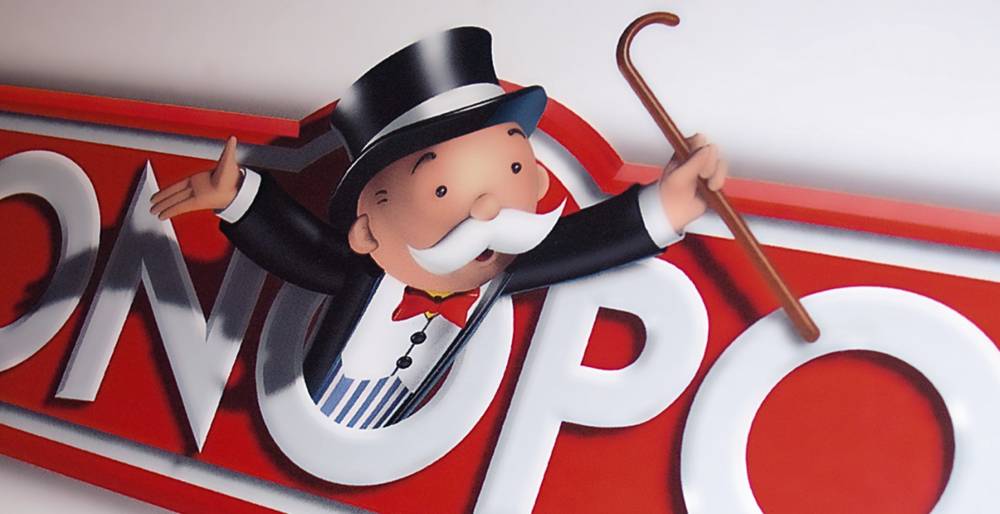
Figure 2-10: The Monopoly logo.
Photo by Gareth Hardy
Burn Creative, of Carlisle, Pennsylvania, created an illustrated character for the Carlisle High School Thundering Herd (see Figure 2-11). It serves as the identity for all the school’s sports teams. The charging character not only raises team spirit but also just might put a little fear into opposing teams.

Figure 2-11: The logo of the Carlisle High School Thundering Herd, designed by Burn Creative (www.burncreative.com).
Brandberry designed a unique kingfisher character illustration for Alcedo Media (see Figure 2-12). Alcedo is a genus of the Alcedinadae (river kingfisher) family, and kingfishers are rarely sighted birds. The choice to illustrate the kingfisher character in a modern style helps Alcedo Media to become distinguishable—it’s not the type of logo you would commonly associate with a media company, but it’s directly tied to the company name.

Figure 2-12: The Alcedo Media logo, designed by Brandberry (www.brandberry.com).
Typographic
Words and letters can help to translate a message and convey a sense of style in the same way that pictures can. Typographic logos have played an enormous part in the history of logo design. If you look at some of the oldest logos, you’ll notice that they primarily utilize type. Some of the earliest logos even had type blocks cut specifically so that they could be reproduced easily. Type can be used in a variety of ways in today’s logos.
Wordmarks
A wordmark is a logo that displays the name of a brand or individual in a text-only graphic representation. The style of the type can be an existing font that has been tweaked or a custom-designed typeface that has been drawn from scratch. Wordmarks increase the chances of the logo being original, because it focuses on the name of the identifier. Plus, a wordmark can help to form recognition for a new brand name. A potential drawback to wordmarks is that, if they’re too simple, their identifiers may struggle for recognition.
One of the world’s oldest and most famous brands, Coca-Cola, uses a wordmark for the logo of its product, a carbonated soft drink (see Figure 2-13). The logo was designed by Frank Mason Robinson in 1885 and has hardly changed since, with only marginal improvements made to ensure that it performs well in all applications. The old-school script style of the wordmark adds character and still stands out more than a hundred years after it was first introduced.

Figure 2-13: The Coca-Cola logo, designed by Frank Mason Robinson.
Photo by Charlotte Morris
Mads Burcharth, a type-obsessed designer from Odense, Denmark, designed an elaborate new wordmark for Wallen, a Danish jewelry designer (see Figure 2-14). The flowing letterforms in a classic script style help to portray an elegant and luxurious brand image, which reflects the quality of the products that Wallen offers.
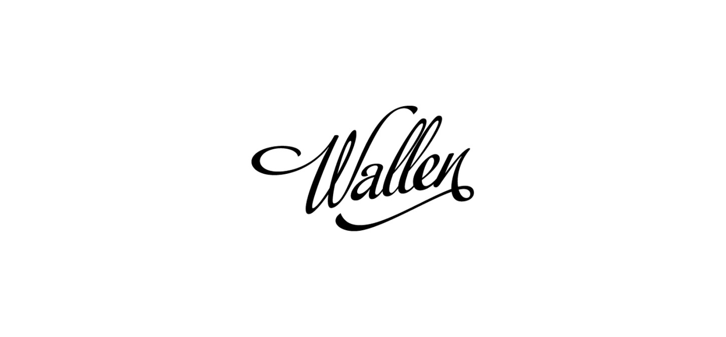
Figure 2-14: The Wallen logo, designed by Mads Burcharth (www.mabu.dk).
Recently, I was asked to design the logo for RXTR (see Figure 2-15), a new international, modern yet elegant fashion brand. The brand image of RXTR is aspirational yet achievable, falling in line with the words rock star, which the acronym RXTR suggests. I created the letterforms from scratch and decided to make small cuts to the R in particular, which creates distinction and improves the flow by matching the same angle of the slope on the X.
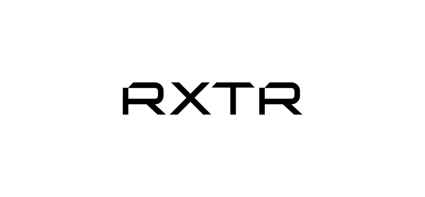
Figure 2-15: The RXTR logo, designed by Gareth Hardy (www.downwithdesign.com).
Letterforms
A logo that uses a single letter or number is classed as a letterform. If a letter is used, it’s usually the first letter of the brand or individual that the logo identifies. Single letterforms can be extremely iconic and powerful due to their simple structure, but they also can take on more elaborate forms. Most work well at very small sizes. Because they’re simple, they’re memorable. For the designer, letterforms can pose a challenge, because finding a unique solution is difficult.
The Honda logo encompasses the initial H drawn in a unique and identifiable style (see Figure 2-16). The iconic symbol that the single letterform creates makes it a perfect choice for car manufacturers—when it’s applied to the hood of a car, it’s still noticeable but doesn’t overimpose. The simplicity of the iconic mark also allows the logo to be used easily on smaller areas of application such as the steering wheel or even on items as small as interior dash buttons.

Figure 2-16: The Honda logo.
Photo by Charlotte Morris
Sergey Babenko, a freelance designer from Kiev, Ukraine, designed an intricate and elegant initial for Alsona (see Figure 2-17), which reflects the high-quality luxurious private villas that Alsona provides.

Figure 2-17: The Alsona Private Villas logo, designed by Sergey Babenko.
In 2008, I designed a single letterform logo for Anastasia, an independent jewelry supplier (see Figure 2-18). The A initial is a representation of a diamond shining under the lights, which falls in line with the nature of the business and symbolizes that Anastasia has high-quality jewels on show.

Figure 2-18: The Anastasia logo, designed by Gareth Hardy (www.downwithdesign.com).
Monograms
A monogram is a combination of two or more typographic characters to form a logo. It’s usually created using the initials of the individual, business, or organization that the logo identifies. The characters have to be overlapping or combined in some way for the logo to be considered a monogram; if the characters are merely placed next to each other, those are initials.
Monograms have been used for hundreds of years. They originally appeared on coins to help identify the city where they were issued. They can give a regal appearance and a sense of importance. Monograms provide a personal touch and often scale very well, providing greater versatility. Because they’re so simple, it can be challenging for the designer to come up with a unique solution.
Chanel, the fashion house founded in Paris, uses a simple monogram for its logo (see Figure 2-19). Even though the brand name consists of just one word, the mark is comprised of the initial repeated twice, with the C reversed on the left side. This produces an iconic and interesting mark.
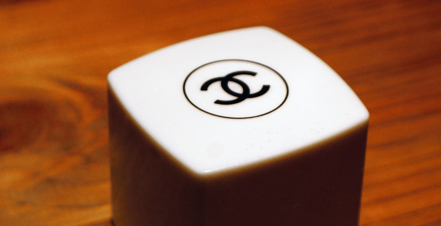
Figure 2-19: The Chanel monogram logo designed by Coco Chanel.
Photo by Charlotte Morris
Roy Smith, a brand identity designer from Norwich, England, worked on the new logo for Union House (see Figure 2-20), an economic development company in the United Arab Emirates. He created a monogram using the two initials of the company, which perfectly illustrates the word union.

Figure 2-20: The Union House logo, designed by Roy Smith (www.roysmithdesign.com).
Oxide Design Co., a design company in Omaha, Nebraska, created a monogram for Biatomic Point (see Figure 2-21), a rock band based in the same city. Biatomic point is a pseudo-scientific term for a point shared between two atoms but exclusive to neither. It’s also a metaphor for an idea or feeling shared by two people—the kinds of thoughtful connections that the band hopes to make with its music. The coming together of the two initials, with the subtle electric shape in the negative space, alludes to the thinking behind the name of the brand, so a monogram was the perfect choice for the project.

Figure 2-21: The Biatomic Point logo, designed by Oxide Design Co. (www.oxidedesign.com).
Image versus type
Designers will forever debate which is best: logos with images or logos that consist of only type. Of course, each logo project is different and the designer is the one tasked with making the right choice (if there is, indeed, one “right” option).
Here are some advantages of image-based logos:
• They help to break down boundaries and aren’t dependant on language.
• They can be more applicable to smaller areas of application.
• They help to link brands as part of a subsidiary.
• They improve recognition for brand names that aren’t initially memorable.
And here are some advantages of type-based logos:
• They work well for unusual and unique brand names.
• They help to reduce the extra marketing costs of trying to get the audience to understand a symbol.
• They mostly stand the test of time.
• They can provide complete distinction.
