
Using the Menu and Tooltip Widgets
In this chapter, I describe the jQuery UI menu and tooltip widgets. Table 23-1 provides the summary for this chapter.
Table 23-1. Chapter Summary
| Problem | Solution | Listing |
|---|---|---|
| Create a menu widget | Select an element structure and call the menu method; the structure is usually created using ul, li, and a elements | 1 |
| Add separators and disabled menu items | Add elements that contain only dashes or spaces and apply the ui-state-disabled class | 2 |
| Perform basic navigation | Add href attributes to a elements in the menu element structure | 3 |
| Use custom element structures | Use the menus setting | 4, 5 |
| Add custom icons to submenus | Use the icons setting | 6 |
| Add icons to menu items | Add span elements that are assigned to the ui-icon class and that specify the jQuery UI icon. | 7 |
| Set the location of submenus | Use the position setting | 8 |
| Receive notifications when menu items are active and selected | Handle the blur, focus, and select events | 9 |
| Create a tooltip widget | Select an element with a title attribute and call the tooltip menu | 10, 11 |
| Set the content of tooltips | Use the content and items settings | 12–15 |
| Add custom styles to tooltips | Use the tooltipClass setting and the ui-tooltip-content class | 16, 17 |
| Move the tooltip to follow the mouse | Use the track setting | 18 |
| Set the location of the tooltip | Use the position setting | 19 |
| Control the tooltips programmatically | Call the open and close methods | 20 |
| Receive notifications when tooltips are shown and hidden | Handle the open and close events | 21 |
JQUERY UI CHANGES SINCE THE LAST EDITION
The menu and tooltip widgets didn’t exist when I wrote the first edition of this book and have been added as part of an ongoing effort to expand the scope of the jQuery UI widgets.
Using the jQuery UI Menu Widget
The menu widget—as its name suggests—provides a menu that allows the user to navigate through a tree of options. This widget is useful when presenting the user with content that has a deep structure, such as product categories for an online store.
The menu widget relies on the menu structure being expressed as a structure of HTML elements, which are selected and transformed with the menu method, as shown in Listing 23-1.
Listing 23-1. Creating a Menu Widget
<!DOCTYPE html>
<html>
<head>
    <title>Example</title>
    <script src="jquery-2.0.2.js" type="text/javascript"></script>
    <script src="jquery-ui-1.10.3.custom.js" type="text/javascript"></script>
    <link rel="stylesheet" type="text/css" href="jquery-ui-1.10.3.custom.css"/>
    <link rel="stylesheet" type="text/css" href="styles.css"/>
    <style>
        .ui-menu { width: 200px; }
    </style>
    <script type="text/javascript">
        $(document).ready(function () {
            $("#menu").menu();
        });
    </script>

</head>
<body>
    <h1>Jacqui's Flower Shop</h1>

    <ul id="menu">
        <li><a>Bouquets</a></li>
        <li><a>Heirloom Blooms</a></li>
        <li><a>Summer Color</a>
            <ul>
                <li><a>Aster</a></li>
                <li><a>Rose</a></li>
                <li><a>Orchid</a></li>
            </ul>
        </li>
        <li><a>Wedding Classics</a></li>
        <li><a>Exotica</a></li>
    </ul>
</body>
</html>
The structure of the menu is defined using an ul element, where individual menu items are li elements that contain an a element and the label for menu items is taken from the text of the a element. Nested submenus can be created by defining a ul element within an li element and you can see the effect of applying the menu method to the structure in the listing in Figure 23-1.
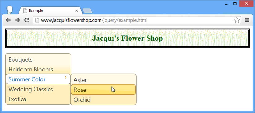
Figure 23-1. Creating a simple menu widget
In the figure, you can see how I have opened a submenu and have positioned my mouse over one of the items that have been revealed. This example demonstrates two key characteristics of the menu widget. First of all, the menu is always visible—it isn’t a pop-up menu and is intended to be a permanent feature in a web page, similar to the way that Amazon presents its top-level product categories.
Second, the menu widget preserves the structure of the elements that it is applied to—the menu items are not sorted by name or any other characteristic. You can see in Figure 23-1 that ordering has been preserved, including the position of the submenu.
 Tip Notice that I have set the width of the top-level ul element to 200 pixels using CSS). By default, the menu widget will fill all of the available horizontal space.
Formatting Menu Items
In addition to nesting submenus, the element structure can also be used to format menu items, creating disabled items and separators between groups of related items. Listing 23-2 shows both types of formatting.
Listing 23-2. Formatting the Menu via the Element Structure
...
<body>
    <h1>Jacqui's Flower Shop</h1>
    <ul id="menu">
        <li><a>Bouquets</a></li>
        <li><a>Heirloom Blooms</a></li>
        <li>-</li>
        <li><a>Summer Color</a>
            <ul>
                <li><a>Aster</a></li>
                <li><a>Rose</a></li>
                <li><a>Orchid</a></li>
            </ul>
        </li>
        <li><a>Wedding Classics</a></li>
        <li>-</li>
        <li class="ui-state-disabled"><a>Exotica</a></li>
    </ul>
</body>
...
Any element with content that is all spaces or dashes is interpreted as a menu divider—I have added two such elements in the listing. Assigning an element to the ui-state-disabled class tells the menu widget that the corresponding menu item should be disabled. You can see the result of these additions in Figure 23-2.
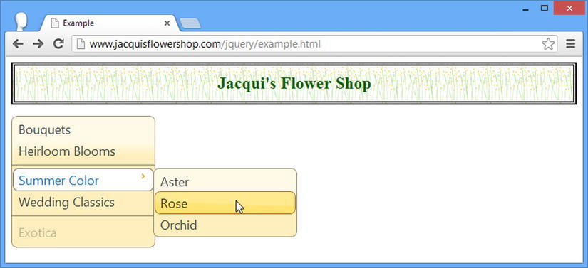
Figure 23-2. Adding separators and disabling menu items
Performing Basic Navigation
One common use for the menu widget is to provide navigation between the web pages that make up a web application and the simplest way to perform this task is to define the href attribute on the a elements in the HTML element structure that underpins the menu widget. When the user selects a menu item that corresponds to an a element with an href attribute, the browser will navigate to the specified URL. In Listing 23-3, you can see how I have added an href attribute to one of the menu item elements.
Listing 23-3. Adding an href Attribute to a Menu Element
...
<body>
    <h1>Jacqui's Flower Shop</h1>

    <ul id="menu">
        <li><a>Bouquets</a></li>
        <li><a>Heirloom Blooms</a></li>
        <li>-</li>
        <li><a>Summer Color</a>
            <ul>
                <li><a href="http://apress.com">Aster</a></li>
                <li><a>Rose</a></li>
                <li><a>Orchid</a></li>
            </ul>
        </li>
        <li><a>Wedding Classics</a></li>
        <li>-</li>
        <li class="ui-state-disabled"><a>Exotica</a></li>
    </ul>
</body>
...
I added an href attribute to one of the menu items, meaning that selecting the Summer Color ➤ Aster menu item will cause the browser to navigate to Apress.com.
Tip Not all menus are used to navigate between web pages. You can perform arbitrary actions when the user selects a menu item by handling the select event, which I describe in the Using the Menu Events section later in this chapter.
Configuring the Menu
The menu widget supports a range of settings that allow you to customize the way that the menu is presented to the user, as described in Table 23-2.
Table 23-2. Menu Settings
Using a Different Element Structure
Although the use of ul, li, and a elements to define menus is the standard technique, the menu widget can work with any element structure where there is a clearly defined parent-child relationship. In Listing 23-4, you can see how I have redefined the example menu using div elements.
Listing 23-4. Using a Different Element Type for the Menu Structure
<!DOCTYPE html>
<html>
<head>
    <title>Example</title>
    <script src="jquery-2.0.2.js" type="text/javascript"></script>
    <script src="jquery-ui-1.10.3.custom.js" type="text/javascript"></script>
    <link rel="stylesheet" type="text/css" href="jquery-ui-1.10.3.custom.css"/>
    <link rel="stylesheet" type="text/css" href="styles.css"/>
    <style>
        .ui-menu { width: 200px; }
    </style>
    <script type="text/javascript">
        $(document).ready(function () {
            $("#menu").menu();
        });
    </script>
</head>
<body>
    <h1>Jacqui's Flower Shop</h1>
    <div id="menu">
        <div><a>Bouquets</a></div>
        <div><a>Heirloom Blooms</a></div>
        <div>-</div>
        <div><a>Summer Color</a>
            <div>
                <div><a>Aster</a></div>
                <div><a>Rose</a></div>
                <div><a>Orchid</a></div>
            </div>
        </div>
        <div><a>Wedding Classics</a></div>
        <div>-</div>
        <div><a>Exotica</a></div>
    </div>
</body>
</html>
This is most useful when you want to make a menu out of existing HTML elements, typically those which are generated from a template or obtained from a remote server via Ajax. The problem is that the menu widget doesn’t know which of my div elements represents submenus and so all of my div elements are treated as top-level menu items, as shown in Figure 23-3.
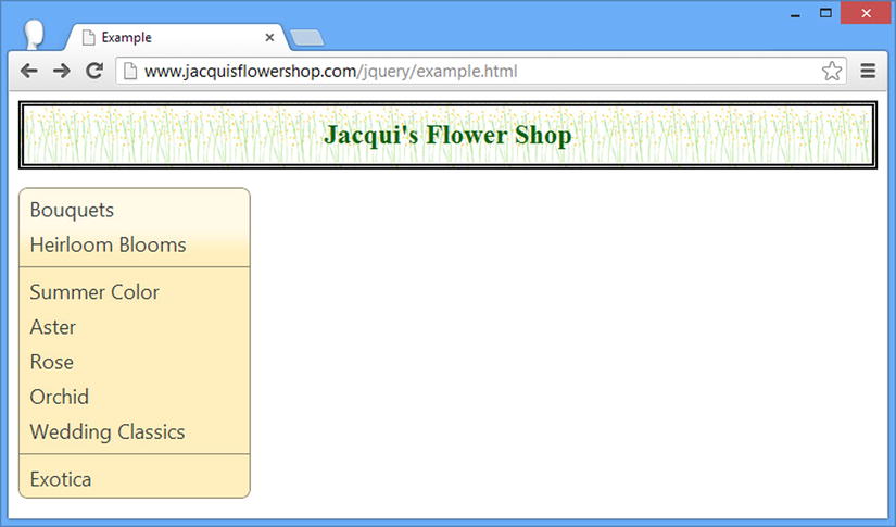
Figure 23-3. The menu widget treating all elements as menu items
I can give the menu widget information about the elements through the menus property, which is set to a selector that matches the elements I want for my submenus, as shown in Listing 23-5.
Listing 23-5. Using the Menus Configuration Property
<!DOCTYPE html>
<html>
<head>
    <title>Example</title>
    <script src="jquery-2.0.2.js" type="text/javascript"></script>
    <script src="jquery-ui-1.10.3.custom.js" type="text/javascript"></script>
    <link rel="stylesheet" type="text/css" href="jquery-ui-1.10.3.custom.css"/>
    <link rel="stylesheet" type="text/css" href="styles.css"/>
    <style>
        .ui-menu { width: 200px; }
    </style>
    <script type="text/javascript">
        $(document).ready(function () {
            $("#menu").menu({
                menus: "div.subMenu"
            });
        });
    </script>
</head>
<body>
    <h1>Jacqui's Flower Shop</h1>

    <div id="menu">
        <div><a>Bouquets</a></div>
        <div><a>Heirloom Blooms</a></div>
        <div>-</div>
        <div><a>Summer Color</a>
            <div class="subMenu">
                <div><a>Aster</a></div>
                <div><a>Rose</a></div>
                <div><a>Orchid</a></div>
            </div>
        </div>
        <div><a>Wedding Classics</a></div>
        <div>-</div>
        <div><a>Exotica</a></div>
    </div>
</body>
</html>
I have assigned the div element that I want as a submenu to the subMenu class and specified a selector of div.subMenu for the menus property when creating the menu widget.
Tip You don’t have to use a class and—if you do—it doesn’t have to be called subMenu. Any selector that matches your elements will work.
Using Icons in Menus
The icons setting specifies the icons that the menu widget uses for submenus and is set to the name of one of the icons that I described in Chapter 18. Listing 23-6 shows the use of the icons setting.
Listing 23-6. Setting the Icons Used in Submenus
...
<script type="text/javascript">
    $(document).ready(function () {
        $("#menu").menu({
            menus: "div.subMenu",
            icons: { submenu: "ui-icon-circle-plus" }
        });
    });
</script>
...
The icons property is set using an object that defines a submenu property which, in turn, is set to the name of the icon you want to use. In the listing, I have specified the icon which shows a plus symbol in a circle and you can see the effect in Figure 23-4.
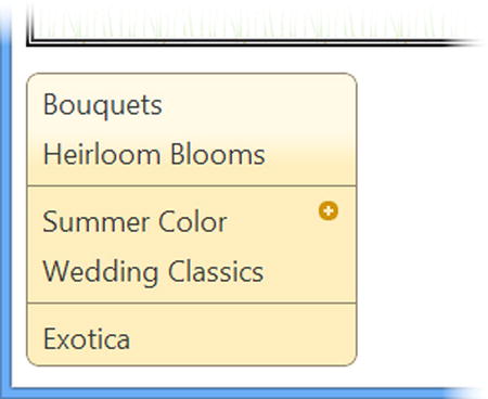
Figure 23-4. Changing the icon used for submenus
You can specify icons for individual menu items by adding span elements to the menu structure and using the class attribute to specify the icon name, as shown in Listing 23-7.
Listing 23-7. Adding Icons to Menu Items
<!DOCTYPE html>
<html>
<head>
    <title>Example</title>
    <script src="jquery-2.0.2.js" type="text/javascript"></script>
    <script src="jquery-ui-1.10.3.custom.js" type="text/javascript"></script>
    <link rel="stylesheet" type="text/css" href="jquery-ui-1.10.3.custom.css"/>
    <link rel="stylesheet" type="text/css" href="styles.css"/>
    <style>
        .ui-menu { width: 200px; }
    </style>
    <script type="text/javascript">
        $(document).ready(function () {
            $("#menu").menu({
                icons: { submenu: "ui-icon-circle-plus" }
            });
        });
    </script>
</head>
<body>
    <h1>Jacqui's Flower Shop</h1>

    <ul id="menu">
        <li><a>Bouquets</a></li>
        <li><a>Heirloom Blooms</a></li>
        <li>-</li>
        <li><a>Summer Color</a>
            <ul>
                <li><a>Aster</a></li>
                <li><a>Rose</a></li>
                <li><a>Orchid</a></li>
            </ul>
        </li>
        <li>
            <a><span class="ui-icon ui-icon-circle-check"></span>Wedding Classics</a>
        </li>
        <li>-</li>
        <li class="ui-state-disabled"><a>Exotica</a></li>
    </ul>
</body>
</html>
The span element must appear within the a element and be assigned to the ui-icon class and the class that represents the icon to display, which is ui-icon-circle-check in this example. You can see the effect of this change in Figure 23-5.

Figure 23-5. Adding icons to menu items
Positioning Submenu Pop-ups
The position setting determines where the pop-up appears for submenus and uses the same position format that I described in Chapter 19. My advice is to allow the menu widget to position submenus automatically, not least because the pop-ups for submenus are transparent and you can see the underlying menu structure when the pop-up is positioned over the parent widget. In Listing 23-8, you can see the position setting used to display submenus so that they are centered over the menu widget.
Listing 23-8. Positioning the Pop-ups for Submenus
...
<script type="text/javascript">
    $(document).ready(function () {
        $("#menu").menu({
            icons: { submenu: "ui-icon-circle-plus" },
            position: {
                my: "left center",
                at: "center center"
            }
        });
    });
</script>
...
The effect can be seen in Figure 23-6, with the underlying menu items visible through the pop-up.

Figure 23-6. Positioning a submenu pop-up over the menu widget
Using the Menu Methods
The jQuery UI menu widget supports the methods described in Table 23-3. I don’t find these methods useful because they mainly provide the means to drive navigation in the menu widget, something that is best left to the user. These methods make it easy to create a jarring user experience and I recommend against using them.
Table 23-3. Menu Methods
| Method | Description |
|---|---|
| menu("blur") | Removes the focus from the menu – triggers the blur event (described later in the chapter) |
| menu("collapse") | Closes the currently active submenu |
| menu("collapseAll") | Closes all open submenus |
| menu("destroy") | Removes the menu widget from the underlying element |
| menu("disable") | Disables the menu |
| menu("enable") | Enables the menu |
| menu("expand") | Opens the submenu associated with the currently selected menu item |
| menu("focus") | Focuses on a menu item |
| menu("isFirstItem") | Returns true if the currently selected item is the first in the menu |
| menu("isLastItem") | Returns true if the currently selected item is the last in the menu |
| menu("next") | Moves the focus to the next menu item |
| menu("option") | Changes one or more settings |
| menu("previous") | Moves the focus to the previous menu item |
| menu("refresh") | Updates the menu to reflect changes in the underlying HTML elements |
| menu("select") | Selects the active menu item, closes all open submenus, and triggers the select event (described later in the chapter) |
It is difficult to demonstrate these methods because the behavior of the menu widget is tied closely to the currently selected menu items. Trying to control a menu with buttons, for example, doesn’t work because clicking the button takes the focus away from the menu. My advice is to avoid using these methods and rely on standard user interaction, handling the events that I describe in the next section.
Note The menu widget also defines methods for navigating through menus that can scroll, but this feature doesn’t work reliably at the time of this writing and so I have omitted the methods from the table.
Using the Menu Events
The jQuery UI menu widget supports the events described in Table 23-4.
Table 23-4. Menu Events
| Event | Description |
|---|---|
| blur | Triggered when the menu loses focus (this event can be explicitly triggered by calling the blur method) |
| create | Triggered when the widget is created |
| focus | Triggered when the menu gains the focus and when a menu item is activated (this event can be explicitly triggered by calling the focus method) |
| select | Triggered when menu item is selected, either by the user or because the select method has been called |
In Listing 23-9, you can see how I have used the blur and focus events to keep track of which menu items are activated by the user and the select event to respond when the user clicks on a menu item.
Listing 23-9. Handling the Blur, Focus, and Select Events from the Menu Widget
<!DOCTYPE html>
<html>
<head>
    <title>Example</title>
    <script src="jquery-2.0.2.js" type="text/javascript"></script>
    <script src="jquery-ui-1.10.3.custom.js" type="text/javascript"></script>
    <link rel="stylesheet" type="text/css" href="jquery-ui-1.10.3.custom.css"/>
    <link rel="stylesheet" type="text/css" href="styles.css"/>
    <style>
        .ui-menu { width: 200px; }
    </style>
    <script type="text/javascript">
        $(document).ready(function () {
            $("#menu").menu({
                focus: function (e, ui) {
                    console.log("Focus: " + ui.item.find("a").first().text());
                },
                blur: function () {
                    console.log("Blur");
                },
                select: function (e, ui) {
                    console.log("Select: " + ui.item.find("a").first().text());
                    e.preventDefault();
                }
            });
        });
    </script>
</head>
<body>
    <h1>Jacqui's Flower Shop</h1>

    <ul id="menu">
        <li><a>Bouquets</a></li>
        <li><a>Heirloom Blooms</a></li>
        <li>-</li>
        <li><a>Summer Color</a>
            <ul>
                <li><a href="http://apress.com">Aster</a></li>
                <li><a>Rose</a></li>
                <li><a>Orchid</a></li>
            </ul>
        </li>
        <li><a>Wedding Classics</a></li>
        <li>-</li>
        <li class="ui-state-disabled"><a>Exotica</a></li>
    </ul>
</body>
</html>
The handler functions for all three events are passed a jQuery event object (which I described in Chapter 9) and an additional ui object whose item property returns a jQuery object. The jQuery object is meant to contain the HTML element that the event corresponds to, but as I write this, the value of this property isn’t set properly for the blur event.
With this in mind, I handle the focus and select events by writing the text content of the first a element contained by the element that the event relates to and simply note that the blur event has been triggered. If you run this example and navigate around the menu, you will see output similar to the following:
Focus: Bouquets
Blur
Focus: Heirloom Blooms
Blur
Focus: Summer Color
Select: Summer Color
Blur
Focus: Aster
Blur
Focus: Aster
Select: Aster
Blur
Focus: Aster
Blur
I have highlighted one of the statements written to the console because it demonstrates that items which contain submenus can themselves be selected—in this case, I was able to click on the Summer Color menu item even though it contains a submenu. This can lead to unexpected behavior when the handler for the select method doesn’t take this into account.
Tip Notice that I call the preventDefault method when handling the select event to prevent the browser from navigating to the URL specified by the href attribute of the a elements.
Using the jQuery UI Tooltip Widget
The tooltip widget provides small pop-ups that can be used to provide the user with helpful context information. Tooltips can be a force for good or evil. When used carefully, tooltips can help users navigate a complex process, but more often they are misused and become a distraction or an annoyance.
The most common pitfall is telling the user something she already knows and, in doing so, missing an opportunity to provide something more useful—this happens most frequently in web forms which require complex data. A recent example I saw came in an online tax form. Taxes are naturally complex and the developers felt it would be helpful to provide tooltips to give users information about the data required for each field. This was a noble gesture, but each tooltip simply restated information that was already evident from the form labels. So, for example, the tooltip for the form labeled Birth Date told me to “Enter your date of birth.” What wasn’t provided was the format I had to use—month/day/year, day/month/year, year/month/day, and so on. You can see examples of this problem all over the web and each one represents a lost opportunity to provide the user with a helpful insight. A related problem is tooltips preventing the user from completing a task. Each time I made another wrong guess in the tax form at the required format for key fields, I would be presented with a tooltip that obscured the input element, slowing down my attempts to get through the process.
My advice is to use tooltips sparingly and to think carefully about what value they offer to the user. If you are simply restating information that the user already has, then reconsider your goals.
Creating the Tooltip
The jQuery UI tooltip widget can be applied to any HTML element with the tooltip method and, by default, displays the contents of the title attribute, as shown in Listing 23-10.
Tip The mainstream browsers will use the title attribute to display tooltips anyway, without needing to use jQuery UI. The advantage of the tooltip widget is that it allows you to style the tooltip consistently with the rest of the application, take control of how the tooltip is used, and use a wider range of content.
Listing 23-10. Creating a Tooltip Widget
<!DOCTYPE html>
<html>
<head>
    <title>Example</title>
    <script src="jquery-2.0.2.js" type="text/javascript"></script>
    <script src="jquery-ui-1.10.3.custom.js" type="text/javascript"></script>
    <link rel="stylesheet" type="text/css" href="jquery-ui-1.10.3.custom.css"/>
    <link rel="stylesheet" type="text/css" href="styles.css"/>
    <style>
        [title] { font-weight: bold; font-style:italic }
    </style>
    <scripttype="text/javascript">
        $(document).ready(function () {
            $("[title]").tooltip();
        });
    </script>
</head>
<body class="ui-widget">
    <h1>Jacqui's Flower Shop</h1>

    <h3>Color and Beauty to Your Door</h3>
    <p>We are pleased to announce that we are starting a home delivery service for
    your flower needs. We will deliver within a
    <span title="We are at 200 Main St">20 mile radius</span>
    of the store for free and $1/mile thereafter.</p>
</body>
</html>
In this example I have defined a span element that has a title attribute. I select any element that has a title attribute and call the tooltip method and—to emphasize which elements have tooltips—I have defined a CSS style that uses the same selector. The result is that jQuery UI creates a tooltip widget which is shown when the mouse hovers over the span element, as shown in Figure 23-7.
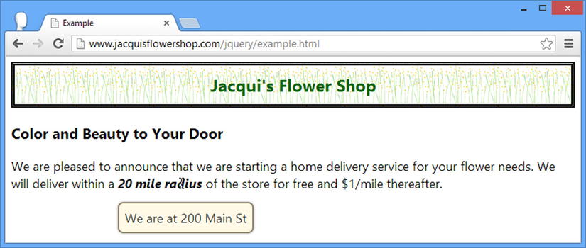
Figure 23-7. A jQuery UI tooltip
Using Tooltips with Input Elements
Tooltips are also shown when the element they relate to has the focus—something that can be useful when working with input elements because the tooltips will appear for each element as the user tabs through the form. Applying tooltips to an input element is just the same as for other elements, as demonstrated in Listing 23-11.
Listing 23-11. Applying Tooltips to Input Elements
<!DOCTYPE html>
<html>
<head>
    <title>Example</title>
    <script src="jquery-2.0.2.js" type="text/javascript"></script>
    <script src="jquery-ui-1.10.3.custom.js" type="text/javascript"></script>
    <link rel="stylesheet" type="text/css" href="jquery-ui-1.10.3.custom.css"/>
    <link rel="stylesheet" type="text/css" href="styles.css"/>
    <style>
        input { width: 150px; }
    </style>
    <script type="text/javascript">
        $(document).ready(function () {
            $("input").tooltip();
        });
    </script>
</head>
<body class="ui-widget">
    <h1>Jacqui's Flower Shop</h1>
    <div><label>Name:</label><input title="Use lastname, firstname" /></div>
    <div><label>City:</label><input title="Don't include your state" /></div>
</body>
</html>
There are two input elements with title attributes in this listing and you can see the effect of tabbing through the elements in Figure 23-8.
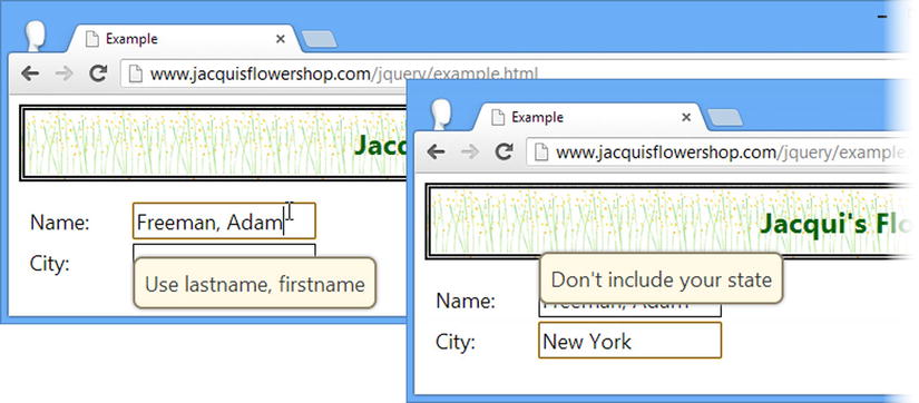
Figure 23-8. Using tooltips with input elements
Configuring the Tooltip
The tooltip widget supports a range of settings that allow you to customize the way that the widget is presented to the user, as described in Table 23-5 and demonstrated in the sections that follow.
Table 23-5. Tooltip Settings
| Setting | Description |
|---|---|
| content | Sets the content for the tooltip, which can be expressed as a string of HTML or as a function |
| disabled | Disables the tooltip when set to true |
| hide | Specifies how the tooltip is animated when it is hidden—see Chapter 34 for details of the jQuery UI animation support |
| items | Specifies a selector that can narrow the set of elements for which tooltips are created |
| position | Specifies the position of the tooltip in relation to the element it corresponds to |
| show | Specifies how the tooltip is animated when it is shown—see Chapter 34 for details of the jQuery UI animation support |
| tooltipClass | Specifies an additional class that the tooltip element will be added to, allowing styling for different types of tooltip (errors, for example) |
| track | When set to true, the position of the tooltip will change to track the position of the mouse as it moves over the underlying HTML element |
One of the big advantages of using jQuery UI tooltips is that you can use them to display rich content, which can be specified either as a fragment of HTML or via a JavaScript function. You can see the first of these in Listing 23-12, where I use the content property to specify a fragment of HTML that contains formatting.
Listing 23-12. Using the Content Setting to Display Formatted Content
<!DOCTYPE html>
<html>
<head>
    <title>Example</title>
    <script src="jquery-2.0.2.js" type="text/javascript"></script>
    <script src="jquery-ui-1.10.3.custom.js" type="text/javascript"></script>
    <link rel="stylesheet" type="text/css" href="jquery-ui-1.10.3.custom.css"/>
    <link rel="stylesheet" type="text/css" href="styles.css"/>
    <style>
        span.toolTip { font-weight: bold; font-style:italic }
    </style>
    <script id="tipContent" type="text/html">
        We are at <b>200</b> Main Street
    </script>
    <script type="text/javascript">
        $(document).ready(function () {
            $("span.toolTip").tooltip({
                content: $("#tipContent").html(),
                items: "span.toolTip"
            });
        });
    </script>
</head>
<body class="ui-widget">
    <h1>Jacqui's Flower Shop</h1>

    <h3>Color and Beauty to Your Door</h3>
    <p>We are pleased to announce that we are starting a home delivery service for
    your flower needs. We will deliver within a
    <span class="toolTip">20 mile radius</span>
    of the store for free and $1/mile thereafter.</p>
</body>
</html>
I have defined a new script element but set the type attribute to be text/html—this has the effect of preventing the browser from treating the contents of the script element as JavaScript or as part of the HTML content. This is the same technique that is used for data templates (as described in Chapter 12), but my goal is just to stash an HTML fragment out of the main part of the document until I need it.
I use the content setting to pass the HTML fragment to the tooltip widget. Notice that I have to select the script element that contains the fragment using jQuery and then call the html method to get its content—the tooltip widget isn’t nicely integrated into jQuery and will only take HTML as a string.
I have had to use the items setting as well—and that’s because I am no longer using the title attribute, which the tooltip widget looks for by default. Without this change, the call to the tooltip method will ignore my span element. I have added the span element to a class called toolTip and used this as the basis for the selector I provided for the items setting.
The HTML fragment contained in the script element is used as the content for the tooltip and the effect is shown in Figure 23-9, including the modest styling I added through a b element.
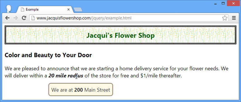
Figure 23-9. Styling the content in a tooltip
Tip I have shown formatted text in this example, but you can use a jQuery UI tooltip to display any HTML content, including images.
Generating Tooltip Content with a Function
I can also specify content using a function. For locally generated tooltip content, I can simply return an HTML fragment directly from the function, as shown in Listing 23-13.
Listing 23-13. Generating Tooltip Content from a Function
<!DOCTYPE html>
<html>
<head>
    <title>Example</title>
    <script src="jquery-2.0.2.js" type="text/javascript"></script>
    <script src="jquery-ui-1.10.3.custom.js" type="text/javascript"></script>
    <link rel="stylesheet" type="text/css" href="jquery-ui-1.10.3.custom.css"/>
    <link rel="stylesheet" type="text/css" href="styles.css"/>
    <style>
        span.toolTip { font-weight: bold; font-style:italic }
    </style>
    <script type="text/javascript">
        $(document).ready(function () {
            $("span.toolTip").tooltip({
                content: function () {
                    if (this.id == "address") {
                        return "We are at <b>200</b> Main Street";
                    } else {
                        return "Fee capped at <i>$20</i> during June!"
                    }
                },
                items: "span.toolTip"
            });
        });
    </script>
</head>
<body class="ui-widget">
    <h1>Jacqui's Flower Shop</h1>

    <h3>Color and Beauty to Your Door</h3>
    <p>We are pleased to announce that we are starting a home delivery service for
    your flower needs. We will deliver within a
    <span id="address" class="toolTip">20 mile radius</span> of the store for free and
    <span id="maxPrice" class="toolTip">$1/mile thereafter.</span></p>
</body>
</html>
I have defined two span elements that have tooltips in this example and I use the function I provided to the content setting to give unique content to each tooltip. When the function is called, the value of the this variable is set to the element that has triggered the need for tooltip content. I use the id property to get the value of the id attribute and return different HTML fragments based on the element. You can see the result in Figure 23-10.
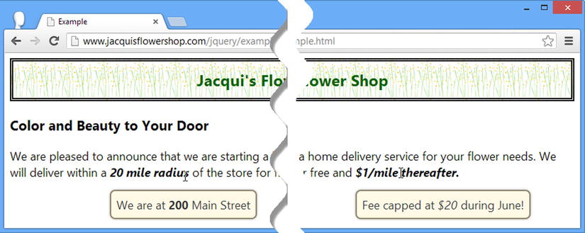
Figure 23-10. Generating tooltip content using a function
Getting Remote Tooltip Content
You can also obtain tooltip content asynchronously using Ajax and provide the fragment you want to display to jQuery UI via a callback. To demonstrate how this works, I have created a new JSON file called tooltips.json and placed it in the same directory as the other files in the example. You can see the content of the tooltips.json file in Listing 23-14.
Listing 23-14. The Contents of the tooltips.json File
{"address": "We are at <b>200</b> Main Street",
 "maxPrice": "Fee capped at <i>$20</i> during June!"}
In a real application, the server would usually send back a specific message for a given element, but for simplicity my JSON file contains all of the tooltip content that my example requires. You can see how I can obtain this data and use it to provide tooltip content in Listing 23-15.
Listing 23-15. Obtaining Remote Tooltip Content
...
<script type="text/javascript">
    $(document).ready(function () {

        var tooltipData;

        $("span.toolTip").tooltip({
            content: function (callback) {
                if (tooltipData != null) {
                    console.log("Requested serviced locally: " + this.id);
                    return tooltipData[this.id];
                } else {
                    var elemID = this.id;
                    $.getJSON("tooltips.json", function (data) {
                        tooltipData = data;
                        console.log("Requested serviced remotely: " + elemID);
                        callback(tooltipData[elemID]);
                    });
                }
            },
            items: "span.toolTip"
        });
    });
</script>
...
Given that the JSON file contains all of the values I require, I can make one request to the server and then store the data I retrieve for subsequent tooltips—and that’s what most of the code in the example relates to. The key point in this example is that the callback that I pass to the getJSON method (which I described in Chapter 14) won’t be executed until after the function used for the content setting has completed, meaning that I can’t simply return the HTML fragment for the tooltip as the result.
Instead, my content function is passed an argument, which is a function to invoke when I have prepared the HTML fragment.
 ...
content: function (callback) {
...
When my Ajax request completes, I call this function with the data I want to display:
...
callback(tooltipData[elemID]);
...
The resulting tooltips are indistinguishable from the earlier examples, but the content that is displayed has been obtained via an Ajax request.
Tip I have included this feature for completeness, but you should use it with caution. Tooltips work best when they provide immediate feedback to the user and this may not happen if your Ajax request takes a while to complete.
Adding Extra CSS Classes to Tooltips
The tooltipClass setting lets you specify one or more CSS classes that will be applied to tooltips for custom styling. Listing 23-16 provides an example.
Listing 23-16. Using the tooltipClass Setting
<!DOCTYPE html>
<html>
<head>
    <title>Example</title>
    <script src="jquery-2.0.2.js" type="text/javascript"></script>
    <script src="jquery-ui-1.10.3.custom.js" type="text/javascript"></script>
    <link rel="stylesheet" type="text/css" href="jquery-ui-1.10.3.custom.css"/>
    <link rel="stylesheet" type="text/css" href="styles.css"/>
    <style>
        span.toolTip { font-weight: bold; font-style:italic }
        *.customTip { border-color: red; }
    </style>
    <script type="text/javascript">
        $(document).ready(function () {
            $("span.toolTip").tooltip({
                content: function () {
                    if (this.id == "address") {
                        return "We are at <b>200</b> Main Street";
                    } else {
                        return "Fee capped at <i>$20</i> during June!"
                    }
                },
                items: "span.toolTip",
                tooltipClass: "customTip"
            });
        });
    </script>
</head>
<body class="ui-widget">
    <h1>Jacqui's Flower Shop</h1>
    <h3>Color and Beauty to Your Door</h3>
    <p>We are pleased to announce that we are starting a home delivery service for
    your flower needs. We will deliver within a
    <span id="address" class="toolTip">20 mile radius</span> of the store for free and
    <span id="maxPrice" class="toolTip">$1/mile thereafter.</span></p>
</body>
</html>
I have defined a CSS style for a class called customTip and applied this class to the tooltips using the tooltipClass setting. My style sets the color of the border, which produces the result shown in Figure 23-11.
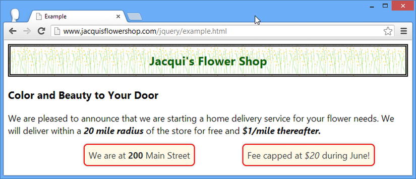
Figure 23-11. Applying a custom class to tooltips
The HTML generated by jQuery UI for tooltips includes another class that can be useful for styling. Following is an example of the HTML generated for one of the widgets in the example:
...
<div id="ui-tooltip-3" role="tooltip" class="ui-tooltip ui-widget ui-corner-all
      ui-widget-contentcustomTip" style="top: 210.15625px; left: 161px; display: block;">
    <div class="ui-tooltip-content">We are at <b>200</b> Main Street</div>
</div>
...
There is an outer div element to which the class specified by the tooltipClass setting is applied, but the content displayed by the tooltip is contained within an inner div element, which belongs to the ui-tooltip-content class. For advanced styling, you can use both classes to target the widget and its content separately, as shown in Listing 23-17.
Tip The other classes applied to the tooltip, such as ui-widget and ui-corner-all, are part of the jQuery UI CSS framework, which I describe in Chapter 35.
Listing 23-17. Styling the Widget and Its Content Separately
...
<style>
    span.toolTip { font-weight: bold; font-style:italic }
    *.customTip { border-color: red; }
    *.ui-tooltip-content { border: thick solid black; margin: 10px; padding: 10px;
                            background-color: white; }
</style>
...
You can see the effect of this change in Figure 23-12.
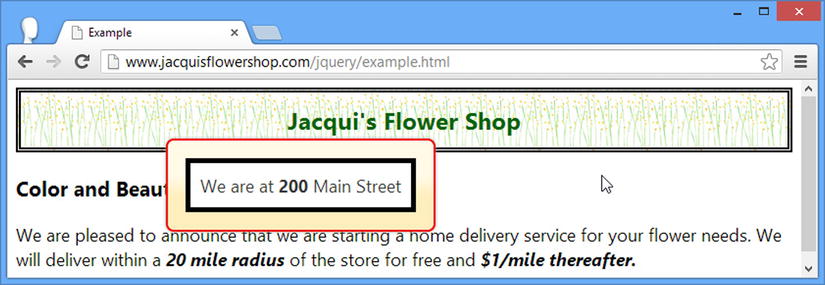
Figure 23-12. Changing the style of the tooltip content independently from the tooltip itself
Tip If you want to change the background color of a tooltip, you will need to set the background-image property to none in the class that is specified with the tooltipClass setting. jQuery UI widget backgrounds are generated using images from the theme rather than colors.
When the track setting is true, the tooltip will follow the movements of the mouse over the HTML element that the tooltip corresponds to. This is useful when you want to change the content of the tooltip based on the position of the mouse, reflecting different regions of the underlying HTML element, as shown in Listing 23-18.
Listing 23-18. Tracking the Position of the Mouse with the Tooltip
<!DOCTYPE html>
<html>
<head>
    <title>Example</title>
    <script src="jquery-2.0.2.js" type="text/javascript"></script>
    <script src="jquery-ui-1.10.3.custom.js" type="text/javascript"></script>
    <link rel="stylesheet" type="text/css" href="jquery-ui-1.10.3.custom.css"/>
    <link rel="stylesheet" type="text/css" href="styles.css"/>
    <style>
        span.toolTip { font-weight: bold; font-style:italic }
    </style>
    <script type="text/javascript">
        $(document).ready(function () {
            $("span.toolTip").tooltip({
                content: "Move the mouse",
                items: "span.toolTip",
                track: true
            }).mousemove(function(e) {
                $(this).tooltip("option", "content",
                    "X: " + e.pageX + " Y: " + e.pageY);
            });
        });
    </script>
</head>
<body class="ui-widget">
    <h1>Jacqui's Flower Shop</h1>
    <h3>Color and Beauty to Your Door</h3>
    <p>We are pleased to announce that we are starting a home delivery service for
    your flower needs. We will deliver within a
    <span id="address" class="toolTip">20 mile radius</span> of the store for free and
    <span id="maxPrice" class="toolTip">$1/mile thereafter.</span></p>
</body>
</html>
I enable tracking the mouse with the track setting and set up a handler function for the mousemove event (as described in Chapter 9) which uses the option method to update the content that the tooltip displays. This is an example that you need to experience firsthand to see the updates being performed, but Figure 23-13 shows a snapshot of the new behavior.
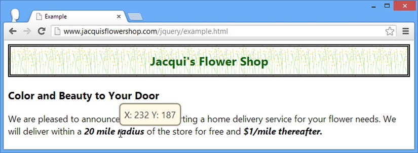
Figure 23-13. Tracking the position of the mouse with the tooltip
The position setting specifies how the tooltip will be positioned relative to the element it corresponds to, using the same format I described in Chapter 19. You can see an example in Listing 23-19.
Listing 23-19. Positioning the Tooltip
<!DOCTYPE html>
<html>
<head>
    <title>Example</title>
    <script src="jquery-2.0.2.js" type="text/javascript"></script>
    <script src="jquery-ui-1.10.3.custom.js" type="text/javascript"></script>
    <link rel="stylesheet" type="text/css" href="jquery-ui-1.10.3.custom.css"/>
    <link rel="stylesheet" type="text/css" href="styles.css"/>
    <style>
        span.toolTip { font-weight: bold; font-style:italic }
    </style>
    <script type="text/javascript">
        $(document).ready(function () {
            $("span.toolTip").tooltip({
                content: function () {
                    if (this.id == "address") {
                        return "We are at <b>200</b> Main Street";
                    } else {
                        return "Fee capped at <i>$20</i> during June!"
                    }
                },
                items: "span.toolTip",
                position: {
                    my: "center bottom",
                    at: "center top"
                }
            });
        });
    </script>
</head>
<body class="ui-widget">
    <h1>Jacqui's Flower Shop</h1>
    <h3>Color and Beauty to Your Door</h3>
    <p>We are pleased to announce that we are starting a home delivery service for
    your flower needs. We will deliver within a
    <span id="address" class="toolTip">20 mile radius</span> of the store for free and
    <span id="maxPrice" class="toolTip">$1/mile thereafter.</span></p>
</body>
</html>
I have used the position setting to specify that the tooltip should be positioned directly above the element it relates to, as shown in Figure 23-14.
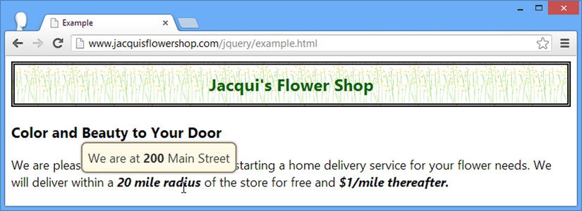
Figure 23-14. Positioning the tooltip
The jQuery UI tooltip widget supports the methods described in Table 23-6.
Table 23-6. Tooltip Methods
The methods of note are open and close, which allow programmatic control over the tooltips. In Listing 23-20, you can see how I have used these methods to show and hide all of the tooltips contained in the HTML document using buttons.
Listing 23-20. Using the open and close Methods
<!DOCTYPE html>
<html>
<head>
    <title>Example</title>
    <script src="jquery-2.0.2.js" type="text/javascript"></script>
    <script src="jquery-ui-1.10.3.custom.js" type="text/javascript"></script>
    <link rel="stylesheet" type="text/css" href="jquery-ui-1.10.3.custom.css"/>
    <link rel="stylesheet" type="text/css" href="styles.css"/>
    <style>
        span.toolTip { font-weight: bold; font-style:italic }
    </style>
    <script type="text/javascript">
        $(document).ready(function () {
            $("span.toolTip").tooltip({
                content: function () {
                    if (this.id == "address") {
                        return "We are at <b>200</b> Main Street";
                    } else {
                        return "Fee capped at <i>$20</i> during June!"
                    }
                },
                items: "span.toolTip",
                position: {
                    my: "center bottom",
                    at: "center top"
                }
            });
            $("button").button().click(function (e) {
                $("span.toolTip").tooltip(this.id);
            });
        });
    </script>
</head>
<body class="ui-widget">
    <h1>Jacqui's Flower Shop</h1>
    <h3>Color and Beauty to Your Door</h3>
    <p>We are pleased to announce that we are starting a home delivery service for
    your flower needs. We will deliver within a
    <span id="address" class="toolTip">20 mile radius</span> of the store for free and
    <span id="maxPrice" class="toolTip">$1/mile thereafter.</span></p>
    <div>
        <button id="open">Open</button>
        <button id="close">Close</button>
    </div>
</body>
</html>
You can see the effect in Figure 23-15.

Figure 23-15. Showing and hiding the tooltips programmatically
The jQuery UI tooltip widget supports the events described in Table 23-7.
Table 23-7. Tooltip Events
| Event | Description |
|---|---|
| close | Triggered when the tooltip is closed |
| create | Triggered when the widget is applied |
| open | Triggered when the tooltip is shown |
I have demonstrated the open and close events in Listing 23-21. The handler function is passed a jQuery event object (as described in Chapter 9) and an additional ui object whose tooltip property returns a jQuery object that contains the tooltip element.
Listing 23-21. Handling the open and close Events
<!DOCTYPE html>
<html>
<head>
    <title>Example</title>
    <script src="jquery-2.0.2.js" type="text/javascript"></script>
    <script src="jquery-ui-1.10.3.custom.js" type="text/javascript"></script>
    <link rel="stylesheet" type="text/css" href="jquery-ui-1.10.3.custom.css"/>
    <link rel="stylesheet" type="text/css" href="styles.css"/>
    <style>
        span.toolTip { font-weight: bold; font-style:italic }
        span.active { border: medium solid red; padding: 10px; background-color: white }
    </style>
    <script type="text/javascript">
        $(document).ready(function () {
            $("span.toolTip").tooltip({
                content: function () {
                    if (this.id == "address") {
                        return "We are at <b>200</b> Main Street";
                    } else {
                        return "Fee capped at <i>$20</i> during June!"
                    }
                },
                items: "span.toolTip",
                open: function (e, ui) {
                    $(this).toggleClass("active");
                },
                close: function (e, ui) {
                    $(this).toggleClass("active");
                }
            });
        });
    </script>
</head>
<body class="ui-widget">
    <h1>Jacqui's Flower Shop</h1>
    <h3>Color and Beauty to Your Door</h3>
    <p>We are pleased to announce that we are starting a home delivery service for
    your flower needs. We will deliver within a
    <span id="address" class="toolTip">20 mile radius</span> of the store for free and
    <span id="maxPrice" class="toolTip">$1/mile thereafter.</span></p>
</body>
</html>
In this example I handle the open and close events by toggling a CSS class called active on the element that the tooltip relates to (which is available via the this variable). The effect is that the element is highlighted when the tooltip is shown, as illustrated by Figure 23-16.
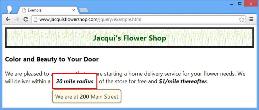
Figure 23-16. Handling the open and close events
Summary
In this chapter, I have shown you how the jQuery UI menu and tooltip widgets work. Following the same format as the other widget chapters, I focused on the settings, methods, and events that these widgets support. In Chapter 24, I describe the first of the jQuery UI interactions.