
Using the Dialog and Spinner Widgets
In this chapter, I describe the jQuery UI dialog and spinner widgets. Table 22-1 provides the summary for this chapter.
Table 22-1. Chapter Summary
| Problem | Solution | Listing |
|---|---|---|
| Create a jQuery UI dialog | Select a div element with a title attribute and call the dialog method | 1 |
| Prevent a dialog from being displayed as soon as it is created | Set the autoOpen setting to false | 2 |
| Prevent the user from resizing a dialog | Set the resizable setting to false | 3 |
| Focus on an element in the dialog | Set the autofocus attribute | 4 |
| Change the initial position of a dialog | Use the position setting | 5 |
| Add one or more buttons to a dialog | Use the buttons setting | 6 |
| Display icons on the dialog buttons | Use the icons setting | 7 |
| Allow the user to move the dialog | Use the draggable setting | 8 |
| Create a model dialog | Set the modal setting to true | 9, 10 |
| Programmatically open and close a dialog | Use the open, close, and isOpen methods | 11 |
| Prevent a dialog from closing | Return false in the handler function for the beforeClose event | 12 |
| Respond to the user moving or changing the size of a dialog | Respond to the dragStart, dragStop, drag, resizeStart, resizeStop, and resize events | 13 |
| Create a jQuery UI spinner | Select an input element and call the spinner method | 14–16 |
| Configure the basic spinner behavior | Use the min, max, step and page settings | 17 |
| Change the icons used for the spinner buttons | Use the icons property | 18 |
| Control the rate of change when the spin buttons are held down | Use the incremental setting | 19 |
| Change the format of the spinner number | Use the culture and numberFormat settings | 20 |
| Change the spinner value programmatically | Call the pageDown, pageUp, stepDown, and stepUp methods | 21 |
| Respond to changes in the spinner value | Handle the spinner events | 22 |
JQUERY UI CHANGES SINCE THE LAST EDITION
The spinner widget didn’t exist when I wrote the first edition of this book. The dialog widget did exist and the API (application programming interface) has been updated in jQuery UI version 1.10. There are some new dialog features: an appendTo setting which specifies where in the DOM (Document Object Model) the dialog elements will be located; support for setting focus on dialog elements; the position option has changed to use the format I described in Chapter 19; and there is support for displaying icons in the dialog buttons. Some features have been removed as well: the stack and zIndex settings.
Using the jQuery UI Dialog Widget
The jQuery UI dialog widget creates a floating window with a title and content area, similar to the kind of dialog you might see from a native application. Dialogs are useful for focusing the user’s attention on an important event or message. As with any element that can obscure the document content, the dialog must be used sparingly and only when displaying the content inside the document layout isn’t feasible.
The dialog widget is created by selecting a div element and then calling the dialog method on the resulting jQuery object. The dialog widget requires a specific structure of HTML elements in order to operate, although the structure is simpler than the tabs widget requires, for example. Listing 22-1 shows a document that contains the required elements and that creates a dialog box.
Listing 22-1. Creating a Dialog Box Using jQuery UI
<!DOCTYPE html>
<html>
<head>
    <title>Example</title>
    <script src="jquery-2.0.2.js" type="text/javascript"></script>
    <script src="jquery-ui-1.10.3.custom.js" type="text/javascript"></script>
    <link rel="stylesheet" type="text/css" href="styles.css"/>
    <link rel="stylesheet" type="text/css" href="jquery-ui-1.10.3.custom.css"/>
    <script type="text/javascript">
        $(document).ready(function() {
            $("#dialog").dialog();
        });
    </script>
</head>
<body>
    <h1>Jacqui's Flower Shop</h1>
    <div id="dialog" title="Dialog Box">
        This is the content that will be displayed in the dialog box. This <b>content</b>
        can be <em>styled</em>.
    </div>
</body>
</html>
The dialog widget requires a div element that has a title attribute. The value of this attribute is used as the title bar of the dialog box. The content of the div element is used as the content for the dialog box, and, as Listing 22-1 shows, this content can contain other elements. When you call the dialog method with no settings, as I have done in the listing, the dialog box appears immediately. Figure 22-1 shows how the browser presents the dialog.
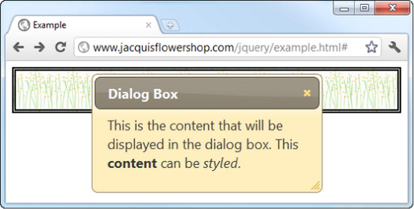
Figure 22-1. A simple dialog box
The dialog widget is created through the clever use of HTML elements and not through the operating system. This means a jQuery UI dialog doesn’t behave in quite the same way as a native dialog box does. For example, it doesn’t show up in the operating system’s list of open windows and it is possible to resize the browser window so that you obscure part (or all) of the jQuery UI dialog.
That being said, the jQuery UI team has done a good job of making the dialog as fully featured as possible. By clicking the title and dragging, the user can reposition the dialog within the browser window. The dialog can be resized and can be dismissed by clicking the close button at the top right. And, since the jQuery UI dialog widget is constructed from HTML, it is styled using the jQuery UI theme I selected in Chapter 17 and can display complex and styled HTML content.
I want to demonstrate a common usage of the dialog before I get into the details of the settings, methods, and events that the widget supports. When you call the dialog method with no arguments, as I did in the first example, the dialog appears immediately, but this isn’t usually convenient. A more common scenario is that you want to create the dialog box when the document loads (so that the element structure isn’t visible to the user) and then display the dialog box later in response to an event. Listing 22-2 shows how you can do this.
Listing 22-2. Deferring the Appearance of a jQuery UI Dialog Box
<!DOCTYPE html>
<html>
<head>
    <title>Example</title>
    <script src="jquery-2.0.2.js" type="text/javascript"></script>
    <script src="jquery-ui-1.10.3.custom.js" type="text/javascript"></script>
    <link rel="stylesheet" type="text/css" href="styles.css"/>
    <link rel="stylesheet" type="text/css" href="jquery-ui-1.10.3.custom.css"/>
    <script type="text/javascript">
        $(document).ready(function() {

            $("#dialog").dialog({
                autoOpen: false
            });

            $("button").button().click(function(e) {
                $("#dialog").dialog("open")
            })
        });
    </script>
</head>
<body>
    <h1>Jacqui's Flower Shop</h1>
    <div id="dialog" title="Dialog Box">
      This is the content that will be displayed in the dialog box. This <b>content</b>
      can be <em>styled</em>.
    </div>
    <button>Show Dialog</button>
</body>
</html>
You use the autoOpen setting to prevent the dialog from appearing immediately. When this setting is false, the HTML element structure is hidden from the user, but the dialog isn’t displayed. When you are ready to display the dialog, you can call the open method. You can see how this works in Figure 22-2.
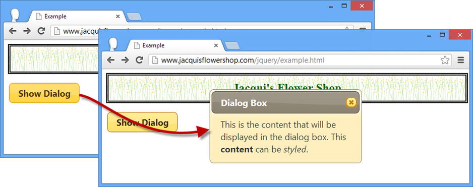
Figure 22-2. Deferring the appearance of a dialog box
Configuring the Dialog
The dialog widget supports a range of settings that allow you to customize the way that you present the dialog to the user. I showed you the autoOpen setting in the previous section, but there other settings, as described in Table 22-2.
Table 22-2. Dialog Settings
| Setting | Description |
|---|---|
| appendTo | Specifies the element that the dialog should be appended to. |
| autoOpen | When true, the dialog is displayed as soon as it is created with the dialog method. The default is true. |
| buttons | Specifies the set of buttons to add to the dialog and the functions that will be invoked when those buttons are clicked. The default is to use no buttons. |
| closeOnEscape | When true, pressing the Escape key dismisses the dialog. The default is true. |
| draggable | When true, the user can click the dialog title and drag to move the dialog within the browser. The default is true. |
| height | Specifies the initial height of the dialog in pixels. The default is auto, which allows the dialog to size itself. |
| hide | Specifies the animation effect that is used to hide the dialog. See Chapter 35 for details of the jQuery UI effects. |
| maxHeight | Specifies the maximum height (in pixels) of the dialog. The default is false, which means that there is no size limit. |
| maxWidth | Specifies the maximum width (in pixels) of the dialog. The default is false, which means that there is no size limit. |
| minHeight | Specifies the minimum height (in pixels) of the dialog. The default is false, which means that there is no minimum size limit. |
| minWidth | Specifies the minimum width (in pixels) of the dialog. The default is false, which means that there is no minimum size limit. |
| modal | When true, the dialog is modal and the user cannot interact with the document until the dialog is dismissed. The default is false. |
| position | Specifies the initial position of the dialog. |
| resizable | When true, the dialog is displayed with a drag handle that allows the user to resize the dialog. The default is true. |
| show | Specifies the animation effect that is used to show the dialog. See Chapter 35 for details of the jQuery UI effects. |
| title | Specifies the title of the dialog. |
| width | Specifies the initial width of the dialog in pixels. The default is auto, which allows the dialog to size itself. |
 Tip jQuery UI 1.10 added the appendTo option, which allows the element to which the dialog will be appended to be specified. Another new feature is that dialog will also focus automatically on content elements. (I demonstrate these features later in this part of the chapter). Other changes include a change in the way that the value of the position setting is specified and the removal of the stack and zIndex configuration options.
Configuring the Basic Dialog Appearance
The title setting allows you to create a dialog from a div element that doesn’t have a title attribute. This can be useful if you are unable to control the generation of the elements that you want to use in the dialog. Listing 22-3 shows the application of the title setting.
Listing 22-3. Using the title Setting
<!DOCTYPE html>
<html>
<head>
    <title>Example</title>
    <script src="jquery-2.0.2.js" type="text/javascript"></script>
    <script src="jquery-ui-1.10.3.custom.js" type="text/javascript"></script>
    <link rel="stylesheet" type="text/css" href="styles.css"/>
    <link rel="stylesheet" type="text/css" href="jquery-ui-1.10.3.custom.css"/>
    <script type="text/javascript">
        $(document).ready(function() {
            $("#dialog").dialog({
                title: "Hello",
                resizable: false
            });
        });
    </script>
</head>
<body>
    <h1>Jacqui's Flower Shop</h1>
    <div id="dialog">
      This is the content that will be displayed in the dialog box. This <b>content</b>
      can be <em>styled</em>.
    </div>
</body>
</html>
I have also applied the resizable setting in this example. This setting prevents the user from resizing the dialog. I usually leave the resizable setting set to true because I like to leave the user with the opportunity to resize the dialog to accommodate the content. You can see how the browser shows the dialog in the example in Figure 22-3.
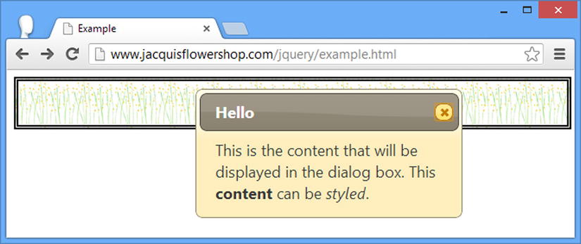
Figure 22-3. A dialog box with a custom title and no resize drag handle
The dialog will automatically focus on the first content element it finds that has the autofocus attribute, which can be useful when using the dialog widget to solicit input from the user, as shown in Listing 22-4.
Listing 22-4. Using the autofocus Attribute on a Content Element
<!DOCTYPE html>
<html>
<head>
    <title>Example</title>
    <script src="jquery-2.0.2.js" type="text/javascript"></script>
    <script src="jquery-ui-1.10.3.custom.js" type="text/javascript"></script>
    <link rel="stylesheet" type="text/css" href="styles.css"/>
    <link rel="stylesheet" type="text/css" href="jquery-ui-1.10.3.custom.css"/>
    <script type="text/javascript">
        $(document).ready(function () {
            $("#dialog").dialog({
                title: "Hello",
                resizable: false
            });
        });
    </script>
</head>
<body>
    <h1>Jacqui's Flower Shop</h1>
    <div id="dialog">
      This is the content that will be displayed in the dialog box. This <b>content</b>
      can be <em>styled</em>.
        <p>Name: <input id="name"/> City: <input id="city" autofocus="autofocus" /></p>
    </div>
</body>
</html>
I have added input elements to the content for the dialog, the second of which has the autofocus attribute. You can see how the dialog widget focuses on this element in Figure 22-4.
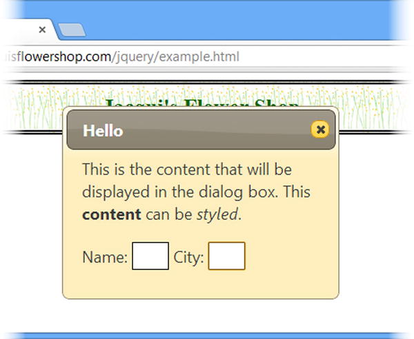
Figure 22-4. The effect of the autofocus attribute
Setting the Location of the Dialog
The position setting allows you to specify where the dialog will be displayed in the browser window. The position is expressed using the same properties and values that I described in Chapter 19 for the autocomplete pop-up, which I have repeated in Table 22-3.
Table 22-3. Position Properties
| Name | Description |
|---|---|
| my | Specifies the part of the dialog that will be used to determine placement |
| at | Specifies the part of the target element that the dialog will be positioned relative to |
| of | Specifies the target element that the dialog will be positioned relative to; this is the body element if omitted |
| collision | Specifies how the placement of the dialog should be adjusted if it overflows the window |
The my and at properties are set using values that specify horizontal and vertical positions, separated by a space. The horizontal values are left, right, and center and the vertical values are top, bottom, and center. You can see how I have set these properties in Listing 22-5. (You can learn about the other position properties in Chapter 19.)
Listing 22-5. Positioning the Dialog
<!DOCTYPE html>
<html>
<head>
    <title>Example</title>
    <script src="jquery-2.0.2.js" type="text/javascript"></script>
    <script src="jquery-ui-1.10.3.custom.js" type="text/javascript"></script>
    <link rel="stylesheet" type="text/css" href="styles.css"/>
    <link rel="stylesheet" type="text/css" href="jquery-ui-1.10.3.custom.css"/>
    <script type="text/javascript">
        $(document).ready(function () {
            $("#dialog").dialog({
                title: "Positioned Dialog",
                position: {
                    my: "left top",
                    at: "left top"
                }
            });
        });
    </script>
</head>
<body>
    <h1>Jacqui's Flower Shop</h1>
    <div id="dialog">
      This is the content that will be displayed in the dialog box. This <b>content</b>
      can be <em>styled</em>.
    </div>
</body>
</html>
I have positioned the dialog so that the top-left edge is positioned with the top-left edge of its parent element, which is the body element by default. You can see how the dialog is positioned in Figure 22-5.
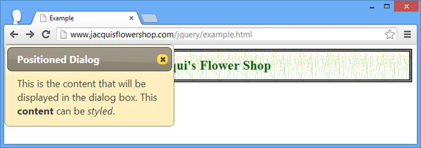
Figure 22-5. Specifying the position of the dialog
Adding Buttons to a Dialog
You can add buttons to a jQuery UI dialog using the buttons setting. The value of this setting is an array of objects, each of which has text and click properties. The value of the text property is used as the label for the button, and you provide a function as the value of click property, which will be invoked when the button is clicked. Listing 22-6 shows the use of this setting.
Listing 22-6. Adding Buttons to a Dialog
...
<script type="text/javascript">
    $(document).ready(function() {
        $("#dialog").dialog({
            title: "Dialog",
            buttons: [{text: "OK", click: function() {/* do something */}},
                      {text: "Cancel", click: function() {$(this).dialog("close")}}]

        });
    });
</script>
...
In this script, I have added two buttons. The function for the OK button doesn’t do anything, but for the Cancel button, I close the dialog. Notice that I use the this variable in the jQuery selector within the Cancel function. This is set to the div element that was used to create the dialog. You can see how the buttons are displayed in Figure 22-6. This example uses the close method, which dismisses the dialog. I describe the dialog methods later in this chapter.
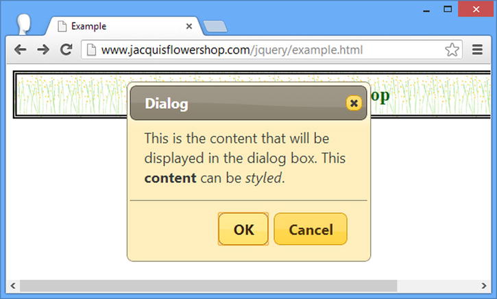
Figure 22-6. Adding buttons to a jQuery UI dialog
As of jQuery UI version 1.10, you can specify icons for buttons in a dialog by adding an icons property to the objects that define each button, as shown in Listing 22-7.
Listing 22-7. Adding Icons to the Buttons in a Dialog Widget
...
<script type="text/javascript">
    $(document).ready(function () {
        $("#dialog").dialog({
            title: "Dialog",
            buttons: [{
                text: "OK",
                click: function () {/* do something */ },
                icons: {
                    primary: "ui-icon-star",
                    secondary: "ui-icon-circle-arrow-e"
                }
            },{ text: "Cancel", click: function () { $(this).dialog("close") }}]
        });
    });
</script>
...
The icons property is set to an object that defines properties named primary and secondary, which define icons to the left and right of the button text. These properties are used to specify icons in the same way as for the button widget, as described in Chapter 18. You can see the effect of the additions to the listing in Figure 22-7.
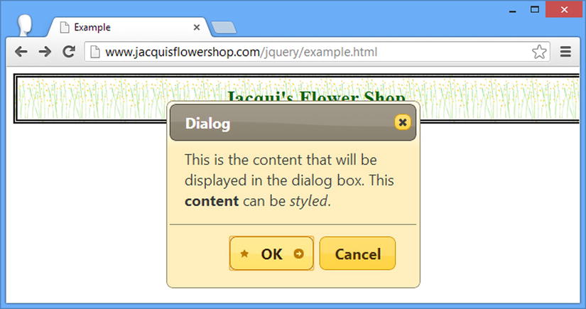
Figure 22-7. Using icons in dialog buttons
Tip You can disable the text in a dialog button by defining a property called showText on the object that defines the button (not the icons object) and setting it to false.
Dragging Dialogs
The draggable setting determines whether the user can drag the dialog box within the browser window. This setting is true by default, and I recommend that you leave the setting unchanged. It allows the user to see the underlying content. This can be particularly important if you are showing a dialog to express some kind of error or problem. If the draggable setting is false, then the user won’t be able to reposition the dialog box.
The draggable setting can also be important when you are using multiple dialogs in the same window. This is not something I recommend, but if you must display dialog boxes, you need to make sure the user can arrange them so that they can all be read. On small screens, they tend to pile up on top of each other, as shown in Listing 22-8.
Listing 22-8. Using the draggable Setting
<!DOCTYPE html>
<html>
<head>
    <title>Example</title>
    <script src="jquery-2.0.2.js" type="text/javascript"></script>
    <script src="jquery-ui-1.10.3.custom.js" type="text/javascript"></script>
    <link rel="stylesheet" type="text/css" href="styles.css"/>
    <link rel="stylesheet" type="text/css" href="jquery-ui-1.10.3.custom.css"/>
    <script type="text/javascript">
        $(document).ready(function () {
            $(".dialog").dialog({
                draggable: true
            });
        });
    </script>
</head>
<body>
    <h1>Jacqui's Flower Shop</h1>
    <div id="d1" class="dialog" title="First Dialog">
      This is the first dialog
    </div>
    <div id="d2" class="dialog" title="Second Dialog">
      This is the second dialog
    </div>
    <div id="d3" class="dialog" title="Third Dialog">
      This is the third dialog
    </div>
</body>
</html>
I create three dialogs in this document and the default positioning stacks them up. Setting the draggable setting to true allows me to move the dialogs, as shown in Figure 22-8.
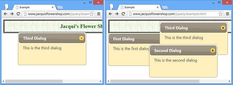
Figure 22-8. Dragging dialogs
Creating Modal Dialogs
A modal dialog prevents the user from interacting with the elements in the document until the dialog has been dismissed. A value of true for the modal setting creates a modal dialog, as shown in Listing 22-9.
Listing 22-9. Creating a Modal Dialog
<!DOCTYPE html>
<html>
<head>
    <title>Example</title>
    <script src="jquery-2.0.2.js" type="text/javascript"></script>
    <script src="jquery-ui-1.10.3.custom.js" type="text/javascript"></script>
    <link rel="stylesheet" type="text/css" href="styles.css"/>
    <link rel="stylesheet" type="text/css" href="jquery-ui-1.10.3.custom.css"/>
    <script type="text/javascript">
        $(document).ready(function() {
            $("#dialog").dialog({
                buttons: [{text: "OK", click: function() {$(this).dialog("close")}}],
                modal: true,
                autoOpen: false
            })

            $("#show").button().click(function() {
                $("#dialog").dialog("open");
            })
        });
    </script>
</head>
<body>
    <h1>Jacqui's Flower Shop</h1>
    <div id="dialog" title="Modal Dialog">
      This is a modal dialog. Press OK to continue.
    </div>
    <button id="show">Show Dialog</button>
</body>
</html>
In Listing 22-9, I have created a modal dialog that is not initially visible to the user. The dialog is shown in response to a button being clicked and you can see the effect in Figure 22-9. This example relies on the open and close methods, which show and dismiss the dialog. I explain all of the methods that the dialog widget supports later in this chapter.
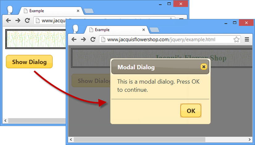
Figure 22-9. Displaying a modal dialog
When showing a modal dialog, jQuery UI places a dark layer behind the dialog but in front of the rest of the document. The document doesn’t return to its original state until the dialog is dismissed. In this example, I have provided the user with an OK button that does this.
Tip When selecting the button you have added to the document to show the dialog, be careful not to use $("button") if you are also adding buttons to the dialog itself. This selector matches the buttons that you have added and those that are created by the dialog method, which means that the dialog buttons will end up with the same click handler as the button in the document, rather than the handlers specified by the buttons setting.
Showing a Form in a Modal Dialog
The benefit of a modal dialog is that it focuses the user’s attention. You can use this to your advantage by displaying forms in modal dialogs, as shown in Listing 22-10.
Listing 22-10. Displaying a Form in a Model Dialog
<!DOCTYPE html>
<html>
<head>
    <title>Example</title>
    <script src="jquery-2.0.2.js" type="text/javascript"></script>
    <script src="jquery-ui-1.10.3.custom.js" type="text/javascript"></script>
    <script src="handlebars.js"></script>
    <script src="handlebars-jquery.js"></script>
    <link rel="stylesheet" type="text/css" href="jquery-ui-1.10.3.custom.css"/>
    <link rel="stylesheet" type="text/css" href="styles.css"/>
    <style type="text/css">
        #dialog input {width: 150px; margin: 5px; text-align: left}
        #dialog label {width: 100px}
        table {border-collapse: collapse; border: thin solid black; margin: 10px}
        #placeholder {text-align: center}
        #show {margin: 10px}
        td, th {padding: 5px; width: 100px}
    </style>
    <script id="rowTmpl" type="text/x-handlebars-template">
        <tr><td>{{product}}</td><td>{{color}}</td><td>{{count}}</td></tr>
    </script>
    <script type="text/javascript">
        $(document).ready(function () {
            $("#dialog").dialog({
                buttons: [{ text: "OK", click: addDataToTable }],
                modal: true,
                autoOpen: false,
                width: 340
            })

            $("#show").button().click(function () {
                $("#dialog").dialog("open");
            })

            function addDataToTable() {
                var data = {
                    product: $("#product").val(),
                    color: $("#color").val(),
                    count: $("#count").val()
                }
                $("#placeholder").hide();
                $("#rowTmpl").template(data).filter("*").appendTo("#prods tbody");
                $("#dialog").dialog("close");
            }
        });
    </script>
</head>
<body>
    <h1>Jacqui"s Flower Shop</h1>
    <div id="dialog" title="Enter Details" class="ui-widget">
        <div><label for="product">Product: </label><input id="product" /></div>
        <div><label for="color">Color: </label><input id="color" /></div>
        <div><label for="count">Quantity: </label><input id="count" /></div>
    </div>
    <table id="prods" class="ui-widget" border="1">
        <tr><th>Product</th><th>Color</th><th>Quantity</th></tr>
        <tr id="placeholder"><td colspan=3>No Products Selected</td></tr>
    </table>
    <button id="show">Add Product</button>
</body>
</html>
In Listing 22-10, I have defined a set of input elements inside the div element that I use to create the modal dialog. When the user clicks the button in the document, the dialog is shown and gathers data from the user. When the user clicks the OK button (which I defined using the buttons setting), I collect the values from the input elements and use a data template to generate a new row for an HTML table. You can see the sequence in Figure 22-10.

Figure 22-10. Using a modal dialog to capture input from the user
I have tried to keep this example simple, but you can readily apply the validation techniques I showed you in Chapter 13 to reduce the risk of data errors, and you can use the Ajax techniques I showed in Chapters 14 and 15 to submit the data entered by the user to a remote server.
Caution Showing a form inside a modal dialog is a useful technique for simple forms only. You are at risk of confusing and annoying the user if you find yourself trying to combine tabs or accordions with a modal dialog. If a form represents a substantial effort to fill in, then it warrants being properly integrated into the document itself.
Using the Dialog Methods
The jQuery UI dialog widget supports the methods described in Table 22-4.
Table 22-4. Dialog Methods
| Method | Description |
|---|---|
| dialog("destroy") | Removes the dialog widget from the underlying element |
| dialog("option") | Changes one or more settings |
| dialog("close") | Dismisses the dialog |
| dialog("isOpen") | Returns true if the dialog is visible |
| dialog("moveToTop") | Moves the dialog to the top of the stack |
| dialog("open") | Displays the dialog to the user |
As you might expect, most of these methods allow you to manage a dialog programmatically. The methods that I find myself using most frequently are open and close , of course. Listing 22-11 shows these methods.
Listing 22-11. Using the Dialog Methods
<!DOCTYPE html>
<html>
<head>
    <title>Example</title>
    <script src="jquery-2.0.2.js" type="text/javascript"></script>
    <script src="jquery-ui-1.10.3.custom.js" type="text/javascript"></script>
    <link rel="stylesheet" type="text/css" href="styles.css"/>
    <link rel="stylesheet" type="text/css" href="jquery-ui-1.10.3.custom.css"/>
    <script type="text/javascript">
        $(document).ready(function () {
            $("#d1, #d2").dialog({
                autoOpen: false,
            });

            $("#t1, #t2").button().click(function (e) {
                var target = this.id == "t1" ? "#d1" : "#d2";
                if ($(target).dialog("isOpen")) {
                    $(target).dialog("close")
                } else {
                    $(target).dialog("open")
                }
            })
        });
    </script>
</head>
<body>
    <h1>Jacqui's Flower Shop</h1>
    <div id="d1" class="dialog" title="First Dialog" class="ui-widget">
        This is the first dialog
    </div>
    <div id="d2" class="dialog" title="Second Dialog" class="ui-widget">
        This is the second dialog
    </div>
    <div>
        <button id="t1">Toggle Dialog 1</button>
    </div>
    <button id="t2">Toggle Dialog 2</button>
</body>
</html>
This document includes two button elements that toggle the visibility of two dialogs. The visibility of each dialog is assessed using the isOpen method. Figure 22-11 shows the document displayed in the browser with both dialogs visible.
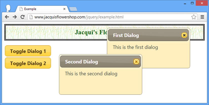
Figure 22-11. Toggling the visibility of dialogs using widget methods
The jQuery UI dialog widget supports the events described in Table 22-5. I describe some of the more useful events in the sections that follow.
Table 22-5. Dialog Events
| Event | Description |
|---|---|
| create | Triggered when the dialog widget is applied to an underlying HTML element |
| beforeClose | Triggered when the dialog is about to close; returning false from the handler function forces the dialog to remain open |
| open | Triggered when the dialog is opened |
| focus | Triggered when the dialog gains the focus |
| dragStart | Triggered when the user starts to drag a dialog |
| drag | Triggered for every mouse movement while a dialog is being dragged |
| dragStop | Triggered when the user finishes dragging a dialog |
| resizeStart | Triggered when the user beings resizing a dialog |
| resize | Triggered for every mouse movement while a dialog is being resized |
| resizeStop | Triggered when the user finishes resizing a dialog |
| close | Triggered when a dialog is closed |
Keeping the Dialog Open
The beforeClose event allows you to receive notification that the user has requested that the dialog be closed. This can be because the user pressed the Escape key (if the closeOnEscape setting is true), clicked the close icon at the top-right of the dialog, or clicked a button you have added through the buttons setting.
Most of the time, you should respect the user’s wishes and allow the dialog to close, but there are rare occasions when you require the user to perform some action using the dialog first, or, as Listing 22-12 demonstrates, you require the dialog to be displayed for a certain period before allowing the user to continue.
Listing 22-12. Preventing a Dialog from Closing
<!DOCTYPE html>
<html>
<head>
    <title>Example</title>
    <script src="jquery-2.0.2.js" type="text/javascript"></script>
    <script src="jquery-ui-1.10.3.custom.js" type="text/javascript"></script>
    <link rel="stylesheet" type="text/css" href="styles.css"/>
    <link rel="stylesheet" type="text/css" href="jquery-ui-1.10.3.custom.css"/>
    <style type="text/css">
        input {width: 150px}
    </style>
    <script type="text/javascript">
        $(document).ready(function() {

            var canClose = false;
            var delay = 15;

            $("#dialog").dialog({
                modal: true,
                autoOpen: false,
                beforeClose: function() {
                    return canClose;
                },
                open: function() {
                    var count = delay;
                    var intID = setInterval(function() {
                        count--;
                        $("#time").text(count);
                        if (count == 0) {
                            clearInterval(intID)
                            canClose = true;
                            $("#dialog").dialog("close")
                        }
                    }, 1000)
                }
            })

            $("button").click(function(e) {
                $("#dialog").dialog("open")
            })

        });
    </script>
</head>
<body>
    <h1>Jacqui's Flower Shop</h1>

    <div class="ui-widget">
        <label for="user">Username: </label><input id="user"/>
        <label for="pass">Password: </label><input id="pass"/>
        <button id="send">Login</button>
    </div>
    <div id="dialog" title="Wrong Password">
        The password you entered was incorrect. Please try again in
        <span id="time">15</span> seconds.
    </div>
</body>
</html>
In Listing 22-12, I have defined a pair of input elements to collect a username and password from the user. It doesn’t matter what the user enters, however, because I respond to the Login button being clicked by displaying a Wrong Password modal dialog.
I respond to the open event by starting a repeating function that counts down from 15 seconds. During this period, I use the beforeClose event to prevent the user from closing the dialog. At the end of the 15 seconds, I call the close method and dismiss the dialog. By combining the open and beforeClose events, I can ensure that the user cannot immediately try other username or password combinations (well, at least not without reloading the HTML document, anyway).
Responding to Changing Sizes and Positions
The dialog widget provides a comprehensive set of events for tracking the dialog as it is resized or dragged. These are events that are usually not required but are handy to have in those rare situations where being able to track the changes becomes important. Listing 22-13 demonstrates using the dragStart and dragStop events to disable the input and button elements in a document while a dialog is being dragged.
Listing 22-13. Responding to a Dialog Being Dragged
<!DOCTYPE html>
<html>
<head>
    <title>Example</title>
    <script src="jquery-2.0.2.js" type="text/javascript"></script>
    <script src="jquery-ui-1.10.3.custom.js" type="text/javascript"></script>
    <link rel="stylesheet" type="text/css" href="styles.css"/>
    <link rel="stylesheet" type="text/css" href="jquery-ui-1.10.3.custom.css"/>
    <style type="text/css">
        input {width: 150px; text-align: left}
    </style>
    <script type="text/javascript">
        $(document).ready(function() {

            $("#dialog").dialog({
                autoOpen: true,
                dragStart: function() {
                    $("input, #send").attr("disabled", "disabled")
                },
                dragStop: function() {
                    $("input, #send").removeAttr("disabled")
                }
            })

            $("button").click(function(e) {
                $("#dialog").dialog("open")
            })
        });
    </script>
</head>
<body>
    <h1>Jacqui's Flower Shop</h1>

    <div class="ui-widget">
        <label for="user">Username: </label><input id="user"/>
        <label for="pass">Password: </label><input id="pass"/>
        <button id="send">Login</button>
    </div>
    <div id="dialog" title="Wrong Password">
        The password you entered was incorrect. Please try again in
        <span id="time">15</span> seconds.
    </div>
</body>
</html>
Using the jQuery UI Spinner Widget
The spinner widget was added to jQuery UI in version 1.9 and enhances an input element with up and down buttons so that the user can spin through a range of values. The spinner widget is applied using the spinner method, as shown in Listing 22-14.
Listing 22-14. Creating a Basic Spinner Widget
<!DOCTYPE html>
<html>
<head>
    <title>Example</title>
    <script src="jquery-2.0.2.js" type="text/javascript"></script>
    <script src="jquery-ui-1.10.3.custom.js" type="text/javascript"></script>
    <link rel="stylesheet" type="text/css" href="jquery-ui-1.10.3.custom.css"/>
    <link rel="stylesheet" type="text/css" href="styles.css"/>
    <style type="text/css">
        input {width: 150px;}
    </style>
    <script type="text/javascript">
        $(document).ready(function () {
            $("#entry").spinner();
        });
    </script>
</head>
<body>
    <h1>Jacqui's Flower Shop</h1>
    <div class="ui-widget">
        Enter value: <input id="entry" value="0" />
    </div>
</body>
</html>
You can see the way in which the input element is transformed in Figure 22-12, as well as the effect of clicking on the buttons that jQuery UI adds to the element.
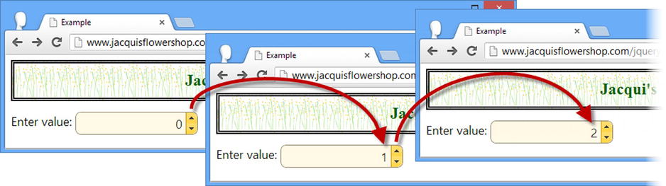
Figure 22-12. Creating and using a spinner
Using the Spinner Widget with the HTML5 Input Element Types
HTML5 supports some new values for the type attribute of the input element, one of which has a similar effect to using the spinner widget: the number type. You can see how I have used this type in Listing 22-15.
Listing 22-15. Using the HTML5 Number Input Element
<!DOCTYPE html>
<html>
<head>
    <title>Example</title>
    <link rel="stylesheet" type="text/css" href="jquery-ui-1.10.3.custom.css"/>
    <link rel="stylesheet" type="text/css" href="styles.css"/>
    <style type="text/css">
        input {width: 150px;}
    </style>
</head>
<body>
    <h1>Jacqui's Flower Shop</h1>
    <div class="ui-widget">
        Enter value: <input id="entry" value="0" type="number" />
    </div>
</body>
</html>
I have taken out all of the JavaScript libraries and code from this example to emphasize the built-in browser support for the new type of input element. Figure 22-13 shows you how Google Chrome displays this listing.
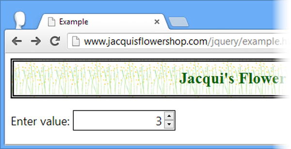
Figure 22-13. Using the number type input element in Google Chrome
This approach has some advantages over the jQuery UI spinner because the implementation of the controls that change the value is not part in the HTML5 standard—this allows browsers to present the user with device-specific navigation. jQuery UI spinners always use the up and down buttons, which can be hard to use on small touch screen devices like smartphones.
The biggest problem with the new number type is that most browsers just ignore it, even those that implement other HTML5 features. And it is hard to mix and match the native HTML5 spinner with jQuery UI because the spinner widget doesn’t check the type of the input element when the spinner method is called. Listing 22-16 shows an example HTML document that applies the spinner widget to an input element whose type is number.
Listing 22-16. Mixing jQuery UI Widgets and HTML5 input Element Types
<!DOCTYPE html>
<html>
<head>
    <title>Example</title>
    <script src="jquery-2.0.2.js" type="text/javascript"></script>
    <script src="jquery-ui-1.10.3.custom.js" type="text/javascript"></script>
    <link rel="stylesheet" type="text/css" href="jquery-ui-1.10.3.custom.css"/>
    <link rel="stylesheet" type="text/css" href="styles.css"/>
    <style type="text/css">
        input {width: 150px;}
    </style>
    <script type="text/javascript">
        $(document).ready(function () {
            $("#entry").spinner();
        });
    </script>
</head>
<body>
    <h1>Jacqui's Flower Shop</h1>
    <div class="ui-widget">
        Enter value: <input id="entry" value="0" type="number" />
    </div>
</body>
</html>
I have restored the JavaScript libraries and code and you can see the effect in Figure 22-14—two sets of buttons to change the value in the input element. The browser implementation of the new input element types and the jQuery UI handling of them are not yet mature enough to be reliable and I recommend avoiding them, especially in combination.
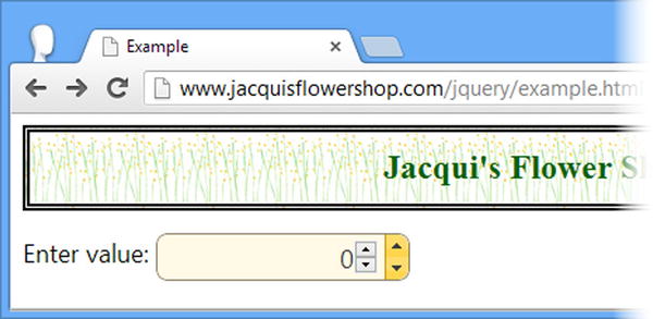
Figure 22-14. Combining the HTML5 number input element and the jQuery UI spinner
Configuring the Spinner Widget
The spinner widget supports a range of settings that allow you to customize the way that it operates, as described in Table 22-6 and as demonstrated in the sections that follow.
Table 22-6. Spinner Settings
| Setting | Description |
|---|---|
| culture | Specifies the locale setting for parsing and formatting the data value. |
| disabled | Disables the spinner when set to true. |
| icons | Specifies the icons used for the spinner buttons (the default icons are up and down arrows). |
| incremental | Specifies how the value is incremented when one of the buttons is held down. When set to true, the rate of change will increase the longer the button is held. When set to false, the rate of change will remain constant. You can also specify a function to customize the rate change. |
| max | Specifies the largest allowed value. |
| min | Specifies the smallest allowed value. |
| numberFormat | Specifies the format of the number that the spinner displays. |
| page | Specifies the size of a page, which is the amount the value changes when the pageUp and pageDown method (described later in the chapter). |
| step | Specifies the amount by which the value will change when the up and down buttons are clicked. |
Configuring the Basic Spinner Behavior
The basic behavior of the spinner widget is controlled by four settings: min, max, step, and page. In Listing 22-17, you can see how I have used these properties to constrain the values the spinner will support and how they are incremented and decremented.
Listing 22-17. Configuring the Basic Spinner Behavior
<!DOCTYPE html>
<html>
<head>
    <title>Example</title>
    <script src="jquery-2.0.2.js" type="text/javascript"></script>
    <script src="jquery-ui-1.10.3.custom.js" type="text/javascript"></script>
    <link rel="stylesheet" type="text/css" href="jquery-ui-1.10.3.custom.css"/>
    <link rel="stylesheet" type="text/css" href="styles.css"/>
    <style type="text/css">
        input {width: 150px;}
    </style>
    <script type="text/javascript">
        $(document).ready(function () {
            $("#entry").spinner({
                min: 2,
                max: 100,
                step: 2,
                page: 5
            });
        });
    </script>
</head>
<body>
    <h1>Jacqui's Flower Shop</h1>
    <div class="ui-widget">
        Enter value: <input id="entry" value="0" />
    </div>
</body>
</html>
The min and max properties don’t enforce validation on the input element—they only control the range of values that will be used by the up and down buttons. Once the limit defined by the max property has been reached (e.g., pressing the up button won’t increment the value any further), the user can still edit the contents of the input element directly and insert a larger value (or a non-numeric value).
Tip See Chapter 13 for details of how you can perform validation on input elements
The step and page properties control how the spinner widget increments and decrements the numeric value. The step property specifies the amount by which the value is changed when the user presses one of the buttons added by the widget; the page property specifies the amount by which the value is changed when the pageUp and pageDown methods are called (I describe these methods later in the chapter).
In the listing, I have specified a minimum value of 2 and a maximum value of 100. I used the step property to tell jQuery UI that the up and down buttons should change the value by 2 and the page property to tells jQuery UI to respond to the pageUp and pageDown methods by incrementing or decrementing the value by 5. You can see the effect in Figure 22-15.
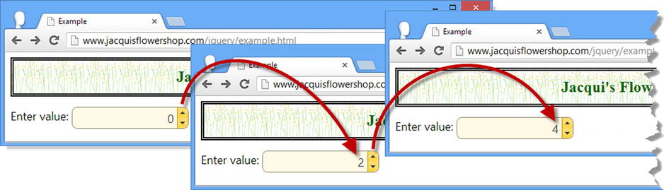
Figure 22-15. Controlling the basic behavior of the spinner widget
Tip Notice that the min value doesn’t affect the initial value displayed by the input element. I have set the value attribute on the input element to zero, which is less than the min value I used when setting up the spinner.
The spinner widget will reset the contents of the input element to the smallest allowed value if the user enters a value which is outside the allowed range and then clicks the up or down buttons. You can see the effect in Figure 22-16.
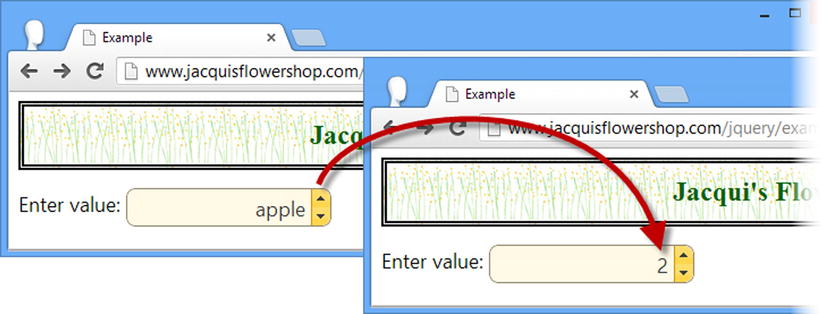
Figure 22-16. The spinner resetting the input element value
Changing the Spinner Button Icons
The icons displayed by the up and down buttons are set using the icons property. The default icons are up and down arrows, but they can be set to any of the jQuery UI icons (which I described in Chapter 18) as shown in Listing 22-18.
Listing 22-18. Changing the Spinner Button Icons
<!DOCTYPE html>
<html>
<head>
    <title>Example</title>
    <script src="jquery-2.0.2.js" type="text/javascript"></script>
    <script src="jquery-ui-1.10.3.custom.js" type="text/javascript"></script>
    <link rel="stylesheet" type="text/css" href="jquery-ui-1.10.3.custom.css"/>
    <link rel="stylesheet" type="text/css" href="styles.css"/>
    <style type="text/css">
        input {width: 150px;}
    </style>
    <script type="text/javascript">
        $(document).ready(function () {
            $("#entry").spinner({
                min: 2,
                max: 100,
                step: 2,
                page: 5,
                icons: {
                    up: "ui-icon-circle-plus",
                    down: "ui-icon-circle-minus",
                }
            });
        });
    </script>
</head>
<body>
    <h1>Jacqui's Flower Shop</h1>
    <div class="ui-widget">
        Enter value: <input id="entry" value="0" />
    </div>
</body>
</html>
The icons property is set with an object that has up and down properties, which define the icon that will be used for the corresponding button. I specified plus and minus icons and you can see the result in Figure 22-17.
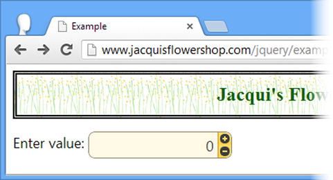
Figure 22-17. Changing the icons used by the spinner widget
Controlling the Change Rate
The incremental property is used to set the rate at which the value is changed when the user holds the up or down button. Setting this property to true will gradually increase the rate at which the value is changed the longer the button is held for; a value of false keeps the rate of change constant. The third option is to specify a function that customizes the rate of change, which Listing 22-19 demonstrates.
Listing 22-19. Specifying a Function for the incremental Setting Property
<!DOCTYPE html>
<html>
<head>
    <title>Example</title>
    <script src="jquery-2.0.2.js" type="text/javascript"></script>
    <script src="jquery-ui-1.10.3.custom.js" type="text/javascript"></script>
    <link rel="stylesheet" type="text/css" href="jquery-ui-1.10.3.custom.css"/>
    <link rel="stylesheet" type="text/css" href="styles.css"/>
    <style type="text/css">
        input {width: 150px;}
    </style>
    <script type="text/javascript">
        $(document).ready(function () {
            $("#entry").spinner({
                incremental: function (spins) {
                    return Math.pow(spins, 2);
                }
            });
        });
    </script>
</head>
<body>
    <h1>Jacqui's Flower Shop</h1>
    <div class="ui-widget">
        Enter value: <input id="entry" value="0" />
    </div>
</body>
</html>
The argument passed to the function is the number of spins that the duration for which the button has been held is equivalent to. The function returns the value that should be displayed and my example returns the square of the spin count.
Setting the Number Format
The format of the number which is displayed by the spinner is controlled by the numberFormat and culture properties and is dependent on an external library called Globalize.
You can get the Globalize files from https://github.com/jquery/globalize. Click the Releases link, select the version you want (as I write this, the latest version is 0.1.1), and download either a zip or tar.gz archive. Extract the files from the archive and copy the following files to the folder that contains example.html and the JavaScript library files.
- lib/globalize.js
- lib/cultures/globalize.cultures.js
The first file contains the JavaScript code for dealing with localization and the second file contains a complete set of the locales that the Globalize library comes with.
Tip There are other, smaller, files in the lib/cultures folder that deal with a single locale and which you can use if you are only working with a limited set of regions.
The numberFormat property for the spinner widget specifies the format for the number, and the culture property specifies the locale whose formatting conventions will be used. In Listing 22-20, you can see both properties in use.
Listing 22-20. Using the numberFormat and culture Properties
<!DOCTYPE html>
<html>
<head>
    <title>Example</title>
    <script src="jquery-2.0.2.js" type="text/javascript"></script>
    <script src="jquery-ui-1.10.3.custom.js" type="text/javascript"></script>
    <link rel="stylesheet" type="text/css" href="jquery-ui-1.10.3.custom.css"/>
    <script src="globalize.js"></script>
    <script charset="utf-8" src="globalize.cultures.js"></script>
    <link rel="stylesheet" type="text/css" href="styles.css"/>
    <style type="text/css">
        input {width: 150px;}
    </style>
    <script type="text/javascript">
        $(document).ready(function () {
            $("#entry").spinner({
                culture: "fr-FR",
                numberFormat: "C"
            });
        });
    </script>
</head>
<body>
    <h1>Jacqui's Flower Shop</h1>
    <div class="ui-widget">
        Enter value: <input id="entry" value="5.00"/>
    </div>
</body>
</html>
The globalize.js file must be imported before the globalize.cultures.js file so that the locale information can be registered with the main library. When configuring the spinner, I have set the culture to fr-FR (which is the locale designator for French-speaking France) and the numberFormat to C, which specifies a currency. You can see the result in Figure 22-18.
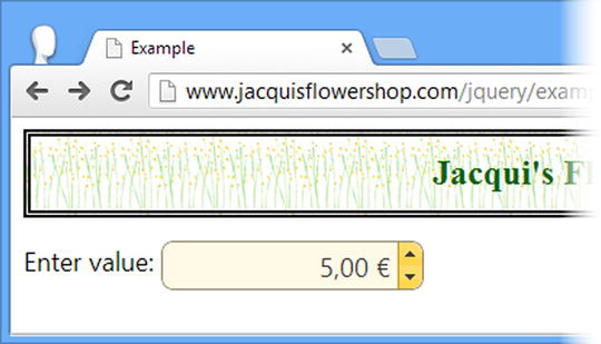
Figure 22-18. Setting the culture and format for the spinner widget
Tip If you omit the culture setting, the locale defaults to the settings for the United States.
France uses the euro as its currency, places the symbol after the number, and separates the whole and fractional parts of a number with a comma.
Notice that I set the charset attribute of the script element for the local information, as follows:
...
<scriptcharset="utf-8"src="globalize.cultures.js"></script>
...
You can set the character set for an HTML document using a meta element, but if you have not done so—and I have not in the example document—then you should set the character set explicitly for the script element that contains the locale information. Without this, most browsers have problems displaying currency symbols of other locales, as shown in Figure 22-19, which should display the euro symbol, but it gets interpreted as nonsense.
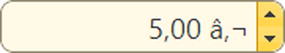
Figure 22-19. The effect of omitting the charset attribute from the locale script element
The jQuery UI spinner widget supports the methods described in Table 22-7.
Table 22-7. Spinner Methods
| Method | Description |
|---|---|
| spinner("destroy") | Removes the dialog widget from the underlying element |
| spinner("disable") | Disables the spinner widget |
| spinner("enable") | Enables the spinner widget |
| spinner("option") | Gets or sets settings |
| spinner("pageDown", count) | Decrements the spinner value by the specified number of pages |
| spinner("pageUp", count) | Increments the spinner value by the specified number of pages |
| spinner("stepDown", count) | Decrements the spinner value by the specified number of steps |
| spinner("stepUp", count) | Increments the spinner value by the specified number of steps |
| spinner("value") | Gets or sets the current value of the spinner |
In Listing 22-21, you can see how I have applied the spinner-specific methods to the example.
Listing 22-21. Using the Spinner Methods
<!DOCTYPE html>
<html>
<head>
    <title>Example</title>
    <script src="jquery-2.0.2.js" type="text/javascript"></script>
    <script src="jquery-ui-1.10.3.custom.js" type="text/javascript"></script>
    <link rel="stylesheet" type="text/css" href="jquery-ui-1.10.3.custom.css"/>
    <script src="globalize.js"></script>
    <script  src="globalize.cultures.js"></script>
    <link rel="stylesheet" type="text/css" href="styles.css"/>
    <style type="text/css">
        input {width: 150px;}
        button { margin-top: 10px; }
    </style>
    <script type="text/javascript">
        $(document).ready(function () {

            $("#entry").spinner({
                culture: "en-US",
                numberFormat: "C",
                step: 2,
                page: 10
            });

            $("button").button().click(function () {
                $("#entry").spinner(this.id);
                console.log("Value: " + $("#entry").spinner("value"));
            });

        });
    </script>
</head>
<body>
    <h1>Jacqui's Flower Shop</h1>
    <div class="ui-widget">
        Enter value: <input id="entry" value="5.00"/>
    </div>
    <div>
        <button id="pageDown">Page Down</button>
        <button id="stepDown">Step Down</button>
        <button id="stepUp">Step Up</button>
        <button id="pageUp">Page Up</button>
    </div>
</body>
</html>
I have added button elements which I use to call the methods on the spinner control, incrementing and decrementing the value based on the step and page values. You can see the result in Figure 22-20.
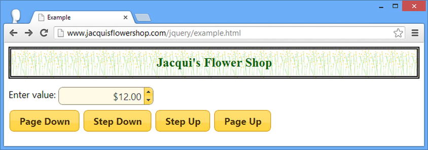
Figure 22-20. Controlling the value of the spinner programmatically
If you look at the browser console, you will see output like the following:
Value: 8
Value: 10
Value: 12
The spinner value method returns the unformatted value, without the effect of the culture and numberFormat settings. You’ll get the formatted value if you use jQuery to select the underlying input element and use the val method.
Using the Spinner Events
The jQuery UI spinner widget supports the events described in Table 22-8.
Table 22-8. Dialog Events
| Event | Description |
|---|---|
| create | Triggered when the widget is created |
| change | Triggered when the value of the spinner changes and the underlying input element has lost the focus |
| spin | Triggered when the value is incremented or decremented |
| start | Triggered before the value is incremented or decremented |
| stop | Triggered after the value is incremented or decremented |
In Listing 22-22, you can see how I have updated the previous example to write out the value of the spinner in response to the stop event.
Listing 22-22. Using the stop Event
...
<script type="text/javascript">
    $(document).ready(function () {
        $("#entry").spinner({
            culture: "en-US",
            numberFormat: "C",
            step: 2,
            page: 10,
            stop: function () {
                console.log("Value: " + $("#entry").spinner("value"));
            }
        });

        $("button").button().click(function () {
            $("#entry").spinner(this.id);
            //console.log("Value: " + $("#entry").spinner("value"));
        });

    });
</script>
...
Tip You can stop the value from changing by canceling the spin or start events. See Chapter 9 for details of the jQuery support for events.
Summary
In this chapter, I showed you the jQuery UI dialog and spinner widgets. Following the same format as the other widget chapters, I focused on the settings, methods, and events that the dialog and spinner widgets support. In Chapter 23, I show you the menu and tooltip widgets.