
Using Lists and Panels
In this chapter, I describe the jQuery Mobile list and panel widgets. Lists are an important tool in building mobile web applications, and they often provide simple and obvious navigation around the different functional areas of a web application. The beauty of lists is that they are compact, even when the individual list items are large enough to be selected by touch. They are also extremely well understood by users. Simply placing an arrow icon at the right edge of a list item (which jQuery Mobile does by default) makes it clear to most users that selecting the item will cause some kind of selection or navigation to occur.
Panels are a general-purpose widget that brings content into context on the left or right side of the window. Panels can be used to display any content, but are most frequently used for settings or navigation features that are persistent throughout the application. Table 32-1 provides the summary for this chapter.
Table 32-1. Chapter Summary
| Problem | Solution | Listing |
|---|---|---|
| Create a list. | Define a ul or ol element that contains one or more li elements and has the data-role attribute set to listview. The contents of the li elements should be links. | 1 |
| Create an inset list. | Set the data-inset attribute to true. | 2 |
| Create a list whose items are made of two distinct parts. | Add a second link to each li element. | 3 |
| Allow the user to filter the contents of the list. | Set the data-filter attribute to true. | 4, 5 |
| Add dividers to a list. | Set the data-role attribute to list-divider on individual li elements. | 6 |
| Add a count bubble to a list item. | Use the ui-li-count class. | 7 |
| Use different text emphasis. | Use the h1-h6 and p elements. | 8 |
| Add an aside to a list item. | Use the ui-li-aside class. | 9 |
| Create a panel. | Set the data-role attribute to panel on a div element contained within the page to which the panel relates. | 10 |
| Set the position and the display style of a panel. | Use the data-display and data-position attributes. | 11 |
| Specify how a panel can be dismissed. | Use the data-swipe-close and data-dismissable attributes. | 12 |
Using the ListView Widget
jQuery Mobile provides flexible support for handling lists through the listview widget. Listing 32-1 shows a basic list that links to jQuery Mobile pages inside the same document. Each page describes a different flower, and the list provides the user with a mechanism to navigate to these pages.
Listing 32-1. A Basic List
<!DOCTYPE html>
<html>
<head>
    <title>Example</title>
    <meta name="viewport" content="width=device-width, initial-scale=1">
    <link rel="stylesheet" href="jquery.mobile-1.3.1.css" type="text/css" />
    <script type="text/javascript" src="jquery-1.10.1.js"></script>
    <script type="text/javascript" src="jquery.mobile-1.3.1.js"></script>
    <style type="text/css">
        .lcontainer {float: left; text-align: center; padding-top: 10px}
        .productData {float: right; padding: 10px; width: 60%}
    </style>
</head>
<body>
    <div id="page1" data-role="page" data-theme="b">
        <div data-role="header">
           <h1>Jacqui's Shop</h1>
        </div>

        <ul data-role="listview">
            <li><a href="#roses">Roses</a></li>
            <li><a href="#orchids">Orchids</a></li>
            <li><a href="#asters">Asters</a></li>
        </ul>
    </div>

  <div id="roses" data-role="page" data-theme="b">
        <div data-role="header">
           <h1>Roses</h1>
        </div>
        <div>
            <div class="lcontainer">
                <img src="rose.png">
                <div><a href="#" data-rel="back" data-role="button"
                       data-inline=true data-direction="reverse">Back</a>
                </div>
            </div>
            <div class="productData">
                A rose is a woody perennial within the family Rosaceae.
                They form a group of erect shrubs, and climbing or trailing plants.
                <div><b>Price: $4.99</b></div>
            </div>
        </div>
    </div>

   <div id="orchids" data-role="page" data-theme="b">
        <div data-role="header">
           <h1>Orchids</h1>
        </div>
        <div>
            <div class="lcontainer">
                <img src="orchid.png">
                <div><a href="#" data-rel="back" data-role="button"
                       data-inline=true data-direction="reverse">Back</a>
                </div>
            </div>
            <div class="productData">
                The orchid family is a diverse and widespread family in the order
                Asparagales. It is one of the largest families of flowering plants.
                <div><b>Price: $10.99</b></div>
            </div>
        </div>
    </div>

   <div id="asters" data-role="page" data-theme="b">
        <div data-role="header">
           <h1>Asters</h1>
        </div>
        <div>
            <div class="lcontainer">
                <img src="aster.png">
                <div><a href="#" data-rel="back" data-role="button"
                       data-inline=true data-direction="reverse">Back</a>
                </div>
            </div>
            <div class="productData">
                The name Aster comes from the Ancient Greek word meaning "star",
                referring to the shape of the flower head.
                <div><b>Price: $2.99</b></div>
            </div>
        </div>
    </div>
</body>
</html>
Most of this document is given over to the pages that describe the flowers. The actual list is just a few elements, as follows:
...
<ul data-role="listview">
    <li><a href="#roses">Roses</a></li>
    <li><a href="#orchids">Orchids</a></li>
    <li><a href="#asters">Asters</a></li>
</ul>
...
 Tip I used the ul element in this example, but jQuery Mobile treats numbered lists (created with the ol element) in just the same way.
This is a standard HTML unnumbered list, expressed using the ul element, which contains three li elements. To apply the listview widget, I set the data-role attribute on the ul element to listview.
The basic use for a list widget is to provide navigation, and to this end, the content of each li element is an a element that links to one of the other pages in the document. Clicking or tapping the individual list items takes the user to the appropriate page. You can see the listview widget and one of the content pages in Figure 32-1. I added a link-based button to each content page that takes the user back to the list, using the standard transition (but in reverse).
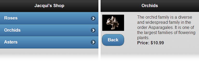
Figure 32-1. A simple jQuery Mobile listview widget
Configuring the Listview Widget
The listview widget supports a number of data attributes and configuration settings that can be used to change the appearance and behavior of the list. These are described in Table 32-2 and demonstrated in the sections that follow.
Table 32-2. Attributes and Configuration Settings for Listview Widgets
| Data Attribute | Setting | Description |
|---|---|---|
| data-count-theme | countTheme | Specifies the theme for count bubbles. |
| data-divider-theme | dividerTheme | Specifies the theme for dividers. |
| data-filter | filter | When set to true, the listview is shown with a filter. |
| N/A | filterCallback | Specifies a function that is invoked by the filter. |
| data-filter-placeholder | filterPlaceholder | Specifies a placeholder for filtering. |
| data-filter-theme | filterTheme | Specifies the theme for the filter search bar. |
| data-header-theme | headerTheme | Specifies the theme for nested headers. |
| data-icon | icon | Specifies the icon used on headers. |
| data-inset | inset | When set to true, the listview is drawn in a style that suits nested lists. |
| data-split-icon | splitIcon | Specifies the icon for a split list. |
| data-split-theme | splitTheme | Specifies the theme for a split list. |
The default layout for lists is to fill the width of the container element and to have square corners, which doesn’t match the style of other jQuery Mobile widgets. To make the style consistent, you can create an inset list, which has rounded corners and can be used in elements that do not touch the edges of the screen. You create an inset list by applying the data-inset attribute with a value of true to the ul or ol element, as shown in Listing 32-2.
Listing 32-2. Creating an Inset List
...
<div id="page1" data-role="page" data-theme="b">
    <div data-role="header">
       <h1>Jacqui's Shop</h1>
    </div>

    <div id="container" style="padding: 20px">
        <ul data-role="listview"data-inset=true>
            <li><a href="#roses">Roses</a></li>
            <li><a href="#orchids">Orchids</a></li>
            <li><a href="#asters">Asters</a></li>
        </ul>
    </div>
</div>
...
In this example, I placed the ul element inside a div element. I used the CSS padding setting to inset the list from the edge of the parent element, and I used the data-inset attribute to change the style of the list. You can see the result in Figure 32-2.
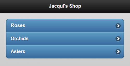
Figure 32-2. Creating an inset list
Split lists are useful when there are two actions that can be performed for each item in the list. The list item is split into two sections, and clicking or tapping on each part of the item leads to a different action. Listing 32-3 shows a split list that allows users to get information about a flower or simply add it to their shopping basket.
Listing 32-3. Using a Split List
<!DOCTYPE html>
<html>
<head>
    <title>Example</title>
    <meta name="viewport" content="width=device-width, initial-scale=1">
    <link rel="stylesheet" href="jquery.mobile-1.3.1.css" type="text/css" />
    <script type="text/javascript" src="jquery-1.10.1.js"></script>
    <script type="text/javascript" src="jquery.mobile-1.3.1.js"></script>
    <style type="text/css">
        .lcontainer {float: left; text-align: center; padding-top: 10px}
        .productData {float: right; padding: 10px; width: 60%}
        .cWrapper {text-align: center; margin: 20px}
    </style>
</head>
<body>
    <div id="page1" data-role="page" data-theme="b">
        <div data-role="header">
           <h1>Jacqui's Shop</h1>
        </div>

        <div id="container" style="padding: 20px">
            <ul data-role="listview" data-inset=true>
                <li><a href="#basket" class="buy" id="rose">Roses</a>
                    <a href="#roses">Roses</a></li>
                <li><a href="#basket" class="buy" id="orchid">Orchids</a>
                    <a href="#orchids">Orchids</a>  </li>
                <li><a href="#basket" class="buy" id="aster">Asters</a>
                    <a href="#asters">Asters</a>  </li>
            </ul>
        </div>
    </div>

    <div id="basket" data-role="page" data-theme="b">
        <div data-role="header">
           <h1>Jacqui's Shop</h1>
        </div>
        <div class="cWrapper">
            Basket will go here
        </div>
        <div class="cWrapper">
            <a href="#" data-rel="back" data-role="button" data-inline=true
               data-direction="reverse">Back</a>
        </div>
    </div>

    <div id="roses" data-role="page" data-theme="b">
        <div data-role="header">
           <h1>Roses</h1>
        </div>
        <div>
            <div class="lcontainer">
                <img src="rose.png">
                <div><a href="#" data-rel="back" data-role="button"
                       data-inline=true data-direction="reverse">Back</a>
                </div>
            </div>
            <div class="productData">
                A rose is a woody perennial within the family Rosaceae.
                They form a group of erect shrubs, and climbing or trailing plants.
                <div><b>Price: $4.99</b></div>
            </div>
        </div>
    </div>

   <div id="orchids" data-role="page" data-theme="b">
        <div data-role="header">
           <h1>Orchids</h1>
        </div>
        <div>
            <div class="lcontainer">
                <img src="orchid.png">
                <div><a href="#" data-rel="back" data-role="button"
                       data-inline=true data-direction="reverse">Back</a>
                </div>
            </div>
            <div class="productData">
                The orchid family is a diverse and widespread family in the order
                Asparagales. It is one of the largest families of flowering plants.
                <div><b>Price: $10.99</b></div>
            </div>
        </div>
    </div>

   <div id="asters" data-role="page" data-theme="b">
        <div data-role="header">
           <h1>Asters</h1>
        </div>
        <div>
            <div class="lcontainer">
                <img src="aster.png">
                <div><a href="#" data-rel="back" data-role="button"
                       data-inline=true data-direction="reverse">Back</a>
                </div>
            </div>
            <div class="productData">
                The name Aster comes from the Ancient Greek word meaning "star",
                referring to the shape of the flower head.
                <div><b>Price: $2.99</b></div>
            </div>
        </div>
    </div>
</body>
</html>
To create a split list, add a second a element to the li elements. jQuery Mobile splits each list item in two and inserts a vertical divider between the parts. Clicking or tapping the left part of the item navigates to the target of the first a element, and clicking or tapping on the right part navigates to the second a element. You can see how the list items are presented in Figure 32-3.

Figure 32-3. Creating split lists
In this example, I set all of the left parts of the list items to point to a new page I added to the document called basket. I’ll come back to this example in Chapter 33 and expand on it to put a simple shopping basket in place. For this example, the basket page is simply a placeholder.
Tip jQuery Mobile uses the arrow icon for the split button by default. You can change this by applying the data-split-icon attribute to the ul or ol element, specifying the name of the icon you want. Chapter 30 contains a list of the available icons.
The listview widget provides a mechanism for filtering the content of lists, which is enabled by applying the data-filter attribute with a value of true to the ul or ol element, as shown in Listing 32-4.
Listing 32-4. Using List Filtering
<!DOCTYPE html>
<html>
<head>
    <title>Example</title>
    <meta name="viewport" content="width=device-width, initial-scale=1">
    <link rel="stylesheet" href="jquery.mobile-1.3.1.css" type="text/css" />
    <script type="text/javascript" src="jquery-1.10.1.js"></script>
    <script type="text/javascript" src="jquery.mobile-1.3.1.js"></script>
    <style type="text/css">
        .lcontainer {float: left; text-align: center; padding-top: 10px}
        .productData {float: right; padding: 10px; width: 60%}
    </style>
</head>
<body>
    <div id="page1" data-role="page" data-theme="b">
        <div data-role="header">
           <h1>Jacqui's Shop</h1>
        </div>

        <div data-role="content">
            <ul data-role="listview" data-inset=truedata-filter=true>
                <li><a href="#roses">Roses</a></li>
                <li><a href="#orchids">Orchids</a></li>
                <li><a href="#asters">Asters</a></li>
            </ul>
        </div>
    </div>

  <div id="roses" data-role="page" data-theme="b">
        <div data-role="header">
           <h1>Roses</h1>
        </div>
        <div>
            <div class="lcontainer">
                <img src="rose.png">
                <div><a href="#" data-rel="back" data-role="button"
                       data-inline=true data-direction="reverse">Back</a>
                </div>
            </div>
            <div class="productData">
                A rose is a woody perennial within the family Rosaceae.
                They form a group of erect shrubs, and climbing or trailing plants.
                <div><b>Price: $4.99</b></div>
            </div>
        </div>
    </div>

   <div id="orchids" data-role="page" data-theme="b">
        <div data-role="header">
           <h1>Orchids</h1>
        </div>
        <div>
            <div class="lcontainer">
                <img src="orchid.png">
                <div><a href="#" data-rel="back" data-role="button"
                       data-inline=true data-direction="reverse">Back</a>
                </div>
            </div>
            <div class="productData">
                The orchid family is a diverse and widespread family in the order
                Asparagales. It is one of the largest families of flowering plants.
                <div><b>Price: $10.99</b></div>
            </div>
        </div>
    </div>

   <div id="asters" data-role="page" data-theme="b">
        <div data-role="header">
           <h1>Asters</h1>
        </div>
        <div>
            <div class="lcontainer">
                <img src="aster.png">
                <div><a href="#" data-rel="back" data-role="button"
                       data-inline=true data-direction="reverse">Back</a>
                </div>
            </div>
            <div class="productData">
                The name Aster comes from the Ancient Greek word meaning "star",
                referring to the shape of the flower head.
                <div><b>Price: $2.99</b></div>
            </div>
        </div>
    </div>
</body>
</html>
As you can see in Figure 32-4, jQuery Mobile adds a search bar above the list. When the user enters characters into the search bar, jQuery Mobile removes all of the items from the list that don’t contain that sequence of characters. (By default, filtering isn't performed until at least two characters have been entered into the filter.)
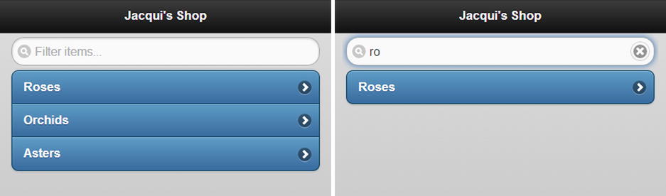
Figure 32-4. Enabling list filtering
Caution The ability to filter lists is a great feature, but it isn’t always useful on small touch screens. To support character input, most mobile devices show a popup touch keyboard when the user activates a text input element such as the search bar. On small devices, the keyboard can occupy so much of the screen that the user can’t easily see the results of the filter. This does not mean you should not support list filtering, but it is important to provide other navigation mechanisms if you are targeting devices with small screens.
Using a Custom Filtering Function
The default filter matches any list item that contains the set of characters the user has entered. These are matched anywhere in the list item text and are case insensitive. You can provide a custom filter function by using a jQuery UI-style method, as shown in Listing 32-5.
Listing 32-5. Using a Custom List Filter Function
...
<head>
    <title>Example</title>
    <meta name="viewport" content="width=device-width, initial-scale=1">
    <link rel="stylesheet" href="jquery.mobile-1.3.1.css" type="text/css" />
    <script type="text/javascript" src="jquery-1.10.1.js"></script>
    <script type="text/javascript">
        $(document).bind("pageinit", function () {
            $("ul").listview("option", "filterCallback", function (listItem, filter) {
                var pattern = new RegExp("^" + filter, "i");
                return !pattern.test(listItem)
            })
        })
    </script>
    <script type="text/javascript" src="jquery.mobile-1.3.1.js"></script>
    <style type="text/css">
        .lcontainer {float: left; text-align: center; padding-top: 10px}
        .productData {float: right; padding: 10px; width: 60%}
    </style>
</head>
...
You set the custom function by calling the option method and using the function as the value for the filterCallback setting. The arguments to the function are the text from a list item and the filter that the user has entered. The function is called once for each item in the list, and if you return true, the item for which the function has been called is hidden. In this example, I use a regular expression to restrict matches to list items that begin with the filter text. You can see the result in Figure 32-5, where typing the letter R into the filter box matches only the Roses item.
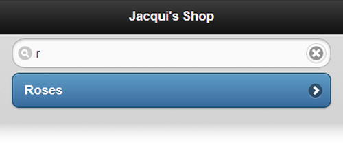
Figure 32-5. Using a custom filter
Adding Dividers
The listview widget can add dividers between list items. These dividers are specified by elements whose data-role attribute is set to list-divider, and they can be styled by the use of the data-divider-theme attribute applied to the ul or ol element that defines the list.
List dividers are useful for providing structure to long or complex lists without changing the way that the user navigates through the list. In Listing 32-6, you can see how I have added some divider elements and applied the data-divider-theme attribute to the example.
Listing 32-6. Using List Dividers
...
<div id="page1" data-role="page" data-theme="b">
    <div data-role="header">
       <h1>Jacqui's Shop</h1>
    </div>

    <div data-role="content">
        <ul data-role="listview" data-inset=truedata-theme="c"
            data-divider-theme="b">

            <li data-role="list-divider">A</li>
            <li><a href="#asters">Asters</a></li>
            <li data-role="list-divider">C</li>
            <li><a href="document2.html">Carnations</a></li>
            <li data-role="list-divider">D</li>
            <li><a href="document2.html">Daffodils</a></li>
            <li data-role="list-divider">L</li>
            <li><a href="document2.html">Lilies</a></li>
            <li data-role="list-divider">O</li>
            <li><a href="#orchids">Orchids</a></li>
            <li data-role="list-divider">P</li>
            <li><a href="document2.html">Peonies</a></li>
            <li><a href="document2.html">Primulas</a></li>
            <li data-role="list-divider">R</li>
            <li><a href="#roses">Roses</a></li>
            <li data-role="list-divider">S</li>
            <li><a href="document2.html">Snowdrops</a></li>
        </ul>
    </div>
</div>
...
You can see the effect that the dividers create in Figure 32-6.
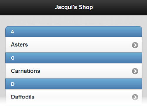
Figure 32-6. Adding dividers to a list
Tip You can apply the data-theme attribute directly to individual list items if you want a different appearance for just one element.
Using Convention-Based Configuration
Some configuration options are handled by convention rather than configuration. You already saw an example of this when you looked at split lists. If you add a second a element to the content of an li element, jQuery Mobile automatically creates a split list item. You don’t have to apply a data attribute to create this effect – it just happens. In this section, I show you three different conventions you can use to format list items: count bubbles, text emphasis, and asides.
You can add a small numeric indicator to a list item. These are called count bubbles, and they can be useful when list items represent a category of some sort and you want to provide information about how many are available. For example, if your list items represent e-mail folders, you can use count bubbles to indicate how many messages are in each folder. You might also use count bubbles to show how many items are in stock in an e-commerce application.
Although this effect is typically used to present numeric values, you can display any information you like. The meaning of the value needs to be self-evident, because you don’t have room to provide an explanation to the user – just the value.
You create a count bubble by adding an additional child element to the contents of an li element. This child element must contain the value and be assigned to the ui-li-count class. You can see examples of count bubbles defined in Listing 32-7, including one that uses a nonnumeric value.
Listing 32-7. Adding Count Bubbles to List Items
...
<div id="page1" data-role="page" data-theme="b">
    <div data-role="header">
       <h1>Jacqui's Shop</h1>
    </div>

    <div data-role="content">
      <ul data-role="listview" data-inset=true data-filter=true>
          <li><a href="#roses">Roses<div class="ui-li-count">23</div></a></li>
          <li><div class="ui-li-count">7</div><a href="#orchids">Orchids</a></li>
          <li><a href="#asters">Asters</a><div class="ui-li-count">Pink</div></li>
      </ul>
    </div>
</div>
...
Notice that you can position the child element anywhere within the li element. It doesn’t have to be the last element (although this is a common convention). You can see how the count bubbles are displayed in Figure 32-7.

Figure 32-7. Using counter bubbles
The listview widget will apply different levels of emphasis when you use content that is wrapped in a header element (the h1 through h6 elements) instead of a p element (indicating a paragraph). This allows you to create a list item that contains a headline and some supporting details text, as shown in Listing 32-8.
Listing 32-8. Adding Text Emphasis
...
<div id="page1" data-role="page" data-theme="b">
    <div data-role="header">
       <h1>Jacqui's Shop</h1>
    </div>

    <div data-role="content">
      <ul data-role="listview" data-inset=true data-filter=true>
          <li>
            <a href="#roses"><h1>Roses</h1>
                <p>A rose is a woody perennial within the family Rosaceae.</p>
                <div class="ui-li-count">$4.99</div></a>
          </li>
          <li><div class="ui-li-count">7</div><a href="#orchids">Orchids</a></li>
          <li><a href="#asters">Asters</a><div class="ui-li-count">Pink</div></li>
      </ul>
    </div>
</div>
...
In this example, I used the h1 element to denote the name of the product and the p element to denote the detailed information. I included a count bubble, indicating the price of the item. (Prices are ideally suited to count bubbles because the currency symbol provides immediate meaning to the numeric value.) You can see the effect in Figure 32-8.
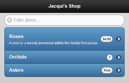
Figure 32-8. Using text emphasis in a list item
An aside is an alternative to using count bubbles. To create an aside, you add a child to the li element that contains the information you want to display and that is assigned to the ui-li-aside class. You can see the use of an aside in Listing 32-9.
Listing 32-9. Creating an Aside in a List Item
...
<div id="page1" data-role="page" data-theme="b">
    <div data-role="header">
       <h1>Jacqui's Shop</h1>
    </div>

    <div data-role="content">
      <ul data-role="listview" data-inset=true data-filter=true>
          <li>
            <a href="#roses">
                <h1>Roses</h1>
                <p>A rose is a woody perennial within the family Rosaceae.</p>
                <p class="ui-li-aside">(Pink) <strong>$4.99</strong></p>
            </a></li>
          <li><div class="ui-li-count">7</div><a href="#orchids">Orchids</a></li>
          <li><a href="#asters">Asters</a><div class="ui-li-count">Pink</div></li>
      </ul>
    </div>
</div>
...
You can see the style with which an aside is displayed for the Roses item in Figure 32-9.
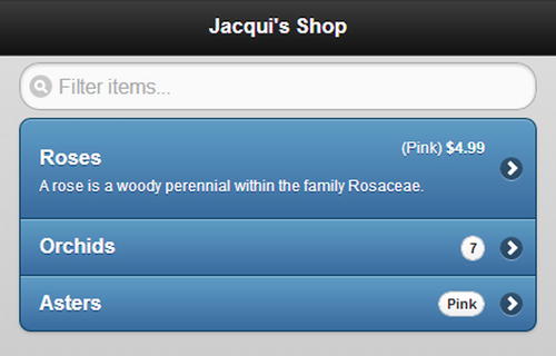
Figure 32-9. Using an aside
The listview widget defines the two methods shown in Table 32-3.
Table 32-3. Listview Methods
| Method | Description |
|---|---|
| listview("refresh") | Updates the listview widget to reflect changes in the underlying elements. |
The listview widget defines only the create event, which is triggered when the widget is applied to an element.
The panel widget appears to the left or right of the current page – you can use a panel to display any content, but the frequent uses are to provide access navigation options and application settings. Panels are created by setting the data-role attribute to panel on a div element, as shown in Listing 32-10.
Listing 32-10. Creating a Panel Widget
<!DOCTYPE html>
<html>
<head>
    <title>Example</title>
    <meta name="viewport" content="width=device-width, initial-scale=1">
    <link rel="stylesheet" href="jquery.mobile-1.3.1.css" type="text/css" />
    <script type="text/javascript" src="jquery-1.10.1.js"></script>
    <script type="text/javascript" src="jquery.mobile-1.3.1.js"></script>
    <style>
        .buttonContainer { text-align: center; }
    </style>
</head>
<body>

    <div id="page1" data-role="page" data-theme="b">
        <div data-role="header">
           <h1>Jacqui's Shop</h1>
        </div>

        <div data-role="content" class="buttonContainer">
            <a data-role="button" data-inline="true" href="#panel">Open Panel</a>
        </div>

        <div id="panel" data-role="panel" data-theme="a">
            <div data-role="panel-content">
                <h3>Simple Panel</h3>
                <p>This is the the panel</p>
                <button data-rel="close" data-inline="true">Close</button>
            </div>
        </div>
    </div>
</body>
</html>
The elements for the panel widget are defined within the page that will show the panel. In the example, I have defined a panel that contains some simple HTML elements, wrapped in a div element whose data-role attribute I have set as panel-content, which ensures that the content is positioned properly within the panel.
The main page in this example contains an a element whose href element specifies the id of the panel element. Clicking the link – or the button since I have set the data-role attribute to button on the a element – opens the panel. You can see the effect in Figure 32-10.
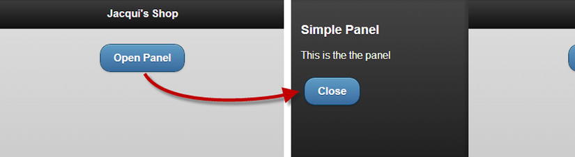
Figure 32-10. Using the popup widget
This is an example that you need to experience firsthand to properly appreciate, but clicking on the Open Panel button slides the main page to the right to reveal the panel. I can close the panel by clicking on the Close button in the panel (which I configured by setting the data-rel attribute to close) or by clicking in the part of the main page that remains visible.
The panel widget defines the data attributes and configuration settings shown in Table 32-4.
Table 32-4. Attributes and Configuration Settings for Panel Widgets
| Data Attribute | Setting | Description |
|---|---|---|
| data-animate | animate | Specifies whether the panel will be animated when it is opened or closed. The default is true. |
| data-dismissable | dismissable | Specifies whether the panel can be closed by tapping the page that opened it. The default is true. |
| data-display | display | Specifies the relationship between the panel and the page. The values are reveal, push, and overlay and are described below |
| data-position | position | Specifies where the panel is shown. The values are left and right. The default is left. |
| data-position-fixed | positionFixed | Specifies whether the contents of the panel will remain visible even if the user scrolls down the page. The default is false. |
| data-swipe-close | swipeClose | Specifies whether the panel can be closed by swiping it. The default is true. |
Positioning and Displaying the Panel
The data-display and data-position attributes determine where the panel is displayed (the left or right side of the window) and how it is displayed relative to the page that opened it. There are three values for the data-display attribute, which I have described in Table 32-5.
Table 32-5. Values for the data-display Attribute
| Value | Description |
|---|---|
| reveal | The default value: the panel pushes the page out of the way. |
| push | The page is resized to share space with the panel. |
| overlay | The panel slides over the page. |
In Listing 32-11, you can see how the effect of both settings, demonstrating all of the permutations of display and position options.
Listing 32-11. Positioning the Panel
<!DOCTYPE html>
<html>
<head>
    <title>Example</title>
    <meta name="viewport" content="width=device-width, initial-scale=1">
    <link rel="stylesheet" href="jquery.mobile-1.3.1.css" type="text/css" />
    <script type="text/javascript" src="jquery-1.10.1.js"></script>
    <script type="text/javascript" src="jquery.mobile-1.3.1.js"></script>
    <script>
        $(document).bind("pageinit", function () {
            $("#pageContent button").tap(function (e) {
                $("#" + this.id + "Panel").panel({
                    display: $("input[type=radio]:checked").attr("id")
                }).panel("open");
            });
        });
    </script>
</head>
<body>
    <div id="page1" data-role="page" data-theme="b">
        <div data-role="header">
           <h1>Jacqui's Shop</h1>
        </div>

        <div id="pageContent" data-role="content">
            <div class="ui-grid-a">
                <div class="ui-block-a"><button id="left">Left</button></div>
                <div class="ui-block-b"><button id="right">Right</button></div>
            </div>

            <div data-role="fieldcontain">
                <fieldset data-role="controlgroup" data-type="horizontal">
                    <input type="radio" name="display" id="reveal" checked="checked"/>
                    <label for="reveal">Reveal</label>
                    <input type="radio" name="display" id="push"/>
                    <label for="push">Push</label>
                    <input type="radio" name="display" id="overlay"/>
                    <label for="overlay">Overlay</label>
                </fieldset>
            </div>
        </div>

        <div id="leftPanel" data-role="panel" data-theme="a" data-position="left">
            <div data-role="panel-content">
                <h3>Left Panel</h3>
                <p>This is the the left panel</p>
                <button data-rel="close" data-inline="true">Close</button>
            </div>
        </div>

        <div id="rightPanel" data-role="panel" data-theme="a" data-position="right">
            <div data-role="panel-content">
                <h3>Right Panel</h3>
                <p>This is the the right panel</p>
                <button data-rel="close" data-inline="true">Close</button>
            </div>
        </div>
    </div>
</body>
</html>
I use a pair of buttons to open left and right panels (using the open method, which I describe later in this chapter) and a set of radio buttons (as described in Chapter 30) to select the display mode. You can see some of the permutations in Figure 32-11.
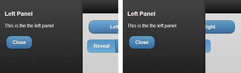
Figure 32-11. Changing the display and position options
The panel widget can't display the same elements to the left and the right of the window: the process for preparing the content aligns it one way or the other. It is for this reason that I have used two separate panels in this example.
The data-swipe-close and data-dismissable attributes allow you to control how the user can close the panel, either by making a swipe gesture or by tapping the page that opened the panel. Setting these attributes to false creates a panel that can only be closed when the user interacts with the panel content (or programmatically using the open or toggle methods, which I describe later in the chapter).
I am wary of taking control of widgets away from users and if you decide to use these attributes, then you should ensure that you do so consistently throughout your web app – having panels that are dismissed in different ways just causes frustration. In Listing 32-12, I have created a panel that is displayed for a fixed period and then dismisses itself – not something that I would recommend in a real application, but useful for demonstrating the widget features. The user can't dismiss the panel by tapping the page that opened it or by swiping, but the button can still be used to close the panel.
Listing 32-12. Creating Panels That Cannot Be Dismissed by Tapping the Page or Swiping
<!DOCTYPE html>
<html>
<head>
    <title>Example</title>
    <meta name="viewport" content="width=device-width, initial-scale=1">
    <link rel="stylesheet" href="jquery.mobile-1.3.1.css" type="text/css" />
    <script type="text/javascript" src="jquery-1.10.1.js"></script>
    <script>
        $(document).bind("pageinit", function () {
            $("a").tap(function (e) {
                var timeRemaining = 15;
                var intervalId = setInterval(function () {
                    $("#remaining").text(timeRemaining--);
                    if (timeRemaining == 0) {
                        $("#panel").panel("close");
                        clearInterval(intervalId);
                    }
                }, 1000);
                $("#panel").panel("open");
            });
        });
    </script>
    <script type="text/javascript" src="jquery.mobile-1.3.1.js"></script>
</head>
<body>
    <div id="page1" data-role="page" data-theme="b">
        <div data-role="header">
           <h1>Jacqui's Shop</h1>
        </div>

        <div data-role="content" class="buttonContainer">
            <a data-role="button" data-inline="true">Open Panel</a>
        </div>

        <div id="panel" data-role="panel" data-theme="a"
                data-dismissable="false" data-swipe-close="false">
            <div data-role="panel-content">
                <h3>Simple Panel</h3>
                <p>This panel will close in
                    <span id="remaining">15</span> seconds.</p>
                <button data-rel="close" data-inline="true">Close</button>
            </div>
        </div>
    </div>
</body>
</html>
I use the open and close methods to control the visibility of the panel – I describe these methods properly in the next section – and use the JavaScript setInterval function to manage a countdown that closes the panel 15 seconds after it has been opened. The user can close the panel early by using the button element displayed in the panel – if you want to prevent the user from closing the panel, then you must ensure that the panel contains no such elements. The panel widget reflects changes in the underlying elements as they happen, as shown in Figure 32-12.
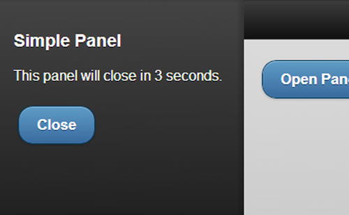
Figure 32-12. A self-closing panel
The panel widget defines the methods shown in Table 32-6. The open and close methods are demonstrated in the previous example.
Table 32-6. Panel Methods
| Method | Description |
|---|---|
| panel("open") | Shows the panel. |
| panel("close") | Hides the panel. |
| panel("toggle") | Toggles the visibility of the panel: hidden panels are shown and visible panels are hidden. |
The panel widget defines the events shown in Table 32-7. I don't find these events useful in my own projects because I prefer to deal with the events from the elements that lead to the panel being shown or hidden.
Table 32-7. Panel Events
| Event | Description |
|---|---|
| create | Triggered when the widget is created. |
| beforeopen | Triggered before the panel is shown. |
| beforeclose | Triggered before the panel is hidden. |
| open | Triggered after the panel is shown. |
| close | Triggered after the panel is hidden. |
Summary
In this chapter, I described the jQuery Mobile list widget, which can be an essential navigation tool for mobile web applications. I showed you the different kinds of lists you can create, the different styles of list you can present to the user, and the configurations and conventions you can use to manage the content of individual list items.