
Using jQuery Mobile Forms
There are particular difficulties when presenting a form on a mobile device. There is little enough screen real estate available to start with, and you need to give the user form elements that are easy to manipulate by touch without creating a page that requires endless scrolling to complete. In this chapter, I show you how jQuery Mobile enhances form elements so that they are consistent with other widgets and can be readily used on a touch screen.
jQuery Mobile does a lot of work automatically when the page is loaded. Form elements are enhanced without your intervention, and Ajax is automatically used when the form is submitted so that jQuery Mobile can smoothly transition to the results returned by the server.
I recommend careful thought when you are creating forms for mobile devices. By their nature, forms are intended to gather input from users, but this can be a tedious process on a mobile device, especially when it comes to typing. In addition, some mobile devices don’t display scrollbars when the user isn’t actively scrolling through a page. This means that the user isn’t always aware there are form elements just off of the immediate display. To create the best possible experience for users, you need to follow some basic guidelines:
- Require as little typing as you can. Where possible, use alternative widgets that allow the user to make simple touch selections, such as check boxes or radio buttons. This can reduce the range of inputs that the user can make, but it might have the effect of increasing the number of users who are willing to complete the form.
- Use navigation between pages to display sections of a form. This gives users a clear indication of their progress through the form and doesn’t require them to speculatively scroll to see if they are missing anything.
- Eliminate any form elements that are not required. Mobile forms should be as streamlined as possible, and that can mean accepting less data from mobile users than you get from desktop users.
Table 31-1 provides the summary for this chapter.
Table 31-1. Chapter Summary
| Problem | Solution | Listing |
|---|---|---|
| Create widgets for form elements. | No specific action is required – jQuery Mobile will apply the widgets automatically. | 1 |
| Add a button that clears the contents of an input element or change the way that the widget for an input element is displayed. | Use the data-clear-btn and data-mini attributes. | 2 |
| Enable or disable an input element. | Use the enable and disable methods. | 3 |
| Create a slider widget. | Define an input element with a type attribute of range. | 4 |
| Create a range slider widget. | Define a pair of input elements within a div element whose data-role attribute is set to rangeslider. | 5 |
| Configure the appearance of sliders. | Use the data-highlight, data-mini and data-track-theme attributes. | 6, 7 |
| Update a range slider to reflect changes in the underlying input elements. | Use the refresh method. | 8 |
| Receive notifications when a slider widget is used. | Handle the start, stop, and normalize events. | 9, 10 |
| Create a widget for a select element. | No specific action is required. | 11 |
| Configure the button displayed for a select element. | Use the data-corners, data-icon, data-iconpos, and data-mini attributes. | 12 |
| Configure the popup that allows users to pick a value for a select element. | Use the data-native-menu, data-overlay-theme, and data-divider-theme attributes. | 13 |
| Add a placeholder to a selectmenu. | Set the data-placeholder attribute to true on one of the option elements contained by the select element. | 14 |
| Control a selectmenu widget programmatically. | Use the open, close, disable, enable, and refresh methods. | 15 |
| Create a flip switch widget. | Define a select element that contains two option elements and that has the data-role attribute set to slider. | 16 |
| Create checkbox and radio button widgets. | No specific action is required. | 17–20 |
jQuery Mobile uses automatic enhancement to create widgets for form elements when HTML pages are loaded, just as with the widgets I described in earlier chapters. Listing 31-1 shows a jQuery Mobile page that contains a form element and some form-related child elements.
Listing 31-1. A Simple Form in a jQuery Mobile Page
<!DOCTYPE html>
<html>
<head>
    <title>Example</title>
    <meta name="viewport" content="width=device-width, initial-scale=1">
    <link rel="stylesheet" href="jquery.mobile-1.3.1.css" type="text/css" />
    <script type="text/javascript" src="jquery-1.10.1.js"></script>
    <script type="text/javascript" src="jquery.mobile-1.3.1.js"></script>
    <style type="text/css">
        #buttonContainer {text-align: center}
        div[data-role=fieldcontain] { padding: 0 10px; }
    </style>
</head>
<body>
    <div id="page1" data-role="page" data-theme="b">
        <div data-role="header">
           <h1>Jacqui's Shop</h1>
        </div>
        <form method="get">
            <div data-role="fieldcontain">
                <label for="name">Name: </label>
                <input id="name">
            </div>
            <div data-role="fieldcontain">
                <label for="address">Address: </label>
                <textarea id="address"></textarea>
            </div>
            <div id="buttonContainer">
                <input type="submit" data-inline="true" value="Submit"/>
            </div>
        </form>
    </div>
</body>
</html>
This is a simple form, but it sets the scene for how jQuery Mobile handles forms overall. There are two form elements: a text input and a textarea , each of which is paired with a label element. You can see the result in Figure 31-1, which I created using the BrowserStack service because the Opera Mobile Emulator doesn’t properly implement a feature that jQuery Mobile relies on for form elements, which I explain in the next section.

Figure 31-1. A simple form displayed by jQuery Mobile
 Tip Notice that I have used CSS to set the padding property for the div elements that contain the form elements. Without this setting, jQuery Mobile would have drawn the label and the form element right up against the left and right edges of the window.
jQuery Mobile will automatically submit the form when an input element whose type is submit is included within a form element. The form will be submitted using Ajax by default, but this behavior can be disabled by applying the data-ajax attribute with a value of false to the form element.
In the last example, each form element and its label are wrapped in a div element. I set the data-role of the div element to be fieldcontain, which tells jQuery Mobile that I want the label and the form element displayed in a single line, and you can see the effect in Figure 31-1.
The styles that jQuery Mobile applies to align the label and the form element are used only when the screen is at least 450 pixels wide. Below that width value, the label and the input/textarea element are displayed on separate rows, as illustrated by Figure 31-2. The Opera Mobile Emulator always reports that its screen is less than 450 pixels wide, which is why I had to generate the figures for these examples using a different browser. (This is just a problem with the emulator – the real Opera Mobile browser implements the feature correctly.)
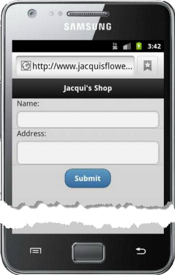
Figure 31-2. Displaying a form in portrait orientation
jQuery Mobile uses different widgets for each of the form elements that it supports and the first of these I describe is the textinput widget, which is used for textarea elements and input elements. This is the widget used in the previous example.
Configuring the Textinput Widget
The textinput widget defines the attributes and settings properties described in Table 31-2. The settings are applied via the textinput method.
Table 31-2. Attributes and Configuration Settings for TextInput Widgets
| Data Attribute | Setting | Description |
|---|---|---|
| data-clear-btn | clearBtn | When set to true, the widget is displayed with a button that clears the contents. The default is false. |
| data-clearn-btn-text | clearBtnText | Sets the text for the clear button for accessibility software. |
| data-mini | mini | When set to true, creates a small version of the widget. The default is false. |
| data-prevent-focus-zoom | preventFocusZoom | When set to true, the browser is prevented from zooming while the widget has the focus. |
In Listing 31-2, you can see how I have applied the data-clear-btn and data-mini attributes to configure the textinput widget on an input element.
Listing 31-2. Configuring the Textinput Widget
...
<form method="get">
    <div data-role="fieldcontain">
        <label for="name">Name: </label>
        <input id="name" data-clear-btn="true" data-mini="true">
    </div>
    <div data-role="fieldcontain">
        <label for="address">Address: </label>
        <textarea id="address"></textarea>
    </div>
    <div id="buttonContainer">
        <input type="submit" data-inline="true" value="Submit"/>
    </div>
</form>
...
You can see the result in Figure 31-3. The clear button isn’t shown until the user starts to enter text into the input element, and clicking the button deletes any content that has been entered. If you use the clear button feature, then be sure to do so consistently for all of your input elements.
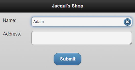
Figure 31-3. Configuring the textinput widget
Using the Textinput Widget Methods
The textinput widget defines the two methods shown in Table 31-3.
Table 31-3. TextInput Methods
| Method | Description |
|---|---|
| textinput("disable") | Disables the widget, preventing the user from entering or editing content. |
| textinput("enable") | Enables the widget, allowing content to be entered or edited. |
In Listing 31-3 I have used both methods to change the state of an input element.
Listing 31-3. Using the Textwidget Methods
<!DOCTYPE html>
<html>
<head>
    <title>Example</title>
    <meta name="viewport" content="width=device-width, initial-scale=1">
    <link rel="stylesheet" href="jquery.mobile-1.3.1.css" type="text/css" />
    <script type="text/javascript" src="jquery-1.10.1.js"></script>
    <script>
        $(document).bind("pageinit", function () {
            $("button").tap(function (e) {
                $("#name").textinput(e.target.id);
                e.preventDefault();
            });
        });
    </script>
    <script type="text/javascript" src="jquery.mobile-1.3.1.js"></script>
    <style type="text/css">
        #buttonContainer {text-align: center}
        div[data-role=fieldcontain] { padding: 0 10px; }
    </style>
</head>
<body>
    <div id="page1" data-role="page" data-theme="b">
        <div data-role="header">
           <h1>Jacqui's Shop</h1>
        </div>
        <form method="get">
            <div data-role="fieldcontain">
                <label for="name">Name: </label>
                <input id="name" data-clear-btn="true" data-mini="true">
            </div>
            <div id="buttonContainer">
                <button id="enable">Enable</button>
                <button id="disable">Disable</button>
            </div>
        </form>
    </div>
</body>
</html>
I added buttons to change the state of the input element, and you can see how a disabled element appears in Figure 31-4.
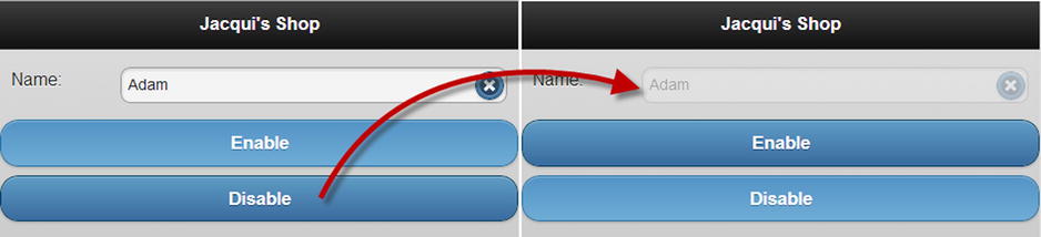
Figure 31-4. Disabling a textinput widget
Using the Textinput Widget Events
The textinput widget defines only the create event, which is triggered when the widget is applied to an element.
Using the Slider and Range Slider Widgets
The slider widget is applied to input elements whose type attribute is set to range. The value of the input element is used to set the initial position of a slider on a scale, which is defined by the values of the min and max attributes. Listing 31-4 shows a simple example of a range input element.
Listing 31-4. Using the Slider Widget
<!DOCTYPE html>
<html>
<head>
    <title>Example</title>
    <meta name="viewport" content="width=device-width, initial-scale=1">
    <link rel="stylesheet" href="jquery.mobile-1.3.1.css" type="text/css" />
    <script type="text/javascript" src="jquery-1.10.1.js"></script>
    <script type="text/javascript" src="jquery.mobile-1.3.1.js"></script>
    <style type="text/css">
        div[data-role=fieldcontain] { padding: 0 10px; }
    </style>
</head>
<body>
    <div id="page1" data-role="page" data-theme="b">
        <div data-role="header">
           <h1>Jacqui's Shop</h1>
        </div>
        <form method="get">
            <div data-role="fieldcontain">
                <label for="quantity">Quantity: </label>
                <input id="quantity" type="range" value="10" min="1" max="20">
            </div>
        </form>
    </div>
</body>
</html>
Tip The range value for the type attribute was added in HTML5, as part of a broader set of enhancements to the input element. For full details, see my book The Definitive Guide to HTML5, which is also published by Apress.
I have defined an input element with the type attribute set to range, specifying that the initial value is 10 and the range of values is 1 to 20. You can see how jQuery Mobile enhances this element with the slider widget in Figure 31-5.
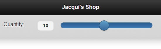
Figure 31-5. Using the slider widget
You can also create a range slider by pairing two input elements, allowing the user to select an upper and lower value in a single widget. In Listing 31-5, you can see how I have created a range slider.
Listing 31-5. Using the Range Slider Widget
<!DOCTYPE html>
<html>
<head>
    <title>Example</title>
    <meta name="viewport" content="width=device-width, initial-scale=1">
    <link rel="stylesheet" href="jquery.mobile-1.3.1.css" type="text/css" />
    <script type="text/javascript" src="jquery-1.10.1.js"></script>
    <script type="text/javascript" src="jquery.mobile-1.3.1.js"></script>
    <style type="text/css">
        div[data-role=fieldcontain] { padding: 0 10px; }
    </style>
</head>
<body>
    <div id="page1" data-role="page" data-theme="b">
        <div data-role="header">
           <h1>Jacqui's Shop</h1>
        </div>
        <form method="get">
            <div data-role="fieldcontain">
                <div data-role="rangeslider">
                    <label for="quantityLow">Quantity: </label>
                    <input id="quantityLow" type="range" value="10" min="1" max="20">
                    <input id="quantityHigh" type="range" value="15" min="1" max="20">
                </div>
            </div>
        </form>
    </div>
</body>
</html>
The input elements are contained in a div element whose data-role attribute is set to rangeslider. The min and max values of the input elements must be the same and the value attribute values are used to set the initial position of the handles that are used to select the range, as shown in Figure 31-6.
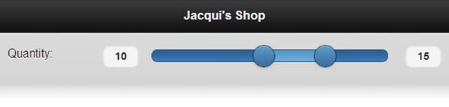
Figure 31-6. Using the range slider widget
Tip The range slider widget doesn’t change the way that form data is sent to the server. Separate values will be sent for both of the input elements.
Configuring the Slider and Range Slider Widgets
The slider and range slider widgets support the same set of data attributes and configuration settings, as described in Table 31-4.
Table 31-4. Attributes and Configuration Settings for Slider and Range Slider Widgets
| Data Attribute | Setting | Description |
|---|---|---|
| data-highlight | highlight | When set to true, the section of the slider track that represents the selected value is highlighted. The default value is false. |
| data-mini | mini | When set to true, the widget is drawn in a more compact form. The default is false. |
| data-track-theme | trackTheme | Specifies the theme for the track part of the slider. |
Tip When setting options, use the slider method to configure slider widgets and the rangeslider method to configure range slider widgets.
You have seen the effect of the data-mini attribute in earlier widgets and so I won’t repeat the description here. I usually set the data-highlight attribute to true because I think it makes the purpose of the slider – especially the range slider – more obvious. In Listing 31-6, you can see how I set the attribute on the div element of a range slider.
Listing 31-6. Using the data-highlight Attribute on a Range Slider Widget
...
<form method="get">
    <div data-role="fieldcontain">
        <div data-role="rangeslider" data-highlight="false">
            <label for="quantityLow">Quantity: </label>
            <input id="quantityLow" type="range" value="10" min="1" max="20">
            <input id="quantityHigh" type="range" value="15" min="1" max="20">
        </div>
    </div>
</form>
...
In Figure 31-7 you can see the range slider with and without the highlight enabled.
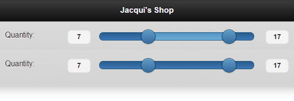
Figure 31-7. The effect of the data-highlight attribute
You can further emphasize the slider by combining the data-track-theme attribute with the globally available data-theme attribute. The data-theme attribute affects the slider handle or handles and data-track-theme affects the slider track. In Listing 31-7, I have applied both attributes to the range slider from the previous example.
Listing 31-7. Using Themes for Slider Handles and Tracks
...
<form method="get">
    <div data-role="fieldcontain">
        <div data-role="rangeslider" data-highlight="true"
            data-theme="b" data-track-theme="a">
            <label for="quantityLow">Quantity: </label>
            <input id="quantityLow" type="range" value="10" min="1" max="20">
            <input id="quantityHigh" type="range" value="15" min="1" max="20">
        </div>
    </div>
</form>
...
You can see the effect of the themes in Figure 31-8.
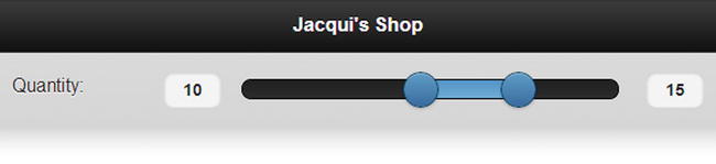
Figure 31-8. Applying Themes to a Range Slider and Its Track
Using the Slider and Range Slider Methods
The slider and range slider widgets define the methods shown in Table 31-5.
Table 31-5. Slider and Range Slider Methods
| Slider Method | Range Slider Method | Description |
|---|---|---|
| slider("disable") | rangeslider("disable") | Disables the widget, preventing the user from changing the slider value or values. |
| slider("enable") | rangeslider("enable") | Enables the widget, allowing the user to change the slider value or values. |
| slider("refresh") | rangeslider("refresh") | Updates the widget to reflect changes in the underlying HTML elements. |
The refresh method lets you change the value of the attributes on an underlying input element and have those changes reflected in the widget, as demonstrated by Listing 31-8.
Listing 31-8. Using the Refresh Method
<!DOCTYPE html>
<html>
<head>
    <title>Example</title>
    <meta name="viewport" content="width=device-width, initial-scale=1">
    <link rel="stylesheet" href="jquery.mobile-1.3.1.css" type="text/css" />
    <script type="text/javascript" src="jquery-1.10.1.js"></script>
    <script>
        $(document).bind("pageinit", function () {
            $("button").tap(function (e) {
                var currentMax = Number($("#quantityLow").attr("max"));
                $("#quantityLow, #quantityHigh").attr("max", currentMax - 1);
                $("#slider").rangeslider("refresh");
                e.preventDefault();
            });
        });
    </script>
    <script type="text/javascript" src="jquery.mobile-1.3.1.js"></script>
    <style type="text/css">
        div[data-role=fieldcontain] { padding: 0 10px; }
    </style>
</head>
<body>
    <div id="page1" data-role="page" data-theme="b">
        <div data-role="header">
           <h1>Jacqui's Shop</h1>
        </div>
        <form method="get">
            <div data-role="fieldcontain">
                <div id="slider" data-role="rangeslider" data-highlight="true"
                        data-theme="b" data-track-theme="a">
                    <label for="quantityLow">Quantity: </label>
                    <input id="quantityLow" type="range" value="10" min="1" max="20">
                    <input id="quantityHigh" type="range" value="15" min="1" max="20">
                </div>
                <div id="buttonContainer">
                    <button>Change Range</button>
                </div>
            </div>
        </form>
    </div>
</body>
</html>
In this example I use a button to decrement the value of the max attribute of the input elements that underpin the slider and call the refresh method so that the widget is updated to reflect the changes.
The slider and range slider widgets define different sets of events. In Table 31-6 I have described the events that are available for the slider widget.
Table 31-6. Slider Events
| Event | Description |
|---|---|
| create | Triggered when the slider widget is created. |
| start | Triggered at the start of any interaction with the slider, including when the widget is tapped (to set a specific value) or when the handle is dragged. |
| stop | Triggered at the end of any interaction with the slider. |
In Listing 31-9, I use the start and stop events to update the content of a span element.
Listing 31-9. Using the Slider Widget Events
<!DOCTYPE html>
<html>
<head>
    <title>Example</title>
    <meta name="viewport" content="width=device-width, initial-scale=1">
    <link rel="stylesheet" href="jquery.mobile-1.3.1.css" type="text/css" />
    <script type="text/javascript" src="jquery-1.10.1.js"></script>
    <script>
        $(document).bind("pageinit", function () {
            $("#quantity").slider({
                start: function () {
                    $("#message").text("Sliding");
                },
                stop: function () {
                    $("#message").text(quantity.value);
                }
            });
        });
    </script>
    <script type="text/javascript" src="jquery.mobile-1.3.1.js"></script>
    <style type="text/css">
        div[data-role=fieldcontain] { padding: 0 10px; }
    </style>
</head>
<body>
    <div id="page1" data-role="page" data-theme="b">
        <div data-role="header">
           <h1>Jacqui's Shop</h1>
        </div>
        <form method="get">
            <div data-role="fieldcontain">
                <label for="quantity">Quantity: </label>
                <input id="quantity" type="range" value="10" min="1" max="20">
            </div>
            Value: <span id="message">Ready</span>
        </form>
    </div>
</body>
</html>
When I receive the start event, I change the contents of the span element to indicate that the slider value is changing. When I receive the stop event, I update the span element to display the value that has been selected – notice that I get the value directly from the input element and not via the slider widget.
In Table 31-7, I have described the events that are defined by the range slider widget.
Table 31-7. Range Slider Events
| Event | Description |
|---|---|
| create | Triggered when the range slider widget is created. |
| normalize | Triggered when the widget has to normalize the values in the input elements, which happens when the user drags one handle past the other. |
As I write this, the event handling for the range slider widget doesn’t work consistently when using the rangeslider method. Instead, event handlers must be created using the bind method, which you can see used in Listing 31-10.
Listing 31-10. Using the Range Slider Widget Events
<!DOCTYPE html>
<html>
<head>
    <title>Example</title>
    <meta name="viewport" content="width=device-width, initial-scale=1">
    <link rel="stylesheet" href="jquery.mobile-1.3.1.css" type="text/css" />
    <script type="text/javascript" src="jquery-1.10.1.js"></script>
    <script>
        $(document).bind("pageinit", function () {
            $("#slider").bind("rangeslidernormalize", function () {
                alert("Normalized!");
            });
        });
    </script>
    <script type="text/javascript" src="jquery.mobile-1.3.1.js"></script>
    <style type="text/css">
        div[data-role=fieldcontain] { padding: 0 10px; }
    </style>
</head>
<body>
    <div id="page1" data-role="page" data-theme="b">
        <div data-role="header">
           <h1>Jacqui's Shop</h1>
        </div>
        <form method="get">
            <div id="slider" data-role="rangeslider" data-highlight="true"
                    data-theme="b" data-track-theme="a">
                <label for="quantityLow">Quantity: </label>
                <input id="quantityLow" type="range" value="10" min="1" max="20">
                <input id="quantityHigh" type="range" value="15" min="1" max="20">
            </div>
        </form>
    </div>
</body>
</html>
I have to use the name rangeslidernormalize in order to receive the event, which is an artifact of having to use the bind method. In this example I call the alert function when I get the normalize event – not least because I have yet to find a real-world situation when this event is useful.
jQuery Mobile provides you with two ways to deal with select elements. The first is to use the selectmenu widget, which presents the user with a stylized version of the select element, with a drop-down button. The selectmenu widget is the default widget applied to select elements , as demonstrated by Listing 31-11.
Listing 31-11. A Page Containing a Select Element
<!DOCTYPE html>
<html>
<head>
    <title>Example</title>
    <meta name="viewport" content="width=device-width, initial-scale=1">
    <link rel="stylesheet" href="jquery.mobile-1.3.1.css" type="text/css" />
    <script type="text/javascript" src="jquery-1.10.1.js"></script>
    <script type="text/javascript" src="jquery.mobile-1.3.1.js"></script>
    <style type="text/css">
        #buttonContainer {text-align: center}
    </style>
</head>
<body>
    <div id="page1" data-role="page" data-theme="b">
        <div data-role="header">
           <h1>Jacqui's Shop</h1>
        </div>
        <form method="get">
            <div data-role="fieldcontain">
                <label for="name">Name: </label>
                <input id="name" placeholder="Your Name">
            </div>
            <div data-role="fieldcontain">
                <label for="speed"><span>Speed: </span></label>
                <select id="speed" name="speed">
                    <option value="vfast">Very Fast</option>
                    <option value="fast">Fast</option>
                    <option value="normal" selected>Normal</option>
                    <option value="slow">Slow</option>
                </select>
            </div>
            <div id="buttonContainer">
                <input type="submit" data-inline="true" value="Submit"/>
            </div>
        </form>
    </div>
</body>
</html>
You can see how jQuery Mobile enhances select elements in Figure 31-9. The Opera Mobile Emulator doesn’t display the selectmenu widget correctly, so I obtained the screenshot using BrowserStack.
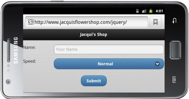
Figure 31-9. A select element that has been enhanced by jQuery Mobile
Configuring the SelectMenu Widget
The selectmenu widget defines data attributes and configuration settings shown in Table 31-8. The configuration options are applied via the selectmenu method. The configuration of the selectmenu widget can be broken down into two areas: configuring the button that is displayed most of the time, and configuring the popup that allows the user to make a selection. I describe both configuration areas in the sections that follow.
Table 31-8. Attributes and Configuration Settings for Selectmenu Widgets
| Data Attribute | Setting | Description |
|---|---|---|
| data-corners | corners | Specifies whether the button that displays the list of options is drawn with rounded corners. The default value is true. |
| data-divider-theme | dividerTheme | Specifies the theme used for optgroup elements when the nativeMenu option is false. |
| data-icon | icon | Specifies the icon that will be displayed on the widget button. |
| data-iconpos | iconPos | Specifies the position of the icon on the widget button. |
| data-inline | inline | Specifies that the widget will be drawn in a compact style. |
| data-mini | mini | Specifies that the widget will be drawn in a smaller style. |
| data-native-menu | nativeMenu | Specifies whether the native selectmenu will be used. The default is true. |
| data-overlay-theme | overlayTheme | Specifies the theme used for the selectmenu popup when the nativeMenu option is set to false. |
Configuring the SelectMenu Button
The selectmenu widget replaces the standard select element with a button that matches the rest of the jQuery Mobile theme. You can configure how the button appears using the data-corners, data-icon, data-iconpos, data-inline, and data-mini attributes or their configuration property counterparts. I have described all of these configuration options as they have appeared in earlier chapters, so I am not going to cover them in depth, but in Listing 31-12 you can see how I have applied some of the attributes to change the way that the button is displayed.
Listing 31-12. Configuring the Selectmenu Button
...
<div data-role="fieldcontain">
    <label for="speed"><span>Speed: </span></label>
    <select id="speed" name="speed"
        data-iconpos="left" data-icon="gear" data-mini="true">
        <option value="vfast">Very Fast</option>
        <option value="fast">Fast</option>
        <option value="normal" selected>Normal</option>
        <option value="slow">Slow</option>
    </select>
</div>
...
I have changed the icon that is displayed and moved it to the left side of the button with the data-icon and data-iconpos attributes and specified a smaller button size with the data-mini attribute. You can see the effect of these changes in Figure 31-10.
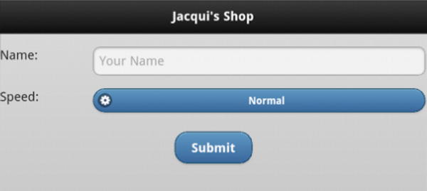
Figure 31-10. Configuring the selectmenu widget button
Configuring the SelectMenu Popup
By default, the selectmenu widget will display the native browser menu when the user clicks on the button to make a selection. This is a sensible idea, because it provides the user with access to whatever optimizations the browser offers to take advantage of the device features. In Figure 31-11, you can see the native menus for the iOS, Android, and Opera browsers and these are shown by default when the user clicks on the selectmenu widget button.
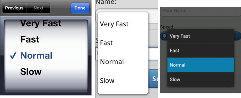
Figure 31-11. The Native Select Menus
You can disable the native menu and have the selectmenu widget display one that matches the rest of the jQuery Mobile theme by setting the data-native-menu attribute to false. This prevents the user from benefiting from the native enhancements, but has the advantage of offering consistency. In Listing 31-13, you can see how I have used the data-native-menu to disable the native menu and the data-overlay-theme attribute to set the theme used for the popup.
Listing 31-13. Configuring the Selectmenu Popup
...
<div data-role="fieldcontain">
    <label for="speed"><span>Speed: </span></label>
    <select id="speed" name="speed" data-native-menu="false" data-overlay-theme="e">
        <option value="vfast">Very Fast</option>
        <option value="fast">Fast</option>
        <option value="normal" selected>Normal</option>
        <option value="slow">Slow</option>
    </select>
</div>
...
You can see the effect of these changes in Figure 31-12.
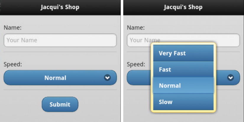
Figure 31-12. Disabling the native selectmenu
You can use an option element as the placeholder for a select element by setting the value of the data-placeholder attribute to true. Placeholders are shown when the select element is initially displayed but isn’t present in the list of options that the user chooses from. Listing 31-14 shows the use of the data-placeholder attribute.
Listing 31-14. Using the data-placeholder Attribute
...
<div data-role="fieldcontain">
    <label for="speed"><span>Speed: </span></label>
    <select id="speed" name="speed" data-native-menu="false" data-overlay-theme="e">
        <option value="placeholder" data-placeholder="true">Select a Speed</option>
        <option value="vfast">Very Fast</option>
        <option value="fast">Fast</option>
        <option value="normal">Normal</option>
        <option value="slow">Slow</option>
    </select>
</div>
...
You can see the effect in Figure 31-13. I generally like to use placeholders with select menus, but this is an especially useful technique for giving the user context when hiding label elements in portrait layouts.
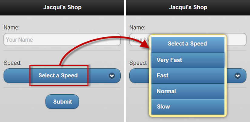
Figure 31-13. Specifying a placeholder element
The selectmenu widget defines the methods shown in Table 31-9.
Table 31-9. Methods for the selectmenu Widget
| Method | Description |
|---|---|
| selectmenu("open") | Opens the selectmenu widget to display the popup. |
| selectmenu("close") | Closes the popup. |
| selectmenu("disable") | Disables the widget so that values cannot be selected. |
| selectmenu("enable") | Enables the widget so that values can be selected. |
| selectmenu("refresh") | Refreshes the widget to incorporate changes in the underlying select element. |
Listing 31-15 shows how to use buttons to control the selectmenu.
Listing 31-15. Controlling the Selectmenu Programmatically
<!DOCTYPE html>
<html>
<head>
    <title>Example</title>
    <meta name="viewport" content="width=device-width, initial-scale=1">
    <link rel="stylesheet" href="jquery.mobile-1.3.1.css" type="text/css" />
    <script type="text/javascript" src="jquery-1.10.1.js"></script>
    <script type="text/javascript">
        $(document).bind("pageinit", function () {
            $("button").bind("tap", function (e) {
                e.preventDefault();
                if (this.id == "open") {
                    $("#speed").selectmenu("open");
                    setTimeout(function () {
                        $("#speed").selectmenu("close")
                    }, 3000);
                } else {
                    $("#speed").selectmenu(this.id)
                }
            });
        })
    </script>
    <script type="text/javascript" src="jquery.mobile-1.3.1.js"></script>
    <style type="text/css">
        [data-role=fieldcontain], .ui-grid-b { margin: 10px; }
    </style>
</head>
<body>
    <div id="page1" data-role="page" data-theme="b">
        <div data-role="header">
           <h1>Jacqui's Shop</h1>
        </div>
        <form method="get">
            <div class="ui-grid-b">
                <div class="ui-block-a">
                    <button id="open">Open</button>
                </div>
                <div class="ui-block-b">
                    <button id="enable">Enable</button>
                </div>
                <div class="ui-block-c">
                    <button id="disable">Disable</button>
                </div>
            </div>
            <div data-role="fieldcontain">
                <label for="speed"><span>Speed: </span></label>
                <select id="speed" name="speed"
                        data-native-menu="false" data-overlay-theme="e">
                    <option value="placeholder"
                        data-placeholder="true">Select a Speed</option>
                    <option value="vfast">Very Fast</option>
                    <option value="fast">Fast</option>
                    <option value="normal">Normal</option>
                    <option value="slow">Slow</option>
                </select>
            </div>
        </form>
    </div>
</body>
</html>
I have defined three buttons that call the open, enable and disable methods. When I call the open method, I also use the setTimeout function to call the close method after three seconds.
The selectmenu widget defines only the create event, which is triggered when the widget is applied to the underlying elements.
If a select element contains only two option elements, you can elect to create a flip switch instead of a regular selectmenu widget. You create a flip switch by applying the data-role attribute to the select element with a value of slider, as shown in Listing 31-16.
Listing 31-16. Creating a Flip Switch
<!DOCTYPE html>
<html>
<head>
    <title>Example</title>
    <meta name="viewport" content="width=device-width, initial-scale=1">
    <link rel="stylesheet" href="jquery.mobile-1.3.1.css" type="text/css" />
    <script type="text/javascript" src="jquery-1.10.1.js"></script>
    <script type="text/javascript" src="jquery.mobile-1.3.1.js"></script>
    <style type="text/css">
        #buttonContainer {text-align: center}
        [data-role=fieldcontain] { margin: 10px; text-align: center }
    </style>
</head>
<body>
    <div id="page1" data-role="page" data-theme="b">
        <div data-role="header">
           <h1>Jacqui's Shop</h1>
        </div>
        <form method="get">
            <div data-role="fieldcontain">
                <label for="speed"><span>Speed: </span></label>
                <select id="speed" name="speed" data-role="slider">
                    <option value="fast">Fast</option>
                    <option value="slow">Slow</option>
                </select>
            </div>
            <div data-role="fieldcontain">
                <label for="size"><span>Size: </span></label>
                <select id="size" name="size" data-role="slider">
                    <option value="large">Large</option>
                    <option value="small" selected>Small</option>
                </select>
            </div>
            <div id="buttonContainer">
                <input type="submit" data-inline="true" value="Submit"/>
            </div>
        </form>
    </div>
</body>
</html>
There are two flip switches in this example. You can see how they are displayed in the browser in Figure 31-14. The user can change the setting either by tapping or clicking on the exposed value or by dragging the slider into position.
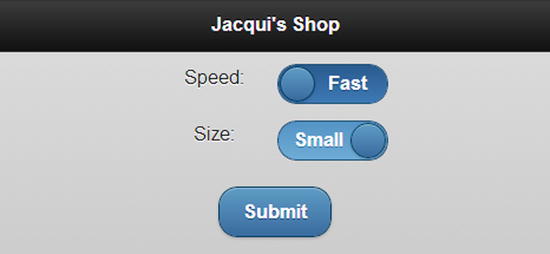
Figure 31-14. Using flip switches
Using the Checkboxradio Widget
The checkboxradio widget is automatically applied to input elements whose type attribute is set to checkbox or radio.
The simplest way to create check boxes is to define an input element whose type is checkbox, followed by a label element, as shown in Listing 31-17.
Listing 31-17. Creating Simple Check Boxes
<!DOCTYPE html>
<html>
<head>
    <title>Example</title>
    <meta name="viewport" content="width=device-width, initial-scale=1">
    <link rel="stylesheet" href="jquery.mobile-1.3.1.css" type="text/css" />
    <script type="text/javascript" src="jquery-1.10.1.js"></script>
    <script type="text/javascript" src="jquery.mobile-1.3.1.js"></script>
    <style type="text/css">
        #buttonContainer {text-align: center}
        form { margin: 10px; }
    </style>
</head>
<body>
    <div id="page1" data-role="page" data-theme="b">
        <div data-role="header">
           <h1>Jacqui's Shop</h1>
        </div>
        <form method="get">
            <div data-role="fieldcontain">
                <label for="name">Name: </label>
                <input id="name" placeholder="Your Name">
            </div>

            <input type="checkbox" name="check" id="check"/>
            <label for="check">I agree</label>

            <div id="buttonContainer">
                <input type="submit" data-inline="true" value="Submit"/>
            </div>
        </form>
    </div>
</body>
</html>
You can see how this check box is presented in Figure 31-15. I have shown the checked and unchecked state of the check box in the figure.
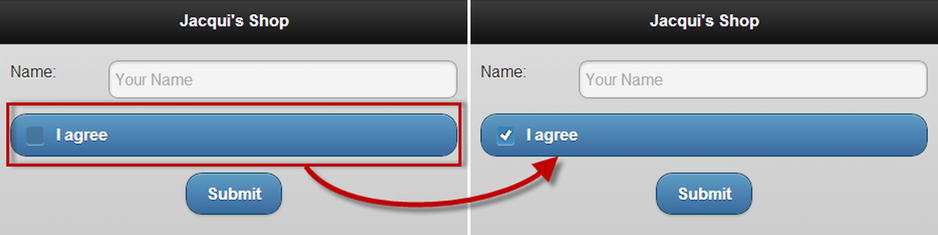
Figure 31-15. A jQuery Mobile check box
Applying a Label to a Check Box
By default, check boxes span the entire width of their parent element, which means, in this case, that the check box is the entire width of the screen. You need to use a particular element structure if you want to make the check box fit into the layout so that it matches the textinput widget above it, as shown in Listing 31-18.
Listing 31-18. Changing the Layout of a Check Box
<!DOCTYPE html>
<html>
<head>
    <title>Example</title>
    <meta name="viewport" content="width=device-width, initial-scale=1">
    <link rel="stylesheet" href="jquery.mobile-1.3.1.css" type="text/css" />
    <script type="text/javascript" src="jquery-1.10.1.js"></script>
    <script type="text/javascript" src="jquery.mobile-1.3.1.js"></script>
    <style type="text/css">
        #buttonContainer {text-align: center}
        form { margin: 10px; }
    </style>
</head>
<body>
    <div id="page1" data-role="page" data-theme="b">
        <div data-role="header">
           <h1>Jacqui's Shop</h1>
        </div>
        <form method="get">
            <div data-role="fieldcontain">
                <label for="name">Name: </label>
                <input id="name" placeholder="Your Name">
            </div>

            <div data-role="fieldcontain">
                <fieldset data-role="controlgroup">
                    <legend>Terms&Conditions:</legend>
                    <input type="checkbox" name="check" id="check"/>
                    <label for="check">I agree</label>
                </fieldset>
            </div>

            <div id="buttonContainer">
                <input type="submit" data-inline="true" value="Submit"/>
            </div>
        </form>
    </div>
</body>
</html>
The outer element should be familiar by now—a div element with the data-role attribute set to fieldcontain. The problem that jQuery Mobile faces is that there is already a label element associated with the input element, so you have to take an alternative path to give jQuery Mobile the information it needs. You do this by adding a fieldset element whose data-role is set to controlgroup and adding a legend element before the input, containing the text you want displayed. You can see the effect in Figure 31-16.
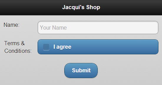
Figure 31-16. Changing the layout of a check box
You can use a fieldset element with a data-role of controlgroup to group multiple check boxes together. Listing 31-19 contains a demonstration.
Listing 31-19. Grouping Check Boxes Together
<!DOCTYPE html>
<html>
<head>
    <title>Example</title>
    <meta name="viewport" content="width=device-width, initial-scale=1">
    <link rel="stylesheet" href="jquery.mobile-1.3.1.css" type="text/css" />
    <script type="text/javascript" src="jquery-1.10.1.js"></script>
    <script type="text/javascript" src="jquery.mobile-1.3.1.js"></script>
    <style type="text/css">
        #buttonContainer {text-align: center}
        form { margin: 10px; }
    </style>
</head>
<body>
    <div id="page1" data-role="page" data-theme="b">
        <div data-role="header">
           <h1>Jacqui's Shop</h1>
        </div>
        <form method="get">
            <div data-role="fieldcontain">
                <label for="name">Name: </label>
                <input id="name" placeholder="Your Name">
            </div>

            <div data-role="fieldcontain">
                <fieldset data-role="controlgroup">
                    <legend>Choose Your Flowers:</legend>
                    <input type="checkbox" name="roses" id="roses"/>
                    <label for="roses">Roses</label>
                    <input type="checkbox" name="orchids" id="orchids"/>
                    <label for="orchids">Orchids</label>
                    <input type="checkbox" name="asters" id="asters"/>
                    <label for="asters">Asters</label>
                </fieldset>
            </div>

            <div data-role="fieldcontain">
                <fieldset data-role="controlgroup" data-type="horizontal">
                    <legend>Font:</legend>
                    <input type="checkbox" name="bold" id="bold"/>
                    <label for="bold"><b>b</b></label>
                    <input type="checkbox" name="italic" id="italic"/>
                    <label for="italic"><em>i</em></label>
                    <input type="checkbox" name="underline" id="underline"/>
                    <label for="underline"><u>u</u></label>
                </fieldset>
            </div>

            <div id="buttonContainer">
                <input type="submit" data-inline="true" value="Submit"/>
            </div>
        </form>
    </div>
</body>
</html>
There are two groups of check boxes in this example. The first set is laid out vertically, which is the default orientation. jQuery Mobile changes the style of the widgets so that there is no space between the individual input elements and only the outer corners of the block are rounded. For the second set, I set the data-type attribute to horizontal, which changes the direction of the layout and causes jQuery Mobile to hide the check box, creating a set of buttons that can be toggled on and off. You can see the result in Figure 31-17.
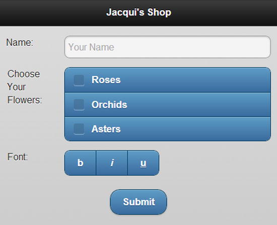
Figure 31-17. Grouping check boxes
Creating and Formatting Radio Buttons
You create radio buttons and format them in much the same way as you format check boxes. Listing 31-20 contains an example.
Listing 31-20. Creating a Group of Radio Buttons
<!DOCTYPE html>
<html>
<head>
    <title>Example</title>
    <meta name="viewport" content="width=device-width, initial-scale=1">
    <link rel="stylesheet" href="jquery.mobile-1.3.1.css" type="text/css" />
    <script type="text/javascript" src="jquery-1.10.1.js"></script>
    <script type="text/javascript" src="jquery.mobile-1.3.1.js"></script>
    <style type="text/css">
        #buttonContainer {text-align: center}
        form { margin: 10px; }
    </style>
</head>
<body>
    <div id="page1" data-role="page" data-theme="b">
        <div data-role="header">
           <h1>Jacqui's Shop</h1>
        </div>
        <form method="get">
            <div data-role="fieldcontain">
                <label for="name">Name: </label>
                <input id="name" placeholder="Your Name">
            </div>

            <div data-role="fieldcontain">
                <fieldset data-role="controlgroup">
                    <legend>Choose Your Flowers:</legend>
                    <input type="radio" name="flowers" id="roses"/>
                    <label for="roses">Roses</label>
                    <input type="radio" name="flowers" id="orchids"/>
                    <label for="orchids">Orchids</label>
                    <input type="radio" name="flowers" id="asters"/>
                    <label for="asters">Asters</label>
                </fieldset>
            </div>

            <div data-role="fieldcontain">
                <fieldset data-role="controlgroup" data-type="horizontal">
                    <legend>Choose Your Flowers:</legend>
                    <input type="radio" name="flowers" id="roses"/>
                    <label for="roses">Roses</label>
                    <input type="radio" name="flowers" id="orchids"/>
                    <label for="orchids">Orchids</label>
                    <input type="radio" name="flowers" id="asters"/>
                    <label for="asters">Asters</label>
                </fieldset>
            </div>

            <div id="buttonContainer">
                <input type="submit" data-inline="true" value="Submit"/>
            </div>
        </form>
    </div>
</body>
</html>
Once again, I created horizontal and vertical groups, and you can see how they are displayed in the browser in Figure 31-18.

Figure 31-18. Creating groups of radio buttons
Configuring the Checkboxradio Widget
The checkboxradio widget supports only one configuration option, which I have described in Table 31-10.
Table 31-10. Attribute and Configuration Setting for checkboxradio Widgets
| Data Attribute | Setting | Description |
|---|---|---|
| data-mini | mini | When set to true, the widget is created in a compact form. |
Using the Checkboxradio Methods
The checkboxradio widget defines the methods shown in Table 31-11.
Table 31-11. Methods for the checkboxradio Widget
| Method | Description |
|---|---|
| checkboxradio("disable") | Disables the widget so that values cannot be selected. |
| checkboxradio("enable") | Enables the widget so that values can be selected. |
| checkboxradio("refresh") | Refreshes the widget to incorporate changes in the underlying elements. |
Using the Checkboxradio Events
The checkboxradio widget defines only the create event, which is triggered when the widget is applied to the underlying elements.
Summary
In this chapter, I showed how jQuery Mobile enhances form elements to make them consistent with the broader touch-enabled style. You don’t have to take any special action to submit a form, which is done automatically using Ajax so that jQuery Mobile can smoothly manage the transition to the page returned by the server. You can rely on jQuery Mobile to automatically enhance form elements, but there are some good reasons to apply some additional elements and data-role attributes, especially when it comes to dealing with select elements. In Chapter 32, I continue my description of jQuery Mobile widgets, turning to the listview and panel widgets.