
This chapter will detail some more Angular Material directives. We will primarily deal with navigation and container elements . This chapter helps build the skeleton for the application.
What are directives? Reiterating an AngularJS concept, directives help create new HTML elements.
In HTML, we use various elements (or tags) for describing, formatting, and managing the behavior of the content on the web page. For example, elements like h1 and h2 define headers in the web page. A tag "strong" applies bold style on text, useful for emphasis. Use input elements for various UI controls and components like buttons, textboxes, drop-downs, and so on.
If we need to create new elements in addition to what we already have, directives are the way to go in AngularJS. This is one place to manipulate DOM. From the best-practices point of view, directives could access and manipulate DOM directly. (It is not preferred to directly deal with DOM elsewhere.)
Many times, they are packaged as UI components, which could be reused across the application.
What are services? In AngularJS, Services are reusable JavaScript objects. They can be injected into controllers and other services.
Note
All Material Design directives are prefixed md-. Services are prefixed $md.
Content (md-content )
This directive is a container element for workspaces in the application. The content this directive holds could be text, images, and/or other controls user interacts with. It applies styles that allow content to scroll. Optionally add layout-padding attribute to the directive for padding a little bit of empty space around margins.
Usage
<md-content layout-padding>Welcome, This is the scrollable content on the workspace.s...</md-content>
Note
This directive makes content inside scrollable. If it is nested with other scroll-enabled directives, it could create multiple scroll bars on the page (which is a bad user experience). Hence it is advised to use md-content as a sibling of other containers and not nest them.
Toolbar (md-toolbar )
Often, the toolbar presents the page title. It describes the purpose of the page or screen. It could have one or more page-level actions.
Usage
The following is a very basic usage of the directive. See Figure 4-1.
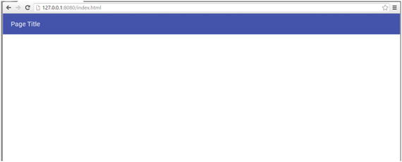
Figure 4-1. Basic toolbar
<md-toolbar layout-padding class="md-toolbar-tools"><h2>Page Title</h2></md-toolbar>
Let us now explore more toolbar features .
Apply CSS class md-tall for larger toolbar as the page loads. The other possible value is md-medium-tall.
Use attribute md-scroll-shrink="true". The user scrolling the page will collapse the title bar and allow more workspace to be seen.
Optionally, use CSS class md-toolbar-tools-bottom for better scroll experience. It vertically aligns titles and buttons to the bottom of the toolbar. As user scrolls up, blank space on the toolbar collapses, leaving the title and actions still visible.
We may also use CSS classes md-warn or md-accent for showing warning or accent colors for the toolbar. Chose them such that if you are alerting the user, you may use warn color.
Group all toolbar items under an element with CSS class “md-toolbar-tools”.
Actions: Page-level actions take their place in the toolbar.
6. Use a flex element with buttons followed by it, so that they are aligned right. Use md-button directive for the Material Design button.
7. For icon buttons, use CSS class md-icon-button. This will adjust the button to size of the icon. It won’t be wide like a text button. Use md-icon element (directive) in md-button.
Here is the complete sample . See Figure 4-2.

Figure 4-2. A tall toolbar
<md-toolbar md-scroll-shrink="true" layout-padding class="md-tall md-toolbar-tools-bottom">
    <span flex></span>
    <div class="md-toolbar-tools">
        <md-button class="md-icon-button">
            <md-icon md-svg-src="/img/ic_menu_black_24px.svg"></md-icon>
        </md-button>
        <h2>Page Title</h2>
        <span flex></span>
        <md-button>An Action</md-button>
    </div>
</md-toolbar>
Note
There are better ways to use the md-icon directive for using icons in the applications (be it a button or not). A later Chapter 10 in the book details icons in Angular Material.
Sidenav (md-sidenav )
Sidenav, a navigation control, is often seen in mobile and desktop web applications. A typical sidenav is used to provide a site-map. It lists actions and links to various functionalities in the application. We could expand and collapse the sidenav on a need basis.
Basic Usage
<md-sidenav class="md-sidenav-left"><!-- toolbar specific markup goes here --></md-sidenav>
Notice md-sidenav-left CSS class. On the page, it aligns sidenav to the left. Use the CSS class md-sidenav-right for it to align on the right.
By default, the navbar will not show. Use attribute md-is-open="true" for it appear straightaway. Attribute value could also be an expression that returns a Boolean.
<md-sidenav md-is-open="true"  class="md-sidenav-left">
   <md-toolbar layout-padding class="md-medium-tall">
        <h2 class="md-toolbar-tools">All Actions</h2>
   </md-toolbar>
</md-sidenav>

<md-content layout="row">
   <div layout-padding >
            Lorem ipsum
                ...
    </div>
</md-content>
In the samples so far, sidenav is in parallel to md-content. It has its own toolbar with a title. Navbar appears on top of the content (like a menu) and hides if user clicks anywhere in the workspace. Consider Figure 4-3. Click anywhere on the text; it hides.

Figure 4-3. Sidenav overlapping the page content
Sidenav Along with the Content
Consider using md-is-locked-open. It takes an expression as the input. When true, clicking away (in the workspace) doesn’t close the sidenav. Preferably, make sidenav part of the workspace. When locked open, it does not override the content and will show the sidenav on the side, along with the content. See Figure 4-4.

Figure 4-4. Sidenav along with the page content
Consider the following code snippet. As it is part of the workspace now, unlike the earlier sample, it is preferred to be coded within the md-content. Also use row layout for sidenav to appear in the content.
<md-content layout="row">
   <md-sidenav md-is-locked-open="true" flex class="md-sidenav-left">
     <h4>side nav content</h4>
    </md-sidenav>
    <div layout-padding flex="80">
       Lorem ipsum
        ...
    </div>
</md-content>
Show/Hide Sidenav On Demand
Another common scenario is to use the menu button on the top-left, clicking which will show/hide sidenav . Consider the following code snippet.
<md-sidenav md-is-open="showLeftSidenav" class="md-sidenav-left"><md-toolbar layout-padding class="md-medium-tall"><h2 class="md-toolbar-tools">All Actions</h2></md-toolbar></md-sidenav>
Notice that md-is-open is using a variable on scope, showLeftSidenav. Unlike the first sample, it is dynamically showing or hiding sidenav. Consider the following controller code.
$scope.showLeftSidenav = false;$scope.toggleLeftSidenav = function(){$scope.showLeftSidenav = !$scope.showLeftSidenav;};
In the HTML template, the menu button in the toolbar calls (ng-click) the function toggleLeftSidenav. It flips current value. Shows if sidenav is hidden and or not. Here is the code for menu button in the toolbar.
<md-button class="md-icon-button" ng-click="toggleLeftSidenav()"<md-icon md-svg-src="/img/ic_menu_black_24px.svg"></md-icon></md-button>
Responsive —Show/Hide Sidenav Based on Screen Width
Instead of opening or closing the sidenav upon the click of a menu button in the toolbar, we may choose to dynamically decide by the screen size. If there is enough space for sidenav, show it. On a smaller screen, hide it by default.
Consider the following code. It uses a service $mdMedia, which evaluates media query and returns true/false for a given screen size.
<md-sidenav md-is-locked-open="$mdMedia('gt-sm')" flex="20" class="md-sidenav-left" layout-padding><h4>side nav content</h4></md-sidenav>
It shows the navbar for a screen greater than small (greater than 960px width).
$mdSidenav Service
$mdSidenav is another related service. A controller function could use API on the service. The following is the API.
It is possible to have multiple sidenavs on the page. In the controller select a specific sidenav using the service $mdSidenav(‘sidenavId1’).
Provide id in the HTML markup, <md-sidenav md-component-id=‘sidenavId1’>
$mdSidenav(‘sidenavId1’).open(): shows sidenav with id sidenavId1.
$mdSidenav(‘sidenavId1’).close(): collapses sidenav wih id sidenavId1.
Note
The open and close functions return a promise. The promise is resolved once the respective action is complete. A promise allows asynchronously perform another action only after open or close operation.
$mdSidenav(‘sidenavId1’).isOpen(): returns true if sidenav is open.
$mdSidenav(‘sidenavId1’).isLockedOpen(): returns true if sidenav is locked open.
Tabs
Tabs are one way of categorizing content on a page. See Figure 4-5. They provide high-level organization of view elements and an easy way to switch to and fro among them. They create a sense of grouping. A logical unit of information, for example, text, images, video, and so on, could be in a tab.

Figure 4-5. Sample tabs
The Angular Material component for tabs provides a subtle ripple effect as feedback on click. It is easy to identify the selected tab. It also shows animation while switching between tabs, which provides a sense of navigation.
Angular Material tabs are built with the following directives.
md-tabs: holds all tabs together.
md-tab: each tab’s content and title are encapsulated in this element/directive.
md-tab-label: optional element. Useful if tab title is not simple text and needs additional markup.
md-tab-body: used for separation of title from tab’s content. This element is mandatory only if md-tab-label is used. It allows separation of tab content from the title.
Usage
The following is basic usage of tabs. We will make it more sophisticated by using many other features of these directives.
<md-content layout-padding flex><md-tabs><md-tab label="Tab-A"><h4>Welcome, This is the first tab !</h4></md-tab><md-tab label="Tab-B" ><h4>There you go, I stand second</h4></md-tab><md-tab label="Tab-C"><h4>At last, you got to me.</h4></md-tab></md-tabs></md-content>
Now, let us explore the md-tabs directive .
md-selected: Use this attribute to select a different tab by default. Provide tab index value (0 based). In the preceding example, the following will select second tab.
<md-tabs md-selected="1">md-stretch-tabs="always": will let tab titles take full horizontal space. In the preceding example, the clickable area for "tab-a", "tab-b", and so on stretches horizontally to take up all available space. Other possible values are
auto: stretched to take full width on a smaller screen like mobile phone and tablet in portrait mode. It does not stretch tabs on a mobile screen in landscape mode or a desktop screen (greater screen width).
never: will not stretch tabs on any screen size. Their size is decided by the space taken by the label.
md-center-tabs: With horizontal space available, it aligns tabs to center. If we use auto or never for md-stretch-tabs, preferably set md-center-tabs.
md-swipe-content: It allows user to swipe on content of the tab right or left to move to next or previous tabs. For a better mobile/table or any other touch screen experience, set md-swipe-content.
Note
A cosmetic aspect: for any attribute with Boolean value (like md-center-tabs or md-swipe-content) providing the attribute on parent directive is good enough. It will set the value to true. The following does the same task.
<md-tabs md-center-tabs><md-tabs md-center-tabs="true">
If you need to provide a value false to the attribute, simply do not use the attribute.
md-dynamic-height: Tabs’ content area has fixed height. If content goes over it, will show a vertical scrollbar within the page. The attribute md-dynamic-height lets tab adjust height dynamically. If the tab content is even more than the page height, will only show one vertical scrollbar for the whole page. No scrollbar will show for the tab.
5. md-no-pagination: Tab titles could grow beyond the available horizontal space. Default behavior will show pagination arrow icons to move left/right. Setting md-no-pagination will jam tab titles to fit all tabs in the available horizontal space.
6. md-align-tabs="bottom": Aligns tabs at the bottom of the control (directive). Default value is "top".
7. md-border-bottom: Shows a separator below tab titles.
Consider the following code for enhanced tab. See Figure 4-6.

Figure 4-6. Tabs positioned at the bottom
<md-tabs md-selected="1" md-stretch-tabs="auto" md-align-tabs="bottom" md-dynamic-height md-border-bottom md-center-tabs md-swipe-content>
    <md-tab label="Tab-A">
        <md-tab-body layout-padding="true">
            <h4>Welcome, This is the first tab !</h4>
        </md-tab-body>
    </md-tab>
    <md-tab label="Tab-B" >
        <md-tab-body layout-padding="true" >
            <h4>There you go, I stand second</h4>
            <div>
                <!-- Removing Lorem ipsum for readability -->
                <br/>
            </div>
        </md-tab-body>
    </md-tab>
    <md-tab label="Tab-C">
        <md-tab-body layout-padding="true">
            <h4>At last, you got to me.</h4>
        </md-tab-body>
    </md-tab>
</md-tabs>
md-tab
This is child or a nested element of md-tabs. It represents "a tab" in the group. We may specify a label attribute and provide title to the tab. Alternatively we can use md-tab-label element nested within the md-tab.
md-tab-label allows additional formatting to the tab title. Consider the following code snippet and Figure 4-7. It adds a rower icon and label to the tab label.

Figure 4-7. Tabs with icon
<md-tab>
  <md-tab-label>
     <md-icon md-svg-src="/img/ic_rowing_black_24px.svg"></md-icon>
     <span>Rower</span>
  </md-tab-label>
</md-tab>
Note
If md-tab-label is used, it’s mandatory to use md-tab-body, which otherwise is an optional element.
Attributes:
md-on-select and md-on-deselect evaluate a given expression or run a function on scope. The former runs when tab is selected, and the latter runs as the user navigates away by selecting a different tab. Consider the following code snippet. It calls functions on scope on tab selected and deselected.
<md-tab md-on-select="tabSelected()" md-on-deselect="tabDeselected()">.controller('sampleController', function($scope){$scope.tabSelected = function(){...console.log('tab selected');};$scope.tabDeselected = function(){...console.log('tab deselected');};Use ng-disabled to disable a tab. A variable on scope could dynamically enable or disable the tab. Consider the following code, which enables/disables tab-3 based on checkbox selection.
<input type="checkbox" ng-model="isTab3Enabled"><span>Disable Tab 3</span><md-tab label="Tab-C" ng-disabled="isTab3Enabled">...</md-tab>md-active: when set true on an md-tab, selects the tab by default. Only one md-tab is expected to have this attribute. This is an alternative to md-tabs element’s md-selected attribute.
Cards
A card is a container. It is a logical unit of information. Material Design spec defines it as “a sheet of material that serves as an entry point to more detailed information.” It may have text, images, captions, and so on. See Figure 4-8.

Figure 4-8. A sample card
Use the following elements/directives to create a card.
md-card: It is the root element encapsulating the card control.
md-card-header: It is an optional element. It is header for the whole card. Usually, card header shows category details. The specific information on the card could have another title or caption. A card header may have the following elements.
md-card-avatar: As the term indicates, it provides a persona for the card. Figure 4-8 shows an icon as the card avatar. Consider the following code.
<md-card-header><md-card-avatar class="md-user-avatar"><md-icon md-svg-src="img/ic_code_black_24px.svg"></md-icon></md-card-avatar><!—Additional elements --></md-card-header>In the preceding sample, we may use an image element instead of md-icon. Consider using CSS class md-user-avatar for a person’s photograph or image.
md-header-text: It is another element md-card-header. It can contain elements that show card title and short description. Use CSS class md-title on title element and md-subhead on short description. Consider the following code.
<md-card-header><!—Additional elements --><md-header-text><div class="md-title">JavaScript Library</div><div class="md-subhead">Explore and share</div></md-header-text></md-card-header>md-card-footer: Optional element for card’s footer. See Figure 4-8; footer was used for sample copyright text.
md-card-content: It is the workspace of the card. If you choose to show image within the content, for bigger dimensions consider using CSS class md-media-xl.
md-card-title: It represents the caption and description text for specific content on the card. In the preceding example, card for Angular Material and its description is coded within the card title. A card title element can have the following elements.
md-card-title-text: Use it to show the title text and the description. Use CSS classes md-headline and md-subhead for HTML elements that has the title and description. Consider following code.
<md-card-title layout-align="center center"><!-- Title caption and description --><md-card-title-text flex="50"><span class="md-headline">Angular Material</span><span class="md-subhead">Material Design Implementation with AngularJS</span></md-card-title-text></md-card-title>md-card-title-media: Use this element to show card title image. In Figure 4-8, it is AngularJS logo. On the image element, you may choose one of the three sizes by applying a CSS class from the following.
md-media-sm
md-media-md
md-media-lg
Consider the following code for the card title image.
<md-card-title layout-align="center center"><md-card-title-media flex="50"><img src="img/angular-logo.png" class="md-media-md" alt="AngularJS"></md-card-title-media><!—More elements here. --></md-card-title>
Refer to the complete code for the following card sample.
<md-card ><!-- Header for the card. Usually describes category --><md-card-header><!-- Avatar - symbolic representation of content in the card --><md-card-avatar class="md-user-avatar"><md-icon md-svg-src="img/ic_code_black_24px.svg"></md-icon></md-card-avatar><!-- Header content --><md-header-text><div class="md-title">JavaScript Library</div><div class="md-subhead">Explore and share</div></md-header-text></md-card-header><!-- Workspace or the main content of the card --><md-card-content><!-- Card title content --><md-card-title layout-align="center center"><md-card-title-media flex="50"><img src="img/angular-logo.png" class="md-media-md" alt="AngularJS"></md-card-title-media><!-- Title caption and description --><md-card-title-text flex="50"><span class="md-headline">Angular Material</span><span class="md-subhead">Material Design Implementation with AngularJS</span></md-card-title-text></md-card-title><p>For building great applications that are responsive and adhers to Material Design specifications, Angular Material is an obvious choice</p></md-card-content><!-- Actions or buttons that you might need on card --><md-card-actions layout-align="end end"><md-button class="md-raised md-primary">Share</md-button><md-button class="md-raised md-primary">More...</md-button></md-card-actions><!-- Card footer --><md-card-footer><span>Copyright - sample text.</span></md-card-footer></md-card>
Summary
This chapter is one step toward building a complete application with Angular Material. It helps design the skeleton for the application. After reading this chapter, think about the high-level view of your application. Think which aspects of it communicate purpose and provide a title, how navigation should be managed, how these aspects adjust on smaller screen sizes. More importantly be consistent with the approach across the application, so that the user is not lost while working with one of many functionalities.
In this chapter, we began describing md-content element/directive. It often is the workspace of the page. It allows content to scroll.
Then, we delved into aspects of the toolbar. We explored the md-toolbar element/directive for showing the title for the page. It could also be used on other components. In this chapter, we saw an example of navbar using its own title.
Navbar provides a site-map for the application. It is an easy way to access the most-used links and actions in the application. We explored the md-navbar element/directive, including responsive aspects that adjust navbar according to the screen size.
Tabs are effective in segregation of UI elements and functionality. md-tabs and other child elements are used for creating tabs in Angular Material.
At the end, this chapter detailed cards. It is a container element/directive. We discussed using md-cards and other child elements to create cards in Angular Material.
References
For Material Design specification on cards refer to the following URL: https://www.google.com/design/spec/components/cards.html