
Angular Material provides variety of action buttons . The directives or elements define Material Design style, behavior, and experience. From a developer point of view, they are easy to integrate within a web application.
One of the important aspects of Material Design is the feedback the user receives while interacting with the controls in the UI. The user will clearly know that he/she tapped on a button, used a link, navigated to a different view, and so on. Animations are subtle yet effective in providing context to the user. Primarily, buttons trigger most actions on a web page. By default, Angular Material provides a ripple effect on the click of a button. This is a common feedback mechanism in Angular Material for many other controls like tabs, menus, and so on.
Angular Material integrates well with ngAnimate, an AngularJS module for animations. Lots of animations for the purpose of feedback on user actions come from this module. As discussed in Chapter 2, this is a mandatory script to include in an Angular Material application.
This chapter will begin by detailing a simple Angular Material button directive. We will explore variations of Angular Material buttons and the user experience value they provide. The chapter will also describe the concept of FAB (Floating Action Buttons) in Material Design. It will describe directives, which are ready-made FAB controls.
Button Directive (md-button )
For the Material Design button, use md-button instead of the default button element.
<md-button>Click Me</md-button>Use ng-href attribute and use the button as a link.
<md-button ng-href="https://material.angularjs.org/" target="__blank">Use as a link</md-button>Use the CSS class md-raised for an elevated 3D effect on the button.
<md-button class="md-raised">Raised Button</md-button>Use the CSS class md-icon-button for an icon button (without a label and only an icon/image). It is styled accordingly and adjusts height and width to fit the icon. To show the icon, use the md-icon directive. The following code shows using an SVG file (for icon) on the button. See Figure 5-1 for sample buttons.

Figure 5-1. Various Angular Material buttons
<md-button class="md-icon-button"><md-icon md-svg-src="/images/ic_menu_black.svg"></md-icon></md-button>
Style and Intention
Use a button as one of the following. They depict intention.
Primary: It represents default or primary action in the view. Consider a form and a submit or a save button. It preferably is a primary button.
Apply CSS class md-primary to make it a primary button.
Accent: Use accent colors on a highlighted action. In general, these are special actions. These are expected to grab user attention. In some scenarios, they are the most used actions.
For example, on a shopping application, add to shopping cart could be an accent button.
Apply CSS class md-accent.
Warning: As the term indicates, the user needs to use this action carefully; for example, an action that results in deleting a document or a record.
Apply CSS class md-warn.
Hue: A primary, accent, or warning action might need to be identified distinctly. It could be done with a subtle change in the color shade. Consider a delete action/button. It is a warning button intended to delete a record. Along with it, “Delete Permanently” could be a warning action with subtle change. Hence, use a hue, along with warning style.
Apply CSS class md-hue-1, md-hue-2, or md-hue-3.
Consider the following code and Figure 5-2. On a raised button, we used the style intentions mentioned previously.

Figure 5-2. Styled buttons
<md-button class="md-raised md-primary">Primary Button</md-button><md-button class="md-raised md-accent"> Accent Button</md-button><md-button class="md-raised md-warn">Warning Button</md-button><md-button class="md-raised md-warn md-hue-1">Hue-1 Button</md-button>
Consider the following code and Figure 5-3 for styles applied on a default button and an icon button.

Figure 5-3. Other styled buttons
<div><md-button class="md-icon-button md-warn"><md-icon md-svg-src="/images/ic_menu.svg"></md-icon></md-button><strong>(Menu Button)</strong></div><div><md-button class="md-warn"><strong>Default Button</strong></md-button></div>
Note
While using SVG for an icon button as in the preceding, ensure SVG does not have a fill attribute of its own. That could override warn or any other theme color from the CSS class.
SVG with fill color
<svg fill="#000000" height="24" viewBox="0 0 24 24" width="24" xmlns="http://www.w3.org/2000/svg"><path d="M0 0h24v24H0z" fill="none"/><path d="M3 18h18v-2H3v2zm0-5h18v-2H3v2zm0-7v2h18V6H3z"/></svg>
Button click/tap feedback:
md-no-ink: Angular Material buttons show ripple effect on clicking/tapping the button. For any reason if it needs to be disabled, use an attribute md-no-ink on md-button. It will disable the feedback, ripple effect.
md-ripple-size: Modify ripple effect’s size. Possible values are full, partial, and auto.
Note
Like any other control in Angular Material, we can disable a button by using ng-disabled. We can programmatically disable or enable by attaching a model value (on the controller).
FAB
FAB are a distinct aspect of Material Design. They are above the UI controls on the page. They highlight and promote an action. See Figure 5-4. “Compose e-mail in Google Inbox” is a familiar example. The plus button indicating an action to open the compose dialog is floating above the Inbox controls.
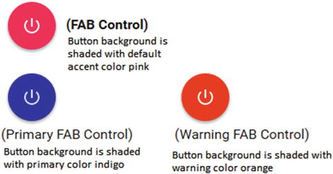
Figure 5-4. FAB control
To create a FAB control, use the CSS class md-fab. Use an icon in the button directive. Consider the following code.
<md-button class="md-fab"><md-icon md-svg-src="/images/ic_power_settings.svg"></md-icon></md-button>
Use md-mini CSS class for a smaller-sized FAB control .
A FAB control by default uses the accent color. We can apply CSS classes for Primary and Warning on the directive. See Figure 5-5.

Figure 5-5. FAB controls , styled primary and warn
<section><md-button class="md-fab md-primary"><md-icon md-svg-src="/images/ic_power_settings.svg"></md-icon></md-button><div class="label">(Primary FAB Control)</label></section><section><md-button class="md-fab md-warn"><md-icon md-svg-src="/images/ic_power_settings.svg"></md-icon></md-button><div class="label">(Warning FAB Control)</div></section>
Position the FAB control on any of the four corners of the view/screen. Apply one of the following CSS classes to do so.
md-fab-top-left
md-fab-top-right
md-fab-bottom-left
md-fab-bottom-right
Speed Dial
It is a FAB control designed for frequently used actions. Tapping or clicking this button pops open a list of related actions. At most, in two taps or clicks you should be performing the desired action.
Consider Figure 5-6. It shows frequently accessed settings as speed dial . Tapping on the Settings FAB control (button) results in a list of available settings.

Figure 5-6. Settings speed dial
Material Design guidelines suggest the following.
All actions that speed dial expands should be related. It should be a logical grouping.
A minimum of three frequent actions should be included in speed dial. We are reaching desired action in two clicks/taps. For a single action, it is not useful to expand with an extra click. For two actions, decide which action is more important and use that one action (as a separate FAB, without using speed dial).
A maximum of six actions should be included in speed dial. More than that would make the grouping complex and will be counterintuitive.
Do not use speed dial as miscellaneous actions or as a replacement for the “more actions” button on the toolbar. It should highlight frequently used functionality.
md-fab-speed-dial
This is the root directive for creating a speed dial using Angular Material. The child directives are as follows:
Speed Dial Trigger (md-fab-trigger): defines the floating FAB control.
Actions (md-fab-actions): individual actions that pop out from speed dial.
(Review Figure 5-6 for better understanding.)
The md-fab-speed-dial has the following attributes.
md-direction: define direction to show actions. Possible values are “up,” “down,” “left,” and “right.”
md-open: By default, speed dial opens on clicking the fab control. Use this attribute to programmatically manage opening and closing the speed dial. It takes a Boolean value.
Note
Use ngCloak for md-open to be effective. Otherwise, when the view loads for the first time, it always shows the speed dial open. There is an open issue in Angular Material project to change this behavior. Follow the link to see details about the issue. https://github.com/angular/material/issues/6788
Typically, ngCloak is used to hide Angular HTML template or code while it is not yet ready. Without this attribute, for a brief moment, users might see HTML template or code. However, it will ultimately render with bindings applied.
Instead of click-opening the speed dial, if it needs to open on mouse-over, consider the following approach. Use the attribute ng-mouseenter and set the model value for md-open to true. Set it back to false for when the mouse leaves the button area. The attribute for mouse leave is ng-mouseleave. Consider the following code.
<md-fab-speed-dial md-open="isOpen" md-direction="up" class="md-fab-bottom-right" ng-mouseenter="isOpen=true" ng-mouseleave="isOpen=false"> Note
If you need the hover to work even when mouse enters/leaves the action buttons area (not just the speed dial trigger), use a class md-hover-full. This opens the speed dial even when mouse hovers in the intended action buttons area. Otherwise, speed dial opens only on hovering over the trigger button.
We can also control the animation while opening action buttons. Use CSS class md-fling or md-scale. The former is the default.
Like a FAB control, position the speed dial on any of the four corners of the view/screen. Apply one of the following CSS classes to do so.
md-fab-top-left
md-fab-top-right
md-fab-bottom-left
md-fab-bottom-right
md-fab-trigger
The md-button acts as the FAB speed dial trigger. Clicking (or hovering on) this button expands the list of actions in speed dial.
Encapsulate md-button in md-fab-trigger directive. In the following sample, CSS class md-fab is applied so that the speed dial is actually shown as a FAB control. Speed dial should highlight the most-used actions. Hence, consider using md-accent class on the md-button.
<md-fab-trigger><md-button class="md-fab"><md-icon md-svg-src="/images/ic_settings.svg"></md-icon></md-button></md-fab-trigger>
md-fab-actions
Use this directive to encapsulate list of action buttons that pop out of speed dial trigger. Design the functionality to use no less than three and no more than six action buttons. These numbers are carefully chosen for better user experience.
Use the CSS class md-fab for action button to be a FAB control. Consider using another CSS class md-mini, which makes action buttons look smaller than the speed dial button. This gives an impression that the action buttons are derivatives of the speed dial trigger. Like the speed dial trigger, action buttons too are FAB controls. Hence, to show an icon on the button, use md-icon within md-button. Consider the following code (skeleton) for FAB actions.
<md-fab-actions><md-button class="md-fab md-primary md-mini">...</md-button>...</md-fab-actions>
Optionally, use tooltip to describe the button. Use the directive md-tooltip.
<md-tooltip md-direction="left">Bluetooth Settings</md-tooltip>It will appear as the user hovers over the action button. Set the direction to show the tooltip depending on available space in the app.
Consider the following speed dial code. This is for building the speed dial shown in Figure 5-6.
<md-fab-speed-dial md-open="isOpen" md-direction="up" class="md-fling md-fab-bottom-right" ng-mouseenter="isOpen=true" ng-mouseleave="isOpen=false"><md-fab-trigger><md-button class="md-fab"><md-icon md-svg-src="/images/ic_settings.svg"></md-icon></md-button></md-fab-trigger><md-fab-actions><md-button class="md-fab md-primary md-mini"><md-tooltip md-direction="left">Bluetooth</md-tooltip><md-icon md-svg-src="/images/ic_settings_bluetooth.svg"></md-icon></md-button><md-button class="md-fab md-primary md-mini"><md-tooltip md-direction="left">Brightness</md-tooltip><md-icon md-svg-src="/images/ic_settings_brightness.svg"></md-icon></md-button><md-button class="md-fab md-primary md-mini"><md-tooltip md-direction="left">Display Overscan</md-tooltip><md-icon md-svg-src="/images/ic_settings_overscan.svg"></md-icon></md-button><md-button class="md-fab md-primary md-mini"><md-tooltip md-direction="left">Voice</md-tooltip><md-icon md-svg-src="/images/ic_settings_voice.svg"></md-icon></md-button></md-fab-actions></md-fab-speed-dial>
FAB Toolbar
Another variant of FAB is the FAB toolbar. It is a collapsed FAB control (a button) that expands to become a full-fledged toolbar. See Figure 5-7 and Figure 5-8. The following are some guidelines while designing FAB toolbar.
Always choose related items on a FAB toolbar. It should be a logical grouping.
Do not use FAB toolbar like a more action button on the toolbar. For miscellaneous items, use “more button” on an original toolbar.

Figure 5-7. Settings, a FAB toolbar

Figure 5-8. Clicking the FAB toolbar results in opening the toolbar.
FAB toolbar is very similar to speed dial, with subtle differences.
In a more obvious difference, FAB toolbar expands to show the toolbar. Hence, it is possible to expand right or left. This is unlike speed dial, which can expand up and down as well.
FAB toolbar hides the FAB while showing the toolbar. It will appear again as the toolbar closes.
md-fab-toolbar (Directive)
Use the Angular Material directive md-fab-toolbar for a FAB toolbar. Similarities between md-fab-speed-dial and md-tab-toolbar are as follows. These define the appearance and behavior of the control.
md-open: programmatically opens or closes the FAB toolbar.
Use one of the following CSS classes to position the FAB control. Class names are self-explanatory:
md-fab-top-left
md-fab-top-right
md-fab-bottom-left
md-fab-bottom-right
md-direction: Possible values are right and left. Preferably, use right if positioned on top-left or bottom-left, and use left if positioned on top-right or bottom-right. See Figure 5-9.
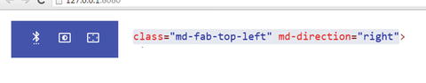

Figure 5-9. FAB toolbar—direction
md-fab-toolbar is a parent directive for the following.
FAB Trigger: A floating button, which expands to become a toolbar. Directive is md-fab-trigger. (Same directive used earlier for FAB speed dial.)
The toolbar: Part of FAB toolbar. Directive is md-toolbar. (Same directive used earlier for a page-level toolbar.)
FAB Actions: A directive fab-action-buttons for buttons on the toolbar. In the context of FAB toolbar, it is a child element under md-toolbar. (Same directive used earlier for FAB speed dial.)
Usage
<md-fab-toolbar md-open="isOpen" md-direction="right"><md-fab-trigger class="align-with-text"><md-button aria-label="Settings" class="md-fab md-primary"><md-icon md-svg-src="images/ic_settings.svg"></md-icon></md-button></md-fab-trigger><md-toolbar><md-fab-actions class="md-toolbar-tools"><md-button aria-label="Bluetooth Settings" class="md-icon-button"><md-icon md-svg-src="images/ic_settings_bluetooth.svg"></md-icon></md-button><md-button aria-label="Brightness Settings" class="md-icon-button"><md-icon md-svg-src="images/ic_settings_brightness.svg"></md-icon></md-icon></md-button><md-button aria-label="Overscan Settings" class="md-icon-button"><md-icon md-svg-src="images/ic_settings_overscan.svg"></md-icon></md-button></md-fab-actions></md-toolbar></md-fab-toolbar>
Notice that on action buttons, we are using class md-icon-buttons (opposed to md-fab-button). On toolbar, action buttons are icon buttons.
Note
You might see warning wherever ARIA attributes are not provided. ARIA provide screen readers and tools with the ability to interpret controls and read provided text for the visually impaired. Angular Material integrates highly with ngAria, an AngularJS module for these features. A separate chapter in the book describes ngAria features in Angular Material. It is highly recommended to make use of these features.
Menu
Using a menu , multiple actions could be collapsed into a button. Click the button to expand individual options. See Figure 5-10. All page-level actions are collapsed into a button on the toolbar. It acts as a trigger. As the user clicks it, each available option is shown.

Figure 5-10. Menu in the toolbar
To create a menu, use the following elements/directives .
md-menu: It is the root element while creating a menu. The trigger button should be coded directly under it. Consider the following code snippet.
<md-menu><!-- Trigger for menu --><md-button ng-click="$mdOpenMenu()">Actions</md-button>...</md-menu>Use $mdOpenMenu function to expand the menu. It is called on trigger button’s click event.
md-menu-content: Code it under md-menu. It encapsulates all menu options.
md-menu-item: Typically, a menu content element contains one or more menu items. Use this element to code each menu option.
Typically, menu items are buttons. Use a controller function on scope to handle events as these buttons are selected or clicked.
Refer to the following complete code below:
<!-- Page level actions positioned on toolbar. Actions are collapsed into a menu --><md-menu><!-- Trigger for menu --><md-button ng-click="$mdOpenMenu()">Actions</md-button><!-- Individual menu options and buttons--><md-menu-content><md-menu-item><md-button ng-click=”shareHandler()”>Share</md-button></md-menu-item><md-menu-item><md-button ng-click=”tagHandler()”>Tag the page</md-button></md-menu-item><md-menu-item><md-button ng-click=”copyHandler()”>Copy link</md-button></md-menu-item></md-menu-content></md-menu>
Alignment
Menu options, by default, are aligned relative to the md-menu element. To align it to the trigger button, specify the md-menu-origin attribute on md-button. Also, specify the md-menu-align-target attribute on individual menu options. Consider the following code.
<!-- Page level actions positioned on toolbar. Actions are collapsed into a menu --><md-menu ><!-- Trigger for menu --><md-button md-menu-origin ng-click="$mdOpenMenu()">Actions</md-button><!-- Individual menu options and buttons--><md-menu-content ><md-menu-item><md-button md-menu-align-target >Share</md-button></md-menu-item>...</md-menu-content></md-menu>
For subtle changes in positioning the menu relative to the trigger, use md-offset. Provide values for the x and y axes. Consider the following sample and Figure 5-11. We repositioned the menu on the y axis. Compare it to Figure 5-10; trigger button “actions” are visible here while the menu is expanded. Menu does not override the trigger.

Figure 5-11. Offset y axis by 40
<md-menu md-position-mode="target-right target" md-offset="0 40 ">...
Use md-position-mode to change the menu origin. The menu expands out of the given x and y axis positions. However, possible values that we can provide are limited. The default value is target on the x and y axes. We can change the x axis value to target-right for flipping the default alignment. Consider the following code.
<md-menu md-position-mode="target-right target" md-offset="0 40"><!-- Trigger for menu -->...<!—rest of the menu code --></md-menu>
Wider Menu Options
Use the width attribute on md-menu-content to change the default width. See Figure 5-12.

Figure 5-12. Wider menu options
The code snippet follows. Set width to 4 points. Possible values for this attribute are 2, 4, or 6.
<md-menu-content width="4">...
Separator
Consider using a separator for better grouping. Use md-divider element/directive. Code it as a menu item. See Figure 5-13 and the following code.

Figure 5-13. Menu separator
<md-menu><md-menu-content><!—More menus items --><md-menu-item><!-- Separator for grouping --><md-divider></md-divider></md-menu-item><!—More menus items --></md-menu-content></md-menu>
Menu Bar
A menu bar is a traditional approach to menus. Typically, Windows and Mac applications use menus on top of the screen or window. They list all possible actions with the window. Sometimes menus are used in web apps as well.
Angular Material provides elements/directives for creating such an interface in a web application. Consider Figure 5-14.

Figure 5-14. Menu bar sample
Use md-menu-bar element to create a menu bar. A menu bar contains one or more menus (md-menu elements). As we have seen so far, each md-menu encapsulates a complete menu and its options. As seen in Figure 5-14, “file” is a menu (md-menu) with three menu options: open, save, and close. The menu bar (md-menu-bar) wraps three menus—file, edit, and help—each with multiple menu options.
Refer to the following code sample for menu bar depicted in Figure 5-13.
<md-menu-bar><md-menu md-offset="0 4"><button ng-click="$mdOpenMenu()">File</button><md-menu-content width="2"><!—Menu options go here --></md-menu-content></md-menu><md-menu md-offset="0 4"><button ng-click="$mdOpenMenu()">Edit</button><md-menu-content width="2"><!—Menu options go here--></md-menu-content></md-menu><md-menu md-offset="0 4"><button ng-click="$mdOpenMenu()">Help</button><md-menu-content width="2"><!—Menu options go here--></md-menu-content></md-menu></md-menu-bar>
We can nest menus. See Figure 5-15.

Figure 5-15. Nested menus
Consider the following code. In the menu item for “paste,” instead of an md-button, an md-menu has been coded.
<md-menu md-offset="0 4"><button ng-click="$mdOpenMenu()">Edit</button><md-menu-content width="2"><md-menu-item><md-button>Cut</md-button></md-menu-item><md-menu-item><md-button>Copy</md-button></md-menu-item><md-menu-item><md-menu><md-button>Paste</md-button><md-menu-content width="2"><md-menu-item><md-button>Paste Special</md-button></md-menu-item><md-menu-item><md-button>Paste as text</md-button></md-menu-item></md-menu-content></md-menu></md-menu-item></md-menu-content></md-menu>
Summary
For the most part, buttons drive actions on the page. The controls or directives demonstrated in this chapter help make our application use Material Design styles, visual effects, and animations, and hence create an overall Material Design experience. These directives are easy to integrate and provide high user experience value. Some of the aspects to highlight are as follows.
Feedback or ripple visual effect to the user on tap/click.
Appearance, positioning, and behavior of FAB controls.
Animation effects.
In this chapter, we initially explored using md-button directive to create a button. We explored variations in options with styling and themes.
We delved into FAB, described using FAB controls as speed dial and toolbar. We also used md-fab-speed-dial and md-fab-toolbar directives (and many other child elements) to create respective controls.
Finally, this chapter detailed using traditional menus and various options with it. We used md-menu directive to create a menu and md-menu-bar for a menu bar.
For specification on Material Design FAB controls, see https://www.google.com/design/spec/components/buttons-floating-action-button.html#buttons-floating-action-button-floating-action-button
For FAB control implementation in Angular Material and documentation, see https://material.angularjs.org/