
In this chapter, we will explore layout management and styling aspects. The focus of this chapter will be markup or templates. We will also explore aspects of responsive design and adjusting view and screen content based on screen resolution.
For the project setup, continue to use a sample created in the previous chapter. Of the multiple approaches detailed, it does not matter which you followed.
Flexbox
Angular Material uses CSS3 Flexbox for responsive design. In the HTML markup, combining Angular Material directives and Flexbox CSS we can build rich UI. This combination (Angular Material & Flexbox) distinguishes between layout management and styling. HTML attributes for layouts and CSS for styles helps with clear separation of concerns. The Angular Material library provides attribute directives, which are primarily used for layout management.
Layout
With Angular Material, layout is one of the basic attributes required for layout management. It is one of the many directives provided by the framework. It transforms to apply Flexbox CSS classes while rendering the HTML page.
We can provide two possible values to the directive (attribute): “row” and “column.” Any element with a row layout applied on it will align child elements horizontally. It will behave as a single row. Similarly, the element with the layout value column will align child elements vertically. We can chain these layouts to get the desired layout structure.
Note
In a later chapter, Angular Material–styled input elements (input text boxes, drop-downs, etc.) have been discussed. For simplicity and focus on layouts, this chapter uses basic HTML input elements.
Consider the following code:
<div layout="column"><textarea rows="5" cols="50" placeholder="text field 1"></textarea><textarea rows="5" cols="50" placeholder="text field 2"></textarea></div>
This will result in two text areas aligned vertically, in a column. See Figure 3-1.

Figure 3-1. Vertically aligned when layout is set to the value “column”
Change the layout value to row, will and you will see the text fields aligned next to each other—horizontally, in one row. See Figure 3-2.

Figure 3-2. Horizontally aligned when layout is set to the value “row”
<div layout="row"><textarea rows="5" cols="50" placeholder="text field 1"></textarea><textarea rows="5" cols="50" placeholder="text field 2"></textarea></div>
Use a combination of layout options to get desired results. For example, align title on top and form fields under it. Column has two elements: title (h2) and the form (div). Form is a row, and it in turn has more elements like labels and input boxes. See Figure 3-3.

Figure 3-3. A layout arrangement
<div layout="column"><h2>Welcome to Angular Material Sample</h2><div layout="row"><strong flex="15">Enter first name</strong><input flex="20" type="text"/></div></div>
Layout-Align
Manages horizontal and vertical alignment of child elements. It works in combination with layout attribute value. Possible values are start, center, and end. Provide two values. Depending on layout, the first value is either horizontal or vertical. That is, if layout is column, then the first value of layout-align is vertical, and the second value is horizontal. It flips if layout is row. See Figure 3-4 and Figure 3-5.

Figure 3-4. layout=“column” layout-align=“start end”

Figure 3-5. layout=“row” layout-align=“start end”
Consider the following sample, aligning child element to bottom-right.
<div layout="column" style="min-height: 500px; background-color: skyblue" layout-align="end end" ><img src="/img/angular-logo.png"></div>
Note
Consider using space-around or space-between values for the first parameter. It is applied horizontally or vertically based on layout value.
More Layout Attributes
layout-padding | Provides padding around the element |
layout-fill | Fills the available space in the container |
layout-wrap/layout-nowrap | Control wrapping content of an element to next line |
layout-margin | Provides margin for the element |
Flex
Flex lets content adjust to the layout container element (a parent element with layout value row or column). Content can grow and shrink to fit the available space. Specify required behavior on the flex attribute. See Figure 3-6 for the result.
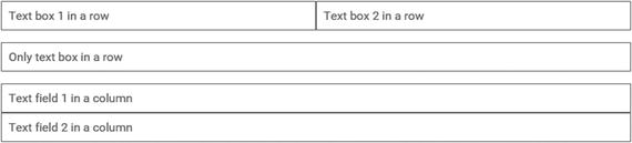
Figure 3-6. Flex streching and skewing with available space in the layout
Consider the following code. This demonstrates how flex fills available space, based on a given container's layout.
<!-- Following row has two text fields. Both together fill the row --><div layout="row" layout-padding><input flex type="text" placeholder="Text box 1 in a row"></input><input flex type="text" placeholder="Text box 2 in a row"></input></div><!-- Following row has just one text field. Whole row is taken by the text field--><div layout="row" layout-padding><input flex type="text" placeholder="Only text box in a row"></input></div><!-- Here container is a column. Hence second element moves to the next row in the column--><div layout="column" layout-padding><input flex type="text" placeholder="Text field 1 in a column"></input><input flex type="text" placeholder="Text field 2 in a column"></input></div>
To the flex attribute (directive), you can provide a numeric or a set of predefined values. The following are the possible flex values.
flex | Merely specifying flex attribute on an element allows it to grow or shrink as needed. |
none | Do not grow or shrink. |
nogrow | Do not grow. However, can shrink. |
noshrink | Do not shrink. However, can grow. |
initial | Can shrink. Set to initial height and width. |
auto | Can grow and shrink. Set to initial height and width |
Numeric values | Numbers between 0 and 100 (the value is considered to be a percentage). Only multiples of 5 and values 33 and 66 are allowed. |
Consider the following code sample. A text field for a person's name is expected to take less space than a complete address. Use a smaller number like 33 for name. Use 66 for the address. See Figure 3-7.
Figure 3-7. Using flex values 33 and 66
Note
On the HTML element, if you apply flex=“33”, it results in 100/3. And flex=“66” results in 200/3. Two elements with flex=“33” and flex =“66” together will take up 100% space. Sum of the two numbers is 100.
<div layout="row" layout-padding><input flex="33" type="text" placeholder="Provide full name"></input><input flex="66" type="text" placeholder="Provide complete address"></input></div>
Note
The preceding specified percentages and relative space each control occupies are the same even when you resize the window (or view the page on a smaller resolution screen). The layout remains similar.
When you need controls to adapt and move around, so that they are usable on a smaller screen (mobile phones and tablets), CSS breakpoint alias in combination with Angular Material directives could be used. We will look at them later in the chapter.
Responsive Design
As described in previous chapter, web front-end is no more about developing for desktop or laptop screens. Applications need to render on much smaller screens like tablets and mobile phones. Of late, many devices are touch enabled. It is an important factor while presenting and interacting with the content.
Next few chapters explore the following scenarios, challenges, and solutions.
Real Estate
Imagine a big table of data, half a dozen columns and tens of rows. It provides snapshot of information on a laptop screen. It is quite useful to see the big picture and take full advantage of the available real estate. However, the same table on a mobile phone is not so useful. The user cannot read all the information at one shot. Columns and cells will not be legible.
The table need to realign and resize to show in one column. Show only the important information and hide nitty-gritty details. When user taps on the cell and navigates to details screen, provide more information.
Feedback for User Actions
On mobile devices, feedback for user actions like tap (click) on a button becomes even more important. The user is directly interacting with the content. The user is touching the content. Feedback that a button was pressed (with a tap) needs to be instantaneous and apparent.
Screen transitions between views need to be intuitive for the user. Imagine that the user tapped on a Create Document button. If the action results in navigation to a new form screen, it needs to be obvious for the user. Animation should depict that tapping on the button is resulting in transition.
Note
Do not attempt to solve user feedback with ngTouch and Ionic Framework library functions in Angular Material. Version 1.x has issues integrating with those libraries. It might change in the future. Make sure to understand fully before attempting to integrate with the two libraries.
Breakpoints
Angular Material has CSS breakpoint alias defined for certain screen resolutions (primarily screen width). It helps define layout, alignment, and other CSS behavior for a given screen resolution. This is a powerful feature for responsive UI development.
Use breakpoint alias in combination with other Angular Material directives and attributes. Examples are provided later in the chapter.
The following are the default breakpoints provided by Angular Material.
Breakpoint Alias | Resolution | Description |
|---|---|---|
xs | Screen width less than 600 pixels (not equal to) | Very small screen. Most mobile phone screens come under this category. |
gt-xs | Any screen with width equal to or above 600px | Greater than extra-small. Use this breakpoint when we need to code for all non-mobile phone screens. Eliminates mobile phone screens. Include everything ranging from tablets, laptops, desktops, or even TVs. |
sm | Screen width ranging from 600px (including 600px) to 960px (excluding) | Small screen. This breakpoint addresses most tablet screens in portrait mode. Often a tablet tilted in landscape mode is greater than small. |
gt-sm | Screen width greater than or equal to 960px | Greater than small. Include all devices greater than small. This excludes tablets in portrait mode and mobile phones. It includes tables in landscape mode, low-resolution laptop/desktop screens, high-resolution laptop/desktop screens, and even high-definition TVs. |
md | Screen width ranging from 960px (including) to 1280px (excluding) | Medium-size screen. Most laptops in landscape mode and low-resolution laptops/desktops come under this category. |
gt-md | Screen width greater than or equal to 1280px | Greater than medium. Excludes tablets (in either landscape or portrait mode), low-resolution laptop/desktop screens. This breakpoint addresses high-resolution laptop/desktop screens and TVs. |
lg | Screen width ranging from 1280 (including) to 1920px (excluding) | Large screens. This breakpoint addresses most laptop/desktop screens. |
gt-lg or xl | Screen width greater than or equal to 1920px | Greater than large screens or extra-large screens. This breakpoint excludes most laptop, tablet, and mobile phone screens. All super-high-resolution desktop/laptop screens and high-definition TV screens come under this category. |
Use breakpoints along with any layout/alignment directives or attributes (layout, flex, etc.). Suffix breakpoint alias (sm, gt-sm, etc.) to the directive name. Most directives have implementation to support breakpoints. For building responsive UI, built-in breakpoints are quite useful.
Consider the following code. Among the three div elements, the first and last are for providing margins to the page. Margins collapse on a medium or smaller screen. That allows content to take complete available space on a smaller screen. See Figures 3-8 and 3-9 for results. Read comments for details on code.

Figure 3-8. Large screen (gt-md)

Figure 3-9. Small screen (emulated to 414px width)
<div layout="row" flex layout-padding><!-- flex-gt-md=10. Flex 10% on a greater than medium screen --><div flex-gt-md="10"></div><div flex-gt-md="80" flex><!-- flex fills available space by default. For a screen greater than medium fill up to 80% -->Lorem ipsum dolor sit amet, consectetur adipiscing elit.<!-- Saving space. Can have paragraphs of information here. --></div><!-- flex-gt-md=10. Flex 10% on a greater than medium screen --><div flex-gt-md="10"></div></div>
On a small screen, emulating screen width of 414px, left and right div elements collapse. Space around the paragraph of text is with layout-padding directive. It stretches to 100% of available screen width (flex).
Note
At the time of writing this book, layout-padding and layout-margin do not support breakpoint alias. Expect enhancement to support alias with the directives in future releases. Here is the GitHub issue tracking progress: https://github.com/angular/material/issues/1984
Show/Hide
Use show or hide directives to display or hide elements in markup. It is similar to ng-show or ng-hide. However, show or hide could be used with breakpoint alias.
Consider the following code:
<div layout="row" layout-padding><!-- show only on screens greater than small --><div show-gt-sm hide><img src="/img/angular-logo.png"></div><div><strong>AngularJS</strong><div>Superheroic JavaScript framework</div><div>Website: angularjs.org</div><div>Twitter: @angularjs</div></div></div>
The element is laid out as a row. The first cell on the left shows an image. On a smaller screen, hide the image div element. Show on all screens larger than small (>= 960px). Always show the second element. It shows textual information that fits even a small screen. See Figures 3-10 and 3-11.

Figure 3-10. On a screen gt-sm

Figure 3-11. On an xs (extra-small) screen (emulated to a mobile phone)
Responsive Layout
Another regular use case would be to fill page horizontally (grow the row) on bigger screens. On a mobile screen with smaller width, skew the page to show content in a column.
Consider the following code: it is laid out as a row on gt-sm breakpoint (greater than small, which is a screen at least 960px wide). On the other hand, it is skewed to a column on smaller screens. See Figures 3-12 and 3-13.

Figure 3-12. On a screen gt-sm

Figure 3-13. On an emulated small screen
<div layout="column" layout-gt-sm="row" layout-padding><div><strong>AngularJS</strong><div>Superheroic JavaScript framework</div><div>Website: angularjs.org</div><div>Twitter: @angularjs</div></div><div><strong>Angular Material</strong><div>AngularJS and Material Design</div><div>material.angularjs.org</div><div>Twitter: @angularjs</div></div></div>
Summary
This chapter detailed out basics of layout management and responsive design in Angular Material. The focus of this chapter has been HTML markup. We used various attribute directives for layout management.
Angular Material uses CSS Flexbox. It encapsulates layout-related CSS classes in attribute directives. As a developer, while managing layout, we use Angular Material API and provide values for attributes.
Angular Material achieves better separation of concerns by using attributes and values in an HTML element for layout and CSS classes for styling. Under the hood, it transforms given directive values to elements with CSS classes applied.
The next set of chapters will focus on sophisticated code samples. We explore Angular Material services and directives.
See Angular Material official documentation at https://material.angularjs.org/latest/layout/children
For information on Flexbox styles for layout features, refer to the following URL: https://gist.github.com/ThomasBurleson/88152ec57c9133dec57a
For issue status on layout margin and layout padding support for breakpoints, refer to the following: https://github.com/angular/material/issues/1984
For AngularJS documentation and logo (used in samples): https://angularjs.org/