
Plotting is used extensively in machine learning problems. MATLAB plots can be two or three dimensional. The same data can be represented using many different types of plots.
5.1 Two-Dimensional Line Plots
5.1.1 Problem
You want a single function to generate two-dimensional (2D) line graphs, avoiding a long list of code for the generation of each graphic.
5.1.2 Solution
Write a single function to take the data and parameter pairs to encapsulate the functionality of MATLAB’s 2D line-plotting functions. An example of a plot created with a single line of code is shown in Figure 5.1.

Figure 5.1 PlotSet’s built-in demo.
5.1.3 How It Works
PlotSet generates 2D plots, including multiple plots on a page. This code processes varargin as parameter pairs to set options. This makes it easy to expand the options.
%% PLOTSET Create two-dimensional plots from a data set.
%% Form
% h = PlotSet( x, y, varargin )
%
%% Decription
% Plot y vs x in one figure.
% If x has the same number of rows as y then each row of y is plotted
% against the corresponding row of x. If x has one row then all of the
% y vectors are plotted against those x variables.
%
% Accepts optional arguments that modify the plot parameters.
%
% Type PlotSet for a demo.
%
%% Inputs
% x (:,:) Independent variables
% y (:,:) Dependent variables
% varargin {} Optional arguments with values
% ’x label’, ’y label’, ’plot title’, ’plot type’
% ’figure title’, ’plot set’, ’legend’
%
%% Outputs
% h (1,1) Figure handle
The function code is shown below. We supply default values for the x- and y-axis labels and the figure name. The parameter pairs are handled in a switch statement. We are careful to use lower to compare the parameter name in lowercase. The plotting is done in a subfunction called plotXY.
function h = PlotSet( x, y, varargin )
% Demo
if( nargin < 1 )
Demo;
return;
end
% Defaults
nCol = 1;
n = size(x,1);
m = size(y,1);
yLabel = cell(1,m);
xLabel = cell(1,n);
plotTitle = cell(1,n);
for k = 1:m
yLabel{k} = ’y’;
end
for k = 1:n
xLabel{k} = ’x’;
plotTitle{k} = ’’;
end
figTitle = ’PlotSet’;
plotType = ’plot’;
plotSet = cell(1,m);
leg = cell(1,m);
for k = 1:m
plotSet{k} = k;
leg{k} = {};
end
% Handle input parameters
for k = 1:2:length(varargin)
switch lower(varargin{k} )
case ’x␣label’
for j = 1:n
xLabel{j} = varargin{k+1};
end
case ’y␣label’
temp = varargin{k+1};
if( ischar(temp) )
yLabel{1} = temp;
else
yLabel = temp;
end
case ’plot␣title’
if( iscell(varargin{k+1}) )
plotTitle = varargin{k+1};
else
plotTitle{1} = varargin{k+1};
end
case ’figure␣title’
figTitle = varargin{k+1};
case ’plot␣type’
plotType = varargin{k+1};
case ’plot␣set’
plotSet = varargin{k+1};
m = length(plotSet);
case ’legend’
leg = varargin{k+1};
otherwise
fprintf(1,’%s␣is␣not␣an␣allowable␣parameter ’,varargin{k});
end
end
h = figure(’name’,figTitle);
% First path is for just one row in x
if( n == 1 )
for k = 1:m
subplot(m,nCol,k);
j = plotSet{k};
plotXY(x,y(j,:),plotType);
xlabel(xLabel{1});
ylabel(yLabel{k});
if( length(plotTitle) == 1 )
title(plotTitle{1})
else
title(plotTitle{k})
end
if( ~isempty(leg{k}) )
legend(leg{k});
end
grid on
end
else
for k = 1:n
subplot(n,nCol,k);
j = plotSet{k};
plotXY(x(j,:),y(j,:),plotType);
xlabel(xLabel{k});
ylabel(yLabel{k});
if( length(plotTitle) == 1 )
title(plotTitle{1})
else
title(plotTitle{k})
end
if( ~isempty(leg{k}) )
legend(leg{k},’location’,’best’);
end
grid on
end
end
%%% PlotSet>plotXY Implement different plot types
% log and semilog types are supported.
%
% plotXY(x,y,type)
function plotXY(x,y,type)
h = [];
switch type
case ’plot’
h = plot(x,y);
case {’log’ ’loglog’ ’log␣log’}
h = loglog(x,y);
case {’xlog’ ’semilogx’ ’x␣log’}
h = semilogx(x,y);
case {’ylog’ ’semilogy’ ’y␣log’}
h = semilogy(x,y);
otherwise
error(’%s␣is␣not␣an␣available␣plot␣type’,type);
end
if( ~isempty(h) )
color = ’rgbc’;
lS = {’-’ ’--’ ’:’ ’-.’};
j = 1;
for k = 1:length(h)
set(h(k),’col’,color(j),’linestyle’,lS{j});
j = j + 1;
if( j == 5 )
j = 1;
end
end
end
%%% PlotSet>Demo
function Demo
x = linspace(1,1000);
y = [sin(0.01*x);cos(0.01*x);cos(0.03*x)];
disp(’PlotSet:␣One␣x␣and␣two␣y␣rows’)
PlotSet( x, y, ’figure␣title’, ’PlotSet␣Demo’,...
’plot␣set’,{[2 3], 1},’legend’,{{’A’ ’B’},{}},’plot␣title’,{’cos’,’sin’});
The example in Figure 5.1 is generated by a dedicated demo function at the end of the PlotSet function. This demo shows several of the features of the function. These include
Multiple lines per graph
Legends
Plot titles
Default axis labels
Using a dedicated demo subfunction is a clean way to provide a built-in example of a function, and it is especially important in graphics functions to provide an example of what the plot should look like. The code is shown below.
j = 1;
for k = 1:length(h)
set(h(k),’col’,color(j),’linestyle’,lS{j});
j = j + 1;
if( j == 5 )
j = 1;
end
end
end
5.2 General 2D Graphics
5.2.1 Problem
You want to represent a 2D data set in different ways.
5.2.2 Solution
Write a script to show MATLAB’s different 2D plot types. In our example we use subplots within one figure to help reduce figure proliferation.
5.2.3 How It Works
Use the NewFigure function to create a new figure window with a suitable name. Then run the following script.
NewFigure(’Plot␣Types’)
x = linspace(0,10,10);
y = rand(1,10);
subplot(4,1,1);
plot(x,y);
subplot(4,1,2);
bar(x,y);
subplot(4,1,3);
barh(x,y);
subplot(4,1,4);
pie(y)
Four plot types are shown that are helpful in displaying 2D data. One is the 2D line plot, the same as is used in PlotSet. The middle two are bar charts. The final is a pie chart. Each gives you different insight into the data. Figure 5.2 shows the plot types.

Figure 5.2 Four different types of MATLAB 2D plots.
There are many MATLAB functions for making these plots more informative. You can
Add labels.
Add grids.
Change font types and sizes.
Change the thickness of lines.
Add legends.
Change axis limits.
The last item requires looking at the axis properties. Here are the properties for the last plot—the list is very long! gca is the handle to the current axis.
>> get(gca)
ALim: [0 1]
ALimMode: ’auto’
ActivePositionProperty: ’position’
AmbientLightColor: [1 1 1]
BeingDeleted: ’off’
Box: ’off’
BoxStyle: ’back’
BusyAction: ’queue’
ButtonDownFcn: ’’
CLim: [1 10]
CLimMode: ’auto’
CameraPosition: [0 0 19.6977]
CameraPositionMode: ’auto’
CameraTarget: [0 0 0]
CameraTargetMode: ’auto’
CameraUpVector: [0 1 0]
CameraUpVectorMode: ’auto’
CameraViewAngle: 6.9724
CameraViewAngleMode: ’auto’
Children: [20x1 Graphics]
Clipping: ’on’
ClippingStyle: ’3dbox’
Color: [1 1 1]
ColorOrder: [7x3 double]
ColorOrderIndex: 1
CreateFcn: ’’
CurrentPoint: [2x3 double]
DataAspectRatio: [1 1 1]
DataAspectRatioMode: ’manual’
DeleteFcn: ’’
FontAngle: ’normal’
FontName: ’Helvetica’
FontSize: 10
FontSmoothing: ’on’
FontUnits: ’points’
FontWeight: ’normal’
GridAlpha: 0.1500
GridAlphaMode: ’auto’
GridColor: [0.1500 0.1500 0.1500]
GridColorMode: ’auto’
GridLineStyle: ’-’
HandleVisibility: ’on’
HitTest: ’on’
Interruptible: ’on’
LabelFontSizeMultiplier: 1.1000
Layer: ’bottom’
LineStyleOrder: ’-’
LineStyleOrderIndex: 1
LineWidth: 0.5000
MinorGridAlpha: 0.2500
MinorGridAlphaMode: ’auto’
MinorGridColor: [0.1000 0.1000 0.1000]
MinorGridColorMode: ’auto’
MinorGridLineStyle: ’:’
NextPlot: ’replace’
OuterPosition: [0 0.0706 1 0.2011]
Parent: [1x1 Figure]
PickableParts: ’visible’
PlotBoxAspectRatio: [1.2000 1.2000 1]
PlotBoxAspectRatioMode: ’manual’
Position: [0.1300 0.1110 0.7750 0.1567]
Projection: ’orthographic’
Selected: ’off’
SelectionHighlight: ’on’
SortMethod: ’childorder’
Tag: ’’
TickDir: ’in’
TickDirMode: ’auto’
TickLabelInterpreter: ’tex’
TickLength: [0.0100 0.0250]
TightInset: [0 0.0405 0 0.0026]
Title: [1x1 Text]
TitleFontSizeMultiplier: 1.1000
TitleFontWeight: ’bold’
Type: ’axes’
UIContextMenu: [0x0 GraphicsPlaceholder]
Units: ’normalized’
UserData: []
View: [0 90]
Visible: ’off’
XAxis: [1x1 NumericRuler]
XAxisLocation: ’bottom’
XColor: [0.1500 0.1500 0.1500]
XColorMode: ’auto’
XDir: ’normal’
XGrid: ’off’
XLabel: [1x1 Text]
XLim: [-1.2000 1.2000]
XLimMode: ’manual’
XMinorGrid: ’off’
XMinorTick: ’off’
XScale: ’linear’
XTick: [-1 0 1]
XTickLabel: {3x1 cell}
XTickLabelMode: ’auto’
XTickLabelRotation: 0
XTickMode: ’auto’
YAxis: [1x1 NumericRuler]
YAxisLocation: ’left’
YColor: [0.1500 0.1500 0.1500]
YColorMode: ’auto’
YDir: ’normal’
YGrid: ’off’
YLabel: [1x1 Text]
YLim: [-1.2000 1.2000]
YLimMode: ’manual’
YMinorGrid: ’off’
YMinorTick: ’off’
YScale: ’linear’
YTick: [-1 0 1]
YTickLabel: {3x1 cell}
YTickLabelMode: ’auto’
YTickLabelRotation: 0
YTickMode: ’auto’
ZAxis: [1x1 NumericRuler]
ZColor: [0.1500 0.1500 0.1500]
ZColorMode: ’auto’
ZDir: ’normal’
ZGrid: ’off’
ZLabel: [1x1 Text]
ZLim: [-1 1]
ZLimMode: ’auto’
ZMinorGrid: ’off’
ZMinorTick: ’off’
ZScale: ’linear’
ZTick: [-1 0 1]
ZTickLabel: ’’
ZTickLabelMode: ’auto’
ZTickLabelRotation: 0
ZTickMode: ’auto’
Every single one of these can be changed by using the set function:
set(gca,’YMinorGrid’,’on’,’YGrid’,’on’)
This uses parameter pairs just like PlotSet. In this list children are pointers to the children of the axes. You can access those using get and change their properties using set.
5.3 Custom 2D Diagrams
5.3.1 Problem
Many machine learning algorithms benefit from 2D diagrams such as tree diagrams, to help the user understand the results and the operation of the software. Such diagrams, automatically generated by the software, are an essential part of learning systems. This section gives an example of how to write MATLAB code for a tree diagram.
5.3.2 Solution
Our solution is to use MATLAB patch function to automatically generate the blocks, and use line to generate connecting lines. Figure 5.3 shows the resulting hierarchical tree diagram. The circles are in rows and each row is labeled.

Figure 5.3 A custom tree diagram.
5.3.3 How It Works
Tree diagrams are very useful for machine learning. This function generates a hierarchical tree diagram with the nodes as circles with text within each node. The graphics functions used in this function are
line
patch
text
The data needed to draw the tree are contained in a data structure, which is documented in the header. Each node has a parent field. This information is sufficient to make the connections. The node data are entered as a cell array.
%% TreeDiagram Tree diagram plotting function.
%% Description
% Generates a tree diagram from hierarchical data.
%
% Type TreeDiagram for a demo.
%
% w is optional the defaults are:
%
% .name = ’Tree’;
% .width = 400;
% .fontName = ’Times’;
% .fontSize = 10;
% .linewidth = 1;
% .linecolor = ’r’;
%
%--------------------------------------------------------------------------
%% Form:
% TreeDiagram( n, w, update )
%
%% Inputs
% n {:} Nodes
% .parent (1,1) Parent
% .name (1,1) Number of observation
% .row (1,1) Row number
% w (.) Diagram data structure
% .name (1,:) Tree name
% .width (1,1) Circle width
% .fontName (1,:) Font name
% .fontSize (1,1) Font size
% update (1,1) If entered and true update an existing plot
The code is shown below. The function stores a figure handle in a persistent variable so that the same figure can be updated with subsequent calls, if desired. The last input, a boolean, enables this behavior to be turned on and off.
function TreeDiagram( n, w, update )
persistent figHandle
% Demo
%-----
if( nargin < 1 )
Demo
return;
end
% Defaults
%---------
if( nargin < 2 )
w = [];
end
if( nargin < 3 )
update = false;
end
if( isempty(w) )
w.name = ’Tree’;
w.width = 1200;
w.fontName = ’Times’;
w.fontSize = 10;
w.linewidth = 1;
w.linecolor = ’r’;
end
% Find row range
%----------------
m = length(n);
rowMin = 1e9;
rowMax = 0;
for k = 1:m
rowMin = min([rowMin n{k}.row]);
rowMax = max([rowMax n{k}.row]);
end
nRows = rowMax - rowMin + 1;
row = rowMin:rowMax;
rowID = cell(nRows,1);
% Determine which nodes go with which rows
%------------------------------------------
for k = 1:nRows
for j = 1:m
if( n{j}.row == row(k) )
rowID{k} = [rowID{k} j];
end
end
end
% Determine the maximum number of circles at the last row
%---------------------------------------------------------
width = 3*length(rowID{nRows})*w.width;
% Draw the tree
%--------------
if( ~update )
figHandle = NewFigure(w.name);
else
clf(figHandle)
end
figure(figHandle);
set(figHandle,’color’,[1 1 1]);
dY = width/(nRows+2);
y = (nRows+2)*dY;
set(gca,’ylim’,[0 (nRows+1)*dY]);
set(gca,’xlim’,[0 width]);
for k = 1:nRows
label = sprintf(’Row␣%d’,k);
text(0,y,label,’fontname’,w.fontName,’fontsize’,w.fontSize);
x = 4*w.width;
for j = 1:length(rowID{k})
node = rowID{k}(j);
[xC,yCT,yCB] = DrawNode( x, y, n{node}.name, w );
n{node}.xC = xC;
n{node}.yCT = yCT;
n{node}.yCB = yCB;
x = x + 3*w.width;
end
y = y - dY;
end
% Connect the nodes
%------------------
for k = 1:m
if( ~isempty(n{k}.parent) )
ConnectNode( n{k}, n{n{k}.parent},w );
end
end
axis off
axis image
%--------------------------------------------------------------------------
% Draw a node. This is a circle with a number in the middle.
%--------------------------------------------------------------------------
function [xC,yCT,yCB] = DrawNode( x0, y0, k, w )
n = 20;
a = linspace(0,2*pi*(1-1/n),n);
x = w.width*cos(a)/2 + x0;
y = w.width*sin(a)/2 + y0;
patch(x,y,’w’);
text(x0,y0,sprintf(’%d’,k),’fontname’,w.fontName,’fontsize’,w.fontSize, ’horizontalalignment’,’center’);
xC = x0;
yCT = y0 + w.width/2;
yCB = y0 - w.width/2;
%--------------------------------------------------------------------------
% Connect a node to its parent
%--------------------------------------------------------------------------
function ConnectNode( n, nP, w )
x = [n.xC nP.xC];
y = [n.yCT nP.yCB];
line(x,y,’linewidth’,w.linewidth,’color’,w.linecolor);
The demo shows how to use the function. In this case, it takes more lines of code to write out the hierarchical information than it does to plot the tree!
%--------------------------------------------------------------------------
% Create the demo data structure
%--------------------------------------------------------------------------
function Demo
k = 1;
%---------------
row = 1;
d.parent = [];
d.name = 1;
d.row = row;
n{k} = d; k = k + 1;
%---------------
row = 2;
d.parent = 1;
d.name = 1;
d.row = row;
n{k} = d; k = k + 1;
d.parent = 1;
d.name = 2;
d.row = row;
n{k} = d; k = k + 1;
d.parent = [];
d.name = 3;
d.row = row;
n{k} = d; k = k + 1;
%---------------
row = 3;
d.parent = 2;
d.name = 1;
d.row = row;
n{k} = d; k = k + 1;
d.parent = 2;
d.name = 4;
d.row = row;
n{k} = d; k = k + 1;
d.parent = 3;
d.name = 2;
d.row = row;
n{k} = d; k = k + 1;
d.parent = 3;
d.name = 5;
d.row = row;
n{k} = d; k = k + 1;
d.parent = 4;
d.name = 6;
d.row = row;
n{k} = d; k = k + 1;
d.parent = 4;
d.name = 7;
d.row = row;
n{k} = d; k = k + 1;
%---------------
row = 4;
d.parent = 5;
d.name = 1;
d.row = row;
n{k} = d; k = k + 1;
d.parent = 6;
d.name = 8;
d.row = row;
n{k} = d; k = k + 1;
d.parent = 6;
d.name = 4;
d.row = row;
n{k} = d; k = k + 1;
d.parent = 7;
d.name = 2;
d.row = row;
n{k} = d; k = k + 1;
d.parent = 7;
d.name = 9;
d.row = row;
n{k} = d; k = k + 1;
d.parent = 9;
d.name = 10;
d.row = row;
n{k} = d; k = k + 1;
d.parent = 10;
d.name = 11;
d.row = row;
n{k} = d; k = k + 1;
d.parent = 10;
d.name = 12;
d.row = row;
n{k} = d;
%---------------
% Call the function with the demo data
TreeDiagram( n )
5.4 Three-Dimensional Box
There are two broad classes of three-dimensional (3D) graphics. One is to draw an object, like the earth. The other is to draw large data sets. This recipe plus the following one will show you how to do both.
5.4.1 Problem
We want to draw a 3D box.
5.4.2 Solution
Use the patch function to draw the object. An example is shown in Figure 5.4.

Figure 5.4 A box drawn with patch.
5.4.3 How It Works
Three-dimensional objects are created from vertices and faces. A vertex is a point in space. You create a list of vertices that are the corners of your 3D object. You then create faces that are lists of vertices. A face with two vertices is a line, while one with three vertices is a triangle. A polygon can have as many vertices as you would like. However, at the lowest level graphics processors deal with triangles, so you are best off making all patches triangles.

Figure 5.5 A patch. The normal is toward the camera or the “outside” of the object.
You will notice the normal vector. This is the outward vector. Your vertices in your patches should be ordered using the ”right-hand rule”; that is, if the normal is in the direction of your thumb, then the faces are ordered in the direction of your fingers. In this figure the order for the two triangles would be
[3 2 1]
[1 4 3]
MATLAB lighting is not very picky about vertex ordering, but if you export a model then you will need to follow this convention. Otherwise, you can end up with inside-out objects!
The following code creates a box composed of triangle patches. The face and vertex arrays are created by hand.
function [v, f] = Box( x, y, z )
% Demo
if( nargin < 1 )
Demo
return
end
% Faces
f = [2 3 6;3 7 6;3 4 8;3 8 7;4 5 8;4 1 5;2 6 5;2 5 1;1 3 2;1 4 3;5 6 7;5 7 8];
% Vertices
v = [-x x x -x -x x x -x;...
-y -y y y -y -y y y;...
-z -z -z -z z z z z]’/2;
% Default outputs
if( nargout == 0 )
DrawVertices( v, f, ’Box’ );
clear v
end
function Demo
x = 1;
y = 2;
z = 3;
Box( x, y, z );
The box is drawn using path in the function DrawVertices. There is just one call to patch. patch accepts parameter pairs to specify face and edge coloring and many other characteristics of the patch. Only one color can be specified for a patch. If you wanted a box with different colors on each side, you would need multiple patches.
function DrawVertices( v, f, name )
% Demo
if( nargin < 1 )
Demo
return
end
if( nargin < 3 )
name = ’Vertices’;
end
NewFigure(name)
patch(’vertices’,v,’faces’,f,’facecolor’,[0.8 0.1 0.2]);
axis image
xlabel(’x’)
ylabel(’y’)
zlabel(’z’)
view(3)
grid on
rotate3d on
s = 10*max(Mag(v’));
light(’position’,s*[1 1 1])
function Demo
[v,f] = Box(2,3,4);
DrawVertices( v, f, ’box’ )
We use only the most basic lighting. You can add all sorts of lights in your drawing using light.
5.5 Draw a 3D Object with a Texture
5.5.1 Problem
We want to draw a planet.
5.5.2 Solution
Use a surface and overlay a texture onto the surface. Figure 5.6 shows an example with a recent image of Pluto.

Figure 5.6 A three-dimensional globe of Pluto.
5.5.3 How It Works
We generate the picture by first creating x, y, z points on the sphere and then overlaying a texture that is read in from an image file. The texture map can be read from a file using imread. If this is color, it will be a 3D matrix. The third element will be an index to the color, red, blue, or green. However, if it a grayscale image, you must create the 3D matrix by replicating the image.
p = imread(’PlutoGray.png’);
p3(:,:,1) = p;
p3(:,:,2) = p;
p3(:,:,3) = p;
The starting p is a 2D matrix.
You first generate the surface using the coordinates generated from the sphere function. This is done with surface. You then apply the texture

Phong is a type of shading. It takes the colors at the vertices and interpolates the colors at the pixels on the polygon based on the interpolated normals. The complete code is shown below. Diffuse and specular refer to different types of reflections of light. They aren’t too important when you apply a texture to the surface.

5.6 General 3D Graphics
5.6.1 Problem
We want to use 3D graphics to study a 2D data set.
5.6.2 Solution
Use MATLAB surface, mesh, bar, and contour functions. An example of a random data set with different visualizations is shown in Figure 5.7.

Figure 5.7 Two-dimensional data shown with six different plot types.
5.6.3 How It Works
We generate a random 2D data set that is 8 × 8 using rand. We display it in several ways in a figure with subplots. In this case, we create two rows and three columns of subplots. Figure 5.7 shows six types of 2D plots. surf, mesh and surfl (3D shaded surface with lighting) are very similar. The surface plots are more interesting when lighting is applied. The two bar3 plots show different ways of coloring the bars. In the second bar plot, the color varies with length. This requires a bit of code, changing the CData and FaceColor

5.7 Building a Graphical User Interface
5.7.1 Problem
We want a graphical user interface (GUI) to provide a second-order system simulation.
5.7.2 Solution
We will use the MATLAB GUIDE to build a GUI that will allow us to
Set the damping constant.
Set the end time for the simulation.
Set the type of input (pulse, step, or sinusoid).
Display the inputs and outputs plot.
5.7.3 How It Works
We want to build a GUI to interface with SecondOrderSystemSim shown below.


Running it gives the following plot Figure 5.8. The function has the simulation loop built in.
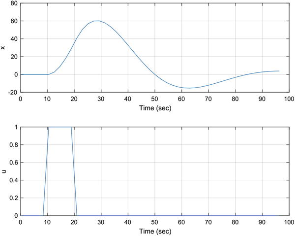
Figure 5.8 Second-order system simulation.
The MATLAB GUI building system, GUIDE, is invoked by typing guide at the command line. There are several options for GUI templates, or a blank GUI. We will start from a blank GUI. First, let’s make a list of the controls we will need from our desired features list above:
Edit boxes for
Simulation duration
Damping ratio
Undamped natural frequency
Sinusoid input frequency
Pulse start and stop time
Radio button for the type of input
Run button for starting a simulation
Plot axes
We type “guide” in the command window and it asks us to either pick an existing GUI or create a new one. We choose blank GUI. Figure 5.9 shows the template GUI in GUIDE before we make any changes to it. You add elements by dragging and dropping from the table at the left.

Figure 5.9 Blank GUI.
Figure 5.10 shows the GUI inspector. You edit GUI elements here. You can see that the elements have a lot of properties. We aren’t going to try and make this GUI really slick, but with some effort you can make it a work of art. The ones we will change are the tag and text properties. The tag gives the software a name to use internally. The text is just what is shown on the device.

Figure 5.10 The GUI inspector.
We then add all the desired elements by dragging and dropping. We choose to name our GUI GUI. The resulting initial GUI is shown in Figure 5.11. In the inspector for each element you will see a field for “tag.” Change the names from things like edit1 to names you can easily identify. When you save them and run the GUI from the.fig file, the code in GUI.m will automatically change.

Figure 5.11 Snapshot of the GUI in the editing window after adding all the elements.
We create a radio button group and add the radio buttons. This handles disabling all but the selected radio button. When you hit the green arrow in the layout box, it saves all changes to the m-file and also simulates it. It will warn you about bugs.
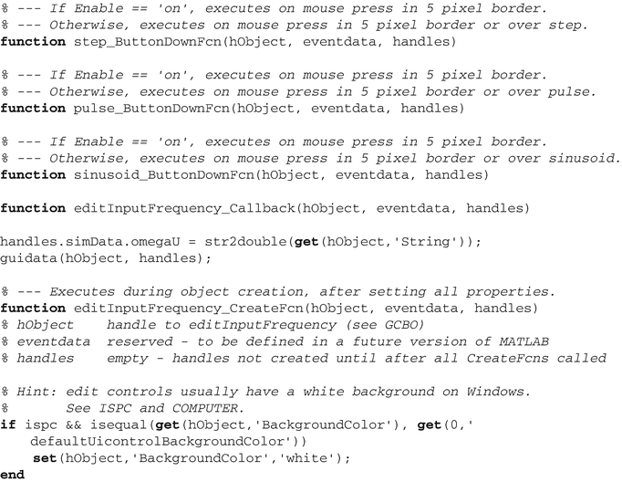
At this point, we can start work on the GUI code itself. The template GUI stores its data, calculated from the data the user types into the edit boxes, in a field called simdata. The entire function is shown below. We’ve removed the repeated comments to make it more compact.


When the GUI loads, we initialize the text fields with the data from the default data structure. Make sure that the initialization corresponds to what is seen in the GUI. You need to be careful about radio buttons and button states.

When the start button is pushed, we run the simulation and plot the results. This essentially is the same as the demo code in the second-order simulation.

The callbacks for the edit boxes require a little code to set the data in the stored data. All data are stored in the GUI handles. guidata must be called to store new data in the handles.

One simulation is shown in Figure 5.12. Another simulation in the GUI is shown in Figure 5.13.
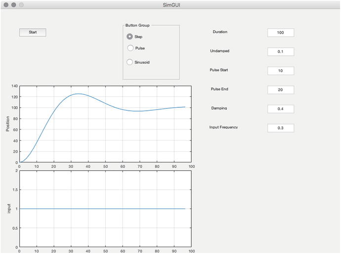
Figure 5.12 Snapshot of the GUI in simulation.

Figure 5.13 Snapshot of the GUI in simulation.
Summary
This chapter has demonstrated graphics that can help understand the results of machine learning software. Two- and three-dimensional graphics were demonstrated. The chapter also showed how to build a GUI to help automate functions.
Table 5.1 Chapter Code Listing
File | Description |
|---|---|
Box | Draw a box. |
DrawVertices | Draw a set of vertices and faces |
Globe | Draw a texture mapped globe |
PlotSet | 2D line plots |
SecondOrderSystemSim | Simulates a second-order system |
SimGUI | Code for the simulation GUI |
SimGUI.fig | The figure |
TreeDiagram | Draw a tree diagram |
TwoDDataDisplay | A script to display 2D data in 3D graphics |