In this final chapter we will cover Developer Mode . Developer Mode tends to seem very mysterious to new Squarespace users. There isn’t much documentation on Developer Mode, and web developers often learn how to use the system as they go. It does take a serious understanding of HTML, CSS, and JavaScript to safely use Developer Mode. Even if you don’t plan on using Developer Mode, it is good to understand the capabilities of the system! By the end of this chapter you should have a solid understanding of what Developer Mode is, how to use it, and when to use it.
What Is Developer Mode?
Developer Mode gives web developers access to the template files for a particular website. It provides developers a way to modify the website outside of the Style Editor and Code Injections. Using Developer Mode provides increased control over the website and allows the coding of completely bespoke templates.
One major benefit of using Developer Mode is that trial sites in Developer Mode never expire. This allows web professionals to keep two versions of the website – a production site and a development site – without paying for a second website subscription. For bespoke templates it is best practices to have a development site and a production site. When using a development site, all changes are made to the development site first. This allows the client to see the changes, interact with the development site, and approve the changes. Once the changes are approved, the files are then moved to the production site and any content updates are made.
While Developer Mode gives increased control of the template, it also takes away some nice features. When Developer Mode is enabled, the template will not receive any automatic updates to the template files. The reasoning behind this is that Squarespace does not want to overwrite any of the custom code. The core files for the website, the Squarespace platform, Blocks, and menu features will still receive updates. This works really well for truly bespoke templates. For templates that are based off of a Squarespace template, like the Brine family templates, it is important to understand they won’t automatically be updated. The Squarespace template updates can be incorporated into the Developer Mode template, but it takes careful consideration and planning to integrate the new template code into the custom template. A good example of this is when the Brine template family was updated to include videos as banner backgrounds. The update included a restructuring of the JavaScript code for the entire template. Therefore it wasn’t an easy task to integrate the video background feature into the existing Developer Mode template. Clients need to know that future updates like this will take time and cost money.
When to Use Developer Mode
Like most powerful tools , it is important to know when to use Developer Mode and when to not use it. The best time to use Developer Mode is when you are building a truly bespoke template. Bespoke templates could include unique navigation, animations, layouts, or other interactive features., Before starting a Developer Mode project I make sure that I cannot create the bespoke element using an existing Squarespace template. I used Developer Mode more frequently a few years ago when the Squarespace templates were less flexible. Since the release of the new style template families, Brine, Skye, Farro, Tremont, and York, are so flexible, I use Developer Mode less often.
Enabling Developer Mode also is helpful for projects with a large amount of custom CSS or other code injections. This is especially true if the custom CSS depends on template-specific classes or ids. When using a Squarespace template without Developer Mode, there is always the risk that an automatic template update will break the custom code. For sites that extensively customize a Squarespace template, this risk can be minimized by enabling Developer Mode. Some Squarespace developers will always enable Developer Mode for this very reason. However, when browsers change, the web developer has to make those updates to the bespoke template. If the template is not updated as browsers change the user experience can slowly degrade over time.
Developer Mode really requires having an ongoing relationship with the client. Squarespace is always working on improving the platform and templates. Therefore it is safe to assume new features will be added that your clients will eventually want to use. I have several clients whom have been with me for years running Developer Mode templates. There are other clients that I have steered away from Developer Mode since they were going to do all ongoing site management themselves.
For web developers switching to the Squarespace platform from other web platforms, Developer Mode can feel more natural. The ability to see all the template files, modify them, and upload them to the site is a common way to edit websites on many platforms. It also allows the developer to see all the code in one location. When I first used Squarespace I found it easier to use Developer Mode and over time grew my understanding of the Style Editor and Code Injections.
Sometimes clients really want all the automatic updates that Squarespace provides. These clients often update their site and will use new features as soon as they are released. For these clients I will make the customizations work with the Code Injections, even if it would have been easier to use Developer Mode .
Turning On Developer Mode
The first step in using Developer Mode is to choose a starting point. You can start with any of the Squarespace templates or with the Squarespace Base Template, https://base-template.squarespace.com/ . The Base Template is a skeleton of a template. It has all the necessary files and almost no styling or frills. The other Squarespace templates are all very complicated, and often a lot of code needs to be removed for customizations to work correctly. It is often easier to start with a blank slate than to work around existing code. Developer Modes sites are started just like regular Squarespace websites by selecting “create a site like this” and walking through all the initial steps we covered in earlier chapters.
Once the website has been created in the Squarespace platform, Developer Mode can be enabled. Developer Mode can be enabled by going to the Settings Menu, selecting the Advanced option under Website, and finally selecting Developer Mode. The Developer Mode area will initially be set to “off.” Figure 11-1 shows how the Developer Mode menu will initially appear. Toggling the switch to “on” enabled Developer Mode. A popup will appear making sure that you understand the basics of Developer Mode before continuing. This popup is also shown in Figure 11-1.

Figure 11-1. Developer Mode toggle switch and popup message
Once you select continue, Squarespace will switch the template to developer mode and provide the connectivity details. Figure 11-2 shows how the Developer Mode area now appears. The Developer Mode area now displays all the information needed to access the template files for the site.
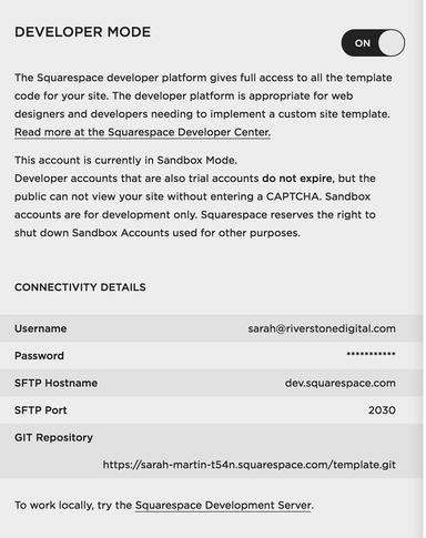
Figure 11-2. Developer Mode area enabled
Getting Started with SFTP
The next step in the process is accessing the template files. There are two ways to access the template files, SFTP and GIT. In this chapter we will use SFTP to access the template files. SFTP uses a visual user interface and is usually easier to learn. However, SFTP is not as powerful as GIT and most seasoned web developers will use GIT. When I use SFTP to access a Developer Mode website I still use GitHub https://github.com/ to keep track of my code.
The template files are accessed via SFTP using an FTP client. An FTP client is a program that can connect to the remove server and allows you to browse, upload, and download files. There are many different FTP clients. I will be using the Cyberduck FTP client in my examples. Cyberduck is a free FTP client that is available for both Mac and Windows https://cyberduck.io/ . If you do not have an FTP client then you will need to download and install one before accessing the template files.
Once you have a FTP client installed it is time to set up the connection to the Squarespace server. The first step is to select the Open Connection button. In Cyberduck the screen in Figure 11-3 is then displayed. The default value in Cyberduck is to use FTP as the protocol. However Squarespace uses SFTP so the first change I make is selecting SFTP (SSH File Transfer Protocol) from the drop-down menu. Next I will put in the configuration information found in the Developer Mode area. Figure 11-2 shows that the host name is dev.squarespace.com. In Cyberduck the host name goes in the Server field. Figure 11-2 also shows that the SFTP port is 2030. Therefore 2030 should be entered into the Port field in Cyberduck . The username and password are the same as your Squarespace account login. Figure 11-3 shows the completed Cyberduck form. Make sure you double check the port value. There are multiple port values that Squarespace uses.

Figure 11-3. Default Cyberduck form and completed Cyberduck form
Once you have successfully connected to the Squarespace server, Cyberduck will display a list of folders. If this is your first Developer Mode website then only one folder will be present. Figure 11-4 shows my list of websites in Cyberduck. I currently have 11 websites in Developer Mode. The folder sarah-martin-t54n is the example I am using in this chapter. You can also see how I have development and production versions of multiple websites.
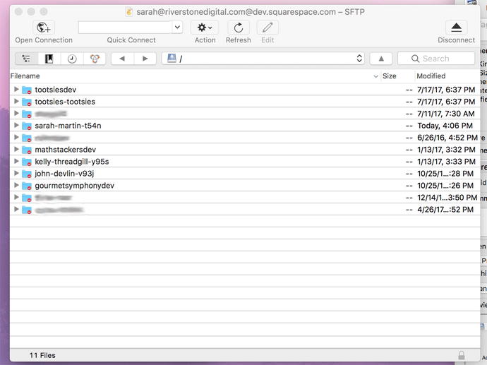
Figure 11-4. Squarespace websites folder list in Cyberduck
Inside the Folder Structure
All Squarespace templates share the same basic structure. When I expand the folder in Cyberduck you can see all the parts of the template. Figure 11-5 shows the expanded Base Template and an expanded Brine family template. As you can see the only difference between the two templates is that the Brine template has an additional folder called assets and the Base Template has a file called readme.md. Once you have access to the folder, you can then download it to your computer to work with.
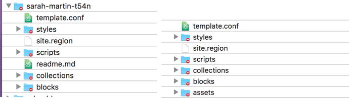
Figure 11-5. Template folder contents of Base Template and Brine Template
It is always good to start by reading the readme file. Many developers will skip over the readme file and only go back to it when they get stuck. I find that I save time if I at least skim the readme file before working with new code or software for the first time. The readme file contains a basic overview of the Squarespace template structure as well as links to additional resources. Figure 11-6 shows the readme file as it appears in my code editor. We will cover all the same material in this chapter so the readme file serves as a nice point of reference later when you are working on your own projects.

Figure 11-6. Readme file included with Base Template
The first file we will take a look at is the site.region file. Listing 11-1 shows the contents of the site.region file. Taking a look at the file content we see that it is mostly written in HTML. However, there are definitely portions that are clearly not HTML . For example, this code found in the header {squarespace-headers} is definitely not HTML. The curly brackets denote areas of JSON Template, also known as JSON-T , programming language. JSON-T is potentially the most mysterious aspect of Developer Mode. JSON-T is a minimalist template language Squarespace uses to render the website. If you are familiar with other web programming languages JSON-T is the equivalent of PHP. It is the server-side programming language that the platform uses to take data stored in a database and turn it into a webpage.
Listing 11-1. site.region file
<!doctype html><html><head><meta http-equiv="X-UA-Compatible" content="IE=edge,chrome=1"><meta name="viewport" content="width=device-width, initial-scale=1.0, shrink-to-fit=no"><!-- include system scripts, page meta, and header code injection -->{squarespace-headers}</head><body id="{squarespace.page-id}" class="{squarespace.page-classes}"><div class="site-container"><header class="site-header"><!-- site navigation --><squarespace:navigation navigationId="siteNav" template="site-navigation" /><!-- site title or logo -->{.section website}<h1 class="site-title-heading" data-content-field="site-title"><a href="/" class="site-title-link">{siteTitle}</a></h1>{.end}</header><!-- cms content injection point --><main class="content-container" role="main" data-content-field="main-content">{squarespace.main-content}</main><!--Footer with open block field --><footer class="site-footer"><squarespace:block-field id="footerBlocks" columns="12" /></footer></div><!-- combo and minify scripts when not logged in --><squarespace:script src="site.js" combo="{.if authenticatedAccount}false{.or}true{.end}" /><!-- other scripts, and footer code injection -->{squarespace-footers}</body></html>
Looking at site.region in Listing 11-1 we see that it contains the basic structure of the website. The site.region file defines the areas for the header, body content, and footer. The Base Template and Brine template each have a single site.region file. However it is possible to have multiple page layouts by having multiple .region files. The files could be broken out into a header.region, footer.region, full-width-content.region, and left-column.region. All of the .region files would need to be included in the top-level folder. Figure 11-7 shows the multiple regions that one of my Developer Mode sites has. The site has three page layouts: one with a sidebar (sidebar.region), one without a sidebar (regular.region), and a special one for the homepage (home.region).
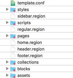
Figure 11-7. Developer Mode website with multiple regions
The next file we will look at is the template.conf file. The template.conf file defines the configuration of the page layouts, the navigation menus, style sheets, and system collections to be used by the site. Listing 11-2 shows the Base Template template.conf file and Listing 11-3 shows the template.conf file from the Math Stackers website. In Listing 11-3 you can see where I defined the additional page layouts by providing a name for the layout and a list of the regions that make up the layout. Listing 11-4 is the template.conf file from the Brine template. You can see where the Brine template defines the three navigation areas, includes all the system files, and a lot of style sheets. You can also see that the Brine family of templates is actually called the Wright famework by Squarespace.
Listing 11-2. Base Template template.conf file
{"name" : "Basic Template","author" : "Squarespace","layouts" : {"default" : {"name" : "Default","regions" : [ "site" ]}},"navigations" : [ {"title" : "Site Navigation","name" : "siteNav"} ],"stylesheets" : [ "base.less" ]}
Listing 11-3. Math Stackers template.conf file
{"name" : "Math Stackers","author" : "Sarah Martin","layouts" : {"default" : {"name" : "Default","regions" : [ "header", "regular", "footer" ]},"homepage" : {"name" : "Home Page","regions" : ["header", "home", "footer"]},"sidebar" : {"name" : "Sidebar","regions" : ["header", "sidebar", "footer"]}},"navigations" : [ {"title" : "Main Navigation","name" : "mainNav"} ],"stylesheets" : [ "base.less", "animation.less" ],"systemCollections" : [ "products" ]}
Listing 11-4. Brine template.conf file
{"name": "Wright","author": "Squarespace, Inc.","layouts": {"default": {"name": "Default","regions": ["site"]}},"navigations": [{"title": "Main Navigation","name": "mainNavigation"},{"title": "Secondary Navigation","name": "secondaryNavigation"},{"title": "Footer Main Navigation","name": "footerMainNavigation"}],"stylesheets": ["site.less","ancillary.less","cart.less","footer.less","header.less","index.less","mobile-styles.less","tweak.less","ui-icons.less","util.less","social-links.less","sqs-video-background.less"],"systemCollections": ["blog","products","gallery","events","album"],"systemPartials": ["sqs-share-buttons"]}
The template folder also contains a number of subfolders. The assets folder contains static images for the website. These images are ones that are part of the template itself. You could also use the assets folder for font files or content images. However, the items in the assets folder cannot be updated or changed from the Squarespace interface. Therefore don’t add anything to the assets folder that your client would need to access or update.
The styles folder contains all the style sheets for the website and for the Base Template that includes the files base.less and reset.css. The Brine template has many more style sheets that are included. The scripts folder should contain any JavaScript that the site uses. On the Math Stackers website, which has an animation on the homepage, I included the animation.js file. The animation.js file has all the custom JavaScript for the homepage. The pages folder would contain any static HTML pages that you want to include on your site. This would be the way to add a stand-alone splash page that was completely different from the rest of the website.
The blocks folder contains template partials to reuse throughout the website. This is not to be confused with the Squarespace content Blocks in the page layout. In the Base Template the blocks folder contains the code that defines the site navigation structure. Listing 11-5 shows the contents of the Base Templates site-navigation.block. You will see that the site-navigation.block file contains the same mix of HTML and JSON-T that we saw in the site.region file. If you look back at Listing 11-1 you will see <squarespace:navigation navigationId="siteNav" template="site-navigation" /> in the site.region file for the Base Template. This bit of code is what tells the site.region file to include the contents of the site-navigation.block file .
Listing 11-5. site-navigation.block
<nav class="site-navigation"><ul class="site-navigation-list">{.repeated section items}<li class="site-navigation-item {.section active} active-link{.end}"><!-- collection link -->{.section collection}<a href="{fullUrl}">{navigationTitle}</a>{.end}<!-- external link -->{.section externalLink}<a href="{url}"{.section newWindow} target="_blank"{.end}>{title}</a>{.end}</li>{.end}</ul></nav>
The final folder is the collections folder . There are two types of collection files. There are system collections that are used across multiple Squarespace template and are included in the template.conf file under the systemCollections definition. The second type of collections is template-specific collections. If files are included in the collections folder then they will be used instead of the systems collection files. There are three parts to a collection. There is the .conf file, which defines the collection. The .list file defines how the list of items displays. The final file is the .item file. The .item file defines how the single item displays. Listing 11-6 shows the blog.conf file for the Base Template. The blog.conf file defines the name of the collection as Blog. It also sets the ordering to chronological and defines the text on the add new item button and the type of content it takes. We will go into editing the collection files in more detail later in this chapter.
Listing 11-6. blog.conf file for Base Template
{"title" : "Blog","ordering" : "chronological","addText" : "Add Post","acceptTypes": ["text"]}
Editing CSS
The styles folder in the theme can contain both LESS and CSS style sheets. As mentioned earlier LESS is a CSS pre-compiler language. That means you write the style rules using the LESS language and it gets compiled into CSS. LESS allows style rules to be nested as well as variable names used. This allows you to write less styling code, hence the name. When used with other websites the LESS language has to be compiled into CSS before being added to the website. With Squarespace all LESS files that are in the styles folder are combined and then run through the LESS compiler by Squarespace. This saves you the step of pre-compiling the code. The final compiled style sheet generated by Squarespace is the site.css file. Since all the style sheets are combined it can be difficult to debug the style code.
Listing 11-7 shows the base.less file included in the Base Template. As you can see the base.less file is a very basic skeleton for the site styling. The use of variables in LESS is one of my favorite parts of the language. It allows me to define all my major style colors in one place and update them throughout the code if needed. In Listing 11-8 you will see where I have added some color variables to the top of the base.less file. Then I have used the color variables in the base.less file to define the color of links and headers. You can learn more about the LESS language at http://lesscss.org/ .
Listing 11-7. Base Template base.less file
/* CSS pre-processing by {less}. http://lesscss.org/***************************************************//* General styles***************************************************/body {font-family: -apple-system, BlinkMacSystemFont,"Segoe UI", "Roboto", "Oxygen", "Ubuntu", "Cantarell","Fira Sans", "Droid Sans", "Helvetica Neue",sans-serif;font-size: 100%;font-weight: normal;}.site-container {line-height: 1.6em;color: #777;max-width: 1020px;padding: 6vw;h1, h2, h3 {font-weight: normal;line-height: 1.2em;}a {color: cornflowerblue;&.disabled {color: #ccc;}}}.site-header {margin-bottom: 4vw;}.site-navigation { }.site-navigation-list {padding: 0;}.site-navigation-item {display: inline-block;font-size: 87.5%;& + .site-navigation-item {margin-left: 1em;}a {color: #111;text-decoration: none;&:hover {color: #999;}}&.active-link > a {color: #999;}}.site-title-heading {.site-title-link {color: #111;font-weight: 400;text-decoration: none;}}.content-container { }.site-footer {font-size: 75%;margin-top: 4vw;margin-bottom: 4vw;}/* Homepage***************************************************/body.homepage { }/* Blog list***************************************************/body.collection-type-blog.view-list {.blog-list-item + .blog-list-item {margin-top: 3vw;}}/* Break grid and stack blocks on small screens***************************************************/@media screen and (max-width: 640px) {@import 'sqs-grid-breaker';}
Listing 11-8. Base Template base.less with color variables
/* CSS pre-processing by {less}. http://lesscss.org/***************************************************/@tealBlue: #00cace;@darkBlue: #0b1699;/* General syles***************************************************/body {font-family: -apple-system, BlinkMacSystemFont,"Segoe UI", "Roboto", "Oxygen", "Ubuntu", "Cantarell","Fira Sans", "Droid Sans", "Helvetica Neue",sans-serif;font-size: 100%;font-weight: normal;}.site-container {line-height: 1.6em;color: #777;max-width: 1020px;padding: 6vw;h1, h2, h3 {font-weight: normal;line-height: 1.2em;color: @darkBlue;}a {color: @tealBlue;&.disabled {color: #ccc;}}}.site-header {margin-bottom: 4vw;}.site-navigation { }.site-navigation-list {padding: 0;}.site-navigation-item {display: inline-block;font-size: 87.5%;& + .site-navigation-item {margin-left: 1em;}a {color: #111;text-decoration: none;&:hover {color: #999;}}&.active-link > a {color: @tealBlue;}}.site-title-heading {.site-title-link {color: #111;font-weight: 400;text-decoration: none;}}.content-container { }.site-footer {font-size: 75%;margin-top: 4vw;margin-bottom: 4vw;}/* Homepage***************************************************/body.homepage { }/* Blog list***************************************************/body.collection-type-blog.view-list {.blog-list-item + .blog-list-item {margin-top: 3vw;}}/* Break grid and stack blocks on small screens***************************************************/@media screen and (max-width: 640px) {@import 'sqs-grid-breaker';}
Editing JavaScript
All JavaScript included in the template should be added in the scripts folder. In the Base Template there is only a very basic site.js JavaScript file. Listing 11-9 shows the site.js file. The only thing included in this file is a function that loads all of the images for the website. The function loadAllImages() tells the Squarespace ImageLoader function to load the images. Then there are two event handlers. The first event hander document.addEventListener('DOMContentLoaded', loadAllImages); tells Squarespace to load the images when the page changes. The second event handler, window.addEventListener('resize', loadAllImages); tells Squarespace to load the images when the browser window resizes.
Listing 11-9. Base Template site.js file
/*** This script wrapped in a Immediately-Invoked Function Expression (IIFE) to* prevent variables from leaking onto the global scope. For more information* on IIFE visit the link below.* @see http://en.wikipedia.org/wiki/Immediately-invoked_function_expression*/(function() {'use strict';// Load all images via Squarespace's Responsive ImageLoaderfunction loadAllImages() {var images = document.querySelectorAll('img[data-src]' );for (var i = 0; i < images.length; i++) {ImageLoader.load(images[i], {load: true});}}// The event subscription that loads images when the page is readydocument.addEventListener('DOMContentLoaded', loadAllImages);// The event subscription that reloads images on resizewindow.addEventListener('resize', loadAllImages);}());
Most of the Squarespace templates have extensive amounts of JavaScript in the site.js file. The Brine template has all the JavaScript for parallax images, navigation , background videos, and many other features in the site-bundle.js file. The unbundled version of the scripts can be found on GitHub as part of the template frameworks provided by Squarespace.
Editing the Layout with JSON-T
Earlier in this chapter we looked at the site.region files. The region files allow you to change the HTML structure for the entire template. You could change the header layout, add body content areas, and customize the footer layout. In addition to the site.region files I also introduced the three type of collection files. The three types of files are the .conf, .list, and .item files. In the Base Template the blog.conf, blog.list, and blog.item files are included in the website folder.
The collection files can be used to customize the corresponding part of the collection. For example, Listing 11-10 shows the blog.list file included in the Base Template. The top of the file contains three tags that populate the content at the top of the Blog List page. These tags display the text Filtered by Category: xxxx. There are filters for category, tag, and author. If my desired layout doesn’t include the filtered text then I could remove it by deleting the first 12 lines from the blog.list file.
Listing 11-10. Base Template blog.list
{.section categoryFilter}<p class="filtered-by">Filtered by Category: {@|safe}</p>{.end}{.section tagFilter}<p class="filtered-by">Filtered by Tag: {@|safe}</p>{.end}{.if authorFilter}<p class="filtered-by">Filtered by Author: {author.displayName}</p>{.end}<!-- item loop -->{.repeated section items}<article id="post-{id}" class="blog-list-item {@|item-classes}" data-item-id="{id}"><!-- main image (thumbnail) -->{.main-image?}<a href="{fullUrl}" class="main-image content-fill"><img {@|image-meta} /></a>{.end}<!-- post title --><h1 class="title" data-content-field="title">{.passthrough?}<a href="{sourceUrl}" target="_blank">{title}</a>{.or}<a href="{fullUrl}">{title}</a>{.end}</h1><!-- excerpt or body -->{.if excerpt}{excerpt}<a class="link" href="{fullUrl}">Read More</a>{.or}{body}{.end}</article>{.or}<!-- no items means no blog posts --><p><em>No blog posts yet.</em></p>{.end}<!-- pagination -->{.if pagination}<nav class="blog-list-pagination"><!-- newer page -->{.if pagination.prevPage}<a href="{pagination.prevPageUrl}">Newer</a>{.or}<a class="disabled">Newer</a>{.end}<!-- older page -->{.if pagination.nextPage}<a href="{pagination.nextPageUrl}">Older</a>{.or}<a class="disabled">Older</a>{.end}</nav>{.end}
Individual blog posts can also be customized within the blog.item file. Listing 11-11 shows the Base Template blog.item file. Looking through the file we can see where the post title, body content, categories, tags, sharing, and commenting are added to the blog post. At the bottom of the file is the pagination to navigate between blog posts. The navigation is a great example of how to easily customize the text for a blog post. In this file the navigation uses the words Newer and Older to define the pagination. However if you wanted to have the pagination say Next Event and Previous Event you could easily change it here. The original newer post link is <a href="{fullUrl}">Newer</a> . To update the text all that needs to change is the text. The JSON-T surrounding it will take care of populating all the other data. Therefore the updated newer post link would look like <a href="{fullUrl}">Next Event</a> . Changing text is a great place to get started with custom updates in Developer Mode. Changing text creates meaningful changes to the template without too much risk of breaking the site.
Listing 11-11. Base Template blog.item file
{.section item}<!--WRAPPER--><article id="post-{id}" class="{@|item-classes}" data-item-id="{id}"><!--POST TILE--><h1 class="title" data-content-field="title">{.passthrough?}<a href="{sourceUrl}" target="_blank">{title}</a>{.or}{title}{.end}</h1><!--AUTHOR AND DATE--><p class="meta"><a href="{fullUrl}" class="permalink"><time datetime="{addedOn|date %F}">{addedOn|date %B %d, %Y}</time></a> by <a href="{collection.fullUrl}?author={author.id}">{author.displayName}</a></p><!--MAIN CONTENT-->{body}<!--BLOG INJECTION-->{postItemInjectCode}<!--CATEGORIES-->{.repeated section categories}<a class="category" href="{collection.fullUrl}?category={@|url-encode}">{@}</a>{.alternates with},{.end}<!--TAGS-->{.repeated section tags}<a class="tag" href="{collection.fullUrl}?tag={@|url-encode}">{@}</a>{.alternates with},{.end}<!--SHARE AND LIKE-->{@|like-button}{@|social-button}<!--LOCATION-->{.section location}{.section addressTitle}{addressTitle}{addressLine1}{addressLine2}{addressCountry}{.end}{.end}<!--COMMENTS-->{@|comments}</article>{.end}<!--PAGINATION-->{.section pagination}<nav class="blog-item-pagination"><!--NEWER PAGE-->{.section prevItem}<a href="{fullUrl}">Newer</a>{.or}<a class="disabled">Newer</a>{.end}<!--OLDER PAGE-->{.section nextItem}<a href="{fullUrl}">Older</a>{.or}<a class="disabled">Older</a>{.end}</nav>{.end}
Custom Post Types
In addition to changing existing collection types, Developer Mode allows you to create custom post types . The custom post type first is defined in the template.conf file. In this example we will create a custom post type called Sponsored Post. This type of custom post will have an additional field that links to the sponsor’s website. Listing 11-12 shows the code that is added to the template.conf to add the Sponsored Post type to the template. The key of “customTypes” is added so that Squarespace knows you are creating a custom type. Then the custom post type has to have a title, name, and base type. In this example the base type is text since it is a type of blog post. The base type can also be image or video. Finally the additional custom fields are defined. The fields can be text, wysiwyg, image, checkbox, or gallery. In the Listing 11-12 example the custom field is a text field since it contains the text URL of the link.
Listing 11-12. Code for Sponsored Post to add to template.conf file
"customTypes" : [{"title" : "Sponsored Post","name" : "sponsoredPost","base" : "text","fields" : [{"name" : "sponsorLink","title" : "Sponsor Link","type" : "text"}]}]
The next step is to add the custom post type to a collection. The custom post type can also be added to multiple collections. Some developers have created custom post types that are a hybrid of an event and a blog post.
Squarespace also offers custom collections. Custom collections have to have a .conf, .item, and .list file just like the regular template collections. The custom collection functionality is fairly limited. The custom collections can be ordered chronologically or user ordered. It is not possible to have alphabetical, reverse-chronological, or any other type of sorting. This severely limits the usefulness of custom collections compared to other platforms. The post types are also limited to text, image or video.
Style Editor Tweaks
A special type of LESS file found in Squarespace templates is the tweaks.less file. The tweaks.less file defines everything found in the Style Editor . The tweaks.less file also defines the default values for the Style Editor Tweaks. The tweak.less file can be used in a couple of different ways. The first option would be to add more Tweaks to the Style Editor. I could see this being useful for changing the template colors seasonally or providing very specific options to the client. The more common use for the tweak.less file is to remove options from the Style Editor. When starting a bespoke website from a Squarespace template it is often a good idea to remove the Style Editor tweaks. This prevents the client from significantly changing the style of their custom template.
There are a few parts to each tweak. Listing 11-13 shows the beginning part of the tweak.less file for the Brine family template. The first part of the tweak is the tweak definition that is used in the Style Editor. The tweak definition opens with //tweak: telling Squarespace that a tweak will be defined. Next the category, label, variable name, type of tweak, and options are defined in name-value pairs. The second part of the tweak is the default value of the tweak. The default value is defined by a LESS variable and value. In Listing 11-13 the first tweak is the body background color tweak. The name of the variable is @tweak-site-body-background-color and the value is #f5f5f5. I can change the default background color by changing the color code. I can also remove the background style editor tweak by removing the tweak definition. The variable will need to be kept or replaced throughout all the style sheets. I will typically move the variable definitions to the main less file that I am working with, for easy reference. In this example I would move @tweak-site-body-background-color: #f5f5f5; to the base.less file .
Listing 11-13. First 30 lines from the Brine template tweak.less file
// =======================================================// Site// =======================================================// tweak: { "category" : "Site", "label" : "Background", "title" : "tweak-site-body-background-color", "type" : "color", "disableTransparency" : "true", "showOnlyWhenPresent" : ".tweak-site-width-option-constrained-width" }@tweak-site-body-background-color: #f5f5f5;// tweak: { "category" : "Site", "label" : "Design", "title" : "tweak-site-width-option", "type" : "dropdown", "options" : [ "Full Width", "Full Background", "Constrained Width" ], "default" : "Full Background" }// tweak: { "category" : "Site", "label" : "Width", "title" : "tweak-site-width", "type" : "value", "step" : 10, "min" : 640, "max" : 1920, "showOnlyWhenPresent" : "body:not(.tweak-site-width-option-full-width)" }@tweak-site-width: 1440px;// tweak: { "category" : "Site", "label" : "Side Padding", "title" : "tweak-site-side-padding", "type" : "value", "step" : 1, "min" : 17, "max" : 240 }@tweak-site-side-padding: 40px;// tweak: { "category" : "Site", "label" : "Icons", "title" : "tweak-icon-weight", "type" : "dropdown", "options" : [ "Hairline", "Light", "Medium", "Heavy" ], "default" : "Hairline", "target" : ".Icon", "showOnlyWhenPresent" : ".Icon" }// -----------------------------------------// Border// tweak: { "category" : "Site: Border", "label" : "Show Border", "title" : "tweak-site-border-show", "type" : "checkbox", "active" : false }// tweak: { "category" : "Site: Border", "label" : "Width", "title" : "tweak-site-border-width", "type" : "value", "step" : 1, "min" : 1, "max" : 120, "target" : ".Site", "showOnlyWhenPresent" : ".tweak-site-border-show" }@tweak-site-border-width: 5px;// tweak: { "category" : "Site: Border", "label" : "Color", "title" : "tweak-site-border-color", "type" : "color", "disableTransparency" : "true", "showOnlyWhenPresent" : ".tweak-site-border-show" }@tweak-site-border-color: #dddddd;
Error Reporting
Squarespace does provide some built-in error reporting when working in developer mode. Any LESS compilation errors will be written at the bottom of the site.css file. Therefore you can use the inspector tool to read the error and fix it in the LESS file. The error message can also be seen by going to the /site.css URL. You can also see that Figure 11-8 shows how the LESS errors appear in the site.css file. It is typically pretty obvious that you have a LESS error; the site will look completely wrong. LESS errors also typically appear in the Developer Mode area.
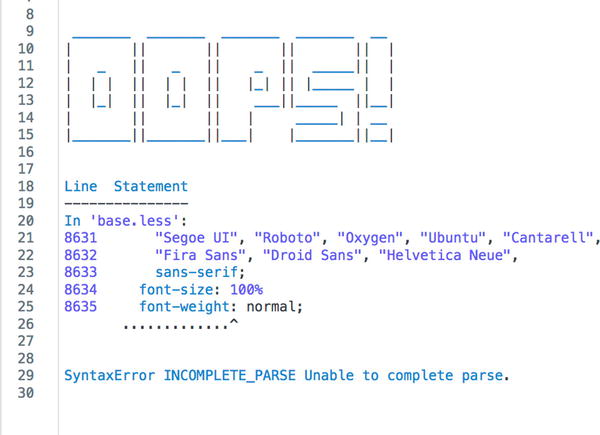
Figure 11-8. LESS compiler error at the bottom of the site.css file
The second type of error reporting is template structure errors. These types are errors are usually due to typos in the region, collection, or block files. The template structure errors are displayed in the Developer Mode section of the menu, under the server connection settings. The error will also be large and red; it is very hard to miss! The error message will also explain exactly where the error was found. Figure 11-9 shows an example of a template structure error message.

Figure 11-9. Template Structure Error message
The final type of error message is an error with the JSON-T. Serious JSON-T errors appear as a black screen of death, with the error message rendered directly into the front end of the website. Figure 11-10 shows how the JSON-T error message looks. Squarespace calls it the black screen of death since you cannot view the website until you have fixed the error. For minor JSON-T errors, the error may be written inside the website HTML inside of a comment block.

Figure 11-10. JSON-T error message
Development Tools
Squarespace also provides a number of development tools to the Squarespace developer community. I won’t walk through all of the tools in detail, just provide you with an overview. The first tool is the Local Development Server. Squarespace’s Local Development Server is a little different than regular local servers. The Squarsepace’s Local Development Server still requires an Internet connection to pull content down from the website. The Local Development Server also does not allow you to log in or make edits to the site. It is purely a way to view changes to the template files locally. Nothing else can be changed locally. I have found the Local Development Server to be useful when doing extensive CSS work since it saves the time spent on multiple SFTP file uploads. However, I have found that I tend to update content as I work on the template and therefore the Local Development Server didn’t fit my workflow well. You can find out more about the Local Development Server, as well as set up instructions at https://developers.squarespace.com/local-development/ .
Squarespace has also provided a number of development code helpers they call the Squarespace Toolbelt. You can find the full definition of the Squarespace toolbelt tools on GitHub or npm. There are also a number of front-end modules available on GitHub and npm as well. The front-end modules include the AJAX page loading code, video background code, layout helpers, and the core code files. All of these tools have extensive documentation provided within the GitHub or npm platform. Using these tools also takes a considerable amount of programming language . I would suggest mastering the basics of updating a template before diving into the more complex tools.
The final resource that Squarespace provides is the template frameworks. The template frameworks are the uncompressed versions of the five new template families. The frameworks are listed by their framework name but have the common template family name included in the description. If you look at the Wright Framework, also known as Brine family template , in GitHub you will see that there are three folders and two additional files that all get combined into the site-bundle.js file that we saw in Cyberduck. Figure 11-11 shows the side-by-side comparison of the scripts folder of the framework on GitHub and the scripts folder in Cyberduck.

Figure 11-11. Brine template scripts folder in GitHub and in Cyberduck
Join the Squarespace Community
Congratulations on reaching the end of the book! To continue exploring Developer Mode and other advanced customizations, get involved with the Squarespace Community . The Squarespace Circle Forum is for active web professionals and provides a wealth of resources. Inside the Squarespace Circle Forum you can find hundreds of my code solutions. You can also continue learning by following my blog at www.riverstonedigital.com/blog . My blog contains additional Squarespace customizations. The format of learning will be the same as this book. Each blog post explores a customization and breaks it down into the code needed with step-by-step explanations.