
When developing a mobile application, it’s inevitable that you will need to work with data. Whether it’s retrieving data or showing data on the screen, data is something every app will need to properly function. This chapter will cover some of the different options you have when presenting your data to the user.
We will take a look at some of the data binding features in Xamarin.Forms that allow us to be notified when data changes. We will also take a look at one of the essential controls within Xamarin.Forms: the ListView.
By using data templates, we can increase the reusability of our code, by consolidating cells that are used in various screens in our application into a single reusable template. We will also look into the default caching behavior of the ListView to improve the performance of our application.
Getting Data Onto the Screen
Most Xamarin.Forms applications will consist of one or more pages. These pages contain all sorts of views that represent data within the application. The application keeps track of all the values assigned to these views and handles changes within these values by displaying the appropriate new values to the user.
However, manually assigning values to properties of views can be a tedious and error-prone job, not to mention updating these values every time your data changes. Technologies that use XAML as its UI markup language, such as WPF, have always benefited greatly from the concept of data binding. Data binding is a technology that takes care of moving 7data between your UI layer and your data source while making sure it stays in sync. Luckily for us, when Xamarin.Forms was created, the UI markup language was based heavily on existing XAML specifications and integrated a full-fledged data binding engine.
Data Binding Basics
The views that show the data in your application often get their data from an underlying data source. When this data changes we want to reflect those changes in our user interface. The same applies the other way around; when a user changes a value we also want this value to change in our data source. This is where data binding comes into play.
Essentially, data binding is a mechanism that triggers an event as soon as the value changes. This event can then be handled by the data source and the views to ensure that the data is successfully transferred from one side to the other, resulting in the correct current values showing in the user interface. Data bindings can be built in either the XAML file or in code, but putting them in the XAML file is the simpler, more common option.
Data Bindings in Xamarin.Forms
The target is the object and property on which the data binding is set, usually a View object in the user interface. However, it can be any type of object as long as it inherits from BindableObject and the property we’re setting is a BindableProperty.
The source is the object and property that usually contain the value we want to bind to the View object. This is the object that we reference in the data binding, which can be of any type. The property can be either a normal property or a BindableProperty.
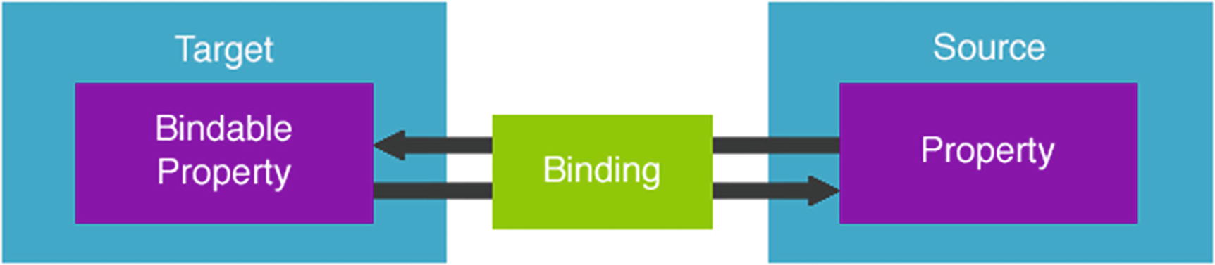
The concept of data binding visualized
An Example of a Data Binding As It’s Defined in XAML
So, what does this do? The first thing we did is tell our Label where to get its data from. This is done by setting the BindingContext. By using the built-in x:Reference markup extension, we can point to a view elsewhere on the page, in this case the Slider control. In order to do this, we need to set the x:Name property of our Slider, which will uniquely identify it on the page. Now we can use this name in our x:Reference markup extension to reference this control. We then use our Binding markup extension to specify which of the properties of the slider we want to bind to our label. In this case, we choose the Value property. Notice that we are specifying this using the Path= prefix. In this specific case this part can be omitted since the default property of a binding is its Path property. However, if we create a more complex binding by setting multiple properties on the binding, it is advised to add the prefix for the sake of clarity.
Because we’ve created a connection between these controls through data binding, changes are instantly propagating from one object to the other. This means that when we move the Slider it is instantly updating the value of our Label control.
In the example shown in Listing 3-1 we bind two controls to one another using data binding. This is what is known as a view-to-view binding . More often than not you may want to bind to a property of a business object of some sorts. To do so, simply set the BindingContext to an instance of your business object.
But wait, what is a binding context? Every bindable object has a binding context. Because the View object inherits from BindableObject, each view in Xamarin.Forms has a binding context. The binding context is the source of the object’s bindings, so by setting it, we specify where the object should get its values from. When setting the binding context, each child object also receives the same binding context, which means we don’t need to set it on each control individually.
An Example of Setting the BindingContext to a Business Object from Code-Behind
Because we set the BindingContext of the page, we can now use the Value1 in our data bindings on the page. When you run this sample, you will immediately see that the value we’ve set in code (“A”) is shown in the textbox. Whenever we change this value it will also immediately reflect those changes in the property on our object. When using an MVVM framework a lot of this kind of plumbing code is done for you and the appropriate view model is set as the BindingContext of the page automatically.
Different Binding Modes
Default—One of the following values, as defined by the creator of the property.
TwoWay—Data flows both ways between the source and the target.
OneWay—Data flows from the source to the target.
OneWayToSource—Data flows from the target to the source.
OneTime—Data flows from source to target, but only when the BindingContext changes. The data binding is only executed once, when the BindingContext is initially set. This makes this ideal for labels bound to a value that will not be changed. The only way to update a OneTime binding is by setting the BindingContext again. This option was introduced in Xamarin.Forms 3.0.
Most bindable properties have a default binding mode of OneWay. Properties that support user input, such as the Text property on an Entry control, usually have a default binding mode of TwoWay. This is why the sample shown in Listing 3-2 works both ways, even though we never explicitly defined the binding as being a TwoWay binding.
Overriding the Default Binding Mode
An Example of Overriding the Default Binding Mode of a Data Binding
In this sample we change the data binding of the Entry to become a OneWay binding. When we move the slider around, we will see the value shown in the entry field change. However, when manually editing the value in the entry field, the position of the slider is not updated. This is because the binding only flows one way.
Because the default binding mode of an Entry control is TwoWay we can omit the Mode property on the binding. If we do that we will see the entry value changing when we change the slider, but we can also enter a value in the entry field, which will make the value of the slider update.
Setting this binding to OneWayToSource will make sure that we will only see changes in the entry when we move the slider. Using the OneTime mode, we will see that our Entry control gets a default value, but both moving the slider and entering a value manually will not change anything. This is because the value is set only once, which sets it to the default value, after which it is never set again.
Notifying the App of Data Changes
So far, we’ve talked about data bindings and how our data flows through them but we haven’t really touched on how our app knows that data has actually changed. There has to be a mechanism somewhere that tells our app that a property was changed, right? When using the MVVM architectural pattern, it is common practice to implement an interface called INotifyPropertyChanged on our view models. This is what lets the data binding engine know that a value has changed.
The Basic Implementation of the INotifyPropertyChanged Interface
As the sample in Listing 3-4 shows, we added an event called PropertyChanged that is defined in the INotifyPropertyChanged interface. When our property changes we trigger the event and pass in the name of the property that changed. The binding engine then takes care of the rest for us and updates our targets accordingly.
Most people implement the INotifyPropertyChanged interface on a base view model class that all other view models inherit from. Alternatively, most MVVM frameworks offer their own implementation of the interface, which you can to use to raise the event. Another alternative is IL weaving, which is described in more detail in the next section.
Implementing INotifyPropertyChanged Using Fody
The sample given in Listing 3-4 shows how to implement the INotifyPropertyChanged interface, but it can get very repetitive if we have to implement this boilerplate code in every one of our view models. We could abstract parts of the boiler plate code away into a base view model class, but there is an even easier way—using Fody!
Fody is a framework that enables us to manipulate the intermediate language of an assembly when it’s being built through a process known as weaving . In essence this means we can use it to improve our code automatically at the time of compilation.
The Simplified Version of Our View Model Using PropertyChanged.Fody
We could improve on the sample shown in Listing 3-5 even further by adding a base view model that implements the INotifyPropertyChanged interface. The resulting view model would only contain the MyProperty property, which is a significant improvement when looking at our lines of code.
AlsoNotifyFor—By adding this attribute we can define other properties that should also have their PropertyChanged event called when the property that we added the attribute to has changed.
DoNotNotify—This means that the property decorated with this attribute will not automatically raise its PropertyChanged event.
DependsOn—By decorating a property with this attribute, we define that it depends on another property and injects this property to be notified when the dependent property is set. An example of a dependent property would be a full name property that depends on a first name and last name property.
Implementing PropertyChanged.Fody is not the solution to all of your problems. There are other solutions out there that work just as well and it all depends on personal preference. We’ve been using PropertyChanged.Fody in a few of our projects and decided to include it since it is a relatively unknown solution for implementing INotifyPropertyChanged.
Note
You can find out more about setting up Fody and the add-ins it currently supports on the GitHub page: https://github.com/Fody/Fody/
Working with Collections
A Sample of INotifyPropertyChanged with a List Type Property
When we call the Add method what do you think will happen in our user interface? Will we see items being added? As it turns out, nothing will happen. But why is that?
As was shown in Listing 3-4, the INotifyPropertyChanged mechanism works by sending out a PropertyChanged event when the setter of a property is called. However, making changes to a collection type by adding to or removing from it doesn’t actually call the property setter. Since the setter is never called, there is no notification sent to the data binding, which is why we see no changes on the screen.
Improving Our Collection Data Bindings Using an ObservableCollection
This works because ObservableCollection contains an event named CollectionChanged that is provided through the INotifyCollectionChanged interface. Because this behavior is defined through this interface, we can also create our own custom collection object and use it in data binding. The CollectionChanged event notifies any subscribers of changes to the collection in the same way that the PropertyChanged event handles changes to a property.
Converting Data Bound Values
When data binding values directly from and to an object, you may run into the scenario where you want to display a value in a slightly different way than its representation in the object. For example, you may want to format a date in a specific way, or perhaps you want to prefix a certain value with fixed text. To handle this scenario, you can use the StringFormat markup extension.
Formatting a String Value Using the Built-In StringFormat Markup Extension
The formatting string is delimited by single quote characters to ensure that the XAML parser doesn’t treat the curly braces in the expression as another markup extension. In this example the value of the slider will be displayed with two decimal places due to the addition of the F2 specification in the formatting string.
Using ValueConverters to Tackle Complex Scenarios
A data binding transfers data from a source to a target property. But what if those two properties are not of the same type? Let’s say for example that you want to bind a Boolean type property based on the value of an Enum type property. If you want to data-bind two properties that have incompatible types, you need a piece of code in between that converts the value from source to target type and back. This is what is called a ValueConverter. When looking at StringFormat we concluded that it can be used to convert anything into a string representation. Using a ValueConverter you can convert from and to any type of object.
A Sample ValueConverter That Converts from String to Boolean and Back
The Convert() method assumes that it receives a string as the input (as represented by the value parameter). It takes that value and converts it into a Boolean true or false value and falls back to false if the value is not “yes” or “no”. This method is called when data moves from the source to the target in OneWay, OneTime, or TwoWay bindings.
The ConvertBack() method does the exact opposite: It assumes that the input value is a Boolean type and then returns the word “yes” or “no”. This also falls back to “no” if the input is not a Boolean type. This method is called when data moves from the target to the source in TwoWay or OneWayToSource bindings.
Adding the Value Converter to the Data Binding
First, we add an instance of our value converter to the page’s resource dictionary. That means that our value converter is now known on the entire page by the name yesNoToBool. We can then add the value converter to our Binding using the Converter property. We do this by using the StaticResource markup extension, which points to the converter in our resource dictionary using the exact same key value that we’ve defined in the resource dictionary. Depending on the value of the MyBoolAsString property, the Label should become visible or invisible.
This is a rather simple scenario of what is possible with a value converter. Because you can use it on any type of data binding with any type of object, you can make them as simple or as complex as needed. Another added benefit of value converters is that you can reuse them. In the sample in Listing 3-10 we added the value converter to the page’s resource dictionary. Alternatively, we could also add it to the resource dictionary of the app. That way, it becomes available for use throughout the entire app, which means that we don’t need to define it on every single page where we want to use it.
Getting to Know the ListView
The ListView in its default state on iOS and Android
The ListView can be used in any situation where you are displaying scrollable lists of data. The ListView supports context actions and data binding and has a number of additional features available that you can use, like pull-to-refresh, headers and footers, grouping, and support for custom cells.
Understanding the Basics
The ListView is used for displaying lists of items and to do so we set the ItemsSource property . This property accepts any collection that implements IEnumerable. We can also run into the scenario where we want to use data binding to bind to a dynamic list of items from which we can add and remove items. To also allow data binding to show these changes to the list’s content, we can use ObservableCollection<T>, as we mentioned earlier in this chapter.
Using the Built-In Cell Types
TextCell—Used for displaying text.
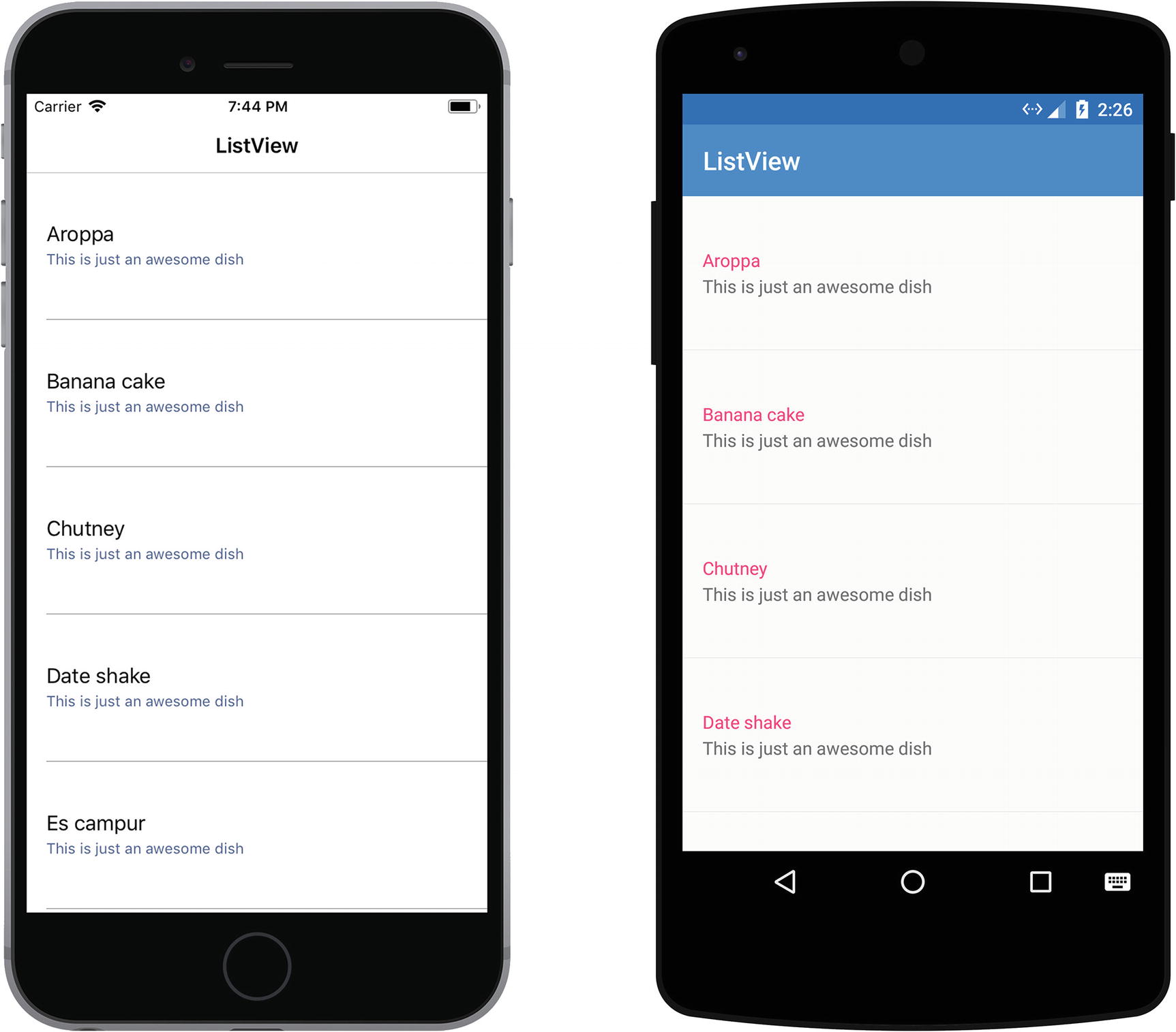
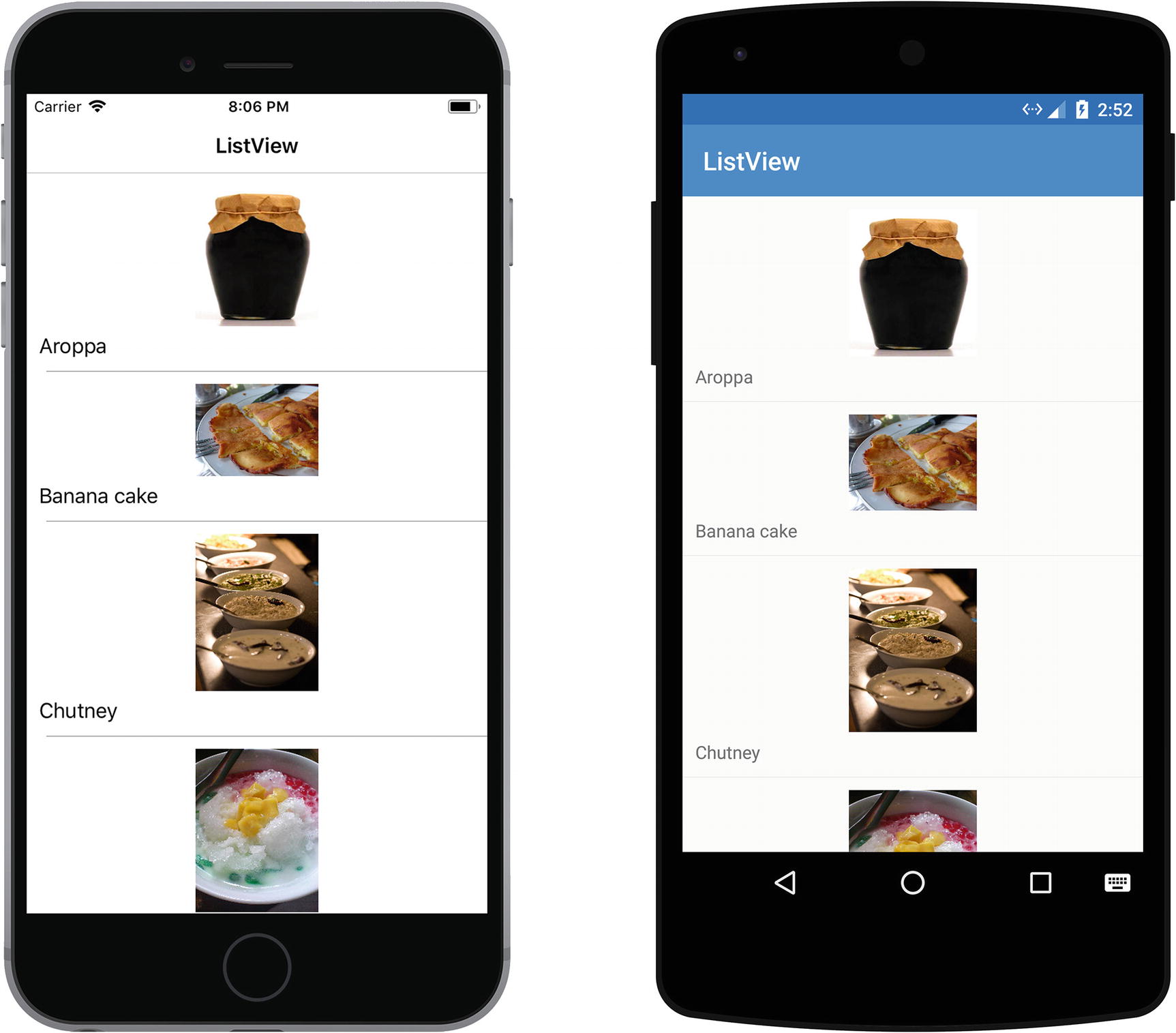
ImageCell—Used for displaying an image with text.
SwitchCell—Used for displaying a toggle control.
EntryCell—Used for displaying a text entry control.
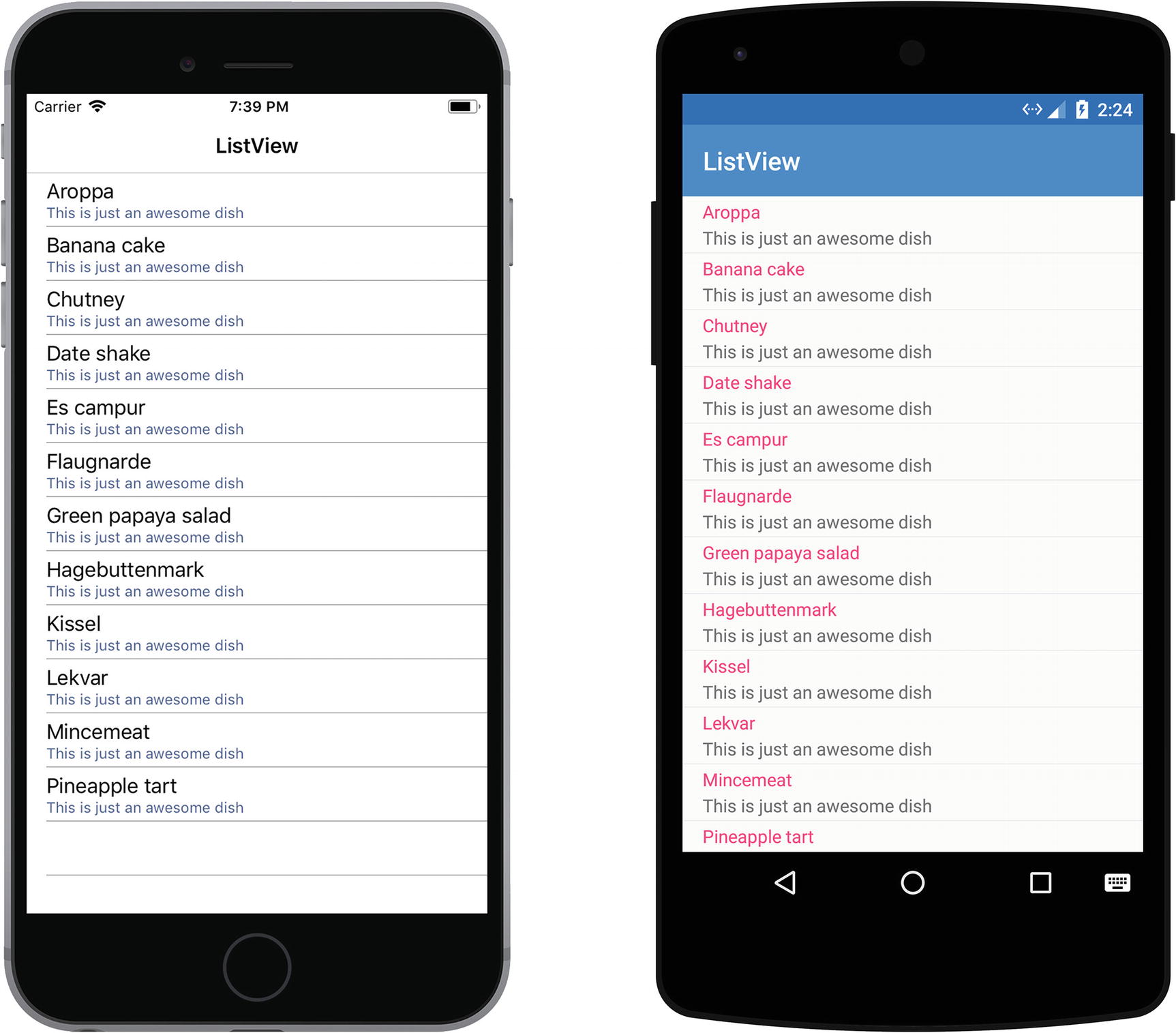
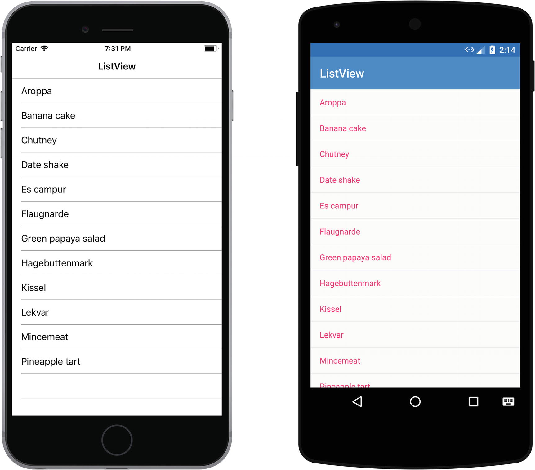
The TextCell as it is rendered on iOS and Android
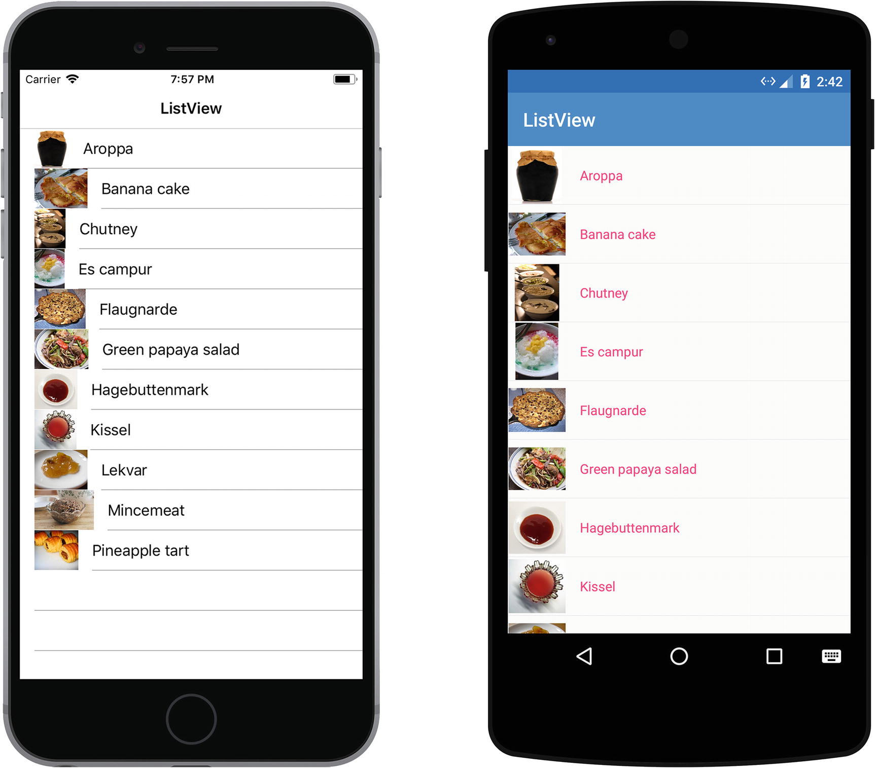
The ImageCell as it is rendered on iOS and Android
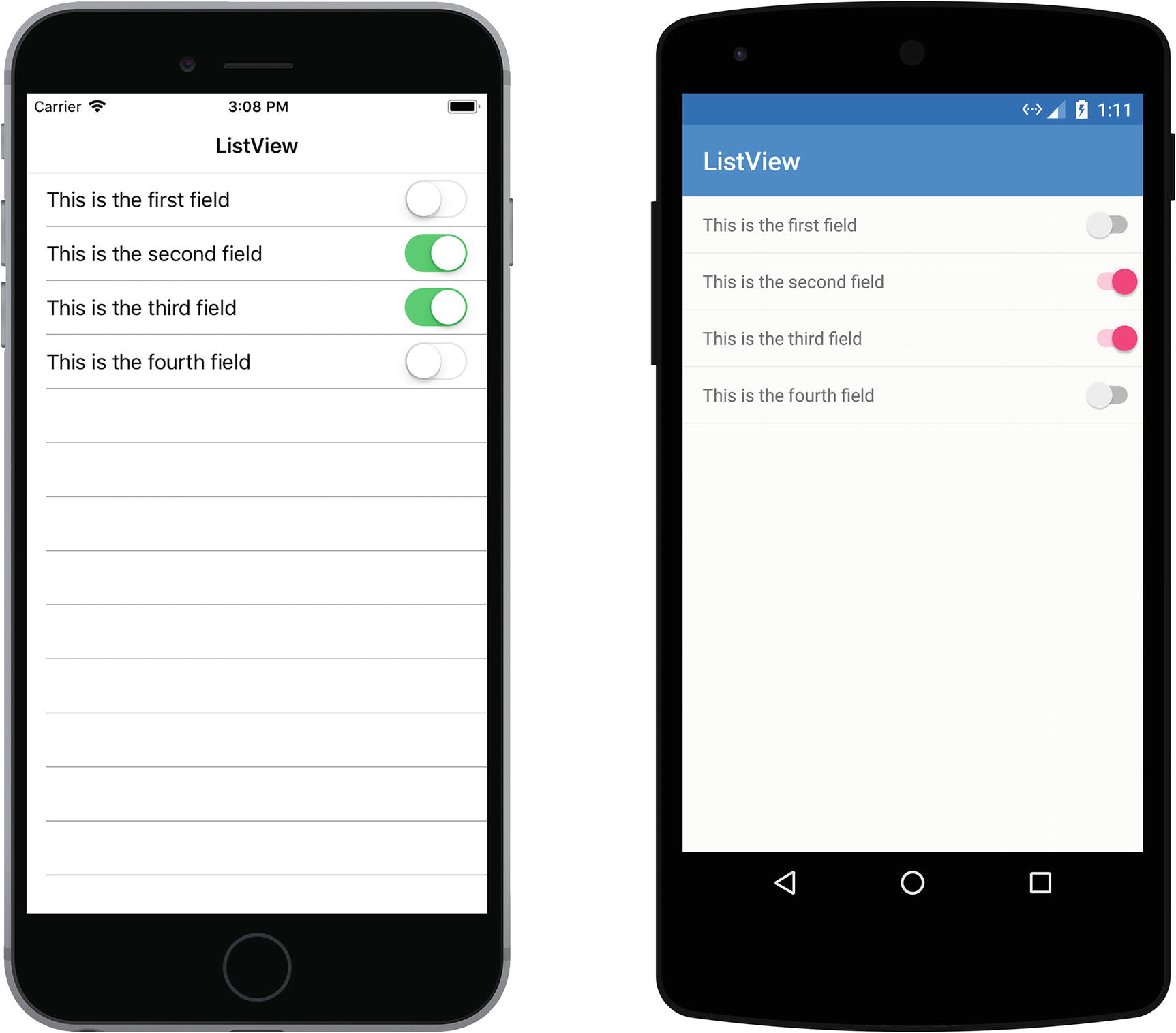
The SwitchCell as it is rendered on iOS and Android
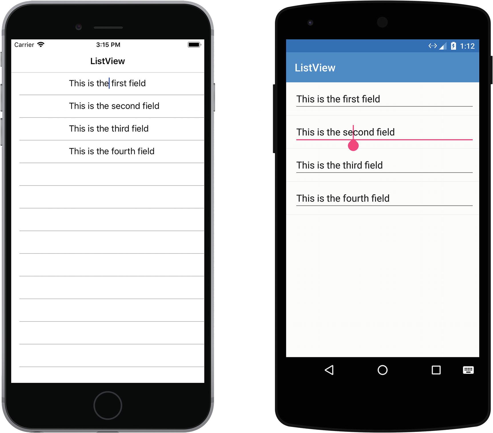
The EntryCell as it is rendered on iOS and Android
Using a TextCell and Binding a Value to it in the ListView
In the sample shown in Listing 3-11, each item in the MyItems collection will be shown in its own TextCell instance, which is bound to the value of that item’s MyText property.
Defining Separators and Row Height
Default—Shows the separator lines.
None—Hides the separator lines.
Setting the SeparatorColor, HasUnevenRows, and RowHeight on the ListView
Setting the RowHeight changes the height of all the rows in the ListView
Setting HasUnevenRows to true means each row calculates its own height
Adding Headers and Footers
Setting the Header and Footer on the ListView the Simple Way
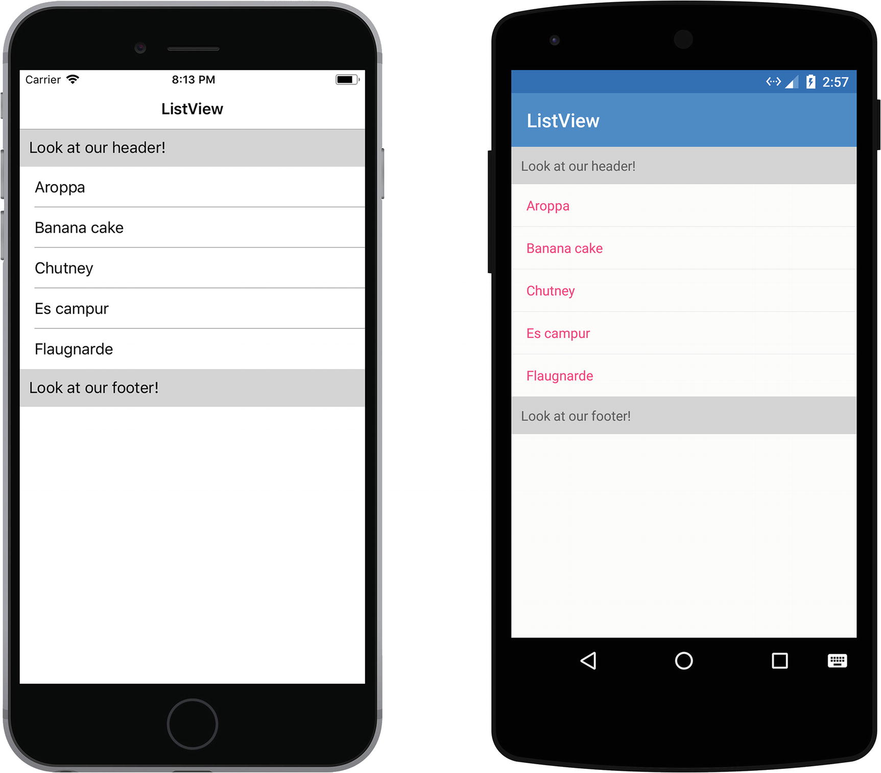
A simple header and footer on iOS and Android
Setting the Header and Footer to a More Complicated Set of Views
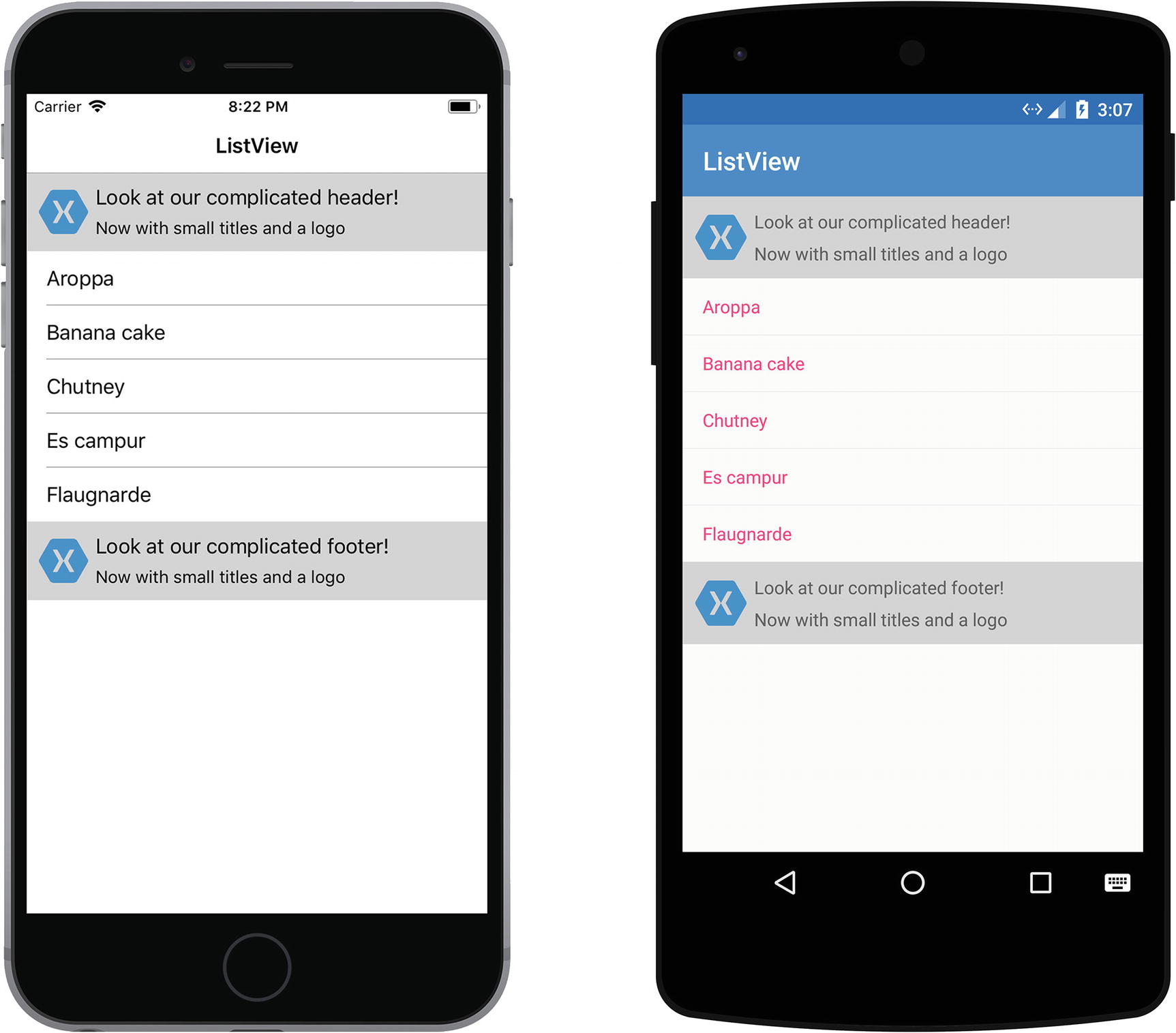
A complicated header and footer on iOS and Android
Selecting Items and Handling Tap Events
ItemTapped—Fires each time an item is tapped.
ItemSelected—Fires only once for each item you tap. Also fires when an item is deselected.
Implementing the ItemSelected Event on the ListView
Using the arguments that we get passed in from this event, we can retrieve the item that was selected and act on it. We also need to add a null check because this event also fires when an item is deselected. In this case, the SelectedItem property will be null, which is why we need to check for it.
Disabling the Item Selection by Setting the SelectedItem to Null
Adding a Pull-to-Refresh
Implementing the Pull-to-Refresh Mechanism in Xamarin.Forms
The sample in Listing 3-17 shows how easy it is to implement pull-to-refresh. We start by setting the IsPullToRefreshEnabled variable to true on the ListView. To hook up some behavior to this event, we specify a Command that will be triggered as soon as the user pulls down the list. In this case we’re simply adding a new item to the list on each refresh. The IsRefreshing property can also be bound to a value in your view model, which allows you to show or hide the loading indicator. By setting this value to true when we start loading and back to false when we’re done, we can show and hide the loading indicator accordingly.
Using a Context Action to Act on a List Item
Sometimes you want your users to be able to perform an action on a list item. A common example of this is an email application, where you can swipe left or right to reveal additional actions you can take on an email, such as deleting it or marking it as read. On Android, this action can be reached by performing a long press on an item, whereas for UWP these are shown by right-clicking on an item. These actions are known as context actions.
A Context Action Implemented on a ListView in XAML
Because we are adding a context action to each cell, we need to add it in a custom data template. If you don’t know what data templates are, you can read up on them later on in this chapter. In this example we are defining a ViewCell that has a ContextAction assigned to it. This context action has a Command and a CommandParameter, which we can use to trigger an action and pass data to that action. You can also define the text to display and determine whether or not the operation is a destructive one, which will alter the appearance of the context action on iOS.
One thing that may strike you as odd in this is that we’re explicitly setting the source of our data binding. We covered using the binding context and source earlier in this chapter, but why do we need it here? This is due to the fact that we’re inside a ListView where the data context for each ViewCell is the item that is bound to it. However, the Command we’re referencing here does not exist on each ListView item, but exists on the page level in the view model. Therefore, we need to explicitly set the binding context of the Command we’re trying to bind to the page.
We’re also binding both the label’s Text property and the menu item’s CommandParameter to a period. What does that mean? The period references the root object that the current view is bound to, in this case the item in our list. This means we’re sending the entire list item as a parameter to our command.
The View Model Associated with the XAML Shown in Listing 3-18
As you can see, we have an ObservableCollection of strings that represent our items. Updates to this list, such as removing an item, are immediately visible in the UI. The Delete command is an instance of Command<string>, where the part in angle quotes represents the type of the parameter our command accepts. Our DeleteItem method accepts a string parameter, which is the value that it receives from the XAML binding and removes it from the list of items.
Adding a Jump List for Easy Navigation
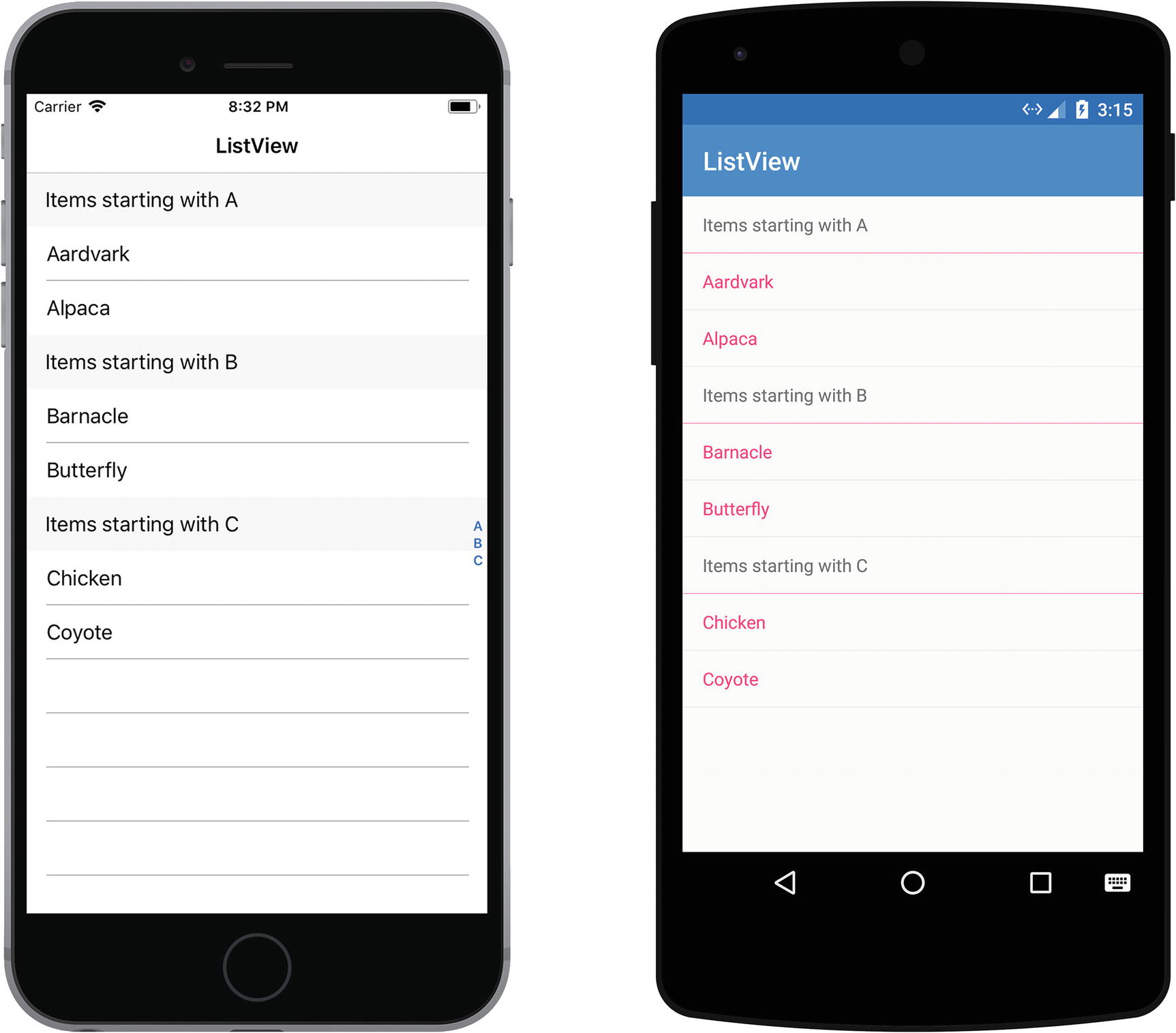
Adding grouping to the ListView to improve the user experience
Change your data source into a list of lists (each group has a list of items and is contained within a list itself).
Set the ItemsSource property of the ListView to this list.
Set IsGroupingEnabled to true on the ListView.
Set the GroupDisplayBinding property to bind to the property of the groups that will be used as the header text for that group.
Optionally, you can set the GroupShortNameBinding property to bind to the property of the groups that will be used as the jump list text.
A Simple Group Class That Can Serve As the Grouping for the ListView
Setting Up the Grouping on the ListView in XAML
The final step we need to take is setting up our grouping on the ListView. Listing 3-21 shows how to do so in XAML. We bind both the GroupDisplayBinding and the GroupShortNameBinding to their respective counterparts in our MyGroup object and simply enable grouping. The end result is that we get a grouped list of items and a jump list that lets you scroll toward related items quickly.
The sample in Listing 3-21 also shows that we have defined a custom group header template. Currently we only supply a simple text cell, but in the next section about data templates we will see that we can also create complicated data templates containing entire view hierarchies and use those as the group header.
Using Data Templates
A data template enables you to define the appearance of data and typically uses data binding to display the data. A common scenario can be found when using a ListView control. Each item in the list is shown using the defined data template, which enables you to define how an object is represented in the list. The fact that data templates are reusable means you only have to define the object’s representation once and you can use it for as many lists as you want.
When the list you use to show your objects contains different types of objects or if data needs to be represented differently based on an object’s properties, you can use a data template selector. The selector determines which template should be shown for each object in the list based on the criteria you define.
Creating a Data Template
Control-level (also known as inline)
Page-level
App-level
Each data template has an attribute named x:Key that enables you to specify a name for it. This name is used when referencing the data template and any other resource you put in a resource dictionary. You can create multiple data templates with the same x:Key value; however, the template that is defined at the lowest level will take precedent over the others. When the template is defined at the app level, it will be overridden by a template at the page level and when it’s defined at the control level it will override a page-level template.
Create an Inline Data Template
A Basic Inline Data Template Containing a Label and an Image
Create a Data Template in a Resource Dictionary
The Same Data Template Added as a Resource to the Page’s Resource Dictionary
Create a Custom Cell Type to Use in the Data Template
The Data Template Created as a Custom Type
The Same Data Template Added as a Custom Type to the ListView’s ItemTemplate
Dynamically Selecting a Data Template
So far, we’ve talked about data templates that were essentially hardcoded into our markup, resulting in each list item using the same template. But what if we would like to be able to dynamically switch our templates at runtime depending on the data? That’s where the DataTemplateSelector comes into play. A DataTemplateSelector enables us to choose which DataTemplate we want to show, depending on the property values of the objects bound to the ListView.
So when would we use a data template selector? Because they have a performance impact, they should only be used if the data templates are significantly different from one another. If we can achieve the desired result by changing the visibility of controls, using value converters or using data triggers than using a data template selector is not necessary. If the content of the cell needs to be completely different, perhaps because the list has different types of objects, we can consider using a data template selector.
The DataTemplateSelector Determines Which Template Needs to Be Used
Adding the DataTemplateSelector to the ListView
Caching Data Using the ListView
The ListView is often used to display more data than can fit onscreen. If you have a lot of items that you want to show, it may be beneficial for the performance of the application if you use a caching mechanism because creating a new row for each item would result in poor performance.
To improve performance, the native ListView equivalents for each platform have built-in features that let you reuse existing rows. When you enable the cell reusing feature, only the cells visible onscreen are loaded in memory and the content is loaded into these existing cells. This prevents the application from instantiating a new cell for each item, saving time and memory.
RetainElement—The default value. This will generate a new cell for each item.
RecycleElement—This setting uses recycling to improve performance by minimizing the memory usage. When using a DataTemplateSelector to select a DataTemplate, this strategy will not cache the DataTemplate. This means that a DataTemplate is selected for each item in the list.
RecycleElementAndDataTemplate—This setting builds on RecycleElement by also reusing any DataTemplate you may have set through a DataTemplateSelector. When using this strategy, a DataTemplate is selected once per item type, instead of once per item. This means that we can only use this strategy when we differentiate which template we want to use based on the type of item instead of a value within the item.
In Xamarin.Forms 2.4 and onwards, a change has been made to the RecycleElement caching strategy. Each of the DataTemplate type properties in the DataTemplateSelector should return only one ViewCell type. If the same property returns different ViewCell types, Xamarin.Forms will throw an exception.
When using the RecycleElementAndDataTemplate caching strategy, each DataTemplate returned by the DataTemplateSelector must use the DataTemplate constructor that takes a Type.
Summary
When it comes to displaying and working with data, Xamarin.Forms has a lot of options to help you get your data onscreen. Adhering to an MVVM framework will make your life a lot easier due to the easy binding support it gives you out-of-the-box. We learned about the ListView and some of the neat tricks it can do, such as showing a jump list with only a few lines of code. We also learned about data templates and that they’re an easy way to standardize and reuse how we show our data. Lastly, we learned about dynamically showing a different template depending on our data by using a data template selector.