
In this chapter, we look at some Xamarin.Forms fundamentals. The concepts explained here will be used throughout this book, so it is important that you have an understanding of how these fundamentals work. If you already have some knowledge of Forms and more specifically, custom renderers, the DependencyService, the MessagingCenter, behaviors and effects, then it is probably safe to skip this chapter. If not, please keep reading.
Custom Renderers
At the heart of Xamarin.Forms are the renderers. Xamarin.Forms is a library that allows you to define the user interface (UI) as an abstract layer as opposed to implementing a UI per platform. To make this work, Xamarin has provided a set of so-called renderers that will take these abstract controls and translate them into the native counterparts for you.
Built-in Renderers
For example, if you define a (Xamarin.Forms) Button at runtime, this will be translated to a UIButton and Android.Widget.Button for iOS and Android, respectively. All the properties you have set on the Forms button will be mapped by the renderer to the native equivalent of that property. Or, if a similar property is not available, code is injected to simulate the intended behavior.
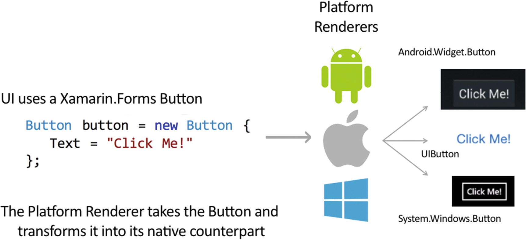
Schematic overview of a renderer in Xamarin.Forms
You might be wondering why a custom renderer would be needed at all. The team at Xamarin has mostly focused on implementing the most basic properties of each control. More specifically the properties that are supported by all the platforms that were supported by Xamarin.Forms at that time. But the platform-specific controls usually have more properties and capabilities that you might want to use but aren’t supported by Xamarin.Forms right now. To make the platform-specific properties available to you, you can write your own renderer, typically referred to as a custom renderer.
So, if the default renderer, implemented by Xamarin, doesn’t cut it for you, you can always choose to implement your own. I wouldn’t recommend writing it from scratch, but if that is what you want, it is possible. Creating a full custom renderer on your own can be done by inheriting from the ViewRenderer. When you do implement your own renderer from scratch, you are responsible for creating a platform control from start to finish. That means translate the abstract Xamarin.Forms control into the control that belongs on the targeted platform. This includes setting all the necessary properties.
Instead, typically you would inherit the default renderer and just tweak the bits that are relevant to you. That way, you can normally use 99% of the code that the Xamarin team wrote for you and you just have to set that one property that you would want to change. To explain the basics, let’s look at an example in the next section.
Implementing a Custom Renderer
Let’s say that we want to customize a Xamarin.Forms Entry. In Figure 1-2, you can see how the entry control is rendered for each specific platform if we are creating an app for iOS, Android, and Windows.
At the top level, we define an Entry either in XAML or code. Whenever this code is executed, through reflection Xamarin.Forms will go through the associated renderer for this control and instantiate a new control. The newly created control is the platform-specific equivalent of the Entry.

Default path for rendering an Entry
Imagine that we want to change something in the default behavior of the Forms renderer. For instance, we want to change the background color for this control. Note that this is possible with Forms out of the box, but for this example we will do it with our own renderer.
- 1.
Create a custom control—This needs to be created in the shared Xamarin.Forms project. Typically you would want to create an inheritance of the control that you want to create a renderer for. We will see why in a minute.
- 2.
Use the control in your app—This also happens in the shared Forms project. You can use your control from either XAML or code, use it anywhere in your screens and layout.
- 3.
Create a custom renderer for your control—Finally, you have to implement the custom renderer in each platform that you want to add something custom. Implementing it for each platform is not absolutely necessary. We will see this a little later.
The first step isn’t absolutely necessary, but I would recommend it. If you do not create a custom control, the renderer will be invoked for all the default controls. That could be something that you would want, but typically it isn’t. Imagine you want to add color your Entry control’s border. By implementing a custom renderer for the Entry, all entries in your project will have a colored border. By sub-classing the Entry into MyEntry and applying the renderer to that, you can apply the color to only those controls.
Let’s proceed with the first step, creating a custom control. This does not have to be too hard; it can be just an inheritance of the default control without adding anything new. At least, if in the future your requirements change, you have the possibility to still add something to your custom control.
The Custom Entry to Which We Will Apply the Custom Renderer
We have now simply created a new type with the sole purpose of not rendering all entry controls, but only the ones of the MyEntry type.
A Basic Page in XAML Using the MyEntry Control
The code in Listing 1-2 is XAML (Extensible Application Markup Language). With this XML-like syntax you can define your UI design. For this book, we assume that you already have worked with Xamarin.Forms before and that you know what XAML is. If not, refer to this link for more information: https://docs.microsoft.com/en-us/xamarin/xamarin-forms/xaml/xaml-basics/ .
Note
Throughout the course of this book, we will be defining the UI in XAML. Everything that can be done in XAML can also be done in code. Whether you want to use XAML or code is mostly a matter of taste.
There are two things notable in the code in Listing 1-2. First, make sure that you included a new namespace declaration in the root of the page. In Listing 1-2, it is this line: xmlns:local="clr-namespace:SolutionsSampleApp". This is similar to adding a using statement in your class. Now, the local prefix is available to declare controls in the namespace that is associated to it. You will see this prefixing of tags more often in the remainder of this book, now you know that this is because of a namespace declaration. This is what the <local:MyEntry /> tag does. It defines a new control, our custom control, and takes it from the namespace that we have abbreviated as local. Since our MyEntry control is just an inheritance of the Entry control, all properties of the Entry are also available in our control.
Now that we have our own custom control and consumed it in our app, it is time for the final step: create the custom renderer for it. The renderer classes are to be created for each platform that we want to support. But note that you are not required to implement a custom renderer for each platform if you decide to implement it for one platform.
For example, if you want to implement something specific to iOS, you can create a renderer for iOS only. On Android (or any other platform), the default renderer will stay in effect and nothing will change there.
The Implemented iOS Custom Renderer
On the first line, you can see how we inherit from the default renderer, EntryRenderer. This is the renderer implemented by the Xamarin team. From that renderer, we override the OnElementChanged method. This pattern is what you will see for the most custom renderers.
OldElement—This can be null when a control is created. When it is not null, a control is being destroyed and you should unsubscribe from events and clean up any other resources.
NewElement—This can also be null whenever a control is being destroyed. When it is not null, a control is being created and you should initialize it as needed.
Both OldElement and NewElement will contain a reference to the Xamarin.Forms variant of the control. In case of this example, it would be an Entry.
Control—This property contains a reference to the native control. In our example, when the renderer is initialized, it will contain a typed reference to a UITextField.
Element—This will hold a reference to the Xamarin.Forms control. So, in our case that would be the Entry.
Boilerplate for Any Custom Renderer
Typically, you are probably only interested whenever the Control property is not null. That is, when the platform control is created and you can do your custom magic.
Register the Custom Renderer with the Runtime
The important line is at the top. With the ExportRenderer attribute, we register with this attribute we inform Xamarin that we want to use this type of renderer when it needs to render a view of type MyEntry. It takes two parameters—the type of the control that we want to render and the type of the renderer we want to use for it. Failing to add this attribute will result in the default renderer taking over and your renderer having no effect at all.
When we now run this code, the entry on iOS will have a background color.
At this stage, we don’t have a custom renderer for the other platforms. As MyEntry inherits from Entry, Xamarin will use the default EntryRenderer to render this control on the other platforms. Hence there will be no custom background or anything—a native control will be rendered as if it were a standard Entry.
Implementation of the Custom Renderer on Android
You can see the concept is mostly the same. Only the code to set the background color on an Android control is different. As we learned earlier, the Control property contains a reference to the native control, in this case of type EditText. Since the renderers are implemented in the platform-specific projects, we can access the native APIs directly and set the background on the Android natives EditText. This really is how Xamarin.Forms works, inside these renderers—either made by you or the Xamarin team—the translation happens from the Forms control to its native counterpart.
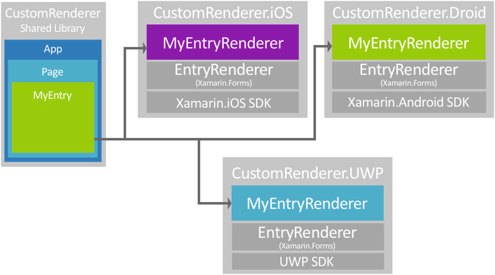
The situation after implementing a custom renderer on each platform
While UWP is depicted in Figure 1-3, we will not show you this example in code. It is mostly the same as the other examples or Android and iOS you saw earlier.
Tip
For more information on how to create custom renderers, take a look at the documentation at https://docs.microsoft.com/en-us/xamarin/xamarin-forms/app-fundamentals/custom-renderer/ .
Effects
Somewhat relatable to the custom renderers are effects. With effects, you do not need to subclass a whole renderer, instead you can write just enough code to customize the control a little bit.
Effects Versus Custom Renderers
Of course, then the question arises: when do you use an effect and when do you use a custom renderer? The short answer is that it’s totally up to you. There are however a few differences between renderers and effects. While effects can be reused more easily, custom renderers offer more flexibility in terms of what you can achieve with them.
An effect is recommended when changing the properties of a platform-specific control will achieve the desired result.
A custom renderer is required when there’s a need to override methods of a platform-specific control.
A custom renderer is required when there’s a need to replace the platform-specific control that implements a Xamarin.Forms control.
All documentation on effects can be found at https://docs.microsoft.com/en-us/xamarin/xamarin-forms/app-fundamentals/effects/introduction .
Implementing an Effect
Container—Holds a reference to the parent the control is added to.
Control—References the platform-specific control.
Element—Contains a reference to the Xamarin.Forms control.
iOS—UIView both for Container and Control
Android—ViewGroup (Container) or View (Control)
UWP—FrameworkElement for Container and Control
Therefore, it is important to know for which control you are creating an effect so you can strongly type it or cast it to the right type yourself.
OnAttached —This method is called when the effect is attached to the Forms control. In here you need to implement your custom styling, hooking up events, etc. You also need to take into account any error handling for when the effect fails to attach.
OnDetached —Basically, this is the opposite of the attached method. You need to clean up any resources and unhook events, etc.
The PlatformEffect class also has a OnElementPropertyChanged method that can be overridden. This method is invoked whenever a property on the element changes. Please note that this method can be called many times potentially.
- 1.
Create a new class that inherits from PlatformEffect in the platform project.
- 2.
Override the OnAttached method to apply our new effect.
- 3.
Override the OnDetached method and implement code to clean up after our effect, which is not always required.
- 4.
Add a ResolutionGroupName attribute as part of the unique identifier of this effect. Think of this as the namespace for a class.
- 5.
Add a ExportEffect attribute to register the effect with the runtime, equal to the way we register the custom renderer.
Implementing an Effect to Set the Background Color
This code shows you an example of how we can implement this effect for iOS. It shows a couple of similarities with the custom renderer. An effect also needs to be implemented at platform project level. Also, just like with the renderers, you will have to register the effect with an attribute. In the code from Listing 1-7, you can see it being done with the ExportEffect attribute above the namespace declaration. The additional ResolutionGroupName attribute is needed to be able to uniquely identify the effects in your project. The ResolutionGroupName together with the class name will make for the fully qualified name. We will see this in a little bit. Also, you just need to set the ResolutionGroupName once per project. It will carry over to all other effects defined in the project.
Implementing the BackgroundEffect on Android
You can see the gist of the code is the same, but here you can also use the platform-specific APIs just like with renderers. This is because we are implementing the effects in the platform code.
Consuming an effect is a bit harder than with a custom renderer. The biggest difference here is that you have to keep in mind that each control will have its own instance of the effect, whereas a custom renderer will be used for all the controls going through. This also means that you don’t need to create your own inheritance of a control; you can just attach the effect to one instance of a regular control.
RoutingEffect in Shared Code To Be Able to Consume Our Effect in XAML
In the base call you have to specify the value from the ResolutionGroupName and the class name combined. From that, Xamarin.Forms will know which effect to route to.
Consuming the Effect in XAML
Adding a Color to Our Effect So We Can Set Different Colors
Effect with Dynamic Color
In this code, you can see something funny going on while assigning the effect variable. A control can have multiple effects, so we need to find the right effect, cast it, and extract the value for our background color. After doing that, we can assign this color as we did before. Luckily, the Xamarin team has already provided us with helper extension methods to translate a Forms color into a platform color. I will skip over the Android counterpart for brevity. The extraction of the color from the RoutingEffect will be the same, only the translation of the color will happen through another extension method (ToAndroid()).
And in code you can now simply set this property just as well. You can see this in the code example of Listing 1-13.
Consuming the Effect When Creating a Control from Code
This concludes creating and consuming effects in Xamarin.Forms.
MessagingCenter
One of the core functionalities of Xamarin.Forms is the MessagingCenter. Although I would recommend using it as a last resort, it does have its use. The MessagingCenter helps you keep your code decoupled. Sometimes you will find yourself in a position that requires you create a reference between certain code, but by doing so, you have to compromise on reusability, maintainability, and probably a whole lot of other -ilities.
How MessagingCenter Works
To overcome these kinds of situations, you can use the MessagingCenter. The MessagingCenter is a simple messaging service that allows you to subscribe to a certain message. The sender and receiver do not need to know each other besides a simple message contract. As I have mentioned, this is also not ideal since your code will become less readable.
Subscribe: From the point in code where you want to execute logic based on a received message, you need to subscribe to said message.
Send: Whenever you need to trigger logic, you need to send a message. Any subscribers will then receive the message and act accordingly. When sending a message, you have no knowledge whatsoever about the number of subscribers. This could just as well be zero.
To access the service, you can call upon a static class called MessagingCenter, which has basically three, self-describing methods: Subscribe, Unsubscribe, and Send.
Using MessagingCenter
Subscribing to a Simple String Message
Sending a Message Through the MessagingCenter
The key thing in this example it the "YourMessageName" string. This binds the two together and acts as a contract. This is very useful if you just want this mechanism in place as some kind of event.
Receiving a Message with Arguments
With this code we again subscribe to a message with the name "YourMessageName" but notice how we also stated a string type between the angle brackets after Subscribe. This indicates that we expect an argument to come along with our message. In the handler, you will notice that I have added another parameter, args. Because we indicated that this has to be of type string, this is strongly typed.
Sending a Message with Arguments
You will notice in this code that we also added the second type between the angle brackets. Also, after specifying the message name, we now also need to add the arguments’ value. In this case, of type string.
Note
Even though the message names can be the same, the full signature of the Send and Subscribe calls needs to match. For example, the Subscribe from Listing 1-14 will not be invoked by the Send of Listing 1-17 and vice versa.
Unsubscribing from Message As Seen in Listing 1-16
The MessagingCenter included by Xamarin.Forms makes it easy to reduce coupling in your code where needed. As mentioned, I do use it as a last resort; usually there is another way to achieve your desired functionality. While sending a message can be very powerful, using it too much can really eat into your readability.
A real-life example would be a case where you need to update values in multiple parts of your app. You can subscribe to a message from multiple places and thus execute code in multiple places when a message is received. Another use case could be if some background process is done, it can send a message and you can then inform the user in your UI.
If you want to learn even more about the MessagingCenter, have a look at this official documentation: https://docs.microsoft.com/en-us/xamarin/xamarin-forms/app-fundamentals/messaging-center .
DependencyService
While Xamarin.Forms is designed to help you overcome writing different code for different platforms, there are limits to what is implemented. Each platform will have features unique to that platform that cannot be leveraged on any of the other platforms. Also, the team at Xamarin has implemented a lot of basic functionality, but not for everything.
- 1.
Create an interface—At the shared code level you will have to define an interface that is the contract for each implementation.
- 2.
Implement—For each platform that you support, implement the interface. You must implement it for each platform that you target.
- 3.
Register the implementation—Similar to the custom renderers and effects, you need to register this implementation with the runtime.
- 4.
Call DependencyService—Consume the new functionality from your shared code.
Note
Instead of an interface you can also use an abstract class. While an interface should be sufficient in most cases, an abstract class certainly has it uses. For instance, if only one method needs a platform-specific implementation, you could implement it through an abstract class and just mark that one method as abstract. You can then inherit the abstract class and implement only the abstract method as needed. In this section, we stick with the interface, but keep in mind that you can substitute this with an abstract class.
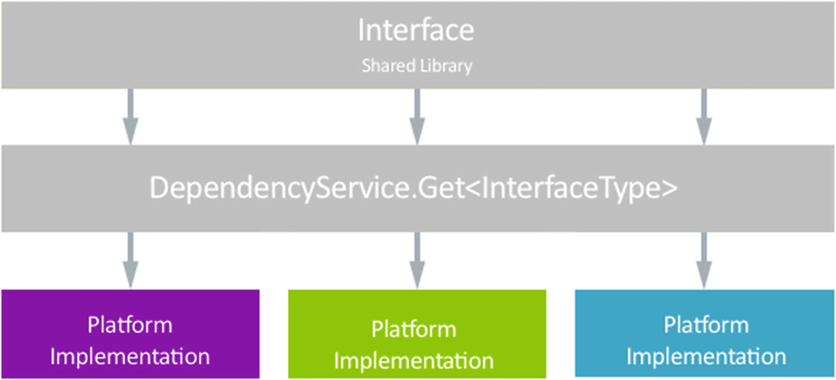
Schematic overview of the DependencyService workings
Using the DependencyService
We will now look at how to implement this in code. As we have just learned, a good start would be to create an interface. In Listing 1-19, you can see an interface definition that we will use to implement text-to-speech functionality.
Interface Definition for Text-To-Speech
This interface should be defined in the shared project. The implementations will go into the platform-specific platforms. Let’s look at the implementation for iOS. The full code for this is in Listing 1-20.
iOS Implementation of the Text-To-Speech Functionality
Note that the implementation has an attribute to register it with the runtime, the Xamarin.Forms.DependencyAttribute. There is another Dependency attribute in .NET as well, so make sure you pick the right one. This attribute has one mandatory parameter that takes in a type. This should be the type of the platform-specific implementation of this class. You only need to specify the platform-specific class, since it will always implement an interface or inherit from an abstract class, that class can be inferred for when you want to resolve it.
The actual code is not really relevant at this point, the thing that should be mentioned here is that you should see some iOS specific types pointing out that we’re working in a platform-specific project.
For brevity I will skip over the actual implementations of the other platforms. They will look very similar, the only thing different will be the implementation of the Speak method.
Note
On UWP when using Universal Windows Platform .NET Native Compilation, registration needs to be done differently. In the App.xaml.cs file , you will need to register each class in the DependencyService through a separate line of code instead of through the attribute. In our example, it would look like this:
Xamarin.Forms.Forms.Init(e, assembliesToInclude);
// Register your DependencyService
Xamarin.Forms.DependencyService.Register<TextToSpeechImplementation>();
The last step is to call the DependencyService and execute our just implemented functionality. Of course, this is done through our shared code. Xamarin.Forms includes a static class called DependencyService that can be used to locate the implementation of our text-to-speech platform-specific implementation.
This call will locate the right implementation and invoke the Speak method on it. When an implementation could not be found, the Get<T> method will return null, so you might want to implement checks for that as well.
Note
You will need to implement the platform-specific code for each platform that you want to support. If, for some reason, you should only implement it for one platform, you can wrap it in a check to see on what platform the app is running.
This will look like:
if (Device.RuntimePlatform == Device.iOS)
DependencyService.Get<ITextToSpeech>().Speak("Hello from Xamarin.Forms");
This will cause the code only to be executed on iOS.
DependencyFetchTarget
While retrieving the implementation of a class through the DependencyService, you have the option to get a global copy or a new instance. A global copy in this case, meaning a singleton instance. You can do this by providing an extra parameter to the Get method of the DependencyFetchTarget enum type. The Get method has a default parameter value that defaults to DependencyFetchTarget.GlobalInstance. So, by default, a class registered in the DependencyService will be retrieved as a singleton.
By specifying the DependencyFetchTarget.NewInstance as a value, you will retrieve a new instance of the class.
For more information on the DependencyService, see the full documentation at https://docs.microsoft.com/en-us/xamarin/xamarin-forms/app-fundamentals/dependency-service/introduction .
Behaviors
With behaviors, you are able to enrich a user-control’s functionality without having to subclass it. This can be useful whenever you want to add or change only a small bit.
Xamarin.Forms behaviors
Attached behaviors
Both can do pretty much the same; the way to implement them is different. Also, both of them can be set up in a way so that they are reusable, even across different applications. One example of a behavior that is used often is for commanding. There are lots of controls that expose events. With events, you are able to act on certain actions that the user invokes on a control. For instance, the click on a button has a backing event of whenever an item is selected in a picker.
The downside of events is that they are always used from the code-behind of your page. If you want to use an architectural pattern like MVVM, which is pretty common in Xamarin.Forms apps, using events is something you typically want to avoid. To convert events to a command, you can use a behavior. Note that there are multiple plugins out there that do this. Unless you have some specific requirements, I would recommend using a plugin that does the hard work for you. Still, to be aware of what is going on, it might be nice to see how it works on the inside. You can look at the specific event to command behavior at this sample repository by Xamarin: https://github.com/xamarin/xamarin-forms-samples/tree/master/Behaviors/EventToCommandBehavior .
If you would rather use a plugin for it like I have mentioned, look at the Xamarin.Forms Community Toolkit plugin. You can find all the info on their project page at https://github.com/xamarin/XamarinCommunityToolkit .
Other examples of behaviors could be input validation, limiting the length of an input, restricting the character use, or controlling animations.
Through a simple example, I will show you how to implement a Xamarin.Forms behavior and an attached behavior.
Xamarin.Forms Behaviors
Implementing a Xamarin.Forms behavior is done through inheriting from the Behavior class. It can be strongly typed by inheriting from the Behavior<T> class, where T is the type of the control you want the behavior to apply to.
Boilerplate Code for a Xamarin.Forms Behavior
Implementation of a Numeric Validation with a Xamarin.Forms Behavior
Adding a Behavior to a Control
Note that when you are writing a strongly-typed behavior, you can only attach it to that specific type of control. Failing to do so will result in a runtime exception being thrown.
You can reuse this behavior by applying it to multiple entries, or maybe even create your own custom inheritance of an entry control with this behavior attached by default. By implementing the behavior for higher level control or by not applying strong typing, you can make it available to all kinds of controls that share a certain property of event.
Tip
Since a lot of behaviors focus on pretty common concepts, a group of people in the community have collected a number of them in a handy NuGet package. By the name of Xamarin Community Toolkit, they have hosted the project on GitHub: https://github.com/xamarin/XamarinCommunityToolkit . It includes behaviors (and effects, animations, and converters for that matter) for validations and commanding.
Attached Behaviors
So-called attached behaviors are static classes with one or more properties that can be attached to a control. The attached properties are a special implementation of the bindable property. So, it might be good to explain the bindable property first. A bindable property is a property that you can bind to. This means it does not have a hardcoded value, but you bind it to a property in your code-behind or view model. That way you can update your controls, without having to actually reference the controls itself. You only need to update the property on your view model. The Xamarin Binding Engine will update the value of the BindableProperty of the control to which the property on your view model is bound. This can also work the other way around, depending on the binding mode. Chapter 3 has more on data-binding.
Now that we know what bindable properties are, let’s go back to the attached properties. Basically, these properties are defined in one (static) class and are attached to another class, a control.
This might sound a little abstract, but we already know at least two attached properties if you have worked with a Grid. On all the controls that you put inside a grid can specify the Grid.Row and Grid.Column property. The Xamarin team could’ve chosen to add a Row and Column property to every control that can be put inside a grid. Of course, this would be far from ideal, but most of the time they probably wouldn’t be in a grid and you would be stuck with a couple of useless properties. Instead, what the people at Xamarin did was add the attached properties to the BindableObject class. The Grid, in its turn, can now read the values of these attached properties from each of its children and determine how and where to show them.
So, why not put it as a “regular” bindable property on the BindableObject? If tomorrow a new container control (equivalent to the grid) is launched, there is no need to update the BindableObject class; the new control can just introduce new attached properties that it can query. This way, there is no impact on existing base objects, and no gazillion (layout-)properties on a base object where only a few are used in a particular occurrence.
Numeric Validation with an Attached Behavior
In this code, note that GetAttachBehavior and SetAttachBehavior can vary by name. These methods should be named by a certain convention. Notice that in the BindableProperty.CreateAttached method right above it, as the first parameter we give the behavior a name, this is critical for the naming of your methods. The convention needs the be Get or Set, followed by the behavior name. In this case, the behavior name is AttachBehavior. So the methods are named GetAttachBehavior and SetAttachBehavior. If the behavior was named MyAwesomeBehavior, the methods would be named GetMyAwesomeBehavior and SetMyAwesomeBehavior. Also, and this might be redundant, but the return value specified in the BindableProperty.CreateAttached method must be the same as the return type of the getter and setter.
The least interesting logic is going on at the bottom. This validation logic is identical to the logic we have used in our Xamarin.Forms behavior. Actually, the most important part is all the way at the top. This public static readonly BindableProperty AttachBehaviorProperty property defines the name of the property we can attach to a control and is used to tie it to the logic that is executed.
When we look at how the AttachBehaviorProperty is defined through a BindableProperty.CreateAttached, you will notice that we need to specify the type of our property (a bool in this case). Hooking up the property changed event happens with this little piece of code: propertyChanged:OnAttachBehaviorChanged. With this we refer to the OnAttachBehaviorChanged method and mark this for invocation whenever a value of a property changes. Of course, the implementation of the OnAttachBehaviorChanged method needs to adhere to a certain signature. Because of that, we can gain information about the control invoking this event and information about the old and new value. Since these behaviors are not strongly-typed you, as the developer, will need to verify the right types and take care of error handling.
Consuming an Attached Behavior in XAML and Code
The attached behavior we have created now just takes in a Boolean value to enable of disable it. You could of course take another approach to just enable it when you attach the behavior. You can then use an attached property to influence the workings of your behavior. For instance, set a maximum value on our entry, so the maximum numeric value could be set. Also, you are not limited to just one property, add as much as you like. So, you could both use the Boolean from this example and add a numeric property to specify the maximum value.
The obvious question now is: when do you use a Xamarin.Forms behavior and when do you use an attached behavior? Since you can achieve pretty much the same functionality both ways, the answer is that it’s mostly up to you. It is a bit a matter of taste. Forms behaviors can be strongly-typed, which is an advantage in my opinion, so I like to go with these. Also, there is a little less overhead, because a Forms behavior doesn’t get invoked with each property change. But in the end, it is up to you!
Summary
In this chapter we saw some of the fundamentals of working with Xamarin.Forms. It is important to have a basic understanding of these concepts as they might be used or referred to throughout the rest of this book.
With custom renderers you can create your own implementation of renderers that are normally defined by the Xamarin team. If you want to leverage a functionality that isn’t in the default Xamarin.Forms toolkit (yet), you can access it through a renderer. You don’t like how a certain control or page looks? Render it your own way!
A little less rigorous than a custom renderer is an effect. With an effect you can just tweak your control a little bit. At the end of the day, a renderer and an effect can do the same thing, an effect just feels a little more lightweight since you don’t have to inherit a whole class.
Another thing we learned in this chapter is how to work with the DependencyService and the MessagingCenter. The DependencyService is a service locator that can be used to reach platform-specific functionality that isn’t available in the Xamarin.Forms abstraction. Through a simple contract in the form of an interface or by the use of an abstract class, we can still call platform-specific code in our platform projects where the contracts are implemented.
The MessagingCenter can be used to keep our code loosely-coupled. You might find yourself in a situation where you have to create a reference to a piece of code that just doesn’t feel right. To still be able to reach that code, you have a simple message bus at your disposal with the MessagingCenter.
Lastly, we looked at behaviors. With both Xamarin.Forms behaviors and attached behaviors we can achieve the same functionality, although logistics are a bit different. With both we can influence the functionality of a control by invoking logic when events are fired. This way we can implement commanding, to make out controls more suitable for the MVVM pattern or implement things like entry validation.
In the next chapters, you will find all kinds of solutions for common scenarios that you will encounter in Xamarin.Forms. Through our, the authors, combined experience of over a decade, we want you to benefit from that. Where we might have to have spent precious time finding these answers to our questions, we want to provide you with this handbook, so you won’t have to. The concepts in this chapter are part of the Xamarin.Forms fundamentals and you will probably recognize some of these patterns in the solutions to come.