PRACTICE
In Identity
For many graphic designers, the logo is the ultimate expression of graphic design—a literal, figurative, or abstract icon, or a compelling wordmark that represents a product or organization and makes it instantly identifiable. Logos by themselves can’t tell the complete story or describe all the attributes of a product or organization; they are beholden to the behaviors of who or what they represent and the associations triggered by their reputation. Logos are also rarely deployed alone; rather, they are accompanied by a complementary visual system (an identity program) that enhances and supports its presence. Nonetheless, there is something infinitely satisfying about a strong, memorable, innovative, and clever logo—especially one that can stand on its own.
Building a visual language that can serve as an encompassing identity for a product or organization requires the definition of colors, typefaces, and other graphic elements and their integration in an expandable system that is consistent but adaptable to different communication needs and mediums. Identity programs range from the sparingly simple, defining a small range of colors and applications of the logo, to infinitely expandable systems, with multiple versions of a logo or a comprehensive library of imagery and graphics that acts as a kit of parts that can be assembled at the discretion of designers or vendors inheriting the program. Neither direction is better than the other, and both require a disciplined application to achieve consistency and relevance.
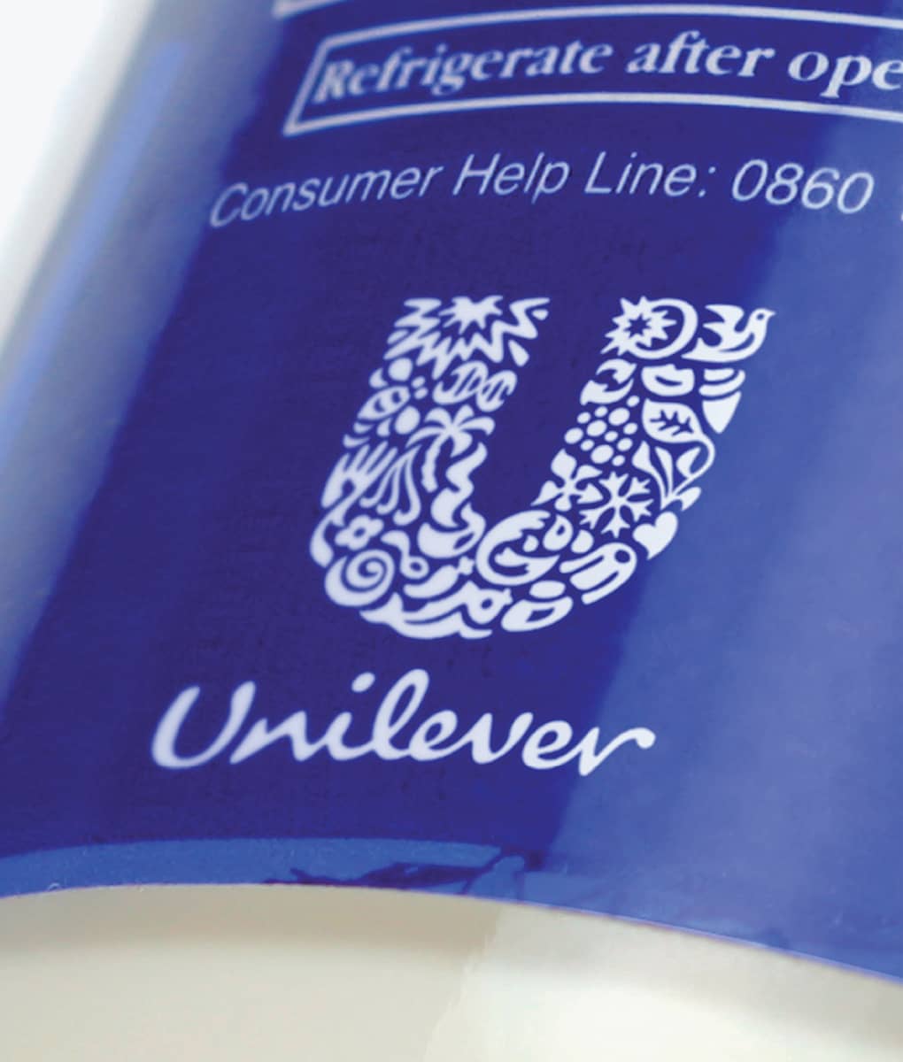
Detail of UNILEVER IDENTITY AS USED ON CONSUMER PACKAGING / Wolff Olins / UK, 2004
Coca-Cola
Pharmacist Dr. John S. Pemberton used two main ingredients in the creation of his famous beverage, coca plant and cola (or kola) nut. Frank Robinson, his partner and the company’s bookkeeper (chief financial officer, perhaps, in today’s terms), named the drink Coca-Cola, which Pemberton introduced in 1886 at Jacob’s Pharmacy in Atlanta, Georgia. Coca-Cola’s first ad ran in the Atlanta Journal on May 29, 1886, and featured the name set in a sans serif typeface; it wasn’t until a June 1887 ad that Robinson introduced the Spencerian handwriting logo he developed. Later, an oilcloth sign with the red logo on a white background was placed on the awning of Jacob’s Pharmacy. More than 120 years later, the Coca-Cola logo remains true to its original. It has undergone numerous refinements over the years, and as the brand became bigger and harder to control, firms like Lippincott Mercer in the 1960s—they introduced the wave underline based on the contour of the bottle—and Landor Associates in the 1980s developed comprehensive identity programs. Whether hand-painted on a wall in a rural village or printed in corporate letterhead, the Coca-Cola logo is one of the most recognized in the world.

COCA-COLALOGO
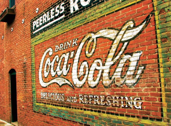
Ashland, Oregon, USA, 2006 / Photo: Flickr user ElektraCute
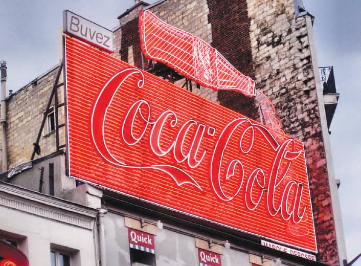
Paris, France, 2008 / Photo: Flickr user OTAILLON
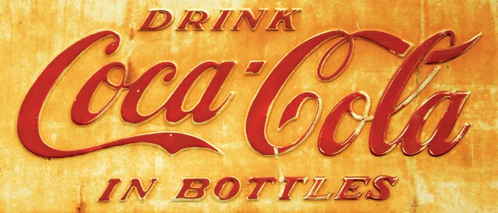
Brighton, UK, 2008 / Photo: Flickr user Dominic’s pics
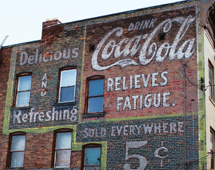
Schenectady, New York, USA, 2007 / Photo: Flickr user roytsaplinjr
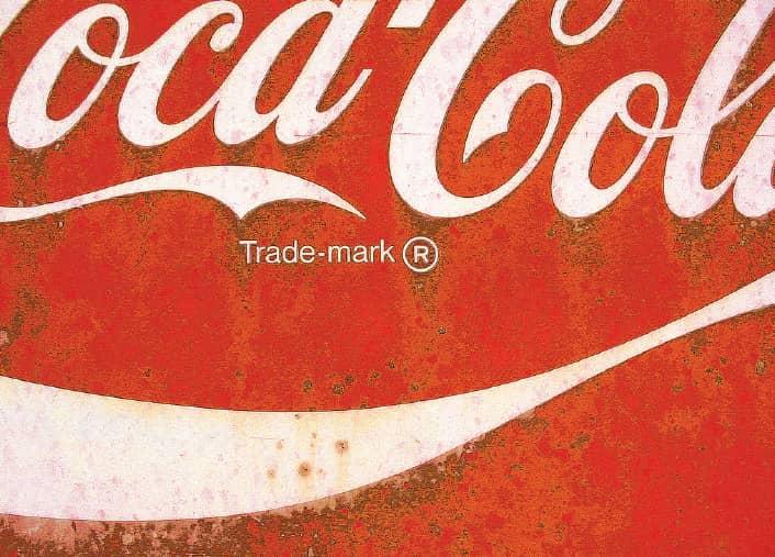
Ridgeland, Mississippi, USA, 2007 / Photo: Flickr user iboy_daniel
IBM
During World War II, International Business Machines Corporation (IBM) took its first steps toward advancing computing technologies while continuing the development of its electric typewriter. Change came in 1952 when Thomas J. Watson Sr., IBM’s chief executive for nearly four decades, passed the title to his son, Thomas J. Watson Jr. Determined to position IBM as a commanding company from its products to its public appearance, Watson brought in architect and interior designer Eliot Noyes to oversee the transformation of IBM’s architecture, manufacturing, product design, and visual communication. Noyes hired Paul Rand ›159, whom he knew socially, to establish a much-needed identity program for IBM in 1956. Although a simplified logo of the acronym typeset in a slab serif had been introduced in 1947, the convoluted globe logo constructed from the full name of the company that was first used in 1924 could still be occasionally seen. Rand’s first change was subtle, exchanging one slab serif for another, Beton Bold Condensed for City Medium.
Slowly and delicately, Rand kept altering the logo, at one point introducing an outline version to lighten the heaviness of the letters. It wasn’t until 1962 that the famous striped version was first used by Rand—it was officially introduced in 1972—as he sought to consolidate the dissonant letterforms through the unified set of lines that ran from one letter to the next. Conceptually, the stripes were spurred by the notion of the thin parallel lines used in legal documents to protect a signature from counterfeiting, alluding to a sense of authority. Rand created two versions of the logo, one that used eight lines and another 13. For nearly 30 more years, until 1991, Rand oversaw the application of the logo and the identity across all of IBM’s applications, from packaging to annual reports, and instituted forceful standards for the in-house design group in documents like IBM Logo Use and Abuse and The IBM Logo, which also showed the potential flexibility and creativity of the logo. As corporate identities from the 1960s and 1970s slowly disappear, it might be a matter of time before the next version of the IBM logo has no stripes at all.

IBM, CHICAGO OFFICE / USA, 2001 / Photo: Flickr user alui0000
UPS
With bicycles and their own two feet, teenagers Jim Casey and Claude Ryan established their private delivery service as American Messenger Company in Seattle, Washington, in 1907. Six years later, the company acquired its first delivery car, a Model T Ford, and changed its name to Merchants Parcel Delivery. In 1919, it expanded service in Oakland, California, and changed the company name to United Parcel Service (UPS). The new logo introduced an eagle grasping a parcel in its claws and flying over a shield.
Around 1937, as the firm grew, another new logo was adopted, this one with the company’s acronym inside a shield. After working unsuccessfully with other designers to redesign their logo, UPS approached Paul Rand ›159, who responded, to his client’s surprise, with a single design solution—a simplified shield with sans-serif lettering and the outline of a bow-tied package. Rand’s logo was used from 1961 until 2003, when a new logo, designed by Futurebrand, was introduced to signal the evolution of UPS from a package delivery company to a logistics company with diverse supply chain services.

UNITED PARCEL SERVICE PACKAGE CAR / Replica of the P-600 delivery vehicle / Made in Hong Kong

UPS EXPRESS ENVELOPES
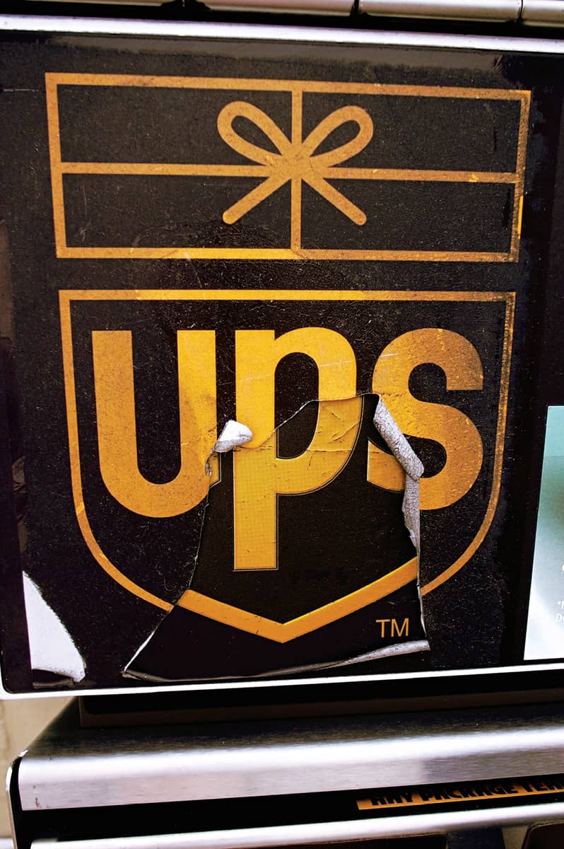
FROM UNDERNEATH A NEW UPS LOGO BY FUTUREBRAND, AN OLD LOGO BY PAUL RAND EMERGES / USA, 2008 / Photo: Brandon Shigeta
FedEx
Federal Express, founded by Frederic W. Smith in 1973, inaugurated the concept of overnight delivery service by creating a hub where packages arrive and then disperse to their locations in the middle of the night. By the late 1980s, the name was synonymous with overnight shipping. Federal Express began working with Landor Associates in the early 1990s to fortify its growing brand presence. Landor’s research revealed the name Federal Express was not optimal for global markets and suggested renaming the company FedEx, the way some insiders and customers already referred to it. The identity design was led by the senior design director at Landor’s San Francisco office, Lindon Leader. After hundreds of design explorations and input from their clients, Leader and his team presented six possibilities to a room full of executives. Only Smith spotted Leader’s typographic sculpting that revealed an arrow between the E and the x. The new logo was introduced in 1994, but people still challenge each other to find the hidden arrow.
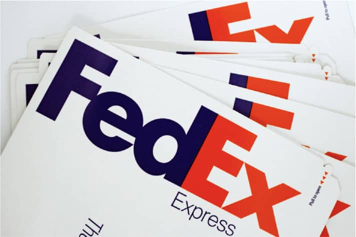
FEDEX EXPRESS ENVELOPES

FEDEX TRUCKS AT REST / USA, 2007 / Photo: Flickr user Andrew Christensen

FEDEX MCDONNELL DOUGLAS DC-10-10(F) N361FE PLANE / USA, 2008 / Photo: Flickr user Cubbie_n_vegas
Nike
After distributing sports shoes since the mid-1960s under the name of Blue Ribbon Sports (BRS), Phil Knight was determined to establish his own line. Looking to build an identity for it, he hired Carolyn Davidson, an art student at Portland State University. Knight requested a logo that would be as effective as the three stripes of Adidas, which were not only visually dynamic but also functional, holding the upper and lower soles together while supporting the arch. Davidson set her own fee at $35. Among her designs was a checkmark toward which Knight and his partners gravitated despite a heavy dose of skepticism. “I don’t love it,” Knight said, “but I think it will grow on me.” It’s not clear when the logo became known as the Swoosh, but one of the first shoes distributed by BRS was made of nylon, a fabric promoted in an ad as the “Swoosh fiber.” The next step was choosing a name. Knight had proposed Dimension Six, to little excitement, with Bengal as another option. The day before the shoeboxes were to be printed, there was still no name. The next morning, one of his partners, Jeff Johnson, came up with Nike, after the Greek goddess of victory. “I guess we’ll go with the Nike thing for now,” Knight commented, “I really don’t like any of them, but I guess that’s the best of the bunch.” Not a bad turn of events for a couple of ugly duckling choices.

NIKE PRODUCTS / USA
ABC LOGO / After other designers had failed, the American Broadcasting Company (ABC) approached Paul Rand ›159. With a visually compelling acronym of three round letters, Rand drew each letter out of three perfect circles, with their counterspaces also forming three perfect circles. Over the years, ABC has attempted to replace the logo—even Peter Saville ›180 designed an alternative in 1996—to no avail. / Paul Rand / USA, 1962
NBC LOGO / Years ahead of its competitors, the National Broadcasting Company (NBC) began airing color broadcasts in 1953. Three years later, the NBC peacock strutted its colored feathers for the first time, not as a logo but as an on-air identifier to brag about the departure from black and white. After the 1975 abstract N logo was found to pose a trademark infringement on the Nebraska ETV Network, the peacock was embedded in the N in 1979. The peacock finally became the center of attention in 1986 with a simplified design by Steff Geissbuhler › 157, who trimmed the peacock’s feathers from 11 to six and turning its head to face right. / Chermayeff & Geismar, Inc.: designer, Steff Geissbuhler / USA, 1986

CBS LOGO / Based on hex symbols drawn on Shaker barns to ward off evil and on a drawing of an all-seeing eye in a book about Shaker art, William Golden, creative director of Columbia Broadcasting System (CBS), devised the streamlined drawing of the eye with graphic artist Kurt Weiss. Golden intended it as a visual device for just one season, but CBS president Frank Stanton designated it the official logo. / CBS: creative direction, William Golden / USA, 1951

I♥ NY LOGO / Hoping to boost the state’s economy by increasing tourism, in 1975 the New York State Department of Commerce hired advertising agency Wells, Rich, Greene and designer Milton Glaser › 170 to develop a campaign. With the theme “I Love New York,” Glaser first designed a logo that spelled out the full name, and it was accepted. While riding in a taxi, Glaser replaced the word love with a heart and had to convince his clients this was the better option. Of course, it was. The “I♥ [blank]” visual trope has become one of the most imitated, parodied, and commercialized, much to the distress of the state’s lawyers, who have reportedly filed approximately 3,000 trademark objections. / Milton Glaser / USA, 1975
GENERAL ELECTRIC LOGO / In 1892, Thomas Edison’s The General Electric Company merged with The Thompson-Houston Company to form General Electric. The initials GE, in an Art Nouveau style, were used as a logo. In 1900 they were simplified, bordered by four swirling curlicues, and placed inside a circle. “[The] letters G-E are more than a trademark,” stated a 1923 advertisement. “They are an emblem of service—the initials of a friend.” That friend grew to be one of the largest corporations in the world. Despite the company’s constant innovations and diversification, GE has maintained its logo—referred to as the “meatball” around the 1960s—nearly without change. A vibrant update by Wolff Olins ›206 in 2004 built a visual language around the logo, extending its life just a few more years—or centuries. / Designer unknown / USA, 1892 / Version shown: Wolff Olins / USA, 2004
CITI LOGO / Citicorp and Travelers Group merged in 1998 to form Citigroup, at the time the world’s largest financial firm. Working with Michael Wolff as a consultant and Pentagram’s ›162 Paula Scher › 182 and Michael Bierut › 203 as the identity designers, Citigroup gave them ten weeks to design a logo that would best represent the visual legacy of both corporations. Drawing a subtle red arc over a lowercaset, Pentagram created a new, abstract umbrella, the identifier for Travelers Group, that also served as a joining symbol of the two companies. The shortened name Citi, which was a joint recommendation by Wolff and Pentagram, was rendered in blue to carry the equity of Citicorp’s logo. In her monograph, Make it Bigger, Scher confides that this was the first logo she sketched, but then she created other options to demonstrate that a “scientific logo exploration” was actually performed. / Pentagram: Paula Scher / USA, 1998

BP LOGO / After the merger of British Petroleum (BP) and Amoco in 1998, an interim “BP Amoco” wordmark typeset in an italic sans serif over a swoosh was briefly used. In 2000, Landor Associates introduced the Helios, named after the Greek god of the sun. A radiant but ambiguous abstraction of a sun, a flower, a plant, or all of these was designed by the San Francisco office, led by creative director Margaret Youngblood. The Helios became the centerpiece of the identity, downplaying, in lowercase letters, the BP acronym to establish some distance from the word petroleum. A massive advertising campaign, “Beyond Petroleum,” was created by Ogilvy & Mather. More than a decade after the merger, BP stands simply for BP. / Landor Associates / USA, 2000
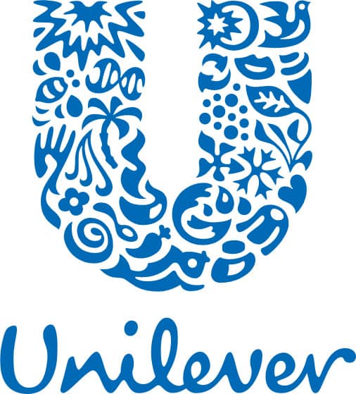
UNILEVER LOGO / As owner of some of the world’s best-known brands in the food, beverage, and personal care industries—Ben & Jerry’s, Lipton, Knorr, Dove, and Pond’s, to name a few—Unilever’s brand is carried in products across 150 countries. In 2004, Unilever hired brand consultancy Wolff Olins › 206 to create a new identity. Led by creative director Lee Coomber and executed by outside designer Miles Newlyn, the new logo is a rare, successful instance in corporate identity where more, as opposed to less, is more. Coming together to form a U, 25 individual icons represent different aspects of Unilever—for example, lips (for beauty, looking good, and taste); a bee (for creation, pollination, hard work, and biodiversity); a bowl of delicious-looking food; and particles (a reference to science, bubbles, and fizz). / Wolff Olins / UK, 2004
LONDON UNDERGROUND LOGO / When the Central London Railway and a number of private underground lines were consolidated in 1906 they formed a new company, the Underground Group. In 1907, a precedent for the now famous roundel was established: a blue bar with white lettering resting on top of a solid red circle. Frank Pick, responsible for the publicity and appearance of the Underground, commissioned typographer Edward Johnston in 1916 to design a typeface for the system—Johnston Sans—and later, in 1918, to revise the logo. Johnston changed the solid circle to a band and typeset the name in his own typeface with dashes underlining each letter between the first U and the final D. The logo was simplified in 1935 by German graphic designer Hans Schlege and revised in 1972 by the London-based firm Design Research Unit. / Edward Johnston / UK, 1918 / Version shown: Design Research Unit / UK, 1972 / Image: Courtesy of Transport for London

NORTHWEST AIRLINES LOGO / From its home airport in the Twin Cities of Minneapolis and St. Paul, Northwest Airlines (then named Northwest Airways) began as a mail carrier in 1926 and started flying ticketed passengers one year later. As its name implies, the airline flew north and west to Winnipeg, Canada; Seattle, Washington; Alaska; and, later, Tokyo, among other destinations. In 1988, Landor Associates designed a logo that was both witty and serious. Honoring the name, the logo shows an arrow pointing to the northwest as if it were a compass, with a slanted N on the right. Looking at the arrow and the N together reveals a W to reinforce northwest. By 2003, Northwest Airlines’s routes had greatly expanded beyond that one direction, and it shortened its name to NWA and developed a new logo by TrueBrand. The arrow still points northwest, but the visual play lost its wings. / Landor Associates / USA, 1989

PENGUIN BOOKS LOGO / The affordable paperbacks of Penguin Books › 274 were first published in 1935, and it was a youthful 21-year old employee, Edward Young, who designed the iconic horizontal-striped covers and charming logo, the latter the result of a visit to the London Zoo. When Jan Tschichold › 140 was hired to standardize the design of Penguin Books in 1947, one of his contributions was to redraw Young’s penguin, and Pentagram › 162 partner Angus Hyland did further modifications in 2003. While these iterations concern the main Penguin Books logo, it is common to find the black and white critter take on different shapes, styles, and accoutrements in certain collections or individual cases. A recurring version is the “Dancing Penguin” logo—or, as some call it, the “Appendicitis Penguin,” with its curled stomach. / Edward Young / UK, 1935 / Versions shown, left to right: Edward Young (UK, 1935), Designer unknown (USA, 1944), Jan Tschichold (UK, 1949), Pentagram (UK, 2003), David Pearson (UK, 2007)

CANADIAN NATIONAL RAILWAYS LOGO / The legacy of the Canadian National Railways Company (CN) spans to the mid-nineteenth century and across more than 20,000 route-miles of track in Canada and the United States. With logos that included moose and maple leaves in its past, and an increasingly antiquated perception by customers, CN commissioned New York designer James Valkus to assess the project, and he recommended a complete overhaul. Valkus assigned the logo project to Canadian designer Allan Fleming. His solution, a single-stroke line forming the letters CN —Fleming suggested dropping the R for Railways to create bilingual acronym, Canadien National in French and Canadian National in English—represents “the movement of people, materials, and messages from one point to another.” At the time, Fleming stated that “this symbol will last for 50 years at least.” As of this book’s publication date, in one more year his prophecy will come true. / Allan Fleming / Canada, 1960

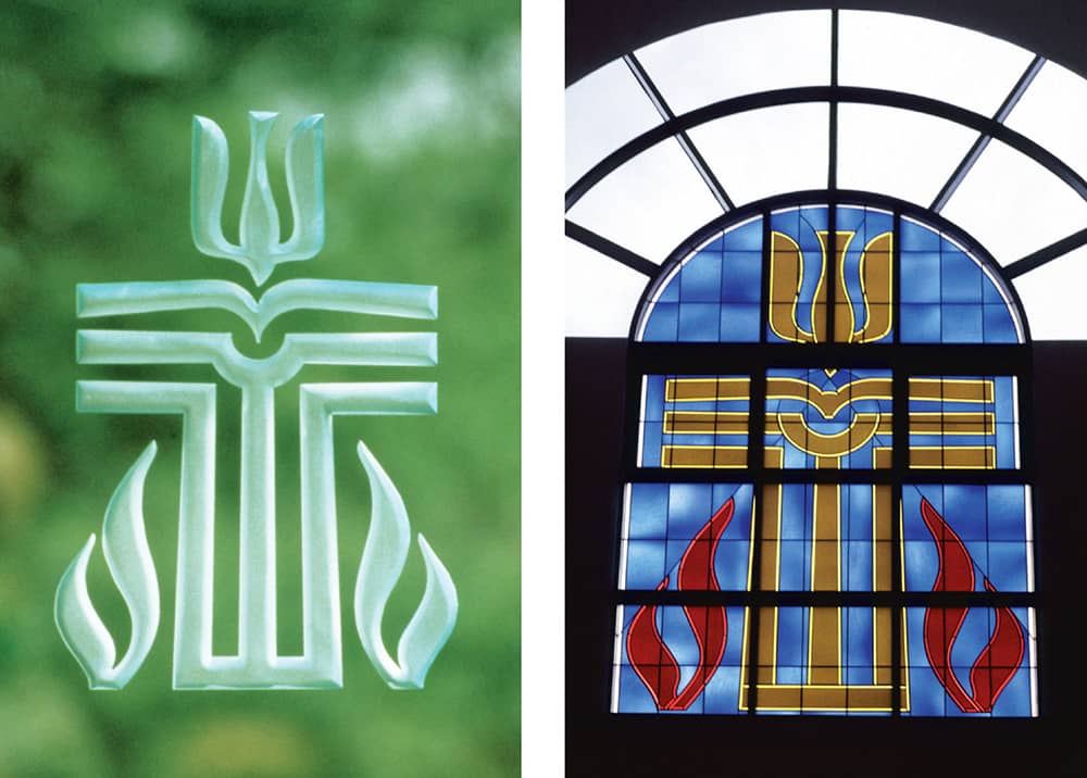
Glass artistry, Ed Macilvane
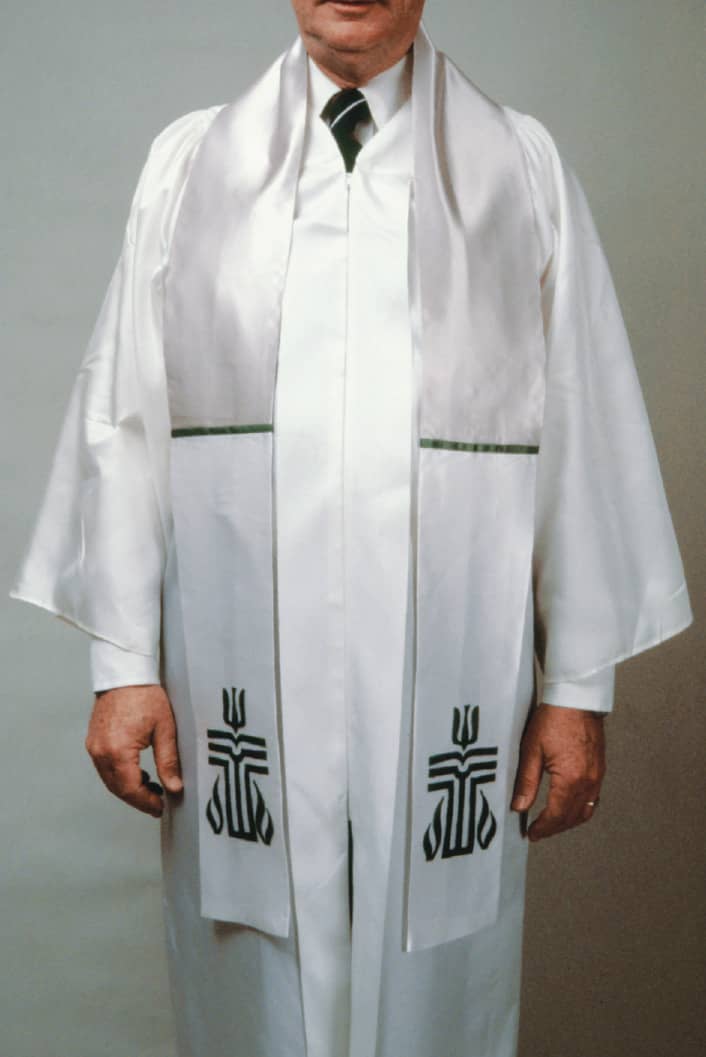
PRESBYTERIAN CHURCH (U.S.A.) LOGO / When various divisions of the Presbyterian Church came together in 1983 to form Presbyterian Church (U.S.A.), the largest such group in the United States, they hired Malcolm Grear Designers (MGD) from a pool of 46 possible consultants. The brief to MGD indicated that the new logo should include the cross as its main element as well as fire, a descending dove, and the Bible. To add to the challenge, the contract stipulated that a committee from the Presbyterian Church was to oversee the design process, not just the selected solutions. The result is an impressively inclusive seal that incorporates all the requested iconography and then some. More remarkable is that the logo was approved by an initial committee, then a 40-member board, and, finally, a 700-member governing board. / Malcolm Grear Designers / USA, 1985
CAMPAIGN FOR NUCLEAR DISARMAMENT
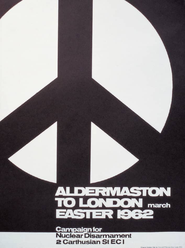
Nuclear bombs were deployed by the United States on the Japanese cities of Hiroshima and Nagasaki in 1945. To the dismay of people around the world, the United States, the Soviet Union, and Great Britain continued to test such weapons even after World War II ended. One of the most vocal groups urging a stop to this was the Campaign for Nuclear Disarmament (CND), formed in London in February 1958. Two months later, in conjunction with the Direct Action Committee Against Nuclear War (DAC), the CND organized a rally on Easter Day at Trafalgar Square, followed by a 52-mile march to the atomic weapons establishment in the village of Aldermaston. Reportedly, 4,000 people marched for four days, swelling to 10,000 in its final moments, many of them bearing placards picturing a stark, black circle with a white, angled, drooping cross.
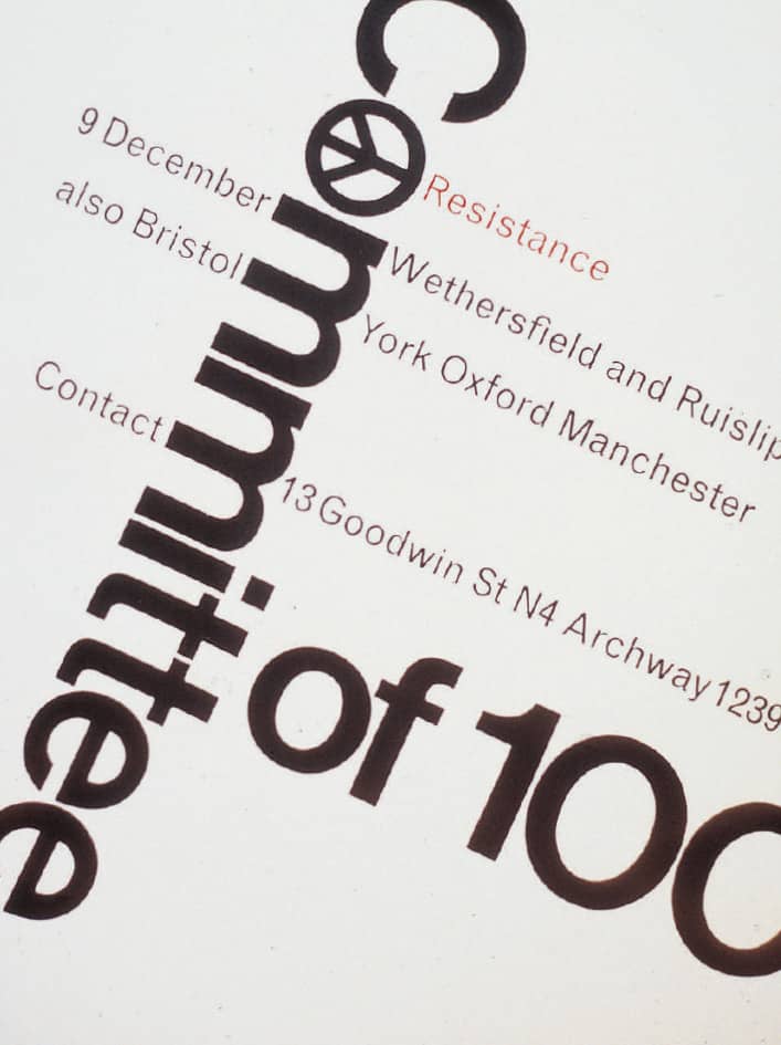
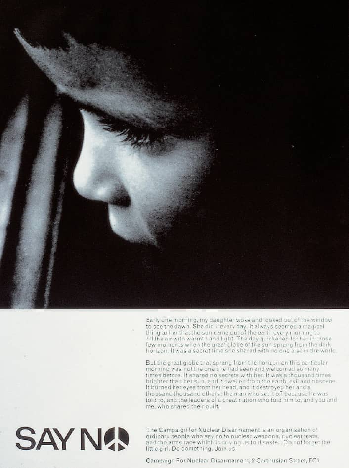
Designed by Gerald Holtom, a textile designer, the symbol was meant to combine the N and D of the semaphore flag-signaling system, used to communicate at a distance by positioning one flag in each hand in different configurations. The N is formed by pointing both arms downward at a 45-degree angle, while holding just one arm straight in the air forms the D. “I was in despair. Deep despair,” Holtom later explained to PeaceNews magazine editor Hugh Brock. “I drew myself: the representative of an individual in despair, with hands, palm outstretched, outwards and downwards in the manner of Goya’s peasant before the firing squad. I formalised the drawing into a line and put a circle round it.” Holtom presented this design to DAC, which embraced it as its rallying visual for the march, and afterwards CND adopted it as its official logo, putting it front and center as it hosted other rallies to Aldermaston in subsequent years. Social-minded graphic designer Ken Garland designed many of the CND’s posters and flyers beginning in 1962, activating the symbol in different ways.
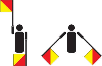
LETTERS D AND N OF THE SEMAPHORE FLAG SIGNALING SYSTEM
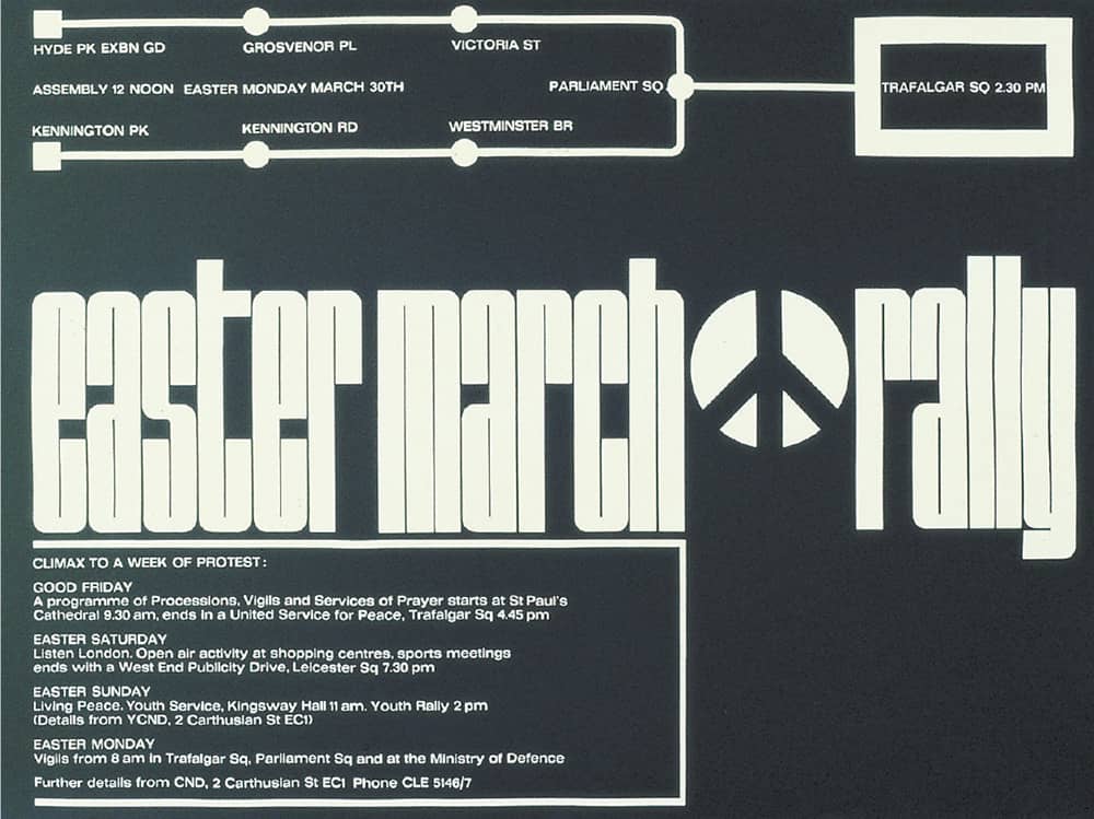
POSTERS FOR THE CAMPAIGN FOR NUCLEAR DISARMAMENT / Ken Garland / UK, 1962-1966
Attending the 1958 rally was Bayard Rustin, an American civil rights activist who is one of the acknowledged connections in bringing the symbol to the United States and separating it from its connections to the CND for use in civil rights demonstrations. It later gained popularity as a symbol to protest the Vietnam War and then became associated with the hippie subculture. Gradually, however, it became a symbol simply for peace. Because the CND never registered the symbol as a trademark, it has become the property of everyone, and in opening that ownership the symbol has gained its true strength, made ever more prevalent and meaningful as people render it in different ways and imbue it with their own personalities.
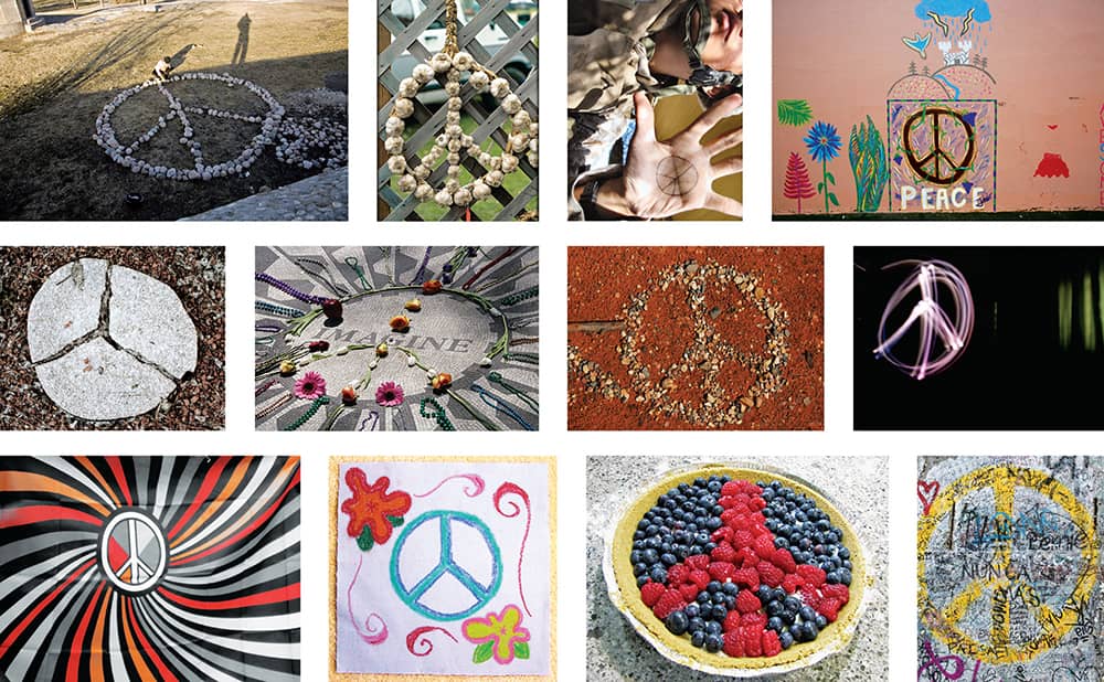
REINTERPRETATIONS, APPROPRIATIONS, AND MANIFESTATIONS OF THE PEACE SYMBOL / Photographers, from left to right: Mika Hiironniemi, CarbonNYC, Jayel Aheram, aturkus, cogdogblog, jeffpearce, dental ben, hashmil, eyeliam, normanack, NatalieMaynor, Clarita / All images uploaded to Flickr under a Creative Commons Attribution license
New Haven Railroad
Formed in 1872, the New York, New Haven, and Hartford Railroad, commonly referred to as “the New Haven,” operated freight and passenger trains between New York and Boston, enjoying modest success until the beginning of the twentieth century. Then followed a string of woes over the next 70 years. The New Haven avoided bankruptcy once during World War I but succumbed to it in 1935. After resurfacing in 1947, the New Haven saw better days with Frederick Dumaine Jr. as president, but in 1954 Patrick B. McGinnis, looking to increase dividends to shareholders, took over the position. Dividends increased, but the performance of the company decreased. McGinnis was replaced less than two years later. However, he left behind an important visual legacy for both the corporate identity and railroad industries.
McGinnis worked with his wife, Lucille McGinnis, to develop a new identity in 1954. She commissioned Swiss-born Herbert Matter, a design consultant for Knoll and faculty member at Yale School of Art › 129, who created a boldly simple, single-weight slab serif of the NH monogram that became, literally, the centerpiece of the identity program. It was regularly printed big—sometimes even twice on the same cover—in a limited color palette of black and red on everything from timetables to brochures to the front of the train, which sported a bold paint scheme unlike any other. Matter created much of the material but, after McGinnis’s departure, the responsibilities went to the New Haven, which went bankrupt in 1961 and ceased operations in 1968. Since 1990, thanks to a group of rail enthusiasts, 16 locomotives that run on New York State’s Metro-North Railroad and Connecticut’s Shore Line East proudly sport Matter’s identity.
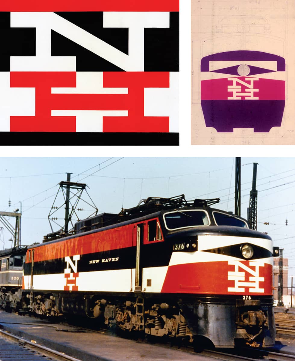
NEW YORK, NEW HAVEN, AND HARTFORD RAILROAD / USA, 1954 / Herbert Matter / Images: Mark J. Frattasio Collection
The New School
Since its founding in 1919 as The New School for Social Research by a group of former Columbia University professors who felt limited in the kind of courses and teachings they could offer, this New York institution has served as an alternative to higher education. Whether it was opening its doors to European intellectuals fleeing fascist regimes at the University in Exile, offering a broad range of continuing education evening classes for adults, or facing a student uprising as recently as 2008 that demanded, among other things, the resignation of its president, Bob Kerrey, The New School has consistently veered away from relative normalcy. Over the years, it has established eight major divisions, each with its own unique personality.
In 1997, the different schools came under the broad umbrella of New School University with an institutional logo by Chermayeff & Geismar › 156, but in 2005, after two years of studying the public’s perception, a bold new nomenclature and identity were introduced. “The New School” was how people already referred to the university, and this was adopted as its official name. Each school name was then woven in with this basic name—for example, Parsons School of Design is now Parsons The New School for Design. Tying together all the schools was a decidedly different identity created by brand agency Siegel+Gale, headed by creative director Howard Belk. A graffiti-inspired visual system, referencing the school’s urban context, provides a flexible reference point that allows the logo to change and feel as active as its faculty and student body. And as New York City has grown increasingly graffiti-less since the late 1980s, The New School stands out in this newly sanitized environment.
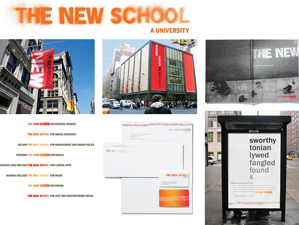
NEW SCHOOL IDENTITY AND APPLICATIONS / Siegel+Gale: executive creative direction, Howard Belk; creative direction, Young Kim; design, Lloyd Blander / USA, 2005
MTV
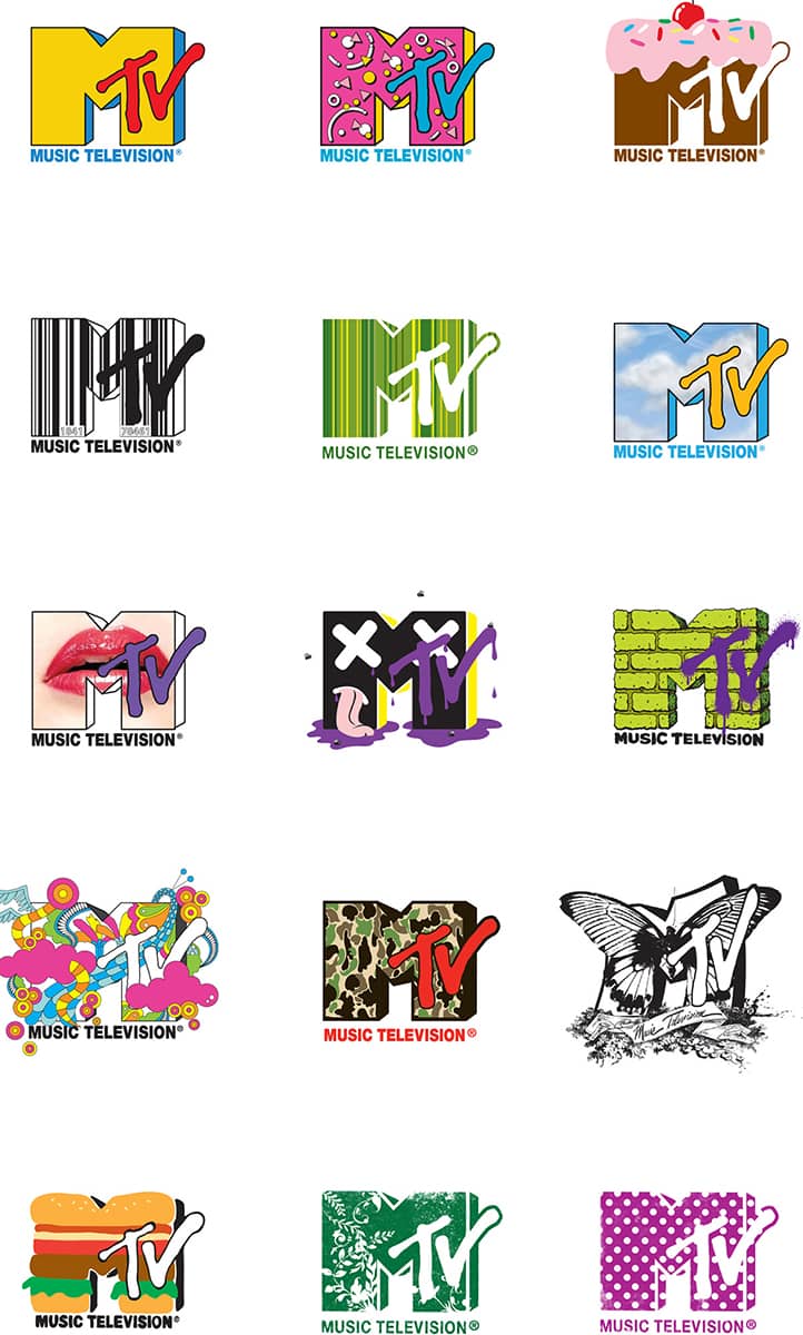
Working with John Lack, the executive vice president of Warner Satellite Entertainment Company (WASEC), Robert Pittman, a successful radio programmer, helped establish a groundbreaking cable television channel: MTV, the music channel. Fred Seibert, a former jazz record producer and radio station promotion coordinator, was hired by Pittman to oversee the identity of the channel. Seibert turned to his lifelong friend Frank Olinsky, who had just established Manhattan Design with two partners, Pat Gorman and Patty Rogoff, to create the logo. The process was remarkably collaborative: Rogoff first drew the big M and worked with Gorman to determine its perspective; then Gorman suggested a pointy TV to its side, which Olinsky took and spray-painted it. Meanwhile, the M was subjected to productive tomfoolery, with the partners rendering it in bricks, polka dots, and zebra stripes, and suggesting the logo could be all these things.
Seibert presented the mutating logo to Pittman and Lack, and met resistance to both the solution and the firm behind it. Seibert was asked to hire a big-name designer like Push Pin Studios › 168 or Lou Dorfsman ›173 to do the logo. He did, but as the process extended and time became a problem, Manhattan Design’s was approved. Seibert next focused on the station identifications for broadcast, which Pittman equaled to radio jingles, instantly recognizable and memorable. The first pool of collaborators comprised production houses like Broadcast Arts, Colossal Pictures, and Perpetual Motion Pictures, who created surreal ten-second animations that gave life to the MTV logo. For MTV’s top-of-the-hour identification, illustrator Candy Kugel at Perpetual took the still images of Neil Armstrong’s moon landing (available in the public domain) and colorized the MTV logo on top of the American flag. On August 1, 1981, at 12:01 a.m., to the unmistakable sound of MTV’s guitar riff, this image launched a new generation of viewers, artists, designers, and citizens.
(RED)
In January 2006, Bono, the lead singer of U2, and Bobby Shriver, a philanthropist-cum-producer-cum–city councilmember, launched (RED), a new business model, to help raise awareness about the AIDS epidemic in Africa and to provide a sustainable flow of money for the Global Fund, the international financing organization that invests the money it receives to fight AIDS, tuberculosis, and malaria. (RED) partners with some of the most visible brands that license the (PRODUCT) RED brand to market specific products or services, with a percentage or a set amount of the profits going to the Global Fund. Apple has released (RED) editions of its iPod Nano and iPod Shuffle, Converse has launched a collection of Chuck Taylor All-Star shoes made from canvas sourced in Africa, and the Gap has created a (RED) collection of T-shirts and accessories. Marrying together all the products and services is a simple visual device created by Wolff Olins › 206.
For the main brand—the name was selected because red is the color of emergency, which certainly applies to AIDS—RED is rendered in a sans serif typeset within parentheses. For the license brand, (PRODUCT) RED, the logo of the partner is placed within the parentheses and RED becomes a superscript; the combination is meant to be read as, for example, “Apple to the power of RED.” The simplicity of the identity barely hints at the complexity of Wolff Olins’s task: finding a way to create a new, strong brand for (RED) that could be integrated with some of the best-guarded and most carefully developed brands, turning untouchable assets like Starbucks green and American Express blue to red. While consumerism and philanthropy still remain an oxymoron, (RED) demonstrates, through action and design, a possible blueprint for their convergence. . .well, a (RED) print for their convergence.
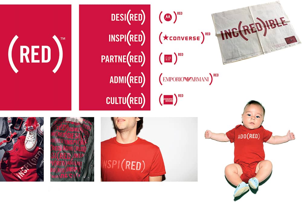
(RED) IDENTITY / Wolff Olins / USA, 2006
Walker Art Center
From 1965 to 1995, the Minneapolis Walker Art Center had employed a series of sans serif typefaces— Univers›372, Helvetica ›373, Franklin Gothic › 370, and DIN › 377 —as its logo, and its overall identity displayed, as design writer Peter Hall once described it, an “unwavering adherence to the clinical International Style.” In 1990, Laurie Haycock Makela joined the Walker as design director, replacing Mildred Friedman, who had held the position for 20 years, and in 1995 she introduced a remarkably different, and distinct, identity based on a new type family, Walker. Designed by Matthew Carter in collaboration with Haycock and her team, Walker is, at its barest, a sans serif just like its predecessors, but the full typographic system provides a kit of parts that can render innumerable permutations: Five styles of “snap-on” serifs can be attached to each character and selectively added to the top or bottom, left or right, or all. It also included variants for heavy rules at the top, bottom, or both; a range of connectors to create custom ligatures; and, to top it all off, italic versions of each variant. Taking the place of a typical logo, the Walker typeface unifies all the materials of the museum and gives it a highly individual identity. It also established the Walker Art Center’s in-house design studio as one of the most innovative.

PREVIOUS WALKER ART CENTER LOGOS / USA, 1965-1990

THE SPACE BETWEEN THE LETTERS, Moira Cullen for Eye magazine reprint / Laurie Haycock Makela, Deborah Littlejohn / USA, 1995
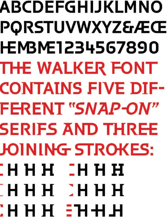
WALKER TYPEFACE / Matthew Carter / USA, 1995
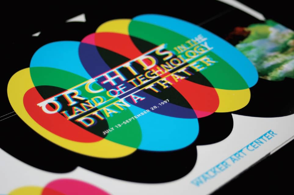
DIANA THATER EXHIBIT INVITATION / Matt Eller / USA, 1997
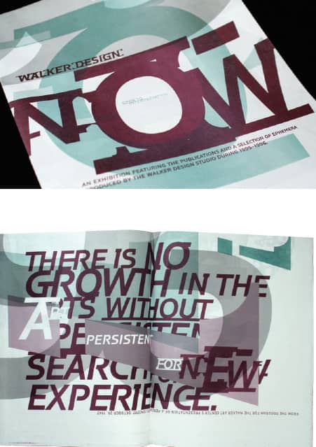
WALKER DESIGN NOW INVITATION / Laurie Haycock Makela / USA, 1996
In 1998, design educator and writer Andrew Blauvelt took on the role of design director and further developed the design studio and its output, overseeing the revitalization of the museum’s identity in preparation for its momentous expansion in 2005. Still foregoing an institutional logo and looking to extend the viability of its previous approach, Blauvelt and designer Chad Kloepfer designed Walker Expanded, an expansive range of vertical striping rendered in different patterns and motifs, with bright colors that hold a series of words that, together and only when applied, form the identity. Set mostly in Avenir with select words rendered in Carter’s Walker, the system is again typographic, but instead of being built around styles like italic or bold, it is arranged around groups of words and patterns and motifs. So, for example, the Peer-to-Peer “weight” includes language from within the institution, like Film/Video, a department name, while the Public Address “weight” contains more typical language, like movies. The system is complex, and it requires conscious manipulation from the designers—who benefit from a font developed by Eric Olson, who runs Process Type Foundry in Minneapolis and is a former designer at the Walker’s design studio, that makes the combination of words and patterns more easily accessible. Instead of simply replacing it, Walker Expanded builds on the legacy and innovation of its former flexible identity and creates a new language—literally, visually, and metaphorically.
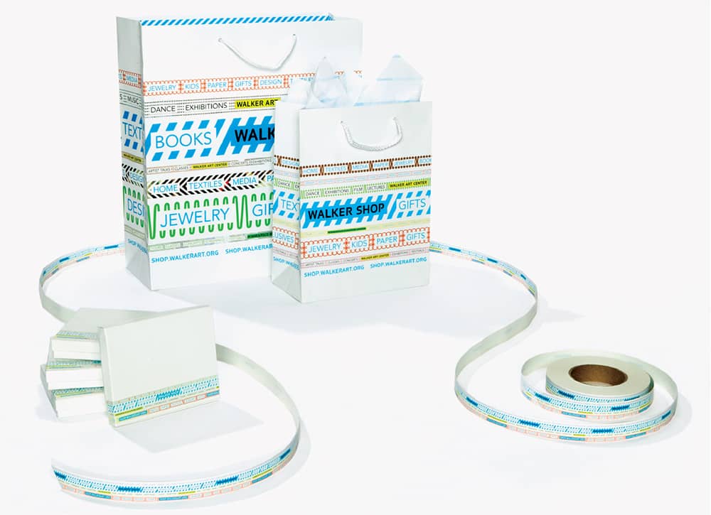
SHOPPING BAGS, BOXES, AND TAPE / Andrew Blauvelt, Chad Kloepfer / USA, 2005
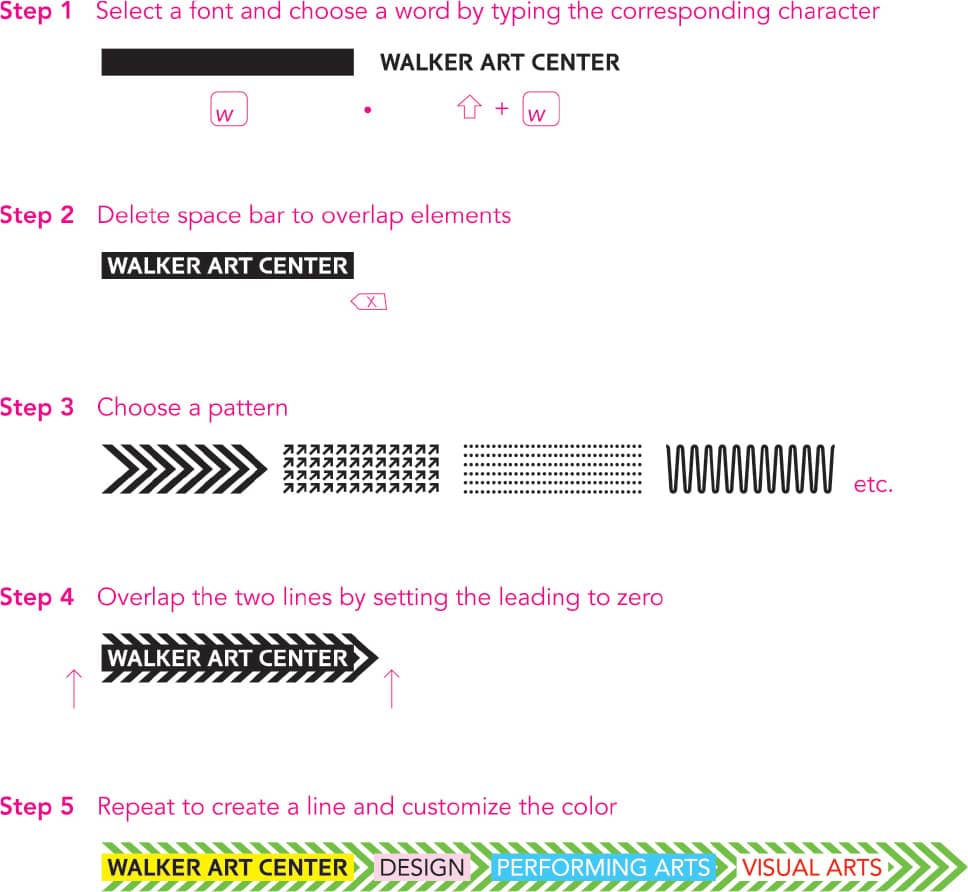
CUSTOM FONT USAGE INSTRUCTIONS / Andrew Blauvelt, Chad Kloepfer, Eric Olson / USA, 2005
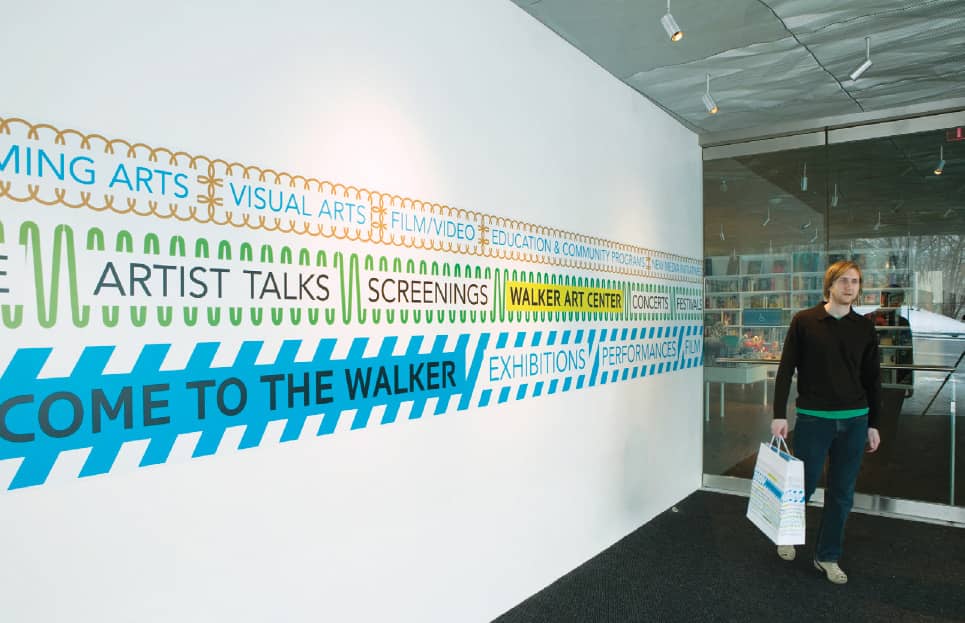
WALL GRAPHICS / Andrew Blauvelt, Chad Kloepfer / USA, 2005
Summer Olympic Games
Every four years, the world is captivated by the Summer Olympic Games. For athletes, the Olympics are the pinnacle of their dreams and aspirations; for the media, they are an endless source of stories of courage. Sponsors thrill to the sight of their logo emblazoned on billboards and skintight uniforms, and graphic designers delight in the visual revelry of the Games’ graphic identity. While many of these comprehensive and extensive programs are remarkable, three of them are continually referenced as the most memorable, and one of them as the most controversial.
The heated social and political climate in Mexico City in 1968 was palpable as the world focused on the entangled country, with a student protest that ended in tragic bloodshed almost canceling the Games. But soon after, Mexico was clad in the colorful and exuberant regalia of the identity program designed by Lance Wyman (USA), Peter Murdoch (UK), and architect Eduardo Terrazas (Mexico) under the leadership of Pedro Ramírez Vásquez, chairman of the Organizing Committee, which provided a joyful and needed contrast to the events leading up to the Games. Wyman devised the logo by combining the iconography from Mexico’s indigenous civilizations with Op Art, resulting in a vibrant deployment of concentric circles and lines with the number 68 as its hinge—and he was responsible for the development of most of the program, working actively with Mexican designers and design students. The identity was also designed as a system that could be molded in many ways—sometimes literally by Mexican craftsmen, who produced everything from pinwheels to jewelry, encouraging the citizens to embrace the identity as a representation of their visual culture.
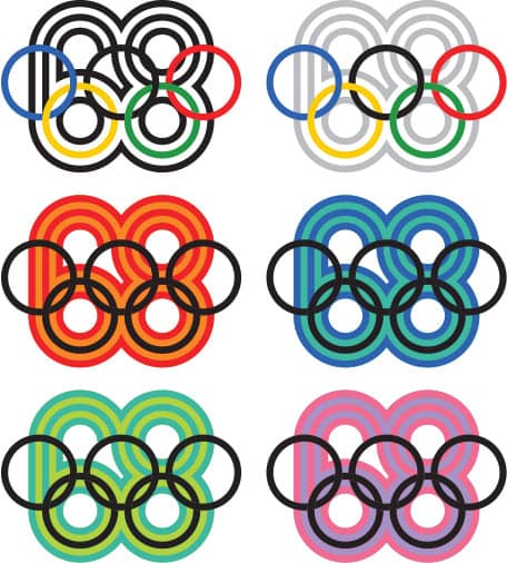
IDENTITY
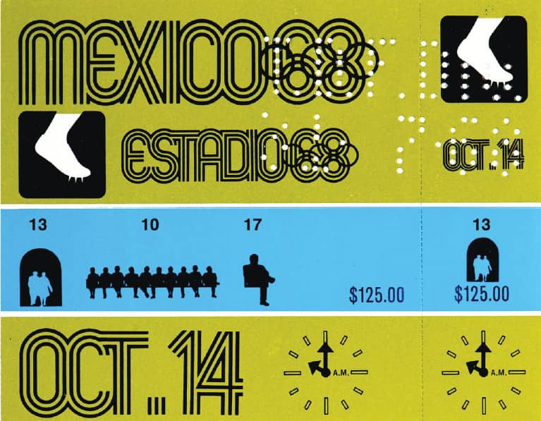
EVENT TICKETS / Beatrice Colle
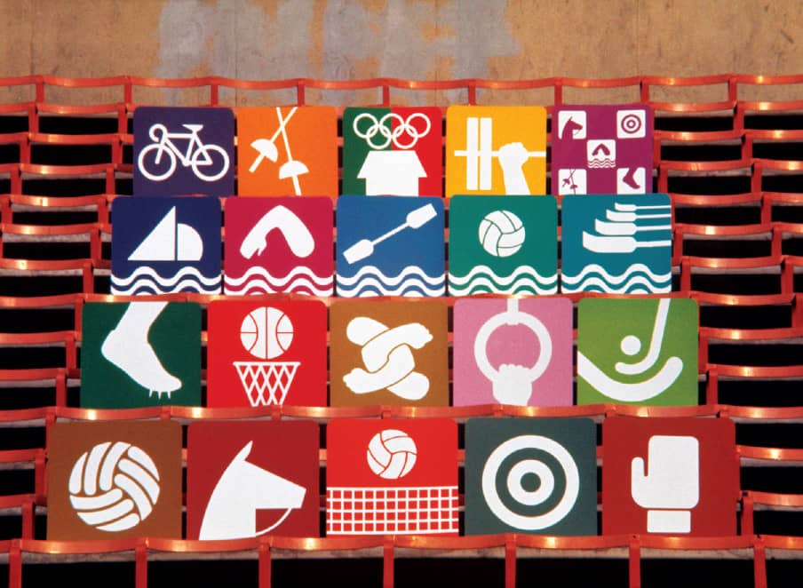
PICTOGRAMS / Eduardo Terrazas, Universidad Iberoamericana students
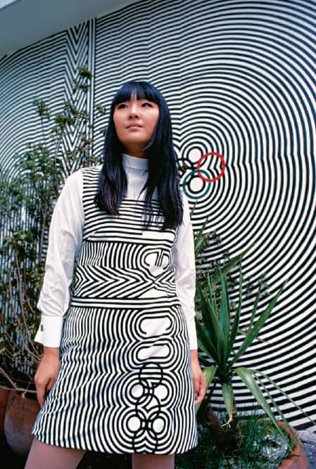
UNIFORM / Julia Johnson Marshall
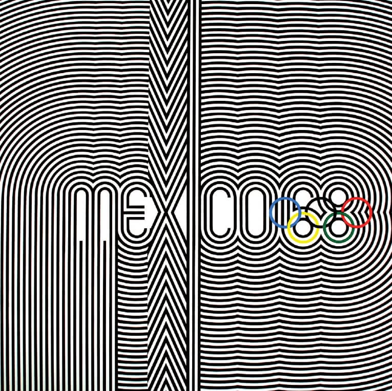
POSTER / art direction; Eduardo Terrazas, Pedro Ramirez Vásquez
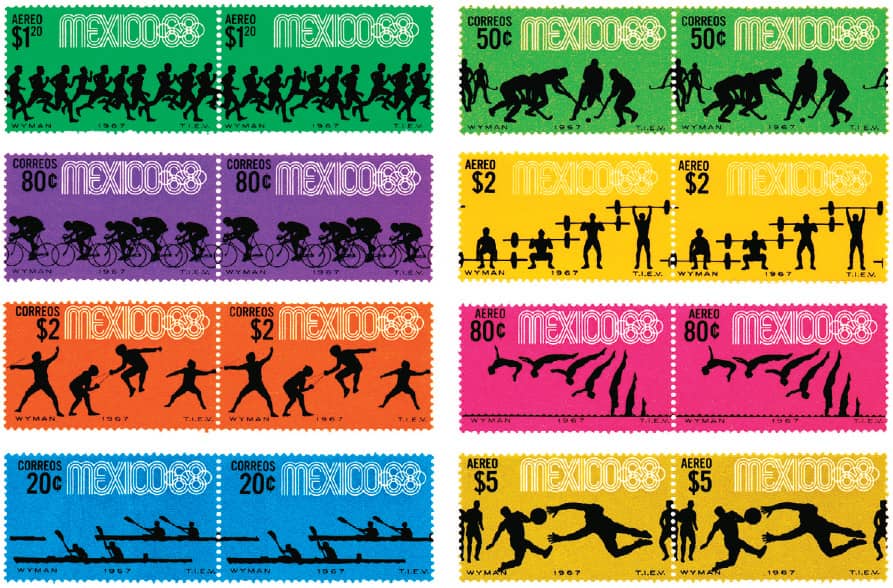
POSTAGE STAMPS
MEXICO 1968 / Lance Wyman / Mexico, 1968
In 1966, at the same time Wyman was awarded the project, Otl Aicher › 166 received the commission from the National Olympic Committee (NOC) for the 1972 Games in Munich. Although they were marred by the terrorist activity that claimed the lives of 11 Israeli athletes, the Munich Games presented the opportunity to show a different Germany from the one experienced in the 1936 Berlin Games under Adolf Hitler. Aicher and his team developed a colorful identity that drew from the local Bavarian environment without crossing into pure folklore. The evocative imagery, focusing closely on the athletes, was paired with a solid grid system and the sole use of Univers ›372, which allowed flexibility and maintained consistency.
Developing the hypnotic emblem of the Games was not a smooth process: Aicher’s first design was an abstract radiant garland that the committee did not consider distinctive enough to copyright; his second design, based on the letter M, met the same reaction. The NOC then held an open competition, yielding 2,300 entries that did not fulfill their needs. Finally, a member of Aicher’s team, Coordt von Mannstein, merged the original garland with a spiral structure for the winning emblem, nearly a year after the first version had been presented. Aicher and his team also developed a cohesive set of nearly 180 pictograms for sporting events as well as services through a strict orthogonal and diagonal square grid, where all visual elements were arranged at 90 and 45 degrees. The sum of all the work was a precise and structured identity with just the right amount of warmth—succinctly embodied, perhaps, in Waldi, the geometric dachshund you could not resist petting.

ATHLETICS AND GYMNASTICS REGULATIONS BOOKLET

OFFICIAL GUIDE TO THE GAMES OF THE XXTH OLYMPIAD MÜNCHEN 1972
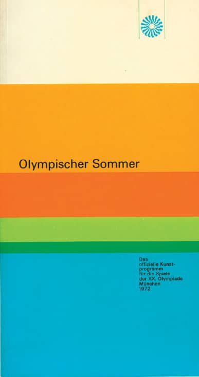
OLYMPIC SUMMER, CULTURAL EVENTS PROGRAM
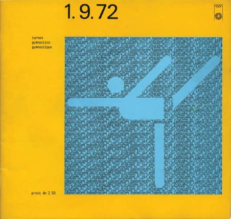
Above and Right GYMNASTICS AND SHOOTING DAILY PROGRAMS
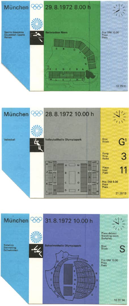
EVENT TICKETS
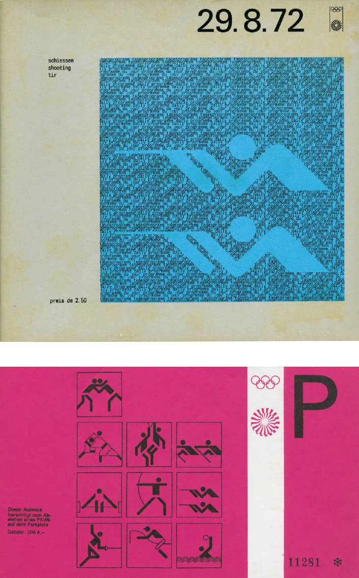
PARKING STUB
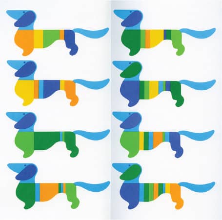
WALDI, THE OFFICIAL MASCOT, IN DIFFERENT COLOR CONFIGURATIONS
MUNICH1972 / Otl Aicher / Germany, 1966-1972 / Images: Courtesy of Joe Miller
After the dim financial results of the 1976 Games in Montreal and the lowest country attendance at the 1980 Moscow Games since 1956, Los Angeles faced little to no competition in winning the Olympic bid; only New York challenged for the American candidacy, and in the next phase, Tehran dropped out voluntarily. With no public funding, the Organizing Committee relied on existing sports facilities and makeshift Olympic Villages at universities across Los Angeles and Southern California. Bringing together approximately 130 venues was the task of the Jerde Partnership, led by architect Jon Jerde, who collaborated with the environmental design firm Sussman/Prejza, led by Deborah Sussman. When the committee agreed to step away from a red/white/blue design approach, Jerde and Sussman developed an architectural and graphic kit of parts where a series of scaffolding structures, freestanding columns, arches, and banners was emblazoned with a cornucopia of stars, stripes, geometric shapes, and even a confetti pattern rendered in unexpected combinations of magenta, red, yellow, and aqua. The final look, dubbed “Festive Federalism,” succeeded in establishing an Olympics presence where none existed; when it was dismantled, no dreaded white elephants remained.
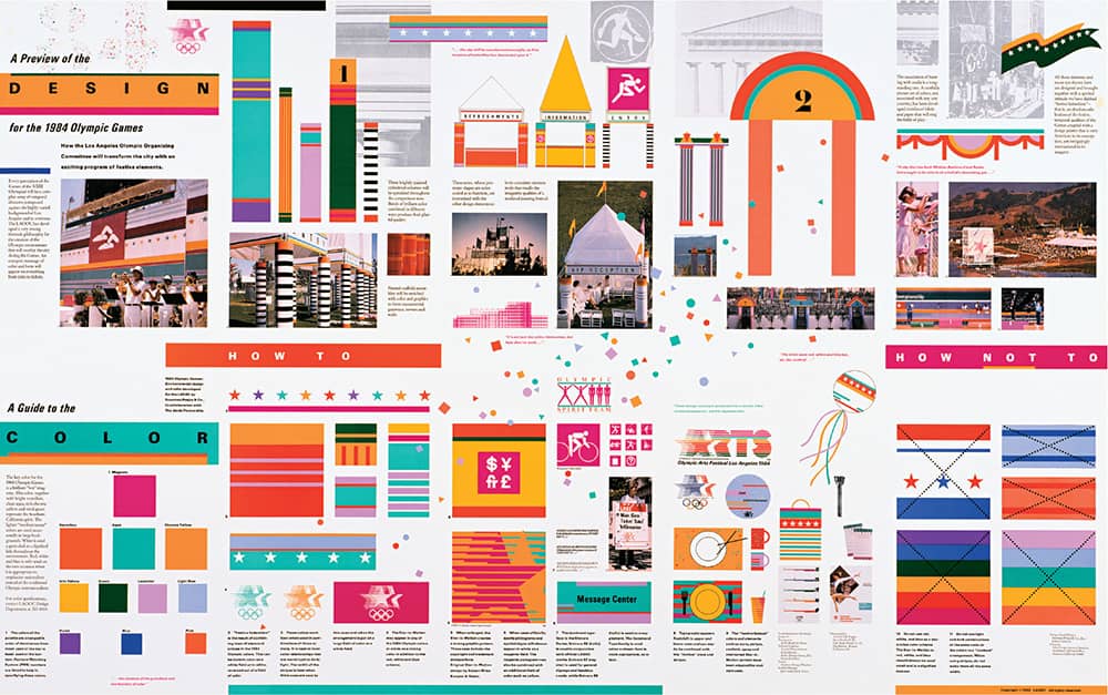
KIT OF PARTS
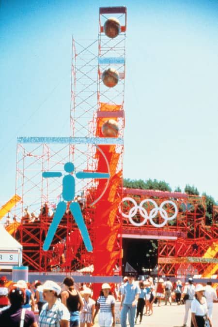
Above and Below ENVIRONMENTAL AND BRANDING APPLICATIONS

LOS ANGELES 1984 / Sussman/Prejza & Company, Inc.: Deborah Sussman; The Jerde Partnership / USA, 1984
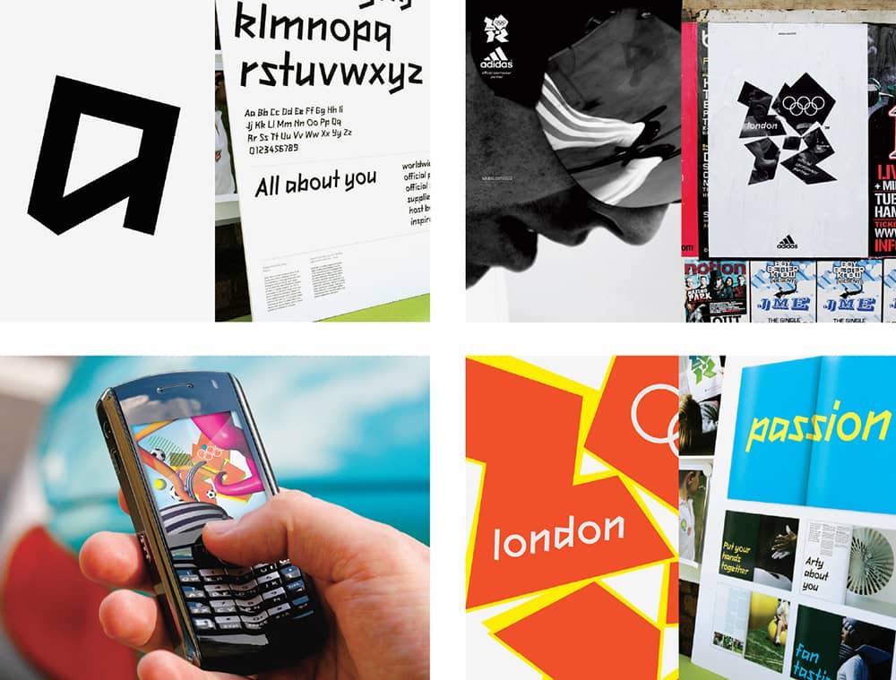
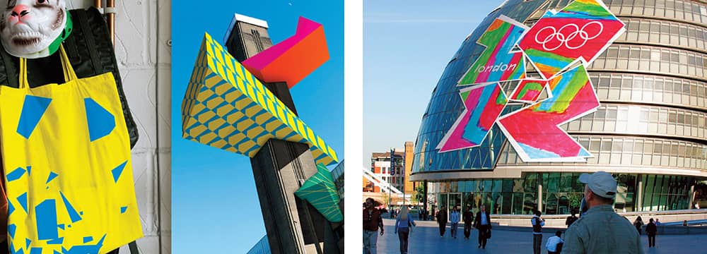
In contrast to these examples, the identity for the Games that won’t take place until 2012 has already cemented its place as one of the most memorable—and not for the right reasons—five years before it takes the world stage. Unveiled with momentous fanfare in June 2007 by Sebastian Coe, head of the Organizing Committee, the jagged, morphing, almost fluorescent logo met global distaste. News anchors mocked it on air, newspapers ran demeaning editorials where children could submit their own (theoretically superior) logos, and an online petition to revoke the logo gathered 48,616 signatures in 48 hours. It was designed by Wolff Olins ›206 in London, which describes the identity as “unconventionally bold, deliberately spirited and unexpectedly dissonant, echoing London’s qualities of a modern, edgy city.” The 2012 emblem is devised as a shape that can be filled with imagery and, in turn, meaning for everyone; it uses a kinetic visual language—so much that a launch video had to be removed from the website because some people claimed it was inducing seizures—that prepares the identity for the most widely broadcast Olympics through television, the web, and mobile devices, targeting much more deliberately a new, younger generation of viewers. Wolff Olins’s work may be have been berated, but the potential to redefine the expectations of how Olympics identities should perform and adapt is undeniable.
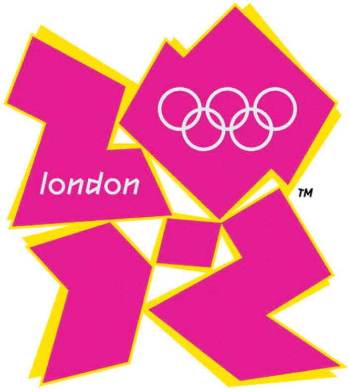
2012 SUMMER OLYMPIC GAMES LONDON IDENTITY / Wolff Olins / UK, 2007
OBAMA’08 PRESIDENTIAL CAMPAIGN
On Saturday, February 10, 2007, the junior senator from Illinois, Barack Obama, announced his candidacy for the presidency of the United States at the Old State Capitol building in his state’s capital city, Springfield. At the front of the podium and in the glove-covered hands of attendees in the form of placards, the Obama ’08 campaign logo was introduced. The glowing blue O with the red and white stripes of the flag swooping across it to form a horizon was unlike any other presidential campaign logo ever produced. This is neither hubris nor rhetoric: Until that point, campaign logos were always typographic solutions that clumsily attempted to integrate stars and flags. Obama ’08 was a simple icon that could stand by itself, no differently than successful consumer brands like Nike ›343, Target, and Apple. The logo was created by Sender LLC, a Chicago-based design firm headed by Sol Sender, who was approached by motion graphics firm mo/de, which in turn had been contracted by AKP&D Message and Media, the consulting firm of David Axelrod, top campaign advisor to Obama. With two weeks to develop options, Sender and his design team, Andy Keene and Amanda Gentry, created over a dozen logo options, gradually filtering the proposals to two or three viable options, with the O rising as the most successful.
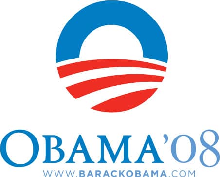
OBAMA ’08 LOGO IN TWO-COLOR VERSION / Sender LLC / USA, 2007

“O” LOGOMARK IN ONE-, TWO- AND FOUR-COLOR VERSIONS / Sender LLC / USA, 2007
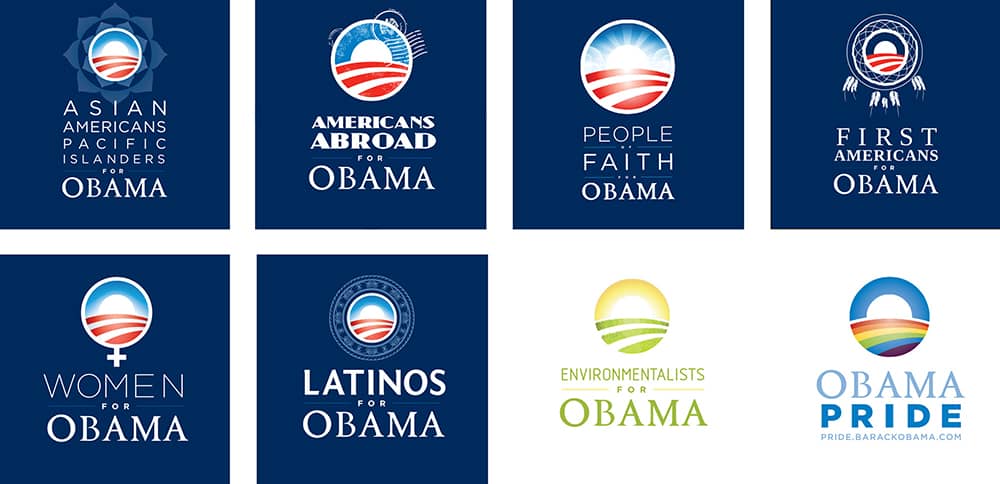
EIGHT OUT OF FOURTEEN LOGO APPLICATIONS FOR DIFFERENT SECTORS AND CULTURES OF THE POPULATION / Obama’ 08 Campaign / USA, 2008
Sender delivered the identity assets to the campaign with a set of standards and guidelines to ensure consistency, as different vendors had to manufacture numerous campaign artifacts. He never expected the permutations that made the campaign’s identity even more impressive. With John Slabyk as art director and Scott Thomas as director of new media, the campaign developed a broad and cohesive identity that exploited the simplicity of the logo. To reach and connect with different segments of the population, they adapted the logo in clever ways, whether it was replacing the flag with a lined sheet of paper for students or replacing the O with a colored rainbow for the lesbian, gay, bisexual, and transgender community.
In addition, a cadre of creatives began interpreting the image of Obama himself and what he stood for. The most notable was Shepard Fairey, whose self-published, three-color portrait of Obama featuring the word hope ignited the trend. The campaign later officially commissioned Fairey, as well as Lance Wyman, Jonathan Hoefler ›230, and Scott Hansen, among other artists, to create prints. The logo, meanwhile, at a grassroots level, took on the shape of cookies, muffins, chili dishes, and Halloween pumpkin carvings, generating a contagious creative aura. On Tuesday, November 4, 2008, Barack Obama was elected the 44th president of the United States of America.

CHANGE WE CAN BELIEVE IN POSTERS / Obama’08 Campaign / USA, 2008
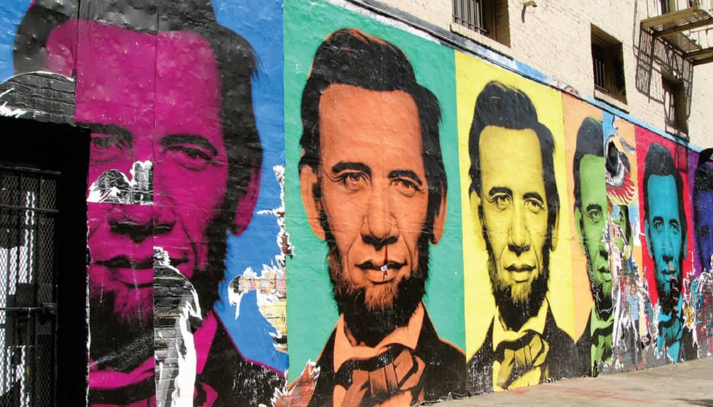
POSTERS BY RON ENGLISH IN SAN FRANCISCO / Photo: Flickr user Jef Poskanzer / USA, 2008
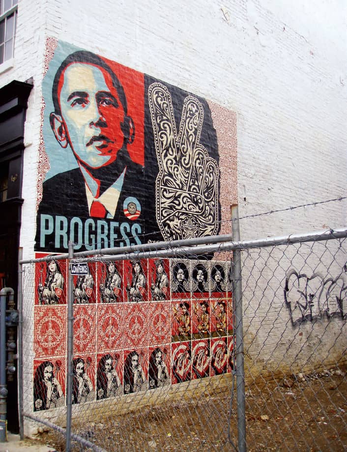
POSTERS BY SHEPARD FAIREY IN WASHINGTON, D.C. / Photo: Flickr user Daquella manera / USA, 2008
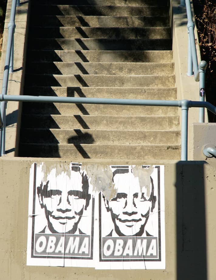
OBEY LOOK-ALIKE OBAMA POSTER / Photo: Flickr user Jef Poskanzer / USA, 2008
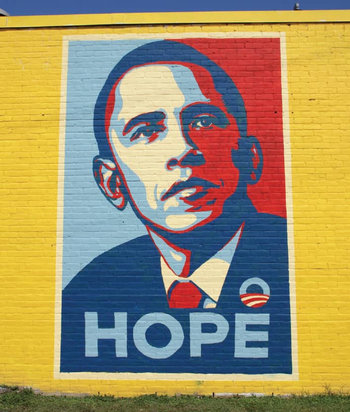
MURAL ON THE SIDE OF THE OBAMA ’08 CAMPAIGN HEADQUARTERS IN HOUSTON PAINTED BY AEROSOL WARFARE BASED ON DESIGN BY SHEPARD FAIREY / Photo: Flickr user jetherlot / USA, 2008
