Chris Bigg
Isle of Wight, England
In 1987, Chris Bigg joined Vaughan Oliver at 23 Envelope (later v23), where their work for 4AD Records, among others, has had a dramatic impact on graphic design. Bigg is perhaps best known for his expressive typography and calligraphy.
VAUGHAN OLIVER’S WORK for the seminal British record label 4AD had already garnered critical acclaim and the adulation of music fans by the time Bigg arrived. Chris was fresh from stints at Platform Design and music packaging specialist Stylorouge, and the influence of his sprawling calligraphy and intricate typographic detailing was felt immediately. Oliver has said of Bigg, “He produces this beautiful tangle, and I say, ‘Put that next to it. Take that out of it.’ I give it some space. He produces a lot of nervous energy. Conceptually, he’ll agree with something, then add some details that complement it and expand it.”9
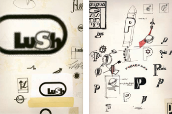
This tangle of ideas is nowhere more apparent than in Bigg’s sketchbooks. “I don’t do it as much as I used to,” he admits. “I used to sketch every day, when I was still discovering my visual identity. I could doodle with letters and typefaces for hours—I’d take an F and see how far it could go before it stopped being an F. I wanted to make the most beautiful F I had ever seen. When I sketch, there’s always a sense of automatic drawing, making shapes with letters, often not for any project in particular but just for the desire to surprise myself.”
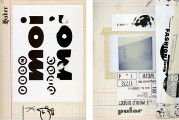
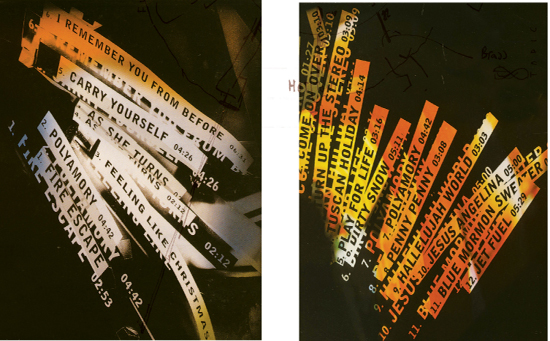
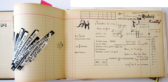
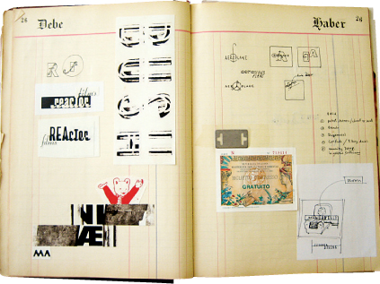
Bigg also appreciates his sketchbooks as historical documents. “I paste in my collection of found lettering—wine labels, tickets, and other typographic detritus,” he says. “Anything I can pull apart at a later date and make my own. I’ve always loved the way an incidental tear on the side of a cardboard box can inspire you, how a juxtaposition of elements you’d never have dreamed of putting together can become the basis of an entire campaign. The accidental juxta-position has always been an inspiration in all aspects of my design work, and sketching is a useful tool for imposing some sort of order onto the chaos.”
“I found four or five of these old Spanish accounting ledgers in a flea market in Barcelona; it took me a few years to fill them up.”
—Chris Bigg
Jacob Golden
Music Packaging
Rough Trade Records
“I ended up putting this sketchbook under the PMT camera, and it became the back cover for a record by Jacob Golden. I think it’s one of the nicest backs I’ve ever done, but it kind of got lost on a record that no one bought. Jacob came in—he was the strangest fellow, very sweet, looked a bit like the guy from Midnight Cowboy—and he said, ‘I’ve got this amazing idea for the back; you know the mixing desk, where they have the bits of tape all over it?’ and I thought, ‘Oh, bloody hell—we’ve seen that one before, haven’t we, Jacob?’ So I said I’d do an interpretation of that, and cut up all these photocopies and slapped it down, and he loved it. It’s quite interesting how someone can have a vision, and you can turn it around with a bit of artistic license. That’s what makes the job enjoyable: when you’ve got conviction in an idea and the client lets you go with it, and it works. Few and far between, those moments.”
—Chris Bigg
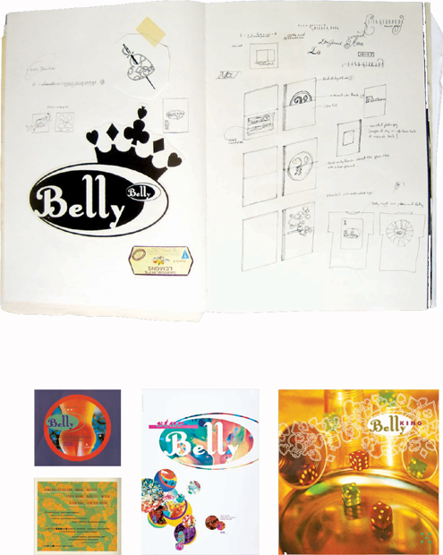
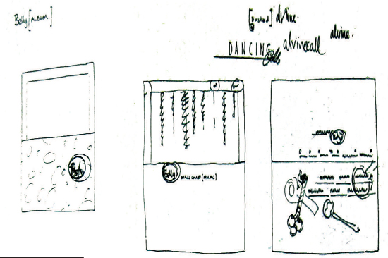
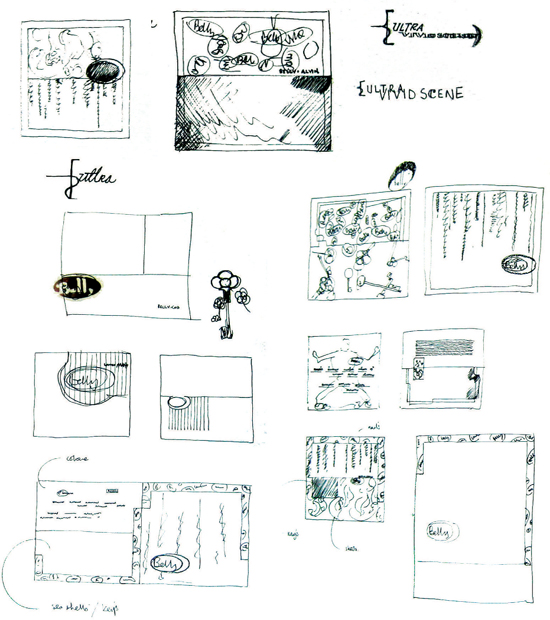
Belly
Music Packaging
4AD Records
“Belly’s drummer, Chris Gorman, was also a photographer, and he had sent a huge pile of images, not in one huge go, but a constant flow of bits and bobs. Normally, when you hear the drummer went to art college, you say, ‘Oh no,’ but this was one of the best relationships with a band I’ve ever had—a true collaboration. It wasn’t even art direction; my job was just to edit it and put it into some form of context. The band had given me a Holiday Inn logo as a reference, and many of Chris’s photos featured spades and tumbling dice, so the artwork began to take on this Las Vegas vibe. The album title King came up after the band saw my initial visuals.”
—Chris Bigg
“This was actually the first job I did on the computer—with some help, of course. Looking at it now, I wouldn’t tuck the title typography over the logo. The first record, Star, still feels fresh to me; I don’t think King is quite as strong. Star had almost accidentally become really big, so there was a lot of tension involved in the follow-up.”
—Chris Bigg
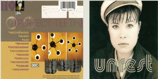
Unrest
Music Packaging
4AD Records
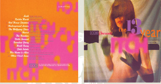
The 13 Year Itch
Music Packaging
4AD Records
“The Unrest record and the 13 Year Itch both happened about the same time. The 13 Year Itch was a series of concerts celebrating 4AD Records’ thirteenth anniversary. Even at the sketch stage, before we knew which image we were using, we felt that bringing a lot of different type-faces together could work and perhaps reflect all the different bands that would be playing. It’s interesting to see how it whittled down to just a few typefaces.
Because this wasn’t for one band who would have their own ideas and identity, there were no boundaries. Ivo Watts-Russell, the label head, had basically said, ‘Do what you want,’ so there was a real flurry of activity in the studio. The use of very bright colors was quite different to the other work we were doing at the time. Ivo had recently moved from London to Los Angeles, and he was always talking about how bright and colorful everything was over there; and that somehow translated into a brighter palette.
I shot the word itch on the PMT camera by reducing it really small and then blowing it up again through a dot screen. I was really proud of that; it was the first time I’d done that. I remember Ivo really liked the bulgy top of the C—that was a mistake, but he was really into it. He also came down to the studio one day and said, ‘You have to put shuffle on there somewhere. I don’t care where, just as long as it’s on there.’ I never really knew why.”
—Chris Bigg

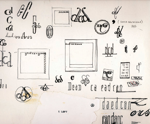
Dead Can Dance
2005 Tour Logo
“Dead Can Dance was the first project Vaughan handed over to me. They always had very strong ideas regarding typography and imagery, but after a number of projects I won their confidence and was able to introduce elements of my own.
I had always wanted to design a logo for them and had spent years presenting various sketches—with no success. This logo for their 2005 reunion tour is, I feel, quite an extreme solution, as the second d is laterally reversed.
The dragonfly wings I found in my garden. I was struggling for an image and had presented many landscapes and moods, to no avail. I was surprised at how well they scanned. I love the fine detail within each segment of the wing structure.”
—Chris Bigg
Art direction and design by Chris Bigg/v23 Artwork adapted by Coudal Partners Photograph by Bryan Bedell

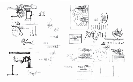
Miscellaneous sketches
“I have a quite chaotic and racing mind, and sketching helps me impose some order on my thoughts. I especially like to sketch in the morning, in that early, lucid period.”
—Chris Bigg