Rob O’Connor / Stylorouge
London
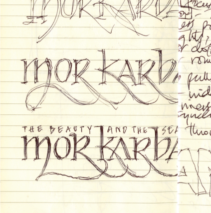
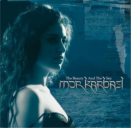
Mor Karbasi
Music Packaging
Mintaka Music
“Logo sketch for a London-based singer-songwriter of Moroccan/Persian Jewish parentage. It is florid but legible, with a hint of a Hebrew feel (she sings in Spanish and Ladino, an ancient Jewish language). The photography for the final sleeve is by me.”
—Rob O’Connor
If Stylorouge has been occasionally eclipsed over its 25+ years by more notorious music packaging firms and has never experienced the heady rush of sudden, explosive success, neither have they suffered a drop in commissions as tastes and trends have changed. This is in large part due to its intentional avoidance of a house style, preferring to place the individual needs of the artists first.
“I BELIEVE IT WAS JOHN GILL who said there’s never been a great design that couldn’t be verbally explained in a couple of sentences,” says Rob O’Connor. “This may be an exaggeration, but it highlights the need to be a good communicator—in any medium. The combination of describing and illustrating your thoughts in a cohesive and persuasive manner is the best way to instill confidence in a client.”
“Sketching is as cathartic as it is potentially creative,” he says, and acknowledges that beyond the sheer enjoyment of mark-making, his sketches are largely an extension of his meeting notes. “They’re my initial thoughts about a project. Even if I know at the time that they’re wrong, by getting them out in the open, I’m clearing space in my mind for other stuff that may be less obvious. I don’t think I doodle idly; I’m happier investigating possible solutions to a creative brief and objectively studying the outpourings later, and deciding whether they really work or not. The first time an idea makes it onto paper is a good initial test of how a final design may look, and this can sometimes be the most exciting stage of a project.”
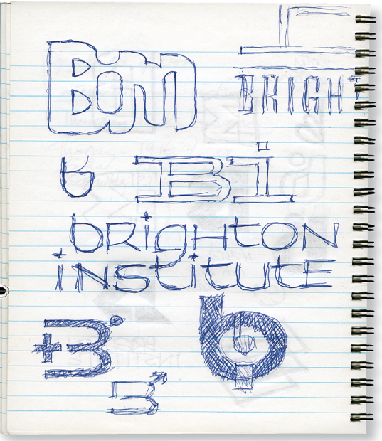
BIMM
Identity
British Institute of Modern Music
“These sketches were initial thoughts for a logo for BIMM, a contemporary music school originally based in Brighton. The client wanted to avoid clichés related to Brighton and its cultural and musical history. We started working mainly typographically, and I was trying to emulate from memory the cool corporate style of 1960s U.S. design, but the final design for what has now become the British Institute of Modern Music shows how we ended up veering toward the mod scene that is synonymous with the pop culture of Brighton.”
—Rob O’Connor
Having painstakingly created multilayered images out of “transparency sandwiches” in Stylorouge’s early years, O’Connor is no traditionalist pining for the hands-on days of rubber cement and drawing boards. However, “committing my thoughts to paper is an absolute necessity for me—my memory is possibly the most unreliable tool in my box,” he says. “But there are certain things that are best created on a computer. I do find, though, that being able to draw has been a huge benefit—and when it’s done in front of a client, that can be a winning party piece.”
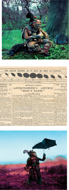
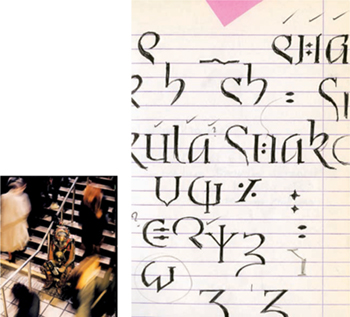
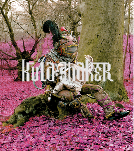
Kula Shaker
Music Packaging
Columbia Records
“Peasants, Pigs, and Astronauts was the second (and final) studio album by English psych-pop-rock act Kula Shaker before they split and then re-formed. Their interest in classic 1970s album art and late 1960s U.S. garage punk went hand in hand. The original brief for the album sleeve was to combine the sense of physical and metaphysical travel. Early ideas submitted to the band threw up a theme when we all enjoyed a historic woodcut illustration we found of ‘the ship of fools,’ an inhumane approach to exiling members of the community with psychiatric problems by casting them adrift on an arklike boat. This developed into the idea of a historic astral traveller—a character apparently from medieval history who had the ability to travel in space and time. (Yeah, I know. Personally, I was only under the influence of Harveys Bitter at the time.) The notebook shows the first sketch for a complete medieval/alien/astronaut font design that went almost to final art before the band had a change of heart.”
—Rob O’Connor
Photography by Jeff Cottenden. The guy in the astronaut suit is the esteemed author of this book.
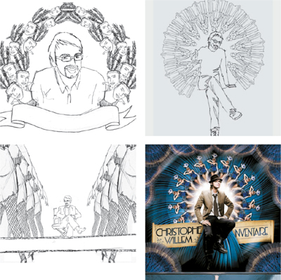
Christophe Willem
Music Packaging
Sony BMG Records
“Some of the initial sketches for a campaign to launch the recording career of Christophe Willem, winner of the French equivalent of American Idol. His marketing graduate status and his own penchant for camp and irony set him intellectually above the level of the great majority of pop wannabies, and we joined in the fun, helping him present himself as ‘Product of the Year.’
The album title changed to Inventaire but the image remained intact; the dressed-down, reluctant hero portrayed as the centerpiece of a pompous aristocratic seal made out of images of a showgirl. Even I can’t fathom how we arrived at the absurdity of the final image, but the album went to number one in France and we drank a small amount of champagne.”
—Rob O’Connor
Photography by Sandrine and Michael.
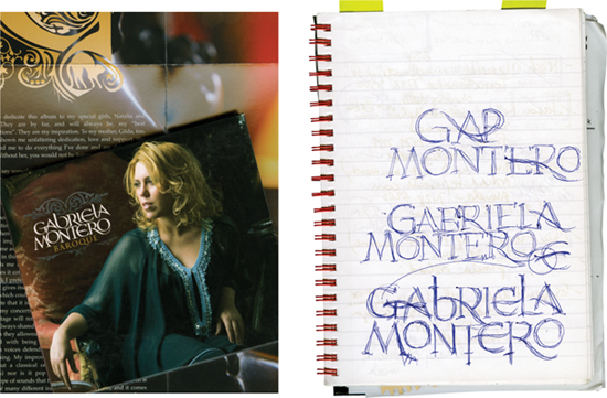
Gabriela Montero
Music Packaging
EMI Classics
“Gabriela Montero is a South American classical improvisational piano genius, signed to EMI Classics in the UK, for whom I wanted a hand-drawn logo—nothing fancy, just something with femininity and a touch of the latin and the baroque. The album is a collection of her let-loose creations based on the music of Scarlatti, Vivaldi, and so on. The sketch is a typical bit of doodling on the train home from London Bridge to Paddock Wood. The final logo art was drawn at Stylorouge by Anthony Lui.”
—Rob O’Connor
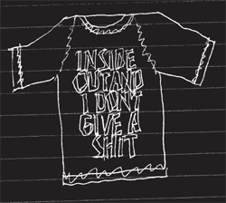
Miscellaneous sketches
“Various stuff, most of which wasn’t used.
Zone 2000 was a projected community youth festival in South London. Demon Music developed into the music company’s corporate ID.
Regarding the T-shirt-shaped stuff, well, ideas for T-shirt designs and slogans are constantly jotted down, as we do a couple of ranges each year.”
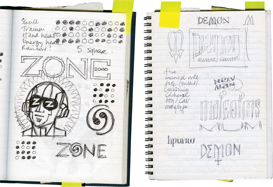
—Rob O’Connor
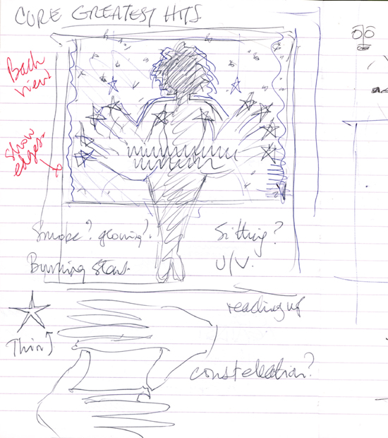
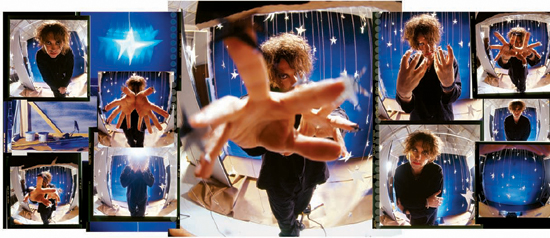
The Cure
Music Packaging
Elektra
“The Cure’s Robert Smith approached me with an idea for his greatest hits package, and immediately warming to the potential for a little lo-fi handmade eccentricity, I volunteered myself to take the photographs. I showed him nothing more than a couple of the worst-drawn sketches I’ve ever seen, let alone done, to make sure we were on the same page visually, and went about building a set that was part décor for a cheap nightclub and part juvenile nativity play. Final typography was by Andy Huckle for Stylorouge. The shots that were taken were reinvented as a one-off print in 2007 to be sold at a music business auction event in aid of the charity Cancer Research at London’s Abbey Road Studios. Both Robert and I signed the final print, but I think it was his signature that attracted the £1,000 bid.”
—Rob O’Connor