Jason Munn / The Small Stakes
Oakland, California
The Small Stakes has been producing nationally and internationally commissioned book covers, album packaging, and screen-printed posters since 2003. In addition to many well-known bands, Jason Munn’s clients include Random House, ReadyMade magazine, and Patagonia.
“I CAN’T JUST JUMP on the computer,” says Jason Munn. “Some people can, but I can’t start anything until I have somewhat of a plan.”
Munn’s studio in Oakland, California, has two desks—one with a computer, and one without. “Even though the computer’s only across the room, it helps not being right in front of it. Otherwise, every time I get an email, I have to look at it immediately, and I can definitely waste a lot of time on the Internet.
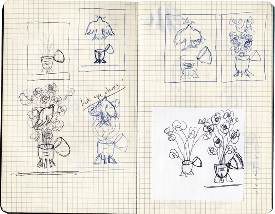
“Typically, I spend half my time sketching,” he says. “I’ll often start off with a list of word associations. My sketchbooks are kind of a mess in general; I keep everything in there, to-do lists, receipts, reminders for appointments, etc.”
Once he’s sketched an idea he likes, Munn tries it out in Illustrator to see if it works, often going back and forth between the computer and his sketchbook. If the idea shows promise, he moves onto tracing paper. “I’ll just keep working over it, tracing on top of the drawing. This is where I’m really figuring out the details.”
One area Munn rarely explores in his sketchbooks is typography. “I might sketch out where it’s going to go, but I play around with the fonts on the computer.” Despite his reliance on working out ideas on paper, he admits to occasionally trying to design on the screen. “Sometimes I will get lucky on the computer and see things I hadn’t seen in the initial thumbnailing. But in general, I’ll just sort of flail about and not really get anywhere. That’s just the reality of it.”
The Books
Posters
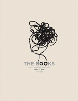
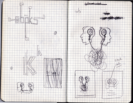
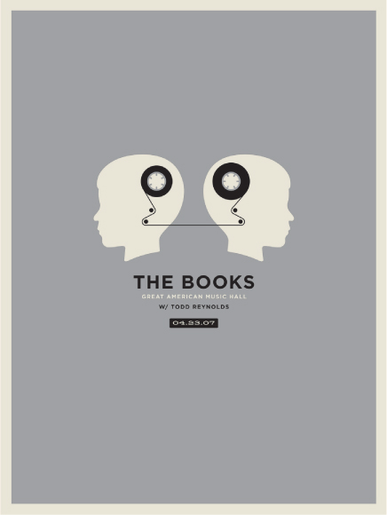
“The Books is two guys who play cello and guitar; they rummage through garage sales and thrift stores for old cassettes and answering machine tapes, and then they record their own music over it. It’s super, super intricate. I had done my first poster for them almost exactly one year before, and I had used an image of an unwound cassette, because my assumption was that the place where they recorded their music would be a huge mess, with old tapes piled all over the place. When it came to doing the second poster, I discovered they’re actually very precise about it; they have a whole process of naming and cataloging everything, so they can find it again.
I wanted to make the second poster similar, so they’d relate to each other, so I used the same silver and black palette, and I used cassette tape imagery again, although much more neatly this time.”
—Jason Munn
Ted Leo + Pharmacists
Poster
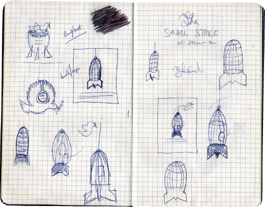
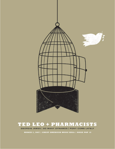
“Ted Leo is somewhat political and I wanted to reflect that, but I didn’t want to use, you know, fists in the air. I was thinking about how else I could use war imagery. I was playing with bombs and flowers, but everything started looking like vases. Then I realized the bomb could work as a birdcage. Occasionally it bothers me because I think it looks like a rocket, not a bomb.”
—Jason Munn
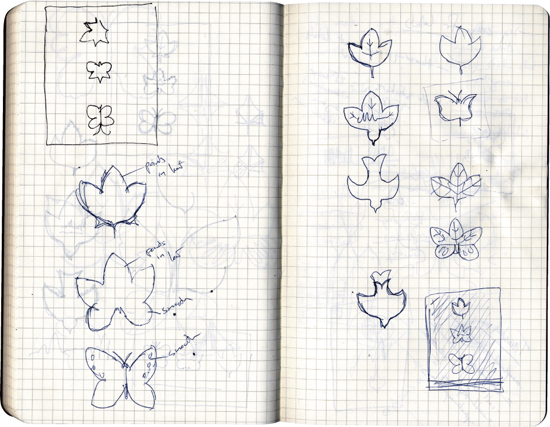
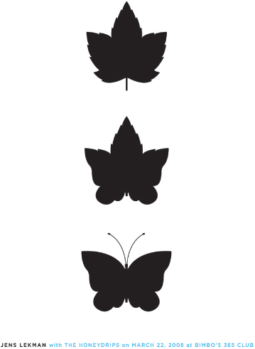
Jens Lekman
Poster
“I was inspired by one of Jens’ songs, called “Maple Leaves,” in which he’s talking to a girl, who says ‘We are all just make-believe,’ and he thinks she said ‘We are all just maple leaves.’ So I played with the idea of thinking one thing is actually another. I seem to use a lot of butterflies; maybe because they’re symmetrical.”
—Jason Munn
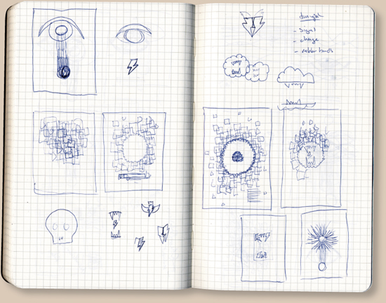
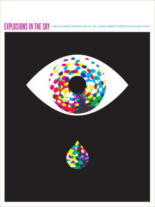
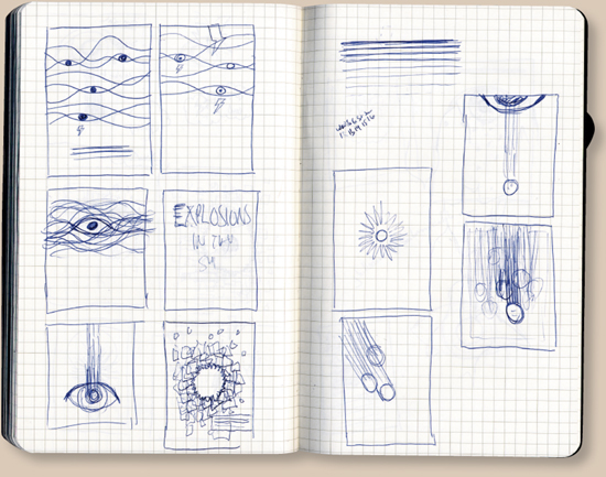
Explosions in the Sky
Poster
“This reminds me of an old science fiction book cover. I was thinking about the band’s name, and fireworks came to mind. I had tried a ton of sketches for this, with birds and lightning bolts, but nothing was working.”
—Jason Munn
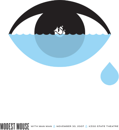
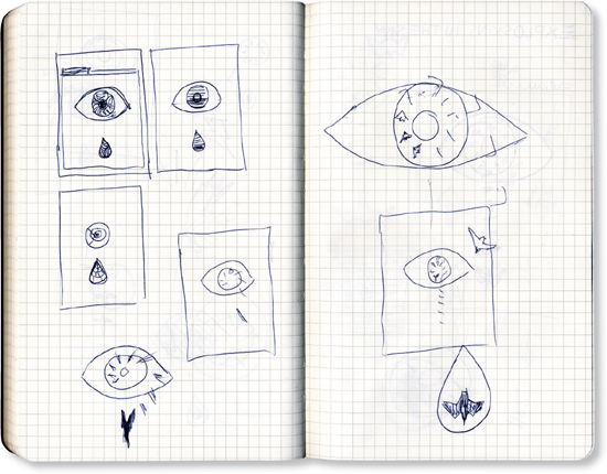
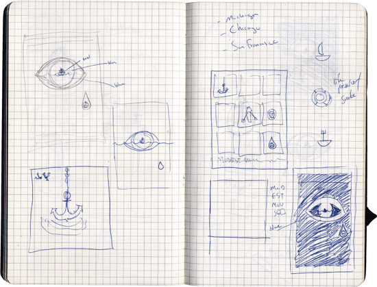
Modest Mouse
Poster
“The title of Modest Mouse’s most recent album was We Were Dead Before the Ship Even Sank, which obviously lent itself to the ship imagery. I brought back the eye image I’d used on the ‘Explosions in the Sky’ poster. I used to try to steer away from repeating myself, but now I really enjoy trying to create a visual language I can work with.”
—Jason Munn
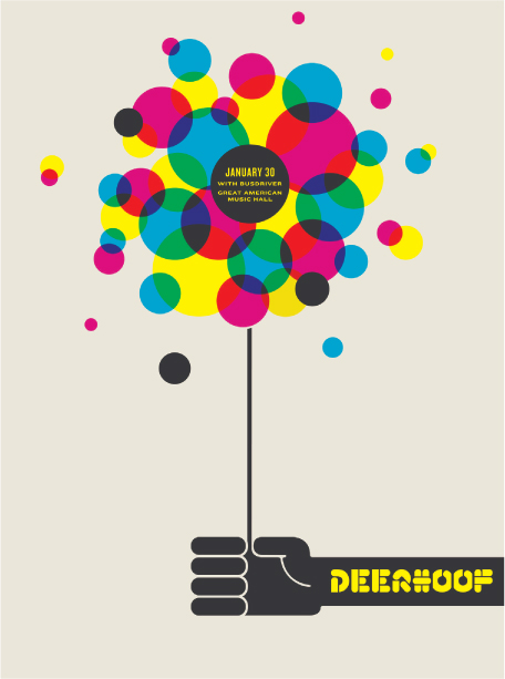
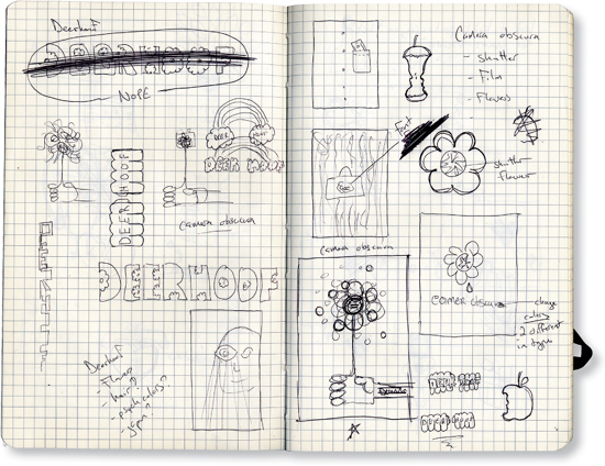
Deerhoof
Poster
“Deerhoof is kind of an abstract band, unconventional, and hard to classify. Sometimes I’ll have a hard time finding an image for bands like that, and eventually I’ll just say, ‘Oh, dots!’ They have a poppy kind of sound that just seems to want really bright colors.”
—Jason Munn