
Local Control Approach Using JMP
7.2 Some Traditional Analyses of Hypothetical Patient Registry Data.
7.3 The Four Phases of a Local Control Analysis
The local control approach to adjustment for treatment selection bias and confounding in observational studies is illustrated here using JMP because local control is best implemented and applied in highly visual ways. The local control approach is also unique because it hierarchically clusters patients in baseline covariate x-space; applies simple nested analysis of variance (ANOVA) models (treatment within cluster); and ends up being highly flexible, non-parametric, and robust. Although the local control approach is classical rather than Bayesian, its primary output is a full distribution of local treatment differences (LTDs) that contains all potential information relevant to patient differential responses to treatment. All concepts are illustrated using freely distributable data on 10,000 patients that were generated to be like those from a published cardiovascular registry containing 996 patients.
The key roles played by blocking and randomization in the statistical design of experiments are universally recognized. This chapter emphasizes that relatively simple variations on these same concepts can lead to powerful and robust analyzes of observational studies. Because adequate blocking and randomization usually is not (or cannot be) incorporated into the data collection phase of observational research, the two variations (local control and resampling) that we discuss here are both applied post hoc.
Since the work of Cochran (1965, 1968), many methods for analysis of observational data have stressed formation of subclasses, subgroups, or clusters of patients leading to treatment comparisons that summarize locally defined outcome averages and/or differences. Traditionally, local control is just another name for blocking. Here, the local control approach is characterized as being a dynamic process in which the number and size of patient clusters (subgroups) is not pre-specified. Rather, built-in sensitivity analyses are used first to identify and then to focus on only the most relevant patient comparisons. This strategy ends up reducing treatment selection bias and revealing the full distribution of local treatment differences (LTDs) (that is, it identifies any patterns of patient differential response).
At least since the work of Fisher (1925), randomization has consistently been placed at the top of the hierarchy of research principles. See Concato and colleagues (2000). After all, randomization of patients to treatment is essential in all situations where nothing is known about the patients except their treatment choice(s) and observed outcomes. Without randomization in this situation, there would be no reason to believe (or at least hope) that the treated and untreated groups were comparable before treatment and definitely no way to identify meaningful patient subgroups anddemonstrate that they are comparable in any way!
7.1.1 Fundamental Problems with Randomization in Human Studies
The main, practical problem with randomization of patients to treatment is that, due to ethical or pragmatic considerations, humans with acute conditions can be randomized at most one, single time. In other words, crossover designs are not possible. In theory, a single randomization can make a real difference. However, to get anywhere, one must then also be willing to make an almost endless litany of unverifiable assumptions about causal effects and counterfactual outcomes. See Holland (1986) on Rubin’s causal model.
By the way, rather than using old-fashioned, complete randomization (where balance is merely expected on long-range averages), it is now widely recognized that the only way to come anywhere close to assuring relatively good balance in a study featuring only one treatment randomization per patient is to use separate, dynamic randomizations within each block of patients who are most comparable at baseline (McEntegart, 2003). Still, patients do not like to be randomized and blinded to the treatment they receive. As a result, the treatment arms of most studies typically tend, due to differential patient dropout over time, toward becoming unbalanced on baseline x-characteristics of the patients who end up being evaluable.
For me, the bottom line is simply that randomization unquestionably yields powerful and robust inferences only when each experimental subject can be exposed (like animals in cages, plots in a field, or Fisher’s lady tasting tea) to a sequence of blinded challenges, ideally of variable length.
Example: Consider the following experiment on a collection (finite, nonrandom sample) of ancient coins of different designs and grades (amounts of circulation). Suppose each coin is to be treated by either being flipped in the usual way or else spun on edge on a hard flat surface, resulting in an observed outcome designated as either heads or tails. See Gelman and Nolan (2002) and Diaconis and colleagues (2007), especially Figure 7. How much information could randomization to treatment (flip vs. spin) add to this experiment under the stifling restriction that each coin is both treated and tested only one time? Due to such severe limitations on randomization in this experiment, nothing particularly interesting can be inferred about either the fairness of the coins or the effects of the treatments!
Situations where very little is known about the patients actually entering a study are rare. In fact, researchers frequently have such a good idea of which patient baseline characteristics are predictive of outcomes (and/or treatment choices) that they would not consider performing a serious (prospective or retrospective) study without first confirming that these key patient characteristics will be observed in each patient.
Here, we propose using a form of resampling (without replacement) in Section 7.3.3 to verify that an observed LTD distribution is salient. To avoid any possibility of bad luck in a single randomization of all patients to an exhaustive set of distinct subgroups, we certainly recommend accumulating results across multiple, independent resamples (default: 25 replications).
7.1.2 Fundamental Local Control Concepts
When performing a local control (LC) analysis, the more one knows about the most relevant pre-treatment characteristics of the patients, the better. This information is used to form blocks retrospectively. Blocks are potentially meaningful patient subgroups, which one might call empirically defined strata or subclasses (Cochran, 1965, 1968) or clusters. Because human subjects are notoriously heterogeneous in terms of their (baseline) x -characteristics, there really is little reason for optimism about reproducibility of findings when one cannot at least make treatment comparisonswithin subgroups of patients who really are very much alike.
Most importantly, a key feature of the LC approach is that one can indeed verify that the local subgroups one has formed reveal statistically meaningful differences, which are called salient treatment differences here. The basic LC terminology needed to establish the concept of salient differences is as follows.
Within any subgroup that contains both treated and untreated patients, the local treatment difference (LTD) is defined as the mean outcome for treated patient(s) minus the mean outcome for untreated patient(s). Because LTDs are calculated from mean outcomes, the local numbers of patients treated or untreated do not need to be balanced (that is, occur in a 1:1 ratio) for the LTD to be an unbiased estimate of the unknown, true local difference.
Any subgroup containing only treated patient(s) or only untreated patient(s) is said to be uninformative. The LTD for this subgroup is not estimable and is represented in JMP and SAS by the missing value symbol, a period.
When all N available patients are divided into K mutually exclusive and exhaustive subgroups (or clusters) of patient(s), each containing one or more patients (K£N), the corresponding LTD distribution consists of K values for the LTDs within the distinct subgroups, some of which may be missing values. The sufficient statistic for a given LTD distribution is assumed to be its empirical cumulative distribution function (CDF), where the height of the step at each observed, non-missing LDT value is (total number of patients in that subgroup) / (total number of patients within all informative subgroups). Because these steps can be of different heights, the CDF is described here as patient weighted. Because observed LTDs are heteroskedastic (due to variation in within-subgroup treatment fractions and to local heteroskedasticity in outcomes as well as to variation in subgroup sizes), several alternative weightings for CDFs could also be considered.
A useful rule of thumb is that K £ (N/11), so that the overall average number of patients per subgroup is at least 11. While smaller subgroups tend to be more local, they also tend to become uninformative about their LTD, thereby wastefully discarding information and increasing overall uncertainty.
In the LC approach, the CDF for an observed LTD distribution resulting from K subgroups of well-matched patients is compared with the CDF for the corresponding artificial LTD distribution, defined as follows. An artificial LTD distribution results fromrandomly assigning the N observed patient outcomes to K subgroups of the same size and with the same fractions of treated and untreated patients as the K observed subgroups. The precision of the overall, artificial LTD CDF is typically deliberately increased by merging several complete replications (typically 25) of independent, random assignments of N patients to K clusters. In particular, note that patient x -characteristics are deliberately ignored when forming artificial LTD distributions; specifically, only the observed patient-level y -outcomes and their observed t -treatment assignments are used to estimate an LTD distribution. The artificial replicates can then be merged (averaged) or maximum and minimum values can be calculated at individual y -values.
When the CDF for an observed LTD distribution is trulydifferent (in a possibly subtle way) from its corresponding artificial CDF, the observed LTD distribution is said to be salient. After all, like the overall comparison of all treated patients with all untreated patients in the full data set, treatment comparisons based upon randomly defined subgroups are biased whenever differential treatment selection or other confounding (x -characteristic imbalance) information is present. In sharp contrast, the observed LTDs formed within subgroups of truly comparable patientsare unbiased.
When the empirical distributions of biased and unbiased estimates are not distinguishable from each other, the unbiased estimates are certainly not clearly superior to the biased estimates! Once the CDFs for the observed and artificial LTD distributions are seen to be trulydifferent, the logical explanation is that the observed LTD distribution has been (at least partially) adjusted for treatment selection bias and confounding.
Similarly, the mean LTD value across the subgroups that constitute a salient LTD distribution is the corresponding adjusted main effect of treatment. Finally, the empirical CDF for a salient LTD distribution is assumed here to constitute an adjusted sufficient statistic for addressing questions about patient differential response to treatment as function(s) of their x -characteristics.
7.1.3 Statistical Methods Most Useful in Local Control
The LC concepts discussed and illustrated in this chapter rely heavily on cluster analysismethodology (see, for example, Kaufman and Rousseeuw [1990]) applied to the observed baseline x-characteristics of patients. Clustering is a form of unsupervised learning (Barlow, 1989); no information from the ultimate outcome variables (y) or treatment assignment indicators (t ) is used to guide (supervise) formation of patient clusters. While the bad news is that patient clustering is an extremely difficult (NP* hard) computational task, the good news is that several versatile and relatively fast (approximate) algorithms have been developed recently. For example, see Fraley and Raftery (2002) or Wegman and Luo (2002).
In the early phases of an LC analysis, the only statistical modeling and estimation tools needed are those of a simple nested ANOVA model with effects for clusters, for treatment within cluster, and for error in Table 7.1.
Table 7.1 Nested ANOVA Table with Effects for Treatment within Cluster
| Source | Degrees of Freedom | Interpretation |
| Clusters (Subgroups) | K = Number of Clusters | Cluster Means are Local Average Treatment Effects (LATEs) when Xs are Instrumental Variables (IVs) |
| Treatment within Cluster | I = Number of Informative Clusters £ K | Local Treatment Differences (LTDs) are of interest when X Variables either are or are not IVs. |
| Error | Number of Patients - K - I | Outcome Uncertainty and/or Model Lack of Fit |
In Sections 7.3.2 and 7.3.3, we will see that the LC focuses on new ways to analyze, visualize, and interpret nested treatment effects and their uncertainty.
While the LC approach to adjustment for selection bias and confounding clearly makes very good sense intuitively, it may be comforting to some readers to note that the basic strategy and tactics of LC are also fully compatible with the propensity scoring (PS) principles of Rosenbaum and Rubin (1983, 1984) as well as with the clustering-based instrumental variable (IV) approach of McClellan, McNeil, and Newhouse (1994). The appendix to this chapter discusses the common foundational aspects shared by both the PS and LC approaches.
7.1.4 Contents of the Remaining Sections of Chapter 7
Section 7.2 introduces the LSIM10K numerical example that will be used to illustrate LC analyses. Section 7.3 outlines the four basic phases of a local control analysis and then illustrates that LC can lead to deeper and more detailed insights than the traditional approaches described in Section 7.2. Finally, Section 7.4 provides some conclusions about LC as well as a brief, general discussion of the advantages and disadvantages of LC methodology relative to
• covariate adjustment using global multivariable models
• inverse probability weighting
• propensity score matching or subgrouping
• instrumental variable approaches
7.2 Some Traditional Analyses of Hypothetical Patient Registry Data
7.2.1 Introduction to the LSIM10K Data Set
We have tried to gain access to any of a number of relatively large and rich data sets that have recently been described and analyzed in high profile, published observational studies, typically using some form of covariate adjustment for treatment selection bias as well as confounding among predictors of outcome. Unfortunately, the owners of these data sets often refuse to share them publicly.
We ultimately decided to simulate a data set with a relatively large number of patients (10,325), yielding data that can be distributed on the CD that accompanies this publication. This simulated patient registry-like data will also be used to illustrate a wide assortment of alternative methodologies, like the traditional, global analyses outlined in Sections 7.2.2 through 7.2.4.
To make the simulated data at least somewhat realistic, the Linder Center data described and analyzed in Kereiakes and colleagues (2000) served as our simulation starting point. This study collected 6-month follow-up data on 996 patients who underwent an initial percutaneous coronary intervention (PCI or angioplasty) in 1997 and were treated with usual care alone or usual care plus a relatively expensive blood thinner (IIB/IIIA cascade blocker). We decided to simulate the same two-outcome y -variables (measures of treatment effectiveness and cost) and use the same basic variable correlations and patient clustering patterns observed among seven patient baseline x -characteristics (listed here) in the original data set. These patient characteristics apparently help quantify differences in disease severity and/or patient frailty between treatment groups. In any case, they proved to be predictive of outcome and/or treatment selection.
The LSIM10K.SAS7BDAT data set contains the values of 10 simulated variables for 10,325 hypothetical patients. To simplify analyses, the data contain no missing values. The 10 variables are defined as follows:
mort6mo
This binary, numeric variable characterizes 6-month mortality. It contains either 0, to indicate that the patient survived for 6 months, or 1, to indicate that the patient did not survive for 6 months.
cardcost
This variable contains the cumulative, cardiac-related charges, expressed in 1998 dollars, incurred within 6 months of the patient’s initial PCI. Reported costs are truncated by death for patients with mort6mo=1 .
trtm
This binary, numeric variable identifies treatment selection. It contains either 0, to indicate usual care alone, or 1, to indicate usual care augmented with a hypothetical blood thinner.
stent
This binary, numeric variable identifies coronary stent deployment. A value of 0 means that no stent was deployed, while a value of 1 means that a stent was deployed.
height
This numeric variable records the patient’s height rounded to the nearest centimeter. These integer values range from 133 to 197.
female
This binary, numeric variable equals 0 for male patients or 1 for female patients.
diabetic
This binary, numeric variable equals 0 for patients with no diagnosis of diabetes mellitus or 1 for patients with a diagnosis of diabetes mellitus.
acutemi
This binary, numeric variable equals 0 for patients who had not recently suffered an acute myocardial infarction or 1 for patients who had suffered an acute myocardial infarction within the previous 7 days.
ejfrac
This numeric variable records the patient’s left ejection fraction rounded to the nearest full percentage point. These integer values range from 18 to 77 percent.
ves1proc
This numeric variable records the number of vessels involved in the patient’s initial PCI. These integer values, ranging from 0 to 5, may be best viewed as six ordinal values. Here, we treat ves1proc as either a factor with 6 levels (5 degrees of freedom) or as continuous (1 degree of freedom when entering a model linearly).
7.2.2 Analyses of Mortality Rates and Costs Using Covariate Adjustment
The observed 6-month mortality rate among 4,679 treated patients in the LSIM10K data is 1.218%, while that among 5,646 untreated patients is 3.719%, which corresponds to a mortality risk ratio of more than 3:1 in favor of treatment. Equivalently, the risk percentage difference (treated minus untreated) of −2.501% is highly significant (t-statistic = −8.38, two-tailed p-value = 0.0000+).
A simple model appropriate for covariate adjustment (also called multivariable modeling) of 6-month mortality using the LSIM10K data would be logistic regression of the binary mortality indicator, mort6mo, on the binary trtm indicator plus all seven baseline patient characteristics (say, with height and ejfract entering linearly and model degrees of freedom = 12, not counting the intercept). The area under the receiver operating characteristic (ROC) curve is 0.7107 for this model, and it suffers no significant lack of fit. On the other hand, the R-squared statistic for this simple model is 0.0653, which is quite poor (low).
Most importantly, the implied predictions of 6-month mortality from this logistic model average 0.01218 for treated patients and 0.03720 for untreated patients, which are essentially the same as those previously observed, unadjusted results (differing only in the fifth decimal place). In other words, covariate adjustment essentially accomplishes nothing on average when outcomes are discrete.
When outcome measures are continuous, such as the 6-month cardiac-related cost variable (cardcost), covariance adjustment methods can be more interesting. For example, the mean costs in the LSIM10K data are $15,188 when untreated and $15,443 when treated; the t-statistic for the unadjusted difference in mean cost between treatment groups (+$255) is t = 1.24, with a p-value of 0.892. Using the simple linear covariate adjustment multivariable model with 12 degrees of freedom (R-squared = 0.0364), with right-hand-side structure identical to the logit model described previously, the least squares mean costs are $12,176 when untreated and $12,305 when treated. The t-statistic for the adjusted difference in mean cost (+$129) is t = 0.62, with a p-value of 0.538. Thus, covariate adjustment methods clearly can accomplish something when outcomes are continuous. However, smooth, global models offer little hope for making realistic adjustments for treatment selection bias and confounding. Typically, they provide only relatively poor fits to large data sets covering numerous, heterogeneous patient subpopulations.
A highly touted variation on these sorts of covariate adjustment modeling is known as inverse probability weighting (IPW). This approach typically uses simple logistic or linear regression models like the ones considered here, but each observed patient outcome is then weighted inversely proportional to the conditional probability that he/she would receive the observed choice of treatment given his/her baseline x -characteristics. These estimated conditional probabilities are called fitted propensity scores and the appropriate calculations and graphical displays are illustrated next, in Section 7.2.3. We will then use the propensity score estimates from Section 7.2.3 to illustrate the IPW approach in Section 7.2.4.
7.2.3 Analyses of Mortality Rates Using Estimated Propensity Score Deciles
The conditional probability that a patient will choose a specified treatment given his/her baseline x -characteristics is that patient’s true propensity score. The conditional probability of that patient choosing some other treatment is thus (1–PS). Propensity score estimates are typically generated by fitting a logit (or probit) model to binary indicators, trtm = 0 or 1, of observed choices for given patient baseline x –characteristics. Because all attention will ultimately be focused only on the resulting propensity score estimates (rather than on any p-values or other characteristics of the model), no penalties are assumed to result from overfitting. Thus, researchers typically fit nonparsimonious global models; here, we fit a full factorial-to-degree-two logit model in all seven available covariates. This model uses up 46 degrees of freedom, not counting the intercept.
The area under the ROC curve is 0.6993 for this model, and it suffers no significant lack of fit. On the other hand, the R-squared statistic for this model is 0.0867, which is again quite poor (low).
An essential feature of satisfactory propensity score estimates is that they behave, at least approximately, like unknown, true propensity scores. Specifically, conditioning upon (rounded) propensity score estimates should yield pairs of x -covariate distributions (treated vs. untreated) that are not significantly different. After all, conditioning upon true propensity scores would make all such pairs of subdistributions identical; see equation A.2 in the appendix. In other words, if patients are sorted by estimated propensity scores and divided into 10 ordered deciles (in the current context, 10 subgroups of size 1,032 or 1,033 patients each), then the pairs of within propensity score decile subdistributions (treated vs. untreated) for every x -covariate should be approximately the same. For example, Figure 7.1 shows (in the left panel) the relatively dissimilar marginal distributions of ejfract within the two treatment arms, which is due to treatment selection bias and confounding. On the other hand (in the right panel), we see the 10 pairs of relatively well-matched subdistributions of ejfract by treatment choice, which is due to subgrouping using estimated propensity score deciles. Again, in the left panel, note that the lower tail of the marginal ejfract distribution (that is, patients with the most severe impairment in circulation) tends to be dominated by treated patients. Meanwhile, within the 10th estimated propensity score decile (last pair of box plots in the right panel), note that the corresponding pair of conditional distributions for ejfract appears nearly identical.
Figure 7.1 Marginal and Within Propensity Score Decile Distributions of ejfract by Treatment
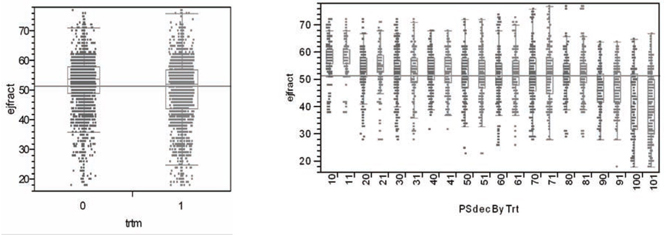
What may not be particularly clear from Figure 7.1 is that the treatment ratio is more than 3:1 (791 treated to 241 untreated) within the 10th estimated propensity score decile. In fact, the within propensity score decile treatment ratios are not very close to 1:1 here except in deciles 5, 6, and 7. See Figure 7.3. As a result, it is best to think of the objective of subgrouping via estimated propensity score deciles as being formation of valid blocks of patients. Within each block, the x -covariate distributions for treated and untreated patients need to be almost the same, yet the treatment fractions within each block may be quite different across blocks (deciles).
As well as examining these sorts of plots for each continuous x -covariate, researchers need to compare the corresponding 2 ´ L contingency tables for each discrete x -covariate (factor) with L levels. In other words, researchers need to verify that the patient deciles implied by their propensity score estimates do indeed constitute 10 validblocks of patients. This propensity score modeling/validation process can be somewhat tedious and time-consuming, at least when mismatches in x -covariate distributions don’t go away! Again, propensity score estimates are clearly inadequate and unrealistic when they cannot be verified to at least approximately behave like unknown, true propensity scores.
An even more elementary requirement of estimated propensity scores is that they do indeed predict the observed local fractions of patients actually treated, as demonstrated by the least squares regression fit in Figure 7.2. As a direct result, the observed numbers of treated and untreated patients are expected to vary by propensity score decile to reveal the familiar X-shaped pattern of Figure 7.3.
Figure 7.2 Estimated Within Decile Propensity Score Means vs. Observed Fractions of Patients Treated
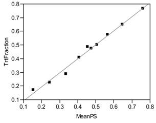
Local Fraction Treated = −0.0101 + 1.0223 * Mean Estimated Propensity Score within Decile
Figure 7.3 Numbers of Treated and Untreated Patients by Propensity Score Decile

Another fundamental concept that differentiates the propensity score (and local control) approaches from covariate adjustment (CA) and IPW modeling is that it can be best to simply ignore the data from certain patients. For example, if all the patients with the lowest propensity score estimates in the first decile of Figure 7.3 were untreated, then the data from these patients should be set aside. Similarly, if all the patients with the highest propensity score estimates in the 10th decile of Figure 7.3 were treated, then their data should also be set aside. A more technical explanation for these sorts of patient exclusions is discussed next.
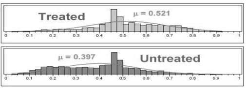
The distributions of propensity score estimates are portrayed in Figure 7.4 using histograms with 40 cells each. Only those patients within the common support of these two distributions are considered sufficiently comparable to be included in propensity score analyses. For the LSIM10K data, these two distributions luckily have essentially the same range, from 0.025 to 0.925. For pairs (treated vs. untreated) of distributions of propensity score estimates with different ranges, data from all patients falling outside of the maximum range supported by both distributions should be set aside. The propensity score deciles should then be formed using only the patients falling within this maximum supported range.
Figure 7.4 Detailed Histograms of Estimated Propensity Scores
The remaining steps in a propensity score decile analysis are
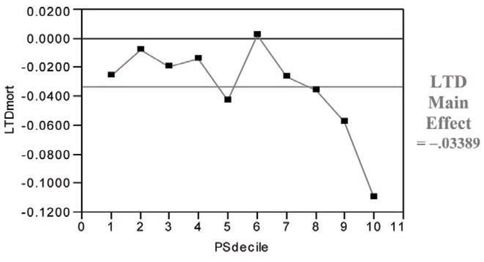
1. compute the LTDs within each decile and their variances
2. compute the LTD main effect = the average of within decile LTDs across deciles and its variance
3. compute the t-statistic and p-value for the test of significance of the LTD main effect
For the LSIM10K data, t = −2.95 and p = 0.026. Note in Figure 7.5 that the hypothetical treatment in the LSIM10K data tends to deliver its greatest, incremental mortality benefit to the patients in the ninth and 10th propensity score deciles (that is, those who are most likely to choose/receive it). In summary, compared with the covariate adjustment approach that used a global (“wrong”) model, the propensity score deciles approach yields a much larger (less biased) estimate for the main effect of treatment with somewhat lower (more realistic) precision.
Figure 7.5 LTDs for 6-Month Mortality (Treated minus Untreated) by Propensity Score Decile
7.2.4 Analyses of Mortality Rates and Costs Using Inverse Probability Weighting
The model appropriate for inverse probability weighting of 6-month mortality on the LSIM10K data would be a (weighted) logistic regression with the binary trtm indicator and all seven baseline patient characteristics as dependent variables (again, with height and ejfract entering linearly and model degrees of freedom = 12, not counting the intercept). Here, the IPW is proportional to 1/PS for treated patients or 1/(1-PS) for untreated patients. To give results comparable to those from the unweighted analyses of Section 7.2.2, the estimated weights need to be rescaled to sum to 10,325, which is the total number of patientsin the LSIM10K data. Without this rescaling, the weights here would sum to 20,796, which would yield a false increase in implied precision equivalent to assuming that the data are available for more than twice as many patients as actually are available!
The rescaled weights that sum to 10,325 range from 0.519 to 11.38 and are summarized in Figure 7.6. The mean weight for untreated patients is then 0.9114 (that is, less than one for the larger sample of 5,646 patients) while that for treated patients is 1.1050 (that is, more than one for the smaller sample of 4,679 patients).
Figure 7.6 IPWs for Treated or Untreated Patients Derived from Propensity Score Estimates
The area under the ROC curve for the resulting IPW prediction of 6-month mortality increases to 0.7550, again with no significant lack of fit. On the other hand, the R-squared statistic for this simple model is still only 0.1041, which is poor. The IPW predictions of 6-month risk of mortality average 0.01278 for treated patients and 0.03994 for untreated patients. The IPW adjusted main effect difference in mortality is thus 0.02716, which differs from the observed, unadjusted difference in the third decimal place. In other words, the IPW variation on covariate adjustment also accomplishes very little on average for a binary outcome.
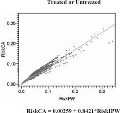
Figure 7.7 compares predictions of the risk of 6-month mortality from simple logistic regression models, including the least squares regression of covariance adjustment risks (the unweighted logit) on IPW risks. The correlation between these risk predictions is 0.9177, so the fitted slope is 0.8421.
Using an IPW linear covariance adjustment model (with R-square = 0.0312), the IPW least squares mean costs are $13,761 when untreated and $13,647 when treated, and the t-statistic for the adjusted difference in mean cost (-$114) is t = −0.56, with a p-value of 0.573. Thus, while IPW methods do change the numerical sign of the estimated cost difference (treated minus untreated), this difference remains insignificant statistically. The fact remains that smooth, global models offer little hope for making realistic adjustments for treatment selection bias and confounding.
Figure 7.7 IPW versus Unweighted Predictions of 6-Month Risk of Mortality
7.3 The Four Phases of a Local Control Analysis
7.3.1 Introduction to the Four Tactical Phases of a Local Control Analysis
Start by examining Table 7.2, which gives a brief title and description for each of the four phases of local control analysis. Sections 7.3.2 through 7.3.5 then provide more detailed motivations for each phase as well as illustrations of the use of JMP scripts on the LSIM10K.SAS7BDAT data set plus detailed interpretations for the resulting graphical and tabular outputs.
7.3.2 Phase One: Revealing Bias in Global Estimates by Making Local Comparisons
The local control approach is a highly graphical and computationally feasible way to bypass validation of propensity score estimates (as discussed in Section 7.2.3) and still end up with an even better (more robust) view of treatment effects that has been fully adjusted for treatment selection bias, local imbalance in treatment fractions, and confounding.
The primary concept behind the local control approach is that, within all data sets, comparisons between treated and untreated patients who are most similar should be more relevant than the same sorts of comparisons between dissimilar patients. Unfortunately, the x -covariate(s) most relevant to determining patient similarity may not be known or may be unobserved (missing from the data set).
Table 7.2 The Four Tactical Phases of Local Control Analysis
| Phase One LC Tactics: Revealing Bias in Global Estimates by Making Treatment Comparisons More and More Local |
The first phase of LC analysis needs to be highly interactive so that the researcher can literally see not only the direction and magnitude of potential bias introduced by treatment selection (channeling) and confounding but also the extent to which this bias can be reduced by simply increasing the number (and thereby decreasing the size) of relevant, local patient clusters. The primary objective in phase one is to identify the most revealing Local Treatment Difference (LTD) distribution (that is, an ideal number of clusters) when using available patient x -characteristics to define clusters and also weighting them equally. Systematic exploration of alternative clustering strategies and tactics are best postponed until phase three. |
| Phase Two LC Tactics: Determining Whether an Observed LTD Distribution is Salient (Statistically Meaningful) |
As pointed out in the second paragraph of Section 7.1.2, a key feature of the LC approach is that a researcher can indeed verify whether an observed set of patient x -space clusters yields a meaningful LTD distribution. The artificial distribution resulting from random assignment of treated or untreated patients to the same number of clusters with the same within-cluster treatment fractions deliberately ignores all observed patient x -characteristics. If the observed and artificial LTD distributions are not different, the observed LTD distribution is, for all practical purposes, meaningless. The key principle here is that, like the overall comparison(s) between treated and untreated groups within the full data set, comparisons within artificial subgroups are also biased whenever x -imbalance and/or confounding are present. Differences between an observed LTD distribution and its artificial LTD distribution thus provide strong evidence of removal of bias and/or adjustment for confounding. Again, treatment comparisons made strictly within clusters of patients with highly comparable characteristics(other than treatment choice) are relatively unbiased. The LC approach emphasizes these most relevant comparisons and de-emphasizes all less local (less relevant) comparisons. |
| Phase Three LC Tactics: Performing Systematic Sensitivity Analyses |
In the third (and most important) phase of LC analysis, a researcher explores the implications of using alternative ways to form clusters (for example, using different subsets of the available x -covariates, different patient similarity or dissimilarity metrics, alternative clustering algorithms and [again] various numbers of clusters). Because this third phase is tedious and repetitive, it is best performed by invoking algorithms using some form of batch mode processing. The primary objective in phase three is to identify, say, the three most interesting LTD distributions that are typical (representative) of all the salient LTD distributions that have been identified. For example, which distribution is typical of the salient distributions most favorable to treatment? Which distribution is most representative of the LTD distributions least favorable to treatment? And, which LTD distribution is most typical of all salient distributions? |
| Phase Four LC Tactics: Identifying Baseline Patient Characteristics Predictive of Differential Treatment Response |
Because results from the first three phases of LC analyses can make the differential patient response question moot, the LC approach rightfully postpones all causal and/or predictive types of analyses until last. Once the LTD for a cluster has been estimated, an extremely helpful LC tactic is to replace the observed outcomes for all patients in that cluster (whether treated or untreated) with this LTD value. As we will see, this simple tactic can be a big help in evaluating fitted models and making them more relevant and easy to interpret. Traditional covariate adjustment (CA) methods using global, parametric models (possibly combined with inverse probability weighting, IPW) are disadvantaged in the sense that they essentially have tostart hereat what is really the final, least well-defined, and potentially most frustrating phase of LC analysis. The researcher may well find that differential response is really rather difficult to predict. |
In any case, the logical way to start learning about the potential value of concentrating uponlocal(within-subgroup) treatment comparisons is to simply jump in by using whatever patient baseline x -characteristics one does have to literally see, using the JMP scripts illustrated here, how far they can take you.
A convenient way to launch my JMP Script Language (*.JSL) files for automating local control analyses is to select Edit À Customize À Menus and Tool Bars in JMP to modify the list of Analyze options on the JMP main menu. Figure 7.8 illustrates that I have chosen the fifth and sixth positions on my JMP Analyze menu to display icons and titles for my local control and artificial LTD distribution scripts.
Figure 7.8 Customized JMP Analyze Menu

If no data set is currently open in JMP when the Local Control menu option is selected, JMP first displays the dialog box for opening a *.JMP or *.SAS7BDAT data set, as is illustrated in Figure 7.9. To follow along with the computations illustrated here, open the LSIM10K data set.
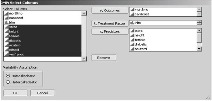
JMP then displays the customized Select Columns dialog box, as shown in Figure 7.10. Note that the figure shows that the first two columns (mort6mo and cardcost) were first highlighted (using left mouse shift-clicks) in the left-hand variable list and then transferred to the right-hand side by clicking on the y, Outcomes selection box. Similarly, the third column (trtm) was selected as the t, Treatment Factor , while columns four to ten (stent, height, …, ves1proc) were selected as the seven x, Predictors of outcome and/or treatment choice.
Figure 7.9 Open Data File Dialog Box with the LSIM10K Data Set Highlighted
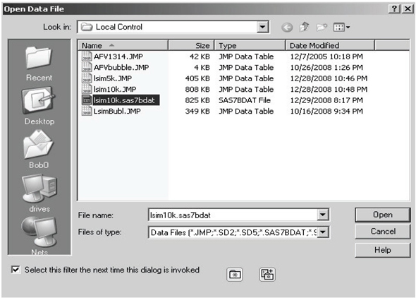
Figure 7.10 JMP Select Columns Dialog Box for Local Control
My JMP scripts for local control and artificial LTD distribution have a key restriction. All outcome y -variables are analyzed by computing averages, and all x -variables are used to cluster patients by computing distances (dissimilarities) between patients. Therefore, all y - and x -variables need to be declared both numeric and continuous in JMP. In other words, discrete y - and x -variables need to be first recoded using one or more dummy (0-1) variables, and all other y - and x -variables need to be coded using only finite, real numbers. A binary (class) variable may be declared nominal (or ordinal) in JMP only if it will be used as the t, treatment factor. Location and scaling of y - and x -variables input to my JMP script for local control are unimportant because the script re-centers all x -variables at 0 and standardizes their scale.
Note that the pair of radio buttons toward the lower left corner of the dialog box in Figure 7.10 allow the user to choose between the assumptions of either homoskedasticity or heteroskedasticity of variances in local control analysis. To be informative about local heteroskedasticity, each patient cluster must contain at least two treated patients plus at least two untreated patients. Because estimated within-cluster variances can be as small as 0, supposedly optimally weighted averages of LTDs across clusters can actually ignore much of the data. Thus the assumption of homoskedasticity is generally recommended for initial local control analyses.
Once the user has clicked on the OK box displayed in Figure 7.10, intensive and lengthy calculations are triggered. Depending on the speed of your computer and/or the amount of RAM it contains, somewhere between 15 seconds and 90 seconds are required to compute the full hierarchical clustering tree for the LSIM10K data set.
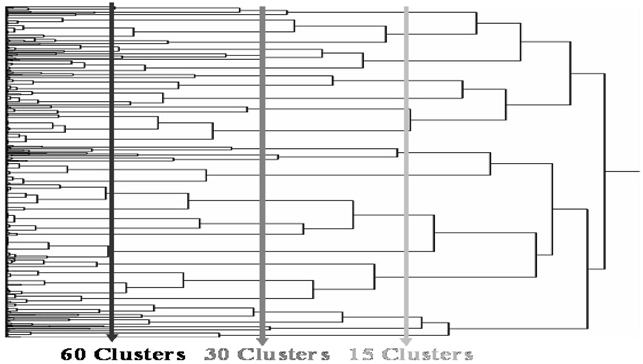
Eventually, a dendrogram like that displayed in Figure 7.11 is displayed in a JMP window and a dialog box like that in Figure 7.12 appears in the foreground on your screen. The main computational advantages of using hierarchical clustering in local control analysis is that all clusters are strictly nested and (vertical) cuts of the dendrogram tree (as illustrated in Figure 7.11) can yield almost any requested number of terminal clusters.
Figure 7.11 Vertical Cuts of the JMP Clustering Dendrogram Produce a Requested Number of Clusters from the Hierarchy
In the Next Number of Clusters dialog box in Figure 7.12, note that the initial default value is 50 clusters. When one cluster is requested, the average outcome from all untreated patients is subtracted from the average outcome for all treated patients to yield the (potentially badly biased) traditional estimate of the main effect of treatment.
Figure 7.12 JMP Dialog Box for Selecting a Desired Number of Clusters
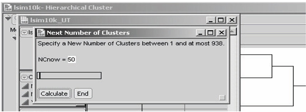
With 10,325 patients and an overall average cluster size of at least 11 patients, the number of clusters would be constrained to be at most 938, as noted in this dialog box. It is possible that clusters as small as only two patients will still be informative. However, my experience is that when the average cluster size dips to 10 or fewer patients, there is usually a wasteful abundance of clusters that are uninformative; so many clusters have been requested that some clusters have essentially been forced to be too small.
To change the number of clusters (NCnow) being requested, use your cursor to move the slider right or left. In response, the displayed value of NCnow usually changes in jumps of 10 patients or 100 patients. To select values of NCnow that are not in such a sequence, highlight the displayed value of NCnow using your cursor and edit that value using the number keys and the DELETE or BACKSPACE key. Once the desired value of NCnow is displayed, click Calculate in the dialog box.
Caution: My local control JMP script does not verify that the number of clusters specified is actually a new number (that is, a value different from all previously specified values of NCnow). Specifying the same number of final clusters more than once produces unnecessary and undesirable duplication of effort. On the other hand, the user can always simply delete duplicate rows in the unbiasing TRACE table as well as any duplicate tables created unintentionally.
Once you have clicked Calculate at least three times, the local control script starts displaying the LC unbiasing TRACE display(s) of LTD main effects (±two sigma), as in Figures 7.13 and 7.14, respectively. At each such iteration within phase one, the user should examine thesetrace displays to help decide whether to
• extend the graph to the left
• extend it to the right
• fill in gaps between displayed values for the number of clusters
Figure 7.13 LC Unbiasing TRACE for the LTD Main Effect in the First Outcome
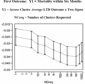
Table 7.3 Across Cluster Summary Statistics Displayed in Figure 7.13
| NCreq | NCinfo | Y1 LTD MAIN | Y1 Local Std Err | Y1 Lower Limit | Y1 Upper Limit |
| 1 | 1 | −0.0250 | 0.00313 | −0.0313 | −0.0188 |
| 5 | 5 | −0.0270 | 0.00319 | −0.0333 | −0.0206 |
| 10 | 10 | −0.0306 | 0.00326 | −0.0371 | −0.0241 |
| 20 | 20 | −0.0315 | 0.00338 | −0.0383 | −0.0248 |
| 50 | 50 | −0.0351 | 0.00340 | −0.0419 | −0.0283 |
| 100 | 100 | −0.0372 | 0.00346 | −0.0441 | −0.0302 |
| 200 | 199 | −0.0393 | 0.00351 | −0.0463 | −0.0322 |
| 500 | 492 | −0.0398 | 0.00360 | −0.0470 | −0.0326 |
| 700 | 660 | −0.0383 | 0.00363 | −0.0456 | −0.0311 |
| 900 | 816 | −0.0365 | 0.00363 | −0.0438 | −0.0293 |
NCreg = Number of Clusters Requested
NCinfo = Number of Informative Clusters Found
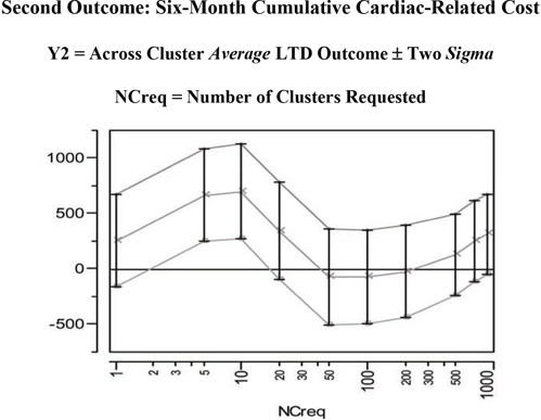
Figure 7.14 LC Unbiasing TRACE for the LTD Main Effect in the Second Outcome
Once you decide to stop exploring different numbers of clusters, click End , also shown in Figure 7.12. While this action terminates the automated sequence of iterations within phase one, you will still want to explore one or more of the individual JMP data tables that were created for each specified number of clusters. As we see here, each of these tables has one or more built-in scripts to generate detailed data visualizations and/or to perform further analyses.
For example, the JMP table LSIM10K_UT contains the statistics displayed in the LC unbiasing TRACE graphics for LTD main effects on outcome(s). This table also contains script(s), named UTsumy1andUTsumy2, for redisplaying these graphics. This allows the graphs to be customized. For example, the user can change the tic-mark spacing, orientation of tic-mark labels, and specification of descriptive axis labels. The resulting graphs and tables can then be saved in a JMP journal file and, ultimately, written to the user’s hard disk as, say, RTF or DOC files.
In Figure 7.13 and its corresponding table (numerical listing), note that negative values for the mean of the LTD distribution (main effect of treatment) on the Y1=mort6mo outcome imply that treated patients have a lower expected 6-month mortality rate than untreated patients. Furthermore, this mean difference initially becomes more negative in the unbiasing TRACE as patient comparisons are made more and morelocal (by using more or smaller clusters). After all, the initial globalresult (treated minus untreated mort6mo rates = −0.025) essentially assumes that all available patients are in the same, single cluster, In fact, as shown on the left side of Figure 7.15, the LTD distribution is nowhere near to being smoothly continuous. For example, it has a point mass of probability 0.690 at LTD = 0 when 900 clusters are requested (and 816 informative clusters are found). In other words, there is strong evidence that treatment selection and confounding were biasing the mean of the nonlocal comparisons of mort6mo outcomes in a way unfavorable to treatment. The mean of the LTD distribution for mort6mo thus shifts mostly left (from −0.0250 to −0.0398 at NCreq = 500 to −0.0365 at NCreq = 900) as its comparisons become more local, but this LTD distribution remains rather complicated (unsmooth) but bounded on [−1.00, +1.00].
The second unbiasing TRACE of Figure 7.14 for the Y2=cardcost outcome suggests some potentially confusing and complicated possibilities. In fact, the mean of the cardcost LTD distribution (main effect of treatment on cardcost) bounces around, first sharply up, then distinctly down, and then partially back up again. As seen on the right side of Figure 7.15, the LTD distribution of cardcost contains some obvious outliers (-$38K, -$21K, +$28K, +$29K, +$34K, +$82K, and +$98K). On the other hand, the LTD distribution for cardcost is much smoother than the LTD distribution for mort6mo.
In summary, there is no real evidence that treatment selection and confounding are biasing mean cardcost either up or down in the LSIM10K data set. In fact, a relatively wide range of LTD cardcost point estimates of main effect (ranging from +$699 to -$74) are all supported by Figure 7.14. Note that the point estimates of uncertainty (sigma) displayed in Figure 7.14, which are computed at fixed values for the number of clusters, are clearly underestimating the true uncertainty about the cardcost main effect that is revealed by varying the number of clusters.
Table 7.4 Across Cluster Summary Statistics Displayed in Figure 7.14
| NCreq | NCinfo | Y2 LTD MAIN | Y2 Loc Std Err | Y2 Low Limit | Y2 Upr Limit |
| 1 | 1 | 255.08 | 206.21 | −157.33 | 667.50 |
| 5 | 5 | 664.94 | 208.99 | 246.96 | 1082.92 |
| 10 | 10 | 698.80 | 214.19 | 270.42 | 1127.19 |
| 20 | 20 | 341.77 | 220.48 | −99.19 | 782.74 |
| 50 | 50 | −71.92 | 214.84 | −501.59 | 357.75 |
| 100 | 100 | −73.59 | 212.71 | −499.02 | 351.83 |
| 200 | 199 | −24.28 | 209.32 | −442.93 | 394.37 |
| 500 | 492 | 127.11 | 184.59 | −242.08 | 496.30 |
| 700 | 660 | 248.93 | 183.97 | −119.01 | 616.87 |
| 900 | 816 | 312.96 | 181.35 | −49.74 | 675.66 |
NCreg = Number of Clusters Requested
NCinfo = Number of Informative Clusters Found
All results expressed in 1998 US Dollars ($)
To create the graphs displayed in Figure 7.15, open the LC_900 data table created by the LocalControl script. This table contains 900 rows for clusters (numbered 1 to 900) but only 816 non-missing values for the LTD estimates, Y1LTD and Y2LTD, from informative clusters. The table also contains script(s), named LTDdist1 and LTDdist2, for displaying detailed graphics that describe the LTD distributions (for mort6mo and cardcost) using histograms, normal probability plots, and tabulated summary statistics, as shown in Figure 7.15. The script Y12dist generates the graphic displayed in Figure 7.16, while the fourth script, LTDjoin, is useful in phase two (and four) local control analyses.
Figure 7.15 LTD Graphics and Summary Stats for 816 Informative Clusters
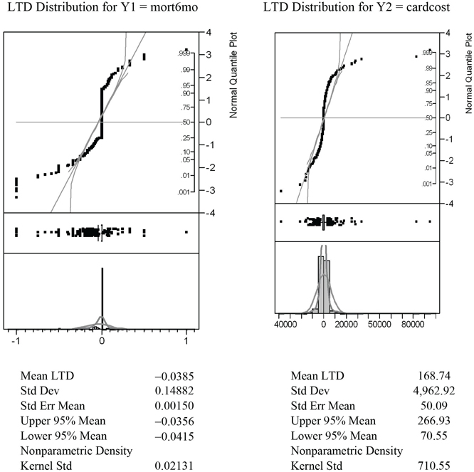
Note also that both of these LTD distributions tend to be more leptokurtic than the best fitting normal distributions in the histograms and probability plots.
Note that point-masses in the mort6mo LTD distribution at −1 and 0 are clearly visible on the left-hand side of Figure 7.15. Furthermore the LTD mean for the 2,332 patients (23.7%) like those predicted to have better mort6mo average outcomes when treated was −0.1957, while the corresponding mean LTD for the 718 patients (7.3%) like those predicted to have better average mort6mo outcomes when untreated was +0.1350. In other words, the mort6mo LTD main effect of −0.0365 is not descriptive or representative of this LTD distribution, where 69.0% of patients have an expected mort6mo LTD of exactly 0.0. In fact, −0.0385 could also be viewed as the mort6mo LTD main effect for only the 31.0% of patients with non-zero LTDs, and (again) the LTDs for these patients still range all from −1 to +1.
Figure 7.16 Bivariate LTD Scatter for 816 Informative Clusters
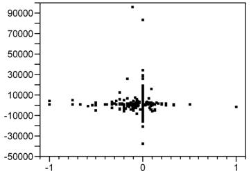
Finally, as is clear from Figure 7.9, there is little or no association (correlation) between mort6mo and cardcost LTD outcomes within their (bivariate) joint distribution. In fact, note that the patients with the most extreme cardcost LTDs tend to have mort6mo LTDs of 0. Similarly, patients with extreme mort6mo LTDs tend to have relatively small cardcost LTDs.
7.3.3 Phase Two: Determining Whether an LTD Distribution Is Salient
Suppose that a researcher has used phase one local control tactics to define a set of clusters from patient baseline characteristics and has estimated the corresponding LTD distribution. This distribution cannot be meaningful unless it is different from the artificial LTD distribution that results from purely random assignment of patients to clusters. In other words, when these two distributions are not different, the measures of patient similarity or dissimilarity used to form clusters are really no more informative than random patient characteristics!
Specifically, the objective of phase two local control tactics is to ask whether observed x -covariates are predictive of true patient similarity in the sense that their observed LTD distribution is indeed different from the corresponding artificial (completely random) LTD distribution. When these two LTD distributions are different, the observed LTD distribution is said to be salient (statistically meaningful). Importantly, the artificial LTD distribution can be estimated with increased precision using replicated Monte Carlo simulations. One simply uses repeated, random resampling without replacement for the same fixed number of clusters and the same treatment fractions within each cluster as in the observed clusters.
Due to heteroskedasticity of LTD estimates from clusters of different sizes with different local treatment fractions, the sufficient statistic that characterizes both the observed and the artificial LTD distributions is the (weighted) empirical cumulative distribution function (eCDF). The observed and artificial LTD distributions can also be compared in many revealing alternative ways, but comparison of LTD sCDFs (observed vs. artificial) is key for establishing saliency.
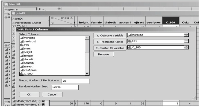
If no (open) data set is currently selected in JMP when the artificial LTD distribution script is selected, JMP again displays a dialog box for opening a *.JMP or *.SAS7BDAT data set, as illustrated in Figure 7.9. On the other hand, this script is usually invoked when the target JMP table has just been created and opened. Specifically, to follow along with the computations illustrated here, you should first invoke the LTDjoin script built into the LC_900 data set (for 900 requested clusters) for the LSIM10K data. While the LC_900 table has 900 rows (one for each cluster) and 816 non-missing LTD estimates for the 816 informative clusters, the resulting joinDt table contains 10,325 rows for individual patients, a cluster ID variable (containing an integer from 1 to 900, inclusive, for each patient), and 9,839 non-missing LTD estimates for the patients within the 816 informative clusters. This is the specific type of JMP table that the artificial LTD distribution script is designed to operate upon.
Invoking the JMP aLTD script then displays the customized Select Columns dialog box in Figure 7.17. Here, only one outcome variable (mort6mo), one binary treatment factor, and no patient baseline x -characteristics are specified. However, the researcher must also specify
1. the name of the cluster ID variable (C_900 here)
2. a total number of replications (displayed default value is 25)
3. a random number seed value (displayed default value is 12,345)
Figure 7.17 Artificial LTD Distribution Dialog Box
Researchers may wish to first specify a smaller number of replications (for example, three) to estimate how long calculations will take. Whenever a second invocation of the aLTD script is then used to increase precision, be sure to use a different initial seed in the second run so that the two batches of artificial LTD estimates will be independent and can be merged. On the other hand, if a second invocation is used to evaluate a different y -outcome, be sure to use the same number of replications and the same initial seed in both runs if you wish to estimate the joint artificial LTD distribution of the two outcomes.
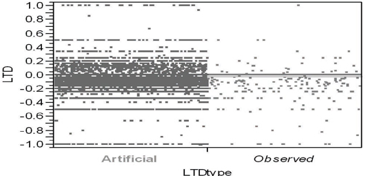
Figure 7.18 illustrates the standard way to compare two unrelated samples (here, of very different sizes) in JMP using the Y by X platform. In Figure 7.18, the Y variable contains estimated LTDs while the binary X variable labels each LTD estimate as either observed or artificial. The observed LTD distribution consists of 816 estimates from the 9,816 patients within informative clusters. Here, the artificial LTD distribution consists of 25×816 = 20,400 non-missing LTD estimates; each set of 816 artificial LTD estimates uses the data from 9,839 patients randomly selected from the original 10,325. On the other hand, because the mort6mo variable is binary, only 254 distinct numerical values for LTDs occur in the merged observed and artificial LTD samples, as seen in Figures 7.18 and 7.19.
Figure 7.18 JMP Side-by-Side Comparison Using the Spread
Option of the Artificial and Observed LTD Distributions
Even when individual patient outcomes are assumed to be homoskedastic, some might argue that LTD estimates need to be weighted because they can still be distinctly heteroskedastic. For an informative cluster containing n > 1 patients, let n×p represent the number of treated patients, where p denotes the local propensity to be treated, and 0 < 1/n ≤ p ≤ (n−1)/n < 1. The number of untreated patients is thus n×(1-p). It follows that the variance of the local difference, (), would be proportional to 1/[n×p×(1-p)]. Thus a weight could be assigned to the LTD estimate from this cluster that is proportional to n×p×(1-p) (that is, inversely proportional to variance). These weights would then need to be renormalized so as to sum to Sn = 9,839 in this example. Instead, here we simply assign a frequency of n to the LTD computed from an informative cluster of n patients, thereby assuring that Σf = 9,839.
Unfortunately, Figure 7.19 doesn’t strike me as being particularly helpful in comparing the observed and artificial LTD distributions. In addition to several variations on the sort of visualization shown in Figure 7.18, the JMP Y by X platform also contains several alternative ways to test for differences between the distributions represented by (two) samples. Alas, comparisons of the 9,839 observed LTD main effect estimates with the 245,975 artificial LTD main effect estimates are more or less expected to suggest that even small differences are highly significant due to such gigantic sample sizes! For example, Dunnett's method for comparing the aLTD mean with the observed LTD mean yielded a Abs(Dif)-LSD = 0.009 (p < .0001); variances of the LTD distributions are different (p < 0.0001) using all four tests routinely performed by JMP, and the Welch test assuming unequal variances yields a t-statistic of 7.986 with 10,401 estimated degrees of freedom (p < 0.0001). The Wilcoxon/Kruskal-Wallis rank sums test yields a z-score of −5.508 (p < 0.0001).
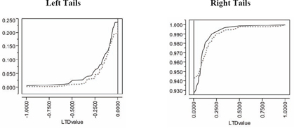
Still, it is clear that the observed LTD distribution has a larger atom of probability at −1 and a smaller atom of probability at 0 than does the artificial LTD distribution:
| LTD Estimate | Observed Frequency in 9,839 | Observed Fraction of Patients | Artificial Frequency in 20,400 | Artificial Fraction of Patients |
| −1.00 | 60 | 0.0061 | 48 | 0.0024 |
| 0.00 | 6,789 | 0.690 | 15,192 | 0.745 |
| +1.00 | 14 | 0.0014 | 33 | 0.0016 |
Similarly, the comparison of empirical CDFs displayed in Figure 7.19 strongly suggests that the observed LTD distribution for 816 informative clusters is indeed salient. Specifically, the observed LTD distribution has a thicker left-hand tail (of negative LTDs favorable to treatment) and a possibly thinner right-hand tail (of positive LTDs unfavorable to treatment).
Our local control analysis has definitely revealed some bias. After all, the initial observed mean difference in mortality fraction (for 4,679 treated patients minus that for 5,646 untreated patients when all patients are assumed to be within a single cluster) was −0.0250 (that is, −2.5%). The artificial LTD main effect for 816 informative clusters of −2.45% is very slightly larger (less negative), but it is also clearly biased. In sharp contrast, the mort6mo observed LTD main effect of −3.85% is clearly less biased and more favorable to treatment.
Of course, LTD means (main effects) are not particularly descriptive or representative of these sorts of relatively complex (zero-inflated) LTD distributions, where more than 2 out of 3patients have an expected mort6mo LTD of 0.0. In fact, the −3.85% observed reduction in mort6mo and −2.45% artificial reduction could be viewed as the mort6mo LTD main effects for the fewer than 1 in 3 patients with non-zero LTD estimates. Besides, the LTD distributions for these patients still range from −1.0 to +1.0. In summary, visual comparison of eCDFs provides essential information about saliency, providing insights that are much more relevant and robust than tests for differences in mean values!
Figure 7.19 Visual Comparison of Patient Frequency-Weighted Empirical CDFs for the Observed LTD (Solid) and Artificial LTD (Dotted) Distributions
7.3.4 Phase Three: Performing Systematic Sensitivity Analyses
The fundamental concept that forms the basis for phase three of the local control approach is that observed LTD distributions need to be shown to be relatively stable over a range of meaningful, alternative patient clusterings. While the number of clusters is increased in phase one to show that, as comparisons are forced to become more and morelocal, they typically also become more and more different from—and more interesting than—simplistic overall comparisons. In contrast, careful and systematic sensitivity analyses are badly needed in phase three to illustrate that a range of alternative clusterings can yield realistic, salient LTD distributions that actually have much in common.
This third phase of local control calls for rather tedious and repetitive calculations best done using some sort of batch mode processing. Unlike the interactive approach implemented in my local control and alternative LTD distribution scripts in JMP that implement tactics for phases one and two, no automatic implementation for the phase three sensitivity analyses currently exists. Thus, I describe here some alternative clusterings for the LSIM10K data that the reader may find interesting and then review the basic clustering concepts that should be used in phase three sensitivity analyses.
7.3.4.1 Alternative Clusterings That Readers Can Try on Their Own
The three patient baseline x -characteristics that appear to be most predictive of t -treatment choice and the mortality y -outcome are stent, acutemi, and ejfract. Thus, a local control analysis using only these three patient characteristics is parsimonious. Interestingly, the resulting local control unbiasing trace for mort6mo is similar to Figure 7.13 while the corresponding cardcost trace is much smoother than Figure 7.14. Furthermore, the number of informative clusters drops to only 166 when between 300 and 900 clusters are requested. The 166 informative clusters out of 300 contain 98.4% of the patients, while the 166 informative clusters out of 900 are somewhat smaller (containing 92.6% of all patients, 96.0% of treated patients and 89.9% of untreated patients). Finally, the observed LTD distributions for 900 requested clusters are again salient!
7.3.4.2 Review of Clustering Concepts Useful in Sensitivity Analysis
The objective of cluster analysis is to partition patients into mutually exclusive and exhaustive subgroups. All patients within a cluster should have x-vectors that are as similar as possible, while patients in different clusters should have x-vectors that are as dissimilar as possible. A metric for measuring similarity or dissimilarity between any twox-vectors is needed to do this (Kaufman and Rousseeuw, 1990). My local control JMP script uses the standardize (mean 0 and variance 1) principal co-ordinates of the x-covariates to represent patients in Euclidean space, which is equivalent to computing Mahalanobis distances between patients (Rubin, 1980). A variety of distance and similarity measures, such as the Dice coefficient, the Jaccard coefficient, and the cosine coefficient, are also widely used for clustering. All of these unsupervised methods can identify patient closeness relationships that may be impossible to visualize in only two or three Euclidean dimensions.
Suppose that some patient x -characteristics are qualitative factors either with only relatively few levels or with only unordered levels. The analyst may then wish to require that all patients within the same cluster match exactly on these particular x -components. Alternatively, an x -factor with k levels can be recoded as k−1 dummy (binary) variables.
If certain x -covariates are being used primarily as instrumental variables, the analyst may wish to give them extra weight when defining patient dissimilarity. For example, McClellan and colleagues (1994) used approximate distance from the hospital of admission (derived from pairs of ZIP codes) as their initial key variable in clustering 205,021 elderly patients; the only other available x -characteristics were age, sex, and race. With such a gigantic number of subjects, the logical strategy is to start by stratifying patients into several distance-from-the-hospital bands. Smaller clusters can be easily formed within these initial strata by, for example1, matching patients on both sex and race and then grouping them into age ranges.
Patient clusterings certainly do not need to be hierarchical, but the resulting dendrogram (tree) can be quite helpful computationally in sensitivity analyses designed to deliberately vary the total number of clusters to study the stability of the observed LTD distribution.
Agglomerative (bottom-up) clustering methods start with each patient in his/her own cluster and iteratively combine individual patients and/or clusters of patients to form larger and larger clusters. This is a “natural” way to do unsupervised, hierarchical analyses, and the vast majority of clustering algorithms work this way.
Divisive (top-down) clustering methods start with a single cluster containing all patients and focus on making the few, very large clusters at the top of the tree more meaningful. The “diana” method of Kaufman and Rousseeuw (1990) is divisive.
To get more compact clusters, it also makes sense to use complete linkage methods that minimize the maximum patient dissimilarity within a cluster rather than single linkage methods.
Again, a cluster is said to be uninformative (pure) if all subjects within that cluster received the same treatment (either all t = 0 or all t = 1). There is no possibility of observing any local outcome (y) difference between treatments using only subjects from within a pure cluster! In this sense, local control methods automatically discard all information from treated patients who are different from all untreated patients and all information from untreated patients who are different from all treated patients. Again, patients lying outside of the common support of the estimated propensity score distributions for treated and untreated patients are supposed to be excluded from analyses, but this fundamental principle (that is, compare only patients who are comparable) is typically ignored by practitioners of the covariate adjustment augmented with propensity score covariates methods.
To be fully informative about a within-cluster local treatment difference without assuming homoskedasticity of patient outcomes (equal variances), a cluster must contain at least two patients on each treatment. These patients are needed first to compute the heteroskedastic standard errors of the two treatment outcome means and then to compute the conventional standard error of the resulting local treatment difference.
7.3.5 Phase Four: Identifying Baseline Patient Characteristics Predictive of Differential Treatment Response
The objective of the fourth and final phase of local control analysis is to answer questions such as, “Do the differential benefits and/or risks of treatment vary systematically with observed patient characteristics?” and “Which types of patients are better off being treated rather than left untreated?” The first three phases of local control analysis pave the way to answering these ultimate questions by addressing a more fundamental question: “Do important differences in outcomes due to treatment exist?” Specifically, phase one identifies LTD distributions, phase two determines whether an LTD distribution is salient, and phase three establishes which salient LTD distributions are most typical. Before phase four even starts, results from the first three phases may have rendered the ultimate questions (that is, the prediction of differential benefit / risk variation) essentially moot because little or no evidence of any form of patient differential response to treatment has been uncovered.
Phase four analyses can use conventional covariate adjustment methods to predict LTD variables constructed by assigning the (salient and typical) LTD value for a cluster to all patients within that cluster (whether treated or untreated). Similarly, the LTD outcome for each patient that fell into an uninformative cluster is set to missing. This tactic allows researchers to address questions such as, “How do the patients in the left-hand and right-hand tails of an observed LTD distribution differ in their baseline x -characteristics?” and “Which types of patients are least likely (or most likely) to make their optimal treatment choice?”
Given my personal distrust of smooth, global models, my favorite phase four local control strategy for predictive modeling is to rely on local, semi-parametric methods like regression (partition) tree models to the LTD variable from patient baseline x-characteristics. The tree model of Figure 7.20 can be fit using the Partition option on the JMP Analyze: Modeling menu and is, as usual, easy to interpret.
Figure 7.20 JMP Partition (Regression) TREE for Predicting mort6mo LTDs from Seven Baseline Patient x-Characteristics
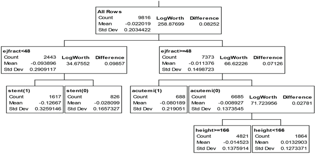
Treatment is most highly effective for the 16.5% of patients with a left-ejection fraction less than 48% and who are to receive a stent; these patients experience a 12.7% absolute reduction in 6-month mortality. Similarly, the 7% of patients who have suffered an acute myocardial infarction within the previous 7 days but have a left-ejection fraction of at least 48% experience an 8.0% reduction in 6-month mortality when treated. In fact, treatment is expected to yield a numerically lower 6-month mortality rate for 81% of all patients; patients expected to do better when untreated tend to be short (height < 166 cm or 5 feet, 5 inches).
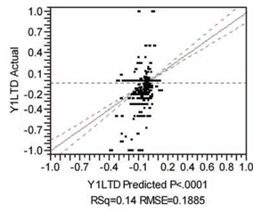
Also as usual, the global, multivariable model for predicting mort6mo LTD described in Figure 7.21 is complicated and, thus, not particularly easy to interpret or visualize. I used the JMP effect screening platform to fit a factorial to degree 2 model in the seven available patient x-characteristics. Like the regression tree model, this model has an R-squared statistic of only 14%, so it too has considerable lack of fit. For example, the mort6mo LTDs vary from −1.0 to +1.0, but the estimates from this covariate adjustment model range only from −0.4 to +0.14 (see Figure 7.21). Furthermore, many terms are significant primarily because the data set contains so many observations (9,816 non-missing values of LTDs for patients within informative clusters). Having such a large number of terms in the prediction equation greatly hampers use of such a model in practical applications, where an expected LTD typically needs to be computed for each individual patient to make a treatment recommendation.
Figure 7.21 JMP Multivariable Model for Predicting mort6mo LTDs from Seven Baseline Patient x-Characteristics
| Summary of Fit | |
| RSquare | 0.144396 |
| RSquare Adj | 0.141948 |
| Root Mean Square Error | 0.188451 |
Analysis of Variance
| Source | DF | Sum of Squares | Mean Square | F Ratio |
| Model | 28 | 58.65786 | 2.09492 | 58.9892 |
| Error | 9787 | 347.57256 | 0.03551 | Prob > F |
| C. Total | 9815 | 406.23042 | <.0001 |
Sorted Parameter Estimates
| Term | Estimate | Std Error | t Ratio | Prob>|t| |
| stent[0]*(ejfract−53.3258) | −0.002267 | 0.000151 | −14.97 | <.0001 |
| diabetic[0]*(ves1proc−1.15983) | 0.0309841 | 0.00346 | 8.96 | <.0001 |
| (height−173.388)*(ejfract−53.3258) | 0.0001851 | 2.255e−5 | 8.21 | <.0001 |
| ejfract | 0.0030098 | 0.000375 | 8.04 | <.0001 |
| acutemi[0]*(ves1proc−1.15983) | −0.042697 | 0.005336 | −8.00 | <.0001 |
| diabetic[0]*(ejfract−53.3258) | −0.001307 | 0.000171 | −7.66 | <.0001 |
| stent[0]*acutemi[0] | 0.0187662 | 0.002453 | 7.65 | <.0001 |
| acutemi[0] | 0.0313478 | 0.004146 | 7.56 | <.0001 |
| female[0]*(ejfract−53.3258) | −0.001634 | 0.00023 | −7.11 | <.0001 |
| female[0] | −0.029563 | 0.004364 | −6.77 | <.0001 |
| female[0]*acutemi[0] | 0.0202919 | 0.003597 | 5.64 | <.0001 |
| (height−173.388)*diabetic[0] | −0.001409 | 0.000276 | −5.11 | <.0001 |
| stent[0]*diabetic[0] | −0.008277 | 0.001828 | −4.53 | <.0001 |
| acutemi[0]*(ejfract−53.3258) | 0.0014733 | 0.000344 | 4.28 | <.0001 |
| height | 0.0012274 | 0.00038 | 3.23 | 0.0012 |
| stent[0] | −0.007796 | 0.002929 | −2.66 | 0.0078 |
| female[0]*diabetic[0] | 0.0071039 | 0.002721 | 2.61 | 0.0091 |
| (height−173.388)*acutemi[0] | −0.000705 | 0.000301 | −2.34 | 0.0194 |
| female[0]*(ves1proc−1.15983) | 0.0078406 | 0.003395 | 2.31 | 0.0209 |
| stent[0]*female[0] | −0.004199 | 0.001942 | −2.16 | 0.0306 |
| (ejfract−53.3258)*(ves1proc−1.15983) | 0.0005172 | 0.000272 | 1.90 | 0.0572 |
| (height−173.388)*(ves1proc−1.15983) | −0.000434 | 0.00033 | −1.32 | 0.1882 |
| (height−173.388)*female[0] | 0.0001881 | 0.000197 | 0.95 | 0.3400 |
| diabetic[0]*acutemi[0] | −0.00349 | 0.003981 | −0.88 | 0.3806 |
| ves1proc | 0.005063 | 0.006262 | 0.81 | 0.4188 |
| stent[0]*(ves1proc−1.15983) | 0.0004261 | 0.002269 | 0.19 | 0.8510 |
| diabetic[0] | −0.000365 | 0.004074 | −0.09 | 0.9287 |
| stent[0]*(height−173.388) | −5.615e−6 | 0.000193 | −0.03 | 0.9767 |
In summary, I find it interesting that the local control approach can generate LTD distributions that are sufficiently rich and detailed that they actually are difficult to model using conventional regression techniques (parametric or semi-parametric). Clearly, LTD distributions can capture both signal and (considerable) noise from raw data!
We have seen that the fundamental concepts of blocking and randomization that play such important roles in the prospective design of experiments (DoE) have variations that can play similarly fundamental roles in the analysis of data on human subjects. These variations are retrospective local control and resampling (with or possibly without replacement). Use of these highly flexible, post-data collection tools is typically avoided when study objectives are primarily confirmatory (that is, when the study’s statistical analysis plan needs to be completely pre-specified and deterministic).
Table 7.5 gives brief definitions of the five basic alternative approaches to analysis of observational data and also discusses their major advantages and disadvantages.
Table 7.5 Five General Approaches to Analysis of Observational Data
| Covariate Adjustment (CA) Using Multivariable Models | History: Generalization of ANOVA and regression models. |
| Advantages: Ubiquitous; widely taught and well accepted; implemented in all statistical analysis packages. | |
| Disadvantages: Essentially ignores imbalance (for example, always uses all available data); global, parametric models are difficult to visualize and thus may be unrealistic; results are frustratingly sensitive to model specification details; p-values can be small simply due to large sample sizes. | |
| Inverse Probability Weighting (IPW) | History: Heuristic modification of CA somewhat similar to Horvitz-Thompson adjustment in sample surveys. |
| Advantages: As easy to perform as CA; does attempt to adjust for local variation in treatment selection fraction (imbalance); requires software for (diagonally) weighted regression. | |
| Disadvantages: Basically the same as CA; IPW focuses on up-weighting rarely observed outcomes (never really ignores observations from uninformative clusters); basic variance assumptions somewhat counterintuitive (least frequently observed outcomes are treated as being more precise). | |
| Propensity Score (PS) Matching and Subgrouping | History: Fundamental PS theory has attracted more and more attention over the last 25 some years; motivates use of traditional matching and subclassifying approaches. |
| Advantages: Intuitive, weak assumptions; widely applicable; many results easily displayed using histograms. | |
| Disadvantages: Results may be less precise than they appear (are reported) to be; no built-in sensitivity analyses; not a standard method implemented in current commercial statistical software. | |
| Instrumental Variable (IV) Methods | History: Adding IV variable(s) to structural equation models can identify causal effects when the given x-covariates are correlated with model error terms due to endogenous effects, omitted covariates, or errors in variables. Newest IV approaches use patient clustering and nonparametric, local PS estimates. |
| Advantages: Near the top of the theoretical pecking order. | |
| Disadvantages: IV assumption is very strong and not testable; implemented only in some commercial statistical packages. | |
| Local Control Methods Using Patient x-clusterings (Unsupervised Learning) | History: Generalization of nested ANOVA (treatment within cluster) and hierarchical models. |
| Advantages: Intuitive, weak assumptions; widely applicable; guaranteed asymptotic balancing scores finer than propensity scores; inferences based upon bootstrap confidence or tolerance intervals; built-in sensitivity analyses. | |
| Disadvantages: Quite new; completely different focus from that of traditional parametric models; not a standard method implemented in current statistical software packages. |
The local control approach is interesting primarily because it directly addresses the highly relevant subject of the distribution of LTDs in an almost non-parametric way (using nested cell-means models, as in Row 2 of Table 7.1). In fact, the only obvious down sides of this approach are that taking this local difference essentially doubles the variance of the resulting outcome point estimates and that LTDs definitely are not identically distributed because they have local means and variances that depend upon cluster size and local treatment fractions.
In contrast, the IV plotting approach (based upon Row 1 of Table 7.1) of McClellan, McNeil, and Newhouse (1994) requires parametric modeling across clusters on the plot of LATEs versus observed within-cluster treatment fractions (local propensity score estimates). By averaging outcomes over both treated and untreated patients within clusters, at least IV methods do avoid doubling the variance in outcome point estimates. However, doing only a pure IV analysis (and thus failing to examine LTDs) strikes me as an extremely high price to pay!
Randomized studies will probably long remain the gold standard for scientific research on humans. I think that this is unfortunate, especially in health outcomes research and pharmacoeconomic settings, where performing prospective experiments within otherwise general medical practice settings typically implies imposing strong enrollment / participation incentives that result in unrealistic (unnatural) behaviors from both patients and clinicians. If you want to develop real insight into what happens when new treatments become available, shouldn’t you use real data from actual experience? There is absolutely nothing wrong with using real-world data to try to realistically answer real-world questions. On the other hand, it is quite obvious that more and much better insights could be developed if researchers had access to better (much more complete) observational data and to better local control software, especially for phase three local control systematic sensitivity analyses.
All of the five basic approaches covered by Table 7.4 address the problem of unobserved confounders only obliquely. After all, the unknown and unobserved could actually represent anything. Still, observed variables that are surrogates for those unobserved (that is, those that are correlated with them) can be used in all of these approaches. The strength of the local control approach in this regard is that it directly addresses the question of whether the observed LTD distribution is salient. While one can never know how much better they could do with better data, it is essential to be confident that at least some progress has been made.
In any case, the good news is that much more sensitive, robust, and data-driven methods for assessing treatment effects in observational data are practical. Meanwhile, the bad news is that these approaches will rely heavily on unsupervised learning methods (clustering and density estimation) that address the most challenging / difficult computational problems in statistics.
The author wishes to thank Gerhardt Pohl and Stan Young for helpful discussions of many of the topics addressed in this chapter.
Appendix: Propensity Scores and Blocking/Balancing Scores
A.1 Review of the Fundamental Theorem of Propensity Scoring
For a patient with a given x- –vector of baseline characteristics, that patient’s propensity score is their conditional probability of receiving the first of, say, two treatments, t = 1. This conditional probability is denoted in equation (A.1) by the symbol “p.” Thus, by definition, p is a function only of the given x –vector of patient baseline characteristics.
A simple four-line proof of the fundamental conditional independence theorem of propensity scoring (Rosenbaum and Rubin, 1983) is displayed in equation (A.2). The Pr( x , t | p) factor on the left-hand side of the first line denotes the conditional joint distribution of a patient’s baseline x -vector and their treatment choice, t , given that patient’s (possibly unknown, true) propensity score, p. The factoring of the right-hand side of the first line then follows from the very definition (º) of conditional probability. In the second line, the second factor on the right-hand side is simplified by noting that p is a function of x and, thus, conditioning upon both x and p is really no stronger than conditioning on x alone. The third line then follows because equation (A.1) shows that Pr( t | x ) is either p or (1 - p). Finally, the fourth line follows because the third line result shows that conditioning on the distribution of t given x is no stronger than conditioning on only p.
Pr( x, t | p ) ≡ Pr( x | p ) Pr( t | x, p )
= Pr( x | p ) Pr( t | x )
= Pr( x | p ) p or Pr( x | p ) (1 - p)
= Pr( x | p ) Pr( t | p ) (A.2)
In summary, equation (A.2) establishes that the joint conditional distribution of x and t given the true p must necessarily factor into the product of the conditional distribution of x given p times the conditional distribution of t given p. In statistics and probability theory, this factoring has profound implications. The distribution of baseline patient x -characteristics has thereby been shown to be statistically independent of the distribution of treatment choice, where both distributions are conditional upon the given (possibly unknown, true) p.
Technically, the first, Pr( x | p ) factor in the fourth line of equation (A.2) actually shows that conditioning on a fixed value of p defines a block of patients. To avoid forming too many blocks, p can be rounded to two or at most three decimal places. The conditional distribution of x for a given, rounded value of p may be rather complicated, but at least one knows (due to independence) that this distribution will be the samefor both treated and untreated patientswithin each block (defined by a single, rounded value of p). On the other hand, the fact that the x -distribution can vary across blocks (that is, as p varies) provides ample motivation and justification for calling these patient subgroupings blocks.
Similarly, the second, Pr( t | p ) factor in the fourth line of equation (A.2) defines local treatment balance (or imbalance) on the local fraction treated. Specifically, the local (within-block) ratio of treated to untreated patients is expected to be very close to 1:1 only within the block with p = 0.50.
In data sets where p does not appear to vary with x, there is, for all practical purposes, only one block in the entire data set! In randomized clinical trials (RTCs), p is typically not only known but also usually does not vary with x. In observational (nonrandomized) studies, the true value of p is typically unknown. Furthermore, p must vary with x whenever patient differential treatment selection is present.
A.2 Practical Problems with Estimated Propensity Scores
The result expressed by equation (A.2) is really rather profound and yet requires only relatively weak assumptions to be valid. Unfortunately, the true propensity score, p, for a given x- –vector is unknown in observational studies, and estimates of p can easily be sufficiently poor (unrealistic) that treated and untreated patients matched on rounded propensity score estimates can actually have rather different x- –vector distributions. Any such patients may really belong in different true conditional blocks rather than within the same block.
An illustration of how this can happen when propensity scores are estimated using logistic regression and the space of x–-vectors is three-dimensional is depicted in Figure A.1. This model uses a linear functional (vector inner product) of the form x¢b to estimate the logit transform, {log[p/(1–p)]}, of propensity to be treated. Two different patients then have the same rounded propensity score estimate if and only if their corresponding x- –vectors lie strictly on or between a pair of parallel, two–dimensional planes (depicted as a thin slab in Figure A.1) that are orthogonal to the three–dimensional estimated b–hat vector (depicted in Figure A.1).
Note that, because the thin slab extends out to infinity in all directions strictly orthogonal to the estimated b–hat vector, two patients with essentially the same fitted propensity score can actually be very far apart in x –space. In other words, all of the x –vectors for treated patients might possibly be well separated from the corresponding x –vectors for untreated patients. Thus, there is absolutely no assurance that the conditional x –distributions for given rounded propensity score estimates will be identical (or even similar).
When using estimated propensity scores, it is absolutely essential to verify that conditioning upon such estimates does yield blocks that behave, at least approximately, like those resulting from conditioning upon true propensity scores. This sort of validation process, which is described and illustrated here in Section 7.2.3 and in publications like Kereiakes and colleagues (2000) and Yue (2007), can be rather tedious and frustrating.
Figure A.1 The x-Space Geometry of Linear Functionals from Logistic Regression
As we will see in Section A.4, a major practical advantage of the local control approach is that it can be performed without either modeling propensity or validating propensity scores estimates!
A.3 Range of Blocking/Balancing Scores: From Most Fine to Most Coarse
Rosenbaum and Rubin (1983) proposed calling any statistic, such as j, a balancing score if the conditional distributions of x -covariates and treatment choice are independent given j, as in equation (A.2). Here, we will call any such statistic, φ, a blocking/balancing (or B/B) score because, again, Pr( x | φ ) characterizes the within-block conditional x -distribution independently from the Pr( t | φ ) factor that describes treatment fraction balance (or imbalance) within that block.
A patient’s true propensity score, p, is clearly a B/B score due to equation (A.2). However, unlike true propensity scores that are well defined as conditional probabilities, φ statistics can apparently be specified in many alternative ways.
Rosenbaum and Rubin (1983) established that the patient x –vector of baseline characteristics is the most detailed possible B/B score. They accomplished this by simply noting that
Pr( x , t ) ≡ Pr( x ) Pr( t | x ), (A.3)
where Pr( x ) denotes a degenerate distribution (point mass at the given x). When the given x–vectors contain continuous measures and/or many components, the bad news here is simply that there may be no exact matches and only few relatively good matches within the entire data set!
Even more importantly, Rosenbaum and Rubin (1983) also successfully argued (by contradiction) that true propensity scores are also extreme in the sense that they are always the most coarse (least detailed) B/B scores.
A.4 Cluster Membership Is an Asymptotic Blocking/Balancing Score
A simple two-line proof of our desired approximate conditional independence result is displayed in equation (A.4). The Pr( x, t | C) factor on the left-hand side of the first line denotes the conditional joint distribution of a patient’s baseline x –vector and their treatment choice, t, given that the patient is a member of cluster C. The factoring of the right-hand side of the first line then again follows from the very definition (≡) of conditional probability. In the second line, the first factor on the right-hand side is then simplified by noting that Pr( x | t, C ) and Pr( x | C ) are approximately equal (≈) whenever clusters are small and information about treatment choice, t, is not used to help define clusters. Unfortunately, Pr( x, t | C ) = Pr( x | C ) Pr( t | C ) cannot possibly hold when clusters are large because cluster membership would then be a B/B score that is more coarse than the propensity score. What we will be able to argue is that Pr( x , t | C ) does approximately factor as shown in the limit as clusters become small, compact, and numerous.
Pr( x, t | C ) ≡ Pr( x | t, C ) Pr( t | C )
≈ Pr( x | C ) Pr( t | C ) (A.4)
Note that the last factor, Pr( t | C ), on both lines of equation (2.4) has an extremely natural, non-parametric estimator: namely, the observed fractions of treated and untreated patients within cluster C. Furthermore, Pr( t=1 | C ) can be as extreme as 0 or 1, and cluster C is then said to be pure or uninformative about the corresponding local treatment difference (LTD). After all, such a cluster then contains either only treated patients or only untreated patients.
Consider the following heuristic argument that the Pr( x | t, C ) factor in the first line of equation (A.4) is asymptotically well represented by the Pr( x | C ) factor in the second line. First of all, observed treatment assignment is used in the approaches known as optimal matching, (Rosenbaum, 2003) or full matching (Hansen, 2004) that are designed specifically to prevent creating uninformative clusters. Supposing that a potential cluster contains only, for example, treated patients, full matching would then distort and extend that cluster until it includes at least one untreated patient (that is, the clustering algorithm is primarily based on observed x-vectors but is semi-supervised by t). On the other hand, even when clustering does not depend upon t-assignment, Pr( x | t, C ) and Pr( x | C ) can still be quite different whenever cluster C is large.
For example, the distribution of x–vectors within a very large cluster can be quite inelegant, with large separation of all treated patients from all untreated patients having occurred simply by accident. Furthermore, a large cluster might contain patients with a wide range of values for their true p = Pr( t=1 | x ). If Pr( x | t, C ) and Pr( x | C ) were equal in this case, cluster membership would again be a B/B score more coarse than the true p, which is impossible.
At the opposite extreme, where all clusters contain only one patient, C = x and Pr( x | t, x ) = Pr( x | x ) is a degenerate distribution with unit mass at x. Thus, the smallest possible clusters are clearly exact B/B scores.
OK, so when is cluster membership an approximate B/B score? When clusters are small, compact, and numerous, patients with the same rounded propensity scores could be in different clusters. For all practical purposes, this means that cluster membership has become an approximate B/B score finer than p but clearly coarser than individual x–vectors. Furthermore, this situation is likely to occur whenever Pr( t = 1 | x ) tends to be a smooth function of x and clusters have small x-space volume. Meanwhile, when these small clusters have not been distorted to prevent creation of uninformative clusters, the conditional distribution of x given both t and C is also clearly less dependent upon t-assignment. When all of this happens, one would certainly not need to confirm blocking (x-distribution balance between treatment groups within informative clusters); their local B/B properties will have been assured. This concept is illustrated in Figure A.2.
First, note that the three-dimensional cubes depicted in Figure A.2 represent relatively small, compact, and numerous clusters. Here, the displayed clusters just happen to intersect a thin slab of rounded propensity score estimates from a fitted logistic regression model for treatment choice. Suppose now that the white cubes denote uninformative clusters while each dark cube contains at least one treated patient as well as at least one untreated patient. If the rounded propensity score estimates satisfied equation (A.2), then all of these clusters would need to have nearly the same within-cluster treatment fraction, namely the rounded estimate of p. Fortunately, there is no such restriction when using clusters to define B/B scores; the within-cluster treatment fraction is simply the observed local fraction. Furthermore, because each cluster is small and compact, the local x-distributionsfor treated and untreated patients must necessarily be quite similar, and the resulting B/B scores must be finer than propensity scores.
Figure A.2 The x-Space Geometry of Small, Compact, and Numerous Clusters that Intersect a Thin Slab of Rounded Propensity Score Estimates from Logistic Regression
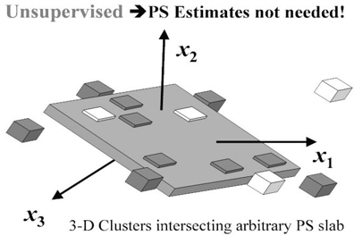
Angrist, J. D., G. W. Imbens, D. B. Rubin, J. M. Robins, et al. 1996. “Identification of causal effects using instrumental variables.” Journal of the American Statistical Association 91: 444–472.
Bang, H., and J. M. Robins. 2005. “Doubly robust estimation in missing data and causal inference models.” Biometrics 61(4): 962–973.
Barlow, H. B. 1989. “Unsupervised learning.” Neural Computation 1(3): 295–311.
Board on Life Sciences. 2003. Sharing Publication-Related Data and Materials: Responsibilities of Authorship in the Life Sciences. Washington, DC: The National Academies Press. Available at http://www.nap.edu/books/0309088593/html.
Box, G. E. P. 1979. “Robustness Is the Strategy of Scientific Model Building.” Robustness in Statistics: Proceedings of a Workshop, 202. Edited by R. L. Launer and G. N. Wilkinson. New York: Academic Press.
Cochran, W. G. 1965. “The planning of observational studies of human populations (with discussion).” Journal of the Royal Statistical Society A: (Statistics in Society) 128: 234–266.
Cochran, W. G. 1968. “The effectiveness of adjustment by subclassification in removing bias in observational studies.” Biometrics 24: 295–313.
Concato, J., N. Shah, and R. I. Horwitz. 2000. “Randomized, controlled trials, observational studies, and the hierarchy of research designs.” The New England Journal of Medicine 342: 1887–1892.
D’Agostino, Jr., R. B. 1998. “Propensity score methods for bias reduction in the comparison of a treatment to a non-randomized control group. Statistics in Medicine 17: 2265–2281.
D'Agostino, Jr., R. B., and D. B. Rubin. 2000. “Estimating and using propensity scores with partially missing data.” Journal of the American Statistical Association 95: 749–759.
D'Agostino, Jr., R. B., W. Lang, M. Walkup, T. Morgan, and A. Karter. 2001. “Examining the impact of missing data on propensity score estimation in determining the effectiveness of self-monitoring of blood glucose (SMBG).” Health Services and Outcomes Research Methodology 2: 291–315.
Diaconis, P., S. Holmes, and R. Montgomery. 2007. “Dynamical bias in the coin toss.” SIAM Journal 49: 211–235.
Efron, B. 1979. “Computers and the theory of statistics: thinking the unthinkable.” SIAM Review 21: 460–480.
Efron, B., and R. J. Tibshirani. 1993. An Introduction to the Bootstrap. London: Chapman & Hall/CRC.
Federal Judicial Center. 2000. Reference Manual on Scientific Evidence. 2d ed. Available at http://www.fjc.gov/public/pdf.nsf/lookup/sciman00.pdf/$file/sciman00.pdf.
Fisher, R. A. 1925. Statistical Methods for Research Workers. Edinburgh: Oliver and Boyd.
Fraley, C., and A. E. Raftery. 2002. “Model-based clustering, discriminant analysis, and density estimation.” Journal of the American Statistical Association 97: 611–631.
Gelman, A., and D. Nolan. 2002. “You can load a die but you can’t bias a coin.” The American Statistician 56: 308–311.
Gu, C. 2002. Smoothing Spline ANOVA Models. New York: Springer-Verlag.
Hansen, B. B. 2004. “Full matching in an observational study of coaching for the SAT.” Journal of the American Statistical Association99: 609–618.
Hayward R. A., D. M. Kent, S. Vijan, and T. P. Hofer. 2005. “Reporting clinical trial results to inform providers, payers and consumers.” Health Affairs 24(6): 1571–1581.
Holland, P. W. 1986. “Statistics and causal inference.” Journal of the American Statistical Association 81: 945–960.
Horvitz, D. G., and D. J. Thompson. 1952. “A generalization of sampling without replacement from a finite universe.” Journal of the American Statistical Association 47(260): 663–685.
Imbens, G. W., and J. D. Angrist. 1994. “Identification and estimation of local average treatment effects.” Econometrica 62: 467–475.
Ioannidis, J. P. A. 2005. “Contradicted and initially stronger effects in highly cited clinical research.” The Journal of the American Medical Association 294: 218–229.
Ioannidis, J. P. A. 2005. “Why most published research findings are false.” PLoS Medicine 2(8): e124. Available at 10.1371/journal.pmed.0020124.
Kaufman, L., and P. J. Rousseeuw. 1990. Finding Groups in Data: An Introduction to Cluster Analysis. New York: John Wiley & Sons, Inc.
Kent, D. M., and R. A. Hayward. 2007. “Limitations of applying summary results of clinical trials to individual patients: the need for risk stratification.” The Journal of the American Medical Association 298(10): 1209–1212.
Kent, D. M., and R. A. Hayward. 2007. “When averages hide individual differences in clinical trials.” American Scientist 95(1): 60–68.
Kereiakes, D. J., R. L. Obenchain, B. L. Barber, A. Smith, M. McDonald, T. M. Broderick, J. P. Runyon, T. M. Shimshak, J. F. Schneider, C. R. Hattemer, E. M. Roth, D. D. Whang, D. L. Cocks, and C. W. Abbottsmith. 2000. “Abciximab provides cost-effective survival advantage in high volume interventional practice.” American Heart Journal 140(4): 603–610.
Leamer, E. E. 1978. Specification Searches: Ad Hoc Inference with Nonexperimental Data. New York: John Wiley & Sons, Inc.
McClellan, M., B. J. McNeil, and J. P. Newhouse. 1994. “Does more intensive treatment of acute myocardial infarction in the elderly reduce mortality? Analysis using instrumental variables.” The Journal of the American Medical Association 272:859–866.
McEntegart, D.J. 2003. “The pursuit of balance using stratified and dynamic randomization techniques: an overview.” Drug Information Journal 37: 293–308.
MÜllner, M., H. Matthews, and D. G. Altman. 2002. “Reporting on statistical methods to adjust for confounding: a cross-sectional survey.” [Brief Communication] Annals of Internal Medicine 136(2): 122–126.
Newhouse, J. P., and M. McClellan. 1998. “Econometrics in outcomes research: the use of instrumental variables.” Annual Review of Public Health19: 17–34.
Obenchain, R. L. 2004. “Unsupervised propensity scoring: NN and IV plots. In ASA Proceedings of the Joint Statistical Meetings. Alexandria, VA: American Statistical Association, 1899–1906.
Obenchain, R. L. 2005. “USPS: R package for unsupervised and supervised propensity scoring and instrumental variable adjustment.” Available at http://www.r-project.org.
Obenchain, R. L. 2006. “Identifying meaningful patient subgroups via clustering––sensitivity graphics.” In ASA Proceedings of the Joint Statistical Meetings. Alexandria, VA: American Statistical Association.
Obenchain, R. L. 2009. JMP scripts for local control and artificial LTD distribution. Available at http://members.iquest.net/~softrx/other/LC_aLTD.zip.
Obenchain, R. L., and C. A. Melfi. 1997. “Propensity score and Heckman adjustments for treatment selection bias in database studies.” In ASA Proceedings in the Biopharmaceutical Section. Alexandria, VA: American Statistical Association, 297–306.
Pocock, S. J., S. E. Assmann, L. E. Enos, and L. E. Kasten. 2002. “Subgroup analysis, covariate adjustment and baseline comparisons in clinical trial reporting: current practice and problems.” Statistics in Medicine 21: 2917–2930.
Rao, C. R. 1973. Linear Statistical Inference and Its Applications. 2d ed. New York: John Wiley & Sons, Inc.
Robins, J. M., M. A. Hernan, and B. Brumback. 2000. “Marginal structural models and causal inference in epidemiology.” Epidemiology 11: 550–560.
Rosenbaum, P. R. 2002. Observational Studies. 2d ed. New York: Springer-Verlag.
Rosenbaum, P. R., and D. B. Rubin. 1983. “The central role of the propensity score in observational studies for causal effects.” Biometrika 70: 41–55.
Rosenbaum, P. R., and D. B. Rubin. 1984. “Reducing bias in observational studies using subclassification on the propensity score.” Journal of the American Statistical Association 79: 516–524.
Rubin, D. B. 1980. “Bias reduction using Mahalanobis-metric matching.” Biometrics 36: 293–298.
Rubin, D. B. 1997. “Estimating causal effects from large data sets using propensity scores.” Annals of Internal Medicine127: 757–763.
Salsburg, D. 2002. The Lady Tasting Tea: How Statistics Revolutionized Science in the Twentieth Century. New York: Owl Books.
Shah, B. R., A. Laupacis, J. E. Hux, and P. C. Austin. 2005. “Propensity score methods gave similar results to traditional regression modeling in observational studies: a systematic review.” Journal of Clinical Epidemiology 58(6): 550–559.
StÜ;rmer, T., M. Joshi, R. J. Glynn, J. Avorn, K. J. Rothman, and S. Schneeweiss. 2006. “A review of the application of propensity score methods yielded increasing use, advantages in specific settings, but not substantially different estimates compared with conventional multivariable methods.” Journal of Clinical Epidemiology 59(5): 437.e1–437.e24.
Wainer, H., M. Gessaroli, and M. Verdi. 2006. “Finding what is not there through the unfortunate binning of results: the Mendel effect.” Chance 19: 49–52.
Wegman, E. J., and Q. Luo. 2002. “On methods of computer graphics for visualizing densities.” Journal of Computational and Graphical Statistics 11: 137–162.
Yue, L. Q. 2007. “Statistical and regulatory issues with the application of propensity score analysis to nonrandomized medical device clinical studies.” Journal of Biopharmaceutical Statistics 17: 1–13.
*Non-deterministic polynomial-time.