
Profiler Overview
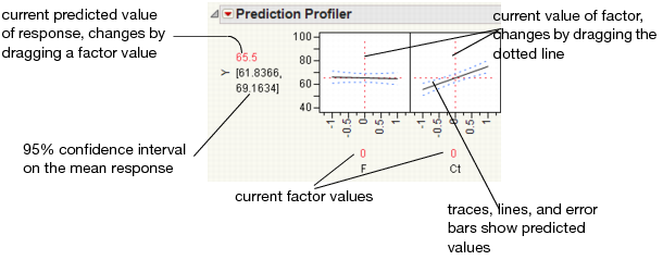
The Profiler displays profile traces (see Figure 3.2) for each X variable. A profile trace is the predicted response as one variable is changed while the others are held constant at the current values. The Profiler recomputes the profiles and predicted responses (in real time) as you vary the value of an X variable.
• The vertical dotted line for each X variable shows its current value or current setting. If the variable is nominal, the x-axis identifies categories. See “Interpreting the Profiles”, for more details.
For each X variable, the value above the factor name is its current value. You change the current value by clicking in the graph or by dragging the dotted line where you want the new current value to be.
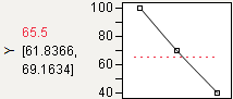
• The horizontal dotted line shows the current predicted value of each Y variable for the current values of the X variables.
• The black lines within the plots show how the predicted value changes when you change the current value of an individual X variable. In fitting platforms, the 95% confidence interval for the predicted values is shown by a dotted blue curve surrounding the prediction trace (for continuous variables) or the context of an error bar (for categorical variables).
The Profiler is a way of changing one variable at a time and looking at the effect on the predicted response.
Figure 3.2 Illustration of Traces
The Profiler in some situations computes confidence intervals for each profiled column. If you have saved both a standard error formula and a prediction formula for the same column, the Profiler offers to use the standard errors to produce the confidence intervals rather than profiling them as a separate column.
Interpreting the Profiles
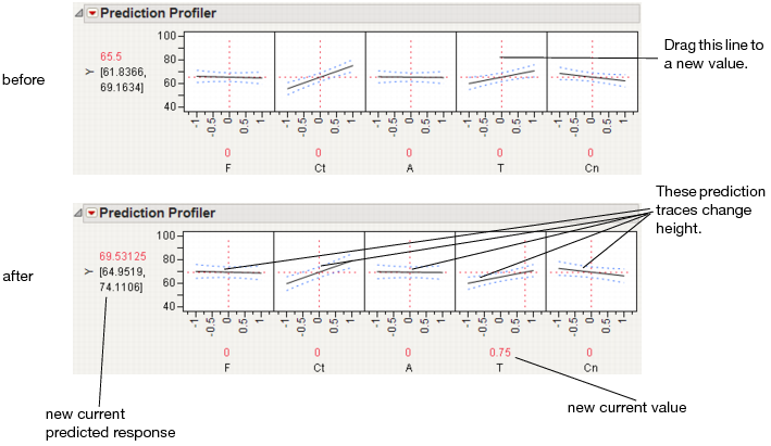
The illustration in Figure 3.3 describes how to use the components of the Profiler. There are several important points to note when interpreting a prediction profile:
• The importance of a factor can be assessed to some extent by the steepness of the prediction trace. If the model has curvature terms (such as squared terms), then the traces might be curved.
• If you change a factor’s value, then its prediction trace is not affected, but the prediction traces of all the other factors can change. The Y response line must cross the intersection points of the prediction traces with their current value lines.
Note: If there are interaction effects or cross-product effects in the model, the prediction traces can shift their slope and curvature as you change current values of other terms. That is what interaction is all about. If there are no interaction effects, the traces only change in height, not slope or shape.
Figure 3.3 Changing One Factor from 0 to 0.75
Prediction profiles are especially useful in multiple-response models to help judge that factor values can optimize a complex set of criteria.
Click a graph or drag the current value line right or left to change the factor’s current value. The response values change as shown by a horizontal reference line in the body of the graph. Double-click in an axis to bring up a window that changes its settings.
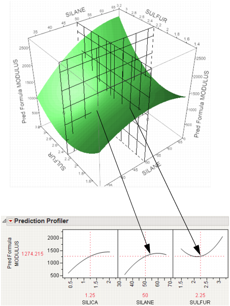
Thinking about Profiling as Cross-Sectioning
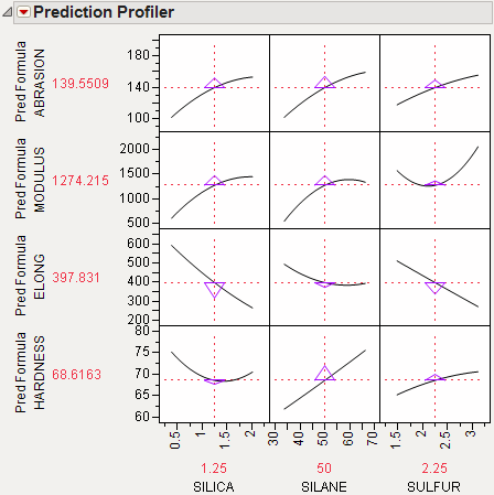
In the following example using Tiretread.jmp, look at the response surface of the expression for MODULUS as a function of SULFUR and SILANE (holding SILICA constant). Now look at how a grid that cuts across SILANE at the SULFUR value of 2.25. Note how the slice intersects the surface. If you transfer that down below, it becomes the profile for SILANE. Similarly, note the grid across SULFUR at the SILANE value of 50. The intersection when transferred down to the SULFUR graph becomes the profile for SULFUR.
Figure 3.4 Profiler as a Cross-Section
Now consider changing the current value of SULFUR from 2.25 to 1.5.
Figure 3.5 Profiler as a Cross-Section
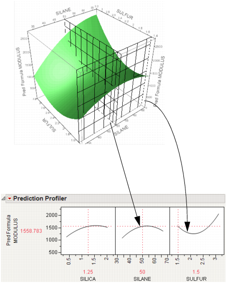
In the Profiler, note the new value just moves along the same curve for SULFUR, the SULFUR curve itself does not change. But the profile for SILANE is now taken at a different cut for SULFUR. The profile for SILANE is also a little higher and reaches its peak in the different place, closer to the current SILANE value of 50.
Setting or Locking a Factor’s Values
If you Alt-click (Option-click on the Macintosh) in a graph, a window prompts you to enter specific settings for the factor.
Figure 3.6 Continuous Factor Settings Window
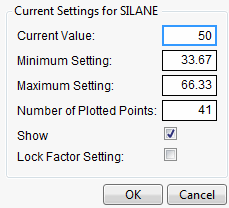
For continuous variables, you can specify:
Current Value
The value used to calculate displayed values in the profiler, equivalent to the red vertical line in the graph.
Minimum Setting
The minimum value of the factor’s axis.
Maximum Value
The maximum value of the factor’s axis.
Number of Plotted Points
Specifies the number of points used in plotting the factor’s prediction traces.
Show
Show or hide the factor in the profiler.
Lock Factor Setting
Locks the value of the factor at its current setting.
Profiler Platform Options
The red triangle menu on the Profiler title bar has the following options:
Profiler
Shows or hides the Profiler.
Contour Profiler
Shows or hides the Contour Profiler.
Custom Profiler
Shows or hides the Custom Profiler.
Surface Profiler
Shows or hides the Surface Profiler.
Mixture Profiler
Shows or hides the Mixture Profiler.
Save for Adobe Flash Platform (.SWF)
Enables you to save the Profiler (with reduced functionality) as an Adobe Flash file, which can be imported into presentation and web applications. An HTML page can be saved for viewing the Profiler in a browser. The Save as Flash (SWF) command is not available for categorical responses. For more information about this option, go to http://www.jmp.com/support/swfhelp/.
The Profiler accepts any JMP function, but the Flash Profiler only accepts the following functions: Add, Subtract, Multiply, Divide, Minus, Power, Root, Sqrt, Abs, Floor, Ceiling, Min, Max, Equal, Not Equal, Greater, Less, GreaterorEqual, LessorEqual, Or, And, Not, Exp, Log, Log10, Sine, Cosine, Tangent, SinH, CosH, TanH, ArcSine, ArcCosine, ArcTangent, ArcSineH, ArcCosH, ArcTanH, Squish, If, Match, Choose.
Note: Some platforms create column formulas that are not supported by the Save As Flash option.
Show Formulas
Opens a JSL window showing all formulas being profiled.
Formulas for OPTMODEL
Creates code for the OPTMODEL SAS procedure. Hold down CTRL and SHIFT and then select Formulas for OPTMODEL from the red triangle menu.
Script
Contains options that are available to all platforms. See Using JMP.
Prediction Profiler Options
The red triangle menu on the Prediction Profiler title bar has the following options:
Prop of Error Bars
Appears under certain situations. See “Propagation of Error Bars”.
Confidence Intervals
Shows or hides the confidence intervals. The intervals are drawn by bars for categorical factors, and curves for continuous factors. These are available only when the profiler is used inside certain fitting platforms.
Sensitivity Indicator
Shows or hides a purple triangle whose height and direction correspond to the value of the partial derivative of the profile function at its current value. This is useful in large profiles to be able to quickly spot the sensitive cells.
Figure 3.7 Sensitivity Indicators
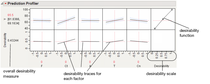
Desirability Functions
Shows or hides the desirability functions Desirability is discussed in “Desirability Profiling and Optimization”.
Maximize Desirability
Sets the current factor values to maximize the desirability functions. Takes into account the response importance weights.
Maximize and Remember
Maximizes the desirability functions and remembers the associated settings.
Maximization Options
Enables you to refine the optimization settings through a window.
Figure 3.8 Maximization Options Window
Maximize for Each Grid Point
Used only if one or more factors are locked. The ranges of the locked factors are divided into a grid, and the desirability is maximized at each grid point. This is useful if the model that you are profiling has categorical factors. Then the optimal condition can be found for each combination of the categorical factors.
Save Desirabilities
Saves the three desirability function settings for each response, and the associated desirability values, as a Response Limits column property in the data table. These correspond to the coordinates of the handles in the desirability plots.
Set Desirabilities
Brings up a window where specific desirability values can be set.
Figure 3.9 Response Grid Window
Save Desirability Formula
Creates a column in the data table with a formula for Desirability. The formula uses the fitting formula when it can, or the response variables when it cannot access the fitting formula.
Reset Factor Grid
Displays a window for each value allowing you to enter specific values for a factor’s current settings. See the section “Setting or Locking a Factor’s Values” for details.
Factor Settings
Submenu that consists of the following options:
Remember Settings adds an outline node to the report that accumulates the values of the current settings each time the Remember Settings command is invoked. Each remembered setting is preceded by a radio button that is used to reset to those settings.
Set To Data in Row assigns the values of a data table row to the Profiler.
Copy Settings Script and Paste Settings Script enable you to move the current Profiler’s settings to a Profiler in another report.
Append Settings to Table appends the current profiler’s settings to the end of the data table. This is useful if you have a combination of settings in the Profiler that you want to add to an experiment in order to do another run.
Link Profilers links all the profilers together. A change in a factor in one profiler causes that factor to change to that value in all other profilers, including Surface Plot. This is a global option, set or unset for all profilers.
Set Script sets a script that is called each time a factor changes. The set script receives a list of arguments of the form
{factor1 = n1, factor2 = n2, ...}
For example, to write this list to the log, first define a function
ProfileCallbackLog = Function({arg},show(arg));
Then enter ProfileCallbackLog in the Set Script dialog.
Similar functions convert the factor values to global values:
ProfileCallbackAssign = Function({arg},evalList(arg));
Or access the values one at a time:
ProfileCallbackAccess = Function({arg},f1=arg["factor1"];f2=arg["factor2"]);
Unthreaded enables you to change to an unthreaded analysis if multithreading does not work.
Output Grid Table
Produces a new data table with columns for the factors that contain grid values, columns for each of the responses with computed values at each grid point, and the desirability computation at each grid point.
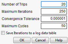
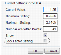
If you have a lot of factors, it is impractical to use the Output Grid Table command, because it produces a large table. A memory allocation message might display for large grid tables. In such cases, you should lock some of the factors, which are held at locked, constant values. To get the window to specify locked columns, Alt- or Option-click inside the profiler graph to get a window that has a Lock Factor Setting check box.
Figure 3.10 Factor Settings Window
Output Random Table
Prompts for a number of runs and creates an output table with that many rows, with random factor settings and predicted values over those settings. This is equivalent to (but much simpler than) opening the Simulator, resetting all the factors to a random uniform distribution, then simulating output. This command is similar to Output Grid Table, except it results in a random table rather than a sequenced one.
The prime reason to make uniform random factor tables is to explore the factor space in a multivariate way using graphical queries. This technique is called Filtered Monte Carlo.
Suppose you want to see the locus of all factor settings that produce a given range to desirable response settings. By selecting and hiding the points that do not qualify (using graphical brushing or the Data Filter), you see the possibilities of what is left: the opportunity space yielding the result that you want.
Some rows may appear selected and marked with a red dot. These represent the points on the multivariate desirability Pareto Frontier - the points that are not dominated by other points with respect to the desirability of all the factors.
Alter Linear Constraints
Enables you to add, change, or delete linear constraints. The constraints are incorporated into the operation of Prediction Profiler. See “Linear Constraints”.
Save Linear Constraints
Enables you to save existing linear constraints to a table script called Constraint. See“Linear Constraints”.
Default N Levels
Enables you to set the default number of levels for each continuous factor. This option is useful when the Profiler is especially large. When calculating the traces for the first time, JMP measures how long it takes. If this time is greater than three seconds, you are alerted that decreasing the Default N Levels speeds up the calculations.
Conditional Predictions
Appears when random effects are included in the model. The random effects predictions are used in formulating the predicted value and profiles.
Simulator
Launches the Simulator. The Simulator enables you to create Monte Carlo simulations using random noise added to factors and predictions for the model. A typical use is to set fixed factors at their optimal settings, and uncontrolled factors and model noise to random values. You then find out the rate of responses outside the specification limits. For details see the “Simulator” chapter.
Interaction Profiler
Brings up interaction plots that are interactive with respect to the profiler values. This option can help visualize third degree interactions by seeing how the plot changes as current values for the terms are changed. The cells that change for a given term are the cells that do not involve that term directly.
Arrange in Rows
Enter the number of plots that appear in a row. This option helps you view plots vertically rather than in one wide row.
Reorder X Variables
Opens a window where you can reorder the model main effects by dragging them to the desired order.
Reorder Y Variables
Opens a window where you can reorder the responses by dragging them to the desired order.
Assess Variable Importance
Provides three approaches to calculating indices that measure the importance of factors to the model. These indices are independent of the model type and fitting method. Available only for continuous responses. For details, see “Assess Variable Importance”.
Desirability Profiling and Optimization
Often there are multiple responses measured and the desirability of the outcome involves several or all of these responses. For example, you might want to maximize one response, minimize another, and keep a third response close to some target value. In desirability profiling, you specify a desirability function for each response. The overall desirability can be defined as the geometric mean of the desirability for each response.
To use desirability profiling, select Desirability Functions from the Prediction Profiler red triangle menu.
Note: If the response column has a Response Limits property, desirability functions are turned on by default.
This command appends a new row to the bottom of the plot matrix, dedicated to graphing desirability. The row has a plot for each factor showing its desirability trace, as illustrated in Figure 3.11. It also adds a column that has an adjustable desirability function for each Y variable. The overall desirability measure shows on a scale of zero to one at the left of the row of desirability traces.
Figure 3.11 The Desirability Profiler
About Desirability Functions
The desirability functions are smooth piecewise functions that are crafted to fit the control points.
• The minimize and maximize functions are three-part piecewise smooth functions that have exponential tails and a cubic middle.
• The target function is a piecewise function that is a scale multiple of a normal density on either side of the target (with different curves on each side), which is also piecewise smooth and fit to the control points.
These choices give the functions good behavior as the desirability values switch between the maximize, target, and minimize values. For completeness, we implemented the upside-down target also.
JMP does not use the Derringer and Suich functional forms. Because they are not smooth, they do not always work well with JMP’s optimization algorithm.
The control points are not allowed to reach all the way to zero or one at the tail control points.
Using the Desirability Function
To use a variable’s desirability function, drag the function handles to represent a response value.
As you drag these handles, the changing response value shows in the area labeled Desirability to the left of the plots. The dotted line is the response for the current factor settings. The overall desirability shows to the left of the row of desirability traces. Alternatively, you can select Set Desirabilities to enter specific values for the points.
Figure 3.12 shows steps to create desirability settings.
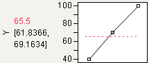
Maximize
The default desirability function setting is maximize (“higher is better”). The top function handle is positioned at the maximum Y value and aligned at the high desirability, close to 1. The bottom function handle is positioned at the minimum Y value and aligned at a low desirability, close to 0.
Figure 3.12 Maximizing Desirability
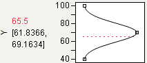
Target
You can designate a target value as “best.” In this example, the middle function handle is positioned at Y = 70 and aligned with the maximum desirability of 1. Y becomes less desirable as its value approaches either 45 or 95. The top and bottom function handles at Y = 45 and Y = 95 are positioned at the minimum desirability close to 0.
Figure 3.13 Defining a Target Desirability
Minimize
The minimize (“smaller is better”) desirability function associates high response values with low desirability and low response values with high desirability. The curve is the maximization curve flipped around a horizontal line at the center of plot.
Figure 3.14 Minimizing Desirability
Note: Dragging the top or bottom point of a maximize or minimize desirability function across the y-value of the middle point results in the opposite point reflecting. A Minimize becomes a Maximize, and vice versa.
The Desirability Profile
The last row of plots shows the desirability trace for each factor. The numerical value beside the word Desirability on the vertical axis is the geometric mean of the desirability measures. This row of plots shows both the current desirability and the trace of desirabilities that result from changing one factor at a time.
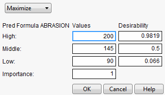
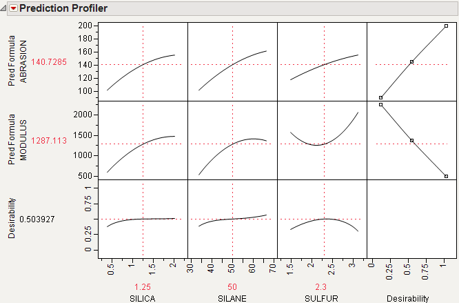
For example, Figure 3.15 shows desirability functions for two responses. You want to maximize ABRASION and minimize MODULUS. The desirability plots indicate that you could increase the desirability by increasing any of the factors.
Figure 3.15 Prediction Profile Plot with Adjusted Desirability and Factor Values
Example of Desirability Profiling for Multiple Responses
A desirability index becomes especially useful when there are multiple responses. The idea was pioneered by Derringer and Suich (1980), who give the following example. Suppose there are four responses, ABRASION, MODULUS, ELONG, and HARDNESS. Three factors, SILICA, SILANE, and SULFUR, were used in a central composite design.
The data are in the Tiretread.jmp table in the sample data folder. Use the RSM For 4 responses script in the data table, which defines a model for the four responses with a full quadratic response surface. The summary tables and effect information appear for all the responses, followed by the prediction profiler shown in Figure 3.16. The desirability functions are as follows:
1. Maximum ABRASION and maximum MODULUS are most desirable.
2. ELONG target of 500 is most desirable.
3. HARDNESS target of 67.5 is most desirable.
Figure 3.16 Profiler for Multiple Responses before Optimization
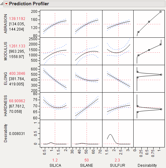
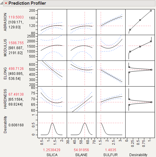
Select Maximize Desirability from the Prediction Profiler red triangle menu to maximize desirability. The results are shown in Figure 3.17. The desirability traces at the bottom decrease everywhere except the current values of the effects, which indicates that any further adjustment could decrease the overall desirability.
Figure 3.17 Profiler after Optimization
Assess Variable Importance
For continuous responses, the Variable Importance report calculates indices that measure the importance of factors in a model in a way that is independent of the model type and fitting method. The fitted model is used only in calculating predicted values. The method estimates the variability in the predicted response based on a range of variation for each factor. If variation in the factor causes high variability in the response, then that effect is important relative to the model.
Assess Variable Importance can also be accessed in the Profiler that is obtained through the Graph menu.
For statistical details, see “Assess Variable Importance”. See also Saltelli, 2002.
The Assess Variable Importance Report
The Assess Variable Importance red triangle menu has three options that address the methodology used in constructing importance indices:
Independent Uniform Inputs
For each factor, Monte Carlo samples are drawn from a uniform distribution defined by the minimum and maximum observed values. Use this option when you believe that your factors are uncorrelated and that their likely values are uniformly spread over the range represented in the study.
Independent Resampled Inputs
For each factor, Monte Carlo samples are obtained by resampling its set of observed values. Use this option when you believe that your factors are uncorrelated and that their likely values are not represented by a uniform distribution.
Dependent Resampled Inputs
Factor values are constructed from observed combinations using a k-nearest neighbors approach, in order to account for correlation. This option treats observed variance and covariance as representative of the covariance structure for your factors. Use this option when you believe that your factors are correlated. Note that this option is sensitive to the number of rows in the data table. If used with a small number of rows, the results can be unreliable.
The speed of these algorithms depends on the model evaluation speed. In general, the fastest option is Independent Uniform Inputs and the slowest is Dependent Resampled Inputs. You have the option to Accept Current Indices when the estimation process is unable to complete instantaneously.
Note: In the case of independent inputs, variable importance indices are constructed using Monte Carlo sampling. For this reason, you can expect some variation in importance index values from one run to another.
Variable Importance Report
Each Assess Variable Importance option presents a Summary Report and Marginal Model Plots. When the Assess Variable Importance report opens, the factors in the Profiler are reordered according to their Total Effect importance indices. When there are multiple responses, the factors are reordered according to the Total Effect importance indices in the Overall report. When you run several Variable Importance reports, the factors in the Profiler are ordered according to their Total Effect indices in the most recent report.
Summary Report
For each response, a table displays the following elements:
Column
The factor of interest.
Main Effect
An importance index that reflects the relative contribution of that factor alone, not in combination with other factors.
Total Effect
An importance index that reflects the relative contribution of that factor both alone and in combination with other factors. The Total Effect column is displayed as a bar chart.
Main Effect Std Error
The Monte Carlo standard error of the Main Effect’s importance index. This is a hidden column that you can access by right-clicking in the report and selecting Columns > Main Effect Std Error. By default, sampling continues until this error is less than 0.01. Details of the calculation are given in “Variable Importance Standard Errors”. (Not available for Dependent Resampled Inputs option.)
Total Effect Std Error
The Monte Carlo standard error of the Total Effect’s importance index. This is a hidden column that you can access by right-clicking in the report and selecting Columns > Total Effect Std Error. By default, sampling continues until this error is less than 0.01. Details of the calculation are given in “Variable Importance Standard Errors”. (Not available for Dependent Resampled Inputs option.)
Weights
A plot that shows the Total Effect indices, located to the right of the final column. You can deselect or reselect this plot by right-clicking in the report and selecting Columns > Weights.
Proportion of function evaluations with missing values
The proportion of Monte Carlo samples for which some combination of inputs results in an inestimable prediction. When the proportion is nonzero, this message appears as a note at the bottom of the table.
Note: When you have more than one response, the Summary Report presents an Overall table followed by tables for each response. The importance indices in the Overall report are the averages of the importance indices across all responses.
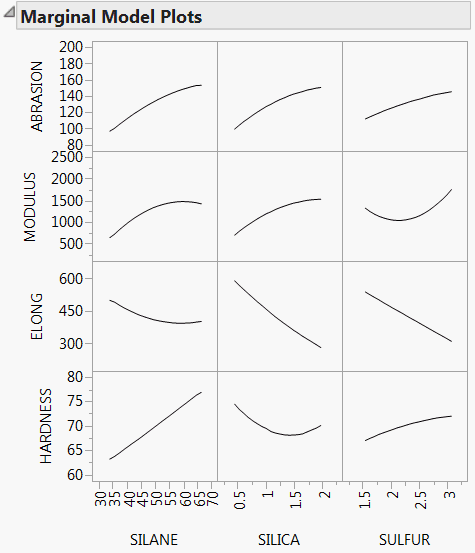
Marginal Model Plots
The Marginal Model Plots report (see Figure 3.22) shows a matrix of plots, with a row for each response and columns for the factors. The factors are ordered according to the size of their overall Total Effect importance indices.
For a given response and factor, the plot shows the mean response for each factor value, where that mean is taken over all inputs to the calculation of importance indices. These plots differ from profiler plots, which show cross sections of the response. Marginal Model Plots are useful for assessing the main effects of factors.
Note that your choice of input methodology impacts the values plotted on marginal model plots. Also, because the plots are based on the generated input settings, the plotted mean responses might not appear as smooth curves.
Variable Importance Options
The Variable Importance report has the following red-triangle options:
Reorder factors by main effect importance
Reorders the cells in the Profiler in accordance with the importance indices for the main effects (Main Effect).
Reorder factors by total importance
Reorders the cells in the Profiler in accordance with the total importance indices for the factors (Total Effect).
Colorize Profiler
Colors cells in the profiler by Total Effect importance indices using a red to white intensity scale.
Note: You can click rows in the Summary Report to select columns in the data table. This can facilitate further analyses.
Examples
A Neural Network Example
The Boston Housing.jmp sample data table contains data on 13 factors that might relate to median home values. You will fit a model using a neural network. Because neural networks do not accommodate formal hypothesis tests, these tests are not available to help assess which variables are important in predicting the response. However, for this purpose, you can use the Assess Variable Importance profiler option.
Note that your results will differ from, but should resemble, those shown here. There are two sources of random variability in this example. When you fit the neural network, k-fold cross validation is used. This partitions the data into training and validation sets at random. Also, Monte Carlo sampling is used to calculate the factor importance indices.
1. Open the Boston Housing.jmp sample data table.
2. Select Analyze > Modeling > Neural.
3. Select mvalue from the Select Columns list and click Y, Response.
4. Select all other columns from the Select Columns list and click X, Factor.
5. Click OK.
6. In the Neural Model Launch panel, select KFold from the list under Validation Method.
When you select KFold, the Number of Folds defaults to 5.
7. Click Go.
8. From the red triangle menu for the Model NTanH(3) report, select Profiler.
The Prediction Profiler is displayed at the very bottom of the report. Note the order of the factors for later comparison.
Because the factors are correlated, you take this into account by choosing Dependent Resampled Inputs as the sampling method for assessing variable importance.
9. From the red triangle menu next to Prediction Profiler, select Assess Variable Importance > Dependent Resampled Inputs.
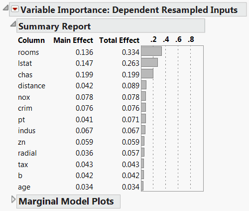
The Variable Importance: Dependent Resampled Inputs report appears (Figure 3.18). Check that the Prediction Profiler cells have been reordered by the magnitude of the Total Effect indices in the report. In Figure 3.18, check that the Total Effect importance indices identify rooms and lstat as the factors that have most impact on the predicted response.
Figure 3.18 Dependent Resampled Inputs Report
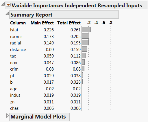
You might be interested in comparing the importance indices obtained assuming that the factors are correlated, with those obtained when the factors are assumed independent.
10. From the red triangle menu next to Prediction Profiler, select Assess Variable Importance > Independent Resampled Inputs.
The resampled inputs option makes sense in this example, because the distributions involved are not uniform. The Variable Importance: Independent Resampled Inputs report is shown in Figure 3.19. Check that the two factors identified as having the most impact on the predicted values are lstat and rooms. Note that the ordering of their importance indices is reversed from the ordering using Dependent Resampled Inputs.
Figure 3.19 Independent Resampled Inputs Report
Variable Importance for Multiple Responses
The data in the Tiretread.jmp sample data table are the result of a designed experiment where the factors are orthogonal. For this reason, you use importance estimates based on independent inputs. Suppose that you believe that, in practice, factor values vary throughout the design space, rather than assume only the settings defined in the experiment. Then you should choose Independent Uniform Inputs as the sampling scheme for your importance indices.
1. Open the Tiretread.jmp sample data table.
2. Run the script RSM for 4 Responses.
The Prediction Profiler is displayed at the very bottom of the report.
3. From the red triangle menu next to Prediction Profiler, select Assess Variable Importance > Independent Uniform Inputs.
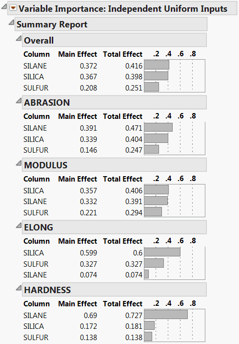
The Summary Report is shown in Figure 3.20. Because the importance indices are based on random sampling, your estimates might differ slightly from those shown in the figure.
The report shows tables for each of the four responses. The Overall table averages the factor importance indices across responses. The factors in the Profiler (Figure 3.21) have been reordered to match their ordering on the Overall table’s Total Effect importance.
Figure 3.20 Summary Report for Four Responses
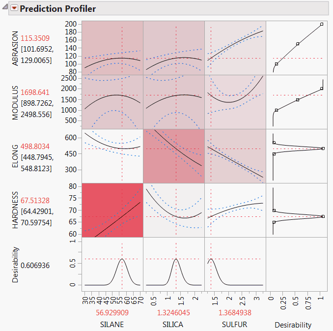
4. From the red triangle menu next to Variable Importance: Independent Uniform Inputs, select Colorize Profiler.
Colors from a red to white intensity scale are overlaid on profiler panels to reflect Total Effect importance. For example, you easily see that the most important effect is that of Silane on Hardness.
Figure 3.21 Profiler for Four Responses
The Marginal Model Plots report (Figure 3.22) shows mean responses for each factor across a uniform distribution of settings for the other two factors.
Figure 3.22 Marginal Model Plots for Four Responses
Special Profiler Topics
Propagation of Error Bars
Propagation of error (POE) is important when attributing the variation of the response in terms of variation in the factor values when the factor values are not very controllable.
In JMP’s implementation, the Profiler first looks at the factor and response variables to see whether there is a Sigma column property (a specification for the standard deviation of the column, accessed through the Cols > Column Info dialog box). If the property exists, then the Prop of Error Bars command becomes accessible in the Prediction Profiler drop-down menu. This displays the 3σ interval that is implied on the response due to the variation in the factor.
Figure 3.23 Propagation of Errors Bars in the Prediction Profiler
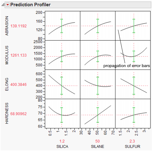
The POE is represented in the graph by a green bracket. The bracket indicates the prediction plus or minus three times the square root of the POE variance, which is calculated as:
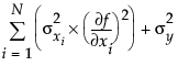
where f is the prediction function, xi is the ith factor, and N is the number of factors.
Currently, these partial derivatives are calculated by numerical derivatives:
centered, with δ=xrange/10000
POE limits increase dramatically in response surface models when you are over a more sloped part of the response surface. One of the goals of robust processes is to operate in flat areas of the response surface so that variations in the factors do not amplify in their effect on the response.
Customized Desirability Functions
It is possible to use a customized desirability function. For example, suppose you want to maximize using the following function.
Figure 3.24 Maximizing Desirability Based on a Function
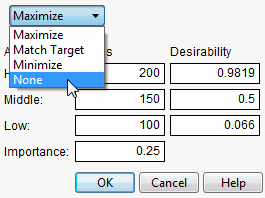
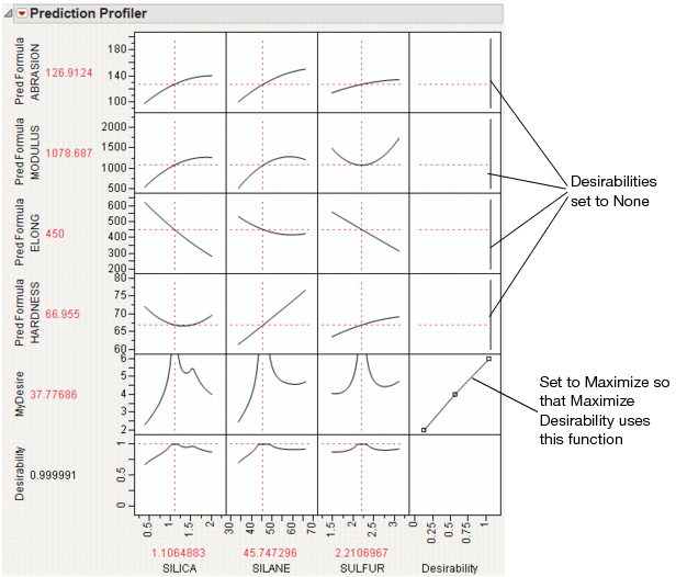
First, create a column called MyDesire that contains the above formula. Then, launch the Profiler using Graph > Profiler and include all the Pred Formula columns and the MyDesire column. Turn on the desirability functions by selecting Desirability Functions from the red-triangle menu. All the desirability functions for the individual effects must be turned off. To do this, first double-click in a desirability plot window, then select None in the window that appears (Figure 3.25). Set the desirability for MyDesire to be maximized.
Figure 3.25 Selecting No Desirability Goal
At this point, selecting Maximize Desirability uses only the custom MyDesire function.
Figure 3.26 Maximized Custom Desirability
Mixture Designs
When analyzing a mixture design, JMP constrains the ranges of the factors so that settings outside the mixture constraints are not possible. This is why, in some mixture designs, the profile traces appear to turn abruptly.
When there are mixture components that have constraints, other than the usual zero-to-one constraint, a new submenu, called Profile at Boundary, appears on the Prediction Profiler red triangle menu. It has the following two options:
Turn At Boundaries
Lets the settings continue along the boundary of the restraint condition.
Stop At Boundaries
Truncates the prediction traces to the region where strict proportionality is maintained.
Expanding Intermediate Formulas
The Profiler launch window has an Expand Intermediate Formulas check box. When this is checked, when the formula is examined for profiling, if it references another column that has a formula containing references to other columns, then it substitutes that formula and profiles with respect to the end references—not the intermediate column references.
For example, when Fit Model fits a logistic regression for two levels (say A and B), the end formulas (Prob[A] and Prob[B]) are functions of the Lin[x] column, which itself is a function of another column x. If Expand Intermediate Formulas is selected, then when Prob[A] is profiled, it is with reference to x, not Lin[x].
In addition, using the Expand Intermediate Formulas check box enables the Save Expanded Formulas command in the platform red triangle menu. This creates a new column with a formula, which is the formula being profiled as a function of the end columns, not the intermediate columns.
Linear Constraints
The Prediction Profiler, Custom Profiler, and Mixture Profiler can incorporate linear constraints into their operations. Linear constraints can be entered in two ways, described in the following sections.
Red Triangle Menu Item
To enter linear constraints via the red triangle menu, select Alter Linear Constraints from either the Prediction Profiler or Custom Profiler red triangle menu.
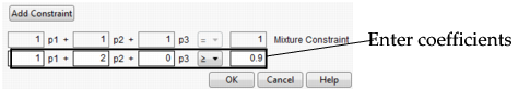
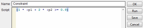
Choose Add Constraint from the resulting window, and enter the coefficients into the appropriate boxes. For example, to enter the constraint p1 + 2*p2 ≤ 0.9, enter the coefficients as shown in Figure 3.27. As shown, if you are profiling factors from a mixture design, the mixture constraint is present by default and cannot be modified.
Figure 3.27 Enter Coefficients
After you click OK, the Profiler updates the profile traces, and the constraint is incorporated into subsequent analyses and optimizations.
If you attempt to add a constraint for which there is no feasible solution, a message is written to the log and the constraint is not added. To delete a constraint, enter zeros for all the coefficients.
Constraints added in one profiler are not accessible by other profilers until saved. For example, if constraints are added under the Prediction Profiler, they are not accessible to the Custom Profiler. To use the constraint, you can either add it under the Custom Profiler red triangle menu, or use the Save Linear Constraints command described in the next section.
Constraint Table Property/Script
If you add constraints in one profiler and want to make them accessible by other profilers, use the Save Linear Constraints command, accessible through the platform red triangle menu. For example, if you created constraints in the Prediction Profiler, choose Save Linear Constraints under the Prediction Profiler red triangle menu. The Save Linear Constraints command creates or alters a Table Script called Constraint. An example of the Table Property is shown in Figure 3.28.
Figure 3.28 Constraint Table Script
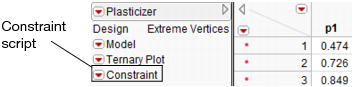
The Constraint Table Property is a list of the constraints, and is editable. It is accessible to other profilers, and negates the need to enter the constraints in other profilers. To view or edit Constraint, right-click the red triangle menu and select Edit. The contents of the constraint from Figure 3.27 is shown below in Figure 3.29.
Figure 3.29 Example Constraint
The Constraint Table Script can be created manually by choosing New Script from the red triangle menu beside a table name.
Note: When creating the Constraint Table Script manually, the spelling must be exactly “Constraint”. Also, the constraint variables are case sensitive and must match the column name. For example, in Figure 3.29, the constraint variables are p1 and p2, not P1 and P2.
The Constraint Table Script is also created when specifying linear constraints when designing an experiment.
The Alter Linear Constraints and Save Linear Constraints commands are not available in the Mixture Profiler. To incorporate linear constraints into the operations of the Mixture Profiler, the Constraint Table Script must be created by one of the methods discussed in this section.
Statistical Details
Assess Variable Importance
The details that follow relate to the how the variable importance indices are calculated.
Background
Denote the function that represents the predictive model by f, and suppose that  are the factors, or main effects, in the model. Let
  .
.
• The expected value of y,  , is defined by integrating y with respect to the joint distribution of
  .
.
• The variance of y,  , is defined by integrating
  with respect to the joint distribution of
  .
.
Main Effect
The impact of the main effect  on y can be described by
  . Here the expectation is taken with respect to the conditional distribution of
  given
given  , and the variance is taken over the distribution of
  . In other words,
  measures the variation, over the distribution of
  , in the mean of y when
  is fixed.
It follows that the ratio 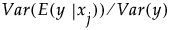 gives a measure of the sensitivity of y to the factor
  . The importance index in the Main Effect column in the Summary Report is an estimate of this ratio (see “Adjustment for Sampling Variation”).
Total Effect
The Total Effect column represents the total contribution to the variance of  from all terms that involve
  . The calculation of Total Effect depends on the concept of functional decomposition. The function f is decomposed into the sum of a constant and functions that represent the effects of single variables, pairs of variables, and so on. These component functions are analogous to main effects, interaction effects, and higher-order effects. (See Saltelli, 2002, and Sobol, 1993.)
Those component functions that include terms containing  are identified. For each of these, the variance of the conditional expected value is computed. These variances are summed. The sum represents the total contribution to
  due to terms that contain
  . For each
  , this sum is estimated using the selected methodology for generating inputs. The importance indices reported in the Total Effect column are these estimates (see “Adjustment for Sampling Variation”).
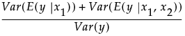
Consider a simple example with two factors,  and
and  . Then the Total Effect importance index for
  is an estimate of:
Adjustment for Sampling Variation
Due to the fact that they are obtained using sampling methods, the Main Effect and Total Effect estimates shown in the Summary Table might have been adjusted. Specifically, if the Total Effect estimate is less than the Main Effect estimate, then the Total Effect importance index is set equal to the Main Effect estimate. If the sum of the Main Effect estimates exceeds one, then these estimates are normalized to sum to one.
Variable Importance Standard Errors
The standard errors that are provided for independent inputs measure the accuracy of the Monte Carlo replications. Importance indices are computed as follows:
• Latin hypercube sampling is used to generate a set of data values.
• For each set of data values, main and total effect importance estimates are calculated.
• This process is replicated until the estimated standard errors of the Main Effect and Total Effect importance indices for all factors fall below a threshold of 0.01.
The standard errors that are reported are the standard error values in effect when the replications terminate.
..................Content has been hidden....................
You can't read the all page of ebook, please click here login for view all page.