
4
A Deeper Understanding of PLS
PLS as a Multivariate Technique
An Example Exploring Prediction
Choosing the Number of Factors
A Simulation of K-Fold Cross Validation
Validation in the PLS Platform
The NIPALS and SIMPLS Algorithms
Useful Things to Remember About PLS
Although it can be adapted to more general situations, PLS usually involves only two sets of variables, one interpreted as predictors, X, and one as responses, Y. As with PCA, it is usually best to apply PLS to data that have been centered and scaled. As shown in Chapter 3 this puts all variables on an equal footing. This is why the Centering and Scaling options are turned on by default in the JMP PLS launch window.
There are sometimes cases where it might be useful or necessary to scale blocks of variables in X and/or Y differently. This can easily be done using JMP column formulas (as we saw in LoWarp.jmp) or using JMP scripting (Help > Books > Scripting Guide). In cases where you define your own scaling, be sure to deselect the relevant options in the PLS launch window. For simplicity, we assume for now that we always want all variables to be centered and scaled.
PLS as a Multivariate Technique
When all variables are centered and scaled, their covariance matrix equals their correlation matrix. The correlation matrix becomes the natural vehicle for representing the relationship between the variables. We have already talked about correlation, specifically in the context of predictors and the X matrix in MLR.
But the distinction between predictors and responses is contextual. Given any data matrix, we can compute the sample correlation between each pair of columns regardless of the interpretation we choose to assign to the columns. The sample correlations form a square matrix with ones on the main diagonal. Most linear multivariate methods, PLS included, start from a consideration of the correlation matrix (Tobias 1995).
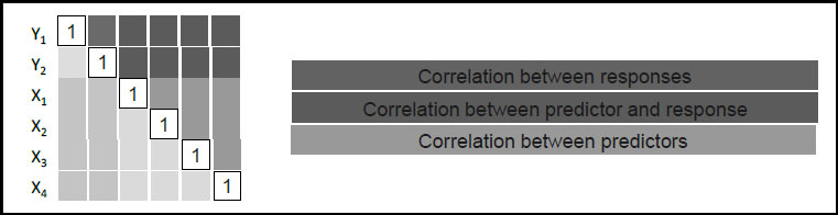
Suppose, then, that we have a total of v variables measured on our n units or samples. We consider k of these to be responses and m of these to be predictors, so that v = k + m. The correlation matrix, denoted Σ, is v x v. Suppose that k = 2 and m = 4. Then we can represent the correlation matrix schematically as shown in Figure 4.1, where we order the variables in such a way that responses come first.
Figure 4.1: Schematic of Correlation Matrix Σ, for Ys and Xs
Recall that the elements of Σ must be between –1 and +1 and that the matrix is square and symmetric. But not every matrix with these properties is a correlation matrix. Because of the very meaning of correlation, the elements of a correlation matrix cannot be completely independent of one another. For example, in a 3 x 3 correlation matrix there are three off-diagonal elements: If one of these elements is 0.90 and another is –0.80, it is possible to show that the third must be between –0.98 and –0.46.
As we soon see in a simulation, PLS builds models linking predictors and responses. PLS does this using projection to reduce dimensionality by extracting factors (also called latent variables in the PLS context). The information it uses to do this is contained in the dark green elements of Σ, in this case a 2 x 4 submatrix. For general values of k and m, this sub-matrix is not square and does not have any special symmetry. We describe exactly how the factors are constructed in Appendix 1.
For now, though, note that the submatrix used by PLS contains the correlations between the predictors and the responses. Using these correlations, the factors are extracted in such a way that they not only explain variation in the X and Y variables, but they also relate the X variables to the Y variables.
As you might suspect, consideration of the entire 6 x 6 correlation matrix without regard to predictors and responses leads directly to PCA. As we have seen in Chapter 3, PCA also exploits the idea of projections to reduce dimensionality, and is often used as an exploratory technique prior to PLS.
Consideration of the 4 x 4 submatrix (the orange elements) leads to a technique called Principal Components Regression, or PCR (Hastie et al. 2001). Here, the dimensionality of the X space is reduced through PCA, and the resulting components are treated as new predictors for each response in Y using MLR. To fit PCR in JMP requires a two-stage process (Analyze > Multivariate Methods > Principal Components, followed by Analyze > Fit Model). In many instances, though, PLS is a superior choice.
For completeness, we mention that consideration of the 2 x 2 submatrix associated with the Ys (the blue elements) along with the 4 x 4 submatrix associated with the Xs (the orange elements) leads to Maximum Redundancy Analysis, MRA (van den Wollenberg 1977). This is a technique that is not as widely used as PLS, PCA, and PCR.
Consistent with the heritage of PLS, let’s consider a simulation of a simplified example from spectroscopy. In this situation, samples are measured in two ways: Typically, one is quick, inexpensive, and online; the other is slow, expensive, and offline, usually involving a skilled technician and some chemistry. The goal is to build a model that predicts well enough so that only the inexpensive method need be used on subsequent samples, acting as a surrogate for the expensive method.
The online measurement consists of a set of intensities measured at multiple wavelengths or frequencies. These measured intensities serve as the values of X for the sample at hand. To simplify the discussion, we assume that the technician only measures a single quantity, so that (as in our MLR example in Chapter 2) Y is a column vector with the same number of rows as we have samples.
To set up the simulation, run the script SpectralData.jsl by clicking on the correct link in the master journal. This opens a control panel, shown in Figure 4.2.
Figure 4.2: Control Panel for Spectral Data Simulation
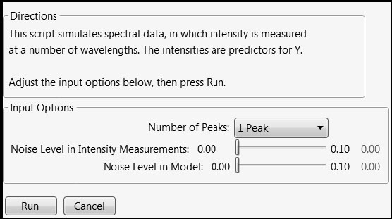
Once you obtain the control panel, complete the following steps:
1. Set the Number of Peaks to 3 Peaks.
2. Set the Noise Level in Intensity Measurements slider to 0.02.
3. Leave the Noise in Model slider set to 0.00.
4. Click Run.
This produces a data table with 45 rows containing an ID column, a Response column, and 81 columns representing wavelengths, which are collected in the column group called Predictors. The data table also has a number of saved scripts.
Let’s run the first script, Stack Wavelengths. This script stacks the intensity values so that we can plot the individual spectra. In the data table that the script creates, run the script Individual Spectra. Figure 4.3 shows plots similar to those that you see.
Figure 4.3: Individual Spectra
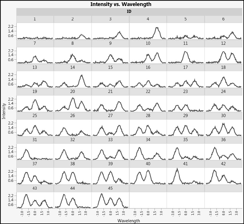
Note that some samples display two peaks and some three. In fact, the very definition of what is or is not a peak can quickly be called into question with real data, and over the years spectroscopists and chemometricians have developed a plethora of techniques to pre-process spectral data in ways that are reflective of the specific technique and instrument used.
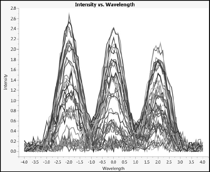
Now run the script Combined Spectra in the stacked data table. This script plots the spectra for all 45 samples against a single set of axes (Figure 4.4). You can click on an individual set of spectral readings in the plot to highlight its trace and the corresponding rows in the data table.
Figure 4.4: Combined Spectra
Our simulation captures the essence of the analysis challenge. We have 81 predictors and 45 rows. A common strategy in such situations is to attempt to extract significant features (such as peak heights, widths, and shapes) and to use this smaller set of features for subsequent modeling. However, in this case we have neither the desire nor the background knowledge to attempt this. Rather, we take the point of view that the intensities in the measured spectrum (the row within X), taken as a whole, provide a fingerprint for that row that we try to relate to the corresponding measured value in Y.
Let’s close the data table Stacked Data and return to the main data table Response and Intensities. Run the script Correlations Between Xs. This script creates a color map that shows the correlations between every pair of predictors using a blue to red color scheme (Figure 4.5). Note that the color scheme is given by the legend to the right of the plot. To see the numerical values of the correlations, click the red triangle next to Multivariate and select Correlations Multivariate.
Figure 4.5: Correlations for Predictors Shown in a Color Map
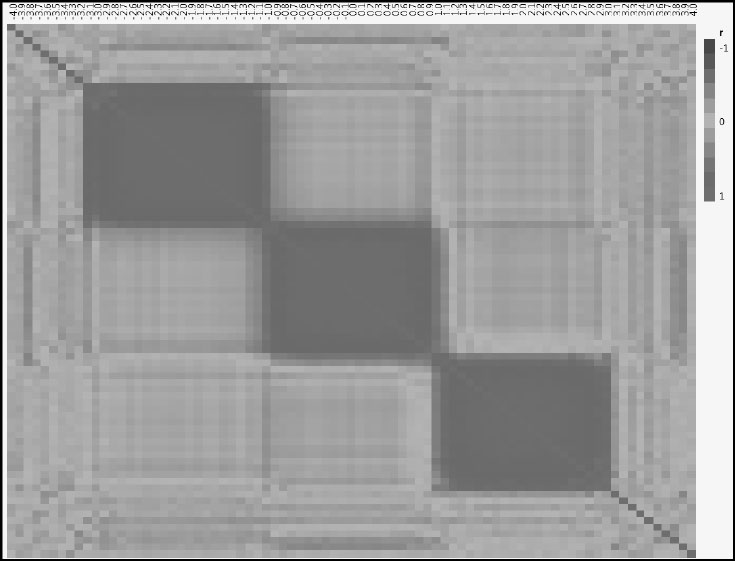
In the section “The Effect of Correlation among Predictors: A Simulation” in Chapter 2, we investigated the impact of varying the correlation between just two predictors. Here we have 81 predictors, one for each wavelength, resulting in 81*80/2 = 3,240 pairs of predictors. Figure 4.5 gives a pictorial representation of the correlations among all 3,240 pairs.
The cells on the main diagonal are colored the most intense shade of red, because the correlation of a variable with itself is +1. However, Figure 4.5 shows three large blocks of red. These are a consequence of the three peaks that you requested in the simulation. You can experiment by rerunning the simulation with a different number of peaks and other slider settings to see the impact on this correlation structure.
Next, in the data table, find and run the script MLR (Fit Model). This attempts to fit a multiple linear regression to Response, using all 81 columns as predictors. The report starts out with a long list of Singularity Details. This report, for our simulated data, is partially shown in Figure 4.6.
Figure 4.6: Partial List of Singularity Details for Multiple Linear Regression Analysis
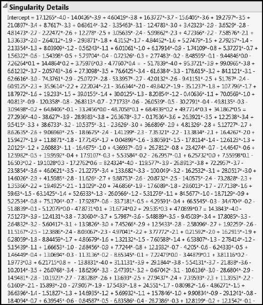
Here, the X matrix has 81+1 = 82 columns, but X and Y have only 45 rows. Because n < m (using our earlier notation), we should expect MLR to run into trouble. Note that the JMP Fit Model platform does produce some output, though it’s not particularly useful in this case. If you want more details about what JMP is doing here, select Help > Books > Fitting Linear Models and search for “Singularity Details”.
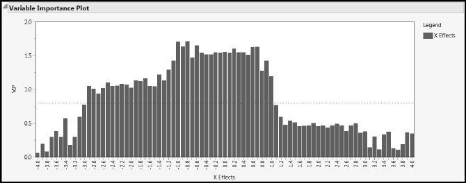
Now run the script Partial Least Squares to see a partial least squares report. We cover the report details later on, but for now, notice that there is no mention of singularities. In fact, the Variable Importance Plot (Figure 4.7) assesses the contribution of each of the 81 wavelengths in modeling the response. Because higher Variable Importance for the Projection (VIP) values suggest higher influence, we conclude that wavelengths between about –3.0 and 1.0 have comparatively higher influence than the rest.
Figure 4.7: PLS Variable Importance Plot
As mentioned earlier, our example is deliberately simplified. It is not uncommon for spectra to be measured at a thousand wavelengths, rather than 81. One challenge for software is to find useful representations, especially graphical representations, to help tame this complexity. Here we have seen that for this type of data, PLS holds the promise of providing results, whereas MLR clearly fails.
You might like to rerun the simulation with different settings to see how these plots and other results change. Once you are finished, you can close the reports produced by the script SpectralData.jsl.
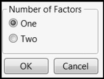
So what, at a high level at least, is going on behind the scenes in a PLS analysis? We use the script PLSGeometry.jsl to illustrate. This script generates an invisible data table consisting of 20 rows of data with three Xs and three Ys. It then models these data using either one or two factors. Run the script by clicking on the correct link in the master journal. In the control panel window that appears (Figure 4.8), leave the Number of Factors set at One and click OK.
Figure 4.8: Control Panel for PLSGeometryDemo.jsl
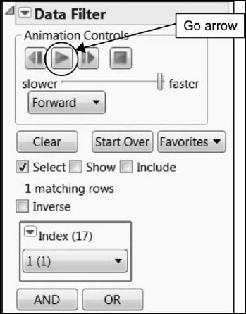
This results in a two-by-two arrangement of 3-D scatterplots, shown in Figure 4.9. A Data Filter window also opens, shown in Figure 4.10.
Because the data table behind these plots contains three responses and n = 20 observations, the response matrix Y is 20 x 3. This is the first time that we have encountered a matrix Y of responses, rather than simply a column vector of responses. To use MLR in this case, we would have to fit a model to each column in Y separately. So, any information about how the three responses vary jointly would be lost. Although in certain cases it is desirable to model each response separately, PLS gives us the flexibility to leverage information relative to the joint variation of multiple responses. It makes it easy to model large numbers of responses simultaneously in a single model.
Figure 4.9: 3-D Scatterplots for One Factor
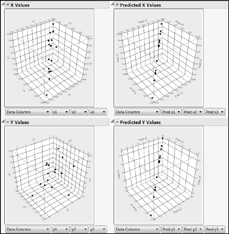
The two 3-D scatterplots on the left enable us to see the actual values for all six variables for all observations simultaneously, with the predictors in the top plot and the responses in the bottom plot. By rotating the plot in the upper left, you can see that the 20 points do not fill the whole cube. Instead, they cluster together, indicating that the three predictors are quite strongly correlated.
You can see how the measured response values relate to the measured predictor values by pressing the Go arrow in the Animation Controls on the video-like control of the Data Filter window that the script produced (Figure 4.10). When you do this, the highlighting loops over the observations and shows the corresponding observations in the other plots. To pause the animation, click the button with two vertical bars that has replaced the Go arrow.
Figure 4.10: Data Filter for Demonstration
The two plots on the right give us some insight into how PLS works. These plots display predicted, rather than actual, values. By rotating both of these plots, you can easily see that the predicted X and Y values are perfectly co-linear. In other words, for both the Xs and the Ys, the partial least squares algorithm has projected the three-dimensional cloud of points onto a line.
Now, once again, run through the points using the Animation Controls in the Data Filter window and observe the two plots on the right. Note that, as one moves progressively along the line in Predicted X Values, one also moves progressively along the line in Predicted Y Values. This indicates that PLS not only projects the point clouds of the Xs and the Ys onto a lower-dimensional subspace, but it does so in a way that reflects the correlation structure between the Xs and the Ys. If you were given a new observation’s three X coordinates, PLS would enable you to obtain its predicted X values, and PLS would use related information to compute corresponding predicted Y values for that observation.
In Appendix 1, we give the algorithm used in computing these results. For now, simply note that we have illustrated the statement made earlier in this chapter that PLS is a projection method that reduces dimensionality. In our example, we have taken a three-dimensional cloud of points and represented those points using a one-dimensional subspace, namely a line. As the launch window indicates, we say that we have extracted one factor from the data. In our example, we have used this one factor to define a linear subspace onto which to project both the Xs and the Ys.
Because it works by extracting latent variables, partial least squares is also called projection to latent structures. While the term “partial least squares” stresses the relationship of PLS to other regression methods, the term “projection to latent structures” emphasizes a more fundamental empirical principle: Namely, the underlying structure of highly dimensional data associated with complex phenomena is often largely determined by a smaller number of factors or latent variables that are not directly accessible to observation or measurement (Tabachnick and Fidell 2001). It is this aspect of projection, which is fundamental to PLS, that the image on the front cover is intended to portray.
Note that, if the observations do not have some correlation structure, attempts at reducing their dimensionality are not likely to be fruitful. However, as we have seen in the example from spectroscopy, there are cases where the predictors are necessarily correlated. So PLS actually exploits the situation that poses difficulties for MLR.
Given this as background, close your data filter and 3-D scatterplot report. Then rerun PLSGeometry.jsl, but now choosing Two as the Number of Factors. The underlying data structure is the same as before. Rotate the plots on the right. Observe that the predicted values for each of the Xs and the Ys fall on a plane, a two-dimensional subspace defined by the two factors. Again, loop through these points using the Animation Controls in the Data Filter window. As you might expect, the two-dimensional representation provides a better description of the original data than does the one factor model.
When data are highly multidimensional, a critical decision involves how many factors to extract to provide a sound representation of the original data. This comes back to finding a balance between underfitting and overfitting. We address this later in our examples. For now, close the script PLSGeometry.jsl and its associated reports.
As described earlier, PCA uses the correlation matrix for all variables of interest, whereas PLS uses the submatrix that links responses and predictors. In a situation where there are both Ys and Xs, Figure 4.1 indicates that PCA uses the orange-colored correlations, whereas PLS uses the green-colored correlations. These green entries are the correlations that link the responses and predictors. PLS attempts to identify factors that simultaneously reduce dimensionality and provide predictive power.
To see a geometric representation that contrasts PLS and PCA, run the script PLS_PCA.jsl by clicking on the correct link in the master journal. This script simulates values for two predictors, X1 and X2, and a single response Y. A report generated by this script is shown in Figure 4.11.
Figure 4.11: Plots Contrasting PCA and PLS
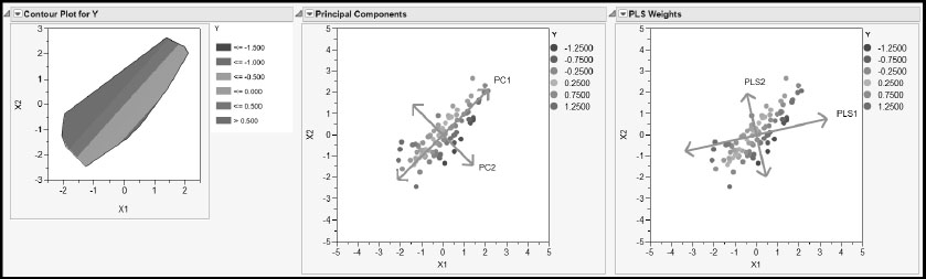
The Contour Plot for Y on the left shows how the true value of Y changes with X1 and X2. The continuous color intensity scale shows large values of Y in red and small values in blue, as indicated by the legend to the right of the plot. The contour plot indicates that the response surface is a plane tilted so that it slopes upward in the upper left of the X1, X2 plane and downward in the lower right of the X1, X2 plane. Specifically, the relationship is given by Y = –X1 + .75X2.
The next two plots, Principal Components and PLS Weights, are obtained using simulated values for X1 and X2. But Y is computed directly using the relationship shown in the Contour Plot.
The Principal Components plot shows the two principal components. The direction of the first component, PC1, captures as much variation as possible in the values of X1 and X2 regardless of the value of Y. In fact, PC1 is essentially perpendicular to the direction of increase in Y, as shown in the contour plot. PC1 ignores any variation in Y. The second component, PC2, captures residual variation, again ignoring variation in Y.
The PLS Weights plot shows the directions of the two PLS factors, or latent variables. Note that PLS1 is rotated relative to PC1. PLS1 attempts to explain variation in X1 and X2 while also explaining some of the variation in Y. You can see that, while PC1 is oriented in a direction that gives no information about Y, PLS1 is rotated slightly toward the direction of increase (or decrease) for Y.
This simulation illustrates the fact that PLS tries to balance the requirements of dimensionality reduction in the X space with the need to explain variation in the response. You can close the report produced by the script PLS_PCA.jsl now.
Extracting Factors
Before considering some examples that illustrate more of the basic PLS concepts, let’s introduce some of the technical background that underpins PLS. As you know by now, a main goal of PLS is to predict one or more responses from a collection of predictors. This is done by extracting linear combinations of the predictors that are variously referred to as latent variables, components, or factors. We use the term factor exclusively from now on to be consistent with JMP usage.
We assume that all variables are at least centered. Also keep in mind that there are various versions of PLS algorithms. We mentioned earlier that JMP provides two approaches: NIPALS and SIMPLS. The following discussion describes PLS in general terms, but to be completely precise, one needs to refer to the specific algorithm in use.
With this caveat, let’s consider the calculations associated with the first PLS factor. Suppose that X is an n x m matrix whose columns are the m predictors and that Y is an n x k matrix whose columns are the k responses. The first PLS factor is an m x 1 weight vector, w1, whose elements reflect the covariance between the predictors in X and the responses in Y. The jth entry of w1 is the weight associated with the jth predictor. The vector w1 defines a linear combination of the variables in X that, subject to norm restrictions, maximizes covariance relative to all linear combinations of variables in Y. This vector defines the first PLS factor.
The weight vector w1 is used to weight the observations in X. The n weighted linear combinations of the entries in the columns of X are called X scores, denoted by the vector t1. In other words, the X scores are the entries of the vector t1 = Xw1. Note that the score vector, t1, is n x 1; each observation is given an X score on the first factor. Think of the vector w1 as defining a linear transformation mapping the m predictors to a one-dimensional subspace. With this interpretation, Xw1 represents the mapping of the data to this one-dimensional subspace.
Technically, t1 is a linear combination of the variables in X that has maximum covariance with a linear combination of the variables in Y, subject to normalizing constraints. That is, there is a vector c1 with the property that the covariance between t1 = Xw1 and u1 = Yc1 is a maximum. The vector c1 is a Y weight vector, also called a loading vector. The elements of the vector u1 are the Y scores. So, for the first factor, we would expect the X scores and the Y scores to be strongly correlated.
To obtain subsequent factors, we use all factors available to that point to predict both X and Y. In the NIPALS algorithm, the process of obtaining a new weight vector and defining new X scores is applied to the residuals from the predictive models for X and Y. (We say that X and Y are deflated and the process itself is called deflation.) This ensures that subsequent factors are independent of (orthogonal to) all previously extracted factors. In the SIMPLS algorithm, the deflation process is applied to the cross-product matrix. (For complete information, see Appendix 1.)
Models in Terms of X Scores
Suppose that a factors are extracted. Then there are:
• a weight vectors, w1, w2,...,wa
• a X-score vectors, t1, t2,...,ta
• a Y-score vectors, u1, u2,...,ua
We can now define three matrices: W is the m x a matrix whose columns consist of the weight vectors; T and U are the n x a matrices whose columns consist of the X-score and Y-score vectors, respectively. In NIPALS, the Y scores, ui, are regressed on the X scores, ti, in an inner relation regression fit.
Recall that the matrix Y contains k responses, so that Y is n x k. Let’s also assume that X and Y are both centered and scaled. For both NIPALS and SIMPLS, predictive models for both Y and X can be given in terms of a regression on the scores, T. Although we won’t go into the details at this point, we introduce notation for these predictive models:
(4.1)
where P is m x a and Q is k x a. The matrix P is called the X loading matrix, and its columns are the scaled X loadings. The matrix Q is sometimes called the Y loading matrix. In NIPALS, its columns are proportional to the Y loading vectors. In SIMPLS, when Y contains more than one response, its representation in terms of loading vectors is more complex. Each matrix projects the observations onto the space defined by the factors. (See Appendix 1.) Each column is associated with a specific factor. For example, the ith column of P is associated with the ith extracted factor. The jth element of the ith column of P reflects the strength of the relationship between the jth predictor and the ith extracted factor. The columns of Q are interpreted similarly.
To facilitate the task of determining how much a predictor or response variable contributes to a factor, the loadings are usually scaled so that each loading vector has length one. This makes it easy to compare loadings across factors and across the variables in X and Y.
Model in Terms of Xs
Let’s continue to assume that the variables in the matrices X and Y are centered and scaled. We can consider the Ys to be related directly to the Xs in terms of a theoretical model as follows:
Y = Xβ + εY.
Here, β is an m x k matrix of regression coefficients. The estimate of the matrix β that is derived using PLS depends on the fitting algorithm. The details of the derivation are given in Appendix 1.
The NIPALS algorithm requires the use of a diagonal matrix, Δb, whose diagonal entries are defined by the inner relation mentioned earlier, where the Y scores, ui, are regressed on the X scores, ti. The estimate of β also involves a matrix, C, that contains the Y weights, also called the Y loadings. The column vectors of C define linear combinations of the deflated Y variables that have maximum covariance with linear combinations of the deflated X variables.
Using these matrices, in NIPALS, β is estimated by
(4.2) B = W(P'W)-1ΔbC'
and Y is estimated in terms of X by
The SIMPLS algorithm also requires a matrix of Y weights, also called Y loadings, that is computed in a different fashion than in NIPALS. Nevertheless, we call this matrix C. Then, for SIMPLS, β is estimated by
(4.3) B = WC'
and Y is estimated in terms of X by
Properties
Perhaps the most important property, shared by both NIPALS and SIMPLS, is that, subject to norm restrictions, both methods maximize the covariance between the X structure and the Y structure for each factor. The precise sense in which this property holds is one of the features that distinguishes NIPALS and SIMPLS. In NIPALS, the covariance is maximized for components defined on the residual matrices. In contrast, the maximization in SIMPLS applies directly to the centered and scaled X and Y matrices.
The scores, which form the basis for PLS modeling, are constructed from the weights. The weights are the vectors that define linear combinations of the Xs that maximize covariance with the Ys. Maximizing the covariance is directly related to maximizing the correlation. One can show that maximizing the covariance is equivalent to maximizing the product of the squared correlation between the X and Y structures, and the variance of the X structure. (See the section “Bias toward X Directions with High Variance” in Appendix 1, or Hastie et al. 2001.)
Recalling that correlation is a scale-invariant measure of linear relationship, this insight shows that the PLS model is pulled toward directions in X space that have high variability. In other words, the PLS model is biased away from directions in the X space with low variability. (This is illustrated in the section “PLS versus PCA”.) As the number of latent factors increases, the PLS model approaches the standard least squares model.
The vector of X scores, ti, represents the location of the rows of X projected onto the ith factor, wi. The entries of the X loading vector at the ith iteration are proportional to the correlations of the centered and scaled predictors with ti. So, the term loading refers to how the predictors relate to a given factor in terms of degree of correlation. Similarly, the entries of the Y loading vector at the ith iteration are proportional to the correlations of the centered and scaled responses with ti. JMP scales all loading vectors to have length one. Note that Y loadings are not of interest unless there are multiple responses. (See “Properties of the NIPALS Algorithm” in Appendix 1.)
It is also worth pointing out that the factors that define the linear surface onto which the X values are projected are orthogonal to each other. This has these advantages:
• Because they relate to independent directions, the scores are easy to interpret.
• If we were to fit two models, say, one with only one extracted factor and one with two, the single factor in the first model would be identical to the first factor in the second model. That is, as we add more factors to a PLS model, we do not disturb the ones we already have. This is a useful feature that it is not shared by all projection-based methods; independent component analysis (Hastie et al. 2001) is an example of a technique that does not have this feature.
We detail properties associated with both fitting algorithms in Appendix 1.
Example
Now, to gain a deeper understanding of two of the basic elements in PLS, the scores and loadings, open the data table PLSScoresAndLoadings.jmp by clicking on the correct link in the master journal. This table contains two predictors, x1 and x2, and two responses, y1, and y2, as well as other columns that have been saved, as we shall see, as the result of a PLS analysis. The table also contains six scripts, which we run in order.
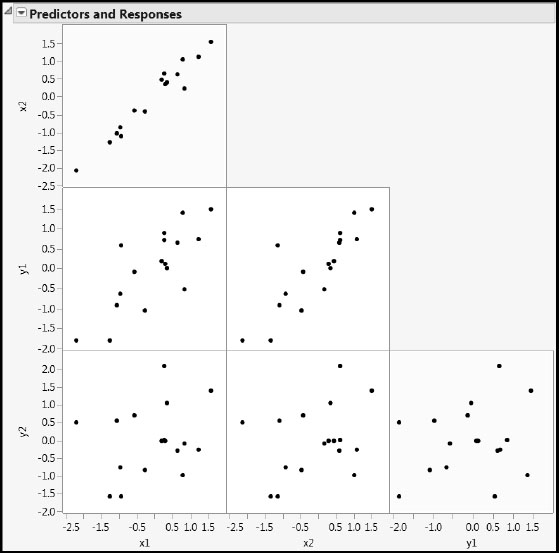
Run the first script, Scatterplot Matrix, to explore the relationships among the two predictors, x1 and x2, and the two responses, y1, and y2 (Figure 4.12). The scatterplot in the upper left shows that the predictors are strongly correlated, whereas the scatterplot in the lower right shows that the responses are not very highly correlated. (See the yellow cells in Figure 4.12.)
Figure 4.12: Scatterplots for All Four Variables
The ranges of values suggest that the variables have already been centered and scaled. To verify this, run the script X and Y are Centered and Scaled. This produces a summary table showing the means and standard deviations of the four variables.
The data table itself includes a number of saved columns that were generated by fitting a PLS model with one factor. If you want to see the details, use the script PLS with One Factor to re-create the report from which the additional columns in the table were saved.
Scores
As we saw in the section “How Does PLS Work?”, when we extract a single factor the observations are projected onto a line. The script Projections and Scores helps us explore this projection and the idea of a PLS score. Running the script gives the report shown in Figure 4.13.
Figure 4.13: Plots Describing Projection onto a Line
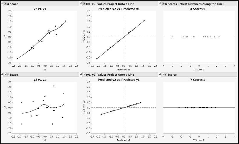
For each of the Xs and the Ys, the leftmost plot shows the raw data, with a smoothing spline superimposed to show the general behavior of the relationship.
The predicted values shown in both middle panels of Figure 4.13 are obtained by regressing the two Xs and two Ys on the score vector t, given as X Scores 1 in the data table. Let’s focus on the plot for x1 and x2. Because both x1 and x2 are regressed on a single predictor, t(X Scores 1), their predicted values fall on a line. Here, we have plotted the predicted values of x1 and x2 against each other. Note that the predicted values do a good job of describing the behavior of the raw data in the X space.
Now, let’s look at the rightmost plot in the top row. Here we are thinking of the new basis vector defined by the weight vector as having been rotated to a horizontal direction. This axis represents the first PLS factor, and it gives a basis vector for a coordinate system defined by potentially more factors. The points that are plotted along this line are the X scores. Remember, these are the elements of the vector t = Xw. Note that the X scores reflect precisely the distances from the corresponding points in the middle graph to the origin of the x1 and x2 plane.
Predicted values for y1 and y2 are also obtained by regressing these variables on t. The predicted values for y1 and y2 are plotted in the middlemost panel in the second row in Figure 4.13. Again, because both y1 and y2 are regressed on a single predictor, t, their predicted values fall on a line. There is more variability in the raw Y values than in the raw X values, and so the predicted values of y1 and y2 don’t represent the data in the Y space very closely. Yet, PLS was able to pick up the joint upward trend in the two Y variables shown by the smoother.
Recall that the X-score vector, t, is determined so as to maximize the covariance with some linear combination of the variables in Y. This linear combination of the variables in Y, when applied to the observations, produces the vector of Y scores, u. These are shown in the rightmost panel of the second row.
To help you see what is happening, while you have the PLS Loadings and Scores window still open, run the script Animation for Scores. This opens a Data Filter window. Run the animation by clicking on the single-headed arrow under Animation Controls. Note that you can set the animation speed using the slider in the Animation Controls panel.
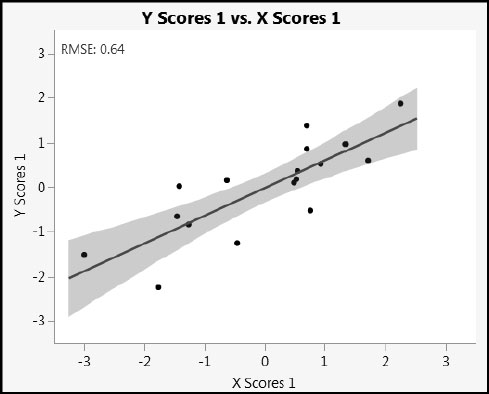
As the animation runs forward, it scrolls through the rows as they are ordered in the data table. X Scores 1 increases monotonically, but the values of Y Scores 1 do not. This is because, unsurprisingly, the scores themselves are not perfectly related. To see this, run the script X Scores Predicting Y Scores to obtain the plot in Figure 4.14.
Figure 4.14: Y Scores 1 versus X Scores 1
If we had fit a PLS model with a latent variables, JMP would allow you to save columns called X Scores 1, X Scores 2, . . ., X Scores a and Y Scores 1, Y Scores 2, …, Y Scores a, back to the data table. As mentioned earlier, we can group the scores t1, t2,...ta, (respectively, u1, u2,...,ua) into an n x a matrix T (respectively, an n x a matrix U). Note that scores are associated with rows in the data table (samples or units on which measurements are made). Scatterplots of scores help diagnose univariate and multivariate outliers, as well as the need to augment the model, perhaps with polynomial terms, to properly account for curvature.
Loadings
Notice the slopes of the blue lines in the two middle plots of Figure 4.13. Given that the horizontal and vertical scales are identical, it appears that x1 and x2 are about equally correlated with the scores on the extracted factor. On the other hand, y1 appears to have a stronger relationship with the scores on the extracted factor than does y2. Confirmatory and more precise information can be found in the report produced by PLS with One Factor. The plots shown in the reports entitled X Loading Plot and Y Loading Plot are shown in Figure 4.15. These are plots of the X loadings and Y loadings.
Figure 4.15: X and Y Loadings Plots
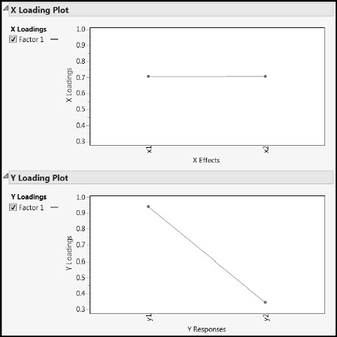
Recall that the Y loadings describe how Y is related to the extracted factor, and similarly for the X loadings. Also, as we mentioned earlier, the loadings are normalized so that their values can be compared across factors and across X and Y. The vertical axes in the two loading plots are identical. You can see that x1 and x2 load about equally on the one extracted factor, while y1 is more important in terms of its loading on that factor than is y2.
Note that if we had fit a PLS model with a factors, there would be a check boxes (labeled Factor 1, Factor 2,…, Factor a) shown to the left of the plots in this report. This would enable us to view loadings on all factors or only on the checked factors.
Keep in mind that loadings are related to columns in the data table, namely to the predictors or responses, and that loadings show the relative importance of each variable in the definition of the extracted factors. Loadings can sometimes help simplify a model by identifying non-essential variables.
An Example Exploring Prediction
To gain more insight on how PLS works as a predictive model, open the data table PLSvsTrueModel.jmp by clicking on the link in the master journal. This table contains two Xs, three Ys, and ten observations. Click on the plus icons next to Y1, Y2, and Y3 in the Columns panel to see how the Ys are determined by the Xs. You see the following:
Y1 = X1 + RandomNormal(0, 0.01)
Y2 = X2 + RandomNormal(0, 0.01)
Y3 = X1 + X2 + RandomNormal(0, 0.01)
(The notation RandomNormal(0, 0.01) represents normal noise variation with mean 0 and standard deviation 0.01.)
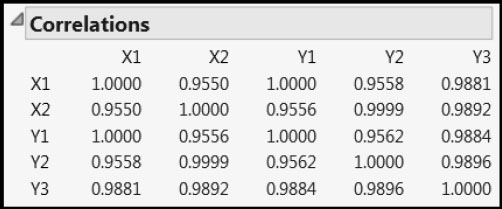
Run the script Multivariate to see the correlation relationships among the five variables (Figure 4.16). The correlations of Y1 with X1 and Y2 with X2 are essentially one, whereas the correlation of Y3 with each of X1 and X2 is almost .99. Beyond this, the Xs and Ys are highly correlated among themselves.
Figure 4.16: Correlations among Xs and Ys
We begin by fitting a one-factor NIPALS model to the Ys. We then obtain the prediction formulas. These are already saved to the data table, but we first show how to obtain them. Then we examine the prediction formulas.
Obtaining the Prediction Formulas
Populate the Fit Model window as illustrated in Figure 4.17 by selecting Analyze > Fit Model. Click Run.
Figure 4.17: Fit Model Window
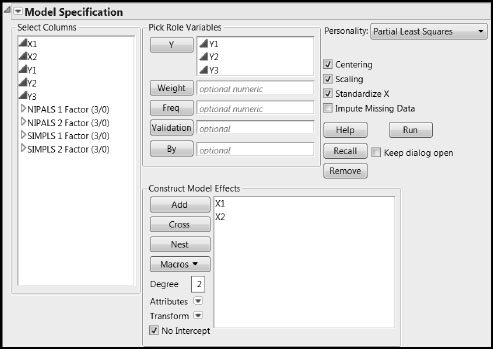
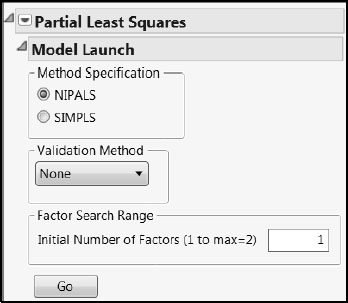
In the Partial Least Squares Model Launch control panel, accept the NIPALS default, set the Validation Method to None, and set the Initial Number of Factors to 1 (shown in Figure 4.18). Click Go.
Figure 4.18: Partial Least Squares Model Launch Settings
In the NIPALS Fit with 1 Factors report, click the red triangle and select Save Columns > Save Prediction Formula. This adds three new columns to the far right in your data table. It also appends these three columns to the Columns panel at the left of the data grid. Click the + sign to the right of the new column Pred Formula Y1 5 in the Columns panel. You should see the formula shown in Figure 4.19. Click the red triangle above the function key pad and select Simplify, as shown in Figure 4.19.
Figure 4.19: Formula for Y1
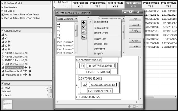
When simplified, with coefficients rounded to four decimal places, the formula is
-0.0224 + 0.5014* X1 + 0.4673* X2
Formulas for the three responses have been obtained in this fashion. They are in the column group called NIPALS 1 Factor. Similarly constructed column groups are given for the formulas for the one-factor SIMPLS fit and for the NIPALS and SIMPLS two-factor fits (SIMPLS 1 Factor, NIPALS 2 Factor, and SIMPLS 2 Factor).
Examining the Prediction Formulas
Recall that Y1 is essentially determined by X1, Y2 by X2, and Y3 by the sum of X1 and X2. In the column group NIPALS 1 Factor, click on each of the plus signs for the three formulas. Despite the underlying model, the coefficients for the Xs in all prediction formulas place approximately equal weight on each of X1 and X2. Although the prediction formula for Y3 is consistent with the underlying model, the prediction formulas for Y1 and Y2 are not. Here are the prediction formulas:
PredFormula Y1 = -0.0224 + 0.5014* X1 + 0.4673* X2
PredFormula Y2 = -0.0225 + 0.5362* X1 + 0.4997* X2
PredFormula Y3 = -0.0004 + 1.0378* X1 + 0.9672* X2
Yet, the prediction formulas do a very good job of predicting the Y values. Run the script Pred vs Actual Plots – One Factor, which produces Figure 4.20. This produces plots of the predicted values against the actual values, together with a line on the diagonal (intercept 0 and slope 1).
Figure 4.20: Predicted by Actual Plots for One-Factor PLS Model
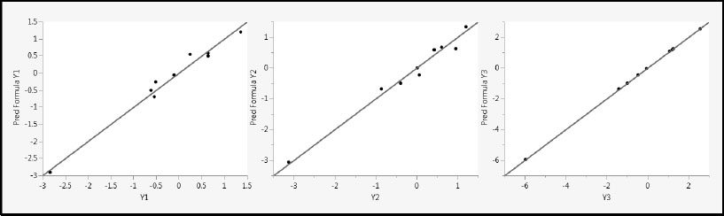
The reason that all three fits are good is that PLS exploits the correlation among the Xs in determining latent factors. With the single factor it has extracted, PLS models the fairly high correlation between X1 and X2, as well as the covariance with the variables in Y. The result is that both X1 and X2 receive about equal weight in the one-factor model.
You can check that standard least squares models for Y1 and Y2 using X1 and X2 as predictors are more faithful to the true model and provide better fits than does PLS. However, the PLS fit we examined used only one factor (or predictor), while the regression fits use two predictors. If you fit PLS models with two factors, these two factors explain all of the variation in the Xs and the prediction models for the Ys are identical to the standard least squares fits.
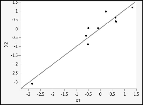
This example also illustrates very strikingly how the one-factor PLS model is biased in the direction of maximum variability in the Xs. Figure 4.21 shows a plot of X2 versus X1. The two variables are highly collinear, and the direction of maximum variability is close to the 45 degree line in the X1 and X2 plane. This is reflected in the coefficients for the one-factor PLS fits, where the coefficients for X1 and X2 are nearly equal, with the coefficient for X2 slightly smaller than the coefficient for X1. As mentioned earlier, when a second factor is added to the PLS model, the prediction models are identical to the standard least squares regression models, and the bias disappears.
Figure 4.21: Scatterplot of X1 versus X2
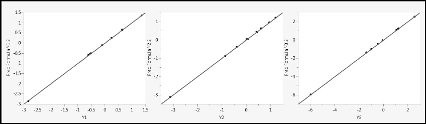
Now, we fit a two-factor model. If you run the Fit Model script, you see a report entitled NIPALS Fit with Two Factors. We have already saved the prediction formulas for this two-factor fit to the data table and simplified them. Examine these formulas to see that the following prediction equations were obtained:
PredFormula Y1 2 = -0.0008 + 0.9960* X1 + 0.0066* X2
PredFormula Y2 2 = -0.0005 + 0.0099* X1 + 0.9901* X2
PredFormula Y3 2 = -0.0007 + 1.0125* X1 + 0.9907* X2
These formulas faithfully reflect the true relationship between the Ys and the Xs. In fact, these are precisely the predictive models that you would obtain were you to regress each of the Ys individually on X1 and X2. The two PLS factors capture all of the variation in the Xs. Figure 4.22 shows the predicted values plotted against the actual values. (Script is Pred vs Actual Plots – Two Factors.)
Figure 4.22: Predicted by Actual Plots for Two-Factor PLS Model
The two-factor PLS model results in better fits than does the one-factor model, but note that the one-factor model predictions were very good, given that only one factor was used. The one-factor model leveraged information about correlation in the Xs to obtain a very good model for the Ys.
The one-factor model gives us some insight on variable selection using PLS when the modeling objective is geared to explanation rather than prediction. Using the one-factor model, we would be hard-pressed to determine which of X1 or X2 is more likely to be active relative to Y1 or Y2. Because of the high correlation between them, both X1 and X2 have coefficients of about equal size. So, deciding which is active based on coefficient size is not effective. The VIP criterion mentioned in the section “Why Use PLS?” is often used for variable selection. But, in this case, this criterion would also be ineffective because of the high correlation.
SIMPLS predicted values are given as hidden columns in the data table. If you peruse these, you will not see any differences of note relative to the NIPALS fits. In fact, the one-factor fits are identical—this is always the case. The two-factor prediction equations are identical to the least squares fit.
You can now close PLSvsTrueModel.jmp.
Choosing the Number of Factors
In the section “Underfitting and Overfitting: A Simulation” in Chapter 2, we showed how critical it is to select a model that strikes a balance between fitting the structure in the data and fitting the noise. In terms of PLS, this becomes a question of how many factors to extract. If we were to build a PLS model with the maximum possible number of factors, then we would very likely be overfitting the data.
Our hope is that there is sufficient correlation within the data so that a value of a much smaller than the rank of X provides us with a useful model. We have already seen this happen in specific examples. For example, recall that the spearhead data in the section “An Example of a PLS Analysis” in Chapter 1 had 10 predictors. Yet, using a model with a = 3, we were able to perfectly classify 10 new spearheads with no errors. In this example, the dimensionality of the X space was effectively reduced from 10 to 3. So the general question is, how should we determine the optimal number of factors when conducting a PLS analysis?
Think of a data set as being partitioned into two parts: a training set and a validation set. The training set is used to develop a model. So, for example, the rows in the training set are used to estimate the model parameters. That model is then evaluated using the validation set. This is done by applying the model to the rows in the validation set and using one or more criteria that measure how well the model predicts this data. In this way, the fit of the model is evaluated on a set of data that is independent of the data used to develop the model.
The value of this strategy is in choosing among models. One constructs a number of different models using the training set. For example, one might compare multiple linear regressions, or partition models, or neural nets, with different predictor sets; or one might compare PLS models with different numbers of factors. These models all tend to fit the training set better than they fit “new” observations, because their parameters are tuned using the training data. To take this bias out of the picture, all of these models should be compared in terms of their performance on the independent validation set. On this basis, a “best” model is chosen.
Although the validation set is independent of the training set that was used to fit the best model, the choice of the best model is nevertheless influenced by the validation set. So, again, there is the potential for bias when one uses that best model to predict values for new observations. To avoid an over-optimistic picture of how this best model will perform on new observations, analysts often reserve a test set as well. The test set is used exclusively for assessing the best model’s performance. So, in a data-rich situation, one might partition the data, for example, into a 50% training set, a 30% validation set, and a 20% test set.
Think back to the data table Spearheads.jmp that we used as an example in Chapter 1. The model for the spearhead data was built using nine observations, and the performance of this model was assessed using 10 observations that had not been used in the construction of the model. The nine observations were our training and validation set. The remaining 10 observations were treated as a test set, enabling us to assess the usefulness of our model.
We focus only on training and validation sets at this point. The validation scenario that we have described, using a single training set and a single validation set, is called the holdout method. This is because we “hold out” some observations for model validation. The limitation of this method is that the evaluation is highly dependent on exactly which points are included in the training set and which are included in the validation set. One can fall victim to an unfortunate split.
The k-fold cross validation method improves on the holdout method. In this method, the data are randomly split into k subsets, or folds, of approximately equal size. Each one of the k folds is treated as a holdout sample. In other words, for a given fold, all the remaining data are used as a training set and that fold is used as a validation set. This leads to k analyses and then to k values of the statistic or statistics used to evaluate prediction error. These statistics are usually averaged to give an overall measure of fit.
The k-fold cross validation method ensures that each observation in the data set is used in a validation set exactly once and in a training set k-1 times. So how the data are divided is less important than in the holdback method, where, for example, one outlier in the training or validation set can unduly influence conclusions.
A special type of k-fold cross validation consists of choosing k to be equal to the number of observations in the data set, n. This is called leave-one-out cross validation. The data are split into n folds, each consisting of a single observation. For each fold, the model is fit to all observations but that one observation, and that single holdout observation is used as the validation set. This leads to n estimates of prediction error that are averaged to give a final measure for evaluation. Note that when all observations but one are used to train the data, the model obtained is unlikely to differ greatly from a model obtained using the entire data set.
The question of which type of cross validation is best for model selection is a difficult one (Arlot and Celisse 2010). It is generally agreed that k-fold cross validation is better than the holdout method. In practice, the choice of the number of folds depends on the size of the data set. Often, moderate numbers of folds suffice. The general consensus is that 10 is an adequate number of folds. The leave-one-out method tends to result in error estimates with high variance and is generally used only with small data sets.
A Simulation of K-Fold Cross Validation
Let’s get a sense of how k-fold cross validation works using the data table BigClassCVDemo.jmp, which you open by clicking on the correct link in the master journal. This is the same data as in the JMP sample data table BigClass.jmp, consisting of measurements on 40 students. We are interested in predicting weight from age, sex, and height.
Run the first script, Create Folds. This creates a new column called Folds that randomly assigns each observation to one of four folds in a way that creates folds of equal sizes. Select Analyze > Distribution to verify that each fold consists of 10 observations.
Our first step is to fit a regression model to all observations not in fold 1. To do this, run the script Fit Model Excluding Fold 1. You see that the script excludes and hides the fold 1 rows, generates a regression report, and adds a column to the data table, Pred Formula weight 1, containing the prediction formula generated by the model. Keep in mind that the prediction formula is developed using a model that was fit, or trained, without the fold 1 observations.
To see how well the model fits observations in the validation set, fold 1, one approach is to consider the root mean square error of prediction (RMSE) for fold 1. In other words, you take the differences between the actual values of weight and those predicted based on the training set, square these, and take the square root of their adjusted mean. This estimates the error variability. To get a visual sense of this calculation, run the script Graph Builder – Fit Excluding Fold 1. For our random allocation of observations to folds, we obtain the plot in Figure 4.23. Note that your random allocation leads to slightly different results from those shown in Figure 4.23.
Figure 4.23: Comparison of Fits across Folds with Fold 1 as Validation Set
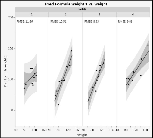
We would expect the fit for fold 1 observations to be the worst, and in this case it is. For our random allocation, fold 1 has the highest RMSE. If the data for the other three folds were combined, their combined RMSE would be somewhat lower than that of fold 1. All the same, the model fit for fold 1 observations is not that much worse than the fit for the three folds used in the training set.
At this point, we suggest that you run the three remaining Fit Model Excluding Fold “k” scripts to save the prediction formulas to the data table. You can also run the Graph Builder – Fit Excluding Fold “k” scripts. Once you have saved the four prediction formulas, run the script Comparison. This script plots predicted versus actual values for each fold, where the model has been fit using the remaining data. It also plots the actual values of weight and their corresponding predicted values by row. The distances between these points are the prediction errors. These are the values that are squared to form the prediction error sum of squares, used in defining the RMSE.
You see variation in the RMSE over the four folds. The average of these four values provides a measure of how well a multiple linear regression model based on the three predictors fits new observations.
Validation in the PLS Platform
JMP Pro users see all of the validation methods that we have described under Validation Method in the PLS Model Launch control panel. Specifically, the selection includes KFold, Holdback, Leave-One-Out, and None. (Although Leave-One-Out is not in JMP Pro 10, it can be obtained by specifying KFold with the number of folds equal to the number of observations.) The default value of k for k-fold cross validation used in the PLS platform is seven, but this can be changed as desired. Users of JMP have a choice of Leave-One-Out and None.
Assuming that you use one of the JMP validation methods when you run PLS, the PLS platform helps you to identify an optimum number of factors. If you don’t use a validation method, you need to specify an Initial Number of Factors. Based on the report you obtain, you can then choose to reduce or increase that number of factors. In either case, the maximum number of factors that can be fit is 15, regardless of the number of predictors and responses. Note that this is consistent with the interests of dimensionality reduction.
When you use a model validation method, the PLS platform bases its selection of the optimum number of factors on the Root Mean PRESS statistic (where PRESS comes from “Predicted REsidual Sum of Squares”), evaluated on validation observations. This is a value that is computed in a fashion similar to how the prediction root mean square error was computed for BigClassCVDemo.jmp earlier. The details of the JMP calculation are given in the section “Determining the Number of Factors” in Appendix 1.
There are a few points to be noted relative to the JMP PLS implementation:
• The PLS platform enables you to fit and review multiple models within the same report window. But, if you use a model validation method, it presents a default fit of a PLS model based on the number of factors that it has determined to be optimum. To fit a model with a different number of factors, you need to specify that number in the Model Launch control panel, which remains open at the top of the report, and run the new analysis.
• Although the word “optimum” is seductive, when your modeling goals involve an aspect of explanation as well as prediction, it might be advantageous to investigate models with a smaller number of factors. Often there are models with fewer factors that are essentially equivalent to the selected optimum model.
• When you use a model validation method, the PLS platform provides you with van der Voet T2 tests (van der Voet 1994) to help you formally identify models with smaller numbers of factors that are not significantly different from the optimum model. Van der Voet p-values are obtained using Monte Carlo simulation, so the p-value associated with a value of the test statistic is not unique.
The following comments apply specifically to JMP Pro 10.0.2 and 11. With row states, validation columns, and the built-in capabilities of the PLS platform, JMP Pro provides a number of ways to control exactly how rows are used for training, validation, and testing.
• In JMP Pro, PLS can be fit using the Partial Least Squares personality in the Fit Model launch window. This window allows for a user-specified Validation column to be entered. If you assign a column to this role, it is used to define a holdout sample. If you do not assign a column to this role, then you are presented with Validation options in the Model Launch control panel: KFold, Holdback, Leave-One-Out (in JMP Pro 11), and None.
• The JMP convention in defining validation columns is as follows: A validation column can contain various integer values. If it contains only two values, say i1 and i2, where i1 < i2, then i1 corresponds to the training data and i2 corresponds to the validation data. In JMP Pro 11, if the validation column has three values, i1 < i2 < i3, then i3 corresponds to test set data. If the number of levels, r, exceeds 2 in JMP Pro 10.0.2 or 3 in JMP Pro 11, then the PLS platform uses the r levels to perform r-fold cross validation.
• Note that a validation column with two levels does not result in 2-fold cross validation, because any one row appears in only one group, and the model is only fit once.
• Once a validation strategy has been applied using the Model Launch control panel, you can save a column to the data table containing the fold or holdback assignments for the observations. Select Save Columns > Save Validation from the red triangle menu of any one of the fits in the report window. This column can then be used in the Validation role in a subsequent Fit Model launch, if desired.
• The random assignments used by KFold and Holdback are controlled by a random seed. If you need to reproduce the same assignment of observations to validation sets for future PLS launches, you can select Set Random Seed from the top level red triangle menu in the Partial Least Squares report, and set the random seed to a specified value.
• If you choose to use a two-level or three-level validation column in the Fit Model window or the validation method Holdback in the PLS Model Launch control panel, all models fit in the PLS report window are based on the training data only. If you use KFold validation, then the models are fit using all observations.
In the examples in subsequent chapters, we often use row states to isolate a small test set of observations. With the remaining observations, we fit models using JMP validation functionality to build and validate models. A test set that is completely independent of the modeling process is extremely useful for model assessment, and for demonstration and learning purposes.
The NIPALS and SIMPLS Algorithms
The methodology of partial least squares (PLS) was developed in connection with social science modeling in the 1960s with the work of Herman Wold (Dijkstra 2010; Mateos-Aparicio 2011; Wold, H. 1966). Svante Wold, Herman Wold’s son, has added substantially to the body of theory and applications connected with PLS, particularly in the area of chemometrics.
The algorithm that Herman Wold implemented was called the nonlinear iterative partial least squares algorithm (NIPALS), and this became a foundational element for the theory of PLS regression (Wold, H. 1980). Actually, the NIPALS algorithm existed before it was used for PLS (Wold, H. 1980). The algorithm is based on a sequence of simple ordinary least squares linear regression fits.
By way of review, consider the case where Y consists of a single response variable. The first factor is the linear combination of the X variables that has the maximum covariance with Y. A score vector for the X variables is computed by applying this linear combination to the X variables, and then Y is regressed on that single score vector. The deflated residuals are calculated, and the process is repeated so that a second factor that maximizes the covariance with Y is extracted. Working with residuals ensures that the second factor is orthogonal to the first. This process is repeated successively until sufficiently many factors have been extracted.
NIPALS avoids working with the covariance matrix directly. As such, it can handle very large numbers of X and Y variables. We have seen that cross validation can be used to determine when to stop extracting factors. The idea is that a large amount of the variation in both Y and X can often be explained by a small number of factors.
The NIPALS algorithm is one method for fitting PLS models. Another popular algorithm is the SIMPLS algorithm, where SIMPLS stands for “Statistically Inspired Modification of the PLS Method.” This methodology was introduced by Sijmen de Jong in 1993 (de Jong 1993). De Jong’s goal was to take a traditional statistical approach to PLS. He wanted to explicitly specify the statistical criterion to be optimized, solve the resulting problem, and then derive an efficient algorithm to generate the solution. He accomplished all of this in his 1993 paper, and the algorithm that he proposed has come to be called the SIMPLS algorithm.
In his paper, de Jong showed that, for a single response variable in Y, the NIPALS algorithm and the SIMPLS algorithm lead to identical predictive models. However, for multivariate Y, the two predictive models do differ slightly, indicating that the earlier NIPALS method does not exactly optimize de Jong’s statistical criterion.
Useful Things to Remember About PLS
As we have seen, PLS is a method for relating inputs, X, to outputs, or responses, Y, using a multivariate linear model. Its value is in its ability to model data that involve many collinear and noisy variables in both X and Y, some of which might contain missing data. Unlike ordinary least squares methods, PLS can be used to model data with more X and/or Y variables than there are observations.
PLS does this by extracting factors from X and using these as explanatory variables for Y. PLS differs from principal components analysis (PCA), where one reduces the dimension of the X matrix by defining factors that are optimal in terms of explaining X. In contrast, in PLS, the factors not only explain variation in X, but also in Y. In PCA, there is no guarantee that a factor will be useful in explaining Y. For this reason, many consider PLS a better predictive modeling technique than PCR, which simply regresses each variable in Y on the PCA components of X.
Partly, but not exclusively, due to the widespread use of automated test equipment, we are seeing data sets with increasingly large numbers of columns (variables, v) and rows (observations, n). Often, it is cheap to increase v and expensive to increase n.
In situations where such a data set consists of predictors and responses, PLS is a flexible approach to building statistical models for prediction. As we have seen, PLS can deal effectively with the following:
• Wide data (when v >> n, and v is large or very large)
• Tall data (when n >> v, and n is large or very large)
• Square data (when n ~ v, and n is large or very large)
• Multicollinearity
• Noise
In relative terms, PLS is a sophisticated approach to statistical model building. All the good practice that you already use to build models still applies, but this very sophistication means that you have to be especially diligent to construct a model that is genuinely useful. JMP Pro provides the functionality you need, surfaced in the intuitive style characteristic of JMP. Working through the examples in the next chapters should give you the confidence to use PLS for your own applications.