
6
Predicting the Octane Rating of Gasoline
Creating a Test Set Indicator Column
Constructing Plots of the Individual Spectra
Viewing VIPs and Regression Coefficients for Spectral Data
Model Assessment Using Test Set
The example presented in this section deals with predicting the octane rating of gasoline samples based on spectral analysis. The data set contains octane ratings (Y) and 401 diffuse reflectance measurements (Xs), measured over the wavelength range of 900 to 1700 nm in 2 nm increments (that is, in the near infrared range of the spectrum). The goal is to use the spectral data to predict octane content. The data are discussed in Kalivas (1977).
These data are typical spectroscopic data, characterized by many potential predictors (401) measured on a comparatively small number of observations (60). In fact, there has been a large research effort in chemometrics aimed at building calibration models using spectral data and other molecular descriptors. “Fat matrices,” matrices where there are many more predictors than observations, characterize these situations. As we saw in the section “Why Use PLS” in Chapter 4, MLR is not capable of fitting a unique model when the design matrix has more predictors than observations.
A least squares MLR fit would require variable selection, and this would likely underutilize the available information. Even then, multicollinearity would cause the least squares fit to be unstable with high prediction variance. This typifies the two main issues associated with fat matrices, namely, rank and multicollinearity.
PLS has two major advantages:
• It is efficient in utilizing the information in the data.
• It effectively shrinks the estimates in the coefficient vector or matrix away from the least squares estimates by not including insignificant factors in the model.
And because the extracted factors are mutually orthogonal, the regression that is performed as part of PLS is guaranteed to be non-problematic.
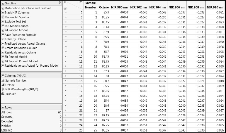
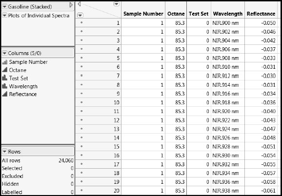
Open the Gasoline.jmp data table by clicking on the correct link in the master journal. A portion of the data table is shown in Figure 6.1. Each row gives data on a gasoline sample, whose Sample Number is given in the first column. Octane ratings are in the second column. In the Columns panel, the 401 near infrared reflectance (NIR) measurements are in a column group called NIR Wavelengths. To be precise, the values in the NIR columns are transformed values of reflectance, R, given as log(1/R).
Figure 6.1 Portion of Gasoline.jmp Data Table
The rows in the data table have been colored by the values of Octane. This was done by selecting Rows > Color or Mark by Column. We used the default continuous intensity scale (Colors > Blue to Gray to Red), where high values of octane rating are shown in red and low values in blue.
Creating a Test Set Indicator Column
A column called Test Set has been added to the data table. This column shows which rows will be used in building a model (indicated by values of “0”) and which will later be used to test the model (indicated by values of “1”).
Although we use the Test Set column that is already in the data table, follow these instructions to see how you would create such a column.
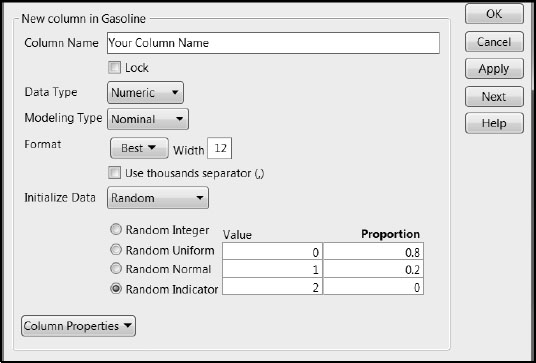
1. Create a new column. Select Cols > New Column. (You can also do this by double-clicking in the column heading area to the right of the last column in the data table, and then right-clicking in that area and selecting Column Info.)
2. In the New Column window, enter a Column Name.
3. Set the Modeling Type to Nominal.
4. From the Initialize Data list, select Random. This provides the options shown in Figure 6.2.
5. Select Random Indicator. We accepted the default 80% and 20% split into 0s and 1s.
6. Click OK.
Figure 6.2: New Column Window for Defining Training and Test Sets
This creates a new column that you can use to select your training and test sets. However, for the remainder of this chapter, it would be best if you used the column Test Set that is already saved in the data table. So you should now delete the column that you have just created. To do this, right-click on the column heading and select Delete Columns from the menu.
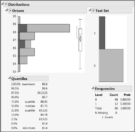
Run the first script in the table, Distribution of Octane and Test Set, to see the distributions for Octane and the Test Set indicator column. The plot for Octane shows that the octane ratings range between about 83 and 90. The Test Set distribution shows two bars, because we have assigned it the Nominal modeling type. As expected, we have an 80/20 percent split into 0s and 1s. Click on the bar labeled “1” to see the distribution of Octane values in the test set (Figure 6.3). This suggests that we have a fairly representative selection of Octane values in the test data.
Figure 6.3: Distribution of Octane Values in the Test Set
JMP provides many ways to view spectral data. We will stack the data into a new data table and then create overlay plots to view the individual spectra as well as all of the spectra together. The script Stack NIR Columns creates a new data table where all spectral readings are stacked in a single column. This script also places a script in the new data table, called Plots of Individual Spectra. This script creates the overlay plots whose construction is described in the next section, “Constructing Plots of the Individual Spectra”.
You can run the script Stack NIR Columns or you can follow these instructions to first create the data table and then plot the individual spectra yourself using menu commands.
With the data table Gasoline.jmp as the active data table, complete the following steps:
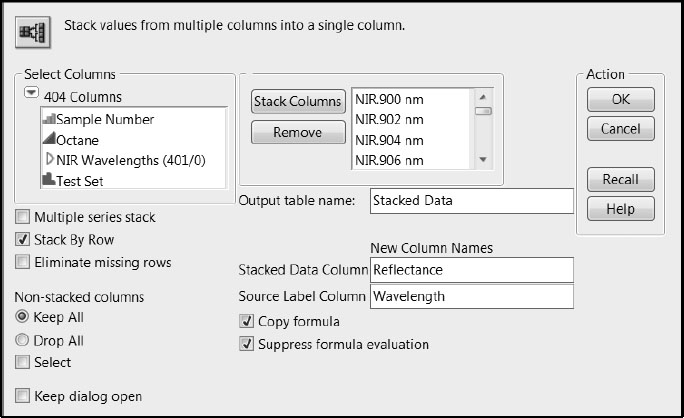
1. Select Tables > Stack.
2. In the text box to the right of Output table name, enter a name for the data table. We have called ours Stacked Data.
3. Select the NIR Wavelengths column group and click Stack Columns.
4. In the text box to the right of Stacked Data Column, give the stacked reflectance values the column name Reflectance.
5. In the text box to the right of Source Label Column, give the source columns the name Wavelength.
6. Figure 6.4 shows the populated Stack window. Click OK.
Figure 6.4: Populated Stack Window
The stacked data table is partially shown in Figure 6.5. Note that the row state colors are inherited by the stacked data.
Figure 6.5: Partial View of Stacked Data Table
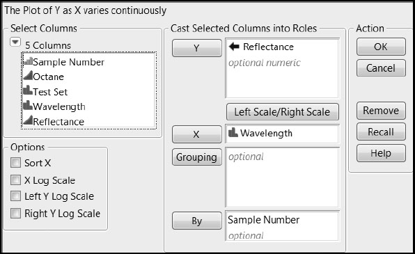
Constructing Plots of the Individual Spectra
With the stacked data table that you have just created as the active data table, complete the following steps. (If you don’t want to construct these plots using the menu options, you can simply run the script Stack NIR Columns in Gasoline.jmp and then run the script that appears in the stacked data table.)
1. Select Graph > Overlay Plot.
2. Select Reflectance and click Y.
3. Select Wavelength and click X.
4. Select Sample Number and click By.
5. Deselect the Sort X box under Options.
Deselecting the Sort X option allows the Wavelength values to appear on the horizontal axis in the order in which they appear in the data table. Otherwise, these would be sorted alphanumerically.
Figure 6.6 shows the populated Overlay Plot window.
6. Click OK.
Figure 6.6: Populated Overlay Plot Window
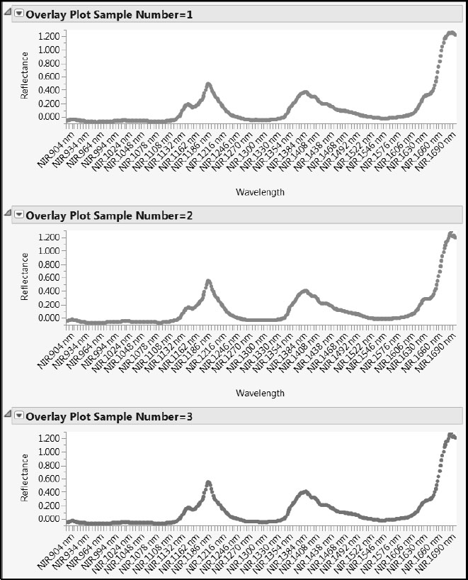
A partial view of the individual spectra is given in Figure 6.7. Recall that the color of the points describes the Octane value, with red indicating higher values and blue indicating lower values. As you scroll through these individual spectra, you notice a common “fingerprint” consisting of two peaks followed by an increase in reflectance for the longer wavelengths.
Had you wanted to see the Test Set designation for each sample, you could have added Test Set as a By variable in the Overlay Plot window.
Figure 6.7: Partial View of Overlay Plots for Individual Spectra
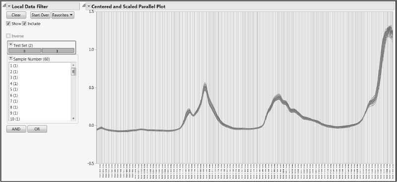
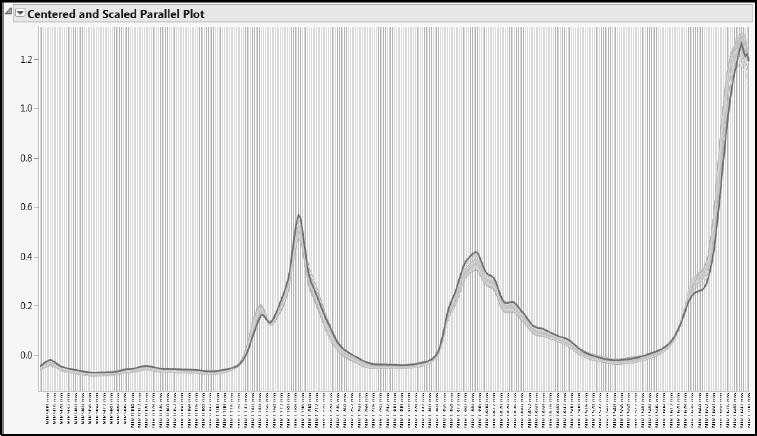
Once you have reviewed the spectra, close the stacked data table. In the data table Gasoline.jmp, run the script Review All Spectra. This script produces a plot containing the spectra for all samples, along with a Local Data Filter (Figure 6.8).
Because this script displays the data using the Parallel Plot platform (with uniform scaling), it does not require the data to be stacked. The Local Data Filter enables you to see one or more selected spectra in the context of the rest. The advantage of using a Local Data Filter rather than the (global) Data Filter obtained under the Rows menu is that it does not affect the row states in the data table. Our data table contains color row states; these are unaffected by the Local Data Filter.
Figure 6.8: Local Data Filter and Parallel Plot
To construct this plot on your own using menu options, complete these steps. Make sure that Gasoline.jmp is your active data table.
1. Select Graph > Parallel Plot.
2. In the Select Columns list, select the NIR Wavelengths column group and click Y, Response.
3. Select the Scale Uniformly check box.
The Scale Uniformly option ensures that the vertical axis represents the actual measurement units. Because parallel plots are often used to compare variables that are measured on different scales, the JMP default is to leave this check box deselected.
The Parallel Plot window should appear as shown in Figure 6.9.
4. Click OK.
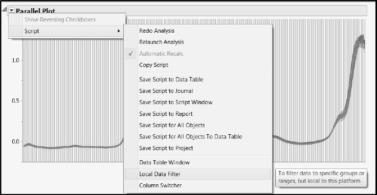
5. In the Parallel Plot report, click the red triangle and select Script > Local Data Filter, as shown in Figure 6.10.
This adds a Local Data Filter to the Parallel Plot report.
6. In the Local Data Filter report, from the Add Filter Columns list, select Test Set and then click Add.
7. Click the AND button.
8. From the Add Filter Columns list, select Sample Number and click Add.
Your report now appears as shown in Figure 6.8.
Figure 6.9: Populated Parallel Plot Window
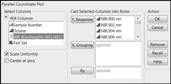
Figure 6.10: Local Data Filter Selection from Parallel Plot Report Menu
At this point, you can click on a value of Test Set to compare the spectra in the two sets. Or you can click on one or more values of Sample Number to see that row or collection of rows (hold down the Ctrl key to make multiple selections). Once you have finished exploring the data, you can close all open reports.
In this example, we have used the built-in capabilities of JMP to explore the data visually. If you do a lot of work with spectral data, you should look at the File Exchange on the JMP User Community page for add-ins that might be useful to you.
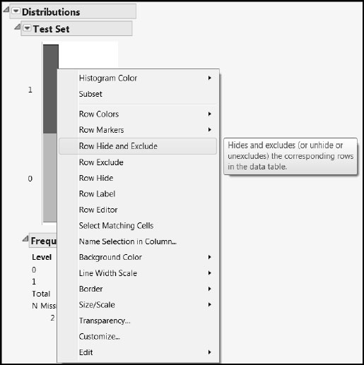
Now we turn our attention to developing a PLS model for Octane. We’ll develop this model using our training set, namely, those rows for which Test Set has the value 0. So, at this point, Hide and Exclude all rows for which Test Set = 1. An easy way to do this is as follows (or you can run the script Exclude Test Set):
1. Select Analyze > Distribution.
2. Enter Test Set in the Y, Columns list box.
3. Click OK.
4. In the Distribution report, click on the bar labeled “1”.
5. Then right-click on this bar and, from the menu, select Row Hide and Exclude (Figure 6.11).
This excludes and hides 12 rows in the data table. Check this in the data table Rows panel.
Figure 6.11: Excluding and Hiding Rows Using Distribution
Next, we fit a PLS model using the 48 rows in the training set. We use Fit Model to obtain the PLS Model Launch control panel, giving the instructions for JMP Pro. (Alternatively, if you have JMP Pro, you can run the PLS Model Launch script.) If you have JMP, you can use the PLS launch by selecting Analyze > Multivariate Methods > Partial Least Squares.
1. Select Analyze > Fit Model.
2. From the Select Columns list, select Octane and click Y.
3. Select the NIR Wavelengths column group and click Add.
4. From the Personality menu, select Partial Least Squares.
5. Click Run.
The Partial Least Squares Model Launch control panel (Figure 6.12) opens.
Figure 6.12: PLS Model Launch Control Panel
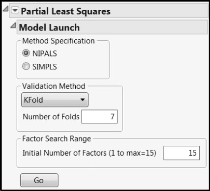
We accept the default settings. Note that we are using the default Validation Method (KFold with Number of Folds equal to 7). This involves a random assignment of rows to folds. In order for you to reproduce the results shown in our analysis, we suggest that you do the following. From the red triangle menu, select Set Random Seed. In the window that opens, enter the value 666 as the random seed and click OK.
If you are using JMP, use Leave-One-Out as the Validation Method. Be aware that your results will differ from those obtained below.
Click Go in the Model Launch control panel. The initial reports include a Model Comparison Summary table, a KFold Cross Validation report, and a NIPALS Fit with 5 Factors report (Figure 6.13).
Figure 6.13: Model Fit Results
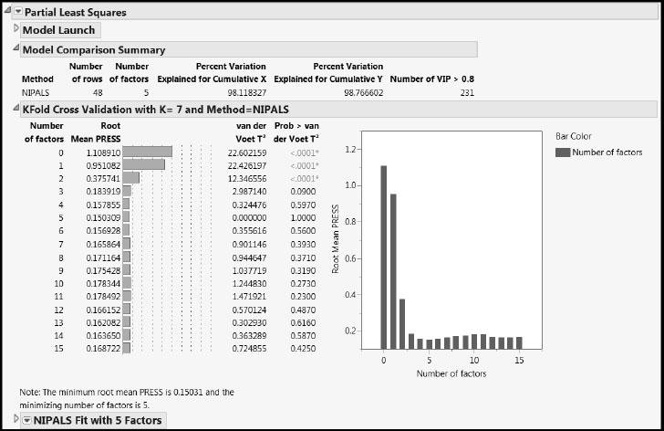
The KFold Cross Validation report computes the Root Mean PRESS statistic, using the seven folds, for models based on up to 15 factors. Note that this requires fitting 7 x 15 = 105 PLS models. (Details about the calculation are given in “Determining the Number of Factors” in Appendix 1.) The report shows that the Root Mean PRESS statistic is minimized using a five-factor model. This is the initial model that JMP fits. Details for this model are given in the NIPALS Fit with 5 Factors report.
The Model Comparison Summary gives high-level information about the five-factor model that has been fit. It notes that 48 rows were used to construct this model and that the model explains 98.12% of the variation in the Xs and 98.77% of the variation in Y. The Model Comparison Summary table is updated when new models are fit.
The KFold Cross Validation report also provides test statistic values (van der Voet T2) and p-values (Prob > van der Voet T2) for a test developed by van der Voet (1994). For a model with a given number of factors, the van der Voet test compares its PRESS statistic with the PRESS statistic for a model based on the number of factors corresponding to the minimum PRESS value achieved. This enables one to determine whether the variation explained by the additional factors is significant. A cut-off of 0.10 for Prob > van der Voet T2 is often used.
The first three Prob > van der Voet T2 values in the KFold Cross Validation report shown in Figure 6.13 are displayed in red and have asterisks to their right. They are all less than 0.0001. This indicates that the residuals from the null, one-, and two-factor models differ significantly from those for the five-factor model. However, residuals from the four-factor model do not differ significantly from those of the five-factor model. Although the p-value for the three-factor model is slightly below 0.10, the Root Mean PRESS plot to the right of the p-values suggests that it is similar to the five-factor model. This leads us to select the three-factor model as our model of choice.
To fit the three-factor model, in the Model Launch control panel, enter 3 as the Number of Factors in the Factor Specification text box, and click Go. The Model Comparison Summary report is updated accordingly, and a report for the new fit, NIPALS Fit with 3 Factors, is added to the report window (Figure 6.14).
Figure 6.14: Three-Factor Model
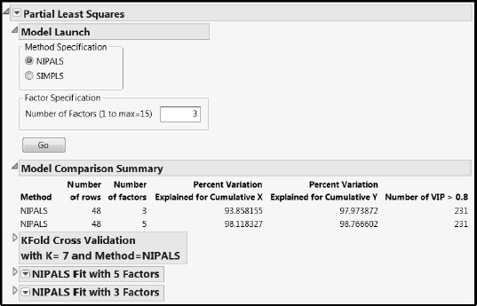
For our candidate three-factor model, the percent variation in Y that is explained is about 98%, while the percent variation in X that is explained is about 94%.
Let’s examine the reports provided as part of the NIPALS Fit with 3 Factors report (Figure 6.15). We’ll start by reviewing the X-Y Scores Plots and the Percent Variation Explained report.
Figure 6.15: X-Y Scores Plots and Percent Variation Explained Report
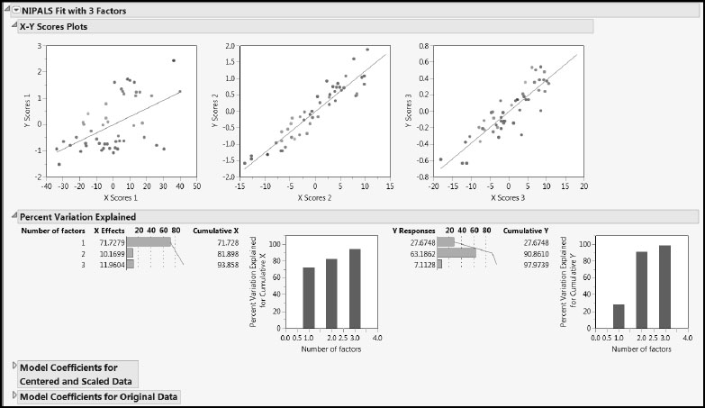
In the X-Y Scores Plots, we hope to see a lot of the variation in the Y scores explained by the X scores. For each factor, the Y scores are plotted against the X scores and a least squares line is added to describe the relationship. In this case, the first factor explains some variation in Y, but there is scatter about the line. The second and third factors explain more variation, as seen by the fact that the points are more tightly grouped around the line. Note also that, compared to the first factor, the second factor provides much better discrimination between the measured Octane rating, with red points to the upper right and blue points to the lower left.
The behavior exhibited by the scores plots is related to the values presented in the Percent Variation Explained report. The first factor explains about 72% of the X variation, while it explains only about 28% of the Y variation. These roles are switched for the second factor, which explains only 10% of the variation in X but 63% of the variation in Y. Because it explains 72% of the variation in X, the first factor represents the observed values of the predictors well, while the second factor represents the values of Y fairly well.
Although our model appears to explain a lot of variation, before we accept it as a good model, we need to scrutinize it for shortcomings. So, before proceeding to a detailed analysis of the scores, loadings, VIP values, and model coefficients, let’s look at a few diagnostic tools.
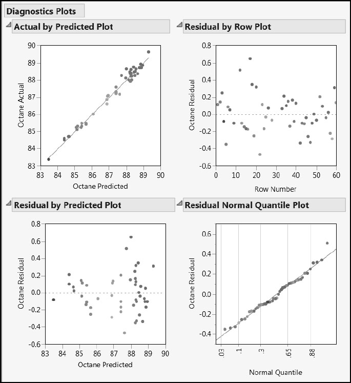
Select Diagnostic Plots from the red triangle menu for the NIPALS Fit with 3 Factors report. This gives the four plots shown in Figure 6.16. The Actual by Predicted Plot and the Residual by Predicted Plot show evidence that residuals increase with larger predicted values of Octane. This is not unexpected, and it is not serious enough to affect our ability to fit a predictive model. Had this been more pronounced, we might have considered using a normalizing transformation for Octane, rather than the raw Octane value itself. The Residual by Row Plot and the Residual Normal Quantile Plot give no cause for concern.
Figure 6.16: Diagnostics Plots
Next, select Distance Plots and T Square Plot from the red triangle menu for the PLS fit (Figure 6.17). The first two Distance Plots show distances from each of the observations to the X model and the Y model. The third plot shows an observation’s distance to the Y model plotted against its distance to the X model. None of the points stand out as unusually distant from the X or Y models.
The T2 Plot with Control Limit shows a multivariate measure of the distance from each point’s X scores on the three factors to their mean of zero. A control limit, whose value is based on the assumption of multivariate normality of the scores, is plotted. By positioning your mouse pointer over the point that falls above the limit, you obtain the tooltip indicating that this is observation 15.
Figure 6.17: Distance and T Square Plots
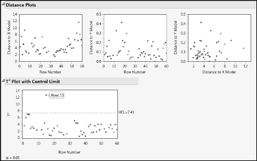
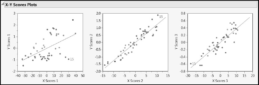
Click to select this point. Then right-click in the plot and select Row Label. This labels the observation by its row number, namely, 15. Click on some blank space in the plot to deselect observation 15. Now look at the X-Y Scores Plots (Figure 6.18). Observation 15’s X scores are among the more extreme X scores. The X score for observation 15 is high for factors 1 and 2 and low for factor 3.
Figure 6.18: X-Y Scores Plots with Observation 15 Labeled
Looking in the data table, you can see that the Octane rating for observation 15 is 88.7, among the highest Octane ratings in our training set. You can select Analyze > Distribution to verify this.
To get some insight on why observation 15 is extreme relative to the X scores, we’ll do the following: Run the script Review All Spectra. Take note of where the low (bluish) Octane colors appear. Now select Sample Number 15 in the Local Data Filter. Click on the trace for observation 15. Deselect Show. The spectral trace for observation 15 appears highlighted on the parallel plot, but the other traces appear as well (Figure 6.19). Notice that observation 15 tends to be extreme in terms of its reflectance values—its trace is usually at one or the other extreme of the other traces. Also, its trace is unusual given its Octane value. Over the spectrum, its trace often falls in largely “blue,” rather than “red,” regions.
Figure 6.19: Spectral Trace for Observation 15
It is likely that this behavior is causing the X scores for observation 15 to be extreme, and that this is what is being described by the T2 Plot with Control Limit. In terms of distance to the X and Y models, observation 15 is not aberrant. But the T2 Plot with Control Limit indicates that observation 15 is somewhat distant in the factor-defined predictor space.
If this is a legitimate and correct observation, then one should retain it in the model. As is often the case in the MLR setting, an observation might have high leverage, but if it is a legitimate observation, it might still be reasonable to retain it in the model. If this were your data, you might want to verify that observation 15 was not affected by unusual circumstances.
We proceed with observation 15 as part of our training set. However, if you desired, it would be easy for you to exclude this observation and refit the model. At this point, remove the label from observation 15. You can either do this by right-clicking on the point in a plot and selecting Row Label or by going back to the data table, right-clicking on the label icon, and selecting Label/Unlabel.
You can also plot the X scores or Y scores against each other to look for irregularities in the data. To do this, select Score Scatterplot Matrices from the red triangle menu next to the NIPALS Fit with 3 Factors report title. In the plots, you should look for patterns or clusters of observations. For example, if you see a curved pattern, you might want to add a quadratic term to the model. Two or more clusters of observations indicate that it might be better to analyze the groups separately.
The X Score Scatterplot Matrix is shown in Figure 6.20. Each scatterplot displays a 95% confidence ellipse. For insight on how the ellipses are constructed, think of X Score i as plotted on the horizontal axis and X Score j as plotted on the vertical axis. The pairs of scores, (X Score i, X Score j), are assumed to come from a bivariate normal distribution with zero covariance. The assumption of zero covariance follows from the orthogonality of the X scores, which results from the process of deflation. (See Chapter 4, “The NIPALS and SIMPLS Algorithms” and Appendix 1, “Properties of the NIPALS Algorithm.”) A T2 statistic is computed for the X scores (Nomikos and MacGregor 1995, and Kourti and MacGregor 1996). The exact distribution of this statistic, times a constant, is a beta distribution (Tracy et al. 1992).
Figure 6.20: X Score Scatterplot Matrix
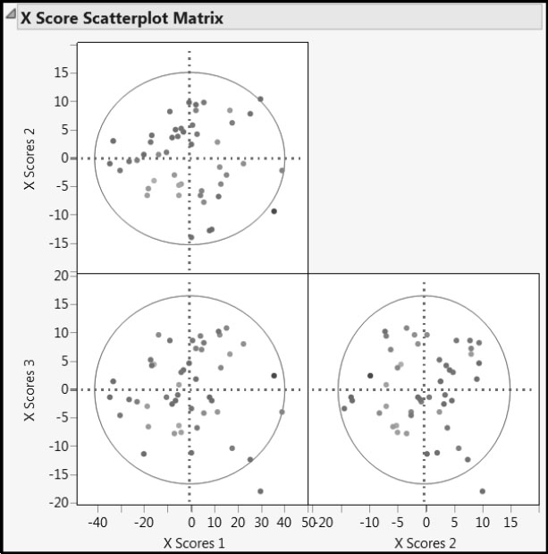
Looking at the X Score Scatterplot Matrix, we see no problematic patterns or groupings. You can think of the X-score plots as describing the coverage or support of the study, in terms of the factors. In that vein, the data seem fairly well dispersed through the factor space. Because each X score is a linear combination of the 401 predictors, the bivariate normality assumption required for the interpretability of the ellipses is viable. By positioning your mouse pointer over the points that fall just outside the ellipses, you see that these points correspond to observations 4 and 15. Observation 4 is hardly a cause for concern. We have already seen why observation 15 has extreme values for X scores. Although it would be prudent to verify that observation 15 is not suspect or different in some sense, there is nothing in the plots to suggest that it poses a serious issue.
The color coding applied to Octane helps us see that X Scores 1 does not explain Octane values well. However, X Scores 2 seems to distinguish high from low Octane values. This is consistent with the Percent Variation Explained report, which indicates that the first factor tends to explain variation in X, rather than Y, while the second factor explains a large proportion of the variation in Y.
Because, in this example, Y consists of a single vector, the Y Score Scatterplot Matrix gives information about deflation residuals. More specifically, because there is a single Y, it follows that Y Scores 1 is collinear with Octane. Because we are using the NIPALS method to fit our model, Y Scores 2 consists of the residuals once Y Scores 1 (which is collinear with Octane) has been regressed on X Scores 1, and Y Scores 3 consists of the residuals once Y Scores 2 has been regressed on X Scores 2. (To be precise, these relationships hold up to ±1.) So Y Scores 2 consists of the variation in Octane that the first factor fails to predict, and Y Scores 3 consists of the variation that the first two factors fail to predict.
Next, let’s look at the loadings. The loadings for a factor indicate the degree to which each wavelength is correlated with, or contributes to, that factor. There are three options for viewing loadings: Loading Plots, Loading Scatterplot Matrices, and Correlation Loading Plot. For spectral data, the best option is Loading Plots, because this presentation uses overlay plots and preserves the ordering of the wavelengths.
Select Loading Plots from the red triangle menu for the three-factor fit. Note that the check boxes to the left of the plot allow you to select which factor loadings to display. (See Figure 6.21, where loadings for all three factors are displayed.)
Figure 6.21: Loading Plots
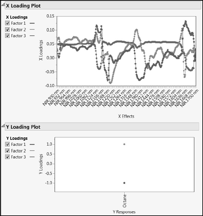
The Y Loading Plot is not of interest because there is only one Y and each loading value must be ±1. The X Loading Plot shows that features in different spectral regions seem to characterize the three factors. These factors define the “fingerprints” that we mentioned in “Why Use PLS?” in Chapter 4. Factor 1 seems to be weakly, but positively, correlated with most wavelengths, except in two notable areas of the spectrum, where ranges of wavelengths are negatively correlated with factor 1. Factors 2 and 3 have interesting loading patterns: Factor 2 seems to have three dips and two peaks; Factor 3 seems to have two dips and three peaks.
Also, the X Loading Plot shows that there are relatively few variables with loadings near zero, suggesting that most NIR measurements contribute to defining the factors.
Recall that PLS factors are defined so as to both explain variation in X and Y and to build a useful regression model. There are various reasons why we might be interested in identifying the variables that contribute substantively to the model. It might be useful to know that certain variables don’t contribute to help better understand the mechanism at work, or simply to avoid wasting time in the future in measuring unhelpful variables. Also, if certain variables only contribute noise to the model, a better and more parsimonious model can be obtained by eliminating these variables.
A variable’s VIP (variable importance for the projection) value measures its influence on the factors that define the model. To see the VIPs for our 401 wavelengths, select Variable Importance Plot from the red triangle menu at the NIPALS Fit with 3 Factors report title (Figure 6.22). The dashed horizontal line in the plot is set at the threshold value of 0.8. This is the cut-off value advocated by Wold (1995, p. 213) to separate terms that do not make an important contribution to the dimensionality reduction involved in PLS (VIP < 0.8) from those that might (VIP ≥ 0.8). We already know from the Model Comparison Summary that 231 of the 401 wavelengths have VIP values exceeding 0.8.
Figure 6.22: Variable Importance Plot
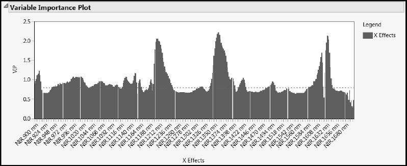
Compare the X Loading Plot in Figure 6.21 to the Variable Importance Plot in Figure 6.22. The spectral regions with high VIP values seem to mirror the regions where the factor loadings distinguish the factors.
The report below the plot, Variable Importance Table, gives the VIP values for the variables in a form that can be made into a data table. To construct such a data table, click on the disclosure icon to reveal the table and its associated bar graph, and then right-click in the report and select Make into Data Table.
The VIP value does not directly reflect a variable’s role in the overall predictive model. That variable’s regression coefficient, based on the centered and scaled data, gives a way to determine its influence on the predictive model for Y. As mentioned in Chapter 5, common practice is to consider variables with VIPs below 0.8 and with standardized regression coefficients near 0 to be unimportant relative to the overall PLS model.
From the red triangle menu at NIPALS Fit with 3 Factors, select VIP vs Coefficients Plots. If the Centering and Scaling options have been selected in the PLS launch window, the VIP vs Coefficients Plots option gives two plots: one for the centered and scaled data; one for the original data (with Xs standardized if the Standardize X option was selected).
Regression coefficients are sensitive to centering and scaling. For this reason, we consider the plot for the centered and scaled data. (See Figure 6.23, where we have deselected the Show Labels options.) The plot gives VIP values on the vertical axis and regression coefficient values on the horizontal axis.
Figure 6.23: VIP versus Coefficients for Centered and Scaled Data
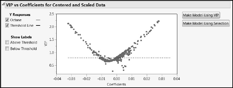
The dashed horizontal line is set at the Wold threshold value of 0.8. With both VIPs and coefficients displayed in a single plot, it is easier to make decisions about which variables to consider unimportant relative to the PLS model. The Make Model Using VIP button creates a model containing only those variables with VIPs exceeding 0.8. The Make Model Using Selection button constructs a model based on points that you choose interactively in the plot.
The VIP vs Coefficients for Centered and Scaled Data plot often exhibits a characteristic “V” shape. In particular, this suggests that variables with low VIP values also tend to have small values for their standardized regression coefficients. If one were to define a new model using only those variables with VIPs exceeding 0.8, the excluded variables would generally have small magnitude regression coefficients as well.
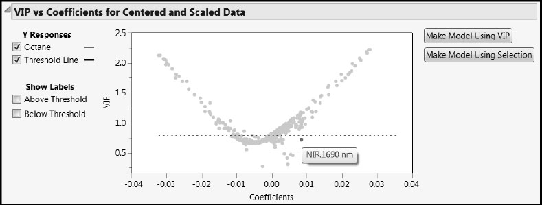
But note that there is one variable with VIP below the 0.8 threshold that has a regression coefficient value near 0.01. To identify that variable, position your mouse pointer over it in the plot. We have selected it in Figure 6.24. It is NIR.1690 nm, when the wavelength is 1690 nanometers. This wavelength is near the upper end of the measured spectrum. If you look closely at Figure 6.22, you can spot it by its relatively large VIP value. We revisit this wavelength later on.
Figure 6.24: Identifying Odd Wavelength (Coefficient about 0.009 and VIP about 0.73)
Viewing VIPs and Regression Coefficients for Spectral Data
As is the case for the loadings, for spectral data it is useful to see VIP values and coefficients in a plot that preserves the ordering of wavelengths. We illustrate a method for doing this.
If you have closed your Variable Importance Plot, please reselect it. Also, select Coefficient Plots from the red triangle menu of the PLS fit. We show how to use these plots and JMP journal abilities to create the plot shown in Figure 6.25. (The completed journal file is called VIPandCoefficients.jrn. You can open this file by clicking on the VIPandCoefficients link in the master journal.)
Figure 6.25: Variable Importance and Coefficient Plots with Graphics Scripts
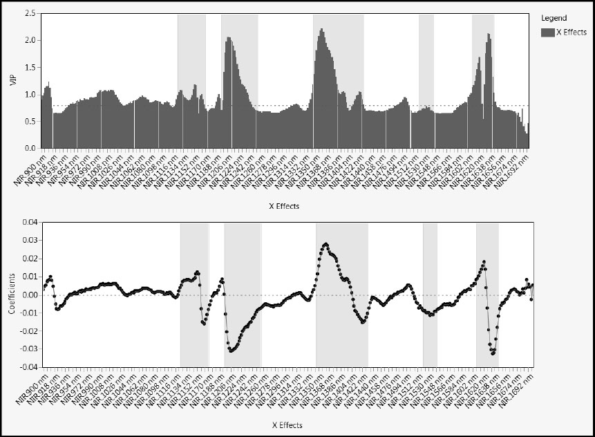
Select File > New > Journal to make a new journal file and to avoid appending content to the open master journal. In the report, use the “fat plus” tool and hold the Shift key to select the Variable Importance Plot and the Coefficient Plot for Centered and Scaled Data. With the right selection you should be able to include the graphics region and the axes and labels, but exclude the legends. Now select Edit > Journal to copy the selected regions to the journal file. Exchange the “fat plus” tool for the pointer, and resize the two graphics boxes to make the wavelength axes align properly. (For information about journal files, select Help > Books > Using JMP and search for “JMP Journals”.)
In Figure 6.25, we have added graphics scripts to each of the plots to identify wavelength ranges (using green) that seem to be of special interest relative to modeling Octane. These ranges could also form the basis for a more parsimonious model. We have generally followed the idea that the interesting wavelengths have VIP values exceeding 0.8 or standardized regression coefficients that are not near zero. We later reduce our model using the 0.8 VIP cut-off, but for now we simply want to illustrate how spectral ranges of interest might be identified.
To add a graphics script, right-click in either plot and select Customize. In the Customize Graph window, click the + sign button. You can add a graphics script in the text window. To view the graphics scripts we created, select the journal file, VIPandCoefficients.jrn, right-click in a plot, select Customize, and click Script in the list. Close the journal file you have constructed.
Model Assessment Using Test Set
We have analyzed our three-factor model and have found no reason not to consider it. Given that the goal of our modeling effort is prediction, it is time to see how well our candidate three-factor PLS model performs, particularly on the test set. We will display predicted versus actual Octane values on a scatterplot for both our training and test sets.
First we’ll save the prediction formula for Octane. To accomplish this, complete the following steps, or run the script called Save Prediction Formula.
1. From the NIPALS Fit with 3 Factors red triangle menu, select Save Columns > Save Prediction Formula. (Or, run the script Save Prediction Formula.)
This adds a new column called Pred Formula Octane to the data table.
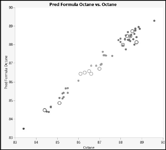
Next, we’ll apply a marker to the test set and create a plot of predicted versus actual values (Figure 6.26). Alternatively, you can run the script Predicted versus Actual Octane.
2. Select Rows > Clear Row States.
3. Reapply the Octane colors by selecting Rows > Color or Mark by Column, and selecting Octane in the Mark by Column window. (Or, run the script Color by Octane.)
4. Select the rows for which Test Set equals 1. An easy way to do this is to select Analyze > Distribution, enter Test Set as Y, Columns. In the report’s bar graph, click in the bar corresponding to Test Set = 1. This selects the 12 rows in the test set.
5. Select Rows > Markers and click on the open circle, o, to use that symbol to identify test set observations.
6. In the upper left corner of the data table, above the row numbers, click in the lower triangular region to clear the row selections.
7. Select Graph > Graph Builder.
8. Drag Pred Formula Octane to the Y axis drop zone. Drag Octane to the X axis drop zone.
9. Click on the second icon from the left above the graph to deselect the Smoother.
If you want to increase the size of the points to match ours, right-click in the plot, select Graph > Marker Size, and then select 4, XL.
Your plot should look like the one in Figure 6.26 (where we have deselected the Show Control Panel option in the Graph Builder red triangle menu). The actual values and predicted values align well. Also, we don’t see any systematic difference in the fit between the training and test set observations.
Figure 6.26: Plot of Predicted versus Actual Octane Values
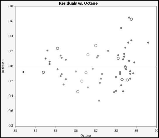
To get a better look at our prediction error, we examine the residuals. Note that residuals can be saved to a column by selecting Save Columns > Save Y Residuals, but this option does not save a formula. So, we create a column containing the formula for residuals. (The script is Create Residuals Column.)
1. Select Cols > New Column to create a new column.
2. Enter Residuals as the Column Name.
3. From the Column Properties menu, select Formula.
4. Enter the formula Octane – Pred Formula Octane.
5. Click OK.
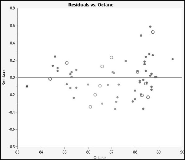
Next, we create a plot using Graph Builder. Alternatively, you can run the script Residuals versus Octane.
6. Select Graph > Graph Builder. Drag Residuals to the Y axis drop zone. Drag Octane to the X axis drop zone.
7. Click on the second icon from the left above the graph to deselect the Smoother.
8. Double-click the Residuals axis to open the Y Axis Specification window.
9. Click Add to insert a reference line at 0.
10. Click OK.
If you want to increase the size of the points to match ours, right-click in the plot, select Graph > Marker Size, and then select 4, XL.
The plot is shown in Figure 6.27 (where, again, we have deselected the Show Control Panel option in the Graph Builder red triangle menu). The plot does not show any systematic difference in the fit between the training and test set observations.
From the plot, we see that the largest value of prediction error for our test set is a little over 0.6 units. Given that the measured sample octane ratings range from 83 to 90, this amount of prediction error seems small, and indicates that we have a model that should be of practical use.
Figure 6.27: Residual Plot
At this point, we wonder if a model that eliminates variables that don’t contribute substantially might prove as effective as the model we have just developed. We fit a new model that includes only those variables with VIPs of 0.8 and above, and NIR.1690 nm.
To fit this model, complete the following steps. (The script is PLS Pruned Model Launch.)
1. In the data table, run the script Exclude Test Set to re-exclude the test observations.
2. In the NIPALS Fit with 3 Factors red triangle menu, select VIP versus Coefficients Plots.
3. In the VIP vs Coefficients Plot for Centered and Scaled Data report, to the right of the plot, click Make Model Using VIP.
This enters all variables with VIPs exceeding 0.8 into a Fit Model or PLS launch window.
4. In the launch window, in the Select Columns list, open the NIR Wavelengths column group and select NIR.1690 nm.
Recall that this was the wavelength that had a VIP close to 0.8 and a comparatively large regression coefficient.
5. Add NIR.1690 nm to the list of model effects. (In the Fit Model launch window, click Add; in the PLS launch window, click X, Factor.)
6. Click Run (Fit Model launch window) or OK (PLS launch window).
7. To obtain the same JMP Pro results as we discuss in the report below, click the red triangle, select Set Random Seed, set the value of the seed to 666, and click OK.
8. Accept the default settings and click Go.
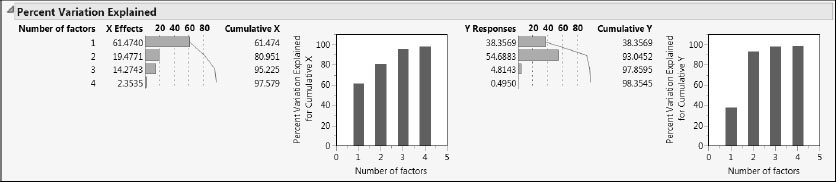
The van der Voet test in the report KFold Cross Validation with K = 7 and Method = NIPALS suggests that a four-factor model does not differ statistically from the minimizing five-factor model. Return to the Model Launch control panel and enter 4 as the Number of Factors under Factor Specification. Then click Go to fit this model. (The script is Fit Second Pruned Model.)
The Percent Variation Explained report (Figure 6.28) shows that the four factors explain about 98% of the variation both in X and in Y. This is better than our previous three-factor model. Even the first three factors in this pruned model explain slightly more variation than did our previous model.
Figure 6.28: Percent Variation Explained Report for Pruned Model
We leave it as an exercise for you to save the prediction formula and to construct a column containing residuals. You can easily adapt the instructions in the section “Model Assessment Using Test Set”. Also, following those instructions, you can construct a plot of residual versus actual Octane values, as shown in Figure 6.29. (The script is Residuals Versus Actual for Pruned Model.)
Figure 6.29: Residual Plot for Pruned Model
We conclude that this model fits well and might even be superior to the original model. In addition, the model might have identified spectral ranges that are of scientific interest.