
7
Water Quality in the Savannah River Basin
Conclusions from Visual Analysis and Implications
A First PLS Model for the Savannah River Basin
The Partial Least Squares Report
A Pruned PLS Model for the Savannah River Basin
Saving the Prediction Formulas
Comparing Actual Values to Predicted Values for the Test Set
A First PLS Model for the Blue Ridge Ecoregion
A Pruned PLS Model for the Blue Ridge Ecoregion
Comparing Actual Values to Predicted Values for the Test Set
The term water quality refers to the biological, chemical, and physical conditions of a body of water, and is a measure of its ability to support beneficial uses. Of particular interest to landscape ecologists is the relationship between landscape conditions and indicators of water quality. (See the U.S. EPA Landscape Ecology website.)
In their attempts to develop statistically valid predictive models that relate landscape conditions and water quality indicators, landscape ecologists often find themselves with a small number of observations and a large number of highly correlated predictors. An additional challenge relates to the low level of signal relative to noise inherent in the relationship between predictors and responses. In the application of standard multiple or multivariate regression analyses, these conditions usually compromise the modeling process in one way or another, often requiring the selection and use of a subset of the potential predictors.
In this chapter, you apply PLS to model the relationships among biotic indicators of surface water quality (the Ys) and landscape conditions (the Xs), thus ameliorating these problems. Our example is based on the paper by Nash and Chaloud (2011). We would like to thank the authors for providing us with the data used in their paper.
The values of the Ys are derived from measurements made on samples of water taken at specific locations in the Savannah River basin, and the values of the Xs are calculated from existing remote sensing data representing the associated landscape conditions in the vicinity. The remote sensing data was obtained from several sources. (For more information, see Nash and Chaloud 2011.)
Given that the investment to secure remote sensing data from wide areas of the United States has already been made, gathering new values for these Xs is inexpensive and simple, whereas for the Ys such values would be expensive and time-consuming. So the promise of a viable predictive model that makes good use of available landscape data is appealing.
Open the data table WaterQuality1.jmp, partially shown in Figure 7.1, by clicking on the correct link in the master journal. This table contains 86 rows, one for each sample of water taken at a specific location in the field. For each sampling location, the watershed support area was delineated and a suite of landscape variables was calculated.
Figure 7.1: Partial View of WaterQuality1.jmp
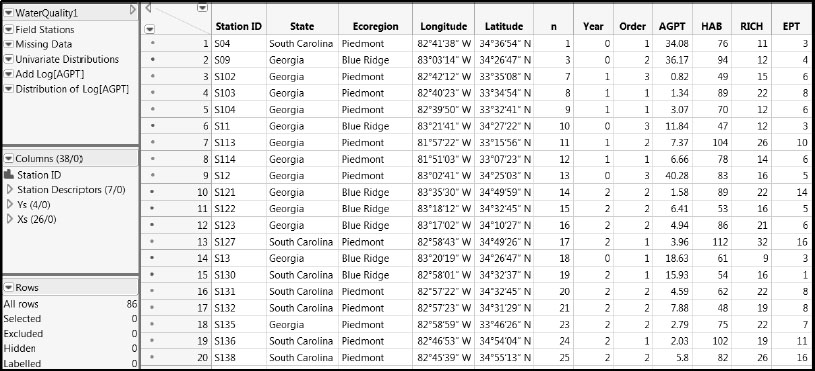
The table contains the following:
• A column called Station ID that uniquely identifies each sample.
• A column group called Station Descriptors consisting of seven columns that describe aspects of where a sample was taken. (To make such a group, select multiple columns in the Columns panel by clicking and holding down the Shift key, and then right-click and select Group Columns from the context-sensitive menu. Once the group has been made, you can double-click on the assigned name to enter a more descriptive name.)
• A group of columns called Ys consisting of four columns that describe the water quality of each sample. (See Figure 7.2.)
• A group of columns called Xs consisting of 26 columns that describe the landscape conditions associated with each sample. (See Figure 7.3.)
In total, the table WaterQuality1.jmp contains 38 columns. Brief descriptions of the Ys and Xs are provided in Figures 7.2 and 7.3. More specific descriptions of the variables as well as references relating to the specific measurement protocols can be found in Nash and Chaloud (2011). Brief descriptions of the variables are entered as Notes under Column Info for the relevant columns in the data table.
Figure 7.2: Description of Ys
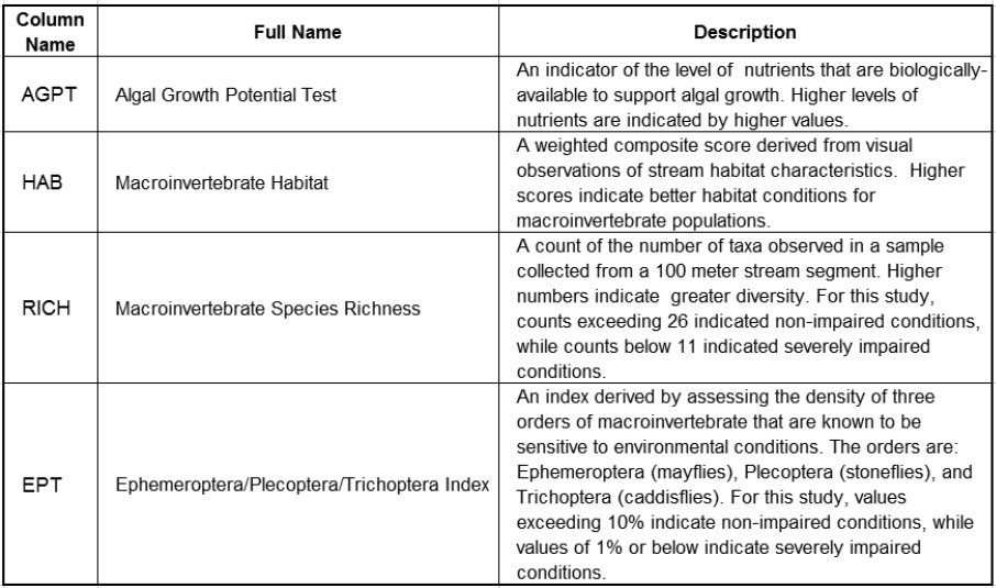
Figure 7.3: Description of Xs
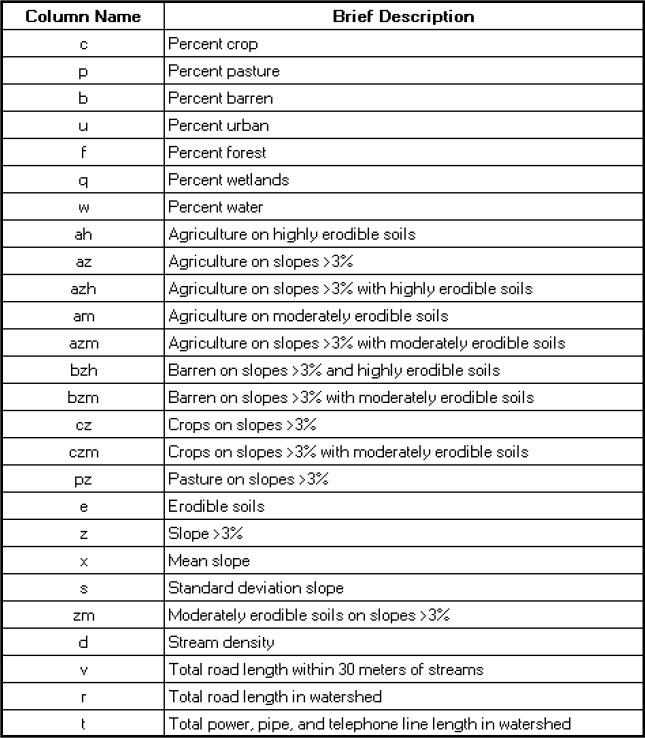
You will note that 11 columns in the group of Xs have names that consist of two or three characters. These composite-character variables are variations on the base (single-character) variables. For example, the variable z represents the percent of the total area with slope exceeding 3%. The variable az represents the percent of the total area on slopes exceeding 3% that is used for agriculture. Because of the nature of these composite variables, there will be correlation with the underlying variables involved in their definitions.
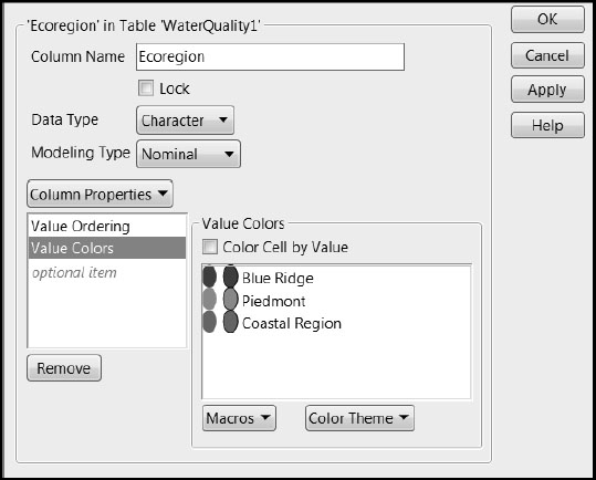
If you run Distribution on the column Ecoregion, found in the Station Descriptors group, you see that three regions are represented: “Blue Ridge”, “Piedmont”, and “Coastal Region”. The rows in WaterQuality1.jmp have been colored by the column Ecoregion. (To color the rows yourself, select Rows > Color or Mark by Column.) In addition, a Value Colors property has been assigned to Ecoregion to make the colors that JMP uses more interpretable. By clicking on the asterisk next to Ecoregion, found in the Station Descriptors group in the Columns panel, and selecting Value Colors, you see that compatible colors were assigned to the regions (Figure 7.4).
Figure 7.4: Value Colors for Ecoregion
Location of Field Stations
The Savannah River is located in the southeastern United States, where it forms most of the border between the states of Georgia and South Carolina. The two large cities of Augusta and Savannah, Georgia, are located on the river. Within the Savannah River Basin, there are three distinct spatial patterns distinguished by the amount of forest cover and wetlands. The three regions can be labeled Blue Ridge, Piedmont, and Coastal Plain.
In the Blue Ridge Mountains, the home of the Savannah River headwaters, evergreen forests predominate. This landscape gives way to the Piedmont, an area where pastureland and hay fields, mixed and deciduous forests, as well as parks and recreational areas and several urban areas are found. There are two large reservoirs on the main river. South of Augusta, the Coastal Plain begins, evidenced by crop agriculture and wetlands. The mouth of the river broadens to an estuary southeast of Savannah.
Below Augusta, Georgia, extensive row crop agriculture is evident, along with wetland areas. The city of Savannah is located near the outlet of the river to the Atlantic Ocean. The spatial patterns seen in the landcover define three ecoregions: Blue Ridge, Piedmont, and Coastal Plain.
To see the geographical distribution of the sampling locations, run the first saved script, Field Stations, to produce Figure 7.5. You can see that the 86 locations are spread over the two states that make up the Savannah River basin, Georgia and South Carolina, and the three ecoregions.
Figure 7.5: Location of Field Stations within State and Ecoregion
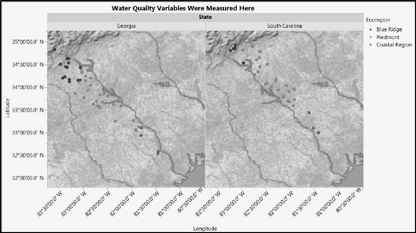
We expect that Ecoregion might have an impact on modeling, but that State will not.
Next we investigate the pattern of missing data.
1. Select Tables > Missing Data Pattern.
2. Select the column groups Ys and Xs, and click Add Columns.
3. Click OK.
(Alternatively, run the saved script Missing Data.) The data table shown in Figure 7.6 appears. Rows 2 and 3 of this data table indicate that only six of the 86 samples have one or two missing values for the water quality variables (Ys). There are no Xs missing.
Figure 7.6: Six Samples Have Missing Values for Water Quality Variables
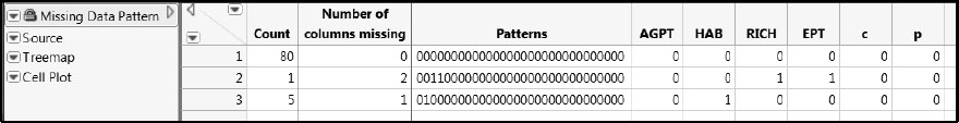
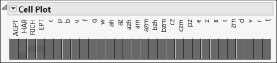
Run the Cell Plot script in the Missing Data Pattern table for a visual indication of where values are missing. It is easy to see now that five rows have missing values only for HAB, while one row has missing values for both RICH and EPT. Note that it is typical to have missing values when data are collected in the field.
Figure 7.7: Cell Plot for Missing Data Pattern Table
As with any multivariate analysis, appropriate handling of missing values is an important issue. The PLS platform in JMP Pro provides two imputation methods: Mean and EM. These can be accessed from both Analyze > Multivariate Methods > Partial Least Squares and Analyze > Fit Model.
To impute missing data, check the Impute Missing Data check box on the launch window. If this box is not checked, rows that contain missing values for either Xs or Ys are not included in the analysis. When you check Impute Missing Data, you are asked to select which Imputation Method to use:
• Mean: This option replaces the missing value in a column with the mean of the nonmissing values in the column.
• EM: This option imputes missing values using an iterative Expectation-Maximizaton (EM) method. On the first iteration, the model is fit to the data with missing values replaced by their column means. Missing values are imputed using the predictions from this model. On following iterations, the predictions from the previous model fit are used to obtain new predicted values. When the iteration stops, the predicted values become the imputed values.
Note that the EM method depends on the type of fit (NIPALS or SIMPLS) selected and the number of factors specified. When you select the EM method, you can set the number of iterations. When you run your analysis, a Missing Value Imputation report appears. This report shows you the maximum difference between missing value predictions at each stage of the iteration. The iterations are terminated when that maximum difference for both Xs and Ys falls below 0.00000001.
In this chapter we will assume that you are using JMP Pro. If you are using JMP, the six rows identified in Figure 7.6 will be ignored.
Continuing to visualize the data, let’s look at the distributions of the variables in the Ys group and Xs group. Complete the following steps, or run the saved script Univariate Distributions.
1. Select Analyze > Distribution.
2. At the lower left of the window, select the Histograms Only check box.
3. Select the two column groups called Ys and Xs and click Y, Columns.
4. Click OK.
5. You will obtain the plots partially shown in Figure 7.8.
Figure 7.8: Distributions of Responses and Predictors (Partial View)
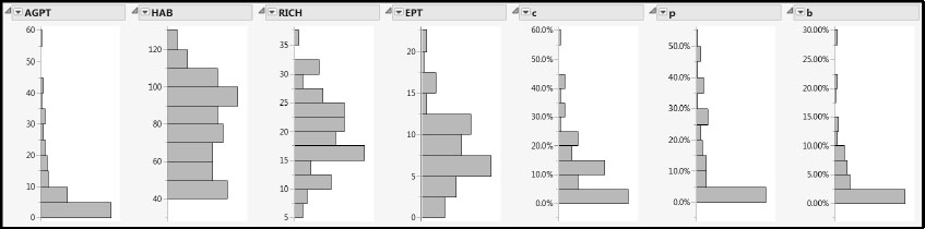
With the exception of AGPT, the distributions of the Ys appear fairly mound-shaped. Because our analysis is more reliable when the responses have at least approximately a multivariate normal distribution, we will apply a transformation to AGPT to bring it closer to normality.
Although many of the Xs also have distributions that are skewed and unruly, we find this behavior less troubling than unruly distributions for the Ys. However, note that most of the landscape variables assume values of zero, and some have a high percentage of zeros. To verify this, hold down the Ctrl key while clicking the red triangle corresponding to any one of the variables. Then select Display Options > Quantiles. These substantial percentages of zeros make it very difficult to transform the landscape variables to mound-shaped distributions.
To make AGPT more symmetric, we apply a logarithmic transformation. If you are using JMP 11, you can create transformation columns in launch windows. We illustrate this approach first. Then we show the more general approach of defining the transformation using a column formula. (If you want to bypass this discussion, you can run the script Add Log[AGPT]).
Transforming through a Launch Window
1. Select Analyze > Distribution.
2. Click the disclosure icon next to Ys to reveal the column names.
3. Right-click AGPT and select Transform > Log. This selection creates a virtual column called Log[AGPT]. You can use this column in your analysis, but it is not saved to the data table.
4. To save the virtual column to your data table, right-click on Log[AGPT] and select Add to Data Table.
5. Add Log[AGPT] to the Y, Columns list.
6. Click OK.
You have created and saved the new column, Log[AGPT], and you have produced a plot of its distribution (Figure 7.10).
Transforming by Creating a Column Formula
1. Double-click in the column heading area to the right of the last column in the table to insert a new column called Column 39.
2. Right-click in the column heading area and select Formula from the pop-up menu to open the formula editor window.
3. In the formula editor, select AGPT from the list of Table Columns. This selection inserts AGPT into a red box in the formula editing area. The red box indicates which formula element is selected.
4. From the list of Functions, select Transcendental > Log. This selection applies the natural log transformation to AGPT, as shown in the formula area.
5. Click OK.
6. Double-click on the column heading to rename the column. We will call it Log[AGPT].
In the Columns panel in the data table, the new column Log[AGPT] appears with an icon resembling a large plus sign to its right. This icon indicates that the column is defined by a formula. Clicking the + sign selects the column and displays the formula (Figure 7.9).
Figure 7.9: Plus Sign Indicating Formula for Log[AGPT]
![Figure 7.9: Plus Sign Indicating Formula for Log[AGPT]](http://imgdetail.ebookreading.net/other/3/9781612908229/9781612908229__discovering-partial-least__9781612908229__images__img0107.jpg)
Suppose that you want to move this column, say to place it closer to the original four responses. In the Columns panel, click and drag it to place it where you would like it.
To check the effect of the transformation on the distribution of AGPT, select Analyze > Distribution and enter Log[AGPT] in the Y, Columns box. Note that, if you transformed AGPT in the Distribution launch window, you have already produced this plot. (Alternatively, run the script Distribution of Log[AGPT].) The distribution, shown in Figure 7.10, indicates that the right-skewed distribution of AGPT has been transformed to a more mound-shaped distribution.
Figure 7.10: Distribution of Log[AGPT]
![Figure 7.10: Distribution of Log[AGPT]](http://imgdetail.ebookreading.net/other/3/9781612908229/9781612908229__discovering-partial-least__9781612908229__images__img0108.jpg)
Keep in mind that we have transformed AGPT for modeling purposes. It is important to remember that you need to apply the inverse transformation to Log[AGPT] when interpreting analytical results in terms of the raw measurements.
At this point, close the data table WaterQuality1.jmp and click on the master journal link for WaterQuality2.jmp. Here, AGPT has been replaced by its transformed analog, Log(AGPT), in the column group called Ys. (Note that we are using the more conventional functional notation, Log(AGPT), rather than the square bracket notation.)
Next we turn attention to looking for any differences in water quality among the three ecoregions.
1. Select Analyze > Fit Y by X.
2. Select the Ys group from the Select Columns list and click Y, Response.
3. Select Ecoregion from the Station Descriptors group in the Select Columns list and click X, Factor.
4. Click OK.
5. While holding down the Ctrl key, select Densities > Compare Densities from any of the Oneway red triangle menus.
Holding down the Ctrl key while selecting an option broadcasts this option to all relevant reports. Check to see that a Compare Densities plot has been added for each response.
Alternatively, run the saved script Distribution of Ys by Ecoregion. The report appears as shown in Figure 7.11.
Figure 7.11: Distribution of Responses within and across Ecoregions
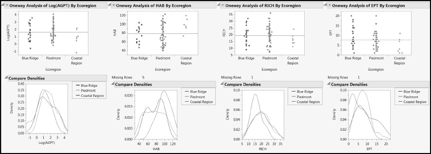
Note that, with the possible exception of HAB and perhaps EPT, the responses show little variation across Ecoregion. HAB seems to have higher values in the Coastal Region than do the other three responses, while EPT might have lower values in the Coastal Region than do the other responses.
Following the same procedure for the Xs group as we did for the Ys, or by running the saved script Distribution of Xs by Ecoregion, obtain the report partially shown in Figure 7.12.
Figure 7.12: Distribution of Predictors within and across Ecoregions (Partial View)
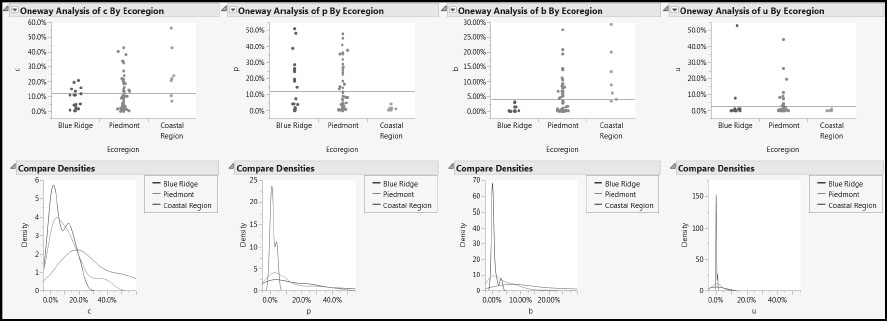
The plots show that the Piedmont region had the largest number of water samples and the Coastal Region the least, information that we have already seen in Figure 7.5. But we also see that, as should be expected, the variation of the landscape variables across the three ecoregions is considerable.
Visualization of Two Variables at a Time
Now we explore the relationships between pairs of variables. We construct two scatterplot matrices, one for the Ys and one for the Xs. To construct the plot for the Ys, complete the following steps:
1. Select Graph > Scatterplot Matrix.
2. Select the Ys group from the Select Columns list.
3. Click Y, Columns.
4. From the Matrix Format menu in the lower left of the window, select Square.
5. Click OK.
6. From the report’s red triangle menu, select Group By.
7. In the window that opens, select Grouped by Column and select Ecoregion. Note that Coverage is set, by default, to 0.95.
8. Click OK.
9. From the Scatterplot Matrix report’s red triangle menu, select Density Ellipses > Density Ellipses and Density Ellipses > Shaded Ellipses.
The report shown in Figure 7.13 appears. Constructing the scatterplot matrix for the Xs is done in a similar fashion (partially shown in Figure 7.14). Alternatively, run the scripts Scatterplot Matrix for Ys and Scatterplot Matrix for Xs.
Figure 7.13: Pairwise Variation of Responses within and across Ecoregions
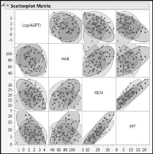
Figure 7.14: Pairwise Variation of Predictors within and across Ecoregions (Partial View)
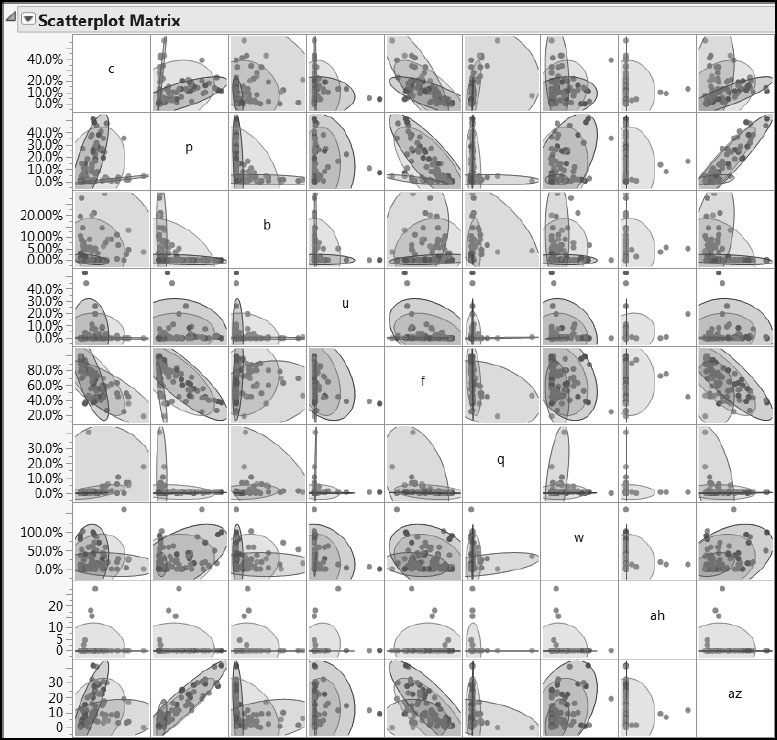
The density ellipses shown in Figures 7.13 and 7.14 delineate 95% confidence regions for the joint distribution of points, assuming that these points come from a bivariate normal distribution. We are somewhat comfortable with this interpretation for the Ys, because these are generally at least mound-shaped. However, the ellipses have little statistical relevance for the Xs, because their distributions are generally far from normal. For the Xs, these ellipses serve only as a useful guide to the eye. You can see that, broadly, the responses lie in somewhat similar regions, but that in many cases the predictors show marked differences by Ecoregion.
Conclusions from Visual Analysis and Implications
This visualization of the data alerts us to the fact that Ecoregion has an important impact on the patterns of variation in the data. This impact suggests that we consider two modeling approaches:
1. Produce a model for the Savannah River basin as a whole, but include Ecoregion as an additional X.
2. Produce three models, one for each ecoregion.
Approach (2) necessarily restricts the number of observations available for building and testing each model to the number of observations made on each ecoregion. But, even so, it might provide better predictions than approach (1) for similar ecoregions located elsewhere. Approach (1) gives us more data to work with and might produce an omnibus model that has more practical utility, assuming it can predict well.
Following Nash and Chaloud (2011), we will explore both approaches. However, in the interest of brevity, we will restrict approach (2) to the study of a single ecoregion, namely the Blue Ridge.
A First PLS Model for the Savannah River Basin
We will begin by developing a PLS model based on data from the entire Savannah River Basin using approach (1).
The last column in WaterQuality2.jmp is called Test Set. It contains the values “0” (labeled as “No”) and “1” (labeled as “Yes”). This column was constructed by selecting a stratified random sample of the full table, taking a proportion of 0.3 of the rows for each level of Ecoregion. You can review the outcome of this random selection by selecting Analyze > Distribution to look at the distributions of Test Set and Ecoregion. Clicking on the Yes bar shows that there is an appropriate number of rows highlighted for each level of Ecoregion.
If you want to construct the Test Set column yourself, complete the following steps:
1. Select Tables > Subset.
2. Click the button next to Random - sampling rate. Specify a random sampling rate of 0.3.
3. Select the Stratify check box and then select the Ecoregion column.
4. Select the Link to Original Table check box and click OK to make a new subset table.
5. In the subset table, select Rows > Row Selection > Select All Rows. Note that, because the tables are linked, this selects the corresponding rows in WaterQuality2.jmp as well.
6. Close the subset table, then select Rows > Row Selection > Name Selection in Column. Call the new column Test Set 2, and click OK. You can also add a Value Label property to Test Set 2 to display “Yes” and “No” rather than “1” and “0”.
As in the Spearheads.jmp example in Chapter 1, we will use the Test Set column to provide development and test data for the modeling process. The data used for model building (training and validation) will consist of those rows for which Test Set has the label “No”. The test set will consist of rows for which Test Set has the label “Yes” and will be used to test the predictive ability of the resulting model. (Note that the data table contains the saved scripts Use Only Non-Test Data, Use Only Test Data, and Use all Data. These scripts manipulate the Exclude and Hide row state attributes, as their names imply.)
We will emulate a situation where the data used for model building is the currently available data, while the test data only becomes available later on. To this end, WaterQuality2_Train.jmp contains the data we will use for modeling, and WaterQuality2_Test.jmp contains the test data.
At this point, close WaterQuality2.jmp and open the data table WaterQuality2_Train.jmp. This data table contains only the 61 rows designated as not belonging to the test set in WaterQuality2.jmp.
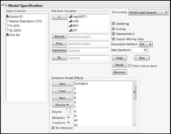
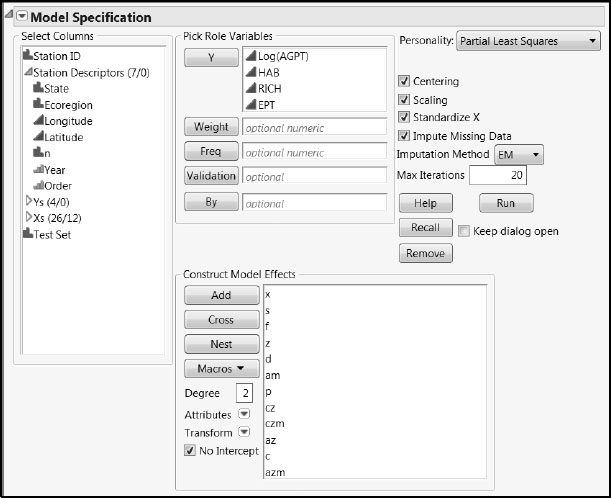
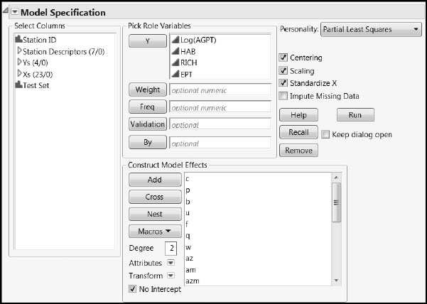
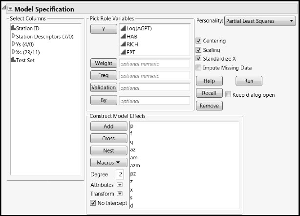
In our model, we will be including a categorical variable, Ecoregion, as a predictor. Although JMP Pro supports categorical predictors, JMP does not. If you are using JMP rather than JMP Pro, skip ahead to the analysis in the section “A First PLS Model for the Blue Ridge Ecoregion.” Or, follow along without using Ecoregion as a predictor. You can easily adapt the following steps using the PLS platform by selecting Analyze > Multivariate Methods > Partial Least Squares. Follow these steps if you have JMP Pro:
1. Select Analyze > Fit Model.
2. Enter the group called Ys as Y.
3. Enter Ecoregion, found in the Station Descriptors column group, and the column group Xs in the Construct Model Effects box.
4. Select Partial Least Squares as the Personality.
5. Select the Impute Missing Data check box.
6. Select EM as the Imputation Method.
7. Enter 20 for Max Iterations. Your window should appear as shown in Figure 7.15.
8. Click Run.
You can also run the script Fit Model Launch to obtain the Fit Model launch window.
Figure 7.15: Fit Model Window
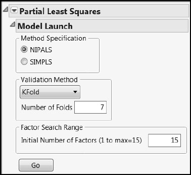
The Model Launch control panel opens (Figure 7.16). Accept the default settings shown here. However, to obtain exactly the output shown below, complete the following steps:
1. Select the Set Random Seed option from the Partial Least Squares red triangle menu.
2. Enter the value 666.
3. Click OK.
4. Click Go.
Figure 7.16: PLS Model Launch Control Panel
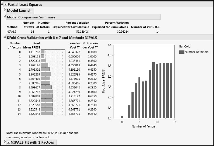
The Partial Least Squares Report
Clicking Go adds three report sections. (The saved script is PLS Fit.)
• A Model Comparison Summary report, which is updated when new fits are performed.
• A report with the results of your cross validation study. Because you selected the NIPALS method and accepted the default number of folds, namely, 7, this report is called KFold Cross Validation with K=7 and Method=NIPALS.
• A report giving results for a model with the number of factors chosen through the cross validation procedure. In this example, this report is entitled NIPALS Fit with 1 Factors, because you requested a NIPALS fit and the number of factors chosen by the cross validation procedure is one. Note that only the title bar for this last report is shown in Figure 7.17.
Figure 7.17: PLS Report for One-Factor Fit
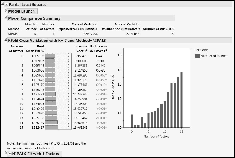
The Model Comparison Summary gives details for the automatically chosen fit, and shows that the single factor accounts for about 23% of the variation in the predictors and about 22% of the variation in the responses. The last column, Number of VIP > 0.8, indicates that 15 of the 27 predictors are influential in determining the factor. There might be an opportunity for refining the model by dropping some of the predictors.
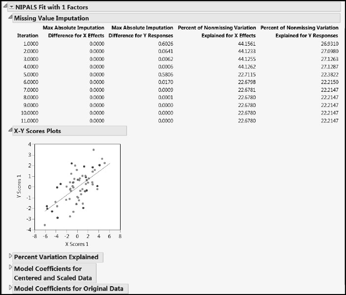
Now let’s look at the report for the fit, NIPALS Fit with 1 Factors (Figure 7.18). The first report is the Missing Value Imputation report. This report gives information about how the behavior of the imputation changed over the 20 iterations that we specified. Notice that only 11 iterations are listed. This is because the convergence criterion of a maximum absolute difference for imputed values of .00000001 was achieved after the 11th iteration.
The X-Y Scores Plots report shows clear correlation between the X and Y scores.
The Percent Variation Explained report displays the percent of variation in the Xs and Ys that is explained by the single factor. The Cumulative X and Cumulative Y values agree with the corresponding figures in the Model Comparison Summary.
The two Model Coefficients reports give the estimated model coefficients for predicting the Ys. The Model Coefficients for Centered and Scaled Data report shows the coefficients that apply when both the Xs and Ys have been standardized to have mean zero and standard deviation one. The Model Coefficients for Original Data report expresses the model in terms of the standardized X values, because Standardize X was selected on the Fit Model launch window. This second set of model coefficient estimates is often of secondary interest.
Figure 7.18: NIPALS Fit Report
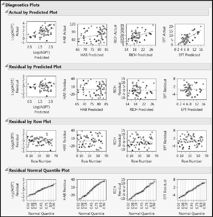
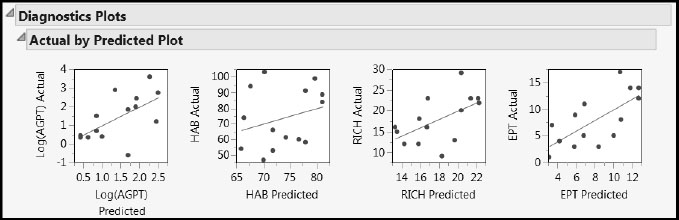
To get a better sense of how the data relate to the one factor model, we look at the T Square Plot and the Diagnostics Plots. Select each of these in turn from the red triangle menu for the NIPALS Fit with 1 Factors report. (Or, run the script Diagnostic Plots.) The T Square Plot is shown in Figure 7.19.
Figure 7.19: T Square Plot
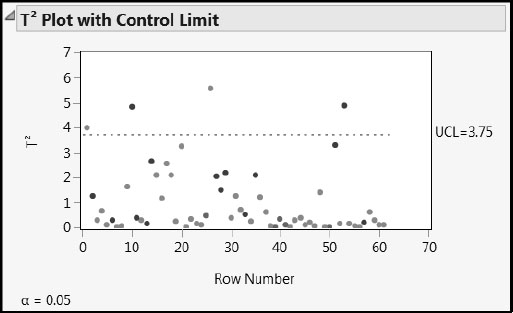
The T Square plot shows a multivariate distance for the X score corresponding to each observation. There is one point that is just beyond the upper limit and three that are a little further beyond.
The upper limit (UCL) on the T Square plot is computed assuming that the X scores have approximately a multivariate normal distribution. In this model, there is only one factor, so this amounts to assuming that the scores have a normal distribution. To verify that the X scores are at least mound-shaped, select Save Columns > Save Scores from the red triangle menu. This selection saves the X and Y scores to the data table. Then select Analyze > Distribution to obtain a histogram of X Scores 1.
Drag a rectangle to select the four points that fall above the upper limit in the T Square plot. In the Diagnostics Plots, all four points fall at the extremes for the distributions of the predicted responses (Figure 7.20). Even so, based on the Diagnostics Plots, none of the four points seem unusual or influential enough to cause concern.
Figure 7.20: Diagnostics Plots with Four Rows Selected
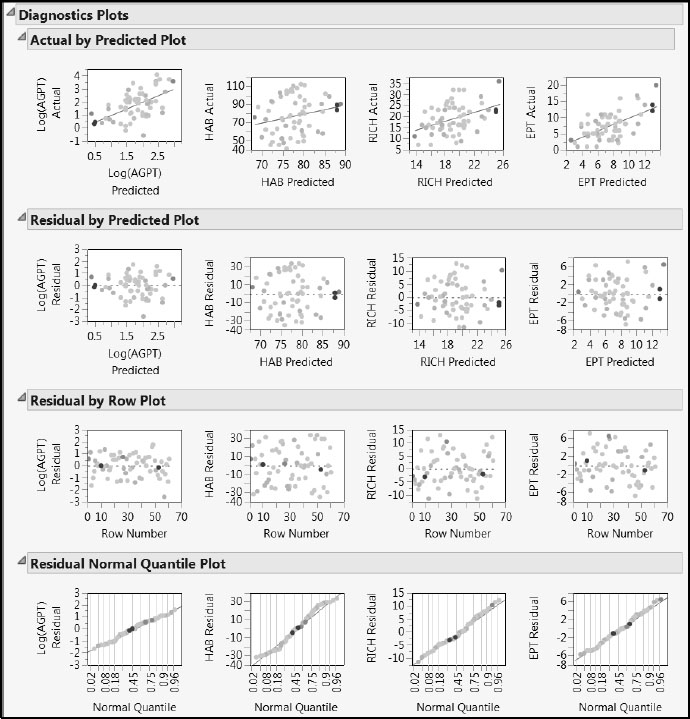
However, the Actual by Predicted Plot portion of the Diagnostics Plots report is of interest. The red lines in the plots are at the diagonal. If the responses were being perfectly predicted, the points would fall on these lines. Note that predicted values for HAB and RICH appear to be biased. Predictions for small values are larger than expected, and predictions for large values are smaller than expected.
This bias could be connected with the number of factors used or the fact that all four responses are being jointly modeled. In Appendix 2, we discuss the bias-variance tradeoff in greater detail. There we present a script, ComparePLS1andPLS2, that you can use with your own data to explore the impact of the number of factors and joint modeling of multiple responses.
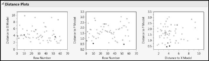
Yet another way to check for outliers is to look at the Euclidean distance from each observation to the PLS model in both the X and Y spaces. No point should be dramatically farther from the model than the rest. A point that is unusually distant might be unduly influencing the fit of the model. Or, if there is a cluster of distant points, it might be that they have something in common and should be analyzed separately. These distances are plotted in the Distance Plots.
Select the Distance Plots option from the NIPALS Fit with 1 Factors red triangle menu. Again, none of the selected points seem unusual enough to cause concern. Note that these distances to the model are called DModX and DModY by Umetrics and others (Eriksson et al. 2006).
Figure 7.21: Distance Plots with Four Rows Selected
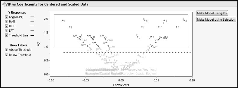
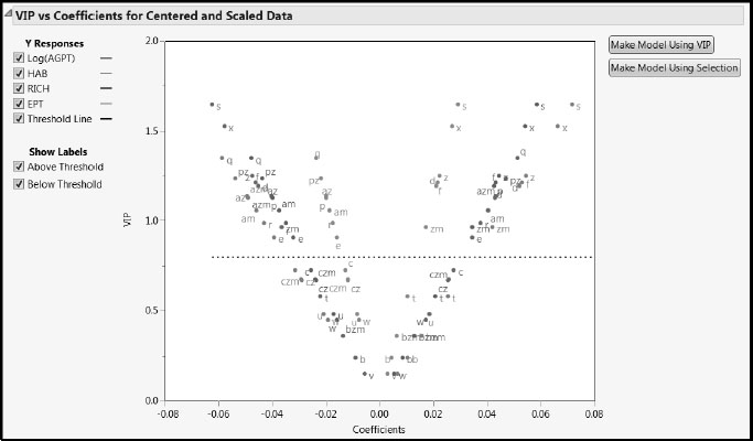
To explore the VIPs for the predictors, select the VIP vs Coefficients Plots option from the NIPALS Fit with 1 Factors red triangle menu (Figure 7.22). (Alternatively, run the script VIP Plots.) Consider the plot in the VIP vs Coefficients for Centered and Scaled Data report.
Figure 7.22: VIP vs Coefficients Plot for Centered and Scaled Data
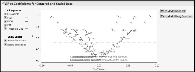
The Y Responses check boxes enable you to review each response in isolation. In this case, all four responses show a characteristic “V” shape, indicating that the terms that contribute to the regression (the terms with larger absolute coefficients) also are important relative to dimensionality reduction in PLS. Note that labels are not shown for points that are very close together. However, tooltips enable you to identify which model term corresponds to any given point in the plot.
Contrary to our expectation, the three terms associated with Ecoregion all have small coefficients and VIP values. We suspect that this is because other continuous predictors differentiate the varied landscape conditions found in the three ecoregions.
We note that s, x, f, z, and am have large VIPs for most responses. The predictors s, x, and z all deal with slope. They have negative coefficients for Log(AGPT), which measures habitat conditions, but positive coefficients for the other three responses. The predictor f, which measures percent forest, behaves similarly, as one might expect. However, am, which measures agriculture on moderately erodible soils, has a positive coefficient for Log(AGPT) and negative coefficients for the remaining three responses. The VIP vs Coefficients plot shows a similar differentiation for other predictors with high VIPs that deal with crops and agriculture (cz, czm, az, azm, and c). Information of this type should be very meaningful to an ecologist.
The two buttons to the right of the plot in Figure 7.22 are convenient for producing a pruned model. We will use an alternative VIP threshold of 1.0, which is sometimes recommended in the PLS literature, rather than the JMP default value of 0.8. (For a comparison of the 0.8 and 1.0 cut-offs, see Appendix 1.) In part, we use the 1.0 cut-off to illustrate selecting a specific set of predictors.
To select those terms that have VIP values of 1.0 or larger, use your cursor to drag a rectangle around the desired points. (See Figure 7.23.) Then, with these terms selected, click Make Model Using Selection to the right of the plot. We have selected 12 terms in this fashion. (The script is Pruned Fit Model Launch.)
Figure 7.23: Selecting Terms for the Pruned Model
Dragging a rectangle to enclose the desired points might not be sufficiently precise, especially when many terms are present. We describe a method that offers more control, should it be needed:
1. Select the Variable Importance Plot option from the red triangle menu for the relevant model fit.
2. Below the Variable Importance Plot, there is a Variable Importance Table report. Open the report. This table gives the VIPs for each term.
3. Right-click in this table and select Make Into Data Table from the context-sensitive menu.
4. Right-click the VIP column and select Sort > Descending.
5. Select the rows with the desired VIP values (in our example, rows 1 to 12).
6. Select column X so that the terms of interest are selected.
7. Right-click in the selected area of the table body and select Copy from the context-sensitive menu.
8. Close this auxiliary table.
9. Making sure that your working data table is active, select Analyze > Fit Model.
10. Right-click in the white region of the Construct Model Effects box and select Paste.
11. Complete the Fit Model window as required.
When you complete these steps for the one-factor model using a VIP cut-off of 1.0, you select a total of 12 terms. These terms and the completed Fit Model window are shown in Figure 2.24. Remember to set the Imputation Method to EM and to enter 20 as the number of Max Iterations.
Figure 7.24: Fit Model Window for Pruned Model
A Pruned PLS Model for the Savannah River Basin
To fit the pruned model with the chosen terms, click Run in the Fit Model launch window that results from clicking the Make Model Using Selection button as described earlier, from your constructed Fit Model window, or from running the script Pruned Fit Model Launch. From the red triangle menu in the report, select Set Random Seed and enter the random seed 666 as described earlier to replicate the results shown here.
In the PLS Model Launch control panel, accept the defaults and click Go. This produces the PLS Report shown in Figure 7.25. You can also generate this report by using the Pruned Fit script in the data table.
Figure 7.25: PLS Report for Pruned Model
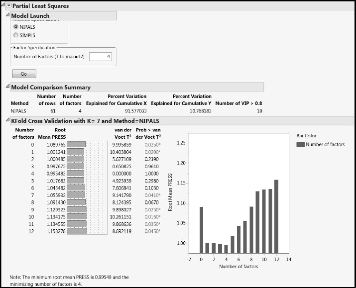
The cross validation procedure selects a four-factor model, which explains almost 92% of the variation in the Xs and almost 31% of the variation in the Ys. For comparison, note that Table 4 of Nash and Chaloud (2011) states that 80% and 43% of the variation in the Xs and Ys is explained by their model for the whole Savannah River basin. But note also that their model restricts attention to only two of the four Ys (HAB and EPT).
This observation raises the question of whether we can produce better models by using the PLS framework to model each Y separately, rather than modeling all the Ys collectively. For example, a three-factor model for EPT as a single Y accounts for 62% of the variation in Y. We will return to this interesting question in Appendix 2, where we present a script that you can use to compare the results of fitting each Y with a separate model to the results of fitting all Ys together in the same model.
The van der Voet test in the KFold Cross Validation report indicates that the four-factor model Root Mean PRESS does not differ significantly from that of the two-factor model. In the interests of parsimony, we will adopt a two-factor model. To fit a two-factor model:
1. In the Factor Specification area of the Model Launch control panel, enter 2 as the Number of Factors.
2. Click Go.
Alternatively, run the saved script Pruned Fit: Two Factors.
From the red triangle menu next to the NIPALS Fit with 2 Factors report, select Diagnostics Plots to produce the report shown in Figure 7.26. The Residual by Predicted Plot report shows no anomalies or patterns. You can check that the T Square Plot and the Distance Plots show no egregious or problematic points.
However, the Actual by Predicted Plot report once again indicates that HAB and RICH are not well predicted by this model. In fact, predictions for all four responses seem somewhat biased: higher response values are given lower predictions, and lower response values are given higher predictions. If interest is in predicting the individual measures, it might be better to model these responses separately. We encourage you to explore various options using the script ComparePLS1andPLS2, described in Appendix 2.
Figure 7.26: Diagnostic Plots for Two-Factor Pruned Model
Saving the Prediction Formulas
In the next section, we will validate our model using the test set data. To this end, we must save the prediction formulas for the Ys. To do this, you can follow the instructions below or run the script Add Predictions for PLS Pruned Model.
From the red triangle menu next to NIPALS Fit with 2 Factors, select Save Columns > Save Prediction Formula. This script adds four columns, one for each response to the end of the data table WaterQuality2_Train.jmp. These columns are formula columns. You can view the formulas by clicking the + sign next to each column name in the Columns panel.
Next, place these four prediction columns in a column group. In the Columns panel, select the four columns. Right-click on the selected column names, and select Group Columns from the menu. This selection groups the columns under the name Pred Formula Log(AGPT) etc. Click on this name, and rename the group to Predictions from Pruned Model.
Comparing Actual Values to Predicted Values for the Test Set
At this point, open the test set that we have held in reserve, WaterQuality2_Test.jmp. You will use this independent data to test the model’s performance on new data.
To apply the formulas saved in WaterQuality2_Train.jmp to the 25 rows in WaterQuality2_Test.jmp, you will append this second data table to WaterQuality2_Train.jmp. Complete the following steps, or run the script Add Test Data in WaterQuality2_Train.jmp once you have opened WaterQuality2_Test.jmp.
1. Ensure that both WaterQuality2_Train.jmp and WaterQuality2_Test.jmp are open.
2. Make WaterQuality2_Train.jmp the active table, and select Tables > Concatenate.
3. From the Opened Data Table list, select WaterQuality2_Test.jmp.
4. Click Add.
5. Check Save and evaluate formulas.
6. In the Output table name text area, enter WaterQuality3.jmp.
The window should appear as shown in Figure 7.27.
7. Click OK.
Figure 7.27: Completed Concatenate Window
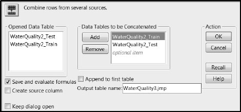
Check that the 25 rows have been appended to the new data table WaterQuality3.jmp, and that the prediction formulas have evaluated for these rows.
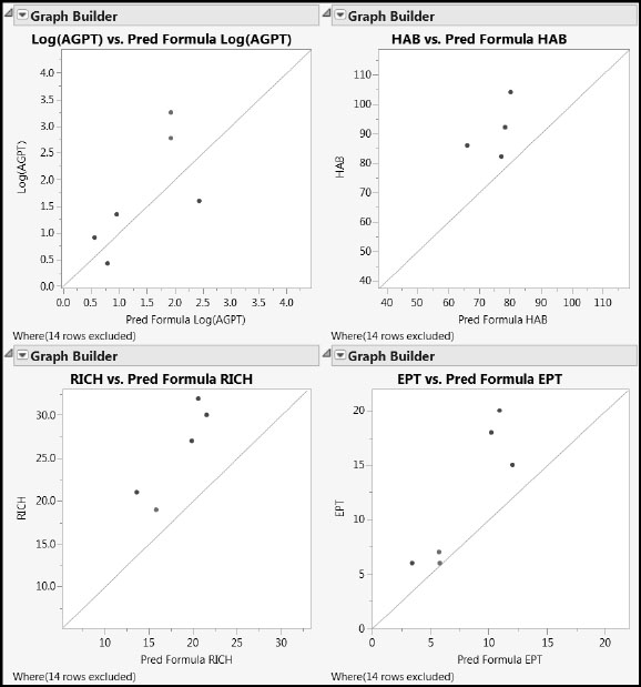
By selecting Graph > Graph Builder, it is easy to produce plots for the test data of actual versus predicted values for each of the four responses. We will illustrate obtaining such a plot for Log(AGPT). To go directly to the plots, run the script Actual by Predicted in WaterQuality3.jmp.
1. Ensure that WaterQuality3.jmp is the active data table. Select Graph > Graph Builder.
2. From the Variables list that appears at the left, select Log(AGPT) and drag it to the Y area near the left vertical axis of the plot template. The various predicted values are plotted in a jittered fashion.
3. From the Variables list, select Pred Formula Log(AGPT) and drag it to the X area at the bottom of the plot template. Now the points are plotted as they would be in a scatterplot, except that a smoother has been added.
4. Click the Smoother to deselect it. The Smoother is the second icon from the left above the template.
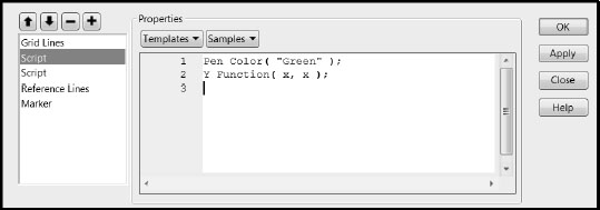
Next, we will plot a line on the diagonal. If the predicted values exactly matched the actual values, all points would fall on the diagonal.
5. Right-click in the plot and select Customize.
6. In the Customize Graph window, click the + sign to open a text window where you can enter a script.
7. In the text area, enter the following script, so that your window matches the one in Figure 7.28. Pen Color ("Green"); Y Function(x, x);
8. Click OK.
9. Resize the graph appropriately.
Figure 7.28: Customize Graph Window
The resulting plot displays results for all 81 rows. Run the script Use Only Test Data to display only the 25 test rows. The completed plot for Log(AGPT), along with those for the three other responses, is shown in Figure 7.29.
Figure 7.29: Actual by Predicted Plots for Test Set Using PLS Pruned Model
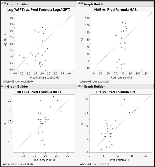
For all four responses, we see some bias. Specifically, higher values of the response are generally predicted to have lower values, and lower values are predicted to have higher values, relative to the line that describes perfect agreement. To see that this is consistent with the model for the training data, run the script Use Only Non-Test Data to exclude all but the 61 training rows. The Actual by Predicted Plots display is updated. The bias remains evident. We give further consideration to the question of bias in PLS predictions in Appendix 2.
A First PLS Model for the Blue Ridge Ecoregion
At the end of the section “Conclusions from Visual Data Analysis and Implications,” we noted two strategies for modeling. The first was to obtain a single model that covers all three ecoregions. The second was to obtain separate models for each ecoregion. In this section, we illustrate the second approach by building a model for one of the ecoregions, the Blue Ridge.
It is possible to build separate models for multiple ecoregions simultaneously from the same table. You can do this by assigning Ecoregion to the role of a By variable in the Fit Model window. However, this workflow leads to a proliferation of saved columns and the use of long names to distinguish them. For this reason, we will simply work with a subset of WaterQuality2.jmp that contains the appropriate rows.
To create the subset:
1. Open WaterQuality2.jmp by clicking on the link in the master journal.
There are many ways to select the appropriate rows. We will use Distribution.
2. Select Analyze > Distribution.
3. Select Ecoregion from the column group Station Descriptors and click Y, Columns.
4. Click OK.
5. In the plot, double-click on the bar labeled “Blue Ridge”.
Double-clicking produces the subset table shown in Figure 7.30.
Figure 7.30: Linked Subset Table Containing the Blue Ridge Data (Partial View)
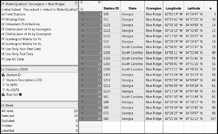
This table is a linked subset. If you close the parent table, the linked table closes too, so you need to save this table if you want to continue to work with it. Also, the scripts from WaterQuality2.jmp propagate to this new table. Some of these are no longer relevant to the reduced data and need to be removed.
At this point, we suggest that you close all open tables and open the table WaterQuality_BlueRidge.jmp by clicking on the link in the master journal. This table contains the data for the 20 Blue Ridge observations, and a set of relevant scripts. The column Test Set designates 14 observations that will be used for modeling and 6 for testing.
The steps for reviewing the data and for building the PLS model mirror those we used for the data from the entire Savannah River Basin. For this reason, our instructions will be succinct and we will rely heavily on saved scripts.
Running the saved Missing Data script shows that two samples have missing values for HAB. We note that both of these are in the test set. Because coloring the rows by Ecoregion is no longer relevant, we choose to color the rows containing a missing value as red. To do this, in the Missing Data Pattern table produced by the Missing Data script, select Rows > Color or Mark by Column. Select the column Number of Columns Missing and click OK.
To review the data for the Blue Ridge ecoregion you can run the four scripts: Univariate Distribution of Ys, Univariate Distribution of Xs, Scatterplot Matrix for Ys, and Scatterplot Matrix for Xs. From the quantiles shown by the script Univariate Distribution of Xs, we see that the variables ah, azh, and bzh, which all deal with agriculture on highly erodible soils, have only zero values. As such, these are non-informative for modeling.
To remove these columns from further consideration, select all three columns in the Columns panel of the data table holding down the Ctrl key. Then, with your cursor on one of the highlighted selection areas, right-click and select Exclude/Unexclude from the context-sensitive menu. (Incidentally, if you include these columns in your model, JMP will ignore them. However, identifying such columns can be useful for your general understanding of the data.)
First, we must hide and exclude the rows for which Test Set values are “No”. To do this, select Analyze > Distribution, entering Test Set as Y, Columns, to select the “Yes” rows, and then Hide and Exclude them by right-clicking on one of the selection areas in the data table. Or, you can run the saved script Use Only Non-Test Data.
Populate the Fit Model launch window as shown in Figure 7.33, or run the saved script BR Fit Model Launch. Check to see that the three excluded columns do not appear in the group of Xs in the Select Columns list. You do not need to check the Impute Missing Data option, because there are no missing observations for the training data.
Figure 7.31: Fit Model Window
Click Run to obtain the Partial Least Squares Model Launch control panel. As before, to reproduce the results below exactly, set the random seed to be 666. Click Go to accept the default settings and to proceed with the modeling. Alternatively, you can run the script BR PLS Fit.
Figure 7.32 shows that cross validation has selected the one-factor model, which explains 53% of the variation in the Xs and 31% of the variation in the Ys.
Figure 7.32: PLS Report for One-Factor Fit
The Distance Plots and T Square Plot show no obvious outliers or patterns. However, the Actual by Predicted Plot report in the Diagnostics Plots shows that the predicted values are biased (Figure 7.33). For large observed values, the predicted values tend to be smaller, whereas for small observed values, the predicted values tend to be larger.
Figure 7.33: Actual by Predicted Plots for One-Factor Fit
From the red triangle menu at NIPALS Fit with 1 Factors, select VIP vs Coefficients Plots. The VIP vs Coefficients for Centered and Scaled Data plot shows that predictors exhibit the characteristic “V” shape (Figure 7.34). There are several terms below the 0.8 threshold, and 14 above that threshold, as indicated by the Number of VIP > 0.8 given in the Model Comparison Summary (Figure 7.32).
Figure 7.34: VIP vs Coefficients Plot for Centered and Scaled Data
The VIP vs Coefficients Plot for the Blue Ridge data shows some differences from the plot for the entire Savannah River basin. The behavior of s and x, which deal with slope, is similar. But notice that q, the percent wetlands, has the next highest VIP. It has a positive coefficient for Log(AGPT), and negative coefficients for HAB, RICH, and EPT. Other predictors, such as e, which measures erodible soils, have moved up in importance.
A Pruned PLS Model for the Blue Ridge Ecoregion
For consistency with the analysis of the whole Savannah River Basin, we prune the model by selecting terms with VIP > 1. As described earlier, select a region of the VIP vs Coefficients Plot by dragging a rectangle to capture the required terms. Or use the Variable Importance Table approach described earlier. You should have 11 predictors in all. Then click Make Model Using Selection. This selection generates a new Fit Model window, containing 11 predictors, shown in Figure 7.35. You can also obtain this window by running the saved script BR Pruned Fit Model Launch.
Figure 7.35: Fit Model Window for the Pruned Model
As before, click Run, set the random seed to 666, and then click Go to see the results of the cross validation process and the details of the chosen model. Alternatively, run the saved script BR Pruned Fit.
Cross validation selects the one-factor model, which explains 79% of the variation in the Xs and 31% of the variation in the Ys. For comparison, the analysis conducted by Nash and Chaloud (2011) on the same data gives corresponding figures of 94% and 59%, but, as mentioned earlier, their model is restricted to only two of the four Ys (HAB and EPT).
The residual plots do not reveal outliers or patterns. However, the Actual by Predicted Plot report indicates, as before, that the model is biased. To validate the model against the test data, we need to save the prediction formulas. To this end, select Save Columns > Save Prediction Formula from the red triangle menu for the fit. For convenience, place the resulting columns in a column group called Predictions from Pruned Model. To save the prediction formulas and to create the column group directly, run the saved script Add Predictions for BR PLS Pruned Fit.
Comparing Actual Values to Predicted Values for the Test Set
To use only the data that has not been used to build the PLS models for the Blue Ridge ecoregion, run the saved script Use Only Test Data. The script hides and excludes 14 rows.
You can select Graphs > Graph Builder to build the requisite plots, or run the saved script Actual by Predicted. The plots are shown in Figure 7.36.
Figure 7.36: Predictions on Test Set for PLS Pruned Model
The model appears to be biased for all responses except Log(AGPT). For the other three responses, predicted values are always less than the actual values. The practical impact of this, though, has to be seen in the wider context: For the test data, HAB underpredicts by about 15 units against a range of 22 units, RICH by about 7 units against a range of 13 units, and EPT by about 4 units against a range of 14 units. Note, however, that these conclusions are based on a very small number of points.
This bias is not unexpected. In this example, the variation in the Xs is well explained, whereas the variation in the Ys is not as well explained. The model seems to model the Xs more accurately than the Ys. But such is the nature of PLS—it models both the Xs and the Ys. As mentioned earlier, we deal further with the question of PLS bias in Appendix 2.
We have seen how to fit PLS models to the water quality data featured in Nash and Chaloud (2011). The objective was to relate landscape variables obtained from remote sensing data to measures of water quality obtained from laboratory assessment of samples gathered from field locations. We fit a model for the whole Savannah River Basin and a model for only the Blue Ridge ecoregion. In both cases we used cross validation to select an initial model, and VIPs and coefficients to prune the initial model. We then applied the pruned models to a hold-out set of test data, and found that in many cases the results are biased, but still potentially useful.
The bias in the fits can be mitigated to some extent by fitting each response individually. We encourage you to explore this approach to the analysis using the script ComparePLS1andPLS2 presented in Appendix 2.
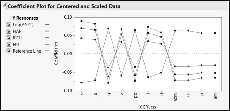
Ecology is a specialized topic, and our analysis, out of necessity and expediency, does not emphasize the meaning of the variables used. Although our approach differs in detail from that in Nash and Chaloud (2011), our results conform to their commentary on the major aspects. For example, consider Figure 7.37, which shows the Coefficients Plot for the one-factor pruned PLS Blue Ridge ecosystem model for all 20 Blue Ridge observations. (The plot is given by the script Coefficient Plots.) You can relate this plot directly to the discussion in Section 5 of Nash and Chaloud (2011). Note how Log(AGPT) is differentiated from HAB, RICH, and EBT.
Figure 7.37: Coefficient Plot for Blue Ridge PLS Pruned Model
Depending on the kind of data with which you work, you might feel that the predictive power of PLS is a little disappointing in this setting. But you need to view the utility of PLS in a context that is broader than prediction. As you have seen, PLS can provide insight on relationships between the predictors and the responses. In the context of prediction, you must evaluate PLS relative to other analysis approaches commonly used in your area, and also to the information content of the data being analyzed.
Nash and Chaloud (2011) are positive about the practical value of their specific results:
“In both the preliminary and refined models for the whole basin, associations among water biota and landscape variables, largely conform to known ecological processes. In each case the dominant landscape variable corresponds to a critical aspect of the ecoregion: forest in the evergreen forest-dominated Blue Ridge, wetland in the transitional Piedmont, and row crops in the agriculture-dominated Coastal Plain.”
They are also positive about the relevance of PLS to similar types of problems:
“The results indicate PLS may prove to be a valuable statistical analysis tool for ecological studies. The data sets used in our analysis contain limitations typical of ecological studies: a small number of sampling sites, a large number of variables, missing values, low signal-to-noise ratio, differences in spatial extent, and different collection methodologies between the field-collection surface water samples and the remote sensing-derived landscape variables. The PLS methodology is less sensitive to these limitations than other statistical methods . . . Univariate-multiple regression analyses with these data sets will not reveal a distinctive pattern of association due to a weak correlation. Summarizing information in the predictor variables by reduction into a few variables . . . makes PLS more suitable in a multivariate context than other, more commonly used, multivariate methods.”