
8
Baking Bread That People Like
Visual Exploration of Overall Liking and Consumer Xs
The Plan for the First Stage Model
Comparing the Stage One Models
Visual Exploration of Ys and Xs
The Partial Least Squares Report
The Combined Model for Overall Liking
Constructing the Prediction Formula
Faced with a competitive landscape, consumer goods companies respond by bringing new, innovative products to market. These might be completely new products or variants of existing products that are expected to be more successful than their predecessors. Extensive consumer research and testing, usually considered part of marketing research, is used to understand the preferences, attitudes, and behaviors of customers and potential customers.
For the technical evaluation of food and drink products, the science of sensory analysis is of critical importance. Sensory analysis applies experimental design and statistical methodology to data relating to the human senses of sight, smell, taste, touch, and hearing. Most consumer goods companies have departments dedicated to sensory analysis, and those that don’t usually outsource this important capability.
Both consumer research and sensory analysis constitute considerable bodies of knowledge, and the application of statistical principles and methods in these areas is well established. For introductions to the heavily used statistical approaches, see Statistics in Market Research (Chakrapani 2004) and Sensory Evaluation of Food: Statistical Methods and Procedures (O’Mahony 1986).
In this chapter, we explore the use of PLS in modeling the relationships between consumer test results on various types of bread, and sensory panel results on the same products. A useful model would allow us to use sensory results to predict likely acceptance by consumers, enabling us to design new desirable products by endowing them with preferable sensory characteristics. In addition, we might be able to determine which characteristics are particularly important to consumer desirability, enabling us to modify these characteristics to produce formulations that are more successful than those currently marketed.
Our data are from a large commercial bakery that wanted to understand how sensory results influence consumer desirability. The company’s interest focused on 24 types of bread. It conducted both consumer and sensory studies of their bread types. (This example uses data kindly supplied to us by David Rose of SAS.)
For the consumer study, 50 participants were chosen at random from a specific demographic grouping to form a sample representative of the target market. For each type of bread, each participant rated seven attributes on a monotonic scale from 0 to 9 where higher ratings indicate higher desirability. For each type of bread, the scores for
each attribute were averaged over all the consumers who took part in the study. These average consumer ratings form the basis of our first analysis.
The company also employed an expert taste panel to assess 60 sensory characteristics for these same 24 breads. Each expert rated every characteristic on a 0 to 9 scale three times. The resulting scores for each characteristic were averaged over all experts and replicates, giving an average sensory score for each type of bread. These 60 sensory ratings are used in our second analysis.
Click on the link in the master journal to open the data table Bread.jmp, shown in Figure 8.1. This table contains 24 rows, one for each type of bread studied, and 69 columns. In preparing the table for analysis, all but three of the 69 columns have been arranged in column groups. Specifically, the table contains the following:
• A column called Bread that uniquely identifies each type of bread. Note that the bakery sometimes makes more than one type of bread under the same brand.
• A column called Overall Liking, the overall affinity that consumers expressed for a given type of bread.
• A group of six columns called Consumer Xs that contains the results of the consumer tests for specific aspects of each bread type. In our first analysis, we focus on modeling Overall Liking in terms of these columns.
• Five column groupings called Appearance, Aroma, Aftertaste, Flavor and Mouthfeel. These result from the taste panel’s analysis of the 60 sensory characteristics, grouping variables by aspects of the sensory data. Note that the first two characters of each column name indicate the grouping. For example, Ar Malt is contained within the Aroma grouping and At Bitter within the Aftertaste grouping. These columns are used as Xs in a second analysis to model the appropriate columns in Consumer Xs.
• A column called Row State that holds markers and colors used in the analysis. The colors are determined by the value of Overall Liking, with green indicating high values and red indicating low values.
Figure 8.1: Partial View of Bread.jmp
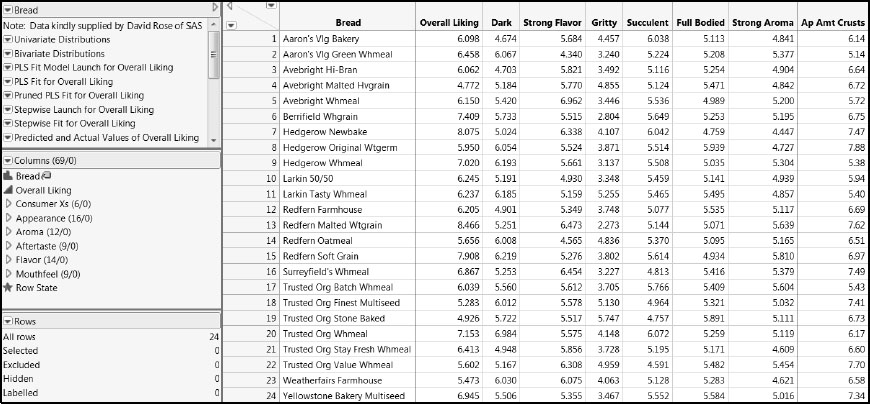
In the Columns panel, you see an icon next to Bread that resembles a tag. This icon indicates that Bread has been designated as a labeling variable. When you click on a point in a plot, the type of Bread for that point appears. (To assign the label role, right -click on a column name in the Columns panel and select Label/Unlabel.)
As implied earlier, the interpretation of the measured variables suggests a two-step, hierarchical, approach to the modeling: First, we model Overall Liking in terms of the other six consumer ratings, identifying a subset of these Xs with explanatory power. Then, treating these key variables as Ys, we build a second model involving the associated sensory panel results as Xs. We then implicitly model Overall Liking in terms of the relevant underlying sensory panel results by combining the two explicit models.
First we investigate the pattern of missing data. Select Tables > Missing Data Pattern. Then select all columns and column groups other than Row State, click Add Columns, and then click OK. The report indicates that none of the 24 rows have missing values in any of the columns. So, we can exploit the information in all the rows without being concerned about how to handle missing values.
Visual Exploration of Overall Liking and Consumer Xs
For the first stage model, Y is Overall Liking and the Xs are the columns in the column group Consumer Xs. Let’s look at the univariate distribution of each variable. (The saved script is Univariate Distributions.)
1. Select Analyze > Distribution.
2. Select Overall Liking and the Consumer Xs column group from the Select Columns list, and click Y, Columns.
3. Select the Histograms Only check box in the lower left of the window.
4. Click OK.
Select the top three bars of the histogram for Overall Liking by clicking on them while holding down the Shift key. You see the report shown in Figure 8.2.
Figure 8.2: Univariate Distributions of Consumer Study Results
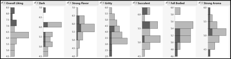
The distributions seem relatively well behaved. The highlighting shows the distribution of the consumer preferences for the types of bread that are liked best. Gritty and Full Bodied both have generally low values for these breads, but the patterns for other characteristics are not as clear.
To explore the relationships between variables two at a time, complete the following steps, or, run the script Bivariate Distributions:
1. Select Analyze > Multivariate Methods > Multivariate.
2. Enter Overall Liking and the columns in Consumer Xs as Y, Columns.
3. Click OK.
The report gives Correlations and a Scatterplot Matrix. In the Scatterplot Matrix, the points that are not currently selected in the table Bread.jmp are muted. To undo the selection, click in some blank space within the matrix. The Scatterplot Matrix is shown in Figure 8.3.
Figure 8.3: Scatterplot Matrix for Consumer Study Results
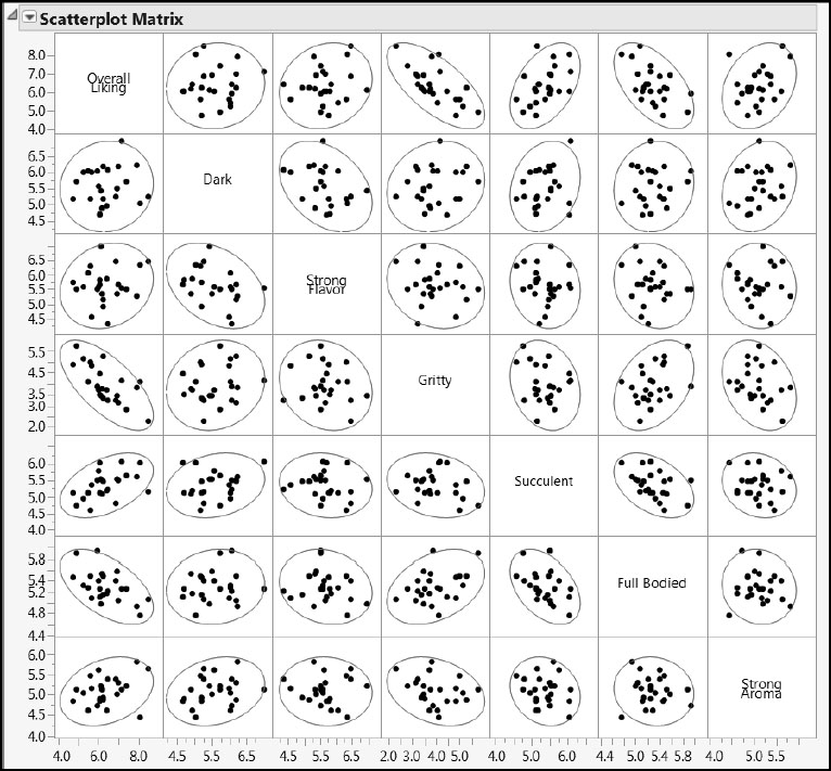
The confidence ellipses that are shown by default in the scatterplot matrix are based on the assumption that the data follow a multivariate normal distribution. This assumption might not apply for our consumer ratings, so these ellipses serve only as a useful guide to the eye. Position your mouse pointer near the points outside the ellipses. Tooltips appear that show the type of bread and the values of the two variables for that bread type. No one type of bread appears consistently as an outlier in these bivariate distributions, and no single point appears to be too distant from the cloud of points.
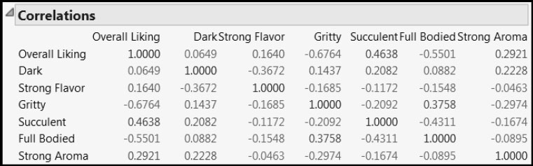
The Correlations report is shown in Figure 8.4. The correlations are only moderate; the correlation with the largest absolute value is –0.6764. Nonetheless, Overall Liking is correlated with some of the Xs, and some of the Xs are mutually correlated. (For example, Full Bodied and Succulent have a correlation of –0.4311.)
Figure 8.4: Correlations between Consumer Study Variables
The Plan for the First Stage Model
We make the assumption that the specific characteristics represented in Consumer Xs are connected with Overall Liking. We are interested in determining which of these characteristics are most influential in this relationship. In other words, we are interested in variable selection.
There are many statistical approaches to variable selection. Generally speaking, PLS should be used cautiously for this purpose. (See Appendix 2.) Given that PLS is often used when variables are heavily interrelated, variable selection can result in choosing variables that don’t make sense from an explanatory perspective. But the fact remains that PLS is often used for variable selection. In the final analysis, a useful model is the goal and the model’s utility is dependent on both the data and the wider objectives and context of the analysis. Our advice is to seek confirmation using alternative approaches when possible.
Recall that there are 24 rows in Bread.jmp, Overall Liking is a single Y, and there are only six variables in Consumer Xs. So in addition to using PLS, we can also use multiple linear regression (MLR) to identify the Xs that drive Overall Liking. In the case of MLR, we will use stepwise regression for model selection.
We will attempt to identify the important consumer predictors using both methods: PLS and stepwise regression. To identify important predictors using PLS, we first fit a PLS model using all predictors, and then use the VIPs and model coefficients to select predictors. Next we perform variable selection based on MLR using a stepwise approach. We compare the results of the two methods to determine a final set of predictors.
In terms of validation, we do the following:
• PLS: To avoid fitting noise, given that we have relatively few rows available, we use leave-one-out cross validation. This choice makes good use of the data and, with small data sets, runs quickly. (In case this option isn’t available to you in your version of JMP, in the PLS Model Launch control panel, you can specify leave-one-out cross validation by setting the Number of Folds equal to the number of rows, here, 24).
• Stepwise: There are several alternative stopping rules for the stepwise personality. We will use K-Fold Crossvalidation with k = 24 for consistency with our PLS choice of leave-one-out cross validation.
Although you generally need to specify a Random Seed to reproduce cross validation results, for leave-one-out cross validation specifying a seed is unnecessary, because there is only one way to define the folds.
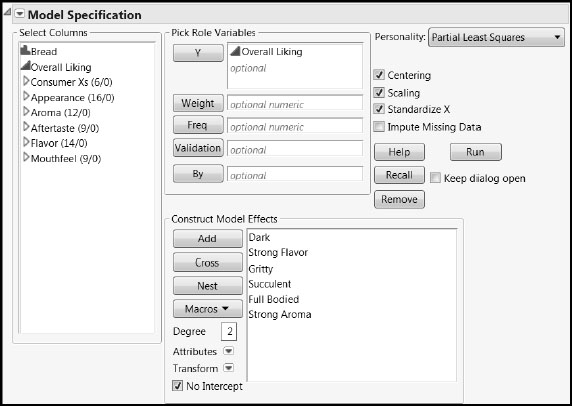
We describe the JMP Pro PLS launch through Fit Model. (The script is PLS Fit Model Launch for Overall Liking.) If you are running JMP, you can launch the platform by selecting Analyze > Multivariate Methods > Partial Least Squares and adapt the following steps.
1. Select Analyze > Fit Model.
2. Enter Overall Liking as Y.
3. Enter all the columns in the group Consumer Xs in the Construct Model Effects list.
4. Select Partial Least Squares as the Personality.
Your window should appear as shown in Figure 8.5.
5. Click Run.
Figure 8.5: Fit Model Window
In the PLS Model Launch control panel, accept the default Model Specification of NIPALS, but either change the Validation Method to Leave-One-Out, or change the Number of Folds for KFold validation to 24. Click Go. (The saved script is PLS Fit for Overall Liking.)
The Partial Least Squares Report
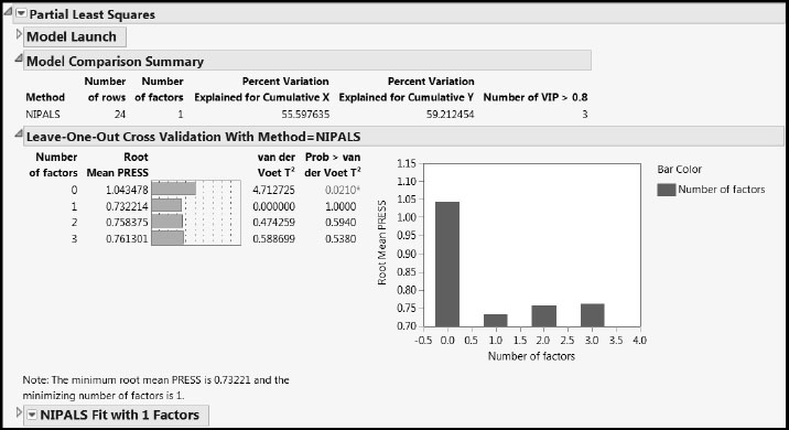
Clicking Go adds three report sections (Figure 8.6): A Model Comparison Summary report, which is updated when new fits are performed, a Leave-One-Out (or KFold) Cross Validation report, and a NIPALS Fit with 1 Factors report that details the fit chosen through the cross validation procedure.
Figure 8.6: PLS Report for One-Factor Model
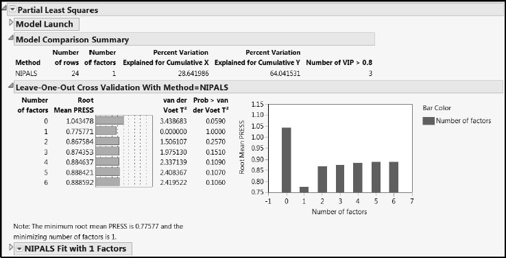
The Leave-One-Out (or KFold) Cross Validation report shows that Root Mean PRESS is minimized with one factor. The Prob > van der Voet values indicate that PRESS for a single-factor model differs significantly from PRESS for a no-factor model. Keep in mind that, because the van der Voet p-values are obtained by simulation, your Prob > van der Voet values might differ from those shown in Figure 8.6.
The Model Comparison Summary indicates that the single factor accounts for about 29% of the variation in the Xs and 64% of the variation in the Ys. The last column, Number of VIP > 0.8, indicates that only 3 of the 6 customer preference predictors are influential in determining the single factor. This suggests some potential for refining the model by dropping some of the predictors.
The NIPALS Fit Report
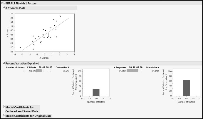
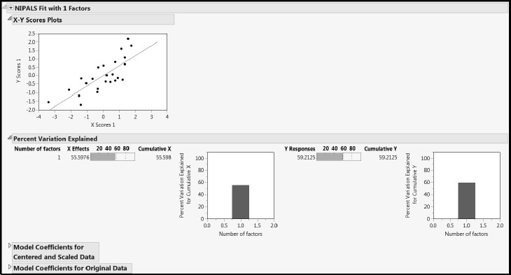
Now let’s look at the report for the fit, NIPALS Fit with 1 Factors (Figure 8.7). The X-Y Scores Plots report shows reasonable correlation between the X and Y scores. In a good PLS model, the first few factors should show a high correlation between the X and Y scores and, although there is some scatter here, the correlation is reasonable.
The Percent Variation Explained report displays the variation in the Xs and Ys that is explained by each factor. The Cumulative X and Cumulative Y values must agree with the corresponding figures in the Model Comparison Summary. Because of the small to moderate correlations among the Xs, we are not surprised that the model explains only 29% of the variation in the Xs.
The two Model Coefficients reports give the estimated model coefficients for predicting the Ys. Recall that the Model Coefficients for Centered and Scaled Data report gives coefficients that apply when the Xs and Ys have been transformed to have mean zero and standard deviation one. If the Standardize X option is selected, the Model Coefficients for Original Data report gives coefficients for the model expressed in terms of the standardized predictors. If the Standardize X option is not selected, the report gives the coefficients for the model in terms of the raw data values. In both cases, this second set of model coefficient estimates is of secondary interest.
Figure 8.7: NIPALS Fit Report
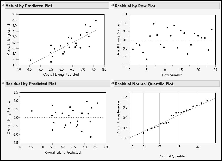
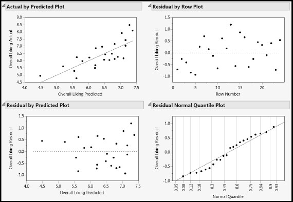
Select Diagnostics Plots from the NIPALS Fit with 1 Factors red triangle menu to obtain the plots shown in Figure 8.8. These plots indicate no issues of note.
Figure 8.8: Diagnostics Plots
To compare this first model with others we build, select Save Columns > Save Prediction Formula from the red triangle menu for the NIPALS fit. This adds a new formula column, called Pred Formula Overall Liking, to the Bread.jmp data table.
To explore possibilities for pruning the model by removing Xs, select the VIP vs Coefficients Plots option from the NIPALS Fit with 1 Factors red triangle menu (Figure 8.9). Note there is an overall “V” shape, indicating that the terms that contribute to the regression also are important in PLS dimensionality reduction.
Figure 8.9: VIP versus Coefficients Plot
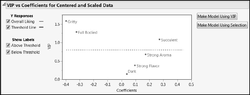
The two buttons to the right of the plot in Figure 8.9 are convenient for producing a pruned model. Click the Make Model Using VIP button to use the default VIP threshold of 0.8. This selection produces a Fit Model launch window containing the terms with VIP values of 0.8 or higher: Gritty, Succulent, and Full Bodied.
Model Fit
To fit the pruned model using the chosen terms, click Run in the Fit Model launch window. In the resulting PLS Model Launch control panel, accept the default Model Specification of NIPALS, but as for the full model, select Leave-One-Out as the Validation Method. (Or, use KFold with the Number of Folds equal to 24.) Click Go. (The script is Pruned PLS Fit for Overall Liking.)
Cross validation selects a one-factor model, producing the report shown in Figure 8.10.
Figure 8.10: PLS Report for One-Factor Pruned Model
The one-factor model based on our variable selection explains 56% of the variation in the Xs and 59% of the variation in Y, Overall Liking, compared to the corresponding figures of 29% and 64%, respectively, for the full model.
Open the NIPALS Fit with 1 Factors report to review the X-Y Scores Plots, shown in Figure 8.11.
Figure 8.11: NIPALS Fit Report for the Pruned Model
Diagnostics
From the red triangle menu next to the model fit, select Diagnostics Plots to produce Figure 8.12.
The Actual by Predicted Plot report shows a somewhat unbiased fit with some variation. There is a suggestion that larger values of Overall Liking are being slightly underpredicted.
The Residual by Predicted Plot shows no anomalies or patterns. The Residual Normal Quantile Plot shows some non-randomness in that points are systematically below and above the red line as we move from left to right. This effect is a little more pronounced than for the full model in Figure 8.8. However, this issue is not serious and we do not pursue it.
Figure 8.12: Diagnostics Plots for the Pruned Model
To compare this pruned model with other models, select Save Columns > Save Prediction Formula from the red triangle menu for the fit to generate a new formula column in Bread.jmp. The new column is called Pred Formula Overall Liking 2.
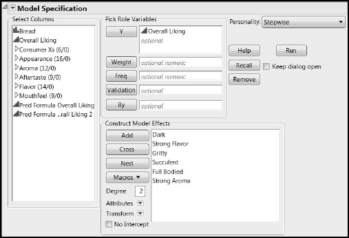
We use the stepwise personality to perform variable reduction based on multiple linear regression fits. Complete the following steps. (Or, run the script Stepwise Launch for Overall Liking.)
1. Select Analyze > Fit Model.
2. Enter Overall Liking as Y.
3. Enter all the columns in the group Consumer Xs into the Construct Model Effects list.
4. Select Stepwise as the Personality.
Your window should appear as shown in Figure 8.13.
5. Click Run.
Figure 8.13: Fit Model Window for Stepwise Multiple Linear Regression
6. Select K-Fold Crossvalidation from the report’s red triangle menu.
7. Enter a value of 24 for k in the menu that opens.
8. Click OK.
This results in the Stepwise Regression Control report shown in Figure 8.14. (The script Stepwise Fit for Overall Liking produces this report.)
9. Click Go.
Figure 8.14: Control Panel for Stepwise Multiple Linear Regression
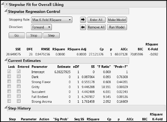
The variable reduction process runs until the stopping rule is triggered. The variables Gritty, Succulent, and Full Bodied are selected. These are precisely the same terms that appear in the pruned PLS model.
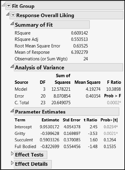
To fit a linear regression model to only these three terms, click the Run Model button. In the resulting report, from the red triangle menu next to Response Overall Liking, select Save Columns > Prediction Formula (Figure 8.15). This saves the prediction formula so that we can compare it to the two formulas obtained using PLS. The new column is called Pred Formula Overall Liking 3.
Figure 8.15: Multiple Linear Regression Fit with Terms Selected by Stepwise
Comparing the Stage One Models
A Graphical Comparison
To facilitate interpreting subsequent reports, rename the three saved prediction formula columns as follows:
• Pred Formula Overall Liking as Pred Formula Overall Liking – PLS.
• Pred Formula Overall Liking 2 as Pred Formula Overall Liking – PLS Pruned.
• Pred Formula Overall Liking 3 as Pred Formula Overall Liking – Regression.
To rename a column, slowly double-click on the column name in the Columns panel and enter the new name.
Now select Graph > Graph Builder. Drag Overall Liking to the X area. Drag each of the three prediction formula columns individually to the Y area, depositing each at the top of the axis to produce individual displays. Your plot should be similar to that shown in Figure 8.16. (This graph is one of two produced by the script Predicted and Actual Values of Overall Liking, which also generates the three prediction formulas.)
Figure 8.16: Comparison of Fitted versus Actual Values of Overall Liking
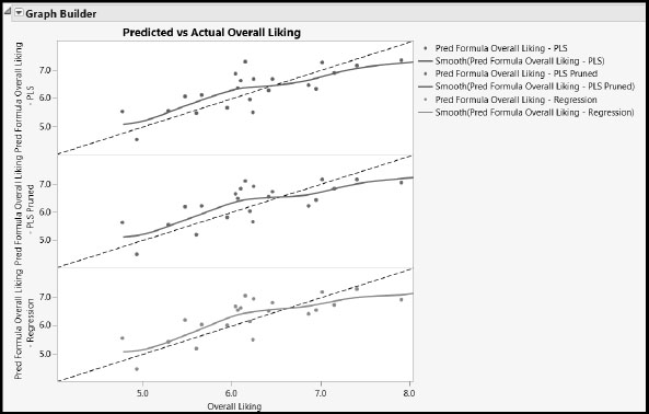
The diagonal dotted line is the line of perfect agreement. You can add this line by right-clicking on the respective white region in each graph box, selecting Customize, and then clicking the + sign. In the text box, enter the following expression:
Line Style(“Dashed”); Y Function(x, x);
Click OK.
These lines serve as guides, enabling you to gauge the quality of each fit and assess the differences between fits. These fits appear quite similar, but we stress that this might not always be the case when comparing PLS and MLR.
Comparison via the Profiler
For another view, select Graph > Profiler. Assign the three formula columns to the Y, Prediction Formula role and click OK. This produces the report shown in Figure 8.17. (This graph is one of two produced by the script Predicted and Actual Values of Overall Liking.)
Figure 8.17: Simultaneous Profiling of Three Stage One Models of Overall Liking
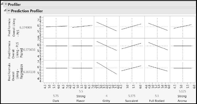
In the second and third profiler rows, the cells for the three variables, Dark, Strong Flavor, and Strong Aroma, show perfectly horizontal lines. These variables were not included in the pruned PLS or reduced regression models. They were included in our first PLS model, which is the model represented in the top row of the plot.
Manipulating the dotted vertical lines produces different profiles of Overall Liking within the six-dimensional or three-dimensional X space. By varying the settings, you see that the model predictions are in good agreement. In fact, predictions for the bottom two models are virtually identical for practical purposes.
Based on the stage one analysis, the customer preference columns Gritty, Succulent, and Full Bodied become the Ys for our stage two analysis. In that stage, we model these three variables as Ys in terms of the expert taste panel results.
Visual Exploration of Ys and Xs
In this analysis we have three Ys (Gritty, Succulent, and Full Bodied), 60 Xs (in 5 groups), and 24 rows. Because we have more predictors than rows, it is not possible to use MLR.
To help make subsequent displays more meaningful, we color the rows in Bread.jmp according to the values of Overall Liking. To color the rows, complete the following steps:
1. Select Rows > Color or Mark by Column.
2. Select Overall Liking from the Columns list.
3. From the Colors list, select Green to Black to Red.
4. Select the Reverse Scale check box.
Reversing the scale causes small values of Overall Liking to be colored red and large values green, which is more intuitive.
5. Click OK.
6. Select all the rows, right-click in the highlighted area, select Markers, and then select the open circle marker.
The previous two steps update the row states of Bread.jmp. Alternatively, you can apply these row states using the Row State column, where they are already saved. To apply row states from the Row State column, click on the red star next to the Row State column name in the Columns panel and select Copy to Row States.
We can conveniently assess the pattern of variation between Gritty, Succulent, and Full Bodied using a 3-D Scatterplot. Select Graph > Scatterplot 3D, enter the columns Gritty, Succulent, and Full Bodied as Y, Columns, and then click OK. From the report’s red triangle menu, select Normal Contour Ellipsoids. In the menu that appears, set Coverage to 0.95 and click OK. After a little rescaling of the three axes, your plot should appear as in Figure 8.18. Alternatively, run the script Scatterplot 3D of Taste Panel Ys to obtain this plot.
Figure 8.18: Pattern of Variation for Three Taste Panel Ys
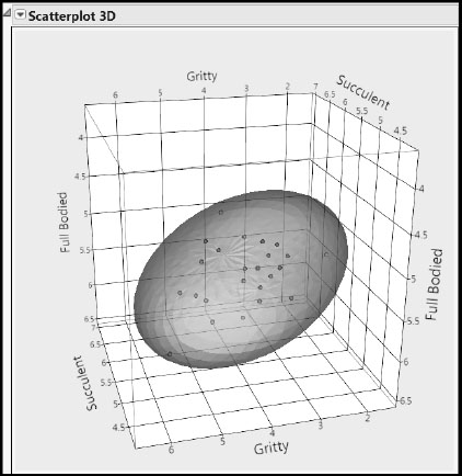
Rotating the cube shows that the cloud of points has a compact distribution, and that the three Ys are moderately correlated. (See also Figure 8.4.)
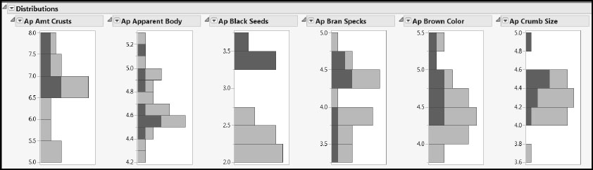
To review the univariate distribution of the 60 Xs, select Analyze > Distribution, add the five column groups Appearance, Aroma, Aftertaste, Flavor, and Mouthfeel to the Y, Columns role, select the Histograms Only check box, and then click OK. Alternatively, generate Figure 8.19 by running the saved script Univariate Distributions of Taste Panel Xs. Note that some of the columns, such as Ap Black Seeds, seem to have a bimodal distribution. To see if this is a common feature across several columns, select the top two bars of the histogram for Ap Black Seeds to produce the highlighting shown. (Click and hold down the Shift key to select both bars.) Ap White Husks clearly exhibits this effect too.
Figure 8.19: Univariate Distributions of Taste Panel Xs (Partial View)
To visualize the distributions of the Xs two at a time, select Analyze > Multivariate Methods > Multivariate, assign the groups Appearance, Aroma, Aftertaste, Flavor, and Mouthfeel to the Y, Columns role, and then click OK. From the report’s red triangle menu, select Scatterplot Matrix. Alternatively, run the script Bivariate Distributions of Taste Panel Xs. Be patient—this computation takes a little time. Figure 8.20 shows a partial view of the results.
Figure 8.20: Bivariate Distributions of Taste Panel Xs (Partial View)
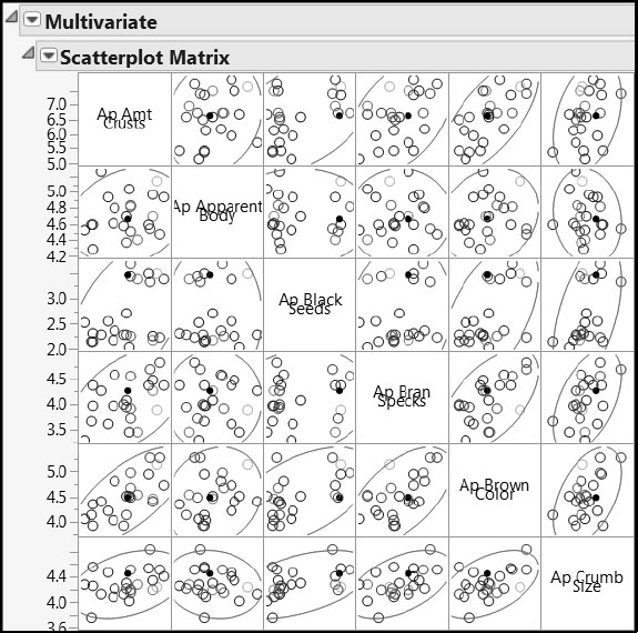
Aside from the bimodality observed already, the points generally form compact groups within the ellipses with no obvious extreme values, and with moderate pairwise correlations. We can investigate the correlation structure further by selecting Color Maps > Color Map on Correlations from the Multivariate red triangle menu in the report window, producing Figure 8.21. This report is provided if you have run the script Bivariate Distributions of Taste Panel Xs.
Figure 8.21: Pairwise Correlations between Taste Panel Xs
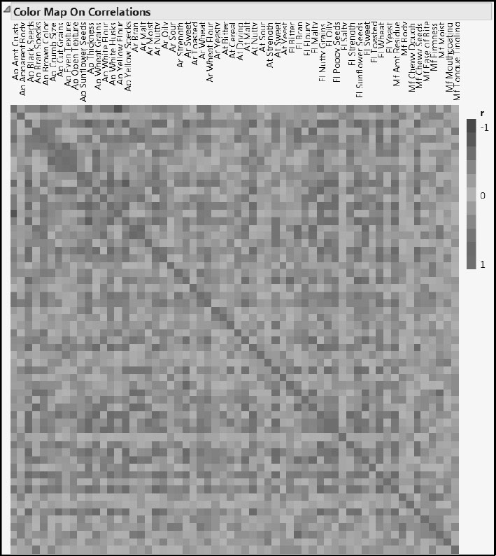
Generally, the correlations are moderate to high, with some evidence that the columns within groups are particularly strongly related.
To investigate the variation between Xs and Ys, select Graph > Scatterplot Matrix. Assign Gritty, Succulent, and Full Bodied to the Y, Columns role and the groups Appearance, Aroma, Aftertaste, Flavor, and Mouthfeel to the X role. From the Matrix Format list, select Square. Click OK. From the report’s red triangle menu, select Density Ellipses > Density Ellipses to produce Figure 8.22. (The script is Scatterplot Matrix for Taste Panel Xs and Ys.)
Figure 8.22: Bivariate Distributions of Taste Panel Ys and Xs (Partial View)
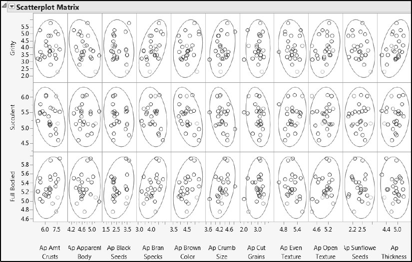
None of the associations look particularly strong, although some are stronger than others. There are no obviously extreme points in any X and Y combination.
Fitting a First Model
We use the JMP Pro PLS launch through Fit Model. (The script is PLS Fit Model Launch for Taste Panel Ys.) Remember that, if you are running JMP, you can launch the platform by selecting Analyze > Multivariate Methods > Partial Least Squares.
1. Select Analyze > Fit Model.
2. Enter Gritty, Succulent, and Full Bodied as Y.
3. Enter all the columns in the groupings Appearance, Aroma, Aftertaste, Flavor, and Mouthfeel as Model Effects.
4. Select Partial Least Squares as the Personality.
Your window should appear as shown in Figure 8.23.
5. Click Run.
Figure 8.23: Fit Model Window
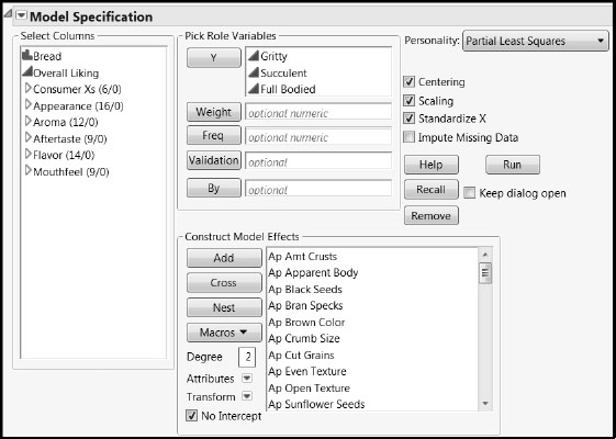
In the PLS Model Launch control panel, accept the default Model Specification of NIPALS, but set the Validation Method to Leave-One-Out. Click Go. (The script is PLS Fit for Taste Panel Ys.)
The Partial Least Squares Report
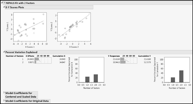
The usual results are appended: A Model Comparison Summary report, a KFold Cross Validation report, and a report entitled NIPALS Fit with 2 Factors, detailing the fit chosen through the cross validation procedure (Figure 8.24).
Figure 8.24: PLS Report for Two-Factor Fit
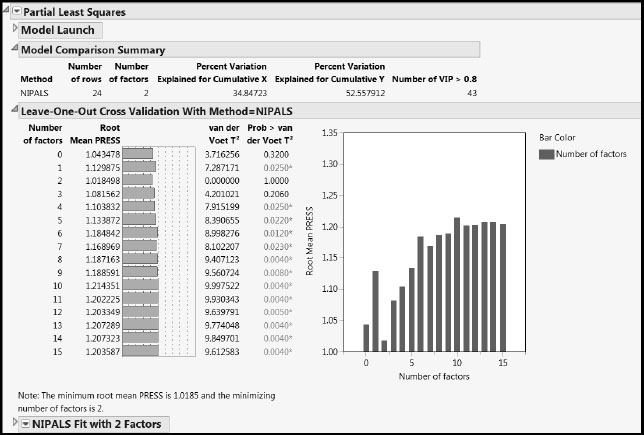
The Leave-One-Out (or KFold) Cross Validation report shows that Root Mean PRESS is minimized with two factors. The Prob > van der Voet values indicate that PRESS for a single-factor model differs significantly from PRESS for a two-factor model. Note that your Prob > van der Voet values might differ from those shown in Figure 8.24, as these are obtained by simulation. We conclude that a two-factor model is appropriate.
The Model Comparison Summary indicates that two factors account for about 35% of the variation in the Xs and 53% of the variation in the Ys. The last column, Number of VIP > 0.8, indicates that 43 of the 60 taste panel preference predictors are influential in determining the factors.
The NIPALS Fit Report
Now let’s look at the report for the fit, NIPALS Fit with 2 Factors (Figure 8.25). The X-Y Scores Plots report shows reasonable correlation between the X and Y scores.
The Percent Variation Explained report displays the variation in the Xs and Ys that is explained by each factor. The Cumulative X and Cumulative Y values must agree with the corresponding figures in the Model Comparison Summary. Because the Xs are not highly correlated, we are not surprised that the model explains only 35% of the variation in the Xs.
The two Model Coefficients reports give the estimated model coefficients for predicting the Ys. Recall that the Model Coefficients for Centered and Scaled Data report is of primary interest. It gives coefficients that apply when the Xs and Ys have been transformed to have mean zero and standard deviation one.
Figure 8.25: The NIPALS Fit Report
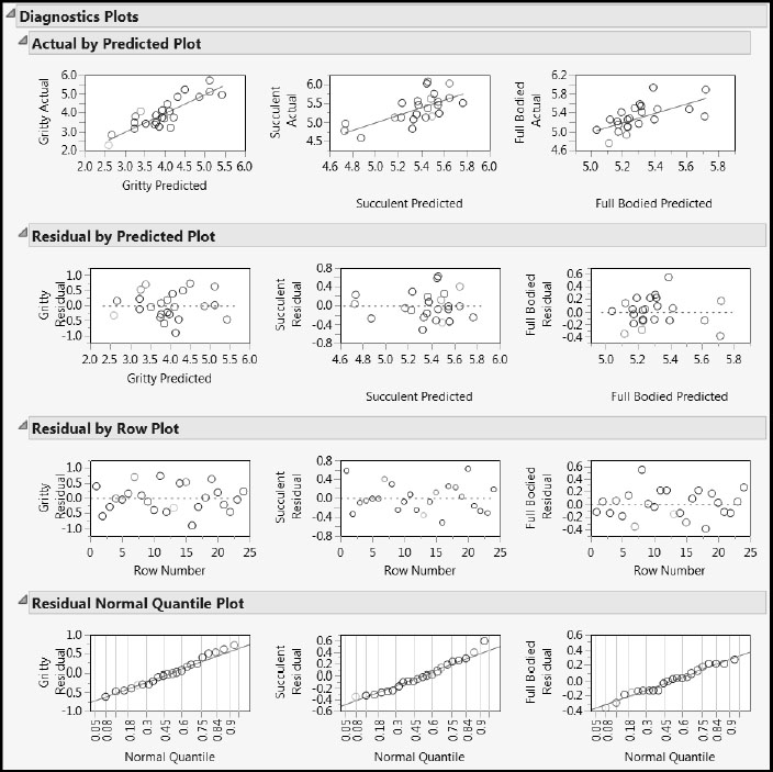
The Diagnostics Plots (Figure 8.26) show no obvious issues. (The script PLS Fit for Taste Panel Ys 2 opens to show Figures 8.25, 8.26, and 8.27.)
Figure 8.26: Diagnostics Plots
Model Reduction
We would like to narrow the list of Xs to a manageable number so that we can focus on modifying a select number of characteristics to improve Overall Liking (and sales!). We would also like to use our manageable number of Xs to predict changes in Overall Liking. To this end, we decide to focus on only those predictors whose coefficients for the centered and scaled data have magnitudes exceeding 0.1 for at least one of the three responses. Admittedly, the value 0.1 is arbitrarily chosen to produce a manageable set of predictors and to allow the use of a multiple regression model.
Select Coefficients Plots from the red triangle menu of the NIPALS Fit to obtain the plot in Figure 8.27. The horizontal dashed reference lines at –0.1 and +0.1were added by the script PLS Fit for Taste Panel Ys 2.
Figure 8.27: Coefficient Plot for the Stage Two PLS Model
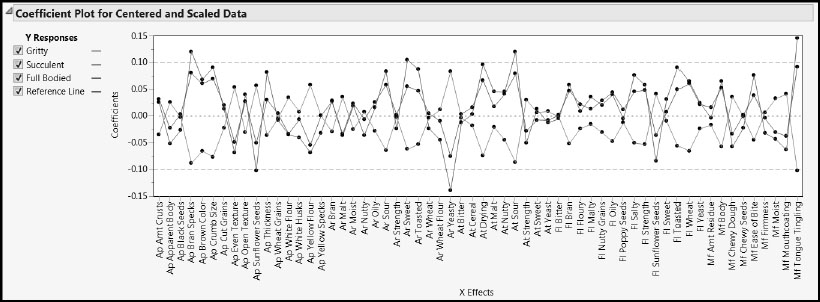
Note that Figure 8.27 shows an interesting pattern in the coefficient values—Full Bodied and Gritty follow a similar pattern, while Succulent shows that same pattern but with the opposite sign. This information alone should be of value in terms of understanding consumer preferences.
Only six Xs, Ap Bran Specs, Ap Sunflower Seeds, Ar Sweet, Ar Yeasty, At Sour, and Mf Tongue Tingling have coefficients with magnitudes exceeding 0.1. Note that we could not make this, or any other, selection of variables from MLR directly, because multiple regression with the full set of variables is not possible.
At this point, you could construct the regression model that you want to fit as follows: Select VIP vs Coefficients Plots from the red triangle NIPALS Fit with 2 Factors menu. In the VIP vs Coefficients for Centered and Scaled Data plot, select points where Coefficients is less than –0.10. Then, holding down the Shift key, select points where Coefficients is greater than 0.10. Click Make Model Using Selection. Change the Personality to Standard Least Squares. Or, proceed as described in the next section.
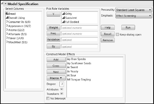
Fit a multiple linear regression model to our three Ys by completing the following steps. (Alternatively, run the saved script Regression Fit Model Launch.)
1. Select Analyze > Fit Model.
2. Enter Gritty, Succulent, and Full Bodied as Y.
3. Enter the columns Ap Bran Specs, Ap Sunflower Seeds, Ar Sweet, Ar Yeasty, At Sour, and Mf Tongue Tingling as Model Effects.
4. Select Standard Least Squares as the Personality.
Your Fit Model window should appear as shown in Figure 8.28.
5. Click Run.
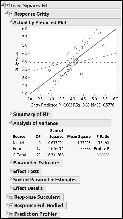
Figure 8.28: Fit Model Window for Multiple Linear Regression Model
The report, with some closed report sections, is shown in Figure 8.29. There is a report for each of the three responses, followed by a report for the Prediction Profiler. The Actual by Predicted plots show no anomalies. The report indicates that the overall model for Gritty is significant. The models for Succulent and Full Bodied are not significant, but keep in mind that we are interested in the effects of the predictors on all three responses, and eventually, on Overall Liking.
Figure 8.29: Multiple Linear Regression Report
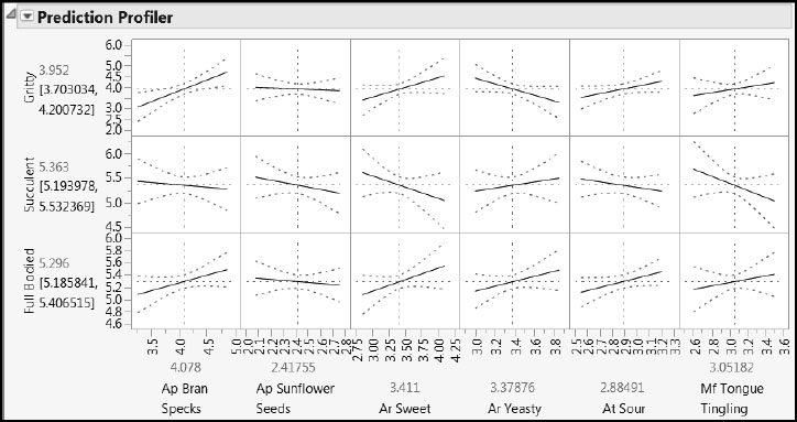
The Prediction Profiler is shown at the bottom of the Least Squares Fit report (Figure 8.30). Profiler plots for all three responses are shown. The dotted blue lines show the uncertainty in the fit, and you can drag the vertical dotted red lines to profile the Ys as the six-dimensional factor space is cut.
Figure 8.30: Profilers for Taste Panel Ys and Xs
While holding down the Ctrl key, select Save Columns > Prediction Formula from the Response Gritty red triangle menu. This saves a prediction column in Bread.jmp for each of the three responses. Alternatively, you can add these columns by running the script Add Predictions for Consumer Xs.
The Combined Model for Overall Liking
Constructing the Prediction Formula
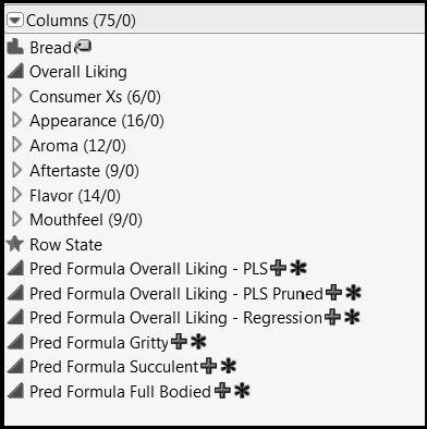
The table Bread.jmp now contains six prediction formula columns (Figure 8.31). The first three come from modeling Overall Liking in terms of Gritty, Succulent, and Full Bodied using PLS (twice) and MLR, and the second three come from modeling each of Gritty, Succulent, and Full Bodied in terms of Ap Bran Specs, Ap Sunflower Seeds, Ar Sweet, Ar Yeasty, At Sour, and Mf Tongue Tingling using MLR.
Next we construct a prediction formula for Overall Liking using the two stages of modeling. We use Pred Formula Overall Liking – Regression as our first stage model for Overall Liking. Then, for each of the Gritty, Succulent, and Full Bodied terms that appear in that formula, we substitute the prediction formula for that term obtained from our second stage regression. This gives a formula for Overall Liking expressed in terms of the six key taste panel terms. Note that the model defined by the two-stage formula differs from a single-stage regression model for Overall Liking using the same six terms. The two-stage model connects the taste panel Xs explicitly to the consumer Xs, and then these are connected to Overall Liking.
Figure 8.31: Prediction Formula Columns from First and Second Stage Models
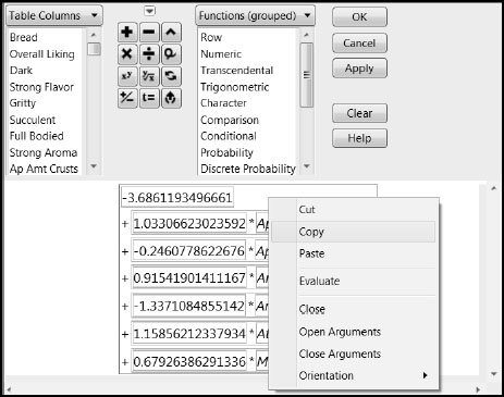
Click the + sign to the right of Pred Formula Gritty in the Columns panel to reveal the formula editor (Figure 8.32). Right-click in the formula in the editor window. As shown in Figure 8.32, you can Copy and Paste the formula. Note that the scope of this operation is defined by the red box in the formula editor.
Figure 8.32: Formula for Gritty from Second Stage MLR Model
Using this feature, complete the following steps. Alternatively, you can run the script Add Two-Stage Prediction of Overall Liking.
1. Use Cols > New Column to make a new column called Prediction of Overall Liking from Taste Panel Xs.
2. Select Formula from the Column Properties menu.
This opens a formula editor window.
3. Copy the formula expression from Pred Formula Overall Liking – Regression, as described earlier.
4. Paste that formula into the formula editor for Prediction of Overall Liking from Taste Panel Xs. To do this, you can hold down the Ctrl key and click v. Alternatively, double-click inside the red outline. It turns blue. Right-click inside and select Paste. Leave this formula editor window open.
5. Copy the formula from the column Pred Formula Gritty.
6. In the Prediction of Overall Liking from Taste Panel Xs formula editor, select Gritty in the expression. Make sure that there is a red box surrounding Gritty.
7. Paste the formula from Pred Formula Gritty into this red box. You can hold down the Ctrl key and click v, or you can right-click inside the red box and select Paste.
8. Close the formula editor window for Pred Formula Gritty.
9. Repeat steps 5 through 8 for Succulent and Full Bodied using the appropriate formulas.
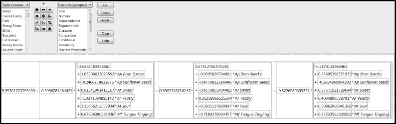
Now the column Two-Stage Prediction of Overall Liking contains a single formula relating Overall Liking to Ap Bran Specs, Ap Sunflower Seeds, Ar Sweet, Ar Yeasty, At Sour, and Mf Tongue Tingling. The complete formula is shown in Figure 8.33.
10. Click OK to close the formula editor window for the column Two-Stage Prediction of Overall Liking.
Figure 8.33: Formula for Overall Liking from the Two-Stage Model
Now select Graph > Profiler. Enter Two-Stage Prediction of Overall Liking as Y, Prediction Formula. Click OK. (The script is Profiler for Overall Liking.) The profiler is shown in Figure 8.34.
Figure 8.34: Profiler for Overall Liking in Terms of Key Taste Panel Xs
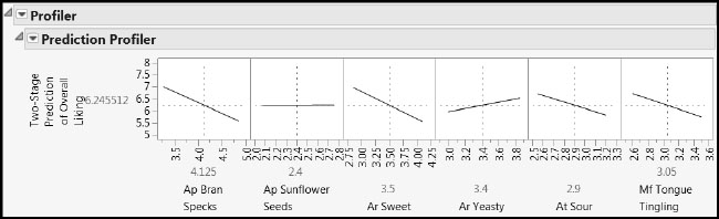
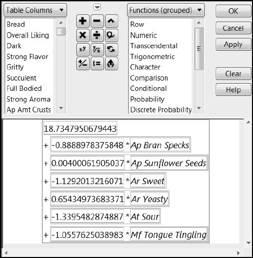
The profiler shows a surprising but not contradictory result, namely that one of our key taste panel Xs (Ap Sunflower Seeds) has little or no effect on Overall Liking. For some insight on why this happens, open the formula editor for Two-Stage Prediction of Overall Liking. Notice the red triangle above the key pad. From the red triangle menu, select Simplify (Figure 8.35). The coefficient of Ap Sunflower Seeds in the combined model is close to zero, with a value of 0.004.
Figure 8.35: Simplified Two-Stage Formula for Overall Liking
You can investigate how Ap Bran Specs, Ar Sweet, Ar Yeasty, At Sour, and Mf Tongue Tingling affect Overall Liking by interacting with the Profiler and performing informative what-if scenarios using the built-in simulator. (To access the simulator, select Simulator from the Prediction Profiler red triangle menu.)
We have seen how to use PLS and MLR in combination to effectively model relationships among overall liking, 6 consumer-testing results, and 60 sensory panel results on 24 types of bread. Although its use for variable selection is sometimes controversial, PLS can be viewed as another tool for selecting important variables. It is of particular value when MLR is not viable. But the ultimate test of whether a model is useful is how well it survives contact with new data, and no matter how it was built, models should be continually challenged in this way to avoid pitfalls.
The new understanding conveyed by the composite model enables the bakery to focus on a small number of sensory characteristics in developing new breads that consumers rate more highly. As well as providing useful direction as to how the new bread should be formulated and baked, the bakery might also be able to reduce the cycle time and effort required for sensory testing.