
Analyze Single Variables
Single-variable graphs, or univariate graphs, let you look closely at one variable at a time. When you begin to look at your data, it’s important to learn about each variable before looking at how the variables interact with each other. Univariate graphs let you visualize each variable individually.
This section covers two graphs that show the distribution of a single variable:
• “Histograms”, for continuous variables
• “Bar Charts”, for categorical variables
Use the Distribution platform to create both of these graphs. Distribution produces a graphical description and descriptive statistics for each variable.
Histograms
The histogram is one of the most useful graphical tools for understanding the distribution of a continuous variable. Use a histogram to find the following in your data:
• the average value and variation
• extreme values
Figure 4.2 Example of a Histogram

Scenario
This example uses the Companies.jmp data table, which contains data on profits for a group of companies.
A financial analyst wants to explore the following questions:
• Generally, how much profit does each company earn?
• What is the average profit?
• Are there any companies that earn either extremely high or extremely low profits compared to the other companies?
To answer these questions, use a histogram of Profits ($M).
Create the Histogram
1. Select Help > Sample Data Library and open Companies.jmp.
2. Select Analyze > Distribution.
3. Select Profits ($M) and click Y, Columns.
Figure 4.3 Distribution Window for Profits ($M)

4. Click OK.
Figure 4.4 Histogram of Profits ($M)

Interpret the Histogram
The histogram provides these answers:
• Most companies’ profits are between $-1000 and $1500.
All the bars except for one are located in this range. Also, more companies’ profits range from $0 to $500 than any other range. The bar representing that range is much longer than the others.
• The average profit is a little less than $500.
The middle of the diamond in the box plot indicates the mean value. In this case, the mean is slightly lower than the $500 mark.
• One company has significantly higher profits than the others, and might be an outlier. An outlier is a data point that is separated from the general pattern of the other data points.
This outlier is represented by a single, very short bar at the top of the histogram. The bar is small and represents a small group (in this case, a single company), and it is widely separated from the rest of the histogram bars.
In addition to the histogram, this report includes the following:
• The box plot, which is another graphical summary of the data. For detailed information about the box plot, see the Graph Builder chapter in the Essential Graphing book.
• Quantiles and Summary Statistics reports. These reports are discussed in “Analyze Distributions” in the “Analyze Your Data” chapter.
Interact with the Histogram
Data tables and reports are all connected in JMP. Click on a histogram bar to select the corresponding rows in the data table.
Bar Charts
Use a bar chart to visualize the distribution of a categorical variable. A bar chart looks similar to a histogram, since they both have bars that correspond to the levels of a variable. A bar chart shows a bar for every level of the variable, whereas the histogram shows a range of values for the variable.
Figure 4.5 Example of a Bar Chart

Scenario
This example uses the Companies.jmp data table, which contains data on the size and type of a group of companies.
A financial analyst wants to explore the following questions:
• What is the most common type of company?
• What is the most common size for a company?
To answer these questions, use bar charts of Type and Size Co.
Create the Bar Chart
1. Select Help > Sample Data Library and open Companies.jmp.
2. Select Analyze > Distribution.
3. Select Type and Size Co and click Y, Columns.
4. Click OK.
Figure 4.6 Bar Charts of Type and Size Co

Interpret the Bar Charts
The bar charts provide these answers:
• There are more computer companies than pharmaceutical companies.
The bar that represents computer companies is larger than the bar that represents pharmaceutical companies.
• The most common company size is small.
The bar that represents small companies is larger than the bars that represent medium and big companies.
The additional summary output gives detailed frequencies. This report is discussed in “Distributions of Categorical Variables” in the “Analyze Your Data” chapter.
Interact with the Bar Charts
As is the case with histograms, click on individual bars to highlight rows of the data table. If more than one graph is created, clicking on a bar in one bar chart highlights the corresponding bar or bars in the other bar chart.
For example, suppose that you want to see the distribution of company size for the pharmaceutical companies. Click the Pharmaceutical bar in the Type bar chart, and the pharmaceutical companies are highlighted on the Size Co bar chart. Figure 4.7 shows that although most companies in this data table are small, most of the pharmaceutical companies are medium or big.
Also, the corresponding rows in the data table are selected.
Figure 4.7 Clicking Bars

Compare Multiple Variables
Use multiple-variable graphs to visualize the relationships and patterns between two or more variables. This section covers the following graphs:
|
Use scatterplots to compare two continuous variables.
|
|
|
Use scatterplot matrices to compare several pairs of continuous variables.
|
|
|
Use side-by-side box plots to compare one continuous and one categorical variable.
|
|
|
Use overlay plots to compare one or more variables on the Y-axis to another variable on the X-axis. Overlay plots are especially useful if the X variable is a time variable, because you can compare how two or more variables change across time.
|
|
|
Use variability charts to compare one continuous Y variable to one or more categorical X variables. Variability charts show differences in means and variability across several categorical X variables.
|
|
|
Use Graph Builder to create and change graphs interactively.
|
|
|
Bubble plots are specialized scatterplots that use color and bubble sizes to represent up to five variables at once. If one of your variables is a time variable, you can animate the plot to see your other variables change through time.
|
Scatterplots
The scatterplot is the simplest of all the multiple-variable graphs. Use scatterplots to determine the relationship between two continuous variables and to discover whether two continuous variables are correlated. Correlation indicates how closely two variables are related. When you have two variables that are highly correlated, one might influence the other. Or, both might be influenced by other variables in a similar way.
Figure 4.8 Example of a Scatterplot

Scenario
This example uses the Companies.jmp data table, which contains sales figures and the number of employees of a group of companies.
A financial analyst wants to explore the following questions:
• What is the relationship between sales and the number of employees?
• Does the amount of sales increase with the number of employees?
• Can you predict average sales from the number of employees?
To answer these questions, use a scatterplot of Sales ($M) versus # Employ.
Create the Scatterplot
1. Select Help > Sample Data Library and open Companies.jmp.
2. Select Analyze > Fit Y by X.
3. Select Sales ($M) and Y, Response.
4. Select # Employ and X, Factor.
Figure 4.9 Fit Y by X Window

5. Click OK.
Figure 4.10 Scatterplot of Sales ($M) versus # Employ

Interpret the Scatterplot
One company has a large number of employees and high sales, represented by the single point at the top right of the plot. The distance between this data point and all the rest makes it difficult to visualize the relationship between the rest of the companies. Remove the point from the plot and re-create the plot by following these steps:
1. Click on the point to select it.
2. Select Rows > Hide and Exclude. The data point is hidden and no longer included in calculations.
Note: The difference between hiding and excluding is important. Hiding a point removes it from any graphs but statistical calculations continue to use the point. Excluding a point removes it from any statistical calculations but does not remove it from graphs. When you both hide and exclude a point, you remove it from all calculations and from all graphs.
3. To re-create the plot without the outlier, select Redo > Redo Analysis from the red triangle menu for Bivariate. You can close the original report window.
Figure 4.11 Scatterplot with the Outlier Removed
The updated scatterplot provides these answers:
• There is a relationship between the sales and the number of employees.
The data points have a discernible pattern. They are not scattered randomly throughout the graph. You could draw a diagonal line that would be near most of the data points.
• Sales do increase with the number of employees, and the relationship is linear.
If you drew that diagonal line, it would slope from bottom left to top right. This slope shows that as the number of employees increases (left to right on the bottom axis), sales also increases (bottom to top on the left axis). A straight line would be near most of the data points, indicating a linear relationship. If you would have to curve your line to be near the data points, there would still be a relationship (because of the pattern of the points). However, that relationship would not be linear.
• You can predict average sales from the number of employees.
The scatterplot shows that sales generally increase as the number of employees does. You could predict the sales for a company if you knew only the number of employees of that company. Your prediction would be on that imaginary line. It would not be exact, but it would approximate the real sales.
Interact with the Scatterplot
As with other JMP graphics, the scatterplot is interactive. Place your mouse pointer over the point in the bottom right corner with the mouse to reveal the row number and the x and y values.
Figure 4.12 Place Your Mouse Pointer Over a Point

Click on a point to highlight the corresponding row in the data table. Select multiple points by doing one of the following:
• Click and drag with the mouse around the points. This selects points in a rectangular area.
• Select the lasso tool, and then click and drag around multiple points. The lasso tool selects an irregularly shaped area.
Scatterplot Matrix
A scatterplot matrix is a collection of scatterplots organized into a grid (or matrix). Each scatterplot shows the relationship between a pair of variables.
Figure 4.13 Example of a Scatterplot Matrix

Scenario
This example uses the Solubility.jmp data table, which contains data for solubility measurements for 72 different solutes.
A lab technician wants to explore the following questions:
• Is there a relationship between any pair of chemicals? (There are six possible pairs.)
• Which pair has the strongest relationship?
To answer these questions, use a scatterplot matrix of the four solvents.
Create the Scatterplot Matrix
1. Select Help > Sample Data Library and open Solubility.jmp.
2. Select Graph > Scatterplot Matrix.
3. Select Ether, Chloroform, Benzene, and Hexane, and click Y, Columns.
Figure 4.14 Scatterplot Matrix Window

4. Click OK.
Figure 4.15 Scatterplot Matrix
Interpret the Scatterplot Matrix
The scatterplot matrix provides these answers:
• All six pairs of variables are positively correlated.
As one variable increases, the other variable increases too.
• The strongest relationship appears to be between Benzene and Chloroform.
The data points in the scatterplot for Benzene and Chloroform are the most tightly clustered along an imaginary line.
Interact with the Scatterplot Matrix
If you select a point in one scatterplot, it is selected in all the other scatterplots.
For example, if you select a point in the Benzene versus Chloroform scatterplot, the same point is selected in the other five plots.
Figure 4.16 Selected Points

Side-by-Side Box Plots
Side-by-side box plots show the following:
• the relationship between one continuous variable and one categorical variable
• differences in the continuous variable across levels of the categorical variable
Figure 4.17 Example of Side-by-Side Box Plots

Scenario
This example uses the Analgesics.jmp data table, which contains data on pain measurements taken on patients using three different drugs.
A researcher wants to explore the following questions:
• Are there differences in the average amount of pain control among the drugs?
• Does the variability in the pain control given by each drug differ? A drug with high variability would not be as reliable as a drug with low variability.
To answer these questions, use a side-by-side box plot for the pain levels and the drug categories.
Create the Side-by-Side Box Plots
1. Select Help > Sample Data Library and open Analgesics.jmp.
2. Select Analyze > Fit Y by X.
3. Select pain and click Y, Response.
4. Select drug and click X, Factor.
Figure 4.18 Fit Y by X Window

5. Click OK.
6. From the red triangle menu, select Display Options > Box Plots.
Figure 4.19 Side-by-Side Box Plots

Interpret the Side-by-Side Box Plots
Box plots are designed according to the following principles:
• The line through the box represents the median.
• The middle half of the data is within the box.
• The majority of the data falls between the ends of the whiskers.
• A data point outside the whiskers might be an outlier.
The box plots in Figure 4.19 show these answers:
• There is evidence to believe that patients on drug A feel less pain, since the box plot for drug A is lower on the pain scale than the others.
• Drug B appears to have higher variability than Drugs A and C, since the box plot is taller.
There is one point for drug C that is a lot lower than the other points for drug C. Place your mouse pointer over it with your mouse to see that it is row 26 of the data table. That point looks like it is more similar to the data in drug group A or B. The information in row 26 deserves investigation. There might have been a typographical error when the data was recorded.
Overlay Plots
Like scatterplots, overlay plots show the relationship between two or more variables. However, if one of the variables is a time variable, an overlay plot shows trends across time better than scatterplots do.
Figure 4.20 Example of an Overlay Plot

Note: To plot data over time, you can also use Graph Builder, bubble plots, control charts, and variability charts. For complete details about Graph Builder and bubble plots, see the Graph Builder chapter in the Essential Graphing book. Refer to the Control Chart Builder chapter and the Variability Gauge Charts chapter in the Quality and Process Methods book for information about control charts and variability charts.
Scenario
This example uses the Stock Prices.jmp data table, which contains data on the price of a stock over a three-month period.
A potential investor wants to explore the following questions:
• Has the stock’s closing price changed over the past three months?
To answer this question, use an overlay plot of the stock’s closing price over time.
• How do the stock’s high and low prices relate to each other?
To answer this question, use another overlay plot of the stock’s high and low prices over time.
Create the first overlay plot to answer the first question, and then create a second overlay plot to answer the second question.
Create the Overlay Plot of the Stock’s Price over Time
1. Select Help > Sample Data Library and open Stock Prices.jmp.
2. Select Graph > Overlay Plot.
3. Select Close and click Y.
4. Select Date and click X.
Figure 4.21 Overlay Plot Window

5. Click OK.
Figure 4.22 Overlay Plot of the Closing Price over Time

Interpret and Interact with the Overlay Plot
The overlay plot shows that the closing stock price has been decreasing over the last several months. To see the trend more clearly, connect the points and add grid lines.
1. From the red triangle menu, select Connect Thru Missing.
2. Double-click the Y axis.
3. Select the Major Grid Lines check box.
4. Click OK.
Figure 4.23 Connected Points and Grid Lines

The potential investor can see that although the stock price has gone up and down over the past three months, the overall trend has been downward.
Create the Overlay Plot of the Stock’s High and Low Prices
Use an overlay plot to plot more than one Y variable. For example, suppose that you want to see both the high and the low prices on the same plot.
1. Follow the steps in “Create the Overlay Plot of the Stock’s Price over Time”, this time assigning both High and Low to the Y role.
2. Connect the points and add grid lines as shown in “Interpret and Interact with the Overlay Plot”.
Figure 4.24 Two Y Variables
The legend at the bottom of the plot shows the colors and markers used for the High and Low variables in the graph. The overlay plot shows that the High price and Low price track each other very closely.
Answer the Questions
Both of the overlay plots answer the two questions asked at the beginning of this example.
• The first plot shows that the price of this stock has not remained the same, but has been decreasing.
• The second plot shows that the high and low prices of this stock are not very different from each other. The stock price does not vary wildly on any given day.
Variability Chart
In the graphs described so far, you specified only a single X variable. Use a variability chart to specify multiple X variables and see differences in means and variability across all of your variables at once.
Figure 4.25 Example of a Variability Chart

Scenario
This example uses the Popcorn.jmp data table with data from a popcorn maker. The yield (the volume of popcorn for a given measure of kernels) was measured for each combination of popcorn style, batch size, and amount of oil used.
The popcorn maker wants to explore the following question:
• Which combination of factors results in the highest popcorn yield?
To answer this question, use a variability chart of the yield versus the style, batch size, and oil amount.
Create the Variability Chart
1. Select Help > Sample Data Library and open Popcorn.jmp.
2. Select Analyze > Quality and Process > Variability/Attribute Gauge Chart.
3. Select yield and click Y, Response.
4. Select popcorn and click X, Grouping.
5. Select batch and click X, Grouping.
6. Select oil amt and click X, Grouping.
Note: The order in which you assign the variables to the X, Grouping role is important, because the order in this window determines their nesting order in the variability chart.
Figure 4.26 Variability Chart Window

7. Click OK.
The top chart is the variability chart, showing the yield broken down by each combination of the three variables. The bottom chart shows the standard deviation for each combination of the three variables. Since the bottom chart does not show the yield, hide it.
8. Deselect Std Dev Chart on the red triangle menu.
Figure 4.27 Results Window

Interpret the Variability Chart
The variability chart for yield indicates that small, gourmet batches produce the highest yield.
To be more specific, the popcorn maker might ask this additional question: Is the yield high because those batches are small, or because those batches are gourmet?
The variability chart shows the following:
• The yield from small, plain batches is low.
• The yield from large, gourmet batches is low.
Given this information, the popcorn maker can conclude that only the combination of small and gourmet at the same time results in batches with high yield. It would have been impossible to reach this conclusion with a chart that only allowed a single variable.
Graph Builder
Use Graph Builder to interactively create and modify graphs. So far, all of the graphs have been created by launching a platform and specifying variables. To create a different type of graph, you must launch a different platform. In Graph Builder, you can change the variables and change the graphs at any time.
Use Graph Builder to accomplish the following tasks:
• Change variables by dragging and dropping them in and out of the graph.
• Create a different type of graph with a few mouse clicks.
• Partition the graph horizontally or vertically.
Figure 4.28 Example of a Graph That Was Created with Graph Builder

Note: Only some of the Graph Builder features are covered here. For complete details, see the Graph Builder chapter in the Essential Graphing book.
Scenario
This example uses the Profit by Product.jmp data table, which contains profit data for multiple product lines.
A business analyst wants to explore the following question:
• How is the profitability different between product lines?
To answer this question, use a line plot that displays revenue, product cost, and profit data across different product lines.
Create the Graph
1. Select Help > Sample Data Library and open Profit by Product.jmp.
2. Select Graph > Graph Builder.
Figure 4.29 Graph Builder Workspace

3. Click Quarter and then drag and drop it onto the X zone to assign Quarter as the X variable.
4. Click Revenue, Product Cost, and Profit, and drag and drop them onto the Y zone to assign all three variables as Y variables.
The X and Y zones are now axes.
Note: You can also click on variables and then click a zone to assign them. However, after a zone becomes an axis, drag and drop additional variables onto the axis rather than clicking on the variables and axis.
Figure 4.30 After Adding Y and X Variables

Based on the variables that you are using, Graph Builder shows side-by-side box plots.
5. To change the box plots to a line plot, click the Line  icon.
icon.
Figure 4.31 Line Plot
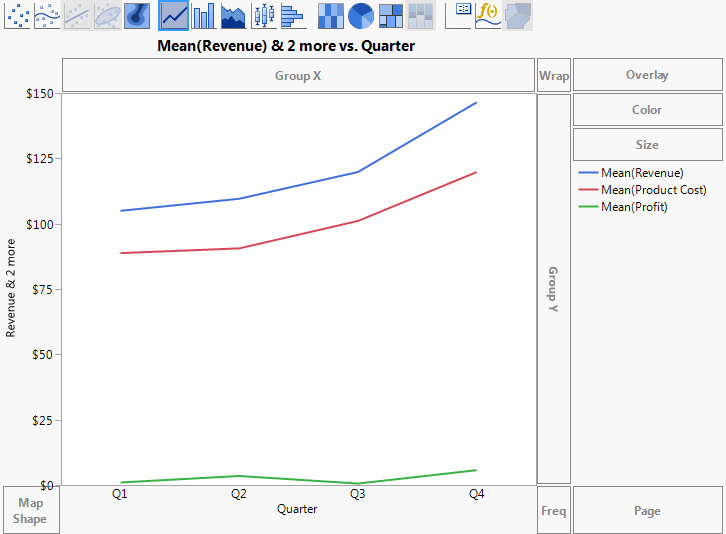
6. To create a separate chart for each product, click Product Line, and drag and drop it into the Wrap zone.
A separate line plot is created for each product.
Figure 4.32 Final Line Plots

Interpret the Graph
Figure 4.32 shows revenue, cost, and profit broken down by product line. The business analyst was interested in seeing the difference in profitability between product lines. The line plots in Figure 4.32 can provide some answers, as follows:
• Credit products, deposit products, and revolving credit products produce more revenue than fee-based products, third-party products, and other products.
• However, the profits of all the product lines are similar.
The data table also includes data on sales channels. The business analyst wants to see how revenue, product cost, and profit differ between different sales channels.
1. To remove Product Line from the graph, click the title of the graph (Product Line) and drag and drop it into any empty area within Graph Builder.
2. To add Channel as the wrap variable, click Channel and drag and drop it into the Wrap zone.
Figure 4.33 Line Plots Showing Sales Channels
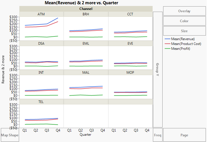
Figure 4.33 provides this answer: revenue and product cost for ATMs are the highest and are growing the most quickly.
Bubble Plots
A bubble plot is a scatterplot that represents its points as bubbles. You can change the size and color of the bubbles, and even animate them over time. With the ability to represent up to five dimensions (x position, y position, size, color, and time), a bubble plot can produce dramatic visualizations and make data exploration easy.
Figure 4.34 Example of a Bubble Plot
Scenario
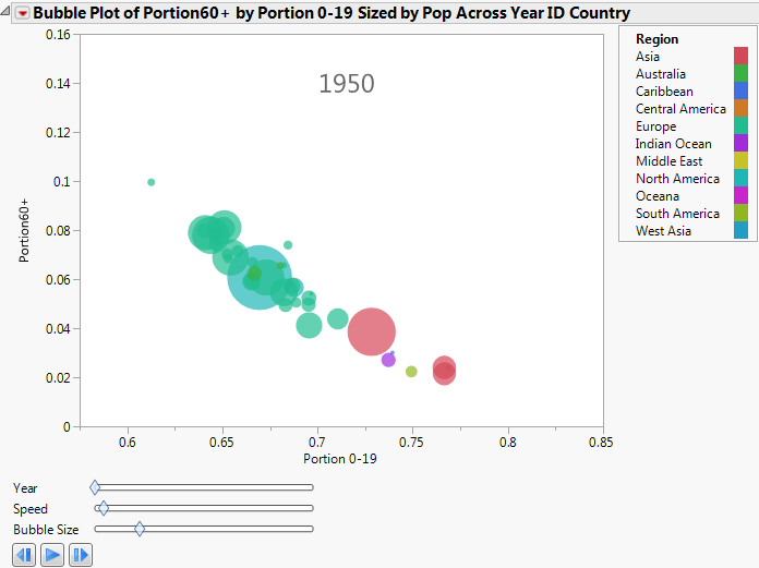
This example uses the PopAgeGroup.jmp data table, which contains population statistics for 116 countries or territories between the years 1950 to 2004. Total population numbers are broken out by age group, and not every country has data for every year.
A sociologist wants to explore the following question:
• Is the age of the population of the world changing?
To answer this question, look at the relationship between the oldest (more than 59) and the youngest (younger than 20) portions of the population. Use a bubble plot to determine how this relationship changes over time.
Create the Bubble Plot
1. Select Help > Sample Data Library and open PopAgeGroup.jmp.
2. Select Graph > Bubble Plot.
3. Select Portion60+ and click Y.
This corresponds to the Y variable on the bubble plot.
4. Select Portion 0-19 and click X.
This corresponds to the X variable on the bubble plot.
5. Select Country and click ID.
Each unique level of the ID variable is represented by a bubble on the plot.
6. Select Year and click Time.
This controls the time indexing when the bubble plot is animated.
7. Select Pop and click Sizes.
This controls the size of the bubbles.
8. Select Region and click Coloring.
Each level of the Coloring variable is assigned a unique color. So in this example, all the bubbles for countries located in the same region have the same color. The bubble colors that appear in Figure 4.36 are the JMP default colors.
Figure 4.35 Bubble Plot Window
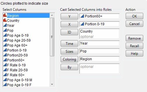
9. Click OK.
Figure 4.36 Initial Bubble Plot
Interpret the Bubble Plot
Because the time variable (in this case, year) starts in 1950, the initial bubble plot shows the data for 1950. Animate the bubble plot to cycle through all the years by clicking the play/pause button. Each successive bubble plot shows the data for that year. The data for each year determines the following:
• The X and Y coordinates
• The bubble’s sizes
• The bubble’s coloring
• Bubble aggregation
Note: For detailed information about how the bubble plot aggregates information across multiple rows, see the Bubble Plots chapter in the Essential Graphing book.
The bubble plot for 1950 shows that if a country’s proportion of people younger than 20 is high, then the proportion of people more than 59 is low.
Click the play/pause button to animate the bubble plot through the range of years. As time progresses, the Portion 0-19 decreases and the Portion60+ increases.
Year
is used to change the time index manually.
Speed
controls the speed of the animation.
Bubble Size
controls the absolute sizes of the bubbles, while maintaining the relative sizes
The sociologist wanted to know how the age of the world’s population is changing. The bubble plot indicates that the population of the world is getting older.
Interact with the Bubble Plot
Click to select a bubble to see the trend for that bubble over time. For example, in the 1950 plot, the large bubble in the middle is Japan.
To See the Pattern of Population Changes in Japan through the Years
1. Click in the middle of the Japan bubble to select it.
2. From the red triangle menu, select Trail Bubbles > Selected.
3. Click the play button.
As the animation progresses through time, the Japan bubble leaves a trail of bubbles that illustrates its history.
Figure 4.37 Japan’s History of Population Shifts

Focusing on the Japan bubble, you can see the following over time:
• The proportion of the population 19 years old or less decreased.
• The proportion of the population 60 years old or more increased.
..................Content has been hidden....................
You can't read the all page of ebook, please click here login for view all page.