
PAINTING FLOWERS FROM THE GARDEN
WHO DOESN’T LOVE FLOWERS? Despite my training in New York City art schools in the 1980s where the emphasis was decidedly not floral, I love to paint flowers. I love their color, their patterns, their structure, their textures, and their design potential. I love their variations of shapes, edge qualities, and their fleeting ever-changingness. It’s reassuring to remind myself that flower painting is one of the great art traditions. The Impressionists share in that tradition.
While some artists consider flowers as unimportant and decorative, the Impressionists celebrated the very nature of flowers. Van Gogh, Monet, Pissarro, and Renoir painted fields of them—poppies, irises, dahlias, and sunflowers—as bright living color, nodding and bending under the sun. They painted orchards in bloom and single flowering sprigs. They brought armloads of flowers indoors, piled them in vases—irises, lilacs, roses, and tulips—and painted portraits of them, over and over again.
The Impressionists didn’t assign symbolic meanings to flowers. They didn’t try to make their paintings scientifically correct. They painted their impressions, capturing the fragility, the color, the crooked stems, and fading leaves of flowers. In doing so, they somehow caught the essence and even the scent of flowers and made them real. The public has never gotten tired of looking at Impressionist flower paintings. For many, in fact, flowers are the first thing that comes to mind when the word “Impressionism” is mentioned.
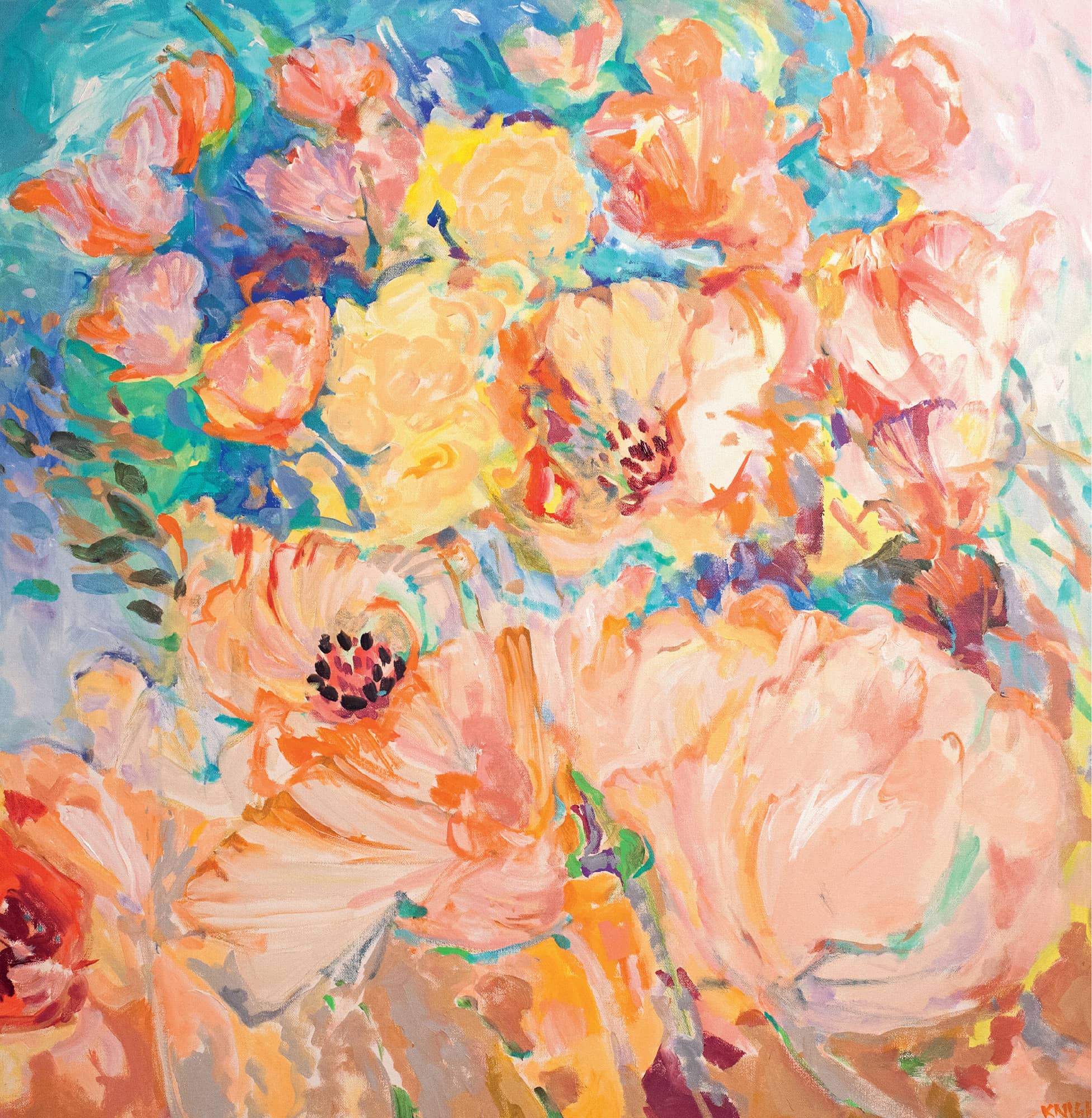
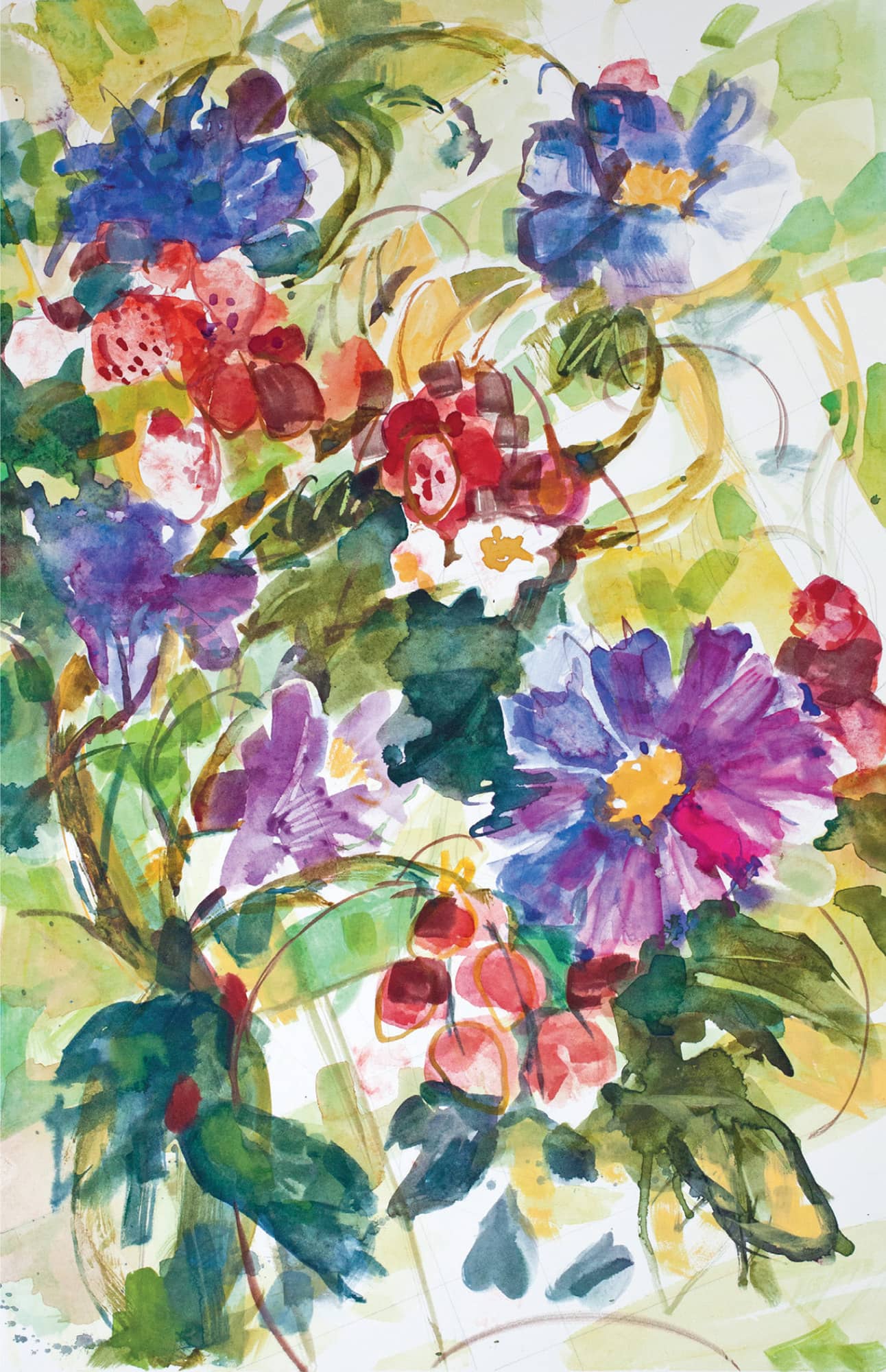
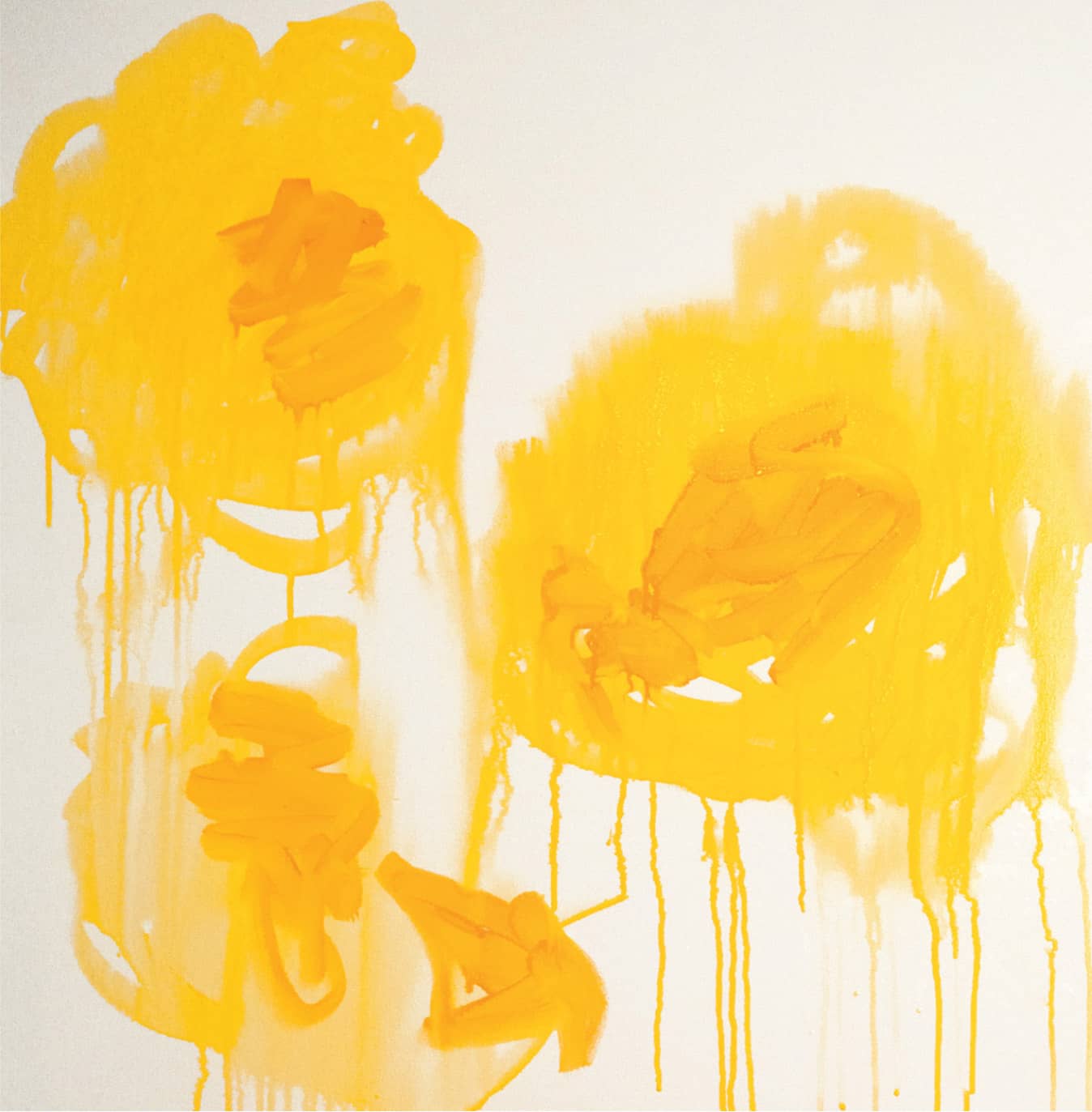
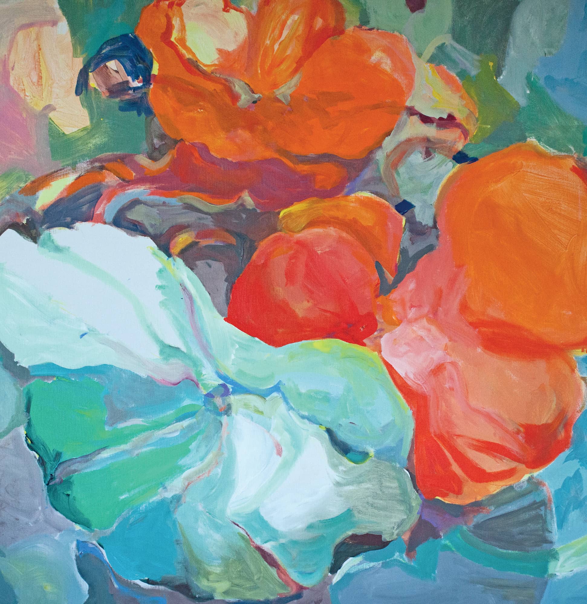
Dancing Garden. Acrylic. 36" × 36" (91.5 × 91.5 cm).
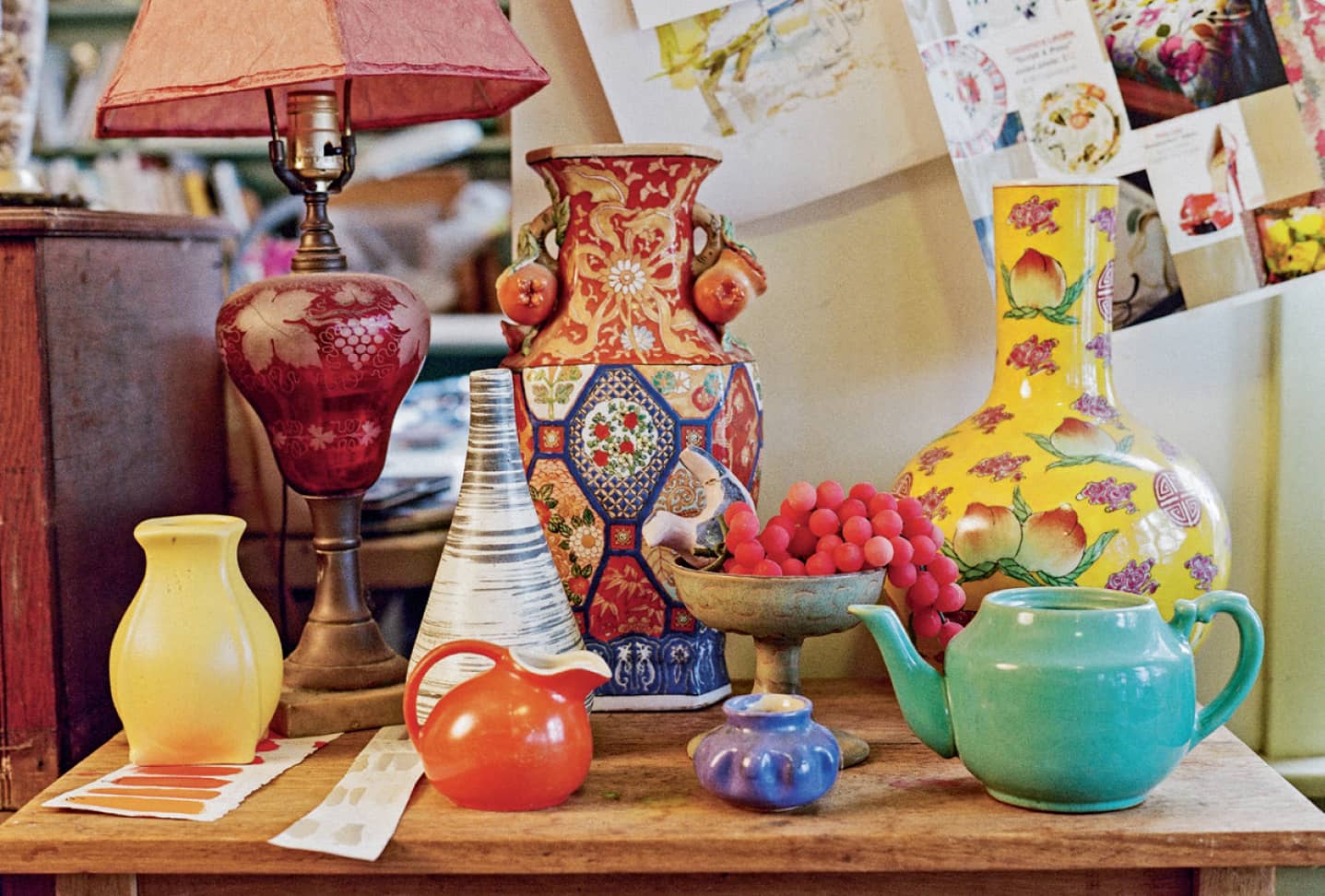
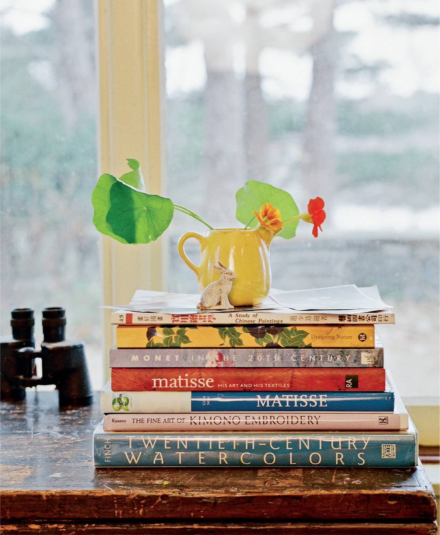
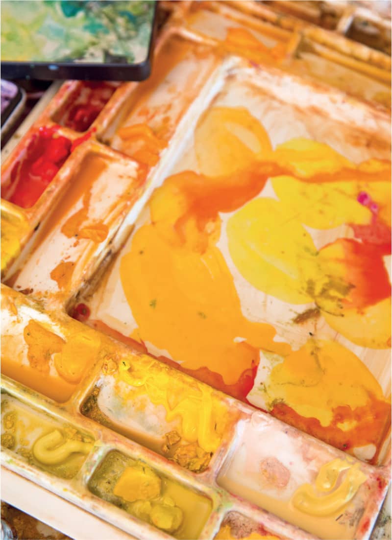
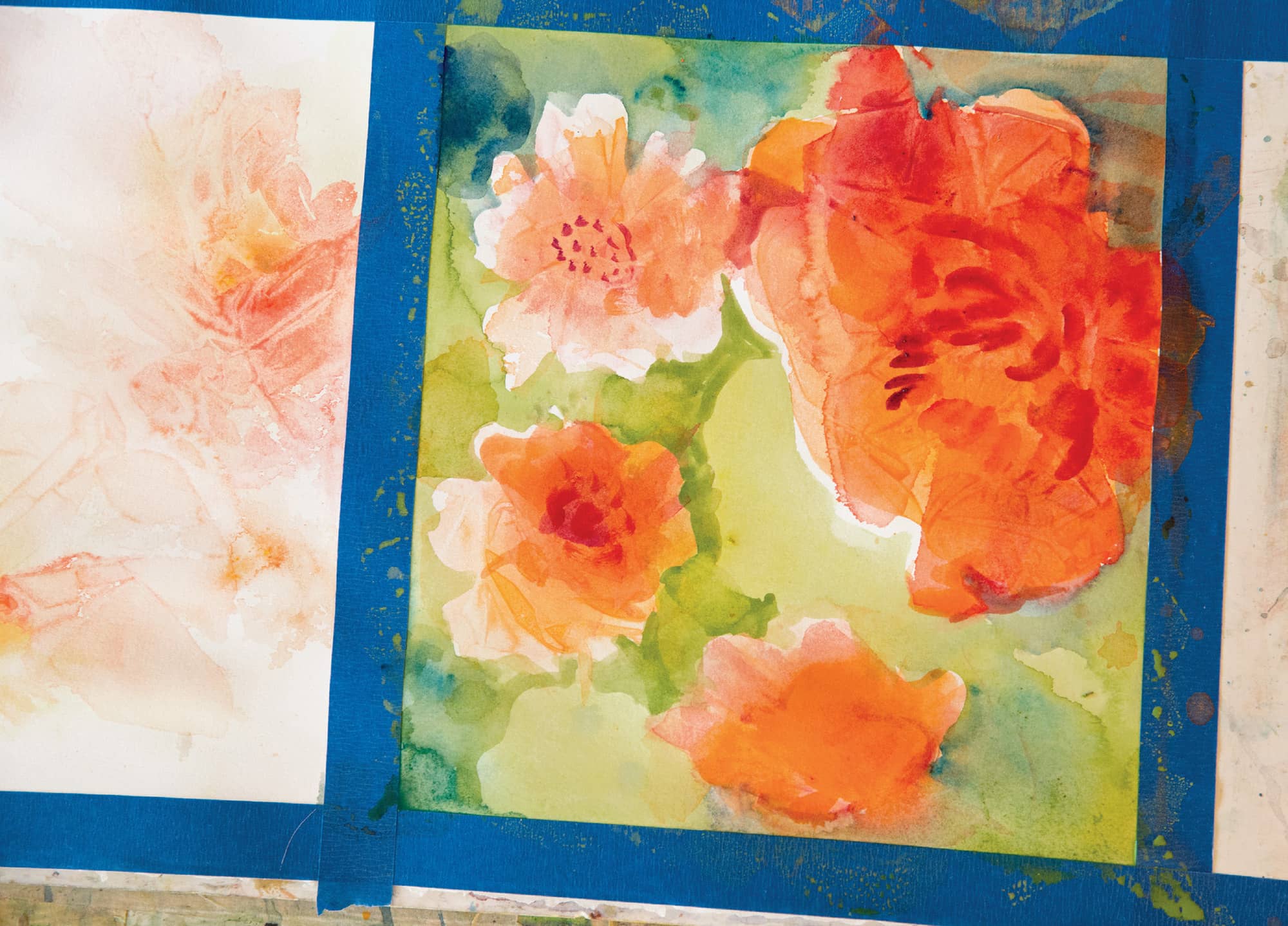
Floral inspiration in the studio
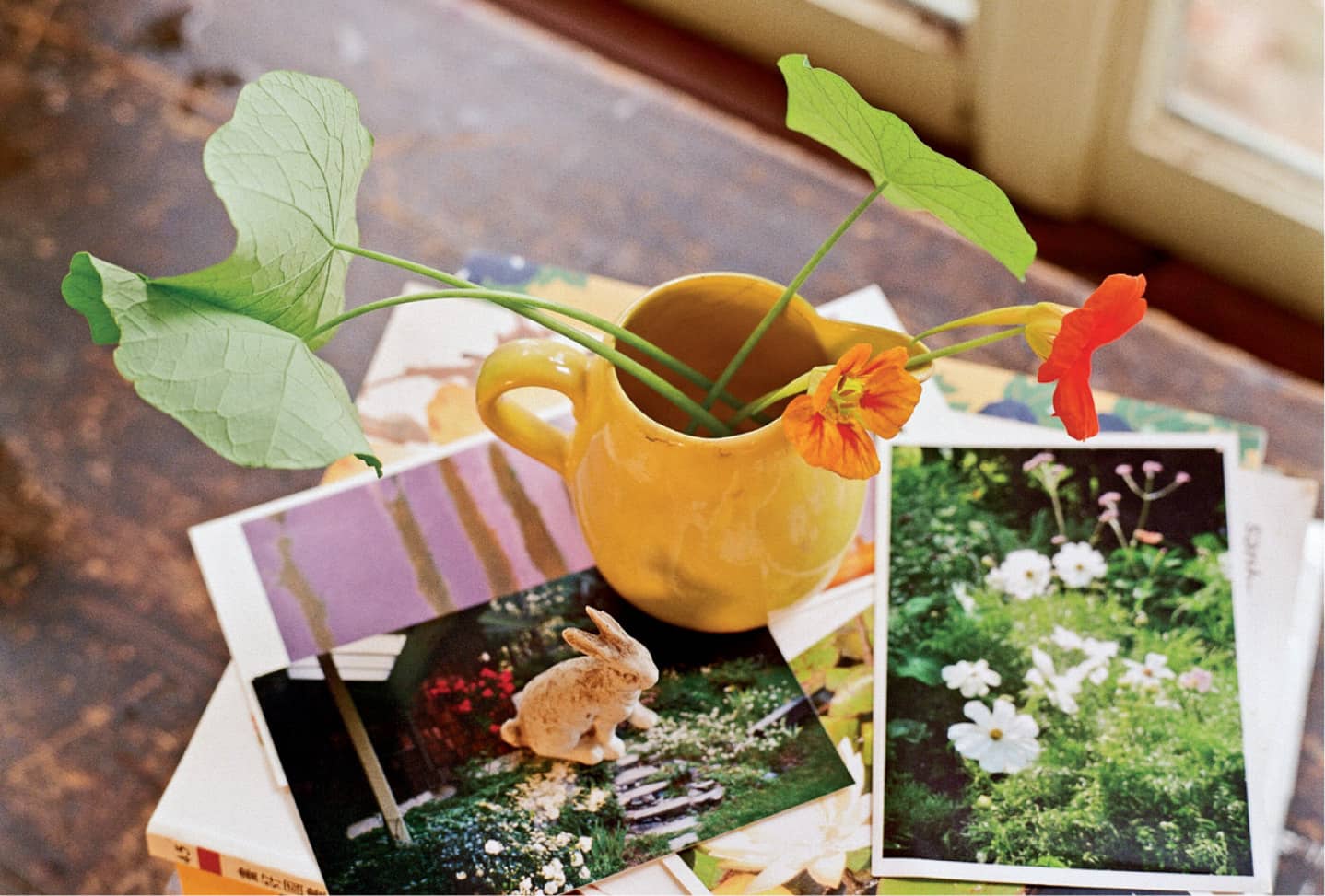
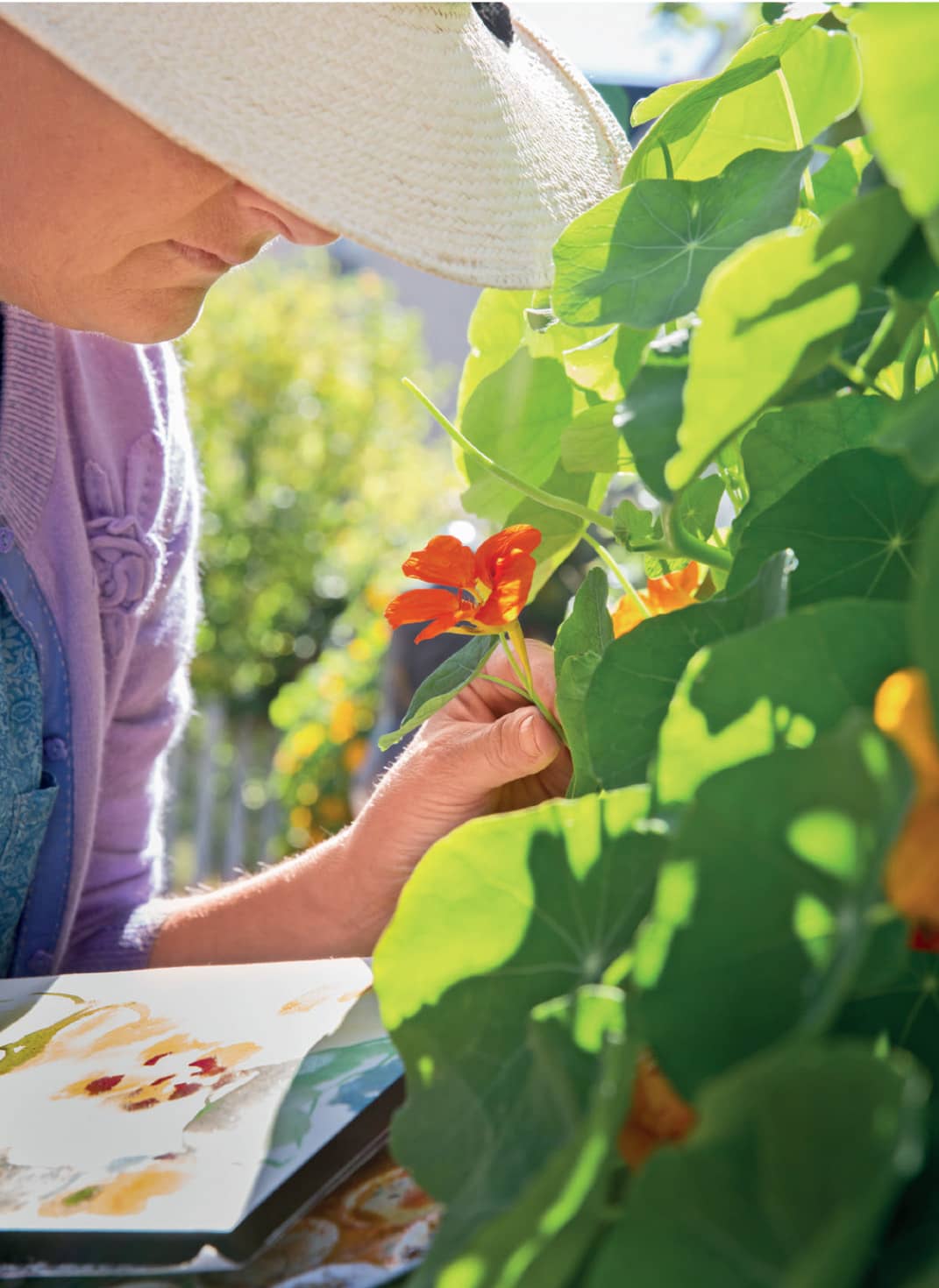
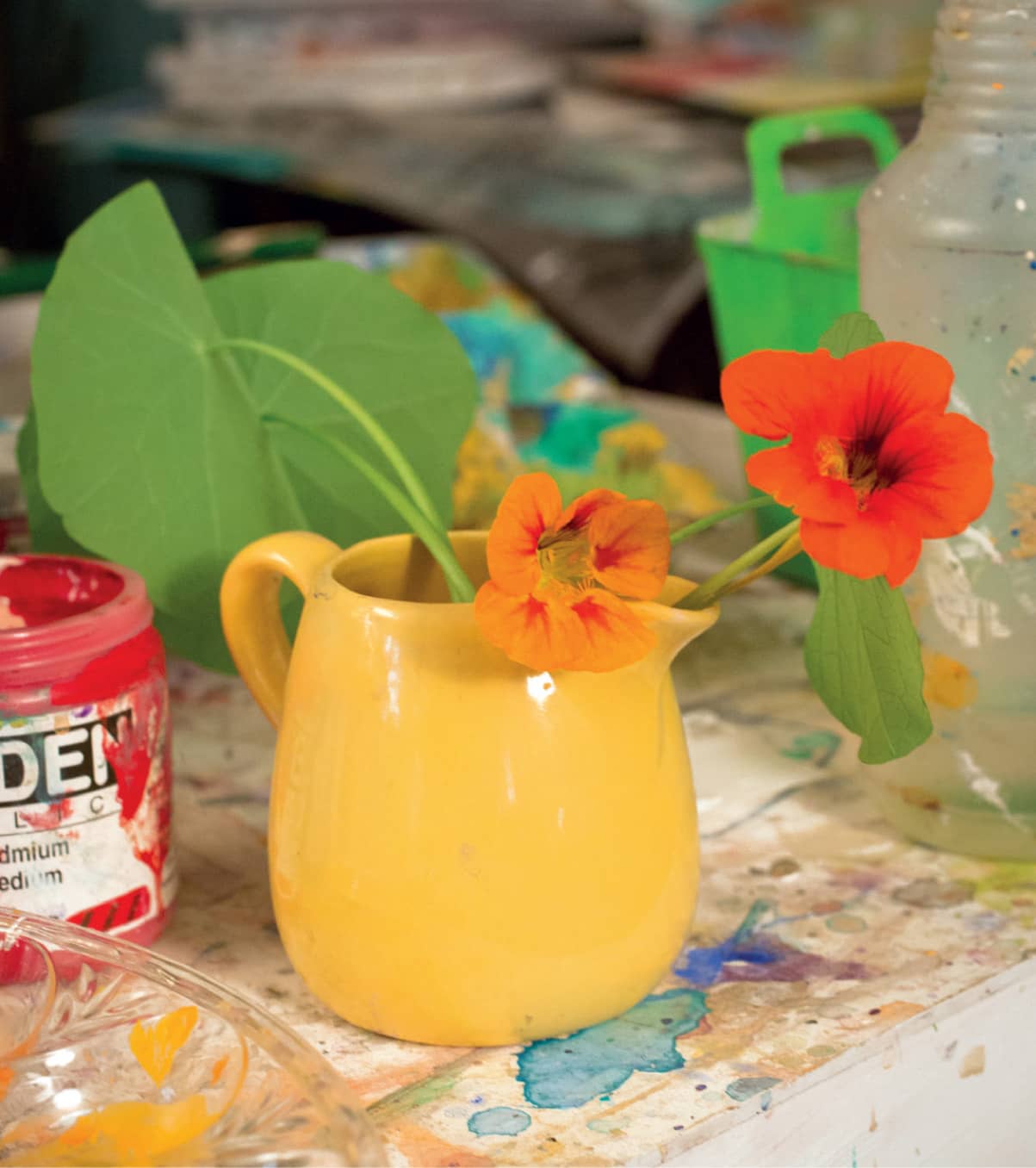
Nasturtiums from my garden in my favorite yellow pitcher
My inspiration for painting flowers is all around me in the studio, on vintage fabrics, on postcards, on porcelain vases, and old tea cups. But of course my greatest inspiration is my own garden. It makes me glad when I read how Monet was intimately involved in every detail of his garden. I share his passion.
My garden is a lot like my paintings. It’s wild and tangled and creeps stealthily across the bit of what’s left of my lawn. Nasturtiums are a particular favorite because they have such a desire to grow, and their stems are so interesting and unexpected.
As a gardener, I continually edit. I move things if they look unhappy, I pull things out if I don’t like them, and I add a new plant when a friend gives me one or I happen by a garden store. This is exactly the way I paint, always in flux. Always changing.
Every flower has its own character and personality. Some are refined with excellent posture like the iris with its ruffled evening-wear edges. Some, like daisies are casual and exude a feeling of confidence. Nasturtiums are more like teenagers—unpredictable in their size and growth direction. My whimsical interpretations of flowers make painting them more fun. I like the idea of capturing the essence of flowers—what I love about them when I see them blooming. Perhaps it’s their color, or the way they nod in the breeze that attracts me.
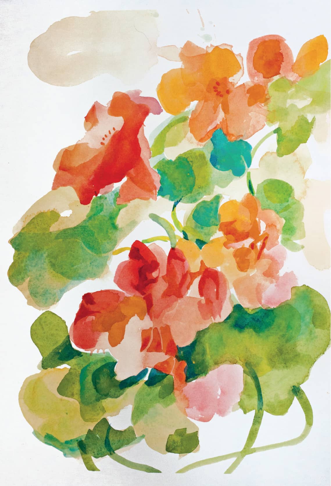
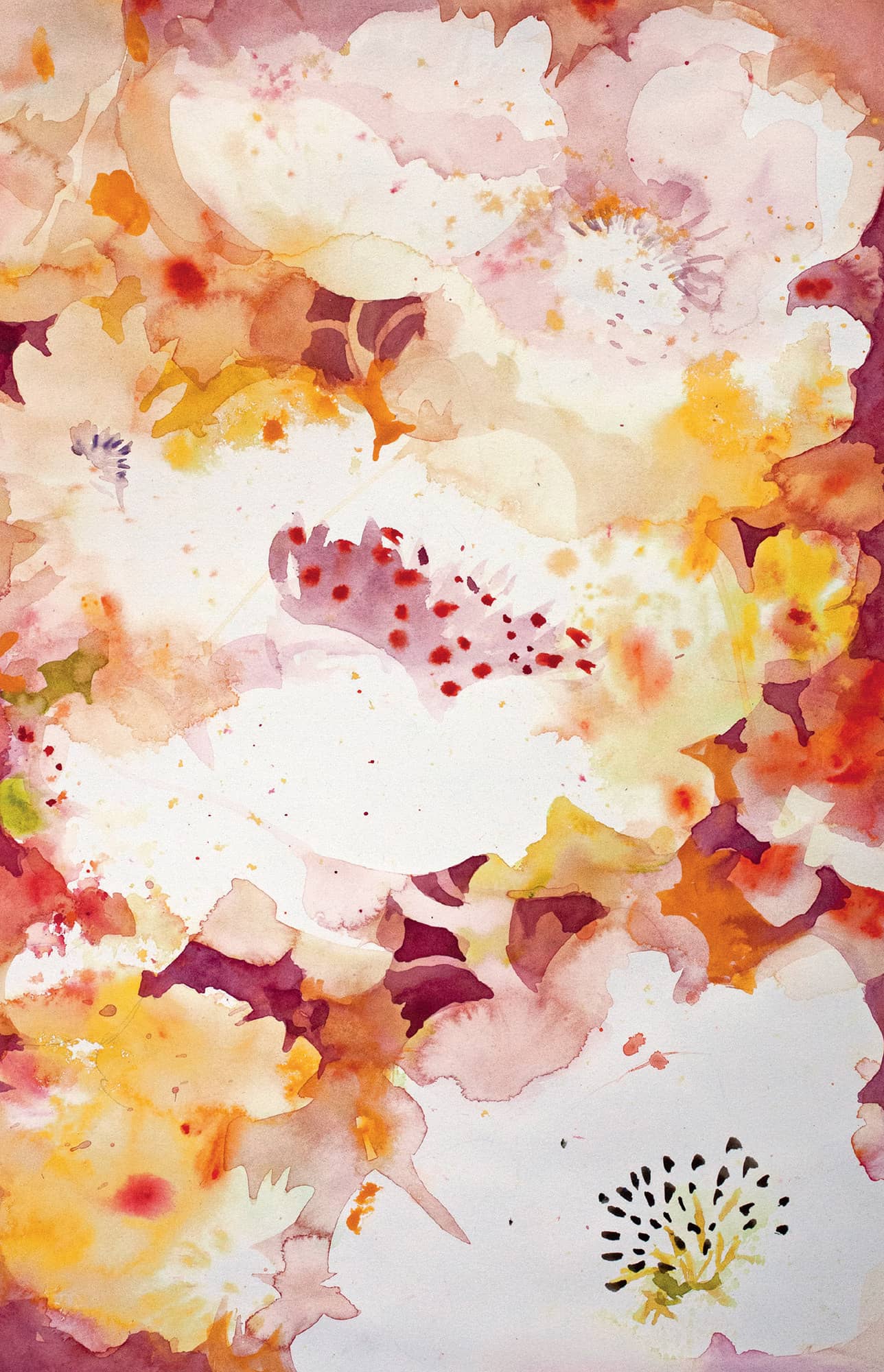
Nasturtium Impression. Watercolor. 14" × 10" (35.5 × 25.5 cm).
On the Trellis. Watercolor. 22" × 10" (56 × 25.5 cm).
I think of flowers as falling into three basic shapes: the circle, the cup, and the clump. The circle silhouette can be dynamically shaped with deep cuts and irregular edges like the field daisy and sunflower, or folded in on itself like a rose. The cup silhouette is the tulip, magnolia, and lily, with a smooth bottom and an articulated top edge. The clump is the lilac, the hydrangea, the goldenrod, or lavender.
Simplifying the flower shapes in my mind prevents me from being sucked into a botanical daze when I go to paint them. It allows me to focus on creating a design with the flowers in a painting, rather than focusing on their details.
Foliage is another wonderful design element. I try to use foliage that is a different shape than the blossom and I try to use it repetitively so the flower stands out, just as it does in my garden.
Along with design, good color is the foundation to a great flower painting. I use colors to share my emotional impressions. To create excitement, I surround hotter reds and yellow with cooler, darker greens and blues. Sometimes I choose a quieter, softer feeling using a dominant color like golden yellow or pale blue and the whole picture glows.
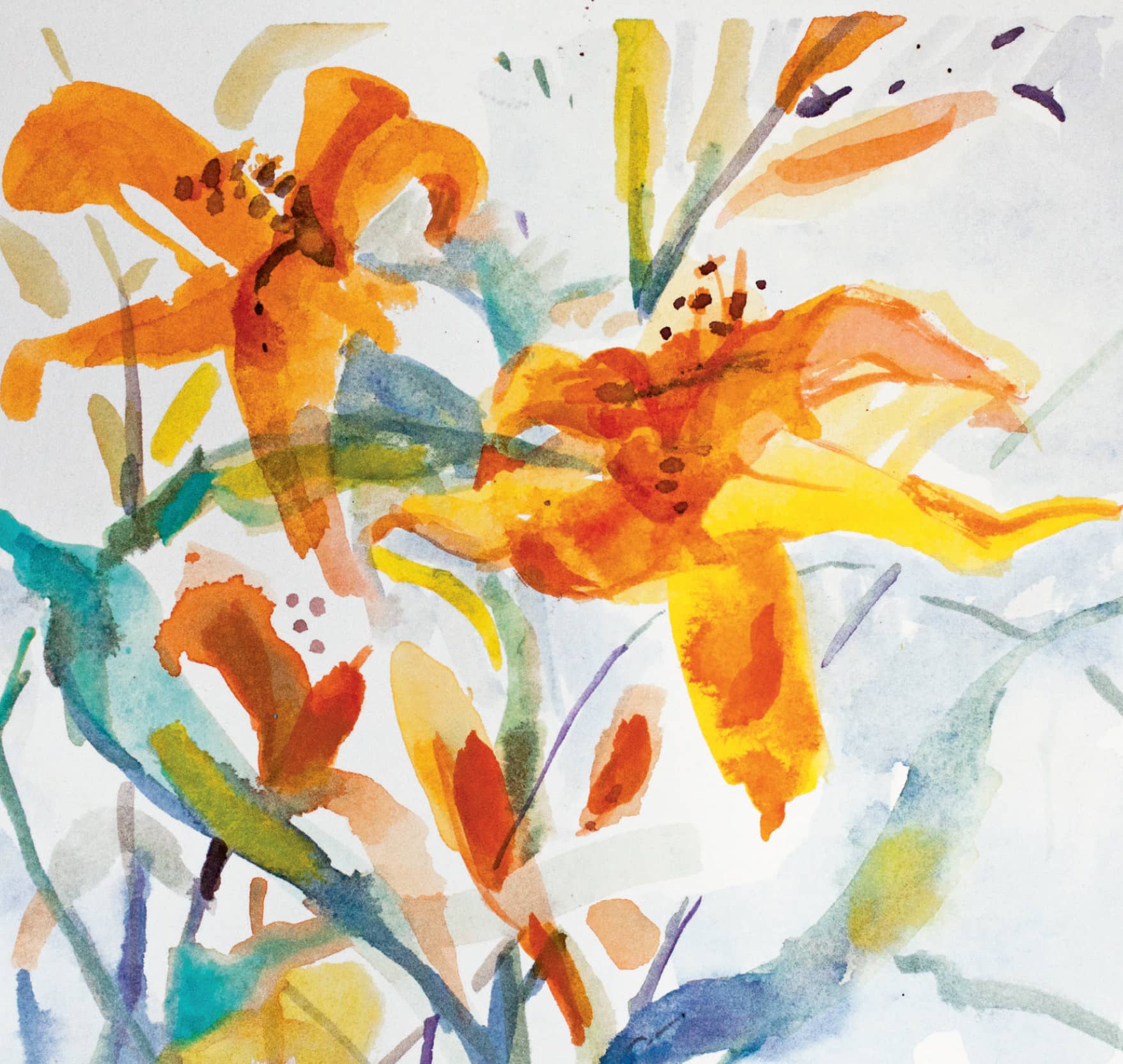
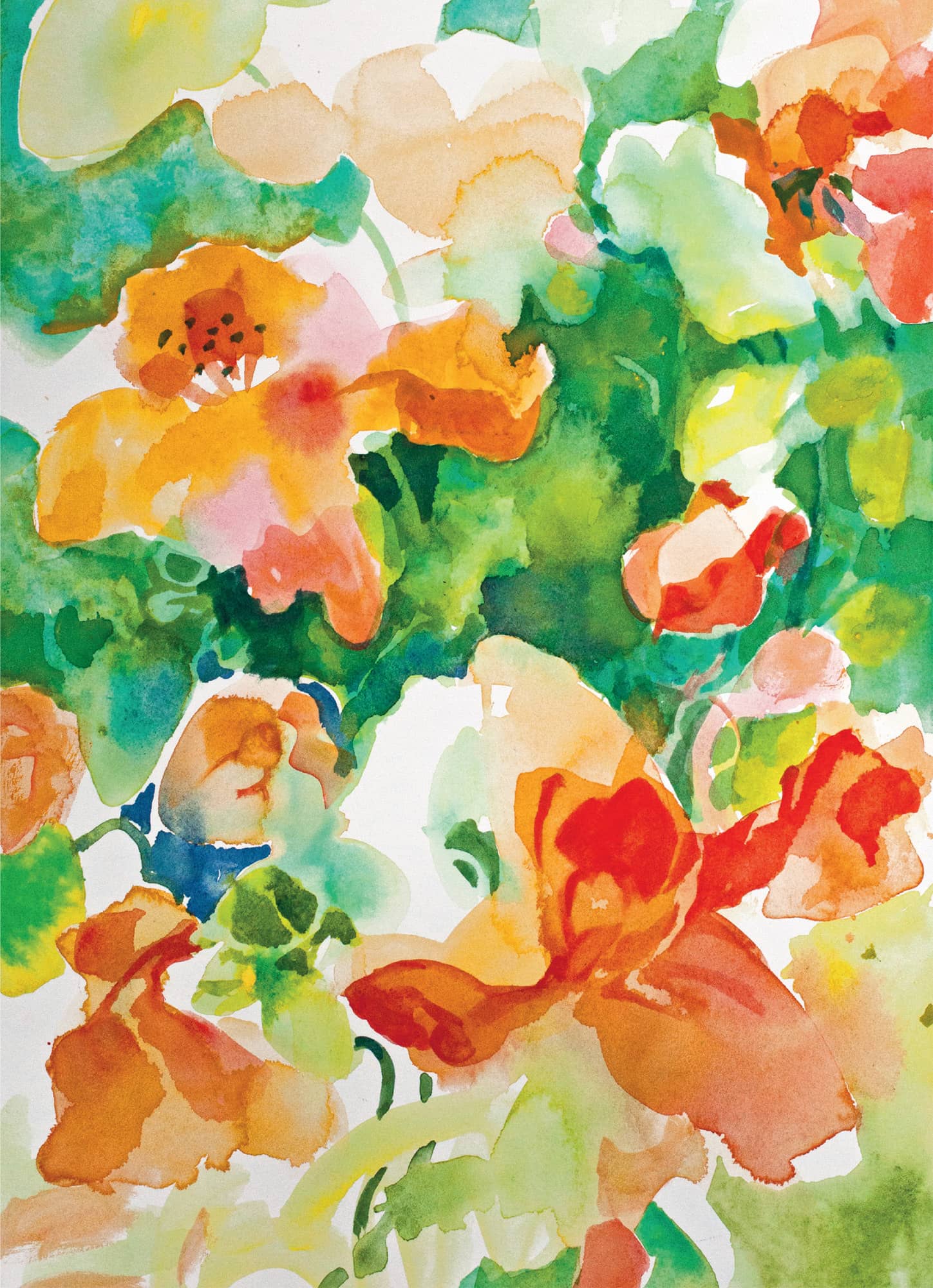
Day Lilies. Watercolor. 12" × 10" (30.5 × 25.5 cm).
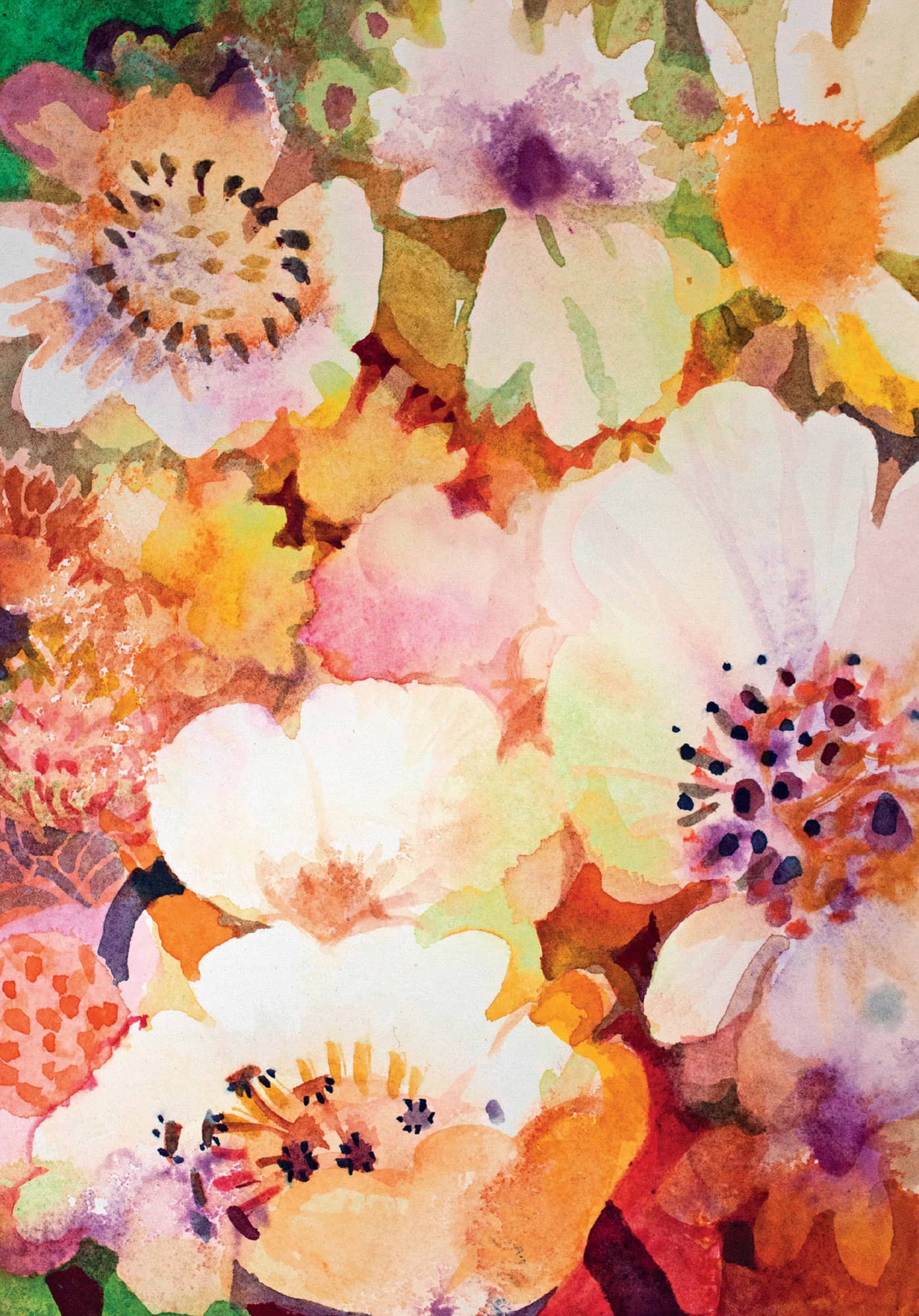
Joyful Garden. Watercolor. 30" × 20" (76 × 51 cm).
Demonstration: Painting Flowers in Watercolor
The Approach
My garden calls to me and I choose it as my subject location throughout the spring, summer, and fall. It’s the color and shape of my flowers that I like the best. I like to watch the garden change throughout the day as the light shifts, affecting the flowers and foliage. I pick the time of day when the color shows best.
PHOTOGRAPHY
Step 1. The moments when I usually feel that rush of excitement and go searching for my camera are when the morning sun is coming at an angle across the foliage and blossoms. Sunny mid-mornings are a fabulous time to be in the garden. The blossoms are opening wider. There may still be dew in the crook of a leaf. Often the shadows act as dark cool backgrounds and make the blossoms appear to jump out.
I like it when there is enough sun to highlight the colors without bleaching them or tinting them yellow. For New Hampshire, it’s mid morning. I try to record the light changes with my camera.
My first challenge in approaching a flower is to determine exactly what I like about it and its foliage. This seems obvious, but I don’t know how many times I’ve gotten three-quarters of the way through a painting and then realized I was really only interested in one small part. With the nasturtiums I am interested in the big circular leaves, the thin turning stems, and the intensity of the color of the blooms.
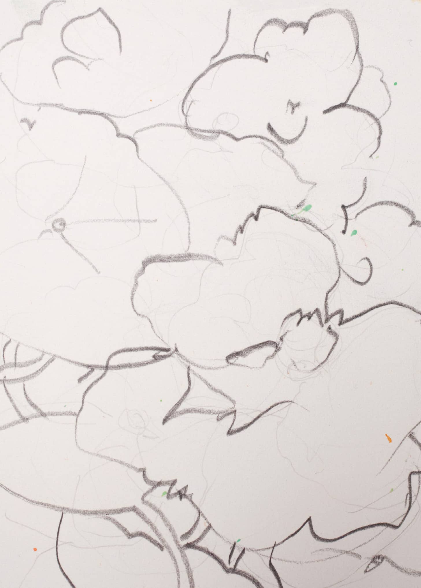
STARTING TO PENCIL SKETCH
Step 2. I bring my trusty outdoor sketchbook with the big spiral binding into the garden and pull up close to the nasturtiums spilling from a planter. I have my graphite pencil and eraser ready. This is a non-pressure, intimate, getting-to-know the plants time. I admire their leaves and stems. I marvel at their color and the tiny veins on their petals. I notice the interplay of leaf shadows, one on top of another.
I draw blind contour sketches. I put my pencil point on the paper and as my eyes follow the length of the stem, my pencil point traces it automatically on the paper. I’m falling in love with their delicate strength and vitality.
I’m definitely an amateur gardener. My garden is a tangle, often more foliage than flowers, but I kind of like that. For me, finding the bright spots of color tucked into the abundant green just calls attention to how important each part of the garden is.
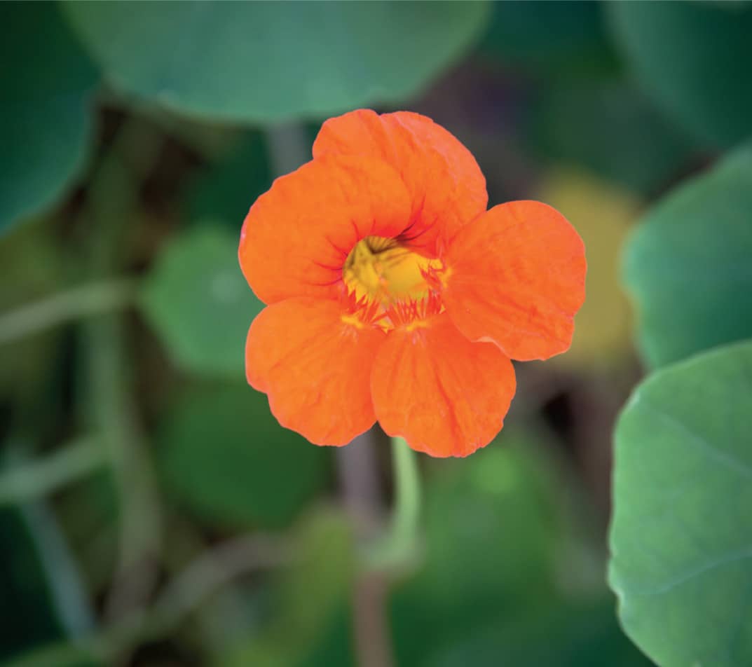
I like flowers, such as these nasturtiums, with intense color and interesting silhouettes.
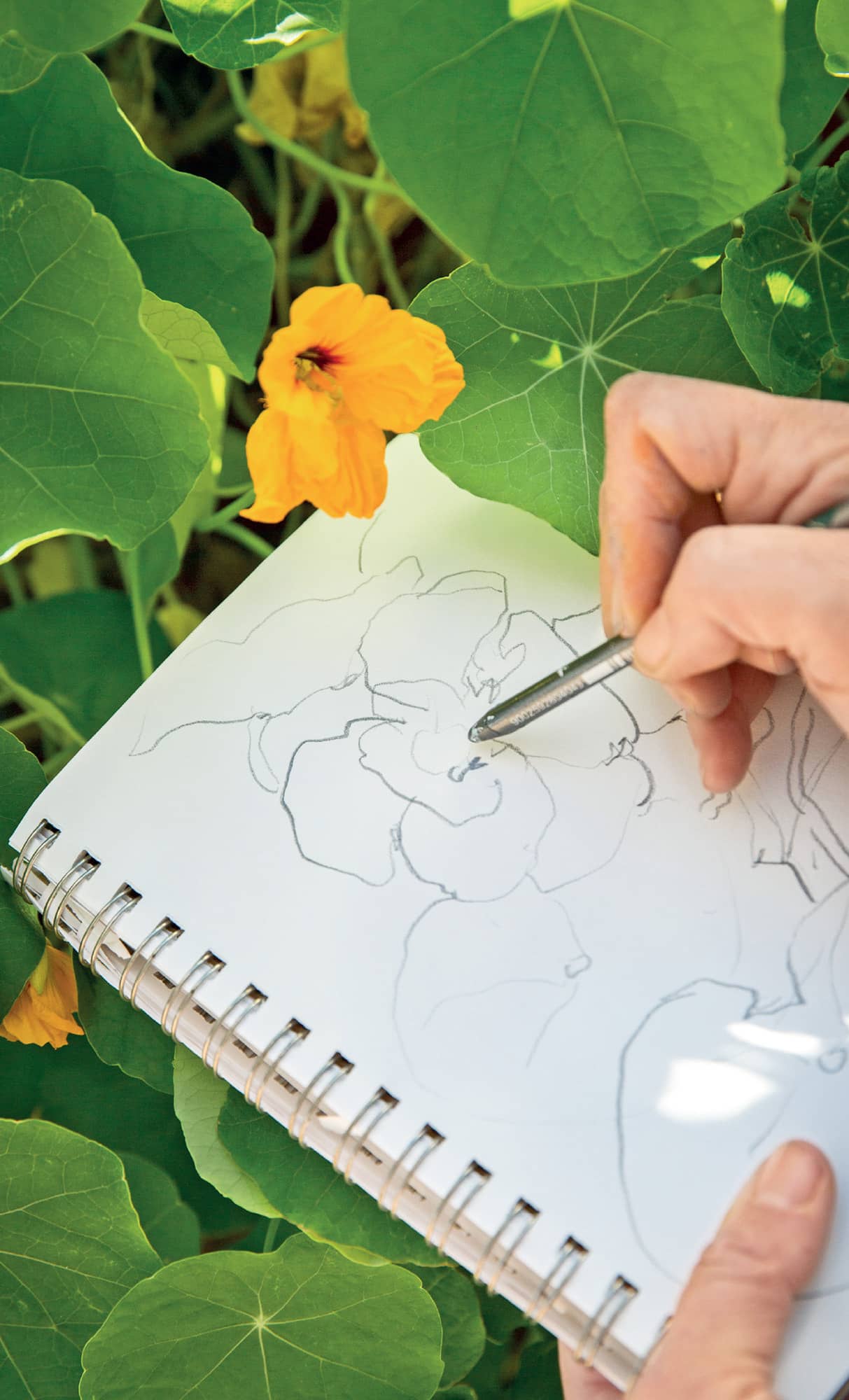
Sketching allows me to really enjoy looking at the beauty of a flower.
ON-SITE WATERCOLOR
Step 3. When my pencil sketching has helped me clarify what I want to capture in the painting, it’s time for me to transition to color. Much as I did with my on-site color sketch of the woods, I put together an abbreviated palette of colors, water, brushes, and an 8" × 10" (20 × 25.5 cm) Arches hot press watercolor block to work with on site. I often use two or three of these watercolor blocks when I sketch outdoors. That way I can work on several color sketches at a time, while I wait for the first ones to dry.
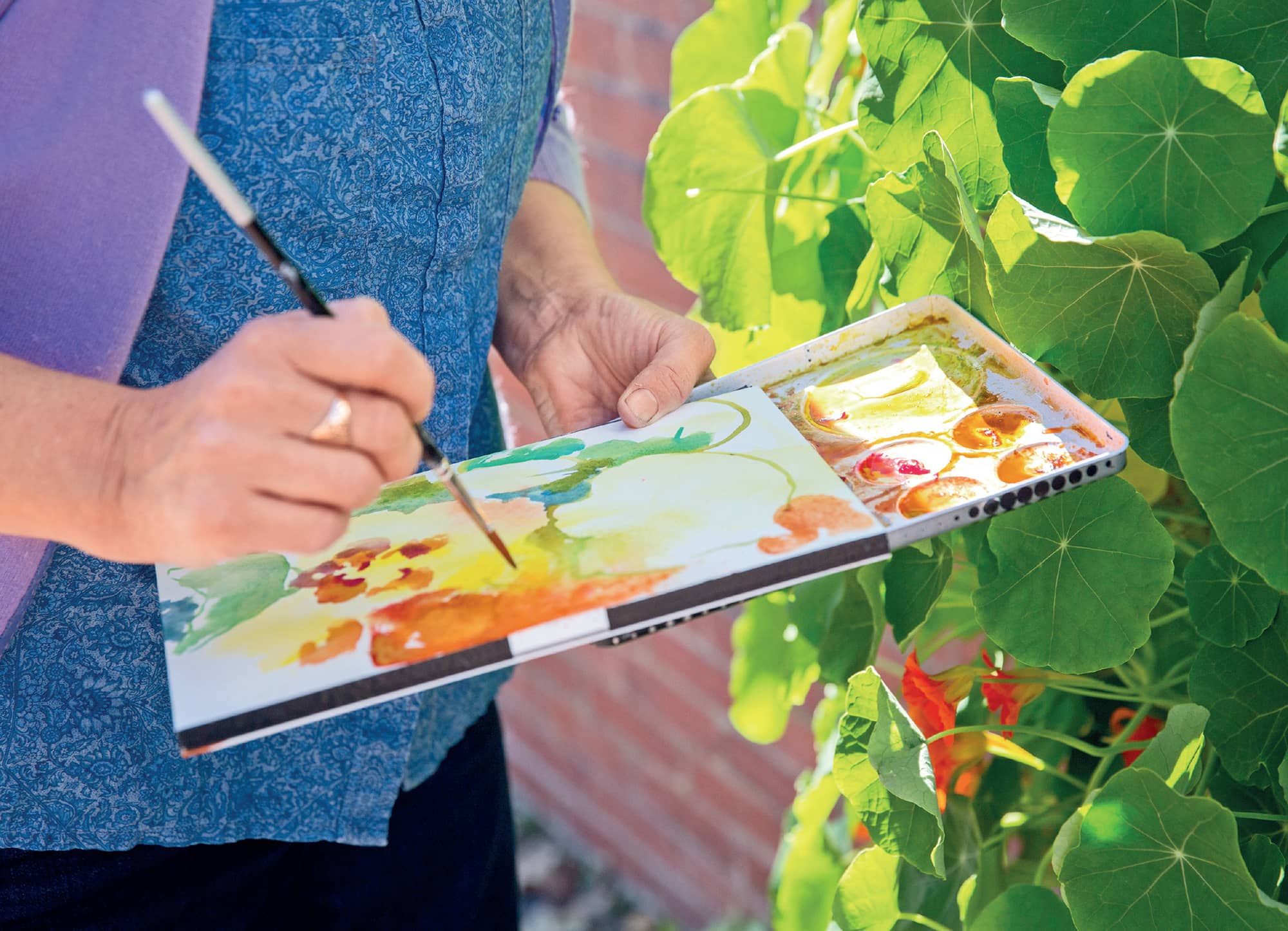
My abbreviated watercolor kit allows me to hold everything and paint at the same time.
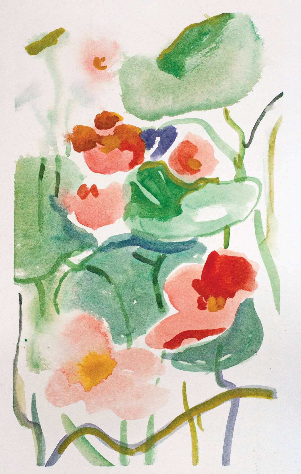
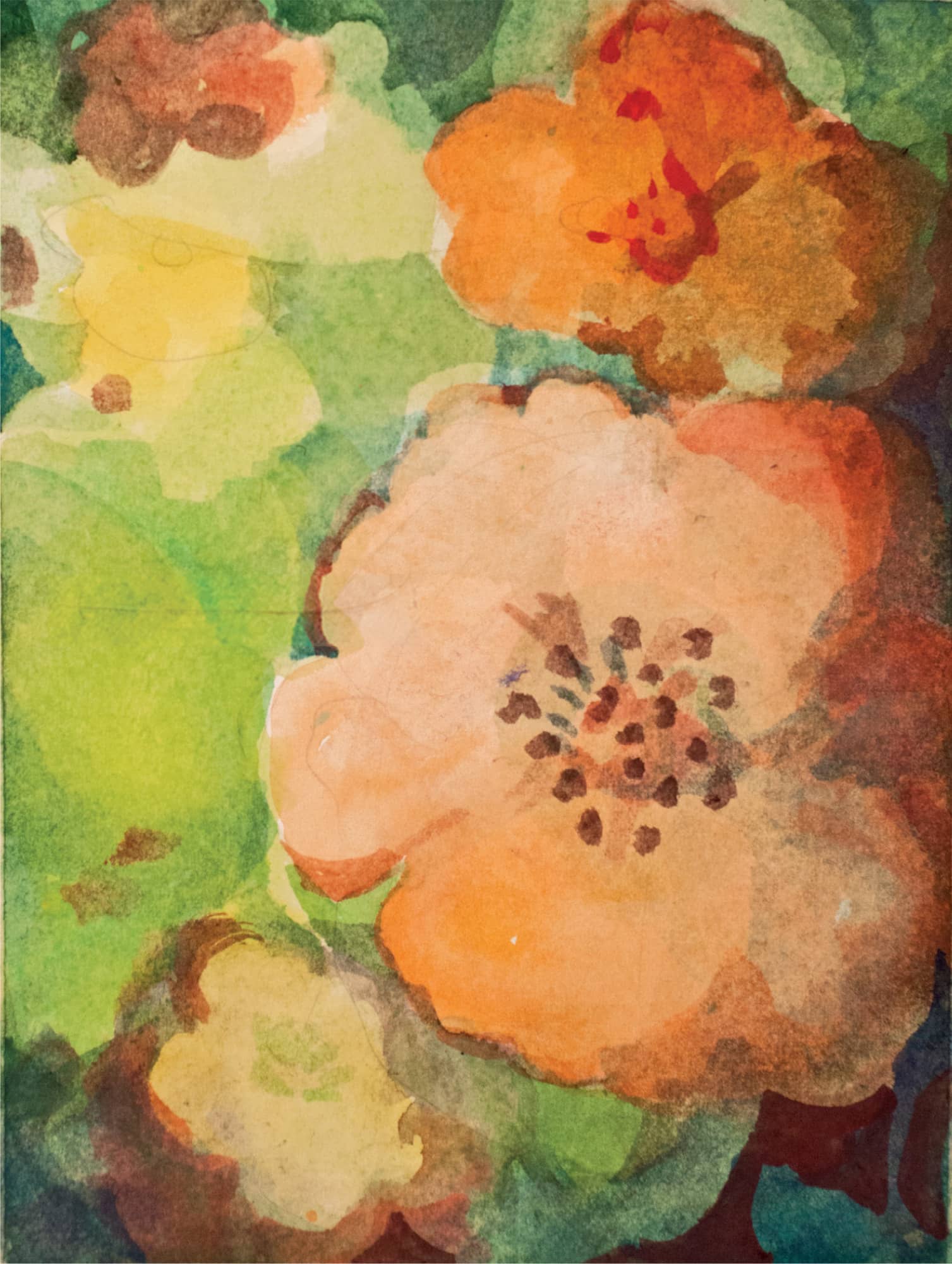
Impression of Nasturtiums. Watercolor. 9" × 12" (23 × 30.5 cm).
In the Studio
I take everything back to the studio and spread out my sketches and photographs on the floor. My dog, Lilly, is glad to get in from the sun and watches me from her nest under a table. I feel rich with so many choices.
Moving inside quiets my mind. I have more control over the environment. It’s just me and my impressions. The choices I make are my own. There isn’t much in life that’s like that. It’s an open candy shop of possibilities.
Often each sketch and photo has a different look and feel depending on how densely the flowers are arranged, how many stems and leaves appear, or whether the background color is light or dark. Sometimes, when I notice that I have a slew of photos and sketches of a single image, it dawns on me: I already know how I want this painting to go.
For this painting, I create two story boards, one with a large sheet of paper taped into rectangles, and the other with the paper taped into squares. I find this particularly helpful with flower paintings because I like to play with the composition of foliage and blossoms. Starting out with two story boards, I can go back and forth between them, trying out both formats simultaneously. I also like to have a lot of story board frames for flower paintings because the first color I put down for each flower is the most intense, delicate, and transparent that I will achieve. The pigment is pristine on the clean white paper. Every time I go back into the blossom, even if I use the same color, the surface will become a tiny bit cloudier and, sometimes, drastically more opaque and gray. The first color I put down for my blossoms has to be what I want: practice helps me decide.
A quiet moment
Step 1. Design. I like the feeling of being surrounded by foliage and flowers, as if my nose is right there next to them, causing the shapes to blur a bit. To create that feeling, I pick up my pencil and make an all-over design without any reference to the sky or horizon. Everything is close to the foreground.
Within the close-up space I’ve drawn, I’ve made a complex design of overlapping shapes. I keep in mind considerations like variations in size and make a point of varying the sizes of the flower shapes. I create a big round flower in the center left as a focus. The overall design is a soft curve from the bottom left up along the right side and back across the top. I put smaller blossoms at the top and crop the bigger blossom on the lower edge as if I’ve come in very close to it and can’t see the whole blossom at once.
First studio sketch
Step 2. Value. I’m ready to work on the value sketch just as I did with the woodland painting, but I’m using the values differently this time. I’m not going to show the direction of the sunlight in this painting. This time it’s about color not atmosphere.
I’m already thinking about colors, but first I need to decide where I will keep the painting lighter and where it will be darker. The light areas will be pure, bright color, and the darker areas, more opaque mixes. I plan where the paint will go on in a single layer and where it will be mixed or overlaid.
There’s a saying that values are the cake and color is the frosting of a good painting. The values are the structure that holds the painting together. The most important thing for me in this design is to keep the composition light in the center. I want the center to lift up toward me, fresh and fragrant, as if it will brush my nose. So I will darken the design around the edges and keep the center light.
I decide to darken the edges and keep the center light in my value sketch.
Step 3. Color. I use a lot of yellow in all my watercolor paintings. It has a very light value, so it doesn’t change the value range of the white paper too much. As an under-painting, it unifies the finished work with a common ancestor. If glimpses show through, they are all part of the same color family.
I have a large palette with only yellows on it. I put five of one yellow in a row. As I work on the painting, and return to the five, they pick up other colors from the paint and become different yellows.
For this painting I’m using the cadmium yellow light as the first color. I mix a puddle with clear water until the color is light. I also make a puddle of cadmium orange. I can control the intensity of the colors by adding either more pigment or more water. I have one water container to rinse off a dirty brush and another of clean water to dilute clean colors. I am using one brush for the yellow and one for orange to start. I will put the pure yellows and oranges in first.
When I work out my colors I go for bright warmth: cadmium yellow light, Winsor red, cadmium red, and cadmium orange for the blossoms. Cobalt turquoise and cobalt blue will mix to give me a good range of greens.
Several yellows mix together on my palette.
Step 4. First wash. I begin by lightly washing in the background colors, reminding myself that I want to arrange the darks around the edges and to keep the center lighter. I use a lot of water and a soft, round brush. The size of the brush depends on the size of paper. I’m working on a small piece of paper so I select a #8 brush.
I brush the clear water on first in a simple round shape, a little smaller than I think the flower will be. Then I drop the color into the center and watch as the color spreads out into the wet shape. This is a wet-on-wet watercolor technique.
In other areas of the painting I will load up a brush with the water and color I’ve mixed on my palette and paint directly onto the dry paper. This is wet-onto-dry painting. When you’re painting, use whichever technique you prefer, wherever you want, both in the same painting if you like, and make up variations of your own to get the look you want.
My first light wash of pure color is a lemony yellow, reaching toward green. I also use orange, which I’ve mixed on my palette using the yellows and some cadmium red.
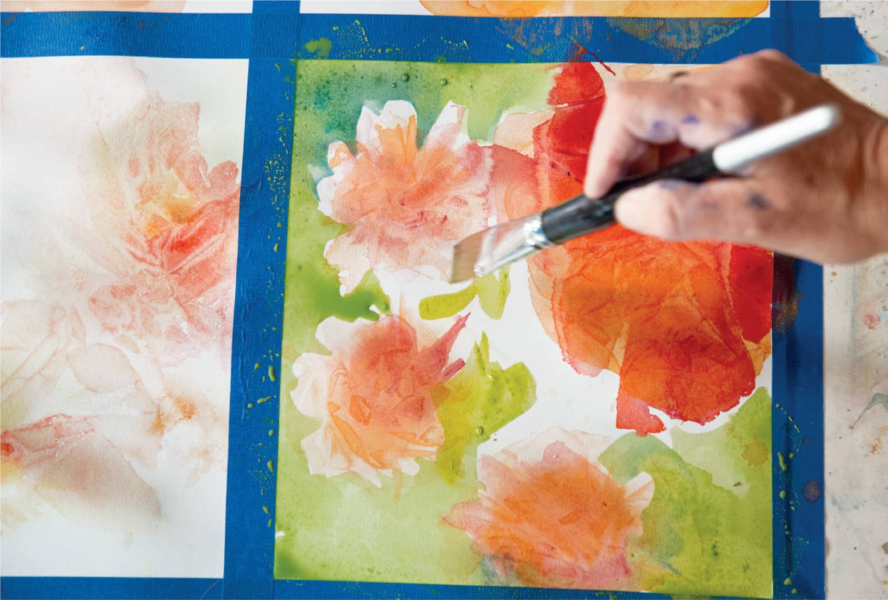
Step 5. Second wash. I let the first wash dry before proceeding. In this round, I begin establishing the foliage shapes in the center by letting some yellows and wet turquoise blues blend together on the paper. I stay away from the flowers and work only with my greens and blues.
I add a range of happy greens.
Step 6. Adding foliage. I continue developing the foliage while avoiding the drying blossoms. I mix several different greens on my palette. The contrast between the greens and the oranges should be striking. If I used only one orange and only one green, the contrasts would look flat. The time spent mixing the variations of blues and yellows and greens is time very well spent. Watercolor pigments do not all mix the same. Each pigment, and even each brand, has a slightly different chemical formula causing it to dilute, granulate, and dissipate its own way.
I use a yellow green in the center of the painting to connect the blossoms visually. I use fresh water and brushes to make sure the oranges and reds do not mix with my greens. If the orange mixes with the green, I will get a brown green, which can be beautiful, but it’s not what I want here. I mix a bluer green for foliage around the edges of the painting, always supporting my original idea of light and warmth in the center of the design.
I give more form to the green foliage by shaping leaves and stems.
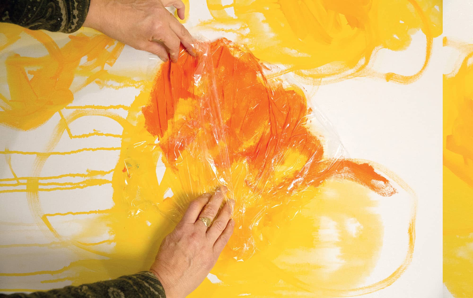
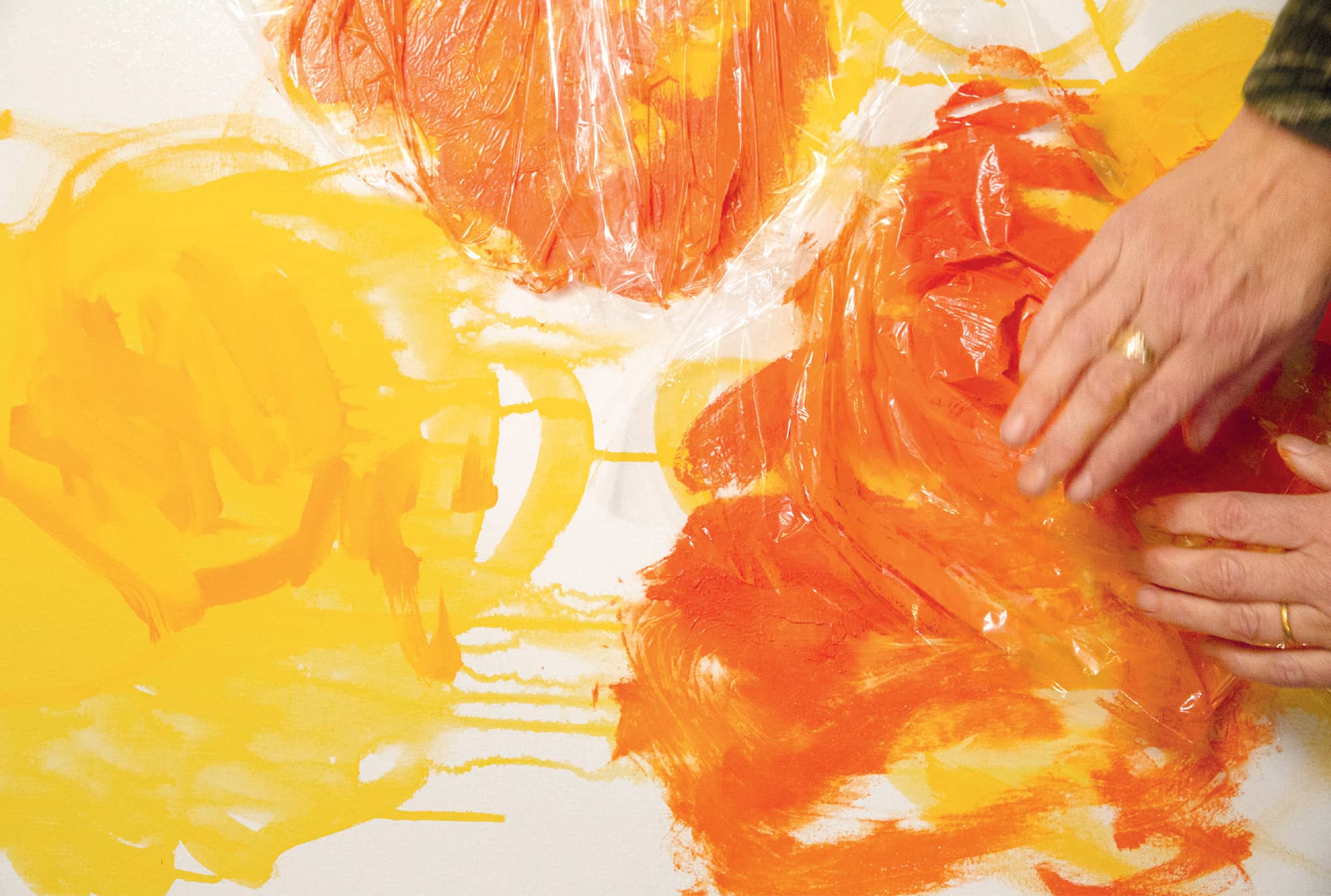
Step 7. Adding texture to the flowers. Once the feeling of depth is suggested by the variations of greens in the foliage, I go back to add richer oranges to my flowers.
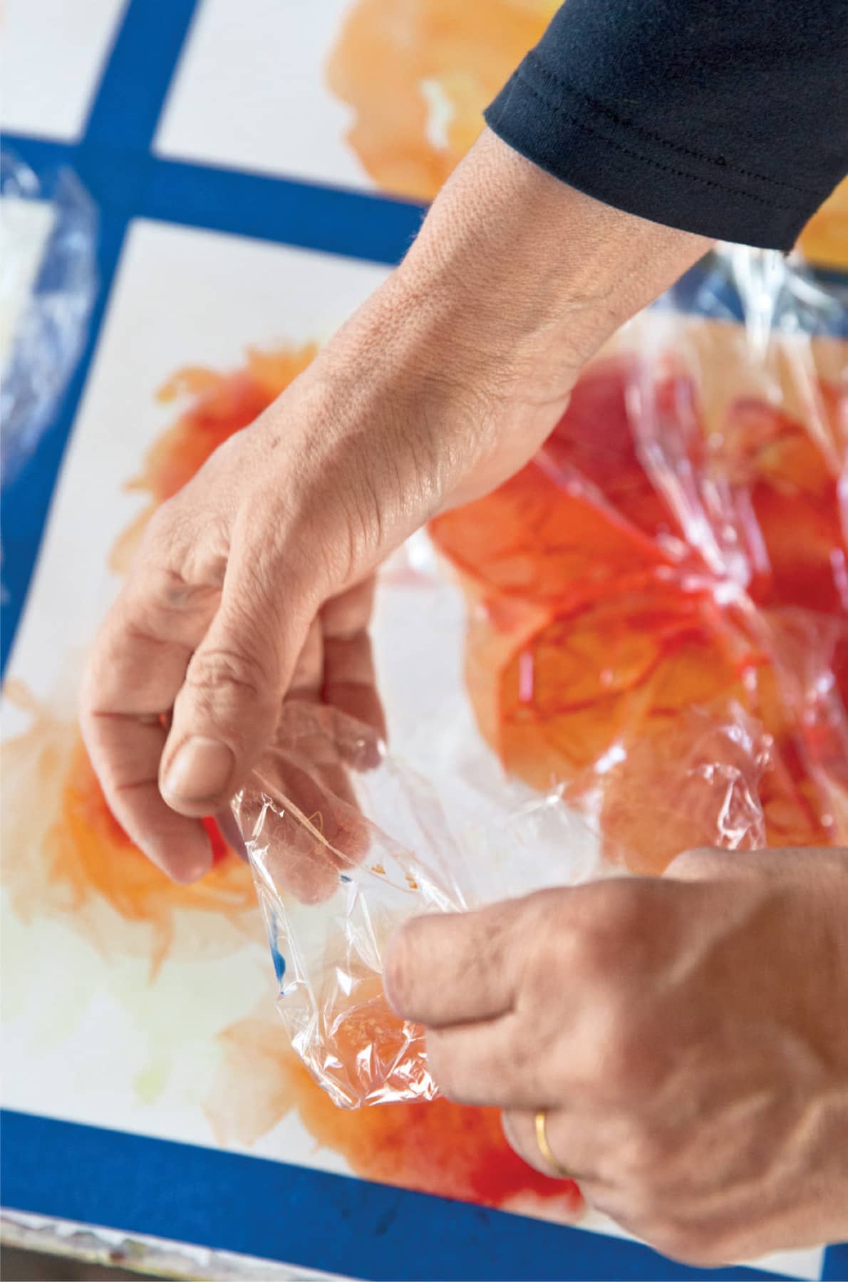
I get clean water, rinse my brushes, and rewet the yellows and oranges on my palette. I want to begin adding delicate texture to the petals, but I don’t want to get too fussy. I decide to use plastic wrap to create the feeling of the folds and veins in the petals. (See here to here for details on the plastic wrap technique.)
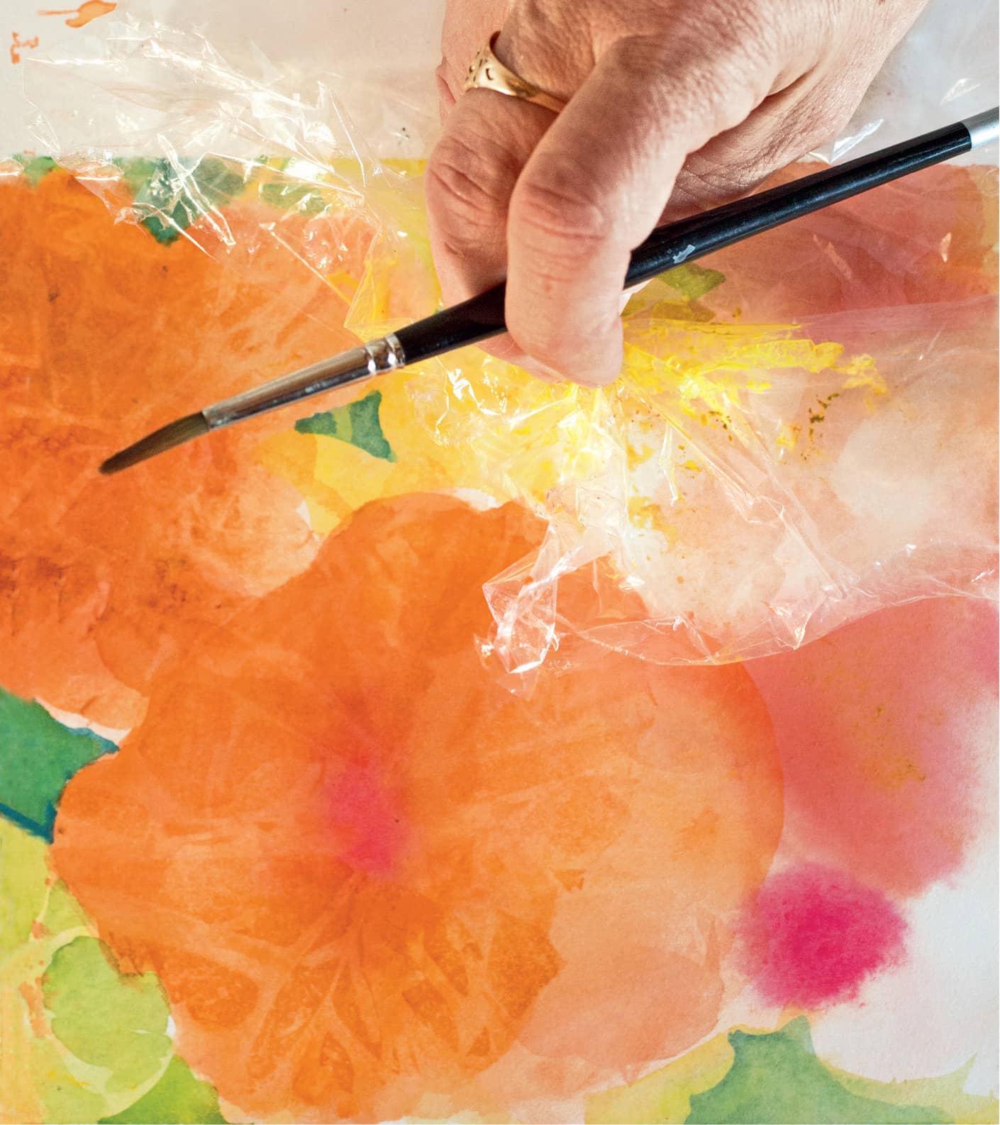
I use plastic wrap to add delicate details to the petals.
Step 8. Adding details to the foliage. While I wait for the paint to dry under the plastic wrap, I make some decisions about the foliage. I’ve already decided I want it bright and cheerful, but the amount of detail I put into the foliage will determine the degree of attention it will attract.
Often it’s the background that determines the volume and tempo of a painting. If I describe every leaf and indicate every stem, the painting will be visually demanding. If I blur the leaves and indicate only the bits of stems, the painting will relax and it will feel as though the air is moving through it. I decide to blur the leaves and suddenly the painting relaxes.
I can go back into the patterns made with the plastic wrap to soften some and darken others.
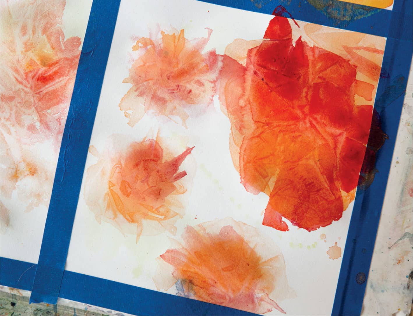
Step 9. The reveal. I get fresh water and go back to consider the flowers. I’m eager to see the effect of the wrap. I gently lift off the plastic. Each blossom is different. I admire the way the darker reds and oranges make a fluted pattern across the delicate first washes. I touch the textured paint to make sure it’s completely dry before moving on.
As I adjust the details of the blossoms, I am careful not to cover the first wash or lose the crispness of the plastic-wrap imprint. This is not the time for big gestural brushwork. Using a small brush, such as #1 round, I add a darker area, never more than a third of the blossom. I can’t stress enough the importance of using clean water when working with flower colors. Even the slightest amount of green or blue in the water will mute the orange, and I want the color to stay bright.
To finish up I add dots of varying sizes and colors to create the center of the flowers. I place them so that the flowers appear to turn in to face each other.
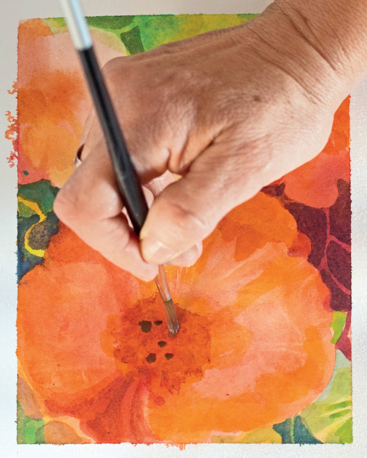
Adding the final details to the centers of the flowers.
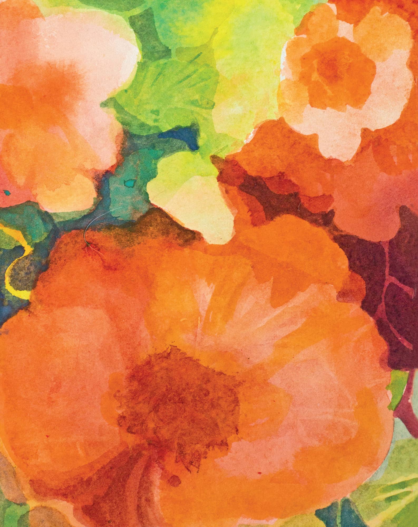
Step 10. Standing out. I squint at the painting, which allows me to see the overall composition and value relationships. I let my mind slip back to the feelings I had leaning into the bright glory of the blossoms, hearing the buzz of the busy honeybee, feeling the sun’s heat on my back. The square watercolor I’ve been working on (opposite) really captures the impression I am hoping for.

The finished watercolor
Special Watercolor Technique: Plastic Wrap
Creating Texture
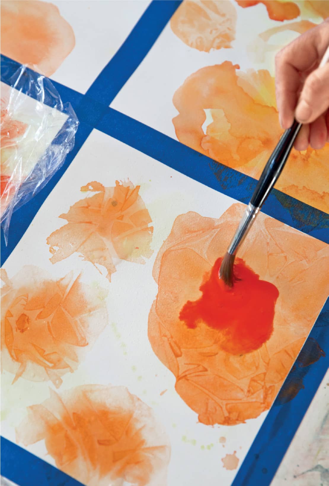
Plastic kitchen wrap is a staple for every watercolorist. I avoided using it for many years because I thought it was too gimmicky. But I discovered in time that if you use it properly, it can add a level of delicate detail to even the most expert watercolors.
You’ll need clingy kitchen wrap, clean water (a spritzer helps), a round brush, and several colors of paint. I’ve decided to try it on some more nasturtiums and have chosen cadmium yellow light, pyrrole orange, cadmium orange, and cadmium red.
In this process, you’ll use plastic wrap to create a crinkled pattern in the paint. Once it dries, you can then use the thirsty brush technique (Shown here to here) to add washes and lift out color in the textured pattern.
Step 1. Spritz or brush a thin puddle of water on the paper where you want to create the flowers. Drop some bright yellow into the water and watch the color spread. When the yellow dries, make another puddle of clear water over the first and drop in some orange or red where the center of the blossom will be.
Step 2. While the orange paint is still quite wet, tear a square of plastic wrap double the size of the blossom. Pinch the center of the plastic square and pull out the edges so that it is pleated from the center outward.
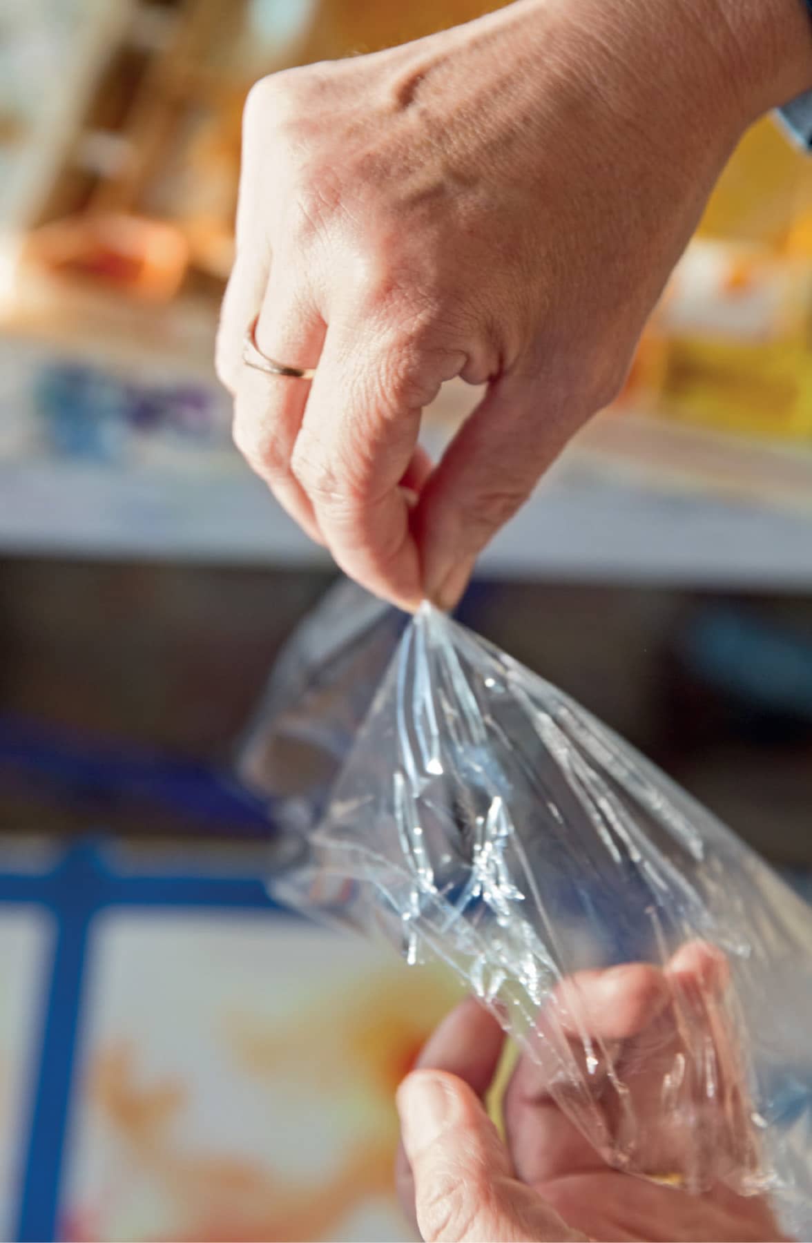
Step 3. Once the pleats and creases are arranged, place the square of plastic over the wet orange paint. Press lightly; you will see the orange paint squish into the creases of the plastic wrap.
Step 4. Allow the paint to dry completely before shifting or removing the plastic wrap. The best way to tell whether the paint is dry without removing the plastic is to blow on it. If the plastic slides off the paper, the paint is dry.
Step 5. Now you can go back into your painting and add foliage as well as details.
Step 6. The drier the paper and pigment, the crisper the pattern will be. Once your pattern is dry, you can paint over it with darker washes or lift out areas to create contour in the petals.
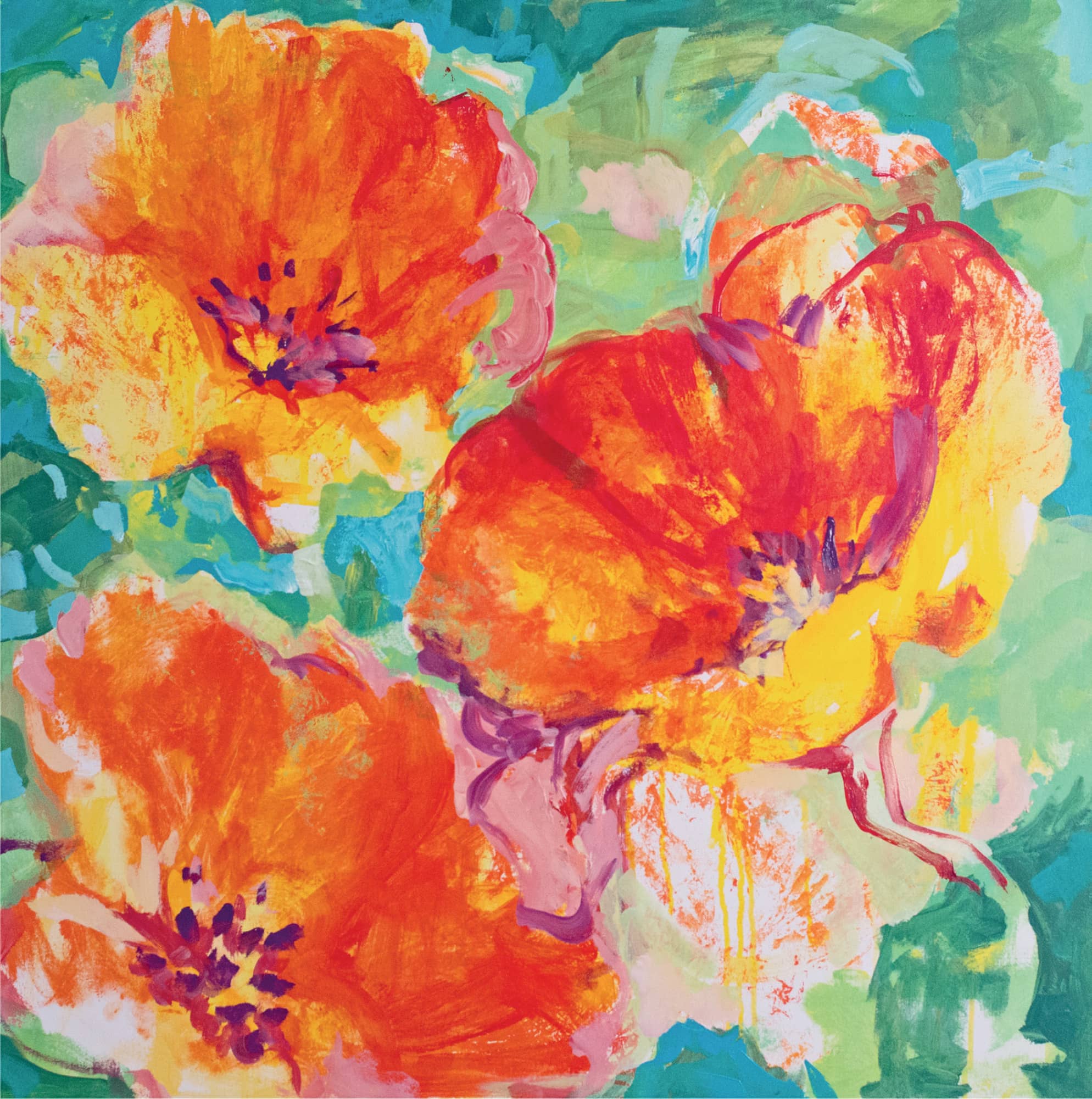
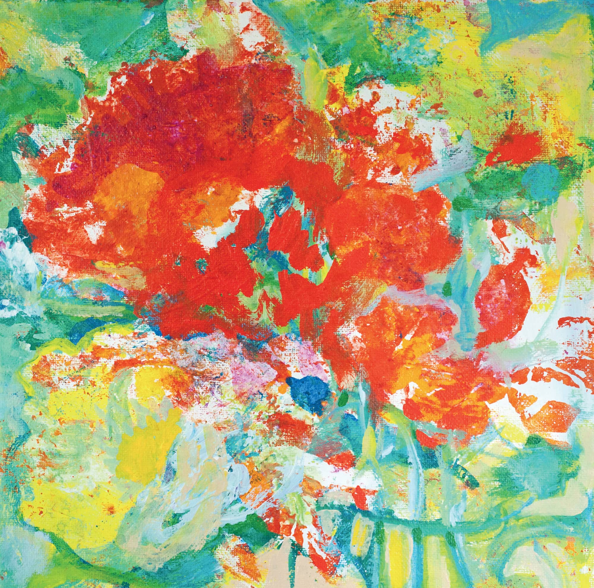
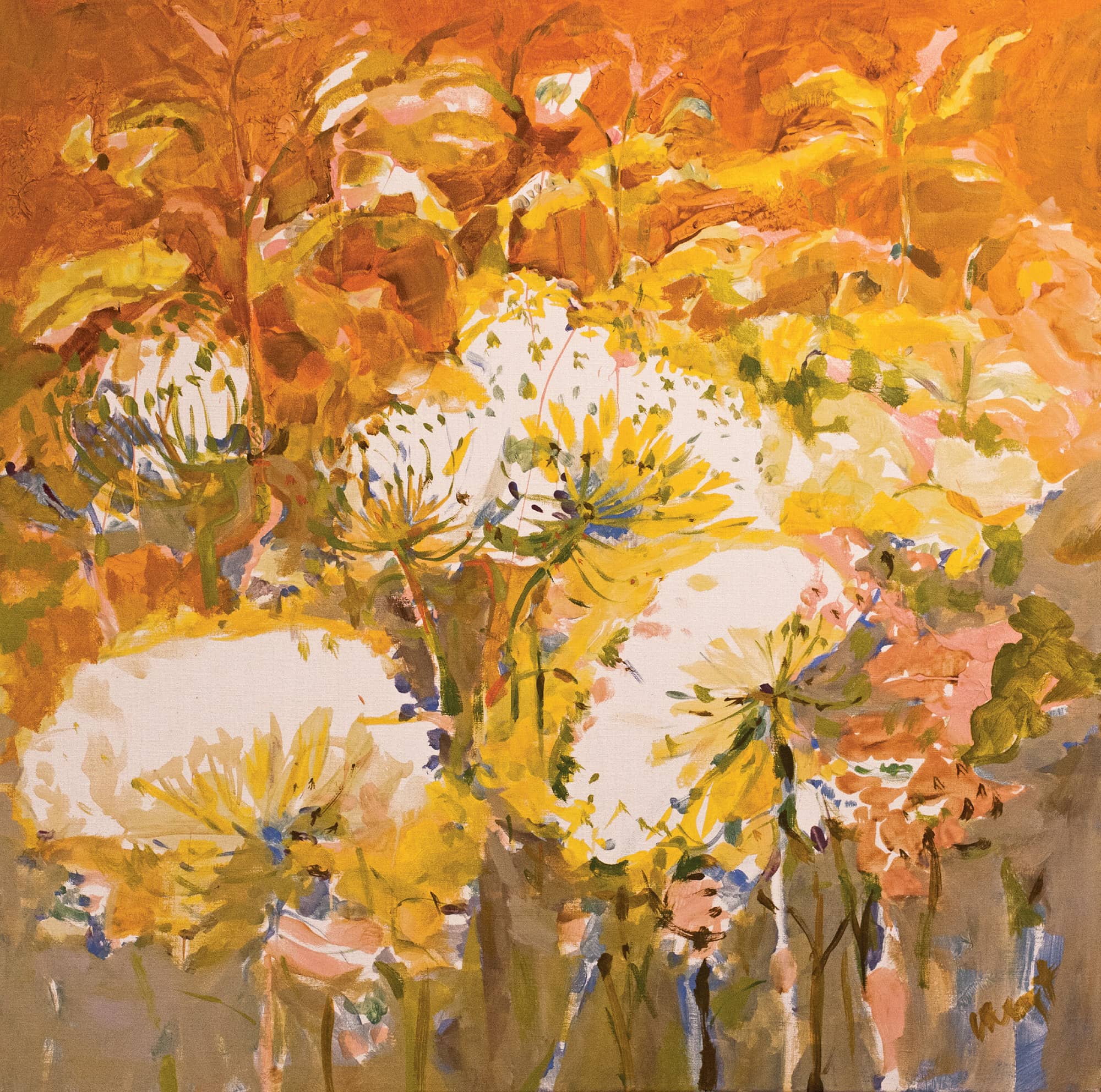
Gallery
Flowers are gloriously varied in shape, color, and details. These finished paintings celebrate the beauty of the flower.
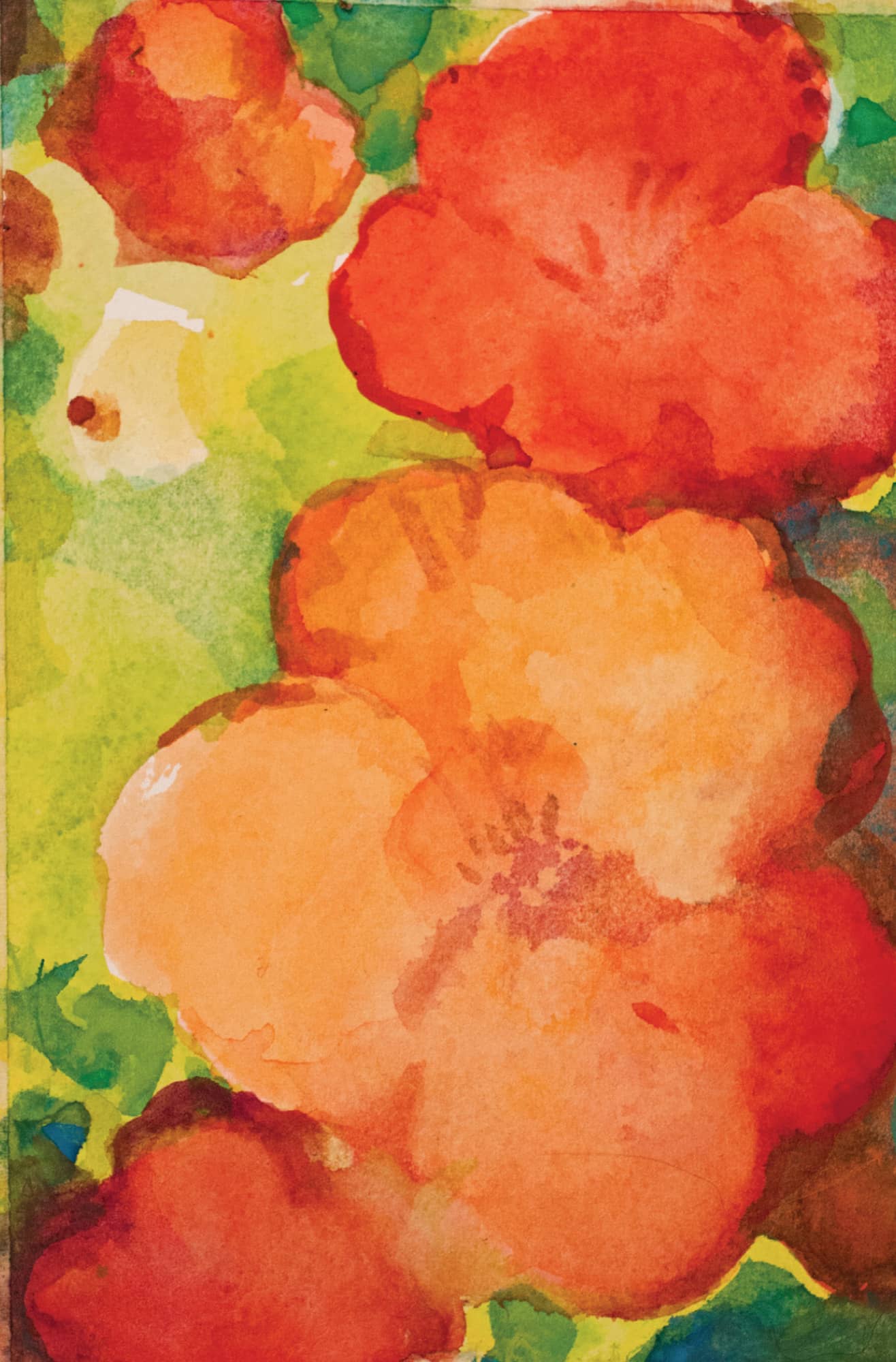
Impressions of Nasturtiums. Watercolor. 22" × 12" (56 × 30.5 cm).
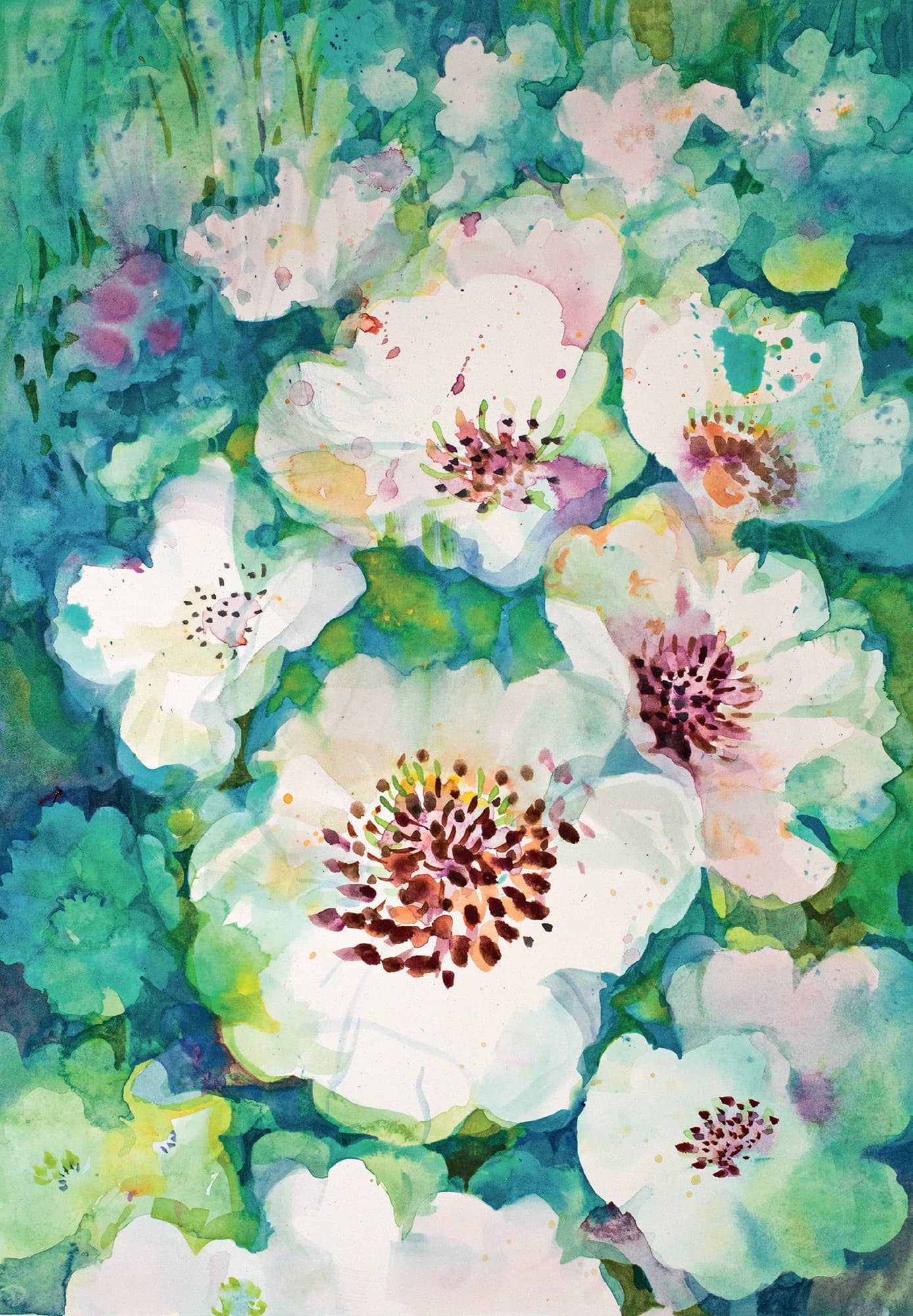
Moonlight on Peonies. Watercolor. 22" × 11" (56 × 28 cm).
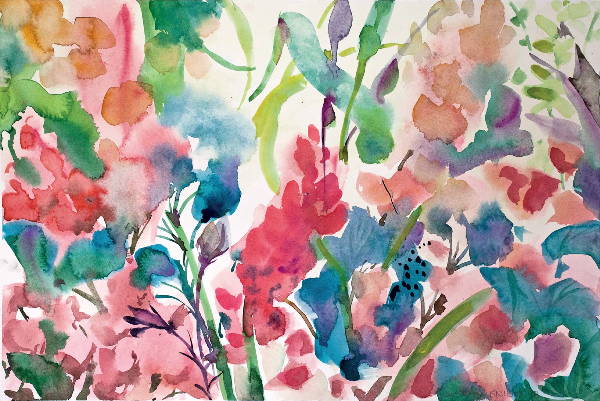
Morning Garden in June. Watercolor. 11" × 22" (28 × 56 cm).
Golden Melody. Watercolor. 22" × 12" (56 × 30.5 cm).
Demonstration: Painting Flowers in Acrylic
When I think of flower paintings on canvas, Monet’s water lilies and fields of poppies come to mind. Let’s add Van Gogh’s sunflowers and irises and Renoir’s enormous vases of rust and gold chrysanthemums. These artists knew what it was like to have their noses right up close to the blossom. That’s my favorite view, too. I am still intrigued with the idea that I started in watercolor.
Working with acrylic on canvas, however, offers me greater flexibility in the painting process and a physical presence beyond the watercolors. The color dries where I put it, and by dragging and scumbling the paint, I can build up tactile layers, allowing dozens of colors to sit in close proximity. When close up, you can see all the tiny bits of the individual colors. Step away and the colors blend into three-dimensional forms. Monet’s water lilies are a perfect example.
As I approach the idea of beginning a painting in acrylic, I’m thinking it would be great to build up a complex physical surface in one area of the painting and a smooth, thin surface of a single color in another. I’ll need to pay attention to the thin layers of paint that provide the transparency of the petals without making them so thin that I lose the big happy orange color. As in the watercolor painting, I intend to use the plastic-wrap technique to suggest a pattern of thin veins on the petals.
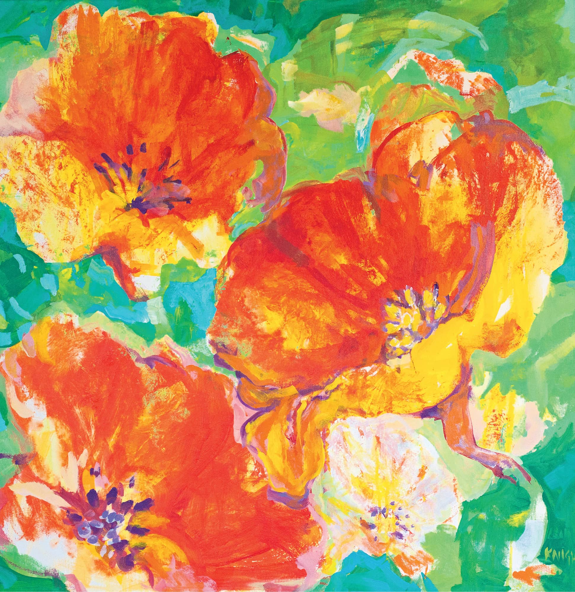
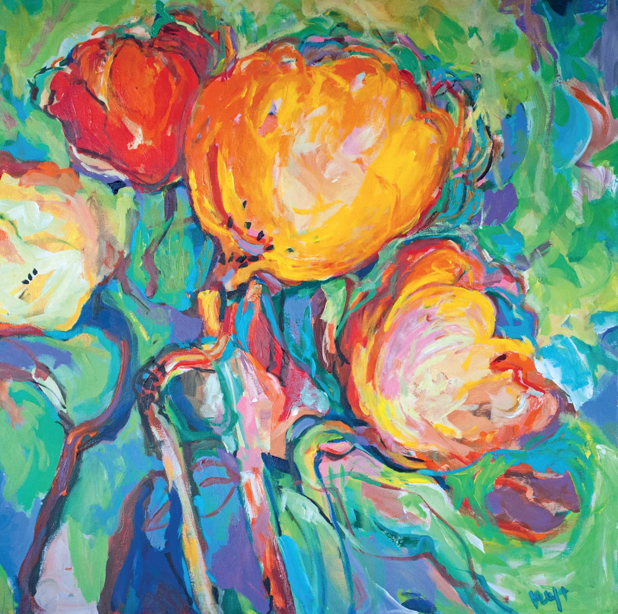
Big, Bold and Beautiful. Acrylic on canvas. 36" × 36" (91.5 × 91.5 cm).
Getting Ready
I put away my watercolor gear and bring out my acrylic water buckets, synthetic brushes, and jars and tubes of acrylic paint. I also gather old plastic lids and plastic plates to use as palettes, a roll of plastic wrap, and paper towels.
I want to keep the bright, warm reds and oranges that I used in the watercolor, so for my floral colors, I choose cadmium red light and cadmium red medium. Cadmium yellow and lemony aureolin yellow will add warmth. I’ll also use titanium white, burnt umber, and a darker red (perhaps a pyrrole red or alizarin crimson) for the deeper tones. I want this painting to make me cheerful, so I will contrast the bright orange flowers with green. Choosing turquoise for my greens will make the reds and oranges pop, but I also want cobalt blue for a cooler green mixture.
Color inspiration in the studio
In the Studio
Step 1. Setting up an acrylic palette is different than setting up a watercolor palette. Professional watercolor paints are pigment-intense. They are thinner and quickly settle into a flat puddle when you squeeze them out. Acrylics have more filler and binder, giving them a full-body, toothpaste texture.
I squeeze out a generous blob of cadmium yellow and a blob of titanium white. I won’t put out all the colors I intend to use because they dry so quickly. I begin with the yellow and white, leaving lots of room on the palette to mix and move the paints. Acrylic does not flow like watercolor. I have to drag the paints together. As with watercolor, I use separate brushes, one for oranges and yellows, and the other for greens. I also use separate water containers for each.
I put the pre-stretched and gessoed canvas on my easel and choose a hefty #12 synthetic round brush. This is a durable, flexible brush that holds a lot of paint and allows for a wet application of paint.
I rarely start acrylic paintings with pencil sketches, but instead start directly with paint. With acrylic, I can always go back over an area to change it. In this case, with my sketches as models, I have my design clear in my mind.
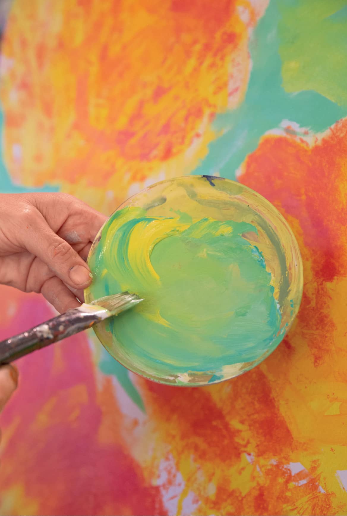
I brush large circles of bright (but not thick) yellow paint onto the canvas and let it dry. While it sets, I squirt out cadmium orange and an additional blob of white on my palette. On another palette, I set out my greens—using yellows, turquoise, cobalt blue, and white. I add pale orange loosely in areas over the yellow and sketch in with green where I want important pieces of foliage to be.
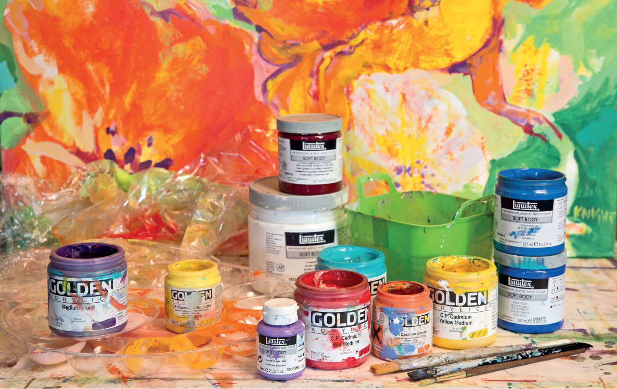
Materials include Golden and Liquitex acrylic paints, a plastic water bucket, and acrylic paint brushes.
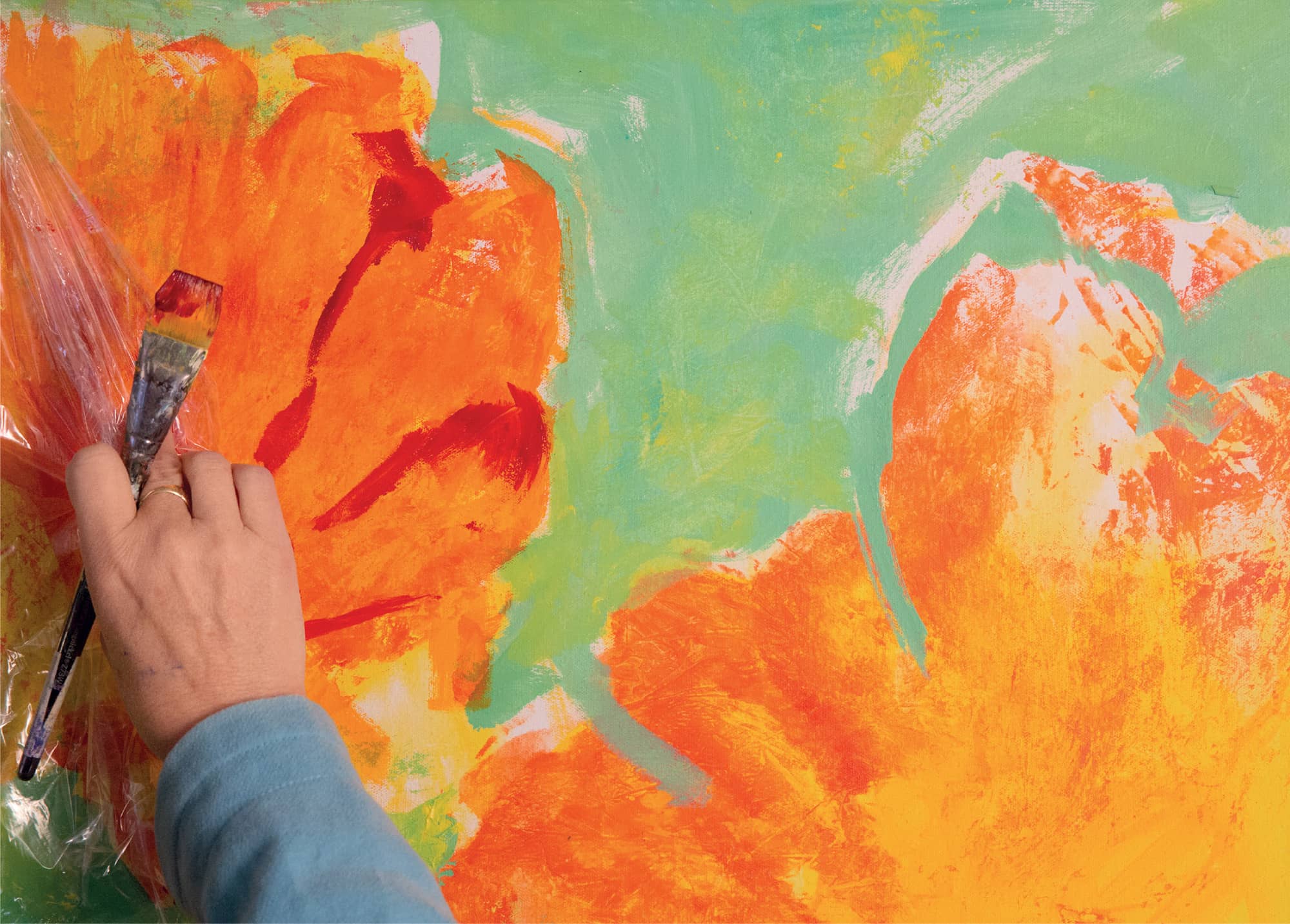
First loose, bold washes
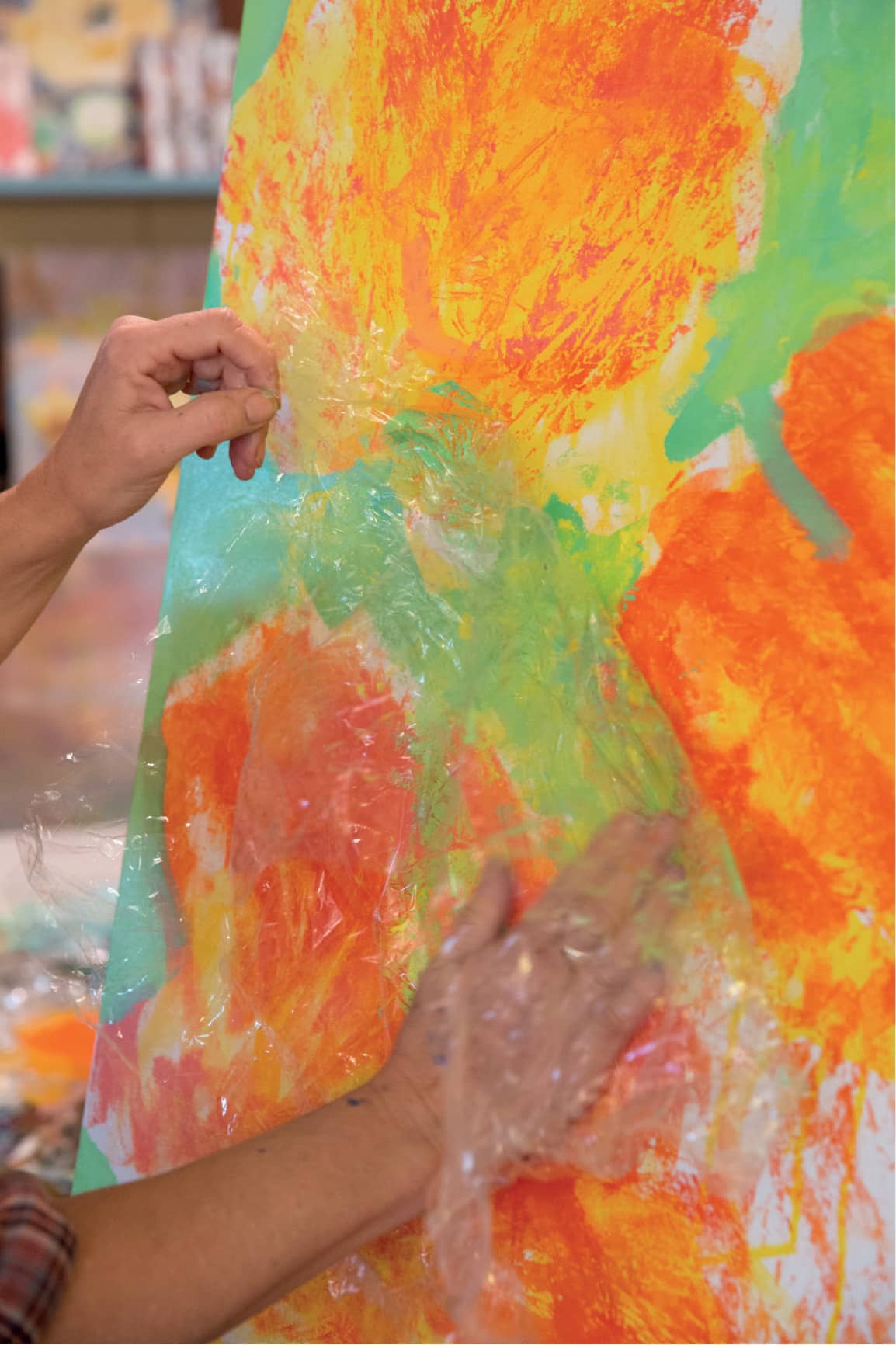
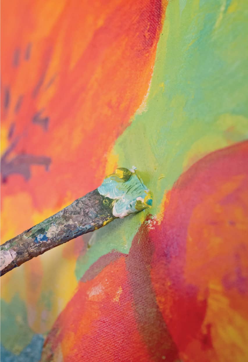
Step 2. When the paint is dry, I’m ready to use the plastic wrap, in the same way as I do with watercolors (see here to here). This will be easiest if I lay the canvas flat on the floor or on a large work surface. I mix a red-orange on a palette and brush it over the yellow flowers, trying to stay within the flower shape, and piling the paint thickly at the center. I cut a piece of plastic wrap larger than the area I want to cover and pinch the center of the wrap to create a pattern of wrinkles and folds. I place it over the wet paint and gently press down, encouraging the thick red-orange paint to move into the folds of the wrap, and then I leave it to dry.
NOTE: To get the clearest, most delicate striations of texture from plastic wrap, it’s best to use the technique only once for each flower. Later, as the painting progresses, you can return and repeat the process in smaller areas. You can do this at any time. Overdoing it with the plastic-wrap technique can cause the texture to become confusing, losing the feeling of the delicate flower. A single application is best.
Place the plastic wrap onto the wet acrylic paint and arrange the crinkles and pleats to suggest petal details.
Step 3. While the paint is drying under the plastic wrap, I work on the foliage. In the earlier watercolor painting, I painted “negatively,” filling in the shapes around the lighter leaves. With acrylic, that’s not necessary; I can paint the leaves in front and the foliage in back at the same time.
What I need to keep in mind is that the leaves in front will be lighter and yellow-green. The leaves behind them will be darker and bluer. I can mix my greens in an orderly way by thinking in terms of light, medium, and dark, and moving from warm yellows to cooler blues.
I squeeze cadmium yellow light and turquoise onto my palette, along with white. For a cooler blue green, I add a squeeze of cobalt. (My palette is covered with many coin size piles of various greens.) Then I mix, trying different variations, sometimes mixing all the different greens together. I want to capture the rich variety of greens I see in the garden.
Always mix colors until you like them. Everyone has a slightly different color taste. It’s what makes your art yours.
Smooth some of the creases to blend the colors.
Step 4. I repeat the plastic-wrap process on the foliage. Building up rich variations in the color and textures of the foliage is critical for this painting. I can remove the plastic wrap within minutes of putting it on if the paint is thick, or I can leave it on all afternoon. I vary my timing to see what I like. The flexibility of the acrylic allows me to make big and small adjustments throughout the painting process.
Repeat the plastic-wrap technique on the leaves.
Mix some greens, keeping variations on the palette.
Step 5. As I shape and blend my foliage colors, I simultaneously refine the flower shapes by bringing the green up to the orange. I think about bringing the leaves under the flowers. I remember the layers and layers of leaves and stems under the flowers in my nasturtium garden. I think about the delicate edges of the flower against the rich, thicker foliage.
I like the tangle of leaves and tendrils. They’ve created the impression I wanted, but I do need a focus in the painting to draw the eye. I squeeze alizarin crimson onto the palette and use a smaller brush to dab a darker center on each flower so the flowers seem to talk to each other—as I did for my in-studio watercolor painting.
I build up layers of orange, yellow, and deep red.
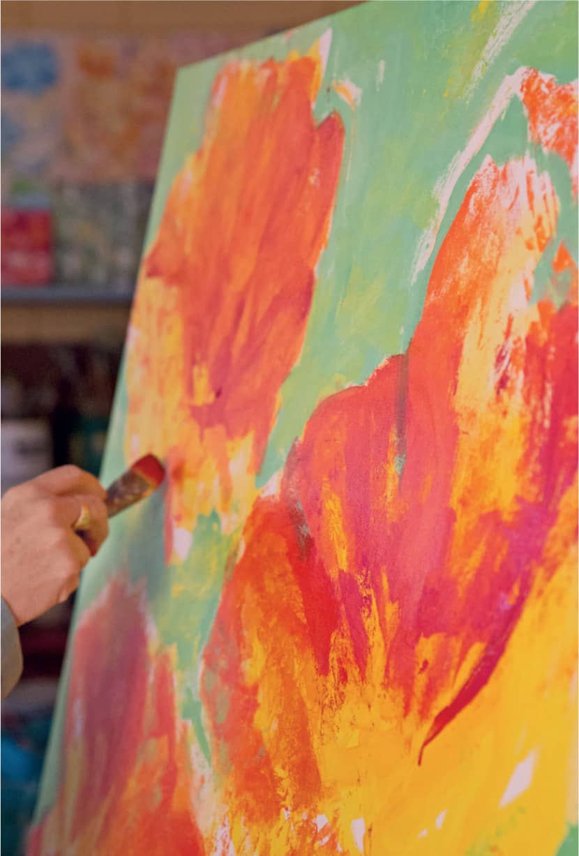
I lightly tap some orange across the yellow to suggest the thin, delicate impression of the petals.
Step 6. Art is a wonderful process of starting with a loose idea, making decisions about it, and then refining it until you know it’s done. I have made most of the big decisions about this painting. The process isn’t over yet, but now I can relax and have fun refining the blossoms further.
I use smaller brushes—small, synthetic flats. I make a point of using new brushes now, so I can achieve a tidy edge. My brushstrokes become smaller. I continue to clean up the blossom edges by outlining them with various light, dark, and yellow greens. Yellow greens are for the foliage tucked around the petals. The darker blue green is for the small spaces between the lighter leaves and around the edges of the design.
Detailing reds
Step 7. I take a break to sit in my big studio chair and “listen” to the painting. What is it saying? Does it need something here? Is it too busy there? Can I feel the delicate vitality of the petals?
Working in the greens
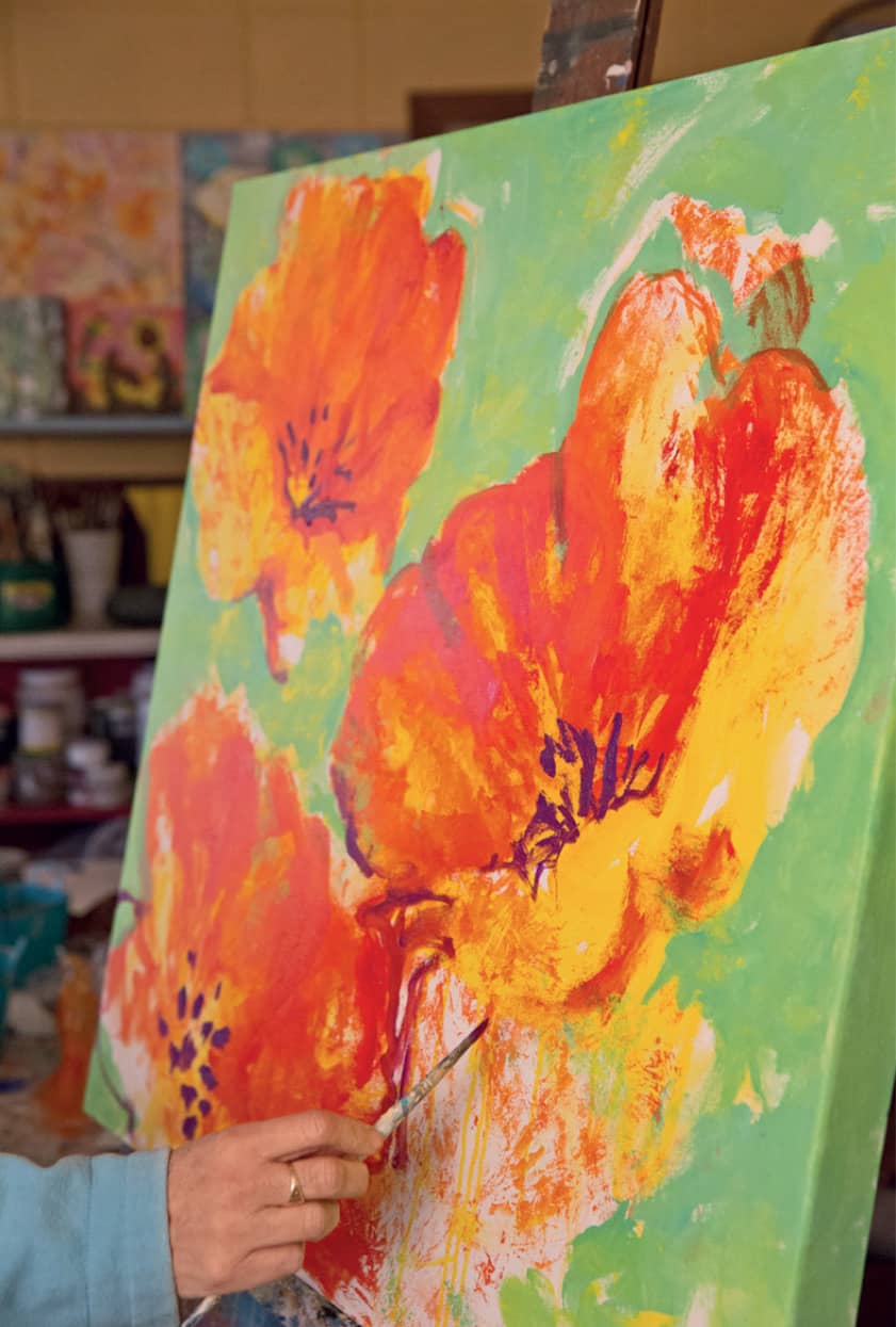
Step 8. Finishing up this acrylic is a wonderful slow dance of adding glimpses of detail among the leaves. I add a graceful bending stem of the curve of a shadowed petal. I also add more dark details to the centers. I look for the most “talkative” blossom, the one that the others seem to be listening to.
I adjust the flowers’ strengths by varying detail and contrast. The most important flowers have the darkest, most dramatic centers, and the less important may have just a few spots of body color. The centers of the flowers become less dramatic as the eye moves away from the center of the painting. I’ve tried to capture the feeling that I am leaning into these flowers and leaves.

Painting details with a small, round brush
Step 9. I’m happy with the outcome of this painting. It has the bright colors and interesting design of my earlier watercolor plus the physical texture and presence of acrylic. It seems to call out “come look at me” when you walk into its space. That’s what attracted me to the nasturtiums, when I photographed them in the garden.
As I finish up, I use crisp drawn lines of bright red to refine the shapes.
Geraniums. Acrylic on canvas. 20" × 20" (51 × 51 cm).
Queen Anne’s Lace Evening. Acrylic on canvas. 30" × 30" (76 × 76 cm).
Nasturtiums #5. Acrylic on canvas. 30" × 30" (76 × 76 cm).
Tulip Tango #2. Acrylic on canvas. 30" × 30" (76 × 76 cm).