
CHAPTER 5: Julia Goes All Data Science-y

Before we dig into using Julia to help with our data science endeavors, let’s take a look at the data science pipeline, in order to get a sense of perspective. The high level pipeline will be covered in this chapter, and subsequent chapters will get into the details.
Data Science Pipeline
Unlike other types of data analysis (e.g. statistics), data science involves a whole pipeline of processes, each stage intricately connected to each other and to the end result, which is what you ultimately share with the user or customer. As we demonstrated in Chapter 1, Julia fits in well in almost all of these processes, making it an ideal tool for data science projects. We’ll start with an enhanced version of our data science chart from earlier, seen here in Figure 5.1.
In general, data science involves one of two things: the creation of a data-driven application (usually referred to as a data product), or the generation of actionable insights. Both of these end results are equally worth examining, though certain data streams lend themselves more to one than the other. To achieve these end results, a data scientist needs to follow the steps presented in this figure, in roughly this order, paying particular attention to the end result.
The first three processes are often referred to collectively as data engineering. Julia is helpful in completing all the tasks within this part of the pipeline, even without any additional packages. Data engineering is something we’ll focus our attention on, as it typically takes up around 80% of a data scientist’s work, and is often considered the most challenging part of the pipeline.
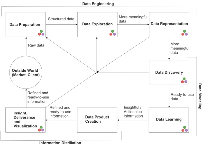
Figure 5.1 A map showing the interconnectivity of the data science process. The direction of the lines connecting the nodes is not set in stone; there are often back-and-forth relationships between consecutive phases of the process. Also, we have proposed a grouping of these stages that may help you better organize them in your mind.
The two stages following data engineering can be considered the data modeling part of the process–where all the fun stuff happens. Julia also shines in these stages, as its efficiency is a huge plus when it comes to all the resource-heavy work that is required. However, Julia’s base functions aren’t as adequate in this phase of the pipeline, and it relies heavily on the packages developed for the relevant tasks.
The results of all your hard work are revealed to the world in the final two stages, which we can call information distillation. Actually, this part of the process doesn’t have an official name and hasn’t been formally researched, but it is equally important and is inherently different than the other two groups of stages. It’s worth considering on its own.
In this chapter we’ll explore each one of the processes of the pipeline at a high level, examining how it integrates with the other processes, as well as with the end result. Parallel to that, we’ll see how all this translates into specific actions, through a case study using a realistic dataset. In this case study, we’ll be working with a fictitious startup that plans to promote Star Wars®-related products from various sellers, catering to an audience of fans that populate its Star Wars-themed blog. The firm started by collecting some survey data from a random sample of its users, questioning their experience with the Star Wars franchise. Now they’re trying to answer questions like “what product should we market to particular individuals?” and “what is the expected revenue from a particular customer?”
Jaden is the startup’s data scientist, and he recently starting working with Julia. Jaden’s first observation is that these questions relate to the variables FavoriteProduct and MoneySpent, which will be our target variables. Let’s see how he goes about applying the data science process on this project, which is known inside the company as “Caffeine for the Force”.
The Caffeine for the Force project is fleshed out in the IJulia notebook that accompanies this chapter. We encourage you to take a look at it as you go through this chapter. This notebook will give you a better grasp of the bigger picture and how all the concepts presented in this chapter are translated into Julia code. Finally, there is some room for improvement of this project–the code is not optimal. This is because in practice you rarely have the resources to create the best possible code, since data science is not an exact science (particularly in the business world). A great way to learn is to play, so definitely play with this notebook to optimize it as you see fit.
Data Engineering
Data preparation
This is a fundamental process, even though it is not as creative or interesting as the ones that follow. Paying close attention to this stage enables you to proceed to the following stages smoothly, as you will have laid a solid foundation for a robust data analysis. Think of it as tidying up your desk at work, organizing your documents and your notes, and making sure that all your equipment is working. Not a lot of fun, but essential if you want to have a productive day!
Data preparation first involves cleansing the data and encoding it in matrices (or arrays in general), and often in data frames. A data frame is a popular data container that was originally developed in R. It’s a strictly rectangular formation of data, which offers easy access to its variables by name instead of indexes; this enables the user to handle its contents in a more versatile manner than conventional arrays.
For the data attributes that are numeric (ratio variables), this process also entails normalizing them to a fixed range (usually [0, 1], or (0, 1), or around 0 with a fixed dispersion level). The latter is the most commonly used normalization method and it involves subtracting the mean (μ) of the variable at hand and dividing the result by the standard deviation (σ). When it comes to string data, normalization entails changing all the text into the same case (usually lowercase). For natural language processing (NLP) applications in particular, it involves the following techniques:
- • Retaining only the stem of each word instead of the word itself, a process known as stemming (for example running, ran, and run would also be changed into “run” as they all stem from that root word).
- • Removing “stop words”, which add little or no information to the data (e.g. “a”, “the”, “to”, etc.). You can find various lists of stop words at http://bit.ly/29dvlrA).
- • Removing extra spaces, tabs ( ), carriage returns ( ) and line breaks ( ).
- • Removing punctuation and special characters (e.g. “~”).
Data cleansing is largely about handling missing values. For string-based data, it entails removing certain characters (e.g. brackets and dashes in phone number data, currency symbols from monetary data). This is particularly important as it allows for better handling of the data in the data representation and other parts of the pipeline.
Handling outliers is another important aspect of data preparation, as these peculiar data points can easily skew your model—even though they may contain useful information. They often need special attention, as discerning between useless and important outliers is not trivial. Although this process is easily done using statistical methods, some data scientists prefer to identify outliers in the data exploration stage. The sooner you deal with them, the smoother the rest of the process will be.
More often than not, the type of work required in data preparation is not readily apparent. It always depends on the information that is ultimately going to be derived from the data. That’s one of the reasons why it is difficult to automate this entire process, although certain parts of it can be handled in an automated way (e.g. text cleansing, variable normalization).
You can always revisit this stage and perform more rigorous engineering on the data, ensuring that it is even fitter for the applications required. Since this process can get messy, always document in detail everything you do throughout this process (ideally within the code you use for it, through comments). This will be particularly useful towards the end of your analysis when someone may inquire about your process, or for when you need to repeat this work for other similar data streams. We’ll go into the details of this part of the pipeline, along with other data engineering related processes, in Chapter 6.
In our case study, data preparation would involve filling out the missing values of each one of the variables, as well as normalizing the numeric variables (namely, MoviesWatched, Age and MoneySpent).
The output of the data preparation stage is not necessarily refined data that can be fed into a stats model or a machine learning algorithm. Often, the data will require additional work. This will become apparent only after the following stage, when we get to know the data more intimately. You can attempt to use the output on a model as-is, but it’s unlikely you’ll have any noteworthy results or performance. To ensure that you make the most of your refined data, you’ll need to get to know it better; this brings us to data exploration.
Data exploration
For most people, this open-ended stage of the pipeline is the most enjoyable part of any data science project. It involves calculating some descriptive statistics on the structured part of the data, looking into the unstructured data and trying to find patterns there, and creating visuals that can assist you in the comprehension of the data at hand. The patterns you find in the unstructured data are then translated into features, which can add quantifiable value to the dataset being built for your project.
Data exploration also enables you to come up with novel questions to ask about your data, which are often referred to as hypotheses. Hypotheses allow you to scientifically test the hunches you get from looking at the data, unveiling the information that is hidden in the data stream. Testing involves some statistics work as well as some reasoning, as you need to connect your findings with the bigger picture of your project. That’s why many people consider data exploration a creative process. As such, it is often a bit messy, and the visuals involved are more like “rough drafts” than polished products.
This part of the pipeline also includes carefully selecting which data to use for the analysis tasks at hand. In a way, data exploration is a manual search for the variables that are relevant to your questions.
When this process is automated, particularly in structured datasets, it is referred to as “association rules extraction,” which is a popular field of data analysis. However, automating your data exploration may lead to oversights, as it lacks the data scientist’s discerning eye and creative mind. Some manual work is inevitable if you are to produce truly valuable data science work. There is simply no substitute for the intuition that you, the data scientist, bring to the data exploration approach. We’ll cover data exploration in depth in Chapter 7.
Back at our startup, Jaden looks for any potentially insightful relationships among the variables, particularly between a feature and each one of the target variables (e.g. the correlation of average values of Age with MoneySpent, as depicted in the plot in Figure 5.2). He also creates histograms for each relationship he explores, like the one for FavoriteProduct (Figure 5.3), which reveals a noticeable class imbalance.
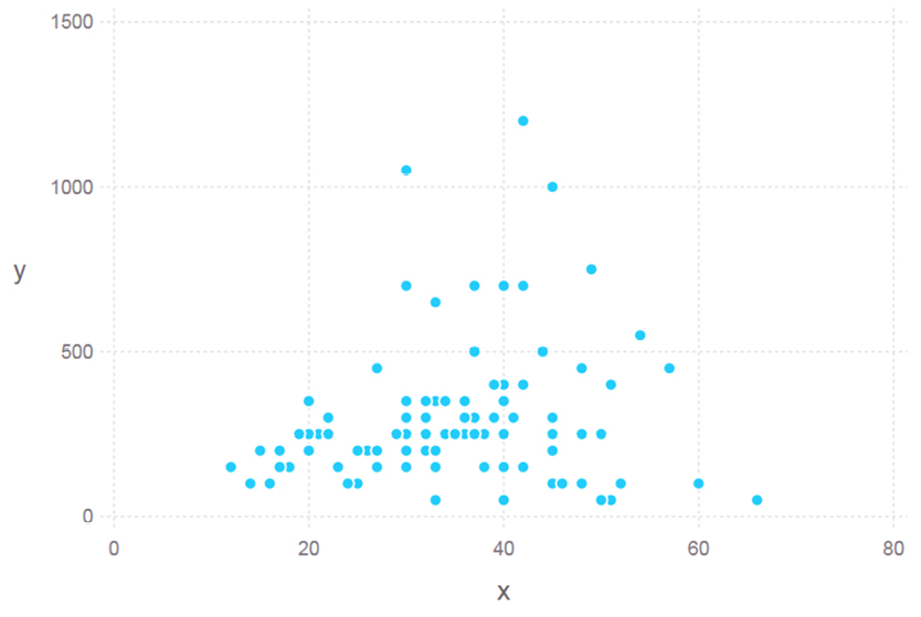
Figure 5.2 A visual for the data exploration stage of the “Caffeine for the Force” project. Although not so refined (since Jaden is the only one needing to use them), it depicts an interesting pattern that sheds some light on the problem at hand.
All this information, though not actionable, will help Jaden understand the dataset in greater depth and better choose the right models and validation metrics to use. Plus, if one of the graphics he creates at this stage looks particularly interesting, he can refine it and use it in the visualization stage.
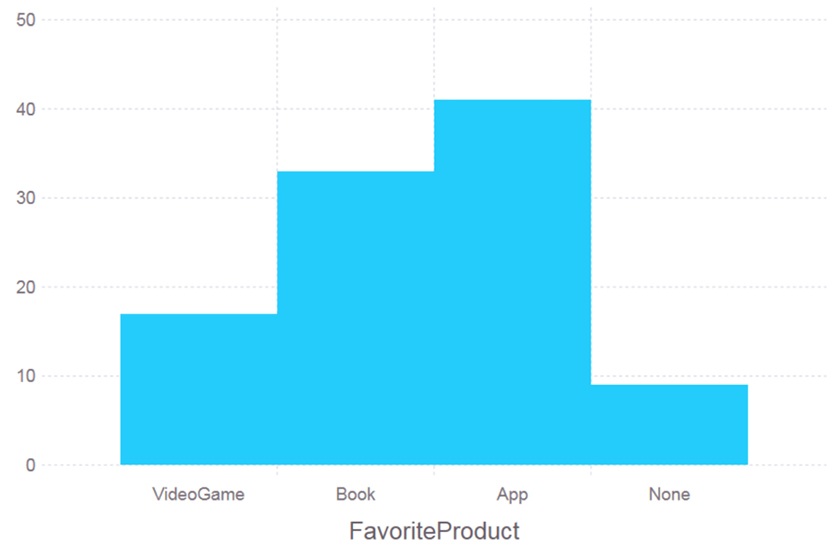
Figure 5.3 Another visual for the data exploration stage of the “Caffeine for the Force” project. This one reveals that the classes of the dataset are not balanced at all; this will prove useful later on.
Data representation
Data representation addresses the way data is coded in the variables used in your dataset. This is particularly useful for larger datasets (which are the bread and butter of a data scientist) as good data representation allows for more efficient use of the available resources, particularly memory. This is important, as even when there is an abundance of resources (e.g. in the cloud) they are not all necessarily free, so good resource management is always a big plus. In addition, representing data properly will make your models more lightweight and allow for higher speed and sustainability. You’ll be able to reuse them when more data becomes available, without having to make major changes.
Picking the right type of variable can indeed make a difference, which is why declaring the variable types is essential when importing data from external sources or developing new features. For example, if you are using a feature to capture the number of certain keywords in a text, you are better off using an unsigned 8- or 16-bit integer, instead of the Int64 type, which takes four to eight times the memory and uses half of it on negative values which you’d never use in this particular feature.
This is also helpful when it comes to understanding the data available and dealing with it in the best way possible (e.g. employing the appropriate statistical tests or using the right type of plots). For example, say you have a numeric attribute that takes only discreet values that are relatively small. In this case it would make more sense to encode this data into an integer variable—probably a 16-bit one. Also, if you were to plot that feature, you would want to avoid line or scatter plots, because there would be lots of data points having the same value.
Data representation also involves the creation of features from the available data. This is an essential aspect of dealing with text data, as it is difficult to draw any conclusions directly from the text. Even some basic characteristics (e.g. its length in characters, the number of words it contains) can reveal useful information, though you may need to dig deeper in order to find more information-rich features. This is why text analytics techniques (especially Natural Language Processing, or NLP) rely heavily on robust data engineering, particularly data representation.
Feature creation is also important when it comes to signal processing, including processing data from medical instruments and various kinds of sensors (such as accelerometers). Even though such signals can be used as-is in certain analytics methods, usually it is much more efficient to capture their key aspects through certain features, after some pre-processing takes place (e.g. moving the signal into the frequency domain or applying a Fourrier transformation).
In our example, Jaden will need to do some work on the representation of the nominal variables. Specifically, we can see that FavoriteMovie and BlogRole are variables with more than two distinct values and could be broken down into binary groups (e.g. BlogRole could be translated into IsNormalUser, IsActiveUser, and IsModerator). Gender, on the other hand, could be changed into a single binary.
Unfortunately there is no clear-cut stopping point for the data representation stage of the data science process. You could spend days optimizing the representation of your dataset and developing new features. Once you decide that enough is enough (something that your manager is bound to be kind enough to remind you of!), you can proceed to other more interesting data science tasks, such as data modeling.
Data Modeling
Data discovery
Once your dataset is in a manageable form and you have explored its variables to your heart’s content, you can continue with the data modeling segment of the pipeline, starting with data discovery. Patterns are often hiding within data in the feature space’s structure, or in the way the data points of particular classes populate that space. Data discovery aims to uncover these hidden patterns.
Data discovery is closely linked with data exploration; it is usually during data explorations that the patterns in the data begin to reveal themselves. For example, you may run a correlation analysis and find out that certain features have a high correlation with your target variable. That in itself is a discovery that you can use in the predictive model you’ll be building. Also, you may find that certain variables correlate closely with each other, so you may want to weed them out (remember, less is more).
Hypothesis formulation and testing is also essential in this part of the pipeline. That’s where a good grasp of statistics will serve you well, as it will enable you to pinpoint the cases where there is a significant difference between groups of variables, and to find meaningful distinctions between them. All this will ultimately help you build your model, where you will try to merge all these signals into a predictive tool.
Sometimes, even our best efforts with all these techniques don’t provide all the insights we expected from our data. In such cases, we may need to perform some more advanced methods, involving dimensionality reduction (which we’ll cover in Chapter 8), visualization (Chapter 7), and even group identification (Chapter 9). Also, certain patterns may become apparent only by combining existing features (something we’ll examine more in Chapter 6). An example of a technique often used in this stage is factor analysis, which aims to depict which features influence the end result (the target variable) the most, and by how much.
Skilled data discovery is something that comes with experience and practice. It requires delving thoughtfully into your data–more than just applying off-the-shelf techniques. It is one of the most creative parts of the whole data science process and a critical part of building a useful model. Yet, we’ll often have to revisit it in order to continuously improve the model, since this stage’s workload is practically limitless.
Upon examining our case study’s dataset more closely, we realize that none of the variables appear to be good predictors of the FavoriteProduct overall, although some of them do correlate with certain values of it. Also, none of the variables seem to correlate well with the MoneySpent apart from Age, although the connection is non-linear.
Data learning
Data learning is a process that involves the intelligent analysis of the patterns you have discovered in the previous stages, with the help of various statistical and machine learning techniques. The goal is to create a model that you can use to draw some insightful conclusions from your data, by employing the process of generalization. In this context, generalization refers to the ability to discern high-level patterns in a dataset (e.g. the form of rules), empowering you to make accurate predictions with unknown data having the same attributes (features).
Generalization is not an easy task; it involves multiple rounds of training and testing of your model. More often than not, in order to achieve a worthwhile generalization you will need to create several models, and sometimes even combine various models in an ensemble. The ultimate goal is to be able to derive the underlying pattern behind the data and then use it to perform accurate predictions on other data, different from that which you used to train your model.
Naturally, the better your generalization, the more applicable (and valuable) your model will be. That’s why this process requires a great deal of attention, as there is a strong impetus to go beyond the obvious patterns and probe the data in depth (hence the term “deep learning,” which involves sophisticated neural network models that aim to do just that).
A computer can learn from data in two different ways: using known targets (which can be either continuous or discreet) or on its own (without any target variable). The former is usually referred to as supervised learning, as it involves some human supervision throughout the learning process. The latter approach is known as unsupervised learning, and it is generally what you will want to try out first (sometimes during the data exploration stage).
An important part of this whole process (especially for the unsupervised learning case) is validation. This involves measuring how well the model we have created performs when applied to data that it’s not trained on. In other words, we put its generalization ability to the test and quantify how accurate it is, either by measuring how many times it hits the right target (classification) or by calculating the error of the estimated target variable (regression). In any case, this validation process often leads to plots that provide interesting insights to the model’s performance.
Data learning is an essential part of the data science pipeline, as it is the backbone of the whole analysis. Without proper data learning, you would be hard-pressed to create a worthwhile data product or generate conclusions that go beyond the traditional slicing and dicing methods of basic data analytics. Although this stage is usually the most challenging, it is also the most enjoyable and requires some creativity, especially when dealing with noisy data. We’ll further discuss this part of the data science process in Chapters 10 and 11, where we’ll be looking at methods like Decision Trees, Support Vector Machines, k means, and more.
As for our case study, the way data learning can be applied is twofold: first as a classification problem (predicting the FavoriteProduct nominal variable using the first five variables), and then a regression problem (predicting the value of the MoneySpent numeric variable using the same feature set). You can view the performance of one of the models created (for the classification problem), depicted through the Receiver Operating Characteristic (ROC) curve in Figure 5.4.
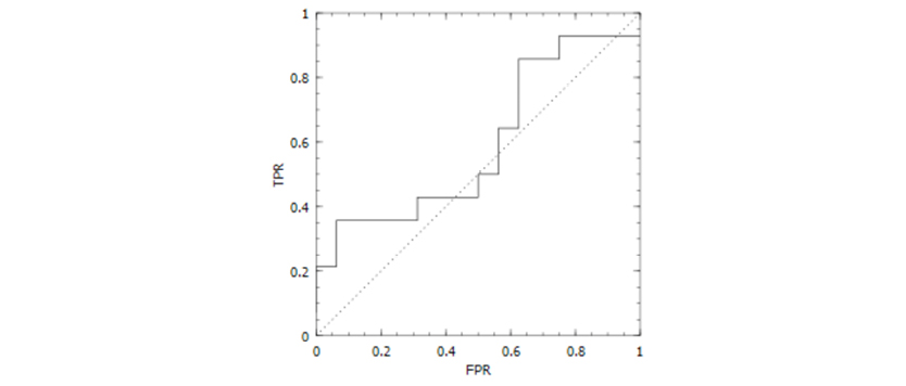
Figure 5.4 An ROC curve illustrating the performance of the best one of the classification models (random forest) developed for the “Caffeine for the Force” project.
Information Distillation
Data product creation
This stage of the pipeline encompasses several tasks that ultimately lead to the creation of an application, applet, dashboard, or other data product. This makes all the results gleaned throughout the previous parts of the pipeline accessible to everyone in an intuitive way. Moreover, it is usually something that can be repeatedly used by the organization funding your work, providing real value to the users of this product. As you would expect, it may need to be updated from time to time, or expanded in functionality; you will still be needed once the data product is deployed!
To create a data product you need to automate the data science pipeline and productionalize the model you have developed. You also must design and implement a graphical interface (usually on the web, via the cloud). The key factor of a data product is its ease of use, so when building one you should optimize for performance and accessibility of its features.
Examples of data products are the recommender systems you find on various websites (e.g. Amazon, LinkedIn), personalized interfaces on several retail sites (e.g. Home Depot), several apps for mobile devices (e.g. Uber), and many more. Basically, anything that can run on a computer of sorts, employing some kind of data model, qualifies as a data product.
Although the development of a data product comprises a lot of different processes that aren’t all dependent on use of a programming language, Julia can still be used for that particular purpose. However, this involves some of the more specialized and complex aspects of the language, which go beyond the scope of this book.
The data product created by our Star Wars Startup could take the form of an application that the marketing team will use to bring the right product to the right customers. The application could also indicate the expected amount of money that customers are willing to spend. Based on products like these, targeted and effective marketing strategies can be created.
Insight, deliverance, and visualization
This final stage of the data science pipeline is particularly important as it has the highest visibility and provides the end result of the entire process. It involves creating visuals for your results, delivering presentations, creating reports, and demonstrating the data product you have developed.
The insights derived from data science work tend to be actionable: they don’t just provide interesting information, but are used practically to justify decisions that can improve the organization’s performance, ultimately delivering value to both the organization and its clients. Insights are always intuitively supported by a model’s performance results, graphics, and any other findings you glean from your analysis.
Delivering your data product involves making it accessible to its targeted audience, acquiring feedback from your audience, making improvements based on the feedback, and when necessary tweaking your process and expanding its capabilities.
Although visualization takes place throughout the pipeline (particularly in the data exploration stage), creating comprehensive and engaging visuals in this final stage is the most effective way to convey your findings to people who aren’t data scientists. These visuals should be much more polished and complete than those generated in previous steps; they should have all the labels, captions, and explanations necessary to be completely self-explanatory and accessible to people with a wide range of knowledge of and experience with data analysis and the topic in question.
Insight, delivery, and visualization may be the final stage of the data science pipeline, but they may also launch the beginning of a new cycle. Your findings will often fuel additional hypotheses and new questions that you’ll then attempt to answer with additional data analysis work. The new cycle may also require you to apply your previous model to different types of data, leading you to revise your model.
Jaden is finally ready to wrap up his data analysis. Figure 5.5 demonstrates one of the many ways Jaden can share the insights derived from his analysis. Furthermore, the data product from the previous stage can enter a beta-testing phase, and some visuals like the one in Figure 5.5 can be shared with the stakeholders of the project.
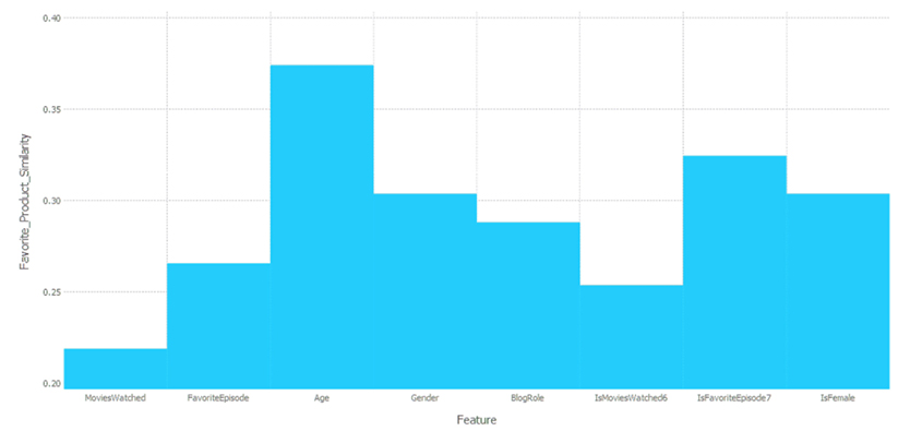
Figure 5.5 A visual data product for the final stage of the “Caffeine for the Force” project. What’s shown here is the relative importance of each feature used in the classification model.
Keep an Open Mind
Although there has been considerable effort to introduce packages that enhance the data science process, you don’t need to rely on them exclusively. This is because unlike Python, R, and other high-level languages, Julia doesn’t rely on C to make things happen. So, if you find that you need a tool that is not yet available in the aforementioned packages, don’t hesitate to build something from scratch.
The data science process is often messy. It’s not uncommon to glue together pieces of code from various platforms in order to develop your product or insight. Julia helps solve this patchwork problem by being more than capable of handling all your data science requirements. Still, if you wish to use it only for one particular part of the process, you can always call your Julia script from other platforms, such as Python and R. Naturally, the reverse applies too; should you wish to call your Python, R, or even C scripts from Julia, you can do that easily (see Appendix D for details on how to do both of these tasks).
Finally, it’s important to keep in mind that the data science process is not set in stone. As the field evolves, some steps may be merged together, and we may even see new steps being added. So, it’s good to keep an open mind when applying the process.
Applying the Data Science Pipeline to a Real-World Problem
Let’s consider the spam dataset we discussed in the previous chapters, as it’s a concept familiar to anyone who has used email. This dataset consists of several hundred emails in text format, all of which are split into two groups: normal (or “ham”) and spam. The latter class is much smaller, as you would hope. Now let’s see how each part of the pipeline would apply in this case study.
Data preparation
First of all, we’ll need to structure the data. To do that, we have to decide what parts of the email we plan to use in our data product, which might be a spam filter that a user can use on their computer or smartphone. If we want to make this process relatively fast, we should opt for simplicity, using as few features as possible.
One way to accomplish structuring the data is to focus on one aspect of the email which usually contains enough information to make the call of “spam or ham”: the subject line. We have all received emails with subjects like “free Viagra trial” or “sexyJenny’s date invite is pending,” and it doesn’t take much to figure out that they are not legitimate. So, our spam detection data product could actually work if it learns to recognize enough email subjects like these ones.
To prepare our data for this task, we’ll need to extract just the relevant parts of the emails. Upon looking closer at the various email files, you can see that the subject is always prefaced by the character string “Subject:“ making it easy to identify. So, in this stage of the pipeline we’ll need to extract whatever follows this string, on that line. To make things simpler, we can remove all special characters and set everything to lowercase.
Also, the location of the email (i.e. the folder it is stored in) denotes whether it is spam or not, so we can store this information in a variable (e.g. “IsSpam”). We could attempt a finer distinction of the email type by marking the normal emails “easy_ham” or “hard_ham,” and naming the class variable “EmailType,” though this would complicate the model later on (you are welcome to try this out, once you master the simpler approach we’ll work with here).
Data exploration
Now that we have gotten our data neatly trimmed, we can start probing it more thoroughly. To do that, we’ll try out different features (e.g. number of words, length of words, the presence of particular words) and see whether they return different values across the classes (in the simplest case, between the spam and ham cases). We’ll also create a variety of plots, and try to understand what the feature space looks like. In this stage we’ll also look at some statistics (e.g. mean, mode, and median values) and run some tests to see if the differences we have observed are significant.
For example, if we noticed that the average length of the subject line is much greater in the spam class, we may be inclined to use that as a feature, and possibly investigate other similar features (e.g. the maximum length of the words). In this stage we may also try out various words’ frequencies and remove the ones that seem to be present too often to make any difference (e.g. “a”, “the”). These are often referred to as “stop words” and are an important part of text analytics.
Data representation
In this part of the pipeline we’ll be looking at how we can encode the information in the features in an efficient and comprehensible way. It makes sense to model all features related to countable objects as integers (e.g. the number of words in the subject), while all the features that take two values as Boolean (e.g. the presence or absence of the “RE” word), and features that may have decimal values are better off as float variables (e.g. the average number of letters in the words of the subject).
Since the counts may not yield all the gradients of the information present in a particular buzz word, we may go a step further and apply statistical methods more specific to this particular problem. For instance, we could try a Relative Risk or Odds Ratio, a couple of continuous metrics that can be derived from a contingency table. Alternatively, we can just leave the counts as they are and just normalize the features afterwards. At this stage, don’t be shy about creating lots of features, since everything and anything may add value to the model. If something ends up without much use, we’ll find out in the statistical tests we run.
Data discovery
Now things will get more interesting as we delve into the information-rich aspects of the dataset. It’s here that we’ll be experimenting with more features, stemming from our better understanding of the dataset. It’s not uncommon to use some machine learning techniques (like clustering) at this stage of the pipeline, as well as dimensionality reduction (since it’s practically impossible to visualize a multidimensional dataset as it is). Using a machine learning technique may reveal that certain words tend to appear often together; this is something we could summarize in a single feature.
During the data discovery phase we’ll also assess the value of the features and try to optimize our feature set, making sure that the ensuing model will be able to spot as many of the spam emails as possible. By evaluating each one of these potential features using the target variable (IsSpam) as a reference, we can decide which features are the most promising and which ones can be omitted (since they’ll just add noise to the model, as in the case of the “stop words”). Once we are satisfied with what we’ve discovered and how we’ve shaped the feature set, we can move on to figuring out how all this can be summed up into a process that we can teach the computer.
Data learning
In this stage we’ll put all our findings to the test and see if we can create a (usually mathematical or logical) model out of them. The idea is to teach the computer to discern spam emails from normal ones, even if such a skill is entirely mechanical and often without much interpretability.
The ability to interpret results is critical, since the project manager of the data science project has to be able to understand and convey the key elements of the model (such as the importance of specific features). Whatever the case, the model will be much more sophisticated and flexible than the strictly rule-based systems (often called “expert systems”) that were the state-of-the-art a few years ago.
In the data learning stage we’ll build a model (or a series of models, depending on how much time we can devote) that takes the features we created in the previous stages and use them to predict whether an email is spam, often also providing a confidence score. We’ll train this model using the email data we have, helping it achieve a high level of generalization so that it can accurately apply what it has learned to other emails. This point is important because it dictates how we’ll evaluate the model and use it to justify all our work. Predicting the known data perfectly is of no use, since it’s unlikely that the same identical emails will reach our mailboxes again. The “true” value of the model comes when it’s able to accurately identify an unfamiliar email as spam or “ham.”
Data product creation
Once we’re convinced that we have a viable model, we are now ready to make something truly valuable out of all this hard work. In this stage we would normally translate the model into a low-level language (usually C++ or Java), though if we implement the whole thing in Julia, that would be entirely unnecessary. This proves that Julia can provide start-to-finish solutions, saving you time and effort.
We may want to add a nice graphical interface, which can be created in any language and then linked to our Julia script. We can also create the interface in a rapid application development (RAD) platform. These platforms are high-level software development systems that make it easy to design fully functional programs, with limited or no coding. Such systems are not as sophisticated as a regular production-level programming languages, but do a very good job at creating an interface, which can then be linked to another program that will do all the heavy lifting on the back end. A couple of popular RAD platforms are Opus Pro and Neobook.
We are bound to make use of additional resources for the data product, which will usually be in a cloud environment such as AWS / S3, Azure, or even a private cloud. To do this, we will need to parallelize our code and make sure that we use all the available resources. That may not be necessary if we just need a small-scale spam-detection system. But if we are to make our product more valuable and useful to more users, we’ll need to scale up sooner or later.
Insight, deliverance, and visualization
Finally, we can now report what we’ve done and see if we have a convincing argument for spam detection based on our work. We’ll also create some interesting visuals summarizing our model’s performance and what the dataset looks like (after the data discovery stage). Naturally, we’ll need to make a presentation or two, perhaps write a report about the whole project, and gracefully accept any criticism our users offer us.
Based on all of that, and on how valuable our work is to the organization that funds this project, we may need to go back to the drawing board and see how we can make the product even better. This could entail adding new features (in the business sense of the word) such as automatic reports or streaming analytics, and will most likely target improved accuracy and better performance.
Finally, at this stage we’ll reflect upon the lessons learned throughout the project, trying to gain more domain knowledge from our experience. We’ll also examine how all this spam-detection work has helped us detect potential weaknesses we have in the application of the whole pipeline, so that we can ultimately become better data scientists.
Summary
- • The end result of a data science project is either a data product (e.g. a data-driven application, a dashboard), or a set of actionable insights that provide value to the organization whose data is analyzed.
- • The data science pipeline comprises seven distinct stages, grouped together into three meta-stages:
- • Data Engineering:
- ◦ Data preparation – making sure the data is normalized, is void of missing values, and in the case of string data, doesn’t contain any unnecessary characters.
- ◦ Data exploration – creatively playing around with the data, so that we can understand its geometry and the utility of its variables. This involves a lot of visualization.
- ◦ Data representation – encoding the data in the right type of variable and developing features that effectively capture the information in that data.
- • Data Modeling:
- ◦ Data discovery – pinpointing patterns in the data, often hidden in the geometry of the feature space, through the use of statistical tests and other methods.
- • Data learning – the intelligent analysis and assimilation of everything you have discovered in the previous stages, and the teaching of the computer to replicate these findings on new, unfamiliar data. Information distillation includes:
- ◦ Data product creation – the development of an easily accessible program (usually an API, app, or dashboard) that makes use of the model you have created.
- ◦ Insight-deliverance-visualization – the stage with the highest visibility, involving the communication of all the information related to the data science project, through visuals, reports, presentations, etc.
- • Although the components of the data science process usually take place in sequence, you’ll often need to go back and repeat certain stages in order to improve your end result.
- • The completion of one data science cycle is often the beginning of a new cycle, based on the insights you have gained and the new questions that arise.
- • Julia has packages for all the stages of the data science process, but if you cannot find the right tool among them, you can always develop it from scratch without compromising your system’s performance.
- • Although Julia can deliver every part of the data science pipeline, you can always bridge it with other programming tools, such as Python and R, if need be (see Appendix D).
- • The data science process is an ever-evolving one. The steps presented here are not etched in stone. Instead, focus on the essence of data science: transforming raw data into a form that you can use to create something valuable to the end-user.
Chapter Challenge
- 1. What is data engineering? Is it essential?
- 2. What is the importance of the data preparation stage?
- 3. What’s the main difference between data science and other data analysis pipelines?
- 4. How would you perform data preparation on the following data: “The customer appeared to be dissatisfied with product 1A2345 (released last May).”
- 5. What does data exploration entail?
- 6. What are the processes involved in data representation?
- 7. What is included in data discovery?
- 8. What do we mean by data learning?
- 9. What is the data product creation process?
- 10. What takes place during the insight, deliverance, and visualization phase? How is it different from the creation of a data product?
- 11. Is the data science pipeline a linear flow of actions? Explain.
- 12. What is a data product and why is it important?
- 13. Give a couple of examples of data products.
- 14. How are the visualizations created in the final stage of the pipeline different from the ones created in the data exploration stage?
- 15. Are all the aspects of the pipeline essential? Why?