Chapter 14
BASIC IMAGE EDITING
The topic of image editing, or “postprocessing,” is broad (and sometimes confusing) enough in scope to be the subject of numerous books and online resources. Here, I will only touch on the very basics and, while I share my own workflow for organizing and editing images, mine is only one of many possible procedures. I usually do minimal image processing, as I’d rather be out shooting than sitting at a computer!

Image-Editing Software
The two software programs that photographers most commonly use to develop, or “optimize,” images are Adobe Photoshop and Adobe Lightroom. I use Photoshop, which offers an extensive and powerful range of image-processing tools and design functions. It includes the RAW conversion plug-in Adobe Camera RAW (ACR) and comes with a separate file browser program called Adobe Bridge. It was originally developed decades ago as a graphic design program that was quickly adopted by photographers.
Lightroom, developed many years later, is a powerful all-in-one image-processing and file-management program targeted expressly toward photographers. Lightroom’s Develop module contains the same optimization tools as in ACR plus a limited number of other Photoshop-like functions. But the program’s greatest strength lies in efficient file browsing and organization.
Given Lightroom’s obvious advantages, why do I still restrict myself to using Photoshop? Blame inertia! I’ve used Photoshop for many years and have methods to optimize my images that I’m comfortable with, including some of the more creative tools in Photoshop that are absent from Lightroom.
I want you to learn directly from the masters of image processing, and so I’ll direct your attention to a few excellent sources of information:
- Two books recently published by Rocky Nook (the publisher of this book): The Enthusiast’s Guide to Lightroom (2017) and The Enthusiast’s Guide to Photoshop (2018) both by Rafael “RC” Concepcion.
- Photoshop for Photographers bundle of video courses online by Adobe Photoshop master educator Tim Grey at www.greylearning.com.
The RAW Advantage
Before we get going, I’ll put in another plug for shooting in RAW mode. RAW capture provides the maximum amount of digital information captured by the camera’s sensor and gives you the most control over how your images will ultimately appear. You can interpret and manipulate that information in various ways repeatedly during postprocessing. Preset camera parameters—such as white balance, contrast, and exposure—are not permanent in a RAW file, whereas in JPEG mode, those settings are irreversibly applied at the moment of capture. Trying to fix errors in a JPEG file usually degrades the image. The downside is that RAW files must be converted to another format such as TIFF or PSD for use, but it is through the wide-reaching control you have during the conversion process that the power of RAW becomes obvious.
Workflow
When you’re processing numerous images, it’s vital to be organized and proceed in a systematic way.
My workflow includes the following steps:
- 1. Download images into a new folder on the computer. For this example I’ll call my folder New Pix.
- 2. In Bridge, open New Pix, select all images, and then add contact and copyright information. (Tip: Create a metadata template to do this efficiently.)
- 3. Make a backup copy of the entire New Pix folder on an external hard drive (my RAW Archive).
- 4. Still in Bridge, select and open an image (or a batch of images). This automatically opens the ACR dialog box (figure 14.1).
- 5. Within the ACR dialog box, examine the image(s) for sharpness at 100% magnification via the Zoom tool.
Star those that warrant keeping by reason of being sharply focused and/or showing something interesting or special. Delete any that are completely out of focus.
- 6. Within the ACR basic adjustments window, check the image and its histogram. Adjust color and tone, if necessary, using the following sliders: White Balance (Temperature affects blue and yellow tones, Tint affects green and magenta tones), Exposure, Highlights, Shadows, and Vibrance. (I only occasionally use the other sliders.) These adjustments can be made either to a single image or to an entire batch.
- 7. Click Open Image(s) to open the selected image(s) in Photoshop. Save each as a TIFF file in the same New Pix folder. My filenames include the original file number as well as brief subject description, such as AmOystercatcherFlight_8633.
- 8. In Photoshop, straighten and/or crop each image as necessary, clean up the image by removing dust spots, flaws, or distracting elements.
- 9. Apply targeted adjustments and tweak color balance as needed.
- 10. Add caption and keywords. At this point the image is in its final form.
- 11. Save the image in my Image Collection archive, the working collection from which I pull images for clients. It resides on a dedicated internal hard drive on my desktop computer and is hierarchically organized into folders and subfolders, for instance Birds: North America>Birds of Prey>Mississippi Kite.

Figure 14.1: The ACR dialog box. In this example, I am evaluating a batch of seven images as shown in the leftmost panel. The image at the top is rated with a star to signify I consider it worth optimizing and converting into usable form. The histogram for the selected image is in the upper right, and below that is a set of movable sliders to adjust various parameters. To work more efficiently, you may select all the images and then apply the same optimization adjustments to each.
- 12. After converting all the worthwhile images in the New Pix folder, make another backup copy of this entire folder to a second external hard drive (my Edited Archive). Yes, I make multiple backups of my files!
- 13. Delete the New Pix folder from the computer.
- 14. For output—for instance for publication, to make prints, or to post online—I apply noise reduction as necessary (usually only to the image background), resize the image, and save it as a separate output file. Depending on the intended use, I may sharpen the image.
A Word about Sharpening
Images being prepared for output often benefit from a small amount of judicious sharpening, but it is a process in which less can be more. The secret is subtlety. Heavy-handed sharpening makes a subject look unnatural, yet it’s a pitfall that many photographers fall into when learning image processing. Signs that you’ve taken it too far are details with a too crisp, almost grainy quality and/or a faint, white halo around the edge of the subject. View images at 100% magnification to make sure you don’t over-do sharpening, especially when preparing images for web use.
I use Unsharp Mask found in Photoshop’s Filter menu (Filter>Sharpen>Unsharp Mask). It works by enhancing contrast along the edges of the subject. The Unsharp Mask dialog box contains three adjustable parameters to fine-tune the sharpening effect: Amount, Radius, and Threshold. Each combination of picture and intended use will require its own set of sharpening values, but as a very general rule of thumb, for a high-resolution output file such as I might use for an 11" × 14" print, I would use the values Amount 100, Radius 1, and Threshold 4. I rarely sharpen web-size images.
Photoshop Tips and Tricks
I prefer to leave the content of my images as close to the original capture as possible, and so, the workflow I’ve outlined above is all I do for most of my images. But by now you’ve doubtless discovered that you often can’t control field conditions nor can you avoid making occasional mistakes. It’s inevitable that some of your shots will have minor flaws. Next, I’ll show you a few Photoshop methods to remedy them. First, though, familiarize yourself with the various tools within Photoshop’s Tool Palette, especially the following:
- Selection tools (Marquee, Lasso, Magic Wand)
- Cloning tools (Healing Brush, Spot Healing Brush, Clone Stamp)
- Eraser tool
- Dodge and Burn tools
- Crop tool
You may want to learn about using Layers, Adjustment Layers, and Layer Masks, too.
Fixing Exposure Errors
If you still need to be convinced to shoot in RAW mode, consider the overexposed Mute Swans shown in figure 14.2. Notice the burned out white areas on the swans, also revealed by the peak abutting the histogram’s rightmost edge. One of RAW capture’s greatest benefits is the ability to correct exposure errors such as this without losing image quality. This is achieved during the process of RAW conversion using the adjustment sliders in the ACR dialog box. Figure 14.3 shows how I recovered the feather detail using the Exposure and Highlights sliders (see figure 1.14 in chapter 1 for the finished image, including equipment details and camera settings). Had the image been captured as a JPEG, I could have darkened the image during editing, but those white areas would simply have become flat gray with no feather detail.
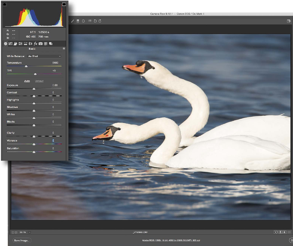
Figure 14.2: The Adobe Camera RAW dialog box containing the original unadjusted capture of a Mute Swan pair. As the image and the histogram reveal, the birds’ wings and back are overexposed and show no detail in the feathering.

Figure 14.3: The optimized image after Exposure and Highlights sliders were adjusted to recover detail in the birds’ white feathers on the wings and back.
Removing Distractions
To clone or not to clone? That is indeed the question! Before I spend time removing distracting elements, I decide whether or not the final image will be worth the effort. Maybe the shot has redeeming qualities such as a bird displaying interesting behavior, I think it is marketable, or maybe I simply like it for some aesthetic reason. I rarely, if ever, make huge changes in a shot. Also, it’s important to keep in mind that removing (other than by cropping) or adding elements disqualifies an image for most photo contests. It’s best to be honest about what you have done to an image.
The image of an American Oystercatcher in figure 14.4 has some obvious distracting elements. I used several Photoshop tools to clean up the shot. I removed the out-of-focus bird in the distance and the shadow in the foreground by first selecting them and a small part of their surroundings using the Lasso tool and then deleting the contents of the selection using Delete>Content-Aware Fill (see next section). I used the Healing Brush to remove the pole at the top of the frame. I disguised the tire tracks by picking a color from the sand and painting over the tracks using the Brush tool at reduced opacity. Finally, I used the Crop tool to produce the final image in figure 14.5.
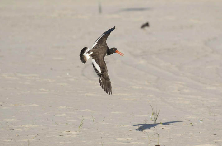
Figure 14.4: The original capture of a flying American Oystercatcher has several background and foreground distractions. Because it is an otherwise appealing image showing great action and a pleasing wing position, I decided it was worth keeping and, therefore, removed the flaws.
The types of distractions I sometimes remove include stray twigs in the frame and food fragments or bright highlights on a bird’s bill. I designate files that have had anything but minor content alteration by appending the letter “R” (short for “retouched”) to the filename and briefly describe the alterations in the caption. Standard optimization adjustments such as exposure, contrast, saturation, white balance, and cropping are not considered content alteration.
Improving Composition by Adding Space
Like me, you probably sometimes capture an interesting, sharp shot that is poorly framed. The culprit usually is a fast moving or flying bird! Cropping can help, but if the subject is close to an edge and facing out of the frame, as is the flying Acorn Woodpecker in figure 14.6, a different solution is needed. To improve the composition, add space to the image, which in Photoshop parlance translates to extending the canvas.

Figure 14.5: The optimized image of an American Oystercatcher, distractions removed and the image cropped so the subject fills more of the frame.
Canon EOS 7D Mark II with EF 100–400 mm IS II lens (at 400mm), handheld, 1/2000 sec., f/8.0, ISO 500. Nickerson Beach, Long Island, New York.
Choose Image>Canvas Size, pick an anchor point and extension color, and then type in the new dimensions. For figure 14.6 I added white space on the right of the frame. Next, I selected the white area, and hit Delete. In the resulting drop-down Fill menu, I chose Content-Aware, which filled the new space with blue sky. Finally, I cropped away empty space on the left of the frame for the final composition in figure 14.7.
Content-Aware Fill is also a powerful method to remove distractions from an image, but because it works by sampling the surroundings to come up with the content of the fill, it gives the best results when the area around the unwanted object is smooth and evenly toned. Avoid using it to remove objects surrounded by a lot of detail, or where there is pronounced contrast, tonality, or patterns, because doing so can introduce odd-looking artifacts.
How do you add space to a highly detailed image such as the two Arctic Terns flying over buttercups at the beginning of this chapter? The original capture had one bird too near the frame’s left edge. I solved the problem by examining other frames in the same sequence of images to find a matching area—a narrow strip of habitat—to serve as fill. I copied and pasted it into the canvas extension that I’d created on the left of the frame, then used the Eraser and Healing Brush tools to carefully blend the new material with the existing content.
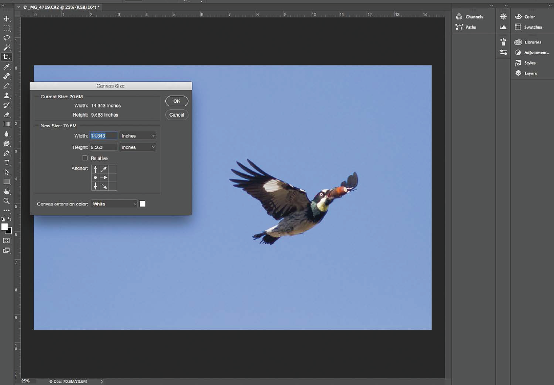
Figure 14.6: A poorly framed image of an Acorn Woodpecker in flight carrying an acorn. The Canvas Size dialog box shows I am ready to extend the image canvas to the right.

Figure 14.7: The same image after the canvas was extended on the right of the frame to improve composition.
Canon EOS 7D with EF 400mm f/5.6L USM lens, handheld, 1/2000 sec., f/6.3, ISO 500. Mt. Diablo State Park, Walnut Creek, California.
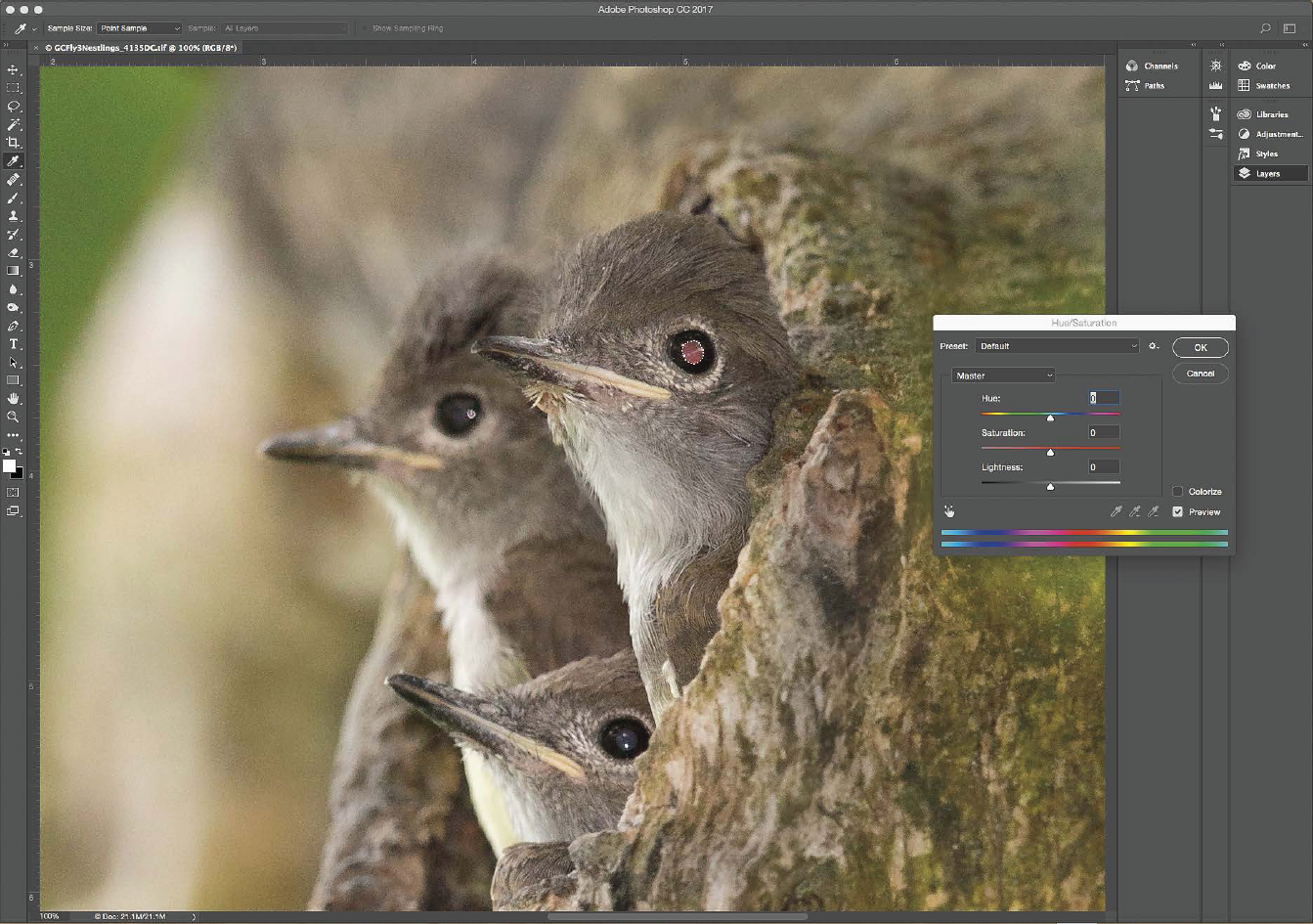
Figure 14.8: Three Great Crested Flycatcher soon-to-fledge nestlings look out of their nest hole entrance. One is afflicted with red-eye. The bird’s pupil is selected and the Hue/Saturation dropdown menu is open in preparation for desaturating the red color.
Red-Eye Repair
Using flash sometimes produces ugly eye-shine called “red-eye” or “steel-eye.” Although it’s best solved by readjusting the flash position (see chapter 2), it can also be dealt with during postprocessing. The Photoshop Screenshot in figure 14.8 shows an image of Great Crested Flycatcher nestlings, of which the upper-right bird is afflicted with red-eye.
Following are the steps I use to remedy this type of problem:
- 1. In Photoshop, select the bird’s entire pupil using the Lasso or Magic Wand tool.
- 2. Choose Image>Adjustments>Hue/Saturation. Move the Saturation slider to left to reduce saturation of the red tones (they will turn gray).
- 3. With pupil still selected, choose Image>Adjustments>Brightness/Contrast. Move Brightness slider to left and Contrast slider to right to darken pupil.
- 4. For steel-eye (silvery appearance of pupil), skip step 2, as only step 3 is needed.

Figure 14.9: The red-eye of the upper-right nestling has been remedied.
Canon EOS 5D Mark III with EF 500mm f/4/L IS II lens, 1.4× III teleconverter, Gitzo tripod, Canon Speedlight 580 EXII, Better Beamer flash extender, 1/2000 sec., f/5.6, ISO 400. Central New York.
Figure 14.9 shows the final image.
Alternatively, you can use Photoshop’s Red Eye Removal tool, but I prefer the above process because it retains the eye’s dimensionality and natural appearance.
Red-eye repair is an example of a problem that calls for a targeted adjustment: changing a particular part of an image but not the entire shot. Targeted adjustments can be achieved in several ways. Here, you learned one simple way: using a selection tool to select the target area and then applying an adjustment. More flexible methods entail Layers, Adjustment Layers, and Layer Masks. These powerful functions let you go back to an earlier step of the process and change the extent or amount of adjustment if necessary. I encourage you to explore these Photoshop techniques for yourself. You’ll likely use them frequently as your image-processing skills evolve.

Figure 14.10: Northern Gannet carrying nest material. Original, unprocessed capture.
Canon EOS 7D Mark II with EF 100–400 mm IS II lens (at 160mm), handheld, 1/1600 sec., f/5.6, ISO 640. Cape St. Mary’s Ecological Reserve, Newfoundland.

Figure 14.11: Screenshot showing two layers: the original, low-contrast capture on top of a background layer that was processed to be darker and with higher contrast. The upper layer has been carefully erased away to reveal only the darkened main subject underneath. The final image (figure 12.11) combined the two layers into one.
Targeted Adjustments
Targeted adjustments were used to optimize the image of a Northern Gannet on a foggy morning (see figure 12.11). Figure 14.10 shows the original image converted from the RAW file with no adjustments. My goal was to retain the foggy appearance of the background birds while enhancing the main subject so that it stood out better from the background. The final image was a combination of two separate RAW conversions layered one on top of the other.
Refer to figure 14.11 as you follow through my workflow:
- 1. I made one conversion from the low-contrast, original capture with no adjustments (we’ll call it image #1).
- 2. I made a second, darker and higher-contrast conversion processed using the following slider settings in ACR: Highlights −17, Blacks −54, Vibrance +63, and Saturation +6 (image #2).
- 3. Image #2 (the processed file) served as the background layer.
- 4. I selected and copied image #1 and pasted it on top of image #2 to form a new layer (figure 14.11).
- 5. Using the Eraser tool with a very small brush size, I carefully erased away the flying bird in the upper layer to reveal the darkened layer underneath.
- 6. I lowered the opacity of the upper layer slightly.
- 7. Finally, I flattened the image (i.e., combined the two layers into one) and saved it.
I’ve described a mere handful of the vast range of Photoshop tools and techniques available. Now it’s up to you to explore them for yourself. But before I end this chapter, let’s get creative!
Escape from Reality
If your goal is to render images as true to life as possible, Photoshop gives you the tools to do that. But it also gives you the power to push the boundaries of reality, if you so desire. Here is an example of how I changed a blah shot into something dramatic and unique with just a few simple steps in Photoshop.
First, the back story: By the time I finally got around to photographing the consistently present flock of White Pelicans in figure 14.12, on the last evening of my trip to Utah’s Bear River Migratory Bird Refuge, the light was dull and flat under an overcast sky. But I captured a few images anyway. Not surprisingly, they were nothing special.
Revisiting the shots months later, I decided to play with them in Photoshop, processing beyond what I would normally do, moving away from reality and toward art. I chose one of the more interesting frames that included two pelicans stretching up with open bills. Figure 14.12 shows the original unprocessed capture, and figures 14.13 and 14.14 show the results of my experimentation.

Figure 14.12: White Pelican flock. The original unprocessed capture taken in flat lighting under an overcast sky.
Canon EOS 7D Mark II with EF 500mm f/4/L IS II lens, 1.4× III teleconverter, Gitzo tripod, 1/500 sec., f/11, ISO 800. Bear River Migratory Bird Refuge, Utah.

Figure 14.13: In this processed version of figure 14.12, the color, saturation, and contrast have been intensified to create a dramatic, hyper-realistic version of the drab original.

Figure 14.14: The image has been processed one step further away from reality by the addition of the Plastic Wrap filter in Photoshop.
The following is what I did to produce figure 14.13:
- 1. In ACR, I moved the Temperature slider toward blue and the Tint slider toward magenta; I substantially increased Vibrance and Saturation; and then I opened the image in Photoshop.
- 2. In Photoshop, I chose Image>Adjustments>Levels. I then pulled the ends of both the Input sliders inward, substantially increasing the contrast.
- 3. Finally, I used the Burn tool with a large brush size to further darken the background.
This made the originally drab image considerably more dramatic and interesting. It would have been fine to stop at this point, but I was in a playful mood. I went one step further from reality by choosing Filter>FilterGallery>Artistic> Plastic Wrap to produce figure 14.14. I love it!
They’re your images. Play!