In earlier chapters, from basics of the form we learned how to style, validate, and link our form with the database. In this section, we will learn how to make our form responsive.
We will re-use our form that we styled earlier and will see the new technique with which we can make our forms responsive.
The HTML code remains the same except that the following links are added to the <head> tag of the HTML page.
The following first line mentioned is the viewport <meta> tag:
<meta name="viewport" content="width=device-width, initial-scale=1.0" />
The second line is an external media query (explained for example). The code is maintained in a separate file but the media query is written in the <head> tag.
The following mentioned CSS file will get included and comes into action when the device screen resolution width is lower than or exactly 520 px, but as soon as the device resolution exceeds 520 px in width, the media query is no longer active.
In the styling, we have set the widths of the input text element to be 85 percent. We have also cleared the value of the form element radio button marked with the gender class to be none. Adjustments have been made in the styling of the Submit button with the font size set to 15 px and increasing the width to 23 percent. The class for date of birth, div_dob, is also cleared to none so that it falls under the same line in a sequential manner.
<link rel='stylesheet' media='screen and (max-width: 520px)' href='Css/Internal_MediaQuery.css' />
Here is the code written in CSS:
#masteringhtml5_form .txtinput.textbox{
  width: 85%;
}
#masteringhtml5_form .txtinput{
  width: 85%;
}
#masteringhtml5_form .gender{
  float:none;
}
#masteringhtml5_form .gender span{
  font-size: 14px;
}
#masteringhtml5_form .txtinput.select{
  width: 97%;
}
#masteringhtml5_form .submit_btn{
  font-size:15px;
  width:23%;
  padding-top: 3px;
  padding-bottom: 3px;
}
#masteringhtml5_form .div_dob{
  width: 100%;
  float:none;
}
The preceding CSS code is already explained in Chapter 3, Styling the Forms, but the important point here is the internal media query that makes our form responsive for small screen devices.
The third line is the external media query file linked to the main HTML page:
<link href="Css/External_MediaQuery.css" rel="stylesheet" />
The following snippet is the CSS code that is maintained in a separate file:
@media screen and (min-width: 1169px) and (max-width: 1255px){
  #masteringhtml5_form .txtinput{
    width:45.7%;
  }
  #masteringhtml5_form .dateinput{
    width: 90%;
  }
}

@media screen and (min-width: 957px) and (max-width: 1170px){
  #masteringhtml5_form .txtinput{
    width:44.7%;
  }
  #masteringhtml5_form .dateinput{
    width: 90%;
  }
#masteringhtml5_form .txtinput.textbox{
    width: 94%;
  }
}

@media screen and (min-width: 811px) and (max-width: 958px){
  #masteringhtml5_form .txtinput{
    width:43.7%;
  }
  #masteringhtml5_form .txtinput.textbox{
    width: 93.7%;
  }
  #masteringhtml5_form .dateinput{
    width: 88%;
  }
}

@media screen and (min-width: 707px) and (max-width: 812px){
  #masteringhtml5_form .txtinput{
    width:42.7%;
  }
  #masteringhtml5_form .txtinput.textbox{
    width: 92.7%;
  }
  #masteringhtml5_form .dateinput{
    width: 88%;
  }
}

@media screen and (min-width: 624px) and (max-width: 708px){
  #masteringhtml5_form .txtinput{
    width:41.7%;
  }
  #masteringhtml5_form .txtinput.textbox{
    width: 92%;
  }
  #masteringhtml5_form .dateinput{
    width: 86%;
  }
}

@media screen and (min-width: 567px) and (max-width: 625px){
  #masteringhtml5_form .txtinput{
    width:40.7%;
  }
  #masteringhtml5_form .txtinput.textbox{
    width: 90%;
  }
  #masteringhtml5_form .dateinput{
    width: 84%;
  }
}

@media screen and (min-width: 521px) and (max-width: 568px){
  #masteringhtml5_form .txtinput{
    width:39.7%;
  }
  #masteringhtml5_form .txtinput.select{
    width: 48.7%;
  }
  #masteringhtml5_form .txtinput.textbox{
    width: 90%;
  }
  #masteringhtml5_form .dateinput{
    width: 84%;
  }
}
In the preceding code, the media query is applied to the media type screen having the specific minimum width of the screen to the specific maximum width of the screen. We have overwritten the width of the classes txtinput, select, and dateinput that adjust according to the screen resolution. The elements reflow and adjust according to the specific screen resolution.
The following screenshots are of our form that we have made responsive. This responsive form responds for both web browser (changing the browser size) and various device screen resolutions.
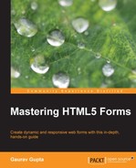
For resolution 480 x 800, our form looks as the following screenshot:
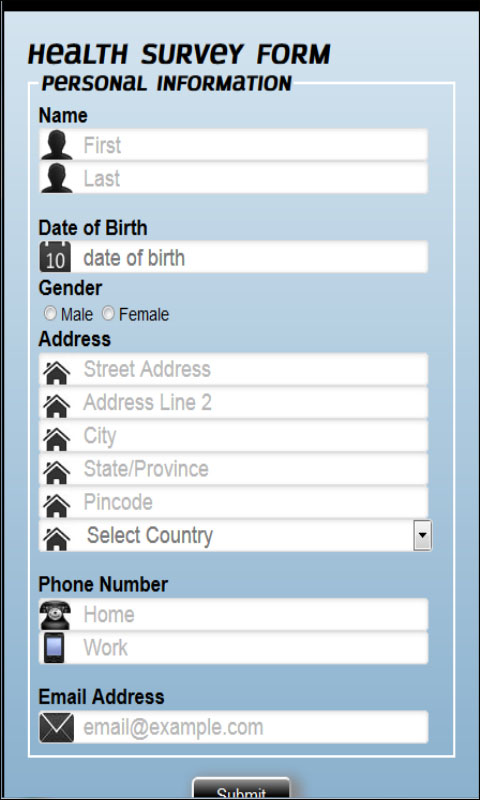
For resolution 768 x 1024, our form looks as the following screenshot:
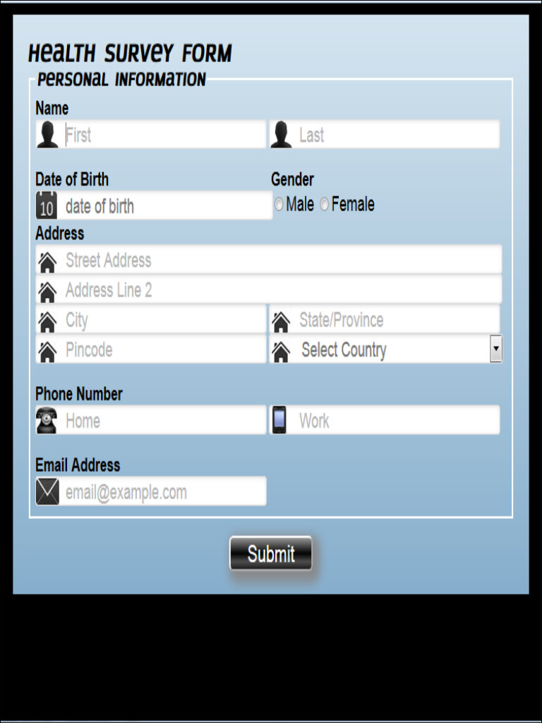
For resolution 1280 x 800, our form looks as the following screenshot:
For each particular resolution, we can notice that we are able to view the full form without any scrolling from either side.
In the preceding scenarios, for different resolutions, some elements are resized and have been shifted dynamically from their original position for better user experience.
This way, our form dynamically responds to different resolutions.