After a quick revision of the new CSS3 properties, it's time to customize the old and boring forms.
In Chapter 1, Forms and Their Significance, we built a Health Survey Form. We will reuse that form example to talk about the new CSS3 as well as the basic CSS properties and how they work to enhance the creativity in the form.
For styling, we will just take the first part of the form which is Personal Information. With some minor changes which need no explanation, the following is the HTML code:
<form id="masteringhtml5_form">
  <label for="heading" class="heading">Health Survey Form</label>
  <fieldset class="fieldset_border">
    <legend class="legend">Personal Information</legend>
    <div>
      <label for="name">Name</label><br>
      <input  type="text" class="name txtinput" name="name" placeholder="First" autofocus>
      <input  type="text" class="name txtinput" name="name" placeholder="Last">
    </div><br>
    <div class="div_outer_dob">
      <div class="div_dob">
        <label for="dob">Date of Birth</label><br>
        <input type="date" value="date of birth" class="txtinput dateinput">
      </div>
      <div class="gender">
        <label for="gender">Gender</label><br>
        <input type="radio" name="gender"><label>Male</label>
        <input type="radio" name="gender"><label>Female</label>
      </div>
    </div>

    <div class="div_outer_address" >
      <label for="address">Address</label><br>
      <input type="text" class="txtinput textbox address_img" placeholder="Street Address"><br>
      <input type="text" class="txtinput textbox address_img" placeholder="Address Line 2"><br>
      <input type="text" class="txtinput  address_img" placeholder="City">
      <input type="text" class="txtinput  address_img" placeholder="State/Province"><br>
      <input type="text" class="txtinput  address_img" placeholder="Pincode">
      <select class="txtinput select address_img" >
        <option value="Country" class="select"  >Select Country</option>
        <option value="India" class="select"  >India</option>
        <option value="Australia" class="select"  >Australia</option>
      </select>
    </div><br>
    <div>
      <label for="contact">Phone Number</label><br>
      <input type="tel" class="txtinput  home_tel" placeholder="Home">
      <input type="tel" class="txtinput  work_tel" placeholder="Work">
    </div><br>
    <div>
      <label for="email">Email Address</label><br>
      <input type="email" class="txtinput  email" placeholder="[email protected]">
    </div>
    </fieldset>
    <br>

  <div class="submit">
    <input type="submit" class="submit_btn" value="Submit">
  </div>
</form>
Since our main focus is on styling, let us take a look at the CSS of the form. The following code is maintained in a separate file with a .css extension (external CSS file), which is linked to the main HTML page. Having a separate CSS file should be followed as it improves code readability as well as the maintenance of styling is made easier.
Also, new properties and font types are highlighted in bold:
/* General Form */
html{
  margin: 0px;
  padding: 0px;
  background: #000000;
}
@font-face{
  font-family: 'Conv_azoft-sans-bold-italic';
  src: url('fonts/azoft-sans-bold-italic.eot'),
  src: url('fonts/azoft-sans-bold-italic.woff') format('woff'),
  url('fonts/azoft-sans-bold-italic.ttf') format('truetype'), url('fonts/azoft-sans-bold-italic.svg') format('svg'),
  font-weight: normal;
  font-style: normal;
}

body{
  font-size:12px;
  height: 100%;
  width: 38%;
  padding: 20px;
  margin: 10px auto;
  font-family: Helvetica, Arial, sans-serif;
  color: #000000;
  background: rgba(212,228,239,1);
  background: -moz-linear-gradient(top, rgba(212,228,239,1) 0%, rgba(134,174,204,1) 100%);
  background: -webkit-gradient(left top, left bottom, color-stop(0%, rgba(212,228,239,1)), color-stop(100%, rgba(134,174,204,1)));
  background: -webkit-linear-gradient(top, rgba(212,228,239,1) 0%, rgba(134,174,204,1) 100%);
  background: -o-linear-gradient(top, rgba(212,228,239,1) 0%, rgba(134,174,204,1) 100%);
  background: -ms-linear-gradient(top, rgba(212,228,239,1) 0%, rgba(134,174,204,1) 100%);
  background: linear-gradient(to bottom, rgba(212,228,239,1) 0%, rgba(134,174,204,1) 100%);
}

input[type="radio"]{
  cursor:pointer;
}

#masteringhtml5_form .fieldset_border{
  border-color:#ffffff;
  border-style: solid;
}

#masteringhtml5_form .txtinput{
  font-family: Helvetica, Arial, sans-serif;
  border-style: solid;
  border-radius: 4px;
  border-width: 1px;
  border-color: #dedede;
  font-size: 18px;
  padding-left: 40px;
  width: 40%;
  color: #777;
  cursor:pointer;
}

#masteringhtml5_form .name{
  background: #fff url('images/user.png')  no-repeat;
}

#masteringhtml5_form  label{
  font-weight:bold;
  font-size:17px;
}

#masteringhtml5_form .legend{
  font-size: 18px;
  font-family: 'Conv_azoft-sans-bold-italic',Helvetica, Arial, sans-serif;
}

#masteringhtml5_form .heading{
  font-size: 24px;
  font-family: 'Conv_azoft-sans-bold-italic',Helvetica, Arial, sans-serif;
}

#masteringhtml5_form .txtinput.textbox{
  width:89%;
}

#masteringhtml5_form .address_img{
  background: #fff url('images/home.png')  no-repeat;
  background-position-y: -5px;
}

#masteringhtml5_form .txtinput.select{
  width:49%;
  color:#777777;
}

#masteringhtml5_form .div_outer_dob{
  width:100%;
}

#masteringhtml5_form .dateinput{
  width:79%;
  background: #fff url('images/date.png')  no-repeat;
  background-position-x: 1px;
  background-size: 29px 29px;
}

#masteringhtml5_form .home_tel{
  background: #fff url('images/tel.png')  no-repeat;
  background-position-x: 1px;
  background-size: 29px 29px;
}

#masteringhtml5_form .work_tel{
  background: #fff url('images/work.png')  no-repeat;
  background-size: 27px 25px;
}

#masteringhtml5_form .email{
  background: #fff url('images/email.png')  no-repeat;
}

#masteringhtml5_form .div_dob{
  width:50%;
  float:left;
}

#masteringhtml5_form .gender{
  width:50%;
  float:left;
}

#masteringhtml5_form .gender span{
  font-size:18px;
}

#masteringhtml5_form .div_outer_address{
  clear:both;
}

.legend{
  font-weight:bold;
  font-size:14px;
}

#masteringhtml5_form .submit{
  text-align:center;
}

#masteringhtml5_form .submit_btn{
  color:#ffffff;
  cursor:pointer;
  border-radius:5px;
  width: 17%;
  height: 100%;
  font-size: 21px;
  height:100%;
  box-shadow: 5px 5px 10px 5px #888888;
  background: rgb(149,149,149);
  background: -moz-linear-gradient(top,  rgba(149,149,149,1) 0%, rgba(13,13,13,1) 46%, rgba(1,1,1,1) 50%, rgba(10,10,10,1) 53%, rgba(78,78,78,1) 76%, rgba(56,56,56,1) 87%, rgba(27,27,27,1) 100%);
  background: -webkit-gradient(linear, left top, left bottom, color-stop(0%,rgba(149,149,149,1)), color-stop(46%,rgba(13,13,13,1)), color-stop(50%,rgba(1,1,1,1)), color-stop(53%,rgba(10,10,10,1)), color-stop(76%,rgba(78,78,78,1)), color-stop(87%,rgba(56,56,56,1)), color-stop(100%,rgba(27,27,27,1)));
  background: -webkit-linear-gradient(top,  rgba(149,149,149,1) 0%,rgba(13,13,13,1) 46%,rgba(1,1,1,1) 50%,rgba(10,10,10,1) 53%,rgba(78,78,78,1) 76%,rgba(56,56,56,1) 87%,rgba(27,27,27,1) 100%);
  background: -o-linear-gradient(top,  rgba(149,149,149,1) 0%,rgba(13,13,13,1) 46%,rgba(1,1,1,1) 50%,rgba(10,10,10,1) 53%,rgba(78,78,78,1) 76%,rgba(56,56,56,1) 87%,rgba(27,27,27,1) 100%);
  background: -ms-linear-gradient(top,  rgba(149,149,149,1) 0%,rgba(13,13,13,1) 46%,rgba(1,1,1,1) 50%,rgba(10,10,10,1) 53%,rgba(78,78,78,1) 76%,rgba(56,56,56,1) 87%,rgba(27,27,27,1) 100%);
  background: linear-gradient(to bottom,  rgba(149,149,149,1) 0%,rgba(13,13,13,1) 46%,rgba(1,1,1,1) 50%,rgba(10,10,10,1) 53%,rgba(78,78,78,1) 76%,rgba(56,56,56,1) 87%,rgba(27,27,27,1) 100%);
}
The result of the previous HTML and CSS code is as follows:
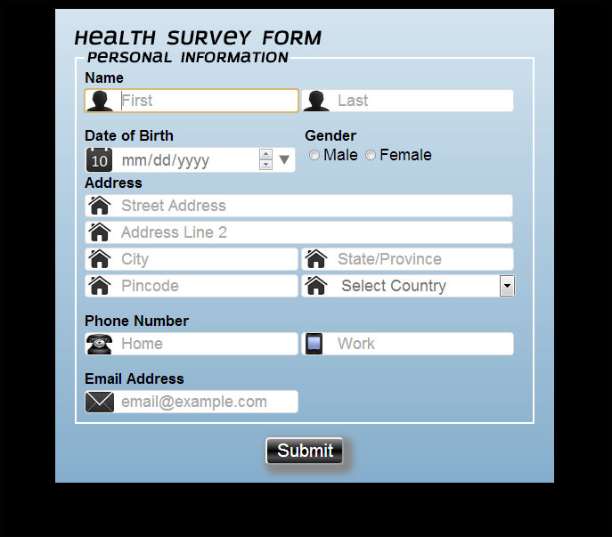
If we compare the new CSS3 form with the first section of the form which we built in Chapter 1, Forms and Their Significance, we will see the difference in the look and feel of both the forms.
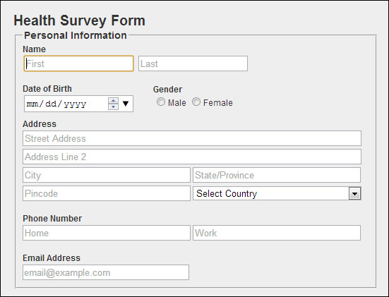
For better comparison, the first section of the form in Chapter 1, Forms and Their Significance, is given as follows:
Now, we realize the power of CSS3, using which we have converted a simple and boring form into something stylish and eye catching very easily.
Let us see the various selectors used in the CSS of the form and their significance:
An attribute such as background which utilizes the color (in terms of RBG), is set with the help of linear-gradient. The linear-gradient is described with the help of RBG color value, starting from the top with stop values defined as percentage till the bottom. They are described for the different browser supports which contain start values such as –webkit, -O, "and" -ms. It shows the blue background of the form. Apart from this, various other CSS attributes such as font-size, height, and width are also used.
headingandlegend: For our form heading (Health Survey Form) and legend heading (Personal Information), we have implemented a new font type,Conv_azoft-sans-bold-italic, which is defined in thefont-familyattribute in theheadingandlegendclass using the@font-faceproperty.We have imported the font type files
.eot,.woff,.ttf, and.svgfor supporting different browsers with the help of the@font-faceproperty.Also, for the
legendtag we have utilized thefieldset_borderclass for changing the border color and style.dateinputanddiv_dob: Both these classes are defined for the<input>typedatefor the user to pick his/her date of birth from the drop-down calendar. Thediv_dobclass is defined for the arrangement of the elements on the screen by utilizing thefloatattribute one the left-hand side. Along with it, thedateinputclass is used for placing the date icon with the help of thebackground,background-position, andbackground-sizeproperties for proper rendering.txtinput: Thetxtinputclass is used for styling the text inputs used in the form, and apart from using the previous CSS attributes, such asfont-familyandborder-style, we have used a new attribute namedborder-radiusto give the text input a rounded border on all sides.We have also added a property for the
cursortype as a pointer that shows a hand-click icon when we move the mouse pointer over the input field.The classes
name,address_img,home_tel,work_tel,email,dropdown, andcalendarhave been used for setting the background image for the text inputs fields with their respective icon images depending on the<input>type. We have utilized various properties of the background, such asbackground,background-position, andbackground-sizefor proper rendering of an icon image.The
autofocusattribute is used on the first name text input for the automatic focus of the cursor during the form load.radiobutton: The<input>typeradiois an old HTML input, which is used here for the purpose of selecting the gender. We have also used thefloatproperty for aligning the radio buttons on the right-hand side of the date of birth.We have also added a property for the
cursortype as a pointer that shows a hand-click icon when we move the mouse pointer over the input field.submit: For submitting the form to the server, we have created a Submit button. In thesubmit_btnclass we have performed button customization using the previous version properties such as color, width, and height, along with CSS3 properties such asborder-radiusto round the button from all sides,box-shadow, andbackgroundwith a color attribute usinglinear-gradientsto provide the desired effect.We have also added a property for the
cursortype which is a pointer that shows a hand-click icon when we move the mouse pointer over the input field.