
One of the most important things that will help you learn how to become better frontend developers is taking a look at a design mockup and dissecting how you would implement it within Drupal. This would mean asking ourselves questions along the way, such as how the homepage is put together, how a user interacts with a webpage, and how we are going to implement a specific functionality. In this chapter, we will do exactly that as we begin with a fully working HTML mockup that we can review within the browser and then convert it into a Drupal 8 theme, piece by piece. To give us a better idea of what we will be covering, let's review the following:
- We will start by reviewing our completely designed mockup with a Homepage, Interior page, Landing page, Blog posts, a Contact Us page with a Google map and web form, and other user interactions that we will need to build.
- Once we have a better understanding of what we are building, we will take a backup of the database and restore it onto our Drupal 8 instance. This will allow us to have a baseline starting point from which to build a theme.
- Finally, we will finish up with creating our new theme structure, including defining the metadata, creating our regions, and implementing one of several CSS and JavaScript libraries.
While we work through each section, we have the ability to refer to the Chapter05 exercise files folder. Each folder contains a start and end folder with files that we can use to compare our work when needed. This also includes database snapshots that will allow us to all start from the same point when working through various lessons.
Before we get started, let's open up the Mockup folder located in our exercise files and the index.html page using Google Chrome web browser. The Mockup contains a fully functioning HTML website that we have been tasked with developing for our client. We will be reviewing this mockup throughout the remaining chapters to compare against our final Drupal 8 theme, so let's get started.
Whether we are working for a digital agency or simply freelancing, in most cases, we will already have purchased a theme or designed one from scratch that has been built in pure HTML, CSS, and JavaScript. Having a theme already available to us makes our job as a frontend developer much easier in identifying what needs to be built. As we begin to review each page of our design, we will be taking notes about specific functionality that we will later revisit when creating our new theme. We will clearly point out such items as regions, page layouts, blocks of content, and how we would best implement CSS and JavaScript.
If we haven't already done so, let's open up the homepage of our mockup, as shown in the following image, and navigate as any other user visiting our site would.
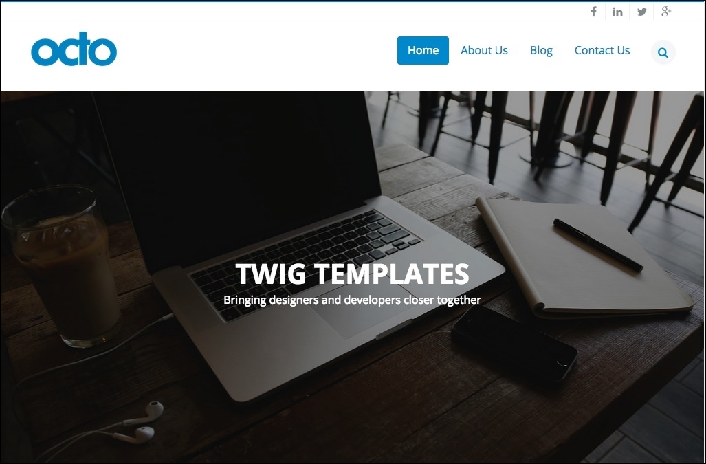
At first glance, our mockup seems to contain some very standard components, such as a header with a logo, menu, full page slider, and some social network icons. However, there are several hidden characteristics that we may have missed unless we click around our homepage.
The first item to point out is the search icon in the main menu. Clicking on this icon reveals a hidden search input that allows the user to search content, as shown in the following image:

We know that Drupal 8 provides the user with the ability to search database content as well as providing us with a search block that will need to account for in our theme.
The second item is a Parallax function where the background image moves at a slower rate than the text overlaid on it as we scroll. If we happened to click on the arrow icon at the bottom of the page instead of scrolling, we also discover that we are automatically taken to another section of the homepage. One thing to note is that the scrolling effect is smooth and not sudden. This Parallax method, as well as the smooth scroll effect, will require us to implement some custom JavaScript or libraries that assist in providing this type of user interaction.
Our third item is the fixed header containing the logo, main menu, and search element. When a user begins to scroll down the page, the header becomes fixed to the top of the viewport. This feature allows the end user to navigate anywhere within the website without having to scroll back to the top of any long-form content pages.
As we continue further down the homepage layout, we come to another section of content, as shown in the following image:
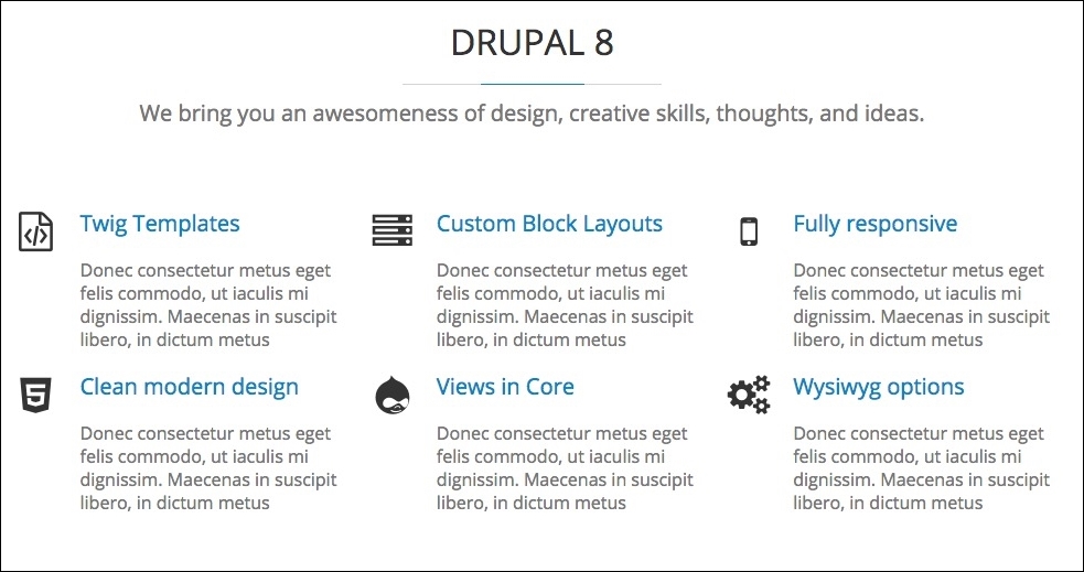
This section of content should be of no concern as it contains some simple markup with headings and blocks of text, but we will need to make a note of the icons being used. We will look at implementing these icons using Font-Awesome, a CSS toolkit that allows for iconic fonts.
Finally, our homepage consists of a footer and subfooter with three small blocks of content containing various text blocks and a form element, as shown in the following image:
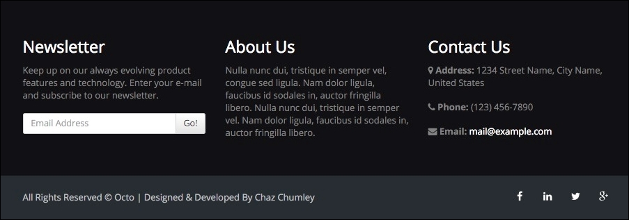
One thing to note is that our header and footer areas will be consistent throughout the mockup. Keeping this in mind, we will take a look at how to implement this in our theme without having to repeat the content from page to page.
One last exercise we need to consider based on our homepage is what visible regions we have that can contain content. Starting from the top of our homepage and ending at the bottom of our document, we should be able to identify the following regions:
- Top Header with social network icons
- Header with logo, menu, and hidden search element
- Headline section with static background and vertically sliding text
- Before Content section to display the content before the main content
- Content section with various blocks of content
- Footer with three separate blocks of text and form elements
- Sub footer with the left and right sections containing content
We will need to define these regions within our theme, along with any others we discover as we review the internal pages of our mockup.
Finally, let's review the notes we took that pertain to user experience and functionality that may be new to us and that we will need to implement when building our homepage. Such items are:
With our review of the complete homepage, it's now time to move on to the interior pages and investigate what else our mockup has in store for us.
Let's begin reviewing the About Us section of our mockup by clicking on the corresponding menu item in the header. As we begin to review our first interior page, we will note that our basic page layout includes a page title that spans across the width of our page, as shown in the following image:

This basic page differs from our homepage and is our first clue that we will need to consider one or more alternative page layouts for our interior pages.
After scrolling a little further down our page, we also find a section of content displaying team members that consists of a heading, subheading, and four blocks of identical content, highlighting each team member.
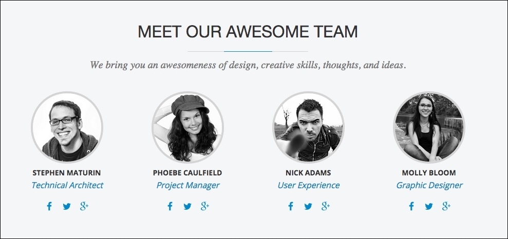
If we hover our mouse over each of the team member images, we will note a visual effect where the image fades from gray to full color. We will need to keep this in mind while identifying the fields that make up this piece of content and how we may need to manipulate the HTML markup to achieve this technique.
Our basic page is a simple one-column layout, which does not introduce any new layouts we may need to define as of yet, and which should not be too challenging to develop. It is also typical of most of the pages that a frontend developer or themer will face while creating themes.
Starting from the top of our interior page and ending at the bottom, we should be able to identify the following new regions:
- A title bar with a page title
- The After Content section to display content blocks below main content
We will need to define these regions within our theme along with any others we discover as we continue to review pages of our mockup.
One of the more complex page layouts in our mockup is that of the Blog section. If we navigate to the Blog landing page by clicking on the Blog menu item in our header, we will be presented with a very rich looking page, as shown in the following screenshot:
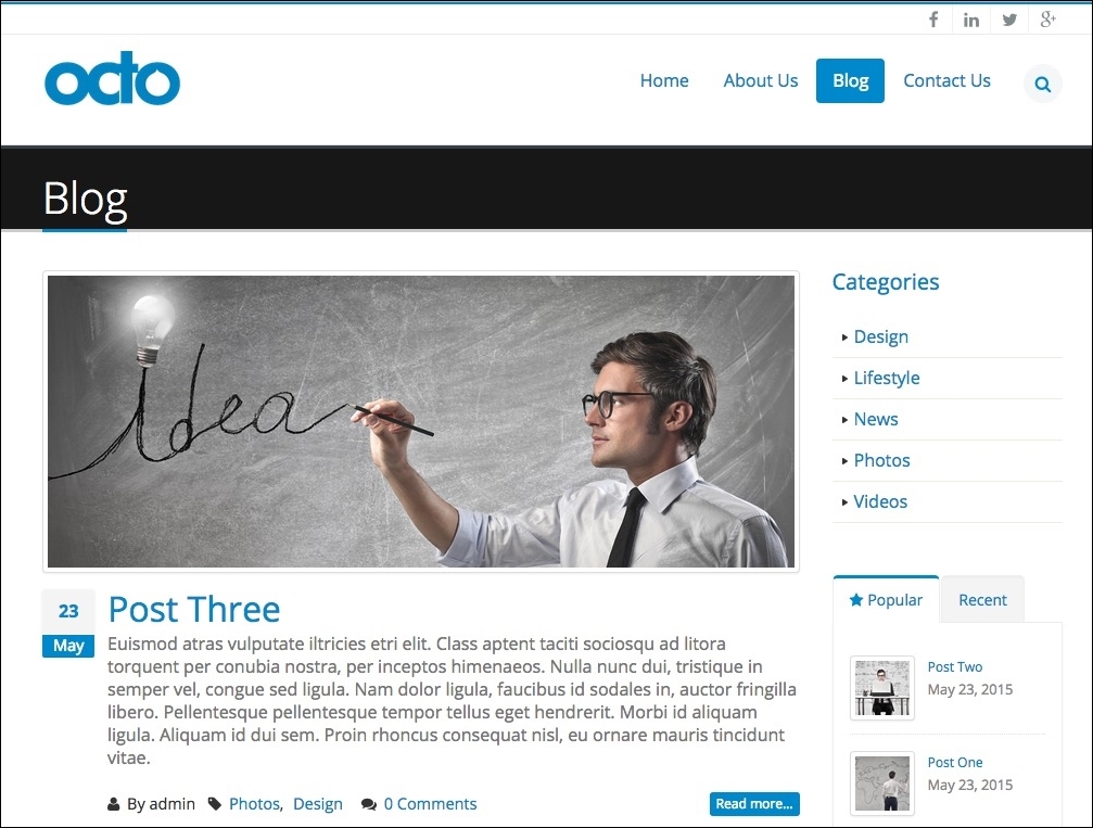
Landing pages often display a listing of content with related or highlighted information to accompany it. Our blog page is no different, and it consists of a teaser of content previewing each blog post and repeating down the page. We are also presented with a two-column layout with the content region to the left and a sidebar to the right. This page gives us our second layout to consider when creating our Twig templates.
Some other regions of content are the Categories listing and tabbed block of Popular and Recent blog posts that reside in the right sidebar. This content is just an extension of the blog post itself with a listing of taxonomy terms and a teaser. Drupal 8 will be able to handle vocabulary terms, View modes, and Views listing of content, all without having to worry about any contributed modules.
Because landing pages only generally provide us with a listing of content, let's quickly review the blog content in more detail beginning with browsing an individual blog post. We can accomplish this by clicking on the Post Two blog post title, which should bring us to the Post content type detail page.
It looks like the two-column page layout is being continued from our landing page to our detail page. This will make it very easy for us to develop a Twig template that both our teaser and full content views can use. We also have repeating sidebar content on our detail page as well. This is a great indication of blocks of content that we will need to make sure is reusable, another great feature of Drupal 8 since blocks can now be reused.
Before we move on to the View of our contact page, we need to keep in mind two different features of the Blog detail page. The first is a slider present when a post has multiple images, which is indicated by the two blue navigational dots.
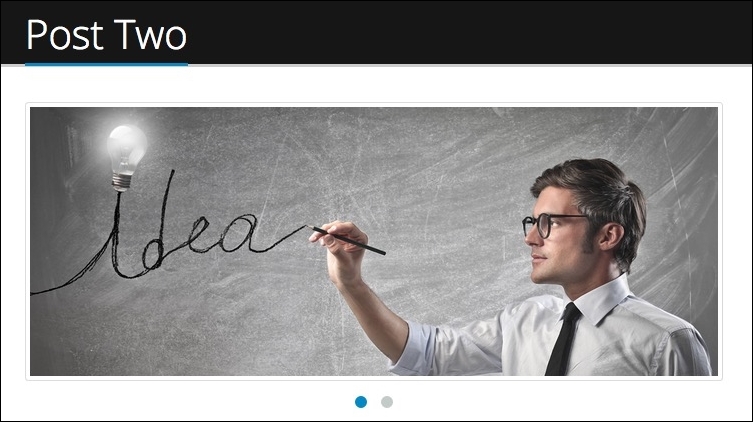
Upon closer inspection, we can view each image by clicking on either of the two dots. We will need to make another mental note when it comes to this image field and consider how we can determine if there are multiple images and how to apply the slideshow effect to them.
The other item of interest is towards the bottom of our Blog post, and it consists of a commenting feature, as shown in the following image:
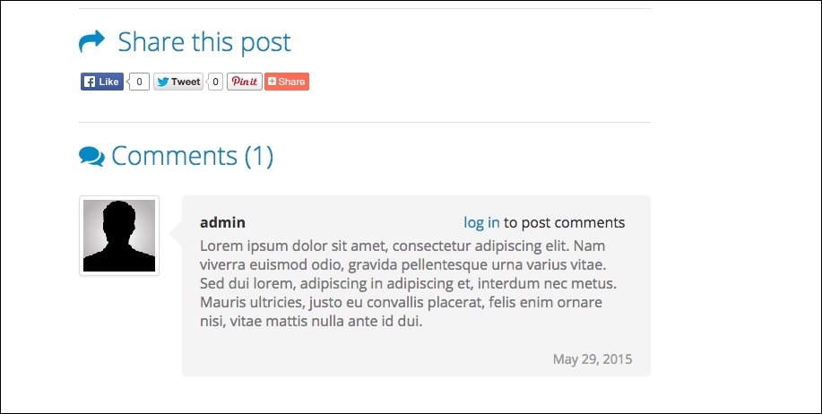
This new commenting region allows users not only to leave feedback about a post, but also the ability to share a post using social networks, as is apparent with the Share this post heading being displayed above the comment region. We will look at how to theme comments in Drupal 8 in more detail later in Chapter 8, Theming Our Blog Listing Page.
Our second to last navigational page to review is the Contact Us page. Traditional contact pages consist of general business hours, e-mail addresses, and other methods to contact the user of the website. However, if we navigate to the contact page by clicking on the Contact Us link in the menu, we will be presented with the following image:
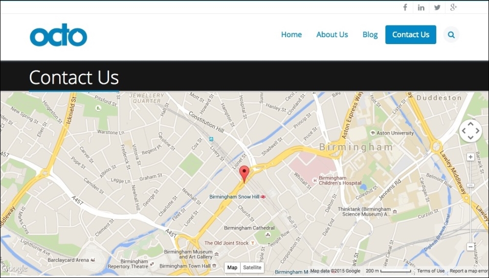
The Contact Us page shows a full-width one-column layout with a gorgeous Google Map highlighting the location of our office with a map marker. The map is fully functional, and it allows the end user to navigate wherever they would like in the world. The Google Maps API allows us to add this type of user interaction very easily to a page with very little JavaScript. Drupal 8 makes this even easier with their new way to handle JavaScript libraries. We will keep this in mind when developing this Twig template.
Adding a little more personalization to our contact page, this web form allows any user to contact us.
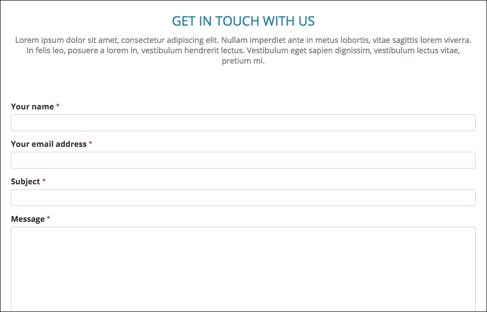
Being fully responsive, our web form will function on all mobile devices and is a great example of customization versus just a typical e-mail address being displayed. We have various examples of form elements within our mockup that will be developed while creating our Drupal 8 theme.
However, what would a website be without giving our end user an ability to search for content?
The final page of our mockup ties back into our search block in the header of our website, allowing us to display the content of our website based on a user query. Drupal 8 provides us with this mechanism to index content and allows us to then display the search results. We can find a mockup of the search results page located in the exercise files Mockup folder titled search.html, as shown in the following image:
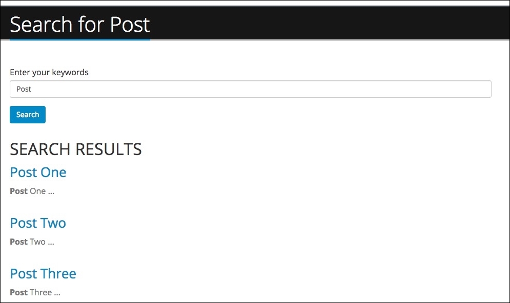
One thing we will find though is that the search results are very limited without extending the functionality with other third-party search services such as Apache Solr, which provides for a much more robust search experience. Still, we will take a look at how to customize the search results page for a cleaner look and feel.
So enough review of our mockup, let's get busy creating a Drupal 8 theme based on the design we just previewed. This would be the time where we put on some good music and do the tedious work of installing Drupal 8, configuring content types, creating blocks and views, and populating our site with content so we have something to actually theme. However, let's skip all that tedious work and just start with a database snapshot.