
So far, we have only been dealing with a one column layout. All of our blocks have been assigned to regions before, after, or within our main content. Now we are faced with our first block that is associated with a sidebar. The challenge is to make sure that when content is added to a sidebar, our main content region adjusts accordingly.
For this next section, we will be modifying our page.html.twig template to conditionally look for the existence of sidebars and alter the column classes of our content region.
Begin by opening page.html.twig and adding the logic and markup for the sidebar first region. This markup will be added directly below the <div class="row"> section, but above the content wrapper:
New markup
{% if page.sidebar_first %}
  <aside class="layout-sidebar-first" role="complementary">
    <div class="col-md-3">
      {{ page.sidebar_first }}
    </div>
  </aside>
{% endif %}
The markup we added conditionally checks to see if any blocks are assigned to the Sidebar first region. If any blocks are present, it will then print the included markup and blocks within the region.
When a sidebar is available to print, we need to be able to adjust our main content region's grid measurements accordingly. We can use similar logic to test and then create a new column class that can be used for our content region.
Add the following markup directly after our Sidebar first region:
New markup
{% if page.sidebar_second and page.sidebar_first %}
  {% set col_class = 'col-md-6' %}
{% elseif page.sidebar_second or page.sidebar_first %}
  {% set col_class = 'col-md-9' %}
{% else %}
  {% set col_class = 'col-md-12' %}
{% endif %}
The logic above checks for one or more sidebar regions and creates our new column class accordingly. We can then apply the new class to our content region by replacing the hardcoded column class with our new col_class variable:
<div class="{{ col_class }}">
  {{ page.content }}
</div>
Finally, we can add the conditional logic to print the Sidebar second region. This logic is similar to what we added for the Sidebar first region. Add the following markup directly below our main content region:
New markup
{% if page.sidebar_second %}
<aside class="layout-sidebar-second" role="complementary">
<div class="col-md-3">
{{ page.sidebar_second }}
</div>
</aside>
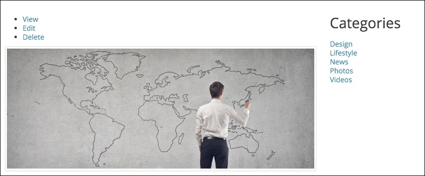
{% endif %}Make sure to save the template, clear Drupal's cache, and then refresh the Blog listing page. The main content area of our post listing is now adjusted to allow our Sidebar second region to display the Categories block:
If we look at our mockup, we can see that our Categories heading should be <h4> and the list of terms should be contained within an unordered list. How can we modify the markup for this block or view? Easy: we can create Twig templates for both the Block and the View to override the markup and add any classes that we need.