
Qt includes a Model View framework that maintains separation between the way data is organized and managed, and the way that it is presented to the user. In this section, we will learn how to make use of the model view, in particular by using the list view to display information and at the same time apply our own customization to make it look slick.
- Create a new Qt Quick application project and open up
qml.qrcwith Qt Creator. Add six images,home.png,map.png,profile.png,search.png,settings.png, andarrow.png, to the project:
- After that, open up
MainForm.ui.qml. Delete all the default widgets on the canvas and drag a List View widget from under the Qt Quick - Views category in the Library window onto the canvas. Then, set its Anchors setting to Fill the parent size by clicking on the button located in the middle of the Layout window:
- Next, switch over to the Script Editor, as we will define what the list view will look like:


- After that, open up
main.qmland replace the code with this:import QtQuick 2.4 import QtQuick.Window 2.2 Window { visible: true width: 480 height: 480 MainForm { anchors.fill: parent MouseArea { onPressed: row1.opacity = 0.5 onReleased: row1.opacity = 1.0 } } } - Build and run the program, and now your program should look like this:
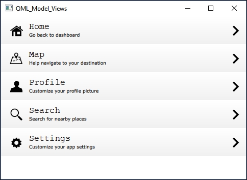
Qt Quick allows us to customize the look of each row of the list view with ease. The delegate defines what each row will look like and the model is where you store the data that will be displayed on the list view.
In this example, we added a background with a gradient on each row, then we also added an icon on each side of the item, a title, a description, and a mouse area widget that makes each row of the list view clickable. The delegate is not static, as we allow the model to change the title, description, and the icon to make each row look unique.
In main.qml, we defined the behavior of the mouse area widget, which will halve its own opacity value lower when pressed and return to fully opaque when released. Since all other elements, such as title, icon, and so on, are all the children of the mouse area widget, they all will also automatically follow their parent widget's behavior and become semi-transparent.
Also, we have finally solved the display problem on mobile devices with high resolution and DPI. It's a very simple trick—first, we defined a variable called sizeMultiplier. The value of sizeMultiplier is the result of dividing the width of the window by a predefined value, say 480, which is the current window width we used for the PC. Then, multiply sizeMultiplier by all the widget variables that have to do with size and position, including font size. Do note that in this case, you should use the pixelSize property for text instead of pointSize, so that you will get the correct display when multiplying by sizeMultiplier. The following screenshot shows you what the app looks like on the mobile device with and without sizeMultiplier:

Notice that you may get a messed up UI in the editor once you multiply everything with the sizeMultiplier variable. This is because the width variable may return as 0 in the editor. Hence, by multiplying 0 by 480, you may get the result 0, which makes the entire UI to look funny. However, it will look fine when running the actual program. If you want to preview the UI on the editor, temporarily set the sizeMultiplier to 1.