In the previous chapter, we developed the main theme structure and the main sections that are displayed for the whole theme. In this chapter, we are going to learn how to develop our custom home page by adding the Bootstrap carousel as the main slider, a custom vertical navigation menu on the left sidebar, and a products grid.
Then, we are going to analyze how to customize the other main pages of the theme.
The following is a list of topics that will be covered in this chapter:
- Developing the home page
- Customizing the left sidebar
- Customizing the main content
- Customizing the other pages of the theme
- File paths and handles for the other sections of the theme
- Creating the content row
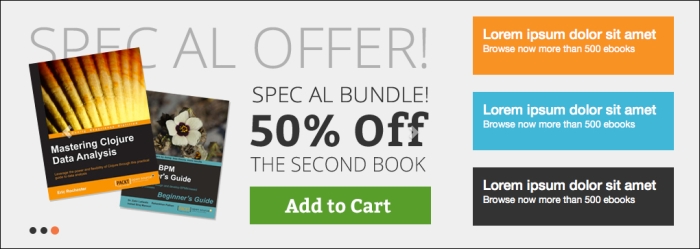
Let's start developing our custom home page. The following screenshot shows the final result that we are going to reach:
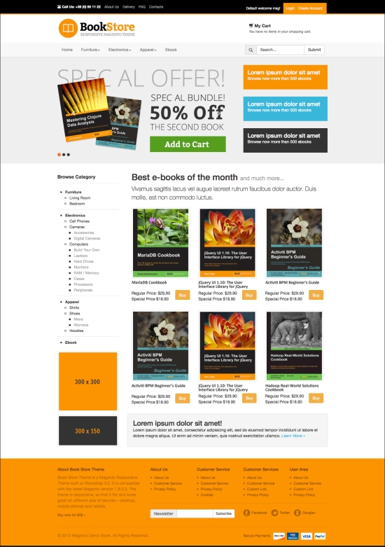
This is an example of what the screen in this program looks like.
The home page structure contains two main blocks that we will call slider block and main content block. As you can see from the design, the slider bar is a full screen bar with a carousel and three text banners on the right.
Under the main slider bar, we have the left sidebar with a vertical navigation, and on the right a simple products list.
We are going to create a home page from the admin panel using the CMS home page, some CMS blocks, and some layout XML updates by using the following steps:
- Creating the slider row
- Creating the CMS block for the carousel
- Creating the CMS block for the text banners
- Creating the CMS home page
- Customizing the look and feel of the home page with CSS
First of all, we create all the CMS blocks. Then we display them in the CMS home page. So let's start with the full-width row that we call slider.
This block will contain the carousel and the banners. We wrap these blocks into the CMS static block that we create in the backend from CMS | Static Blocks, with the following information:
- Block name:
Home Block Fullwidth - Block identifier:
home-fullwidth
The following is the HTML code to create a responsive row:
<div class="row">
  <div class="col-md-8">
    {{block type="cms/block" block_id="home-carousel"
      template="cms/content.phtml"}}
  </div>

  <div class="col-md-4">
    {{block type="cms/block" block_id="home-right-banner"
      template="cms/content.phtml"}}
  </div>
</div>
In this way, we have created a responsive row with two main blocks:
- The block with the CSS class
col-md-8contains the carousel - The block with the CSS class
col-md-4contains the three text banners on the right
The {{block type="cms/block" … }} code snippet inserts CMS blocks that can also be created in the admin panel
You can use the same snippet to include a CMS block in a CMS page.
Bootstrap includes some nice built-in features that speed up the development process without losing precious time in the research of external components.
The JavaScript carousel, shown in the following screenshot, is very simple to use, and you can find more details in the Bootstrap documentation, under the Carousel tab of the JavaScript section:
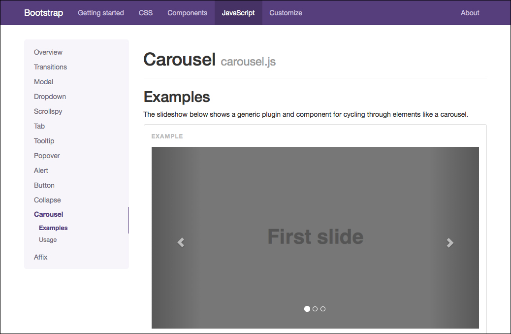
There are two ways to use the carousel: via data attributes and via JavaScript. In this case, we are going to use the data attributes to easily control the carousel and its options without calling a JavaScript.
You can get additional information in the official Bootstrap documentation at http://getbootstrap.com/javascript/#carousel.
Let's start by creating the CMS block from the admin panel with the following information:
- Block name:
Home Carousel - Block identifier:
home-carousel
The following is the HTML code to create the CMS block:
<div data-ride="carousel" class="carousel slide" id="slider-home">

        <ol class="carousel-indicators">
          <li data-slide-to="0" data-target="#slider-home"></li>
          <li data-slide-to="1" data-target="#slider-home" class="active"></li>
          <li data-slide-to="2" data-target="#slider-home" class=""></li>
        </ol>

        <div class="carousel-inner">
          <div class="item">
            <img src="{{skin_url='images/slide1.png'}}" alt="Slide 1 Alt Text">
          </div>
          <div class="item active">
          <img src="{{skin_url='images/slide1.png'}}" alt="Slide 2 Alt Text">
          </div>
          <div class="item">
          <img src="{{skin_url='images/slide1.png'}}" alt="Slide 3 Alt Text">
          </div>
        </div>

        <a data-slide="prev" href="#slider-home" class="left carousel-control">
          <span class="glyphicon glyphicon-chevron-left"></span>
        </a>
        <a data-slide="next" href="#slider-home" class="right carousel-control">
          <span class="glyphicon glyphicon-chevron-right"></span>
        </a>

</div>You can find the following content in the Bootstrap documentation: Use data attributes to easily control the position of the carousel.
data-slideaccepts the keywordsprevornext, which alters the slide position relative to its current position. Alternatively, usedata-slide-toto pass a raw slide index to the carouseldata-slide-to="2", which shifts the slide position to a particular index beginning with 0. Thedata-ride="carousel"attribute is used to mark a carousel as animating starting at page load.
Now, we are going to create the CMS block for the banners that will be placed next to the carousel, with the following information:
- Block name:
Home Banner - Block identifier:
home-right-banner
The following is the HTML code:
<div id="banner-home">
  <div class="bg-orange">
    <h3>Lorem ipsum dolor sit amet</h3>
    <p>Browse now more than 500 ebooks</p>
  </div>
  <div class="bg-cyan">
    <h3>Lorem ipsum dolor sit amet</h3>
    <p>Browse now more than 500 ebooks</p>
  </div>

  <div class="bg-darkgrey">
    <h3>Lorem ipsum dolor sit amet</h3>
    <p>Browse now more than 500 ebooks</p>
  </div>

</div>
In this section, we have created some text banners. Feel free to replace the content with images or other cool stuff according to your needs.
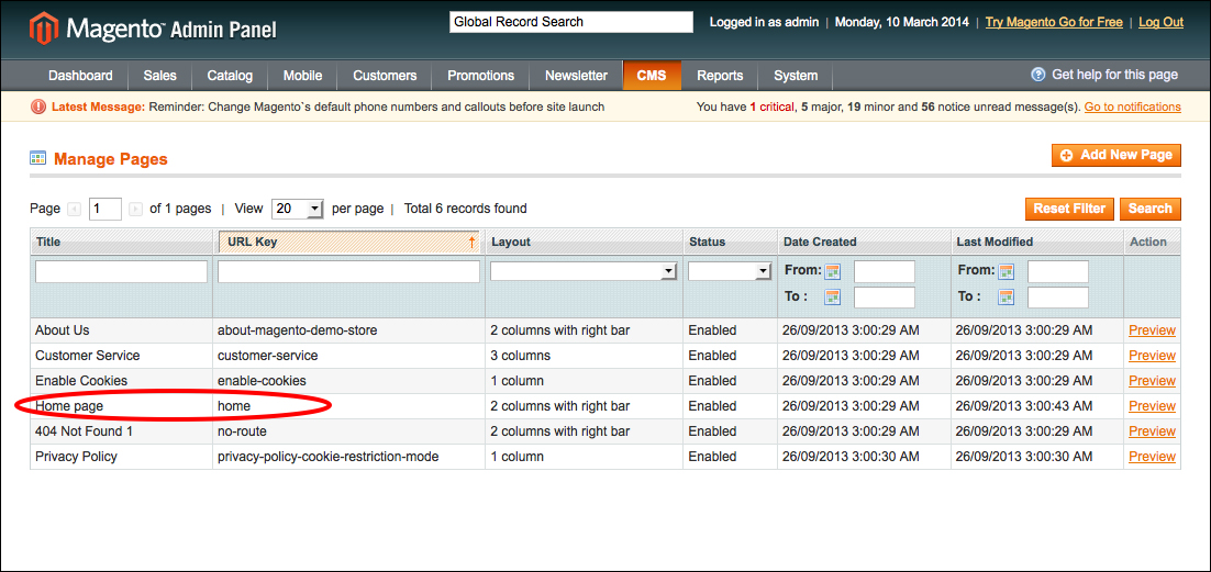
Now that we have created the full width bar, we need to display it in the home page. First, we need to have a home CMS page. If you are using a Magento installation with sample data, you already have a default home page that you can edit; if you don't, create the CMS page by navigating to CMS | Pages as shown in the following screenshot:
Now, insert a dummy text in the content box. We focus our attention on the slider block, and later we will look at what to insert in the main content.
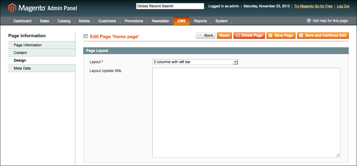
In the Design tab, select the 2 columns with left bar option for Layout as shown in the following screenshot:
If we try to insert the CMS block home-fullwidth in the main content, we will not obtain the expected full-width block because the content inserted in the code block of the CMS pages will be shown in the right-hand part of the layout, in the main content area.
To solve this, we need to create a new section that needs to be displayed before the main page content. To manage this section dynamically, we have to create a new reference.
A reference block is a block that can contain other blocks. To allow this, the block type must be core/text_list.
So let's create the new reference block, called slider, with the following steps:
- Open the file
local.xmllocated atapp/design/frontend/bookstore/default/layout/local.xml. - Inside the
<reference name="root">object, insert the following code that creates the new reference block:<!-- define the reference block slider --> <block type="core/text_list" name="slider" as="slider" translate="label"> <label>Slider Block</label> </block>
- Then, we need to specify where to place this new reference block with the following code:
<?php echo $this->getChildHtml('slider') ?>Since this block is structural and we can use it in other pages, and not just on the home page, we have to insert it into the template files that control the structure of the pages.
We have already created these files in the previous chapter. Just to remind you, they are located at
app/design/frontend/bookstore/default/template/page, such as 2columns-left.phtml.So, let's place that where you want to make it appear. We have already inserted the code just, before the page container, with the following code:
<section id="after-header"> <div class="container"> <?php echo $this->getChildHtml('slider') ?> </div> </section> - Finally, we only need to update the layout XML of the CMS page with the following code:
<reference name="slider">
  <block type="cms/block" name="home-fullwidth" as="home-fullwidth">
    <action method="setBlockId">
      <block_id>home-fullwidth</block_id>
    </action>
  </block>
</reference>
- Save the page; if everything goes well, you will see the full width slider block, including the carousel and the banners.
Now, customize the code a little bit with some CSS added in the styles.css file we created in skin/frontend/bookstore/default/css/styles.css, as follows:
/* Carousel */

#after-header {
  background-color: #efefef;
}

#slider-home {
  text-align:center;
  padding:40px 0;
}

#slider-home .carousel-control.right,#slider-home .carousel-control.left {
  background:none;
}

#slider-home .carousel-indicators {
  bottom:20px;
  left:0;
  margin:0;
  text-align:left;
}

/* Carousel Bullets */

.carousel-indicators li {
  border:0;
  background-color:#333;
}

.carousel-indicators li:hover {
  background:#41b7d8;
}

#slider-home .carousel-indicators .active {
  background:#f37541;
  border-color:#f37541;
}


/* 3 Banners */
#banner-home {
}

#banner-home div {
  color:#FFF;
  height:85px;
  margin:25px 0;
  padding:15px;
  background: #ddd;
}
#banner-home h3 {
  font-size:20px;
  margin:0;
  padding:0;
}

/* Text Banners Background Colors */

#banner-home div.bg-orange {
  background:#f89223;
}

#banner-home div.bg-cyan {
  background:#41b7d8;
}

#banner-home div.bg-darkgrey {
  background:#333;
}
And now, if you reload the page, you should see the full width block with banners and carousel, as shown in the following screenshot: