
The responsive design is the base of Bootstrap. By reading the official documentation, you will find a lot of useful tips and information to create fully responsive elements.
Now we are going to discuss the most important classes to integrate into our theme, to have the control while optimizing it for all the devices.
With media queries, we can hide content on screens with smaller resolutions, show content on screens with a higher resolution, or vice versa. The easiest way to hide images or unnecessary blocks of content on mobile devices is by using some Bootstrap classes that would suit this purpose.
The following table taken from Bootstrap documentation shows all the classes that you can use to show or hide elements:
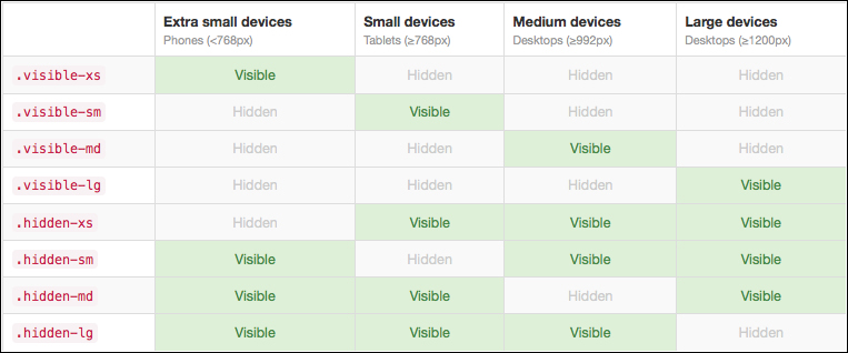
To learn more from Bootstrap, you can refer to its documentation by accessing the website (http://getbootstrap.com/css/#responsive-utilities) and navigating to CSS | Responsive utilities.
Another important task to do is to make all the images flexible. To make the images flexible, simply add the img-thumbnail class to the <img> elements.
The following simple example helps you understand better what the CSS class img-thumbnail can do.
As you can see in the following screenshot, the image with a width of 500 px inside div with the CSS class col-md-4 is bigger than the container, and hence, it overflows:
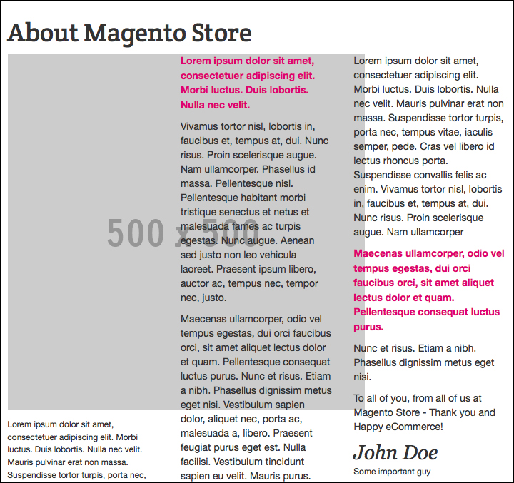
The test is conducted in the CMS page with the ID about-magento-demo-store, with the following code:
<div class="page-title">
<h1>About Magento Store</h1>
</div>
<div class="row">
<div class="col-md-4">
<a href="http://www.varien.com/">
<img src="http://placehold.it/500x500" title="Varien" alt="Varien" class="img-responsive" />
</a>
</div>
<div class="col-md-4">
. . .
</div>
<div class="col-md-4">
. . .
</div>
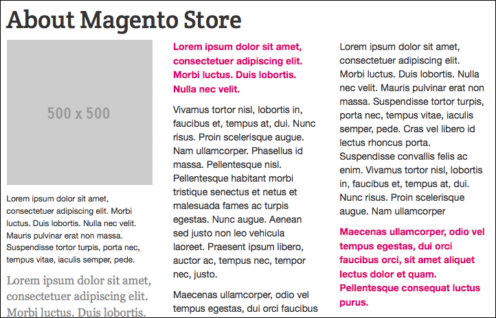
</div>To avoid the problem, add the img-responsive class to the image in the following way:
<img src="http://placehold.it/500x500" title="Varien" alt="Varien" class="img-thumbnail" />
The img-responsive class will adapt the width to the container, as you can see in the following screenshot:
On an iPhone, Safari shrinks HTML pages to fit into the iPhone screen. To avoid this, we can add a simple meta tag that tells the browser to use the width of the device as the width of the viewport and disable the initial scale, as follows:
<meta name="viewport" content="width=device-width; initial-scale=1.0">
If not already inserted, open the head.phtml file of your theme placed in app/design/frontend/bookstore/default/template/page/html/ and insert the meta tag.