
More often than not, while reading daily newspapers and similar articles, one can find charts that are used by media organizations to misrepresent the facts. One usual example is using linear scales to create, so called, panic charts where constantly growing value is followed for long period of time (years) and starting values are smaller from latest one by several magnitudes. These values when visualized correctly, would (and usually should), produce linear or almost linear charts. This takes some panic out of the articles they illustrate.
With the logarithmic scale, the ratio of consecutive values is constant. This is important when we are trying to read log plots. With linear (arithmetic) scales, the constant is the distance between consecutive values. In other words, logarithmic plots have constant distance in orders of magnitude. We will see this illustrated on the following plots. The code used to produce this figure is explained here.
As a general rule of thumb, logarithmic scales should be used when the data presented has the following:
Don't blindly follow these rules, they are more like hints than rules. Always use your own judgment about the data in hand and requirements presented to you by the project or customer.
Depending on the data range, different log bases should be used. The standard base for the log is 10, but if the range of the data is smaller, a base of 2 can prove to be more useful as it will show more "resolution" within the smaller range.
If we have the range of data suitable for display on logarithmic scales, we will note that the values previously being too close to judge any difference are now well apart. This allows us to read the chart much easily than if we would present the data in linear scale.
The growth rate charts, where long-range time series data is collected, are where we want to see, not the absolute value measured at time point, but the growth in time. We will still get the absolute value information, but that information is of lower priority.
Also, if the data distribution has positive skew (for example, salaries), taking the logarithm of the value (salary) will help us fit the data into the model, as the logarithm transformation will give us more normal data distribution.
We will exemplify this with a sample code that shows the same two dataset (one linear and one logarithmic in nature) on two different plots (in the same figure) using different scales (linear and logarithmic).
We will be performing the following steps with the help of the code mentioned after the steps:
- Generate two simple datasets,
y—exponential/logarithmic in nature, andz—linear in nature. - Create figure containing grid of four subplots.
- Create two subplots containing the
ydataset one in logarithmic scale and one in linear scale. - Create another two subplots containing
zdataset, again, one logarithmic and the other linear.
Here is the code:
from matplotlib import pyplot as plt
import numpy as np

x = np.linspace(1, 10)
y = [10 ** el for el in x]
z = [2 * el for el in x]

fig = plt.figure(figsize=(10, 8))

ax1 = fig.add_subplot(2, 2, 1)
ax1.plot(x, y, color='blue')
ax1.set_yscale('log')
ax1.set_title(r'Logarithmic plot of $ {10}^{x} $ ')
ax1.set_ylabel(r'$ {y} = {10}^{x} $')
plt.grid(b=True, which='both', axis='both')


ax2 = fig.add_subplot(2, 2, 2)
ax2.plot(x, y, color='red')
ax2.set_yscale('linear')
ax2.set_title(r'Linear plot of $ {10}^{x} $ ')
ax2.set_ylabel(r'$ {y} = {10}^{x} $')
plt.grid(b=True, which='both', axis='both')


ax3 = fig.add_subplot(2, 2, 3)
ax3.plot(x, z, color='green')
ax3.set_yscale('log')
ax3.set_title(r'Logarithmic plot of $ {2}*{x} $ ')
ax3.set_ylabel(r'$ {y} = {2}*{x} $')
plt.grid(b=True, which='both', axis='both')

ax4 = fig.add_subplot(2, 2, 4)
ax4.plot(x, z, color='magenta')
ax4.set_yscale('linear')
ax4.set_title(r'Linear plot of $ {2}*{x} $ ')
ax4.set_ylabel(r'$ {y} = {2}*{x} $')
plt.grid(b=True, which='both', axis='both')


plt.show()
This code will produce the following figure:
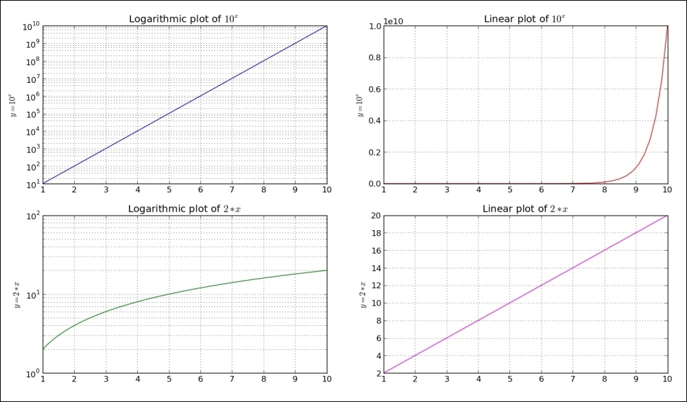
We generate some sample data and two dependent variables—y and z. Variable y is expressed as exponential function of data (x), and variable z is simple linear function of x. This helps us illustrate different looks of linear and exponential charts.
We then create grid of four subplots, where the top row subplots are of data (x, y) and bottom row are of data (x, z) pairs.
Looking from left-hand side, columns charts have logarithmic scales on the y-axis, while right-hand side columns are in linear scale. We set this using set_yscale('log') for each axis separately.
For every subplot, we set a title and label, where label also describes the function plotted.
With plt.grid(b=True, which='both', axis='both'), we turn the grid on for both axis and both the major and minor ticks.
We observe how linear functions are straight lines on linear plots, while logarithmic functions are straight lines on logarithmic plots.