
If the data is already represented using polar coordinates, we can also display it using polar figures. Even if the data is not in polar coordinates, we should consider converting it to polar form and draw on polar plots.
To decide whether we want to do this, we need to understand what the data represents and what we are hoping to display to the end user. Imagining what the user will read and decode from our figures usually leads us to the best visualizations.
Polar plots are commonly used to display information that is radial in nature. For example, in sun path diagrams—we see the sky in radial projection and the radiation maps of antennas radiate differently at different angles. You can learn more about this at http://www.astronwireless.com/topic-archives-antenna-radiation-patterns.asp.
In this recipe, you will learn how to change the coordinate system used in the plot and to use the polar coordinate system instead.
To display data in polar coordinates, we must have appropriate data values. In the polar coordinate system, a point is described with radius distance (usually denoted by r) and angle (usually theta). The angle can be in radians or degrees, but matplotlib uses degrees.
Similarly enough to the function plot(), to draw polar plots, we will use the polar() function, which accepts two same-length arrays of parameters, theta and r, for the angle array and radius array, respectively. The function also accepts other formatting arguments, the same as those used by plot() one does.
We also need to tell matplotlib that we want axes in the polar coordinate system. This is done by providing the polar=True argument to the add_axes or add_subplot functions.
Additionally, to set other properties on the figure, such as grids on radii or angles, we need to use matplotlib.pyplot.rgrids() to toggle radial grid visibility or to set up labels. Similarly, we use matplotlib.pyplot.thetagrid() to configure angle ticks and labels.
Here is one recipe that demonstrates how to plot polar bars:
import numpy as np
import matplotlib.cm as cm
import matplotlib.pyplot as plt

figsize = 7
colormap = lambda r: cm.Set2(r / 20.)
N = 18 # number of bars

fig = plt.figure(figsize=(figsize,figsize))
ax = fig.add_axes([0.2, 0.2, 0.7, 0.7], polar=True)

theta = np.arange(0.0, 2*np.pi, 2*np.pi/N)
radii = 20*np.random.rand(N)
width = np.pi/4*np.random.rand(N)
bars = ax.bar(theta, radii, width=width, bottom=0.0)
for r, bar in zip(radii, bars):
bar.set_facecolor(colormap(r))
bar.set_alpha(0.6)

plt.show()
The preceding code snippet will give us the following plot:
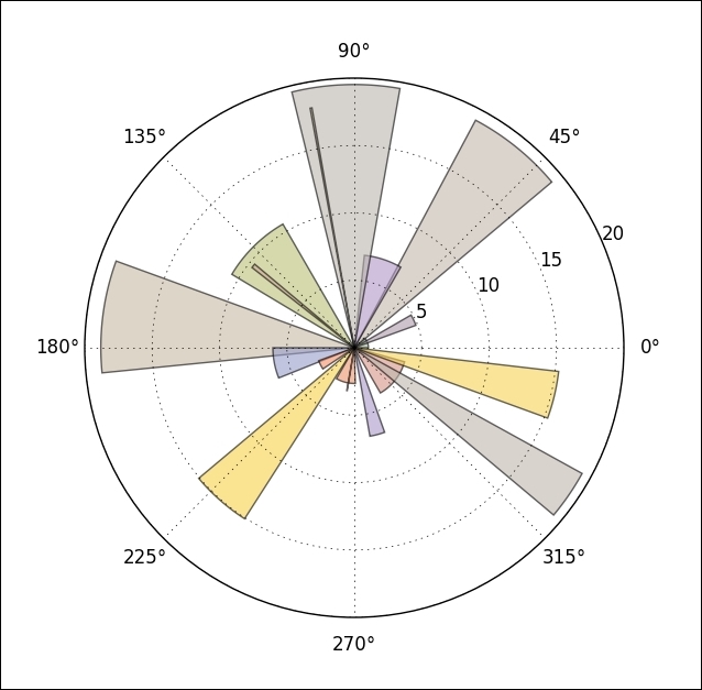
First, we create a square figure and add the polar axes to it. The figure does not have to be square, but then our polar plot will be ellipsoidal.
We then generate random values for a set of angles (theta) and a set of polar distances (radii). Since we have drawn bars, we also need a set of widths for each bar, so we also generate a set of widths. matplotlib.axes.bar accepts an array of values (as almost all the drawing functions in matplotlib do), so we don't have to loop over this generated dataset; we just need to call the bar once with all the arguments passed to it.
In order to make every bar easily distinguishable, we have to loop over each bar added to ax (Axes) and customize its appearance (face-color and transparency).