
4
Designing Image-Interfaces
Using interfaces routinely paves the way to different predicative scenes that can be identified, such as editing a photo, making a digital draw, compositing channels of video and audio, writing a novel or essay and discovering a new programming language. These scenes are the underlying ground for establishing processes that will be recognized as kinds of practices, for example, using an interface with educational, professional or artistic intentions. When a scene of practice is identified, we may then talk about fields, domains and disciplines.
In Chapter 3, we saw numerous examples of graphical interfaces designed to support practices associated mostly with image creation (we also displayed some examples where the interface is graphical enough to convey plastic dimensions of texts and other types of information). In this chapter, we pay special attention to those cases where the image being manipulated acts as the graphical interface itself.
We are thinking about multidisciplinary fields at the crossroads of several disciplines such as graphic design, data science, computer science and humanities. The kinds of results that are produced from those perspectives include data visualization, networks graphs, infographics, cultural analytics and data art.
As we mentioned earlier, our intention with this book is to inform creative practices with the constituent and technical aspects behind the design of graphical interfaces. The kind of practice that we adopt occurs within the academic and scientific scene. That being said, our productions should be regarded more as prototypes or sketches, but also as visions, statements, hypothetical theories and pedagogical detonators, instead of fully developed systems. With respect to the design and development of complex systems, we locate ourselves at the level of interface and visualization tools. However, we believe that the use of new creations by different users and in different contexts re-launches the processes of practices, leading to potential applications in diverse domains or to the emergence of new fields (such as speculative and critical design1).
4.1. Precursors to data visualization
The idea of studying images as interfaces can be associated with their diagrammatic properties. In section 1.4.3, we evoked the fundamental notion of icon according to philosopher and logician Charles Peirce. Icons are signs that stand for something else by virtue of similarity. Peirce further subdivided icons into three categories: images can be appreciated as visual attributes; diagrams represent relations that convey a general predicate and metaphors map structures from one domain into another. In practice, these types of signs exist in combination with other classes of signs. Figure 4.1 situates images, diagrams and metaphors in the bigger picture of sign categories elaborated by Peirce.
Pre-computational uses of images as interfaces can be found in the literature, in the form of diagrams and illustrations from a wide range of fields. Indeed, when diagrammatic functions are explicitly added to pictures, they convert images into powerful supports for observation, abstraction and reasoning. As insisted by Stjernfelt, “manipulability and deductibility is what makes diagrams icons with the special feature that they may be used to think with” [STJ 07, p. 278]. Reading and interpreting a diagram happens in the mind of the viewer; this implies that she could manipulate mentally its properties and project more into it. Stjernfelt continues: “What is gained by realizing the diagrammatical character of picture viewing is not least the close relation between picture and thought. Seen as a diagram, the picture is a machine à penser, allowing for a spectrum of different manipulations” [STJ 07, p. 288].
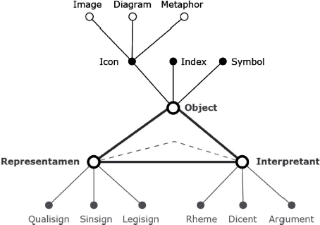
Figure 4.1. Peirce’s types of signs
To mention some examples, we have already discussed a few names in sections 1.3.1, 1.3.3 and 1.4.3 who can be considered precursors to data and image visualization, in the sense of depicting relations, complex concepts and quantities in diagrammatic form. We can now try to draw a larger map of inspirational sources in Table 4.1. This is of course an ambitious goal and we had to make choices among many examples. The interested reader can find more resources in [DRU 14, TUF 97, BUS 07, ECO 61, GIE 13, GLE 17].
4.2. Data visualization
Data visualization is a transformation process that takes us essentially from one symbolic state to a visual representation, sometimes linearly but most of the times by taking steps back and forth. In an attempt to explain the process as simply as possible, we can recall the seven steps in data representation identified by designer and developer Ben Fry (who co-started with Casey Reas the programming language and development environment Processing): acquire, parse, mine, represent, refine and interact [FRY 08, p. 5]. Another perspective is the ASSERT model, which proposes six phases to guide the design of data visualizations: ask a question; search for information; structure that information; envision the answer; represent the visualization and tell a story [FER 13, p. 43].
Table 4.1. Some precursors to data visualization and diagrammatic reasoning
| Year | Author | Work title |
| c. 300 BC | Euclid | Elements |
| 1305 | Ramon Lull | Ars generalis ultima |
| c. 1370 | Nicolas Oresme | Tractatus de configurationibus qualitatum et motuum |
| 1478–1519 | Leonardo da Vinci | Codex Atlanticus |
| 1637 | René Descartes | La géométrie |
| 1802 | Leonhard Euler | Letters of Euler to a German princess |
| 1810 | Johann von Goethe | Theory of colors |
| 1854 | Goerge Boole | Laws of thought |
| 1866 | Bernhard Riemann | On the hypotheses which lie at the foundation of geometry |
| 1875 | Etienne-Jules Marey | La méthode graphique dans les sciences expérimentales |
| 1878 | Eadweard Muybridge | The horse in motion |
| 1879 | Gottlob Frege | Begriffsschrift |
| 1880 | John Venn | On the Diagrammatic and Mechanical Representation of Propositions and Reasonings |
| 1893 | Etienne-Jules Marey | Le mouvement |
| 1912 | Frank Gilbreth | Primer of scientific management |
| 1925 | Paul Klee | Pedagogical sketchbook |
| 1926 | Wassily Kandinsky | Point and line to plane |
| 1932 | Lazlo Moholy-Nagy | The new vision |
| 1934 | Jacob Moreno | Who shall survive? |
| 1935 | Walter Gropius | The new architecture and the Bauhaus |
| 1935 | Kurt Koffka | Principles of gestalt psychology |
| 1939 | James Joyce | Finnegans Wake |
| 1958 | Martin Gardner | Logic machines and diagrams |
| 1958 | Yona Friedman | Mobile Architecture |
| 1967 | Jacques Bertin | Sémiologie graphique |
| 1975 | Buckminster Fuller | Synergetics |
| 1977 | Christopher Alexander | A pattern language |
| 1990 | Abraham Moles | Les sciences de l’imprécis |
| 1993 | Scott McCloud | Understanding comics |
A common aspect in both models is to start gathering information according to a question or a research interest. In terms of their sources and functions, data can be empirical, abstract, meta-data, spatial, visual, scientific, biological, physical or all of the above in a single project. Briefly speaking:
- – Empirical data are collected from observations of the real world. These are often defined as qualitative data, as they are constructed from subjective interpretations made by domain specialists.
- – Abstract data or quantitative data define measures and numerical values that can be analyzed or derived from formal models, such as “variables consisting of series, lattices, and other indexing schemes” like time, counts and mathematical functions [WIL 05, p. 48].
- – Metadata are data about the data.
- – Spatial data refer to geography, geo-location, Earth coordinates, etc.
- – Visual data are associated with visual attributes, features and descriptors (also associated with aesthetics in statistics literature [WIL 05, p. 255]).
- – Scientific data is an umbrella term for astronomical, nuclear, subatomic, biological and medical data among others.
In general terms, the types of the data2 determine the graphical representation: bar charts, pie charts, scatterplots, network graphs, word clouds, media visualizations, etc. However, current practices tend to combine several types: perhaps by transforming data from one type into another (e.g. quantifying words or adding semantic annotations to images) or by designing complex and hybrid interfaces that support several views and types of data.
4.2.1. Data models and data tables
When data are obtained, they are either structured or unstructured. The latter case is often the most common. Consider the result of digitizing documents. A digital book can be represented not only as a sequence of texts but also as images where no text can be individually selected. If it is a picture, we have a raster format. If it is a transcription of an interview, we have plain text. There are of course data in native digital format, and the World Wide Web is an exemplary case. While a web search returns lists of links or a web site contains documents in HTML format, to think about these views as structured is misleading. Web scrapping and web data mining provide tools and methods to extract information from the web into a unified data table that is the basis of structured data.
We say that data are structured when they are stored and organized in a pertinent format that describe their content. The canonical practice of structuring data follows the form of a data table where columns define fields or dimensions, whereas rows are the individual entries. We can imagine a simple spreadsheet. One column can be assigned to names, another to dates, and so on. Then, each row is expected to be filled in with the corresponding types of data that make sense to the field (i.e. strings for names, numbers for dates).
A data model is precisely the formal description of all the columns that constitute a data table. Sometimes, users might have formulated in advance the information that is required to represent formally a subject through data. In this case, we elaborate an empty table or define a database that will be populated later. However, in other cases, the process is a cooperation between technical possibilities and access to data. In the case of web scrapping, for instance, the resulting table is organized by the document model itself: titles (<h1>), subtitles (<h2>), paragraphs (<p>), images (<img>), links (<a>), etc. Although we can give arbitrary names to our fields, the values will inherit from the technical mechanism of scrapping3.
A proper format to store a data table must avoid formatting of cells and tables. This is typically confusing to spreadsheet users, who might be used to merging cells, hiding columns, and adding bold, italic and color format to text. For data visualization purposes, a plain text format is required because visual attributes are a service of the software application. That means visual formatting is defined at the level of the XLS file format. The recommendation is to choose formats like CSV (comma-separated values), TSV (tab-delimited values), XML (extensible markup language), JSON (JavaScript Object Notation) or SQL (structured query language).
4.2.2. Visual descriptors
In general, visual features refer to distinctive parts of objects (e.g. eyes are features of faces). They can also be seen as attributes derived from those objects (e.g. rectangularity and circularity). Furthermore, numerical features can be combined to form feature vectors, whose main characteristic is to be independent of geometrical transformations (scale, translation and rotation).
Visual descriptors are summary representations derived from an image. That means they create a formal structure of the image that will be mapped onto the data model. Hence, a data model may be composed of several kinds of visual information, typically:
- – Metadata independent of the content: for example, name of author, date, location, format, etc. Formal models to describe this information are EXIF (Exchangeable Image File Format), XMP (Extensible Metadata Platform) and Dublin Core standards4.
- – Content descriptors: these include low-level (color, texture and shape) and intermediate-level (structure and spatial relationships) features.
- - Color: from a physiological and psychological standpoint, color attributes are characterized by chromaticity, saturation and brightness. That means a color tonality is given by a combination of these three attributes. As we saw in section 2.2.2, there are various color models that can be used for a digital representation of color, namely HSL, HSB or RGB.
- - Texture: also from a psychological standpoint, texture is perceived through granularity, directionality and repetitiveness. A texture descriptor is commonly a numerical vector that establishes if points in a region are lesser, greater or approximate to a central reference point.
- - Shape: in section 2.2.4, we talked about algorithms for image analysis considering two entry points: image features and shape features. The first entry point considers the entire image plane, whereas the second is local (i.e. acts within a region of an image). Among the local shape features, we saw geometric features such as eccentricity, elongatedness, compactness, aspect ratio, rectangularity, circularity, solidity and convexity. Regarding image features, they take into account elements like corners, edges, interest points, curve vertices, edges, lines, curves or surfaces.
- - Structure is given by a “set of features that provide a gestalt impression of the shapes in the image” [DEL 99, p. 26]. The structure of an image can be approached by combining edges, corners and their location within the image. In retrieval systems, this is used to distinguish, for example, between photos and sketches.
- - Spatial relationships can be of two kinds: directional and topological [DEL 99, p. 27]. On the one hand, once an orientation is established, directions can be described as “from left to right” or “from top to bottom”. The metrics of directional relationships are typically the distance or angles between entities. On the other hand, topological relationships are described in terms of disjunction, adjacency, containment and overlapping. Usually, they are formalized in natural language but we can also use set operations as logical propositions.
- – Content semantics: these are high-level human-namable entities. They describe real-world objects, temporal events, emotions, associated meanings and interpretations. Traditionally, we can use semantic primitives (object, role, action and event) and, more recently, with developments in machine learning, we talk about classifiers: holistic descriptors (e.g. furry, shiny, etc.) and localized parts (e.g. has-legs, has-wheels) [CHE 17, p. 50]. At a higher level, classifiers describe broader categories, like “human”, “animal” or “vehicle”.
As it can be imagined, a project might have virtually innumerable fields or dimensions that describe an image. If we take, for example, FeatureExtractor,5 it had already defined 399 content descriptors. These dimensions can easily grow with EXIF and XMP metadata. Ultimately, we could define our own descriptors, based on mathematical and statistical functions that analyze visual content. Moreover, semantic categories can modulate between shared attributes, semantic groups, vocabularies and individual perceptions over time. The challenge now is how to manage and visualize large amounts of dimensions (columns in the data table), together with large amounts of images (the rows of the table). The latter case is commonly studied as big data, whereas the former has been proposed as “wide data” [MAN 16].
4.2.3. Exploratory data analysis
In 1977, mathematician John Tukey inaugurated an approach to statistics called “exploratory data analysis” (EDA), which has largely influenced the way in which we interact with data today.
The originality of Tukey, who was already known in the computer science field for coining the terms “software” and “bit”, was to embrace an investigative posture towards data analysis. For him, EDA was characterized by new or unfamiliar techniques based on procedures rather than on theories, an emphasis on graphical representations and the use of simple mathematics [TUK 93, p. 5]. Of course, Tukey did not disregard the EDA’s counterpart, CDA (confirmatory data analysis), which was more interested in supporting or confirming hypotheses through data analysis. Indeed, the whole idea was to make them cooperate.
The influence of exploratory data analysis in modern data workflows can be seen in the following common techniques:
- – Data cleansing: scaling data to comparable ranges, transposing (also known as swapping, rotating or pivoting) from rows to columns, filtering rows, handling missing elements and unifying formats (case, punctuation, etc.).
- – Data transformations: these operations are applied to numerical data with the intention to create, summarize or generate new values. They include taking roots, reciprocals, logarithms and powers.
- – Statistics operations: in descriptive statistics,6 these include measures for central tendency (mean, median and mode) and dispersion (range and standard deviation).
Moreover, with the increase in data and descriptors (visual, but also social, economic, historical, geographical, etc.), one of the major issues to deal with has been: how should multiple columns of data be represented in a planar surface? In other words, how should many dimensions or descriptors in our existing graphical supports be adjusted? To tackle these questions, statisticians have forged several techniques on “dimensionality reduction”7.
4.2.4. Dimensionality reduction
Whenever we find ourselves dealing with data tables containing more than 15 columns with different data values, it is often recommended to use some method to reduce such dimensions for the sake of graphical analysis purposes, which means that instead of plotting few values, we could take advantage of the richness of the data and produce new data measures. Dimensionality reduction can be seen as “a mapping from the higher-dimensional space to a lower-dimensional one, while keeping information on all of the available variables” [MAR 11, p. 32]. From an applied perspective, this mapping can be linear or nonlinear depending on the data transformations. Table 4.2 summarizes linear and nonlinear methods, modified from [MAR 11].
Table 4.2. Dimensionality reduction methods
| Linear methods | Nonlinear methods |
| Principal component analysis (PCA) | Multidimensional scaling (MDS) |
| Singular value decomposition (SVD) | Local-linear embedding (LLE) |
| Linear discriminant analysis (LDA) | Isometric feature mapping (ISOMAP) |
| Nearest neighbor approach | Hessian locally linear embedding (HLLE) |
| Correlation dimension | Self-organizing maps (SOM) |
| Maximum likelihood approach | Generative topographic maps (GTM) |
| Intrinsic dimension estimation using packing numbers | Curvilinear component analysis (CCA) |
| Stochastic Neighbor Embedding (t-SNE) |
From the last table, we highlight that PCA and MDS are among the most used; their algorithms and functions can be found integrated into various statistics software applications. On the one hand, the principle of PCA is to decompose a matrix of values in order to output a new matrix whose values correspond to maximizations of variations. The new values are linear combinations of the original, also called orthogonal components or factors. On the other hand, MDS is based on the dissimilarity of all data values in order to determine principal coordinates. As stated in [BOS 08, p. 312], the ordination process relies on a geometric representation of data to identify the principal components.
In this line, we would like to evoke other methods that rely on geometrical transformations of data to determine dimension reduction. That means they require, first, to represent graphically the properties of data and then to calculate distances, proximities and relations. Three of these methods are well summarized in [DON 03, p. 10]: LLE, ISOMAP and HLLE, in comparison to input data (top left in Figure 4.2).
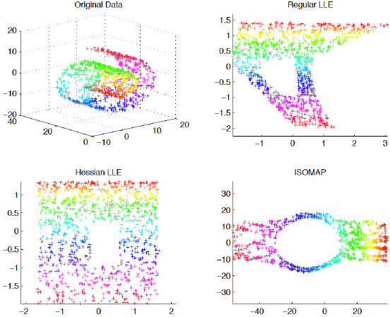
Figure 4.2. Geometrical representations of dimensionality reduction [DON 03]. For a color version of the figure, see www.iste.co.uk/reyes/image.zip
4.2.5. Graphical methods for data visualization
Graphical methods are concerned with the multiple ways to represent and organize data in space. Essentially, graphical methods are procedures and algorithms that work on visual data types to generate a graphical result on screen. This is also referred to as visualizing data, graph drawing, plotting or charting.
The main characteristic of graphical methods resides in the use of statistics and network science procedures. As we will see, all the basic visual data types that we studied in section 2.2.2 can be used: points, lines, polylines, polygons, fill areas, curves, solid geometry and surfaces. Hence, depending on the procedure and visualization kind, these data types vary in visual attributes: form (size, shape, rotation), color (hue, saturation, brightness), texture (granularity, pattern, orientation) and optics (blur, transparency)8.
The data techniques we just mentioned in section 4.2.3 can be perceived in the visual space. This space is a coordinate system, mostly partitioned into regular bins and intervals, where visual elements are the subject of transformations, like axis orientation, polar coordinates, planar bending and projections. Furthermore, within a digital image context, graphical methods adapt exploratory techniques from interactive systems, most notably: labeling, navigation (zooming, panning, lensing, orbiting) and direct manipulation (selecting, hovering, dragging, clicking, reordering, linking, connecting, brushing, expanding, collapsing, fading).
We can identify six major types of graphics output: charts, plots, matrices, networks, geometrical sets and the various combinations that can be produced with them.
4.2.5.1. Charts
Charts are of course the most common graphical method at present. They are supported natively in applications like Microsoft Office, Google Docs and a variety of programming libraries. Figure 4.3 shows six simple examples: dot, line, bar, pie, Gantt and bubble. As we can see, charts can be traced back to the work of Nicolas Oresme (c. 1370) and, more recently, to engineer William Playfair, credited with the systematization of line, bar and pie charts.
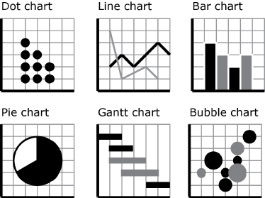
Figure 4.3. Chart types
4.2.5.2. Plots
In their most simple form, plots involve locating a point in space, at the intersection of two numerical values in two axes. When data have several dimensions, the point in space can be fashioned with visual attributes to convey more information. Besides 2D plots, it is also common to find 3D and 2.5D orthogonal views.
3D plots are known as surface plots when enough values are represented as dots but close enough to give the impression of succession. Another case is to calculate interpolations (or predictions between two dots) to generate the surface.
4.2.5.3. Matrices
Matrices, with respect to data visualization, are covariance approximations that show all the relationships in a set of fields. In other words, they show, at a glance, the shape of plots for any given intersection of columns. The idea is then to have a look at all possible combinations.
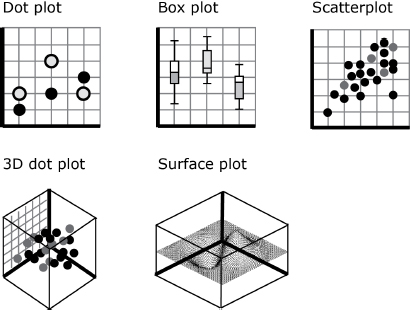
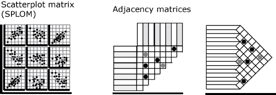
Figure 4.5. Matrix types
Among the many different types of matrices (e.g. simplex, band, circumflex, equi-correlation, block [WIL 05, p. 517] or the multi-thread method matrix (MTMM)), Figure 4.5 shows two: the scatter plot matrix (SPLOM) and the adjacency matrix.
4.2.5.4. Trees and networks
While graphs are invisible mathematical structures that connect nodes through links, graph drawing provides methods for laying out those elements in the visual space. These methods vary according to network science metrics and goals of analysis. Figure 4.6 shows large families of network visualizations that we observe in the literature as well as from current software packages (most notably d3 js, RAWGraphs and Gephi): hierarchical, clustering, force-atlas, sunbursts, radial (or layered), alluvial, parallel coordinates, arc diagram, circular layout, radial axis, hiveplot, isometric, concentric and event graph.
Without any intention of entering into details of network visualization or network science terminology, we should nevertheless evoke two main aesthetic criteria that are taken into account for graph drawing:
- – Minimization of edge crossings, edge bends, uniform edge lengths and visible area surface;
- – Maximization of angles (between two edges), symmetries (isomorphism with its physical counterpart) and node clustering into categories or families and layers (also called orbits or steps that separate levels of nodes).
These criteria come from different applications of networks, from integrated circuit design to social graphs. In general, they are promulgated to facilitate the readability and visibility of complex diagrams.
4.2.5.5. Geometrical sets
We call geometrical sets the different groupings of basic elements that introduce a figurative or symbolic interpretation. In this sense, while diagrams establish indexical relationships between parts, an iconical representation conveys a semantic identification of the figure it represents. This is the case with drawn faces, where simple elements such as two circles (eyes), a triangle (nose) and a line (mouth) can be organized to resemble a face. Furthermore, at a higher level, the combination of figures can be organized to signify structures only accessible through culture. This occurs when we can recognize the geographical shape of countries and other specific uses of images (tessellations, conex hull, treemaps, hexagon binnings). Figure 4.7 summarizes some of the most common geometrical sets.
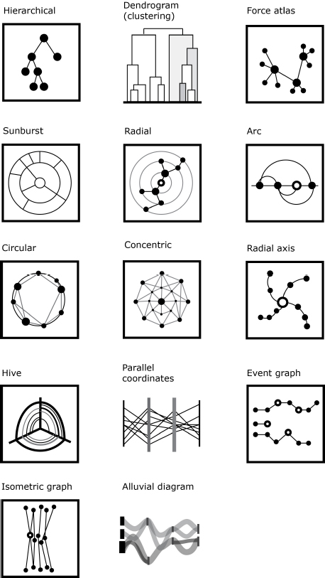
Figure 4.6. Network layouts
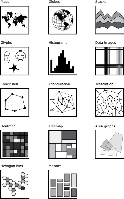
Figure 4.7. Geometrical sets
4.2.5.6. Variations and combinations
The precedent models can be diversified into innumerable possibilities. By combining visual attributes as well as coordinate projections and navigation types (lensing, zooming, orbiting, etc.), we find juxtapositions and combinations of models. Figure 4.8 shows circular treemaps, circular dendrograms, circular heatmaps, map warpings and force-atlas variations (Fruchterman-Reingold, Yifan Hu) among other combinations of charts, plots and stacks.
4.2.6. Data visualization as image-interface
In practice, the design of image-interfaces for interactive environments implies assembling diagrammatical schemes from two domains: graphical user interfaces and graphical representations of data. In Chapter 3, we identified some interface logics from the evolution of software applications, especially those dedicated to handling graphical information. We also suggested the increasing importance of web-based applications due to the fact that web browsers provide improved support for graphics routines and ubiquitous cross-platform access.
We can study the exchange processes between platforms, domains and fields from a communicative perspective. The characterization made by semiotician Göran Sonesson of translation as a double act of communication is useful at this point [SON 12]. The idea is that communicative processes exist within similar cultures where we share similar codes and ideas. However, when we import and adopt elements from another culture, the translator is the actor in charge of bridging between two cultures. On the one hand, she has to understand the original message but she also has to use rhetorical figures to communicate it in terms of another culture. Thus, she has two strategies: either she adapts to the sender or she adapts to the receiver (or eventually a mix of both).
[SON 12] recalls that linguist Roman Jakobson stresses that translation not only occurs from one verbal language to another, but might also occur within a single language or extend to different sign systems. The typical case of translation is the intralinguistic (replacing one word by another from another language). However, when we depict a picture to represent a verbal story, we are dealing with intersemiotic translation. This theory applies well to images: replacing one image with another in the same discourse (poster, graphic design, etc.) could be called intrapictorial, whereas replacing a photograph by a drawing would be interpictorial.
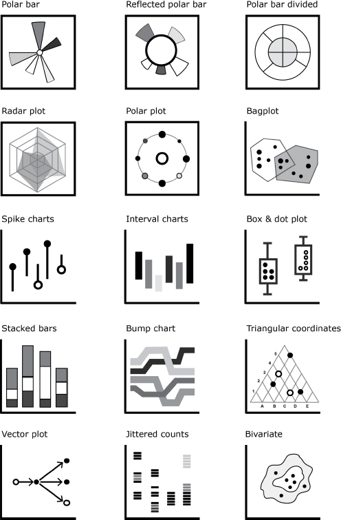
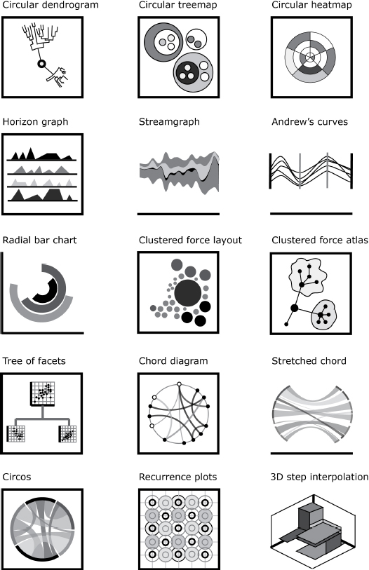
Figure 4.8. Variations and combined types
We believe the same schema applies to image-interfaces. Exchanging one controller by another of the same kind operates at an intra-interfacial level. A button might be relooked or stylized, but nonetheless remains a button. The same could be said when customizing keyboard short cuts. The other case is inter-interfacial exchanges. A designer could think that a slider is the best-suited solution for an interaction problem; however, the clever user might adapt a combo-box (or drop-down menu) or any other unit from the universe of GUI widgets to access the same commands (this process also applies to page layouts, grids, coordinate systems and all other factors that modify the graphical aspect of an image-interface).
Thus, the design of image-interfaces is a complex process because not only must designers construct for a given culture according to their own interpretations, but the visual properties of images can also be used as interactive triggers. At the same time, elements of interaction are depicted through visual attributes. In the following sections, we present examples derived from a small sample of domains where promising approaches to images-interfaces are constantly developed and prototyped.
4.2.6.1. Infographics
Infographics are popular in mass media such as blogs, newspapers, magazines, posters and advertising. They emphasize an appealing graphic design and visual style of data representations. Scholar Jay D. Bolter observed infographics as an example of visual metaphors, where it seems the symbolic structure of graphics does not suffice to convey meaning [BOL 01, p. 53]. For infographics, the strategy is to fuse visual elements from the domain depicted (let’s say “colors of flags”) with the visual attributes of the graphics (a chart colored with the colors of flags corresponding to the data country).
Most often, infographics include figurative images; in other words, they appear like pictures instead of symbolic network graphs, charts, plots or GUI. Moreover, it is common that visual attributes are modified in order to attract the eye (as they concur with many other kinds of images with the same media). We should also note that infographics are a fertile terrain for experimenting with modes of interaction, for example, using scroll events as action launchers, etc. The reader can find examples of infographics through a simple search on Pinterest9, visiting specialized blogs10 or websites of designer communities11 or using online services for designing simple infographics12. Appendix C summarizes appealing infographics and data visualization projects with an accent on user interactivity and cultural data. Figure 4.9 offers a glance at interactive infographics, in this particular case working with data from Wikipedia.org.
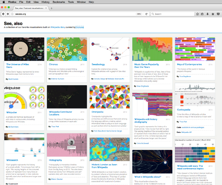
Figure 4.9. seealso.org. A volunteer-run design studio created in 2012 that curates data visualizations made with Wikipedia data. For a color version of the figure, see www.iste.co.uk/reyes/image.zip
4.2.6.2. Engineering graphics
Engineering applications of data visualization have the purpose of optimizing and making efficient flows that will be applied at industry level. Throughout this book, we have already discussed some examples: representations of data structures, algorithms and signals. Another case of using images as interfaces is well illustrated with a couple of graphics standards: UML and VLSI diagrams.
- – UML: the Unified Modeling Language appeared in 1997 and, maintained by the Object Management Group, proposes a graphical notation for describing and designing software systems, especially those based on object-oriented approaches. UML 2 includes 13 diagram types broadly grouped into two categories: structure diagrams (class, object, component, package, deployment) and behavior diagrams (activity, use case, state machine, interaction, sequence, communication, timing). Each diagram contains basic graphical elements (arrows, circles, boxes and a user glyph) that are connected by means of planar graphs. The interested reader might take a look at the official documentation13 or check one among many different UML diagram examples14 or use a software application to start creating her own15.
- – Integrated circuits layouts: in electric and electronic engineering, there are a series of symbols that represent circuit components such as transistors, inverters, gates, capacitors and inductors16. As we saw in section 2.4.2, CMOS (complementary metal oxide semiconductor) circuits are the most used in current electronic devices. The CMOS basic building block is the transistor, which is often represented as a logic gate and combined to form Boolean functions: OR, AND, NAND (not and), NOR (not or) and XOR (exclusive or). Figure 4.11 depicts three graphical representations of the same sample circuit. Graph theory is applied extensively to organize geometric layout. One example is the force-directed graph, which optimizes the wire length by calculating the position of cells at the equilibrium of forces (indeed, the force-atlas algorithm seen in section 4.2.5.4 is inspired by this technique) [KAH 11, p. 112].
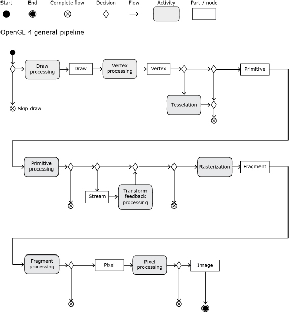
Figure 4.10. UML activity diagram of OpenGL graphics17
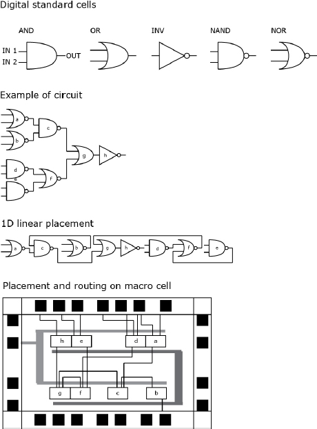
Figure 4.11. Circuit layout
The next level in the hierarchy of electronics concerns prototypes. Recently, with the introduction of free and open hardware such as Arduino micro-controllers, DIY printed circuit boards and low-cost electronic components (breadboards, LEDs, resistors, sensors, servo motors, etc.), software applications like Fritzing18 help diagraming and documenting electronic prototypes.
4.2.6.3. Scientific visualization
We refer to scientific visualization in the sense of representation in science and technology studies (STS). It typically encompasses the use of images in disciplines like mathematics, physics, biology, chemistry, geology, oceanography, meteorology, astronomy and medicine. These areas have also revolved around the use of digital imaging techniques, from modeling to simulation and visualization. Researchers like [COO 14] address the complexities of visual artifacts (such as microscopic imaging, MRI scans, 3D-modeled organs, optical imaging) within the context of image distribution and publication. From a broad perspective, the study of the numerous transformations and manipulations of images in science is also a question of what is “scientific” in science after all [LAT 14, p. 347].
Visualization types and conventions in STS have been separated according to the kind of data they visualize19:
- – Scalar data: slice planes, clipping regions, height-fields, isosurfaces, volume rendering and manifolds.
- – Vector data: arrow glyphs, streamlines, streamtube, streamsurface, particle traces and flow texture.
4.2.6.4. Digital humanities
With the increasing growth of scholars interested in digital humanities, the types of data typically represented in these kinds of projects have diversified. While most efforts have been dedicated to digital text, current projects include images, 3D models, geo-location, and heritage data designed for different platforms. As a result, interface design has become paramount to digital humanities. Seminal examples such as “Mapping the republic of letters”20, “Hypercities”21 and, more recently, “AIME”22 gained notoriety thanks to the functionality of representing multiple data types within an original interactive space.
Considered independently, text has always offered insights and inspirational approaches for designing image-interfaces. Raw text can be seen as unstructured data in the sense that text sequences of any kind (interview transcripts, speeches, novels, poems, essays, etc.) need data operations for their treatment and visualization. Some of these operations are: term frequency, term matrices (where columns represent words and rows represent documents), bigram proximity matrices [MAR 11, pp. 9–12], text encoding23, syntax and semantic fields, topic modeling, lexicometric and stylometric analysis [ARN 15, pp. 157–175], and network plot analysis [MOR 13, pp. 211–240]. Among the diverse tools and graphical representations that have emerged from a text-oriented context, some of the well known are:
- – Text analyzers: simple interfaces that count characters, words, sentences, unique words, paragraphs, ngrams, etc24. The typical outcome of this counter is numerical information.
- – Ngram viewers: the celebrated website Ngram Viewer25 that Google launched in 2010 allows searching among millions of digitized books and returns pairs of words, thirds, and up to 8 ngrams, depicted as line charts to locate publishing dates of books containing that words. Behind Ngram Viewer visualizations, data is structured as data tables and can be freely downloaded.
- – Word clouds: in 2005, computer scientist Jonathan Feinberg created an algorithm to visualize corpora of words as “word clouds”, inspired by his work on tag clouds in 2004, together with Bernard Kerr. In 2008, the famous website Wordle26 popularized the use of word clouds by common users. Although Wordle is not easy to run nowadays (because of Java restrictions in web browsers), several alternatives, plugins and libraries exist on the web to create word clouds.
- – Word trees: this kind of visualization was introduced by designers and computer scientists Martin Wattenberg and Fernanda Viégas in 200727. The idea is to summarize recurrences of a word with respect to all other words that follow or precede it. Thus, the network draws a graph that links between words which can be expanded interactively. The first versions of word trees were designed for the visualization platform IBM Many Eyes; however, a free-to-use version is currently maintained by software developer Jason Davies28.
- – Phrase nets: in 2009, Wattenberg & Viégas added phrase net visualizations to IBM Many Eyes29. Essentially, this type visualizes 2-grams in form of network graphs. An adaptation of these phrase nets can be seen as collocated graphs in Voyant Tools30.
- – Voyant Tools: humanities scholars Stéfan Sinclair and Geoffrey Rockwell have been the principal developers of Voyant Tools31 since 2010. The project constitutes a robust environment that integrates different visualization tools that can be navigated at the same time. The standard organization is a rich space where word clouds, text analyzers and frequency charts can be explored. As with other windowed systems, they are synchronized and updated whenever a change is made in a different window tool. A major upgrade to Voyant was released in 2016 under a GNU/GPL license.
Besides the main interface in Voyant, it is possible to launch alternative text visualizations which are more creative and atypical32. The gallery of graphical models reinforces the perspective of continuing the exploration of text as a plastic element. Other creative productions inspired by texts describe the production process in [DRU 09, DRU 11, RUE 14, REY 17].
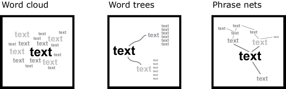
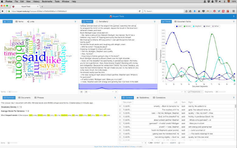
Figure 4.14. Visualization of Ulysses by James Joyce using Voyant Tools For a color version of the figure, see www.iste.co.uk/reyes/image.zip
4.2.6.5. Cultural analytics
Media theorist Lev Manovich coined the term “cultural analytics” as an intellectual program in 2005 [MAN 16]. The main objective has been to analyze massive cultural data sets using computing and visualization techniques. For Manovich, the term culture is taken in a broader sense: it is about productions made by anybody and not only those created by specialists. This means that projects in cultural analytics cover not only scientific images, professional paintings, photographs and films, but also amateur photos, selfies, home videos, student designs, tweets, etc. Moreover, instead of focusing on social impacts and relationships between content and users, the accent is put on cultural transformations and forms. This last point implies adopting an elastic vision capable of adjusting to see large patterns and zooming into particular anomalies and singular events that may pass unnoticed otherwise.
Among the techniques elaborated within the context of cultural analytics (by members and collaborators of the Software Studies Initiative33, later renamed Cultural Analytics Lab34), we can now talk about some recognized models that have proven useful for the analysis of multiple images. These techniques are known as “media visualization” [MAN 13a]; they refer to the practice of analyzing visual media through visual media. In other words, it consists of making visualizations including the images being analyzed:
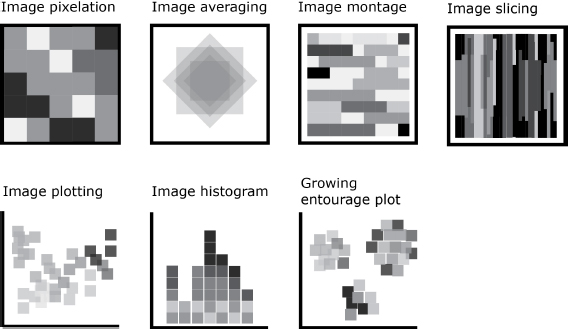
- – Image pixelation (color summarization): it basically involves obtaining the colors of an image and representing them according to a discreet sequence of mask shapes. The mask shape is often a square (it could also be another geometrical figure such as hexagons, triangles, circles or superimposed rings) and its color is sampled from the original image and organized along its relative position to the image. The size of a unitary shape determines the degree of pixelation. A bigger size of shape implies the summarization of more colors from the visual area where it gets its values.
- – Image averaging (z-visualization): this technique involves stacking a series of images on top of each other at the same spatial coordinates. It implies that all images are present in the same visual space but, in order to observe visual patterns, it is necessary to perform a statistical measure of visual features; otherwise, only the last image of the series would be visible. A single procedure for image averaging would be to reduce the opacity of each image by n-times its percentage. Another technique would be to output an image where each pixel depicts the calculated measure in all the series of images.
- – Image montage (image mosaicing): an image montage involves ordering the corpus of images one after another in a sequential manner. Similar to texts, images follow a consecutive order, reading orderly from left to right and top to bottom. The ordering rule could be obtained from measures of visual features (for instance, going from the brightest to the darkest), from metadata (for instance, by year) or by order of appearance in the sequence (from the first to the last frame). The resulting image mosaic shows a rhythm of variations and transformations that can be analyzed as a whole. In many cases, visual patterns appear clearer when there is no space between images (i.e. images are only divided by their own size) and when all the images of the corpus have the same width and height.
- – Image slicing (orthogonal views): this also presents the corpus of images one after another, but there is a fundamental difference in comparison to an image mosaic. We call a “slice” a thin region of an image cut all along the X- or Y-axis. A slice does not show or summarize the entire image, but only a delimited region. The size of the slice (how thin or thick it is) can be parameterized. For large collections of images, it seems thinner slices are the best option in order to depict variations and transformations of the entire corpus of analysis. The visual patterns then are observed by differences and variations in the regions generated.
- – Image plotting: this is based on the general 2D plot chart type that uses dots and lines to represent data along the X- and Y-axis. An image plot places, at the crossing coordinate of two values, the image corresponding to those values. For example, we can decide to plot images by “year” on the X-axis, while the Y axis would be determined by the median brightness value. In this case, we can observe variations and evolution in time over the two scales. In the cases where more than 15 dimensions or columns describe an image, it might be interesting to use a dimension reduction technique such as PCA or MDS before plotting (see section 4.2.4).
- – Image and slice histogram: this technique gives the distribution of a single dimension (or data column) by placing the corresponding image in the diagrammatic visualization [CRO 16, p. 180]. In the case of visualizing large collections of images, the histogram facilitates the identification of color and shape patterns. However, it is sometimes necessary to refine the variation in colors within a single image. For this purpose, media scientist Damon Crockett proposed to make slices at regions of interest in images. The result is a more homogeneous visualization of color fingerprints particularly useful for massive collections.
- – Growing entourage plot: also discussed in [CRO 16, p. 190], the growing entourage plots tackle the issue of 2D representation of dimension reduction algorithms by creating clusters of images. Each cluster has a centroid and similar images entourage it by their ranking proximity, resulting in “islands of images”.
One of the most interesting impacts of media visualization techniques has been their influence from an “info-aesthetic” point of view [MAN 14]. The exploration of graphical models for visual media has opened possibilities to think about visual spaces by considering the formal and material supports as plastic elements. In this line, we have introduced new media visualization methods that will be discussed in the following chapter: polar transformations and volumetric visualizations.
4.2.6.6. Data art
To conclude this chapter, we shall provide other examples that deal more closely with the info-aesthetic perspective of data visualization. In this respect, some existing techniques can be approached as media art, whose community has been growing and attracted talented programmers and artists since the 1960s. Nowadays, several efforts have been made to classify and archive digital artworks in order to have an idea of the larger picture of themes, authors, materials and exhibitions (e.g. the “Art and Electronic Online Companion”35 initiated by scholar Edward Shanken or the “Digital Art Archive”36 maintained by scholar Oliver Grau).
Regarding text visualization, we can cite exemplary projects where text acquires image-interface features: “History words flow” by Santiago Ortiz37, “The dumpster” by Golan Levin38, “The preservation of favored traces” by Ben Fry39 and “Gamer textually” by Jeremy Douglass40, to mention only a few cases.
In addition, more related to media visualization, pixelation might evoke “pixel art”, as it was introduced by artists Goldberg and Flegal in 1982 to describe the new kind of images being produced with Toolbox, a Smalltalk-80 drawing system designed for interactive image creation and editing [GOL 82]. Image averaging is related to the work of computer scientists Sirovich and Kirby on “Eigenfaces” in 1987 [SIR 87] and, more recently, to media artist Jason Salavon, who has produced a series of images by averaging 100 photos of special moments41. For image mosaics, media researcher Brendan Dawes presented “Cinema Redux”42 in 2004, a project aimed at showing what he calls a visual fingerprint of an entire movie. His main idea was to decompose an entire film into frames and then to arrange them as rows and columns. Moreover, image slicing can also be seen as a remediation of slit-scan photography. Among other prominent slit-scan photographers, William Larson produced, from 1967 to 1970, a series of experiments on photography called “figures in motion”. The trick was to mount a thin slit in front of the camera lens to avoid the pass of light into the film. Thus, the image is only a part of an ordinary 35 mm photograph. More recently, in 2010, artist Paul Magee has produced large print visualizations that reorder colors in photographs using C [MAG 16, p. 456].