5
Prototyping Image-Interfaces
This chapter presents my own productions and experiments created within the context of image-interface and data visualization. It covers a range of prototypes, screen shots and sample codes for scripting software applications, integrating data and media visualization, and extending the generated images beyond the screen to “data physicalization” via 3D printing. The accent is put on personal perspectives and ongoing procedures that have been assembled to produce image-interface prototypes.
5.1. Scripting software applications
One of the common practices to extend the standard functionalities of software applications is to create small programs that will process step-by-step operations that we would do repetitively by hand. In operating systems like macOS, the programming language that helps automatize routines is AppleScript, together with the graphical interface Automator. In other cases, software applications provide access to programmatic components via an API. We mentioned in section 2.3.1 that popular commercial packages like Adobe Photoshop can be scripted with JavaScript (among other languages such as Visual Basic, AppleScript and ExtendedScript).
Table 5.1 shows a basic script example written in JavaScript to be run with Photoshop. The idea is to generate 15 rectangles in different layers, each having different sizes, random colors and rotation angles. Figure 5.1 shows the resulting image.
Table 5.1. newLayers.js. JavaScript code to be run with Photoshop
| /* ****************************
This scripts generates 15 random layers in Photoshop CS6. 1. Create new document. 2. File --> Scripts --> Browse… Written by E. Reyes, 2017. *************************** */ // Uncomment this line to run the script with no opened document //app.documents.add(); app.preferences.rulerUnits = Units.PIXELS; app.preferences.colorModel = ColorModel.RGB; var message = confirm("Add new random layers?"); if(message){ for(var i = 0; i < 15; i++){ var layerRef = app.activeDocument.artLayers.add(); layerRef.name = "Random Layer " + i; //layerRef.blendMode = BlendMode.NORMAL; app.activeDocument.selection.selectAll; var colorRef = new SolidColor(); colorRef.rgb.red = Math.floor(Math.random()*255); colorRef.rgb.green = Math.floor(Math.random()*255); colorRef.rgb.blue = Math.floor(Math.random()*255); app.activeDocument.selection.fill(colorRef); var s = Math.floor(Math.random()*100); layerRef.resize(s,s); layerRef.translate(Math.random()*10, Math.random()*10); layerRef.rotate(Math.floor(Math.random()*360)); layerRef.fillOpacity = 30; } } |
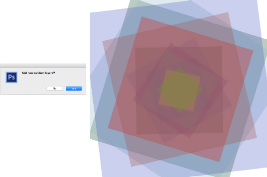
Figure 5.1. Generated image with Photoshop using JavaScript. For a color version of the figure, see www.iste.co.uk/reyes/image.zip
The way in which JavaScript “understands” Photoshop syntax and components is similar to that of HTML pages: through a Document Object Model (DOM). Adobe supports scripting via JS in almost 85 different objects, including the main application, documents, layers, actions, color management, save options, print options, metadata, etc. [ADO 12, pp. 3–31]. In our example, we have access to the “preferences” objects to set units to pixels and color model to RGB. We then call the method “confirm” which uses the standard GUI library in Photoshop to show a pop-up window. The rest of the script is nested inside a “for” loop in which we assign random values to layers, via the “artLayers” object.
We can imagine an orthogonal view of Figure 5.1. Recent versions of Photoshop include a 3D module which is handy at this point. Selecting all generated layers, we choose 3D → New Mesh From Layer → Volume… Figure 5.2 shows two orthogonal views of the same image.
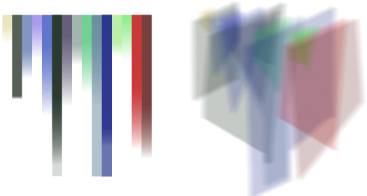
Figure 5.2. Orthogonal views of the generated layers. For a color version of the figure, see www.iste.co.uk/reyes/image.zip
Another example is Autodesk Maya whose components can be manipulated with the Maya Embedded Language (MEL) and with Maya Python. While it is the native language used to communicate with Maya components, Python was introduced in version 8.5 as a solution to add object-oriented possibilities to MEL. Moreover, the popularity of Maya has attracted communities of developers and, in current practice, we use the set of tools PyMEL to instantiate the Command Engine, and in-house plug-ins can be developed with Qt [MEC 12, p. 234].
Figure 5.3 shows the basic GUI to generate procedural designs and the resulting image design (top right). Indeed, the interface offers two rule hints to help create two kinds of L-System: a Dragon Curve and a Gopser Curve (recall section 2.2.4). Just as we saw in the Photoshop examples, the generated image can be used as the basis for exploring further graphical interventions. The figure shows the same geometrical set with modified Phong shader values and a top perspective to observe the fractal iterated with 9 rewriting rules (bottom).
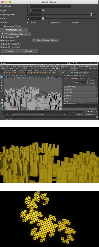
Figure 5.3. Generated model using Python with Maya. For a color version of the figure, see www.iste.co.uk/reyes/image.zip
Table 5.2. mayaFractal.py. Python script to be run with Maya
| ##################################
# 1. Open the Script editor and select Python tab # 2. Copy-paste the following code # 3. Follow instructions in GUI # 4. Save the script as plug-in : Save script to shelf # Written by G. Miranda, J. Maya, E. Reyes. 2011-2017 # +info: brooom.org/mayaFractal ###################################################### from pymel import * import math import maya.cmds as cmds import random global ANG,ang,x,y,Forma class lSystem: def __init__(self): self.axioma = '' self.regla = ['']*256 #cadena que reemplaza for i in range (256): self.regla[i]=None self.noRe = 0 self.axiom = '' self.angle=0 self.forma=0 self.random=None self.color=0 self.lShader = ['']*30 self.SG = ['']*30 def setAxioma(self, a): self.axioma=a def setAngle(self,ang): self.angle=ang def addRegla(self,c,r): self.regla[ord(c)]=r def delRegla(self,c): self.regla[ord(c)]=None def setColor(self,col): self.color=col for i in range (int(self.color)): self.lShader[i]=None self.lShader[i] = cmds.shadingNode('blinn', name='LSys'+str(i), asShader=True) def Cambio(self,nr): i=0 j=0 for i in range(nr): self.axiom = '' for j in range(len(self.axioma)): if self.regla[ord(self.axioma[j])]!= None: self.axiom = self.axiom + self.regla[ord(self.axioma[j])] else: self.axiom = self.axiom + self.axioma[j] self.axioma=self.axiom def Dibujar(self): x = 0.0 y = 0.0 x1 = 0.0 y1 = 0.0 ANG = math.radians(self.angle) ang = 0 self.grupo=cmds.group( em=True, name='LSystem' ) self.random=setRandom() f=0 for i in range(len(self.axioma)): if self.axioma[i]=='+': ang=ang-ANG else: if self.axioma[i]=='-': ang=ang+ANG else: if self.axioma[i]!='+' or self.axioma[i]!='-': x1=x y1=y x = x + math.cos(ang) y = y + math.sin(ang) f=f+1 rando=random.random() if self.forma== 1: if self.random == False: cmds.polyCube(height=.2, depth=(x-x1), width=(y-y1)) cmds.move(x,0,y) else: cmds.polyCube(height=rando*5, depth=(x-x1), width=(y-y1)) cmds.move(x,(rando*5)/2,y) cmds.parent( 'pCube'+str(f), self.grupo ) CUBO='pCube'+str(f) cmds.select(CUBO) SHADER=self.lShader[int(rando*int(self.color))] cmds.hyperShade( assign=SHADER) elif self.forma==2: if self.random == False: cmds.polyPyramid(sideLength=1,numberOfSides=int(rando*3)+2) cmds.move(x,0,y) else: cmds.polyPyramid(sideLength=1,numberOfSides=int(rando*3)+2) cmds.scale(1,rando*5,1) cmds.move(x,0,y) cmds.parent( 'pPyramid'+str(f), self.grupo ) CUBO='pPyramid'+str(f) cmds.select(CUBO) SHADER=self.lShader[int(rando*int(self.color))] cmds.hyperShade( assign=SHADER) elif self.forma==3: if self.random == False: cmds.polySphere(r=.4) cmds.move(x,0,y) else: cmds.polySphere(r=.1) cmds.scale(1,1+rando*5,1) cmds.move(x,(rando*5)/2,y) cmds.parent( 'pSphere'+str(f), self.grupo ) CUBO='pSphere'+str(f) cmds.select(CUBO) SHADER=self.lShader[int(rando*int(self.color))] cmds.hyperShade( assign=SHADER) L=lSystem() def CrearFra(*args): setAxioma() setAngle() setRepeticiones() setColor() L.forma=setForma() L.Dibujar() cerrarVentana(0) def AddRule(*args): result = cmds.promptDialog( title='Add Rule', message='Change,Rule:', button=['+', '-']) if result == '+': texto = cmds.promptDialog(query=True, text=True) texto2='' for i in range(2,len(texto)): texto2=texto2+texto[i] print 'Rule added: ' + texto L.addRegla(texto[0],texto2) elif result == '-': texto = cmds.promptDialog(query=True, text=True) print 'Rule Deleted: ' + texto[0] L.delRegla(texto[0]) def setColor(*args): COL= cmds.textFieldGrp('Colores', q=True,text=1) L.setColor(COL) def setAxioma(*args): AXM= cmds.textFieldGrp('Axioma', q=True,text=1) L.setAxioma(AXM) def setAngle(*args): ANG= cmds.floatFieldGrp('Angulo', q=True, value=1)[0] L.setAngle(ANG) def setRepeticiones(*args): REP= cmds.intSliderGrp('Repeticiones', q=True, value=1) L.Cambio(REP) def setForma(*args): return cmds.radioButtonGrp( 'Formas', q=1, select=1) def setRandom(*args): return cmds.checkBox('Random',q=1,value=1) def cerrarVentana(arg): cmds.deleteUI('LSystem', window=True) #### GUI #### if cmds.window('LSystem', exists=True): cerrarVentana(0) cmds.window('LSystem',title="Maya Fractal") cmds.columnLayout(adjustableColumn=True) #Fields cmds.textFieldGrp( 'Axioma',label='Initial State', columnAlign=[1, 'left']) cmds.floatFieldGrp( 'Angulo',label='Angle', extraLabel='°',columnAlign=[1, 'left']) cmds.intSliderGrp( 'Repeticiones', field=True, label='Rewriting rules', minValue=0, maxValue=10, fieldMinValue=0, fieldMaxValue=10,columnAlign=[1, 'left']) cmds.intSliderGrp( 'Colores', field=True, label='Colors', minValue=1, maxValue=30, fieldMinValue=1, fieldMaxValue=30,value=1,columnAlign=[1, 'left']) cmds.radioButtonGrp('Formas', label='Shapes: ', labelArray3=['Cubes', 'Pyramids', 'Spheres'], numberOfRadioButtons=3, columnAlign=[1, 'left'] ) cmds.checkBox('Random', label='Randomize Height',align='right') cmds.columnLayout(adjustableColumn=False,columnAlign='right') cmds.button(label="Add/delete rules", width=150, align="center", command = AddRule ) cmds.rowLayout( numberOfColumns=2,columnAlign=(1, 'right')) cmds.frameLayout( label='Try a Dragon Curve ', collapsable=1,collapse=1 ) cmds.text( label="• Initial string: FX", align="left") cmds.text( label="• Angle: 90.0", align="left") cmds.text( label="• Rule 01: X, X+YF+ ", align="left") cmds.text( label="• Rule 02: Y, -FX-Y" , align="left") cmds.setParent( '..' ) cmds.frameLayout( label='Try a Gopser Curve ', collapsable=1,collapse=1 ) cmds.text( label="• Initial string: FX", align="left") cmds.text( label="• Angle: 60.0", align="left") cmds.text( label="• Rule 01: X, X+YF++YF-FX--FXFX-YF+ ", align="left") cmds.text( label="• Rule 02: Y, -FX+YFYF++YF+FX--FX-Y ", align="left") cmds.setParent( '..' ) cmds.setParent( '..' ) cmds.columnLayout() cmds.rowLayout( numberOfColumns=2,columnAlign=(1, 'right')) cmds.button("Create", command= CrearFra, align="right", width=100) cmds.button("Cancel", command=cerrarVentana,align="right", width=100) cmds.setParent( '..' ) cmds.setParent( '..' ) cmds.showWindow() |
In our experience, when prototyping image-interfaces it is often necessary to customize functionalities of software applications. In fact, whenever we use macros in office software like Word and Excel, we are also scripting applications. This is an excellent way to understand the data types, data structures and actions supported by the environment. We might end up generating unexpected graphical results or perhaps we will have to solve a GUI readability problem. The ease of using a software API and the power to extend it is also a determining criteria that would encourage us to identify with it and continue its practice: designing workflows, new images and plugins.
5.2. Integrating data visualizations
I started working systematically on data and media visualization in 2007. At that time, one of the most popular development platforms was Adobe Flash, together with the scripting languages ActionScript 2 and 3 (although very different from each other). Among my first experiments was the idea to visualize interrelationships between media, arts and technology. The result was MediaViz, a standalone bubble chart interactive SWF application, which was exhibited at the University of Annecy in 2010 (Figure 5.4).
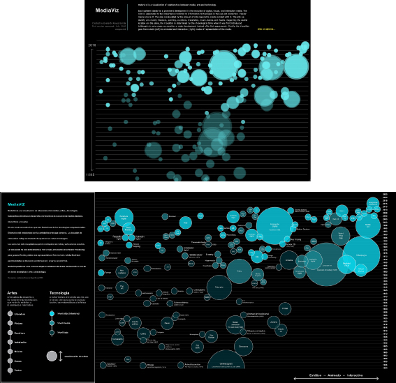
Figure 5.4. MediaViz, 2010. Screenshot of Flash movie and static image. For a color version of the figure, see www.iste.co.uk/reyes/image.zip
Among the traditional and recurrent issues encountered were: scale mapping (fitting a delimited range of years into a given width of pixels), interaction and objectivity of data. Answers to the first were solved with arithmetic calculations, the second depends on the software platform (handling mouse events, collision detection between cursor and object), and the third is more metaphysical. I arbitrarily selected 150 media from between 1895 and 2010, from cinema to DVD, from photograph to multimedia. When the latest version was finished, it was obvious that information could be rethought.
In 2012, I prototyped the “Map of digital arts”, which was submitted to ACM SIGGRAPH as a poster co-authored with Paul Girard, technical head of the médialab at Science Po Paris1. For this experiment, I conducted an informal survey among students of the BA in Animation and Digital Art at Tecnológico de Monterrey at Toluca in Mexico. Students selected the 25 most representative arts, technologies and media. These were the entry points in Wikipedia to extract all the links pointing to further elements, using Open Refine. The result was a database of 5330 nodes and almost 6000 edges. For us, the most evident software application to visualize the network was Gephi, but the intention was to create a standalone interactive version. Paul Girard hard-coded the network exported from Gephi in gefx format to be loaded into Processing 1. Figure 5.5 shows one of the final versions, depicting the profile image in their Wikipedia page.
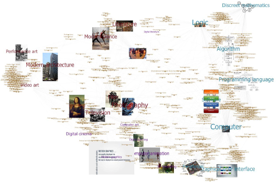
Figure 5.5. Map of digital arts. 53330 nodes extracted from Wikipedia. For a color version of the figure, see www.iste.co.uk/reyes/image.zip
5.3. Integrating media visualizations
In 2008, I was introduced to the concept of media visualization and other theoretical perspectives on software by media scientist Lev Manovich. The following year I had the opportunity to invite digital artist scholar Jeremy Douglass (then co-director of the Software Studies Initiative), to conduct hands-on workshops around a series of seminars and classes on cultural analytics I organized in Mexico.
Douglass demonstrated how to visualize visual media with Fiji2 (a distribution of ImageJ which stands for Fiji Is Just Imagej). The kind of content we visualized was video and motion graphics: image generation steps with Context Free, video game sessions, videos of juggling, etc. This was appealing to students in 3D animation as they were used to thinking of videos as a sequence of images, as they render animated sequences frame-by-frame in Maya or 3ds Max.
In 2013, I assembled different visualizations of alternative rock group Nirvana for an invitation at the seminar “Social History of Rock” at the Institut Mahler in Paris. Figure 5.6 shows a poster placing together the complete videography of the group. I produced horizontal orthogonal views of each video. In my own workflow, I gathered videos from YouTube, then I used QuickTime 7 to export a video as an image sequence. Finally, in ImageJ, I imported that image sequence. The reader might also be interested to explore vertical orthogonal views. Both horizontal and vertical are created with Image→Stacks→ Orthogonal Views…
I called network media visualization a network graph where nodes were replaced with images being put in relation. In my work on Nirvana, I paid attention to cover designer Robert Fisher, who conceived the design layout of all Nirvana album and single covers, as well as many more designs for other groups while working at Geffen Records. Figure 5.7 depicts the network of Robert Fisher. Similar to the workflow in “Map of digital arts”, I first obtained album credit information from the AllMusic website database. I then laid out the network using the force atlas algorithm in Gephi. I exported the network in gexf format and imported it into Processing, now using the Java library Gephi Toolkit3.
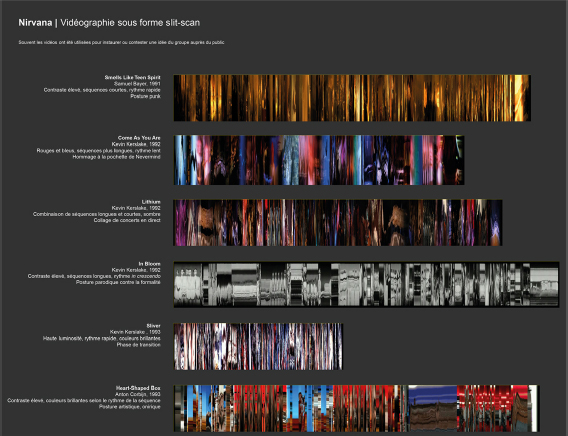
Figure 5.6. Visualization of Nirvana videos. For a color version of the figure, see www.iste.co.uk/reyes/image.zip
Another integration effort to reunite different visualization types into one discourse was a custom application made with Processing 1.5. NirViz synchronized audio playback, video, image slicing and most significant colors at each position in time. Figure 5.8 shows the interface, a standalone full screen Java app exported from Processing.
5.4. Explorations in media visualization
5.4.1. Software visualization of Processing 2
As mentioned earlier, choosing a software environment or a programming language greatly influences not only the kind of images obtained, but also how we think about the media they handle. In this study, the value of an environment such as Processing was essentially in the sense of “software esthetics”.
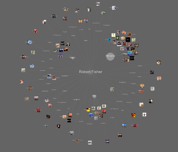
Figure 5.7. Network media visualization of Robert Fisher. For a color version of the figure, see www.iste.co.uk/reyes/image.zip
I have argued elsewhere that software art is important because it shows how software could behave differently, mainly through ruptures of function [REY 14]. Understanding such ruptures requires us also to understand how the software operates. Esthetics of software happens when we discover and use new software. Not only it is appealing to see and to interact with its elements, it also represents the vision of another designer or artist: how she thought the names, icons, functions and which algorithms were implemented.
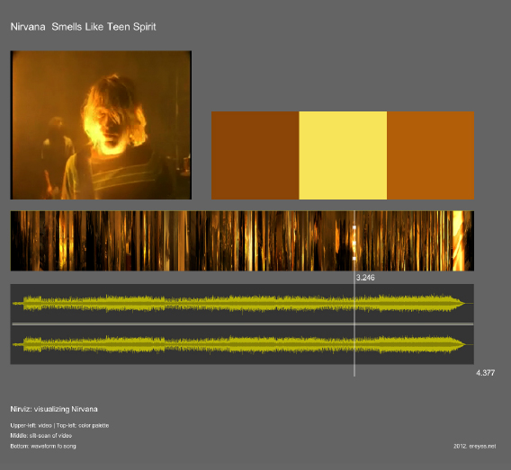
Figure 5.8. The NirViz app interface. For a color version of the figure, see www.iste.co.uk/reyes/image.zip
There is a deep and large effect underlying media art software. The more we use it, the deeper we go into its ecology and ideology. Fully adopted, software shapes us as media designers and media artists, but at the same time it also means challenging its paradigms and mode of existence. When we discover new software, it happens that the mere production of ‘Hello World’ is satisfying, but it is also of the most significant importance precisely because it embraces engagement and motivates us to continue experimenting.
Furthermore, software esthetics finds an echo in software criticism. For example, media theorist Matthew Fuller understands software as a form of digital subjectivity [FUL 03, p. 19]. The human–computer interface is seen as having a series of ideological, socio-historical and political values attached to it. Studying the HCI implies investigating power relations between the user and the way the software acts as a model of action. This idea resonates with Winograd and Flores: “We encounter the deep questions of design when we recognize that in designing tools we are designing ways of being” [WIN 86, p. ix].
Inspired by the notion of “object-oriented ontology” and their visual representation as ontographs [BOG 12, p. 51], I created views of the Processing 2 source code (Figure 5.9) using software visualization tools and techniques. The idea was to put in relation to the underlying components of the software classes and entities. I downloaded the source code from the Processing github repository, then I used inFusion for basic software metrics and to convert into Moose format, which is required by CodeCity and X-Ray applications to produce a more graphical representation.
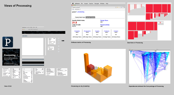
Figure 5.9. Visualizations of Processing 2. For a color version of the figure, see www.iste.co.uk/reyes/image.zip
5.4.2. Graphical interventions on Stein poems
While Processing 1.x was an exciting tool for experimenting with visual information, one of the main caveats was its support for web browser distribution. In 2008, the situation changed when computer engineer John Resig, best known for creating jQuery, wrote the first version of Processing.js to be displayed on an HTML canvas. At that time, the graphical web was still in its early stages of development, thus Processing.js was only featured in WebKit-based browsers (Firefox, Safari, Opera).
Processing.js was inspiring to explore artistic hypertext as it does not ascribe specific forms of representation to data, but rather allows for the exploration of interrelationships between the system components. In collaboration with scholar Samuel Szoniecky and digital poetry pioneer Jean-Pierre Balpe, we worked together on “Stein Poems” with the artistic goal of experimenting and provoking unexpected behaviors of conventional computing in order to challenge cultural and perceptual habits [REY 16].
Stein poems are short fragments of text that refer to life in general. In early 2015, Jean-Pierre Balpe started creating such structures as part of his extensive research and development in automatic literary text processing since the 1980s. As the first text generators developed by Balpe were created on Hypercard, it was necessary to migrate the dictionaries and rules into more recent technologies. In late 2014, Samuel Szoniecky developed a complete authoring tool for generating texts using Flex and made it available through the web.
I used the generator API to produce graphical interventions in the web browser. The idea was to exploit plastic properties of text through recent graphical web technologies. As Stein poems are short fragments and combine vocabulary from multiple domains, they can be “experienced” and “touched” as visual images and user interfaces. Figure 5.10 shows two output interfaces, one is based on Processing.js and the other is rendered as SVG text using the library D3.js4. Both applications are interactive and use the same text API. While the first handles the web page as 2D matrix and applies rotation and translation transformations with a GUI, the second randomizes position and allows dragging/dropping each individual letter5. In the end, both tools create patterns and textures of text from the Stein poems.
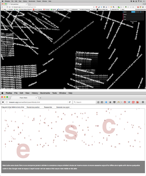
Figure 5.10. Graphical interventions in digital poetry
5.4.3. Web-based visualization of rock album covers
While text as plastic element allows exploring visual configurations, the main challenge of media visualization within a web environment is to load great amounts of images as individual elements. In 2014, I prototyped “RockViz”6 in an effort to design interactive web-based image plots and mosaics. For this production, I gathered the most representative albums of different rock genres according to editors of the platform AllMusic.com. I quickly obtained almost 2000 albums, from folk rock to progressive rock and heavy metal.
The metadata collected was about the artist/group name, album title, release date and album cover image. I then downloaded the album cover images and extracted their basic visual features with ImageJ. In this respect, members of the Cultural Analytics Lab have created macro scripts for ImageJ and MATLAB that help the extraction process: ImageMeasure.imj, ShapeMeasure.imj, ImageMontage.imj and ImagePlot.imj. As mentioned earlier, scripting applications are common when working in media visualization. I have contributed with a different version of ImageMontage that supports different compressed file formats (PNG and JPG) and another script to extract colors according to the RGB color model. The latter script, ImageMeasure-RGB.imj, is shown in Table 5.3.
When the database was completed, I used Open Refine to handle data, but more importantly to apply mathematical formulae to numerical visual attributes and dynamically calculate their Cartesian position. The result was a dynamically generated column in Refine that constructed a full line of CSS style for each individual image, for instance: <img style="left:70.5%; top:4.0%; visibility:visible;">
I adapted this method to create an image mosaic, ordered according to: 1) median of hue; 2) median saturation; 3) median brightness (Figure 5.11). In the image plot visualization, the horizontal axis represented years (from 1955 to 2014) and the vertical axis hue values (from 0 to 360, following the HSB color model) (Figure 5.12). In GREL scripting language, which is natively supported by Refine, my formula to calculate plot horizontal positions is (((cells["year"].value/1.0) − 1950) * 1500) / 1000 and vertical positions is (((value/1.0) − 0) * 3500) / 10000. As can be seen, the delimited space is no bigger than 1500 x 900 screen pixels.
Table 5.3. ImageMeasure-RGB. Macro script for extracting RGB colors
| // This macro measures a number of statistics of every image in a directory:
// red median and stdev, green median and stdev, blue hue and stdev // To run the macro: open ImageJ; select Plugins>Macros>Run… from the imageJ top menu // For information on how to use imageJ, see // http://rsbweb.nih.gov/ij/ // Everardo Reyes, 2014 // ereyes.net // www.softwarestudies.com run("Clear Results"); dir = getDirectory("Choose images folder to be measured"); list = getFileList(dir); print("directory contains " + list.length + "files"); savedir = getDirectory("Choose folder to save output file measurementsRGB.txt"); f = File.open(savedir +"measurementsRGB.txt"); // option: save measurementsRGB.txt inside images folder // f = File.open(dir+"measurementsRGB.txt"); // option: to save measurements.txt inside to user-specified location // uncomment next two lines and change the mydir path to the path on your computer // mydir = "/Users/the_user/"; // f = File.open(mydir+"measurementsRGB.txt"); //write headers to the file print(f, "filename" + " " + "imageID" + " " + "red_median" + " " + "red_stdev" + " " +"green_median" + " " +"green_stdev" +" " + "blue_median" + " " +"blue_stdev" + " "); setBatchMode(true); run("Set Measurements…", " standard median display redirect=None decimal=2"); for (i=0; i<list.length; i++) { path = dir+list[i]; open(path); id=getImageID; // if image format is 24-bit RGB, measure it if (bitDepth==24) { image_ID = i + 1; print(image_ID + "/" + list.length + " " + list[i]); run("RGB Stack"); run("Convert Stack to Images"); selectWindow("Red"); //rename(list[i] + "/brightness"); run("Measure"); red_median = getResult("Median"); red_stdev = getResult("StdDev"); close(); // close the active image - "Brightness") selectWindow("Green"); //rename(list[i] + "/saturation"); run("Measure"); green_median = getResult("Median"); green_stdev = getResult("StdDev"); close(); // close the active image - "Saturation") selectWindow("Blue"); //rename(list[i] + "/hue"); run("Measure"); blue_median = getResult("Median"); blue_stdev = getResult("StdDev"); close(); // close the active image - "Hue") } // if image format is not 24-bit RGB, print the name of the file without saving measurements else print("wrong format:" + " " + list[i]); // write image measurements to measurements.txt print(f, list[i] + " " + image_ID + " " + red_median + " " + red_stdev + " " + green_median + " " + green_stdev + " " + blue_median + " " + blue_stdev + " "); } // setBatchMode(false); |
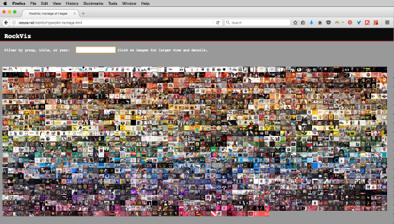
Figure 5.11. Interactive image mosaic of 2000 rock album covers. For a color version of the figure, see www.iste.co.uk/reyes/image.zip
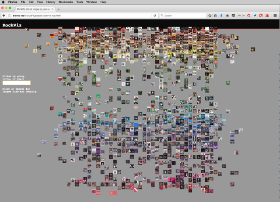
Figure 5.12. Image plot of 2000 rock album covers. X = years; Y = hue. For a color version of the figure, see www.iste.co.uk/reyes/image.zip
An additional functionality I added was a text input filter. Given the amount of images, I found it useful to explore by typing a year, an artist name or an album title. To make the loading of images a little faster, I produced two versions of each image: one is scaled to 100 x 100 px. and the other to 500 x 500 px. The small version is used for visual representations and the larger appears when the user clicks on an image therefore allowing her to observe more details of a single cover. I originally used JQuery and the function getJSON to communicate with a JSON database, but the loading time is very slow for more than a few hundred images.
With the intention of producing different organizations of images and to eventually observe different patterns, I modified my original formulae. I explored some combinations of sine and cosine functions taking advantage of the fact that GREL supports trigonometric calculations. Figure 5.13 plots the formula r2 = x2 + y2 ; x = r cos(θ) ; y = r sin(θ) and Figure 5.14 plots the formula r2 = x2 + y2 ; x = r cos(θ) * cos(ι) ; y = r sin(θ) * cos(ι). Other variations are sketched in Figure 5.15.
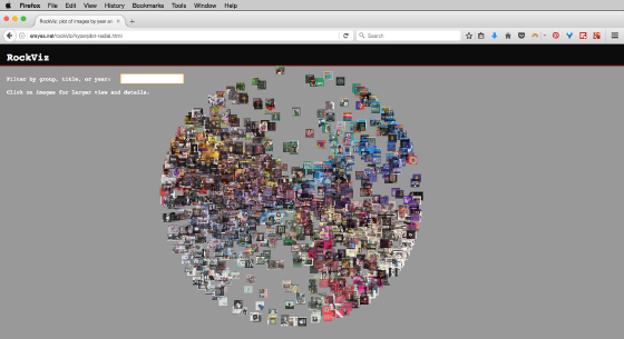
Figure 5.13. Experimental radial plot of images. r2 = x2 + y2 ; x = r cos(θ); y = r sin(θ). For a color version of the figure, see www.iste.co.uk/reyes/image.zip
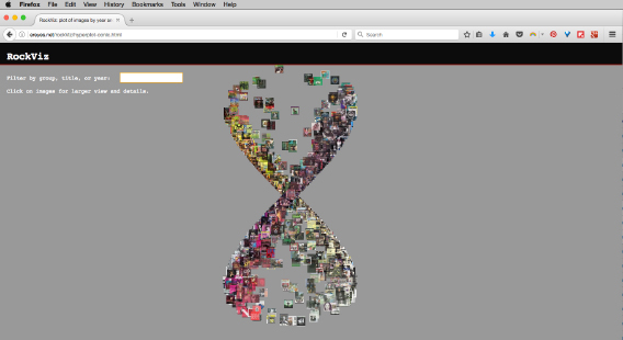
Figure 5.14. Experimental radial plot of images. r2 = x2 + y2 ; x = r cos(θ) * cos(ι); y = r sin(θ) * cos(ι). For a color version of the figure, see www.iste.co.uk/reyes/image.zip
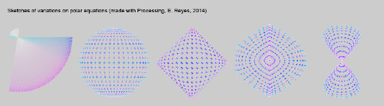
Figure 5.15. Sketches of polar plot variations. For a color version of the figure, see www.iste.co.uk/reyes/image.zip
5.4.4. Esthetics and didactics of digital design
With the more recent development of web graphics, the possibilities of HTML5, CSS3 and JavaScript facilitate the way in which we can approach data visualization. Within an educational context my endeavor has the intention to introduce digital humanities to undergraduate students. Indeed, it may be regarded from three angles: first, as the construction of tailored toolkits of digital methods for students; second, as a contribution to the analysis of material properties of cultural productions; and third, as a mid-term strategy to orient students towards design-based learning techniques.
The way in which the three perspectives connect is as follows: we consider the realm of cultural productions populated by music albums, films, comic books, TV series, video games, digital art, architecture, industrial design, etc. Now, with the emergence of various kinds of tools and scripts for analyzing media data (text, images, audio, etc.), we select and assemble several of them in a tailored toolkit for studying cultural productions. Then we use the toolkit as a teaching methodology in the classroom. In the mid/long-term, our intention is to move students from the use of tools (as it happens in undergraduate courses) to the creation and design of tools, services and processes (as it happens in postgraduate courses).
The analysis of cultural productions deals with tasks such as gathering, documenting, representing and exploring valuable data about forms, materials, contexts, techniques, themes and producers of these productions. The resulting visualizations are put together into what I call “analytical maps”, which are helpful in the processes of identification of relationships, observation, comparison, evaluation, formulation of hypothesis, verification of intuitions, elaboration of conclusions and other humanities methods.
For example, a media visualization model might emerge from an abstraction of forms and layouts of web graphics, from simple HTML element positions to data and images. I coded an interactive version of the interface shown in Figure 5.16 (top), using exclusively HTML, CSS and jQuery. The GUI controller is implemented with the dat.GUI library7, made available by the Google Data Arts Team. In the bottom picture, the same organization is generated from a data table saved in JSON format. This table contains 201 images of paintings by artist Paul Klee (http://ereyes.net/kleeviz/). We had previously extracted visual attributes with ImageJ: red, green, blue, hue, saturation, brightness, and some shape descriptors. Of course, I am conscious that Klee was a prolific artist whose entire production counts in the thousands; however, I limited myself to images available from the website wikiart.org.
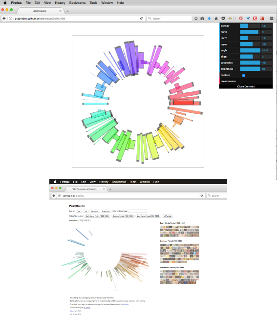
Figure 5.16. Adapting HTML positions to media visualization. For a color version of the figure, see www.iste.co.uk/reyes/image.zip
I present to students this and other examples in order to stimulate the exploration of different manners of using the same web technologies we employ in conventional websites. Among the original results, Figure 5.17 presents an experimental visualization made by three MA students in Interface Design. They chose to represent 609 comic magazine covers from Marvel in a vertical orthogonal view8. Each bar stands for a cover and its most prevalent color. Bars are positioned in a chronological order and clustered by season: spring, summer, autumn and winter. Other functionalities were proposed by students themselves: a color chart containing the 10 most common colors and hexadecimal color notations.
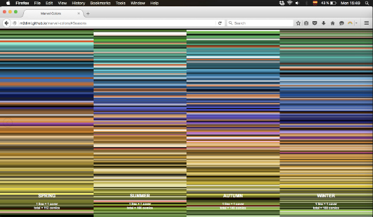
Figure 5.17. 609 Marvel comics covers by season, published between 2000 and 2015 (created by Blumenfeld, Mauchin and Lenoir). For a color version of the figure, see www.iste.co.uk/reyes/image.zip
Other examples made with students are shown in Figure 5.18 and 5.19. The first one shows a simple implementation in CSS for an image slicing. Students of the MA Analysis of Digital Uses gathered pictures from actresses who won an Oscar between 2010 and 2016. With a simple right float position and shrinking the width value, the images are depicted in chronological order. When the user passes the mouse over an image, its size changes while showing a larger preview below the analytical map9.
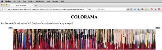
Figure 5.18. 120 dress photos from Oscar awards between 2010 and 2016 (created by Corviole, Legrand, Magny, Molina and Nguer). For a color version of the figure, see www.iste.co.uk/reyes/image.zip
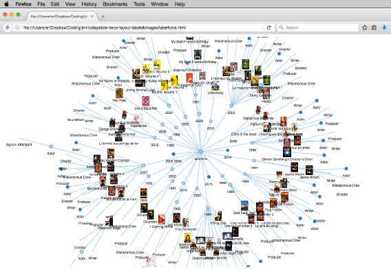
Figure 5.19. D3.js force-directed graph with images. Created by J. Caignard. For a color version of the figure, see www.iste.co.uk/reyes/image.zip
The third example presents a modification of a D3.js script. Similar to Figure 5.7, this visualization replaces nodes as circles with images themselves –in this particular case, movie posters from films by director Quentin Tarantino. My workflow to introduce and personalize D3.js examples relies on RAW Graphs10, an open-source tool created by the DensityDesign Research Lab (Politecnico di Milano). Once students have constructed a database, RAW Graphs allows them to copy/paste the data to generate and personalize a static visualization. It is interesting to note that such visualizations can be downloaded as a compressed image (PNG), a vector image (SVG), and also as a data model in JSON format. Specifically regarding network graphical models, the output structure is an object containing two arrays: nodes and links. This data structure is the same employed in D3.js, hence students can easily personalize scripts from the examples by replacing the JSON file.
5.4.5. Prototyping new graphical models for media visualization with images of paintings by Mark Rothko
I have started working on media visualization with colleagues from other disciplines, most notably semiotics and information sciences. The Paul Klee visualization that I presented earlier was the subject of a communication at the congress of the International Association for Visual Semiotics held in Liège in 2014. Klee is a peculiar artist who has attracted semiotic analyses and thus my own visualization tried to put in perspective the different paintings analyzed within his complete production.
Another attractive artist for semioticians has been Mark Rothko. For this occasion, I prototype “Rothko Viz”11. I gathered 203 images of paintings from wikiart.org and followed the already discussed workflow for extracting visual attributes: shape measurements, RGB and HSB color modes together with a variety of statistical derivations (median, standard deviation, mean). The database quickly had 60 columns and I produced Principal Component Analyses (PCA) of those dimensions. Figure 5.20 shows a parallel coordinate visualization of the 60 data columns made with Mondrian, and Figure 5.21 plots images according to the first two factors of the PCA, made with ImagePlot.imj. The main difference of plotting PCA values instead of, for example, years versus hue values as we did before is that images seem closer according to similarity. As we saw in section 4.2.4, PCA is a statistical method dedicated to dimension reduction and the numerical result derives from all the data columns.
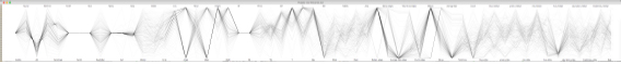
Figure 5.20. Parallel coordinate visualization of multiple dimensions
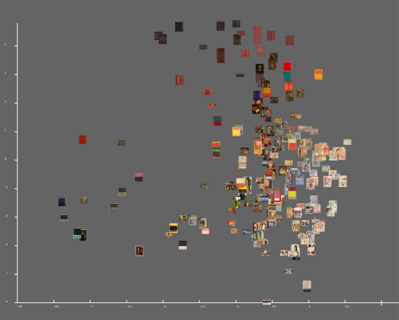
Figure 5.21. Image plot of PCA factors. For a color version of the figure, see www.iste.co.uk/reyes/image.zip
With the intention to produce new media visualization models, I explored plugins already available for ImageJ. Among such plugins, the Polar Transformer12 (created by scholars E. Donnelly and F. Mothe in 2007) proves to be useful with our context. The idea is to apply a Cartesian 360 degree transform to an orthogonal view of a series of images. Figure 5.22 depicts an infographic in which I placed an image mosaic to situate a range of images within the polar plot.
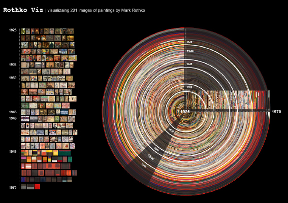
Figure 5.22. Polar plot of Rothko images of paintings. For a color version of the figure, see www.iste.co.uk/reyes/image.zip
Although it may seem rather abstract at first glance, above all because the image set does not contain an image sequence that would help to create a continuous discourse, the design of guides and labels might assist in completing the sense. To furnish one more example where radial plots can be pictured, let us come back to Figure 5.6 (visualization of Nirvana videos). If we apply our technique to both vertical and horizontal orthogonal views, we obtain the graphical patterns in Figure 5.23.
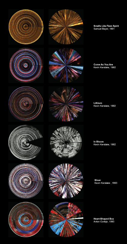
Figure 5.23. Polar plots of Nirvana videography. For a color version of the figure, see www.iste.co.uk/reyes/image.zip
One more model we introduced using Rothko images is the 3D image plot media visualization. In its first and foremost form, it is an extension of the 2D plot, but it now takes into account three different values for each of the three axes. The RGB model defines a cube, whose vertices map the relationships between red, green and blue: magenta, cyan, yellow, black and white. Another model that can be plotted in 3D is the HSB with a cylindrical form, where the top corresponds to the 360 degrees of the hue values, the height to the brightness and the distance from the centroid to the saturation. In ImageJ, it is possible to generate these visualizations with the 3D Color Inspector13 plugin (developed by scholar K. Barthel in 2004). A simplified version only for RGB cubes is also available as a plugin for Firefox, the Color Inspector 3D14 (developed by scholar David Fichtmueller in 2010). I developed a simple version of 3D color plots in Processing. Figure 5.24 shows these different versions.
The latest version of the prototype for 3D media visualization in web-based environments was an adaptation of the visualization engine by graduate student Mathias Bernhard [BER 16, pp. 95–116]. Although Bernhard’s project has different research goals, I employed the basis of his engine using WebGL and three.js. For this prototype, I adapted algorithms and layouts to display 3D media visualization in three plot forms: the RGB color model, the HSV color model and the same algorithm I conceived for “Rock Viz” in Figure 5.14.
As a matter of fact, given that the algorithm has now been used in 2D and 3D graphical spaces, it can be formalized as follows:
Given the equation of sphere S as:
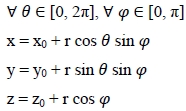
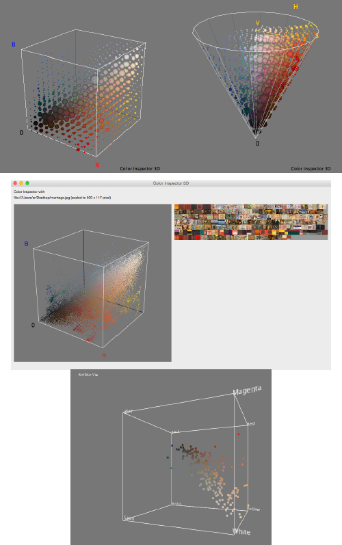
Figure 5.24. 3D plots of Rothko images. For a color version of the figure, see www.iste.co.uk/reyes/image.zip
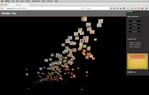
Figure 5.25. Interactive web-based 3D media visualization. For a color version of the figure, see www.iste.co.uk/reyes/image.zip
- – Algorithm Polar HSB: Given a set values h = hue; s = saturation; b = brightness; where 0 ≤ h ≤ 360; 0 ≤ s ≤ 100; and 0 ≤ b ≤ 100:
- 1) For each row in the database, get values representing h, s and b.
- 2) Plot values according to x, y and z in function SVn (Sphere Variation n).
- 3) Display source image file at point positions.
- x = x1 + r cos hπ cos sπ
- y = y2 + r sin hπ cos sπ
- z = z3 b
The graphical result is shown in Figure 5.26.
Figure 5.26. Interactive web-based 3D media visualization of variation SV1 of algorithm Polar HSB
To conclude this section about emerging web-based graphical models, I want to point to recent ideas on creating an image generator with iconic similarity to the late works by Rothko. Indeed, the idea is to employ the visual attributes existing in a determined painting style. Then, as the forms are basically abstract, we can describe basic spatial composition rules. Incorporating colors, combinations of tonalities and format (portrait or landscape), I wrote a simple generator of Rothko images. For me, the interesting aspect of this kind of visualization is that of synthesizing images proven to mislead the viewer or to evoke Rothko values; then, the descriptive rules are effective. Furthermore, it could be imagined that the generator might be useful in experimental tests and other cognitive and psychological applications. Figure 5.27 shows a screenshot of one of the Rothko generators.
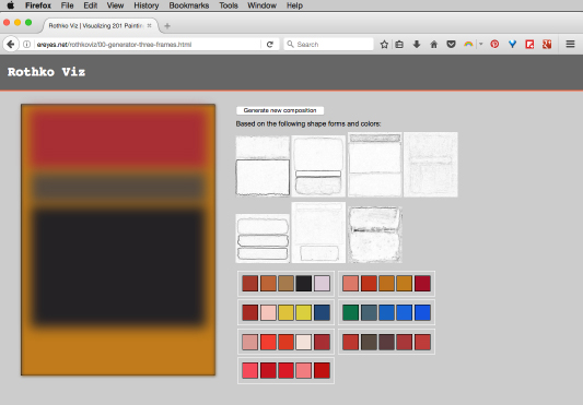
Figure 5.27. Image generator based on visual attributes and composition rules. For a color version of the figure, see www.iste.co.uk/reyes/image.zip
5.4.6. Volumetric visualizations of images sequences
In 2011, I used the term “motion structures” to describe my ongoing approach to exploring and interacting with motion media such as film, video and animations, as volumetric media visualization. My aim is based on the idea of representing spatial and temporal transformations of an animated sequence. For this kind of visualization, I am interested in representing the shape of spatial and temporal transformations that occur within the same visual space of the frame. The final outcome thus traces those transformations in the form of a 3D model. The mode of interaction with the 3D object allows for different ways of exploration: orbiting around, zooming in and out and even exploring the inside structure of the model.
Our process pays special attention to shapes above other visual features. From a technical point of view, to create volumetric media visualization, we use a script we wrote for ImageJ. Figure 5.28 depicts the overall workflow used to generate the 3D model that can be consulted in Table 5.4. Basically, an image sequence is manipulated as a stack and several operations are applied: converting to 8-bit format, subtracting background and transforming the stack as 3D shape in the 3D Viewer window. From the 3D Viewer, it is possible to save the result as a static image, as a 360° rotation movie and to export it as a mesh surface.
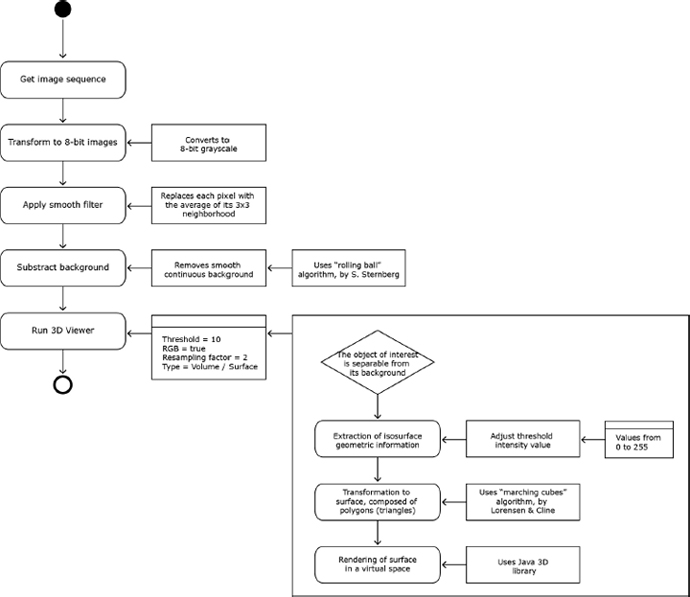
Figure 5.28. Overall volumetric media visualization workflow
The obtained 3D shape encodes the changes in the objects in a frame: the different positions, the movement traces and spatial and temporal relations. The way in which we can interact with an object is not limited to ImageJ. An exported 3D mesh can be manipulated in other 3D software applications such as Maya, Sculptris or MeshLab. Furthermore, it is also possible to export a motion structure for the web or to 3D print it; however, both techniques require destructive 3D model processing, i.e. reducing geometry by simplification, decimation or resampling. For technical records, a motion structure exported from ImageJ has an average of 500,000 vertices and more than 1 million faces, which is a very large amount compared with an optimized 2000-face model for the web, to be loaded with the library three.js.
Table 5.4. MotionStructure-v2.imj script
| // motionStructure-v2
// Description: // This macro creates a digital 3D object from an image sequence // It asks for a directory path, then impots all images, converts them to 8-bit, substracts background, applies a smooth filter and runs the 3D viewer with some predefined parameters // To run the macro: open ImageJ, from the top menu Plugin, select Macros then Run… choose the file from your local disk. // For information on how to use imageJ, see // http://rsbweb.nih.gov/ij/ // Created: October 29, 2015, in Paris. // By: Everardo Reyes Garcia // http://ereyes.net dir = getDirectory("Choose image sequence"); list = getFileList(dir); print("directory contains " + list.length + " files"); run("Image Sequence…", dir); name = getTitle; print(name); run("8-bit"); run("Smooth", "stack"); run("Subtract Background…", "rolling=50 stack"); // Display as Volume (last parameter in 0). Goes faster if no immediate need to export as OBJ //run("3D Viewer"); //call("ij3d.ImageJ3DViewer.add", name, "None", name, "0", "true", "true", "true", "2", "0"); //selectWindow(name); // Display as Surface (last parameter in 2). 1 as threshold value… higher values mean less shapes because only pixels above such threshold are taken into account. // Description of parameters // where 1 = threshold value, 2,3,4 = r,g,b, 2 = resampling factor, 2 = type // Types: 0 = volume, 1 = Orthoslice, 2 = surface, 3 = surface plot 2D, 4 = Multiorthoslices //run("3D Viewer"); //call("ij3d.ImageJ3DViewer.add", name, "None", name, "1", "true", "true", "true", "2", "2"); //selectWindow(name); // Display as Surface (last parameter in 2). 10 as threshold value… higher values handle better large images sequences run("3D Viewer"); call("ij3d.ImageJ3DViewer.add", name, "None", name, "50", "true", "true", "true", "2", "2"); selectWindow(name); |
My first experiments with motion structures, initiated in late 2011 working on the shape of CGI visual effects sequences, started with the Paris fold-over sequence from the film “Inception” (Nolan, 2010). In November 2012, I produced a second motion structure: it came from the title sequence of the TV series Game of Thrones. I took a 5-second shot of a traveling pan of the fictional city of Qarth. The image sequence of the fragment has 143 images and they were staked and converted into a 3D model. For this project, I felt compelled to 3D print the model as a physical piece, a technique that can be called “data physicalization” (Figure 5.30). As it was required to reduce geometry for printing, the final object can be seen as a map of traces. We selected white plastic as printing material in order to convey the esthetics of rapid prototyping15.
At the occasion of the re-new 2013 digital arts forum, I selected image sequences from seminal video artworks by Charles Csuri, Peter Weibel and Bill Viola. The importance of taking into account video as input media was its inherent characteristics in opposition to cinema. The introduction of video and animation technologies for recording, processing and playing back moving pictures opened a wide range of possibilities for artists to explore and experiment with the esthetics of space and time. Contrary to cinema, video was more accessible, malleable and portable for artists. It was also easier and faster to watch and project the recorded movie. Finally, the look and size of the technological image was based on lines, reproduced at a different pace than film. While video art has been in itself a rhetorical movement against the traditional representation of moving images, motion structures of video artworks are at a second degree; an esthetization of the shape of time and space. Figure 5.29 shows a volumetric visualization of Bill Viola’s “Acceptance” (2008), 02:03 minutes, equivalent to 1231 frames; Figure 5.30 of Charles Csuri’s “Hummingbird” (1967), 02:10 minutes, 1295 frames; and Figure 5.31 of Peter Weibel’s “Endless Sandwich” (1969), 00:38 seconds, 378 frames.
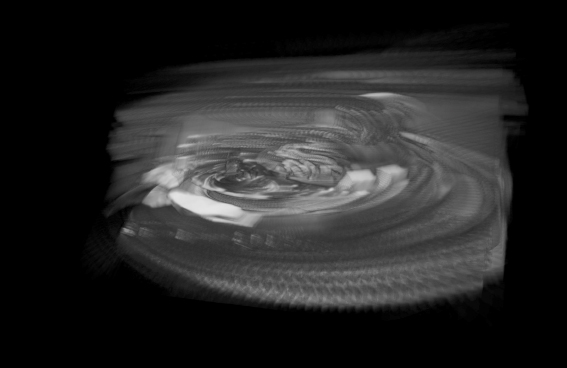
Figure 5.29. Motion structure from the title sequence of Game of Thrones
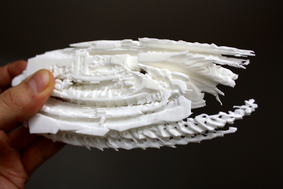
Figure 5.30. 3D print motion structure from the title sequence of Game of Thrones
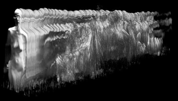
Figure 5.31. Volumetric visualization of Bill Viola’s “Acceptance”
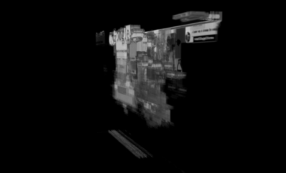
Finally, in a more recent prototype, I have applied the same technique to a series of image sequences from web page design. “Google Viz” contains almost 200 screen shots from the Google home page, from 1998 to 2015, obtained with the Internet Archive Wayback Machine16 (Figure 5.32).
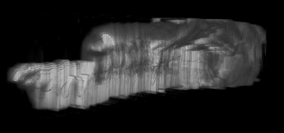
Figure 5.32. Volumetric visualization of Charles Csuri’s “Hummingbird”
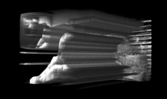
Figure 5.33. Volumetric visualization of Peter Wibel’s “Endless Sandwich”