
4
Styling and Populating the Funbook App
In the previous chapter, we planned what surfaces and components will be needed for our app based on the design file. We also got comfortable previewing and debugging the app – at least I hope you got comfortable, my dear reader! Whether you’re using an iPhone or Android simulator or a real device with the Expo Go app, make sure you prefer checking your app that way. There’s no wrong answer for previewing apps built with Expo. In this chapter, we will style our surfaces and components. We will finally see an app that looks, hopefully, close to the design! After that, we will add some real data.
Here’s a very short list of what we’re planning to achieve in this chapter:
- Creating and styling components
- Pulling in data for the app
By the end of this chapter, we will have a good-looking app that fetches data from an external API. Feel free to follow closely or write your own code.
Technical requirements
In order to follow along with this chapter, you will need some knowledge of JavaScript and ReactJS. If you have followed along the first two chapters of this book, you should be able to go forward without any issues.
Feel free to use an IDE of your choice, as React Native does not need any specific functionality. Currently, the most popular IDEs for frontend developers are Microsoft’s Visual Studio Code, Atom, Sublime Text, and WebStorm.
The code snippets provided in this chapter are here to illustrate what we should be doing with the code. They do not provide the whole picture. For a better experience of coding along, open the GitHub repo in your IDE and look at the files in there.
If you get stuck or lost, you can check the code in the GitHub repo: https://github.com/PacktPublishing/Simplifying-State-Management-in-React-Native/tree/main/chapter-4.
Creating and styling components
It’s time to create some real components! Let’s start with the home surface.
I like to work from top to bottom, so we will start with the header. Our free design template includes the app name (“Socially”) and a bell icon at the top of the feed surface. We won’t be implementing notifications in our example app, so we’ll overlook this part of the design file. Adding styles to the header is done through React Navigation. We will add the following properties to <Tab.Navigator>:
// …
  headerTransparent: true,
  headerTitleAlign: "left",
  headerTitleStyle: {
  paddingTop: 140,
  paddingBottom: 40,
  textAlign: "left",
  fontWeight: "bold",
},
// …
As we analyzed the home surface before, we know we need to create two parts of this surface: a list of avatars and a list of cards with images. The list of avatars will use a horizontal FlatList component. The first item on the list is different; it’s a button used by the user to add content. We’ll add a ListHeaderComponent property to FlatList, where we will add this special item. Let’s create a placeholder component for now:
// src/components/ListHeaderComponent
import React from "react";
import { View, Text } from "react-native";
export const ListHeaderComponent = () => {
  return (
    <View>
      <Text>List Header component placeholder</Text>
    </View>
  );
};
In the preceding code, we created a component named ListHeaderComponent, so we can import it into FlatList. So far, this component only displays placeholder text.
I added a few profile images exported from the design file into the assets folder. We’ll use them for our list of avatars.
Here’s what the ListOfAvatars component looks like:
// src/components/ListOfAvatars.js
import React from "react";
import { View, Text, FlatList} from "react-native";
import { ListHeaderComponent } from "./ListHeaderComponent";
const arrayOfAvatars = [
  {
    id: 1,
    url: "",
  },
  {
    id: 2,
    url: "",
  },
  {
    id: 3,
    url: "",
  },
];
export const ListOfAvatars = () => {
  const renderItem = ({ item }) => {
    return <Text>{item.id}</Text>
  };
  return (
    <View style={{ paddingTop: 30 }}>
      <FlatList
        data={arrayOfAvatars}
        renderItem={renderItem}
        keyExtractor={(item) => item.id}
        horizontal
        ListHeaderComponent={<ListHeaderComponent />}
      />
    </View>
  );
};
Remember to import the necessary components from React Native – in this case, we need to import FlatList. You may also notice I set up a very simple data array to be fed into the list of avatars. We’ll manage connecting this component to our sample data later.
If you prefer to look at this code on your screen instead of the book, you can always look in the repo. The code we are working on currently can be found in the chapter-3 branch: https://github.com/PacktPublishing/Simplifying-State-Management-in-React-Native/tree/main/chapter-3.
Once we have FlatList set up with links to actual images, we can change the <Text> component for an <Image> component, feed it data from our array, add some styles so that the images are rounded, and we’re done!
We’ll add a list of cards, which will be very similar to the list of avatars. We’ll also use an array with temporary data and add some styling, and we should end up with a component looking like this:
// src/components/ListOfCards.js
export const ListOfCards = () => {
  const renderItem = ({ item }) => {
    return (
      <Image
        style={{
          width: "100%",
          height: 288,
          borderRadius: 20,
          marginBottom: 32,
        }}
        source={{
          uri: item.url,
        }}
      />
    );
  };
  return (
    <View style={{ paddingVertical: 30 }}>
      <FlatList
        data={arrayOfImages}
        renderItem={renderItem}
        keyExtractor={(item) => item.id}
        showsVerticalScrollIndicator={false}
      />
    </View>
  );
};
The surface component called Feed should only concern itself with importing the correct children components and general styling. It looks like this:
// src/surfaces/Feed.js
export const Feed = () => {
  const headerHeight = useHeaderHeight();
  return (
    <SafeAreaView
        style={{ flex: 1, paddingTop: headerHeight + 20,          paddingHorizontal: 20 }}
    >
      <View>
        <ListOfAvatars />
        <ListOfCards />
      </View>
    </SafeAreaView>
  );
};
And the Feed surface of our app should look like this:
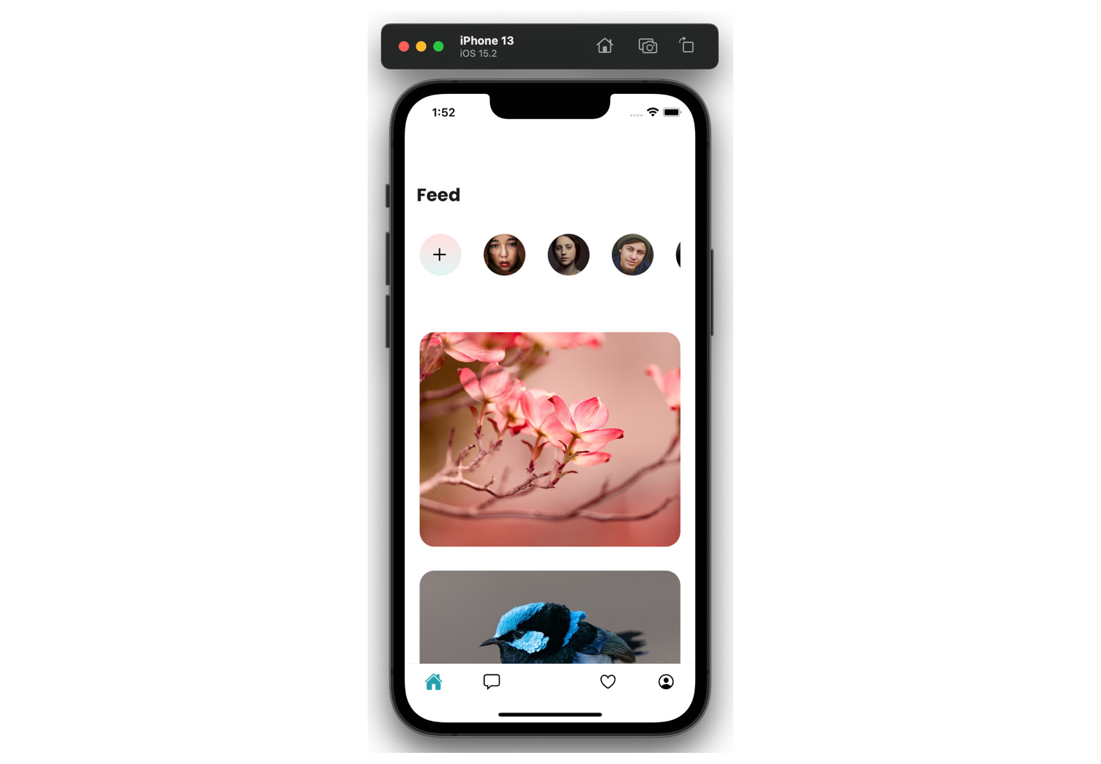
Figure 4.1 – An iPhone simulator screenshot of the Feed surface
You can leave your app as is, or you can copy some styling tweaks that I added in the GitHub repo. We’re not focusing on styles in this book, so we’re not going to go over them in detail; nonetheless, I encourage you to have a look around.
The Feed surface is looking quite similar to the design, so we can move forward to the Conversations surface.
Our Conversations surface needs to be wrapped in a new navigator because we want our users to be able to go into the conversation details. We’ll add a new component called <ConversationsNavigation>, where we will create a Stack Navigator:
// src/surfaces/ConversationsNavigation.js
import React from "react";
import { Conversations } from "./Conversations";
import { Messages } from "./Messages";
import { createStackNavigator } from "@react-navigation/stack";
const Stack = createStackNavigator();
export const ConversationsNavigation = () => {
  return (
    <Stack.Navigator
      screenOptions={{
        //…
      }}
    >
        <Stack.Screen name='Conversations'          component={Conversations} />
      <Stack.Screen
        name='Messages'
        component={Messages}
        options={({ route }) => ({
          title: route.params.name,
          //…
        })}
      />
    </Stack.Navigator>
  );
};
The most interesting option we’re setting in this component is this one:
options={({ route }) => ({
          title: route.params.name,
          //…
This line of code tells React Navigation to use a route parameter as the header title for the Messages surface. If you test your app now, you will notice this is not happening yet. We also need to set this parameter at the time the user will choose to go to the Messages surface, which means we need to set it when Conversation is clicked. We will create the Conversations surface with an input box at the top, followed by a list of conversations in FlatList. Each item in the list will be wrapped in a <Pressable> component, which will look like this:
<Pressable onPress={() => navigation.navigate("Messages", { name: item.name })} >When our users choose a conversation, this conversation will pass the assigned name parameter to the Messages surface, which in turn will display this name as the header. We can now add a list of dummy messages and conditional styling, which will style differently messages from the user and to the user. A useful thing to remember for message lists is to use the inverted prop on the FlatList component of messages. After all, we want the latest item to appear at the bottom of the list.
You may notice at this point that the Conversations surface and the Messages surface do not have the bottom tabs visible. The best way to achieve this functionality is to move our <ConversationsNavigation> out of the tab navigator and move it into the main stack navigator. The surfaces listed in the main stack will be displayed above the surfaces in the Tab Navigator, plus we will be able to use the pre-configured back button provided by the React Navigation library. Here’s what the App.js root component should look like:
// src/App.js
export default function App() {
  //…
  return (
    <SafeAreaProvider>
      <NavigationContainer>
        <Stack.Navigator>
          {!userLoggedIn ? (
            <Stack.Screen name='Login' component={Login} />
          ) : (
            <>
              <Stack.Screen
                name='Home'
                component={Home}
                options={{ headerShown: false }}
              />
              <Stack.Screen
                name='ConversationsNav'
                component={ConversationsNavigation}
                options={{ headerShown: false }}
              />
            </>
          )}
        </Stack.Navigator>
      </NavigationContainer>
    </SafeAreaProvider>
  );
}
In order to have a button for our Conversations surface displayed in the tabs, we will need to create an empty dummy surface and pass it into the Tab Navigator:
// src/surfaces/Home.js
<Tab.Screen name='Feed' component={Feed} />
      <Tab.Screen
        name='ConversationsMain'
          component={ConversationsBase} // just a dummy             component which will never be called
        options={{
          tabBarIcon: ({ size }) => (
              <Ionicons name='chatbox-outline' color='#000000'                size={size} />
          ),
        }}
        listeners={({ navigation }) => ({
          tabPress: (e) => {
            e.preventDefault();
            navigation.navigate("ConversationsNav");
          },
        })}
      />
      <Tab.Screen name='AddPost' component={AddPost} />
// …
We’ll add a floating button at the bottom of the Conversations surface, and we’re done!
I’m going over these code changes fairly quickly, because we don’t want to spend too much time focusing on styling or React Navigation tips and tricks. We want to be up and running with an app that’s close to something you may find in the real world, so we can start playing with state and data management. Feel free to go over all code changes in the GitHub repo, where you can also ask questions and raise issues.
We’ll continue our progress by adding content to the Favorites surface. This will be a list of cards, like what can be found on the Feed surface. Next, we’ll add components to the Profile surface. We will need an avatar, a name, some statistics, and two FlatList components that will display added images and favorited images.
We will finish up this surface by adding a custom component to the Tab Navigator for the central item, the black button for adding posts. We can add any custom component that we want as the tab bar icon:
// src/surfaces/Home.js
function Home() {
  return (
    <Tab.Navigator>
//…
   <Tab.Screen
        name='AddPost'
        component={AddPost}
        options={{
          tabBarIcon: ({ size }) => (
            <View
              style={{
                marginTop: -30,
              }}
            >
              <View
                style={{
                  position: "absolute",
                  backgroundColor: "#000000",
                  padding: 30,
                  bottom: -10,
                  left: -13,
                  borderRadius: 23,
                  transform: [{ rotate: "-45deg" }],
                  shadowColor: "#000000",
                  shadowOffset: { width: 0, height: 4 },
                  shadowOpacity: 0.2,
                  shadowRadius: 4,
                }}
              />
                <Ionicons name='add-circle-outline'                  color='#ffffff' size={36} />
            </View>
          ),
        }}
      />
//…
If you look closely, you will notice that the styling for this button is very similar to the floating button on the Conversations surface. In cases where we’re repeating a lot of code, it’s a good idea to abstract it into a separate file. This is called Don’t Repeat Yourself (DRY) programming. We don’t want to go too far, making abstractions for every little thing. There’s another programming principle called Write Everything Twice (WET) programming, which advocates writing verbose code, especially when starting a new project. My personal preference is Avoid Hasty Abstractions (AHA) programming, proposed by Kent C. Dodds. This approach marries DRY and WET principles and encourages us programmers to find the best use cases for abstractions while not overusing them.
In this specific case, we are repeating styling. We can easily create a class called something like floatingButton and apply it to both of our components. We could also use the Styled Components library and create a <FloatingButton> styled component. There are more ways to achieve this goal of having reusable styles, but we are not going to dive into them. I’ll do some cleanup in our components, and I’ll meet you right back here in a few moments so that we can hook up some real data from our (almost) real API.
Pulling in data for the app
Welcome back! Did you take a moment to look at our app code? Did you clone the repo from the chapter-3 branch, or did you create your own components following the broad strokes I described previously? Either way, I’m glad you’re here! Let’s fetch some data and use some state!
A quick reminder about the data we’ll be using: I set up GitHub Pages in the /docs folder, which you can find here: https://github.com/PacktPublishing/Simplifying-State-Management-in-React-Native/tree/main/docs.
You can preview every JSON file right in the GitHub UI. You can also view the raw contents of any file by clicking the Raw button:
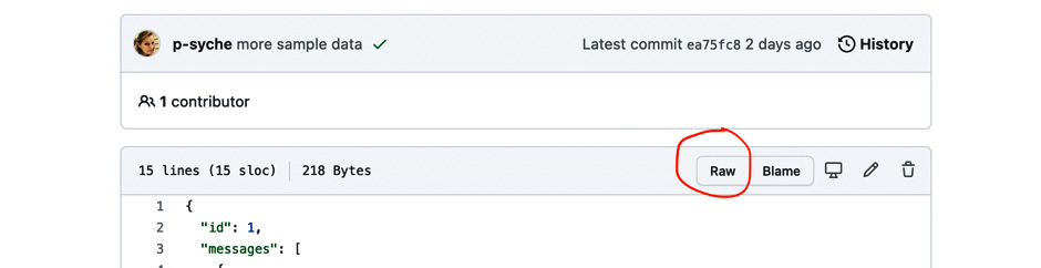
Figure 4.2 – GitHub UI with the Raw button circled in red
The text file visible after clicking this button is what you could see as an API response.
We’ll start with fetching the list of users. This list contains user IDs and links to user avatars. Our API depends on us to manage the user avatars everywhere in the app and passes them in this one endpoint only.
So, let’s check where we need the list of users. We need it on the Feed surface to display the list of avatars. We will also need it to display avatars on the cards on the Feed surface. We will also need the user data on the Conversations surface and the Messaging surface. At this point, it will be beneficial to find the common parent of those surfaces and call our API in the said parent. In our case, the parent is the root component declared in App.js.
The first thing we’ll do is fetch our data in the parent:
// src/App.js
export default function App() {
  const [userLoggedIn, setIsUserLoggedIn] = useState(true);
  const [userList, setUserList] = useState(null);
//…
  async function fetchUserData(id) {
    const response = await fetch(requestBase + "/users.json");
    setUserList(await response.json());
  }
  useEffect(() => {
    fetchUserData();
  }, []);
  //…
  if (!userList) {
    return <AppLoading />;
  }
Once we have our data fetched and inside the userList object, we can pass it as a prop from the parent component to the children. According to the React Navigation docs, you can pass additional props through the render callback of the navigator. Here’s what it would look like for the Home component:
<Stack.Screen name='Home' options={{ headerShown: false }}>
    {(props) => <Home {...props} userList={userList} />}
</Stack.Screen>
Once we have the userList prop in the Home surface, we should be done, yes? Unfortunately, no. The Home surface is a parent for the tab navigator, so we need to do the whole song and dance of adding the render callback for the Feed surface. Once we get to the Feed surface, we will need to pass the userList prop to the ListOfAvatars component… This is starting to be a bit much, don’t you think? This is a taste of what would be called prop drilling in a bigger app. Passing an object through multiple surfaces and components is not only tedious but also error-prone. This sort of setup is brittle – it suffices that one component in the chain changes, and the whole app may become unusable. What can we do to avoid this? We can use React Context. This is also the strategy recommended by the maintainers of React Navigation.
What is context?
Context is used to pass data down the component tree without having to thread the props manually through every component.
The first step we need to take is to create our context with an initial value:
const UserListContext = React.createContext(null);
Then, we need to wrap the parent component in a Context Provider with an updated value:
// src/App.js
return (
    <SafeAreaProvider>
      <UserListContext.Provider value={{ userList: userList }}>
        <NavigationContainer theme={MyTheme}>
          <Stack.Navigator>
//…
The last piece of the context puzzle is how to use it, or “consume it.” Once the context is provided to the parent, we can consume it in any one of its children through the <Context.Consumer> component. We will add this consumer to our list of avatars:
// src/components/ListOfAvatars.js
export const ListOfAvatars = () => {
  const renderItem = ({ item }) => {
   //…
  };
  return (
    <UserListContext.Consumer>
      {({ userList }) => (
          <View
          //…
          >
            <FlatList
              data={userList}
              renderItem={renderItem}
              keyExtractor={(item) => item.id}
              horizontal
              //…
And there we go! We successfully fetched external data, fed it to our app, and passed the data around with the help of React Context. Using context offers a much better developer experience; however, it does come with its own set of issues. The biggest issue that you should always keep in mind when using context is that any change to the context will cause a re-render of the component where the Provider is placed, along with all the children of the said component. This means that if we were to have an API where the user can add or remove other users to their list, every time they would do this, the entire app would have to re-render. Sometimes, that’s what we want; we want to have the avatar list and the list of images in Feed updated. We also want to update the Conversations surface in such a case. But what about the Profile and Add Post surfaces? We will not be answering those questions now, as we’re working with an example app. However, every time you decide to use React’s Context, you should ask yourself where to place the Provider and what will happen when the data of the context changes.
Let’s continue fetching real data for other parts of our app. We’d like to display images on Feed. We’ll start by fetching data in the ListOfCards component with a useEffect hook:
// src/components/ListOfCards.js
import AppLoading from "expo-app-loading";
import { requestBase } from "../utils/constants";
export const ListOfCards = () => {
  const [cardList, setCardList] = useState(null);
  async function fetchCardData() {
    const response = await fetch(requestBase + "/home.json");
    setCardList(await response.json());
  }
  useEffect(() => {
    fetchCardData();
  }, []);
  if (!cardList) {
    return <AppLoading />;
  }
  return (
  //…
      <FlatList
        data={cardList.listOfitems}
        renderItem={renderItem}
        keyExtractor={(item) => item.itemId}
Once our card items are fetched and passed on to the Card component, we can do something more with them – namely, we can check the author ID against the user list in our context and display the correct username and avatar thanks to this information.
We will add the same context consumer to the Card component as the one we added to ListOfAvatars, but that is not going to be enough in this case. Once we get the whole list, we also need to find the user whose ID matches the author ID of the card. We’ll adjust the way we pass the context value, and we’ll filter the userList array:
// src/components/Card.js
import { UserListContext } from "../context";
export const Card = ({ item }) => {
  return (
    <UserListContext.Consumer>
      {({ userList }) => {
        const currentUser = userList.filter(
          (user) => user.id === item.authorId
        );
        return (
          <View>
            <Image
            //…
We created a variable called currentUser, which is an array holding precisely one item – the user who posted the specific card. Unfortunately, this variable is accessible to the Card component only. If we wanted to use the same information, for example, on a modal that would open when we tap the image, we would have to either nest the modal component in the Card component or search for the current user again. You will see an example of this issue in our very own app in a few moments, when we’ll be working with the Conversations surface.
On the other hand, we have composed another surface using the Card component – the Favorites surface. All we must do to have it working correctly is fetch the Favorites data. All the rest should fall into place.
If you encounter any problems with loading data from our example API hosted on GitHub pages, start by making sure the data is fetched. You can do so by using console.log in your code and looking in the terminal to see whether the object is fetched or not. Then, you need to check whether you have all the names and object keys spelled and nested correctly. If you get stuck at any point, remember that you can always go to the repo hosted on GitHub, clone it, and look around at any stage you would like.
Let’s move on to the next component that needs to fetch data – Conversations. As I mentioned before, we will need to tweak and repeat some code we already wrote for the Card component used in the Feed and Favorites surfaces. In Conversations, we will also fetch the user list and search for the current user. Make sure to spell everything correctly. The sneaky API author named everything differently! Here’s what my Conversations component looks like:
// src/components/ConversationItem.js
export const ConversationItem = ({ navigation, item }) => {
  return (
    <UserListContext.Consumer>
      {({ userList }) => {
          const currentUser = userList.filter((user) =>            user.id === item.userId);
        return (
          <Pressable
            onPress={() =>
              navigation.navigate("Messages", {
                name: currentUser[0].name,
                avatar: currentUser[0].url,
              })
            }
            style={{
              height: 103,
         //…
Please pay attention to [0] after currentUser. We used a filter function on an array, and we have an array as a result. Omitting [0] means the app will not be displaying any data because it will see an array instead of an object.
We have our list of conversations; now’s the time to fetch the specific conversation when one is tapped by the user. The action of redirecting to the messages screen happens in the <ConversationItem> component in FlatList on the Conversations surface. The Messages surface is a part of the same stack navigator as the Conversations, which means we could go two ways here:
- Add context to the <ConversationsNavigation> component, set its value when a conversation is tapped, and consume it on the Messaging surface.
- Pass the conversation ID as a route parameter, along with user data.
The second approach is very tempting because it’s simple. We’re just adding a piece of data that’s already accessible to us, and we’re passing it through the navigation to the correct place. There’s nothing inherently wrong with this approach that I could criticize off the bat. It is foreseeable, however, that in a real-world app, you would end up writing very big or duplicated objects to be passed around in the route params. As per the React Navigation documentation, even though using route params is convenient, they should not be used as a replacement for a global app state. Manually passing data through route params can lead to bugs and an app showing outdated data. If you’d like a little bit of exercise, you could implement this solution in your own copy of the FunBook app right now.
When you’re ready, come back here and I’ll walk you through creating and consuming the new context for the conversations.
We’ll start like before, by creating the context with its initial value:
export const ConversationContext = React.createContext(null);
I’ve decided to hold the functions to create context in a separate file, called context.js for simplicity’s sake. Once the context is created, we need to wrap it around the correct component. In this case, we will need to add the Provider around the nested Stack Navigator of the Conversations surface. Let’s add the following code to the <ConversationsNavigation> component:
// src/surfaces/ConversationsNavigation.js
import { ConversationContext } from "../context";
//…
export const ConversationsNavigation = () => {
  const [conversationId, setConversationId] = useState(null);
  return (
    <ConversationContext.Provider
      value={{
        conversationId: conversationId,
        setConversationId: setConversationId,
      }}
    >
      <Stack.Navigator
        screenOptions={{
          headerBackTitleVisible: false,
// …
You will notice we are passing both the value and the setter function to the context this time. This is because we will need to set the value of the context deeper in the tree, in the <ConversationItem> component. Not to worry though; passing functions through context is 100% a-okay!
What about multiple contexts, you may ask, when you notice that <ConversationItem> is already wrapped in <UserListContext.Consumer>? Again, this is totally fine. You can have just as many wrappers as you need and like! Here’s what our component with two contexts will look like:
// src/components/ConversationItem.js
export const ConversationItem = ({ navigation, item }) => {
  const onPressItem = (setConversationId, currentUser) => {
    setConversationId(item.id);
    navigation.navigate("Messages", {
      name: currentUser[0].name,
      avatar: currentUser[0].url,
    });
  };
  return (
    <ConversationContext.Consumer>
      {({ setConversationId }) => (
        <UserListContext.Consumer>
          {({ userList }) => {
            const currentUser = userList.filter(
              (user) => user.id === item.userId
            );
            return (
              <Pressable
                  onPress={() => onPressItem(setConversationId,                    currentUser)}
                //…
Now that we’re setting the context, let’s consume it in the Messages surface. We need to first get the conversation ID from the context and then fetch the correct JSON file for the given conversation. We’ll add <ConversationContext.Consumer> as a wrapper on the Messages surface:
// src/surfaces/Messages.js
export const Messages = ({ route }) => {
  const headerHeight = useHeaderHeight();
  return (
      <SafeAreaView style={{ flex: 1, paddingTop: headerHeight         + 100 }}>
      <ConversationContext.Consumer>
        {({ conversationId }) => (
Once we get the conversation ID, we’ll use it in the ListOfMessages component to fetch the data pertinent to the given screen:
// src/components/ListOfMessages.js
import AppLoading from "expo-app-loading";
import { requestBase } from "../utils/constants";
export const ListOfMessages = ({ conversationId }) => {
  const [messages, setMessages] = useState(null);
  async function fetchMessages() {
    const response = await fetch(
      requestBase + "/messages/" + conversationId + ".json"
    );
    setMessages(await response.json());
  }
  useEffect(() => {
    fetchMessages();
  }, []);
  if (!messages) {
    return <AppLoading />;
  }
  const renderItem = ({ item }) => {
    //…
  };
  return (
    //…
      <FlatList
        data={messages.messages}
        renderItem={renderItem}
        keyExtractor={(item) => item.id}
        showsVerticalScrollIndicator={false}
        inverted
      />
    </View>
  //…
And there we go! We’ve done some solid work here; it’s time for a pat on the back. We have multiple components fetching data and passing it around when necessary. We’ve set up the Feed component, Favorites, Conversations, and Messaging. The last surface left is Profile. I will leave it to you, dear reader, to manage data on this surface. I trust that you have learned enough in this chapter to be able to do it on your own.
When you go to the book repo, you will find all work related to this chapter on a branch called chapter-3. You can browse through commits to see how the app development progressed, or you can simply check out the final state of the app. In the next chapter, we will see whether we can replace all our context, props, and filtering users with a more global solution called Redux. Onward and upward!
Summary
We have done a lot of great work in this chapter! There’s a very specific sort of satisfaction when you see an app that looks nice and works smoothly, isn’t there?
Here’s where we are at after this chapter – we have an app that’s styled according to design. This app pulls in external data from an API. I admit that our app is rather simple. There are many more functionalities that could be added to a social media clone app. And there’s nothing stopping you from doing just that. You can play around and add and delete whatever you want. I will also add a few more functionalities, maybe a modal, or a functioning “like” button, and I’ll see you in Chapter 5, where we’ll start investigating our first state management solution – Redux.
Further reading
- https://www.digitalocean.com/community/tutorials/what-is-dry-development: DRY programming.
- https://betterprogramming.pub/when-dry-doesnt-work-go-wet-6befda0444bf: WET programming.
- https://kentcdodds.com/blog/aha-programming: AHA programming.
- https://reactnavigation.org/docs/hello-react-navigation/#passing-additional-props: Passing additional props in React Navigation.
- https://reactjs.org/docs/context.html: React Context.
- https://reactnavigation.org/docs/params/#what-should-be-in-params: React Navigation – what should be in params?