
3
Planning and Setting Up the Funbook App
In the previous chapter, we learned how to set up a React Native app. The steps we followed, installing dependencies and building and running the app, are common for most apps you may want to build. Now, it’s time to focus on the specifics of the app we will be building in this book. We want to create a social media clone app so that we can compare different state management solutions in that app. In this chapter, we will plan and build our example app using only React Native built-in solutions – state, props, hooks, and context. We will take the following steps:
- Planning the needed surfaces and components
- Planning data flows in the app
- Getting comfortable previewing and debugging the app
By the end of this chapter, you will have a good idea of planning out development work for the Funbook app. You will also find out how to work comfortably with a React Native app.
Technical requirements
In order to follow along with this chapter, you will need some knowledge of JavaScript and ReactJS. If you have followed the first two chapters of this book, you should be able to go forward without any issues.
Feel free to use an IDE of your choice, as React Native does not need any specific functionality. Currently, the most popular IDEs for frontend developers are Microsoft’s VSCode, Atom, Sublime Text, and WebStorm.
You may have followed the setup guide from the previous chapter. In case you didn’t set up your own app, you can clone the repo dedicated to this book:
https://github.com/PacktPublishing/Simplifying-State-Management-in-React-Native.
In this repository, you will find a very basic app, as it was set up in the previous chapter. You will also find folders with chapter names. Not surprisingly, each folder holds a version of the Funbook app as described in a given chapter.
Planning the needed surfaces and components
As I’ve mentioned before, we can divide our app into surfaces, and then break down the surfaces into smaller, reusable components. Our app will need the following surfaces:
- Login
- Feed (which is also our Home surface)
- Add Post
- Favorites
- Profile
We have those surfaces set up as files in our project. Let’s take a quick look at the free design file we’ll be using for our app. You can find the file here: https://www.pixeltrue.com/free-ui-kits/social-media-app.
You can download this file and open it in Figma or import it at https://www.figma.com. If you don’t have a Figma account yet – don’t worry, they’re free. You can take a moment right now to look at the actual file, or if a screenshot is enough for you, let’s look together:

Figure 3.1 – Figma website with the design template
Let’s zoom in on the home page:
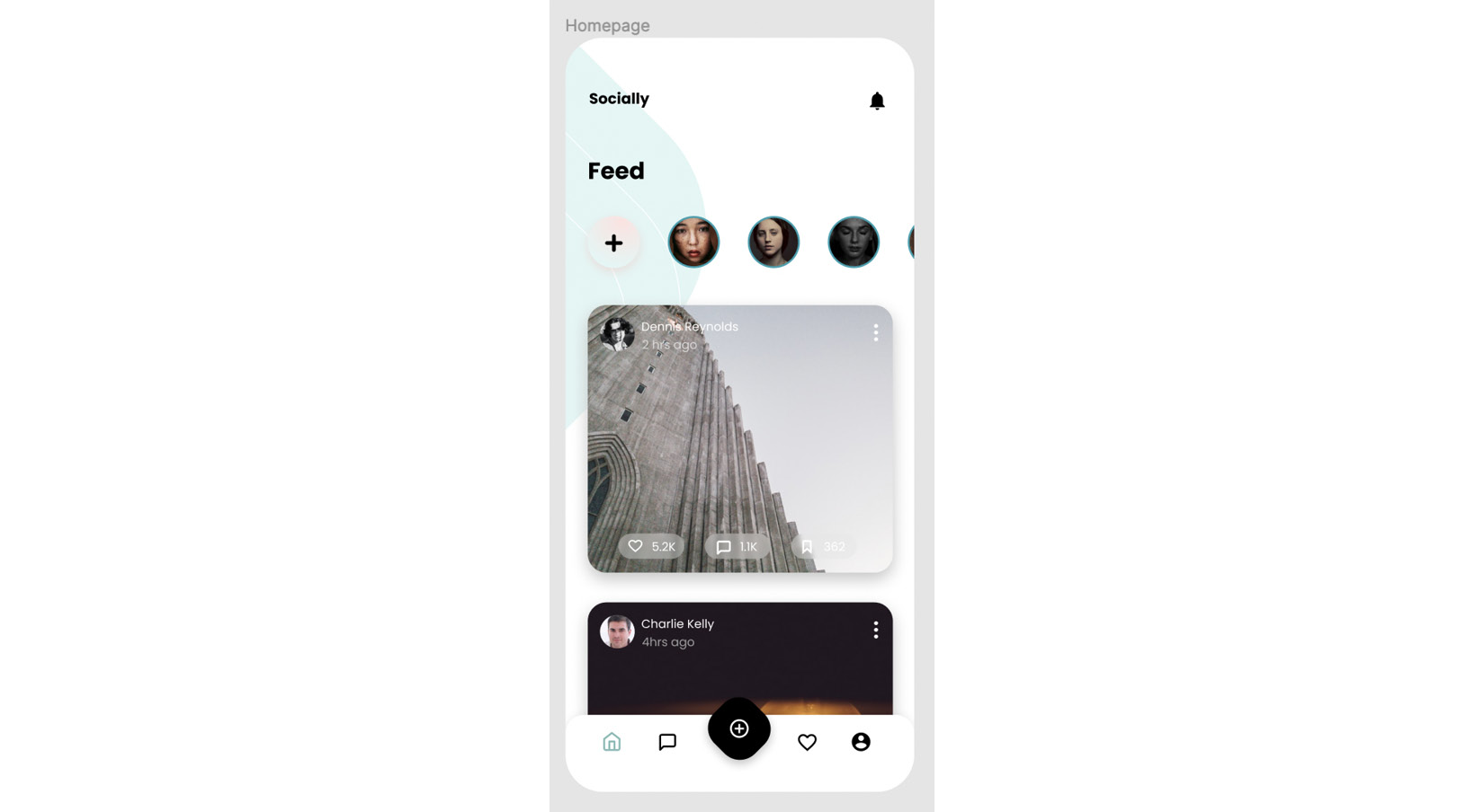
Figure 3.2 – Design of the home surface
You may have noticed there are five items in the bottom tabs on the design. Which one are we missing? The chat bubble. Let’s go ahead and add this surface to our app. I encourage you to add this file on your own and then come back here and check against my example. Here’s what my Conversations surface looks like so far:
import React from "react";
import { View, Text } from "react-native";
export const Conversations = () => {
  return (
    <View>
      <Text>this will be the chat screen</Text>
    </View>
  );
};
And here’s the App.js file with the newly added screen:
import "react-native-gesture-handler";
import React, { useState } from "react";
import { NavigationContainer } from "@react-navigation/native";
import { createStackNavigator } from "@react-navigation/stack";
import { createBottomTabNavigator } from "@react-navigation/  bottom-tabs";
import { Login } from "./src/surfaces/Login";
import { Feed } from "./src/surfaces/Feed";
import { Profile } from "./src/surfaces/Profile";
import { Favorites } from "./src/surfaces/Favorites";
import { AddPost } from "./src/surfaces/AddPost";
import { Conversations } from "./src/surfaces/Conversations";
const Stack = createStackNavigator();
const Tab = createBottomTabNavigator();
function Home() {
  return (
    <Tab.Navigator>
      <Tab.Screen name='Feed' component={Feed} />
        <Tab.Screen name='Conversations'          component={Conversations} />
      <Tab.Screen name='AddPost' component={AddPost} />
      <Tab.Screen name='Favorites' component={Favorites} />
      <Tab.Screen name='Profile' component={Profile} />
    </Tab.Navigator>
  );
}
[…]
Okay! Looking good so far!
Now that we have our main surfaces set up, let’s try to analyze which elements are good candidates for reusable components.
Looking back at the design file, let’s start with the Home surface. At the top, we see a horizontal list of avatars and a list of repetitive cards below. Each card has an author image, a title, a favorite count, and a conversation count. So, the home component should be built out of avatar and card components.
Moving on to the Conversations screen: it consists of a search bar and a list of cards with the name of the person in the conversation and the last message exchanged. When a message is clicked, we will go to the screen named Messaging in the Figma file, where we will see a bigger avatar, a list of messages, and an input box. Remember we already have avatars on the home page; let’s see whether we can reuse an avatar component. Maybe only to some extent, since the styles are not the same for the home avatars, the conversations avatars, and the messaging avatars. They are all round images, but they have different borders and sizes. Maybe we could create an avatar component that accepts size and border style as a prop. That’s a pretty good idea! We’ll try to achieve this when we get to writing code.
The last detailed surface we will in our free design file is Profile. We have yet another avatar here; this one is not even round. It’s followed by the username, some statistics, and a two-column list of pictures and bookmarks. Since we’re not going to be implementing bookmarks, we will exchange the bookmarks from the design for favorites. You may notice that the two columns are built with two different styles of elements, and that’s probably how we should also create our components: one component for cards in the images column and one component for the Favorites card column.
Last but not least: the bottom tab bar. Our design file includes four regular icons and one with a different style. Styling React Navigation components is a separate task altogether, as we will need to read the documentation to find out how to implement a custom icon, active and inactive styles, as well as custom styles.
Since we are using a free design file, it does not cover all the surfaces we want to create. I am very happy we have this free resource at our fingertips, and we’ll try to use the general styles and components to figure out what the remaining two of our surfaces should look like.
The Login surface should surely consist of two inputs: the username and password. We will re-use the input visible on the Messaging screen in Figma, and the background of the splash screen. As for the surface needed for adding posts, we’ll have a rounded square for the image –to match the Home surface – and an input for the title of the post.
Let’s summarize our plan: we have all our surfaces created. We will proceed to create the components necessary for the surfaces. We will create an avatar component, that we will use on the Home, Conversations, and Messaging surfaces. We will create a card component for the Home surface. We will then create another card component for the Conversations surface, along with a search box component. We will need to hook up the navigation to move correctly from Conversations to Messaging. On the Messaging surface, we will reuse the avatar component, a component for displaying messages, and a reusable input component. Moving on to the Profile screen, we will create a profile avatar component, components for profile statistics and components for cards of images, and different components for cards of favorited items. We will then move on to composing the Login screen using input box components created previously for the messaging screen. We will finish by completing the Add Post surface, using a version of the Home surface card and input. I don’t recommend creating all the files beforehand, as a lot of things may change while we create the actual components.
Before we start writing components let’s try to analyze what data will be needed for our app.
Planning data flows in the app
This is a part of app development that usually does not fall under the responsibilities of the frontend developer. The clients will often determine what data they want, and that data is organized by the backend developers. However, if you can participate in the way the data flows are organized, you will make your future work easier. Given that we are only building the frontend of an app using example data, we are free to organize it however we like.
We will use the design file again, as the basis for what work needs to be done. Starting with the Home screen, we know we need a list of users and a list of items to be displayed on the Home surface. As per the Conversations surface, we will need a list of conversations with respective usernames and messages. We will also need data for each one of the conversations, so we can display it on the Messaging surface. On the Profile surface, we will need a list of data pertinent to the user (name, avatar image, statistics), and two lists of images: added images and liked images. As per the surfaces missing from the design, we will need a login and password for the Login screen. We will not need any sample data for the Add Post surface.
Working with real data makes it easier to visualize the future shape of the app and of specific components. That is why I set up GitHub pages of the book repository to hold our sample data. You can find them on GitHub Pages (https://packtpublishing.github.io/Simplifying-State-Management-in-React-Native/) or in the main book repository in the docs/ folder: https://github.com/PacktPublishing/Simplifying-State-Management-in-React-Native/tree/main/docs.
Browsing through sample data
You can see the example data used in the app whenever you’d like. Check out the data branch of the main repository here: https://github.com/PacktPublishing/Simplifying-State-Management-in-React-Native/blob/data/docs/index.md and look in the docs/ folder. You can copy anything you’d like to your own projects.
The biggest and most obvious piece of the data puzzle we will need is a list of users. You can view the file on GitHub here: https://github.com/PacktPublishing/Simplifying-State-Management-in-React-Native/blob/main/docs/users.json. Our app will consume the raw JSON file, which can be accessed through the following link: https://raw.githubusercontent.com/PacktPublishing/Simplifying-State-Management-in-React-Native/main/docs/users.json.
You may wonder why I added user IDs if we’re building a simple app with example data. The reason is that we will use the user data for a list of avatars on the Home surface. We will create this list with React and React requires that every item in a list has a unique key prop. Theoretically, we could use the image URL as our unique key and then try to remember not to use the same picture for more than one person. However, using an ID is a much cleaner solution. It is also closer to what you would see in a real-world app.
Now that we have a user list, let’s take a look at what a specific user profile might look like. Our user will need an ID, which should match the record with their name in the users.json file. They also have a name and avatar image URL. We need to know how many posts, followers, and users following the given user has. Finally, we need two lists of images: added and liked images. Take a look at the john_doe.json file – that’s what our example user profile data looks like.
Moving on to the Home surface: we will use the same data as in the users.json file here to display the list of avatars, so we don’t need to add any additional avatar list data here. It will be followed by a list of items to be displayed in the form of cards with images. The example data is available in the home.json file.
Let’s create our sample dataset for the conversations. It’s not very complicated; it includes a username, a user avatar URL, a message, and an ID. We will need the conversation ID to correctly display conversation details on the Messaging surface.
Finally, we should create sample data for the Messaging surface. We will create a separate folder for conversation data, called messages. Inside that folder, we will create a few files for conversations. Every file is named by the conversation ID, which should make data fetching easier and more readable.
As for the Login screen, we will use a very small JSON file, which will hold a username and password. We will use this data to create user flows when the Login form is filled out correctly or incorrectly.
Looking at the JSON files, you will notice some data is repeated in a few files; namely, the user ID, user’s name, and avatar image URL. In a real-world app, this could cause issues in the future, where data updated in place of the app will not be properly updated or available somewhere else. That is why we will remove all references to user names and avatar images and leave only the user ID, which we will use to get the other data from the users.json file.
And there we have it! A big list of users that we will use in different parts of the app, data for the Home surface, the Profile surface, and Conversations. We’re ready to create our components! Right? Right! However, we need to get comfortable previewing and debugging our app first.
Getting comfortable previewing and debugging the app
Have you been looking to see whether your code runs correctly on a device or a simulator? If not, let’s see how you can see it. The first thing you need to do is run this command in your terminal:
$ yarn start
When expo is done setting up your development server, you can hit “i” for an iPhone simulator (if you’re working on a Mac computer), “a” for an android simulator (if you have Android Studio installed), or you can take your phone and use the Expo Go app.
Whichever one you choose, you will see a browser window open automatically on your device. This browser window looks like this:
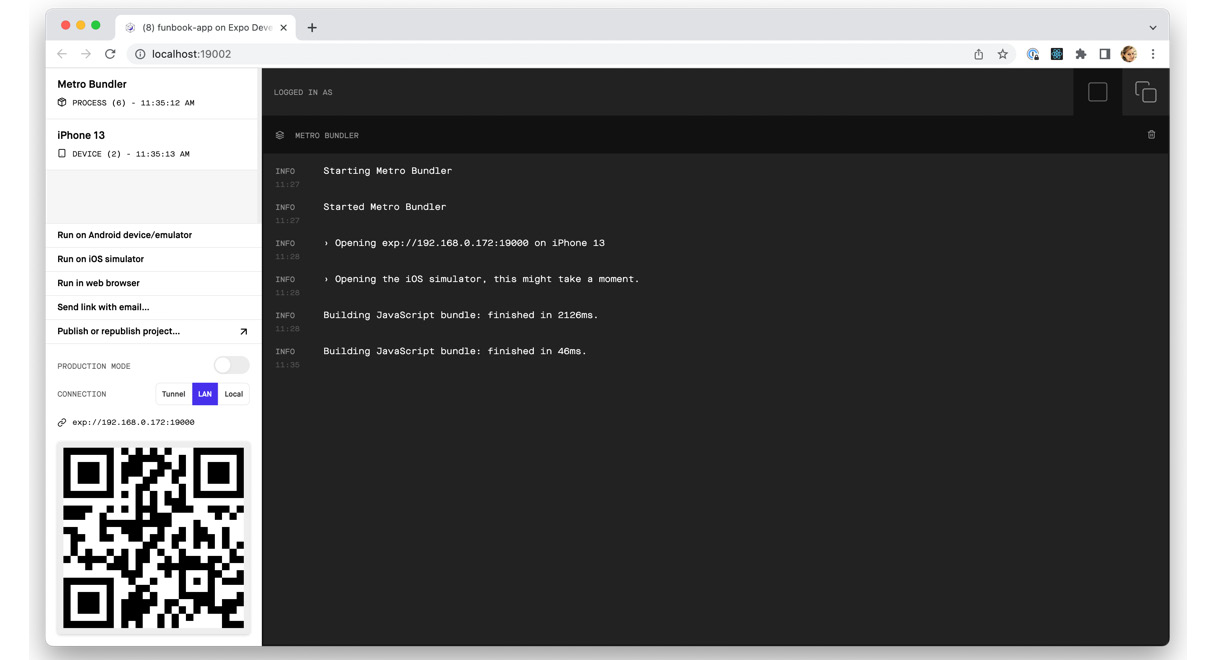
Figure 3.3 – Expo developer tools in the browser
If you want to see your app on your phone, you’ll find the QR code to scan in the Expo Go app right here. You will see error messages here; you can even use this page to publish your app.
I like working with an iPhone simulator open. Here’s what our app looks like set up on my computer:

Figure 3.4 – iPhone 13 with iOS 15.2 simulator screenshot
Hopefully, you see something similar. If you don’t, you can always clone the GitHub repository, or compare your code to the one that’s published. The state of the app you see in the preceding screenshot is what should be seen on the main branch of the repo located here: https://github.com/PacktPublishing/Simplifying-State-Management-in-React-Native.
Take some time to play around with the app. Try creating some obvious errors, such as writing plain text outside of the <Text /> component, maybe using a <div> tag, or not closing a tag.
We will practice code changes on our bottom tab navigation. We will not be creating any components for that.
Customizing the appearance of the tab navigator can be achieved by setting properties when the navigator is set up. We can also add some specific per-screen options. Our bottom tab navigator will use icons for tabs, so we will need to start by importing an icon library into the main App.js file. We will use a library called @expo/vector-icons. This library is installed by default on all projects initialized with expo.
Adding libraries
Before adding any additional dependencies and libraries, make sure to check the Expo documentation to see whether the library you want is not installed already. If you do need to add something, make sure to add libraries compatible with the Expo workflow.
Expo has done all the heavy lifting for us; we have a big icon library at our fingertips. All we need to do is use it to add icons to our navigator. We will start by adding simple icons to four of the five items:
import Ionicons from "@expo/vector-icons/Ionicons";
// …
function Home() {
  return (
    <Tab.Navigator
      screenOptions={({ route }) => ({
        tabBarIcon: ({ focused, color, size }) => {
          let iconName;
          if (route.name === "Feed") {
            iconName = focused ? "md-home" : "md-home-outline";
          } else if (route.name === "Conversations") {
            iconName = focused ? "chatbox" : "chatbox-outline";
          } else if (route.name === "Favorites") {
            iconName = focused ? "heart" : "heart-outline";
          } else if (route.name === "Profile") {
              iconName = focused ? "person-circle" :                "person-circle-outline";
          }
          return <Ionicons name={iconName} size={size} color={color} />;
        },
        tabBarActiveTintColor: "#25A0B0",
        tabBarInactiveTintColor: "#000000",
      })}
    >
      <Tab.Screen name='Feed' component={Feed} />
        <Tab.Screen name='Conversations'          component={Conversations} />
      <Tab.Screen name='AddPost' component={AddPost} />
      <Tab.Screen name='Favorites' component={Favorites} />
      <Tab.Screen name='Profile' component={Profile} />
    </Tab.Navigator>
  );
}
We added a simple if statement to <Tab.Navigator>, where we give it specific instructions on what component should be displayed. Every time we’re displaying a <Ionicons> component from the @expo/vector-icons library, however, we’re feeding it different props. We’ll leave the AddPost item for now. Once we create a reusable button component, we’ll come back here and add it.
What we can customize further now is the tabBar label. As per the design, the label should not be displayed. We need to add another property to <Tab.Navigator>:
// …
tabBarInactiveTintColor: "#000000",
tabBarShowLabel: false,
// …
Looking good! Now, how about the header? Our app has a very generic header with a white background and the title of the given surface. As you can see on the design, some surfaces don’t have titles (such as Profile or Messaging) and others have a title on a transparent background. React Navigation is responsible for the look of the header, so let’s set it right now. We will add yet another prop to <Tab.Navigator>:
// …
tabBarInactiveTintColor: "#000000",
tabBarShowLabel: false,
headerTransparent: true,
// …
Yay! That worked – but wait, the text that was displayed on the screen is now behind a fixed, transparent header!
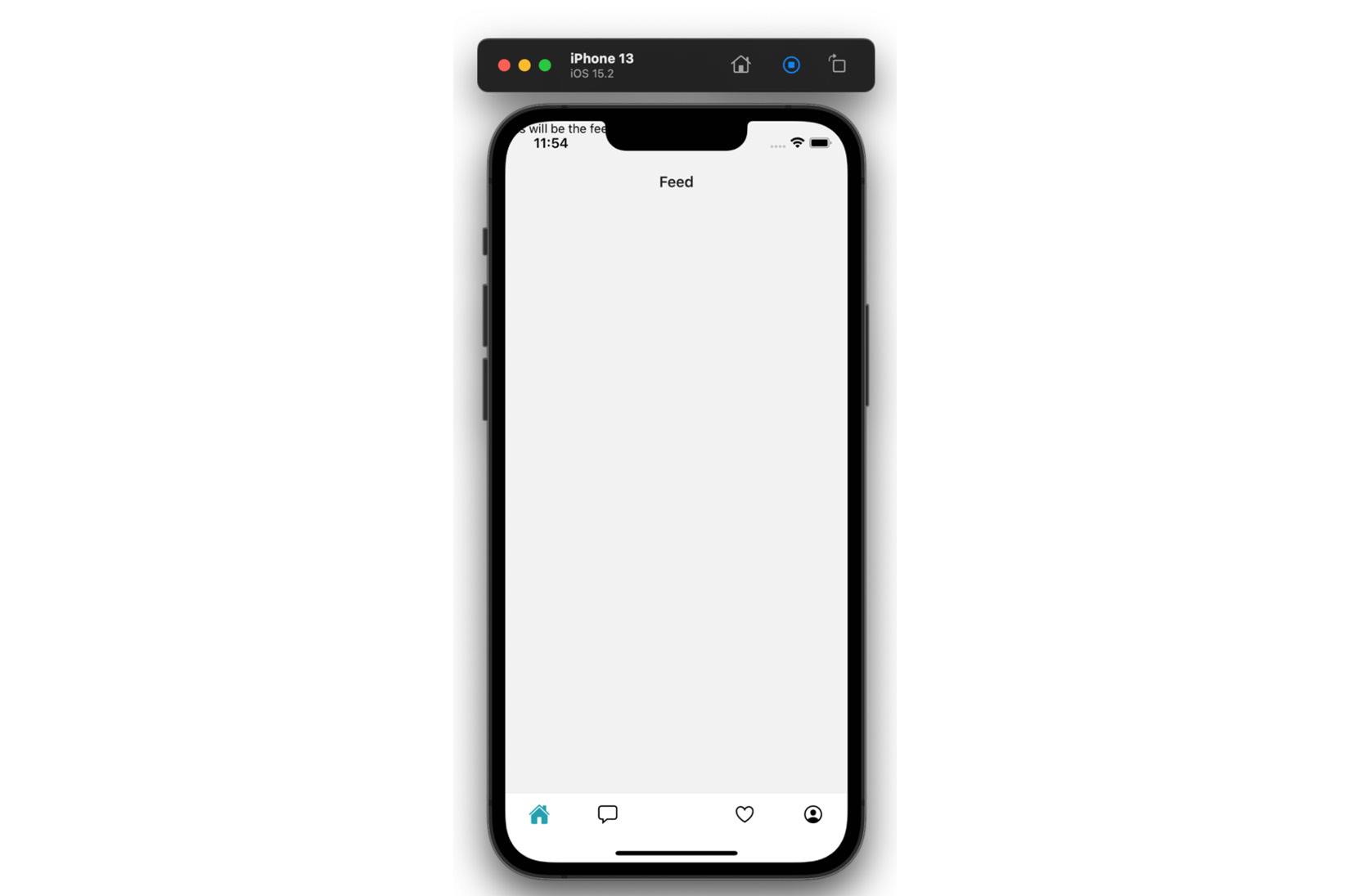
Figure 3.5 – iPhone simulator showing UI issues
We need to make sure the contents of our app won’t ever fly off the screen like this. It’s not an easy task to achieve, especially with so many screen shapes, notches, and digital buttons. Luckily for us, the creators of React Navigation added a wrapper component called <SafeAreaView>. We have to add the SafeAreaProvider component around <NavigationContainer>. This component uses React Context “under the hood.” In order to use this context, we need to add <SafeAreaView> around each one of our surfaces. The main app component will look like this:
export default function App() {
  const [userLoggedIn, setIsUserLoggedIn] = useState(true);
  return (
    <SafeAreaProvider>
      <NavigationContainer>
        <Stack.Navigator>
         // …
        </Stack.Navigator>
      </NavigationContainer>
    </SafeAreaProvider>
  );
}
Let’s add <SafeAreaView> around the <Feed> component. Do you see any improvement over what we saw before? No? That’s because there’s one more gotcha: we need to add the {{flex: 1}} style to the wrapper component. Okay, the surface looks better – the text is contained on the screen – but it’s still behind the header…

Figure 3.6 – Close-up of the iPhone simulator with changes to the UI
We want to add padding to the top of the surface so that our content will begin below the header. We want to determine the height of the header without having to hardcode any pixel values. React Navigation comes to the rescue again, by providing a custom hook called useHeaderHeight(). The Feed component looks like this now:
import React from "react";
import { SafeAreaView } from "react-native-safe-area-context";
import { View, Text } from "react-native";
import { useHeaderHeight } from "@react-navigation/elements";
export const Feed = () => {
  const headerHeight = useHeaderHeight();
  return (
      <SafeAreaView style={{ flex: 1, paddingTop: headerHeight         }}>
      <View>
        <Text>this will be the feed screen</Text>
      </View>
    </SafeAreaView>
  );
};
And the app should look like this:
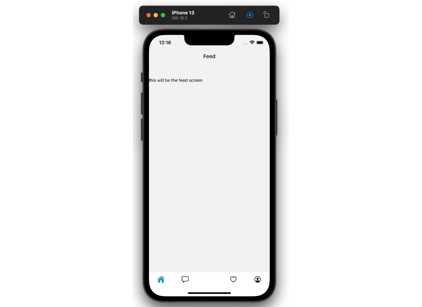
Figure 3.7 – iPhone simulator with fixed UI
Make sure to add <SafeAreaView> to all surfaces if you’re following along with this book. If you prefer to see the code changes on GitHub, you will find them on the branch called chapter-3: https://github.com/PacktPublishing/Simplifying-State-Management-in-React-Native/tree/main/chapter-3.
If you’re wondering why we’re adding header styles to the <Tab.Navigator> and not the root component, I invite you to take a look at the <Stack.Navigator> we have set up at the root of our app, in preparation for a Login screen. In the <Stack.Screen> component, you will notice the following option:
options={{ headerShown: false }}We are telling React Navigation to hide the header of <Stack.Navigator> and display the header of the nested <Tab.Navigator>. This nested <Tab.Navigator> is also the one we need to style. Go ahead and change the headerShown option in your project and observe what happens. You should see another header show up in the app with the Home title! That’s because we’ve named Home the main parent component, used for creating <Tab.Navigator>. Make sure to change the headerShown option back to false, before getting back to work on our app.
I hope you’re getting comfortable with making changes and previewing them in your app. Let’s finish this section by adding a custom font. We’ll use a library provided by Expo again: Expo Google Fonts. If you take a quick look at the design file, you’ll find the name of the font used, it’s a Google font called Poppins.
We’ll go ahead and import the font into the Feed component, add it as a style prop to the <Text> component, and… oh no! Problem!
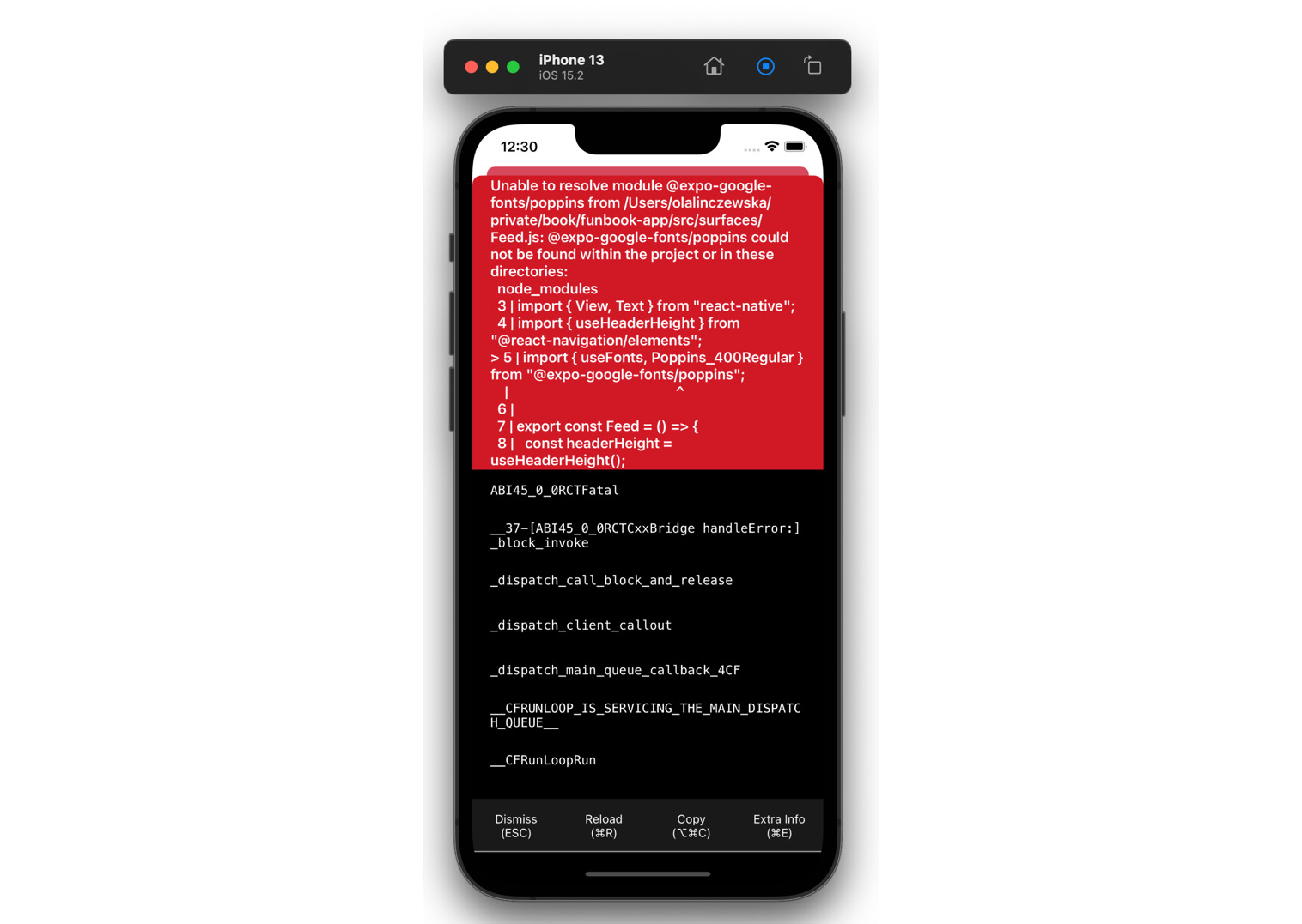
Figure 3.8 – iPhone simulator displaying an error
Even though this huge red box seems to be screaming at us, there’s no need to worry. All we need to do is read the error. It states that @expo-google-fonts/poppins is not defined. Of course! We need to install this font in our project. Let’s run the following commands in the terminal:
$ expo install expo-font
$ expo install @expo-google-fonts/poppins
The error should be gone. Now, we can safely add our font family to the <Text> component. Or can we?

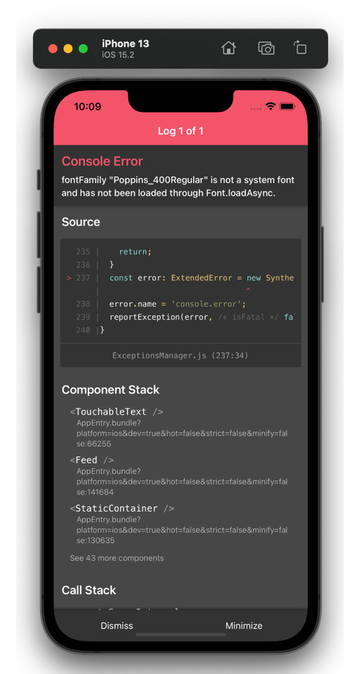
Figure 3.9 – iPhone simulators displaying an error toast message and details
The font has not been loaded… Let’s go back to the Expo documentation and make sure we loaded everything correctly.
According to the documentation, we first need to use the useFont hook with an AppLoading wrapper around the root component! Here’s what we need to add to the App.js file:
export default function App() {
  const [userLoggedIn, setIsUserLoggedIn] = useState(true);
  let [fontsLoaded] = useFonts({
    Poppins_400Regular,
  });
  if (!fontsLoaded) {
    return <AppLoading />;
  }
  return (
// …
And there we have it. Now, the app works correctly, and we can add the fontFamily style wherever we’d like:
<Text style={{ fontFamily: "Poppins_400Regular"}}>In this section, we got comfortable changing code, previewing our app, and handling errors. Now, we’re ready to write and style components in the next chapter.
Summary
In this chapter, we planned our app and got comfortable previewing and debugging it. Both of these steps are vital to creating a good developer experience. First of all, we do not want to face any major surprises – that’s why we want to plan ahead. You could compare this to how a building is built. No self-respecting construction worker would start setting up walls and doors before making, or at least looking at, a blueprint. We, as software developers, are building a digital product and not a building, but we’re using the word “to build” for very good reasons.
Second of all, we need to know how to check whether what we’re writing is actually working. Your code may look logical to you, but that does not mean that it will work after JavaScript tries to understand your logic. That is why every web developer has a browser window open while working, and why a mobile app developer needs to look at a phone or a phone simulator. Since we will be spending quite a lot of time looking at our apps on phones, it’s good to get comfortable.
Now, dear reader, we are ready to continue our journey into the weeds of React Native! In the next chapter, we will build the components we planned above. We will also add styles to match our beautiful design. We will encounter a few classical problems of React Native and a few quirks – and we will have a nice-looking app at the end!
Further reading
- https://docs.expo.dev/guides/icons/ – Expo icons guide.
- https://reactjs.org/docs/context.html – React context.
- https://github.com/expo/google-fonts – Expo Google Fonts.