
7
Machine Learning-Based Approaches to Time Series Forecasting
In the previous chapter, we provided a brief introduction to time series analysis and demonstrated how to use statistical approaches (ARIMA and ETS) for time series forecasting. While those approaches are still very popular, they are somewhat dated. In this chapter, we focus on the more recent, ML-based approaches to time series forecasting.
We start by explaining different ways of validating time series models. Then, we move on to the inputs of ML models, that is, the features. We provide an overview of selected feature engineering approaches and introduce a tool for automatic feature extraction that generates hundreds or thousands of features for us.
Having covered those two topics, we introduce the concept of reduced regression, which allows us to reframe the time series forecasting problem as a regular regression problem. Thus, it allows us to use popular and battle-tested regression algorithms (all the ones available in scikit-learn, XGBoost, LightGBM, and so on) for time series forecasting. Then, we also show how to use Meta’s Prophet algorithm. We conclude the chapter by introducing one of the popular AutoML tools, which allows us to train and tune dozens of ML models with only a few lines of code.
We cover the following recipes in this chapter:
- Validation methods for time series
- Feature engineering for time series
- Time series forecasting as reduced regression
- Forecasting with Meta’s Prophet
- AutoML for time series forecasting with PyCaret
Validation methods for time series
In the previous chapter, we trained a few statistical models to forecast the future values of time series. To evaluate the models’ performance, we initially split the data into training and test sets. However, that is definitely not the only approach to model validation.
A very popular approach to evaluating models’ performance is called cross-validation. It is especially useful for choosing the best set of a model’s hyperparameters or selecting the best model for the problem we are trying to solve. Cross-validation is a technique that allows us to obtain reliable estimates of the model’s generalization error by providing multiple estimates of the model’s performance. As such, cross-validation can help us greatly when we are dealing with smaller datasets.
The basic cross-validation scheme is called k-fold cross-validation, in which we randomly split the training data into k folds. Then, we train the model using k−1 folds and evaluate the performance on the kth fold. We repeat this process k times and average the resulting scores. Figure 7.1 illustrates the procedure.
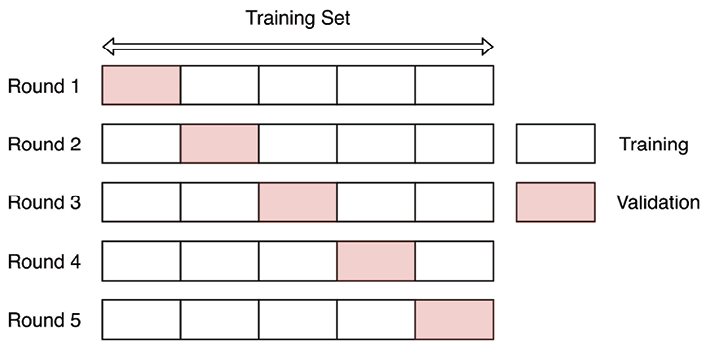
Figure 7.1: Schema of k-fold cross-validation
As you might have already realized, k-fold cross-validation is not really suited for evaluating time series models, as it does not preserve the order of time. For example, in the first round, we train the model using the data from the last 4 folds while evaluating it using the first one.
As k-fold cross-validation is very useful for standard regression and classification tasks, we will come back to it and cover it more in-depth in Chapter 13, Applied Machine Learning: Identifying Credit Default.
Bergmeir et al. (2018) show that in the case of a purely autoregressive model, the use of standard k-fold cross-validation is possible if the considered models have uncorrelated errors.
Fortunately, we can quite easily adapt the concept of k-fold cross-validation to the time series domain. The resulting approach is called the walk-forward validation. In that validation scheme, we expand/slide the training window by one (or multiple) fold(s) at a time.
Figure 7.2 illustrates the expanding window variant of the walk-forward validation, which is also called anchored walk-forward validation. As you can see, we are incrementally increasing the size of the training set, while keeping the next fold as a validation set.

Figure 7.2: Walk-forward validation with an expanding window
This approach comes with a sort of bias—in the earlier rounds, we use much less historical data for training the model than in the latter ones, which makes the errors coming from different rounds not directly comparable. For example, in the first rounds of validation, the model might simply not have enough training data to properly learn the seasonal patterns.
An attempt to solve this problem might be to use a sliding window approach instead of an expanding one. As a result, all models are trained with the same amount of data so the errors are directly comparable. Figure 7.3 illustrates the process.

Figure 7.3: Walk-forward validation with a sliding window
We could use this approach when we have a lot of training data (and each sliding window offers enough for the model to learn the patterns well) or when we do not need to look far into the past to learn relevant patterns used to predict the future.
We can use a nested cross-validation approach to get even more accurate error estimates while tuning the model’s hyperparameters at the same time. In nested CV, there is an outer loop that estimates the model’s performance and the inner loop used for hyperparameter tuning. We provide some useful references on the topic in the See also section.
In this recipe, we show how to use the walk-forward validation (using both expanding and sliding windows) to evaluate the forecasts of the US unemployment rate.
How to do it…
Execute the following steps to calculate the model’s performance using walk-forward validation:
- Import the libraries and authenticate:
import pandas as pd import numpy as np from sklearn.model_selection import TimeSeriesSplit, cross_validate from sklearn.linear_model import LinearRegression from sklearn.metrics import mean_absolute_percentage_error import nasdaqdatalink nasdaqdatalink.ApiConfig.api_key = "YOUR_KEY_HERE" - Download the monthly US unemployment rate from the years 2010 to 2019:
df = (
    nasdaqdatalink.get(dataset="FRED/UNRATENSA",
                       start_date="2010-01-01",
                       end_date="2019-12-31")
    .rename(columns={"Value": "unemp_rate"})
)
df.plot(title="Unemployment rate (US) - monthly")
Executing the snippet generates the following plot:

Figure 7.4: Monthly US unemployment rate
- Create simple features:
df["linear_trend"] = range(len(df))
df["month"] = df.index.month
As we are avoiding autoregressive features and we know the values of all the features into the future, we are able to forecast for an arbitrarily long forecast horizon.
- Use one-hot encoding for the month feature:
month_dummies = pd.get_dummies( df["month"], drop_first=True, prefix="month" ) df = df.join(month_dummies) .drop(columns=["month"]) - Separate the target from the features:
X = df.copy() y = X.pop("unemp_rate") - Define the expanding window walk-forward validation and print the indices of the folds:
expanding_cv = TimeSeriesSplit(n_splits=5, test_size=12)

for fold, (train_ind, valid_ind) in enumerate(expanding_cv.split(X)):
    print(f"Fold {fold} ----")
    print(f"Train indices: {train_ind}")
    print(f"Valid indices: {valid_ind}")
Executing the snippet generates the following log:
Fold 0 ----
Train indices: [ 0  1  2  3  4  5  6  7  8  9 10 11
                12 13 14 15 16 17 18 19 20 21 22 23
                24 25 26 27 28 29 30 31 32 33 34 35
                36 37 38 39 40 41 42 43 44 45 46 47
                48 49 50 51 52 53 54 55 56 57 58 59]
Valid indices: [60 61 62 63 64 65 66 67 68 69 70 71]
Fold 1 ----
Train indices: [ 0  1  2  3  4  5  6  7  8  9 10 11
                12 13 14 15 16 17 18 19 20 21 22 23
                24 25 26 27 28 29 30 31 32 33 34 35
                36 37 38 39 40 41 42 43 44 45 46 47
                48 49 50 51 52 53 54 55 56 57 58 59
                60 61 62 63 64 65 66 67 68 69 70 71]
Valid indices: [72 73 74 75 76 77 78 79 80 81 82 83]
Fold 2 ----
Train indices: [ 0  1  2  3  4  5  6  7  8  9 10 11
                12 13 14 15 16 17 18 19 20 21 22 23
                24 25 26 27 28 29 30 31 32 33 34 35
                36 37 38 39 40 41 42 43 44 45 46 47
                48 49 50 51 52 53 54 55 56 57 58 59
                60 61 62 63 64 65 66 67 68 69 70 71
                72 73 74 75 76 77 78 79 80 81 82 83]
Valid indices: [84 85 86 87 88 89 90 91 92 93 94 95]
Fold 3 ----
Train indices: [ 0  1  2  3  4  5  6  7  8  9 10 11
                12 13 14 15 16 17 18 19 20 21 22 23
                24 25 26 27 28 29 30 31 32 33 34 35
                36 37 38 39 40 41 42 43 44 45 46 47
                48 49 50 51 52 53 54 55 56 57 58 59
                60 61 62 63 64 65 66 67 68 69 70 71
                72 73 74 75 76 77 78 79 80 81 82 83
                84 85 86 87 88 89 90 91 92 93 94 95]
Valid indices: [96 97 98 99 100 101 102 103 104 105 106 107]
Fold 4 ----
Train indices: [ 0  1  2  3  4  5  6  7  8  9 10 11
                12 13 14 15 16 17 18 19 20 21 22 23
                24 25 26 27 28 29 30 31 32 33 34 35
                36 37 38 39 40 41 42 43 44 45 46 47
                48 49 50 51 52 53 54 55 56 57 58 59
                60 61 62 63 64 65 66 67 68 69 70 71
                72 73 74 75 76 77 78 79 80 81 82 83
                84 85 86 87 88 89 90 91 92 93 94 95
                96 97 98 99 100 101 102 103 104 105 106 107]
Valid indices: [108 109 110 111 112 113 114 115 116 117 118 119]
By analyzing the log and keeping in mind that we are working with monthly data, we can see that in the first iteration, the model would be trained using five years of data and evaluated using the sixth year. In the second round, it would be trained using the first six years of data and evaluated using the seventh year, and so on.
- Evaluate the model’s performance using the expanding window validation:
scores = []
for train_ind, valid_ind in expanding_cv.split(X):
    lr = LinearRegression()
    lr.fit(X.iloc[train_ind], y.iloc[train_ind])
    y_pred = lr.predict(X.iloc[valid_ind])
    scores.append(
        mean_absolute_percentage_error(y.iloc[valid_ind], y_pred)
    )
print(f"Scores: {scores}")
print(f"Avg. score: {np.mean(scores)}")
Executing the snippet generates the following output:
Scores: [0.03705079312389441, 0.07828415627306308, 0.11981060282173006, 0.16829494012910876, 0.25460459651634165]
Avg. score: 0.1316090177728276
The average performance (measured by MAPE) over the cross-validation rounds was 13.2%.
Instead of iterating over the splits, we can easily use the
cross_validatefunction fromscikit-learn:cv_scores = cross_validate( LinearRegression(), X, y, cv=expanding_cv, scoring=["neg_mean_absolute_percentage_error", "neg_root_mean_squared_error"] ) pd.DataFrame(cv_scores)Executing the snippet generates the following output:

Figure 7.5: The scores of each of the validation rounds using a walk-forward CV with an expanding window
By looking at the scores, we see that they are identical (except for the negative sign) to the ones we have obtained by manually iterating over the cross-validation splits.
- Define the sliding window validation and print the indices of the folds:
sliding_cv = TimeSeriesSplit(
    n_splits=5, test_size=12, max_train_size=60
)

for fold, (train_ind, valid_ind) in enumerate(sliding_cv.split(X)):
    print(f"Fold {fold} ----")
    print(f"Train indices: {train_ind}")
    print(f"Valid indices: {valid_ind}")
Executing the snippet generates the following output:
Fold 0 ----
Train indices: [ 0  1  2  3  4  5  6  7  8  9 10 11
                12 13 14 15 16 17 18 19 20 21 22 23
                24 25 26 27 28 29 30 31 32 33 34 35
                36 37 38 39 40 41 42 43 44 45 46 47
                48 49 50 51 52 53 54 55 56 57 58 59]
Valid indices: [60 61 62 63 64 65 66 67 68 69 70 71]
Fold 1 ----
Train indices: [12 13 14 15 16 17 18 19 20 21 22 23
                24 25 26 27 28 29 30 31 32 33 34 35
                36 37 38 39 40 41 42 43 44 45 46 47
                48 49 50 51 52 53 54 55 56 57 58 59
                60 61 62 63 64 65 66 67 68 69 70 71]
Valid indices: [72 73 74 75 76 77 78 79 80 81 82 83]
Fold 2 ----
Train indices: [24 25 26 27 28 29 30 31 32 33 34 35
                36 37 38 39 40 41 42 43 44 45 46 47
                48 49 50 51 52 53 54 55 56 57 58 59
                60 61 62 63 64 65 66 67 68 69 70 71
                72 73 74 75 76 77 78 79 80 81 82 83]
Valid indices: [84 85 86 87 88 89 90 91 92 93 94 95]
Fold 3 ----
Train indices: [36 37 38 39 40 41 42 43 44 45 46 47
                48 49 50 51 52 53 54 55 56 57 58 59
                60 61 62 63 64 65 66 67 68 69 70 71
                72 73 74 75 76 77 78 79 80 81 82 83
                84 85 86 87 88 89 90 91 92 93 94 95]
Valid indices: [96 97 98 99 100 101 102 103 104 105 106 107]
Fold 4 ----
Train indices: [48 49 50 51 52 53 54 55 56 57 58 59
                60 61 62 63 64 65 66 67 68 69 70 71
                72 73 74 75 76 77 78 79 80 81 82 83
                84 85 86 87 88 89 90 91 92 93 94 95
                96 97 98 99 100 101 102 103 104 105 106 107]
Valid indices: [108 109 110 111 112 113 114 115 116 117 118 119]
By analyzing the log, we can see the following:
- Evaluate the model’s performance using the sliding window validation:
cv_scores = cross_validate(
    LinearRegression(),
    X, y,
    cv=sliding_cv,
    scoring=["neg_mean_absolute_percentage_error",
             "neg_root_mean_squared_error"]
)
pd.DataFrame(cv_scores)
Executing the snippet generates the following output:

Figure 7.6: The scores of each of the validation rounds using a walk-forward CV with a sliding window
By aggregating the MAPE, we arrive at the average score of 9.98%. It seems that using 5 years of data in each iteration results in a better average score than when using the expanding window. A potential conclusion is that in this particular case, more data does not result in a better model. Instead, we can obtain a better model when using only the most recent data points.
How it works….
First, we imported the required libraries and authenticated with Nasdaq Data Link. In the second step, we downloaded the monthly US unemployment rate. It is the same time series that we worked with in the previous chapter.
In Step 3, we created two simple features:
- Linear trend, which is simply the ordinal row number of the ordered time series. Based on the inspection of Figure 7.4, we saw that the overall trend in the unemployment rate is decreasing. We hope that this feature will capture that pattern.
- The month index, which identifies from which calendar month the given observation comes.
In Step 4, we one-hot encoded the month feature using the get_dummies function. We cover one-hot encoding in depth in Chapter 13, Applied Machine Learning: Identifying Credit Default, and Chapter 14, Advanced Concepts for Machine Learning Projects. In short, we created new columns, each one being a Boolean flag indicating whether the given observation comes from a certain month. Additionally, we dropped the first column to avoid perfect multicollinearity (that is, the infamous dummy variable trap).
In Step 5, we separated the features from the target using the pop method of a pandas DataFrame.
In Step 6, we defined the walk-forward validation using the TimeSeriesSplit class from scikit-learn. We indicated we want to have 5 splits and that the test size should be 12 months. Ideally, the validation scheme should reflect the real-life usage of the model. In this case, we can state that the ML model will be used to forecast the monthly unemployment rate 12 months into the future.
Then, we used a for loop to print the train and validation indices used in each of the cross-validation rounds. The indices returned by the split method of the TimeSeriesSplit class are ordinal, but we can easily map those to the actual indices of the time series.
We decided not to use autoregressive features, as without them we can forecast arbitrarily long into the future. Naturally, we can also do so with the AR feature, but then we need to handle them appropriately. This specification is simply easier for this use case.
In Step 7, we used a very similar for loop, this time to evaluate the model’s performance. In each iteration of the loop, we trained the linear regression model using that iteration’s training data, created predictions for the corresponding validation set, and lastly, calculated the performance expressed as MAPE. We appended the CV scores to a list and then we also calculated the average performance over all 5 rounds of cross-validation.
Instead of using the custom for loop, we can use the cross_validate function from the scikit-learn library. A potential advantage of using it over the loop is that it automatically counts the time spent on the fit and prediction steps of the model. We showed how to obtain the MAPE and MSE scores using this approach.
One thing to note about using the cross_validate function (or other scikit-learn functionalities such as Grid Search) is that we had to provide the metric names as, for example, "neg_mean_absolute_percentage_error". That is the convention used in the metrics module of scikit-learn, that is, the higher values of the scorers are better than the lower values. Hence, as we want to minimize those metrics, they are negated.
Below, you can find a list of the most popular metrics used for evaluating the accuracy of time series forecasts:
- Mean Squared Error (MSE)—One of the most popular metrics in machine learning. As the unit is not very intuitive (not the same unit as the original forecast), we can use MSE to compare the relative performance of various models on the same dataset.
- Root Mean Squared Error (RMSE)—By taking the square root of MSE, this metric is now at the same scale as the original time series.
- Mean Absolute Error (MAE)—Instead of taking the square, we take the absolute value of the error. As a result, MAE is expressed on the same scale as the original time series. What is more, MAE is more tolerant of outliers, as each observation is given the same weight when calculating the average. In the case of the squared metrics, the outliers were punished more significantly.
- Mean Absolute Percentage Error (MAPE)—Very similar to MAE, but expressed as a percentage. Hence, it is easier to understand for many business stakeholders. However, it comes with a serious disadvantage—when the actual value is zero, the metric assumes dividing the error by the actual value, which is not mathematically possible.
Naturally, these are only a few of the selected metrics. It is highly advised to dive deeper into those metrics to fully understand their pros and cons. For example, RMSE is often favored as an optimization metric, as squares are easier to handle than absolute values when mathematical optimization requires taking derivatives.
In Steps 8 and 9, we showed how to create the validation scheme using the sliding window approach. The only difference is the fact that we specified the max_train_size argument while instantiating the TimeSeriesSplit class.
Sometimes we might be interested in creating a gap between the training and validation sets within cross-validation. For example, in the first iteration, the training should be done using the first five values and then the evaluation should be done on the seventh value. We can easily incorporate such a scenario by using the gap argument of the TimeSeriesSplit class.
There’s more…
In this recipe, we have described the standard approach to validating time series models. However, there are many more advanced validation approaches. Actually, most of them come from the financial domain, as validating models based on financial time series proves to be more complex for multiple reasons. We briefly mention some of the more advanced approaches below, together with the challenges they are trying to fix.
One of the limitations of TimeSeriesSplit is that it only works at record-level and cannot handle grouping. Imagine we have a dataset of daily stock returns. And due to the specification of our trading algorithm, we are evaluating the performance on a weekly or monthly level and the observations should not overlap between the weekly/monthly groups. Figure 7.7 illustrates the concept by using the training group size of 3 and validation group size of 1.

Figure 7.7: Schema of group time series validation
To account for such a grouping of the observations (by week or month), we need to use group time series validation, which is a combination of scikit-learn's TimeSeriesSplit and GroupKFold. There are many implementations of this concept on the internet. One of them can be found in the mlxtend library.
To better illustrate the potential problems with forecasting financial time series and evaluating the model’s performance, we have to expand our mental model connected to the time series. Such time series actually have two timestamps for each observation:
- A prediction or trade timestamp—when the ML model makes a prediction and we are potentially opening a trade.
- An evaluation or event timestamp—when the response to the prediction/trade becomes available and we can actually calculate the prediction error.
For example, we can have a classification model that predicts the price of certain stock increases or drops by X in the next 5 business days. Based on that prediction, we make a trading decision. We might enter a long position. And over the next 5 days, a lot can happen. The price might or might not move by X, a stop-loss or take-profit mechanism might be triggered, we might just close the position, or any number of possible outcomes. Hence, we can actually evaluate the prediction only at the evaluation timestamp, in this case, after 5 business days.
Such a framework comes with the risk of leaking the information from the test set into the training set. As a result, this is very likely to inflate the model’s performance. Hence, we need to make sure that all the data is point-in-time, meaning that is truly available at the time it is used by the model.
For example, near the training/validation split point, there might be training samples whose evaluation time is later than the prediction time of the validation samples. Such overlapping samples are most likely correlated or, in other words, unlikely to be independent, which leads to leaking the information between the sets.
To solve the look-ahead bias, we can apply purging. The idea is to drop any samples from the training set whose evaluation time is later than the earliest prediction time of the validation set. In other words, we remove observations whose event time overlaps with the prediction time of the validation set. Figure 7.8 presents an example.

Figure 7.8: Example of purging
You can find the code to run a walk-forward cross-validation with purging in Advances in financial machine learning (De Prado, 2018) or in the timeseriescv library.
Purging alone might not be sufficient to remove all the leakage, as there might be correlations between the samples over longer periods of time. We can try to solve that by applying an embargo, which further eliminates training samples that follow a validation sample. If a training sample’s prediction time falls into the embargo period, we simply drop that observation from the train set. We estimate the required size of the embargo period for the problem at hand. Figure 7.9 illustrates applying both purging and embargo.
Figure 7.9: Example of purging and embargo
For more details about purging and embargo (as well as their implementation in Python), please refer to Advances in financial machine learning (De Prado, 2018).
De Prado (2018) also introduced the combinatorial purged cross-validation algorithm, which combines the concepts of purging and embargoing with backtesting (we cover backtesting trading strategies in Chapter 12, Backtesting Trading Strategies) and cross-validation.
See also
- Bergmeir, C., & Benítez, J. M. 2012. “On the use of cross-validation for time series predictor evaluation,” Information Sciences, 191: 192-213.
- Bergmeir, C., Hyndman, R. J., & Koo, B. 2018. “A note on the validity of cross-validation for evaluating autoregressive time series prediction,” Computational Statistics & Data Analysis, 120: 70-83.
- De Prado, M. L. 2018. Advances in Financial Machine Learning. John Wiley & Sons.
- Hewamalage, H., Ackermann, K., & Bergmeir, C. 2022. Forecast Evaluation for Data Scientists: Common Pitfalls and Best Practices. arXiv preprint arXiv:2203.10716.
- Tashman, L. J. 2000. “Out-of-sample tests of forecasting accuracy: an analysis and review,” International Journal of Forecasting, 16(4): 437-450.
- Varma, S., & Simon, R. 2006. “Bias in error estimation when using cross-validation for model selection,” BMC bioinformatics, 7(1): 1-8.
Feature engineering for time series
In the previous chapter, we trained some statistical models using just the time series as input. On the other hand, when we want to approach time series forecasting from the ML perspective, feature engineering becomes crucial. In the time series context, it means creating informative variables (either from the time series itself or using its timestamp) that help with getting accurate forecasts. Naturally, feature engineering is not only important for the pure ML models but we can use it to enrich the statistical models with external regressors, for example, in the ARIMAX model.
As we have mentioned, there are many ways in which we can create features, and it comes down to a deep understanding of the dataset. Examples of feature engineering include:
- Extracting relevant information from the timestamp. For example, we can extract the year, quarter, month, week number, or day of the week.
- Adding relevant information about special days based on the timestamp. For example, in the retail industry, we might want to add information about all holidays. To get a country-specific holiday calendar, we could use the
holidayslibrary. - Adding lagged values of the target, similar to the AR models.
- Creating features based on aggregate values (such as minimum, maximum, mean, median, or standard deviation) over a rolling or expanding window.
- Calculating technical indicators.
In a way, feature generation is only limited by the data, your creativity, or the available time. In this recipe, we show how to create a selection of features based on the timestamp of the time series.
First, we extract the month information and encode it as a dummy variable (one-hot encoding). The biggest issue with this approach in the context of time series is the lack of cyclical continuity in time. It is easiest to understand with an example.
Imagine a scenario of working with energy consumption data. If we use the information about the month of the observed consumption, intuitively it makes sense there should be a connection between two consecutive months, for example, the connection between December and January or between January and February. In comparison, the connection between months further apart, for example, January and July, will probably be weaker. The same logic applies to other time-related information as well, for example, hours within the day.
We present two possible ways of incorporating this information as features. The first one is based on trigonometric functions (sine and cosine transformation). The second one uses radial basis functions to encode similar information.
In this recipe, we work with simulated daily data from the years 2017 to 2019. We chose to simulate the data as the main point of the exercise is to show how different kinds of encoding time information impact the model. And it is easier to show that using simulated data following clear patterns. Naturally, the feature engineering methods shown in this recipe can be applied to any time series.
How to do it…
Execute the following steps to create time-related features and fit linear models using them as inputs:
- Import the libraries:
import numpy as np import pandas as pd from datetime import date from sklearn.linear_model import LinearRegression from sklearn.preprocessing import FunctionTransformer from sklego.preprocessing import RepeatingBasisFunction - Generate a time series with repeating patterns:
np.random.seed(42)
range_of_dates = pd.date_range(start="2017-01-01",
                               end="2019-12-31")
X = pd.DataFrame(index=range_of_dates)
X["day_nr"] = range(len(X))
X["day_of_year"] = X.index.day_of_year
signal_1 = 2 + 3 * np.sin(X["day_nr"] / 365 * 2 * np.pi)
signal_2 = 2 * np.sin(X["day_nr"] / 365 * 4 * np.pi + 365/2)
noise = np.random.normal(0, 0.81, len(X))
y = signal_1 + signal_2 + noise
y.name = "y"
y.plot(title="Generated time series")
Executing the snippet generates the following plot:

Figure 7.10: The generated time series with repeating patterns
Thanks to the addition of the sine curves and some random noise, we obtained a time series with repeating patterns over the years.
- Store the time series in a new DataFrame:
results_df = y.to_frame() results_df.columns = ["y_true"] - Encode the month information as dummies:
X_1 = pd.get_dummies(
    X.index.month, drop_first=True, prefix="month"
)
X_1.index = X.index
X_1
Executing the snippet generates the following preview of the DataFrame with dummy-encoded month features:

Figure 7.11: Preview of the dummy-encoded month features
- Fit a linear regression model and plot the in-sample prediction:
model_1 = LinearRegression().fit(X_1, y)
results_df["y_pred_1"] = model_1.predict(X_1)
(
    results_df[["y_true", "y_pred_1"]]
    .plot(title="Fit using month dummies")
)
Executing the snippet generates the following plot:

Figure 7.12: The fit obtained using linear regression with the month dummies
We can clearly see the stepwise pattern of the fit, corresponding to 12 unique values of the month feature. The jaggedness of the fit is caused by the discontinuity of the dummy features. With the other approaches, we try to overcome that issue.
- Define functions used for creating the cyclical encoding:
def sin_transformer(period): return FunctionTransformer(lambda x: np.sin(x / period * 2 * np.pi)) def cos_transformer(period): return FunctionTransformer(lambda x: np.cos(x / period * 2 * np.pi)) - Encode the month and day information using cyclical encoding:
X_2 = X.copy()
X_2["month"] = X_2.index.month
X_2["month_sin"] = sin_transformer(12).fit_transform(X_2)["month"]
X_2["month_cos"] = cos_transformer(12).fit_transform(X_2)["month"]
X_2["day_sin"] = (
    sin_transformer(365).fit_transform(X_2)["day_of_year"]
)
X_2["day_cos"] = (
    cos_transformer(365).fit_transform(X_2)["day_of_year"]
)
fig, ax = plt.subplots(2, 1, sharex=True, figsize=(16,8))
X_2[["month_sin", "month_cos"]].plot(ax=ax[0])
ax[0].legend(loc="center left", bbox_to_anchor=(1, 0.5))
X_2[["day_sin", "day_cos"]].plot(ax=ax[1])
ax[1].legend(loc="center left", bbox_to_anchor=(1, 0.5))
plt.suptitle("Cyclical encoding with sine/cosine transformation")
Executing the snippet generates the following plot:

Figure 7.13: Cyclical encoding with sine/cosine transformation
There are two insights we can draw from Figure 7.13:
- The curves have a step-wise shape when using the months for encoding. When using daily frequency, the curves are much smoother.
- The plots illustrate the need to use two curves instead of one. As the curves have a repetitive (cyclical) pattern, if we drew a straight horizontal line through the plot for a single year, we would cross the curve in two places. Hence, a single curve would not be enough for the model to understand the observation’s time point, as two possibilities exist. Fortunately, with the two curves, there is no such issue.
To clearly see the cyclical representation obtained using this transformation, we can plot the sine and cosine values on a scatterplot for a given year:
(
    X_2[X_2.index.year == 2017]
    .plot(
        kind="scatter",
        x="month_sin",
        y="month_cos",
        figsize=(8, 8),
        title="Cyclical encoding using sine/cosine transformations"
    )
)
Executing the snippet generates the following plot:

Figure 7.14: The cyclical representation of time
In Figure 7.14, we can see that there are no overlapping values. Hence, the two curves can be used to identify the given observation’s point in time.
- Fit a model using the daily sine/cosine features:
X_2 = X_2[["day_sin", "day_cos"]]
model_2 = LinearRegression().fit(X_2, y)
results_df["y_pred_2"] = model_2.predict(X_2)
(
    results_df[["y_true", "y_pred_2"]]
    .plot(title="Fit using sine/cosine features")
)
Executing the snippet generates the following plot:

Figure 7.15: The fit obtained using linear regression with the cyclical features
- Create features using the radial basis functions:
rbf = RepeatingBasisFunction(n_periods=12,
                             column="day_of_year",
                             input_range=(1,365),
                             remainder="drop")
rbf.fit(X)
X_3 = pd.DataFrame(index=X.index,
                   data=rbf.transform(X))
X_3.plot(subplots=True, sharex=True,
         title="Radial Basis Functions",
         legend=False, figsize=(14, 10))
Executing the snippet generates the following plot:
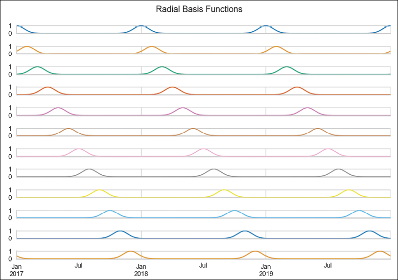
Figure 7.16: Visualization of the features created using the radial basis function
Figure 7.16 presents the 12 curves that we created using the radial basis functions and the day number as input. Each curve tells us how close we are to a certain day of the year. For example, the first curve measures the distance from January 1st. As such, we can observe a peak on the first day of every year, and then it decreases symmetrically as we move away from that date.
The basis functions are equally spaced over the input range. We chose to create 12 curves, as we wanted the radial basis curves to resemble months. This way, each function shows the approximate distance to the first day of the month. The distance is approximate, as the months have unequal lengths.
- Fit a model using the RBF features:
model_3 = LinearRegression().fit(X_3, y)
results_df["y_pred_3"] = model_3.predict(X_3)
(
    results_df[["y_true", "y_pred_3"]]
    .plot(title="Fit using RBF features")
)
Executing the snippet generates the following plot:

Figure 7.17: The fit obtained using linear regression with the RBF-encoded features
We can clearly see that using the RBF features resulted in the best fit so far.
How it works…
After importing the libraries, we generated the artificial time series by combining two signal lines (created using sine curves) and some random noise. The time series we created spans a period of three years (2017 to 2019). Then, we created two columns for later use:
day_nr—numeric index representing the passage of time. It is equivalent to the ordinal row number.day_of_year—The ordinal day of the year.
In Step 3, we stored the generated time series in a separate DataFrame. We did so in order to store the models’ predictions in that DataFrame.
In Step 4, we created the month dummies using the pd.get_dummies method. For more details on this approach, please refer to the previous recipe.
In Step 5, we fitted a linear regression model to the features and used the predict method of the fitted model to obtain the fitted values. For predictions, we used the same dataset as we used for training, as we were interested only in the in-sample fit.
In Step 6, we defined the functions used for obtaining cyclical encoding with the sine and cosine functions. We created two separate functions, but that is a matter of preference and we could have created a single function to create both features at once. The period argument of the functions corresponds to the number of available periods. For example, when encoding the month number, we would use 12. For the day number, we would use 365 or 366.
In Step 7, we encoded both the month and day information using cyclical encoding. We already had the day_of_year column with the day number, so we only had to extract the month number from DatetimeIndex. Then, we created four columns with cyclical encoding.
In Step 8, we dropped all the columns except for the cyclical encoding of the day of the year. Then, we fitted the linear regression model, calculated the fitted values, and plotted the results.
Cyclical encoding has a potentially significant drawback, which is apparent when using tree-based models. By design, tree-based models make a split based on a single feature at the time. And as we have already explained, the sine/cosine features should be considered simultaneously in order to properly identify the time points.
In Step 9, we instantiated the RepeatingBasisFunction class, which works as a scikit-learn transformer. We specified that we wanted 12 RBF curves based on the day_of_year column and that the input range is from 1 to 365 (there is no leap year in the sample). Additionally, we specified the remainder="drop", which drops all the other columns that were in the input DataFrame before the transformation. Alternatively, we could have specified the value as "passthrough", which would keep both the old and new features.
It is worth mentioning that there are two key hyperparameters that we can tune when using radial basis functions:
n_periods—The number of the radial basis functions.width—This hyperparameter is responsible for the shape of the bell curves created with RBFs.
We could use a method such as grid search to identify the optimal values of the hyperparameters for a given dataset. Please refer to Chapter 13, Applied Machine Learning: Identifying Credit Default, for more information on the grid search procedure.
In Step 10, we once again fitted the model, this time using the RBF features as input.
There’s more…
In this recipe, we showed how to manually create time-related features. Naturally, those were just a few of the thousands of possible features we could create. Fortunately, there are Python libraries that facilitate the process of feature engineering/extraction.
We will show two of those. The first approach comes from the sktime library, which is a comprehensive library that is the equivalent of scikit-learn for time series. The second approach leverages a library called tsfresh. The library allows us to automatically generate hundreds or thousands of features with a few lines of code. Under the hood, it uses a combination of established algorithms from statistics, time-series analysis, physics, and signal processing.
We show how to use both approaches in the following steps.
- Import the libraries:
from sktime.transformations.series.date import DateTimeFeatures from tsfresh import extract_features from tsfresh.feature_extraction import settings from tsfresh.utilities.dataframe_functions import roll_time_series - Extract the datetime features using
sktime:dt_features = DateTimeFeatures( ts_freq="D", feature_scope="comprehensive" ) features_df_1 = dt_features.fit_transform(y) features_df_1.head()Executing the snippet generates the following preview of a DataFrame containing the extracted features:

Figure 7.18: Preview of the DataFrame with the extracted features
In the figure, we can see the extracted features. Depending on the ML algorithm we want to use, we might want to further encode those features, for example, using dummy variables.
While instantiating the
DateTimeFeaturesclass, we provided thefeature_scopeargument. In this case, we generated a comprehensive set of features. We can also choose the"minimal"or"efficient"sets.The extracted features are based on the
DatetimeIndexofpandas. For a comprehensive list of all the features that could be extracted from that index, please refer to the documentation ofpandas.
- Prepare the dataset for feature extraction with
tsfresh:df = y.to_frame().reset_index(drop=False) df.columns = ["date", "y"] df["series_id"] = "a"In order to use the feature extraction algorithm, except for the time series itself, our DataFrame must contain columns with a date (or an ordinal encoding of time) and an ID. The latter is required, as the DataFrame might contain multiple time series (in a long format). For example, we could have a DataFrame containing daily stock prices from all the constituents of the S&P 500 index.
- Create a rolled-up DataFrame for feature extraction:
df_rolled = roll_time_series(
    df, column_id="series_id", column_sort="date",
    max_timeshift=30, min_timeshift=7
).drop(columns=["series_id"])
df_rolled
Executing the snippet generates the following preview of a rolled-up DataFrame:
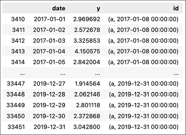
Figure 7.19: Preview of a rolled-up DataFrame
We used a sliding window to roll up the DataFrame because we wanted to achieve the following:
- Calculate meaningful aggregate features for time series forecasting. For example, we might calculate the min/max values in the last 10 days, or the 20-day Simple Moving Average technical indicator. Each time, those calculations involve a time window, as calculating those aggregate measures using one observation would simply make no sense.
- Extract the features for all available time points, so we can easily plug them into our ML forecasting model. This way, we are basically creating the entire training dataset at once.
To do so, we used the
roll_time_seriesfunction to create a rolled-up DataFrame, which will be then used for feature extraction. We specified the minimum and maximum window sizes. In our case, we will discard windows shorter than 7 days and we will use a maximum of 30 days.In Figure 7.19, we can see the newly added
idcolumn. As we can see, multiple observations have the same values in theidcolumn. For example, the value of(a,2017-01-08 00:00:00)indicates that we are using that particular data point when extracting the features from the time series labeled asa(we created this ID artificially in the previous step) for the time point that includes the last 30 days until 2017-01-08. Having prepared the rolled-up DataFrame, we can extract the features.
- Extract the minimal set of features:
settings_minimal = settings.MinimalFCParameters()
settings_minimal
Executing the snippet generates the following output:
{'sum_values': None,
 'median': None,
 'mean': None,
 'length': None,
 'standard_deviation': None,
 'variance': None,
 'maximum': None,
 'minimum': None}
In the dictionary, we can see all the features that will be created. The
Nonevalue implies that the feature has no additional hyperparameters. We chose to extract the minimum set, as the other ones would take a significant amount of time. Alternatively, we could usesettings.EfficientFCParametersorsettings.ComprehensiveFCParametersto generate hundreds or thousands of features.With the following snippet, we actually extract the features:
features_df_2 = extract_features(
    df_rolled, column_id="id",
    column_sort="date",
    default_fc_parameters=settings_minimal
)
- Clean up the index and inspect the features:
features_df_2 = (
    features_df_2
    .set_index(
        features_df_2.index.map(lambda x: x[1]), drop=True
    )
)
features_df_2.index.name = "last_date"
features_df_2.head(25)
Executing the snippet generates the following output:

Figure 7.20: Preview of the features generated with tsfresh
In Figure 7.20, we can see that the minimum window length is 8, while the maximum one is 31. That is as intended, as we indicated we wanted to use the minimum size of 7, which translates to 7 prior days plus the current one. Similarly for the maximum value.
sktime also offers a wrapper around tsfresh. We can access the feature generation algorithm by using sktime's TSFreshFeatureExtractor class.
It is also worth mentioning that tsfresh has three other very interesting features:
- A feature selection algorithm based on hypothesis tests. As the library is capable of generating hundreds or thousands of features, it is definitely important to select the ones that are relevant to our use case. To do so, the library uses the fresh algorithm, which stands for feature extraction based on scalable hypothesis tests.
- The ability to handle feature generation and selection for large datasets by employing parallel processing with either multiprocessing on a local machine or using Spark or Dask clusters when the data does not fit into a single machine.
- It offers transformer classes (for example,
FeatureAugmenterorFeatureSelector), which we can use together withscikit-learnpipelines. We cover pipelines in Chapter 13, Applied Machine Learning: Identifying Credit Default.tsfreshis only one of the available libraries for automatic feature generation for time series data. Other libraries includefeature_engineandtsflex.
Time series forecasting as reduced regression
Until now, we have mostly used dedicated time series models for forecasting tasks. On the other hand, it would also be interesting to experiment with other algorithms that are typically used for solving regression tasks. This way, we might improve the performance of our models.
One of the reasons to use those models is their flexibility. For example, we could go beyond univariate setup, that is, we could enrich our dataset with a wide variety of additional features. We have covered some approaches to feature engineering in the previous recipe. Alternatively, we could add external regressors such as time series, which historically proved to be correlated with the target of our forecasting exercise.
When adding additional time series as external regressors, we should be cautious about their availability. If we do not know their future values, we might use their lagged values or forecast them separately and feed them back into the initial model.
Given the temporal dependency of the time series data (relevant for the lagged values of the time series), we cannot directly use regression models for time series forecasting. First, we need to convert such temporal data into a supervised learning problem, to which we can apply traditional regression algorithms. That process is called reduction and it decomposes certain learning tasks (time series forecasting) into simpler tasks. Then, those can be composed again to offer a solution to the original task. In other words, reduction refers to the concept of using an algorithm or model to solve a learning task that it was not originally designed for. Hence, in reduced regression, we are effectively transforming a forecasting task into a tabular regression problem.
In practice, reduction uses a sliding window to split the time series into fixed-length windows. It will be easier to understand how reduction works with an example. Imagine a time series of consecutive numbers from 1 to 100. Then, we take a sliding window of length 5. The first window contains observations 1 to 4 as features and observation 5 as the target. The second window uses observations 2 to 5 as features and observation 6 as the target. And so on. Once we arrange all those windows on top of each other, we obtain a tabular format of the data that allows us to use traditional regression algorithms for time series forecasting. Figure 7.21 illustrates the reduction procedure.

Figure 7.21: Schema of the reduction procedure
It is also worth mentioning that there are some nuances to working with reduced regression. For example, reduced regression models lose the typical characteristics of time series models, that is, they lose the notion of time. As a result, they are unable to handle trends and seasonality. That is why it is often useful to first detrend and deseasonalize the data and only then perform the reduction. Intuitively, this is similar to modeling only the AR terms. Deseasonalizing and detrending the data first makes it easier to find a better fitting model as we are not accounting for trend and seasonality on top of the AR terms.
In this recipe, we show an example of a reduced regression procedure using the US unemployment rates dataset.
Getting ready
In this recipe, we are working with the already familiar US unemployment rates time series. For brevity, we do not repeat the steps on how to download the data. You can find the code in the accompanying notebook. For the remainder of the recipe, assume that the downloaded data is in a DataFrame called y.
How to do it…
Execute the following steps to create 12 steps ahead forecasts of the US unemployment rate using reduced regression:
- Import the libraries:
from sktime.utils.plotting import plot_series from sktime.forecasting.model_selection import ( temporal_train_test_split, ExpandingWindowSplitter ) from sktime.forecasting.base import ForecastingHorizon from sktime.forecasting.compose import ( make_reduction, TransformedTargetForecaster, EnsembleForecaster ) from sktime.performance_metrics.forecasting import ( mean_absolute_percentage_error ) from sktime.transformations.series.detrend import ( Deseasonalizer, Detrender ) from sktime.forecasting.trend import PolynomialTrendForecaster from sktime.forecasting.model_evaluation import evaluate from sktime.forecasting.arima import AutoARIMA from sklearn.ensemble import RandomForestRegressor - Split the time series into training and tests sets:
y_train, y_test = temporal_train_test_split(
    y, test_size=12
)
plot_series(
    y_train, y_test,
    labels=["y_train", "y_test"]
)
Executing the snippet generates the following plot:

Figure 7.22: The time series divided into training and test sets
- Set the forecast horizon to 12 months:
fh = ForecastingHorizon(y_test.index, is_relative=False)
fh
Executing the snippet generates the following output:
ForecastingHorizon(['2019-01', '2019-02', '2019-03', '2019-04', '2019-05', '2019-06', '2019-07', '2019-08', '2019-09', '2019-10', '2019-11', '2019-12'], dtype='period[M]', is_relative=False)Whenever we will use this
fhobject to create forecasts, we will create forecasts for the 12 months of 2019.
- Instantiate the reduced regression model, fit it to the data, and create predictions:
regressor = RandomForestRegressor(random_state=42) rf_forecaster = make_reduction( estimator=regressor, strategy="recursive", window_length=12 ) rf_forecaster.fit(y_train) y_pred_1 = rf_forecaster.predict(fh) - Evaluate the performance of the forecasts:
mape_1 = mean_absolute_percentage_error(
    y_test, y_pred_1, symmetric=False
)
fig, ax = plot_series(
    y_train["2016":], y_test, y_pred_1,
    labels=["y_train", "y_test", "y_pred"]
)
ax.set_title(f"MAPE: {100*mape_1:.2f}%")
Executing the snippet generates the following plot:

Figure 7.23: Forecasts vs. actuals using the reduced Random Forest
The almost flat forecast is most likely connected to the drawback of the reduced regression approach we have mentioned in the introduction. By reshaping the data into a tabular format, we are effectively losing information about trends and seasonality. To account for those, we can first deseasonalize and detrend the time series and only then use the reduced regression approach.
- Deseasonalize the time series:
deseasonalizer = Deseasonalizer(model="additive", sp=12)
y_deseas = deseasonalizer.fit_transform(y_train)
plot_series(
    y_train, y_deseas,
    labels=["y_train", "y_deseas"]
)
Executing the snippet generates the following plot:
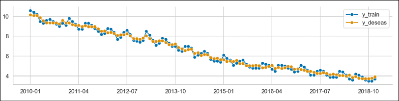
Figure 7.24: The original time series and the deseasonalized one
To provide more context, we can plot the extracted seasonal component:
plot_series(
    deseasonalizer.seasonal_,
    labels=["seasonal_component"]
)
Executing the snippet generates the following plot:

Figure 7.25: The extracted seasonal component
While analyzing Figure 7.25, we should not pay much attention to the x-axis labels, as the extracted seasonal pattern is the same for each year.
- Detrend the time series:
forecaster = PolynomialTrendForecaster(degree=1)
transformer = Detrender(forecaster=forecaster)
y_detrend = transformer.fit_transform(y_deseas)
# in-sample predictions
forecaster = PolynomialTrendForecaster(degree=1)
y_in_sample = (
    forecaster
    .fit(y_deseas)
    .predict(fh=-np.arange(len(y_deseas)))
)
plot_series(
    y_deseas, y_in_sample, y_detrend,
    labels=["y_deseas", "linear trend", "resids"]
)
Executing the snippet generates the following plot:
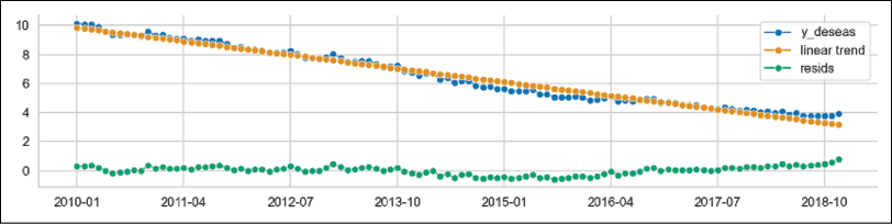
Figure 7.26: The deseasonalized time series together with the fitted linear trend and the corresponding residuals
In Figure 7.26, we can see 3 lines:
- The deseasonalized time series from the previous step
- The linear trend fitted to the deseasonalized time series
- The residuals, which are created by subtracting the fitted linear trend from the deseasonalized time series
- Combine the components into a pipeline, fit it to the original time series, and obtain predictions:
rf_pipe = TransformedTargetForecaster( steps = [ ("deseasonalize", Deseasonalizer(model="additive", sp=12)), ("detrend", Detrender( forecaster=PolynomialTrendForecaster(degree=1) )), ("forecast", rf_forecaster), ] ) rf_pipe.fit(y_train) y_pred_2 = rf_pipe.predict(fh) - Evaluate the pipeline’s predictions:
mape_2 = mean_absolute_percentage_error(
    y_test, y_pred_2, symmetric=False
)
fig, ax = plot_series(
    y_train["2016":], y_test, y_pred_2,
    labels=["y_train", "y_test", "y_pred"]
)
ax.set_title(f"MAPE: {100*mape_2:.2f}%")
Executing the snippet generates the following plot:
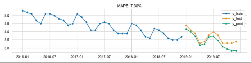
Figure 7.27: The fit of the pipeline containing deseasonalization and detrending before reduced regression
By analyzing Figure 7.27, we can draw the following conclusions:
- Evaluate the performance using expanding window cross-validation:
cv = ExpandingWindowSplitter(
    fh=list(range(1,13)),
    initial_window=12*5,
    step_length=12
)
cv_df = evaluate(
    forecaster=rf_pipe,
    y=y,
    cv=cv,
    strategy="refit",
    return_data=True
)
cv_df
Executing the snippet generates the following DataFrame:

Figure 7.28: The DataFrame containing the cross-validation results
Additionally, we can investigate the range of dates used for training and evaluating the pipeline within the cross-validation procedure:
for ind, row in cv_df.iterrows():
    print(f"Fold {ind} ----")
    print(f"Training: {row['y_train'].index.min()} - {row['y_train'].index.max()}")
    print(f"Training: {row['y_test'].index.min()} - {row['y_test'].index.max()}")
Executing the snippet generates the following output:
Fold 0 ----
Training: 2010-01 - 2014-12
Training: 2015-01 - 2015-12
Fold 1 ----
Training: 2010-01 - 2015-12
Training: 2016-01 - 2016-12
Fold 2 ----
Training: 2010-01 - 2016-12
Training: 2017-01 - 2017-12
Fold 3 ----
Training: 2010-01 - 2017-12
Training: 2018-01 - 2018-12
Fold 4 ----
Training: 2010-01 - 2018-12
Training: 2019-01 - 2019-12
Effectively, we have created a 5-fold cross-validation in which the expanding window is growing by 12 months between the folds and we are always evaluating using the following 12 months.
- Plot the predictions from the cross-validation folds:
n_fold = len(cv_df)
plot_series(
    y,
    *[cv_df["y_pred"].iloc[x] for x in range(n_fold)],
    markers=["o", *["."] * n_fold],
    labels=["y_true"] + [f"cv: {x}" for x in range(n_fold)]
)
Executing the snippet generates the following plot:

Figure 7.29: Forecasts from each of the cross-validation folds plotted against the actuals
- Create an ensemble forecast using the RF pipeline and AutoARIMA:
ensemble = EnsembleForecaster(
    forecasters = [
        ("autoarima", AutoARIMA(sp=12)),
        ("rf_pipe", rf_pipe)
    ]
)
ensemble.fit(y_train)
y_pred_3 = ensemble.predict(fh)
In this case, we fitted an AutoARIMA model directly to the original time series. However, we could have also deseasonalized and detrended the time series before fitting the model. In such a scenario, indicating the seasonal period might not have been necessary (depending on how well the seasonality is removed using classical decomposition).
- Evaluate the ensemble’s predictions:
mape_3 = mean_absolute_percentage_error(
    y_test, y_pred_3, symmetric=False
)
fig, ax = plot_series(
    y_train["2016":], y_test, y_pred_3,
    labels=["y_train", "y_test", "y_pred"]
)
ax.set_title(f"MAPE: {100*mape_3:.2f}%")
Executing the snippet generates the following plot:

Figure 7.30: The fit of the ensemble model aggregating the reduced regression pipeline and AutoARIMA
As we can see in Figure 7.30, ensembling the two models results in improved performance compared to the reduced Random Forest pipeline.
How it works…
After importing the libraries, we used the temporal_train_test_split function to split the data into training and test sets. We kept the last 12 observations (the entire 2019) as a test set. We also plotted the time series using the plot_series function, which is especially useful when we want to plot multiple time series in a single plot.
In Step 3, we defined the ForecastingHorizon. In sktime, the forecasting horizon can be an array of values that are either relative (indicating time differences compared to the latest time point in the training data) or absolute (indicating specific points in time). In our case, we used the absolute values by providing the indices of the test set and setting is_relative=False.
On the other hand, the relative values of the forecasting horizon include a list of steps for which we want to obtain predictions. The relative horizon could be very useful when making rolling predictions, as we can reuse it when we add new data.
In Step 4, we fitted a reduced regression model to the training data. To do so, we used the make_reduction function and provided three arguments. The estimator argument is used to indicate any regression model that we would like to use in the reduced regression setting. In this case, we chose Random Forest (more details on the Random Forest algorithm can be found in Chapter 14, Advanced Concepts for Machine Learning Projects). The window_length indicates how many past observations to use to create the reduced regression task, that is, convert the time series into a tabular dataset. Lastly, the strategy argument determines the way multi-step forecasts will be created. We can choose one of the following strategies to obtain multi-step forecasts:
Direct—This strategy assumes creating a separate model for each horizon we are forecasting. In our case, we are forecasting 12 steps ahead. This would mean that the strategy would create 12 separate models to obtain the forecasts.Recursive—This strategy assumes fitting a single one-step ahead model. However, to create the forecasts, it uses the previous time step’s output as the input for the next time step. For example, to obtain the forecast for the second observation into the future, it would use the forecast obtained for the first observation into the future as part of the feature set.Multioutput—In this strategy, we use one model to predict all the values for the entire forecast horizon. This strategy depends on having a model capable of predicting entire sequences in one go.
After defining the reduced regression model, we fitted it to the training data using the fit method and obtained predictions using the predict method. For the latter, we had to provide the forecasting horizon object as the argument. Alternatively, we could have provided a list/array of steps for which we wanted to obtain the forecasts.
In Step 5, we evaluated the forecast by calculating the MAPE score and plotting the forecasts compared to the actual values. To calculate the error metric, we used sktime's mean_absolute_percentage_error function. An additional benefit of using sktime's implementation is that we can easily calculate the symmetric MAPE (sMAPE) by specifying symmetric=True while calling the function.
At this point, we have noticed that the reduced regression model is suffering from the problem mentioned in the introduction—it does not capture the trend and seasonality of the time series. Hence, in the next steps, we showed how to deseasonalize and detrend the time series before using the reduced regression approach.
In Step 6, we deseasonalized the original time series. First, we instantiated the Deseasonalizer transformer. We indicated that there is monthly seasonality by providing sp=12 and chose additive seasonality, as the magnitude of seasonal patterns does not seem to change over time. Under the hood, the Deseasonalizer class carries out the seasonal decomposition available in the statsmodels library (we covered it in the Time series decomposition recipe in the previous chapter) and removes the seasonal component from the time series. To fit the transformer and obtain the deseasonalized time series in a single step, we used the fit_transform method. After fitting the transformer, the seasonal component can be inspected by accessing the seasonal_ attribute.
In Step 7, we removed the trend from the deseasonalized time series. First, we instantiated the PolynomialTrendForecaster class and specified degree=1. By doing so, we indicated that we were interested in a linear trend. Then, we passed the instantiated class to the Detrender transformer. Using the already familiar fit_transform method, we removed the trend from the deseasonalized time series.
In Step 8, we combined all the steps into a pipeline. We instantiated the TransformedTargetForecaster class, which is used when we first transform the time series and only then fit an ML model to create a forecast. As the steps argument, we provided a list of tuples, each of those containing the name of the step and the transformer/estimator used for carrying it out. In this pipeline, we chained deseasonalizing, detrending, and the reduced Random Forest model we have already used in Step 4. Then, we fitted the entire pipeline to the training data and obtained the predictions. In Step 9, we evaluated the pipeline’s performance by calculating the MAPE and plotting the forecasts versus the actuals.
In this example, we only focused on creating the model using the original time series. Naturally, we can also have other features used for making predictions. sktime also offers functionalities to create pipelines containing relevant transformations for the regressors. Then, we should use the ForecastingPipeline class to apply the given transformers to X (features). We might also want to apply some transformations to X and other ones to the y (target). In such a case, we can pass the TransformedTargetForecaster containing any transformers that need to be applied to y as a step of the ForecastingPileline.
In Step 10, we carried out an additional evaluation step. We used the walk-forward cross-validation using an expanding window to evaluate the model’s performance. To define the cross-validation scheme, we used the ExpandingWindowSplitter class. As inputs, we had to provide:
fh—The forecasting horizon. As we wanted to evaluate 12-steps-ahead forecasts, we provided a list of integers from 1 to 12.initial_window—The length of the initial training window. We set it to 60, which corresponds to 5 years of training data.step_length—This value indicates how many periods the expanding window is actually expanding by. We set it to 12, so each fold will have an extra year of training data.
After defining the validation scheme, we used the evaluate function to assess the performance of the pipeline defined in Step 8. While using the evaluate function, we also had to specify the strategy argument, which defined the approach to ingesting new data when the window expands. The options are as follows:
refit—The model is refitted in each training window.update—The forecaster is updated with the new training in the window, but it is not refitted.no-update_params—The model is fitted to the first training window, and then it is reused without fitting or updating the model.
In Step 11, we used the plot_series function combined with a list comprehension to plot the original time series and the predictions obtained in each of the validation folds.
In the last two steps, we created and evaluated an ensemble model. First, we instantiated the EnsembleForecaster class and provided a list of tuples containing the names of the models and their respective classes/definitions. For this ensemble, we combined an AutoARIMA model with monthly seasonality (a SARIMA model) and the reduced Random Forest pipeline defined in Step 8. Additionally, we used the default value of the aggfunc argument, which is "mean". The argument determines the aggregation strategy used to create the final forecasts. In this case, the prediction of the ensemble model was the average of the predictions of the individual models. Other options include taking the median, minimum, or maximum values.
After instantiating the model, we used the already familiar fit and predict methods to fit the model and obtain the predictions.
There’s more…
In this recipe, we covered reduced regression using sktime. As we have already mentioned, sktime is a framework offering all the tools you might need while working with time series. Below, we list some of the advantages of using sktime and its features:
- The library is suitable not only for working with time series forecasting but also regression, classification, and clustering. Additionally, it also provides feature extraction functionalities.
sktimeoffers a few naive models, which are very useful for creating benchmarks. For example, we can use theNaiveForecastermodel to create forecasts that are simply the last known value. Alternatively, we can use the last known seasonal value, for example, the forecast for January 2019 would be the value of the time series in January 2018.- It provides a unified API as a wrapper around many popular time series libraries, such as
statsmodels,pmdarima,tbats, or Meta’s Prophet. To inspect all the available forecasting models, we can execute theall_estimators("forecaster", as_dataframe=True)command. - By using reduction, it is possible to forecast using all the estimators compatible with the
scikit-learnAPI. sktimeprovides functionalities for hyperparameter tuning with temporal cross-validation. Additionally, we can also tune hyperparameters connected to the reduction process, such as the number of lags or the window length.- The library offers a wide range of performance evaluation metrics (not available in
scikit-learn) and allows us to easily create custom scorers. - The library extends
scikit-learn's pipelines to combine multiple transformers (detrending, deseasonalizing, and so on) with forecasting algorithms. - The library provides AutoML capabilities to automatically determine the best forecaster from a wide range of models and their hyperparameters.
See also
- Löning, M., Bagnall, A., Ganesh, S., Kazakov, V., Lines, J., & Király, F. J. 2019. sktime: A Unified Interface for Machine Learning with Time Series. arXiv preprint arXiv:1909.07872.
Forecasting with Meta’s Prophet
In the previous recipe, we showed how to reframe a time series forecasting problem in order to use popular machine learning models that are commonly used for regression tasks. This time, we present a model specifically designed for time series forecasting.
Prophet was introduced by Facebook (now Meta) back in 2017 and since then, it has become a very popular tool for time series forecasting. Some of the reasons for its popularity:
- Most of the time, it produces reasonable results/forecasts out of the box.
- It was designed to forecast business-related time series.
- It works best with daily time series with a strong seasonal component and at least a few seasons of training data.
- It can model any number of seasonalities (such as hourly, daily, weekly, monthly, quarterly, or yearly).
- The algorithm is quite robust to missing data and shifts in trend (it uses automatic changepoint detection for that).
- It easily accounts for holidays and special events.
- Compared to autoregressive models (such as ARIMA), it does not require stationary time series.
- We can employ business/domain knowledge to tune the forecasts by adjusting the human-interpretable hyperparameters of the model.
- We can use additional regressors to improve the model’s predictive performance.
Naturally, the model is by no means perfect and it suffers from its own set of issues. In the See also section, we listed a few references showing the model’s weaknesses.
The creators of Prophet approached the time series forecasting problem as a curve-fitting exercise (which raises quite a lot of controversies in the data science community) rather than explicitly looking at the time-based dependencies of each observation within a time series. As a result, Prophet is an additive model (a form of generalized additive models or GAMs) and can be presented as follows:
![]()
where:
- g(t)—Growth term, which is piecewise linear, logistic, or flat. The trend component models the non-periodic changes in the time series.
- h(t)—Describes the effects of holidays and special days (which potentially occur on an irregular basis). They are added to the model as dummy variables.
- s(t)—Describes various seasonal patterns modeled using the Fourier series.
 —Error term, which is assumed to be normally distributed.
The logistic growth trend is especially useful for modeling saturated (or capped) growth. For example, when we are forecasting the number of customers in a given country, we should not forecast more than the total number of the country’s inhabitants. With Prophet, we can also account for the saturating minimum.
GAMs are simple yet powerful models that are gaining popularity. They assume that relationships between individual features and the target follow smooth patterns. Those can be linear or non-linear. Then, those relationships can be estimated simultaneously and added up to create the models’ predicted values. For example, modeling seasonality as an additive component is the same approach as the one taken in Holt-Winters’ exponential smoothing method. The GAM formulation used by Prophet has its advantages. First, it decomposes easily. Second, it accommodates new components, for example, when we identify a new source of seasonality.
Another important aspect of Prophet is the inclusion of changepoints in the process of estimating the trend, which makes the trend curve more flexible. Thanks to changepoints, the trend can be adjusted to sudden changes in the patterns, for example, the changes to sales patterns caused by the COVID pandemic. Prophet has an automatic procedure for detecting changepoints, but it can also accept manual inputs in the form of dates.
Prophet is estimated using a Bayesian approach (thanks to using Stan, which is a programming language for statistical inference written in C++), which allows for automatic changepoint selection, creating confidence intervals using methods like Markov Chain Monte Carlo (MCMC) or the Maximum A Posteriori (MAP) estimate.
In this recipe, we show how to forecast daily gold prices using data from the years 2015 to 2019. While we very well realize that the model will be unlikely to accurately forecast the gold prices, we use them as an illustration of how to train and use the model.
How to do it…
Execute the following steps to forecast daily gold prices with the Prophet model:
- Import the libraries and authenticate with Nasdaq Data Link:
import pandas as pd import nasdaqdatalink from prophet import Prophet from prophet.plot import add_changepoints_to_plot nasdaqdatalink.ApiConfig.api_key = "YOUR_KEY_HERE" - Download the daily gold prices:
df = nasdaqdatalink.get(
    dataset="WGC/GOLD_DAILY_USD",
    start_date="2015-01-01",
    end_date="2019-12-31"
)
df.plot(title="Daily gold prices (2015-2019)")
Executing the snippet generates the following plot:

Figure 7.31: Daily gold prices from the years 2015 to 2019
- Rename the columns:
df = df.reset_index(drop=False) df.columns = ["ds", "y"] - Split the series into the training and test sets:
train_indices = df["ds"] < "2019-10-01"
df_train = df.loc[train_indices].dropna()
df_test = (
    df
    .loc[~train_indices]
    .reset_index(drop=True)
)
We arbitrarily chose to use the last quarter of
2019as the test set. Hence, we will create a model forecasting around 60 observations in the future.
- Create the instance of the model and fit it to the data:
prophet = Prophet(changepoint_range=0.9) prophet.add_country_holidays(country_name="US") prophet.add_seasonality( name="monthly", period=30.5, fourier_order=5 ) prophet.fit(df_train) - Forecast the gold prices for the fourth quarter of 2019 and plot the results:
df_future = prophet.make_future_dataframe(
    periods=len(df_test), freq="B"
)
df_pred = prophet.predict(df_future)
prophet.plot(df_pred)
Executing the snippet generates the following plot:

Figure 7.32: The forecast obtained using Prophet
To interpret the figure, we should know that:
- The black dots are the actual observations of the gold price.
- The blue line representing the fit does not match the observations exactly, as the model smooths out the noise in the data (also reducing the chance of overfitting).
- Prophet attempts to quantify uncertainty, which is represented by the light blue intervals around the fitted line. The interval is calculated assuming that the average frequency and magnitude of trend changes in the future will be the same as in the historical data.
It is also possible to create an interactive plot using
plotly. To do so, we need to use theplot_plotlyfunction instead of theplotmethod.Additionally, it is worth mentioning that the prediction DataFrame contains quite a lot of columns with potentially useful information:
df_pred.columnsUsing the snippet, we can see all the columns:
['ds', 'trend', 'yhat_lower', 'yhat_upper', 'trend_lower',
'trend_upper', 'Christmas Day', 'Christmas Day_lower',
'Christmas Day_upper', 'Christmas Day (Observed)',
'Christmas Day (Observed)_lower', 'Christmas Day (Observed)_upper',
'Columbus Day', 'Columbus Day_lower', 'Columbus Day_upper',
'Independence Day', 'Independence Day_lower',
'Independence Day_upper', 'Independence Day (Observed)',
'Independence Day (Observed)_lower',
'Independence Day (Observed)_upper', 'Labor Day', 'Labor Day_lower',
'Labor Day_upper', 'Martin Luther King Jr. Day',
'Martin Luther King Jr. Day_lower',
'Martin Luther King Jr. Day_upper',
'Memorial Day', 'Memorial Day_lower', 'Memorial Day_upper',
'New Year's Day', 'New Year's Day_lower', 'New Year's Day_upper',
'New Year's Day (Observed)', 'New Year's Day (Observed)_lower',
'New Year's Day (Observed)_upper', 'Thanksgiving',
'Thanksgiving_lower', 'Thanksgiving_upper', 'Veterans Day',
'Veterans Day_lower', 'Veterans Day_upper',
'Veterans Day (Observed)', 'Veterans Day (Observed)_lower',
'Veterans Day (Observed)_upper', 'Washington's Birthday',
'Washington's Birthday_lower', 'Washington's Birthday_upper',
'additive_terms', 'additive_terms_lower', 'additive_terms_upper',
'holidays', 'holidays_lower', 'holidays_upper', 'monthly',
'monthly_lower', 'monthly_upper', 'weekly', 'weekly_lower',
'weekly_upper', 'yearly', 'yearly_lower', 'yearly_upper',
'multiplicative_terms', 'multiplicative_terms_lower',
'multiplicative_terms_upper', 'yhat']
By analyzing the list, we can see all the components returned by the Prophet model. Naturally, we see the forecast (
yhat) and its corresponding confidence intervals('yhat_lower'and'yhat_upper'). Additionally, we see all the individual components of the model (such as trends, holiday effects, and seasonalities) together with their confidence intervals. Those might be interesting to us because of the following considerations:- As Prophet is an additive model, we can sum up all the components to arrive at the final forecast. Hence, we can look at those values as a type of feature importance, which can be used to explain the forecast.
- We could also use the Prophet model to obtain those component values and then feed them to another model (for example, a tree-based model) as features.
- Add changepoints to the plot:
fig = prophet.plot(df_pred)
a = add_changepoints_to_plot(
    fig.gca(), prophet, df_pred
)
Executing the snippet generates the following plot:

Figure 7.33: The model’s fit together with the identified changepoints
We can also look up the exact dates that were identified as changepoints using the
changepointsmethod of a fitted Prophet model.
- Inspect the decomposition of the time series:
prophet.plot_components(df_pred)Executing the snippet generates the following plot:

Figure 7.34: The decomposition plot showing the individual components of the Prophet model
We do not spend much time inspecting the components, as the time series of gold prices probably does not have many seasonal effects or should not be impacted by the US holidays. That is especially true for the holidays, as the stock market is closed on major holidays. Therefore, the effect of these holidays may be reflected by the market on the days before and after. As we have mentioned before, we are aware of that and we just wanted to show how Prophet works.
One thing to note is that the weekly seasonality is noticeably different for Saturday and Sunday. That is caused by the fact that the gold prices are collected during weekdays. Hence, we can safely ignore the weekend patterns.
However, it is interesting to observe the trend component, which we can also see plotted in Figure 7.33, together with the detected changepoints.
- Merge the test set with the forecasts:
SELECTED_COLS = [ "ds", "yhat", "yhat_lower", "yhat_upper" ] df_pred = ( df_pred .loc[:, SELECTED_COLS] .reset_index(drop=True) ) df_test = df_test.merge(df_pred, on=["ds"], how="left") df_test["ds"] = pd.to_datetime(df_test["ds"]) df_test = df_test.set_index("ds") - Plot the test values vs. predictions:
fig, ax = plt.subplots(1, 1)
PLOT_COLS = [
    "y", "yhat", "yhat_lower", "yhat_upper"
]
ax = sns.lineplot(data=df_test[PLOT_COLS])
ax.fill_between(
    df_test.index,
    df_test["yhat_lower"],
    df_test["yhat_upper"],
    alpha=0.3
)
ax.set(
    title="Gold Price - actual vs. predicted",
    xlabel="Date",
    ylabel="Gold Price ($)"
)
Executing the snippet generates the following plot:
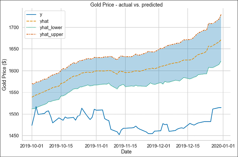
Figure 7.35: Forecast vs ground truth
As we can see in Figure 7.35, the model’s prediction is quite off. As a matter of fact, the 80% confidence interval (the default setting, we can change it using the interval_width hyperparameter) does not capture almost any of the actual values.
How it works…
After importing the libraries, we downloaded the daily gold prices from Nasdaq Data Link.
In Step 3, we renamed the columns of the DataFrame in order to make it compatible with Prophet. The algorithm requires two columns:
ds—Indicating the timestampy—The target variable
In Step 4, we split the DataFrame into training and test sets. We arbitrarily chose to use the fourth quarter of 2019 as the test set.
In Step 5, we instantiated the Prophet model. While doing so, we specified a few settings:
- We set
changepoint_rangeto0.9, which means that the algorithm can identify changepoints in the first 90% of the training dataset. By default, Prophet adds 25 changepoints in the first 80% of the time series. In this case, we wanted to capture the more recent trends as well. - We added the monthly seasonality by using the
add_seasonalitymethod with values suggested by Prophet’s documentation. Specifyingperiodas30.5means that we expect the patterns to repeat themselves after roughly 30.5 days. The other parameter—fourier_order—can be used to specify the number of Fourier terms that are used to build the particular seasonal component (in this case, monthly). In general, the higher the order, the more flexible the seasonality component. - We used the
add_country_holidaysmethod to add the US holidays to the model. We have used the default calendar (available via theholidayslibrary), but it is also possible to add custom events that are not available in the calendar. One example might be Black Friday. It is also worth mentioning that when providing the custom events, we can also specify if we expect the surrounding days to be affected as well. For example, in a retail scenario, we might expect the traffic/sales to be lower in the days following Christmas. On the other hand, we might expect a peak just before Christmas.
Then, we fitted the model using the fit method.
In Step 6, we used the fitted model to obtain predictions. To create forecasts with Prophet, we had to create a special DataFrame using the make_future_dataframe method. While doing so, we indicated that we want to forecast for the length of the test set (by default, this is measured in days) and that we wanted to use business days. That part is important, as we do not have gold prices for the weekends. Then, we created the predictions using the predict method of the fitted model.
In Step 7, we added the identified changepoints to the plot using the add_changepoints_to_plot function. One thing to note here is that we had to use the gca method of the created figure to get its current axis. We had to use it to correctly identify to which plot we wanted to add the changepoints.
In Step 8, we inspected the components of the model. To do so, we used the plot_components method with the prediction DataFrame as the method’s argument.
In Step 9, we merged the test set with the prediction DataFrame. We used a left join, which returns all the rows from the left table (test set) and the matched rows from the right table (prediction DataFrame) while leaving the unmatched rows empty.
Finally, we plotted the predictions (together with the confidence intervals) and the ground truth to visually evaluate the model’s performance.
There’s more…
Prophet offers quite a lot of interesting functionalities. While it is definitely too much to mention in a single recipe, we wanted to highlight two things.
Built-in cross-validation
In order to properly evaluate the model’s performance (and potentially tune its hyperparameters), we do need a validation framework. Prophet implements the already familiar walk-forward cross-validation in its cross_validation function. In this subsection, we show how to use it:
- Import the libraries:
from prophet.diagnostics import (cross_validation, performance_metrics) from prophet.plot import plot_cross_validation_metric - Run Prophet’s cross-validation:
df_cv = cross_validation(
    prophet,
    initial="756 days",
    period="60 days",
    horizon = "60 days"
)
df_cv
We have specified that we want:
- The initial window to contain 3 years of data (a year contains approximately 252 trading days)
- A forecast horizon of 60 days
- The forecasts to be calculated every 60 days
Executing the snippet generates the following output:

Figure 7.36: The output of Prophet’s cross-validation
The DataFrame contains the predictions (including the confidence intervals) and the actual value for a combination of
cutoffdates (the last time point in the training set used to generate the forecast) anddsdates (the date in the validation set for which the forecast was generated). In other words, the procedure creates a forecast for every observed point betweencutoffandcutoff + horizon.The algorithm also informed us what it was going to do:
Making 16 forecasts with cutoffs between 2017-02-12 00:00:00 and 2019-08-01 00:00:00
- Calculate the aggregated performance metrics:
df_p = performance_metrics(df_cv)
df_p
Executing the snippet generates the following output:

Figure 7.37: The first 10 lines of the performance overview
Figure 7.37 presents the first 10 rows of the DataFrame containing the aggregated performance scores from our cross-validation. As per our cross-validation scheme, the entire DataFrame contains all the horizons until
60 days.Please refer to Prophet’s documentation for the exact logic behind the aggregated performance metrics generated by the
performance_metricsfunction.
- Plot the MAPE score:
plot_cross_validation_metric(df_cv, metric="mape")Executing the snippet generates the following plot:

Figure 7.38: The MAPE score over horizons
The dots in Figure 7.38 represent the absolute percent error for each prediction in the cross-validation DataFrame. The blue line represents the MAPE. The average is taken over a rolling window of the dots. For more information about the rolling window, please refer to Prophet’s documentation.
Tuning the model
As we have already seen, Prophet has quite a few tunable hyperparameters. The authors of the library suggest that the following hyperparameters might be worth tuning in order to achieve a better fit:
changepoint_prior_scale—Possibly the most impactful hyperparameter, which determines the flexibility of the trend. Particularly, how much the trend changes at the trend changepoints. A too-small value will make the trend less flexible and might cause the trend to underfit, while a too-large value might cause the trend to overfit (and potentially capture the yearly seasonality as well).seasonality_prior_scale—A hyperparameter controlling the flexibility of the seasonality terms. Large values allow the seasonality to fit significant fluctuations, while small values shrink the seasonality’s magnitude. The default value of 10 applies basically no regularization.holidays_prior_scale—Very similar toseasonality_prior_scale, but controls the flexibility to fit holiday effects.seasonality_mode—We can choose either additive or multiplicative seasonality. The best way to choose this one is to inspect the time series and see if the magnitude of seasonal fluctuations grows with the passage of time.changepoint_range—This parameter corresponds to the percentage of the time series in which the algorithm can identify changepoints. A rule of thumb to identify a good value for this hyperparameter is to look at the model’s fit in the last 1−changepoint_rangepercent of training data. If the model is doing a bad job there, we might want to increase the value of the hyperparameter.
As in the other cases, we might want to use a procedure like grid search (combined with cross-validation) to identify the best set of hyperparameters, while trying to avoid/minimize the risk of overfitting to the training data.
See also
- Rafferty, G. 2021. Forecasting Time Series Data with Facebook Prophet. Packt Publishing Ltd.
- Taylor, S. J., & Letham, B. 2018. “Forecasting at scale,” The American Statistician, 72(1): 37-45.
AutoML for time series forecasting with PyCaret
We have already spent some time explaining how to build ML models for time series forecasting, how to create relevant features, and how to use dedicated models (such as Meta’s Prophet) for the task. It is only fitting to conclude the chapter with an extension of all of the mentioned parts—an AutoML tool.
One of the available tools is PyCaret, which is an open-source, low-code ML library. The goal of the tool is to automate machine learning workflows. Using PyCaret, we can train and tune dozens of popular ML models with only a few lines of code. While it was originally built for classic regression and classification tasks, it also has a dedicated time series module, which we will present in this recipe.
The PyCaret library is essentially a wrapper around several popular machine learning libraries and frameworks such as scikit-learn, XGBoost, LightGBM, CatBoost, Optuna, Hyperopt, and a few more. And to be more precise, PyCaret’s time series module is built on top of the functionalities provided by sktime, for example, its reduction framework and pipelining capabilities.
In this recipe, we will use the PyCaret library to find the best model for predicting the monthly US unemployment rate.
Getting ready
In this recipe, we will use the same dataset we have already used in the previous recipes. You can find more information on how to download and prepare the time series in the Validation methods for time series recipe.
How to do it…
Execute the following steps to forecast the US unemployment rates using PyCaret:
- Import the libraries:
from pycaret.datasets import get_data from pycaret.time_series import TSForecastingExperiment - Set up the experiment:
exp = TSForecastingExperiment()
exp.setup(df, fh=6, fold=5, session_id=42)
Executing the snippet generates the following experiment summary:

Figure 7.39: The summary of PyCaret’s experiment
We can see that the library automatically took the last 6 observations as the test set and identified monthly seasonality in the provided time series.
- Explore the time series using visualizations:
exp.plot_model(
    plot="diagnostics",
    fig_kwargs={"height": 800, "width": 1000}
)
Executing the snippet generates the following plot:
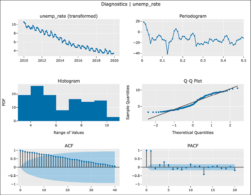
Figure 7.40: Diagnostics plots of the time series
While most of the plots are already familiar, the new one is the periodogram. We can use it (together with the fast Fourier transform plot) to study the frequency components of the analyzed time series. While this might be outside of the scope of this book, we can mention the following highlights of interpreting those plots:
- Peaking around 0 can indicate the need to difference the time series. It could be indicative of a stationary ARMA process.
- Peaking at some frequency and its multiples indicates seasonality. The lowest of those frequencies is called the fundamental frequency. Its inverse is the seasonal period of the model. For example, a fundamental frequency of 0.0833 corresponds to the seasonal period of 12, as 1/0.0833 = 12.
Using the following snippet, we can visualize the cross-validation scheme that will be used for the experiment:
exp.plot_model(plot="cv")Executing the snippet generates the following plot:
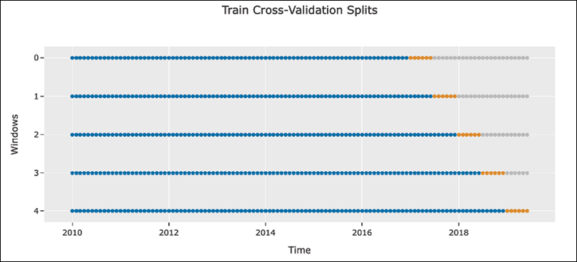
Figure 7.41: An example of 5-fold walking cross-validation using expanding window
- Run statistical tests on the time series:
exp.check_stats()Executing the snippet generates the following DataFrame with the results of various tests:

Figure 7.42: DataFrame with the results of various statistical tests
We can also carry out only subsets of all the tests. For example, we can execute the summary tests using the following snippet:
exp.check_stats(test="summary")
- Find the five best-fitting pipelines:
best_pipelines = exp.compare_models(
    sort="MAPE", turbo=False, n_select=5
)
Executing the snippet generates the following DataFrame with the performance overview:

Figure 7.43: DataFrame with the cross-validation scores of all the fitted models
Inspecting the
best_pipelinesobject prints the best pipelines:[BATS(show_warnings=False, sp=12, use_box_cox=True), TBATS(show_warnings=False, sp=[12], use_box_cox=True), AutoARIMA(random_state=42, sp=12, suppress_warnings=True), ProphetPeriodPatched(), ThetaForecaster(sp=12)]
- Tune the best pipelines:
best_pipelines_tuned = [
    exp.tune_model(model) for model in best_pipelines
]
best_pipelines_tuned
After tuning, the best-performing pipelines are the following:
[BATS(show_warnings=False, sp=12, use_box_cox=True),
 TBATS(show_warnings=False, sp=[12], use_box_cox=True,
       use_damped_trend=True, use_trend=True),
 AutoARIMA(random_state=42, sp=12, suppress_warnings=True),
 ProphetPeriodPatched(changepoint_prior_scale=0.016439324494196616,
                      holidays_prior_scale=0.01095960453692584,
                      seasonality_prior_scale=7.886714129990491),
 ThetaForecaster(sp=12)]
Calling the
tune_modelmethod also prints out the cross-validation performance summary of each of the tuned models. For brevity, we do not print it here. However, you can inspect the accompanying notebook to see how the performance has changed as a result of tuning.
- Blend the five tuned pipelines:
blended_model = exp.blend_models( best_pipelines_tuned, method="mean" ) - Create the predictions using the blended model and plot the forecasts:
y_pred = exp.predict_model(blended_model)Executing the snippet also generates the test set performance summary:

Figure 7.44: The scores calculated using the predictions for the test set
Then, we plot the forecast for the test set:
exp.plot_model(estimator=blended_model)Executing the snippet generates the following plot:

Figure 7.45: The time series, together with the predictions made for the test set
- Finalize the model:
final_model = exp.finalize_model(blended_model)
exp.plot_model(final_model)
Executing the snippet generates the following plot:

Figure 7.46: Out-of-sample prediction for the first 6 months of 2020
Just by looking at the plot, it seems that the forecasts are plausible and contain a clearly identifiable seasonal pattern. We can also generate and print the predictions we have already seen in the plot:
y_pred = exp.predict_model(final_model)
print(y_pred)
Executing the snippet generates the following predictions for the next 6 months:
y_pred
2020-01  3.8437
2020-02  3.6852
2020-03  3.4731
2020-04  3.0444
2020-05  3.0711
2020-06  3.4585
How it works…
After importing the libraries, we set up the experiment. First, we instantiated an object of the TSForecastingExperiment class. Then, we used the setup method to provide the DataFrame with the time series, the forecast horizon, the number of cross-validation folds, and a session ID. For our experiment, we specified that we are interested in forecasting 6 months ahead and that we want to use 5 walk-forward cross-validation folds using an expanding window (the default variant). It is also possible to use the sliding window.
PyCaret offers two APIs: the functional one and the object-oriented one (using classes). In this recipe, we are presenting the latter.
While setting up the experiment, we could also indicate whether we want to apply some transformation to the target time series. We could select one of the following options: "box-cox", "log", "sqrt", "exp", "cos".
To extract the training and test sets from the experiment, we can use the following commands: exp.get_config("y_train") and exp.get_config("y_test").
In Step 3, we carried out a quick EDA of the time series using the plot_model method of the TSForecastingExperiment object. To generate different plots, we simply changed the plot argument of the method.
In Step 4, we looked into a variety of statistical tests using the check_stats method of the TSForecastingExperiment class.
In Step 5, we used the compare_models method to train a selection of statistical and machine learning models and evaluate their performance using the selected cross-validation scheme. We indicated that we wanted to select the five best pipelines based on the MAPE score. We set turbo=False to also train models that might be a bit more time-consuming to train (for example, Prophet, BATS, and TBATS).
PyCaret uses the concept of pipelines as sometimes the “model” is actually built from several steps. For example, we might first detrend and deseasonalize the time series before fitting a regression model. For example, a Random Forest w/ Cond. Deseasonalize & Detrending model is a sktime pipeline that first conditionally deseasonalizes the time series. Afterward, detrending is applied, and only then, the reduced Random Forest is fitted. The conditional part by deseasonalizing refers to first checking with a statistical test if there is seasonality in the time series. If it is detected, then deseasonalization is applied.
There are a few things worth mentioning at this step:
- We can extract the DataFrame with the performance comparison using the
pullmethod. - We can use the
modelsmethod to print a list of all the available models, together with their reference (to the original library, as PyCaret is a wrapper), and an indication of whether the model is taking more time to train and is hidden behind theturboflag. - We can also decide whether we only want to train some of the models (using the
includeargument of thecompare_modelsmethod) or whether we want to train all the models except for a selected few (using theexcludeargument).
In Step 6, we tuned the best pipelines. To do so, we used list comprehension to iterate over the identified pipelines and then used the tune_model method to carry out hyperparameter tuning. By default, it uses a randomized grid search (more on that in Chapter 13, Applied Machine Learning: Identifying Credit Default) using a grid of hyperparameters provided by the authors of the library. Those work as a good starting point, and in case we want to adjust them, we can easily do so.
In Step 7, we create an ensemble model, which is a blend of the five best pipelines (tuned versions). We decided to take the mean of the forecasts created by the individual models. Alternatively, we could use the median or voting. The latter is a voting scheme in which each model is weighed by the provided weights. For example, we could create weights based on the cross-validation error, that is, the lower the error, the larger the weight.
In Step 8, we created predictions using the blended models. To do so, we used the predict_model method and provided the blended model as the method’s argument. At this point, the predict_model method creates a forecast for the test set.
We also used the already familiar plot_model method to create a plot. When provided with a model, the plot_model method can display the model’s in-sample fit, the predictions on the test set, the out-of-sample predictions, or the model’s residuals.
Similar to the case of the plot_model method, we can also use the check_stats method together with the created model. When we pass the estimator, the method will perform the statistical tests on the model’s residuals.
In Step 9, we finalized the model using the finalize_model method. As we have seen in Step 8, the predictions we obtained were for the test set. In PyCaret’s terminology, finalizing the model means that we take the model from the previous stages (without changing the selected hyperparameters) and then train the model using the entire dataset (both training and test sets). Having done so, we can create forecasts for the future.
After finalizing the model, we used the same predict_model and plot_model methods to create and plot the forecasts for the first 6 months of 2020 (which are outside of our dataset). While calling the methods, we passed the finalized model as the estimator argument.
There’s more…
PyCaret is a very versatile library and we have only scratched the surface of what it offers. For brevity’s sake, we only mention some of its features:
- Mature classification and regression AutoML capabilities. In this recipe, we have only used the time series module.
- Anomaly detection for time series.
- Integration with MLFlow for experiment logging.
- Using the time series module, we can easily train a single model instead of all of the available ones. We can do so using the
create_modelmethod. As theestimatorargument, we need to pass the name of the model. We can get the names of the available models using themodelsmethod. Additionally, depending on the model we choose, we might want to pass some kwargs. For example, we might want to specify the order parameters of ARIMA models. - As we have seen in the list of available models, except for the classic statistical models, PyCaret also offers selected ML models using the reduced regression approach. Those models also detrend and conditionally deseasonalize the time series to make it easier for the regression model to capture the autoregressive properties of the data.
You might also want to explore the autots library, which is another AutoML tool for time series forecasting.
Summary
In this chapter, we have covered the ML-based approaches to time series forecasting. We started with an extensive overview of validation approaches relevant to the time series domain. Furthermore, some of those were created to account for the intricacies of validating time series predictions in the financial domain.
Then, we explored feature engineering and the concept of reduced regression, which allows us to use any regression algorithms for a time series forecasting task. Lastly, we covered Meta’s Prophet algorithm and PyCaret—a low-code tool that automates machine learning workflows.
While exploring time series forecasting, we tried to introduce the most relevant Python libraries. However, there are quite a few other interesting positions worth mentioning. You can find some of them below:
autots—AutoTS is an alternative AutoML library for time series forecasting.darts—Similar tosktime, it offers an entire framework for working with time series. The library contains a wide variety of models, starting with classic models such as ARIMA and ending with various popular neural network architectures used for time series forecasting.greykite—LinkedIn’s Greykite library for time series forecasting, including its Silverkite algorithm.kats—A toolkit to analyze time series analysis developed by Meta. The library attempts to provide a one-stop shop for time series analysis, including tasks such as detection (for example, changepoint), forecasting, feature extraction, and more.merlion—Salesforce’s ML library for time series analysis.orbit—Uber’s library for Bayesian time series forecasting and inference.statsforecast—The library offers a collection of popular time series forecasting models (for example, autoARIMA and ETS), which are further optimized for high performance usingnumba.stumpy—A library that efficiently computes the matrix profile, which can be used for many time series-related tasks.tslearn—A toolkit for time series analysis.tfp.sts—A library in TensorFlow Probability used for forecasting using structural time series models.
Join us on Discord!
To join the Discord community for this book – where you can share feedback, ask questions to the author, and learn about new releases – follow the QR code below: