
Chapter 9: Other Popular XAI Frameworks
In the previous chapter, we covered the TCAV framework from Google AI, which is used for producing human-friendly concept-based explanations. We also discussed the other widely used explanation frameworks: LIME and SHAP. However, LIME, SHAP, and even TCAV have certain limitations, which we discussed in earlier chapters. None of these frameworks covers all the four dimensions of explainability for non-technical end-users. Due to these known drawbacks, the search for a robust Explainable AI (XAI) framework is still on.
The journey toward finding a robust XAI framework and addressing the known limitations of the popular XAI modules has led to the discovery and development of many other robust frameworks trying to address different aspects of ML model explainability. In this chapter, we will cover these other popular XAI frameworks apart from LIME, SHAP and TCAV.
More specifically, we will discuss about the important features, and key advantages of each of these frameworks. We will also explore how you can apply each framework in practice. Covering everything about each framework is beyond the scope of this chapter. But in this chapter, you will learn the most important features and practical application of these frameworks. In this chapter, we will cover the following list of widely used XAI frameworks:
- DALEX
- Explainerdashboard
- InterpretML
- ALIBI
- DiCE
- ELI5
- H2O AutoML explainer
At the end of the chapter, I will also share a quick comparison guide comparing all these XAI frameworks to help you to decide on the framework depending on your problem. Now, let's begin!
Technical requirements
This code tutorial with necessary resources can be downloaded or cloned from the GitHub repository for this chapter: https://github.com/PacktPublishing/Applied-Machine-Learning-Explainability-Techniques/tree/main/Chapter09. Like the other chapters, the Python and Jupyter notebooks are used to implement the practical application of the theoretical concepts covered in this chapter. But I will recommend you run the notebooks only after you go through this chapter for a better understanding. Most of the datasets used in the tutorials are also provided in the code repository: https://github.com/PacktPublishing/Applied-Machine-Learning-Explainability-Techniques/tree/main/Chapter09/datasets.
DALEX
In the Dimensions of explainability section of Chapter 1, Foundational Concepts of Explainability Techniques, we discussed the four different dimensions of explainability – data, model, outcome, and end user. Most explainability frameworks such as LIME, SHAP, and TCAV provide model-centric explainability.
DALEX (moDel Agnostic Language for Exploration and eXplanation) is one of the very few widely used XAI frameworks that tries to address most of the dimensions of explainability. DALEX is model-agnostic and can provide some metadata about the underlying dataset to give some context to the explanation. This framework gives you insights into the model performance and model fairness, and it also provides global and local model explainability.
The developers of the DALEX framework wanted to comply with the following list of requirements, which they have defined in order to explain complex black-box algorithms:
- Prediction's justifications: According to the developers of DALEX, ML model users should be able to understand the variable or feature attributions of the final prediction.
- Prediction's speculations: Hypothesizing the what-if scenarios or understanding the sensitivity of particular features of a dataset to the model outcome are other factors considered by the developers of DALEX.
- Prediction's validations: For each predicted outcome of a model, the users should be able to verify the strength of the evidence that confirms a particular prediction of the model.
DALEX is designed to comply with the preceding requirements using the various explanation methods provided by the framework. Figure 9.1 illustrates the model exploration stack of DALEX:
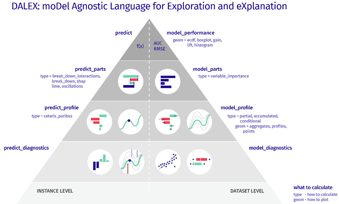
Figure 9.1 – The model exploration stack of DALEX
Next, I will walk you through an example of how to explore DALEX for explaining a black-box model in practice.
Setting up DALEX for model explainability
In this section, you will learn to setup DALEX in Python. Before starting the code walk-through, I would ask you to check the notebook at https://github.com/PacktPublishing/Applied-Machine-Learning-Explainability-Techniques/blob/main/Chapter09/DALEX_example.ipynb. It contains the steps needed to understand the concept that we are going to now discuss in depth. I also recommend that you take a look at the GitHub project repository of DALEX at https://github.com/ModelOriented/DALEX/tree/master/python/dalex in case you need additional details while executing the notebook.
The DALEX Python framework can be installed using the pip installer:
pip install dalex -U
If you want to use any additional features of DALEX that require an optional dependency, you can try the following command:
pip install dalex[full]
You can validate the successful installation of the package by importing it into the Jupyter notebooks using the following command:
import dalex as dx
Hopefully, your import should be successful; otherwise, if you get any errors, you will need to reinstall the framework or separately install its dependencies.
Discussions about the dataset
Next, let's briefly about the dataset that is being used for this example. For this example, I have used the FIFA Club Position Prediction dataset (https://www.kaggle.com/datasets/adityabhattacharya/fifa-club-position-prediction-dataset) to predict the valuation of a football player in Euros, based on their skill and abilities. So, this is a regression problem that can be solved by regression ML models.
FIFA Club Position dataset citation
Bhattacharya A. (2022). Kaggle - FIFA Club Position Prediction dataset: https://www.kaggle.com/datasets/adityabhattacharya/fifa-club-position-prediction-dataset
Similar to all other standard ML solution flows, we start with the data inspection process. The dataset can be loaded as a pandas DataFrame, and we can inspect the dimension of the dataset, the features that are present, and the data type of each feature. Additionally, we can perform any necessary data transformation steps such as dropping irrelevant features, checking for missing values, and data imputation to fill in missing values for relevant features. I recommend that you follow the necessary steps provided in the notebook, but feel free to include other additional steps and explore the dataset in more depth.
Training the model
For this example, I have used a random forest regressor algorithm to fit a model after dividing the data into the training set and the validation set. This can be done using the following lines of code:
x_train,x_valid,y_train,y_valid = train_test_split(
df_train,labels,test_size=0.2,random_state=123)
model = RandomForestRegressor(
n_estimators=790, min_samples_split = 3,
random_state=123).fit(x_train, y_train)
We do minimum hyperparameter tuning to train the model as our objective is not to build a highly efficient model. Instead, our goal is to use this model as a black-box model and use DALEX to explain the model. So, let's proceed to the model explainability part using DALEX.
Model explainability using DALEX
DALEX is model-agnostic as it does not assume anything about the model and can work with any algorithm. So, it considers the model as a black box. Before exploring how to use DALEX in Python, let's discuss the following key advantages of this framework:
- DALEX provides a uniform abstraction over different prediction models: As an explainer, DALEX is quite robust and works well with different types of model frameworks such as scikit-learn, H2O, TensorFlow, and more. It can work with data provided in different formats such as a NumPy array or pandas DataFrame. It provides additional metadata about the data or the model, which makes it easier to develop an end-to-end model explainability pipeline in production.
- DALEX has a robust API structure: The concise API structure of DALEX ensures that a consistent grammar and coding structure is used for model analysis. Using just a few lines of code, we can apply the various explainability methods and explain any black-box model.
- It can provide local explanations for an inference data instance: Prediction-level explainability for a single inference data instance can be easily obtained during DALEX. There are different methods available in DALEX such as interactive breakdown plots, SHAP feature importance plots, and what-if analysis plots, which can be used for local explanations. We will cover these methods, in more detail, in the next section.
- It can also provide global explanations while considering the entire dataset and the model: Model-level global explanations can also be provided using DALEX partial dependence plots, accumulated dependence plots, global variable importance plots, and more.
- Bias and fairness checks can be easily done using DALEX: DALEX provides quantitative ways in which to measure model fairness and bias. Unlike DALEX, most of the XAI frameworks do not provide explicit methods to evaluate model fairness.
- The DALEX ARENA platform can be used to build an interactive dashboard for better user engagement: DALEX can be used to create an interactive web app platform that can be used to design a custom dashboard to show interactive visualizations for the different model explainability methods that are available in DALEX. I think this unique feature of DALEX gives you the opportunity to create better user engagement by providing a tailor-made dashboard to meet the specific end user's needs.
Considering all of these key benefits, let's now proceed with learning how to apply these features available in DALEX.
First, we need to create a DALEX model explainer object, which takes the trained model, data, and model type as input. This can be done using the following lines of code:
# Create DALEX Explainer object
explainer = dx.Explainer(model,
x_valid, y_valid,
model_type = 'regression',
label='Random Forest')
Once the explainer object has been created, it also provides additional metadata about the model, which is shown as follows.
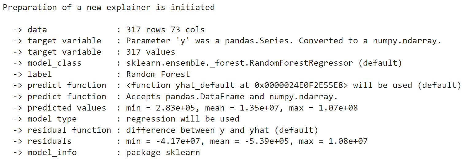
Figure 9.2 – The DALEX explainer metadata
This initial metadata is very useful for building automated pipelines for certain production-level systems. Next, let's explore some model-level explanations provided by DALEX.
Model-level explanations
Model-level explanations are global explanations produced by DALEX. The consider model performance and the overall impact of all the features considered during prediction. The performance of a model can be checked using a single line of code:
model_performance = explainer.model_performance("regression")Depending upon the type of ML model, different model evaluation metrics can be applied. In this example, we are dealing with a regression problem, and hence, DALEX uses the metrics MSE, RMSE, R2, MAE, and so on. For a classification problem, metrics such as accuracy, precision, recall, and more will be used. As covered in Chapter 3, Data-Centric Approaches, by evaluating the model performance, we get to estimate the data forecastability of the model, which gives us an indication of the degree of correctness of the predicted outcome.
DALEX provides methods such as global feature importance, partial dependence plots (PDPs), and accumulated dependency plots to analyze the feature-based explanations for model-level predictions. First, let's try out the variable of feature importance plots:
Var_Importance = explainer.model_parts(
variable_groups=variable_groups, B=15, random_state=123)
Var_Importance.plot(max_vars=10,
rounding_function=np.rint,
digits=None,
vertical_spacing=0.15,
title = 'Feature Importance')
This will produce the following plot:
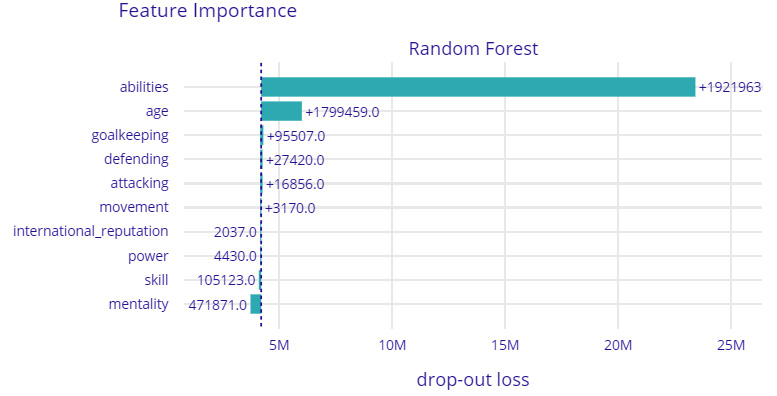
Figure 9.3 – A feature importance plot from DALEX for global feature-based explanations
In Figure 9.3, we can see that the trained model considers the abilities of the players, which comprise the overall rating of the player, the potential rating of the player, and other abilities such as pace, dribbling skill, strength, and stamina to be the most important factors for deciding the player's valuation.
Similar to feature importance, we can generate PDPs. Accumulated dependency plots can also be generated using the following few lines of code:
pdp = explainer.model_profile(type = 'partial', N=800)
pdp.plot(variables = ['age', 'potential'])
ald = explainer.model_profile(type = 'accumulated', N=800)
ald.plot(variables = ['age', 'movement_reactions'])
This will create the following plots for the aggregated profiles of the players:
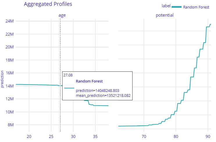
Figure 9.4 – A PDP aggregate profile plot for the age and potential features with predictions for model-level explanations
Figure 9.4 shows how the overall features of age and potential vary with the predicted valuation of football players. From the plot, we can understand that with an increase in the player's age, the predicted valuation decreases. Similarly, with an increase in a player's potential rating, the player's valuation increases. All of these observations are also quite consistent with the real-world observation for deciding a player's valuation. Next, let's see how to obtain a prediction-level explanation using DALEX.
Prediction-level explanations
DALEX can provide model-agnostic local or prediction-level explanations along with a global explanation. It uses techniques such as interactive breakdown profiles, SHAP feature importance values, and Ceteris Paribus profiles (what-if profiles) to explain model predictions at the individual data instance level. To understand the practical importance of these techniques, let's use these techniques for our use case to explain an ML model trained to predict the overall valuation of a football player. For our example, we will compare the prediction-level explanations of three players – Cristiano Ronaldo, Lionel Messi, and Jadon Sancho.
First, let's try out interactive breakdown plots. This can be done using the following lines of code:
prediction_level = {'interactive_breakdown':[], 'shap':[]}ibd = explainer.predict_parts(
player, type='break_down_interactions', label=name)
prediction_level['interactive_breakdown'].append(ibd)
prediction_level['interactive_breakdown'][0].plot(
prediction_level['interactive_breakdown'][1:3],
rounding_function=lambda x,
digits: np.rint(x, digits).astype(np.int),
digits=None,
max_vars=15)
This will generate the following interactive breakdown profile plot for each player:
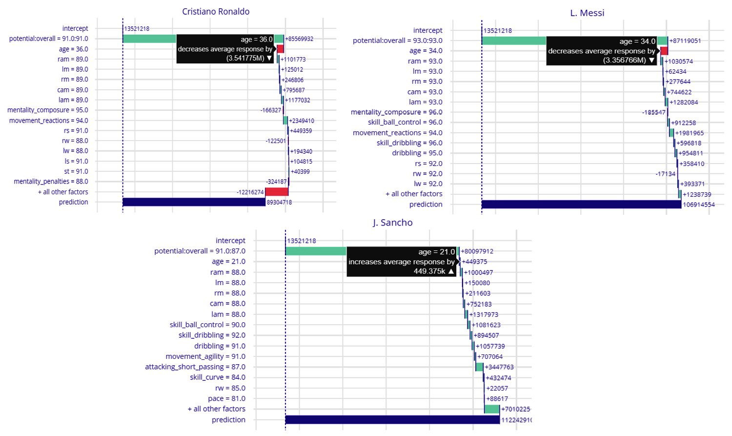
Figure 9.5 – An interactive breakdown plot from DALEX
Figure 9.5 shows the interactive breakdown plot comparing the model predictions for the three selected players. This plot illustrates the contribution of each feature to the final predicted value. The feature values that increase the model prediction value are shown in a different color than the features that decrease the prediction value. This plot shows the breakdown of the total predicted value with respect to each feature value of the data instance.
Now, all three players are world-class professional football players; however, Ronaldo and Messi are veteran players and living legends of the game, as compared to Sancho, who is a young talent. So, if you observe the plot, it shows that for Ronaldo and Messi, the age feature reduces the predicted value, while for Sancho, it slightly increases. It is quite interesting to observe that the model has been able to learn how increasing the age of football players can reduce their valuation. This observation is also consistent with the observation of domain experts who value younger players with higher potential to have a higher market value. Similar to breakdown plots, DALEX also provides SHAP feature importance plots to analyze the contribution of the features. This method gives similar information such as breakdown plots, but the feature importance is calculated based on SHAP values. It can be obtained using the following lines of code:
sh = explainer.predict_parts(player, type='shap', B=10,
label=name)
prediction_level['shap'].append(sh)
prediction_level['shap'][0].plot(
prediction_level['shap'][1:3],
rounding_function=lambda x,
digits: np.rint(x, digits).astype(np.int),
digits=None,
max_vars=15)
Next, we will use What-If plots based on the Ceteris Paribus profile in DALEX. The Ceteris Paribus profile is similar to Sensitivity Analysis, which was covered in Chapter 2, Model Explainability Methods. It is based on the Ceteris Paribus principle, which means that when everything else remains unchanged, we can determine how a change in a particular feature will affect the model prediction. This process is often referred to as What-If model analysis or Individual Conditional Expectations. In terms of application, in our example, we can use this method to find out how the predicted valuation of Jadon Sancho might vary as he grows older or if his overall potential increases. We can find this out by using the following lines of code:
ceteris_paribus_profile = explainer.predict_profile(
player,
variables=['age', 'potential'],
label=name) # variables to calculate
ceteris_paribus_profile.plot(size=3,
title= f"What If? {name}")This will produce the following interactive what-if plot in DALEX:
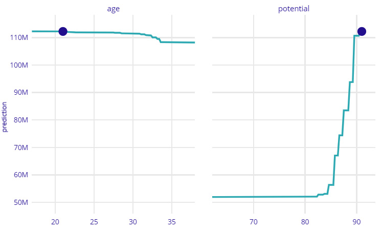
Figure 9.6 – An interactive what-if plot in DALEX
Figure 9.6 shows that for Jadon Sancho, the market valuation will start decreasing as he grows older; however, it can also increase with an increase in overall potential ratings. I would strongly recommend that you explore all of these prediction-level explanation options for the features and from the tutorial notebook provided in the project repository: https://github.com/PacktPublishing/Applied-Machine-Learning-Explainability-Techniques/blob/main/Chapter09/DALEX_example.ipynb. Next, we will use DALEX to evaluate model fairness.
Evaluating model fairness
A Model Fairness check is another important feature of DALEX. Although, model fairness and bias detection are more important to consider for classification problems relying on features related to gender, race, ethnicity, nationality, and other similar demographic features. However, we will apply this to regression models, too. For more details regarding model fairness checks using DALEX, please refer to https://dalex.drwhy.ai/python-dalex-fairness.html. Now, let's see whether our model is free from any bias and is fair!
We will create a protected variable and privileged variable for the fairness check. In fairness checks in ML, we try to ensure that a protected variable is free from any bias. If we anticipate any feature value or group to have any bias due to factors such as an imbalanced dataset, we can declare them as privileged variables. For our use case, we will perform a fairness check for three different sets of players based on their age.
All players less than 20 years are considered to be youth players, players between the ages of 20 and 30 are considered to be developing players, and players above 30 years are considered to be developed players. Now, let's do our fairness check using DALEX:
protected = np.where(x_valid.age < 30, np.where(x_valid.age < 20, 'youth', 'developing'), 'developed')
privileged = 'youth'
fairness = explainer.model_fairness(protected=protected,
privileged=privileged)
fairness.fairness_check(epsilon = 0.7)
This is the outcome of the fairness checks:
No bias was detected! Conclusion: your model is fair in terms of checked fairness criteria.
We can also check the quantitative evidence of the fairness checks and plot them to analyze further:
fairness.result
fairness.plot()
This will generate the following plot for analyzing model fairness checks using DALEX:
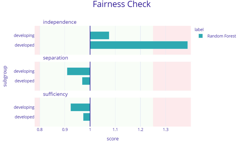
Figure 9.7 – A model fairness plot using DALEX
As shown in Figure 9.7, the model fairness using DALEX for regression models is done with respect to the metrics of independence, separation, and sufficiency. For classification models, these metrics could vary, but the API function usage is the same. Next, we will discuss the ARENA web-based tool for building interactive dashboards using DALEX.
Interactive dashboards using ARENA
Another interesting feature of DALEX is the ARENA dashboard platform to create an interactive web app that can be used to design a custom dashboard for keeping all the DALEX interactive visualizations that were obtained using different model explainability methods. This particular feature of DALEX gives us an opportunity to create better user engagement by creating a custom dashboard for a specific problem.
Before starting, we need to create a DALEX Arena dataset:
arena_dataset = df_test[:400].set_index('short_name')Next, we need to create an Arena object and push the DALEX explainer object created from the black-box model that is being explained:
arena = dx.Arena()
# push DALEX explainer object
arena.push_model(explainer)
Following this, we just need to push the Arena dataset and start the server to make our Arena platform live:
# push whole test dataset (including target column)
arena.push_observations(arena_dataset)
# run server on port 9294
arena.run_server(port=9294)
Based on the port provided, the DALEX server will be running on https://arena.drwhy.ai/?data=http://127.0.0.1:9294/. Initially, you will get a blank dashboard, but you can easily drag and drop the visuals from the right-hand side panel to make your own custom dashboard, as shown in the following screenshot:
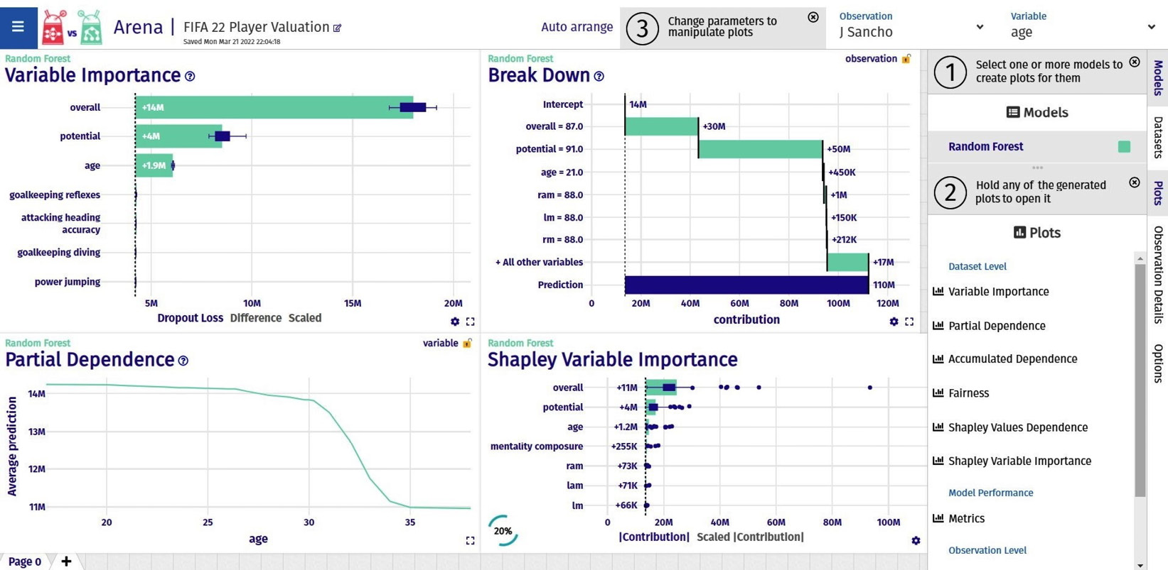
Figure 9.8 – An interactive Arena dashboard created using DALEX
Also, you can load an existing dashboard from a configuration JSON or export a build dashboard as a configuration JSON file. Try recreating the dashboard, as shown in Figure 9.8, using the configuration JSON file provided in the code repository at https://raw.githubusercontent.com/PacktPublishing/Applied-Machine-Learning-Explainability-Techniques/main/Chapter09/dalex_sessions/session-1647894542387.json.
Overall, I have found DALEX to be a very interesting and powerful XAI framework. There are many more examples available at https://github.com/ModelOriented/DALEX and https://github.com/ModelOriented/DrWhy/blob/master/README.md. Please do explore all of them. However, DALEX seems to be restricted to structured data. I think as a future scope, making DALEX easily applicable with image and text data would increase its adoption across the AI research community. In the next section, we will explore Explainerdashboard, which is another interesting XAI framework.
Explainerdashboard
The AI research community has always considered interactive visualization to be an important approach for interpreting ML model predictions. In this section, we will cover Explainerdashboard, which is an interesting Python framework that can spin up a comprehensive interactive dashboard covering various aspects of model explainability with just minimal lines of code. Although this framework supports only scikit-learn-compatible models (including XGBoost, CatBoost, and LightGBM), it can provide model-agnostic global and local explainability. Currently, it supports SHAP-based feature importance and interactions, PDPs, model performance analysis, what-if model analysis, and even decision-tree-based breakdown analysis plots.
The framework allows customization of the dashboard, but I think the default version includes all supported aspects of model explainability. The generated web-app-based dashboards can be exported as static web pages directly from a live dashboard. Otherwise, the dashboards can be programmatically deployed as a web app through an automated Continuous Integration (CI)/Continuous Deployment (CD) deployment process. I recommend that you go through the official documentation of the framework (https://explainerdashboard.readthedocs.io/en/latest/) and the GitHub project repository (https://github.com/oegedijk/explainerdashboard) before we get started with the walk-through tutorial example next.
Setting up Explainerdashboard
The complete tutorial notebook is provided in the code repository for this chapter at https://github.com/PacktPublishing/Applied-Machine-Learning-Explainability-Techniques/blob/main/Chapter09/Explainer_dashboard_example.ipynb. However, in this section, I will provide a complete walk-through of the tutorial. The same FIFA Club Position Prediction dataset (https://www.kaggle.com/datasets/adityabhattacharya/fifa-club-position-prediction-dataset) will be used for this tutorial, too. But instead of using the dataset to predict the valuation of football players, here, I will use this dataset to predict the league position of the football club for the next season based on the skills and ability of the football players playing for the club.
The real-world task of predicting a club league position for a future season is more complex, and there are several other variables that need to be included to get an accurate prediction. However, this prediction problem is solely based on the quality of the players playing for the club.
To get started with the tutorial, you will need to install all of the required dependencies to run the notebook. If you have executed all the previous tutorial examples, then most of the Python modules should be installed, except for Explainerdashboard. You can install explainerdashboard using the pip installer:
!pip install explainerdashboard
The Explainerdashboard framework does have a dependency on the graphviz module, which makes it slightly tedious to install depending on your system. At the time of writing, I have discovered that version 0.18 works best with Explainerdashboard. This can be installed using the pip installer:
!pip install graphviz==0.18
Graphviz is an open source graph visualization software that is needed for the decision tree breakdown plot used in Explainerdashboard. In spite of the pip installer, you might also need to install the graphviz binaries depending on the operating system that you are using. Please visit https://graphviz.org/ to find out more. Additionally, if you are facing any friction during the setup of this module, take a look at the installation instructions provided at https://pypi.org/project/graphviz/.
We will consider this ML problem to be a regression problem. Therefore, similar to the DALEX example, we will need to perform the same data preprocessing, feature engineering, model training, and evaluation steps. I recommend that you follow the steps provided in the notebook at https://github.com/PacktPublishing/Applied-Machine-Learning-Explainability-Techniques/blob/main/Chapter09/Explainer_dashboard_example.ipynb. This contains the necessary details to get the trained model. We will use this trained model as a black box and use Explainerdashboard to explain it in the next section.
Model explainability with Explainerdashboard
After the installation of the Explainerdashboard Python module is successful, you can import it to verify the installation:
import explainerdashboard
For this example, we will use the RegressionExplainer and ExplainerDashboard submodules. So, we will load the specific submodules:
from explainerdashboard import RegressionExplainer, ExplainerDashboard
Next, using just two lines of code, we can spin up the ExplainerDashboard submodule for this example:
explainer = RegressionExplainer(model_skl, x_valid, y_valid)
ExplainerDashboard(explainer).run()
Once this step is running successfully, the dashboard should be running in localhost with port 8050 as the default port. So, you can visit http://localhost:8050/ in the browser to view your explainer dashboard.
The following lists the different explainability methods provided by Explainerdashboards:
- Feature importance: Similar to other XAI frameworks, feature importance is an important method for gaining an understanding of the overall contribution of each attribute used for prediction. This framework uses SHAP values, permutation importance, and PDPs to analyze the contribution of each feature for the model prediction:
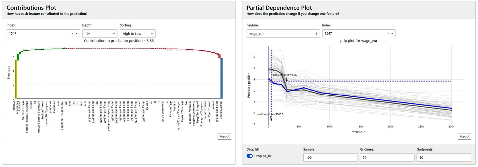
Figure 9.9 – Contribution plots and PDPs from Explainerdashboard
- Model performance: Similar to DALEX, Explainerdashboard also allows you to analyze the model performance. For classification models, it uses metrics such as precision plots, confusion matrices, ROC-AUC plots, PR AUC plots, and more. For regression models, we will see plots such as residual plots, goodness-of-fit plots, and more:
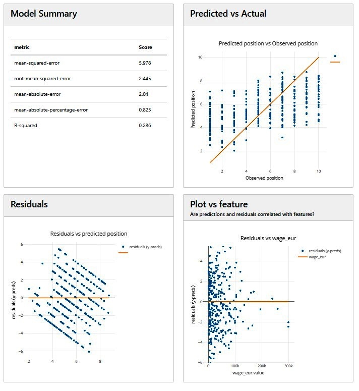
Figure 9.10 – Model performance analysis plots for regression models in Explainerdashboard
- Prediction-level analysis: Explainerdashboard provides interesting and interactive plots for getting local explanations. This is quite similar to other Python frameworks. It is very important to have for analyzing prediction-level outcomes.
- What-if analysis: Another interesting option that Explainerdashboard provides is the what-if analysis feature. We can use this feature to vary the feature values and observe how the overall prediction gets changed. I find what-if analysis to be very useful for providing prescriptive insights:
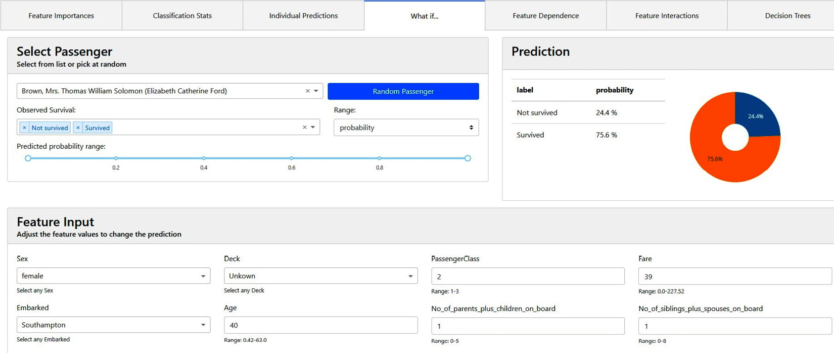
Figure 9.11 – What-if model analysis using Explainerdashboard
- Feature dependence and interactions: Analyzing the dependency and interactions between different features is another interesting explainability method provided in Explainerdashboard. Mostly, it uses SHAP methods for analyzing feature dependence and interactions.
- Decision tree surrogate explainers: Explainerdashboard uses decision trees as surrogate explainers. Additionally, it uses the decision tree breakdown plot for model explainability:
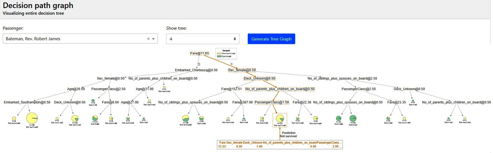
Figure 9.12 – Decision tree surrogate explainers in Explainerdashboard
To stop running the dashboards on your local system, you can simply interrupt the notebook cell.
Explainerdashboard offers you many customization options as well. To customize your own dashboard from the given template, it is recommended that you refer to https://github.com/oegedijk/explainerdashboard#customizing-your-dashboard. You can also build multiple dashboards and compile all the dashboards as an explainer hub: https://github.com/oegedijk/explainerdashboard#explainerhub. To deploy dashboards into a live web app that is accessible from anywhere, I would recommend you look at https://github.com/oegedijk/explainerdashboard#deployment.
In comparison to DALEX, I would say that Explainerdashboard is slightly behind as it is only restricted to scikit-learn-compatible models. This means that with complex deep learning models built on unstructured data such as images and text, you can't use this framework. However, I found it easy to use and very useful for ML models built on tabular datasets. In the next section, we will cover the InterpretML XAI framework from Microsoft.
InterpretML
InterpretML (https://interpret.ml/) is an XAI toolkit from Microsoft. It aims to provide a comprehensive understanding of ML models for the purpose of model debugging, outcome explainability, and regulatory audits of ML models. With this Python module, we can either train interpretable glassbox models or explain black-box models.
In Chapter 1, Foundational Concepts of Explainability Techniques, we discovered that some models such as decision trees, linear models, or rule-fit algorithms are inherently explainable. However, these models are not efficient for complex datasets. Usually, these models are termed glass-box models as opposed to black-box models, as they are extremely transparent.
Microsoft Research developed another algorithm called Explainable Boosting Machine (EBM), which introduces modern ML techniques such as boosting, bagging, and automatic interaction detection into classical algorithms such as Generalized Additive Models (GAMs). Researchers have also found that EBMs are accurate as random forests and gradient-boosted trees, but unlike such black-box models, EBMs are explainable and transparent. Therefore, EBMs are glass-box models that are built into the InterpretML framework.
In comparison to DALEX and Explainerdashboard, InterpretML is slightly behind in terms of both usability and adoption. However, since this framework as a great potential to evolve further, it is important to discuss this framework. Before discussing the code tutorial, let us discuss about the explainability techniques that are supported by this framework.
Supported explanation methods
At the time of writing, the following table illustrates the supported explanation methods in InterpretML, as mentioned in the GitHub project source at https://github.com/interpretml/interpret#supported-techniques:
Figure 9.13 – Explanation methods supported in InterpretML
I recommend that you keep an eye on the project documentation, as I am quite certain the supported explanation methods for this framework will increase for InterpretML. Next, let's explore how to use this framework in practice.
Setting up InterpretML
In this section, I will walk you through the tutorial example of InterpretML that is provided in the code repository at https://github.com/PacktPublishing/Applied-Machine-Learning-Explainability-Techniques/blob/main/Chapter09/InterpretML_example.ipynb. In the tutorial, we used InterpretML to explain an ML model trained for hepatitis detection, which is a classification problem.
To begin the problem, you need to have the InterpretML Python module installed. You can use the pip installer for this:
pip install interpret
Although the framework is supported by Windows, Mac, and Linux, it does require you to have a Python version that is higher than 3.6. You can validate whether the installation is successful by importing the module:
import interpret as iml
Next, let's discuss the dataset that is used in this tutorial.
Discussions about the dataset
The hepatitis detection dataset is taken from the UCI Machine Learning repository at https://archive.ics.uci.edu/ml/datasets/hepatitis. It has 155 records and 20 features of different types for the detection of the hepatitis disease. Therefore, this dataset is used for solving binary classification problems. For your convenience, I have added this dataset to the code repository at https://github.com/PacktPublishing/Applied-Machine-Learning-Explainability-Techniques/tree/main/Chapter09/datasets/Hepatitis_Data.
Hepatitis Dataset Citation
G.Gong (Carnegie-Mellon University) via Bojan Cestnik, Jozef Stefan Institute (https://archive.ics.uci.edu/ml/datasets/hepatitis)
More details about the dataset and initial exploration results are included in the tutorial notebook. However, on a very high level, the dataset is imbalanced, it has missing values, and it has both categorical and continuous variables. Therefore, it needs necessary transformation before the model can be built. All these necessary steps are included in the tutorial notebook, but please feel free to explore additional methods for building a better ML model.
Training the model
For this example, after dividing the entire data into a training set and a test set, I have trained a random forest classifier with minimum hyperparameter tuning:
x_train, x_test, y_train, y_test = train_test_split(
encoded, label, test_size=0.3, random_state=123)
model = RandomForestClassifier(
n_estimators=500, min_samples_split = 3,
random_state=123).fit(x_train, y_train)
Note that sufficient hyperparameter tuning is not done for this model, as we are more interested in the model explainability part with InterpretML rather than learning how to build an efficient ML model. However, I encourage you to explore hyperparameters tuning further to get a better model.
On evaluating the model on the test data, we have received an accuracy of 85% and an Area Under the ROC Curve (AUC) score of 70%. The AUC score is much lower than the accuracy as the dataset used is imbalanced. This indicates that a metric such as accuracy can be misleading. Therefore, it is better to consider metrics such as the AUC score, F1 score, and confusion matrix instead of accuracy for model evaluation.
Next, we will use InterpretML for model explainability.
Explainability with InterpretML
As mentioned earlier, with InterpretML. you can either use interpretable glass-box models as surrogate explainers or explore certain model-agnostic methods to explain black-box models. With both approaches, you can get an interactive dashboard for analyzing the various aspects of explainability. First, I will cover the model explainability using glass-box models in InterpretML.
Explaining with glass-box models using InterpretML
InterpretML supports interpretable glass-box models such as the Explainable Boosting Machine (EBM), Decision Tree, and Rule-Fit algorithms. These algorithms are applied as surrogate explainers for providing post hoc model explainability. First, let's try out the EBM algorithm.
EBM
To explain a model with EBM, we need to load the required submodule in Python:
from interpret.glassbox import ExplainableBoostingClassifier
Once the EBM submodule has been successfully imported, we just need to create a trained surrogate explainer object:
ebm = ExplainableBoostingClassifier(feature_types=feature_types)
ebm.fit(x_train, y_train)
The ebm variable is the EBM explainer object. We can use this variable to get global or local explanations. The framework only supports feature importance-based global and local explainability but creates an interactive plot for further analysis:
# Showing Global Explanations
ebm_global = ebm.explain_global()
iml.show(ebm_global)
# Local explanation using EBM
ebm_local = ebm.explain_local(x_test[5:6], y_test[5:6],
name = 'Local Explanation')
iml.show(ebm_local)
Figure 9.14 illustrates the global feature importance plot and variation of the Age feature with the overall data distribution obtained using InterpretML:
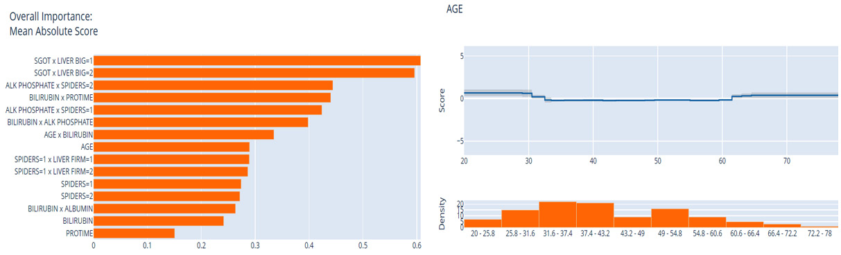
Figure 9.14 – Global explanation plots using InterpretML
Feature importance for the local explanation, which has been done at the prediction level of the individual data instance, is shown in Figure 9.15:
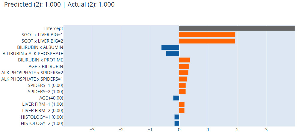
Figure 9.15 – Local explanation using InterpretML
Next, we will explore rule-based algorithms in InterpretML as surrogate explainers, as discussed in Chapter 2, Model Explainability Methods.
Decision rule list
Similar to EBM, another popular glass-box surrogate explainer that is available in InterpretML is the decision rule list. This is similar to the rule-fit algorithm, which can learn specific rules from the dataset to explain the logical working of the model. We can apply this method using InterpretML in the following way:
from interpret.glassbox import DecisionListClassifier
dlc = DecisionListClassifier(feature_types=feature_types)
dlc.fit(x_train, y_train)
# Showing Global Explanations
dlc_global = dlc.explain_global()
iml.show(dlc_global)
With this method, the framework displays the learned rules, as shown in the following screenshot:
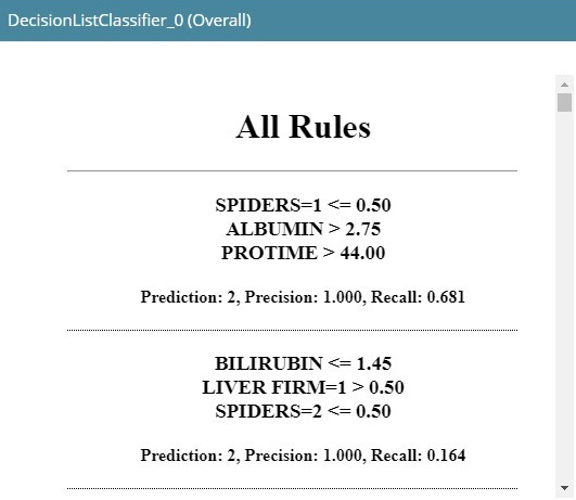
Figure 9.16 – Decision rule list using InterpretML
As we can see in Figure 9.16, it generates a list of learned rules. Next, we will explore the decision tree-based surrogate explainer in InterpretML.
Decision tree
Similar to a decision rule list, we can also fit the decision tree algorithm as a surrogate explainer using InterpretML for model explainability. The API syntax is also quite similar for applying a decision tree classifier:
from interpret.glassbox import ClassificationTree
dtc = ClassificationTree(feature_types=feature_types)
dtc.fit(x_train, y_train)
# Showing Global Explanations
dtc_global = dtc.explain_global()
iml.show(dtc_global)
This produces a decision tree breakdown plot, as shown in the following screenshot, for the model explanation:
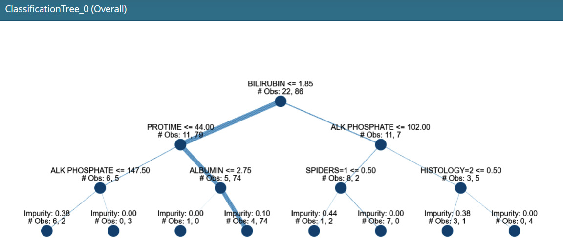
Figure 9.17 – A decision tree-based surrogate explainer in InterpretML
Now all of these individual components can also be clubbed together into one single dashboard using the following line of code:
iml.show([ebm_global, ebm_local, dlc_global, dtc_global])
Figure 9.18 illustrates the consolidated interactive dashboard using InterpretML:
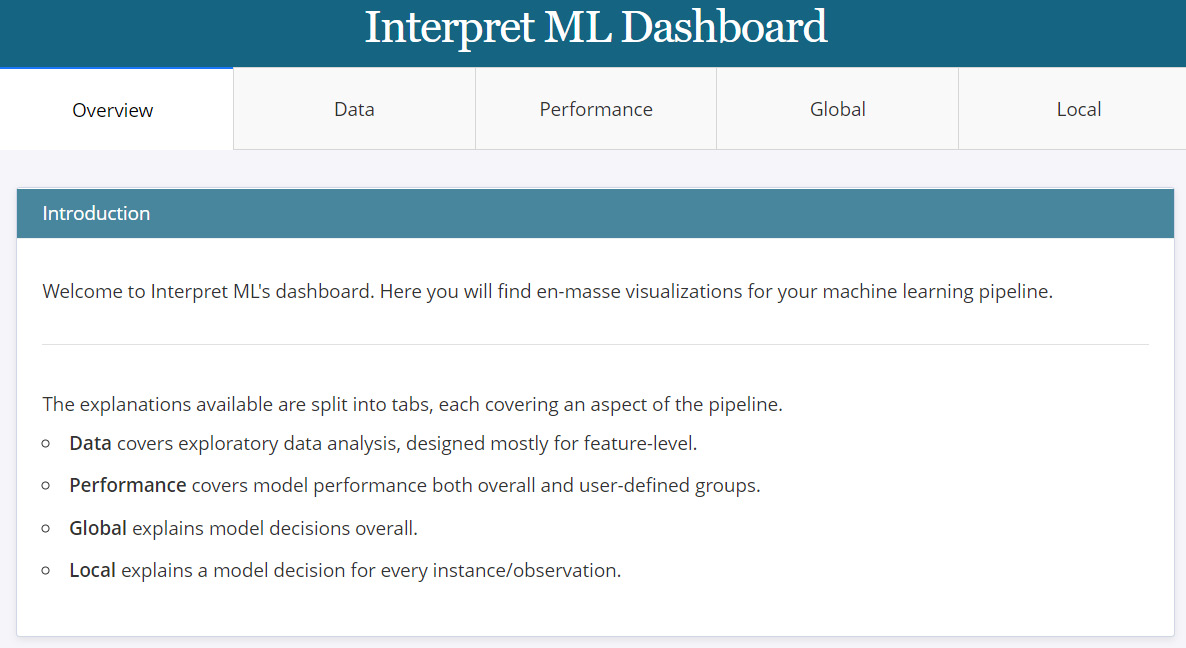
Figure 9.18 – The InterpretML dashboard consolidating all individual plots
In the next section, we will cover the various methods that are available in InterpretML for providing a model-agnostic explanation of the black-box model.
Explaining black-box models using InterpretML
In this section, we will cover the four different methods supported in InterpretML for explaining black-box models. We will only cover the code part as the visualizations of feature importance and feature variation are very similar to the glass-box models. I do recommend looking at the tutorial notebook for interacting with the generated plots to gain more insights. The methods supported are LIME, Kernel SHAP, Morris Sensitivity, and Partial Dependence:
from interpret.blackbox import LimeTabular, ShapKernel, MorrisSensitivity, PartialDependence
First, we will explore the LIME tabular method:
#The InterpretML Blackbox explainers need a predict function, and optionally a dataset
lime = LimeTabular(predict_fn=model.predict_proba, data=x_train.astype('float').values, random_state=123)#Select the instances to explain, optionally pass in labels if you have them
lime_local = lime.explain_local(
x_test[:5].astype('float').values, y_test[:5], name='LIME')
Next, InterpretML provides the SHAP Kernel method for a model-agnostic SHAP-based explanation:
# SHAP explanation
background_val = np.median(
x_train.astype('float').values, axis=0).reshape(1, -1)shap = ShapKernel(predict_fn=model.predict_proba,
data=background_val,
feature_names=list(x_train.columns))
shap_local = shap.explain_local(
x_test[:5].astype('float').values, y_test[:5], name='SHAP')
Another model-agnostic global explanation method that is supported is Morris Sensitivity, which is used to obtain the overall sensitivity of the features:
# Morris Sensitivity
sensitivity = MorrisSensitivity(
predict_fn=model.predict_proba,
data=x_train.astype('float').values, feature_names=list(x_train.columns),
feature_types=feature_types)
sensitivity_global = sensitivity.explain_global(name="Global Sensitivity")
InterpretML also supports PDPs for analyzing feature dependence:
# Partial Dependence
pdp = PartialDependence(
predict_fn=model.predict_proba,
data=x_train.astype('float').values, feature_names=list(x_train.columns),
feature_types=feature_types)
pdp_global = pdp.explain_global(name='Partial Dependence')
Finally, everything can be consolidated into a single dashboard using a single line of code:
iml.show([lime_local, shap_local, sensitivity_global,
pdp_global])
This will create a similar interactive dashboard, as shown in Figure 9.18.
With the various surrogate explainers and interactive dashboards, this framework does have a lot of potential, even though there are quite a few limitations. It is restricted to tabular datasets, it is not compatible with model frameworks such as PyTorch, TensorFlow, and H20, and I think the model explanation methods are also limited. Improving these limitations can definitely increase the adoption of this framework.
Next, we will cover another popular XAI framework – ALIBI for model explanation.
ALIBI
ALIBI is another popular XAI framework that supports both local and global explanations for classification and regression models. In Chapter 2, Model Explainability Methods, we did explore this framework for getting counterfactual examples, but ALIBI does include other model explainability methods too, which we will explore in this section. Primarily, ALIBI is popular for the following list of model explanation methods:
- Anchor explanations: An anchor explanation is defined as a rule that sufficiently revolves or anchors around the local prediction. This means that if the anchor value is present in the data instance, the model prediction is almost always the same, irrespective of changes to other feature values.
- Counterfactual Explanations (CFEs): We have seen counterfactuals in Chapter 2, Model Explainability Methods. CFEs indicate which feature values should change, and by how much, to produce a different outcome.
- Contrastive Explanation Methods (CEMs): CEMs are used with classification models for local explanations in terms of Pertinent Positives (PPs), meaning features that should be minimally and sufficiently present to justify a given classification, and Pertinent Negatives (PNs), meaning features that minimally and necessarily absent to justify the classification.
- Accumulated Local Effects (ALE): ALE plots illustrate how attributes influence the overall prediction of an ML model. ALE plots are often considered to be unbiased and a faster alternative to PDPs, as covered in Chapter 2, Model Explainability Methods.
To get a detailed summary of the supported methods for model explanation, please take a look at https://github.com/SeldonIO/alibi#supported-methods. Please explore the official documentation of this framework to learn more about it: https://docs.seldon.io/projects/alibi/en/latest/examples/overview.html.
Now, let me walk you through the code tutorial provided for ALIBI.
Setting up ALIBI
The complete code tutorial is provided in the project repository for this chapter at https://github.com/PacktPublishing/Applied-Machine-Learning-Explainability-Techniques/blob/main/Chapter09/ALIBI_example.ipynb. If you have followed the tutorials for Counterfactual explanations from Chapter 2, Model Explainability Methods, you should have ALIBI installed already.
You can import the submodules that we are going to use for this example from ALIBI:
import alibi
from alibi.explainers import AnchorTabular, CEM, CounterfactualProto, ale
Next, let's discuss the dataset for this tutorial.
Discussion about the dataset
For this example, we will use the Occupancy Detection dataset from the UCI Machine Learning repository at https://archive.ics.uci.edu/ml/datasets/Occupancy+Detection+#. This dataset is used for detecting whether a room is occupied or not from the different sensor values that are provided. Hence, this is a classification problem that can be solved by fitting ML classifiers on the given dataset. The detailed data inspection, preprocessing, and transformation steps are included in the tutorial notebook. On a very high level, the dataset is slightly imbalanced and, mostly, contains numerical features with no missing values.
Occupancy Detection dataset citation
L.M. Candanedo, V. Feldheim (2016) - Accurate occupancy detection of an office room from light, temperature, humidity and CO2 measurements using statistical learning models. (https://archive.ics.uci.edu/ml/datasets/Occupancy+Detection+#)
In this tutorial, I have demonstrated how to use a pipeline approach with scikit-learn for training ML models. This is a very neat way of building ML models, and it is especially useful when working on industrial problems that need to be deployed to the production system. To learn more about this approach, take a look at the official scikit-learn pipeline documentation at https://scikit-learn.org/stable/modules/generated/sklearn.pipeline.Pipeline.html.
Next, let's discuss the model that will be used for extracting explanations.
Training the model
For this example, I have used a random forest classifier to train a model with minimal hyperparameter tuning. You can explore other ML classifiers too, as the choice of the algorithm doesn't matter. Our goal is to explore ALIBI for model explainability, which I will cover in the next section.
Model explainability with ALIBI
Now, let's use the various explanation methods discussed earlier for the trained model, which we can consider a black box.
Using anchor explanations
In order to get the anchor points, first, we need to create an anchor explanation object:
explainer = AnchorTabular(
predict_fn,
feature_names=list(df_train.columns),
seed=123)
Next, we need to fit the explainer object on the training data:
explainer.fit(df_train.values, disc_perc=[25, 50, 75])
We need to learn an anchor value for both the occupied class and the unoccupied class. This process involves providing a data instance belonging to each of these classes as input for estimating the anchor points. This can be done by using the following lines of code:
class_names = ['not_occupied', 'occupied']
print('Prediction: ', class_names[explainer.predictor(
df_test.values[5].reshape(1, -1))[0]])
explanation = explainer.explain(df_test.values[5],
threshold=0.8)
print('Anchor: %s' % (' AND '.join(explanation.anchor)))print('Prediction: ', class_names[explainer.predictor(
df_test.values[100].reshape(1, -1))[0]])
explanation = explainer.explain(df_test.values[100],
threshold=0.8)
print('Anchor: %s' % (' AND '.join(explanation.anchor)))In this example, the anchor point for the occupied class is obtained when the light intensity value is greater than 256.7 and the CO2 value is greater than 638.8. In comparison, for the unoccupied class, it is obtained when the CO2 value is greater than 439. Essentially, this is telling us that if the sensor values measuring light intensity are greater than 256.7 and the CO2 levels are greater than 638.8, the model predicts that the room is occupied.
The pattern learned by the model is actually appropriate, as whenever a room is occupied, it is more likely that the lights are turned on, and with more occupants, CO2 levels are also likely to increase. The anchor points for the unoccupied class are not very appropriate, intuitive, or interpretable, but this indicates that, usually, CO2 levels are lower when the room is not occupied. Typically, we get to learn about some threshold values of certain impact features that the model relies on for predicting the outcome.
Using CEM
With CEM, the main idea is to learn PPs or conditions that should be present to justify the occurrence of one class and PNs, which should be absent to indicate the occurrence of one class. This is used for model-agnostic local explainability. You can find out more about this method from this research literature at https://arxiv.org/pdf/1802.07623.pdf.
To apply this in Python, we need to create a CEM object with the required hyper-parameters and fit the train values to learn the PP and PN values:
cem = CEM(predict_fn, mode, shape, kappa=kappa,
beta=beta, feature_range=feature_range,
max_iterations=max_iterations, c_init=c_init,
c_steps=c_steps,
learning_rate_init=lr_init, clip=clip)
cem.fit(df_train.values, no_info_type='median')
explanation = cem.explain(X, verbose=False)
In our example, the PP and PN values that have been learned show by how much the value should be increased or decreased to meet the minimum criteria for the correct outcome. Surprisingly, no PN value was obtained for our example. This indicates that all the features are important for the model. The absence of any feature or any particular value range does not help the model predict the outcome. Usually, for higher-dimensional data, the PN values would be important to analyze.
Using CFEs
In Chapter 2, Model Explainability Methods, we looked at tutorial examples of how CFEs can be applied with ALIBI. We will follow a similar approach for this example, too. However, ALIBI does allow different algorithms to generate CFEs, which I highly recommend you explore: https://docs.seldon.io/projects/alibi/en/latest/methods/CF.html. In this chapter, we will stick to the prototype-based method covered in the CFE tutorial of Chapter 2, Model Explainability Methods:
cfe = CounterfactualProto(predict_fn,
shape,
use_kdtree=True,
theta=10.,
max_iterations=1000,
c_init=1.,
c_steps=10
)
cfe.fit(df_train.values, d_type='abdm',
disc_perc=[25, 50, 75])
explanation = cfe.explain(X)
Once the explanation object is ready, we can actually compare the difference between CFEs and the original data instance to understand the change in the feature values required to flip the outcome. However, using this method to get the correct CFE can be slightly challenging as there are many hyperparameters that require the right tuning; therefore, the method can be challenging and tedious. Next, let's discuss how to use ALE plots for model explainability.
Using ALE plots
Similar to PDPs, as covered in Chapter 2, Model Explainability Methods, ALE plots can be used to find the relationship of the individual features with respect to the target class. Let's see how to apply this in Python:
proba_ale = ale.ALE(predict_fn, feature_names=numeric,
target_names=class_names)
proba_explain = proba_ale.explain(df_test.values)
ale.plot_ale(proba_explain, n_cols=3,
fig_kw={'figwidth': 12, 'figheight': 8})This will create the following ALE plots:
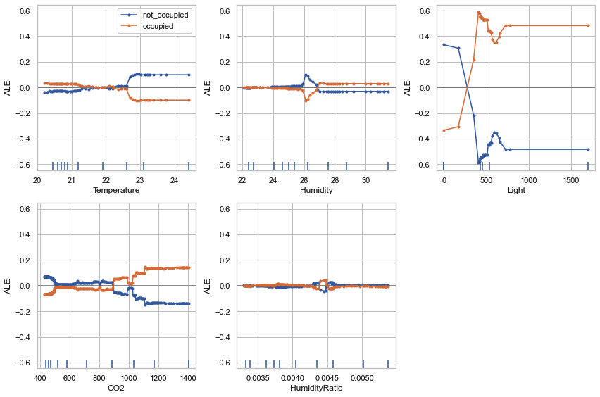
Figure 9.19 – ALE plots using ALIBI
In Figure 9.19, we can see that the variance in feature values for the occupied and not occupied target classes is at the maximum level for the feature light, followed by CO2 and temperature, and at the lowest level for HumidityRatio. This gives us an indication of how the model prediction changes depending on the variation of the feature values.
Overall, I feel that ALIBI is an interesting XAI framework that works with tabular and unstructured data such as text and images and does have a wide variety of techniques for the explainability of ML models. The only limitation I have found is that some of the methods are not very simplified, so they require a good amount of hyperparameter tuning to get reliable explanations. Please explore https://github.com/SeldonIO/alibi/tree/master/doc/source/examples for other examples provided for ALIBI to get more practical expertise. In the next section, we will discuss DiCE as an XAI Python framework.
DiCE
Diverse Counterfactual Explanations (DiCE) is another popular XAI framework that we briefly covered in Chapter 2, Model Explainability Methods, for the CFE tutorial. Interestingly, DiCE is also one of the key XAI frameworks from Microsoft Research, but it is yet to be integrated with the InterpretML module (I wonder why!). I find the entire idea of CFE to be very close to the ideal human-friendly explanation that gives actionable recommendations. This blog from Microsoft discusses the motivation and idea behind the DiCE framework: https://www.microsoft.com/en-us/research/blog/open-source-library-provides-explanation-for-machine-learning-through-diverse-counterfactuals/.
In comparison to ALIBI CFE, I found DiCE to produce more appropriate CFEs with minimal hyperparameter tuning. That's why I feel it's important to mention DiCE, as it is primarily designed for example-based explanations. Next, let's discuss the CFE methods that are supported in DiCE.
CFE methods supported in DiCE
DiCE can generate CFEs based on the following methods:
- Model-agnostic methods:
- KD-Tree
- Genetic algorithm
- Randomized sampling
- Gradient-based methods (model-specific methods):
- Loss-based method for deep learning models
- Variational Auto-Encoder (VAE)-based methods
To learn more about all these methods, I request that you explore the official documentation of DiCE (https://github.com/interpretml/DiCE), which contains the necessary research literature for each method. Now, let's use DiCE for model explainability.
Model explainability with DiCE
The complete tutorial example is provided at https://github.com/PacktPublishing/Applied-Machine-Learning-Explainability-Techniques/blob/main/Chapter09/DiCE_example.ipynb. For this example, I have used the same Occupancy Detection dataset that we used for the ALIBI tutorial. Since the same data preprocessing, transformation, model training, and evaluation steps have been used, we will directly proceed with the model explainability part with DALEX. The notebook tutorial contains all the necessary steps, so I recommend that you go through the notebook first.
We will use the DiCE framework in the same way as we have done for the CFE tutorial from Chapter 2, Model Explainability Methods.
So, first, we need to define a DiCE data object:
data_object = dice_ml.Data(
dataframe = df_train[numeric + [target_variable]],
continuous_features = numeric,
outcome_name = target_variable
)
Next, we need to create a DiCE model object:
model_object = dice_ml.Model(model=model,backend='sklearn')
Following this, we need to pass the data object and the model object for the DiCE explanation object:
explainer = dice_ml.Dice(data_object, model_object,
method = 'random')
Next, we can take a query data instance and generate CFEs using the DiCE explainer object:
test_query = df_test[400:401][numeric]
cfe = explainer.generate_counterfactuals(
test_query,
total_CFs=4,
desired_range=None,
desired_class="opposite",
features_to_vary= numeric,
permitted_range = { 'CO2' : [400, 1000]}, # Adding a constraint for CO2 featurerandom_seed = 123,
verbose=True)
cfe.visualize_as_dataframe(show_only_changes=True)
This will produce a CFE DataFrame that shows the feature values that need to be changed to flip the model predicted outcome. The outcome of this approach is illustrated in the following screenshot:
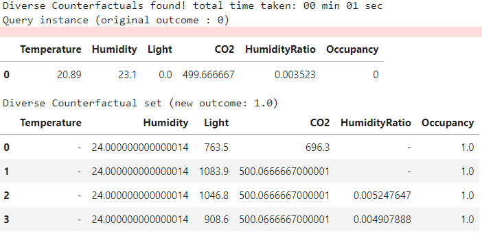
Figure 9.20 – CFE generated using the DiCE framework, which is displayed as a DataFrame
Interestingly, CFEs don't only provide actionable insights from the data. However, they can also be used to generate local and global feature importance. The features that can be easily varied to alter the model prediction are considered to be more important by this approach of feature importance. Let's try applying the local feature importance using the DiCE method:
local_importance = explainer.local_feature_importance(test_query)
print(local_importance.local_importance)
plt.figure(figsize=(10,5))
plt.bar(range(len(local_importance.local_importance[0])),
list(local_importance.local_importance[0].values())/(np.sum(list(local_importance.local_importance[0].values()))),
tick_label=list(local_importance.local_importance[0].keys()),
color = list('byrgmc'))
plt.show()
This produces the following local feature importance plot for the test query selected:
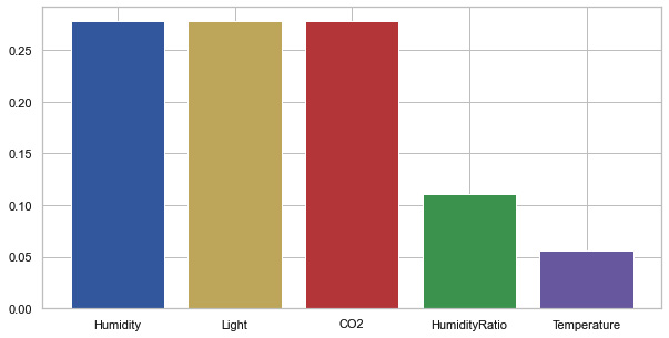
Figure 9.21 – Local feature importance using DiCE
Figure 9.21 shows that for the test query data, the humidity, light, and CO2 features are the most important for model prediction. This indicates that most CFEs would suggest changing the feature values of one of these features to alter the model prediction.
Overall, DiCE is a very promising framework for robust CFEs. I recommend you explore the different algorithms to generate CFEs such as KD-Trees, random sampling, and genetic algorithms. DiCE examples can sometimes be very random. My recommendation is to always use a random seed to control the randomness, clearly define the actionable and non-actionable features, and set the boundary conditions of the actionable features to generate CFEs that are meaningful and practically feasible. Otherwise, the generated CFEs can be very random and practically not feasible and, therefore, less impactful to use.
For other examples of the DiCE framework for multiclass classification or regression problems, please explore https://github.com/interpretml/DiCE/tree/master/docs/source/notebooks. Next, let's cover ELI5, which is one of the initial XAI frameworks that has been developed to produce simplistic explanations of ML models.
ELI5
ELI5, or Explain Like I'm Five, is a Python XAI library for debugging, inspecting, and explaining ML classifiers. It was one of the initial XAI frameworks developed to explain black-box models in the most simplified format. It supports a wide range of ML modeling frameworks such as scikit-learn compatible models, Keras, and more. It also has integrated LIME explainers and can work with tabular datasets along with unstructured data such as text and images. The library documentation is provided at https://eli5.readthedocs.io/en/latest/, and the GitHub project is available at https://github.com/eli5-org/eli5.
In this section, we will cover the application part of ELI5 for a tabular dataset only, but please feel free to explore other examples that have been provided in the tutorial examples of ELI5 at https://eli5.readthedocs.io/en/latest/tutorials/index.html. Next, let's get started with the walk-through of the code tutorial.
Setting up ELI5
The complete tutorial of the ELI5 example is available in the GitHub repository for this chapter: https://github.com/PacktPublishing/Applied-Machine-Learning-Explainability-Techniques/blob/main/Chapter09/ELI5_example.ipynb. ELI5 can be installed in Python using the pip installer:
pip install eli5
If the installation process is successful, you can verify it by importing the module in the Jupyter notebook:
import eli5
For this example, we will use the same hepatitis detection dataset from the UCI Machine Learning repository (https://archive.ics.uci.edu/ml/datasets/hepatitis), which we used for the InterpretML example. Also, we have used a random forest classification model with minimum hyperparameter tuning that will be used as our black-box model. So, we will skip the discussion about the dataset and model part and proceed to the model explainability part using ELI5.
Model explainability using ELI5
Applying ELI5 in Python is very easy and can be done with a few lines of code:
eli5.show_weights(model, vec = DictVectorizer(),
feature_names = list(encoded.columns))
This will produce the following feature weight tabular visualization that can be used to analyze the global feature importance:
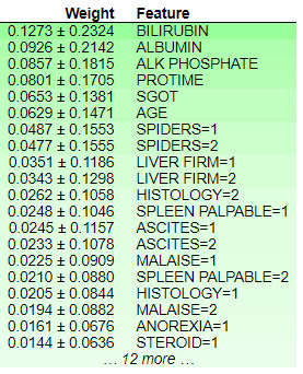
Figure 9.22 – Feature weights obtained using ELI5
Figure 9.22 indicates that the feature, BILIRUBIN, has the maximum weight and, hence, has the maximum contribution for influencing the model outcome. The +/- values shown beside the weight values can be considered to be confidence intervals. This method can be considered a very simple way to provide insights into the black-box model. ELI5 calculates the feature weights using tree models. Every node of the tree gives an output score that is used to estimate the total contribution of a feature. The total contribution on the decision path is how much the score changes from parent to child. The total weights of all the features sum up the total probability of the model for predicting a particular class.
We can use this method for providing local explainability and for an inference data instance:
no_missing = lambda feature_name, feature_value: not np.isnan(feature_value) # filter missing values
eli5.show_prediction(model,
x_test.iloc[1:2].astype('float'), feature_names = list(encoded.columns),
show_feature_values=True,
feature_filter=no_missing,
target_names = {1:'Die', 2:'Live'},top = 10,
show = ['feature_importances',
'targets', 'decision_tree',
'description'])
This will produce the following tabular visualization for analyzing the feature contributions of the inference data:
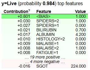
Figure 9.23 – Feature contributions using ELI5 for local explainability
In Figure 9.23, we can see the feature contributions using ELI5 for the local data used for prediction. There is a <BIAS> term that is added to the table. This is considered the expected average score output by the model, which depends on the distribution of the training data. To find out more, take a look at this Stack Overflow post: https://stackoverflow.com/questions/49402701/eli5-explaining-prediction-xgboost-model.
Even though ELI5 is easy to use and probably the least complex of all the XAI frameworks covered so far, I would say that the framework is not comprehensive enough. Even the visualization provided to analyze the feature contributions appears to be very archaic and can be improved. Since ELI5 is one of the initial XAI frameworks that works with tabular data, images, and text data, it is important to know about it.
In the next section, I will cover the model explainability of H2O AutoML models.
H2O AutoML explainers
Throughout this chapter, we have mostly used scikit-learn-based and TensorFlow-based models. However, when the idea of AutoML was first introduced, the H2O community was one of the earliest adopters of this concept and introduced the AutoML feature for the H2O ML framework: https://docs.h2o.ai/h2o/latest-stable/h2o-docs/automl.html.
Interestingly, H2O AutoML is very widely used in the industry, especially for high-volume datasets. Unfortunately, there are very few model explainability frameworks such as DALEX that are compatible with H2O models. H2O models have a good usage in both R and Python, and with the AutoML feature, this framework promises to spin up trained and tuned models to give the best performance in a very short time and with less effort. So, that's why I feel it is important to mention the H2O AutoML explainer in this chapter. This framework does have a built-in implementation of model explainability methods for explaining the predictions of an AutoML model (https://docs.h2o.ai/h2o/latest-stable/h2o-docs/automl.html). Next, let's dive deeper into H2O explainers.
Explainability with H2O explainers
H2O explainers are only supported for H2O models. They can be used to provide both global and local explanations. The following list shows the supported methods to provide explanations in H2O:
- Model performance comparison (this is particularly useful for AutoML models that try different algorithms on the same dataset)
- Variable or feature importance (this is for both global and local explanations)
- Model correlation heatmaps
- TreeSHAP-based explanations (this is only for tree models)
- PDPs (this is for both global and local explanations)
- Individual conditional expectation plots, which are also referred to as what-if analysis plots (for both global and local explanations)
You can find out more about H2O explainers at https://docs.h2o.ai/h2o/latest-stable/h2o-docs/explain.html. The complete tutorial example is provided at https://github.com/PacktPublishing/Applied-Machine-Learning-Explainability-Techniques/blob/main/Chapter09/H2o_AutoML_explain_example.ipynb. In this example, I have demonstrated how to use H2O AutoML for predicting the league position of top football clubs based on the quality of their players using the FIFA Club Position Prediction dataset (https://github.com/PacktPublishing/Applied-Machine-Learning-Explainability-Techniques/tree/main/Chapter09/datasets/FIFA_Club_Position). It is the same dataset that we used for the DALEX and Explainerdashboard tutorials.
To install the H2O module, you can use the pip installer:
pip install h2o
Since we have already covered the steps of data preparation and transformation in the previous tutorials, I will skip those steps here. But please do refer to the tutorial notebook for executing the end-to-end example.
H2O models are not compatible with a pandas DataFrame. So, you will need to convert a pandas DataFrame into an H2O DataFrame. Let's see the lines of code for training the H2O AutoML module:
import h2o
from h2o.automl import H2OAutoML
# Start the H2O cluster (locally) - Don't forget this step
h2o.init()
aml = H2OAutoML(max_models=20, seed=1)
train = x_train.copy()
valid = x_valid.copy()
train["position"] = y_train
valid["position"] = y_valid
x = list(train.columns)
y = "position"
training_frame = h2o.H2OFrame(train)
validation_frame=h2o.H2OFrame(valid)
# training the automl model
aml.train(x=x, y=y, training_frame=training_frame,
validation_frame=validation_frame)
Once the AutoML training process is complete, we can get the best model and store it as a variable for future usage:
model = aml.get_best_model()
For the model explainability part, we just need to use the explain method from an AutoML model object:
aml.explain(validation_frame)
This automatically creates a wide range of supported XAI methods and generates visualizations to interpret the model. At the time of writing, the H2O explainability feature is newly released and is in the experimental phase. If you would like to give any feedback or find any bugs, please raise a ticket request on the H2O JIRA issue tracker (https://0xdata.atlassian.net/projects/PUBDEV).
With that, I have covered all the popular XAI frameworks apart from LIME, SHAP, and TCAV that are commonly used or have a high potential for explaining ML models. In the next section, I will give a quick comparison guide to compare all seven frameworks covered in this chapter.
Quick comparison guide
In this chapter, we discussed the different types of XAI frameworks available in Python. Of course, no one framework is absolutely perfect and can be used for all scenarios. Throughout the sections, I did mention the pros and cons of each framework, but I believe it will be really handy if you have a quick comparison guide to decide on your choice of XAI framework, considering your given problem.
The following table illustrates a quick comparison guide for the seven XAI frameworks covered in this chapter. I have tried to compare these based on the different dimensions of explainability, their compatibility with various ML models, a qualitative assessment of human-friendly explanations, the robustness of the explanations produced, a qualitative assessment of scalability, and how fast the particular framework can be adopted in production-level systems:
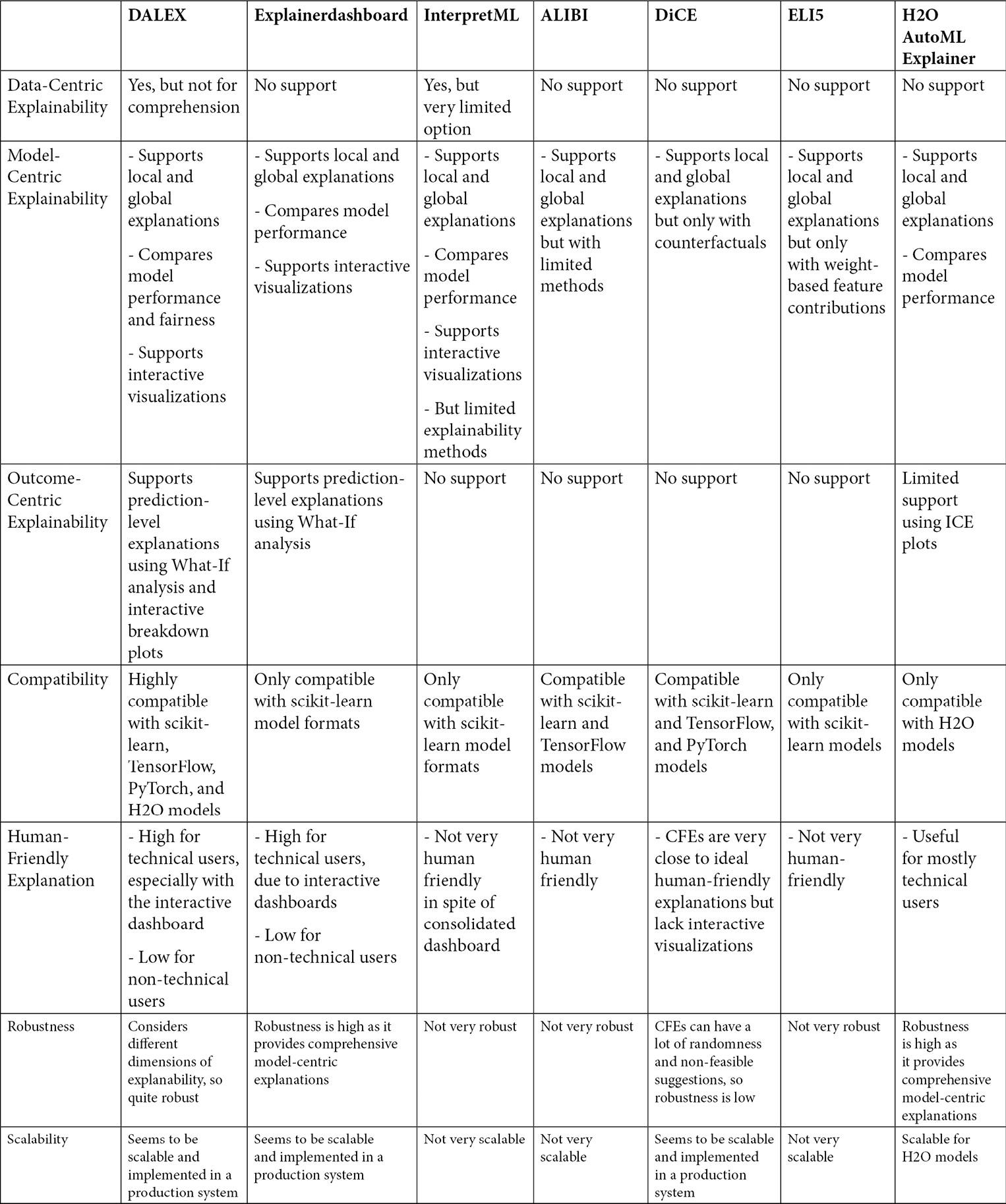
Figure 9.24 – A quick comparison guide of the popular XAI frameworks covered in this chapter
This brings us to the end of this chapter. Next, let me provide a summary of the main topics of discussion for this chapter.
Summary
In this chapter, we covered the seven popular XAI frameworks that are available in Python: the DALEX, Explainerdashboard, InterpretML, ALIBI, DiCE, ELI5, and H2O AutoML explainers. We have discussed the supported explanation methods for each of the frameworks, the practical application of each, and the various pros and cons. So, we did cover a lot in this chapter! I also provided a quick comparison guide to help you decide which framework you should go for. This also brings us to the end of Part 2 of this book, which gave you practical exposure to using XAI Python frameworks for problem-solving.
Section 3 of this book is targeted mainly at the researchers and experts who share the same passion as I do: bringing AI closer to end users. So, in the next chapter, we will discuss the best practices of XAI that are recommended for designing human-friendly AI systems.
References
For additional information, please refer to the following resources:
- The DALEX GitHub project: https://github.com/ModelOriented/DALEX
- The Explainerdashboard GitHub project: https://github.com/oegedijk/explainerdashboard
- The InterpretML GitHub project: https://github.com/interpretml/interpret
- The ALIBI GitHub project: https://github.com/SeldonIO/alibi
- The DiCE GitHub project: https://github.com/interpretml/DiCE
- The official ELI5 documentation: https://eli5.readthedocs.io/en/latest/overview.html
- Model Explainability using H2O: https://docs.h2o.ai/h2o/latest-stable/h2o-docs/explain.html#