“It is a normal distribution!!” exclaims Booka, the owner of Bookwebki. Invo the investor is curious, “What is that?” Booka replies, “I tried to draw a histogram of my store’s sales on a type of book with different designs, and it came up very close to a normal distribution.” We all look at the teacher, “What is a histogram?” Professor Metric, our teacher, responds cheerfully that we will learn these basic concepts very soon and that by the time we finish this chapter, we will be able to do the following:
1. Discuss the nature of an econometric model.
2. Explain basic concepts of probability.
3. Distinguish inferential statistics from descriptive statistics.
4. Perform simple data manipulations and calculations using Excel.
He then leads us into the first section of the lecture.
What Is Econometrics?
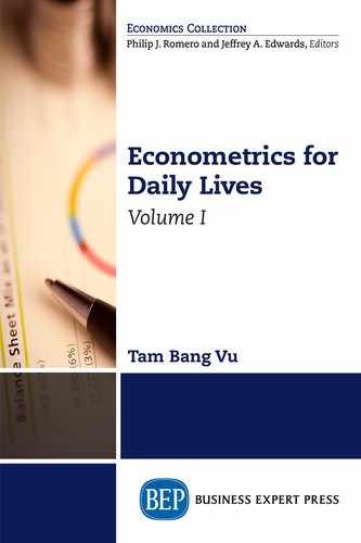
Econometrics is a branch of economics that uses statistical methods and mathematics to estimate any relationship in everyday life, test any hypothesis and theory, evaluate business strategies, and implement public policies. There is a big difference between a theoretical model and an econometric model. A theoretical model studies hypothetical relations between variables using a general function. For example, let the variable WAGE represent the average weekly wage of a person and the variable SPEND represent his or her spending on nondurable goods and services such as food, clothes, haircuts, and so on. Then we can write a theoretical model as
![]()
where a1 is a constant representing the average nondurable spending by a person with WAGE = 0, and a2 is the change in spending due to a unit change in personal wage.
An econometric model quantifies that relationship. In order for you to estimate the value of the parameters a’s and test for their significance, the model is written in a particular way as follows:
![]()
where a1 is the intercept and a2 is the slope of the regression line. The random error, e, accounts for a set of unobserved factors that might affect SPEND other than WAGE or any random component in the model. Figure 1.1 illustrates this relationship, with a1 as the intercept, a2 as the slope of the regression line, and e as the distance from an actual data point to the regression line.
The variable on the left-hand side is called the dependent variable (SPEND in this case), and the variable on the right-hand side is called the independent variable if we have only one variable on the right-hand side (WAGE in this case) or explanatory variables if we have more than one variable on the right-hand side.
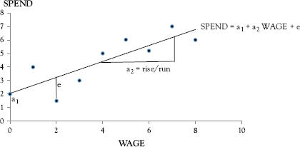
Figure 1.1 Relationship between wage and spending
There are usually three basic steps in econometric research:
Step 1: |
Selecting the Model Depending on the problem and the availability of the information, an appropriate model should be decided. In the preceding example, our model is specified in Equation (1.2). |
Step 2: |
Collecting and Analyzing Data Data can be collected directly by the user (primary data) or by someone other than the user (secondary data). Data analyses consist of constructing data plots, obtaining descriptive statistics, and performing certain techniques to quantify the relationship between a dependent variable and one or more explanatory variables. |
Step 3: |
Interpreting the Results Evaluations of the results are performed based on hypothesis testing and other measures. Based on the interpretations of the results, implications concerning economic theory and practical policies are drawn. |
Statistics Primer
Professor Metric emphasizes that statistics provides important tools for data analysis and you can spend your whole life studying it. However, some basic knowledge of statistics, discussed in the following section, is enough to understand econometric techniques in part one. More concepts will be introduced later.
Probability
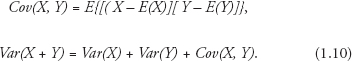
Probability is the likelihood of an event occurring and is measured by the ratio of the chosen case to the total number of possible cases. At this moment, Professor Metric offers the class a basket that contains 24 balls identical in size, except that twelve are rainbow colored, six are red, four are green, and two are blue. We learn that each group of balls is called a category.
Table 1.1 Frequency distributions of the balls
Category |
Absolute frequency |
Relative frequency |
Blue balls |
2 |
2/24 = 1/12 |
Green balls |
4 |
4/24 = 1/6 |
Rainbow balls |
12 |
12/24 = ½ |
Red balls |
6 |
6/24 = ¼ |
At this point, Taila the tailor says, “Oh… I love the rainbow ones.” So, Professor Metric tells her, “Let variable X1 equal getting a rainbow ball, then the possibility of getting a rainbow ball if you are allowed to pick just once is called the probability of X equals X1 and is written as
P(X1) =12/24 = 1/2.
This probability is also the relative frequency of the rainbow-ball category whereas the number of rainbow balls is the absolute frequency.”
Professor Metric continues that if we let Y1 be the probability of getting a green ball, then P(Y1) = 4/24 = 1/6, which is also the relative frequency of the green-ball category. We follow his instruction and put all frequencies into a frequency distribution table (Table 1.1).
The probability of getting a rainbow ball or a green ball in one pick is
P(X1 or Y1) = (1/2) + (1/6) = (3/6) + (1/6) = 4/6 = 2/3.
If one is allowed to pick twice with the rainbow ball returned to the basket after the first pick, then the probability of getting a rainbow ball twice is:
P(X1 and X1) = (1/2) × (1/2) = ¼.
Professor Metric tells us that sometimes, we encounter a joint distribution, such as the percentage of Native Hawaiian males who graduated from high school. He shows us Table 1.2, which lists the joint distribution of high school graduates in Honolulu in 2000 by race and gender.
The table shows that the percentage of male Native Hawaiian high school graduates is P(Y = 1, X = 1) = 0.11, whereas that of female Native Hawaiian high school graduates is P(Y = 1, X = 0) = 0.12. Further, percentage of male non-Hawaiian high school graduates is P(Y = 1, X = 0) = 0.38 and that of non-Hawaiian female graduates is P(Y = 0, X = 0) = 0.39.
Table 1.2 Joint distribution of high school graduates in Honolulu
|
Native Hawaiian |
Non-Native |
Total |
Male (X = 1) |
0.11 |
0.38 |
0.49 |
Female (X = 0) |
0.12 |
0.39 |
0.51 |
Total |
0.23 |
0.77 |
1.00 |
Professor Metric says that this concept will be very helpful in the later chapters when we learn to estimate effects of certain explanatory variables with different demographic characteristics; for example, wage differences between male workers who live in New York and female workers who live in South Carolina.
Descriptive Statistics
Statistics is divided into descriptive statistics and inferential statistics. Descriptive statistics organizes a dataset into useful forms such as summarizing tables, charts, graphs, and relevant measures of the underlying data. Inferential statistics generalizes the characteristics of a population, which is the whole body of a group, by examining its samples, which are subsets of that population.
Professor Metric says that the two aspects of descriptive statistics that are most important to econometric study are measures of central tendency and measures of dispersion.
Measures of Central Tendency
Central tendency is related mainly with the mean, the median, and the mode. The mean of a population X with N observations is called the expectation of the population, E(X), which is the weighted average of all Xs with the weight P(X =Xi), where i = 1, 2,…, N.
![]()
Statisticians usually assign a Greek letter to any parameter of a population, and E(X) is assigned the letter µX (read as “mu-x”). Professor Metric reminds us that for a given population, there is only one E(X ). In contrast, there are many samples. The average of a sample with N observations is notated as ![]() , and the formula for calculating this sample mean is:
, and the formula for calculating this sample mean is:
![]()
From Equation (1.4) we can determine that the sample mean depends on the sample size. The larger the sample size, the closer the sample mean to the population mean. This is called the Law of Large Numbers (LLN). Also, let a be a constant, then
![]()
Professor Metric reminds us that the median is the value of the middle observation, where 50 percent of observations in the underlying dataset have values smaller than the median and the remaining 50 percent have values greater than the median. For example, given a dataset 1, 3, 2, 5, 4, 6, 7, 3, 8, we can sort the data from the lowest value to the highest value as 1, 2, 3, 3, 4, 5, 6, 7, 8, so the median is number 4.
The mode is the value that occurs most frequently. In the aforementioned example, the mode is number 3.
Measures of Dispersion
Variance measures the variability of the data. The population variance of X is the weighted average of the squared deviations from the population mean, in which the positive and negative deviations receive equal weight. Hence, the variance is also said to measure the dispersion of a distribution, and the population variance is:
![]()
This variance is assigned the Greek notation ![]() (read as sigma-squared-x). Booka then asks, “Why do we have to square the deviations?” Invo offers an anecdote as a way of explanation, “My friend and I were playing basketball in his backyard. My first throw was roughly six inches to the left of the basket, and the second one was roughly six inches to the right. My friend applauded, ‘You got it, on average of course.’”
(read as sigma-squared-x). Booka then asks, “Why do we have to square the deviations?” Invo offers an anecdote as a way of explanation, “My friend and I were playing basketball in his backyard. My first throw was roughly six inches to the left of the basket, and the second one was roughly six inches to the right. My friend applauded, ‘You got it, on average of course.’”
We all laugh. Professor Metric says, “Exactly, if you do not square the deviations, then their average is zero because some values are negative and some are positive, so there is no dispersion.” He then says that the sample variance of a particular sample with N observations can be written as
![]()
Touro the tour guide points out that he often sees the sample variance expressed as
![]()
Professor Metric says that Touro’s remark is true because the preceding formula turns out to be a biased estimator of the population variance, so in practice, many econometricians use the second formula to calculate the sample variance. He also says that given a constant c,
![]()
The formula for the covariance of two populations is easy to understand because all we have to do is to enter Y in place of another X in Equation (1.6). And thus, the covariance of X and Y measures the linear association between them.
However, if X and Y are independent or not correlated linearly, then
![]()
Since the formula for variance requires that we square the deviations from the mean, the squared deviations become very large and hardly measure the true dispersion. Hence, the square root of the population variance, called the population standard deviation, σx, and its sample counterpart, called sample standard deviation, sx, is usually used in descriptive statistics.
Professor Metric says that descriptive statistics are useful, because a researcher can have an understanding of the underlying data before making any inference about the population by employing inferential statistics, the basic concepts of which we are about to learn.
Inferential Statistics
Inferential statistics aims at drawing conclusions on the characteristics of a population through repeated sampling. Drawing the first random sample from a population will yield some information about the population. Drawing another random sample from the same population yields somewhat different results. Each sample has a mean value, as shown in Equation (1.4). If we draw many samples from a population, then the average of those sample means is the expectation of the sample mean.
![]()
where E (![]() ) is an unbiased estimator of E(X) when we draw an infinite amount of random samples.
) is an unbiased estimator of E(X) when we draw an infinite amount of random samples.
Booka suddenly says, “I forget what the difference between an estimator and an estimate is?” Invo offers an explanation, “An estimator is any rule or formula related to the data and is used to estimate the population parameters, whereas an estimate is a particular value once we follow the rule or substitute the estimated parameter into the formula.”
Professor Metric praises Invo for his correct answer and continues, “The unbiasedness property of the sample mean is written as:
![]()
While the sample average in one sample might be greater than the population expectation, that in another sample will be less than the population expectation. An unbiased estimator implies that in repeated sampling, they will average out to zero.” We also learn that this unbiasedness, which comes from repeated sampling, is completely different from the LLN mentioned in the section on descriptive statistics. The LLN implies that the sample mean approaches the population mean when the sample size approaches the population size. The unbiasedness of the sample mean holds for any sample size as long as we draw infinitely many random samples from the population.
The repeated sampling process yields various values of ![]() and so has its own dispersion called the sampling variance.
and so has its own dispersion called the sampling variance.
![]()
Because random sampling guarantees that the observations in a sample are statistically independent of each other, we can apply the property in Equation (1.11), where the variance of a sum equals the sum of their variance. In addition, since each Xi is from the same population, we can make the assumption that each draw has the same variance ![]() . Hence, a combination of Equations (1.9), (1.11), and (1.14) and this assumption yields:
. Hence, a combination of Equations (1.9), (1.11), and (1.14) and this assumption yields:
![]()
The standard deviation of the sample mean is called the standard error (se):
![]()
Since σx is unknown, the estimated standard error is:
![]()
where sx comes from the square root of the sample variance in Equation (1.8). In practice, most researchers drop the word “estimated” and simply call the expression in Equation (1.17) the “standard error.” Regardless of this terminology, we all understand that it is an estimated value.
Professor Metric concludes the theoretical section with a summary of the important concepts and reminds the class to read the next section, which will be taught by Professor Empirie.
Data Analyses
Professor Empirie starts with basic data manipulations in Excel.
Working with Data
First, we need to install a tool to perform data analysis.
Add-In Tools
For Microsoft Office (MO) 1997 to 2003:
Click Data Tools on the Tool Bar, then choose Add-Ins from the drop-down menu.
Choose Analysis ToolPak from the new drop-down menu, then click OK.
When you want to use this tool, click Data Tools and then Analysis ToolPak.
For MO 2007 or 2010:
Click the Office logo in MO 2007 or the File tab in MO 2010.
Click Options in the menu.
Choose Add-Ins at the bottom of the left column in Excel Options.
The Add-Ins window will appear; click on Go at the bottom center.
Check the Analysis ToolPak box in the new dialog box and then click OK.
When you want to use this tool, click Data and then Data Analysis on the Ribbon.
A column chart is often used for qualitative data because it displays categories on the horizontal axis and the absolute frequency or relative frequency on the vertical axis. On the contrary, a histogram is good for quantitative data because it displays classes on the horizontal axis (e.g., price ranges) and the frequency (or relative frequency) on the vertical axis (e.g., numbers of goods sold for each price range). Professor Empirie tells us to go to file Ch01.Fig.1.2 in the folder Data Analyses.
We learn to draw a column chart (Figure 1.2) for the absolute frequency distribution of the balls in Professor Metric’s example on probability distribution by following these commands:
Select any chart type you wish to use; for example, clicking on the first choice gives you the chart in Figure 1.2.
Professor Empirie says that drawing the relative frequency distribution yields similar shapes as those in Figure 1.2 and that we can see more chart drawings in Vu (2015).
Booka offers the dataset on music books from her store so that we can learn to draw the histogram that she tried earlier in the class. Because the dataset is too long to display, we all go to the data in the file Ch01.Fig.1.3 and proceed to draw this histogram using the following commands:
Figure 1.2 Column chart for the absolute frequency distribution
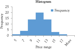
Figure 1.3 Histogram based on book demand
Go to Data on the ribbon and click Data Analysis.
A dialog box appears.
Choose Histogram and click OK.
Type B1:B58 into the Input Range.
Type A1:A8 into the Bin Range.
Check the box Labels.
Click the button Output Range and type D1 in the box.
Check the box Chart Output and then click OK.
To reduce or eliminate the spaces between columns, right-click on a column.
Choose Format Data Series in the drop-down menu.
A dialog box appears.
Move the indicator on the No Gap line to the left as much as you wish, then click Close.
The histogram is displayed in Figure 1.3.
Invo recalls Booka’s comment at the beginning of the class and points out that it is true: The distribution of book sales is very close to a normal distribution.
Professor Empirie says that the frequency table in the data file looks narrow and long. It will look better if we transpose the table to a horizontal arrangement. We will perform the following steps:
Copy cells D1 through F9 and then right-click cell D16.
Under Paste Options choose Paste Special.
Choose Transpose and click OK.
The frequency distribution in horizontal style is shown in Table 1.3.
We all turn to Booka and ask, “So how about interpreting the results?” Booka says that the first four classes are of music books in paperback. The very first class has books that cost at least $5.00 (represented by number 5 in the first cell) and contain only music scores in black and white. The second class contains the books costing from $5.01 to $7.00 (represented by number 7 in the second cell) and each book comes with a black-and-white portrait of the composer. The third one includes books priced between $7.01 and $9.00; books in this class come with color portraits. The fourth one consists of the books costing from $9.01 to $11.00 and brief biographies of the composers. The last three classes represent the hardcover counterparts of the first three. Based on the information in Figure 1.3 and Table 1.3, Booka can now fill up her inventory by placing an order from a supply chain according to her customers’ demand.
Importing Data
Professor Empirie says that we can create a dataset by sending out survey forms and entering the results into an Excel spreadsheet. This is called a primary dataset. If we use data collected by other people, then we have secondary data, which sometimes comes in a text-delimited format with observations separated by spaces or commas. The file Ch01_text in the folder Data Analysis is in this format. To import the data to Excel, we need to follow these steps:
Open a blank Excel file and click on File at the top-left corner of the ribbon.
Table 1.3 Frequency distribution of book demand
Price range |
5 |
7 |
9 |
11 |
13 |
15 |
17 |
More |
Frequency |
1 |
4 |
14 |
20 |
14 |
3 |
1 |
0 |
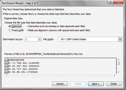
Figure 1.4 First text wizard dialog box
Click Open and then double-click the folder Data Analysis.
In the Open window look for the bottom-right box labeled All Excel Files.
Use the arrow to change the selection from All Excel Files to All Files.
Double-click the file Ch01_text.
The first Text Wizard dialog box appears as in Figure 1.4.
In this dialog box, check the button Delimited if it has not been checked and then click Next.
The second Text Wizard dialog box appears as in Figure 1.5.
Check the box Tab because the observations are separated by spaces in this case (if observations are separated by commas, then check the box Comma).
Most of the time, this is all we need to import the data, so click Finish.
The data are now in Excel format, ready for you to perform data analysis.
To save this dataset, click the arrow in the box Save as type.
Choose either Excel Workbook or Excel 97–2003 Workbook and click Save.
You can save with any name you wish to.
In this textbook, the file is saved in the folder Data for Exercise as Demand_US.
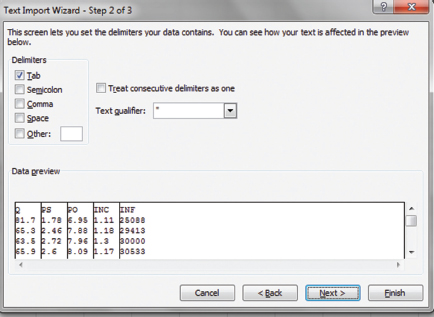
Figure 1.5 Second text wizard dialog box
Once we have the data in Excel, we can change any cell format by first right-clicking the cell and then clicking Format Cells, which opens the Format Cells dialog box where we will find many tools for changing the cells, or we can refer to Vu (2015) for more instructions.
Deleting Every X Rows
Touro asks,
I have monthly sales data for my Touristo company. My boss wants me to compare it with data from other companies. However, they only have data for January, April, July, and October. Can you teach us how to delete every two months from my data without Excel programing?.
Invo says that he knows how to do it and tells Touro to show us the data in the file Ch01. Fig.1.6. Invo then tells us to perform the following steps:
Type D into cell C1 (for “delete”).
Type A into cell C2.
Highlight cells C2, C3, and C4.
Point at the bottom-right corner of cell C3 to get the Fill Handle, which is a black plus sign (+).
Hold down your left mouse clicker and drag this Fill Handle to the end of the dataset.
Copy data in columns A, B, and C, then paste it into columns E, F, and G so that you can keep the original data.
Highlight columns E, F, and G.
Go to Data on the ribbon, then click Sort.
A dialog box appears.
In the Sort by box, choose D and click OK.
Now you will see all As from cells G2 through G13.
Cells E2 through F13 in the data file show data for January, April, July, and October.
Tourp tells us to delete the irrelevant data and transpose cells E2 through F13 into the horizontal format if we wish to display the results as shown in Figure 1.6.
Professor Empirie says that for deleting columns, use the Paste Special tools discussed in the previous section to transpose the columns to rows so that you can sort the data in rows. Once the unwanted data are deleted, transpose the data back to columns.
Calculating in Excel
The following commands are needed to obtain calculation results in Excel.
For adding variable X in cell A2 to variable Y in cell B2: Type =A2+B2 into any empty cell, then press Enter.
For multiplying (or dividing) X in cell A2 by Y in cell B2: Type =A2*B2 in an empty cell (or A2/B2), then press Enter.
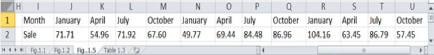
Figure 1.6 Deleting unwanted data
For obtaining Xb in cell A2: Type =A2^(b) in an empty cell, then press Enter.
For the logarithm in cell A2: Type =ln(A2) in an empty cell, then press Enter.
For the sum X = (X1 + X2 + X3) with X1, X2, and X3 in cells A1, A2, A3, respectively:
Type =SUM(A1:A3) in an empty cell, then press Enter.
For the average (or standard deviation) of the same X: Replace the word SUM in the preceding formula with AVERAGE (or STDEV).
Taila asks,
I have data on expenditure on inputs for 200 weeks from my Tailorie shop. I wish to organize this data into five-week intervals so that I can know how much of each input to order from a supply chain every five weeks. Can you teach us how to calculate the above three statistics for equal intervals of five weeks?
Professor Empirie says yes and asks Taila to show us the data for the first 10 weeks for demonstration purpose. Taila tells us to open the file Ch01.xls.Table 1.4. We see that she lists three types of inputs for her shop—namely, buttons, zippers, and threads. We need to perform the following steps:
First, copy data in cells B1 through D1 and paste into cells F1 through H1.
(This gives us the labels of the three variables.)
In cell F2 type =SUM(B2:B6), then press Enter.
Copy the formula in cell F2 and paste into cells G2 and H2.
Highlight the block of cells F2 through H6.
Copy this block of cells F2 through H6 and paste into cells F7 through H11.
For the averages (or standard deviations), replace the word SUM in the preceding formula with AVERAGE (or STDEV) and change the cells accordingly.
Table 1.4 Basic descriptive statistics of input demand for Tailorie
Statistics |
Sum |
Mean |
Standard deviation |
|||
Week |
1 to 5 |
6 to 10 |
11 to 15 |
1 to 5 |
6 to 10 |
11 to 15 |
Button |
8.12 |
6.58 |
1.62 |
1.32 |
0.30 |
0.09 |
Zipper |
39.12 |
42.41 |
7.82 |
8.48 |
0.51 |
0.32 |
Thread |
5.71 |
6.36 |
1.14 |
1.27 |
0.13 |
0.17 |
Professor Empirie says that this trick will save a lot of time if you have hundreds of data points as Taila does. Once we finish calculating all three statistics, we need to eliminate the formulas using the Paste Special tools and click Values. We can also use the commands for deleting every X rows to eliminate the blank cells and the Paste Special tools to transpose the data. The final results are shown in Table 1.4.
To conclude the chapter, Professor Empirie says that we can also use the mathematical functions to obtain the sum, average, standard deviation, and so on by clicking on the letter fX, which is located below and to the left of the word “Alignment” on the ribbon. For example, click fX and choose SUM and then click OK. A dialog box appears. Type in B2:B6, then click OK. This yields the sum of the values in cells B2 through B6.
Exercises
1. Let X be a discrete random variable with the values X = 0, 3, 2 and the probabilities
P(X = 0) = 0.30,
P(X = 3) = 0.40,
P(X = 2) = 0.30,
(a) Calculate E(X)
(b) Find Var(X)
(c) Given a new function
g(X) = 4X + 3,
find the expectation and variance of this function.
2. Data on demand for travels are provided by Touro in the file Travels in the folder Data for Exercise. Draw a histogram using Excel and put the data into a table similar to Table 1.2 in this chapter.
3. Data on sale values provided by Invo are in the file Portfolios.xls in the folder Data for Exercise. Calculate the sum, mean, and standard deviation of the series using Excel mathematic operations.