
Chapter 4. Site Structure

Project 100 had a simple goal: to see one hundred progressive women serving in Congress by 2020. To get there, its founders built a website (project100.org) to showcase the positions and values of every progressive woman running for office.
And with a record number of women running for office in 2018, Project 100 had no shortage of content challenges. Condensing nuanced platform details for each candidate to just a few bullet points was difficult enough—but they still needed to be arranged on the site in a clear, balanced way.
Project 100 cofounder Eduardo Ortiz started first with an algorithm to elevate “trending” candidates, enabling those with strong name recognition to appear at the top of the page. However, Ortiz said, “we wanted people to understand that there are more qualified candidates than the ones who make it to the mainstream or get reported by the media.” To keep lesser-known candidates from disappearing behind a curtain, he designed without pagination:
If we were to paginate the candidates, those who have fewer resources would be displayed on later pages, continuing that disparity…Paginating would have been an arbitrary decision for organizing the candidates. Not paginating was an idealistic approach to giving everyone a level playing field.
This simple but well-considered design decision ensured that all candidates could easily be brought to users’ attention. (Coincidentally, the 2018 elections met Project 100’s goal two years early. Maybe it was the information architecture, maybe it was the power of democracy.)
Pagination would have changed the way candidate information could be discovered and understood—as well as the structure of the site. The meaning and impact of the content tells us not only how to display it, categorize it, and label it, but also how to connect it into a functional, overarching system.
Auditing for Structure
Just as we need to understand our content before we can recategorize it, we need to understand the system before we try to rebuild it.
Enter the structural audit: a review of the site focused solely on its menus, links, flows, and hierarchies. I know you thought we were done with audits back in Chapter 2, but hear me out! Structural audits have an important and singular purpose: to help us build a new sitemap.
This isn’t about recreating the intended sitemap—no, this is about experiencing the site the way users experience it. This audit is meant to track and record the structure of the site as it really works.
Setting up the template
First, we’re gonna need another spreadsheet. (Look, it is not my fault that spreadsheets are the perfect system for recording audit data. I don’t make the rules.)
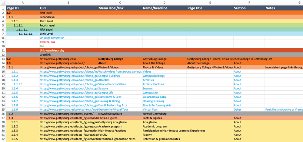
Because this involves building a spreadsheet from scratch, I keep a “template” at the top of my audit files—rows that I can copy and paste into each new audit (Fig 4.1). It’s a color-coded outline key that helps me track my page hierarchy and my place in the auditing process. When auditing thousands of pages, it’s easy to get dizzyingly lost, particularly when coming back into the sheet after a break; the key helps me stay oriented, no matter how deep the rabbit hole.

Color-coding
Color is the easiest, quickest way to convey page depth at a glance. The repetition of black text, white cells, and gray lines can have a numbing effect—too many rows of sameness, and your eyes glaze over. My coloring may result in a spreadsheet that looks like a twee box of macarons, but at least I know, instantly, where I am.
The exact colors don’t really matter, but I find that the familiar mental model of a rainbow helps with recognition—the cooler the row color, the deeper into the site I know I must be.
The nested rainbow of pages is great when you’re auditing neatly nested pages—but most websites color outside the lines (pun extremely intended) with their structure. I leave my orderly rainbow behind to capture duplicate pages, circular links, external navigation, and other inconsistencies like:
- On-page navigation. A bright text color denotes pages that are accessible via links within page content—not through the navigation. These pages are critical to site structure but are easily overlooked. Not every page needs to be displayed in the navigation menus, of course—news articles are a perfect example—but sometimes this indicates publishing errors.
- External links. These are navigation links that go to pages outside the domain. They might be social media pages, or even sites held by the same company—but if the domain isn’t the one I’m auditing, I don’t need to follow it. I do need to note its existence in my spreadsheet, so I color the text as the red flag that it is. (As a general rule, I steer clients away from placing external links in navigation, in order to maintain a consistent experience. If there’s a need to send users offsite, I’ll suggest using a contextual, on-page link.)
- Files. This mostly refers to PDFs, but can include Word files, slide decks, or anything else that requires downloading. As with external links, I want to capture anything that might disrupt the in-site browsing experience. (My audits usually filter out PDFs, but for organizations that overuse them, I’ll audit them separately to show how much “website” content is locked inside.)
- Unknown hierarchy. Every once in a while, there’s a page that doesn’t seem to belong anywhere—maybe it’s missing from the menu, while its URL suggests it belongs in one section and its navigation scheme suggests another. These pages need to be discussed with their owners to determine whether the content needs to be considered in the new site.
- Crosslinks. These are navigation links for pages that canonically live in a different section of the site—in other words, they’re duplicates. This often happens in footer navigation, which may repeat the main navigation or surface links to deeper-but-important pages (like a Contact page or a privacy policy). I don’t want to record the same information about the page twice, but I do need to know where the crosslink is, so I can track different paths to the content. I color these cells gray so they don’t draw my attention.
Note that coloring every row (and indenting, as you’ll see in a moment) can be a tedious process—unless you rely on Excel’s formatting brush. That tool applies all the right styles in just two quick clicks.
Outlines and page IDs
Color-coding is half of my template; the other half is the outline, which is how I keep track of the structure itself. (No big deal, just the entire point of the spreadsheet.)
Every page in the site gets assigned an ID. You are assigning this number; it doesn’t correspond to anything but your own perception of the navigation. This number does three things for you:
- It associates pages with their place in the site hierarchy. Decimals indicate levels, so the page ID can be decoded as the page’s place in the system.
- It gives each page a unique identifier, so you can easily refer to a particular page—saying “2.4.1” is much clearer than “you know that one page in the fourth product category?”
- You can keep using the ID in other contexts, like your sitemap. Then, later, when your team decides to wireframe pages 1.1.1 and 7.0, you’ll all be working from the same understanding.
Let me be completely honest: things might get goofy sometimes with the decimal outline. There will come a day when you’ll find yourself casually typing out “1.2.1.2.1.1.1,” and at that moment, a fellow auditor somewhere in the universe will ring a tiny gong for you.
In addition to the IDs, I indent each level, which reinforces both the numbers and the colors. Each level down—each digit in the ID, each change in color—gets one indentation.
I identify top-level pages with a single number: 1.0, 2.0, 3.0, etc. The next page level in the first section would be 1.1, 1.2, 1.3, and so on. I mark the homepage as 0.0, which is mildly controversial—the homepage is technically a level above—but, look: I’ve got a lot of numbers to write, and I don’t need those numbers to tell me they’re under the homepage, so this is my system. Feel free to use the numbering system that work best for you.
Criteria and columns
So we’ve got some secret codes for tracking hierarchy and depth, but what about other structural criteria? What are our spreadsheet columns (Fig 4.2)? In addition to a column for Page ID, here’s what I cover:
- URL. I don’t consistently fill out this column, because I already collected this data back in my automated audit. I include it every twenty entries or so (and on crosslinks or pages with unknown hierarchy) as another way of tracking progress, and as a direct link into the site itself.
- Menu label/link. I include this column only if I notice a lot of mismatches between links, labels, and page names. Perfect agreement isn’t required; but frequent, significant differences between the language that leads to a page and the language on the page itself may indicate inconsistencies in editorial approach or backend structures.
- Name/headline. Think of this as “what does the page owner call it?” It may be the H1, or an H2; it may match the link that brought you here, or the page title in the browser, or it may not.
- Page title. This is for the name of the page in the metadata. Again, I don’t use this in every audit—particularly if the site uses the same long, branded metadata title for every single page—but frequent mismatches can be useful to track.
- Section. While the template can indicate your level, it can’t tell you which area of the site you’re in—unless you write it down. (This may differ from the section data you applied to your automated audit, taken from the URL structure; here, you’re noting the section where the page appears.)
- Notes. Finally, I keep a column to note specific challenges, and to track patterns I’m seeing across multiple pages—things like “Different template, missing subnav” or “Only visible from previous page.” My only caution here is that if you’re planning to share this audit with another person, make sure your notes are—ahem—professional. Unless you enjoy anxiously combing through hundreds of entries to revise comments like “Wow haha nope” (not that I would know anything about that).
Depending on your project needs, there may be other columns, too. If, in addition to using this spreadsheet for your new sitemap, you want to use it in migration planning or template mapping, you may want columns for new URLs, or template types.
You can get your own copy of my template as a downloadable Excel file (http://bkaprt.com/eia/04-01/, XLSX). Feel free to tweak it to suit your style and needs; I know I always do. As long as your spreadsheet helps you understand the hierarchy and structure of your website, you’re good to go.
Gathering data
Setting up the template is one thing—actually filling it out is, admittedly, another. So how do we go from a shiny, new, naive spreadsheet to a complete, jaded, seen-some-stuff spreadsheet? I always liked Erin Kissane’s description of the process, from The Elements of Content Strategy:
Big inventories involve a lot of black coffee, a few late nights, and a playlist of questionable but cheering music prominently featuring the soundtrack of object-collecting video game Katamari Damacy. It takes quite a while to exhaustively inventory a large site, but it’s the only way to really understand what you have to work with.
We’re not talking about the same kind of exhaustive inventory she was describing (though I am recommending Katamari music). But even our less intensive approach is going to require your butt in a seat, your eyes on a screen, and a certain amount of patience and focus. You’re about to walk, with your fingers, through most of a website.
Start on the homepage. (We know that not all users start there, but we’ve got to have some kind of order to this process or we’ll never get through it.) Explore the main navigation before moving on to secondary navigation structures. Move left to right, top to bottom (assuming that is your language direction) over each page, looking for the links. You want to record every page you can reasonably access on the site, noting navigational and structural considerations as you go.
My advice as you work:
- Use two monitors. I struggle immensely without two screens in this process, which involves constantly switching between spreadsheet and browser in rapid, tennis-match-like succession. If you don’t have access to multiple monitors, find whatever way is easiest for you to quickly flip between applications.
- Record what you see. I generally note all visible menu links at the same level, then exhaust one section at a time. Sometimes this means I have to adjust what I initially observed, or backtrack to pages I missed earlier. You might prefer to record all data across a level before going deeper, and that would work, too. Just be consistent to minimize missed links.
- Be alert to inconsistencies. On-page links, external links, and crosslinks can tell you a lot about the structure of the site, but they’re easy to overlook. Missed on-page links mean missed content; missed crosslinks mean duplicate work. (Note: the further you get into the site, the more you’ll start seeing crosslinks, given all the pages you’ve already recorded.)
- Stick to what’s structurally relevant. A single file that’s not part of a larger pattern of file use is not going to change your understanding of the structure. Neither is recording every single blog post, quarterly newsletter, or news story in the archive. For content that’s dynamic, repeatable, and plentiful, I use an x in the page ID to denote more of the same. For example, a news archive with a page ID of 2.8 might show just one entry beneath it as 2.8.x; I don’t need to record every page up to 2.8.791 to understand that there are 791 articles on the site (assuming I noted that fact in an earlier content review).
- Save. Save frequently. I cannot even begin to speak of the unfathomable heartbreak that is Microsoft Excel burning an unsaved audit to the ground.
Knowing which links to follow, which to record, and how best to untangle structural confusion—that improves with time and experience. Performing structural audits will not only teach you about your current site, but will help you develop fluency in systems thinking—a boon when it comes time to document the new site.
Building Sitemaps
The structural audit paints a picture of how the current system is put together, which should inform your new system. You don’t want to replicate it—you want to understand its weaknesses, so you don’t recreate them; and understand its strengths, so you don’t leave them behind. You’ve learned how the current pages work together experientially; now you can dream up more effective page relationships across the site.
Your sitemap is where you document the dreaming. It’s an artifact for communicating the hierarchy of pages in your site. It records your categories and labels, and maps out how content on the new site will be organized within them. It is your system’s north star.
The value of sitemaps
First, let’s consider the direct relationships to be documented: parent-child relationships between pages at different levels in the hierarchy, and sibling relationships between pages at the same level in the hierarchy (Fig 4.3).
“But,” you might be saying, “my web pages have much more complicated connections, well beyond parent-child and sibling relationships!” Well—good! I would hope your site provides plenty of fluid paths for users to find the content they need as quickly as possible. But sitemaps are not meant to capture every possible path; indirect relationships between pages, and creative ways of surfacing content, won’t necessarily appear here.
Even if you’re not thinking in a strictly page-like way about your designs—I know, I know, we’ve broken the boundaries of the page, and we’re supposed to be designing experiences, not boxes—there are still plenty of benefits to articulating the structure of your site through a sitemap:
- Shared vocabulary. Sitemaps are an opportunity to rally around common terminology. When you have to speak in the abstract about pages that don’t even exist yet, and you have to do that with designers and developers and copywriters and marketers and project managers and stakeholders, you’ll be glad to have a document that codifies page titles or ID numbers (as in the structural audit).
- Complete inventory. Similarly, you need a place to keep a complete list of the stuff—the pages in the new site, or, if you’re living the post-page dream, the collections of screens or other content displays. (I’m gonna call this “pages” for short, fight me.) Eventually you’ll need to know, say, which pages will appear in a local navigation menu so you can design said menu. A complete inventory for the site will come in handy more than once during design and development.
- Mapped hierarchy. Even if all a sitemap can capture is parent-child and sibling relationships, that’s quite a lot—and if you’re not capturing that data here, where else would you do it? Understanding the hierarchy of pages means you have a baseline for the potential paths users could take through the system—a starting point for mapping user journeys or customer touchpoints.
Admittedly, I’m subtweeting a bit to all the times I’ve heard someone say, “But do we really need a sitemap?” But the way a site is put together is a design choice, and documentation helps us conceptualize and communicate our choices.
The sitemap is an artifact—it needs to be articulated textually or visually (or both), not only to record your structural decisions, but to share the context for your work with colleagues and stakeholders.

Documentation styles
The best documentation is the one that works for you, so consider how the sitemap can assist with the next steps in your project. Will it be used to garner stakeholder approval? To demonstrate progress in the project plan? To prepare for a CMS migration? To identify pages for wireframing?
All of those are valid uses for a sitemap (and your sitemap may meet multiple needs at once). But different styles of documentation have different levels of detail, and so are suited for different purposes.
Box-and-arrow diagrams
When people (especially stakeholders) hear “sitemap,” they often think of a visual diagram: a series of boxes arranged in a tree-like structure, connected by lines denoting hierarchy (Fig 4.4).
This visual approach is excellent for presenting high-level structure, particularly to stakeholders who don’t want to get caught up in details. On the flip side, because these diagrams don’t have much room for detail, they tend to work best for smaller sites, or overviews of larger sites.
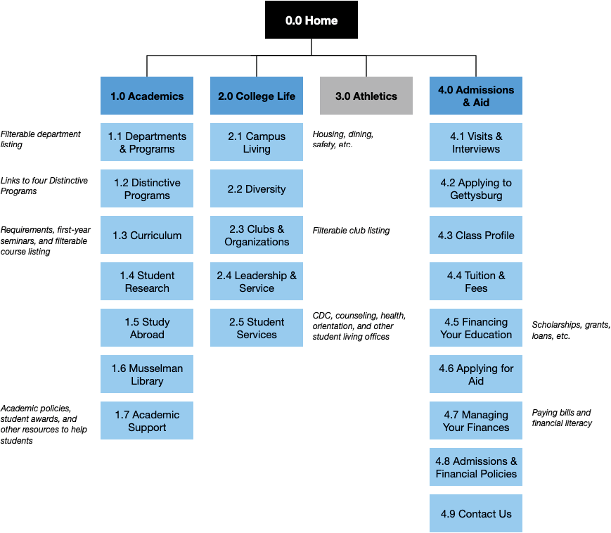
My sitemap diagrams span multiple pages: first, a page that shows all navigation structures, one level deep (Fig 4.4), then subsequent pages that show the details within each navigation structure (Fig 4.5). (If I find that this isn’t enough to convey the structure, that’s an indication that I should try a text-based sitemap format instead.)
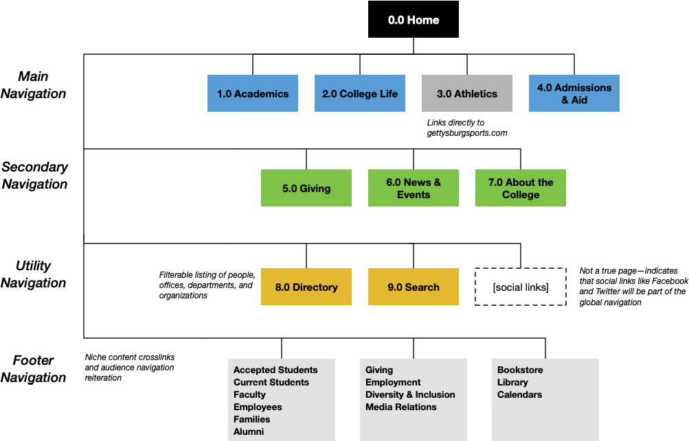
Visually, sitemap diagrams are entirely up to you. Some people prefer horizontal arrangements to vertical ones; some avoid color. Colors, connectors, borders, shading—it’s your call. Just make sure whatever signifiers you apply to your diagram contribute meaningful information. This is particularly important when sharing the sitemap with others; consider including a legend if your system isn’t readily apparent to those who need to approve or act on it.
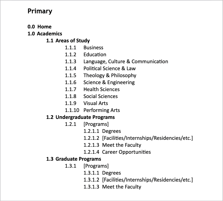
Outlines
For a more textual approach, try an outline—yep, just a plain ol’ outline, in a plain ol’ document (Fig 4.6). Outlines are the epitome of hierarchical documentation—that’s literally why they exist—so you can see how that format works nicely for recording a hierarchy of pages.
Outlines are a good choice for completionist scenarios. If you need to show every page at every level, across multiple nested levels, an outline is a much more effective record than a box-and-arrow diagram.
On the other hand, outlines can become quite long, text-heavy, and wavy with indentations and decimals. Stakeholders who were expecting an easy-on-the-eyes diagram may not interpret this as a “sitemap”—so, once again, consider the needs of your project at this stage.
Spreadsheets
If you need to record more than just page hierarchy, you’ll need to turn to our friend the spreadsheet (again: not my fault). Much like our structural audit, a sitemap spreadsheet creates room for a wealth of data—such as identifying each page’s source content, new URL strategies, content revision status, page ownership, deadlines associated with migration, and more (Fig 4.7).

If you conducted a structural audit, you’re ahead of the game here: you can use that spreadsheet as a springboard for the new sitemap. (Save a copy!) It’s an excellent way to track the progression of content from the old site to the new.
It’s also ideal for collaborating on wireframing, templating, migration, and other development efforts, which may need more metadata than a diagram or outline can provide.
Filling in the details
Depending on the format you use for your sitemap documentation, you’ll need to include different kinds of data and different levels of granularity. But, generally speaking, these are my recommendations for building a well-documented sitemap:
- Use consistent page identification. If you created page IDs in a structural audit, keep that system going—the numbers likely won’t match perfectly because of changes in content, but the consistency can keep project teammates oriented. If you didn’t use page IDs before, start now.
- Differentiate between single pages and collections. For site sections that continuously generate new content of the same content type—like events, blog posts, and articles—indicate that plurality as succinctly as possible. In a visual sitemap, I might overlap several boxes to suggest multiple pages; in a text-based sitemap, I might write the page type in brackets, rather than an individual title (e.g. “[News articles]”).
- Don’t forget outliers. It’s tempting to think you only need to document new content, or significant pages, or just the main navigation—but that wouldn’t be a complete picture of the structure. Refer back to the notes you took during the structural audit, and make sure your sitemap reflects all the necessary navigation structures, components, and pages that will truly make up the site.
- Aim for editorial accuracy. When possible, try to use the spellings, punctuation, capitalization, character lengths, and other style considerations preferred by the content owners (especially if there are branded terms or stakeholder concerns about language). Check in with writers or marketers who might know about editorial guidelines; even small mistakes in labels can ruffle feathers and lead to slowdowns in approval.
- Add context. If you’re hoping your sitemap will garner buy-in from stakeholders, you might need to provide rationale that isn’t part of the sitemap itself—perhaps through a report, a slide deck, or document annotations. You might need to explain what content each page will contain, where different links might appear, which content areas have been added or removed, or any other changes that aren’t self-evident or might take stakeholders by surprise.
If you’ve made it this far, then congratulations: you’ve got a sitemap (plus my respect and admiration)!
But—no matter how rigorous your decision-making, how justified your choices, how solid your data—you’re probably about to make some changes.
Making Adjustments
Maybe you’ve received feedback from stakeholders. Maybe you’ve been told about unexpected content changes that undermine your category labels (oops). Maybe you’ve done some testing (see the Resources section), and users seem confused by your language. Or maybe you’re still iterating, and the sitemap just hasn’t gelled yet.
Whatever your situation, there comes a point (er, probably multiple points) where you’ll have to revise your site structure. Revisions are usually motivated by one of two things: purity (i.e. the structure doesn’t feel balanced, clear, consistent, etc.) or politics (i.e. a stakeholder’s favorite page is buried, a label doesn’t sound important enough, etc.).
When adjusting the sitemap (whether to please your stakeholders or yourself), you have a few levers to manipulate:
- Change the labels. Labels, as we’ve seen, limit your criteria and the content that matches. Review your earlier language decisions and the inputs that led to them. Sometimes, a simple tweak to the wording is all that’s needed; other times, labels need to be entirely rewritten, altering the collection of pages within them.
- Change the categories. Same idea from a different angle: reexamine the distribution of content. Try out alternative ways of grouping the content, and see how they open up new ways of thinking, different expressions of the strategy, or reworded labels.
- Change the content. In some cases (especially if your content analysis was on the lighter side), the content itself may be leading you astray. You might need to turn long pages into multiple shorter ones, or add information to an underdeveloped section, or even delete or add content. Be careful, though—don’t change the content just to make the sitemap fit an ideal. Just be willing to consider how potential changes to the copy might benefit the structure (and, ahem, the user).
- Rethink your approach. As a last resort, you might want to start from scratch—not to throw away all your hard work, but to eliminate any baggage that’s accumulated through the process (cough internal politics cough) and find a new perspective on the structure. Sometimes we make assumptions early in the process that don’t necessarily serve us in the end.
I wish I could give you a formula to follow—some tried-and-true equation where x + y = a scientifically correct sitemap, one so airtight that all content is perfectly exposed and no stakeholder can question the category labels.
But this practice is closer to art than science. We blend a little bit of instinct, a little bit of nerves, and as much data as we can gather to make decisions. No site launches with a perfect sitemap; no sitemap is free from politics and biases and rushed timelines.
The sitemap is the heart and soul of your site structure. But it’s also just one artifact—and a limited one, at that. To ensure a usable structure, we must also illuminate the paths through our content, and help users stay oriented on their journey, wherever it may take them.