When released, Internet Explorer 8 will support many new values for the CSS display property, including the
table-related values: table,
table-row, and table-cell—and it’s the
last major browser to come on board with this support. This event will mark
the end of complex CSS layout techniques, and will be the final nail in the
coffin of using HTML tables for layout. Finally, producing table-like grid layouts using CSS will be quick and easy.
Applying table-related display property values to
web page elements causes the elements to mimic the display characteristics
of their HTML table equivalents. In this chapter, I’ll demonstrate how this
will have a huge impact on the way we use CSS for web page layouts. However, before we can understand why CSS tables will be so
useful to us, we need to have a quick look at current popular CSS layout
methods and the problems we have with them.
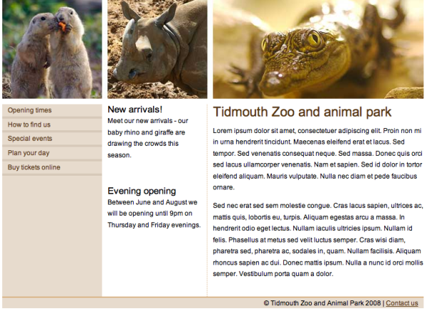
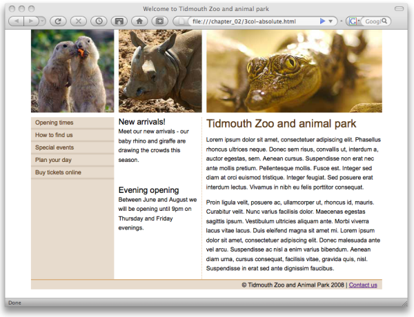
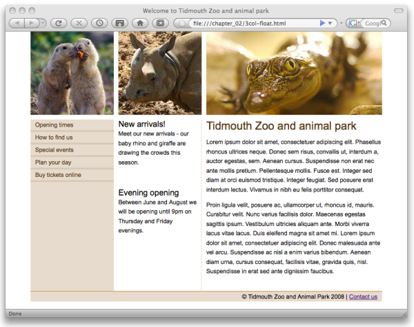
As mentioned in Chapter 1, in order to coerce what effectively consists of a vertical stack of block elements into a grid-like layout, CSS authors have used absolute positioning or floating to force blocks to sit alongside each other. These techniques, while thoroughly tested in all modern browsers, are complex and not without problems. So let’s have a quick review of how to build a simple three-column layout—such as the one shown in Figure 2.1—using current techniques.
Here’s an excerpt of the XHTML markup we’ll be using to create this web page for the Tidmouth Zoo and Animal Park, showing the major structural elements:
<!DOCTYPE html PUBLIC "-//W3C//DTD XHTML 1.0 Strict//EN"
  "http://www.w3.org/TR/xhtml1/DTD/xhtml1-strict.dtd">
<html xmlns="http://www.w3.org/1999/xhtml" lang="en-US">
  <head>
    … HTML head content…
  </head>
  <body>
    <div id="wrapper">
      <div id="header">
        … top graphic banner…
      </div>
      <div id="main">
        <div id="content">
          … main article content…
        </div>
        <div id="nav">
          … navigation column content…
        </div>
        <div id="extras">
          … news headlines column content…
        </div>
      </div>
      <div id="footer">
        … page footer content…
      </div>
    </div>
  </body>
</html>
You’ll be able to view the complete code and all supporting files for the page by downloading the code archive for this book from the SitePoint web site.
The first technique is to use absolute positioning. This is one of the more common layout techniques used today, and probably the easiest to implement. This layout works by making space for the two narrower columns, giving the main content area a large left margin, then positioning the two columns on top of the margin. We’ll focus on the CSS required for the layout of the major structural elements, but the complete CSS is available in the code archive.
We begin by setting a width for the wrapper div element, setting a
height and background width for
the header div, and defining the appearance of the
footer div:
#wrapper {
  position: relative;
  text-align: left;
  width: 760px;
  margin-right: auto;
  margin-left: auto;
}
#header {
  height: 180px;
  background-image: url(images/header.jpg);
  background-repeat: no-repeat;
  padding-bottom: 10px;
}
#footer {
  border-top: 2px solid #d7ad7b;
  background-color: #e7dbcd;
  font-size: 80%;
  padding: 0.2em 10px 0.2em 0;
  text-align: right;
}
The main div is the parent element for our main content
area and the two narrow columns. First, we’ll relatively position the
main div and then give the content div a left margin wide enough to fit the two
other columns:
If we check out the layout in a browser, we’ll see Figure 2.2—the content column is sitting
nicely over to the right-hand side, leaving a 380px
left margin, which is where we’ll place the other two columns.
The final step is to absolutely position the two remaining columns
within the space provided by the content div’s left margin:
#nav {
  position: absolute;
  top: 0;
  left: 0;
  width: 180px;
  background-color: #e7dbcd;
}
#extras {
  position: absolute;
  top: 0;
  left: 190px;
  width: 180px;
}
An absolutely positioned element is positioned relative to its
closest positioned ancestor. In our case, the main div
has been relatively positioned, so our two columns are positioned
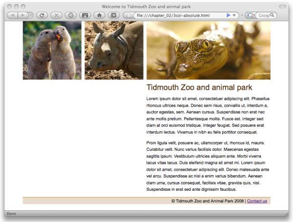
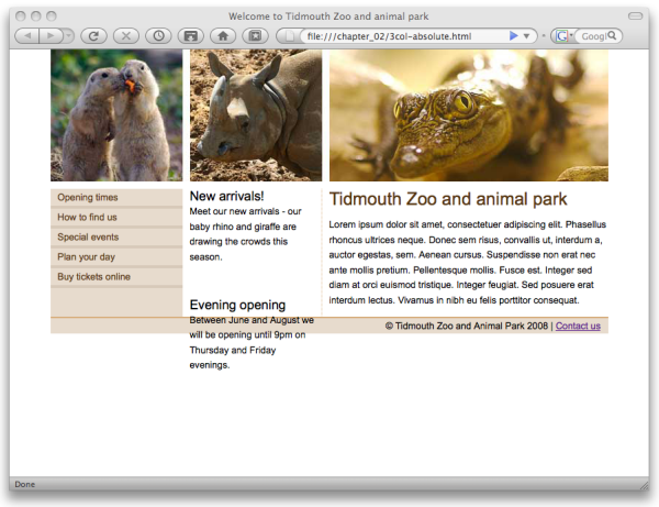
relative to its position in the page layout. Figure 2.3 shows how the absolutely
positioned three-column layout appears in Firefox.
As you can see in Figure 2.3, the background color of
the nav column only extends as far
as the content allows, whereas our original design calls for a
full-length column.
We can circumvent this issue by adding a background image to the container element of the columns. This technique is described as faux columns, popularized in a well-known Alistapart article by Dan Cederholm.
In the case of our web page, the main div
wraps all three columns, so we can add a background image to that
element and position the image to appear behind the nav column—giving the appearance of a
full-height column. The image also includes the dotted border that
appears along the right-hand edge of the extras column. We achieve this effect in
CSS by positioning the image shown in Figure 2.4 as a background image that repeats
vertically.
All we need to do is add a couple of extra declarations to our style sheet:
#main {
  position: relative;
  background-image: url(images/main-bg.gif);
  background-repeat: repeat-y;
}
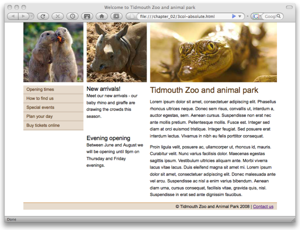
The result is the full-height column shown in Figure 2.5.
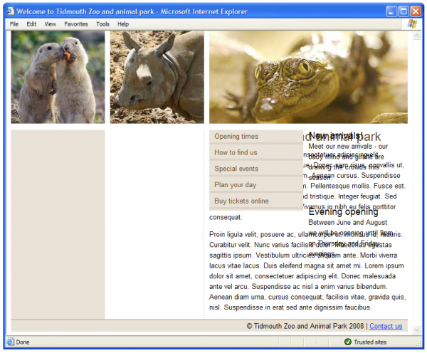
While all seems fine with the current layout, another problem
arises if the content in the content column ends up shorter than the
content of the nav column. As
demonstrated in Figure 2.6, the
footer will end up displaying across the content of all the columns
instead of at the bottom of the page.
The reason for this problem is that absolutely positioning an
element will remove it from the document flow. In our layout above,
we’ve removed the two left-hand columns from the document flow and
placed them on top of the other elements. The content and footer elements remain within the document
flow, and are positioned by the browser under the content div.
To combat this problem, you can add a top margin to the footer element, or bottom padding to the
content element, to ensure the
footer is an appropriate distance from the content. Neither of these
options are particularly desirable; ideally, we’d like our footer to
sit neatly under our content. However, beggars can’t be choosers; if
you can’t guarantee the amount of content in the main content column,
you may need to consider these approaches.
Finally, if you view this layout in Internet Explorer
6, you’ll notice a big problem. The nav and extras columns aren’t positioned correctly,
as you can see in Figure 2.7.
If we add the following width declaration
to our style sheet, IE6 will be able to display our layout
correctly:
#main {
  position: relative;
  width: 100%;
  background-image: url(images/main-bg.gif);
  background-repeat: repeat-y;
}
The above width declaration is in fact
redundant, as we’ve also specified widths for all the columns;
however, in this situation, it’s a safe way to correct the layout in
IE6 without affecting the layout in any other browser.
Note: A Note on Internet Explorer and hasLayout
In Internet Explorer 6 and 7, applying a width declaration
to an element causes the element to “gain a layout.” It’s far beyond
the scope of this book to explain what gaining a layout means and
why it’s important in Internet Explorer—to put it in a nutshell, it means the main div will look after the layout of its
child elements if it has a layout.
When an element has a layout, IE6 and 7’s magical
hasLayout property is set to
true. There are other ways to trigger this
property, including valid actions such as setting a
height or floating the element, as well as
those that involve adding IE-specific properties that don’t
validate, such as setting the zoom property to
1. If the concept of
hasLayout is new to you, you might like to have
a look at The SitePoint CSS
Reference—you’ll find IE6 and 7 bugs far easier to deal
with, once you understand the concept.
The alternative to absolute positioning is a floated layout; by
using the CSS float property, we can cause the
column div elements to float
alongside each other. We only need to make these few small changes to
our CSS to turn our absolutely positioned layout into a floated
layout:
#nav {
  float: left;
  margin-right: 10px;
  width: 180px;
  background-color: #e7dbcd;
}
#extras {
  float: left;
  width: 180px;
}
#content {
  float: right;
  width: 380px;
}
Using the CSS float property, we’ve specified
that the nav and extras columns will be floated to the
left-hand side, while the content
column will be floated to the right-hand side.
If we test the layout after making those changes, we discover the disaster pictured in Figure 2.8.
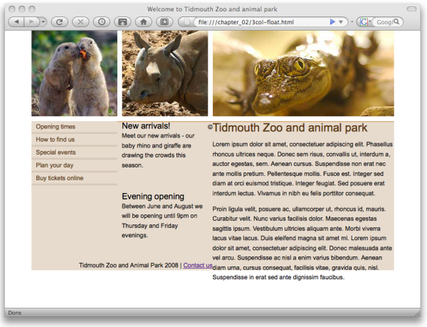
The biggest problem with floated layouts is the need to clear
the floated elements, to stop elements following a floated element
from wrapping around the floated element. As
our columns are now floated—removing them from the document flow—the
main div, having no other content, has no height
or width. Consequently, the background image is no longer visible and
the content of the footer is wrapping around the contents of the
columns as it is supposed to do, being a non-floated element. There’s
more detailed information about floating and clearing in the SitePoint CSS
Reference.
There are various methods of clearing, but one of the most
simple, reliable, and commonly used methods is to put a redundant
div element under the columns that
need to be cleared. First, we add an empty div element with a class value of clear just before the closing tag of the
main div:
Next we add a CSS rule for the clear class:
The value both clears all the columns,
whether floated left or right. Simply clearing the footer would solve
the footer problem but still leave our background missing. This method
enables us to add a footer and have it sit below whichever of the
three columns is the longest, as shown in Figure 2.9.
Adding bits of redundant markup isn’t too much of a problem when you simply need to clear the three main columns of a layout. However, when using this technique on lots of small areas of a layout, this extra markup does add up to create a page that’s larger, more complicated, and harder to maintain than what’s ideal.
For those interested in other options for clearing CSS floats without extra markup, a useful rundown of these techniques can be found on Robert Nyman’s blog. However, these other techniques can be complicated and have their limitations; this pragmatist has found that often the most robust method is the one outlined above—even if it does add a bit of “weight” to the page.
All this talk about clearing floats has also obscured the fact
that the background image is still required to achieve a full-height
column background, just as it was with the absolutely positioned
layout. Also, we still require our width
declaration for the main div element to make the layout work in
IE6.
As we’ve seen, the current methods of laying out pages do have their problems. Developers can negotiate many of the problems by combining the two outlined methods in one layout—perhaps by using a floated main layout, but employing positioning for internal elements. However, just to achieve the relatively simple and common layout of three columns with a footer does require a good understanding of CSS positioning and the issues involved.
It’s no wonder that there’s a very vocal contingent within the web design community who have maintained throughout the rise of CSS-based layout that sticking with HTML tables is the easiest way to lay out a web page—just for the luxury of being able to set a background image on a column and have it extend all of the way down the page!
What is needed is a CSS technique that provides the simplicity of grid layouts with HTML tables, without having to use table markup.
CSS tables solve all the layout issues we’ve explored here regarding
positioning and backgrounds in modern browsers. Specifying the value
table for the display property of
an element allows you to display the element and its descendants as though
they’re table elements. The main benefit of CSS table-based layouts is the
ability to easily define the boundaries of a cell so that we can add
backgrounds and so on to it—without the semantic problems of marking up
non-tabular content as a HTML table in the document.
Before we dive in and discover how this works, let’s create an instant demonstration. First, we make a few small changes to our markup:
<!DOCTYPE html PUBLIC "-//W3C//DTD XHTML 1.0 Strict//EN"
  "http://www.w3.org/TR/xhtml1/DTD/xhtml1-strict.dtd">
<html xmlns="http://www.w3.org/1999/xhtml" lang="en-US">
  <head>
    … HTML head content…
  </head>
  <body>
    <div id="wrapper">
      <div id="header"></div>
      <div id="main">
        <div id="nav">
          … navigation column content…
        </div>
        <div id="extras">
          … news headlines column content…
        </div>
        <div id="content">
          … main article content…
        </div>
      </div>
    </div>
  </body>
</html>
We’ve rearranged the HTML source so that the source order matches
the content display order. The nav
column comes first, followed by the extras column, and then the content column.
We also need to apply the following CSS modifications:
#main {
  display: table;
  border-collapse: collapse;
}
#nav {
  display: table-cell;
  width: 180px;
  background-color: #e7dbcd;
}
#extras {
  display: table-cell;
  width: 180px;
  padding-left: 10px;
  border-right: 1px dotted #d7ad7b;
}
#content {
  display: table-cell;
  width: 380px;
  padding-left: 10px;
}
The fresh CSS table-based layout that we’ve just created will display correctly in Internet Explorer 8 as well as in Firefox, Safari, and Opera; Figure 2.10 shows how it looks in IE8.
Our three-column equal-height layout is achieved without having to resort to tricks like faux columns using background images, worrying about positioning, or having to clear floats—revolutionary!
The display property allows you to specify a range of table-related values in
order to make elements display as though they were table elements. The
available display values are:
tabletable-row-
makes the element behave like a table row (
tr) element table-cell-
makes the element behave like a table cell (
td) element table-row-group-
makes the element behave like a table body row group (
tbody) element table-header-group-
makes the element behave like a table header row group (
thead) element table-footer-group-
makes the element behave like a table footer row group (
tfoot) element table-caption-
makes the element behave like a table
captionelement table-column-
makes the element behave like a table column (
col) element table-column-group-
makes the element behave like a table column group (
colgroup) element
Note: Hang on … Aren’t Tables for Layout Wrong?
Perhaps you’re feeling slightly uncomfortable about the example we’ve just seen—after all, haven’t web standards advocates like myself been insisting for years that you shouldn’t be using tables for layout?
The table element in HTML is a semantic structure: it describes what data is. Therefore, you should only use the table element if the data you are marking up is tabular—for example, a table of financial information. If it would normally be stored in a spreadsheet on your computer, it probably needs marking up as a table in HTML.
The table value of the display property, on the other hand, is
simply an indication of how something should look
in the browser—it has no semantic meaning. Using a table element for your layout tells a
user-agent, “This data is tabular.” Using a bunch of divs that have the
display property set to table
and table-cell says nothing to that user-agent
other than asking it to render them visually in a certain way, if it’s
capable of doing so.
Of course, we should also take care not to use display:
table; on a bunch of div
elements when what we really have is tabular
data!
Our simple example above makes our layout behave as if it were a single row table with three cells; it doesn’t take much imagination to realize the potential of this technique for creating complex grid layouts with ease.
CSS tables happily abide by the normal rules of table layout, which enables an extremely powerful feature of CSS table layouts: missing table elements are created anonymously by the browser. The CSS2.1 specification states:
Document languages other than HTML may not contain all the elements in the CSS 2.1 table model. In these cases, the “missing” elements must be assumed in order for the table model to work. Any table element will automatically generate necessary anonymous table objects around itself, consisting of at least three nested objects corresponding to a “table”/“inline-table” element, a “table-row” element, and a “table-cell” element.
What this means is that if we use display:
table-cell; without first containing the cell in a block set
to display: table-row;, the row will be implied—the
browser will act as though the declared row is actually there.
Let’s use a simple example to investigate this feature: the three-cell grid layout shown in Figure 2.11. We’ll look at three different HTML markup samples that will result in the same visual layout.
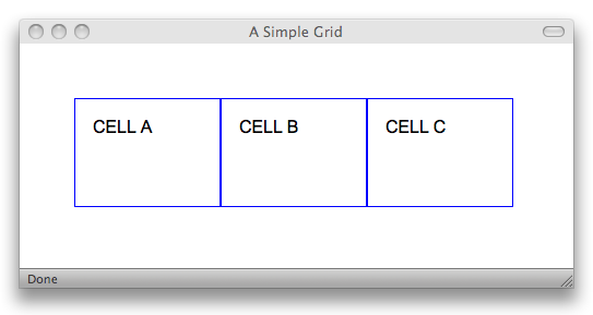
First, here’s a sample of markup that can be used to generate the three-cell layout:
<div class="container">
<div class="row">
<div class="cell">CELL A</div>
<div class="cell">CELL B</div>
<div class="cell">CELL C</div>
</div>
</div>
A set of nested div elements
may not seem so very exciting, but hang in there, we’re building to
something. The CSS is also very simple:
.container {
display:
        table;
}
.row {
display: table-row;
}
.cell {
display:
      table-cell;
width: 100px;
height: 100px;
border: 1px solid blue;
padding: 1em;
}
The CSS above sets the element with a class of container to display:
table, an element with a class of row to display: table-row,
and an element with a class of
cell to display:
table-cell, as well as giving it a border
and a height and width.
This HTML markup above explicitly creates elements for the table
and row surrounding the three cells, using all of
the CSS classes that we’ve created. However, we can reduce the markup,
removing the row div element like so:
<div class="container"> <div class="cell">CELL A</div> <div class="cell">CELL B</div> <div class="cell">CELL C</div> </div>
Even though the above markup is missing the element representing the table row, the row will be created by the browser as an anonymous box. We can reduce the markup even further:
<div class="cell">CELL A</div> <div class="cell">CELL B</div> <div class="cell">CELL C</div>
The above markup is missing the elements representing the table row and the table; these are both created as anonymous boxes by the browser. Even with the elements missing in markup, the end product, shown in Figure 2.11, is the same.
These anonymous boxes are not created by magic, and they won’t
automatically make up for any deficiencies in your HTML code. To be
able to take full advantage of anonymous table elements, you’d best
become familiar with the rules for their creation. If a layout calls
for an implied element, the browser will create an anonymous
box and set its CSS display property to one of
table, table-row, or
table-cell, depending on the context.
If you have an element that has been set to display:
table-cell; but its immediate parent (the containing
element) is not set to table-row, an anonymous box
set to table-row will be created to enclose the
cell and any subsequent adjacent sibling elements that are also set to
table-cell, until it encounters an element not set
to table-cell, so they’ll all end up in the same
row. This is the case with the following markup:
<div class="cell">CELL A</div> <div class="cell">CELL B</div> <div class="cell">CELL C</div> <div>Not a cell</div>
The three div elements above
that have a class of cell are set to display:
table-cell; and will appear side by side as though they’re
in a single row table; the last div
element won’t be included in the row, because it isn’t set to
display: table-cell;.
If an element is set to display: table-row;
while its parent element isn’t set to table (or
table-row-group), an anonymous box set to
display: table; will be created to enclose the row,
and any subsequent adjacent sibling elements will be set to
display: table-row. Also, if the element with
display set to table-row lacks
an element set to table-cell directly within it, an
anonymous box set to table-cell will be created to
enclose all the elements within the table-row
element. Consider the following markup:
<div class="row">ROW A</div> <div class="row">ROW B</div> <div>Not a row</div>
The two div elements above
with a class of row are set to display:
table-row; and will appear one under the other as though
they’re rows in the same single-column table. The last div element won’t be included in the implied
table.
Similarly, if an element is set to any of the other
display values that match elements which would
naturally exist directly inside a parent table element such
as table-row-group,
table-header-group,
table-footer-group,
table-column,
table-column-group, and
table-caption, but does not have a parent set to
display: table;, an anonymous box set to
table will be created to enclose the element and
any subsequent adjacent sibling elements with suitable
display values.
When using CSS tables, because the elements conform to the normal rules for table layout, you can also apply other table-related CSS properties. Here’s a few that can come in handy:
table-layout-
Setting the
table-layouttofixedtells the browser that the table should render with the fixed algorithm for formatting the cell widths. This is useful in a fixed-width layout, such as the one we created earlier.[2] border-collapse-
Just as with regular HTML tables, you can use the
border-collapseproperty to specify that your table layout elements use collapsed (with the valuecollapse) or separated (with the valueseparate) borders between the cell elements. border-spacing-
If you specify the value
separatefor theborder-collapseproperty, you can then use theborder-spacingproperty to specify the width of the space between the cell element borders.
Making a grid of equal height elements has always been a challenge using traditional CSS layout techniques, but it’s something to which CSS tables are well suited. For example, if we want to create an image gallery comprising a grid of images with captions, such as the one shown in Figure 2.12, using a CSS table renders the task simple.
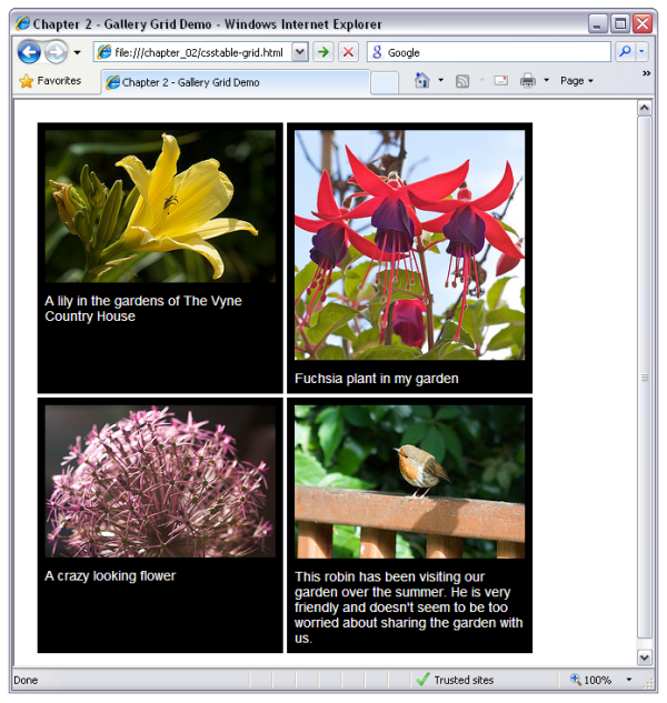
The markup for our gallery is as follows:
<div class="grid">
<div class="row">
<div class="image">
<img src="images/photo1.jpg" alt="A Lily" />
<p>A lily in the gardens of The Vyne Country House</p>
</div>
<div class="image">
<img src="images/photo3.jpg" alt="A Fuchsia plant" />
<p>Fuchsia plant in my garden</p>
</div>
</div>
<div class="row">
<div class="image">
<img src="images/photo2.jpg"
alt="A crazy looking Allium flower" />
<p>A crazy looking flower</p>
</div>
<div class="image">
<img src="images/photo4.jpg"
alt="A Robin sitting on a fence" />
<p>This robin has been visiting our garden over the summer.
He is very friendly and doesn't seem to be too worried
about sharing the garden with us.</p>
</div>
</div>
</div>
Each gallery image cell is comprised of an img element and a caption in a p element contained within a div element with a class of image. Each row is contained within a div element within a class of row, and the whole gallery is contained within
a div with a class of grid.
The CSS required to lay out our grid is simple:
.grid {
display: table;
border-spacing: 4px;
}
.row {
display: table-row;
}
.image {
display: table-cell;
width: 240px;
background-color: #000;
border: 8px solid #000;
vertical-align: top;
text-align: center;
}
.image p {
color: #fff;
font-size: 85%;
text-align: left;
padding-top: 8px;
}
The above CSS is fairly straightforward, but you might notice how
we’ve made use of the border-spacing property to
control the spacing of our gallery image cells. Making a grid layout
couldn’t be easier—and we’ve avoided any headaches over equal heights or
fragile layouts made with floated elements.

Essentially, most of what we do with CSS layout nowadays is a total hack. We’re using floats, and absolute positioning, and negative margins, and any other tricks we happen to stumble upon to produce basic designs. Designs that have been essential to visual design for as long as designers can remember—columns, sidebars, pullquotes. Basic layout. Lining this up with that.
Even though the use of HTML tables for layout was a shortsighted and misguided move, it did match the way that we lay out our pages more logically. And, visually, they are a better match for the layout of pages than using a bunch of nested floats. The only problem is, they’re evil. That’s why I can’t wait to use CSS table layout for laying out content. Because it’s not a hack. Because it does what we want in a logical way; in a way that it was intended for us to use.
Taking a look at the CSS I employed to lay out forms in a consistent manner, I could have avoided a whole bunch of headaches if CSS table layout was available. The rigid structure of forms—titles, columns, fields—is a perfect match for a grid structure—a table structure—so why can’t we lay it out in a table-like manner? I know that many people have succumbed to using HTML tables out of the frustrations involved in wrangling the CSS for a form. So I, for one, can’t wait to see how CSS table layout will transform the way we approach page layout on the Web.
This chapter has presented a basic primer to the usage of the
table-related values of the CSS display property—finally, a source
of relief for all those struggling to construct reliable grid-based
layouts using CSS! We began by examining the current layout options of
absolute positioning and floated elements, and the many issues to consider
when implementing them. We then had an introduction to the straightforward
approach to layout provided by CSS tables. We explored the various
table-related display values available, looked at the
nature of anonymous table elements, and discovered some other useful CSS
table properties.
The next step is up to you—with any luck, you have realized the potential CSS tables provide for creating grid layouts, and are now bursting with curiosity! Using the knowledge gained in this chapter, you’re all set up to begin experimenting with your own CSS table layouts and create new techniques.
Now, we’ll move on to consider some of the most common questions about CSS table layouts in the next chapter, and provide concrete solutions.
[2] You can read more about how the table layout algorithms work in the SitePoint CSS reference, available at http://reference.sitepoint.com/css/tableformatting.