So far, we’ve discovered how CSS tables can simplify both CSS layout and enable effects such as full-height columns, which we’re currently obliged to fake via fragile and problematic hacks. Wouldn’t it be nice if, all of a sudden, you could stop using those hacks and simply rely on CSS tables for all your layout work? Fantastic, you say, but of course this can only be a utopian vision—Internet Explorer 6 and 7, as the two major browser versions currently in use that do not support CSS tables, make this dream impossible.
But the release of Internet Explorer 8, with full support for CSS tables, will change all this. Exactly how it’ll change your life is the subject we’ll explore in this chapter. As we’ll see, it is our responsibility as web professionals to go as far as we possibly can in adopting these new CSS techniques, even if it means sacrificing some degree of design fidelity in older browsers.
Table 4.1 shows current versions of browsers and their support for CSS tables. Aside from Internet Explorer 8, which has not been released at the time of writing, I’ve taken the list of browsers from the Yahoo Graded Browser Support list of A-Grade browsers. These are the browsers that Yahoo has identified as covering 96% of its users, and should be given full support in web design.
Tip: You, the Browser Support Matrix, and Your Clients
The Yahoo Graded Browser Support matrix is a great way to show clients the range of browsers that are in use and that are worth investing time to support. Supporting very old browsers fully—trying to give someone using Internet Explorer 5, for example, the same experience as someone using Internet Explorer 7—can limit the design choices you can make, as well as being time-consuming and expensive. Being able to point to the list that Yahoo uses to decide which browsers to fully support can be very useful indeed. Remember to emphasize that Yahoo is not locking out users of older browsers, but simply giving them a pared-down experience.
As you can see from this table, most browsers in common use have support for CSS tables—unfortunately, the two browsers that do not, namely Internet Explorer 6 and 7, are still widely used.
How to deal with these two stragglers once Internet Explorer 8 hits the streets is a question every web designer will have to answer on a project-by-project basis. It’s also a question that we have faced before.
In 2001, Jeffrey Zeldman, then leader of the Web Standards Project, published a groundbreaking article on the A List Apart site: To Hell With Bad Browsers. This manifesto was to change the face of the Web for many of us authoring sites at the time. Zeldman wrote:
For years, the goal of a Web that was accessible to all looked more like an opium dream than reality. Then, in the year 2000, Microsoft, Netscape, and Opera began delivering the goods. At last we can repay their efforts by using these standards in our sites. We encourage others to do the same.
The burden of moving the Web forward had shifted away from browser makers and onto browser users and web designers. For progress to be made, users would have to upgrade to newer browsers and designers would have to begin using the features of those new browsers.
To encourage this direction, WaSP launched the Browser Upgrade Campaign, shown in Figure 4.1, at the same time that Zeldman’s manifesto was published. The campaign advocated using one of two methods to let users know they should upgrade their browsers. The “gentle” method involved displaying your page without style information for users of old browsers such as Netscape 4, adding a suggestion at the top of the page that users consider upgrading their browsers. The alternate method was to actually block users of old browsers from accessing the site, redirecting them to a browser upgrade message—either on your own site or on the WaSP web site.

Like many other designers and developers at the time, I responded by publishing my own site with a CSS layout and valid markup in April 2001.
With the imminent release of Internet Explorer 8, we find ourselves in the very same position as we did back in 2001. The time for lobbying the browser makers to improve their support for web standards is over—for now, they have done their part. Now it’s our turn.
As I write this, efforts such as Save the Developers are already gearing up to encourage users of IE6 and IE7 to upgrade their browsers. Building that awareness is one part of the equation. The other is to give users a reason to upgrade, by using the features only available in up-to-date browsers in our designs—CSS tables, for instance.
As in 2001, we have several ways we can approach this process of gentle persuasion, and the most appropriate option will vary from project to project. Obviously, if we wanted to make the biggest impact possible, we could simply block old, out-of-date browsers from viewing our sites. That’s a rather extreme approach, though, and not one you are likely to be able to justify, even on your own personal site—or not for another couple of years, at least.
No, most likely you’ll want to let users of older browsers view some version of your site; the question is, what version should you allow them to see? What are your options?
The simplest option is to send older browsers—such as IE6 and IE7—the exact same site that up-to-date browsers are allowed to see, CSS tables and all. This is the approach we eventually hope to end up using in all our work, once the number of IE6 and IE7 users has dropped to a small enough fraction of our audience. Just as we now consider ourselves free to ignore obsolete browsers such as Netscape 4, we will one day be free to ignore IE7.
Chances are, however, that that day has not yet arrived.
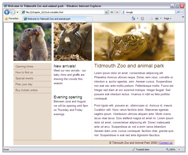
The layout that we created in Chapter 2 looks like the screenshot in Figure 4.2 in all browsers that support CSS tables.
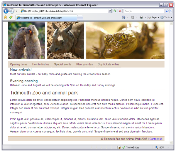
However, if we make no provisions for Internet Explorer 6 and 7, we’ll see something like Figure 4.3 in those older browsers.
What we can see in IE6 and IE7 are the three columns stacked
vertically, one on top of the other. As CSS tables aren’t supported by the browser, these browsers
ignore the instruction telling them to display the div elements as table cells. Therefore, they
display them in the default style for div elements: as blocks displayed one after the
other in source order.

The page is usable enough, but it’s obviously broken. With the number of people still using IE6 and IE7, this presentation is going to be a tough sell.
If you’re designing for yourself and nobody else, this is an option you might want to consider—it’ll certainly save you some time, and if you’re looking to make a point, this is the most visible way to do it. Be sure to use a script like that on offer from the Save the Developers project, to let users know why the page doesn’t look right in their outdated browser, though.
For most projects, however, you’ll probably need to consider making some provision for older browsers.
The best option, in my opinion, is to spend a little extra time after you’ve finished your CSS-table-based layout to build a simplified layout using only the layout features supported by older browsers.
A simplified layout like this has two benefits:
-
It provides a lesser experience when compared with the site as viewed in an up-to-date browser, but it doesn’t actually look broken. This approach allows the appearance of your site to remain professional, but still gives your users a gentle nudge to upgrade their browsers.
-
The simplified layout allows you to save yourself all that time it would take to achieve sophisticated designs using convoluted CSS layout techniques, such as absolute positioning, floated layout, and faux columns.
Let’s see how this is done …
For Internet Explorer 6 and 7 to display a simplified layout, we need to provide them with some different styling information. One option is to use conditional comments.
Conditional comments were introduced by Microsoft in order to give web developers a way to target versions of Internet Explorer. While I have some misgivings about the insertion of code for the browser within comments—which are supposed to be ignored by the browser—they do provide a simple way to pass information that will be ignored by other browsers and non-targeted versions of Internet Explorer.
For example, if we want to include a style sheet for only Internet Explorer 6—a situation that is my most common use of conditional comments—we use the following markup:
<!--[if IE 6]>
<link rel="stylesheet" type="text/css" href="ie6.css" />
<![endif]-->
We’d typically put this style sheet after the main style sheet in the document, then overwrite any problematic CSS with rules for IE6 only in this special style sheet. The cascade approach dictates that if two style sheets in the document have the same selectors, the one that comes later in the document will be applied after the rules in the earlier style sheet, and will have the last word on how elements are displayed.
In this case, we want to add a style sheet for any version of
Internet Explorer below IE8, so we use this conditional comment in which
lt IE8 means if less than
IE8:
<!--[if lt IE 8]>
<link rel="stylesheet" type="text/css"
    href="3col-csstable-ie7simplified.css" />
<![endif]-->
This condition is ideal, as when Internet Explorer 9 comes out we can safely assume it won’t have dropped support for CSS tables. Therefore, this condition will still work—and it won’t accidentally catch a newer browser than was available at the time of building the site. This block of code goes in the head of the document, after the original style sheet, as shown in Figure 4.4.

We create the new style sheet by saving the existing style sheet with a new name: 3col-csstable.oldbrowsers.css. The selectors in the existing style sheet provide a useful starting point for our IE6 and 7 style sheet.
Now, we don’t need to preserve every selector in this style sheet; many of the existing rules for styling text and simple aspects of the layout will work just fine in older browsers—we only need to override the rules for the elements that are set to display as tables, table rows, or table cells. So we can delete everything in the new style sheet other than those rules, which leaves the following CSS:
#main {
  display: table;
  border-collapse: collapse;
}
#main .inner {
  display: table-row;
}
#nav {
  display: table-cell;
  width: 180px;
  background-color: #e7dbcd;
}
#extras {
  display: table-cell;
  padding-left: 10px;
  border-right: 1px dotted #d7ad7b;
  width: 180px;
}
#content {
  display: table-cell;
  width: 380px;
  padding-left: 10px;
}
Then, we merely edit these rules to make the changes needed for
Internet Explorer versions less than version 8. The first step is to
empty the #main and #main .inner
rules:
We’ll leave these selectors in place as a reminder, in case we
need to come back and apply styles to the entire content area of the
page. We don’t need them to create our table and table row for now,
though, so we can leave them as unstyled blocks (the default for
divs).
Now, since we don’t have a CSS table, we need to decide how we’ll
lay out the div elements nav, extras, and content. Each of these are CSS table cells in
our table-based layout, but what do we do with them in our simplified
layout?
Back in the section called “The Grid’s the Thing” in Chapter 1, I explained
that CSS was originally designed with the idea that every page would be
a vertical stack of blocks. If we embrace this assumption in our
simplified design, we should find the CSS code required to describe it
very easy to write. Let’s remove the display
property values for each of these elements—they’ll default to
display: block—and set their
width property back to auto so
they span the full width of the page:
#nav {
  width: auto;
}
#extras {
  width: auto;
  border-right: none;
  border-bottom: 1px dotted #d7ad7b;
}
#content {
  width: auto;
}
Since we’re stacking the blocks vertically instead of
horizontally, we’ve also moved the dotted border from the right side of
the extras div to the bottom side. Figure 4.5 shows what the layout looks like in
IE7 at this point.

The page is now a vertical stack of blocks, but the contents of those blocks still look as though they were designed to stack horizontally across the page. Let’s add a few extra rules to our simplified layout style sheet to correct this issue.
It we look at the navigation menu, which in up-to-date browsers runs vertically down the left side, we can see that displaying it as a vertical list really doesn’t work in this layout. It would be nice to stack those menu items horizontally across the page in our simplified layout, but again, we run into the problem that CSS wasn’t designed to perform horizontal stacking of blocks.
We could fall back on our bag of tricks and use floats to perform the horizontal stacking, but remember that it’s this kind of fragile hack we’re trying to avoid with a simplified layout. Luckily, there is a much simpler option: display the list items as inline elements, so they flow across the page naturally—no stacking required!
#nav {
  width: auto;
  padding: 8px 0;
}
…
#nav li, #nav a:link, #nav a:visited {
  display: inline;
}
As the main style sheet has both the list items and the links
within them displayed as blocks, we need to set display:
inline on the list items, as well as both visited and
unvisited links inside them. With a little extra padding on the nav div,
we can even make the thick border below each of the links fit nicely
inside our simplified layout.
The other aspect of the design that really isn’t working in this
simplified layout is the padding around the news items in extras. We can fix this easily with a final
style rule:
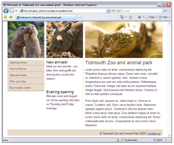
And we’re done! Our completed, simplified layout is shown in Figure 4.6, as displayed by Internet Explorer 7.
Sometimes you’ll have no choice but to support IE6 and 7 with the best design these browsers are able to display. Either you’ll find yourself working for a client that insists the site must look exactly the same in every browser that you support, or you’ll be building a site for an audience that, for whatever reason, contains a large segment of users with outdated browsers. Such situations should become less and less common over time, but for now at least you must be prepared for them.
What you need to do is reproduce your table-based layout as closely as possible using the features available in IE6 and 7. Again, we’ll start by adding a conditional comment that adds an extra style sheet for versions of Internet Explorer older than IE8:
<!--[if lt IE 8]>
<link rel="stylesheet" type="text/css"
    href="3col-csstable-oldbrowsers.css" />
<![endif]-->
And again, we’ll take as a starting point for 3col-csstable-oldbrowsers.css the rules from 3col-csstable.css that create CSS tables:
#main {
  display: table;
  border-collapse: collapse;
}
#main .inner {
  display: table-row;
}
#nav {
  display: table-cell;
  width: 180px;
  background-color: #e7dbcd;
}
#extras {
  display: table-cell;
  padding-left: 10px;
  border-right: 1px dotted #d7ad7b;
  width: 180px;
}
#content {
  display: table-cell;
  width: 380px;
  padding-left: 10px;
}
Now we can modify each of these rules to produce the layout we want in Internet Explorer 6 and 7:
Again, both the #main and #main
.inner rules can be left empty, since the default unadorned
blocks produced by these div elements
will work just fine for our purposes.
nav is the very first column
containing the navigation:
The width and
background-color property values specified in the
main style sheet can be left alone, but for IE6 and 7 we must add
float: left to make this block into a column:
This will float the div to the
left side of the page and allow the next column to come up alongside it.
The same goes for the middle column, extras. Floating the box causes it to gain a
layout—setting Internet Explorer 6 and 7’s magical
hasLayout property to true. We
made mention of this concept back in the section called “Absolute Positioning” in Chapter 2.
Finally, we float the final column left as
well. We’ll also reduce the width of this column slightly to ensure
there’s room for it to float up against the other two columns, and not be
forced to display underneath:
The final step is to set the footer div
to clear: both to make sure it stays below our
floated columns:
The finished layout is shown in Figure 4.7.
The layout now looks reasonable in Internet Explorer 7; the columns are displaying alongside each other and it all holds together pretty well. The background doesn’t extend down to the footer as it does in the tables version, but this doesn’t prevent someone from using the site.
If you wanted to add the background in for IE6 and IE7 users, it actually isn’t too difficult in this
case. We can simply add a background image such as that shown in Figure 4.8 to one of the redundant wrapper
divs, such as main.
#main {
  background-image: url(images/main-bg.gif);
  background-repeat: repeat-y;
}
This adds the background to the main div
that contains all three columns and should create the faux columns effect
described in Chapter 2.
At the same time, add border-right: none to the
rule for the extras to remove the
dotted right border, which is now replaced by the faux columns
image:
At this point, you won’t see the faux columns effect when you view
the layout in Internet Explorer 7. With all three columns floated, there’s
no non-floated content to hold open the main div, so
it collapses down to nothing. Giving main a
one-pixel red border, as shown in Figure 4.9, enables you to see
what has happened.

Luckily, there’s a fairly easy fix. Simply float main as well, which will force it to expand to
contain the floated columns inside it:
#main {
  float: left;
  width: 100%;
  background-image: url(main-bg.gif);
  background-repeat: repeat-y;
}
The finished layout should now be displayed correctly in IE7, as shown in Figure 4.10.

Here’s the finished style sheet for IE6 and 7:
If you’re a professional web designer, perhaps you’re reading this chapter with a certain degree of skepticism. Maybe most of your clients do insist on pixel-perfect rendering in IE6 and 7, and will continue to do so for some time.
Having read the third option above, you might wonder why anyone would bother using CSS tables, given they have to then create a fallback version using old-style floated layout techniques. Why not just use the float-based layout techniques you already know for all browsers?
This question really is the central issue of this book, so in this section we’ll explore the reasons you should make the extra effort to adopt new layout techniques, rather than sticking with what you know.
For years, we’ve criticized Microsoft for holding back the Web by abandoning development of Internet Explorer while its competitors responded to our demands and added the new CSS features. With Internet Explorer 8, Microsoft has caught up. All the features we need to improve the Web with solid, reliable, and—most importantly—easy-to-learn page layout techniques are now available across all the major browsers.
If we don’t start using those features now, then who’s holding back the Web? The users who haven’t upgraded their browsers? Until we build sites that take advantage of the new features added to the latest browsers, how can we expect those users to upgrade?
When we told Microsoft we needed it to improve Internet Explorer, we were making a bargain with the software giant: “You improve the browser to make our lives easier, and we’ll build the sites that take full advantage of it, giving your users a reason to upgrade.” Microsoft has done its part; now it’s our turn.
Yes, embracing new CSS techniques while supporting older browsers involves some extra work, but this is something we’ve done before, and the Web benefited greatly. Back in 2001, web designers began to abandon HTML tables used for layout in favour of then-nascent CSS layout techniques, which were made possible by improvements in the newest browsers, including Internet Explorer 5.5. At the time, there were still plenty of Netscape 4 users around, and designers were forced to create separate versions of their sites for these users.
The designers of 2001 didn’t have the benefit of conditional comments to ease this extra burden, but one by one they made the bold move to CSS layout. The result is that the vast majority of sites designed today use CSS layout, and benefit from the advantages it provides.
With the release of Internet Explorer 8, it’s 2001 all over again.
If we want to benefit from advances in browser support, at some point we have to decide that some browsers have limitations which mean they can’t benefit from the full look and feel of the design we need to implement. That doesn’t mean cutting those users off from being able to visit and use your site; it’s just that the design isn’t going to look the same for those users.
As an example, let’s revisit the image gallery grid we developed in the section called “Making a Perfect Grid” in Chapter 2, shown here in Figure 4.11.
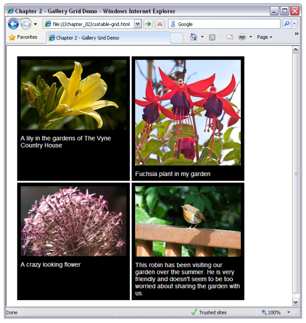
Remember how well CSS tables work here, as we can make all the boxes in each row the same height, regardless of how much text is entered. To support Internet Explorer 7, we can add a couple of rules to float the boxes instead of using the table grid:
The issue here will be that the backgrounds aren’t as neat, but it degrades quite well, as you can see in Figure 4.12.
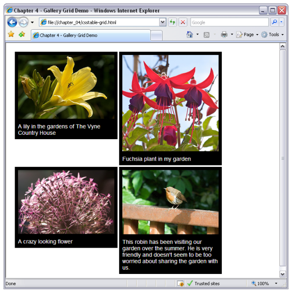
There really isn’t a good way to emulate this type of layout without CSS tables. This grid effect is something that has been elusive until the advent of CSS tables, which is why you often see sites with captions spilling over the edges of boxes when the browser’s text size is increased. The developer has assumed everyone has their text set to the same size, and fixed the height of the boxes to create this effect.
Floated and positioned CSS layout techniques have their problems, which can mean quite a bit of testing in different browsers—even in up-to-date browsers. The stability and reliability of table-based layouts was, for a long time, the main reason some designers chose to stick with HTML tables for layout, rather than embracing newer CSS techniques.
Using CSS tables for your layout will bring this stability to your CSS layout work. You’ll waste a lot less time fixing mysterious bugs and inexplicable behavior in even the latest browsers.
If you’re also able to use Option 1 (no fallback layout) or Option 2 (simplified fallback layout) described above, your testing burden will be reduced in browsers that don’t support CSS tables as well. But even if you must resort to Option 3, fixing squirrelly layout bugs only in IE6 and 7 sure beats fixing bugs across the full range of browsers in use today!

I’m sure that I’m not the only designer working with CSS every day who experiences frustration over implementing my complex, grid-based layouts using current CSS that works across browsers.
As grid-based layout has made its transition from traditional media and onto the Web, often the only ways to implement these layouts using CSS are to add additional markup or to use a complicated mixture of CSS floats and positioning; neither of these were intended to create the kind of rich, visual interfaces that the modern Web demands.
While the (slow) work of the CSS working group includes new
layout tools, these are some years away from becoming available. The
table-related values for the CSS display property
go some way to making my life happy, and as they’re being implemented
in the next version of Internet Explorer, they should make those other
frustrated designers happier too.
In this chapter, we discussed several approaches for supporting older browsers while embracing layout using CSS tables. Even though there are still a considerable number of users relying on browsers that don’t support CSS tables, the time to begin using this technology in production is right now.
Still, even if you’re excited about the new possibilities CSS tables bring to your layouts, you’re bound to be amazed at what’s around the corner. In the next and final chapter of this book, we’ll take a look at what the future might hold for CSS. Specifically, we’ll be concerning ourselves with some of the CSS3 properties that stand a good chance of eclipsing even CSS tables in adding creative freedom to the business of web design.